本文介绍Web侧如何进行多设备适配,结合Web组件实现在不同设备上的定制体验。内容涵盖相对单位、媒体查询、监听窗口变化事件等多设备适配能力,并针对宫格布局、自定义弹窗、轮播布局等前端布局介绍适配的实现思路与方案。
[h2]相对单位
在Web开发中,经常需要控制元素尺寸、边距等属性来调整页面效果。定义这些属性时,需要用到CSS提供的元素尺寸单位,主要分为绝对单位和相对单位。
- 绝对单位:不依赖于其他值或元素属性的固定值。常见的绝对单位如像素(px),适用于页面中尺寸固定不变的元素。
- 相对单位:依赖其他值或元素属性来确定元素尺寸。当依赖的元素值变化时,相对单位定义的值也会随之变化。由于其动态特性,相对单位常用于前端页面的响应式开发。以下为常见的相对单位列表。
单位 | 相对元素 | 使用场景 | 示例代码 |
|---|---|---|---|
% | 百分比单位,相对于包含块(通常是父元素)的尺寸。 | 常用于响应式设计中,使元素的大小相对于其父元素调整。 | .parent {
width: 400px;
}
.child {
width: 50%; /* 200px */
} |
em | 相对于当前元素的字体大小。如果当前元素的字体大小未设置,则相对于其父元素的字体大小。 | 用于文本大小和基于文本的间距,便于通过调整字体大小来改变布局。 | p {
font-size: 16px;
}
span {
font-size: 1.5em; /* 24px */
} |
rem | 相对于根元素(html元素)的字体大小。 | 与em类似,但更加一致,因为所有rem值都基于同一个根元素的大小,易于全局调整。 | html {
font-size: 16px;
}
p {
font-size: 1rem; /* 16px */
}
span {
font-size: 1.5rem; /* 24px */
} |
vw/vh | 相对于视窗(浏览器窗口)尺寸,vw相对于浏览器窗口宽度,vh相对于浏览器窗口高度。 | 元素尺寸完全基于视窗宽度,例如弹窗遮罩层。 | .overlay {
width: 100vw; /* equal to the width of the viewport */
height: 100vh; /* equal to the height of the viewport */
} |

CSS中设置的px单位会自动通过设备像素比(devicePixelRatio)进行换算,这使得px单位在视觉效果上与HarmonyOS中的vp单位相同。此特性可以消除设备物理像素的差异,便于Web应用迁移到HarmonyOS。
[h2]媒体查询
媒体查询允许开发者根据设备特性(如屏幕尺寸、分辨率、方向等)应用不同的样式规则。这确保了网页在不同设备和屏幕尺寸下都能有良好的显示效果,从而提升用户体验。在Web页面适配HarmonyOS侧一多时,横纵向断点对应的尺寸范围与HarmonyOS侧推荐的断点划分范围保持一致。

在使用HarmonyOS侧纵向断点时,需要注意Web侧区分纵向断点时使用宽高比。而HarmonyOS侧定义的纵向断点使用高宽比。
例如以下媒体查询代码,当视口宽度满足不小于840px时,应用了article的类样式的字体大小将变为20px。当视口宽度满足大于等于320px且小于600px,视口宽高比大于等于1/1.2且小于等于1/0.8时,符合手机上下分屏的小窗口,字体大小将变为14px。
@media (840px<=width) {
  .article {
    font-size: 20px;
  }
}

@media (320px<=width<600px ) and (min-aspect-ratio: 1/1.2) and (max-aspect-ratio: 1/0.8){
  .article {
    font-size: 14px;
  }
}
场景一:修改字体大小
实现原理:利用CSS中的媒体查询@media,设置不同断点尺寸下的字体大小,实现响应式布局。以下以常见的sm、md、lg为例进行适配。
- 当屏幕尺寸位于sm断点时,应用了title类样式的元素字体大小为16px。
- 当屏幕尺寸位于md断点时,应用了title类样式的元素字体大小为18px。
- 当屏幕尺寸位于lg断点及以上时,应用了title类样式的元素字体大小为20px。
- 当屏幕尺寸不满足上述范围,应用了title类样式的元素字体大小为14px。
.title {
  font-size: 14px;
}
@media (320px<=width<600px) {
  .title {
    font-size: 16px;
  }
}
@media (600px<=width<840px) {
  .title {
    font-size: 18px;
  }
}
@media (840px<=width) {
  .title {
    font-size: 20px;
  }
}
由此可以实现在不同屏幕尺寸上,拥有不同的字体大小。
场景二:修改图片宽度
实现原理:通过CSS的媒体查询@media能力,设置不同断点下的图片宽度实现响应式布局,下文以常见的sm、md、lg为例进行适配。
- 当屏幕尺寸位于sm断点时,应用了cover类样式的元素尺寸为120px。
- 当屏幕尺寸位于md断点时,应用了cover类样式的元素尺寸为160px。
- 当屏幕尺寸位于lg断点及以上时,应用了cover类样式的元素尺寸为240px。
- 当屏幕尺寸不满足上述范围,应用了cover类样式的元素尺寸为100px。
.cover {
  width: 100px;
  height: 100px;
}
@media (320px<=width<600px) {
  .cover {
    width: 120px;
    height: 120px;
  }
}
@media (600px<=width<840px) {
  .cover {
    width: 160px;
    height: 160px;
  }
}
@media (840px<=width) {
  .cover {
    width: 240px;
    height: 240px;
  }
}
由此可以实现在不同屏幕尺寸上,拥有不同的元素尺寸。
[h2]添加窗口事件
window对象提供了resize事件注册,该事件在文档视图(窗口)调整大小时触发。当无法使用相对单位或媒体查询实现多设备体验时,可以通过JavaScript注册resize事件,使用window.innerHeight获取窗口高度,使用window.innerWidth获取窗口宽度。结合CSS与HTML,根据获取到的窗口尺寸完成多设备体验适配。本章节以等比例修改字体大小为例,根据窗口宽度动态计算字体大小变化。
<!DOCTYPE html>
<html lang="en">
<head>
  <meta charset="UTF-8">
  <meta name="viewport" content="width=device-width, initial-scale=1.0">
  <title>Responsive Font Size on Resize</title>
  <style>
    html {
        font-size: 16px;
    }
    .content {
        padding: 20px;
    }
    .content h1,
    .content p {
        margin: 0 0 1em;
    }
  </style>
</head>
<body>
<div class="content">
  <h1>Responsive Font Size Example</h1>
  <p>Resize the window to see the font size change.</p>
</div>
</body>
</html>
<script>
  const root = document.documentElement;
  const initialScale = window.innerWidth / 1920;
  root.style.fontSize = `${initialScale * 16}px`;
  // Listen for window size change events
  window.addEventListener('resize', () => {
      const newScale = window.innerWidth / 1920;
      root.style.fontSize = `${newScale * 16}px`;
  });
</script> [h2]宫格布局
CSS中提供了grid布局,与栅格布局(GridRow/GridCol)类似,它将网页内容划分成一个一个的网格,通过任意组合不同的网格,从而做出各种各样的布局。
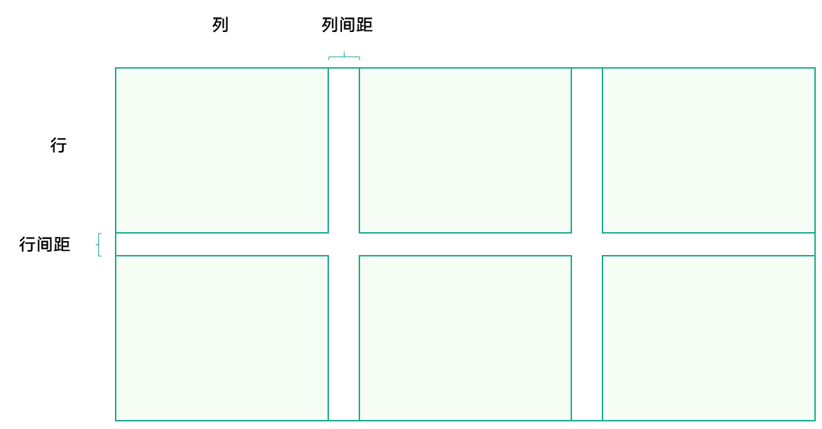
关于宫格布局,有几个关键概念需要了解。更多详细信息,开发者可以查阅CSS Grid的相关资料。
- 容器和项目:采用网格布局的区域称为容器。容器内部采用网格定位的子元素称为项目。
- 行与列:水平区域称为行,垂直区域称为列。
- 行间距与列间距:两行之间或者两列之间存在的空白区域部分。
使用宫格布局,需参考以下步骤:
- 设置容器属性:首先要将容器的display属性设置为grid。
- 确定元素的排列方式:
- 确定列宽与行高:列宽通过grid-template-columns定义,参数个数为列数,参数大小为列宽;行高通过grid-template-rows定义,方式类似。
- 确定行列间距:行间距用row-gap控制,列间距用column-gap控制。若间距相等,用gap属性控制。
例如,宫格元素按两行三列排列,列宽和行高均为100px,行列间距为20px。代码如下所示:
<!DOCTYPE html>
<html lang="en">
<head>
  <meta charset="UTF-8" />
  <meta name="viewport" content="width=device-width, initial-scale=1.0" />
  <title>Demo</title>
</head>
<style>
  .container {
    display: grid;
    gap: 20px;
    grid-template-columns: 100px 100px 100px;
    grid-template-rows: 100px 100px;
  }
  .container .grid-item {
    background-color: #f6fdf5;
    text-align: center;
    line-height: 100px;
  }
</style>
<body>
<div class="container">
  <div class="grid-item">1</div>
  <div class="grid-item">2</div>
  <div class="grid-item">3</div>
  <div class="grid-item">4</div>
  <div class="grid-item">5</div>
  <div class="grid-item">6</div>
</div>
</body>
</html> 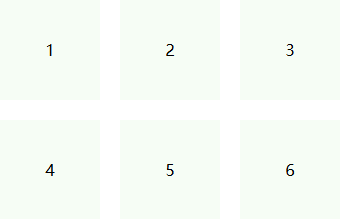
当元素个数较少时,可以通过逐个书写(如grid-template-columns: 100px 100px 100px)的方式进行排列指定。然而,当元素数量较多,例如一行有十列时,这种写法的可读性会变差。此时,可以使用repeat()函数来简化书写。该函数接收两个参数:第一个参数为重复的次数,第二个参数为要重复的值。例如,上述写法可以改写为grid-template-columns: repeat(3, 100px),效果相同。在多列情况下,repeat()函数能显著提高代码的可读性和简洁性。
宫格布局可结合媒体查询,以实现不同设备上的最佳体验。通过设置不同尺寸范围的排列方式,达到在不同屏幕尺寸上显示不同效果的目的。例如,实现以下宫格效果。
断点 | sm | md | lg |
|---|---|---|---|
效果图 |
|
|
|


- 在sm断点下,宫格以4列进行显示,同时行间距为12px。
@media (320px<=width<600px) { .grid-functions { grid-template-columns: repeat(4, 48px); row-gap: 12px; } } - 在md断点下,宫格以6列进行显示,同时行间距为20px。
@media (600px<=width<840px) { .grid-functions { grid-template-columns: repeat(6, 48px); row-gap: 20px; } } - 在lg断点下,宫格以8列进行显示,同时行间距为24px。
@media (840px<=width) {
  .grid-functions {
    grid-template-columns: repeat(8, 48px);
    row-gap: 24px;
  }
}
[h2]自定义弹窗
在大尺寸设备上,使用更大的弹窗展示,以避免内容过小、不易看清。通过CSS的媒体查询@media能力,设置不同断点下的弹窗尺寸。例如:
断点 | sm | md | lg |
|---|---|---|---|
效果图 |
|
|
|


- 在sm断点下,设置弹窗尺寸为328px*344px。
@media (320px<=width<600px) { .custom-dialog { width: 328px; height: 344px; } } - 在md断点下,设置弹窗尺寸为360px*378px。
@media (600px<=width<800px) { .custom-dialog { width: 360px; height: 378px; } } - 在lg断点下,设置弹窗尺寸为393px*412px。
@media (800px<=width) {
  .custom-dialog {
    width: 393px;
    height: 412px;
  }
}

需要注意的是,不仅需要对弹窗的尺寸进行响应式适配,还需要对弹窗的内容进行响应式适配。由于弹窗内容高度定制,难以提供统一的适配方式,因此需要开发者根据弹窗内容采用合适的适配方案自行适配。
[h2]轮播布局
轮播布局,即轮播图,提供了多张图片轮流播放的功能。虽然原生Web未提供直接实现轮播图的组件,但可以通过一些技巧或复用第三方组件库来实现轮播图的效果。轮播布局的一多适配关键点如下:
- 控制轮播元素的尺寸:使用媒体查询和断点,或窗口事件,设置每个断点下的轮播图尺寸样式。
- 控制轮播元素的间距:根据轮播元素的排列方式选择合适的方法。使用flex布局时,推荐使用gap属性定义元素间距;其他情况下,使用margin属性控制间距。
- 控制每次轮播的位移距离:根据轮播的实现方案选择。如果使用translateX()(CSS transform属性,用于水平位移),需控制每次增加的步长;如果使用绝对定位,需根据对应的位移属性进行控制。
此处只提供如下常见的轮播图一多效果并以React语言为例进行实现。
断点 | sm | md | lg |
|---|---|---|---|
效果图 |
|
|
|


const Banner = () => {
  const banner = [
    { id: "001", url: "assets/banner01.png" },
    { id: "002", url: "assets/banner02.png" },
    { id: "003", url: "assets/banner03.png" },
    { id: "004", url: "assets/banner04.png" },
  ];

  const [currentIndex, setCurrentIndex] = useState(1);
  const [currentDot, setCurrentDot] = useState(0);
  const [width, setWidth] = useState<number>(0);
  const [singleOffset, setSingleOffset] = useState<number>(0);
  const [initOffset, setInitOffset] = useState<number>(0);
  const [gap, setGap] = useState(16);
  const [animate, setAnimate] = useState("transform 0.5s ease");
  const [dotVisible, setDotVisible] = useState(false);
  const wrapperRef = useRef<HTMLDivElement>(null);
  const totalItems = banner.length;

  useEffect(() => {
    const updateLayout = () => {
      const winWidth = window.innerWidth;
      if (winWidth < 600) {
        setGap(0); // set the distance between elements under the sm breakpoint.
        setWidth(winWidth - 32); // set the element width under the sm breakpoint.
        setSingleOffset(winWidth - 32); // set the single displacement under the sm breakpoint.
        setInitOffset(0); // set the initial offset under the sm breakpoint.
        setDotVisible(true);
      } else if (winWidth < 840) {
        setGap(12); // set the distance between elements under the md breakpoint.
        setWidth((winWidth - 48 - gap) / 2); // set the element width under the md breakpoint.
        setSingleOffset(width + gap); // set the single displacement under the md breakpoint.
        setInitOffset(24); // set the initial offset under the md breakpoint.
        setDotVisible(false);
      } else {
        setGap(16); // set the distance between elements under the lg breakpoint.
        setWidth((winWidth - 250 - gap) / 2); // set the element width under the lg breakpoint.
        setSingleOffset(width + gap); // set the single displacement under the lg breakpoint.
        setInitOffset(125); // set the initial offset under the lg breakpoint.
        setDotVisible(false);
      }
    };

    updateLayout();
    window.addEventListener("resize", updateLayout);
    return () => window.removeEventListener("resize", updateLayout);
  }, [gap, width]);

  useEffect(() => {
    const interval = setInterval(() => {
      setCurrentIndex((prev) => prev + 1);
      setCurrentDot((p) => (p + 1) % banner.length);
    }, 3000);
    return () => clearInterval(interval);
  });

  useEffect(() => {
    if (currentIndex === totalItems + 1) {
      setTimeout(() => {
        setAnimate("none");
        setCurrentIndex(1);
        setTimeout(() => {
          setAnimate("transform 0.5s ease");
        }, 50);
      }, 550);
    }
  }, [currentIndex, totalItems]);

  return (
    <div className="banner-container">
      <div
        className="banner-wrapper"
        ref={wrapperRef}
        style={{
          transform: `translateX(-${
            currentIndex * singleOffset - initOffset
          }px)`,
          transition: animate,
          gap: `${gap}px`,
        }}
      >
        {[banner[banner.length - 1], ...banner, ...banner].map(
          (item, index) => (
            <div
              style={{
                width,
              }}
              key={`${item.id}-${index}`}
              className="banner-item"
            >
              <img src={item.url} alt={`banner-${item.id}`} />
            </div>
          )
        )}
      </div>
      {dotVisible ? (
        <div className="swiper-dot">
          {banner.map((item, index) => (
            <div
              key={item.id}
              className={`dot${currentDot === index ? " dot-active" : ""}`}
            ></div>
          ))}
        </div>
      ) : (
        <></>
      )}
    </div>
  );
};

export default Banner;