














从API version 9开始,该装饰器支持在ArkTS卡片中使用。
从API version 11开始,该装饰器支持在元服务中使用。
@Prop装饰的变量可以和父组件建立单向同步关系。
在阅读@Prop文档前,建议开发者首先了解@State的基本用法。最佳实践请参考状态管理最佳实践。常见问题请参考状态管理常见问题。
从API version 9开始,该装饰器支持在ArkTS卡片中使用。
从API version 11开始,该装饰器支持在元服务中使用。
@Prop装饰的变量具有以下特性:
@Prop装饰的变量允许本地修改,但修改不会同步回父组件。
当数据源更改时,@Prop装饰的变量都会更新,并且会覆盖本地所有更改。
| @Prop变量装饰器 | 说明 |
|---|---|
| 装饰器参数 | 无。 |
| 同步类型 | 单向同步。对父组件状态变量值的修改,将同步给子组件@Prop装饰的变量,子组件@Prop装饰的变量的修改不会同步到父组件的状态变量上。 嵌套类型的场景请参考观察变化。 |
| 允许装饰的变量类型 | Object、class、string、number、boolean、enum类型,以及这些类型的数组。 API version 10开始支持Date类型。 API version 11及以上支持Map、Set类型、undefined和null类型、ArkUI框架定义的联合类型Length、ResourceStr、ResourceColor类型以及这些类型的联合类型,示例见Prop支持联合类型实例。 支持类型的场景请参考观察变化。 |
| 不允许装饰的变量类型 | 不支持装饰Function类型。 |
| 嵌套传递层数 | 在组件复用场景,建议@Prop深度嵌套数据不要超过5层,嵌套太多会导致深拷贝占用的空间过大以及GarbageCollection(垃圾回收),引起性能问题,此时更建议使用@ObjectLink。 |
| 被装饰变量的初始值 | 允许本地初始化。API version 11及以上,如果和@Require结合使用,则必须父组件构造传参。 |
| 装饰器使用规则 | 说明 |
|---|---|
| 从父组件初始化 | 如果本地有初始化,则是可选的,初始化行为和@State保持一致。没有的话,则必选,支持父组件中的常规变量(常规变量对@Prop赋值,只是数值的初始化,常规变量的变化不会触发UI刷新。只有状态变量才能触发UI刷新)、@State、@Link、@Prop、@Provide、@Consume、@ObjectLink、@StorageLink、@StorageProp、@LocalStorageLink和@LocalStorageProp去初始化子组件中的@Prop装饰的变量。 |
| 用于初始化子组件 | @Prop支持初始化子组件中的常规变量、@State、@Link、@Prop、@Provide。 |
| 是否支持组件外访问 | @Prop装饰的变量是私有的,只能在组件内访问。 |
初始化规则图示:

@Prop装饰的数据可以观察到以下变化。
当装饰支持类型,可以观察到赋值的变化。简单类型完整示例请参考父组件@State到子组件@Prop简单数据类型同步。
- // 简单类型
- @Prop count: number;
- // 赋值的变化可以被观察到
- this.count = 1;
- // 复杂类型
- @Prop title: Model;
- // 可以观察到赋值的变化
- this.title = new Model('Hi');
当装饰的类型是Object或者class复杂类型时,可以观察到自身的赋值和第一层的属性的变化,属性即Object.keys(observedObject)返回的所有属性。复杂类型完整示例请参考从父组件中的@State类对象属性到@Prop简单类型的同步。
- // 定义嵌套类
- class Info {
- public value: string;
-
- constructor(value: string) {
- this.value = value;
- }
- }
-
- class Model {
- public value: string;
- public info: Info;
-
- constructor(value: string, info: Info) {
- this.value = value;
- this.info = info;
- }
- }
- @Prop title: Model;
- // 可以观察到第一层的变化
- this.title.value = 'Hi';
- // 观察不到第二层的变化
- this.title.info.value = 'ArkUI';
对于嵌套场景,如果class是被@Observed装饰的,可以观察到class属性的变化,示例请参考@Prop嵌套场景。
当装饰的类型是数组的时候,可以观察到数组本身的赋值和数组项的添加、删除和更新。数组类型完整示例请参考父组件@State数组项到子组件@Prop简单数据类型同步。
- // @Prop装饰的对象为数组时
- @Prop title: string[];
- // 数组自身的赋值可以观察到
- this.title = ['1'];
- // 数组项的赋值可以观察到
- this.title[0] = '2';
- // 删除数组项可以观察到
- this.title.pop();
- // 新增数组项可以观察到
- this.title.push('3');
对于@State和@Prop的同步场景:
使用父组件中@State变量的值初始化子组件中的@Prop装饰的变量。当@State变量变化时,该变量值也会同步更新至@Prop装饰的变量。
@Prop装饰的变量的修改不会影响其数据源@State装饰变量的值。
除了@State,数据源也可以用@Link或@Prop装饰,对@Prop的同步机制是相同的。
数据源和@Prop装饰的变量的类型需要相同。
当装饰的对象是Date时,可以观察到Date整体的赋值,同时可通过调用Date的接口setFullYear, setMonth, setDate, setHours, setMinutes, setSeconds, setMilliseconds, setTime, setUTCFullYear, setUTCMonth, setUTCDate, setUTCHours, setUTCMinutes, setUTCSeconds, setUTCMilliseconds 更新Date的属性,详见装饰Date类型变量。
当装饰的变量是Map时,可以观察到Map整体的赋值,同时可通过调用Map的接口set, clear, delete 更新Map的值。详见装饰Map类型变量。
当装饰的变量是Set时,可以观察到Set整体的赋值,同时可通过调用Set的接口add, clear, delete 更新Set的值。详见装饰Set类型变量。
理解@Prop装饰的变量值初始化和更新机制,需要了解父组件和子组件的渲染和更新流程。
初始渲染:
更新:
@Prop同步数据源依赖于数据源所在组件的刷新,而应用进入后台后无法触发刷新,因此应用进入后台后,@Prop无法从数据源更新。在此场景下,若需即时数据同步,推荐使用@Link代替。
以下示例中,当@State装饰的变量message改变时,Father组件会刷新。由于Son组件使用@Prop接收了该变量,因此Father组件刷新的过程中会使用message的最新值去更新@Prop的值。@Prop更新后,会触发Son组件的刷新。
- @Component
- struct Son {
- @Prop message: string = 'Hi';
-
- build() {
- Column() {
- Text(this.message)
- }
- }
- }
-
- @Entry
- @Component
- struct Father {
- @State message: string = 'Hello';
-
- build() {
- Column() {
- Text(this.message)
- Button(`father click`).onClick(() => {
- this.message += '*';
- })
- // 父组件@State装饰的message传给子组件的message
- Son({ message: this.message })
- }
- }
- }
@Prop装饰变量时会进行深拷贝,在拷贝的过程中除了基本类型、Map、Set、Date、Array外,都会丢失类型。例如,对于通过NAPI提供的复杂类型(如PixelMap),由于其部分实现在Native侧,因此无法在ArkTS侧通过深拷贝获得完整的数据;同样,RegExp类型在拷贝过程中会丢失原类型,导致被@Prop装饰后无法调用正则相关函数。
@Prop不支持装饰Function类型的变量,API version 23之前,应用在运行时会出现错误。
从API version 23开始,在应用编译时添加了相关校验,@Prop装饰Function类型变量会提示ERROR,应在代码中删除Function类型变量的@Prop装饰器。
父组件传入undefined时,@Prop装饰的变量仍使用本地默认值进行初始化。
- @Entry
- @Component
- struct Parent {
- @State count: number | undefined = undefined;
-
- build() {
- Column() {
- Text(`Parent count value: ${this.count}`)
- .fontSize(20)
- .margin(10)
- Child({ count: this.count })
- }
- }
- }
-
- @Component
- struct Child {
- // 父组件传入undefined时,@Prop装饰的变量仍使用本地默认值进行初始化
- @Prop count: number | undefined = 0;
-
- build() {
- Column() {
- Text(`Child count value: ${this.count}`)
- .fontSize(20)
- .margin(10)
- }
- }
- }
以下示例是@State到子组件@Prop简单数据同步,父组件ParentComponent的状态变量countDownStartValue初始化子组件CountDownComponent中@Prop装饰的count,点击“Try again”,count的修改仅保留在CountDownComponent,不会同步给父组件ParentComponent。
ParentComponent的状态变量countDownStartValue的变化将重置CountDownComponent的count。
- @Component
- struct CountDownComponent {
- @Prop count: number = 0;
- costOfOneAttempt: number = 1;
-
- build() {
- Column() {
- if (this.count > 0) {
- Text(`You have ${this.count} Nuggets left`)
- } else {
- Text('Game over!')
- }
- // @Prop装饰的变量不会同步给父组件
- Button(`Try again`).onClick(() => {
- this.count -= this.costOfOneAttempt;
- })
- }
- }
- }
-
- @Entry
- @Component
- struct ParentComponent {
- @State countDownStartValue: number = 10;
-
- build() {
- Column() {
- Text(`Grant ${this.countDownStartValue} nuggets to play.`)
- // 父组件的数据源的修改会同步给子组件
- Button(`+1 - Nuggets in New Game`).onClick(() => {
- this.countDownStartValue += 1;
- })
- // 父组件的修改会同步给子组件
- Button(`-1 - Nuggets in New Game`).onClick(() => {
- this.countDownStartValue -= 1;
- })
- CountDownComponent({ count: this.countDownStartValue, costOfOneAttempt: 2 })
- }
- }
- }
在上面的示例中:
CountDownComponent子组件首次创建时其@Prop装饰的count变量将从父组件@State装饰的countDownStartValue变量初始化。
按“+1”或“-1”按钮时,父组件的@State装饰的countDownStartValue值会变化,这将触发父组件重新渲染,在父组件重新渲染过程中会刷新使用countDownStartValue状态变量的UI组件,并单向同步更新CountDownComponent子组件中的count值。
更新count状态变量值也会触发CountDownComponent的重新渲染,在重新渲染过程中,评估使用count状态变量的if语句条件(this.count > 0),并执行true分支中的使用count状态变量的UI组件相关描述来更新Text组件的UI显示。
当按下子组件CountDownComponent的“Try again”按钮时,其@Prop装饰的变量count将被更改,但是count值的更改不会影响父组件的countDownStartValue值。
父组件的countDownStartValue值变化时,父组件的修改将覆盖掉子组件CountDownComponent中count本地的修改。
父组件中@State如果装饰数组类型的变量,其数组项也可以初始化@Prop。以下示例中,父组件Index中@State装饰数组arr,将其数组项初始化子组件Child中@Prop装饰的value。
- @Component
- struct Child {
- @Prop value: number = 0;
-
- build() {
- Text(`${this.value}`)
- .fontSize(50)
- .onClick(() => {
- this.value++;
- })
- }
- }
-
- @Entry
- @Component
- struct Index {
- @State arr: number[] = [1, 2, 3];
-
- build() {
- Row() {
- Column() {
- Child({ value: this.arr[0] })
- Child({ value: this.arr[1] })
- Child({ value: this.arr[2] })
-
- Divider().height(5)
-
- ForEach(this.arr,
- (item: number) => {
- Child({ value: item })
- },
- (item: number) => item.toString()
- )
- Text('replace entire arr')
- .fontSize(50)
- .onClick(() => {
- // 两个数组都包含项“3”。
- this.arr = this.arr[0] == 1 ? [3, 4, 5] : [1, 2, 3];
- })
- }
- }
- }
- }
初始渲染创建6个子组件实例,每个@Prop装饰的变量初始化都在本地拷贝了一份数组项。子组件onClick事件处理程序会更改局部变量值。
如果点击界面上的“1”六次,“2”五次、“3”四次,将所有变量的本地取值都变为“7”。
- 7
- 7
- 7
- ——————
- 7
- 7
- 7
点击replace entire arr后,屏幕将显示以下信息。
- 3
- 4
- 5
- ——————
- 7
- 4
- 5
在子组件Child中做的所有的修改都不会同步回父组件Index组件,所以即使6个组件显示都为7,但在父组件Index中,this.arr保存的值依旧是[1,2,3]。
点击replace entire arr,this.arr[0] == 1成立,将this.arr赋值为[3, 4, 5]。
因为this.arr[0]已更改,Child({value: this.arr[0]})组件将this.arr[0]更新同步到实例@Prop装饰的变量。Child({value: this.arr[1]})和Child({value: this.arr[2]})的情况也类似。
this.arr的更改触发ForEach更新,this.arr更新的前后都有数值为3的数组项:[3, 4, 5] 和[1, 2, 3]。根据diff算法,数组项“3”将被保留,删除“1”和“2”的数组项,添加为“4”和“5”的数组项。这就意味着,数组项“3”的组件不会重新生成,而是将其移动到第一位。所以“3”对应的组件不会更新,此时“3”对应的组件数值为“7”,ForEach最终的渲染结果是“7”,“4”,“5”。
如果图书馆有一本图书和两位用户,每位用户都可以将图书标记为已读,此标记行为不会影响其他用户。从代码角度讲,对@Prop图书对象的本地更改不会同步给图书馆组件中的@State图书对象。
在此示例中,图书类可以使用@Observed装饰器,但不是必须的,只有在嵌套结构时需要此装饰器。这一点会在从父组件中的@State数组项到@Prop class类型的同步说明。
- class Book {
- public title: string;
- public pages: number;
- public readIt: boolean = false;
-
- constructor(title: string, pages: number) {
- this.title = title;
- this.pages = pages;
- }
- }
-
- @Component
- struct ReaderComp {
- // 父组件@State装饰的book传入子组件@Prop装饰的book
- @Prop book: Book = new Book('', 0);
-
- build() {
- Row() {
- Text(this.book.title)
- Text(`...has${this.book.pages} pages!`)
- Text(`...${this.book.readIt ? 'I have read' : 'I have not read it'}`)
- .onClick(() => this.book.readIt = true)
- }
- }
- }
-
- @Entry
- @Component
- struct Library {
- @State book: Book = new Book('100 secrets of C++', 765);
-
- build() {
- Column() {
- // 父组件将同一book分别传给两个ReaderComp
- ReaderComp({ book: this.book })
- ReaderComp({ book: this.book })
- }
- }
- }
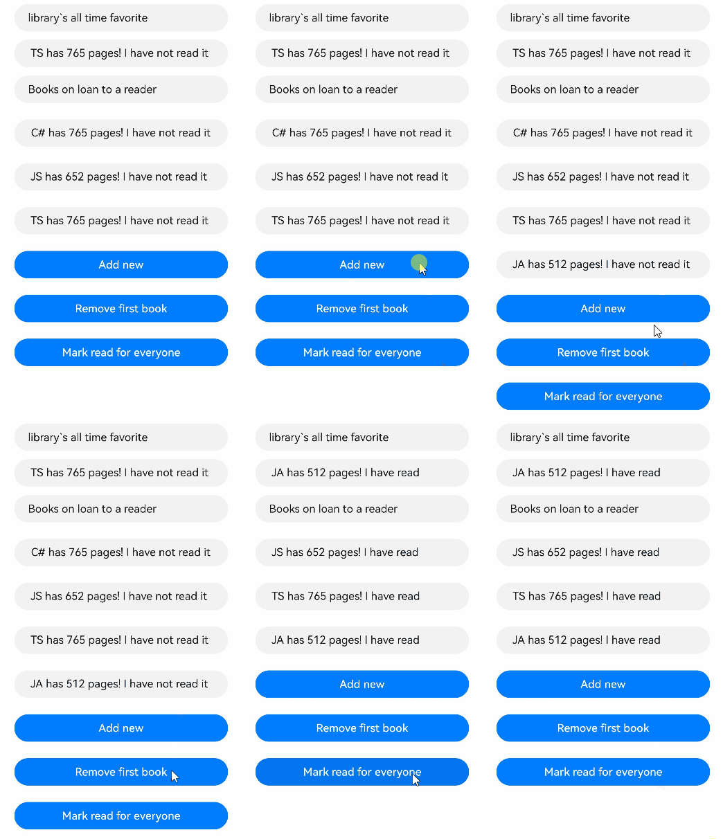
以下示例中,更改了@State装饰的allBooks数组中Book对象的属性,但点击“Mark read for everyone”时,没有触发UI更新。这是因为该属性是第二层的嵌套属性,@State装饰器只能观察到第一层属性,不会观察到此属性更改,所以框架不会更新ReaderComp。
- import { hilog } from '@kit.PerformanceAnalysisKit';
-
- const DOMAIN = 0x0001;
- const TAG: string = '[SampleProp]';
- let nextId: number = 1;
-
- // @Observed
- class Book {
- public id: number;
- public title: string;
- public pages: number;
- public readIt: boolean = false;
-
- constructor(title: string, pages: number) {
- this.id = nextId++;
- this.title = title;
- this.pages = pages;
- }
- }
-
- @Component
- struct ReaderComp {
- @Prop book: Book = new Book('', 1);
-
- build() {
- Row() {
- Text(` ${this.book ? this.book.title : 'Book is undefined'}`).fontColor('#e6000000')
- Text(` has ${this.book ? this.book.pages : 'Book is undefined'} pages!`).fontColor('#e6000000')
- Text(` ${this.book ? this.book.readIt ? 'I have read' : 'I have not read it' : 'Book is undefined'}`)
- .fontColor('#e6000000')
- .onClick(() => this.book.readIt = true)
- }
- }
- }
-
- @Entry
- @Component
- struct Library {
- @State allBooks: Book[] = [new Book('C#', 765), new Book('JS', 652), new Book('TS', 765)];
-
- build() {
- Column() {
- Text('library`s all time favorite')
- .width(312)
- .height(40)
- .backgroundColor('#0d000000')
- .borderRadius(20)
- .margin(12)
- .padding({ left: 20 })
- .fontColor('#e6000000')
- ReaderComp({ book: this.allBooks[2] })
- .backgroundColor('#0d000000')
- .width(312)
- .height(40)
- .padding({ left: 20, top: 10 })
- .borderRadius(20)
- .colorBlend('#e6000000')
- Text('Books on loan to a reader')
- .width(312)
- .height(40)
- .backgroundColor('#0d000000')
- .borderRadius(20)
- .margin(12)
- .padding({ left: 20 })
- .fontColor('#e6000000')
- ForEach(this.allBooks, (book: Book) => {
- ReaderComp({ book: book })
- .margin(12)
- .width(312)
- .height(40)
- .padding({ left: 20, top: 10 })
- .backgroundColor('#0d000000')
- .borderRadius(20)
- },
- (book: Book) => book.id.toString())
- Button('Add new')
- .width(312)
- .height(40)
- .margin(12)
- .fontColor('#FFFFFF')
- .onClick(() => {
- this.allBooks.push(new Book('JA', 512));
- })
- Button('Remove first book')
- .width(312)
- .height(40)
- .margin(12)
- .fontColor('#FFFFFF')
- .onClick(() => {
- if (this.allBooks.length > 0) {
- this.allBooks.shift();
- } else {
- // allBooks为空时输出提示信息
- hilog.info(DOMAIN, TAG, 'length <= 0');
- }
- })
- Button('Mark read for everyone')
- .width(312)
- .height(40)
- .margin(12)
- .fontColor('#FFFFFF')
- .onClick(() => {
- this.allBooks.forEach((book) => book.readIt = true)
- })
- }
- }
- }
使用@Observed装饰class Book,Book的属性变化将被观察。需要注意的是,@Prop在子组件装饰的状态变量和父组件的数据源是单向同步关系,即ReaderComp中的@Prop book的修改不会同步给父组件Library。而父组件只会在状态变量发生变化的时候,才会触发UI的重新渲染。
- @Observed
- class Book {
- public id: number;
- public title: string;
- public pages: number;
- public readIt: boolean = false;
-
- constructor(title: string, pages: number) {
- this.id = nextId++;
- this.title = title;
- this.pages = pages;
- }
- }
@Observed装饰的类的实例会被不透明的代理对象包装,此代理可以检测到包装对象内的所有属性更改。如果发生这种情况,此时,代理通知@Prop,@Prop对象值被更新。
为了支持@Component装饰的组件复用场景,@Prop支持本地初始化,这样可以让@Prop是否与父组件建立同步关系变得可选。当且仅当@Prop有本地初始化时,从父组件向子组件传递@Prop的数据源才是可选的。
下面的示例中,子组件包含两个@Prop装饰的变量:
@Prop customCounter没有本地初始化,所以需要父组件提供数据源去初始化@Prop,并当父组件的数据源变化时,@Prop也将被更新。
@Prop customCounter2有本地初始化,在这种情况下,@Prop依旧允许但非强制父组件同步数据源给@Prop。
- @Component
- struct MyComponent {
- @Prop customCounter: number;
- @Prop customCounter2: number = 5;
-
- build() {
- Column() {
- Row() {
- Text(`From Main: ${this.customCounter}`).fontColor('#ff6b6565').margin({ left: -110, top: 12 })
- }
-
- Row() {
- Button('Click to change locally!')
- .width(288)
- .height(40)
- .margin({ left: 30, top: 12 })
- .fontColor('#FFFFFF')
- .onClick(() => {
- this.customCounter2++;
- })
- }
-
- Row() {
- Text(`Custom Local: ${this.customCounter2}`).fontColor('#ff6b6565').margin({ left: -110, top: 12 })
- }
- }
- }
- }
-
- @Entry
- @Component
- struct MainProgram {
- @State mainCounter: number = 10;
-
- build() {
- Column() {
- Row() {
- Column() {
- // customCounter必须从父组件初始化,因为MyComponent的customCounter成员变量缺少本地初始化;此处,customCounter2可以不做初始化
- MyComponent({ customCounter: this.mainCounter })
- // customCounter2也可以从父组件初始化,父组件初始化的值会覆盖子组件customCounter2的本地初始化的值
- MyComponent({ customCounter: this.mainCounter, customCounter2: this.mainCounter })
- }
- }
-
- Row() {
- Column() {
- Button('Click to change number')
- .width(288)
- .height(40)
- .margin({ left: 30, top: 12 })
- .fontColor('#FFFFFF')
- .onClick(() => {
- this.mainCounter++;
- })
- }
- }
- }
- }
- }

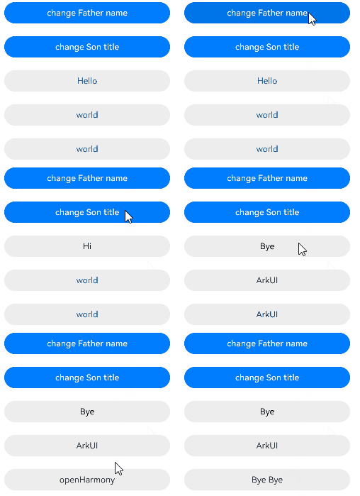
在嵌套场景下,每一层都要用@Observed装饰,且每一层都要被@Prop接收,这样才能观察到嵌套场景。
- // 以下是嵌套类对象的数据结构。
- @Observed
- class Son {
- public title: string;
-
- constructor(title: string) {
- this.title = title;
- }
- }
-
- @Observed
- class Father {
- public name: string;
- public son: Son;
-
- constructor(name: string, son: Son) {
- this.name = name;
- this.son = son;
- }
- }
以下组件层次结构展示了@Prop嵌套场景的数据结构。
- @Entry
- @Component
- struct Person {
- @State person: Father = new Father('Hello', new Son('world'));
-
- build() {
- Column() {
- Flex({ direction: FlexDirection.Column, alignItems: ItemAlign.Center }) {
- Button('change Father name')
- .width(312)
- .height(40)
- .margin(12)
- .fontColor('#FFFFFF')
- .onClick(() => {
- this.person.name = 'Hi';
- })
- Button('change Son title')
- .width(312)
- .height(40)
- .margin(12)
- .fontColor('#FFFFFF')
- .onClick(() => {
- // person被@State装饰,@State无法观测到嵌套类型的变化,直接点击该按钮,此时title已经发生变化,但是无法被观测到。
- this.person.son.title = 'ArkUI';
- })
- Text(this.person.name)
- .fontSize(16)
- .margin(12)
- .width(312)
- .height(40)
- .backgroundColor('#ededed')
- .borderRadius(20)
- .textAlign(TextAlign.Center)
- .fontColor('#e6000000')
- .onClick(() => {
- // 点击该按钮,此次变化会被观测到,同时能够观察到Button('change Son title')点击后的效果。
- this.person.name = 'Bye';
- })
- Text(this.person.son.title)
- .fontSize(16)
- .margin(12)
- .width(312)
- .height(40)
- .backgroundColor('#ededed')
- .borderRadius(20)
- .textAlign(TextAlign.Center)
- .onClick(() => {
- this.person.son.title = 'openHarmony';
- })
- Child({ child: this.person.son })
- }
- }
- }
- }
-
-
- @Component
- struct Child {
- @Prop child: Son = new Son('');
-
- build() {
- Column() {
- Text(this.child.title)
- .fontSize(16)
- .margin(12)
- .width(312)
- .height(40)
- .backgroundColor('#ededed')
- .borderRadius(20)
- .textAlign(TextAlign.Center)
- .onClick(() => {
- this.child.title = 'Bye Bye';
- })
- }
- }
- }
在下面的示例中,message类型为number[],点击Button改变message的值,视图会随之刷新。
- @Entry
- @Component
- struct Index {
- @State message: number[] = [0, 1, 2, 3];
-
- build() {
- Column() {
- Child({ message: this.message })
- }
- }
- }
-
- @Component
- struct Child {
- @Prop message: number[] = [0, 1, 2, 3];
-
- build() {
- Row() {
- Column() {
- ForEach(this.message, (item: number) => {
- Text(`${item}`)
- .fontSize(20)
- .margin(10)
- })
- // 新增数组元素,触发UI刷新
- Button('Push element')
- .onClick(() => {
- this.message.push(4);
- })
- .width(300)
- .margin(10)
- // 删除数组元素,触发UI刷新
- Button('Pop element')
- .onClick(() => {
- this.message.pop();
- })
- .width(300)
- .margin(10)
- // 对数组整体重新赋值,触发UI刷新
- Button('Reset array')
- .onClick(() => {
- this.message = [9, 8, 7, 6];
- })
- .width(300)
- .margin(10)
- // 更新数组元素,触发UI刷新
- Button('Modify element[0]')
- .onClick(() => {
- this.message[0] = 10;
- })
- .width(300)
- .margin(10)
- }
- .width('100%')
- }
- .height('100%')
- }
- }
从API version 11开始,@Prop支持Map类型。
在下面的示例中,value类型为Map<number, string>,点击Button改变value的值,视图会随之刷新。
- @Component
- struct Child {
- @Prop value: Map<number, string> = new Map([[0, 'a'], [1, 'b'], [3, 'c']]);
-
- build() {
- Column() {
- ForEach(Array.from(this.value.entries()), (item: [number, string]) => {
- Text(`${item[0]}`).fontSize(30)
- Text(`${item[1]}`).fontSize(30)
- Divider()
- })
- // value被@Prop装饰,可以被观察到Map整体的赋值以及调用Map接口带来的变化
- Button('child init map').onClick(() => {
- this.value = new Map([[0, 'a'], [1, 'b'], [3, 'c']]);
- })
- Button('child set new one').onClick(() => {
- this.value.set(4, 'd');
- })
- Button('child clear').onClick(() => {
- this.value.clear();
- })
- Button('child replace the first one').onClick(() => {
- this.value.set(0, 'aa');
- })
- Button('child delete the first one').onClick(() => {
- this.value.delete(0);
- })
- }
- }
- }
-
-
- @Entry
- @Component
- struct MapSample {
- @State message: Map<number, string> = new Map([[0, 'a'], [1, 'b'], [3, 'c']]);
-
- build() {
- Row() {
- Column() {
- Child({ value: this.message })
- }
- .width('100%')
- }
- .height('100%')
- }
- }
从API version 11开始,@Prop支持Set类型。
在下面的示例中,message类型为Set<number>,点击Button改变message的值,视图会随之刷新。
- @Component
- struct Child {
- @Prop message: Set<number> = new Set([0, 1, 2, 3, 4]);
-
- build() {
- Column() {
- ForEach(Array.from(this.message.entries()), (item: [number, number]) => {
- Text(`${item[0]}`).fontSize(30)
- Divider()
- })
- // message被@Prop装饰,可以被观察到Set整体的赋值以及调用Set接口带来的变化
- Button('init set').onClick(() => {
- this.message = new Set([0, 1, 2, 3, 4]);
- })
- Button('set new one').onClick(() => {
- this.message.add(5);
- })
- Button('clear').onClick(() => {
- this.message.clear();
- })
- Button('delete the first one').onClick(() => {
- this.message.delete(0);
- })
- }
- .width('100%')
- }
- }
-
-
- @Entry
- @Component
- struct SetSample {
- @State message: Set<number> = new Set([0, 1, 2, 3, 4]);
-
- build() {
- Row() {
- Column() {
- Child({ message: this.message })
- }
- .width('100%')
- }
- .height('100%')
- }
- }
在下面的示例中,selectedDate类型为Date,点击Button改变Date的值,视图会随之刷新。
- @Component
- struct DateComponent {
- @Prop selectedDate: Date = new Date('');
-
- build() {
- Column() {
- // selectedDate被@Prop装饰,可以被观察到Date整体的赋值以及调用Date接口带来的变化
- Button('child update the new date')
- .margin(10)
- .onClick(() => {
- this.selectedDate = new Date('2023-09-09');
- })
- Button(`child increase the year by 1`).onClick(() => {
- this.selectedDate.setFullYear(this.selectedDate.getFullYear() + 1);
- })
- DatePicker({
- start: new Date('1970-1-1'),
- end: new Date('2100-1-1'),
- selected: this.selectedDate
- })
- }
- }
- }
-
- @Entry
- @Component
- struct ParentComponent {
- @State parentSelectedDate: Date = new Date('2021-08-08');
-
- build() {
- Column() {
- Button('parent update the new date')
- .margin(10)
- .onClick(() => {
- this.parentSelectedDate = new Date('2023-07-07');
- })
- Button('parent increase the day by 1')
- .margin(10)
- .onClick(() => {
- this.parentSelectedDate.setDate(this.parentSelectedDate.getDate() + 1);
- })
- DatePicker({
- start: new Date('1970-1-1'),
- end: new Date('2100-1-1'),
- selected: this.parentSelectedDate
- })
-
- DateComponent({ selectedDate: this.parentSelectedDate })
- }
- }
- }
@Prop支持联合类型和undefined和null,在下面的示例中,animal类型为Animals | undefined,点击父组件Zoo中的Button改变animal的属性或者类型,Child中也会对应刷新。
- import { hilog } from '@kit.PerformanceAnalysisKit';
-
- const DOMAIN = 0x0001;
- const TAG: string = '[SampleProp]';
-
- class Animals {
- public name: string;
-
- constructor(name: string) {
- this.name = name;
- }
- }
-
- @Component
- struct Child {
- @Prop animal: Animals | undefined;
-
- build() {
- Column() {
- Text(`Child's animal is ${this.animal instanceof Animals ? this.animal.name : 'undefined'}`).fontSize(30)
-
- Button('Child change animals into tigers')
- .onClick(() => {
- // 赋值为Animals的实例
- this.animal = new Animals('Tiger');
- })
-
- Button('Child change animal to undefined')
- .onClick(() => {
- // 赋值为undefined
- this.animal = undefined;
- })
-
- }.width('100%')
- }
- }
-
- @Entry
- @Component
- struct Zoo {
- @State animal: Animals | undefined = new Animals('lion');
-
- build() {
- Column() {
- Text(`Parents' animals are ${this.animal instanceof Animals ? this.animal.name : 'undefined'}`).fontSize(30)
-
- Child({ animal: this.animal })
-
- Button('Parents change animals into dogs')
- .onClick(() => {
- // 判断animal的类型,做属性的更新
- if (this.animal instanceof Animals) {
- this.animal.name = 'Dog';
- } else {
- hilog.info(DOMAIN, TAG, 'num is undefined, cannot change property');
- }
- })
-
- Button('Parents change animal to undefined')
- .onClick(() => {
- // 赋值为undefined
- this.animal = undefined;
- })
- }
- }
- }


