HarmonyOS provides common JS APIs and components. Leverage them based on your use cases and development requirements. As part of a series of codelabs to acquaint you with the basic JS components, this codelab illustrates how to use the <switch> and <chart> components.
In this codelab, you'll learn how to use the <switch> and <chart> components to display a line chart, gauge chart, and bar chart, and switch the display of the <chart> component data between dynamic and static modes. The following figure shows the expected effect. You can make adjustments as appropriate to get the effect you want.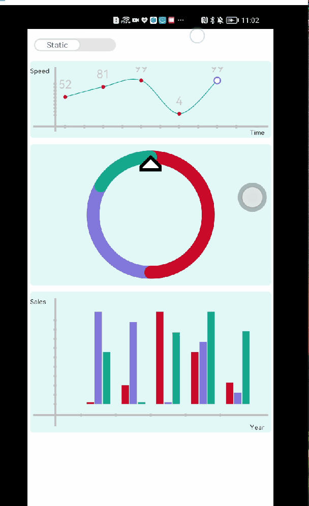
<switch>: enables or disables a feature.
<chart>: displays line charts, gauge charts, and bar charts.
After a JS FA project is created in DevEco Studio, its js directory is displayed, as shown below: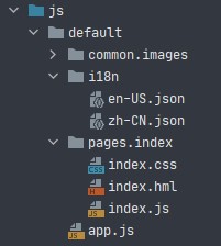
The i18n directory stores JSON files for different locales, the common.images directory stores image resource files used in the project, and the pages directory stores pages of the application, and each page consists of .hml, .css, and .js files.
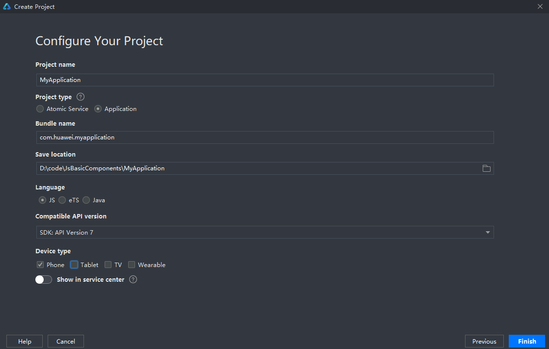
In this task, you'll create a JS project on DevEco Studio.
In this task, you'll create and design an application page and add the <switch> and <chart> components to the layout file index.hml in the pages.index directory, a default directory generated after the project is created.
Open the index.hml file. The default code is as follows:
<div class="container">
    <text class="title">
        {{ $t('strings.hello') }} {{ title }}
    </text>
</div>
In the preceding code, the <div> and <text> components are used to present text. Wherein, the <div> component is a basic container used as the root node of the page structure or to group the content; the <text> component is used to display a piece of textual information. To learn more about these two components, please refer to the respective codelab.
You can delete the default code in the index.hml file and develop your own layout file. As indicated by the following code, the <div> component is used to divide the page, and the <switch> component provides two modes: dynamic or static, as shown below.
|
|
<div class="switch-block">
        <switch class="switch"

        showtext="{{ showText }}"

        texton="{{ textOn }}"

        textoff="{{ textOff }}"

        allow-scale="{{allowScale}}"

        onchange="change">
        </switch>
</div>
Use the <chart> component to display the line chart, gauge chart, and bar chart, as shown below.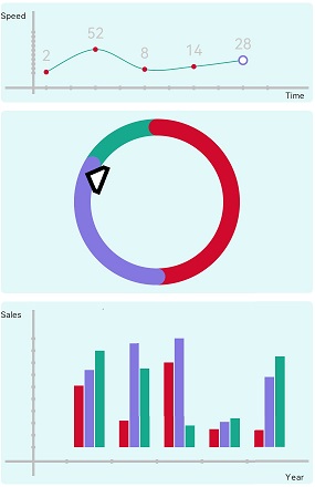
<div class="chart-block">
        <text class="text-vertical">Speed</text>
        <chart class="chart-data" type="line" ref="linechart" options="{{lineOps}}" datasets="{{lineData}}"></chart>
        <text class="text-abscissa">Time</text>
</div>
<div class="gauge-block">
        <chart class="data-gauge" type="gauge" percent = "{{percent}}"></chart>
</div>
<div class="bar-block">
        <text class="text-vertical">Sales</text>
        <chart class="data-bar" type="bar" id="bar-chart" options="{{barOps}}" datasets="{{barData}}"></chart>
        <text class="text-abscissa">Year</text>
</div>
In this task, you'll add styles for the components by defining the class attribute in the index.css file. For more information about CSS, see CSS.
First, define the styles of the <switch-block> container and <switch> component. Specifically, delete the default code from the index.css file and add the following code to it:
.switch-block {
    width: 98%;
    height: 50px;
}
.switch {
    text-padding: 10px; /* Left and right padding of text displayed in textOn and textOff */
    font-size: 12px;
    texton-color: #5F5F5F; /* Font color for the text displayed in textOn */
    textoff-color: #707070; /* Font color for the text displayed in textOff */
}
Define the styles of the line chart, gauge chart, and bar chart implemented by the <chart> component. Specifically, add the following code to the index.css file:
.chart-block, .gauge-block, .bar-block {
    position: relative;
    width: 98%;
    border-radius: 5px;
    background-color: #E3F8F9;
}
.text-speed{
    position: absolute;
    top: 10px;
    left: 20px;
    width: 10px;
    font-size: 10px;
}
.chart-data {
    margin: 10px 5px 10px;
    width: 100%;
    height: 100px;
}
.text-time {
    position: absolute;
    font-size: 10px;
    bottom: 2px;
    right: 10px;
}
.gauge-block, .bar-block {
    margin-top: 10px;
}
.data-gauge{
    width: 200%;
    height: 200px;
    margin: 10px 0 10px; /* Width of the scale bar */
    start-angle: 0; /* Start angle */
    total-angle: 360; /* Maximum angle */
    stroke-width: 20px;
    colors: #CF0A2C, #8477DF, #17A98E; /* Colors */
    weights: 3, 2, 1; /* Color weights */
}
.data-bar {
    width: 100%;
    height: 200px;
    margin: 10px 5px 10px;
}
In task 2, you've referenced the initial values of the components in the layout. Now you must add the following code to the index.js file to define these initial values:
export default {
  data: {
    interval: null, // Timer object
    showText: true, // Whether to display the text
    textOn: 'Dynamic',
    textOff: 'Static',
    allowScale: true, // The text size depends on the font size set by the system.
    dataLength: 5, // Data length
    barGroup: 3, // Number of bar chart groups

    lineData: null, // Line chart data
    lineOps: { // Line chart style
      xAxis: {
        min: 0,
        max: 5,
        display: true
      },
      yAxis: {
        min: 0,
        max: 100,
        display: true
      },
      series: {
        lineStyle: {
          width: '1px',
          smooth: true
        },
        headPoint: {
          shape: 'circle',
          size: 10,
          strokeWidth: 2,
          fillColor: '#ffffff',
          strokeColor: '#8477DF',
          display: true
        },
        loop: {
          margin: 2
        }
      }
    },

    percent: 100, // Progress presented in the gauge chart

    barData: [ // Bar chart data
      {
        fillColor: '#CF0A2C',
        data: [2, 20, 99, 56, 23]
      },
      {
        fillColor: '#8477DF',
        data: [99, 88, 2, 67, 12]
      },
      {
        fillColor: '#17A98E',
        data: [56, 2, 77, 99, 78]
      }
    ],
    barOps: { // Bar chart style
      xAxis: {
        min: 0,
        max: 20,
        display: true,
        axisTick: 5
      },
      yAxis: {
        min: 0,
        max: 100,
        display: true
      }
    }
  },
}
For specific meanings of these values, refer to the following table.
Key | Description |
interval | Timer object. |
showText | Whether text is displayed on the component. |
textOn | Text displayed on the component when it is enabled. |
textOff | Text displayed on the component when it is disabled. |
dataLength | Data length of a line chart or bar chart. |
barGroup | Number of bar chart groups. |
lineData | Line chart data. |
lineOps | Line chart style. |
percent | Progress presented in the gauge chart. |
barData | Bar chart data. |
barOps | Bar chart style. |
When the switch is enabled or disabled, a change event is triggered to set the static or dynamic chart data. In static mode, the <chart> component displays static data. In dynamic mode, the setInterval timer is used to dynamically and randomly generate data for presentation. To implement this effect, add the following code to the end of the data object in export default:
// Initialization
onInit() {
	this.changeLine();
},
change(e) {
	if (e.checked) {
		this.interval = setInterval(() => {
			this.changeLine(); // Update the line chart data.
			this.changeGauge(); // Update the gauge chart data.
			this.changeBar(); // Update the bar chart data.
		}, 1000)
	} else {
		clearInterval(this.interval);
	}
},
// Update the line chart data.
changeLine() {
	var dataArray = [];
	for (var i = 0; i < this.dataLength; i++) {
		var nowValue = Math.floor(Math.random() * 99 + 1);
		var obj = {
			"value": nowValue, // Y coordinate
			"description": nowValue + "", // Comment on the current point
			"textLocation": "top", // Location of the comment
			""textColor": "#CDCACA", // Color of the comment
			"pointStyle": { // Node shape
				"shape": "circle", // Shape
				"size": 5, // Size
				"fillColor": "#CF0A2C", // Fill color
				"strokeColor": "#CF0A2C" // Stroke color
			}
		};
		dataArray.push(obj);
	}
	this.lineData = [
		{
			strokeColor: '#17A98E', // Stroke color
			data: dataArray,
			gradient: false,
		}
	]
},
// Update the gauge chart data.
changeGauge() {
	this.percent = parseInt(this.percent) >= 99 ? 0 : parseInt(this.percent) + 1;

},
// Update the bar chart data.
changeBar() {
	for (var i=0;i<this.barGroup;i++) {
		var dataArray = this.barData[i].data;
		for (var j=0;j<this.dataLength;j++) {
			dataArray[j] = Math.floor(Math.random() * 99 + 1);
		}
	}
	this.barData = this.barData.splice(0, this.barGroup + 1);
}
Now you've completed all the tasks and compiled the code.
Well done! You've successfully completed this codelab and learned the following JS basic components:
You've learned how to use the component to set the dynamic change of chart data from the perspective of layout, styles, and response events. Now you must have a deeper understanding of the basic JS components.Now it's time to test what you've learned.
Use the <chart> component to display a progress circle chart, loading circle chart, and proportional circle chart.
Use the append method of the <chart> component to dynamically add data to an existing data sequence.
Are you ready for the next challenge? Try [Basic JS Components] toolbar and toolbar-item.
You can click either of the following links to view the complete code of this project: