Compared with a bar phone, a bi-fold phone has the following features:
- Its screen size is variable, and it has user interfaces of different sizes and forms.
- It has special folding status and interaction events. There are three states: folded, unfolded, and semi-folded.
- Unfolded: The screen is a perfectly flat surface. This state delivers a larger screen size and allows you to view more content in apps.
- Folded: The screen is folded. This state delivers a smaller screen size.
- Semi-folded: A phone in this state is not completely folded or unfolded, and can be placed stably.
- The available camera and its position vary depending on the folding status.
Currently, the main product with a bi-fold design is the Mate X series, as shown in the following figure.
Product Name | Effect |
|---|---|
Mate X series |
|


This topic provides the development guidelines for improving user experience of bi-fold phone apps. For details about the basic common capabilities of multi-device development, see One-Time Development for Multi-Device Deployment.
Product Hardware Description
This section uses the Mate X5 as an example to describe the screen orientation, screen size, and camera hardware parameters of bi-fold phones.
[h2]Screen Specification Information
Screen specifications in folded state
Screen Rotation Angle | 0 (0°) | 1 (90°) | 2 (180°) | 3 (270°) |
|---|---|---|---|---|
Diagram of the Phone in Folded State |
|
|
|
|
Portrait (PORTRAIT) | Landscape (LANDSCAPE) | Inverted portrait (PORTRAIT_INVERTED) | Inverted landscape (LANDSCAPE_INVERTED) | |
Display ID | 0 | 0 | 0 | 0 |
Resolution (vp, Rounded Down) | 345 × 801 | 801 × 345 | 345 × 801 | 801 × 345 |
Resolution (px) (Width × Height) | 1080 × 2504 | 2504 × 1080 | 1080 × 2504 | 2504 × 1080 |
Horizontal and Vertical Breakpoints | sm for horizontal breakpoints and lg for vertical breakpoints | md for horizontal breakpoints and sm for vertical breakpoints | sm for horizontal breakpoints and lg for vertical breakpoints | md for horizontal breakpoints and sm for vertical breakpoints |


Screen specifications in unfolded state
Screen Rotation Angle | 0 (0°) | 1 (90°) | 2 (180°) | 3 (270°) |
|---|---|---|---|---|
Diagram of the Phone in Unfolded State |
|
|
|
|
Portrait (PORTRAIT) | Landscape (LANDSCAPE) | Inverted portrait (PORTRAIT_INVERTED) | Inverted landscape (LANDSCAPE_INVERTED) | |
Display ID | 0 | 0 | 0 | 0 |
Resolution (vp, Rounded Down) | 711 × 798 | 798 × 711 | 711 × 798 | 798 × 711 |
Resolution (px) (Width × Height) | 2224 × 2496 | 2496 × 2224 | 2224 × 2496 | 2496 × 2224 |
Horizontal and Vertical Breakpoints | md for horizontal breakpoints and md for vertical breakpoints | md for horizontal breakpoints and md for vertical breakpoints | md for horizontal breakpoints and md for vertical breakpoints | md for horizontal breakpoints and md for vertical breakpoints |


- Mate X5 is used as an example to describe the screen properties of the bi-fold phone. For other bi-fold phones, you can obtain the device screen resolution (px) by calling the getDefaultDisplaySync() method of display and convert the resolution to the vp value by calling the px2vp() method.
- The hardware parameters of the semi-folded state at different rotation angles are the same as those of the unfolded state. For details about how to adapt to the semi-folded state, see Semi-Folded State of Foldable Screens.
- For details about the device screen and window orientation, see Window Orientation.
[h2]Camera Hardware Information
The bi-fold phone has a default camera lens installation angle. When using the camera, you need to consider the lens angle and device rotation angle. For details, see Preview Rotation Angle. The following table lists the angles of the front and rear cameras of the bi-fold phone and the rotation angles of the preview stream to be set. The camera parameters in the folded state are the same as those in the unfolded state.
Camera hardware information in the folded state
Screen Rotation Angle | 0 (0°) | 1 (90°) | 2 (180°) | 3 (270°) |
|---|---|---|---|---|
Diagram of the Phone in Folded State |
|
|
|
|
Rear Camera Lens Angle | 90° | 90° | 90° | 90° |
Rotation Angle of the Preview Stream of the Rear Camera | 90° | 180° | 270° | 0° |
Front Camera Lens Angle | 270° | 270° | 270° | 270° |
Rotation Angle of the Preview Stream from the Front Camera | 270° | 0° | 90° | 180° |


Camera hardware information in the unfolded state
Screen Rotation Angle | 0 (0°) | 1 (90°) | 2 (180°) | 3 (270°) |
|---|---|---|---|---|
Diagram of the Phone in Unfolded State |
|
|
|
|
Rear Camera Lens Angle | 90° | 90° | 90° | 90° |
Rotation Angle of the Preview Stream of the Rear Camera | 90° | 180° | 270° | 0° |
Front Camera Lens Angle | 270° | 270° | 270° | 270° |
Rotation Angle of the Preview Stream from the Front Camera | 270° | 0° | 90° | 180° |


- The installation angle of the rear camera is 90°, and that of the front camera is 270°, regardless of the folding state. You can obtain the camera installation angle specified by cameraOrientation through the CameraDevice API.
- For more information about camera hardware differences and development details, see the Cross-Device Camera Interface Adaptation.
[h2]Device Folding Capabilities
Bi-fold phones have a unique folding feature and display different features in different fold states.
The display.isFoldable() API can be used to determine whether the device supports folding. If so, true is returned. Otherwise, false is returned. The display.getFoldStatus() API can be used to obtain the current folding state of a device. For details about the returned result, see FoldStatus. The following table uses the Mate X5 as an example to describe the folded state and attributes of a bi-fold phone.
Folded | Semi-Folded | Unfolded | |
|---|---|---|---|
Effect |
|
|
|
isFoldable | true | ||
FoldStatus | FOLD_STATUS_FOLDED | FOLD_STATUS_HALF_FOLDED | FOLD_STATUS_EXPANDED |


[h2]Small-Screen Foldable Hardware Description
Overview
Compared with a bar phone, a small-screen foldable phone has the following features:
- It has special folding status and interaction events. There are three states: folded, unfolded, and semi-folded.
- Unfolded: The screen is a perfectly flat surface. It is like a bar phone.
- Folded: The screen is folded. After folding, the screen size is reduced while maintaining limited interaction capabilities.
- Semi-folded: A phone in this state is not completely folded or unfolded, and can be placed stably.
Currently, there are two types of small-screen foldable phones: the Pocket series and the Nova Flip series, as shown in the following figure.
Product Name | Effect |
|---|---|
Pocket series |
|
Nova Flip series |
|


Device folding capabilities
The display.isFoldable() API can be used to determine whether the device supports folding. If so, true is returned. Otherwise, false is returned. The display.getFoldStatus() API can be used to obtain the current folding state of a device. For details about the returned result, see FoldStatus. The following table uses the Pocket as an example to describe the folded state and attributes of a small-screen foldable phone.
Folded | Semi-Folded | Unfolded | |
|---|---|---|---|
Effect |
|
|
|
isFoldable | false | ||
FoldStatus | FOLD_STATUS_FOLDED | FOLD_STATUS_HALF_FOLDED | FOLD_STATUS_EXPANDED |


The cover screen of a small-screen foldable device is small. The development of the cover screen is the same as that of the ArtTS widget. For details, see ArkTS Widget Development. Note that the supportShapes field in the form_config.json configuration file must be set to circle. For details about the card design standards, see Service Widget.
[h2]Finger-Following Interaction
The unfolded state of a bi-fold phone provides a wider display view, carries more information, and offers a larger interactive area for users. To further improve user experience of a bi-fold phone, it is recommended that the system adapt to the new interaction capabilities. By integrating new features such as smart reachability, popover dialog, and finger-following sheet, users can perform operations more quickly and efficiently.
- Smart reachability: The system provides the capability to detect the user's current holding hand information. Apps can use the detected hand information to adaptively adjust the display position of core interaction components, effectively improving the convenience of one-handed operation.
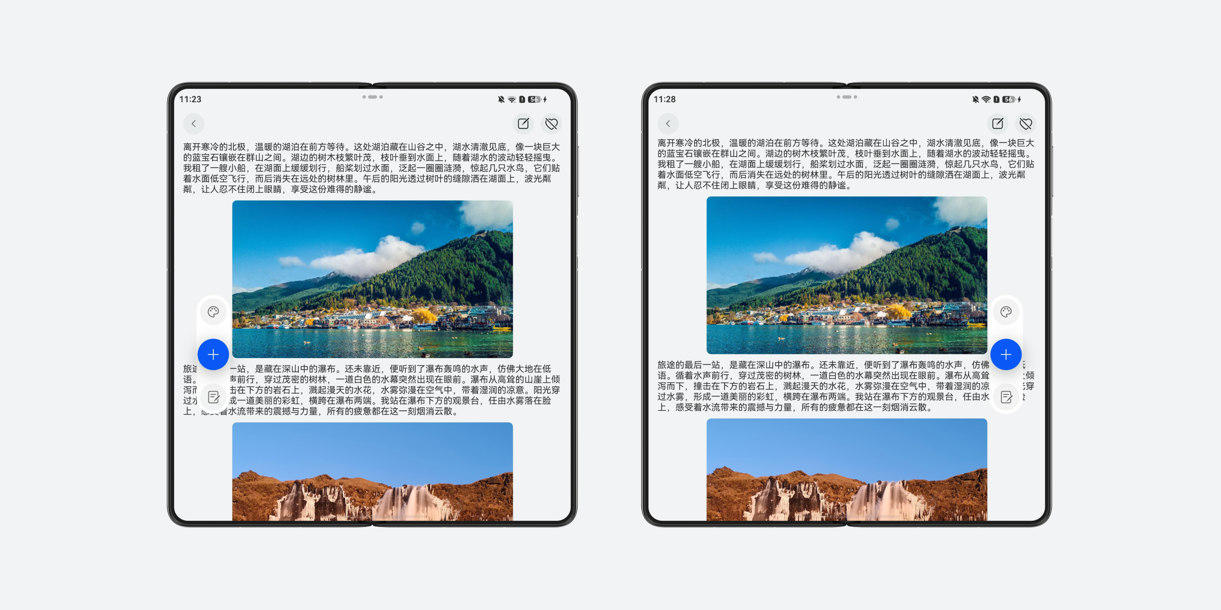
Subscribe to the motion.on('holdingHandChanged') event to obtain the hand holding information and change the display position of the component.
- Popover dialog: To minimize lengthy user operation paths, position a popover dialog closer to the hand for quicker user interaction on phones in folded or unfolded state.
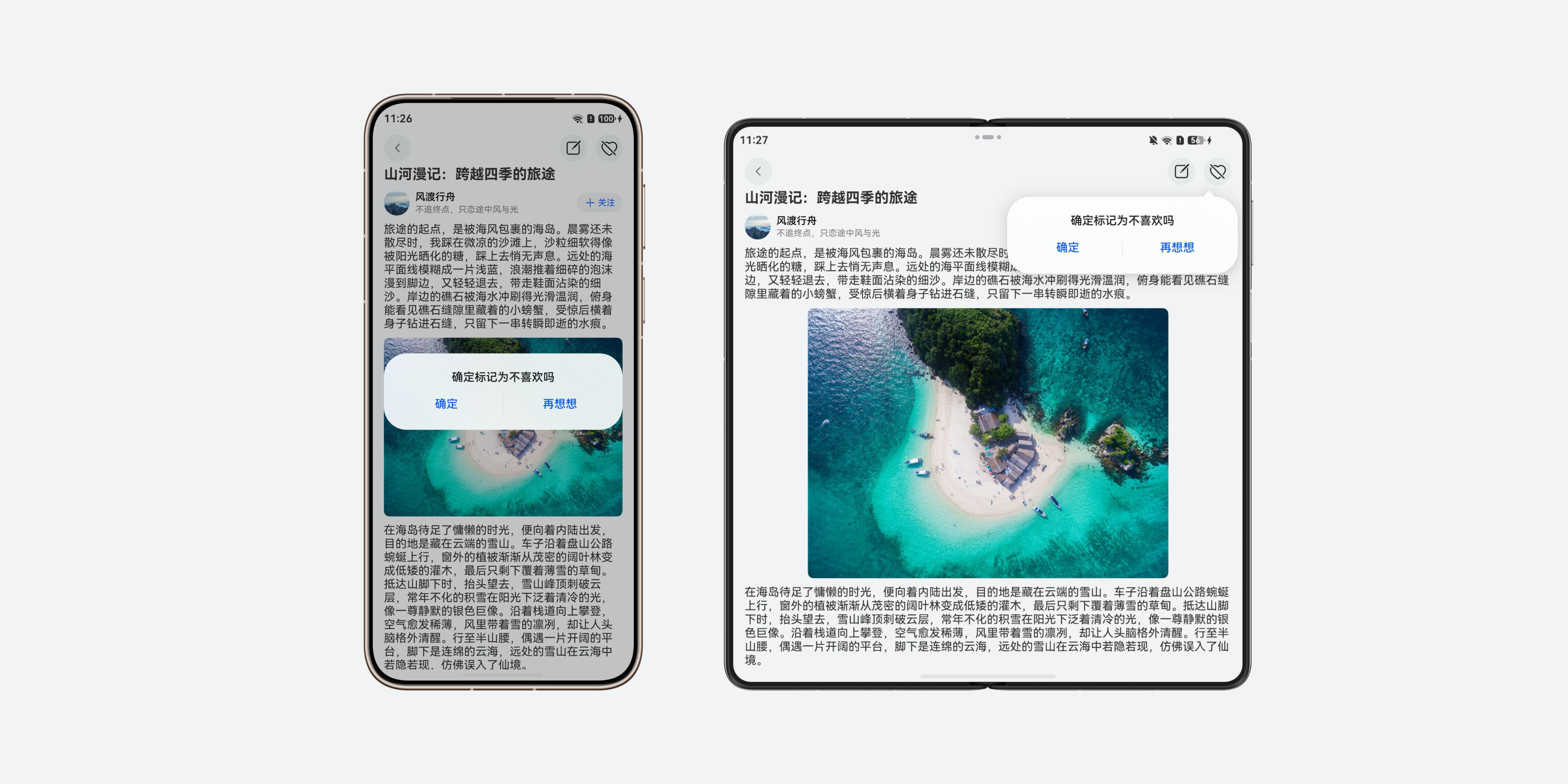
When building the UI layout, you can use a conditional expression to determine the display behavior. If the horizontal breakpoint is sm, use a regular centered dialog box. Otherwise, use a popover dialog PopoverDialog to improve the operation efficiency on large-screen devices.
- Finger-following sheet: In the folded state, the sheet window usually pops up from the bottom of the screen. In the unfolded state, you can choose a finger-following sheet window or a centered sheet window based on service requirements.
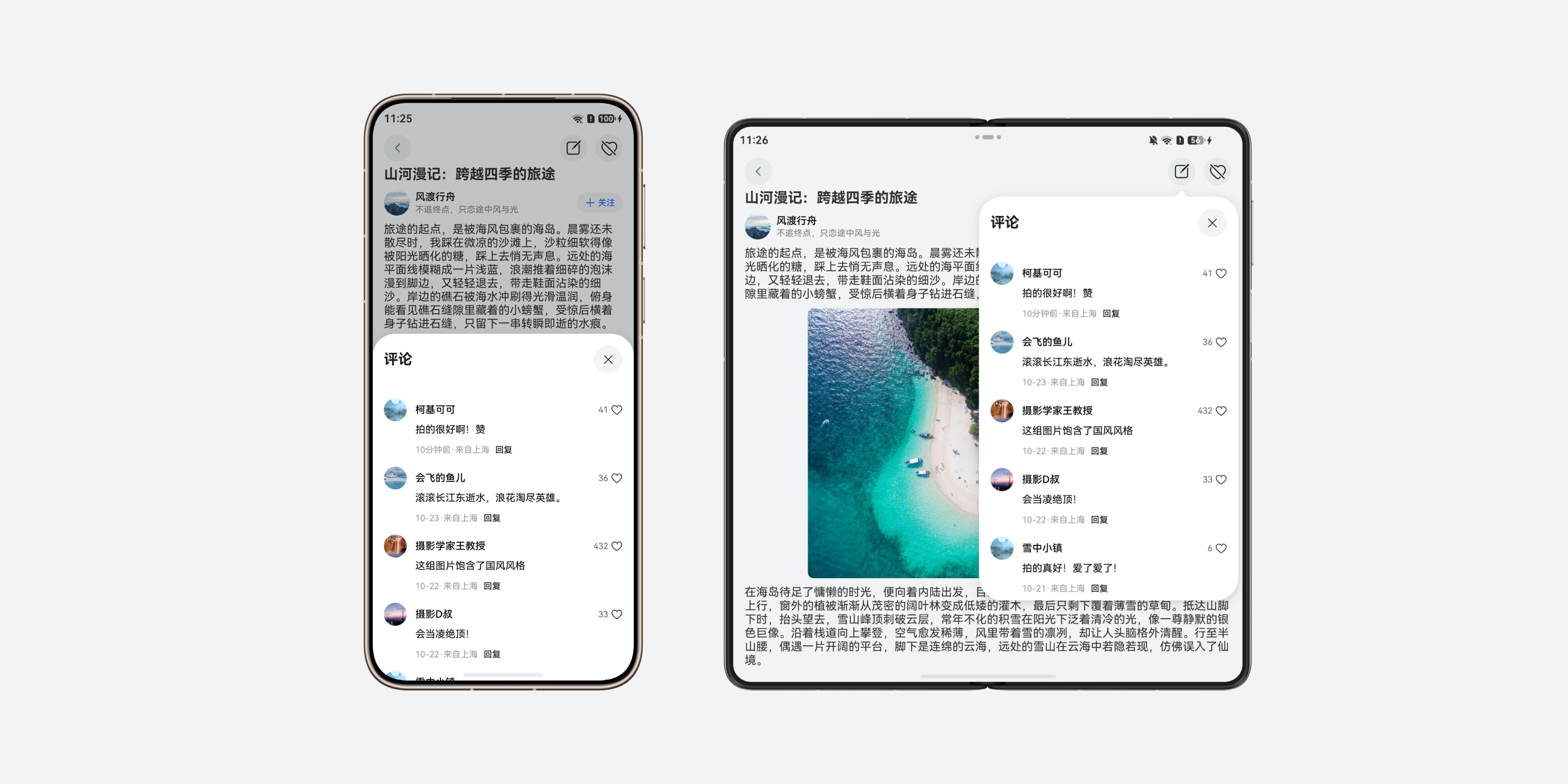
When using bindSheet to bind the sheet transition, set the sheet attribute preferType to SheetType.POPUP. After this attribute is set, the bottom dialog is displayed by default for devices whose window width is less than 600 vp, and the popup sheet is automatically displayed for other devices.
[h2]Semi-Folded State Adaptation
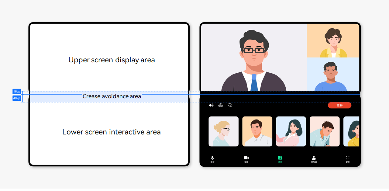
A bi-fold phone in unfolded state can switch to the semi-folded state. In this state, the device can rest steadily on a desktop, enabling a hands-free experience. It is commonly used in scenarios that do not require frequent interaction, such as video calls, video playback, photography, and music listening. The upper and lower screens need to be properly arranged in such a way that the displayed content avoids the crease in the semi-folded state. For details, see Semi-Folded State of Foldable Screens.
[h2]Open/Close Adaptation
Opening-closing continuity means that an app maintains the continuity of page content, job progress, and running status when switching between screen forms and window states. Users can quickly resume their previous operations, ensuring a smooth transition. For example, when a bi-fold device switches between the folded and unfolded states, the app page content remains unchanged and the status is seamlessly continued, ensuring that user experience is not affected. For details about the implementation, see Opening-Closing Continuity.
[h2]Floating Components
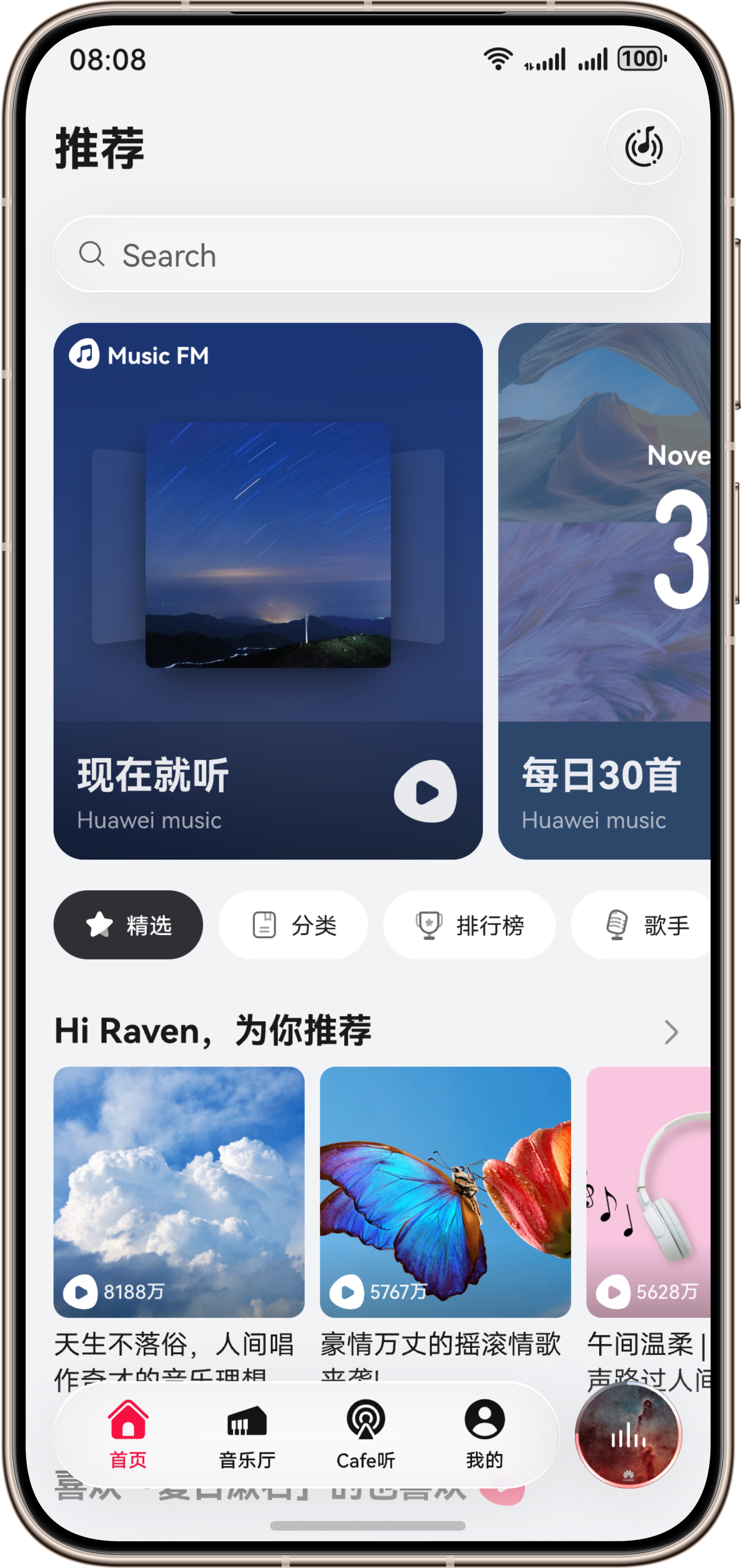
On a bi-fold phone, the barFloatingStyle attribute of the HdsTabs component can be used to implement the floating navigation bar that adapts to various form switching scenarios, maximizing the visible screen area. The SystemMaterialParams parameter can be used to set the effect of transparent frosted-glass texture, improving the UI transparency and adapting to immersive browsing experience. With HdsTabsMiniBar, developers can extend the mini tab bar to offer multiple quick-access entry points and support split-screen operations in the unfolded state. This maintains consistent interaction patterns across folded and unfolded states, reduces user adaptation costs when switching between states, and improves overall interaction efficiency and user experience.
[h2]Adaptive Immersion
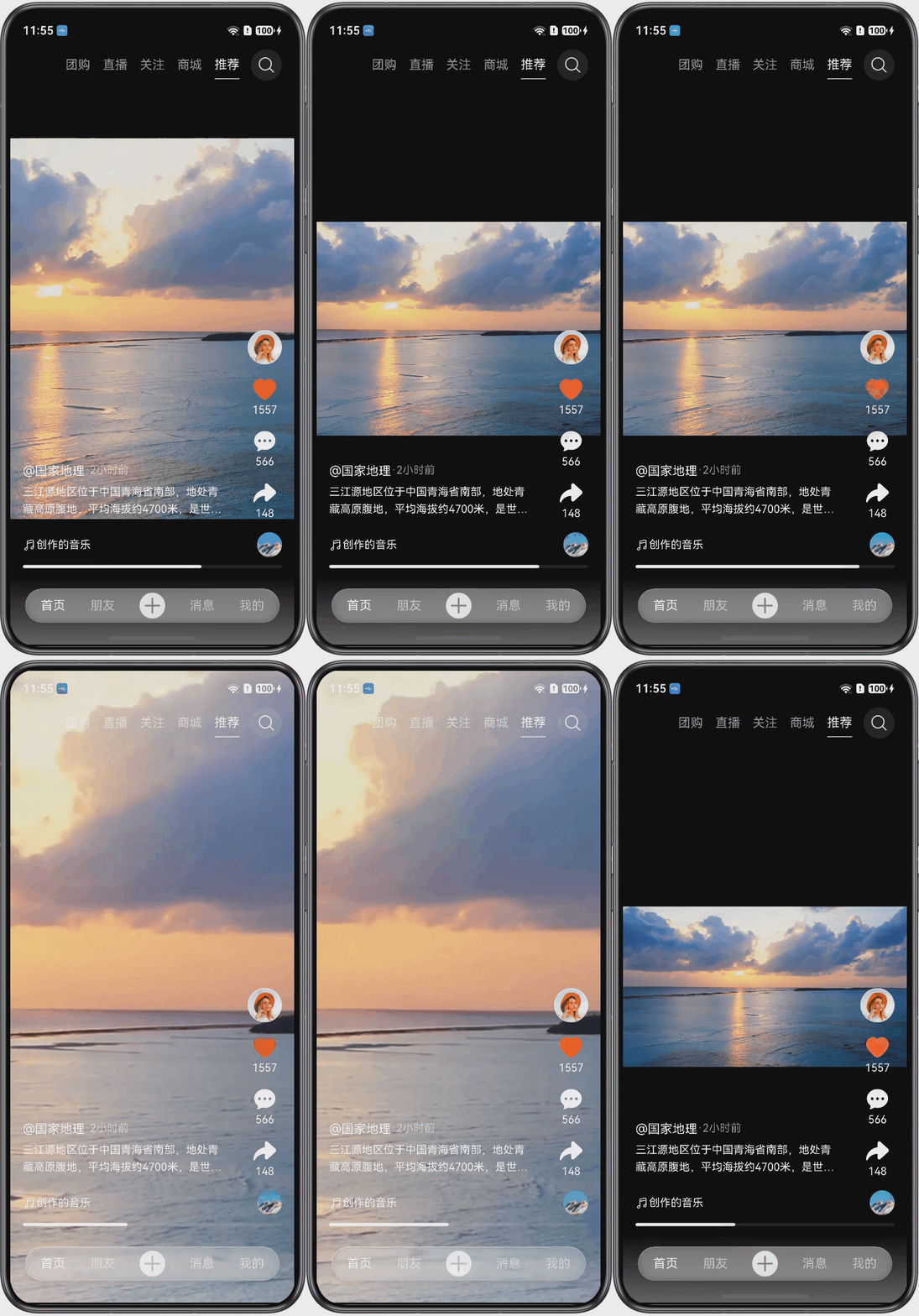
Bi-fold phones support switching between folded and unfolded states, and window modes can be transformed into split-screen and floating window modes. To prevent issues such as video stretching, cropping, or incorrect aspect ratios during form transitions, an adaptive immersive full-screen playback solution can be adopted. By simplifying interface elements and reducing visual distractions, users can focus on the video content, fully utilize the expanded viewing area of large screens, and achieve an enhanced viewing experience. For details about the implementation, see Adapting Videos to Different Screen Sizes.
[h2]Multitask View
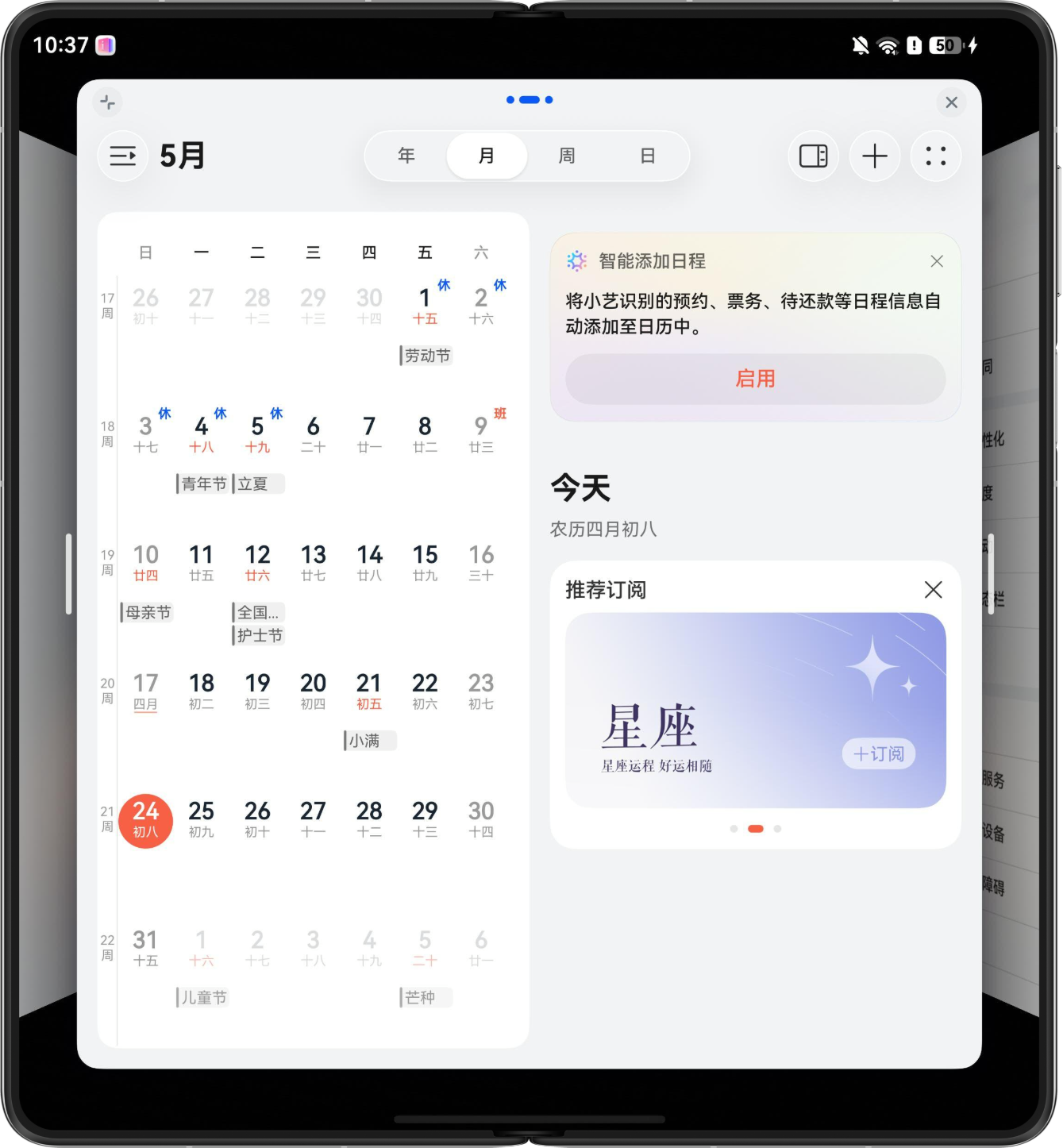
The multitask view feature is designed to help users efficiently handle multiple tasks. With this feature, users can run multiple apps on the same screen concurrently and quickly switch between them, breaking through the physical limitations of the screen and improving operation efficiency. The multitask view capability can fully carry out the space advantages of the bi-fold phone's large screen. A maximum of three windows can run concurrently on the same screen, enabling users to browse information, edit content, and communicate for work at the same time. Multiple tasks can be processed synchronously without conflicting with each other, implementing one-stop collaboration of office, entertainment, and daily operations.
[h2]Truncated/Blank Areas
Incomplete or abnormal app starting window
Problem description: When an app is launched on a bi-fold phone in unfolded state, the starting window of the app is not fully displayed on the screen, resulting in blank areas or a truncated page layout.
Solution: You need to configure an enhanced starting window for the app. After the configuration, resources such as the background, images, and icons on the starting window can be automatically adapted to the window size to ensure proper display on devices of different states. For details about the tags, see startWindow.
How to implement page layouts in different folding states
Problem description: The adaptation method of the app page layout in different folding states is unclear or the adaptation is abnormal.
Solution: You are advised to use breakpoints to adapt the page layout. Develop the corresponding page layout based on the UX design specifications corresponding to different breakpoints. You can use window.on('windowSizeChange') to listen for breakpoint changes on the page to implement page layout adaptation in different folding states. For details about the development solution, see the breakpoints development case.