Overview
In mobile app development, adapting camera interfaces across multiple devices has consistently been a major challenge for developers. Because of the substantial differences in screen sizes, camera lenses, folding designs, and system features across various devices, the development of camera interfaces often faces compatibility challenges that can affect the overall user experience.
This article describes the process of adapting mobile camera pages—including photo preview, capture, and viewing—to various device form factors such as bi-fold phones, Pura X series, tri-fold phones, and tablets. When adapting foldable screens and tablets beyond the basic camera functionality (such as photo preview, capture, and viewing), developers need to focus on the following core issues:
- Implementing multiple page layouts through breakpoints and establishing screen rotation strategies
- Selecting camera devices
- Configuring camera preview aspect ratios across multiple devices
- Setting photo capture rotation angles
- Implementing camera interfaces for hover states
Implementing Multiple Page Layouts Through Breakpoints
When developing page layouts, observe the following key principles to ensure effective adaptation across devices and window sizes:
Principle 1: "Use the same page layout for two windows with similar widths." According to this principle, determine the width ranges of windows to be adapted. Smartphones, bi-fold phones, Pura X series, tri-fold phones, and tablets collectively involve three types of horizontal breakpoints: sm, md, and lg. Therefore, during initial app development, you need to design three distinct page layouts separately.
Breakpoints | sm for horizontal breakpoints and md for vertical breakpoints | sm for horizontal breakpoints and lg for vertical breakpoints | md for horizontal breakpoints | lg for horizontal breakpoints |
UX diagrams |
|
|
|
|


[h2]How to Develop
- Implement UX designs corresponding to the three horizontal breakpoints. For the sm breakpoints, camera button layouts are distributed on the top and bottom sides and need to be implemented separately. The difference between Pura X cover screens and smartphone layouts is distinguished through vertical breakpoints. For md and lg breakpoints, camera button layouts are identical, distributed on the left and right sides, and can be implemented using a single set of code. Use the Stack component to display control buttons on the camera preview screen, and use breakpoints to control their visibility under different fold states of tri-fold devices. On the camera page, both the width and height of the XComponent component can be set to 100%. The size of the preview screen can be adjusted by setting the width and height of the XComponent's surface. For details about the code, see Configuring Camera Preview Aspect Ratios Across Multiple Devices.
Stack() { // Camera View. Column() { XComponent({ type: XComponentType.SURFACE, controller: this.xComponentController }) {} // ... } .width('100%') .height(this.isHalfFolded ? this.creaseRegion[0] : '') .layoutWeight(this.isHalfFolded ? 0 : 1) // ... // Shooting button view. Stack() { // Setting view for sm. Column() { // ... } .width(this.heightBp === HeightBreakpoint.HEIGHT_MD ? 30 : 48) .height('100%') .margin({ right: 16 }) .padding({ top: this.heightBp === HeightBreakpoint.HEIGHT_MD ? 16 : 108 }) .visibility(this.widthBp === WidthBreakpoint.WIDTH_SM ? Visibility.Visible : Visibility.None) // Choose music for sm. Row() { // ... } .width('100%') .height(this.heightBp === HeightBreakpoint.HEIGHT_MD ? 28 : 40) .position({ x: 0, y: this.heightBp === HeightBreakpoint.HEIGHT_MD ? 16 : 28 }) .justifyContent(FlexAlign.Center) .visibility(this.widthBp === WidthBreakpoint.WIDTH_SM ? Visibility.Visible : Visibility.None) // Shooting button for sm. Column() { // ... } .visibility(this.widthBp === WidthBreakpoint.WIDTH_SM ? Visibility.Visible : Visibility.None) .height(this.heightBp === HeightBreakpoint.HEIGHT_MD ? 96 : 132) .width('100%') .margin({ bottom: this.heightBp === HeightBreakpoint.HEIGHT_MD ? 16 : 84 }) // Setting view for md/lg. Column() { // ... } .width(this.widthBp === WidthBreakpoint.WIDTH_MD ? 144 : 152) .height('100%') .justifyContent(FlexAlign.Start) .padding({ left: this.heightBp === HeightBreakpoint.HEIGHT_MD ? 24 : 32 }) .position({ x: 0, y: 0 }) .alignItems(HorizontalAlign.Start) .visibility(this.widthBp === WidthBreakpoint.WIDTH_MD || this.widthBp === WidthBreakpoint.WIDTH_LG ? Visibility.Visible : Visibility.None) // Shooting button for md/lg. Column() { // ... } .width(92) .height('100%') .justifyContent(FlexAlign.Center) .padding({ right: 16 }) .visibility(this.widthBp === WidthBreakpoint.WIDTH_MD || this.widthBp === WidthBreakpoint.WIDTH_LG ? Visibility.Visible : Visibility.None) } .height('100%') .width('100%') .alignContent(Alignment.BottomEnd) .visibility(this.isHalfFolded ? Visibility.None : Visibility.Visible) // ... } .height('100%') .width('100%') .alignContent(this.widthBp === WidthBreakpoint.WIDTH_MD ? (this.isHalfFolded ? Alignment.Top : Alignment.Start) : Alignment.Center) - For details about implementing camera page rotation based on screen orientation across various devices, see Configuring Rotation Policies for Multiple Devices. Taking this app as an example, rotation is supported for the md and lg horizontal breakpoints, but not the sm horizontal breakpoints. Therefore, rotation is supported when the minimum value of window width and height is greater than or equal to 600 vp.
onWindowSizeChange: (windowSize: window.Size) => void = (windowSize: window.Size) => {
  this.setOrientation(this.uiContext!.px2vp(windowSize.width), this.uiContext!.px2vp(windowSize.height));
  // ...
}

setOrientation(width: number, height: number): void {
  // When the minimum value of window width and height is greater than the md breakpoint threshold, rotation is supported.
  if (Math.min(width, height) >= 600) {
    this.windowData?.setPreferredOrientation(window.Orientation.AUTO_ROTATION_RESTRICTED).catch((error: BusinessError) => {
      hilog.error(0x0000, `MultiDeviceCamera`,
        `Set window orientation failed. Code: ${error.code}, message: ${error.message}`);
    });
  } else {
    this.windowData?.setPreferredOrientation(window.Orientation.PORTRAIT).catch((error: BusinessError) => {
      hilog.error(0x0000, `MultiDeviceCamera`,
        `Set window orientation failed. Code: ${error.code}, message: ${error.message}`);
    });
  }
}

// ...
onWindowStageCreate(windowStage: window.WindowStage): void {
  // ...
  windowStage.loadContent('pages/Index', (err) => {
    // ...
    windowStage.getMainWindow().then((data: window.Window) => {
      // ...
      // Monitor window size changes and update breakpoints.
      data.on('windowSizeChange', this.onWindowSizeChange);
      let rect: window.Rect = data.getWindowProperties().windowRect;
      this.setOrientation(this.uiContext.px2vp(rect.width), this.uiContext.px2vp(rect.height));
    }).catch((err: BusinessError) => {
      hilog.error(0x0000, 'testTag', `Error occured, error code: ${err.code}, error message: ${err.message}`);
    })
  });
}
Selecting Camera Devices
A complete camera page should comprise camera preview screens along with button components. Before creating a camera preview object, you need to use createCameraInput() to select the desired camera device to use.
[h2]How to Develop
- Smartphones, bi-fold phones, Pura X series, tri-fold phones, and tablets are all equipped with rear and front cameras. When the camera page is displayed, the camera matching the corresponding CameraPosition is selected based on the isFront variable, with the rear camera used by default.
onPageShow(): void {
  abilityAccessCtrl.createAtManager().requestPermissionsFromUser(this.context, this.permissions).then(() => {
    setTimeout(() => {
      // After obtaining permission, load the camera preview stream and ensure it is consistent with the aspect ratio of the surface.
      // ...
      if (this.isFront) {
        this.cameraUtil.cameraShooting(this.surfaceId, this.context!, camera.CameraPosition.CAMERA_POSITION_FRONT);
      } else {
        this.cameraUtil.cameraShooting(this.surfaceId, this.context!, camera.CameraPosition.CAMERA_POSITION_BACK);
      }
    }, 200);
  }).catch((err: BusinessError) => {
    hilog.error(0x0000, 'testTag', `Failed to requestPermissionsFromUser. Code: ${err.code}, message: ${err.message}`);
  })
}
CameraPosition is relative rather than fixed. For example, in the case of the Pura X cover screen camera:
- In folded state, CameraPosition is CAMERA_POSITION_FRONT, with the following effect:
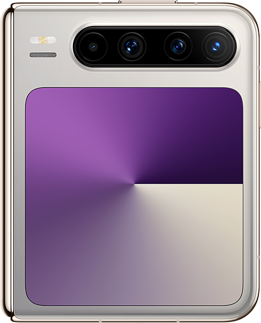
- In unfolded state, CameraPosition is CAMERA_POSITION_BACK, with the following effect:
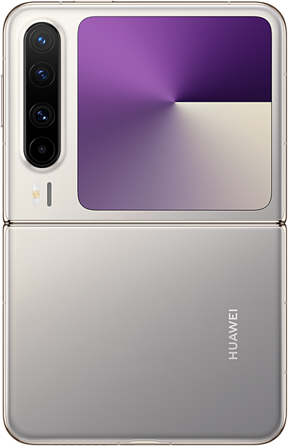
- In folded state, CameraPosition is CAMERA_POSITION_FRONT, with the following effect:
- For other scenarios requiring a preview stream reset, you need to implement custom logic. When the folding state changes (for example, a bi-fold smartphone switches from the folded state to half-folded), the display screen updates, requiring the camera device to be reselected. Therefore, within display.on('foldStatusChange'), compare the folding states before and after the change, and select the front or rear camera for the new state based on the previously active camera.
onFoldStatusChange: (foldStatus: display.FoldStatus) => void = (foldStatus: display.FoldStatus) => {
  if (foldStatus === display.FoldStatus.FOLD_STATUS_HALF_FOLDED) {
    let orientation: display.Orientation = display.getDefaultDisplaySync().orientation;
    // Determine the page layout that has entered half folded status and prohibit portrait orientation.
    if (this.widthBp === WidthBreakpoint.WIDTH_MD && (orientation === display.Orientation.LANDSCAPE ||
      orientation === display.Orientation.LANDSCAPE_INVERTED)) {
      this.isHalfFolded = true;
      this.windowUtil.setMainWindowOrientation(window.Orientation.LANDSCAPE);
      this.cameraUtil.setHalfFoldedRect(this.windowUtil.getWindowSize());
    } else {
      if (this.oldFoldStatus === display.FoldStatus.FOLD_STATUS_FOLDED) {
        if (this.isFront) {
          this.cameraUtil.cameraShooting(this.surfaceId, this.context!, camera.CameraPosition.CAMERA_POSITION_FRONT);
        } else {
          this.cameraUtil.cameraShooting(this.surfaceId, this.context!, camera.CameraPosition.CAMERA_POSITION_BACK);
        }
      }
    }
    return;
  }
  // ...
  // Exit the half folded status page.
  if (this.isHalfFolded) {
    this.isHalfFolded = false;
    this.cameraUtil.setXComponentRect(this.windowUtil.getWindowSize());
  } else {
    if (foldStatus === display.FoldStatus.FOLD_STATUS_FOLDED ||
      (this.oldFoldStatus === display.FoldStatus.FOLD_STATUS_EXPANDED_WITH_SECOND_HALF_FOLDED &&
        foldStatus === display.FoldStatus.FOLD_STATUS_EXPANDED) ||
      (this.oldFoldStatus === display.FoldStatus.FOLD_STATUS_EXPANDED &&
        foldStatus === display.FoldStatus.FOLD_STATUS_EXPANDED_WITH_SECOND_HALF_FOLDED)) {
      if (this.isFront) {
        this.cameraUtil.cameraShooting(this.surfaceId, this.context!, camera.CameraPosition.CAMERA_POSITION_FRONT);
      } else {
        this.cameraUtil.cameraShooting(this.surfaceId, this.context!, camera.CameraPosition.CAMERA_POSITION_BACK);
      }
    }
  }
  // ...
}

aboutToAppear(): void {
  try {
    display.on('foldStatusChange', this.onFoldStatusChange);
  } catch (error) {
    let err = error as BusinessError;
    hilog.error(0x0000, 'MultiDeviceCamera', `Failed to obtain fold status. Code: ${err.code}, message: ${err.message}`);
  }
  // ...
}
Note that the PuraX cover screen only has a front camera. If the rear camera is being used on the main screen and you switch to the cover screen, the rear camera will no longer be available, so the system returns the default camera on the list of available cameras.
getCamera(cameras: Array<camera.CameraDevice>, cameraPosition: camera.CameraPosition): number {
  // Choose front or rear camera.
  for (let i: number = 0; i < cameras.length; ++i) {
    if (cameras[i].cameraPosition === cameraPosition) {
      if (cameraPosition === camera.CameraPosition.CAMERA_POSITION_BACK) {
        AppStorage.setOrCreate('isFront', false);
      }
      if (cameraPosition === camera.CameraPosition.CAMERA_POSITION_FRONT) {
        AppStorage.setOrCreate('isFront', true);
      }
      return i;
    }
  }
  hilog.error(0x0000, 'testLog', `Failed to find the camera with the corresponding position.`);
  if (cameras[0].cameraPosition === camera.CameraPosition.CAMERA_POSITION_BACK) {
    AppStorage.setOrCreate('isFront', false);
  }
  if (cameras[0].cameraPosition === camera.CameraPosition.CAMERA_POSITION_FRONT) {
    AppStorage.setOrCreate('isFront', true);
  }
  return 0;
}
Configuring Camera Preview Aspect Ratios Across Multiple Devices
After selecting the camera, you need to create a preview output object through createPreviewOutput() and bind it to the XComponent to display the preview screen. For the implementation process, refer to Photo Capture Practices. When developing camera preview screens across multiple devices, follow the guidelines below to prevent issues such as compression, stretching, and abnormal rotation.
The aspect ratio of the XComponent's surface depends on the clockwise rotation angle of the device screen during user preview. If display.rotation is 0° or 180°, the surface's aspect ratio is the inverse of the camera preview stream's aspect ratio; if display.rotation is 90° or 270°, the surface's aspect ratio matches that of the camera preview stream.
Taking a preview stream aspect ratio of 4:3 as an example (1:1 for the Pura X in folded state), the surface's aspect ratios for devices in different fold states are listed in the following table.
Pura X (Folded) | Smartphone/Bi-fold (Folded)/Tri-fold (F State)/Pura X (Unfolded) | Bi-fold (Unfolded)/Tri-fold (M State) | Tri-fold (G State) | Tablet | |
Device orientation | Charging port facing right: display.rotation=270 | Charging port facing down: display.rotation=0 | Charging port facing down: display.rotation=0 | Charging port facing down: display.rotation=0 | Charging port facing down: display.rotation=0 |
Surface's aspect ratio | 1:1 | 3:4 | 3:4 | 3:4 | 3:4 |
Device orientation | Page rotation not supported | Page rotation not supported | Charging port facing right: display.rotation=270 | Charging port facing down: display.rotation=270 | Charging port facing right: display.rotation=270 |
Surface's aspect ratio | 4:3 | 4:3 | 4:3 |
The following table illustrates the preview effects across different device states.
Pura X (Folded) | Smartphone/Bi-fold (Folded)/Tri-fold (F State)/Pura X (Unfolded) | Bi-fold (Unfolded)/Tri-fold (M State) | Tri-fold (G State) | Tablet |
|
|
|
|
|
Page rotation not supported | Page rotation not supported |
|
|
|


[h2]How to Develop
- When the window orientation changes, call setXComponentSurfaceRect() to reset the width and height of the XComponent's surface, ensuring consistency with the aspect ratio of the camera preview stream and photo stream across multiple devices.
setXComponentRect(windowSize: window.Size): void { try { // Initialize the width and height of the surface to match the full screen of the window. let rect: SurfaceRect = { surfaceWidth: windowSize.width, surfaceHeight: windowSize.height }; let widthBp: WidthBreakpoint = this.uiContext!.getWindowWidthBreakpoint(); let heightBp: HeightBreakpoint = this.uiContext!.getWindowHeightBreakpoint(); let displayRotation: number = display.getDefaultDisplaySync().rotation * 90; if (widthBp === WidthBreakpoint.WIDTH_SM && heightBp === HeightBreakpoint.HEIGHT_MD) { this.xComponentController!.setXComponentSurfaceRect(rect); return; } if (AppStorage.get('isHalfFolded')) { this.setHalfFoldedRect(windowSize); return; } if (displayRotation === 0 || displayRotation === 180) { if (windowSize.height * 3 / 4 > windowSize.width) { rect.surfaceHeight = windowSize.width / 3 * 4; } else { rect.surfaceWidth = windowSize.height / 4 * 3; } if (widthBp === WidthBreakpoint.WIDTH_MD && heightBp === HeightBreakpoint.HEIGHT_MD) { rect.offsetX = 0; rect.offsetY = 0; } } if (displayRotation === 90 || displayRotation === 270) { if (windowSize.width * 3 / 4 > windowSize.height) { rect.surfaceWidth = windowSize.height / 3 * 4; } else { rect.surfaceHeight = windowSize.width / 4 * 3; } } this.xComponentController!.setXComponentSurfaceRect(rect); } catch (error) { let err = error as BusinessError; hilog.error(0x0000, 'MultiDeviceCamera', `Failed to set XComponent rect. Code: ${err.code}, message: ${err.message}`); } } - During window orientation changes, the window size is updated. The setXComponentRect() method must be called at this point to refresh the preview aspect ratio and prevent visual distortion.
export default class EntryAbility extends UIAbility { // ... isFirstTime: boolean = true; onWindowSizeChange: (windowSize: window.Size) => void = (windowSize: window.Size) => { // ... if (!this.isFirstTime) { this.cameraUtil!.setXComponentRect(this.windowUtil!.getWindowSize()); } else { this.isFirstTime = false; } } // ... onWindowStageCreate(windowStage: window.WindowStage): void { // ... windowStage.loadContent('pages/Index', (err) => { // ... windowStage.getMainWindow().then((data: window.Window) => { // ... // Monitor window size changes and update breakpoints. data.on('windowSizeChange', this.onWindowSizeChange); // ... }).catch((err: BusinessError) => { hilog.error(0x0000, 'testTag', `Error occured, error code: ${err.code}, error message: ${err.message}`); }) }); } // ... } - Call setXComponentSurfaceRotation() to set the XComponent's surface to lock orientation during screen rotation, ensuring a good user experience during rotation of the camera preview screen.
XComponent({
  type: XComponentType.SURFACE,
  controller: this.xComponentController
}) {}
.onLoad(() => {
  // ...
  // Set surface to lock direction when screen rotates.
  this.xComponentController.setXComponentSurfaceRotation({ lock: true });
})
Setting Photo Capture Rotation Angles
In portrait and landscape photo capture scenarios, it's essential to ensure that images are always displayed in the correct orientation, avoiding abnormal photo directions (such as 90° rotation or upside-down orientation).
[h2]How to Develop
In capture(), obtain the current photo capture angle through the gravity sensor, differentiate between rear and front cameras, and set the rotation angle rotation during photo capture.
capture(): void {
  let rotation: number = 0;
  let isFront: boolean | undefined = AppStorage.get('isFront');
  try {
    // Obtain the angle of the gravity sensor during shooting and set the shooting rotation angle.
    sensor.once(sensor.SensorId.GRAVITY, (data: sensor.GravityResponse) => {
      if (Math.abs(data.z) > OVERLOOKING_GRAVITY_OF_Z_AXIS) {
        rotation = this.lastRotation;
      }
      else {
        let degree: number = this.getCalDegree(data.x, data.y, data.z);
        if ((degree >= 0 && degree <= 30) || degree >= 300) {
          rotation = camera.ImageRotation.ROTATION_0;
        } else if (degree > 30 && degree <= 120) {
          if (isFront) {
            // Use ROTATION_270 when degree range is (30, 120] for front camera.
            rotation = camera.ImageRotation.ROTATION_270;
          } else {
            // Use ROTATION_90 when degree range is (30, 120] for back camera.
            rotation = camera.ImageRotation.ROTATION_90;
          }
        } else if (degree > 120 && degree <= 210) {
          // Use ROTATION_180 when degree range is (120, 210].
          rotation = camera.ImageRotation.ROTATION_180;
        } else if (degree > 210 && degree <= 300) {
          if (isFront) {
            // Use ROTATION_90 when degree range is (210, 300] for front camera.
            rotation = camera.ImageRotation.ROTATION_90;
          } else {
            // Use ROTATION_270 when degree range is (210, 300] for back camera.
            rotation = camera.ImageRotation.ROTATION_270;
          }
        };
      }

      let setting: camera.PhotoCaptureSetting = {
        quality: camera.QualityLevel.QUALITY_LEVEL_HIGH,
        rotation: rotation,
        mirror: isFront
      }
      this.photoOutput?.capture(setting);
    })
  } catch (error) {
    let err = error as BusinessError;
    hilog.error(0x0000, 'MultiDeviceCamera', `Capture failed. Code: ${err.code}, message: ${err.message}`);
  }
}
Implementing Camera Interfaces for Hover States
The hover state corresponds to the FOLD_STATUS_HALF_FOLDED state. You can design a special user experience for the camera interface when the screen enters the hover state, i.e., when it is semi-folded. The UX effect diagram is shown below. The UX effect diagram is shown below:

[h2]How to Develop
Call display.on('foldStatusChange') to listen for fold status changes. When the screen is half-folded and the screen display orientation is landscape or reverse landscape, record the hover state isHalfFolded as true, recalculate the width and height of the XComponent's surface display area and adjust the rotation strategy to show the hover state camera page layout; otherwise, record isHalfFolded as false.
onFoldStatusChange: (foldStatus: display.FoldStatus) => void = (foldStatus: display.FoldStatus) => {
  if (foldStatus === display.FoldStatus.FOLD_STATUS_HALF_FOLDED) {
    let orientation: display.Orientation = display.getDefaultDisplaySync().orientation;
    // Determine the page layout that has entered half folded status and prohibit portrait orientation.
    if (this.widthBp === WidthBreakpoint.WIDTH_MD && (orientation === display.Orientation.LANDSCAPE ||
      orientation === display.Orientation.LANDSCAPE_INVERTED)) {
      this.isHalfFolded = true;
      this.windowUtil.setMainWindowOrientation(window.Orientation.LANDSCAPE);
      this.cameraUtil.setHalfFoldedRect(this.windowUtil.getWindowSize());
    } else {
      if (this.oldFoldStatus === display.FoldStatus.FOLD_STATUS_FOLDED) {
        if (this.isFront) {
          this.cameraUtil.cameraShooting(this.surfaceId, this.context!, camera.CameraPosition.CAMERA_POSITION_FRONT);
        } else {
          this.cameraUtil.cameraShooting(this.surfaceId, this.context!, camera.CameraPosition.CAMERA_POSITION_BACK);
        }
      }
    }
    return;
  }
  if (this.widthBp !== WidthBreakpoint.WIDTH_SM) {
    this.windowUtil.setMainWindowOrientation(window.Orientation.AUTO_ROTATION_RESTRICTED);
  }
  // Exit the half folded status page.
  if (this.isHalfFolded) {
    this.isHalfFolded = false;
    this.cameraUtil.setXComponentRect(this.windowUtil.getWindowSize());
  } else {
    if (foldStatus === display.FoldStatus.FOLD_STATUS_FOLDED ||
      (this.oldFoldStatus === display.FoldStatus.FOLD_STATUS_EXPANDED_WITH_SECOND_HALF_FOLDED &&
        foldStatus === display.FoldStatus.FOLD_STATUS_EXPANDED) ||
      (this.oldFoldStatus === display.FoldStatus.FOLD_STATUS_EXPANDED &&
        foldStatus === display.FoldStatus.FOLD_STATUS_EXPANDED_WITH_SECOND_HALF_FOLDED)) {
      if (this.isFront) {
        this.cameraUtil.cameraShooting(this.surfaceId, this.context!, camera.CameraPosition.CAMERA_POSITION_FRONT);
      } else {
        this.cameraUtil.cameraShooting(this.surfaceId, this.context!, camera.CameraPosition.CAMERA_POSITION_BACK);
      }
    }
  }
  this.oldFoldStatus = foldStatus;
} [h2]What should I do if buttons are displayed with abnormal sizes or truncated?
Symptom
Buttons appear with incorrect sizes or are truncated on different devices.
Possible Causes
Camera page layouts have not been designed for different screen sizes.
Solution
Design and implement multiple camera page layouts based on different horizontal breakpoints. For details, see Implementing Multiple Page Layouts Through Breakpoints.
[h2]What should I do if an operable component cannot be rotated on a large screen's camera page?
Symptom
On large screens, such as tri-fold (G state), bi-fold (unfolded), and tablets, operable components on the camera page do not support rotation, impairing usability.
Possible Causes
The window does not support rotation.
Solution
If the horizontal breakpoint of the camera page is sm, rotation is not supported. If the horizontal breakpoint is md or lg, rotation is supported. Therefore, rotation is supported when the minimum value of window width and height is greater than or equal to 600 vp. For details, see Implementing Multiple Page Layouts Through Breakpoints.
[h2]What should I do if the preview image is compressed or stretched?
Symptom
The preview image is compressed or stretched.
Possible Causes
When the camera preview object is bound to the XComponent, the width and height of the surface are not correctly set, causing the aspect ratio to be inconsistent with that of the camera preview stream after rotation.
Solution
Set the aspect ratio of the XComponent's surface to match that of the camera preview stream after rotation. For details, see Configuring Camera Preview Aspect Ratios Across Multiple Devices.
[h2]What should I do if the display angle of a captured photo is abnormal?
Symptom
The captured photo does not match the expected orientation and may be rotated by 90°, 180°, or 270°, requiring manual adjustment for proper viewing.
Possible Causes
The device is rotated during photo capture, and the correct rotation angle is not set.
Solution
Set a correct rotation angle for photo capture. For details, see Setting Photo Capture Rotation Angles.
[h2]What should I do if a black screen occurs during fold state transitions?
Symptom
When switching the fold state of a foldable screen, the camera preview page shows a black screen.
Possible Causes
During the fold state transition, the previously selected camera becomes unavailable, causing the preview screen to go black.
Solution
Monitor window size changes during fold state transitions. When a change is detected, reselect the camera to generate a new preview stream. For details, see Selecting Camera Devices.