This chapter uses the weather app as an example to describe the overall development process of one-for-multi apps, including UX design, project management and debugging, and page development.
UX Design
In this example, the weather app includes a home page, city management page, and city addition page, with the home page featuring two dialog boxes: one for displaying the menu and another for configuring the refresh interval. The following figure illustrates the basic service logic.

To develop a one-for-multi app, you are advised to consider its design and development from the initial phase. Given the vast diversity of smart devices, designers cannot create separate UX design blueprints for each specific device. To develop one-for-multi apps, you are advised to classify devices by their app window width and aspect ratio.
The following table lists device types classified by their app window width.
Device Type | Window Width (vp) |
|---|---|
Extra small-screen device | (0, 320) |
Small-screen device | [320, 600) |
Medium-screen device | [600, 840) |
Large-screen device | [840, 1440) |
Extra-large-screen device | [1440, +∞) |
The following table lists device types classified by their aspect ratio.
Device Type | Height-to-Width Ratio |
|---|---|
Small-screen device | (0, 0.8) |
Medium-screen device | [0.8, 1.2) |
Large-screen device | [1.2, +∞) |

vp is short for virtual pixel, which is a common length unit.
Bar phones, bi-fold phones and tablets correspond to the small-, medium-, and large-screen devices. This example describes the UX designs on these three different types of devices. The following figure shows the home page design of the weather app.
Small-Screen Device | Medium-Screen Device | Large-Screen Device | |
|---|---|---|---|
Home page |
|
|
|


In addition, the home page on the large device allows users to enable or hide the sidebar.
Sidebar Enabled | Sidebar Hidden |
|---|---|
|
|


From UX design diagrams of weather apps across devices, observable patterns emerge:
The overall style of the app remains consistent across varying screen widths.
Within similar screen width ranges, layout structures remain largely unchanged. Across divergent screen width ranges, significant layout variations occur.
Elements displayed on smaller screens constitute subsets of those on larger screens.
- Given screen sizes and display effects, larger screens always accommodate equal or more elements than smaller ones.
- To leverage the larger display space that large screens provide, unique elements or designs (such as the sidebar in this example) can be incorporated.
This approach ensures UX consistency across devices while introducing device-specific differentiations, optimizing UI experience per device and maximizing UI code reuse.
Project Management and Debugging
After the UX design is complete, the next step is to convert the design into a runnable project. For details about creating and managing one-for-multi projects, see Multi-Device Project Deployment. This section only covers project creation and multi-device preview and debugging.
[h2]Project Creation
The process of creating a one-for-multi app is similar to that of creating a traditional app. You only need to select all target device types that the app is expected to run on in the Device Type option during project creation. This ensures that the app can be correctly installed on all target devices.
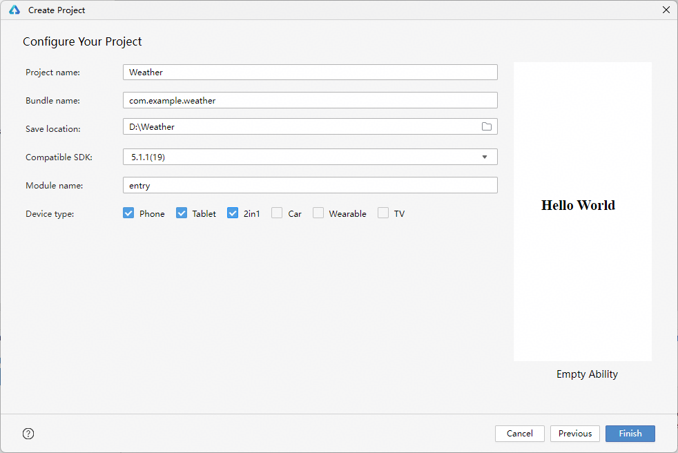
[h2]Preview and Debugging
During code development, you can enable the previewer and enable Multi-profile preview to view the app display effects on different devices in real time.

You can also click + New Profile to add a custom previewer.

Page Development
The weather app involves many pages and dialog boxes. This section uses the weather home page as an example to describe the page implementation process on different devices.
Based on the UX design diagrams for the home page on different devices, you can:
Divide the home page into nine basic areas, as shown in the following figure:

Basic area 9 is displayed only on large-screen devices (the side navigation bar needs to be expanded) while basic areas 1 to 8 are always displayed on all devices, with their sizes and layouts unchanged (area 8 is displayed when the page is scrolled down to the bottom, which is not shown in the following figures). You can implement these nine basic areas using the adaptive layout capabilities and custom components.
Small-Screen Device
Medium-Screen Device
Large-Screen Device
Home page


The layouts of basic areas 1 to 8 differ significantly across different devices. You can leverage the grid layout capabilities of responsive design to achieve the inter-component layout.
The functionality for expanding and collapsing the sidebar can be implemented using the sidebar component. The sidebar is tailored for large-screen devices—by leveraging media queries in responsive layout design, you can ensure that the sidebar is displayed exclusively on large-screen devices.
[h2]Basic Areas on the Home Page
The following table describes the nine basic areas on the home page and their implementation solutions.
No. | Description | Implementation Solution |
|---|---|---|
1 | Title bar | Leverage the stretching capability of the adaptive layout. |
2 | Weather overview | Use Row and Column components, and specify that their child components align along the main axis start direction or at the center. |
3 | Hourly weather | Leverage the extension capability of the adaptive layout. |
4 | Daily weather | Leverage the extension capability of the adaptive layout. |
5 | Air quality | Use the Canvas component to draw the air quality chart, and use Row and Column components to control the layout of internal elements. |
6 | Lifestyle index | Leverage the equal space distribution capability of the adaptive layout. |
7 | Sunrise and sunset | Use the Canvas component to draw the sunrise and sunset chart. |
8 | App information | Use Row and Column components, and specify that their child components are center-aligned. |
9 | Side navigation bar | Comprehensively apply the stretching, proportion, and extension capabilities of the adaptive layout. |
Due to the extensive content of the weather home page, this section only introduces the implementation of area 3 (displaying hourly weather) due to space constraints.
The extension capability refers to the behavior where child components within a container component show or hide in their list order as the container component resizes. As the available display area increases, the hourly weather information visible to users continues to expand. Thus, this section can be implemented using the extension capability, with its core code shown below.
import { Forecast, getHoursData, MyDataSource, Style } from 'common';

@Preview
@Component
export default struct HoursWeather {
  hoursData: Forecast[] = getHoursData(0);
  @State hoursDataResource: MyDataSource<Forecast> = new MyDataSource(this.hoursData);
  @StorageLink('curBp') curBp: string = 'lg';

  // ...
  build() {
    // Implement extensibility capability through list component.
    List() {
      LazyForEach(this.hoursDataResource, (hoursItem: Forecast) => {
        ListItem() {
          this.HoursWeatherItem(hoursItem,
            this.curBp === 'lg' ? Style.WEATHER_ITEM_WIDTH + 2 : Style.WEATHER_ITEM_WIDTH)
        }
      }, (hoursItem: Forecast, index: number) => JSON.stringify(hoursItem) + index)
    }
    .width('100%')
    .height(Style.CARD_HEIGHT)
    .borderRadius(Style.NORMAL_RADIUS)
    .backgroundColor(Style.CARD_BACKGROUND_COLOR)
    .listDirection(Axis.Horizontal)
  }
}
[h2]City Weather Panel
The right-hand city weather panel on the home page comprises areas 1 to 8. Area 1 (title bar) maintains a fixed position at the top of the page. Areas 2 to 8 utilize device-responsive layouts with vertical scrolling capability. This section details the layout implementation for areas 2 to 8.
Device screens may be unable to display all content of areas 2 to 8 simultaneously, requiring an outer Scroll component to enable vertical scrolling. There are three layouts for the relative positions of areas 2 to 8 on different devices. You can use Grid to achieve this effect. In this example, the grid system divides the layout into 4, 8, and 12 columns respectively for different scenarios. The layouts of areas 2 to 8 in these scenarios are shown in the table below.
Small-Screen Device | Medium- or Large-Screen Device (Sidebar Displayed) | Large-Screen Device (Sidebar Hidden) |
|---|---|---|
|
|
|


To improve user experience, modify the relative sequence of the daily weather and air quality modules when the sidebar is hidden on a large-screen device. You can adjust the order property of the GridCol child component to implement the target effect.
import AirQuality from './AirQuality';
import HoursWeather from './HoursWeather';
import IndexHeader from './IndexHeader';
import IndexEnd from './IndexEnd';
import LifeIndex from './LifeIndex';
import MultidayWeather from './MultidayWeather';
import SunCanvas from './SunCanvas';
import { CityListData, Style } from 'common';

@Component
export default struct HomeContent {
  @Prop showSideBar: boolean;
  @StorageLink('titleText') titleText: string[] = [];
  @StorageLink('swiperIndex') swiperIndex: number = 0;
  @State headerOpacity: number = 1;
  cityListData?: CityListData;
  index: number = 1;
  scroller: Scroller = new Scroller();

  build() {
    Scroll(this.scroller) {
      GridRow({
        columns: {
          xs: 4,
          sm: 4,
          md: 8,
          lg: this.showSideBar ? 8 : 12
        },
        gutter: { x: Style.GRID_GUTTER, y: Style.GRID_GUTTER },
        breakpoints: { reference: BreakpointsReference.WindowSize }
      }) {
        // Weather overview.
        GridCol({
          span: {
            xs: 4,
            sm: 4,
            md: 8,
            lg: this.showSideBar ? 8 : 12
          },
          order: 0
        }) {
          IndexHeader({ headerDate: this.cityListData!.header, index: this.index })
            .opacity(this.headerOpacity)
        }

        // Hourly weather.
        GridCol({
          span: {
            xs: 4,
            sm: 4,
            md: 8,
            lg: 8
          },
          order: 1
        }) {
          HoursWeather({ hoursData: this.cityListData!.hoursData })
        }

        // Daily weather.
        GridCol({
          span: 4,
          order: {
            xs: 2,
            sm: 2,
            md: 2,
            lg: this.showSideBar ? 2 : 3
          }
        },) {
          MultidayWeather({ weekData: this.cityListData!.weekData })
        }

        // Air quality.
        GridCol({
          span: 4,
          order: {
            xs: 3,
            sm: 3,
            md: 3,
            lg: this.showSideBar ? 3 : 2
          }
        }) {
          AirQuality({ airData: this.cityListData!.airData, airIndexData: this.cityListData!.airIndex })
        }

        // Living index.
        GridCol({ span: 4, order: 4 }) {
          LifeIndex({ lifeData: this.cityListData!.suitDate })
        }

        // Sun canvas.
        GridCol({ span: 4, order: 5 }) {
          SunCanvas()
        }

        // Index end.
        GridCol({
          span: {
            xs: 4,
            sm: 4,
            md: 8,
            lg: this.showSideBar ? 8 : 12
          },
          order: 6
        }) {
          IndexEnd()
        }
      }
    }
    // ...
  }
}
[h2]Home Page Implementation
Considering cross-device experiences, the root node of the weather home page uses a sidebar component:
On small- and medium-screen devices, the sidebar remains hidden with no control button provided.
On large-screen devices, the sidebar displays by default with a toggle button for the show/hide functionality.
The city weather panel on the right of the home page supports horizontal city-swiping by using the Swiper component:
On small- and medium-screen devices, enable the Swiper component's navigation dots to guide city-swiping.
On large-screen devices, efficient switching between cities by tapping the sidebar list requires disabling the Swiper component's navigation dots.
import HomeContent from './HomeContent';
import IndexTitleBar from './IndexTitleBar';
import SideContent from './SideContent';
import { CityListData, Style, getBg, getCityListWeatherData, Logger } from 'common';
// ...

@Entry
@Component
struct Home {
  // ...
  @State curBp: string = 'md';
  @State cityListWeatherData: CityListData[] = getCityListWeatherData();
  @State showSideBar: boolean = false;
  // ...

  build() {
    SideBarContainer(SideBarContainerType.Embed) {
      // Left sidebar.
      SideContent({ showSideBar: $showSideBar })
        .height('100%')
      // Right content area.
      Column() {
        // Title bar.
        IndexTitleBar({ showSideBar: $showSideBar })
          .height(56)
        // Weather details.
        Swiper() {
          ForEach(this.cityListWeatherData, (item: CityListData, index: number) => {
            HomeContent({ showSideBar: this.showSideBar, cityListData: item, index: index })
          }, (item: CityListData, index: number) => JSON.stringify(item) + index)
        }
        .id('swiper')
        .padding({ left: Style.NORMAL_PADDING, right: Style.NORMAL_PADDING })
        .onChange(index => {
          this.swiperIndex = index;
          AppStorage.setOrCreate('swiperIndex', this.swiperIndex);
        })
        // Disable navigation dots on lg width breakpoint.
        .indicator(this.curBp !== 'lg' ? new DotIndicator()
          .selectedColor(Color.White) : false
        )
        .index(this.swiperIndex)
        .loop(false)
        .width('100%')
        .layoutWeight(1)
      }
      .height('100%')
    }
    .height('100%')
    .sideBarWidth('33.3%')
    .minSideBarWidth('33.3%')
    .maxSideBarWidth('33.3%')
    .showControlButton(false)
    .showSideBar(this.showSideBar)
    .backgroundImageSize(ImageSize.Cover)
    .backgroundImage(getBg(this.cityListWeatherData[this.swiperIndex].header.weatherType))
  }
  // ...
}
The following figure shows the running effect of the preceding code.
Small-Screen Device | Medium-Screen Device | Large-Screen Device (Sidebar Hidden) | Large-Screen Device (Sidebar Displayed) |
|---|---|---|---|
|
|
|
|


Feature Development
App development includes page development, backend feature development, and server-side development. Server-side development falls outside the scope of this guide; this section focuses solely on considerations for feature development across multiple devices.
As previously mentioned, the target runtime devices for this example are small-, medium-, and large-screen devices, corresponding to default devices and tablets. These devices run standard systems with consistent capabilities, requiring no special adaptation. However, on extra small-screen devices (such as wearables), system capabilities are often scaled down due to hardware constraints like CPU, memory, and storage. If an app invokes unsupported system capabilities during backend feature development, exceptions may occur.
Two primary approaches address this issue:
Declare required system capabilities in the app installation package to ensure distribution and installation only on compatible systems.
Verify the existence of specific system capabilities using the canIUse API before invocation, enabling conditional logic execution.
For details, see Cross-Device Feature Development.