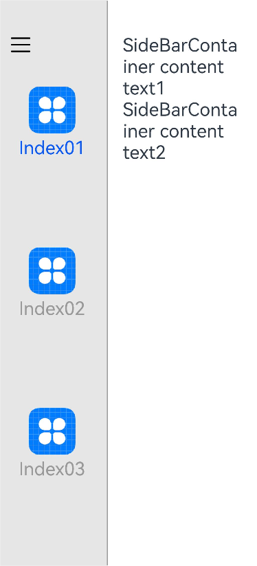
The SideBarContainer component contains a sidebar and content area as its child components. The sidebar is the first child component and can be shown or hidden as needed. The content area is the second child component.

The APIs of this module are supported since API version 8. Updates will be marked with a superscript to indicate their earliest API version.
Child Components
Supported

- Allowed child component types: built-in and custom components, excluding rendering control types (if/else, ForEach, and LazyForEach).
- This component must contain two child components.
- If there are three or more child components, only the first and second child components are displayed. If there is only one child component, the sidebar is displayed, and the content area is blank.
- The focus navigation is performed in the content area and then in the sidebar of the SideBarContainer component.
APIs
SideBarContainer( type?: SideBarContainerType )
Creates a sidebar container.
Atomic service API: This API can be used in atomic services since API version 11.
System capability: SystemCapability.ArkUI.ArkUI.Full
Parameters
| Name | Type | Mandatory | Description |
|---|---|---|---|
| type | SideBarContainerType | No | Display type of the sidebar. Default value: SideBarContainerType.Embed |
SideBarContainerType
Enumerates the types of sidebar containers.
System capability: SystemCapability.ArkUI.ArkUI.Full
| Name | Value | Description |
|---|---|---|
| Embed | 0 | The sidebar is embedded in the component and displayed side by side with the content area. With the overall container size unchanged, displaying the sidebar reduces the content area, and hiding the sidebar expands the content area. If the component size is less than the sum of minContentWidth and minSideBarWidth, and showSideBar is not set, the sidebar is automatically hidden. If minSideBarWidth or minContentWidth is not set, the default value will be used for calculation. The user can bring out the sidebar in Overlay mode by clicking the control button. Atomic service API: This API can be used in atomic services since API version 11. |
| Overlay | 1 | The sidebar is overlaid on top of the content area, without affecting the size of the content area. Atomic service API: This API can be used in atomic services since API version 11. |
| AUTO10+ | 2 | The sidebar is displayed in Embed mode when the component size is greater than or equal to the sum of minSideBarWidth and minContentWidth and in Overlay mode otherwise. If minSideBarWidth or minContentWidth is not set, the default value will be used for calculation. If the calculation result is less than 600 vp, 600 vp will be used as the breakpoint value for mode switching. Atomic service API: This API can be used in atomic services since API version 11. |
| DISPLACE | 3 | The sidebar and the content area are displayed in parallel, and the overflow part of the content area is moved outside the component. When the sidebar is expanded, the content area is displayed with a gray overlay (color: #33000000) and events are disabled. You can tap the content area to collapse the sidebar. Since: 26.0.0 Model restriction: This API can be used only in the stage model. Atomic service API: This API can be used in atomic services since API version 26.0.0. |
[h2]showSideBar
showSideBar(value: boolean)
Specifies whether to display the sidebar.
Since API version 10, this attribute supports two-way binding through $$.
Atomic service API: This API can be used in atomic services since API version 11.
System capability: SystemCapability.ArkUI.ArkUI.Full
Parameters
| Name | Type | Mandatory | Description |
|---|---|---|---|
| value | boolean | Yes | Whether to display the sidebar. true: The sidebar is displayed. false: The sidebar is not displayed. Default value: true |
[h2]controlButton
controlButton(value: ButtonStyle)
Sets the attributes of the sidebar control button.
Atomic service API: This API can be used in atomic services since API version 11.
System capability: SystemCapability.ArkUI.ArkUI.Full
Parameters
| Name | Type | Mandatory | Description |
|---|---|---|---|
| value | ButtonStyle | Yes | Attributes of the sidebar control button. |
[h2]showControlButton
showControlButton(value: boolean)
Specifies whether to display the sidebar control button.
Atomic service API: This API can be used in atomic services since API version 11.
System capability: SystemCapability.ArkUI.ArkUI.Full
Parameters
| Name | Type | Mandatory | Description |
|---|---|---|---|
| value | boolean | Yes | Whether to display the sidebar control button. true: The sidebar control button is displayed. false: The sidebar control button is not displayed. Default value: true |

The sidebar display or hiding animation is triggered when the sidebar is displayed or hidden by clicking the sidebar control button.
[h2]sideBarWidth
sideBarWidth(value: number)
Sets the width of the sidebar. If a value less than 0 is set, the default value is used. The value must comply with the width constraints. If it is not within the valid range, the valid value closest to the set one is used.
Since API version 18, this attribute supports two-way binding through !!.
Atomic service API: This API can be used in atomic services since API version 11.
System capability: SystemCapability.ArkUI.ArkUI.Full
Parameters
| Name | Type | Mandatory | Description |
|---|---|---|---|
| value | number | Yes | Width of the sidebar. Default value: 240vp Unit: vp Value range: [0, +∞). NOTE For versions earlier than API version 10, the default value is 200vp. Since API version 10, the default value is 240vp. |
[h2]sideBarWidth9+
sideBarWidth(value: Length)
Sets the width of the sidebar. If a value less than 0 is set, the default value is used. The value must comply with the width constraints. If it is not within the valid range, the valid value closest to the set one is used. Compared to sideBarWidth, this API supports percentage strings and other pixel units for the value parameter.
Since API version 18, this attribute supports two-way binding through !!.
Atomic service API: This API can be used in atomic services since API version 11.
System capability: SystemCapability.ArkUI.ArkUI.Full
Parameters
| Name | Type | Mandatory | Description |
|---|---|---|---|
| value | Length | Yes | Width of the sidebar. Default value: 240vp Unit: vp Value range: [0, +∞). NOTE For API version 9, the default value is 200vp. Since API version 10, the default value is 240vp. |
[h2]minSideBarWidth
minSideBarWidth(value: number)
Sets the minimum width of the sidebar. If a value less than 0 is set, the default value is used. The value cannot exceed the width of the sidebar container. If the specified value exceeds the sidebar container width, the container width is used instead.
minSideBarWidth, whether it is specified or kept at the default value, takes precedence over minWidth of the sidebar child components.
Atomic service API: This API can be used in atomic services since API version 11.
System capability: SystemCapability.ArkUI.ArkUI.Full
Parameters
| Name | Type | Mandatory | Description |
|---|---|---|---|
| value | number | Yes | Minimum width of the sidebar. Default value: In API version 9 and earlier versions, the default value is 200vp. In API version 10, the default value is 240vp. Value range: [0, +∞). |
[h2]minSideBarWidth9+
minSideBarWidth(value: Length)
Sets the minimum width of the sidebar. If a value less than 0 is set, the default value is used. The value cannot exceed the width of the sidebar container. If the specified value exceeds the sidebar container width, the container width is used instead. Compared to minSideBarWidth, this API supports percentage strings and other pixel units for the value parameter.
minSideBarWidth, whether it is specified or kept at the default value, takes precedence over minWidth of the sidebar child components.
Atomic service API: This API can be used in atomic services since API version 11.
System capability: SystemCapability.ArkUI.ArkUI.Full
Parameters
| Name | Type | Mandatory | Description |
|---|---|---|---|
| value | Length | Yes | Minimum width of the sidebar. Default value: In API version 9 and earlier versions, the default value is 200vp. In API version 10, the default value is 240vp. Value range: [0, +∞). |
[h2]maxSideBarWidth
maxSideBarWidth(value: number)
Sets the maximum width of the sidebar. If a value less than 0 is set, the default value is used. The value cannot exceed the width of the sidebar container. If the specified value exceeds the sidebar container width, the container width is used instead.
maxSideBarWidth, whether it is specified or kept at the default value, takes precedence over maxWidth of the sidebar child components.
Atomic service API: This API can be used in atomic services since API version 11.
System capability: SystemCapability.ArkUI.ArkUI.Full
Parameters
| Name | Type | Mandatory | Description |
|---|---|---|---|
| value | number | Yes | Maximum width of the sidebar. Default value: 280vp Unit: vp Value range: [0, +∞). |
[h2]maxSideBarWidth9+
maxSideBarWidth(value: Length)
Sets the maximum width of the sidebar. If a value less than 0 is set, the default value is used. The value cannot exceed the width of the sidebar container. If the specified value exceeds the sidebar container width, the container width is used instead. Compared with maxSideBarWidth, this API supports percentage strings and other pixel units for the value parameter.
maxSideBarWidth, whether it is specified or kept at the default value, takes precedence over maxWidth of the sidebar child components.
Atomic service API: This API can be used in atomic services since API version 11.
System capability: SystemCapability.ArkUI.ArkUI.Full
Parameters
| Name | Type | Mandatory | Description |
|---|---|---|---|
| value | Length | Yes | Maximum width of the sidebar. Default value: 280vp Unit: vp Value range: [0, +∞). |
[h2]autoHide9+
autoHide(value: boolean)
Specifies whether to automatically hide the sidebar when it is dragged to be smaller than the minimum width. The value is subject to the minSideBarWidth attribute method. If it is not set in minSideBarWidth, the default value is used.
Whether the sidebar should be hidden is determined when it is being dragged. When it is dragged to be smaller than the minimum width, the damping effect is required to trigger hiding (a distance out of range).
Atomic service API: This API can be used in atomic services since API version 11.
System capability: SystemCapability.ArkUI.ArkUI.Full
Parameters
| Name | Type | Mandatory | Description |
|---|---|---|---|
| value | boolean | Yes | Whether to automatically hide the sidebar when it is dragged to be smaller than the minimum width. true: The sidebar is automatically hidden. false: The sidebar is not automatically hidden. Default value: true |
[h2]sideBarPosition9+
sideBarPosition(value: SideBarPosition)
Sets the position of the sidebar.
Atomic service API: This API can be used in atomic services since API version 11.
System capability: SystemCapability.ArkUI.ArkUI.Full
Parameters
| Name | Type | Mandatory | Description |
|---|---|---|---|
| value | SideBarPosition | Yes | Position of the sidebar. Default value: SideBarPosition.Start |
[h2]divider10+
divider(value: DividerStyle | null)
Sets the divider style.
Atomic service API: This API can be used in atomic services since API version 11.
System capability: SystemCapability.ArkUI.ArkUI.Full
Parameters
| Name | Type | Mandatory | Description |
|---|---|---|---|
| value | DividerStyle | null | Yes | Divider style. - DividerStyle (default): The divider is displayed. - null or undefined: No action is taken, and the divider style remains consistent with the default. NOTE In API version 11 and earlier versions, null results in the divider not being displayed. |
[h2]minContentWidth10+
minContentWidth(value: Dimension)
Sets the minimum content area width of the sidebar container.
If this attribute is set to a value less than 0, the default value 360vp will be used. If this attribute is not set, the width of the content area can shrink to 0.
In Embed mode, when the component size is increased, only the content area is enlarged;
when the component size is decreased, the content area is shrunk until its width reaches the value defined by minContentWidth; if the component size is further decreased, while respecting the minContentWidth settings, the sidebar is shrunk
until its width reaches the value defined by minSideBarWidth; if the component size is further decreased, then:
- If autoHide is set to false, while retaining the minSideBarWidth and minContentWidth settings, the content area has its content clipped.
- If autoHide is set to true, the sidebar is hidden first, and then the content area is shrunk. After its width reaches the value defined by minContentWidth, the content area has its content clipped.
minContentWidth takes precedence over the maxSideBarWidth and sideBarWidth attributes of the sidebar. If minContentWidth is not set, minSideBarWidth and maxSideBarWidth take precedence over its default value.
Atomic service API: This API can be used in atomic services since API version 11.
System capability: SystemCapability.ArkUI.ArkUI.Full
Parameters
| Name | Type | Mandatory | Description |
|---|---|---|---|
| value | Dimension | Yes | Minimum content area width of the sidebar container. Default value: 360vp Unit: vp |
[h2]showSideBarWithGesture
showSideBarWithGesture(value: boolean)
Sets whether the sidebar can be displayed or hidden by swiping. If this API is not called, the sidebar cannot be displayed or hidden by swiping.

-
The swipe gesture takes effect on the sidebar and content area (excluding the divider). When the swiping distance reaches 100 vp, the sidebar is displayed or hidden. The maximum swiping distance is equal to the width of the sidebar.
-
When the sidebar is on the left of the container:
- You can swipe right to expand the sidebar when it is hidden.
- You can swipe left to close the sidebar when it is displayed.
-
When the sidebar is on the right of the container:
- You can swipe left to expand the sidebar when it is hidden.
- You can swipe right to close the sidebar when it is displayed.
Since: 26.0.0
Atomic service API: This API can be used in atomic services since API version 26.0.0.
System capability: SystemCapability.ArkUI.ArkUI.Full
Model restriction: This API can be used only in the stage model.
Parameters
| Name | Type | Mandatory | Description |
|---|---|---|---|
| value | boolean | Yes | Whether the sidebar can be displayed or hidden by swiping. true: yes; false: no. |
ButtonStyle
Describes the style of the sidebar control button.
Atomic service API: This API can be used in atomic services since API version 11.
System capability: SystemCapability.ArkUI.ArkUI.Full
| Name | Type | Read-Only | Optional | Description |
|---|---|---|---|---|
| left | number | No | Yes | Spacing between the sidebar control button and the left of the container. Default value: 16vp Unit: vp Value range: [0, +∞). If the value is abnormal, the default value is used. |
| top | number | No | Yes | Spacing between the sidebar control button and the top of the container. Default value: 48vp Unit: vp Value range: [0, +∞). If the value is abnormal, the default value is used. |
| width | number | No | Yes | Width of the sidebar control button. Default value: API version 9 and earlier versions: 32vp API version 10 and later versions: 24vp Unit: vp Value range: [0, +∞). If the value is abnormal, the default value is used. |
| height | number | No | Yes | Height of the sidebar control button. Default value: API version 9 and earlier versions: 32vp API version 10 and later versions: 24vp Unit: vp Value range: [0, +∞). If the value is abnormal, the default value is used. |
| icons | ButtonIconOptions18+ | No | Yes | Icons of the sidebar control button. If the resource fails to be obtained or this attribute is not set, the default icon is used. |
ButtonIconOptions18+
Describes the icons of the sidebar control button.

To standardize anonymous object definitions, the element definitions here have been revised in API version 18. While historical version information is preserved for anonymous objects, there may be cases where the outer element's @since version number is higher than inner elements'. This does not affect interface usability.
Atomic service API: This API can be used in atomic services since API version 18.
System capability: SystemCapability.ArkUI.ArkUI.Full
| Name | Type | Read-Only | Optional | Description |
|---|---|---|---|---|
| shown8+ | string | PixelMap | Resource | No | No | Icon of the control button when the sidebar is displayed. Atomic service API: This API can be used in atomic services since API version 11. |
| hidden8+ | string | PixelMap | Resource | No | No | Icon of the control button when the sidebar is hidden. Atomic service API: This API can be used in atomic services since API version 11. |
| switching8+ | string | PixelMap | Resource | No | Yes | Icon of the control button when the sidebar is switching between the shown and hidden states. Atomic service API: This API can be used in atomic services since API version 11. |
SideBarPosition9+
Enumerates the positions of the sidebar.
Atomic service API: This API can be used in atomic services since API version 11.
System capability: SystemCapability.ArkUI.ArkUI.Full
| Name | Value | Description |
|---|---|---|
| Start | 0 | The sidebar is on the left side of the container. |
| End | 1 | The sidebar is on the right side of the container. |
DividerStyle10+
Sets the divider style.

The settings of the universal size attributes width and height do not take effect for the sidebar child component.
The settings do not take effect for the sidebar content area either. By default, the sidebar content area takes up the remaining space of the sidebar container.
If the showSideBar attribute is not set, the sidebar's visibility is subject to its size.
-
If the size is less than the sum of minSideBarWidth and minContentWidth, the sidebar is not displayed by default.
-
If the size is greater than or equal to the sum of minSideBarWidth and minContentWidth, the sidebar is displayed by default.
Atomic service API: This API can be used in atomic services since API version 11.
System capability: SystemCapability.ArkUI.ArkUI.Full
| Name | Type | Read-Only | Optional | Description |
|---|---|---|---|---|
| strokeWidth | Length | No | No | Stroke width of the divider. Default value: 1vp Unit: vp Value range: [0, +∞). If the value is abnormal, the default value is used. NOTE Percentage values are not supported. The priority of this attribute is lower than that of the universal attribute height. If the value of this attribute is greater than that of height, cropping is performed based on the height settings. Due to hardware limitations on some devices where 1 px dividers may not display properly after rounding, you are advised to use the 2px value. |
| color | ResourceColor | No | Yes | Color of the divider. Default value: #000000, 3%, black. |
| startMargin | Length | No | Yes | Distance between the divider and the top of the sidebar. Default value: 0 Unit: vp Value range: [0, +∞). If the value is abnormal, the default value is used. |
| endMargin | Length | No | Yes | Distance between the divider and the bottom of the sidebar. Default value: 0 Unit: vp Value range: [0, +∞). If the value is abnormal, the default value is used. |
[h2]onChange
onChange(callback: (value: boolean) => void)
Triggered when the status of the sidebar switches between shown and hidden.
This event is triggered when any of the following conditions is met:
- The value of the showSideBar attribute changes.
- The adaptation of the showSideBar attribute changes.
- autoHide is triggered upon divider dragging.
Atomic service API: This API can be used in atomic services since API version 11.
System capability: SystemCapability.ArkUI.ArkUI.Full
Parameters
| Name | Type | Mandatory | Description |
|---|---|---|---|
| value | boolean | Yes | true: The sidebar is shown. false: The sidebar is hidden. |
Example
This example demonstrates how to use the SideBarContainer component and implement the page layout.
// xxx.ets
@Entry
@Component
struct SideBarContainerExample {
  // Replace $r("app.media.icon") with the image resource file you use.
  normalIcon: Resource = $r("app.media.icon");
  selectedIcon: Resource = $r("app.media.icon");
  @State arr: number[] = [1, 2, 3];
  @State current: number = 1;

  build() {
    SideBarContainer(SideBarContainerType.Embed) {
      Column() {
        ForEach(this.arr, (item: number) => {
          Column({ space: 5 }) {
            Image(this.current === item ? this.selectedIcon : this.normalIcon).width(64).height(64)
            Text("Index0" + item)
              .fontSize(25)
              .fontColor(this.current === item ? '#0A59F7' : '#999')
              .fontFamily('source-sans-pro,cursive,sans-serif')
          }
          .onClick(() => {
            this.current = item;
          })
        }, (item: string) => item)
      }.width('100%')
      .justifyContent(FlexAlign.SpaceEvenly)
      .backgroundColor('#19000000')

      Column() {
        Text('SideBarContainer content text1').fontSize(25)
        Text('SideBarContainer content text2').fontSize(25)
      }
      .margin({ top: 50, left: 20, right: 30 })
    }
    .controlButton({
      icons: {
        // Replace $r('app.media.drawer') with the image resource file you use.
        hidden: $r('app.media.drawer'),
        shown: $r('app.media.drawer'),
        switching: $r('app.media.drawer')
      }
    })
    .sideBarWidth(150)
    .minSideBarWidth(50)
    .maxSideBarWidth(300)
    .minContentWidth(0)
    .onChange((value: boolean) => {
      console.info('status:' + value);
    })
    .divider({ strokeWidth: '1vp', color: Color.Gray, startMargin: '4vp', endMargin: '4vp' })
  }
}