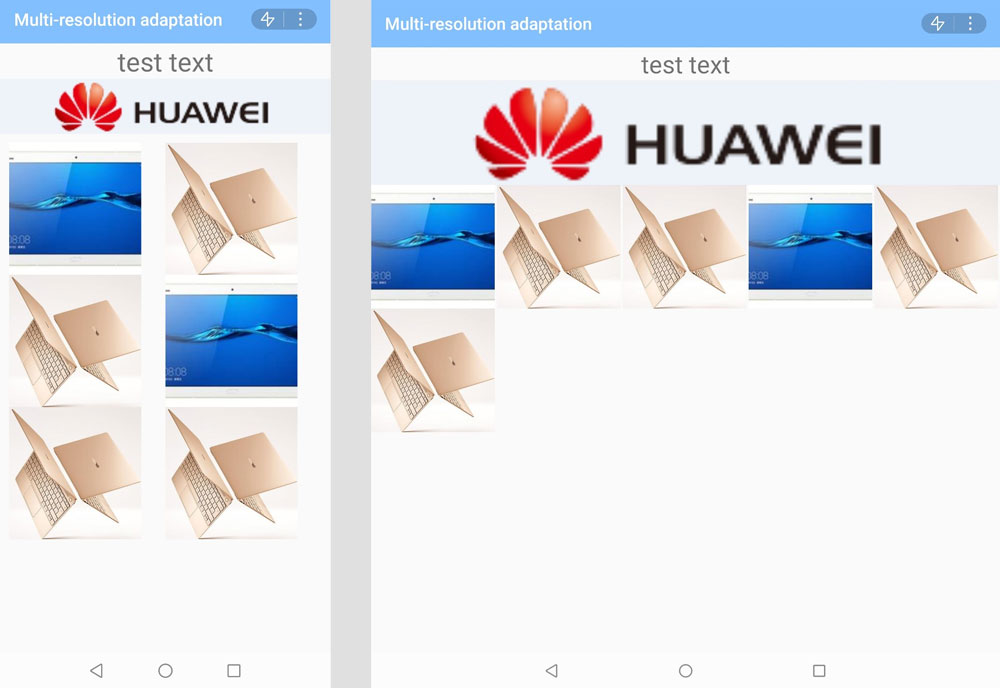
In current practice, you set designWidth to the screen width for your quick app. In this case, if the same content is displayed on a wider device, the content is enlarged. As a result, your quick app cannot be displayed properly on a large screen, a phone in landscape orientation, or an unfolded foldable screen.
This topic provides guidance for you to develop or reconstruct a quick app using responsive layout. Responsive layout enables your quick app to be displayed properly on devices with various sizes, such as large screens, mobile phones in landscape orientation, and unfolded foldable screens.
1. Set minPlatformVersion to 1066 or a later version.
- "minPlatformVersion": 1066,
2. Change the value of designWidth in the config section in the manifest.json file to device-width.
- "config": {
- "designWidth": "device-width"
- },
Plan the sizes and layout of UI elements based on common screen widths. Common screen widths are as follows:
Width of a regular phone in portrait orientation: 360 px
Width of a regular phone in landscape orientation: 640 px, 720 px, etc.
Width of a foldable phone after being unfolded: 733 px
Width of a foldable phone after being folded: 383 px
To adapt your app to various screens, you are advised to pay attention to the following:
In portrait orientation, content should support scrolling. Do not fix the height. Otherwise, the content will be compressed when the height of the screen is insufficient for displaying the content, which will result in content disorder.
Dynamic layout is recommended for landscape orientation. For example, in the flex layout, if the width is large, a line displays more elements, and if the width is small, a line displays fewer elements.
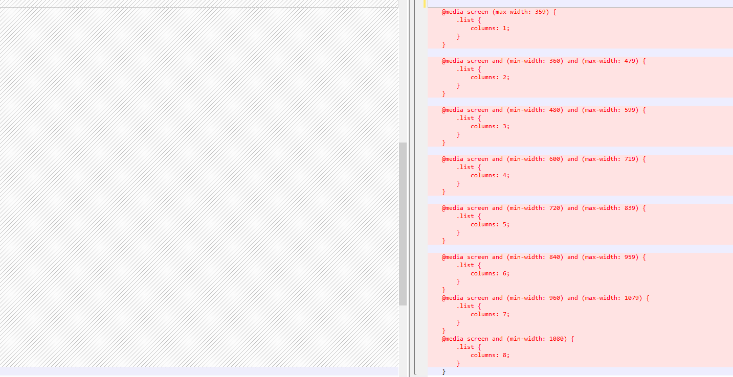
If the simple dynamic layout cannot achieve the expected effect, you can use Media Query. For example, the following code can be used to control the number of columns to display in a list based on the screen width:
- /**
- * For a regular phone in portrait orientation (360 px wide), display three images in a line, with each image occupying 120 px.
- */
- @media screen and (min-width: 0) and (max-width: 239) {
- .list {
- columns: 1;
- }
- }
- @media screen and (min-width: 240) and (max-width: 359) {
- .list {
- columns: 2;
- }
- }
- @media screen and (min-width: 360) and (max-width: 479) {
- .list {
- columns: 3;
- }
- }
- @media screen and (min-width: 480) and (max-width: 599) {
- .list {
- columns: 4;
- }
- }
- @media screen and (min-width: 600) and (max-width: 719) {
- .list {
- columns: 5;
- }
- }
- @media screen and (min-width: 720) and (max-width: 839) {
- .list {
- columns: 6;
- }
- }
- @media screen and (min-width: 840) and (max-width: 959) {
- .list {
- columns: 7;
- }
- }
- @media screen and (min-width: 960) and (max-width: 1079) {
- .list {
- columns: 8;
- }
- }
- @media screen and (min-width: 1080) {
- .list {
- columns: 9;
- }
- }
After the settings, the display effect varies depending on the screen width, as shown in the following figures.
Change the value of designWidth in the config section in the manifest.json file to device-width.
- "config": {
- "designWidth": "device-width"
- },
Plan the sizes and layout of UI elements based on common screen widths. Common screen widths are as follows:
Width of a regular phone in portrait orientation: 360 px
Width of a regular phone in landscape orientation: 640 px, 720 px, etc.
Width of a foldable phone after being unfolded: 733 px
Width of a foldable phone after being folded: 383 px
After setting designWidth to device-width, adapt the sizes in the ux and css files of your project. The size conversion formula is as follows: New size = Old size x 36/75. The following figures show the mapping between the new and old sizes.
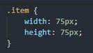
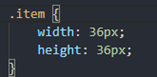
You can download the convert tool, and run the following command to convert the sizes:
- java -jar convert.jar -root D:\workspace\quickapp\project -formats "ux;css"
This tool is compiled in Java. You can also develop a tool based on the conversion formula.
This tool only converts a value with the unit px. A value without the unit is not processed. You need to process values according to the actual situation.
Adaptation for a card is the same as that for a quick app except the change of designWidth. Change the value of designWidth as follows:
Open the ux file corresponding to the card and add designWidth="device-width" to the level-1 node in the template.
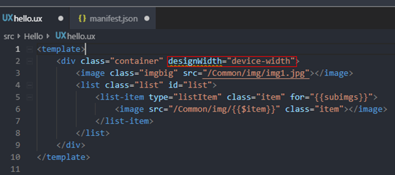
designWidth: 750 is used as an example. Before the adaptation, the display effects on a foldable screen after being folded and unfolded are shown in the following figures. It is obvious that the size of each element is enlarged when the screen is unfolded.
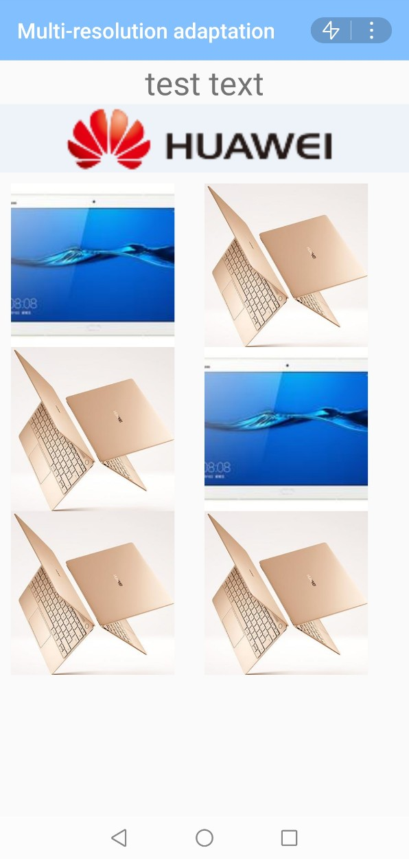
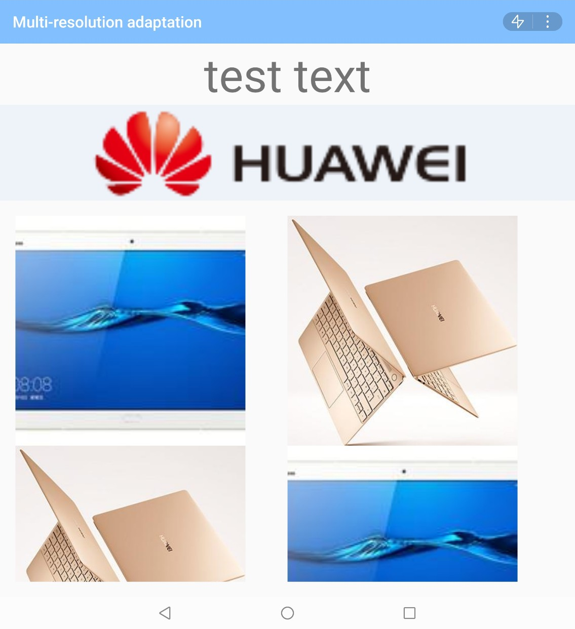
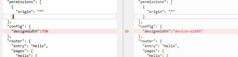
Change "designWidth" in the manifest file to "designWidth":"device-width".
- d:\>java -jar convert.jar -root D:\workspace\fastapp\MultiLayout -formats "ux;css"

The following figure shows the files before and after the conversion.
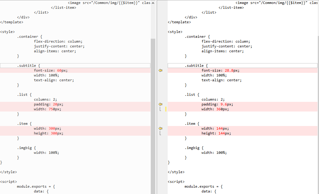
After the conversion, only two images are displayed in one line on the wide screen, leaving much empty space.
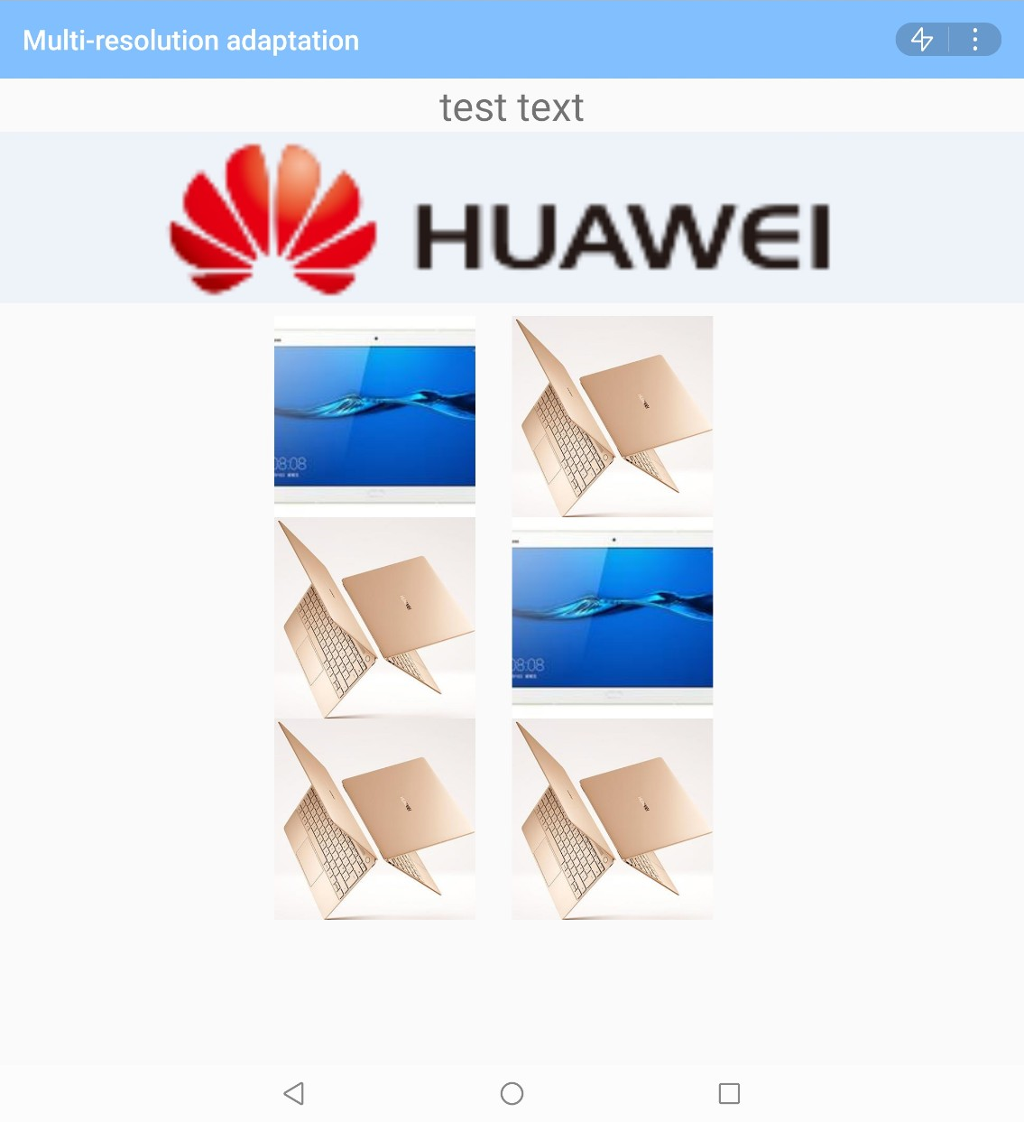
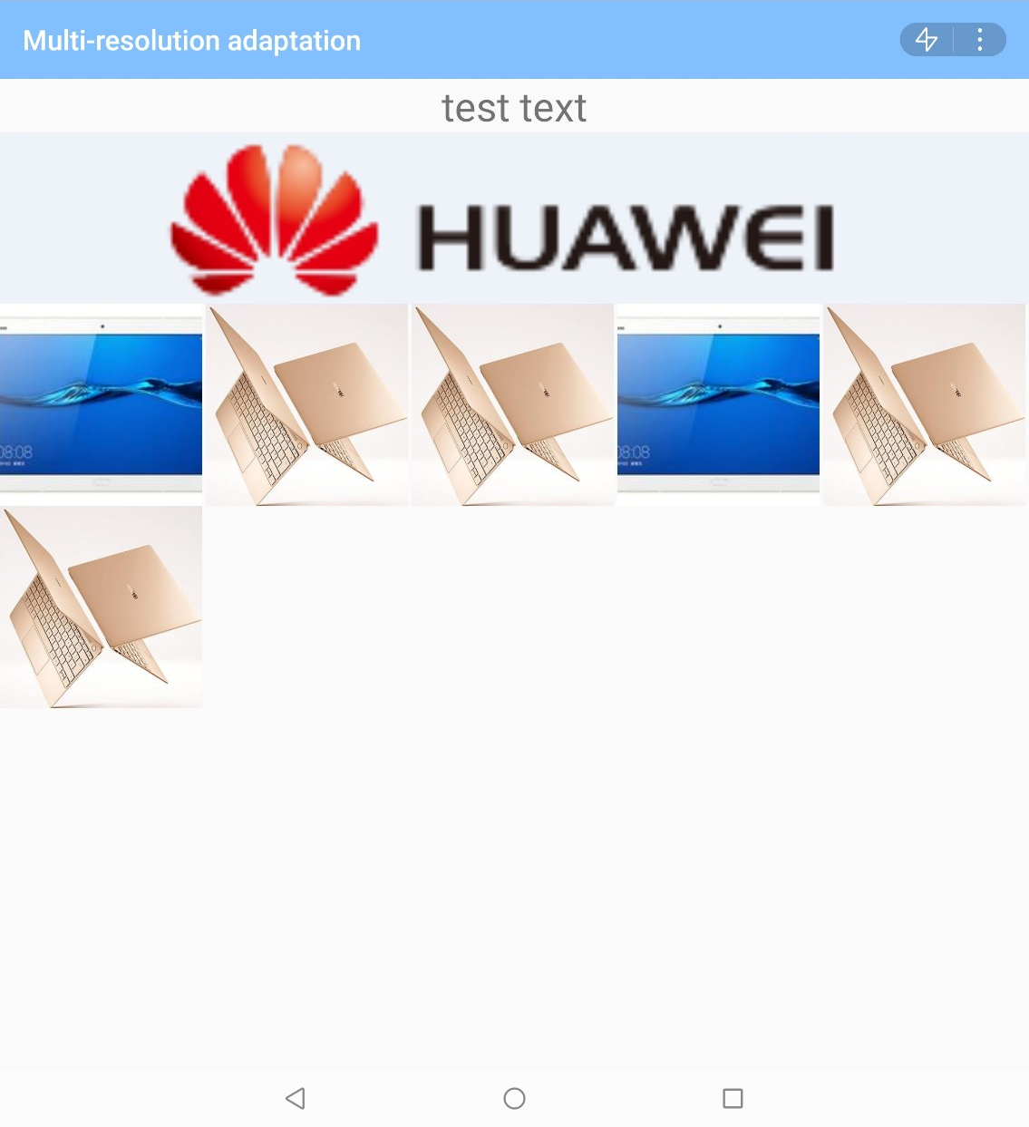
To resolve this issue, use Media Query to dynamically adjust the number of columns to display.
The following figure shows the display effect after the adjustment.
Download sample code: Before Adaptation After Adaptation