

ListItemGroup是鸿蒙系统中用于实现列表分组展示的核心组件,它必须作为List组件的子组件使用,List、ListItem、ListItemGroup构成了三层架构,其层级关系如下:
List
├── ListItemGroup(分组容器)
│   ├── ListItem(列表项1)
│   ├── ListItem(列表项2)
├── ListItem(独立列表项)
我们通过实际代码来看一下用法:
// 定义数据项接口
interface DataGroup {
  title: string;
  items: string[];
}

@Entry
@Component
struct TestListItemGroupPage {
  private dataGroups: DataGroup[] = [
    { title: '2026年', items: ['事件1', '事件2', '事件3', '事件2', '事件3', '事件2', '事件3'] },
    { title: '2025年', items: ['事件1', '事件5', '事件5', '事件5', '事件5', '事件5', '事件5'] },
  ]

  // 分组头部——即年份分隔条
  @Builder
  groupHeader(title: string) {
    Column() {
      Divider()
        .color('#ffff8400')
        .strokeWidth(5)
      Text(title)
        .fontSize(18)
        .fontWeight(FontWeight.Bold)
        .backgroundColor('#fff1f3f5')
        .width('100%')
        .padding({ left: 16, top: 10, bottom: 10 })
    }
  }

  // 分组底部
  @Builder
  groupFooter() {
    Divider()
      .color('#ff003aff')
      .strokeWidth(5)
  }

  build() {
    List({ space: 0 }) {
      ForEach(this.dataGroups, (group: DataGroup) => {
        ListItemGroup({ header: this.groupHeader(group.title), footer: this.groupFooter() }) {
          ForEach(group.items, (item: string) => {
            ListItem() {
              Text(item)
                .width('100%')
                .height(60)
                .fontSize(16)
                .padding({ left: 16 })
            }
          }, (item: string, index) => item + '_' + index)
        }
        // 设置分组内 item 之间的分割线
        .divider({
          strokeWidth: 1,
          //color: '#e5e5e5',
          color: '#ffff0000',
          startMargin: 16,
          endMargin: 0
        })
      })
    }
    .sticky(StickyStyle.Header) // 吸顶效果,需要配合ListItemGroup使用
    //.sticky(StickyStyle.Footer)  // 吸底效果,需要配合ListItemGroup使用
    //.sticky(StickyStyle.Header | StickyStyle.Footer) // 吸顶+吸底效果,需要配合ListItemGroup使用
    //.sticky(StickyStyle.BOTH) // API20开始支持,吸顶+吸底效果,需要配合ListItemGroup使用
    .width('100%')
    .height('100%')
  }
}
每个分组可以通过header参数定制头部内容(如分组标题),通过footer参数定制尾部内容(如分组总结或分隔区域)。配合List组件的sticky属性,可以实现分组头部吸顶或尾部吸底的效果,在长列表滚动时保持分组标题始终可见。
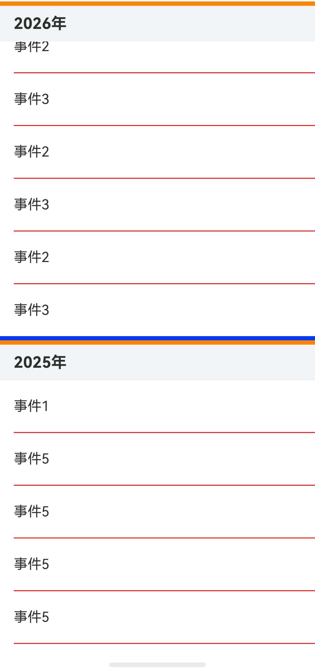
实际运行效果如下:


 上一篇
上一篇 

 1
1





 苏公安网备 32011402010933号