















前言
做个人资料页时,「更换头像」看起来是个小功能,但真落到代码里,往往不止拉起相册这么简单。
如果自己用 picker.PhotoSelectPicker 实现,除了拿到图片 URI,还要考虑权限、用户取消、异常回调、不同设备上的拉起表现,以及头像裁剪后的显示效果。功能能做出来,但每个页面都重复写一遍,时间久了就很烦。
HarmonyOS 的 Scenario Fusion Kit 提供了 FunctionalButton,它把这类高频场景封装成了按钮能力。头像选择对应的是 functionalButtonComponentManager.OpenType.CHOOSE_AVATAR。页面里放一个按钮,绑定 onChooseAvatar 回调,选完后直接拿 data.avatarUri 更新 UI。
这篇文章不讲太泛的概念,只围绕一个完整例子:实现一个个人资料页,包含圆形头像展示、默认头像兜底、点击按钮选择头像、选择成功后即时刷新。
先看最终效果
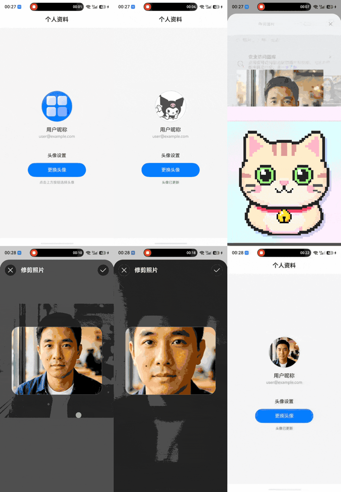
这套流程里有三个关键点:
| 关键点 | 作用 |
|---|---|
openType: CHOOSE_AVATAR |
告诉 FunctionalButton 当前按钮用于选择头像 |
onChooseAvatar |
接收头像选择结果,拿到 avatarUri |
@State |
保存头像 URI,并驱动 ArkUI 自动刷新页面 |
只要这三处配对正确,头像选择功能基本就能跑通。
为什么不直接用 picker 拉相册
手写相册选择并不难,常见写法类似这样:
import { picker } from '@kit.CoreFileKit';

async selectAvatar() {
const photoSelectOptions = new picker.PhotoSelectOptions();
photoSelectOptions.MIMEType = picker.PhotoViewMIMETypes.IMAGE_TYPE;
photoSelectOptions.maxSelectNumber = 1;

const photoViewPicker = new picker.PhotoViewPicker();
try {
  const result = await photoViewPicker.select(photoSelectOptions);
  if (result.photoUris.length > 0) {
    this.avatarUri = result.photoUris[0];
  }
} catch (err) {
  // 这里还要继续补取消、异常、日志等逻辑
}
}
这段代码的问题不在于复杂,而在于它只是「选择图片」这一层。真正做头像功能时,还会遇到这些细节:
- 用户拒绝权限或取消选择时,页面状态要不要恢复?
- 拿到的 URI 为空时,
Image组件怎么兜底? - 按钮点击后是否需要 loading 或禁用态?
- 不同设备上系统选择页的表现是否一致?
- 后续如果换成手机号、地址、发票抬头等场景,是不是又要写一套?
如果只是普通图片选择,picker 当然没问题;但如果需求明确是「头像选择」,FunctionalButton + CHOOSE_AVATAR 更贴近场景。它把按钮触发、系统面板、结果回调这条链路封装好了,页面只需要处理拿到头像 URI 之后的 UI 状态。
FunctionalButton 适合解决什么问题
FunctionalButton 可以理解为一个带系统能力的按钮。它不像普通 Button 那样只负责点击事件,而是通过 openType 指定要拉起的系统场景。
在头像选择场景里,它做了几件事:
- 根据
CHOOSE_AVATAR拉起系统头像选择能力; - 通过
onChooseAvatar返回选择结果; - 允许通过
ButtonConfig自定义按钮样式; - 把场景能力和回调方法绑定起来,减少手写流程代码。
所以它解决的不是「能不能实现头像选择」,而是让这个功能少写样板代码、少踩适配坑。
导入模块
页面里需要用到两个 Kit:
import { FunctionalButton, functionalButtonComponentManager } from '@kit.ScenarioFusionKit'
import { hilog } from '@kit.PerformanceAnalysisKit'
这里分别对应:
FunctionalButton:场景化按钮组件本体,用在 ArkUI 页面中;functionalButtonComponentManager:提供OpenType、ButtonConfig、FunctionalButtonController等配置能力;hilog:用于记录选择失败或成功的日志,方便调试。
如果项目里只是快速验证功能,hilog 可以先少写;但实际项目建议保留错误日志,不然后面遇到「按钮点了没反应」时很难定位。
定义页面状态
头像选择功能至少需要一个状态:头像 URI。为了让 UI 表达更清楚,这里再加一个布尔值记录用户是否已经选择过头像。
const DOMAIN = 0x0000

@Entry
@Component
struct Index {
@State avatarUri: string = ''
@State nickname: string = '用户昵称'
@State account: string = 'user@example.com'
@State hasSelectedAvatar: boolean = false
几个状态的作用如下:
| 状态 | 作用 |
|---|---|
avatarUri |
保存选择完成后返回的头像地址 |
nickname |
页面展示用昵称,真实项目里通常来自账号系统 |
account |
页面展示用账号信息 |
hasSelectedAvatar |
控制默认头像和用户头像的切换,也控制底部提示文案 |
有人可能会问:既然有 avatarUri,为什么还要 hasSelectedAvatar?
只用 avatarUri !== '' 也能实现,但语义没那么直观。hasSelectedAvatar 表达的是「用户是否完成过选择」这个业务状态,而 avatarUri 表达的是「当前头像资源地址」。两个状态分开后,后面扩展上传中、上传失败、审核中等状态会更容易。
搭页面骨架
页面结构很简单:外层 Column,顶部标题栏固定高度,下面用 Scroll 承载个人资料内容。
build() {
Column() {
  Row() {
    Text('个人资料')
      .fontSize(20)
      .fontWeight(FontWeight.Bold)
      .fontColor('#333333')
  }
  .width('100%')
  .height(56)
  .padding({ left: 16, right: 16 })
  .justifyContent(FlexAlign.Center)
  .backgroundColor('#FFFFFF')

  Scroll() {
    Column() {
      // 头像展示区域
      // 头像设置区域
    }
    .width('100%')
  }
  .width('100%')
  .layoutWeight(1)
  .scrollBar(BarState.Off)
}
.width('100%')
.height('100%')
.backgroundColor('#F5F5F5')
}
这里有两个小细节:
- 标题栏固定
56vp,内容区用layoutWeight(1)撑满剩余空间; - 内容区使用
Scroll,即使后面继续加昵称、签名、手机号等设置项,也不会挤出屏幕。
展示圆形头像
头像区域的代码如下:
Column() {
Stack() {
  if (this.hasSelectedAvatar && this.avatarUri !== '') {
    Image(this.avatarUri)
      .width(108)
      .height(108)
      .borderRadius(54)
      .objectFit(ImageFit.Cover)
      .border({ width: 2, color: '#E0E0E0' })
  } else {
    Image($r('app.media.startIcon'))
      .width(108)
      .height(108)
      .borderRadius(54)
      .objectFit(ImageFit.Cover)
      .border({ width: 2, color: '#E0E0E0' })
  }
}
.width(108)
.height(108)
.margin({ top: 32 })

Text(this.nickname)
  .fontSize(18)
  .fontWeight(FontWeight.Medium)
  .fontColor('#333333')
  .margin({ top: 16 })

Text(this.account)
  .fontSize(14)
  .fontColor('#999999')
  .margin({ top: 4 })
}
.width('100%')
.justifyContent(FlexAlign.Center)
.alignItems(HorizontalAlign.Center)
这里最容易被忽略的是头像裁剪。
width(108)、height(108)、borderRadius(54) 三个值要配套使用。宽高相等,圆角半径取宽高的一半,图片才会是标准圆形。如果圆角半径偏小,看起来就像圆角矩形;如果图片不是正方形,还要配合 objectFit(ImageFit.Cover),否则头像区域可能会留白。
条件渲染也建议写得保守一点:
if (this.hasSelectedAvatar && this.avatarUri !== '') {
Image(this.avatarUri)
} else {
Image($r('app.media.startIcon'))
}
这样即使回调里没有拿到有效 URI,页面也会继续显示默认头像,不会让 Image 组件去加载空字符串。
Stack 的作用是固定头像区域尺寸。头像在默认图和用户选择图之间切换时,外层布局不需要重新计算尺寸,视觉上会更稳。
接入 CHOOSE_AVATAR
核心代码在这里:
Column() {
Text('头像设置')
  .fontSize(16)
  .fontWeight(FontWeight.Medium)
  .fontColor('#333333')
  .margin({ bottom: 16 })

FunctionalButton({
  params: {
    openType: functionalButtonComponentManager.OpenType.CHOOSE_AVATAR,
    label: '更换头像',
    styleOption: {
      styleConfig: new functionalButtonComponentManager.ButtonConfig()
        .type(ButtonType.Normal)
        .fontSize(16)
        .fontColor('#FFFFFF')
        .backgroundColor('#007DFF')
        .borderRadius(24)
        .width(200)
        .height(48)
    }
  },
  controller: new functionalButtonComponentManager.FunctionalButtonController()
    .onChooseAvatar((err, data) => {
      if (err) {
        hilog.error(DOMAIN, 'AvatarTag',
          'Failed to choose avatar, error: %{public}d %{public}s', err.code, err.message)
        return
      }

      hilog.info(DOMAIN, 'AvatarTag', 'Succeeded in choosing avatar')
      if (data && data.avatarUri) {
        this.avatarUri = data.avatarUri!
        this.hasSelectedAvatar = true
      }
    })
})

if (this.hasSelectedAvatar) {
  Text('头像已更新')
    .fontSize(12)
    .fontColor('#4CAF50')
    .margin({ top: 12 })
} else {
  Text('点击上方按钮选择头像')
    .fontSize(12)
    .fontColor('#999999')
    .margin({ top: 12 })
}
}
.width('100%')
.justifyContent(FlexAlign.Center)
.alignItems(HorizontalAlign.Center)
.padding({ left: 24, right: 24 })
这段代码主要看三处。
openType 指定系统能力
openType: functionalButtonComponentManager.OpenType.CHOOSE_AVATAR
openType 决定这个 FunctionalButton 要做什么。这里使用 CHOOSE_AVATAR,按钮点击后就会进入头像选择场景。
这一步不要写错。如果 openType 不是 CHOOSE_AVATAR,后面的 onChooseAvatar 就算写了,也不一定会按预期触发。
ButtonConfig 控制按钮样式
styleConfig: new functionalButtonComponentManager.ButtonConfig()
.type(ButtonType.Normal)
.fontSize(16)
.fontColor('#FFFFFF')
.backgroundColor('#007DFF')
.borderRadius(24)
.width(200)
.height(48)
FunctionalButton 不是只能用系统默认样式。通过 ButtonConfig,可以像配置普通按钮一样调整字体、背景色、圆角和尺寸。
这里按钮高度是 48vp,圆角设为 24vp,得到一个胶囊按钮。宽度固定为 200vp,是为了避免在不同父容器宽度下被拉伸得过宽。
onChooseAvatar 处理结果
.onChooseAvatar((err, data) => {
if (err) {
  hilog.error(DOMAIN, 'AvatarTag',
    'Failed to choose avatar, error: %{public}d %{public}s', err.code, err.message)
  return
}

if (data && data.avatarUri) {
  this.avatarUri = data.avatarUri!
  this.hasSelectedAvatar = true
}
})
err 分支一定要先处理。用户取消选择、系统能力异常、其他失败情况,都可能进入这里。这里直接 return,避免后面继续读 data。
成功分支里,也不要默认 data.avatarUri 一定有值。更稳妥的写法是先判断:
if (data && data.avatarUri) {
this.avatarUri = data.avatarUri!
this.hasSelectedAvatar = true
}
avatarUri 更新后,ArkUI 会根据 @State 自动刷新使用它的 UI。hasSelectedAvatar 变成 true 后,头像展示区从默认图切到用户选择的头像,底部提示也从「点击上方按钮选择头像」变成「头像已更新」。
完整源码
下面这段代码可以直接放到 entry/src/main/ets/pages/Index.ets 里验证:
import { FunctionalButton, functionalButtonComponentManager } from '@kit.ScenarioFusionKit'
import { hilog } from '@kit.PerformanceAnalysisKit'

const DOMAIN = 0x0000

@Entry
@Component
struct Index {
@State avatarUri: string = ''
@State nickname: string = '用户昵称'
@State account: string = 'user@example.com'
@State hasSelectedAvatar: boolean = false

build() {
  Column() {
    Row() {
      Text('个人资料')
        .fontSize(20)
        .fontWeight(FontWeight.Bold)
        .fontColor('#333333')
    }
    .width('100%')
    .height(56)
    .padding({ left: 16, right: 16 })
    .justifyContent(FlexAlign.Center)
    .backgroundColor('#FFFFFF')

    Scroll() {
      Column() {
        Column() {
          Stack() {
            if (this.hasSelectedAvatar && this.avatarUri !== '') {
              Image(this.avatarUri)
                .width(108)
                .height(108)
                .borderRadius(54)
                .objectFit(ImageFit.Cover)
                .border({ width: 2, color: '#E0E0E0' })
            } else {
              Image($r('app.media.startIcon'))
                .width(108)
                .height(108)
                .borderRadius(54)
                .objectFit(ImageFit.Cover)
                .border({ width: 2, color: '#E0E0E0' })
            }
          }
          .width(108)
          .height(108)
          .margin({ top: 32 })

          Text(this.nickname)
            .fontSize(18)
            .fontWeight(FontWeight.Medium)
            .fontColor('#333333')
            .margin({ top: 16 })

          Text(this.account)
            .fontSize(14)
            .fontColor('#999999')
            .margin({ top: 4 })
        }
        .width('100%')
        .justifyContent(FlexAlign.Center)
        .alignItems(HorizontalAlign.Center)

        Divider()
          .width('90%')
          .color('#F0F0F0')
          .margin({ top: 24, bottom: 24 })

        Column() {
          Text('头像设置')
            .fontSize(16)
            .fontWeight(FontWeight.Medium)
            .fontColor('#333333')
            .margin({ bottom: 16 })

          FunctionalButton({
            params: {
              openType: functionalButtonComponentManager.OpenType.CHOOSE_AVATAR,
              label: '更换头像',
              styleOption: {
                styleConfig: new functionalButtonComponentManager.ButtonConfig()
                  .type(ButtonType.Normal)
                  .fontSize(16)
                  .fontColor('#FFFFFF')
                  .backgroundColor('#007DFF')
                  .borderRadius(24)
                  .width(200)
                  .height(48)
              }
            },
            controller: new functionalButtonComponentManager.FunctionalButtonController()
              .onChooseAvatar((err, data) => {
                if (err) {
                  hilog.error(DOMAIN, 'AvatarTag',
                    'Failed to choose avatar, error: %{public}d %{public}s', err.code, err.message)
                  return
                }

                hilog.info(DOMAIN, 'AvatarTag', 'Succeeded in choosing avatar')
                if (data && data.avatarUri) {
                  this.avatarUri = data.avatarUri!
                  this.hasSelectedAvatar = true
                }
              })
          })

          if (this.hasSelectedAvatar) {
            Text('头像已更新')
              .fontSize(12)
              .fontColor('#4CAF50')
              .margin({ top: 12 })
          } else {
            Text('点击上方按钮选择头像')
              .fontSize(12)
              .fontColor('#999999')
              .margin({ top: 12 })
          }
        }
        .width('100%')
        .justifyContent(FlexAlign.Center)
        .alignItems(HorizontalAlign.Center)
        .padding({ left: 24, right: 24 })
      }
      .width('100%')
    }
    .width('100%')
    .layoutWeight(1)
    .scrollBar(BarState.Off)
  }
  .width('100%')
  .height('100%')
  .backgroundColor('#F5F5F5')
}
}
容易踩的坑
openType 和回调必须配套
FunctionalButton 的 openType 和 controller 回调是对应关系。头像选择必须使用:
openType: functionalButtonComponentManager.OpenType.CHOOSE_AVATAR
并配套:
.onChooseAvatar((err, data) => {
// 处理头像选择结果
})
如果把 openType 写成其他场景,或者把回调写成 onGetPhoneNumber、onChooseAddress,按钮可能能显示出来,但点击后拿不到头像结果。
常见对应关系可以参考这个表:
| openType | 对应回调 |
|---|---|
CHOOSE_AVATAR |
onChooseAvatar |
GET_PHONE_NUMBER |
onGetPhoneNumber |
CHOOSE_ADDRESS |
onChooseAddress |
CHOOSE_INVOICE_TITLE |
onChooseInvoiceTitle |
LAUNCH_APP |
onLaunchApp |
写这类代码时,我建议先写 openType,再立刻写对应回调,别隔很远补,否则很容易改着改着就不匹配。
avatarUri 为空时别直接渲染
不要只判断 data:
// 不建议
if (data) {
this.avatarUri = data.avatarUri!
this.hasSelectedAvatar = true
}
更稳的写法是判断到 avatarUri:
// 推荐
if (data && data.avatarUri) {
this.avatarUri = data.avatarUri!
this.hasSelectedAvatar = true
}
原因很简单:Image('') 没有业务意义,还可能导致头像区域空白。头像这种用户强感知区域,宁可继续显示默认图,也不要渲染一个无效资源。
默认头像资源要提前准备
示例里用了:
Image($r('app.media.startIcon'))
这要求项目资源里存在 startIcon。如果你的项目没有这个资源,要么替换成自己的默认头像资源,要么新增一张默认头像图。否则代码逻辑没问题,但页面会因为资源不存在而报错。
还能扩展到哪些场景
CHOOSE_AVATAR 只是 FunctionalButton 的一个场景。类似的系统能力还有:
GET_PHONE_NUMBER:获取或验证手机号;CHOOSE_ADDRESS:选择收货地址;CHOOSE_INVOICE_TITLE:选择发票抬头;LAUNCH_APP:拉起指定应用;OPEN_SETTING:打开授权设置页;CHOOSE_LOCATION:选择位置。
这些场景的接入方式很像:换一个 openType,再换对应的回调方法。真正需要注意的是业务状态怎么设计,而不是按钮本身怎么写。
比如地址选择场景,拿到结果后通常要更新收货人、手机号、详细地址;手机号场景则要考虑登录态、绑定态和服务端校验。FunctionalButton 只负责把系统能力拉起来,业务闭环还是要自己处理。
小结
用 FunctionalButton 实现头像选择,核心代码其实就几行:
FunctionalButton({
params: {
  openType: functionalButtonComponentManager.OpenType.CHOOSE_AVATAR,
  label: '更换头像'
},
controller: new functionalButtonComponentManager.FunctionalButtonController()
  .onChooseAvatar((err, data) => {
    if (data && data.avatarUri) {
      this.avatarUri = data.avatarUri!
      this.hasSelectedAvatar = true
    }
  })
})
我的建议是:如果只是普通图片选择,继续用 picker;如果业务语义就是「选择头像」,优先考虑 FunctionalButton + CHOOSE_AVATAR。它能少写一批重复逻辑,也能让页面代码更聚焦在状态和展示上。
最后再记两点:openType 和回调方法必须匹配;avatarUri 一定要判空后再交给 Image。这两个细节处理好,头像选择这块基本就稳了。


 上一篇


 苏公安网备 32011402010933号