智能客服
你问我答,随时在线为你解决问题















您当前浏览的3.1/4.0版本文档归档不再维护,推荐您使用最新的HarmonyOS NEXT版本文档。详细请参考文档维护策略变更。
进度条,用于显示内容加载或操作的处理进度。
从API Version 8 开始支持。后续版本如有新增内容,则采用上角标单独标记该内容的起始版本。
不支持。
除支持通用属性外,还支持如下属性:
| 名称 | 类型 | 默认值 | 必填 | 描述 |
|---|---|---|---|---|
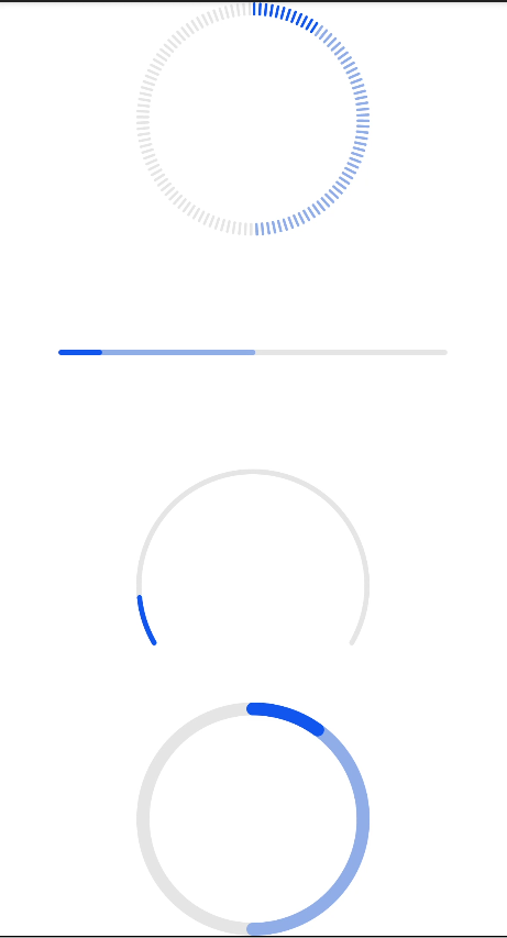
| type | string | horizontal | 否 | 设置进度条的类型,该属性不支持动态修改,可选值为: - horizontal:线性进度条。 - circular:loading样式进度条。 - ring:圆环形进度条。 - scale-ring:带刻度圆环形进度条。 - arc:弧形进度条。 - eclipse:圆形进度条,展现类似月圆月缺的进度展示效果。 |
不同类型的进度条还支持不同的属性:
类型为horizontal、ring、scale-ring时,支持如下属性:
| 名称 | 类型 | 默认值 | 必填 | 描述 |
|---|---|---|---|---|
| percent | number | 0 | 否 | 当前进度。取值范围为0-100。 |
| secondarypercent(Rich) | number | 0 | 否 | 次级进度。取值范围为0-100。 |
类型为ring、scale-ring时,支持如下属性:
| 名称 | 类型 | 默认值 | 必填 | 描述 |
|---|---|---|---|---|
| clockwise | boolean | true | 否 | 圆环形进度条是否采用顺时针。 |
类型为arc、eclipse时,支持如下属性:
| 名称 | 类型 | 默认值 | 必填 | 描述 |
|---|---|---|---|---|
| percent | number | 0 | 否 | 当前进度。取值范围为0-100。 |
除支持通用样式外,还支持如下样式:
type=horizontal
| 名称 | 类型 | 默认值 | 必填 | 描述 |
|---|---|---|---|---|
| color | <color> | #ff007dff | 否 | 设置进度条的颜色。 |
| stroke-width | <length> | 4px | 否 | 设置进度条的宽度。 |
| background-color | <color> | - | 否 | 设置进度条的背景色。 |
| secondary-color | <color> | - | 否 | 设置次级进度条的颜色。 |
type=circular
| 名称 | 类型 | 默认值 | 必填 | 描述 |
|---|---|---|---|---|
| color | <color> | - | 否 | loading进度条上的圆点颜色。 |
type=ring, scale-ring
| 名称 | 类型 | 默认值 | 必填 | 描述 |
|---|---|---|---|---|
| color | <color> | <linear-gradient> | - | 否 | 环形进度条的颜色,ring类型支持线性渐变色设置。 线性渐变色仅支持两个颜色参数设置格式,如color = linear-gradient(#ff0000, #00ff00)。 |
| background-color | <color> | - | 否 | 环形进度条的背景色。 |
| secondary-color | <color> | - | 否 | 环形次级进度条的颜色。 |
| stroke-width | <length> | 10px | 否 | 环形进度条的宽度。 |
| scale-width | <length> | - | 否 | 带刻度的环形进度条的刻度粗细,类型为scale-ring生效。 |
| scale-number | number | 120 | 否 | 带刻度的环形进度条的刻度数量,类型为scale-ring生效。 |
type=arc
| 名称 | 类型 | 默认值 | 必填 | 描述 |
|---|---|---|---|---|
| color | <color> | - | 否 | 弧形进度条的颜色。 |
| background-color | <color> | - | 否 | 弧形进度条的背景色。 |
| stroke-width | <length> | - | 否 | 弧形进度条的宽度。 进度条宽度越大,进度条越靠近圆心。即进度条始终在半径区域内。 |
| start-angle | <deg> | 240 | 否 | 弧形进度条起始角度,以时钟0点为基线。范围为0到360(顺时针)。 |
| total-angle | <deg> | 240 | 否 | 弧形进度条总长度,范围为-360到360,负数标识起点到终点为逆时针。 |
| center-x | <length> | - | 否 | 弧形进度条中心位置,(坐标原点为组件左上角顶点)。该样式需要和center-y和radius一起。 |
| center-y | <length> | - | 否 | 弧形进度条中心位置,(坐标原点为组件左上角顶点)。该样式需要和center-x和radius一起。 |
| radius | <length> | - | 否 | 弧形进度条半径,该样式需要和center-x和center-y一起。 |
支持通用事件。
- <!--xxx.hml -->
- <div class="container">
- <progress class="min-progress" type="scale-ring" percent= "10" secondarypercent="50"></progress>
- <progress class="min-progress" type="horizontal" percent= "10" secondarypercent="50"></progress>
- <progress class="min-progress" type="arc" percent= "10"></progress>
- <progress class="min-progress" type="ring" percent= "10" secondarypercent="50"></progress>
- </div>
- /* xxx.css */
- .container {
- flex-direction: column;
- height: 100%;
- width: 100%;
- align-items: center;
- }
- .min-progress {
- width: 300px;
- height: 300px;
- }
4*4卡片