


智能客服
你问我答,随时在线为你解决问题















您当前正在浏览HarmonyOS开发者3.0版本配套的开发者文档,对应API能力级别为API 8 Release。此版本文档已归档不再维护,推荐您使用HarmonyOS NEXT版本。
按钮组件,可快速创建不同样式的按钮。
该组件从API Version 7开始支持。后续版本如有新增内容,则采用上角标单独标记该内容的起始版本。
可以包含单个子组件。
方法1: Button(options?: {type?: ButtonType, stateEffect?: boolean})
参数:
参数名 | 参数类型 | 必填 | 参数描述 |
|---|---|---|---|
type | ButtonType | 否 | 描述按钮显示样式。 默认值:ButtonType.Capsule |
stateEffect | boolean | 否 | 按钮按下时是否开启按压态显示效果,当设置为false时,按压效果关闭。。 默认值:true |
方法2: Button(label?: ResourceStr, options?: { type?: ButtonType, stateEffect?: boolean })
使用文本内容创建相应的按钮组件,此时Button无法包含子组件。
参数:
参数名 | 参数类型 | 必填 | 参数描述 |
|---|---|---|---|
label | 否 | 按钮文本内容。 | |
options | { type?: ButtonType, stateEffect?: boolean } | 否 | 见方法1参数说明。 |
名称 | 参数类型 | 描述 |
|---|---|---|
type | ButtonType | 设置Button样式。 默认值:ButtonType.Capsule |
stateEffect | boolean | 按钮按下时是否开启按压态显示效果,当设置为false时,按压效果关闭。 默认值:true |
名称 | 描述 |
|---|---|
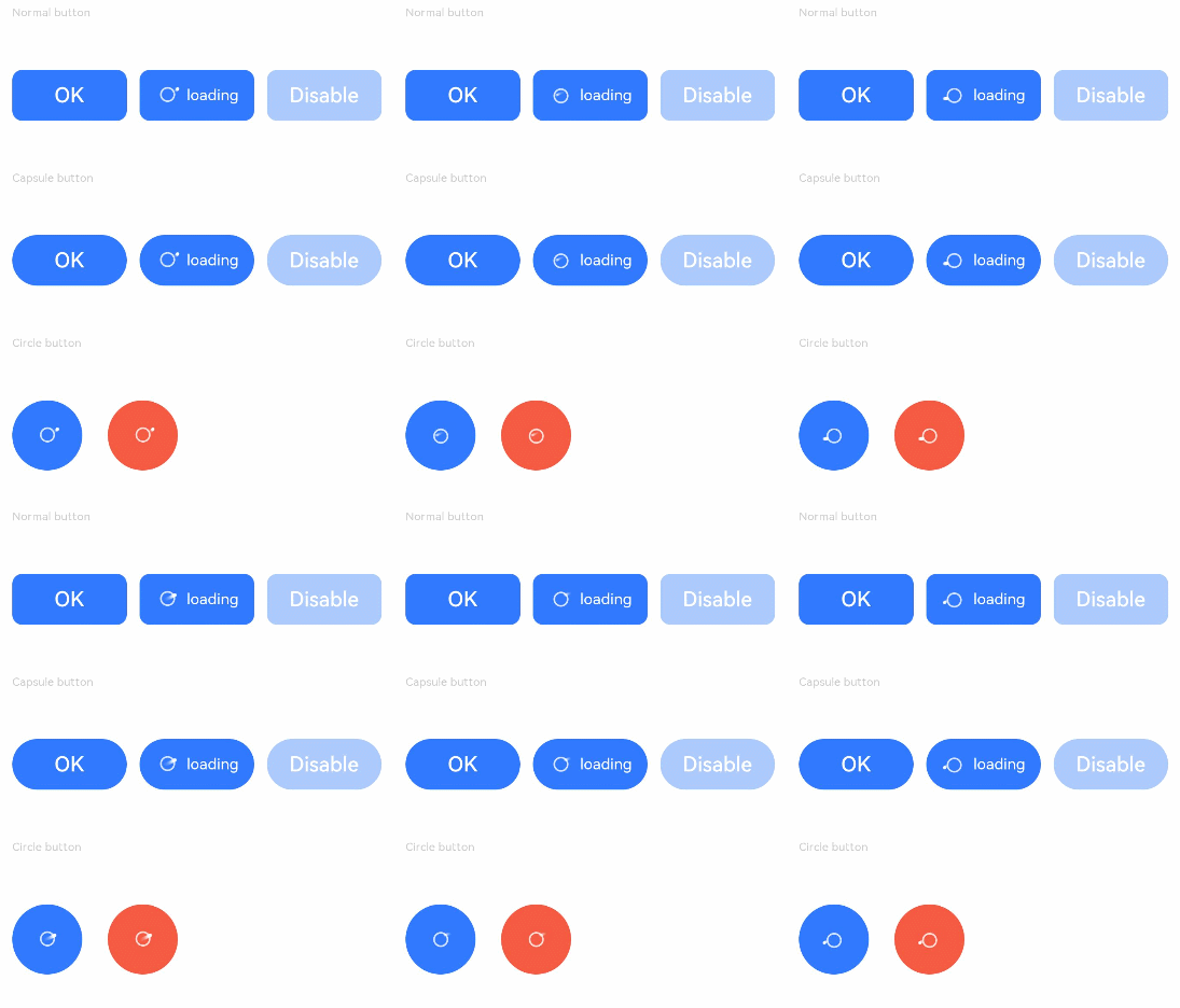
Capsule | 胶囊型按钮(圆角默认为高度的一半)。 |
Circle | 圆形按钮。 |
Normal | 普通按钮(默认不带圆角)。 |
- // xxx.ets
- @Entry
- @Component
- struct ButtonExample {
- build() {
- Flex({ direction: FlexDirection.Column, alignItems: ItemAlign.Start, justifyContent: FlexAlign.SpaceBetween }) {
- Text('Normal button').fontSize(9).fontColor(0xCCCCCC)
- Flex({ alignItems: ItemAlign.Center, justifyContent: FlexAlign.SpaceBetween }) {
- Button('OK', { type: ButtonType.Normal, stateEffect: true }).borderRadius(8).backgroundColor(0x317aff).width(90)
- Button({ type: ButtonType.Normal, stateEffect: true }) {
- Row() {
- LoadingProgress().width(20).height(20).margin({ left: 12 }).color(0xFFFFFF)
- Text('loading').fontSize(12).fontColor(0xffffff).margin({ left: 5, right: 12 })
- }.alignItems(VerticalAlign.Center)
- }.borderRadius(8).backgroundColor(0x317aff).width(90).height(40)
-
- Button('Disable', { type: ButtonType.Normal, stateEffect: false }).opacity(0.4)
- .borderRadius(8).backgroundColor(0x317aff).width(90)
- }
-
- Text('Capsule button').fontSize(9).fontColor(0xCCCCCC)
- Flex({ alignItems: ItemAlign.Center, justifyContent: FlexAlign.SpaceBetween }) {
- Button('OK', { type: ButtonType.Capsule, stateEffect: true }).backgroundColor(0x317aff).width(90)
- Button({ type: ButtonType.Capsule, stateEffect: true }) {
- Row() {
- LoadingProgress().width(20).height(20).margin({ left: 12 }).color(0xFFFFFF)
- Text('loading').fontSize(12).fontColor(0xffffff).margin({ left: 5, right: 12 })
- }.alignItems(VerticalAlign.Center).width(90).height(40)
- }.backgroundColor(0x317aff)
-
- Button('Disable', { type: ButtonType.Capsule, stateEffect: false }).opacity(0.4)
- .backgroundColor(0x317aff).width(90)
- }
-
- Text('Circle button').fontSize(9).fontColor(0xCCCCCC)
- Flex({ alignItems: ItemAlign.Center, wrap: FlexWrap.Wrap }) {
- Button({ type: ButtonType.Circle, stateEffect: true }) {
- LoadingProgress().width(20).height(20).color(0xFFFFFF)
- }.width(55).height(55).backgroundColor(0x317aff)
-
- Button({ type: ButtonType.Circle, stateEffect: true }) {
- LoadingProgress().width(20).height(20).color(0xFFFFFF)
- }.width(55).height(55).margin({ left: 20 }).backgroundColor(0xF55A42)
- }
- }.height(400).padding({ left: 35, right: 35, top: 35 })
- }
- }
智能客服
你问我答,随时在线为你解决问题
合作咨询
我们的专家服务团队将竭诚为您提供专业的合作咨询服务
解决方案
精准高效的一站式服务支持,助力开发者商业成功