














Checkbox更改样式
问题现象
Checkbox组件在交互的过程中有默认样式,但根据界面设计需求,往往需要更改Checkbox的样式使界面更统一或更具辨识度。
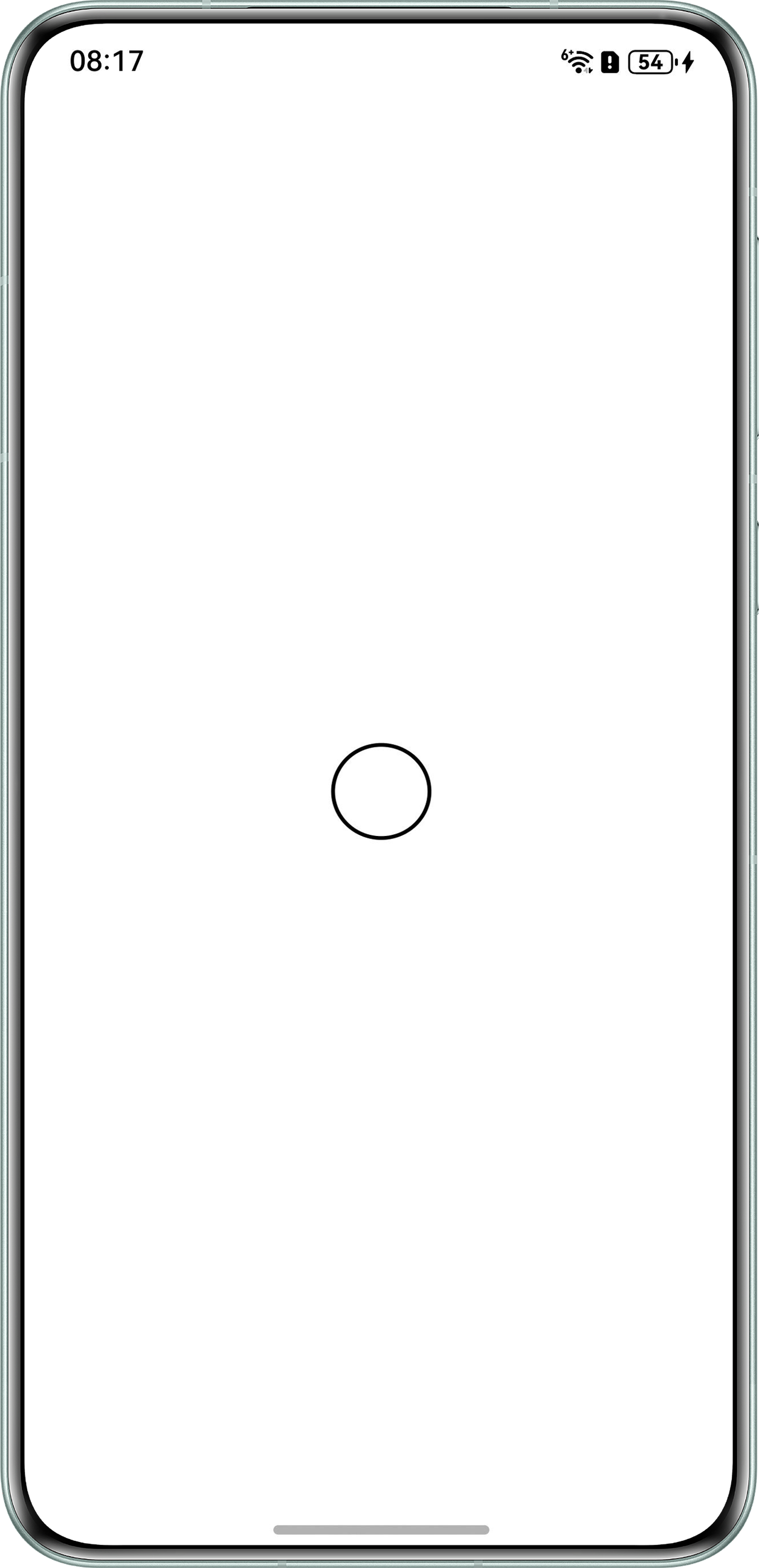
- 场景一:如何自定义边框的宽度?
效果如下:
- 场景二:如何修改Checkbox未选择状态时的背景?
背景知识
- Checkbox:提供多选框组件,通常用于某选项的打开或关闭。
- contentModifier:定制Checkbox内容区的方法。设置该属性时,会导致其他属性设置失效。
- CheckBoxConfiguration对象说明:开发者需要自定义class实现ContentModifier接口。继承自CommonConfiguration。
- Circle:用于绘制圆形的组件,其strokeWidth属性可以设置边框宽度。
解决方案
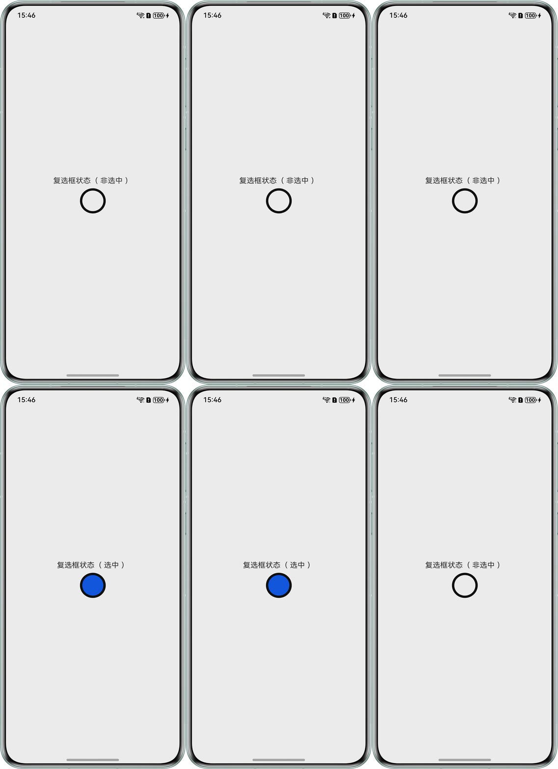
- 场景一:通过contentModifier属性自定义圆形选择框样式,使用Circle组件重绘选择框,设置strokeWidth属性可修改边框宽度。
示例代码如下:
- class MyCheckboxStyle implements ContentModifier<CheckBoxConfiguration> {
- selectedColor: ResourceColor = '#0A59F7';
- cx: number = 100;
- cy: number = 100;
- r: number = 100;
- r2: number = 90;
- constructor(selectedColor: ResourceColor, cx: number, cy: number, r: number, r2: number) {
- this.selectedColor = selectedColor;
- this.cx = cx;
- this.cy = cy;
- this.r = r;
- this.r2 = r2;
- }
- applyContent(): WrappedBuilder<[CheckBoxConfiguration]> {
- return wrapBuilder(buildCheckbox);
- }
- }
- @Entry
- @Component
- struct CheckboxDemo {
- @State checkSelect: boolean = false;
- build() {
- Column() {
- Text(`复选框状态${this.checkSelect ? '( 选中 )' : '( 非选中 )'}`).margin({ bottom: 10 });
- Checkbox({ name: '复选框状态', group: 'checkboxGroup' })
- .select($$this.checkSelect)
- .contentModifier(new MyCheckboxStyle('#0A59F7', 100, 120, 100, 80)) // 自定义选择框样式
- .onChange((value: boolean) => {
- console.info(`Checkbox change is${value}`);
- });
- }
- .alignItems(HorizontalAlign.Center)
- .justifyContent(FlexAlign.Center)
- .height('100%')
- .width('100%');
- }
- }
- @Builder
- function buildCheckbox(config: CheckBoxConfiguration) {
- Circle()
- .fill(config.selected ? (config.contentModifier as MyCheckboxStyle).selectedColor : Color.White)
- .width(50)
- .height(50)
- .strokeWidth(5) // 设置边框宽度
- .stroke('#000') // 设置边框颜色
- .onClick(() => {
- config.triggerChange(!config.selected);
- });
- }
示例代码运行效果如下:
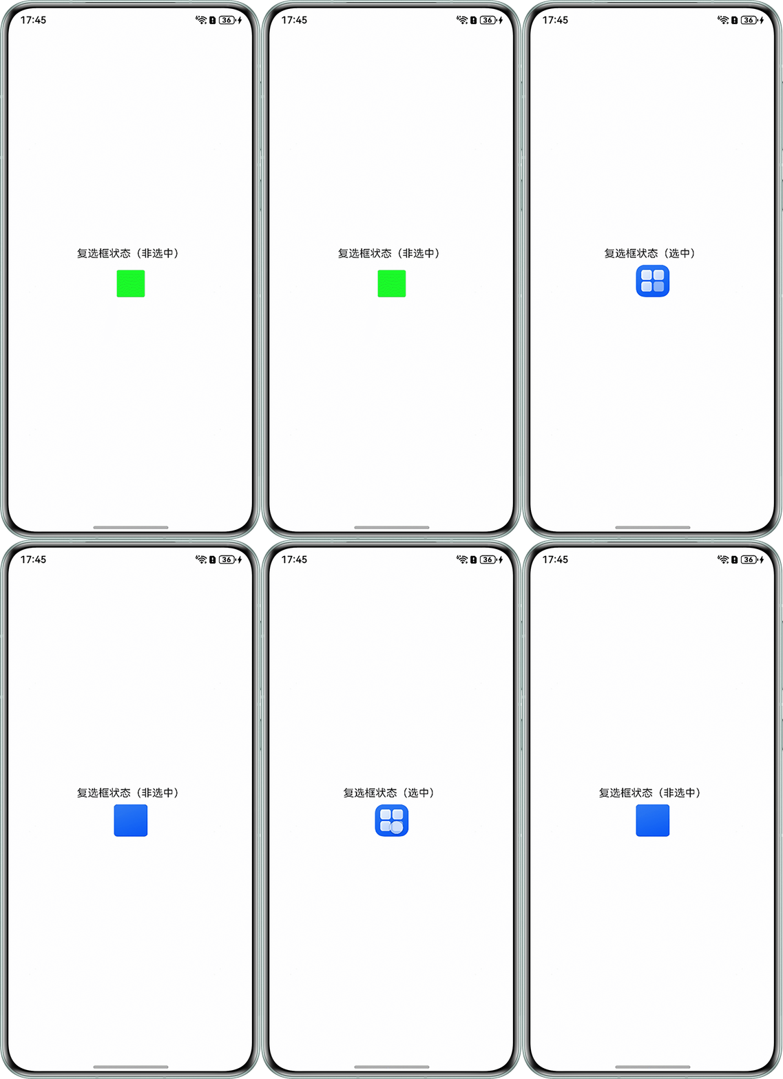
- 场景二:通过contentModifier属性自定义圆形选择框样式,传入未选中时的默认背景图片,在点击事件中对当前背景图片进行取反,且使用CheckBoxConfiguration的triggerChange方法触发多选框选中状态变化从而实现背景的修改。
示例代码如下:
- class MyCheckboxStyleTwo implements ContentModifier<CheckBoxConfiguration> {
- selectedColor: Resource;
- constructor(selectedColor: Resource) {
- this.selectedColor = selectedColor;
- }
- applyContent(): WrappedBuilder<[CheckBoxConfiguration]> {
- return wrapBuilder(buildCheckboxTwo);
- }
- }
- @Entry
- @Component
- struct ModifierCheckBoxTwo {
- build() {
- Row() {
- Column() {
- Checkbox({ name: '复选框状态', group: 'checkboxGroup' })
- .contentModifier(new MyCheckboxStyleTwo($r('app.media.green'))) // 自定义选择框样式,根据具体场景传入默认背景
- .onChange((value: boolean) => {
- console.info(`Checkbox change is${value}`);
- });
- }
- .width('100%');
- }
- .height('100%');
- }
- }
- @Builder
- function buildCheckboxTwo(config: CheckBoxConfiguration) {
- Column() {
- Text(config.name + (config.selected ? '(选中)' : '(非选中)')).margin({ bottom: 8 });
- Flex({ justifyContent: FlexAlign.Center, alignItems: ItemAlign.Center }) {
- }
- .onClick(() => {
- // 对当前背景图片进行取反操作
- (config.contentModifier as MyCheckboxStyleTwo).selectedColor =
- !config.selected ? $r('app.media.startIcon') : $r('app.media.background'); // 根据具体场景加载资源
- // 判断多选框的选择状态
- config.triggerChange(!config.selected);
- })
- .width(50)
- .height(50)
- .borderRadius(5)
- .backgroundImageSize({ width: '100%', height: '100%' })
- // 示例效果:未选中状态时的背景图片为绿色图片,经过自定义后未选中状态时的背景图片为蓝色图片
- .backgroundImage((config.contentModifier as MyCheckboxStyleTwo).selectedColor); // 设置背景,根据具体场景加载资源
- };
- }
示例代码运行效果如下:
常见FAQ
Q:如何为Checkbox组件设置选中颜色?
A:可以使用selectedColor属性来设置Checkbox选中时的颜色,参考官方文档:示例2(设置多选框颜色)实现。
Q:已经通过shape(CheckBoxShape.ROUNDED_SQUARE)属性给Checkbox设置了圆角方形,如何改变圆角大小?
A:参考官方文档:示例3(自定义多选框样式)实现。


