














您当前正在浏览新版开发者文档中心,目录分类和层级有所调整。点击左侧当前文档分类名称前的“☰”图标,可切换文档分类。 了解新版目录
如何实现文字多选框效果
问题现象
HarmonyOS中的Text控件无法手动设置isSelected参数,导致无法判断文字是否被选中。如何实现文字多选框效果?
背景知识
- Text:显示一段文本的组件。没有其他平台isSelected参数,但是支持onClick方法。
- onClick:点击动作触发该回调。
- 动态属性attributeModifier可以通过Modifier对象动态修改属性,根据需要使用多态样式设置属性,组件通过attributeModifier属性绑定动态属性。
- V2状态管理@ObservedV2与@Trace装饰器用于装饰类以及类中的属性,使得被装饰的类和属性具有深度观测的能力。
解决方案
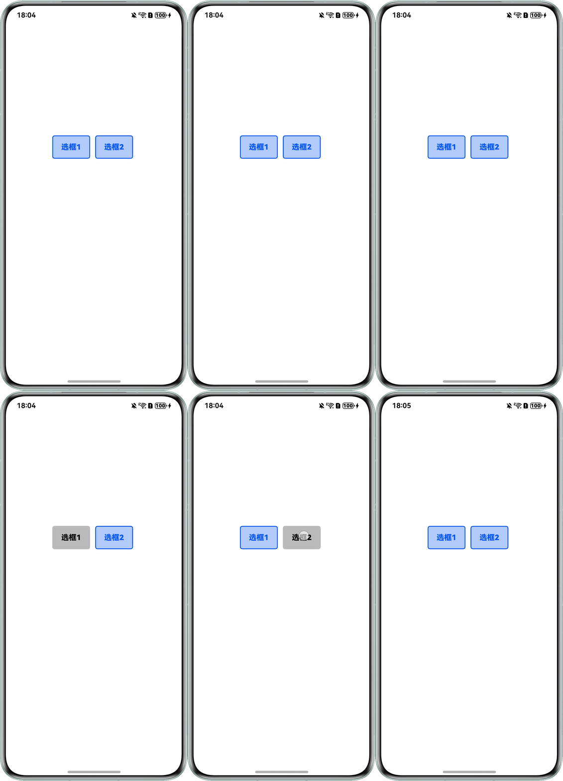
- 方案一:动态变量控制样式:具体操作步骤如下:
- 新建布尔类型状态控制变量isSelect,用true和false控制该Text组件是否被点击。
- 给Text组件添加onClick方法,点击后更改Text组件样式并生成具体业务逻辑。
详细代码示例如下:
- @Entry
- @Component
- struct Selected {
- @State isSelect1: boolean = false; // 选框1选中状态变量
- @State isSelect2: boolean = false; // 选框2选中状态变量
- build() {
- Row({ space: 10 }) {
- Text('选框1')
- .width(80) // 宽度
- .height(50) // 高度
- .textAlign(TextAlign.Center) // 字体居中
- .fontColor(this.isSelect1 ? '#000000' : '#ff0a59f7') // 字体颜色
- .backgroundColor(this.isSelect1 ? '#bbbbbb' : '#ffb2c9f8') // 背景颜色
- .border({ width: 2, color: this.isSelect1 ? Color.Transparent : '#ff0a59f7' }) // 边框
- .borderRadius(5) // 圆角设置
- .fontWeight(FontWeight.Bold) // 字体加粗
- .onClick(() => { // 点击改变选中状态
- this.isSelect1 = !this.isSelect1;
- });
- Text('选框2')
- .width(80) // 宽度
- .height(50) // 高度
- .textAlign(TextAlign.Center) // 字体居中
- .fontColor(this.isSelect2 ? '#000000' : '#ff0a59f7') // 字体颜色
- .backgroundColor(this.isSelect2 ? '#bbbbbb' : '#ffb2c9f8') // 背景颜色
- .border({ width: 2, color: this.isSelect2 ? Color.Transparent : '#ff0a59f7' }) // 边框
- .borderRadius(5) // 圆角设置
- .fontWeight(FontWeight.Bold) // 字体加粗
- .onClick(() => { // 点击改变选中状态
- this.isSelect2 = !this.isSelect2;
- });
- }
- .width('100%')
- .height('100%')
- .justifyContent(FlexAlign.Center)
- .margin({ top: -100 });
- }
- }
效果预览:
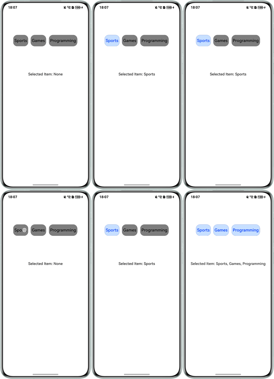
- 方案二:attributeModifier动态属性设置多态样式:具体操作步骤如下:
- 通过创建继承动态属性attributeModifier的类,设置Text组件的多态样式属性。
- 以@ObservedV2与@Trace装饰器装饰类和属性,以观测动态属性值的变化并刷新UI。
- Text组件通过点击事件,改变动态属性值,以修改Text组件的样式属性。
详细代码示例如下:
- import { LengthUnit } from '@kit.ArkUI';
- // 创建动态属性类,并以@ObservedV2与@Trace装饰器装饰
- @ObservedV2
- class TextCustomStyle implements AttributeModifier<TextAttribute> {
- // 动态属性值
- @Trace public isSelected: boolean = false;
- // 设置组件样式
- applyNormalAttribute(instance: TextAttribute): void {
- // 根据动态属性值的不同,设置Text组件的不同样式属性
- if (this.isSelected) {
- instance.fontColor(Color.Blue);
- instance.backgroundColor('#00bfff');
- instance.border({
- width: 0.5,
- color: Color.Blue,
- radius: 18
- });
- } else {
- instance.fontColor(Color.Black);
- instance.backgroundColor(Color.Gray);
- instance.border({
- radius: 18
- });
- }
- }
- }
- @Entry
- @Component
- struct TextMultiSelect {
- arr: string[] = ['Sports', 'Games', 'Programming'];
- @State textStyles: TextCustomStyle[] = [];
- @State selectedItem: string[] = [];
- aboutToAppear(): void {
- // 每个Text组件分别绑定属性类
- for (let i = 0; i < this.arr.length; i++) {
- this.textStyles.push(new TextCustomStyle());
- }
- }
- build() {
- Column() {
- Flex({
- direction: FlexDirection.Row,
- justifyContent: FlexAlign.Center,
- space: {
- main: { value: 5, unit: LengthUnit.VP },
- cross: { value: 10, unit: LengthUnit.VP }
- }
- }) {
- ForEach(this.arr, (item: string, index: number) => {
- Text(item)
- .height(50)
- .fontSize('18fp')
- .padding(5)
- // 设置动态属性
- .attributeModifier(this.textStyles[index])
- .onClick(() => {
- // 改变属性类的属性值
- this.textStyles[index].isSelected = !this.textStyles[index].isSelected;
- if (this.textStyles[index].isSelected) {
- // 保存选项
- this.selectedItem.push(item);
- } else {
- // 删除选项
- let idx = this.selectedItem.indexOf(item);
- let arrFront = this.selectedItem.slice(0, idx);
- let arrBack = this.selectedItem.slice(idx + 1);
- this.selectedItem = arrFront.concat(arrBack);
- }
- });
- });
- }
- .height('auto')
- .width('100%');
- // 选项展示,无选项时显示None
- Text('Selected Item: ' + (this.selectedItem.length === 0 ? 'None' : this.selectedItem.join(', ')));
- }
- .justifyContent(FlexAlign.SpaceEvenly)
- .height('50%')
- .width('100%');
- }
- }
效果预览:
- 方案三:其他多选框实现:
- 若要实现更标准的切换选框,推荐使用Toggle组件:Toggle组件提供状态按钮样式、勾选框样式和开关样式,一般用于两种状态之间的切换。
- 若要实现更标准的多选框,推荐使用Checkbox组件:Checkbox提供多选框组件,通常用于某选项的打开或关闭。
总结
上述方案适用场景总结如下:
方法 | 核心特点 | 适用场景 |
|---|---|---|
动态变量控制样式 | 完全自定义样式(颜色、背景、字体等),需手动管理状态和样式逻辑 | 需要高度个性化的外观(如自定义图标、复杂背景);轻量多选(选项数量少) |
attributeModifier动态属性设置多态样式 | 动态绑定属性,代码更简洁,支持批量样式修改(如同时改颜色和字体大小) | 需要动态修改多个样式属性;样式逻辑需复用(如多个组件共享同一种动态样式规则) |
Checkbox组件(非文字组件场景) | 非文字框场景下,可以自动管理选中状态和样式(如勾选图标、默认颜色) | 标准多选场景(如表单勾选、选项筛选);需要系统级一致性的交互体验 |
Toggle组件(非文字组件场景) | 本质是开关,非文字框场景下,需自定义样式模拟多选;交互更接近“开启/关闭”而非“选中/未选中” | 轻量多选(如快速切换多个开关状态);需要开关样式的场景(如夜间模式切换) |


