智能客服
你问我答,随时在线为你解决问题















您当前浏览的3.1/4.0版本文档归档不再维护,推荐您使用最新的HarmonyOS NEXT版本文档。详细请参考文档维护策略变更。
提供菜单组件,作为临时性弹出窗口,用于展示用户可执行的操作,具体用法请参考menu。
在pages/index目录下的hml文件中创建一个menu组件,添加target、type、title属性。
- <!-- xxx.hml-->
- <div class="container">
- <text class="title-text" id="textId">show menu</text>
- <menu target="textId" type="click" title="title">
- <option value="Item 1">Item 1</option>
- <option value="Item 2">Item 2</option>
- <option value="Item 3">Item 3</option>
- </menu>
- </div>
- /* xxx.css */
- .container{
- width: 100%;
- height: 100%;
- flex-direction: column;
- background-color: #F1F3F5;
- align-items: center;
- justify-content: center;
- width: 100%;
- }
- .title-text{
- font-size: 35px;
- }
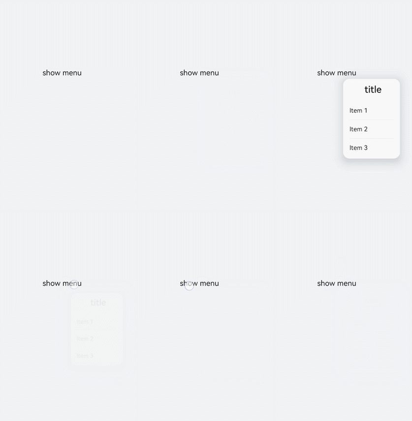
menu仅支持option子组件。
menu组件不支持focusable、disabled属性。
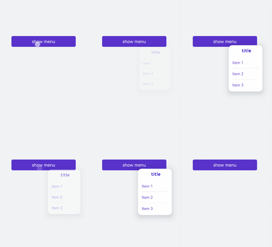
为menu组件设置样式,例如字体颜色、大小、字符间距等。
- <!-- xxx.hml-->
- <div class="container">
- <text class="title-text" id="textId">show menu</text>
- <menu target="textId" type="click" title="title">
- <option value="Item 1">Item 1</option>
- <option value="Item 2">Item 2</option>
- <option value="Item 3">Item 3</option>
- </menu>
- </div>
- /* xxx.css */
- .container{
- width: 100%;
- height: 100%;
- flex-direction: column;
- background-color: #F1F3F5;
- align-items: center;
- justify-content: center;
- width: 100%;
- }
- .title-text{
- font-size: 35px;
- background-color: #5a5aee;
- color: white;
- width: 70%;
- text-align: center;
- height: 85px;
- border-radius: 12px;
- }
- menu{
- text-color: blue;
- font-size: 35px;
- letter-spacing: 2px;
- }
- option{
- color: #6a6aef;
- font-size: 30px;
- }
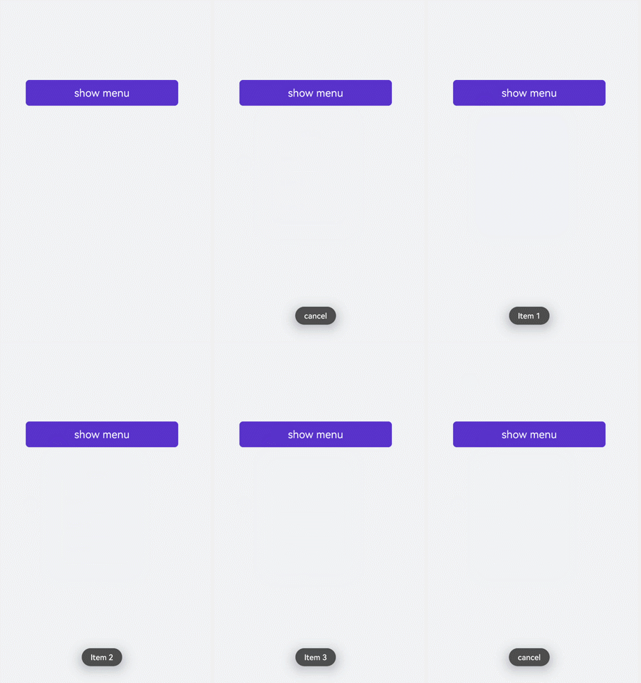
为menu组件绑定onselected事件(菜单中某个值被点击选中时触发)和oncancel事件(取消操作时触发),点击text组件调用show方法可设置menu组件的坐标。
- <!-- xxx.hml-->
- <div class="container">
- <text class="title-text" id="textId" onclick="textClick">show menu</text>
- <menu title="title" onselected="select" oncancel="cancel" id="menuId">
- <option value="Item 1">Item 1</option>
- <option value="Item 2">Item 2</option>
- <option value="Item 3">Item 3</option>
- </menu>
- </div>
- /* xxx.css */
- .container{
- width: 100%;
- height: 100%;
- flex-direction: column;
- background-color: #F1F3F5;
- width: 100%;
- }
- .title-text{
- font-size: 35px;
- background-color: #5a5aee;
- color: white;
- width: 70%;
- text-align: center;
- height: 85px;
- border-radius: 12px;
- margin-top: 500px;
- margin-left: 15%;
- }
- menu{
- text-color: blue;
- font-size: 35px;
- letter-spacing: 2px;
- }
- option{
- color: #6a6aef;
- font-size: 30px;
- }
- // xxx.js
- import promptAction from '@ohos.promptAction';
- export default {
- select(e) {
- promptAction.showToast({
- message: e.value
- })
- },
- cancel(){
- promptAction.showToast({
- message: "cancel"
- })
- },
- textClick() {
- this.$element("menuId").show({x:175,y:590});
- },
- }
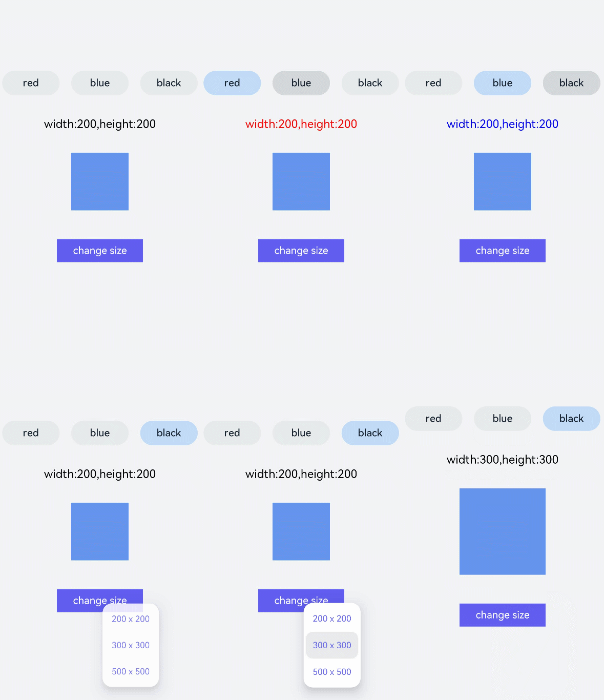
本场景中开发者可点击toggle组件修改文字颜色,选择menu组件修改渐变色块大小。
- <!-- xxx.hml-->
- <div class="container">
- <div class="contentToggle">
- <toggle class="toggle" for="{{item in togglesList}}" onclick="toggleClick({{$idx}})" checked="{{item.checked}}">{{item.name}}</toggle>
- </div>
- <text class="size" style="color: {{color}};">width:{{width}},height:{{height}}</text>
- <div style="width: {{width}}px;height: {{height}}px; background-color: cornflowerblue;"></div>
- <text id="menuId" class="text">change size</text>
- <menu onselected="select" oncancel="cancel" target="menuId">
- <option value="{{item.value}}" for="item in optionList">{{item.text}}</option>
- </menu>
- </div>
- /* xxx.css */
- .container{
- flex-direction: column;
- background-color: #F1F3F5;
- width: 100%;
- justify-content: center;
- align-items: center;
- }
- .contentToggle{
- width: 100%;
- justify-content: space-around;
- }
- .toggle{
- padding: 10px;
- height:80px;
- font-size: 35px;
- width: 200px;
- height: 85px;
- }
- .size{
- width: 100%;
- height: 200px;
- text-align: center;
- font-size: 40px;
- text-align: center;
- }
- .text{
- width: 300px;
- height: 80px;
- background-color: #615def;
- color: white;
- font-size: 35px;
- text-align: center;
- margin-top: 100px;
- }
- menu{
- text-color: blue;
- font-size: 35px;
- letter-spacing: 2px;
- }
- option{
- color: #6a6aef;
- font-size: 30px;
- }
- // xxx.js
- export default {
- data:{
- fresh: false,
- width: 200,
- height: 200,
- color: '',
- optionList:[
- {text:'200 x 200',value:2},
- {text:'300 x 300',value:3},
- {text:'500 x 500',value:5},
- ],
- togglesList:[
- {name:"red", checked:false},
- {name:"blue", checked:false},
- {name: "black", checked:false},
- ],
- },
- toggleClick(index) {
- for(let i=0;i<this.togglesList.length;i++) {
- if (i == index) {
- this.color = this.togglesList[index].name;
- this.togglesList[i].checked = true;
- }else {
- this.togglesList[i].checked = false;
- }
- }
- },
- select(e) {
- this.width = e.value * 100;
- this.height = e.value * 100;
- }
- }