智能客服
你问我答,随时在线为你解决问题
进度条组件,用于显示内容加载或操作处理等进度。
该组件从API version 7开始支持。后续版本如有新增内容,则采用上角标单独标记该内容的起始版本。
无
Progress(options: ProgressOptions)
创建进度条组件。
卡片能力: 从API version 9开始,该接口支持在ArkTS卡片中使用。
元服务API: 从API version 11开始,该接口支持在元服务中使用。
系统能力: SystemCapability.ArkUI.ArkUI.Full
参数:
| 参数名 | 类型 | 必填 | 说明 |
|---|---|---|---|
| options | ProgressOptions | 是 | 按进度条类型不同,设置不同属性的进度条组件参数。 |
元服务API: 从API version 11开始,该接口支持在元服务中使用。
系统能力: SystemCapability.ArkUI.ArkUI.Full
| 名称 | 类型 | 必填 | 说明 |
|---|---|---|---|
| value | number | 是 | 指定当前进度值。设置小于0的数值时置为0,设置大于total的数值时置为total。 默认值:0 卡片能力: 从API version 9开始,该接口支持在ArkTS卡片中使用。 |
| total | number | 否 | 指定进度总长。设置小于等于0的数值时置为100。 默认值:100 卡片能力: 从API version 9开始,该接口支持在ArkTS卡片中使用。 |
| type8+ | ProgressType | 否 | 指定进度条类型。 默认值:ProgressType.Linear 卡片能力: 从API version 9开始,该接口支持在ArkTS卡片中使用。 |
| style(deprecated) | ProgressStyle | 否 | 指定进度条样式。 该参数从API version8开始废弃,建议使用type替代。 默认值:ProgressStyle.Linear |
卡片能力: 从API version 9开始,该接口支持在ArkTS卡片中使用。
元服务API: 从API version 11开始,该接口支持在元服务中使用。
系统能力: SystemCapability.ArkUI.ArkUI.Full
| 名称 | 描述 |
|---|---|
| Linear | 线性样式。从API version9开始,高度大于宽度的时候自适应垂直显示。 |
| Ring | 环形无刻度样式,环形圆环逐渐显示至完全填充效果。 |
| Eclipse | 圆形样式,显示类似月圆月缺的进度展示效果,从月牙逐渐变化至满月。 |
| ScaleRing | 环形有刻度样式,显示类似时钟刻度形式的进度展示效果。从API version9开始,刻度外圈出现重叠的时候自动转换为环形无刻度进度条。 |
| Capsule | 胶囊样式,头尾两端圆弧处的进度展示效果与Eclipse相同;中段处的进度展示效果与Linear相同。高度大于宽度的时候自适应垂直显示。 |
卡片能力: 从API version 9开始,该接口支持在ArkTS卡片中使用。
元服务API: 从API version 11开始,该接口支持在元服务中使用。
系统能力: SystemCapability.ArkUI.ArkUI.Full
| 名称 | 描述 |
|---|---|
| Linear | 线性样式。 |
| Ring8+ | 环形无刻度样式,环形圆环逐渐显示至完全填充效果。 |
| Eclipse | 圆形样式,显示类似月圆月缺的进度展示效果,从月牙逐渐变化至满月。 |
| ScaleRing8+ | 环形有刻度样式,显示类似时钟刻度形式的进度展示效果。 |
| Capsule8+ | 胶囊样式,头尾两端圆弧处的进度展示效果与Eclipse相同;中段处的进度展示效果与Linear相同。高度大于宽度的时候自适应垂直显示。 |
元服务API: 从API version 11开始,该接口支持在元服务中使用。
系统能力: SystemCapability.ArkUI.ArkUI.Full
| 名称 | 类型 |
|---|---|
| ProgressType.Linear | LinearStyleOptions10+ | ProgressStyleOptions8+ |
| ProgressType.Ring | RingStyleOptions10+ | ProgressStyleOptions8+ |
| ProgressType.Eclipse | EclipseStyleOptions10+ | ProgressStyleOptions8+ |
| ProgressType.ScaleRing | ScaleRingStyleOptions10+ | ProgressStyleOptions8+ |
| ProgressType.Capsule | CapsuleStyleOptions10+ | ProgressStyleOptions8+ |
除支持通用属性外,还支持以下属性:
该组件重写了通用属性backgroundColor,直接添加在Progress组件上,生效进度条的底色。如需设置整个Progress组件的背景色,需要在外层容器上添加backgroundColor,容器再包裹Progress组件。
value(value: number)
设置当前进度值。设置小于0的数值时置为0,设置大于total的数值时置为total。非法数值不生效。
卡片能力: 从API version 9开始,该接口支持在ArkTS卡片中使用。
元服务API: 从API version 11开始,该接口支持在元服务中使用。
系统能力: SystemCapability.ArkUI.ArkUI.Full
参数:
| 参数名 | 类型 | 必填 | 说明 |
|---|---|---|---|
| value | number | 是 | 当前进度值。 默认值:0 |
color(value: ResourceColor | LinearGradient)
设置进度条前景色。
从API version 10开始支持利用LinearGradient设置Ring样式的渐变色。
卡片能力: 从API version 9开始,该接口支持在ArkTS卡片中使用,暂不支持LinearGradient。
元服务API: 从API version 11开始,该接口支持在元服务中使用。
系统能力: SystemCapability.ArkUI.ArkUI.Full
参数:
| 参数名 | 类型 | 必填 | 说明 |
|---|---|---|---|
| value | ResourceColor | LinearGradient10+ | 是 | 进度条前景色。 默认值: - Capsule: API version 9及以下:'#ff007dff' API version 10:'#33006cde' API version 11及以上:'#33007dff' - Ring: API version 9及以下:'#ff007dff' API version 10及以上:起始端:'#ff86c1ff',结束端:'#ff254ff7' - 其他样式:'#ff007dff' |
style(value: ProgressStyleOptions | CapsuleStyleOptions | RingStyleOptions | LinearStyleOptions | ScaleRingStyleOptions | EclipseStyleOptions)
设置组件的样式。
卡片能力: 从API version 9开始,该接口支持在ArkTS卡片中使用。
元服务API: 从API version 11开始,该接口支持在元服务中使用。
系统能力: SystemCapability.ArkUI.ArkUI.Full
参数:
| 参数名 | 类型 | 必填 | 说明 |
|---|---|---|---|
| value | ProgressStyleOptions8+ | CapsuleStyleOptions10+ | | 是 | 组件的样式。 - CapsuleStyleOptions:设置Capsule的样式。 - RingStyleOptions:设置Ring的样式。 - LinearStyleOptions:设置Linear的样式。 - ScaleRingStyleOptions:设置ScaleRing的样式。 - EclipseStyleOptions:设置Eclipse的样式。 - ProgressStyleOptions:仅可设置各类型进度条的基本样式。 ProgressStyleOptions,暂不支持其它的参数类型。 |
contentModifier(modifier:ContentModifier<ProgressConfiguration>)
定制progress内容区的方法。
元服务API: 从API version 12开始,该接口支持在元服务中使用。
系统能力: SystemCapability.ArkUI.ArkUI.Full
参数:
| 参数名 | 类型 | 必填 | 说明 |
|---|---|---|---|
| modifier | ContentModifier<ProgressConfiguration> | 是 | 在progress组件上,定制内容区的方法。 modifier: 内容修改器,开发者需要自定义class实现ContentModifier接口。 |
privacySensitive(isPrivacySensitiveMode: Optional<boolean>)
设置隐私敏感。
元服务API: 从API version 12开始,该接口支持在元服务中使用。
系统能力: SystemCapability.ArkUI.ArkUI.Full
参数:
| 参数名 | 类型 | 必填 | 说明 |
|---|---|---|---|
| isPrivacySensitiveMode | [Optional<boolean>] | 是 | 设置隐私敏感,隐私模式下进度清零,文字将被遮罩。 说明: 设置null则不敏感。 |
元服务API: 从API version 12开始,该接口支持在元服务中使用。
系统能力: SystemCapability.ArkUI.ArkUI.Full
| 名称 | 类型 | 必填 | 说明 |
|---|---|---|---|
| value | number | 是 | 当前进度值。 |
| total | number | 是 | 进度总长。 |
元服务API: 从API version 11开始,该接口支持在元服务中使用。
系统能力: SystemCapability.ArkUI.ArkUI.Full
| 名称 | 类型 | 必填 | 说明 |
|---|---|---|---|
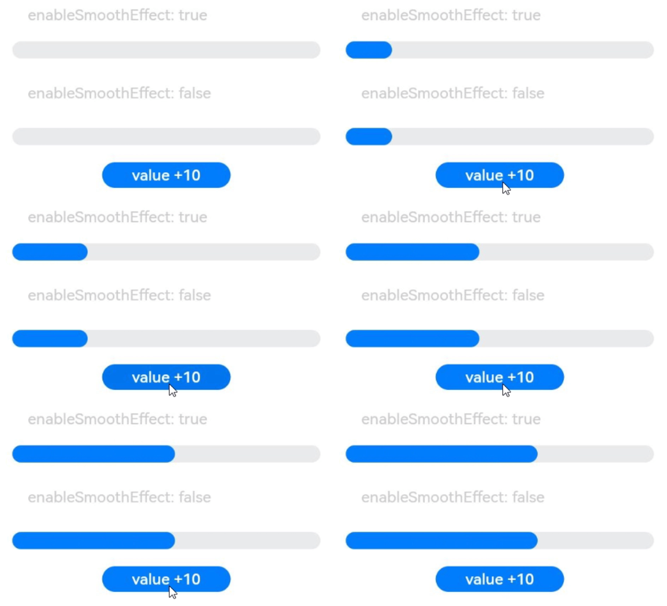
| enableSmoothEffect | boolean | 否 | 进度平滑动效的开关。开启平滑动效后设置进度,进度会从当前值渐变至设定值,否则进度从当前值突变至设定值。 默认值:true |
元服务API: 从API version 11开始,该接口支持在元服务中使用。
系统能力: SystemCapability.ArkUI.ArkUI.Full
| 名称 | 类型 | 必填 | 说明 |
|---|---|---|---|
| enableScanEffect | boolean | 否 | 扫光效果的开关。 默认值:false |
继承自CommonProgressStyleOptions。
卡片能力: 从API version 9开始,该接口支持在ArkTS卡片中使用。
元服务API: 从API version 11开始,该接口支持在元服务中使用。
系统能力: SystemCapability.ArkUI.ArkUI.Full
继承自ScanEffectOptions,CommonProgressStyleOptions。
元服务API: 从API version 11开始,该接口支持在元服务中使用。
系统能力: SystemCapability.ArkUI.ArkUI.Full
| 名称 | 类型 | 必填 | 说明 |
|---|---|---|---|
| borderColor | ResourceColor | 否 | 内描边颜色。 默认值: API version 10:'#33006cde' API version 11及以上:'#33007dff' |
| borderWidth | Length | 否 | 内描边宽度(不支持百分比设置)。 默认值:1vp |
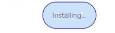
| content | string | 否 | 文本内容,应用可自定义。 |
| font | Font | 否 | 文本样式。 默认值: - 文本大小(不支持百分比设置):12fp 其他文本参数跟随text组件的主题值。 |
| fontColor | ResourceColor | 否 | 文本颜色。 默认值:'#ff182431' |
| showDefaultPercentage | boolean | 否 | 显示百分比文本的开关,开启后会在进度条上显示当前进度的百分比。设置了content属性时该属性不生效。 默认值:false |
继承自ScanEffectOptions,CommonProgressStyleOptions。
元服务API: 从API version 11开始,该接口支持在元服务中使用。
系统能力: SystemCapability.ArkUI.ArkUI.Full
| 名称 | 类型 | 必填 | 说明 |
|---|---|---|---|
| strokeWidth | Length | 否 | 设置进度条宽度(不支持百分比设置),宽度大于等于半径时,默认修改宽度至半径值的二分之一。 默认值:4.0vp |
| shadow | boolean | 否 | 进度条阴影开关。 默认值:false |
| status | ProgressStatus10+ | 否 | 进度条状态,当设置为LOADING时会开启检查更新动效,此时设置进度值不生效。当从LOADING设置为PROGRESSING,检查更新动效会执行到终点再停止。 默认值: ProgressStatus.PROGRESSING |
继承自ScanEffectOptions,CommonProgressStyleOptions。
元服务API: 从API version 11开始,该接口支持在元服务中使用。
系统能力: SystemCapability.ArkUI.ArkUI.Full
继承自CommonProgressStyleOptions。
元服务API: 从API version 11开始,该接口支持在元服务中使用。
系统能力: SystemCapability.ArkUI.ArkUI.Full
继承自CommonProgressStyleOptions。
元服务API: 从API version 11开始,该接口支持在元服务中使用。
系统能力: SystemCapability.ArkUI.ArkUI.Full
元服务API: 从API version 11开始,该接口支持在元服务中使用。
系统能力: SystemCapability.ArkUI.ArkUI.Full
| 名称 | 描述 |
|---|---|
| LOADING | 加载中。 |
| PROGRESSING | 进度更新中。 |
支持通用事件。
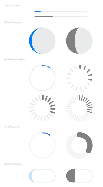
该示例通过type属性,实现了设置进度条类型的功能。
- // xxx.ets
- @Entry
- @Component
- struct ProgressExample {
- build() {
- Column({ space: 15 }) {
- Text('Linear Progress').fontSize(9).fontColor(0xCCCCCC).width('90%')
- Progress({ value: 10, type: ProgressType.Linear }).width(200)
- Progress({ value: 20, total: 150, type: ProgressType.Linear }).color(Color.Grey).value(50).width(200)
-
-
- Text('Eclipse Progress').fontSize(9).fontColor(0xCCCCCC).width('90%')
- Row({ space: 40 }) {
- Progress({ value: 10, type: ProgressType.Eclipse }).width(100)
- Progress({ value: 20, total: 150, type: ProgressType.Eclipse }).color(Color.Grey).value(50).width(100)
- }
-
- Text('ScaleRing Progress').fontSize(9).fontColor(0xCCCCCC).width('90%')
- Row({ space: 40 }) {
- Progress({ value: 10, type: ProgressType.ScaleRing }).width(100)
- Progress({ value: 20, total: 150, type: ProgressType.ScaleRing })
- .color(Color.Grey).value(50).width(100)
- .style({ strokeWidth: 15, scaleCount: 15, scaleWidth: 5 })
- }
-
- // scaleCount和scaleWidth效果对比
- Row({ space: 40 }) {
- Progress({ value: 20, total: 150, type: ProgressType.ScaleRing })
- .color(Color.Grey).value(50).width(100)
- .style({ strokeWidth: 20, scaleCount: 20, scaleWidth: 5 })
- Progress({ value: 20, total: 150, type: ProgressType.ScaleRing })
- .color(Color.Grey).value(50).width(100)
- .style({ strokeWidth: 20, scaleCount: 30, scaleWidth: 3 })
- }
-
- Text('Ring Progress').fontSize(9).fontColor(0xCCCCCC).width('90%')
- Row({ space: 40 }) {
- Progress({ value: 10, type: ProgressType.Ring }).width(100)
- Progress({ value: 20, total: 150, type: ProgressType.Ring })
- .color(Color.Grey).value(50).width(100)
- .style({ strokeWidth: 20 })
- }
-
- Text('Capsule Progress').fontSize(9).fontColor(0xCCCCCC).width('90%')
- Row({ space: 40 }) {
- Progress({ value: 10, type: ProgressType.Capsule }).width(100).height(50)
- Progress({ value: 20, total: 150, type: ProgressType.Capsule })
- .color(Color.Grey)
- .value(50)
- .width(100)
- .height(50)
- }
- }.width('100%').margin({ top: 30 })
- }
- }
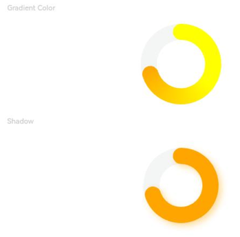
该示例通过style接口的strokeWidth、shadow属性,实现了环形进度条视觉属性设置功能。
- // xxx.ets
- @Entry
- @Component
- struct ProgressExample {
- private gradientColor: LinearGradient = new LinearGradient([{ color: Color.Yellow, offset: 0.5 },
- { color: Color.Orange, offset: 1.0 }])
-
- build() {
- Column({ space: 15 }) {
- Text('Gradient Color').fontSize(9).fontColor(0xCCCCCC).width('90%')
- Progress({ value: 70, total: 100, type: ProgressType.Ring })
- .width(100).style({ strokeWidth: 20 })
- .color(this.gradientColor)
-
- Text('Shadow').fontSize(9).fontColor(0xCCCCCC).width('90%')
- Progress({ value: 70, total: 100, type: ProgressType.Ring })
- .width(120).color(Color.Orange)
- .style({ strokeWidth: 20, shadow: true })
- }.width('100%').padding({ top: 5 })
- }
- }
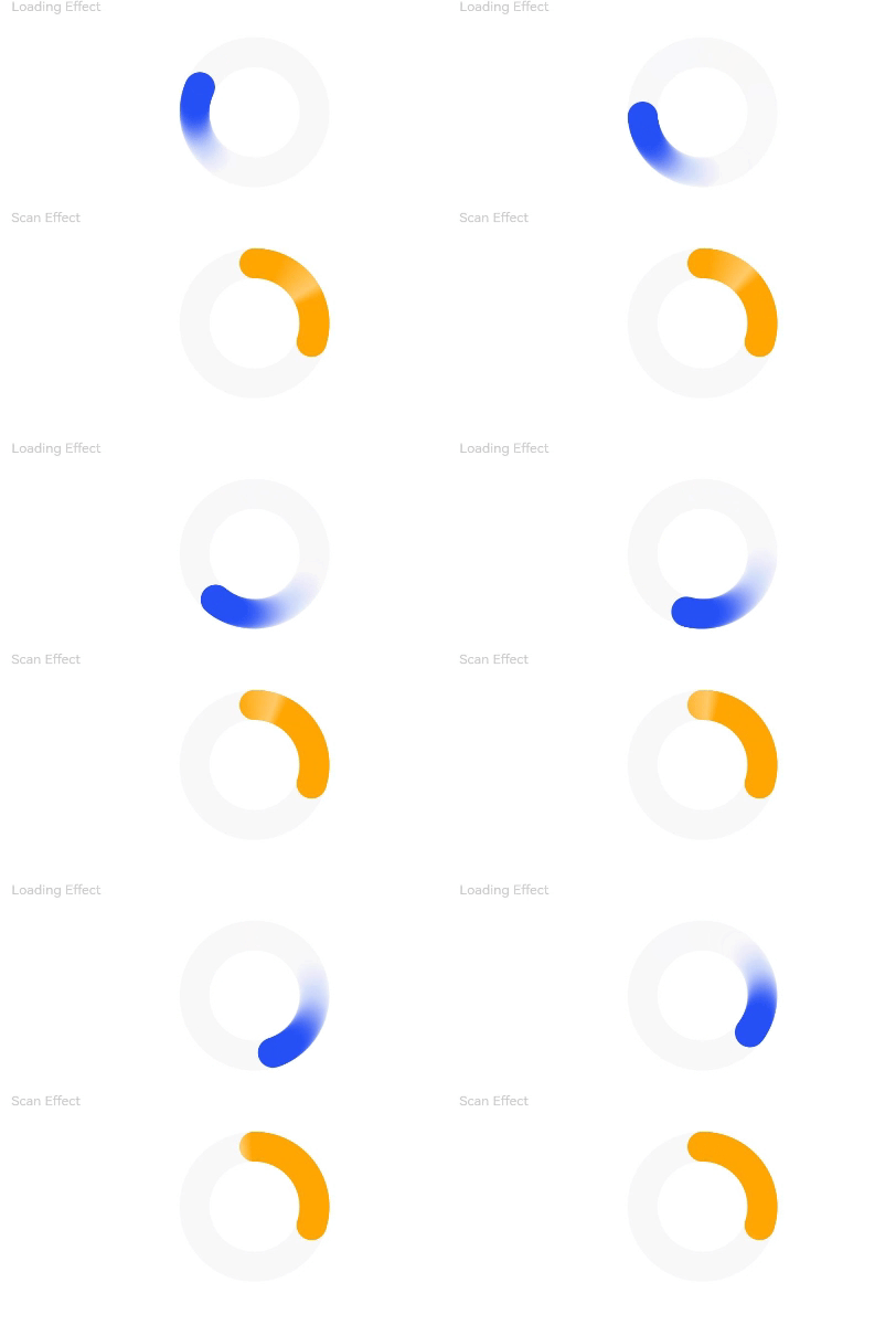
该示例通过style接口的status、enableScanEffect属性,实现了环形进度条动效的开关功能。
- // xxx.ets
- @Entry
- @Component
- struct ProgressExample {
- build() {
- Column({ space: 15 }) {
- Text('Loading Effect').fontSize(9).fontColor(0xCCCCCC).width('90%')
- Progress({ value: 0, total: 100, type: ProgressType.Ring })
- .width(100).color(Color.Blue)
- .style({ strokeWidth: 20, status: ProgressStatus.LOADING })
-
- Text('Scan Effect').fontSize(9).fontColor(0xCCCCCC).width('90%')
- Progress({ value: 30, total: 100, type: ProgressType.Ring })
- .width(100).color(Color.Orange)
- .style({ strokeWidth: 20, enableScanEffect: true })
- }.width('100%').padding({ top: 5 })
- }
- }
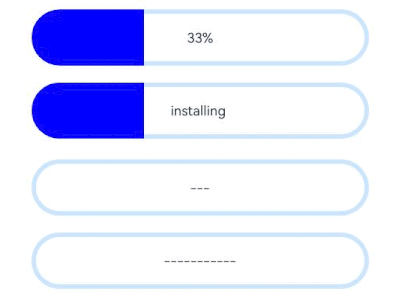
该示例通过style接口的borderColor、borderWidth、content、font、fontColor、enableScanEffect、showDefaultPercentage属性,实现了胶囊形进度条视觉属性设置功能。
- // xxx.ets
- @Entry
- @Component
- struct ProgressExample {
- build() {
- Column({ space: 15 }) {
- Row({ space: 40 }) {
- Progress({ value: 100, total: 100, type: ProgressType.Capsule }).width(100).height(50)
- .style({
- borderColor: Color.Blue,
- borderWidth: 1,
- content: 'Installing...',
- font: { size: 13, style: FontStyle.Normal },
- fontColor: Color.Gray,
- enableScanEffect: false,
- showDefaultPercentage: false
- })
- }
- }.width('100%').padding({ top: 5 })
- }
- }
该示例通过style接口的enableSmoothEffect属性,实现了进度平滑动效开关的功能。
- // xxx.ets
- @Entry
- @Component
- struct Index {
- @State value: number = 0
-
- build() {
- Column({ space: 10 }) {
- Text('enableSmoothEffect: true')
- .fontSize(9)
- .fontColor(0xCCCCCC)
- .width('90%')
- .margin(5)
- .margin({ top: 20 })
- Progress({ value: this.value, total: 100, type: ProgressType.Linear })
- .style({ strokeWidth: 10, enableSmoothEffect: true })
-
- Text('enableSmoothEffect: false').fontSize(9).fontColor(0xCCCCCC).width('90%').margin(5)
- Progress({ value: this.value, total: 100, type: ProgressType.Linear })
- .style({ strokeWidth: 10, enableSmoothEffect: false })
-
- Button('value +10').onClick(() => {
- this.value += 10
- })
- .width(75)
- .height(15)
- .fontSize(9)
- }
- .width('50%')
- .height('100%')
- .margin({ left: 20 })
- }
- }
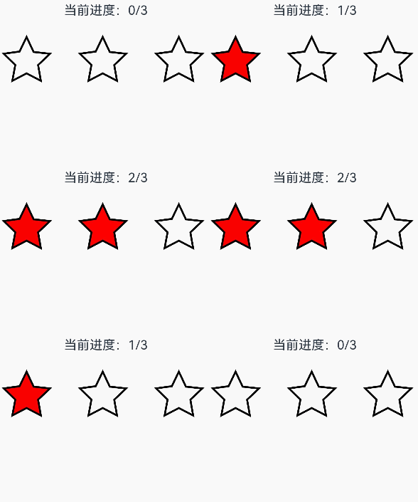
该示例通过contentModifier接口,实现了自定义进度条的功能,自定义实现星形,其中总进度为3,且当前值可通过按钮进行增减,达到的进度被填充自定义颜色。
- // xxx.ets
- class MyProgressModifier implements ContentModifier<ProgressConfiguration> {
- color: Color = Color.White
-
- constructor(color: Color) {
- this.color = color
- }
-
- applyContent(): WrappedBuilder<[ProgressConfiguration]> {
- return wrapBuilder(myProgress)
- }
- }
-
- @Builder
- function myProgress(config: ProgressConfiguration) {
-
- Column({ space: 30 }) {
- Text("当前进度:" + config.value + "/" + config.total).fontSize(20)
- Row() {
- Flex({ justifyContent: FlexAlign.SpaceBetween }) {
- Path()
- .width('30%')
- .height('30%')
- .commands('M108 0 L141 70 L218 78.3 L162 131 L175 205 L108 170 L41.2 205 L55 131 L1 78 L75 68 L108 0 Z')
- .fill(config.enabled && config.value >= 1 ? (config.contentModifier as MyProgressModifier).color :
- Color.White)
- .stroke(Color.Black)
- .strokeWidth(3)
- Path()
- .width('30%')
- .height('30%')
- .commands('M108 0 L141 70 L218 78.3 L162 131 L175 205 L108 170 L41.2 205 L55 131 L1 78 L75 68 L108 0 Z')
- .fill(config.enabled && config.value >= 2 ? (config.contentModifier as MyProgressModifier).color :
- Color.White)
- .stroke(Color.Black)
- .strokeWidth(3)
- Path()
- .width('30%')
- .height('30%')
- .commands('M108 0 L141 70 L218 78.3 L162 131 L175 205 L108 170 L41.2 205 L55 131 L1 78 L75 68 L108 0 Z')
- .fill(config.enabled && config.value >= 3 ? (config.contentModifier as MyProgressModifier).color :
- Color.White)
- .stroke(Color.Black)
- .strokeWidth(3)
- }.width('100%')
- }
- }.margin({ bottom: 100 })
- }
-
- @Entry
- @Component
- struct Index {
- @State currentValue: number = 0
- modifier = new MyProgressModifier(Color.Red)
- @State myModifier: (MyProgressModifier | undefined) = this.modifier
-
- build() {
- Column() {
- Progress({ value: this.currentValue, total: 3, type: ProgressType.Ring }).contentModifier(this.modifier)
- Button('Progress++').onClick(() => {
- if (this.currentValue < 3) {
- this.currentValue += 1
- }
- }).width('30%')
- Button('addProgress--').onClick(() => {
- if (this.currentValue > 0) {
- this.currentValue -= 1
- }
- }).width('30%')
- }.width('100%').height('100%')
- }
- }
该示例通过privacySensitive接口,实现了隐私隐藏效果,效果展示需要卡片框架支持。
- @Entry
- @Component
- struct ProgressExample {
- build() {
- Scroll() {
- Column({ space: 15 }) {
- Row() {
- Progress({ value: 50, total: 100, type: ProgressType.Capsule }).width(100).height(50)
- .style({
- borderColor: Color.Blue,
- borderWidth: 1,
- content: 'Installing...',
- font: { size: 13, style: FontStyle.Normal },
- fontColor: Color.Gray,
- enableScanEffect: false,
- showDefaultPercentage: true
- })
- .privacySensitive(true)
- }
- }
- }
- }
- }