简介
宫格组件主要用于展示商品推荐列表、热门内容等场景。宫格一般具有如下能力:
- 支持正方形布局和矩形布局
- 支持设置列数
- 小宫格中支持设置图片、文本、url链接、角标、角标背景色
- 支持设置无边框以及指定边框颜色
- 支持动态添加或删除宫格
- 支持自定义触发宫格点击事件
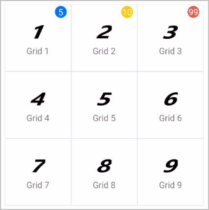
宫格(grid)组件由若干个小宫格组成,每个小宫格的结构大致分为三部分,一是图片,二是文本,三是角标。自定义宫格组件通过data参数,指定上述内容,data参数如下:
{
    text: 'Grid 1',                 //显示的文本
    uri: 'https://www.huawei.com',  //点击宫格跳转链接
    image: '/Common/c1.png',        //显示的图片
    badge: '5',                     //显示的角标
    badgeColor: '#007AFF'           //角标背景色
},
布局结构如下图:
布局代码如下:
<text>方形布局</text>
<div class="example-body">
      <grid data="{{data}}" mode="square" column="{{3}}" show-border="{{true}}"  border-color="#FF0000" @change="change"></grid>
</div>
[h2]自定义子组件
- 定义布局样式。
宫格整体外观都是通用的,但是内部具体的样式有区别,在设计的时候,不能把内部样式固定,否则一旦宫格的UI有变化,会导致子组件也要修改,违背了对外开源的初衷。
所以,在子组件grid.ux中,开放多种样式属性,方便开发者自定义样式。
<import name="flex-row" src="./flex_row"></import> <template> <flex-row wrap="wrap" h-style="{{hStyle}}"> <block for="{{item in compData}}"> <div style="{{compStyle}}" class="border" onclick="{{handleClick(item)}}"> <!--宫格组件内部通过image和text组件渲染图片,文本以及角标。--> <image if="{{item.image !== ''}}" src="{{item.image}}" style="{{compImageStyle}}"></image> <text if="{{item.text !== ''}}" style="{{textStyle}}">{{ item.text }}</text> <text if="{{item.badge !== ''}}" class="badge" style="background-color:{{item.badgeColor?item.badgeColor:'#dd524d'}}">{{ item.badge }}</text> </div> </block> </flex-row> </template> - 规划属性和支持的事件。
属性
类型
默认值
描述
data
Array
[]
宫格数据。
mode
String
square
布局模式。
column
Number
3
宫格列数。
show-border
Boolean
true
是否显示边框。
border-color
String
#d8e4ee
边框颜色。
data配置项:
属性
类型
参数示例
描述
text
String
Grid 1
文本内容。
uri
String
https://www.huawei.com
url链接。
image
String
/Common/c1.png
图片地址。
badge
String
5
角标内容。
badgeColor
String
#007AFF
角标背景色。
支持的事件:
事件名称
参数
描述
change
evt
宫格点击事件。
[h2]父子组件通信
- 子组件的props中定义相关属性值,父组件引用时传入属性值,子组件通过 this.xxx 获取值并进行处理。
props: { data: {}, mode: { default: 'square' }, column: { default: 3 }, showBorder: { default: true }, borderColor: { default: "#d8e4ee" } }, - 父组件定义宫格点击事件并绑定。
<text style="padding-top: 20px;padding-bottom: 20px;font-size: 35px">点击宫格触发事件:</text>
<grid data="{{data}}" mode="square" column="{{3}}" @change="change"></grid>
change: function (evt) { console.log("evt.detail : " + JSON.stringify(evt.detail)); if (evt.detail.params.uri) { router.push({ uri: evt.detail.params.uri }); } else { prompt.showToast({ message: `点击了${evt.detail.params.text}`, duration: 2000, gravity: 'center' }) } }, - 子组件在点击宫格时触发父组件的change事件。
handleClick(item) { console.log("handleClick : " + JSON.stringify(item)); this.$emit('change', { params: item }) }
[h2]计算数据和样式
使用计算属性computed方法,通过props属性动态计算数据和样式,返回给组件使用。
- 生成宫格的数据。
compData() { var arr = [] for (var i = 0, len = this.data.length; i < len; i++) { var text = !this.data[i]['text'] ? '' : this.data[i]['text'] var image = !this.data[i]['image'] ? '' : this.data[i]['image'] var uri = !this.data[i]['uri'] ? '' : this.data[i]['uri'] var badge = !this.data[i]['badge'] ? '' : this.data[i]['badge'] var badgeColor = !this.data[i]['badgeColor'] ? '' : this.data[i]['badgeColor'] var item = { text: text, image: image, uri: uri, badge: badge, badgeColor: badgeColor } arr.push(item) } return arr }, - 生成宫格的style样式。
colWidth() { var that = this device.getInfo({ success: function (ret) { that.width = ret.windowLogicWidth - 66 console.log("width:" + that.width); }, fail: function (erromsg, errocode) { console.log("device.getInfo fail:", erromsg, errocode); } }) return that.width / this.column }, colHeight() { return this.mode === 'square' ? this.width / this.column : 120 }, compStyle() { var style = 'align-items:center;align-content:center;justify-content:center;' if (this.showBorder === true) { style += 'border-width:1px;border-style:solid;' style += 'border-color:' + this.borderColor + ';' } if (this.column > 3) { style += 'flex-direction: column;' } else { if (this.mode === 'square') { style += 'flex-direction: column;' } } style += 'width:' + this.colWidth + 'px;' style += 'height:' + this.colHeight + 'px;' console.log("compStyle : " + style); return style }, - 生成小宫格内文字和图片的style样式。
avatarSize() { if (this.column > 3) { return 46 } else { if (this.mode === 'square') { return 86 } else { return 46 } } }, textStyle() { return (this.column <= 3 && this.mode === 'rect') ? 'margin-left:10px;' : '' }, compImageStyle() { var style = 'width:' + this.avatarSize + 'px;' style += 'height:' + this.avatarSize + 'px;' style += 'align-items: center;justify-content:center;' return style },
示例代码
页面hello.ux代码:
<import name="grid" src="../Grid/grid"></import>
<template>
<div class="container">
<text style="padding-top: 20px;padding-bottom: 20px;font-size: 35px">正方形布局:</text>
<grid data="{{data}}" mode="square" column="{{3}}"></grid>
<text style="padding-top: 20px;padding-bottom: 20px;font-size: 35px">矩形布局:</text>
<grid data="{{data}}" mode="rect" column="{{3}}"></grid>
<text style="padding-top: 20px;padding-bottom: 20px;font-size: 35px">点击宫格触发事件:</text>
<grid data="{{data}}" mode="square" column="{{3}}" @change="change"></grid>
<text style="padding-top: 20px;padding-bottom: 20px;font-size: 35px">红色边框:</text>
<grid data="{{data}}" mode="square" column="{{3}}" border-color="#FF0000"></grid>
<text style="padding-top: 20px;padding-bottom: 20px;font-size: 35px">无边框:</text>
<grid data="{{data}}" mode="rect" column="{{4}}" show-border="{{false}}"></grid>
<text style="padding-top: 20px;padding-bottom: 20px;font-size: 35px">滑动宫格:</text>
<swiper style="height: 750px">
<grid data="{{data}}" mode="square" column="{{3}}"></grid>
<grid data="{{data}}" mode="square" column="{{3}}"></grid>
<grid data="{{data}}" mode="square" column="{{3}}"></grid>
</swiper>
<div class="grid" style="height: 1000px">
<text style="padding-top: 20px;padding-bottom: 20px;font-size: 35px">动态加载:</text>
<grid data="{{dynamicList}}" mode="square" column="{{3}}"></grid>
<input type="button" @click="add" value="点击添加一个宫格"></input>
<input type="button" if="dynamicList.length !== 0" style="margin-top: 15px;" @click="del" value="点击删除一个宫格"></input>
</div>
</div>
</template>
<style lang="less">
.container {
margin-left: 33px;
margin-right: 33px;
flex-direction: column;
}
.grid {
flex-direction: column;
}
</style>
<script>
import router from '@system.router';
import prompt from '@system.prompt';
export default {
private: {
data: [
{
text: 'Grid 1',
uri: 'https://developer.huawei.com/consumer/cn/doc/development/quickApp-Guides/quickapp-introduction-0000001126786237',
image: '/Common/c1.png',
badge: '5',
badgeColor: '#007AFF'
},
{
text: 'Grid 2',
uri: 'www.huawei.com',
image: '/Common/c2.png',
badge: '10',
badgeColor: '#FFCC00'
},
{
text: 'Grid 3',
image: '/Common/c3.png',
badge: '99'
},
{
text: 'Grid 4',
image: '/Common/c4.png'
},
{
text: 'Grid 5',
image: '/Common/c5.png'
},
{
text: 'Grid 6',
image: '/Common/c6.png'
},
{
text: 'Grid 7',
image: '/Common/c7.png'
},
{
text: 'Grid 8',
image: '/Common/c8.png'
},
{
text: 'Grid 9',
image: '/Common/c9.png'
}
],
dynamicList: [],
},
change: function (evt) {
    console.log("evt.detail : " + JSON.stringify(evt.detail));
    if (evt.detail.params.uri) {
        router.push({
            uri: evt.detail.params.uri
        });
    }
    else {
        prompt.showToast({
            message: `点击了${evt.detail.params.text}`,
            duration: 2000,
            gravity: 'center'
        })
    }
},
add() {
if (this.dynamicList.length < 9) {
this.dynamicList.push({
image: `/Common/c${this.dynamicList.length + 1}.png`,
text: `Grid ${this.dynamicList.length + 1}`,
badge: `${this.dynamicList.length + 1}`
})
} else {
prompt.showToast({
message: '最多添加9个'
});
}
},
del() {
this.dynamicList.splice(this.dynamicList.length - 1, 1)
}
}
</script>
宫格组件grid.ux代码:
<import name="flex-row" src="./flex_row"></import>
<template>
<flex-row wrap="wrap" h-style="{{hStyle}}">
<block for="{{item in compData}}">
<div style="{{compStyle}}" class="border" onclick="{{handleClick(item)}}">
<image if="{{item.image !== ''}}" src="{{item.image}}" style="{{compImageStyle}}"></image>
<text if="{{item.text !== ''}}" style="{{textStyle}}">{{ item.text }}</text>
<text if="{{item.badge !== ''}}" class="badge" style="background-color:{{item.badgeColor?item.badgeColor:'#dd524d'}}">{{ item.badge }}</text>
</div>
</block>
</flex-row>
</template>
<style>
.border:active {
background-color: #f1f1f1;
}
.badge {
position: absolute;
top: 5px;
right: 15px;
color: #fff;
background-color: #dd524d;
border-radius: 20px;
font-size: 30px;
width: 40px;
text-align: center;
}
</style>
<script>
import device from '@system.device'
export default {
data: {
width: ''
},
props: {
//宫格数据
data: {},
mode: {
// 布局模式,支持 square和rect
default: 'square'
},
column: {
// 列数
default: 3
},
showBorder: {
// 是否有边框
default: true
},
borderColor: {
// 自定义边框
default: "#d8e4ee"
},
hStyle: {
default: ''
}
},
computed: {
compData() {
var arr = []
for (var i = 0, len = this.data.length; i < len; i++) {
var text = !this.data[i]['text'] ? '' : this.data[i]['text']
var image = !this.data[i]['image'] ? '' : this.data[i]['image']
var uri = !this.data[i]['uri'] ? '' : this.data[i]['uri']
var badge = !this.data[i]['badge'] ? '' : this.data[i]['badge']
var badgeColor = !this.data[i]['badgeColor'] ? '' : this.data[i]['badgeColor']
var item = {
text: text,
image: image,
uri: uri,
badge: badge,
badgeColor: badgeColor
}
arr.push(item)
}
return arr
},
colWidth() {
var that = this
device.getInfo({
success: function (ret) {
that.width = ret.windowLogicWidth - 66 //66为hello.ux文件中设置的container样式margin-left和margin-right,减掉两侧的边距
console.log("width:" + that.width);
},
fail: function (erromsg, errocode) {
console.log("device.getInfo fail:", erromsg, errocode);
}
})
return that.width / this.column
},
colHeight() {
return this.mode === 'square' ? this.width / this.column : 120
},
compStyle() {
var style = 'align-items:center;align-content:center;justify-content:center;'
if (this.showBorder === true) {
style += 'border-width:1px;border-style:solid;'
style += 'border-color:' + this.borderColor + ';'
}
if (this.column > 3) {
style += 'flex-direction: column;'
} else {
if (this.mode === 'square') {
style += 'flex-direction: column;'
}
}
style += 'width:' + this.colWidth + 'px;'
style += 'height:' + this.colHeight + 'px;'
console.log("compStyle : " + style);
return style
},
avatarSize() {
if (this.column > 3) {
return 46
} else {
if (this.mode === 'square') {
return 86
} else {
return 46
}
}
},
textStyle() {
return (this.column <= 3 && this.mode === 'rect') ? 'margin-left:10px;' : ''
},
compImageStyle() {
var style = 'width:' + this.avatarSize + 'px;'
style += 'height:' + this.avatarSize + 'px;'
style += 'align-items: center;justify-content:center;'
return style
},
},
handleClick(item) {
  console.log("handleClick : " + JSON.stringify(item));
  this.$emit('change', { params: item })
}
}
</script>
flex-row.ux代码:
<template>
  <div class="{{bgColor}}" style="{{compStyle}}">
    <slot></slot>
  </div>
</template>

<style lang="less">
    @import "../Common/bg-color.less";
</style>

<script>
    import device from '@system.device'
    export default {
        data: {
            width: ''
        },
        props: {
            reverse: {
                default: false        //项目的排列方向。
            },
            wrap: {
                default: 'nowrap'      //换行。支持:nowrap(默认),wrap,wrap-reverse
            },
            justify: {
                default: 'left'        //项目在主轴上的对齐方式。支持:left(默认),center,right,between,around
            },
            align: {
                default: 'stretch'     //项目在交叉轴上如何对齐。支持:stretch(默认),top,middle,bottom,baseline
            },
            bgColor: {
                default: ''
            },
            hStyle: {
                default: ''
            }
        },
        computed: {
            compStyle() {
                var style = 'flex-direction: ' + (this.reverse ? 'row-reverse' : 'row') + ';'

                style += 'flex-wrap: ' + this.wrap + ';'

                switch (this.justify) {
                    case 'right':
                        style += 'justify-content: flex-end;'
                        break
                    case 'center':
                        style += 'justify-content: center;'
                        break
                    case 'between':
                        style += 'justify-content: space-between;'
                        break
                    case 'around':
                        style += 'justify-content: space-around;'
                        break
                    default:
                        style += 'justify-content: flex-start;'
                        break
                }

                switch (this.align) {
                    case 'top':
                        style += 'align-items: flex-start;'
                        break
                    case 'middle':
                        style += 'align-items: center;'
                        break
                    case 'bottom':
                        style += 'align-items: flex-end;'
                        break
                    case 'baseline':
                        style += 'align-items: baseline;'
                        break
                    default:
                        style += 'align-items: stretch;'
                        break
                }
                return style
            },
        }
    }
</script>