
轮播图指示点组件依赖快应用swiper组件,必须与swiper组件配合使用。
简介
快应用swiper组件可以实现轮播图,并且swiper组件自带指示点,如下图所示。但是指示点风格固定,不能修改,无法满足定制化的需求。
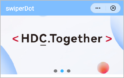
本文中轮播图指示点(swiperdot)组件可以配合快应用swiper组件使用,自定义实现指示点。轮播图指示点一般具有如下特点:
- 可以设置多种显示模式
- 可以设置指示点的个数
- 可以设置指示点的样式
效果图如下:
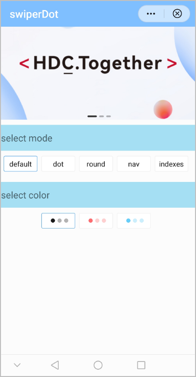
基本布局代码如下:
<import name="swiper-dot" src="./swiperdot.ux"></import>
<template>
    <div class="container">
        <swiper-dot class="swiper-dot-box" info={{info}} current={{current}} mode="{{mode}}" dots-styles={{dotsStyles}} field="content">
            <swiper class="swiper-box" @change="change" indicator="false" index="{{current}}">
                <block for="(index, item) in info">
                    <image class="img" src="{{item.url}}" @click="onBanner(index)" />
                </block>
            </swiper>
        </swiper-dot>

        <text class="section">select mode</text>
        <div class="rowBody">
            <input type="button" class="{{modeIndex === 0 ? 'selectBodyActive' : 'selectBody'}} bodycommon"  value="default" onclick="selectMode('default', 0)" />
            <input type="button" class="{{modeIndex === 1 ? 'selectBodyActive' : 'selectBody'}} bodycommon" value="dot" onclick="selectMode('dot', 1)" />
            <input type="button" class="{{modeIndex === 2 ? 'selectBodyActive' : 'selectBody'}} bodycommon" value="round" onclick="selectMode('round', 2)" />
            <input type="button" class="{{modeIndex === 3 ? 'selectBodyActive' : 'selectBody'}} bodycommon" value="nav" onclick="selectMode('nav', 3)" />
            <input type="button" class="{{modeIndex === 4 ? 'selectBodyActive' : 'selectBody'}} bodycommon" value="indexes" onclick="selectMode('indexes', 4)" />
        </div>

        <text class="section">select color</text>
        <div class="rowBody">
            <div for="(index,item) in dotStyle"  class="{{styleIndex === index ? 'selectBodyActive' : 'selectBody'}} bodycommon"  @click="selectStyle(index)">
                <text style="background-color: {{item.selectedBackgroundColor}}; border: {{item.selectedBorder }};" class="example-body-dots"></text>
                <text style="background-color: {{item.backgroundColor}}; border: {{item.border }};" class="example-body-dots"></text>
                <text style="background-color: {{item.backgroundColor}}; border: {{item.border }};" class="example-body-dots"></text>
            </div>
        </div>
    </div>
</template>
[h2]自定义子组件
- 定义布局样式。
- 轮播部分使用swiper组件展示图片或者其他内容,由于每个页面的swiper内容都不一样,所以使用slot组件来承载父组件中的swiper内容,由使用swiperdot组件的页面来完成轮播布局。
- 指示点部分采用absolute布局,通过bottom属性将指示点显示在距离swiper底部。
布局实现代码如下:
<template>
  <!-- Only one root node is allowed in template. -->
  <div class="swiper_container">
    <slot></slot>
    <div if="mode === 'default'" style="bottom:{{dots.bottom}}px;" class="swiper_dots-box">
      <text for="(index,item) in info" class="swiper_dots-item swiper_dots-bar" @click="clickItem(index)" style="width: {{index === current? dots.width*2:dots.width }}px;height:{{dots.width/3}} px; background-color:{{index !== current?dots.backgroundColor:dots.selectedBackgroundColor}};}">
      </text>
    </div>

    <div if="mode === 'dot'" style="bottom:{{dots.bottom}}px;" class="swiper_dots-box">
      <text for="(index,item) in info" class="swiper_dots-item" @click="clickItem(index)" style="width: {{dots.width}}px;height:{{dots.height}}px; background-color:{{index !== current?dots.backgroundColor:dots.selectedBackgroundColor}};border:{{index !==current ? dots.border:dots.selectedBorder}};">
      </text>
    </div>

    <div if="mode === 'round'" style="bottom:{{dots.bottom}}px;" class="swiper_dots-box">
      <text for="(index,item) in info" class="swiper_dots-item" @click="clickItem(index)" style="width:{{index === current? dots.width*3:dots.width }}px;height:{{dots.height}}px;background-color:{{index !== current?dots.backgroundColor:dots.selectedBackgroundColor}};border:{{index !==current ? dots.border:dots.selectedBorder}};">
      </text>
    </div>

    <div if="mode === 'nav'" style="background-color:{{dotsStyles.backgroundColor}};bottom:0;}" class="swiper_dots-box swiper_dots-nav">
      <text style="color:{{dotsStyles.color}};" class="swiper_dots-nav-item">{{ (current+1)+"/"+info.length +' ' +info[current][field] }}
      </text>
    </div>

    <div if="mode === 'indexes'" style="bottom:{{dots.bottom}}px;" class="swiper_dots-box">
      <text for="(index,item) in info" class="swiper_dots-item swiper_dots-indexes-text" @click="clickItem(index)" style="width:{{dots.width}} px;height:{{dots.height}}px;color:{{index === current?dots.selectedColor:dots.color}};background-color:{{index !== current?dots.backgroundColor:dots.selectedBackgroundColor}};border:{{index !==current ? dots.border:dots.selectedBorder}};">{{ index+1 }}
      </text>
    </div>
  </div>
</template>
指示点css代码如下:
.swiper_dots-box { position: absolute; bottom: 10px; left: 0; right: 0; flex: 1; flex-direction: row; justify-content: center; align-items: center; } - 规划属性。
属性
类型
默认值
描述
current
Number | String
0 | '0'
当前指示点索引,必须是通过swiper的change事件获取的e.index。
mode
String
default
指示点的类型。
- default
- dot
- round
- nav
- indexes
field
String
-
mode为nav时显示的内容字段。
说明:当mode为nav时,此参数必填。
info
Array
-
轮播图的数据,通过数组长度决定指示点个数。
dotsStyles
Object
-
指示点样式。
dotsStyles对象参数:
属性
类型
默认值
描述
width
Number
18
每个指示点宽度。
说明:当mode为nav或者indexes时,此参数不生效。
bottom
Number
10
指示点距swiper底部的高度。
说明:当mode为nav时,此参数不生效。
color
Color
#fff
- 当mode为nav时,表示指示点文字颜色。
- 当mode为indexes时,表示未选择的指示点文字颜色。
selectedColor
Color
#fff
当mode为indexes时,表示已选择的指示点文字颜色。
backgroundColor
Color
rgba(0, 0, 0, 0.3)
未选择的指示点背景色。
border
Border
1px rgba(0, 0, 0, 0.3) solid
未选择的指示点边框样式。
selectedBackgroundColor
Color
#333
已选择的指示点背景色。
说明:当mode为nav时,此参数不生效。
selectedBorder
Border
1px rgba(0, 0, 0, 0.9) solid
已选择的指示点边框样式。
说明:当mode为nav时,此参数不生效。
[h2]实现指示点模式及样式切换
当您希望用户按照自己的喜好去切换想要的模式及样式时,swiperdot组件需要及时更新响应。
- 通过快应用$watch('xx', 'xxx')方法监听指示点类型mode和指示点样式dotsStyles两个属性的变化,从而更新样式绑定变量dots,触发界面刷新。
- 当切换到indexes模式时,指示点的宽度和高度值单独设置为30。
onInit() {
  console.info("swiper dot sub oninit:this.dots="+JSON.stringify(this.dots));
  this.$watch('mode', 'modeChange');
  this.$watch('dotsStyles', 'dotsStyleChange');
},
modeChange: function (newValue, oldValue) {
  console.info("modeChange newValue= " + newValue
    + ", oldValue=" + oldValue);
  if (newValue === 'indexes') {
    this.dots.width = 30
    this.dots.height = 30
  } else {
    this.dots.width = 18
    this.dots.height = 18
  }
},
dotsStyleChange: function (newValue, oldValue) {
  console.info("dotsStyleChange newValue= " + newValue
    + ", oldValue=" + oldValue);
  this.dots = Object.assign(this.dots, this.dotsStyles);
  console.info("dotsStyleChange  this.dots="+JSON.stringify(this.dots));
},

- 由于swiper自身有指示点,在使用本组件时,请将swiper的indicator属性设置为false。
- swiper-item(滑块个数)尽量控制在一定数量之内,否则指示点可能会超出屏幕。
- 暂不支持垂直方向的指示点。
示例代码
轮播图指示点swiperdot.ux代码:
<template>
  <!-- Only one root node is allowed in template. -->
  <div class="swiper_container">
    <slot></slot>
    <div if="mode === 'default'" style="bottom:{{dots.bottom}}px;" class="swiper_dots-box">
      <text for="(index,item) in info" class="swiper_dots-item swiper_dots-bar" @click="clickItem(index)" style="width: {{index === current? dots.width*2:dots.width }}px;height:{{dots.width/3}} px; background-color:{{index !== current?dots.backgroundColor:dots.selectedBackgroundColor}};}">
      </text>
    </div>

    <div if="mode === 'dot'" style="bottom:{{dots.bottom}}px;" class="swiper_dots-box">
      <text for="(index,item) in info" class="swiper_dots-item" @click="clickItem(index)" style="width: {{dots.width}}px;height:{{dots.height}}px; background-color:{{index !== current?dots.backgroundColor:dots.selectedBackgroundColor}};border:{{index !==current ? dots.border:dots.selectedBorder}};">
      </text>
    </div>

    <div if="mode === 'round'" style="bottom:{{dots.bottom}}px;" class="swiper_dots-box">
      <text for="(index,item) in info" class="swiper_dots-item" @click="clickItem(index)" style="width:{{index === current? dots.width*3:dots.width }}px;height:{{dots.height}}px;background-color:{{index !== current?dots.backgroundColor:dots.selectedBackgroundColor}};border:{{index !==current ? dots.border:dots.selectedBorder}};">
      </text>
    </div>

    <div if="mode === 'nav'" style="background-color:{{dotsStyles.backgroundColor}};bottom:0;}" class="swiper_dots-box swiper_dots-nav">
      <text style="color:{{dotsStyles.color}};" class="swiper_dots-nav-item">{{ (current+1)+"/"+info.length +' ' +info[current][field] }}
      </text>
    </div>

    <div if="mode === 'indexes'" style="bottom:{{dots.bottom}}px;" class="swiper_dots-box">
      <text for="(index,item) in info" class="swiper_dots-item swiper_dots-indexes-text" @click="clickItem(index)" style="width:{{dots.width}} px;height:{{dots.height}}px;color:{{index === current?dots.selectedColor:dots.color}};background-color:{{index !== current?dots.backgroundColor:dots.selectedBackgroundColor}};border:{{index !==current ? dots.border:dots.selectedBorder}};">{{ index+1 }}
      </text>
    </div>
  </div>
</template>

<style>
  .swiper_container {
    flex-direction: column;
  }

  .swiper_dots-box {
    position: absolute;
    bottom: 10px;
    left: 0;
    right: 0;
    flex: 1;
    flex-direction: row;
    justify-content: center;
    align-items: center;
  }

  .swiper_dots-item {
    width: 18px;
    border-radius: 100px;
    margin-left: 9px;
    background-color: rgba(0, 0, 0, 0.4);
  }


  .swiper_dots-bar {
    border-radius: 50px;
  }

  .swiper_dots-nav {
    bottom: 0px;
    height: 56px;
    flex: 1;
    flex-direction: row;
    align-items: center;
    background-color: rgba(0, 0, 0, 0.2);
  }

  .swiper_dots-nav-item {
    font-size: 28px;
    color: #fff;
    margin: 0 15px;
  }

  .swiper_dots-indexes-text {
    justify-content: center;
    align-items: center;
    text-align: center;
    color: #fff;
    font-size: 20px;
  }
</style>

<script>
  module.exports = {
    props: {
      info: {
        type: Array,
        default() {
          return []
        }
      },
      current: {
        type: Number | String,
        default: 0
      },
      dotsStyles: {
        type: Object,
        default() {
          return {}
        }
      },
      // 指示点的类型 :default(默认) dot round nav indexes
      mode: {
        type: String,
        default: 'default'
      },
      // 只在 nav 模式下生效
      field: {
        type: String,
        default: ''
      }
    },
    data() {
      return {
        dots: {
          width: 18,
          height: 18,
          bottom: 10,
          color: '#fff',
          selectedColor:'#007aff',
          backgroundColor: 'rgba(0, 0, 0, 0.3)',
          border: '1px rgba(0, 0, 0, 0.3) solid',
          selectedBackgroundColor: '#333',
          selectedBorder: '1px rgba(0, 0, 0, 0.9) solid'
        }
      }
    },

    onInit() {
      console.info("swiper dot sub oninit:this.dots="+JSON.stringify(this.dots));
      this.$watch('mode', 'modeChange');
      this.$watch('dotsStyles', 'dotsStyleChange');
    },

    onReady(options) {
      console.info("swiper dot sub onReady: this.mode=" + this.mode);
      if (this.mode === 'indexes') {
        this.dots.width = 30
        this.dots.height = 30
      }
      this.dots = Object.assign(this.dots, this.dotsStyles);
    },

    modeChange: function (newValue, oldValue) {
      console.info("modeChange newValue= " + newValue
        + ", oldValue=" + oldValue);
      if (newValue === 'indexes') {
        this.dots.width = 30
        this.dots.height = 30
      } else {
        this.dots.width = 18
        this.dots.height = 18
      }
    },
    dotsStyleChange: function (newValue, oldValue) {
      console.info("dotsStyleChange newValue= " + newValue
        + ", oldValue=" + oldValue);
      this.dots = Object.assign(this.dots, this.dotsStyles);
      console.info("dotsStyleChange  this.dots="+JSON.stringify(this.dots));
    },
    clickItem(index) {
      this.$emit('clickItem', index);
    }
  }
</script>
页面hello.ux代码:
<import name="swiper-dot" src="./swiperdot.ux"></import>
<template>
    <div class="container">
        <swiper-dot class="swiper-dot-box" info={{info}} current={{current}} mode="{{mode}}" dots-styles={{dotsStyles}} field="content">
            <swiper class="swiper-box" @change="change" indicator="false" index="{{current}}">
                <block for="(index, item) in info">
                    <image class="img" src="{{item.url}}" @click="onBanner(index)" />
                </block>
            </swiper>
        </swiper-dot>

        <text class="section">select mode</text>
        <div class="rowBody">
            <input type="button" class="{{modeIndex === 0 ? 'selectBodyActive' : 'selectBody'}} bodycommon"  value="default" onclick="selectMode('default', 0)" />
            <input type="button" class="{{modeIndex === 1 ? 'selectBodyActive' : 'selectBody'}} bodycommon" value="dot" onclick="selectMode('dot', 1)" />
            <input type="button" class="{{modeIndex === 2 ? 'selectBodyActive' : 'selectBody'}} bodycommon" value="round" onclick="selectMode('round', 2)" />
            <input type="button" class="{{modeIndex === 3 ? 'selectBodyActive' : 'selectBody'}} bodycommon" value="nav" onclick="selectMode('nav', 3)" />
            <input type="button" class="{{modeIndex === 4 ? 'selectBodyActive' : 'selectBody'}} bodycommon" value="indexes" onclick="selectMode('indexes', 4)" />
        </div>

        <text class="section">select color</text>
        <div class="rowBody">
            <div for="(index,item) in dotStyle"  class="{{styleIndex === index ? 'selectBodyActive' : 'selectBody'}} bodycommon"  @click="selectStyle(index)">
                <text style="background-color: {{item.selectedBackgroundColor}}; border: {{item.selectedBorder }};" class="example-body-dots"></text>
                <text style="background-color: {{item.backgroundColor}}; border: {{item.border }};" class="example-body-dots"></text>
                <text style="background-color: {{item.backgroundColor}}; border: {{item.border }};" class="example-body-dots"></text>
            </div>
        </div>
    </div>
</template>

<style>
    .container {
        flex-direction: column;
        align-items: center;
        width: 100%;
    }

    .swiper-box {
        height: 360px;
    }

    .img {
        width: 100%;
        height: 100%;
    }

    .selectBody {
        border-color: #e5e5e5;
        border-width: 1px;
    }

    .selectBodyActive {
        border-color: #007aff;
        border-width: 1px;
    }

    .bodycommon{
        height: 60px;
        min-width: 130px;
        background-color: #ffffff;
        font-size: 28px;
        font-weight: lighter;
        margin-right: 16px;
        align-items: center;
        justify-content: center;
        border-radius: 5px;
    }

    .rowBody {
        flex-direction: row;
        margin-top: 20px;
        margin-bottom: 20px;
        justify-content: space-between;
    }

    .example-body-dots {
        width: 16px;
        height: 16px;
        border-radius: 50px;
        align-self: center;
        background-color: #333333;
        margin-left: 10px;
    }

    .section {
        font-size: 36px;
        height: 100px;
        width: 100%;
        background-color: #a5dff3;
        margin-top: 20px;
    }
</style>

<script>
    module.exports = {
        data: {
            info: [{
                url: '/Common/testing.png',
                content: '内容 A'
            },
            {
                url: '/Common/testing.png',
                content: '内容 B'
            },
            {
                url: '/Common/testing.png',
                content: '内容 C'
            }
            ],
            dotStyle: [{
                backgroundColor: 'rgba(0, 0, 0, 0.3)',
                border: '1px rgba(0, 0, 0, 0.3) solid',
                color: '#fff',
                selectedColor:'#fff',
                selectedBackgroundColor: 'rgba(0, 0, 0, 0.9)',
                selectedBorder: '1px rgba(0, 0, 0, 0.9) solid'
            },
            {
                backgroundColor: 'rgba(255, 90, 95,0.3)',
                border: '1px rgba(255, 90, 95,0.3) solid',
                color: '#fff',
                selectedColor:'#fff',
                selectedBackgroundColor: 'rgba(255, 90, 95,0.9)',
                selectedBorder: '1px rgba(255, 90, 95,0.9) solid'
            },
            {
                backgroundColor: 'rgba(83, 200, 249,0.3)',
                border: '1px rgba(83, 200, 249,0.3) solid',
                color: '#fff',
                selectedColor:'#fff',
                selectedBackgroundColor: 'rgba(83, 200, 249,0.9)',
                selectedBorder: '1px rgba(83, 200, 249,0.9) solid'
            }
            ],
            modeIndex: 0,
            styleIndex: 0,
            current: 0,
            mode: 'default',
            dotsStyles: {}
        },
        onInit() {
            this.$page.setTitleBar({
                text: 'swiperDot',
                textColor: '#ffffff',
                backgroundColor: '#007DFF',
                backgroundOpacity: 0.5,
                menu: true
            });
        },
        change(e) {
            this.current = e.index;
        },
        selectStyle(index) {
            this.dotsStyles = this.dotStyle[index]
            this.styleIndex = index
        },
        selectMode(mode, index) {
        console.info("select mode mode="+mode+",modeIndex="+index);
            this.mode = mode
            this.modeIndex = index
            this.styleIndex = -1
            this.dotsStyles = this.dotStyle[0]
        },

        onBanner(index) {
            console.log("onBanner index="+index);
        },
        clickItem: function() {/* TODO */}
    }
</script>