简介
标签(tag)组件通常用于商品分类、重点内容显示等场景。标签一般具有如下特点:
- 可以配置标签内容
- 可以配置标签颜色、实心/空心、尺寸、圆角/标记等样式
- 可以配置禁用状态
- 可以自定义触发标签点击事件
效果图如下:
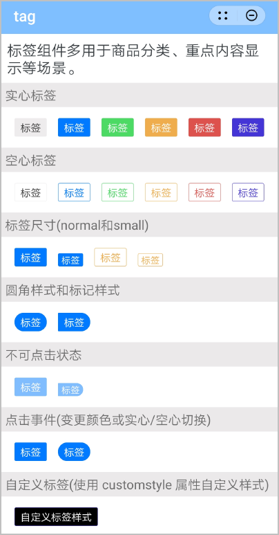
基本布局代码如下:
<import name="tag" src="./Tag/tag.ux"></import>
<template>
  <div class="container">
    <text class="title">基础用法</text>
    <div class="example">
      <div class="tag-view">
        <tag text="标签" type="{{type}}" inverted="true" size="normal" circle="true" disabled="false" @change="setType"></tag>
      </div>
      <div class="tag-view">
        <tag text="标签"  type="primary" inverted="{{inverted}}" size="small" mark="true" disabled="false" @change="setInverted"></tag>
      </div>
      <div class="tag-view">
        <tag text="自定义标签样式" customstyle="background-color: black; border-color: #4335d6; color: #fff;"></tag>
      </div>
    </div>
  </div>
</template>
[h2]自定义子组件
- 定义布局样式。
<template> <text class="tag {{basicStyle}} {{invertedColor}} {{tagSize}} {{markStyle}} {{radiuSize}} {{opacityStyle}}" style="{{customstyle}}" @click="onClick">{{ text }}</text> </template> - 规划属性和支持的事件。
属性
类型
默认值
描述
text
String
-
标签内容。
type
String
default
标签颜色类型。
- default:灰色
- primary:蓝色
- success:绿色
- warning:黄色
- error:红色
- royal:紫色
inverted
Boolean
false
是否为空心。
- true:空心
- false:实心
size
String
normal
标签尺寸。
- normal:正常
- small:偏小
circle
Boolean
false
是否为圆角样式。
mark
Boolean
false
是否为标记样式。
disabled
Boolean
false
是否为禁用状态。
customstyle
String
-
自定义标签样式。
支持的事件:
事件名称
参数
描述
change
-
点击标签时触发的事件。
[h2]父子组件通信
- 子组件的props中定义相关属性值,父组件引用时传入属性值,子组件通过 this.xxx 获取值并进行处理。
props: { text: { // 标签内容 type: String, default: "" }, type: { // 标签颜色类型default、primary、success、warning、error、royal type: String, default: "default" }, inverted: { // 是否为空心 type: [Boolean, String], default: false }, size: { // 标签尺寸normal、small type: String, default: "normal" }, circle: { // 是否为圆角样式 type: [Boolean, String], default: false }, mark: { // 是否为标记样式 type: [Boolean, String], default: false }, disabled: { // 是否为禁用状态 type: [Boolean, String], default: false }, customstyle: { type: String, default: '' } }, - 父组件定义标签点击事件并绑定。
<div class="tag-view">
  <tag text="标签" type="{{type}}" inverted="true" size="normal" circle="true" disabled="false" @change="setType"></tag>
</div>
<div class="tag-view">
  <tag text="标签"  type="primary" inverted="{{inverted}}" size="small" mark="true" disabled="false" @change="setInverted"></tag>
</div>
setType() { let types = ['default', 'primary', 'success', 'warning', 'error']; let index = types.indexOf(this.type); types.splice(index, 1); let randomIndex = Math.floor(Math.random() * 4); this.type = types[randomIndex]; console.log("message", this.type); }, setInverted() { this.inverted = !this.inverted; }, - 在点击标签时,子组件通过this.$emit方法触发父组件的change事件。
onClick() { if (this.isTrue(this.disabled)) { return } this.$emit("change"); },
[h2]计算数据和样式
使用计算属性computed方法,通过props属性动态计算数据和样式,返回给组件使用。
computed: {
basicStyle() {
const {
type
} = this
return type
},
invertedColor() {
const {
isTrue,
type,
inverted
} = this
return isTrue(inverted) ? type + '-inverted' : '';
},
tagSize() {
const {
size
} = this
return size === 'small' ? 'tag-small' : ''
},
radiuSize() {
const {
isTrue,
circle
} = this
return isTrue(circle) ? 'radiuSize' : '';
},
markStyle() {
const {
isTrue,
mark
} = this
return isTrue(mark) ? 'markStyle' : '';
},
opacityStyle() {
const {
isTrue,
disabled
} = this
return isTrue(disabled) ? 'opacityStyle' : '';
}
},
示例代码
标签tag.ux代码:
<template>
<text class="tag {{basicStyle}} {{invertedColor}} {{tagSize}} {{markStyle}} {{radiuSize}} {{opacityStyle}}" style="{{customstyle}}" @click="onClick">{{ text }}</text>
</template>
<style>
.tag {
padding: 5px 15px;
color: #333;
border-radius: 5px;
background-color: #eeecec;
border-width: 1px;
border-color: #eeecec;
font-size: 28px;
}
.default-inverted {
color: #333;
background-color: #ffffff;
border-width: 1px;
border-color: #eeecec;
font-size: 28px;
}
.opacityStyle {
opacity: 0.5;
}
.radiuSize {
border-radius: 50px;
}
.markStyle {
border-top-right-radius: 50px;
border-bottom-right-radius: 50px;
}
.success {
color: #fff;
background-color: #4cd964;
border-width: 1px;
border-color: #4cd964;
font-size: 28px;
}
.success-inverted {
color: #4cd964;
background-color: #ffffff;
border-width: 1px;
border-color: #4cd964;
font-size: 28px;
}
.warning {
color: #fff;
background-color: #f0ad4e;
border-width: 1px;
border-color: #f0ad4e;
font-size: 28px;
}
.warning-inverted {
color: #f0ad4e;
background-color: #ffffff;
border-width: 1px;
border-color: #f0ad4e;
font-size: 28px;
}
.error {
color: #fff;
background-color: #dd524d;
border-width: 1px;
border-color: #dd524d;
font-size: 28px;
}
.error-inverted {
color: #dd524d;
background-color: #ffffff;
border-width: 1px;
border-color: #dd524d;
font-size: 28px;
}
.royal {
color: #fff;
background-color: #4335d6;
border-width: 1px;
border-color: #4335d6;
}
.royal-inverted {
color: #4335d6;
background-color: #ffffff;
border-width: 1px;
border-color: #4335d6;
font-size: 28px;
}
.primary {
color: #fff;
background-color: #007aff;
border-width: 1px;
border-color: #007aff;
font-size: 28px;
}
.primary-inverted {
color: #007aff;
background-color: #ffffff;
border-width: 1px;
border-color: #007aff;
}
.tag-small {
padding: 0px 8px;
font-size: 25px;
}
</style>
<script>
module.exports = {
props: {
text: {
// 标签内容
type: String,
default: ""
},
type: {
// 标签颜色类型default、primary、success、warning、error、royal
type: String,
default: "default"
},
inverted: {
// 是否为空心
type: [Boolean, String],
default: false
},
size: {
// 标签尺寸normal、small
type: String,
default: "normal"
},
circle: {
// 是否为圆角样式
type: [Boolean, String],
default: false
},
mark: {
// 是否为标记样式
type: [Boolean, String],
default: false
},
disabled: {
// 是否为禁用状态
type: [Boolean, String],
default: false
},
customstyle: {
type: String,
default: ''
}
},
data: {
invertedColor: '',
radiuSize: '',
markStyle: '',
tagSize: '',
},
computed: {
basicStyle() {
const {
type
} = this
return type
},
invertedColor() {
const {
isTrue,
type,
inverted
} = this
return isTrue(inverted) ? type + '-inverted' : '';
},
tagSize() {
const {
size
} = this
return size === 'small' ? 'tag-small' : ''
},
radiuSize() {
const {
isTrue,
circle
} = this
return isTrue(circle) ? 'radiuSize' : '';
},
markStyle() {
const {
isTrue,
mark
} = this
return isTrue(mark) ? 'markStyle' : '';
},
opacityStyle() {
const {
isTrue,
disabled
} = this
return isTrue(disabled) ? 'opacityStyle' : '';
}
},
isTrue(value) {
return value === true || value === 'true'
},
onClick() {
if (this.isTrue(this.disabled)) {
return
}
this.$emit("change");
},
}
</script>
页面hello.ux代码:
<import name="tag" src="./Tag/tag.ux"></import>
<template>
<!-- Only one root node is allowed in template. -->
<div class="container">
<text class="example-info">标签组件多用于商品分类、重点内容显示等场景。</text>
<text class="title">实心标签</text>
<div class="example">
<div class="tag-view">
<tag text="标签"></tag>
</div>
<div class="tag-view">
<tag text="标签" type="primary"></tag>
</div>
<div class="tag-view">
<tag text="标签" type="success"></tag>
</div>
<div class="tag-view">
<tag text="标签" type="warning"></tag>
</div>
<div class="tag-view">
<tag text="标签" type="error"></tag>
</div>
<div class="tag-view">
<tag text="标签" type="royal"></tag>
</div>
</div>
<text class="title">空心标签</text>
<div class="example">
<div class="tag-view">
<tag inverted="true" text="标签"></tag>
</div>
<div class="tag-view">
<tag text="标签" type="primary" inverted="true"></tag>
</div>
<div class="tag-view">
<tag text="标签" type="success" inverted="true"></tag>
</div>
<div class="tag-view">
<tag text="标签" type="warning" inverted="true"></tag>
</div>
<div class="tag-view">
<tag text="标签" type="error" inverted="true"></tag>
</div>
<div class="tag-view">
<tag text="标签" type="royal" inverted="true"></tag>
</div>
</div>
<text class="title">标签尺寸(normal和small)</text>
<div class="example">
<div class="tag-view">
<tag text="标签" type="primary"></tag>
</div>
<div class="tag-view">
<tag text="标签" type="primary" size="small"></tag>
</div>
<div class="tag-view">
<tag text="标签" type="warning" inverted="true"></tag>
</div>
<div class="tag-view">
<tag text="标签" type="warning" inverted="true" size="small"></tag>
</div>
</div>
<text class="title">圆角样式和标记样式</text>
<div class="example">
<div class="tag-view">
<tag text="标签" type="primary" circle="true"></tag>
</div>
<div class="tag-view">
<tag text="标签" type="primary" mark="true"></tag>
</div>
</div>
<text class="title">不可点击状态</text>
<div class="example">
<div class="tag-view">
<tag text="标签" type="primary" disabled="true"></tag>
</div>
<div class="tag-view">
<tag text="标签" type="primary" size="small" mark="true" disabled="true"></tag>
</div>
</div>
<text class="title">点击事件(变更颜色或实心/空心切换)</text>
<div class="example">
<div class="tag-view">
<tag text="标签" type="{{type}}" @change="setType"></tag>
</div>
<div class="tag-view">
<tag text="标签" type="primary" inverted="{{inverted}}" circle="true" @change="setInverted"></tag>
</div>
</div>
<text class="title">自定义标签(使用 customstyle 属性自定义样式)</text>
<div class="example">
<div class="tag-view">
<tag text="自定义标签样式" customstyle="background-color: black; border-color: #4335d6; color: #fff;"></tag>
</div>
</div>
</div>
</template>
<style>
.container {
flex-direction: column;
}
.tag-view {
flex-direction: column;
margin: 10px 15px;
justify-content: center;
}
.example-info {
padding: 15px;
color: #3b4144;
background-color: #ffffff;
font-size: 40px;
}
.example {
display: flex;
flex-direction: row;
align-items: flex-end;
flex-wrap: wrap;
padding: 20px 20px;
}
.title {
font-size: 35px;
padding: 10px;
background-color: rgb(235, 233, 233);
}
</style>
<script>
module.exports = {
data: {
type: 'primary',
inverted: false,
customstyle: ''
},
setType() {
  let types = ['default', 'primary', 'success', 'warning', 'error'];
  let index = types.indexOf(this.type);
  types.splice(index, 1);
  let randomIndex = Math.floor(Math.random() * 4);
  this.type = types[randomIndex];
  console.log("message", this.type);
},
setInverted() {
  this.inverted = !this.inverted;
},
onInit() {
this.$page.setTitleBar({
text: 'tag',
textColor: '#ffffff',
backgroundColor: '#007DFF',
backgroundOpacity: 0.5,
menu: true
});
},
}
</script>