
感谢您对车机快应用生态的支持,车机快应用开发前请先联系您的商务经理,确认分发的车型后再启动开发。
[h2]创建项目
- 打开华为快应用IDE,在欢迎页选择“新建项目 > 快应用”,选择“车机”,点击“下一步”。
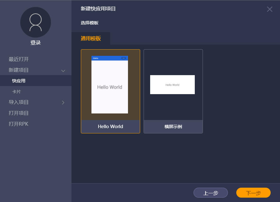
- 根据待开发快应用的内容,选择合适的模板,点击“下一步”。
- Hello World:生成车机快应用项目最基础的项目结构。
- 横屏示例:生成适用于横屏的车机快应用项目最基础的项目结构。
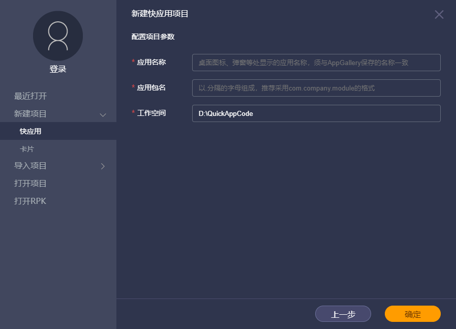
- 填写项目信息后,点击“确定”。
- 应用名称:应用名称,用于在桌面图标、应用市场等处显示。例如:QuickAppDemo。
- 应用包名:发布的快应用为以.rpk为后缀的文件,此处即定义发布后的包名。推荐采用com.company.module的格式,例如:com.huawei.quickappdemo。
- 工作空间:项目工程存储路径。

[h2]新建卡片项目
- 打开华为快应用IDE,在欢迎页选择“新建项目 > 卡片”,选择“车机”,点击“下一步”。
- 根据待开发的内容,选择合适的模板,点击“下一步”。
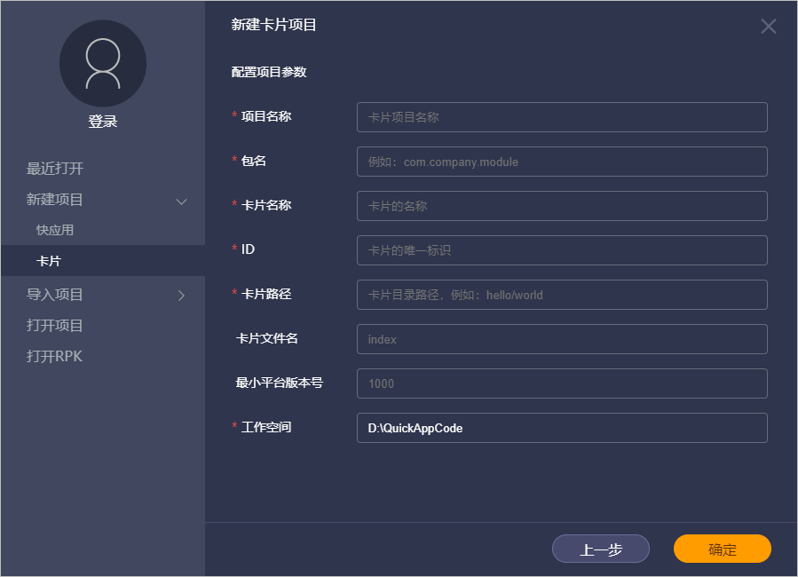
- 填写项目信息后,点击“确定”。
- 项目名称:工程名称,用于指定工程文件夹名称。
- 包名:发布的快应用为以.rpk为后缀的文件,此处即定义发布后的包名。推荐采用com.company.module的格式,例如:com.huawei.carddemo。
- 卡片名称:卡片的名称,卡片提交审核时使用。
- ID:卡片的唯一标识。
- 卡片路径:卡片目录路径。

已在manifest.json中配置过的路径,不可作为新建卡片的路径。
例如:manifest.json中path配置了/c1,则不能在src/c1路径新建卡片。需更改文件夹或者新建文件夹,如src/c2。
- 卡片文件名:项目中的卡片文件名称。
- 最小平台版本号:非必填,默认1000,用于平台版本管理。
- 工作空间:项目工程存储路径。


[h2]新建卡片
- 打开卡片项目,有两种方式新建卡片:
- 菜单选择“文件 > 新建卡片”。
- 左侧资源管理器中,在src文件夹上右键选择“新建卡片”。
- 选择一个卡片模板,点击“下一步”。
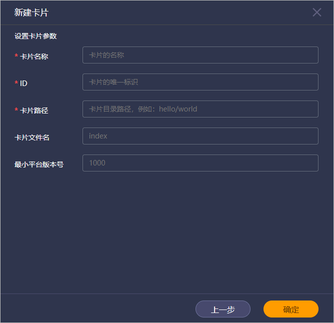
- 设置卡片参数,点击“确定”。
- 卡片名称:卡片的名称,卡片提交审核时使用。
- ID:卡片的唯一标识。
- 卡片路径:卡片目录路径。

已在manifest.json中配置过的路径,不可作为新建卡片的路径。
例如:manifest.json中path配置了/c1,则不能在src/c1路径新建卡片。需更改文件夹或者新建文件夹,如src/c2。
- 卡片文件名:项目中的卡片文件名称。
- 最小平台版本号:非必填,默认1000,用于平台版本管理。

新建卡片成功后,可在manifest.json文件中看到卡片的相关配置。


[h2]尺寸转换
- 配置manifest.json文件。
- minPlatformVersion配置为1045。
"minPlatformVersion": 1045,
- 修改config节点下的designWidth属性为device-width。
"config": {
    "designWidth": "device-width"
},
- minPlatformVersion配置为1045。
- 对项目文件中ux、css文件设置尺寸的地方进行换算,转换公式为:新尺寸 = 旧尺寸*真实宽度/designWidth。
以某11寸车机为例,分辨率1152*1184,屏幕密度为1.125,则真实宽度为 1152/1.125=1024。
当原designWidth为1152时,原来 font-size:60 px 转换后变成 font-size:53.3 px。
当原designWidth为750时,原来 font-size:60 px 转换后变成 font-size:81.9 px。
也可以下载 convert工具 对项目文件进行批量转换,运行命令如下:
java -jar convert.jar -root “d:\quickapp\proj” -formats "ux;css" -oldDesignWidth 750 -destScreenDps 360
750替换为原始配置的宽度,360替换为屏幕的真实宽度。
[h2]动态布局
由于不同厂商车机横屏竖屏宽度差别较大,配置device-width且尺寸转换之后,可能仍然无法兼顾多种屏幕显示效果,此时可以使用MediaQuery进行动态布局,详细请参见“MediaQuery响应式布局能力”。 例如需要区分1024宽度和1280宽度屏幕,可用以下代码实现:
@media screen and (min-width: 0) and (max-width: 1079) {
    .list {
        columns: 2;
    }
    .subtitle {
        font-size: 30px;
        width: 60px;
    }
    /*此处可以根据需要修改组件样式*/
    }
    @media screen and (min-width: 1080) and (max-width: 2159) {
    .list {
        columns: 4;
    }
    .subtitle {
        font-size: 20px;
        width: 40px;
    }
    /*此处可以根据需要修改组件样式*/}
}
[h2]实现建议
响应式布局实现的重要一步在于分割点的划分,即不同宽度范围,我们建议根据常见屏幕宽度按照以下区间划分屏幕范围。
开发者也可以在此基础上根据实际需求修改或者增加新的划分条件,以达到目标效果。
| 序号 | 宽(dp) | 高(dp) | DP区间(宽度) |
|---|---|---|---|
| 1 | 860 | 645 | 800-960 |
| 2 | 878 | 1024 | 800-960 |
| 3 | 912 | 540 | 800-960 |
| 4 | 960 | 500 | 800-960 |
| 5 | 994 | 559 | 960-1120 |
| 6 | 1024 | 1053 | 960-1120 |
| 7 | 1078 | 405 | 960-1120 |
| 8 | 1280 | 480 | 1120-1280 |
| 9 | 1280 | 720 | 1120-1280 |
| 10 | 1345 | 624 | 1280以上 |
[h2]示例代码
@media screen and (max-width: 959) {
    .list {
        columns: 3;
        flex-direction: column;
    }
    .subtitle{
        font-size: 36px;
        width: 512px;
        height:50px;
        background-color:#0000ff;
        text-align: center;
        color: #00ff00;
    }
}
@media screen and (min-width: 960) and (max-height:1119) {
    .list {
        columns: 4;
        flex-direction: column;
    }
    .subtitle{
        font-size: 48px;
        width: 512px;
        height:50px;
        background-color:#add8e6;
        text-align: center;
        color: #ffff00;
    }
}
@media screen and (min-width: 1120) and (max-height:1279) {
    .list {
        columns: 5;
        flex-direction: column;
    }
    .subtitle{
        font-size: 60px;
        width: 512px;
        height:50px;
        background-color:#fafad2;
        text-align: center;
        color: #ff0000;
    }
}
@media screen and (min-height: 1279) {
    .list {
        columns: 6;
        flex-direction: column;
    }
    .subtitle{
        font-size: 72px;
        width: 512px;
        height:50px;
        background-color:#daa520;
        text-align: center;
        color: #00ff00;
    }
}
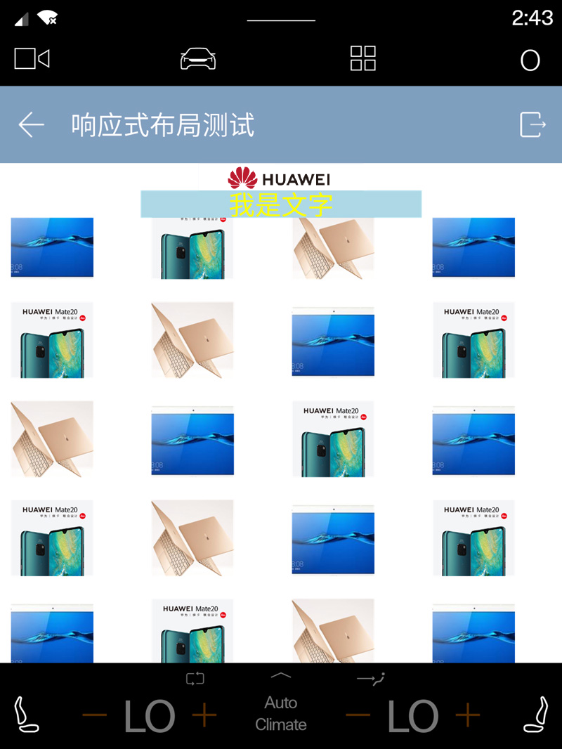
在宽度1024dp的屏幕显示效果:
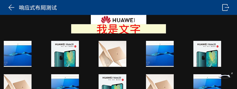
在宽度1280dp的屏幕显示效果:


[h2]FAQ
- 手机上安装车机快应用加载器是否会与原来手机快应用的加载器冲突?
- 车机模拟器上的效果和真的车机效果一样么?车机模拟器上的效果和真的车机效果一样么?
- 车机快应用是否只有华为支持,快应用联盟没有统一的规范?
- 车机快应用发布到哪个平台?
- 车机快应用使用showDialog在横、竖屏都可以弹框吗?
- 车机上实现响应式布局时,使用多层class选择器不生效,如何处理?
- 在车机调用device.getInfo返回的信息与手机有什么区别,具体返回什么数据?
- 使用模拟器时如何模拟车速?
- 如何实现车辆停止时显示二维码,车辆启动后二维码蒙层或者不显示二维码?
- 车机快应用有退出的方法可以调用吗?
- 为什么在手机上调用restrictions.registerUxRestrictionsListener(OBJECT)没有反应?
- 在真实车机上调用restrictions.registerUxRestrictionsListener成功了,但是为什么没有立即执行success的回调内容?
- 如何处理在车机上拉起高德地图出现异常?
- 如何重写车机应用标题栏左上角返回按钮点击事件?
- 车机快应用如何监听网络变化?
- 快应用IDE升级到11.4.1后,使用Node.js的核心模块时编译报错,如何处理?
- 华为快应用IDE中的车机模拟器支持mac M1芯片机型吗?
- 启用车机模拟器,提示“Error: spawn C:\Users\aaa\AppData\Local\Android\Sdk\tools\emulator ENOENT”错误 ,如何处理?
- 快应用在合众EP12车机上页面显示不全,但在EP31车机上正常,如何处理?
- 在车机模拟器上安装加载器失败,如何处理?