属性
除了支持 通用属性 以外,还支持如下属性。
名称 |
类型 |
默认值 |
是否必填 |
描述 |
|---|---|---|---|---|
target |
string |
- |
是 |
目标元素选择器。 |
placement |
string |
bottom |
否 |
弹出窗口位置。 {'left','right','top','bottom','topLeft','topRight','bottomLeft', 'bottomRight'} |
样式
除了支持 通用样式 以外,还支持如下样式。
名称 |
类型 |
默认值 |
是否必填 |
描述 |
|---|---|---|---|---|
mask-color |
color |
0x00000000 |
否 |
遮罩背景层的颜色,缺省为全透明。 假如只设置了颜色,透明度默认为30%。 |
事件
不支持appear,disappear事件,除了支持 通用事件 以外,还支持如下事件。
名称 |
参数 |
描述 |
|---|---|---|
visibilitychange |
{visible: boolean} |
当显隐状态变化时回调函数。 |
示例代码
<template>
    <div class="container">
        <div class="page-title-wrap">
            <text class="page-title">{{componentName}}</text>
        </div>
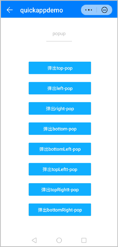
        <input id="btnclick" type="button" class="btn1" style="margin-top: 50px;" value="弹出top-pop" />
        <popup target="btnclick" placement="top" style="mask-color: #0faeff;" @visibilitychange="isVisible">
            <text>top</text>
        </popup>
        <input id="btnclick1" type="button" class="btn1" style="margin-top: 50px;" value="弹出left-pop" />
        <popup target="btnclick1" placement="left" style="mask-color: #0faeff;" @visibilitychange="isVisible">
            <text>left</text>
        </popup>
        <input id="btnclick2" type="button" class="btn1" style="margin-top: 50px;" value="弹出right-pop" />
        <popup target="btnclick2" placement="right" style="mask-color: #0faeff;" @visibilitychange="isVisible">
            <text>right</text>
        </popup>
        <input id="btnclick3" type="button" class="btn1" style="margin-top: 50px;" value="弹出bottom-pop" />
        <popup target="btnclick3" style="mask-color: #0faeff;" @visibilitychange="isVisible">
            <text>bottom</text>
        </popup>
        <input id="btnclick4" type="button" class="btn1" style="margin-top: 50px;" value="弹出bottomLeft-pop" />
        <popup target="btnclick4" placement="bottomLeft" style="mask-color: rgba(0, 195, 255, 0.5);" @visibilitychange="isVisible">
            <text>bottomLeft</text>
        </popup>
        <input id="btnclick5" type="button" class="btn1" style="margin-top: 50px;" value="弹出topLeftt-pop" />
        <popup target="btnclick5" placement="topLeft" style="mask-color: rgb(0, 195, 255);" @visibilitychange="isVisible">
            <text>topLeft</text>
        </popup>
        <input id="btnclick6" type="button" class="btn1" style="margin-top: 50px;" value="弹出topRightt-pop" />
        <popup target="btnclick6" placement="topRight" style="mask-color:  hsla(200, 100%, 50%, 0.5);"
            @visibilitychange="isVisible">
            <text>topRight</text>
        </popup>
        <input id="btnclick7" type="button" class="btn1" style="margin-top: 50px;" value="弹出bottomRight-pop" />
        <popup target="btnclick7" placement="bottomRight" style="mask-color: hsl(200, 100%, 50%);" @visibilitychange="isVisible">
            <text>bottomRight</text>
        </popup>
    </div>
</template>
<script>
    import prompt from '@system.prompt';
    export default {
        data: {
            componentName: 'popup'
        },
        isVisible(ret) {
            prompt.showToast({
                message: ret.visible,
                duration: '1000',
                image: '/Common/logo.png',
                gravity: 'center'
            })
        }
    }
</script>
<style>
    .container {
        flex: 1;
        flex-direction: column;
    }
    .page-title-wrap {
        padding-top: 50px;
        padding-bottom: 80px;
        justify-content: center;
    }
    .page-title {
        padding-top: 30px;
        padding-bottom: 30px;
        padding-left: 40px;
        padding-right: 40px;
        border-color: #bbbbbb;
        color: #bbbbbb;
        border-bottom-width: 2px;
    }
    .item-container {
        margin-top: 20px;
        margin-bottom: 30px;
        flex-direction: column;
    }
    .item-title {
        padding-left: 30px;
        padding-bottom: 30px;
        padding-top: 30px;
        border-bottom-width: 1px;
        border-color: #bbbbbb;
        color: #aaaaaa;
    }
    .item-content {
        background-color: #ffffff;
        border-bottom-width: 1px;
        border-color: #bbbbbb;
        padding-left: 30px;
        padding-right: 30px;
    }
    .btn1 {
        height: 80px;
        width: 400px;
        text-align: center;
        margin-left: 180px;
        border-radius: 5px;
        color: #ffffff;
        font-size: 30px;
        background-color: #0faeff;
    }
</style>
效果图如下: