属性
支持 <text> 属性,同时除了支持 通用属性 以外,还支持如下属性。
名称 |
类型 |
默认值 |
是否必填 |
描述 |
|---|---|---|---|---|
placeholder |
string |
- |
否 |
提示文本的内容 |
maxlength |
number |
- |
否 |
输入框可输入的最多字符数量,不填表示不限制输入框中字符数量 |
model:value(1100+) |
string |
- |
否 |
用于绑定和更新框架中的值的model指令。 |
样式
支持active伪类。除了支持 通用样式以外,还支持如下样式。
名称 |
类型 |
默认值 |
是否必填 |
描述 |
|---|---|---|---|---|
color |
color |
rgba(0,0,0,0.87) |
否 |
文本颜色 |
font-size |
number |
37.5px |
否 |
文本尺寸 |
font-weight(1030+) |
lighter | 100 | 200 | 300 | 400 | 500 | 600 | 700 | 800 | 900 | normal | bold | bolder |
normal |
否 |
- |
placeholder-color |
color |
rgba(0,0,0,0.38) |
否 |
提示文本的颜色 |
font-family(1030+) |
string |
- |
否 |
通过该属性可以设置组件中字符串的字体,支持四种系统原生字体:normal,sans-serif,serif,monospace(此四种字体只对英文有效)。 如果需要设置自定义字体,请参见“font-face样式”。 |
事件
除了支持 通用事件 以外,还支持如下事件。
名称 |
参数 |
描述 |
|---|---|---|
change |
{text:newText} |
输入内容发生变化时触发 |
selectionchange(1030+) |
- |
在<textarea>组件中调用其select()和setSelectionRange()方法改变选中字符串时触发此事件。 |
linechange(1060+) |
{height: number, lineCount:number} |
输入框行数变化时调用,height为当前输入框高度,lineCount为当前文本行数。 |
方法
名称 |
参数 |
描述 |
|---|---|---|
focus |
{focus:true|false},focus不传默认为true |
使组件获得或者失去焦点,可触发focus伪类,可弹出或收起输入法 |
select |
- |
选中文本框的全部文本 |
setSelectionRange |
{start:number,end:number} |
设置文本框的选中区域 |
getSelectionRange |
{callback:function(start: number, end : number)} |
获取文本框的选中区域 |
示例代码
<template>
  <div class="container">
    <div class="page-title-wrap">
      <text class="page-title">{{componentName}}</text>
    </div>

    <div class="item-container">
      <div class="item-content">
        <textarea id="textarea" maxlength="5" placeholder="Please enter content" class="textarea" @selectionchange="selectionchange"></textarea>
        <text class="txt">Wrap text when there is too much text, scroll display when setting high</text>
      </div>
      <input class="select-button" value="select all" type="button" onclick="select"></input>
      <input class="select-button" value="Set the selected area" type="button" onclick="setSelectionRange"></input>
      <input class="select-button" value="Get the first and last position of the selected area" type="button" onclick="getSelectionRange"></input>

      <div class="item-content">
        <textarea class="textarea textarea-fontfamily"></textarea>
        <text class="txt">this textarea font-family is serif</text>
      </div>
    </div>
  </div>
</template>

<style>
    .container {
      flex: 1;
      flex-direction: column;
    }
    .page-title-wrap {
      padding-top: 50px;
      padding-bottom: 80px;
      justify-content: center;
    }
    .page-title {
      padding-top: 30px;
      padding-bottom: 30px;
      padding-left: 40px;
      padding-right: 40px;
      border-color: #bbbbbb;
      color: #bbbbbb;
      border-bottom-width: 2px;
    }

    .item-container {
      margin-bottom: 50px;
      margin-right: 60px;
      margin-left: 60px;
      flex-direction: column;
    }

    .textarea {
      border-color: #bbbbbb;
      border-width: 1px;
      padding: 15px;
      height: 150px;
      font-size: 30px;
      color: #FF6347;
      placeholder-color: #8A2BE2;
    }

    .item-content {
      flex-direction: column;
      background-color: #ffffff;
      padding: 30px;
      margin-bottom: 100px;
      justify-content: center;
    }

    .select-button {
      padding: 15px;
      font-size: 30px;
      color: #000000;
    }

    .textarea-fontfamily {
      font-family: serif;
    }
</style>

<script>
    import prompt from '@system.prompt'

    export default {
        data: {
            componentName: 'textarea'
        },
        onInit() {
            this.$page.setTitleBar({ text: 'textarea' })
        },
        select() {
            this.$element('textarea').select()
        },
        setSelectionRange() {
            this.$element('textarea').setSelectionRange({ start: 0, end: 2 })
        },
        getSelectionRange() {
            this.$element('textarea').getSelectionRange({
                callback: function (start, end) {
                    prompt.showToast({
                        message: 'selection start:' + start + ',end:' + end
                    })
                }
            })
        },
        selectionchange() {
            console.log('selectionchange')
        },
        linechange(ret) {
            console.log('lineCount = ' + ret.lineCount)
            console.log('height = ' + ret.height)
        }
    }
</script>
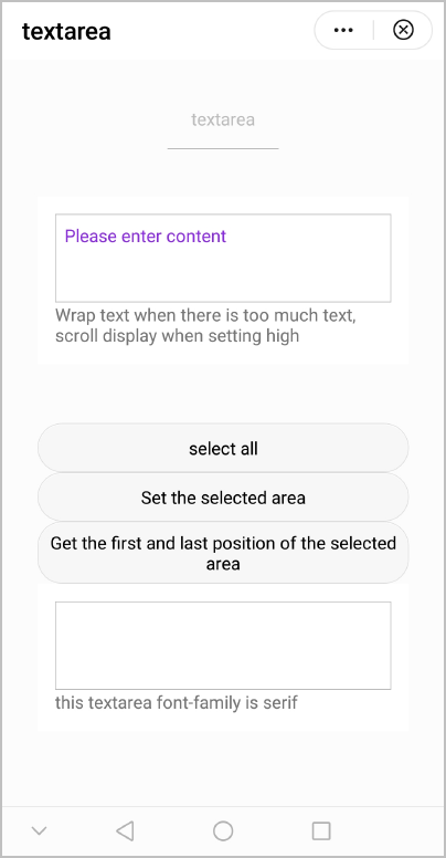
效果图如下:
版本更新说明
版本 |
发布日期 |
描述 |
|---|---|---|
1100 |
2022-07-07 |
新增属性model:value,支持双向绑定 model指令。 |
1060 |
- |
新增事件linechange,在textarea中输入文字换行后可以监听到textarea中文字的行数。 |
1030 |
2018-10-31 |
|
1010 |
2018-04-20 |
|