属性
除了支持 通用属性 以外,还支持如下属性。
名称 |
类型 |
默认值 |
是否必填 |
描述 |
|---|---|---|---|---|
numstars |
number |
5 |
否 |
星级总数 |
rating |
number |
0 |
否 |
评星数 |
stepsize |
number |
0.5 |
否 |
评星步长 |
indicator |
boolean |
false |
否 |
是否作为一个指示器(用户不可操作) |
样式
支持active伪类。除了支持 通用样式 以外,还支持如下样式。
名称 |
类型 |
默认值 |
是否必填 |
描述 |
|---|---|---|---|---|
star-background |
uri |
- |
否 |
仅支持本地路径图片和base64图片(华为扩展接口,非厂商联盟规范)。 |
star-foreground |
uri |
- |
否 |
仅支持本地路径图片和base64图片(华为扩展接口,非厂商联盟规范)。 |
star-secondary |
uri |
- |
否 |
仅支持本地路径图片和base64图片(华为扩展接口,非厂商联盟规范)。 |
width |
length|percentage |
numstars*star资源的宽度 |
否 |
默认为numstars*star资源的宽度。 |
height |
length|percentage |
star资源的高度 |
否 |
默认为star资源的高度。 |
事件
不支持 click 和 longpress 事件,不支持 swipe 事件。除了支持 通用事件 以外,还支持如下事件。
名称 |
参数 |
描述 |
|---|---|---|
change |
{rating:currentRating, isFromUser:isFromUserValue 1080+} |
评星数发生改变时触发。 isFromUser说明:该事件是否由用户拖动触发。 |
示例代码
<template>
  <div class="container">
    <div class="page-title-wrap">
      <text class="page-title">{{componentName}}</text>
    </div>
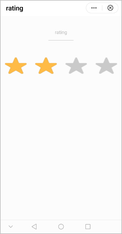
    <rating class="ratingStyle" numstars="4" rating="2" @change="showChangePrompt"></rating>
  </div>
</template>

<style>
    .container {
      flex: 1;
      flex-direction: column;
    }
    .page-title-wrap {
      padding-top: 50px;
      padding-bottom: 80px;
      justify-content: center;
    }
    .page-title {
      padding-top: 30px;
      padding-bottom: 30px;
      padding-left: 40px;
      padding-right: 40px;
      border-color: #bbbbbb;
      color: #bbbbbb;
      border-bottom-width: 2px;
    }
    .ratingStyle {
      star-background: url(/Common/img/ic_stars_gray_mid.png);
      star-foreground: url(/Common/img/ic_stars_blue_mid.png);
      star-secondary: url(/Common/img/ic_stars_blue_half_mid.png);
      height: 150px;
    }
</style>

<script>
    import prompt from '@system.prompt'
    export default {
        data: {
            componentName: 'rating'
        },
        onInit() {
            this.$page.setTitleBar({ text: 'rating' })
        },
        showChangePrompt(ret) {
            prompt.showToast({
                message: JSON.stringify(ret.rating)
            })
        }
    }
</script>
效果图如下: