















合作咨询
我们的专家服务团队将竭诚为您提供专业的合作咨询服务
滑块视图容器。
限制条件 | 说明 |
|---|---|
适用终端 | 手机、平板、智慧屏、车机 |
适用区域 | 全球 |
支持除<list>之外的子组件。
swiper子组件不支持position:fixed,1116版本开始,swiper子组件设置position:fixed会自动转换成position:relative
除了支持 通用属性以外,还支持如下属性。
名称 | 类型 | 默认值 | 是否必填 | 描述 |
|---|---|---|---|---|
index | number | 0 | 否 | 当前显示的子组件索引。 |
autoplay | boolean | false | 否 | 渲染完成后,是否自动进行播放。 |
interval | number | 3000 | 否 | 自动播放时的时间间隔,单位毫秒。 |
indicator | boolean | true | 否 | 是否启用indicator,默认true。 |
loop | boolean | true | 否 | 是否开启循环模式。 |
duration(1040+) | number | - | 否 | 滑动动画时长。 |
vertical(1040+) | boolean | false | 否 | 滑动方向是否为纵向,纵向时 indicator 也为纵向。 |
previousmargin(1072+) | string | 0px | 否 | 前边距,用于露出前一项的一小部分,支持单位:px和%。 |
nextmargin(1072+) | string | 0px | 否 | 后边距,用于露出后一项的一小部分,支持单位:px和%。 |
enableswipe(1080+) | boolean | true | 否 | 是否支持swiper沿其内容的排列方向滑动。 |
previousmargin和nextmargin的总和不应该超过整个swiper大小的1/2,超过部分将会被截取。
除了支持 通用样式 以外,还支持如下样式。
swiper组件的直接子节点不支持修改宽度和高度,宽度默认和swiper宽度相等。
名称 | 类型 | 默认值 | 是否必填 | 描述 |
|---|---|---|---|---|
indicator-color | color | rgba(0,0,0,0.50) | 否 | indicator填充颜色 |
indicator-selected-color | color | rgba(51,180,255,1.0) | 否 | indicator选中时的颜色 |
indicator-size | length | 20px | 否 | indicator组件的直径大小 |
indicator-top|left|right|bottom(1040+) | length | percentage | - | 否 | indicator相对于swiper的位置 |
除了支持 动画样式 以外,还支持页面切换动画。
swiper动画在设置previousmargin和nextmargin场景下不生效。
名称 | 类型 | 默认值 | 描述 |
|---|---|---|---|
page-transform-origin(1080+) | position | 0px 0px | 变换原点位置。取值中两个数值分别对应X轴和Y轴的坐标,单位为px,例如150px 200px 。 |
transform(1080+) | string | - | 详情请参见“transform操作” 。 |
page-animation-name(1080+) | string | - | 对应@keyframes的name取值,详情请参见 “@keyframes属性”。 |
animation-timing-function(1080+) | linear | ease | ease-in | ease-out | ease-in-out | ease | CSS动画在每个周期中的速度曲线。 |
transform操作
方法 | 类型 |
|---|---|
translate | length |
translateX | length |
translateY | length |
scale | multiple |
scaleX | multiple |
scaleY | multiple |
rotate | deg | rad |
rotateX | deg | rad |
rotateY | deg | rad |
@keyframes属性
名称 | 类型 | 默认值 | 描述 |
|---|---|---|---|
background-color | color | - | - |
opacity | number | - | - |
transform | string | - | 仅translateX和translateY支持百分比。 |
使用from和to来标识起点和终点,示例代码如下:
- .sampleAnimation {
- page-animation-name: Opacity, Rotate;
- page-transform-origin: 200px 200px;
- animation-timing-function: ease-in-out;
- }
- @keyframes Opacity {
- from {
- opacity: 0.2;
- }
- to {
- opacity: 1;
- }
- }
- @keyframes Rotate {
- from {
- transform: rotate(0deg);
- }
- to {
- transform: rotate(180deg);
- }
- }
名称 | 参数 | 描述 |
|---|---|---|
swipeTo | {index: number(指定位置)} | swiper滚动到index位置。 示例如下: |
- <template>
- <div class="container">
- <div class="page-title-wrap">
- <text class="page-title">{{componentName}}</text>
- </div>
- <div class="item-container">
- <div class="swiper-container">
- <swiper class="swiper pageAnimation" vertical="{{vertical}}" id="swiper" autoplay="{{autoPlay}}" enableswipe="{{enableswipe}}" interval="{{sliderValue}}"
- indicator="{{indicator}}" loop="{{isLoop}}" onchange="change" @click="swiperClick" duration="{{sliderValueForDuration}}"
- previousmargin="50px" nextmargin="50px" style="height:{{heightSwiper}};;indicator-top:70px ;indicator-left:{{MarginLeft}};indicator-size:{{iSize}}">
- <text class="item color-1">A</text>
- <text class="item color-2">B</text>
- <text class="item color-3">C</text>
- <text class="item color-4">D</text>
- <text class="item color-5">E</text>
- <text class="item color-6">F</text>
- </swiper>
- </div>
- </div>
- <div class="item-container">
- <div>
- <text class="item-content_title">指示点</text>
- <switch class="switch" checked="true" onchange="showIndicator"></switch>
- </div>
- <div>
- <text class="item-content_title">自动播放</text>
- <switch class="switch" onchange="startAutoPlay"></switch>
- </div>
- <div>
- <text class="item-content_title">能否循环滚动</text>
- <switch class="switch" checked="true" onchange="onLoopChanged"></switch>
- </div>
- <div>
- <text class="item-content_title">竖向</text>
- <switch class="switch" checked="true" onchange="onVerticalChanged"></switch>
- </div>
- </div>
- <div class="item-container">
- <div>
- <text class="item-content_title">自动播放间隔时长(ms)</text>
- <text class="item_left">{{sliderValue}}</text>
- </div>
- <slider class="slider" min="1000" max="3000" onchange="setSliderValue"></slider>
- </div>
- <div class="item-container">
- <div>
- <text class="item-content_title">动画时长(ms)</text>
- <text class="item_left">{{sliderValueForDuration}}</text>
- </div>
- <slider class="slider" min="0" max="1000" onchange="sliderValueForDuration"></slider>
- </div>
- <div class="item-container">
- <div>
- <text class="item-content_title">MarginLeft(px)</text>
- <text class="item_left">{{MarginLeft}}</text>
- </div>
- <slider class="slider" min="0" max="1000" onchange="setMarginLeft"></slider>
- </div>
- <div class="item-container">
- <div>
- <text class="item-content_title">heightSwiper(px)</text>
- <text class="item_left">{{heightSwiper}}</text>
- </div>
- <slider class="slider" min="250" max="1000" onchange="setHeightSwiper"></slider>
- </div>
- <div>
- <input type="button" class="btn" value="来到第二页" onclick="goIndex" />
- </div>
- </div>
- </template>
- <style>
- @import '../../../Common/css/common.css';
- .item-container {
- margin-bottom: 50px;
- margin-right: 60px;
- margin-left: 60px;
- flex-direction: column;
- }
- .swiper-container {
- flex-direction: column;
- }
- .swiper {
- flex-direction: column;
- indicator-color: #800080;
- indicator-selected-color: #000000;
- height: 250px;
- }
- .item-content_title {
- flex: 1;
- padding-top: 20px;
- padding-bottom: 20px;
- }
- .item_left {
- padding: 20px;
- }
- .switch {
- height: 50px;
- width: 320px;
- }
- .slider {
- width: 100%;
- padding-left: 50px;
- padding-right: 50px;
- }
- .item {
- height: 250px;
- text-align: center;
- color: #ffffff;
- }
- .color-1 {
- background-color: #09ba07;
- }
- .color-2 {
- background-color: #f76160;
- }
- .color-3 {
- background-color: #0faeff;
- }
- .color-4 {
- background-color: #9acd32;
- }
- .color-5 {
- background-color: #000000;
- }
- .color-6 {
- background-color: #ffff00;
- }
- .pageAnimation {
- page-animation-name: scaleX;
- animation-timing-function: linear;
- }
- @keyframes scaleX {
- from {
- transform: scaleX(0);
- }
- to {
- transform: scaleX(1);
- }
- }
- </style>
- <script>
- import prompt from '@system.prompt'
- export default {
- data: {
- heightSwiper: '250px',
- componentName: 'swiper',
- autoPlay: false,
- enableswipe:true,
- indicator: true,
- sliderValue: 1000,
- sliderValueForDuration: 300,
- isLoop: true,
- vertical: true,
- MarginLeft: '0px',
- iSize: '20px'
- },
- onInit() {
- this.$page.setTitleBar({ text: 'swiper' })
- },
- startAutoPlay: function (e) {
- this.autoPlay = e.checked
- },
- showIndicator: function (e) {
- this.indicator = e.checked
- },
- setSliderValue: function (e) {
- this.sliderValue = e.progress
- },
- onLoopChanged: function (e) {
- this.isLoop = e.checked
- },
- goIndex: function () {
- this.$element('swiper').swipeTo({ index: 2 })
- },
- change: function (e) {
- prompt.showToast({
- message: `播放中。。第 ${e.index} 页`
- })
- },
- swiperClick: function (e) {
- prompt.showToast({
- message: 'Swiper click'
- })
- },
- onVerticalChanged: function (e) {
- this.vertical = e.checked
- },
- sliderValueForDuration: function (e) {
- this.sliderValueForDuration = e.progress
- },
- setMarginLeft: function (e) {
- this.MarginLeft = e.progress + 'px'
- },
- setHeightSwiper: function (e) {
- this.heightSwiper = e.progress + 'px'
- }
- }
- </script>
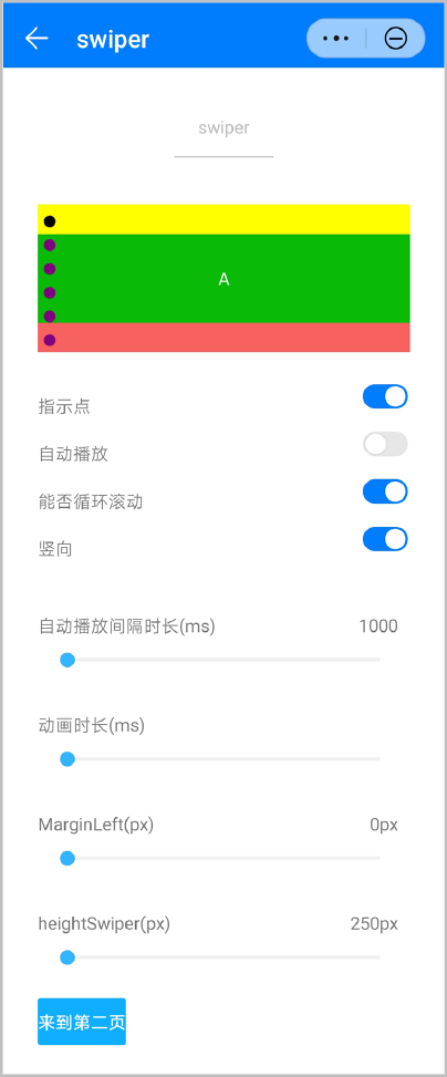
效果图如下:
版本 | 发布日期 | 描述 |
|---|---|---|
1080 | 2021-12-28 |
|
1050 | 2019-09-20 |
|
1010 | 2018-04-20 | 新增loop属性,用于控制是否开启循环模式,默认值为true。 |