属性
除了支持 通用属性以外,还支持如下属性。
名称 | 类型 | 默认值 | 是否必填 | 描述 |
|---|---|---|---|---|
scrollable(1040+) | boolean | true | 否 | 是否可以通过滑动切换页面。设置为false后,页面的切换需通过与 tab-bar 的联动实现。 |
示例代码
<template>
  <div class="container">
    <div class="page-title-wrap">
      <text class="page-title">{{componentName}}</text>
    </div>
    <input type="button" value="Switch tab-content's scrollable value" onclick="changeTabcontentScrollable" />

    <!--tab component-->
    <tabs class="tabs" onchange="changeTabactive" index="2">
      <tab-bar class="tab-bar">
        <text class="tab-text">basic</text>
        <text class="tab-text">form</text>
        <text class="tab-text">list</text>
      </tab-bar>

      <tab-content class="tab-content" scrollable="{{scrollable}}">
        <!--basic component-->
        <div class="item-container">
          <div class="item-content">
            <text class="item-title">a</text>
            <a style="color: #09ba07;" href="https://www.huawei.com/">Huawei official website</a>
          </div>

          <div class="item-content">
            <text class="item-title">image</text>
            <image src="/Common/img/xmad.jpg" class="image"></image>
          </div>

          <div class="item-content">
            <text class="item-title">progress type="horizontal"</text>
            <progress percent="20" style="margin-top: 20px;color:#0faeff;stroke-width:10px"></progress>
          </div>

          <div class="item-content">
            <text class="item-title">progress type="circular"</text>
            <progress class="circular" type="circular" style="margin-top: 20px;color:#A020F0;"></progress>
          </div>

          <div class="item-content">
            <text class="item-title">text</text>
            <text style="color: #f76160">I am text</text>
          </div>

          <div class="item-content">
            <text class="item-title">span</text>
            <text>
              <span style="color: #09ba07">I am span</span>
            </text>
          </div>
        </div>

        <!--form component-->
        <div class="item-container">
          <div class="item-content">
            <text class="item-title">input</text>
            <input class="item-input" placeholder="I am input" />
          </div>

          <div class="item-content">
            <text class="item-title">picker</text>
            <picker class="item-picker" type="time" value="{{time}}" onchange="setTime"></picker>
          </div>

          <div class="item-content">
            <text class="item-title">slider</text>
            <slider class="item-slider" style="selected-color:#0faeff" min="50" max="200" value="100" />
          </div>
        </div>

        <!--list component-->
        <div class="item-container">
          <input type="button" class="btn" value="back to the first item" onclick="goIndex" />
          <list class="list" onscrollbottom="scrollbottom" id="list" scrollpage="{{scrollPage}}">
            <list-item type="listItem" class="item item_color" for="{{list_data}}">
              <text class="txt">{{$item.name}}--{{$idx}}</text>
            </list-item>
            <list-item type="loadMore" class="load-more" if="{{loadMore}}">
              <progress type="circular"></progress>
              <text>load more</text>
            </list-item>
          </list>
        </div>
      </tab-content>
    </tabs>
  </div>
</template>

<style>
    .container {
      flex: 1;
      flex-direction: column;
    }
    .page-title-wrap {
      padding-top: 50px;
      padding-bottom: 80px;
      justify-content: center;
    }
    .page-title {
      padding-top: 30px;
      padding-bottom: 30px;
      padding-left: 40px;
      padding-right: 40px;
      border-color: #bbbbbb;
      color: #bbbbbb;
      border-bottom-width: 2px;
    }
    .tabs {
      flex: 1;
      margin-top: 20px;
      margin-right: 30px;
      margin-left: 30px;
      background-color: #ffffff;
    }

    .tab-content {
      flex: 1;
    }

    .tab-bar {
      height: 100px;
      border-color: #bbbbbb;
      color: #bbbbbb;
      border-bottom-width: 1px;
    }

    .tab-text {
      width: 300px;
      text-align: center;
    }

    .tab-text:active {
      color: #f76160;
    }

    .item-container {
      padding-top: 30px;
      padding-left: 30px;
      padding-right: 30px;
      flex-direction: column;
    }

    .item-content {
      flex-direction: column;
      padding-bottom: 30px;
    }

    .item-title {
      padding-top: 50px;
      padding-bottom: 20px;
      color: #aaaaaa;
    }

    .item-input {
      height: 80px;
      margin-right: 60px;
      margin-left: 60px;
      padding: 20px;
      border-width: 1px;
      border-color: #bbbbbb;
      border-radius: 5px;
      font-size: 30px;
    }

    .item-picker {
      margin-right: 60px;
      margin-left: 60px;
      padding: 20px;
      border-width: 1px;
      border-color: #bbbbbb;
      border-radius: 5px;
      flex: 1;
    }

    .item-slider {
      padding: 20px;
    }

    .circular {
      width: 40px;
      height: 40px;
    }

    .list {
      flex: 1;
    }

    .load-more {
      justify-content: center;
      align-items: center;
      height: 100px;
    }

    .item {
      height: 150px;
      align-items: center;
      justify-content: center;
      margin-bottom: 15px;
    }

    .item_color {
      background-color: #f76160;
    }

    btn:disabled {
      background-color: #008000;
    }
</style>

<script>
    import prompt from '@system.prompt'

    export default {
        data: {
            scrollable: true,
            componentName: 'tabs',
            time: '',
            loadMore: true,
            scrollPage: false,
            btndisabled: false,
            list_data: [{ name: 'A' }, { name: 'B' }, { name: 'C' }, { name: 'D' }, { name: 'E' }, { name: 'F' }]
        },
        onInit: function () {
            this.$page.setTitleBar({ text: 'tab-content' })
            // initial time
            this.time = new Date().getHours() + ':' + new Date().getMinutes()
        },
        changeTabcontentScrollable: function () {
            this.scrollable = !this.scrollable
        },
        changeTabactive: function (e) {
            prompt.showToast({
                message: "the playing page number is " + e.index + "  "
            })
            // switch tab
            console.log('----------switch tab: ' + e.index)
        },
        setTime: function (e) {
            // After select time picker,set time
            this.time = e.hour + ':' + e.minute
        },
        scrollbottom: function () {
            var that = this
            // list scroll to bottom
            setTimeout(function () {
                that.list_data = that.list_data.concat([{ name: 'A' }, { name: 'B' }, { name: 'C' }, { name: 'D' }, { name: 'E' }, { name: 'F' }])
            }, 1000)
        },
        goIndex: function () {
            // List scrolls to the specified index position
            this.$element('list').scrollTo({ index: 0, smooth: true })
        }
    }
</script>
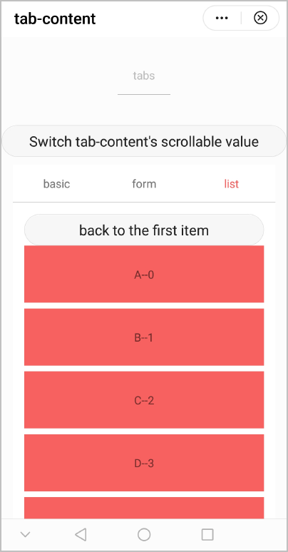
效果图如下: