示例代码
<template>
    <div class="container">
        <tabs class="tabs" onchange="changeTabactive" index="2">
            <tab-bar class="tab-bar">
                <text class="tab-text">tab1</text>
                <text class="tab-text">tab2</text>
                <text class="tab-text">tab3</text>
            </tab-bar>
            <tab-content class="tab-content" scrollable="{{scrollable}}">
                <div class="item-container">
                    <div class="item-content">
                        <text class="item-title">tab1 page</text>
                    </div>
                </div>
                <div class="item-container">
                    <div class="item-content">
                        <text class="item-title">tab2 page</text>
                    </div>
                </div>
                <div class="item-container">
                    <div class="item-content">
                        <text class="item-title">tab3 page</text>
                    </div>
                </div>
            </tab-content>
        </tabs>
    </div>
</template>
<style>
    .tabs {
        flex: 1;
        margin-top: 20px;
        margin-right: 30px;
        margin-left: 30px;
        background-color: #ffffff;
    }
    .tab-content {
        flex: 1;
    }
    .tab-bar {
        height: 100px;
        border-color: #bbbbbb;
        color: #bbbbbb;
        border-bottom-width: 1px;
    }
    .tab-text {
        width: 300px;
        text-align: center;
    }
    .tab-text:active {
        color: #f76160;
    }
    .item-container {
        padding-top: 30px;
        padding-left: 30px;
        padding-right: 30px;
        flex-direction: column;
    }
    .item-content {
        flex-direction: column;
        padding-bottom: 30px;
    }
    .item-title {
        padding-top: 50px;
        padding-bottom: 20px;
        color: #aaaaaa;
    }
</style>
<script>
    import prompt from '@system.prompt'
    export default {
        data: {
            scrollable: true,
        },
        onInit: function () {
            this.$page.setTitleBar({ text: 'tabs' })
        },
        changeTabactive: function (e) {
            prompt.showToast({
                message: this.$t('message.component.tabs.range') + e.index + this.$t('message.component.tabs.page')
            })
            // switch tab
            console.log('----------switch tab: ' + e.index);
        },
    }
</script>
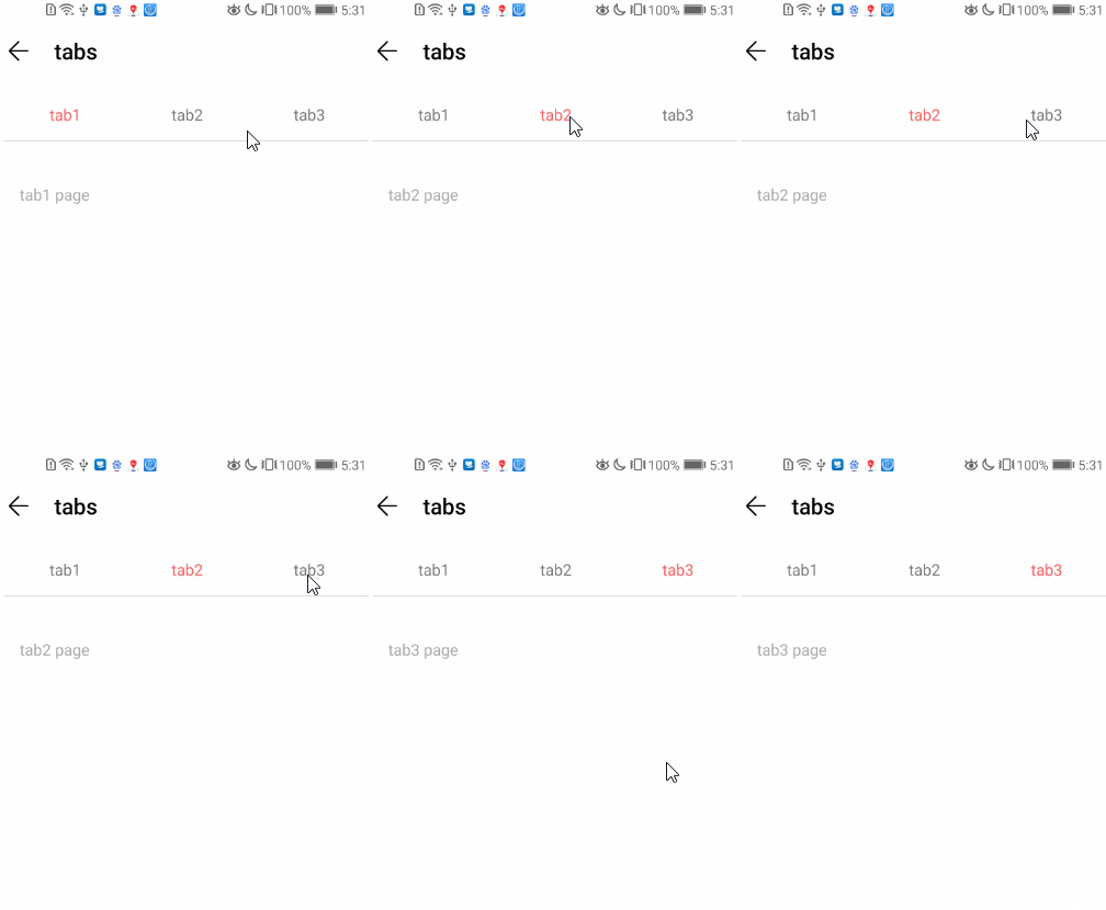
效果图如下: