简介
数字输入框组件是带加减按钮的输入框,主要用于设置限购商品、加购商品数量等场景。数字输入框一般具有如下特点:
- 数字输入框组件默认数值最大值为100,最小值为0,每次点击增加或减少1
- 可根据需要定制最小值和最大值,设置每次减少或增加的数值,是否禁用,获取输入值等
数字输入框(number_box)组件结构可按照布局分为三个部分。左边是减号按钮,中间是数字输入框,右边是加号按钮。布局结构如下图:
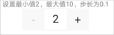
布局代码如下:
<text>设置最小值2,最大值10,步长为0.1</text>
<number_box  value="{{value}}" min="2" max="10"  step="0.1" @change="handlechange" @focus="handlefocus" @blur="handleblur"></number_box>
[h2]自定义子组件
- 定义布局样式。
数字输入框整体外观都是通用的,但是内部具体的样式有区别,在设计的时候,不能把内部样式固定,否则一旦数字输入框的UI有变化,会导致子组件也要修改,违背了对外开源的初衷。
所以,在子组件number_box中,开放多种样式属性,方便开发者自定义样式。
<template> <div class="uni-numbox "> <div class="{{this.extremum1 ? 'uni-numbox__minus1' : 'uni-numbox__minus'}}" onclick="_calcValue('minus')"> <text class="{{this.extremum1?'uni-numbox--text1':'uni-numbox--text'}}" disabled="{{disabled}}">-</text> </div> <input value="{{value}}" type="number" class="uni-numbox__value" onchange="updateValue" enterkeytype="done" onenterkeyclick="enterkeyclick" disabled="{{disabled}}" onfocus="handlefocus" onblur="handleblur"></input> <div class="{{this.extremum ? 'uni-numbox__plus1' : 'uni-numbox__plus'}}" onclick="_calcValue('plus')"> <text class="{{this.extremum ?'uni-numbox--text1':'uni-numbox--text'}}" disabled="{{disabled}}">+</text> </div> </div> </template> - 规划属性和支持的事件。
属性
类型
默认值
描述
value
Number
0
输入框当前值。
min
Number
0
最小值。
max
Number
100
最大值。
step
Number
1
每次点击减号或者加号后改变的数值。
disabled
Boolean
false
是否为禁用状态。
支持的事件:
事件名称
参数
描述
change
value
输入框值改变时触发的事件。
focus
e
输入框聚焦时触发的事件。
blur
e
输入框失焦时触发的事件。
[h2]父子组件通信
- 父组件给子组件传递数据。
- 子组件的props中定义参数。
props: { value: { type: [Number, String], default: 1 }, min: { type: Number, default: 0 }, max: { type: Number, default: 100 }, step: { type: Number, default: 1 }, disabled: { type: Boolean, default: false } }, - 父组件给子组件传值,如果是布尔值,需要在data中定义,而不能直接在组件中定义。
<text>禁用状态</text>
<number_box disabled="{{disabled}}"></number_box>
data: { componentData: {}, value: 8, disabled:true },
- 子组件的props中定义参数。
- 父组件给子组件传递方法。
- 点击父组件的任意区域时,都会触发如下onclick方法,使用this.$broadcast向子组件传递消息。
<div class="container" onclick="onclick"> </div>
onclick(e){ this.$broadcast('checkValue') } - 子组件使用this.$on()方法监听输入的数字并校验。
this.$on('checkValue', this.checkValue)checkValue(e) { console.log("checkValue") console.log(JSON.stringify(e)) if (this.disabled) { return } if (Number(this.value) >= Number(this.max)) { this.value = this.max; } else if (Number(this.value) <= Number(this.min)) { this.value = this.min; } else { this.value = this.value } }
- 点击父组件的任意区域时,都会触发如下onclick方法,使用this.$broadcast向子组件传递消息。
- 子组件给父组件传递数据和方法。
- 父组件中注册特定方法的监听,等待子组件通知触发。
<number_box id="number1" value="{{value}}" @change="handlechange" @focus="handlefocus" @blur="handleblur" ></number_box>handlechange(e) { this.value=e.detail }, handlefocus() { }, handleblur() { }, - 子组件通过this.$emit方法携带事件及参数通知父组件。
updateValue(e) { if (Number(e.value) >= Number(this.max)) { prompt.showToast({ message: '请不要超过最大数' + this.max, }) this.value = e.value this.extremum = true; this.extremum1 = false; } else if (Number(e.value) <= Number(this.min)) { prompt.showToast({ message: '请不要小于最小数' + this.min, }) this.value = e.value this.extremum1 = true; this.extremum = false; } else { this.value = e.value this.extremum = false; this.extremum1 = false; } this.$emit('change', this.value) }, handlefocus(e) { this.$emit('focus', e) }, handleblur(e) { this.$emit('blur', e) },
- 父组件中注册特定方法的监听,等待子组件通知触发。
示例代码
数字输入框number_box.ux代码:
<template>
<div class="uni-numbox ">
<div class="{{this.extremum1 ? 'uni-numbox__minus1' : 'uni-numbox__minus'}}" onclick="_calcValue('minus')">
<text class="{{this.extremum1?'uni-numbox--text1':'uni-numbox--text'}}" disabled="{{disabled}}">-</text>
</div>
<input value="{{value}}" type="number" class="uni-numbox__value" onchange="updateValue" enterkeytype="done"
onenterkeyclick="enterkeyclick" disabled="{{disabled}}" onfocus="handlefocus" onblur="handleblur"></input>
<div class="{{this.extremum ? 'uni-numbox__plus1' : 'uni-numbox__plus'}}" onclick="_calcValue('plus')">
<text class="{{this.extremum ?'uni-numbox--text1':'uni-numbox--text'}}" disabled="{{disabled}}">+</text>
</div>
</div>
</template>
<style>
.uni-numbox__value:disabled {
color: #c0c0c0;
}
.uni-numbox {
display: flex;
flex-direction: row;
height: 100px;
line-height: 100px;
width: 300px;
}
.uni-numbox__minus {
/* #ifndef APP-NVUE */
display: flex;
/* #endif */
flex-direction: row;
align-items: center;
justify-content: center;
width: 100px;
height: 100px;
font-size: 50px;
color: #333;
background-color: #f8f8f8;
border-width: 1px;
border-style: solid;
border-color: #e5e5e5;
border-top-left-radius: 3px;
border-bottom-left-radius: 3px;
border-right-width: 0;
}
.uni-numbox__minus1 {
/* #ifndef APP-NVUE */
display: flex;
/* #endif */
flex-direction: row;
align-items: center;
justify-content: center;
width: 100px;
height: 100px;
font-size: 50px;
color: #333;
background-color: #f8f8f8;
border-width: 1px;
border-style: solid;
border-color: #e5e5e5;
border-top-left-radius: 3px;
border-bottom-left-radius: 3px;
border-right-width: 0;
}
.uni-numbox--text {
font-size: 50px;
color: #333;
background-color: #f8f8f8;
}
.uni-numbox--text1 {
font-size: 50px;
color: #c0c0c0;
background-color: #f8f8f8;
}
.uni-numbox--text:disabled {
font-size: 50px;
color: #c0c0c0;
}
.uni-numbox--text1:disabled {
font-size: 50px;
color: #c0c0c0;
}
.uni-numbox__plus {
display: flex;
flex-direction: row;
align-items: center;
justify-content: center;
width: 100px;
height: 100px;
font-size: 50px;
border-width: 1px;
border-style: solid;
border-color: #e5e5e5;
border-top-right-radius: 3px;
border-bottom-right-radius: 3px;
background-color: #f8f8f8;
border-left-width: 0;
}
.uni-numbox__plus1 {
display: flex;
flex-direction: row;
align-items: center;
justify-content: center;
width: 100px;
height: 100px;
font-size: 50px;
border-width: 1px;
border-style: solid;
border-color: #e5e5e5;
border-top-right-radius: 3px;
border-bottom-right-radius: 3px;
background-color: #f8f8f8;
border-left-width: 0;
}
.uni-numbox__value {
background-color: #ffffff;
width: 100px;
height: 100px;
text-align: center;
line-height: 100px;
font-size: 50px;
border-width: 1px;
border-style: solid;
border-color: #e5e5e5;
border-left-width: 0;
border-right-width: 0;
}
</style>
<script>
import prompt from '@system.prompt';
module.exports = {
props: {
value: {
type: [Number, String],
default: 1
},
min: {
type: Number,
default: 0
},
max: {
type: Number,
default: 100
},
step: {
type: Number,
default: 1
},
disabled: {
type: Boolean,
default: false
}
},
data() {
return {
extremum: false,
extremum1: false,
};
},
onInit() {
this.$page.setTitleBar({ text: '' })
if (Number(this.value) < Number(this.min)) {
this.value = this.min
}
if (this.disabled) {
this.value = " "
}
this.$on('checkValue', this.checkValue)
},
updateValue(e) {
console.log("Number" + Number(undefined))
console.log(JSON.stringify(e))
console.log(e.value)
if (Number(e.value) >= Number(this.max)) {
prompt.showToast({
message: '请不要超过最大数' + this.max,
})
this.value = e.value
this.extremum = true;
this.extremum1 = false;
} else if (Number(e.value) <= Number(this.min)) {
prompt.showToast({
message: '请不要小于最小数' + this.min,
})
this.value = e.value
this.extremum1 = true;
this.extremum = false;
} else {
this.value = e.value
this.extremum = false;
this.extremum1 = false;
}
console.log("子组件中onchange" + this.value);
this.$emit('change', this.value)
},
_calcValue(type) {
console.log(this.disabled);
if (this.disabled) {
return
}
const scale = this.getDecimalScale();
let calcvalue = this.value * scale;
let calcstep = this.step * scale;
if (type === "minus") {
console.log("minus");
console.log(this.value);
this.value = (calcvalue - calcstep) / scale.toFixed(String(scale).length - 1);
if (Number(this.value) <= Number(this.min)) {
this.value = this.min
}
if (Number(this.value) >= Number(this.max)) {
this.value = this.max
}
}
if (type === "plus") {
console.log("plus");
this.value = (calcvalue + calcstep) / scale.toFixed(String(scale).length - 1);
if (Number(this.value) >= Number(this.max)) {
this.value = this.max
}
if (Number(this.value) < Number(this.min)) {
this.value = this.min
}
}
this.$emit('change', this.value)
},
getDecimalScale() {
let scale = 1;
if (this.step !== 1) {
scale = Math.pow(10, String(this.step).split(".")[1].length);
}
return scale;
},
enterkeyclick(e) {
console.log("enterkeyclick" + e.value)
if (Number(e.value) >= Number(this.max)) {
this.value = this.max
} else if (Number(e.value) <= Number(this.min)) {
this.value = this.min
} else {
this.value = e.value
}
},
handlefocus(e) {
console.log("子组件中handlefocus" + this.value);
this.$emit('focus', e)
console.log(JSON.stringify(e))
},
handleblur(e) {
console.log("子组件中handleblur" + this.value);
this.$emit('blur', e)
console.log(JSON.stringify(e))
console.log("e.currentTarget.attr.value" + e.currentTarget.attr.value)
},
checkValue(e) {
console.log("checkValue")
console.log(JSON.stringify(e))
if (this.disabled) {
return
}
if (Number(this.value) >= Number(this.max)) {
this.value = this.max;
} else if (Number(this.value) <= Number(this.min)) {
this.value = this.min;
} else {
this.value = this.value
}
}
}
</script>
页面hello.ux代码:
<import name="number_box" src="../Number_box/number_box.ux"></import>
<template>
<!-- Only one root node is allowed in template. -->
<div class="container" onclick="onclick">
<text>使用v-model"{{ value }}"</text>
<number_box id="number1" value="{{value}}" @change="handlechange" @focus="handlefocus" @blur="handleblur" ></number_box>
<text>设置最大值10和最小值2</text>
<number_box min="2" max="10" ></number_box>
<text>步长为0.1</text>
<number_box step="0.1"></number_box>
<text>禁用状态</text>
<number_box disabled="{{disabled}}"></number_box>
</div>
</template>
<style>
.container {
flex-direction: column;
justify-content: center;
align-items: center;
}
.title {
font-size: 100px;
}
</style>
<script>
module.exports = {
data: {
  componentData: {},
  value: 8,
  disabled:true
},
onInit() {
this.$page.setTitleBar({
text: 'menu',
textColor: '#ffffff',
backgroundColor: '#007DFF',
backgroundOpacity: 0.5,
menu: true
});
},
handlechange(e) {
console.log("父组件中handlechange");
console.log(JSON.stringify(e));
this.value=e.detail
},
handlefocus() {
console.log("父组件中handlefocus");
},
handleblur() {
console.log("父组件中handleblur");
},
onclick(e){
  this.$broadcast('checkValue')
}
}
</script>