


智能客服
你问我答,随时在线为你解决问题















绘制组件用于在页面绘制图形,Shape组件是绘制组件的父组件,父组件中会描述所有绘制组件均支持的通用属性。具体用法请参考Shape。
绘制组件可以由以下两种形式创建:
绘制组件使用Shape作为父组件,实现类似SVG的效果。接口调用为以下形式:
- Shape(value?: PixelMap)
该接口用于创建带有父组件的绘制组件,其中value用于设置绘制目标,可将图形绘制在指定的PixelMap对象中,若未设置,则在当前绘制目标中进行绘制。
- Shape() {
- Rect().width(300).height(50)
- }
绘制组件单独使用,用于在页面上绘制指定的图形。有7种绘制类型,分别为Circle(圆形)、Ellipse(椭圆形)、Line(直线)、Polyline(折线)、Polygon(多边形)、Path(路径)、Rect(矩形)。以Circle的接口调用为例:
- Circle(value?: { width?: string | number, height?: string | number })
该接口用于在页面绘制圆形,其中width用于设置圆形的宽度,height用于设置圆形的高度,圆形直径由宽高最小值确定。
- Circle({ width: 150, height: 150 })
- viewPort(value: { x?: number | string, y?: number | string, width?: number | string, height?: number | string })
形状视口viewport指定用户空间中的一个矩形,该矩形映射到为关联的SVG元素建立的视区边界。viewport属性的值包含x、y、width和height四个可选参数,x和y表示视区的左上角坐标,width和height表示其尺寸。
以下3个示例讲解viewport具体用法:
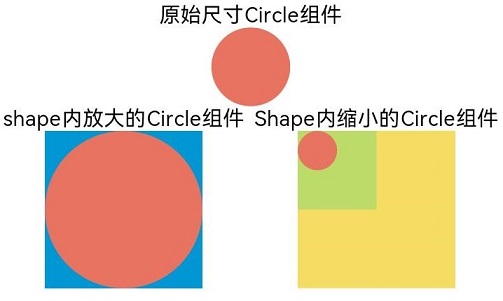
通过形状视口对图形进行放大与缩小。
- class tmp{
- x:number = 0
- y:number = 0
- width:number = 75
- height:number = 75
- }
- let viep:tmp = new tmp()
-
- class tmp1{
- x:number = 0
- y:number = 0
- width:number = 300
- height:number = 300
- }
- let viep1:tmp1 = new tmp1()
-
- // 画一个宽高都为75的圆
- Text('原始尺寸Circle组件')
- Circle({width: 75, height: 75}).fill('#E87361')
-
- Row({space:10}) {
- Column() {
- // 创建一个宽高都为150的shape组件,背景色为黄色,一个宽高都为75的viewport。用一个蓝色的矩形来填充viewport,在viewport中绘制一个直径为75的圆。
- // 绘制结束,viewport会根据组件宽高放大两倍
- Text('shape内放大的Circle组件')
- Shape() {
- Rect().width('100%').height('100%').fill('#0097D4')
- Circle({width: 75, height: 75}).fill('#E87361')
- }
- .viewPort(viep)
- .width(150)
- .height(150)
- .backgroundColor('#F5DC62')
- }
- Column() {
- // 创建一个宽高都为150的shape组件,背景色为黄色,一个宽高都为300的viewport。用一个绿色的矩形来填充viewport,在viewport中绘制一个直径为75的圆。
- // 绘制结束,viewport会根据组件宽高缩小两倍。
- Text('Shape内缩小的Circle组件')
- Shape() {
- Rect().width('100%').height('100%').fill('#BDDB69')
- Circle({width: 75, height: 75}).fill('#E87361')
- }
- .viewPort(viep1)
- .width(150)
- .height(150)
- .backgroundColor('#F5DC62')
- }
- }
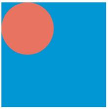
创建一个宽高都为300的shape组件,背景色为黄色,一个宽高都为300的viewport。用一个蓝色的矩形来填充viewport,在viewport中绘制一个半径为75的圆。
- class tmp{
- x:number = 0
- y:number = 0
- width:number = 300
- height:number = 300
- }
- let viep:tmp = new tmp()
-
- Shape() {
- Rect().width("100%").height("100%").fill("#0097D4")
- Circle({ width: 150, height: 150 }).fill("#E87361")
- }
- .viewPort(viep)
- .width(300)
- .height(300)
- .backgroundColor("#F5DC62")
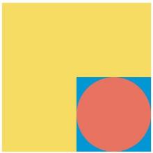
创建一个宽高都为300的shape组件,背景色为黄色,创建一个宽高都为300的viewport。用一个蓝色的矩形来填充viewport,在viewport中绘制一个半径为75的圆,将viewport向右方和下方各平移150。
- class tmp{
- x:number = -150
- y:number = -150
- width:number = 300
- height:number = 300
- }
- let viep:tmp = new tmp()
-
- Shape() {
- Rect().width("100%").height("100%").fill("#0097D4")
- Circle({ width: 150, height: 150 }).fill("#E87361")
- }
- .viewPort(viep)
- .width(300)
- .height(300)
- .backgroundColor("#F5DC62")
绘制组件支持通过各种属性对组件样式进行更改。
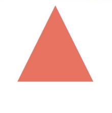
通过fill可以设置组件填充区域颜色。
- Path()
- .width(100)
- .height(100)
- .commands('M150 0 L300 300 L0 300 Z')
- .fill("#E87361")
- .strokeWidth(0)
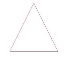
通过stroke可以设置组件边框颜色。
- Path()
- .width(100)
- .height(100)
- .fillOpacity(0)
- .commands('M150 0 L300 300 L0 300 Z')
- .stroke(Color.Red)
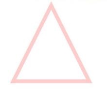
通过strokeOpacity可以设置边框透明度。
- Path()
- .width(100)
- .height(100)
- .fillOpacity(0)
- .commands('M150 0 L300 300 L0 300 Z')
- .stroke(Color.Red)
- .strokeWidth(10)
- .strokeOpacity(0.2)
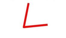
通过strokeLineJoin可以设置线条拐角绘制样式。拐角绘制样式分为Bevel(使用斜角连接路径段)、Miter(使用尖角连接路径段)、Round(使用圆角连接路径段)。
- Polyline()
- .width(100)
- .height(100)
- .fillOpacity(0)
- .stroke(Color.Red)
- .strokeWidth(8)
- .points([[20, 0], [0, 100], [100, 90]])
- // 设置折线拐角处为圆弧
- .strokeLineJoin(LineJoinStyle.Round)
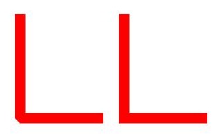
通过strokeMiterLimit设置斜接长度与边框宽度比值的极限值。
斜接长度表示外边框外边交点到内边交点的距离,边框宽度即strokeWidth属性的值。strokeMiterLimit取值需大于等于1,且在strokeLineJoin属性取值LineJoinStyle.Miter时生效。
- Polyline()
- .width(100)
- .height(100)
- .fillOpacity(0)
- .stroke(Color.Red)
- .strokeWidth(10)
- .points([[20, 0], [20, 100], [100, 100]])
- // 设置折线拐角处为尖角
- .strokeLineJoin(LineJoinStyle.Miter)
- // 设置斜接长度与线宽的比值
- .strokeMiterLimit(1/Math.sin(45))
- Polyline()
- .width(100)
- .height(100)
- .fillOpacity(0)
- .stroke(Color.Red)
- .strokeWidth(10)
- .points([[20, 0], [20, 100], [100, 100]])
- .strokeLineJoin(LineJoinStyle.Miter)
- .strokeMiterLimit(1.42)
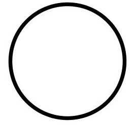
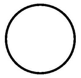
通过antiAlias设置是否开启抗锯齿,默认值为true(开启抗锯齿)。
- //开启抗锯齿
- Circle()
- .width(150)
- .height(200)
- .fillOpacity(0)
- .strokeWidth(5)
- .stroke(Color.Black)
- //关闭抗锯齿
- Circle()
- .width(150)
- .height(200)
- .fillOpacity(0)
- .strokeWidth(5)
- .stroke(Color.Black)
- .antiAlias(false)
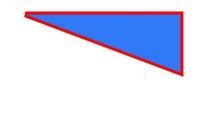
在Shape的(-80, -5)点绘制一个封闭路径,填充颜色0x317AF7,线条宽度3,边框颜色红色,拐角样式锐角(默认值)。
- @Entry
- @Component
- struct ShapeExample {
- build() {
- Column({ space: 10 }) {
- Shape() {
- Path().width(200).height(60).commands('M0 0 L400 0 L400 150 Z')
- }
- .viewPort({ x: -80, y: -5, width: 500, height: 300 })
- .fill(0x317AF7)
- .stroke(Color.Red)
- .strokeWidth(3)
- .strokeLineJoin(LineJoinStyle.Miter)
- .strokeMiterLimit(5)
- }.width('100%').margin({ top: 15 })
- }
- }
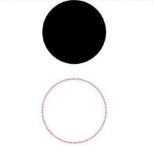
绘制一个直径为150的圆,和一个直径为150、线条为红色虚线的圆环(宽高设置不一致时以短边为直径)。
- @Entry
- @Component
- struct CircleExample {
- build() {
- Column({ space: 10 }) {
- //绘制一个直径为150的圆
- Circle({ width: 150, height: 150 })
- //绘制一个直径为150、线条为红色虚线的圆环
- Circle()
- .width(150)
- .height(200)
- .fillOpacity(0)
- .strokeWidth(3)
- .stroke(Color.Red)
- .strokeDashArray([1, 2])
- }.width('100%')
- }
- }
智能客服
你问我答,随时在线为你解决问题
合作咨询
我们的专家服务团队将竭诚为您提供专业的合作咨询服务
解决方案
精准高效的一站式服务支持,助力开发者商业成功