智能客服
你问我答,随时在线为你解决问题















模态转场是新的界面覆盖在旧的界面上,旧的界面不消失的一种转场方式。
表1 模态转场接口
| 接口 | 说明 | 使用场景 |
|---|---|---|
| bindContentCover | 弹出全屏的模态组件。 | 用于自定义全屏的模态展示界面,结合转场动画和共享元素动画可实现复杂转场动画效果,如缩略图片点击后查看大图。 |
| bindSheet | 弹出半模态组件。 | 用于半模态展示界面,如分享框。 |
| bindMenu | 弹出菜单,点击组件后弹出。 | 需要Menu菜单的场景,如一般应用的“+”号键。 |
| bindContextMenu | 弹出菜单,长按或者右键点击后弹出。 | 长按浮起效果,一般结合拖拽框架使用,如桌面图标长按浮起。 |
| bindPopup | 弹出Popup弹框。 | Popup弹框场景,如点击后对某个组件进行临时说明。 |
| if | 通过if新增或删除组件。 | 用来在某个状态下临时显示一个界面,这种方式的返回导航需要由开发者监听接口实现。 |
bindContentCover接口用于为组件绑定全屏模态页面,在组件出现和消失时可通过设置转场参数ModalTransition添加过渡动效。
定义全屏模态转场效果bindContentCover。
定义模态展示界面。
- // 通过@Builder构建模态展示界面
- @Builder MyBuilder() {
- Column() {
- Text('my model view')
- }
- // 通过转场动画实现出现消失转场动画效果,transition需要加在builder下的第一个组件
- .transition(TransitionEffect.translate({ y: 1000 }).animation({ curve: curves.springMotion(0.6, 0.8) }))
- }
通过模态接口调起模态展示界面,通过转场动画或者共享元素动画去实现对应的动画效果。
- // 模态转场控制变量
- @State isPresent: boolean = false;
-
- Button('Click to present model view')
- // 通过选定的模态接口,绑定模态展示界面,ModalTransition是内置的ContentCover转场动画类型,这里选择None代表系统不加默认动画,通过onDisappear控制状态变量变换
- .bindContentCover(this.isPresent, this.MyBuilder(), {
- modalTransition: ModalTransition.NONE,
- onDisappear: () => {
- if (this.isPresent) {
- this.isPresent = !this.isPresent;
- }
- }
- })
- .onClick(() => {
- // 改变状态变量,显示模态界面
- this.isPresent = !this.isPresent;
- })
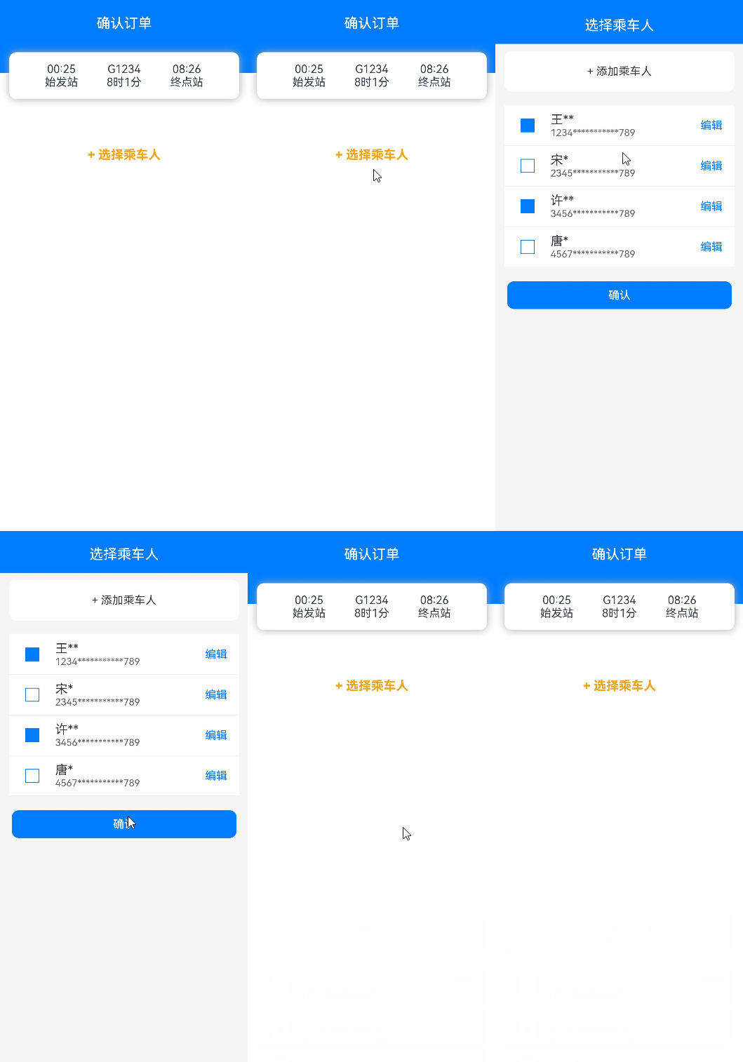
完整示例代码和效果如下。
- import { curves } from '@kit.ArkUI';
-
- interface PersonList {
- name: string,
- cardnum: string
- }
-
- @Entry
- @Component
- struct BindContentCoverDemo {
- private personList: Array<PersonList> = [
- { name: '王**', cardnum: '1234***********789' },
- { name: '宋*', cardnum: '2345***********789' },
- { name: '许**', cardnum: '3456***********789' },
- { name: '唐*', cardnum: '4567***********789' }
- ];
- // 第一步:定义全屏模态转场效果bindContentCover
- // 模态转场控制变量
- @State isPresent: boolean = false;
-
- // 第二步:定义模态展示界面
- // 通过@Builder构建模态展示界面
- @Builder
- MyBuilder() {
- Column() {
- Row() {
- Text('选择乘车人')
- .fontSize(20)
- .fontColor(Color.White)
- .width('100%')
- .textAlign(TextAlign.Center)
- .padding({ top: 30, bottom: 15 })
- }
- .backgroundColor(0x007dfe)
-
- Row() {
- Text('+ 添加乘车人')
- .fontSize(16)
- .fontColor(0x333333)
- .margin({ top: 10 })
- .padding({ top: 20, bottom: 20 })
- .width('92%')
- .borderRadius(10)
- .textAlign(TextAlign.Center)
- .backgroundColor(Color.White)
- }
-
- Column() {
- ForEach(this.personList, (item: PersonList, index: number) => {
- Row() {
- Column() {
- if (index % 2 == 0) {
- Column()
- .width(20)
- .height(20)
- .border({ width: 1, color: 0x007dfe })
- .backgroundColor(0x007dfe)
- } else {
- Column()
- .width(20)
- .height(20)
- .border({ width: 1, color: 0x007dfe })
- }
- }
- .width('20%')
-
- Column() {
- Text(item.name)
- .fontColor(0x333333)
- .fontSize(18)
- Text(item.cardnum)
- .fontColor(0x666666)
- .fontSize(14)
- }
- .width('60%')
- .alignItems(HorizontalAlign.Start)
-
- Column() {
- Text('编辑')
- .fontColor(0x007dfe)
- .fontSize(16)
- }
- .width('20%')
- }
- .padding({ top: 10, bottom: 10 })
- .border({ width: { bottom: 1 }, color: 0xf1f1f1 })
- .width('92%')
- .backgroundColor(Color.White)
- })
- }
- .padding({ top: 20, bottom: 20 })
-
- Text('确认')
- .width('90%')
- .height(40)
- .textAlign(TextAlign.Center)
- .borderRadius(10)
- .fontColor(Color.White)
- .backgroundColor(0x007dfe)
- .onClick(() => {
- this.isPresent = !this.isPresent;
- })
- }
- .size({ width: '100%', height: '100%' })
- .backgroundColor(0xf5f5f5)
- // 通过转场动画实现出现消失转场动画效果
- .transition(TransitionEffect.translate({ y: 1000 }).animation({ curve: curves.springMotion(0.6, 0.8) }))
- }
-
- build() {
- Column() {
- Row() {
- Text('确认订单')
- .fontSize(20)
- .fontColor(Color.White)
- .width('100%')
- .textAlign(TextAlign.Center)
- .padding({ top: 30, bottom: 60 })
- }
- .backgroundColor(0x007dfe)
-
- Column() {
- Row() {
- Column() {
- Text('00:25')
- Text('始发站')
- }
- .width('30%')
-
- Column() {
- Text('G1234')
- Text('8时1分')
- }
- .width('30%')
-
- Column() {
- Text('08:26')
- Text('终点站')
- }
- .width('30%')
- }
- }
- .width('92%')
- .padding(15)
- .margin({ top: -30 })
- .backgroundColor(Color.White)
- .shadow({ radius: 30, color: '#aaaaaa' })
- .borderRadius(10)
-
- Column() {
- Text('+ 选择乘车人')
- .fontSize(18)
- .fontColor(Color.Orange)
- .fontWeight(FontWeight.Bold)
- .padding({ top: 10, bottom: 10 })
- .width('60%')
- .textAlign(TextAlign.Center)
- .borderRadius(15)// 通过选定的模态接口,绑定模态展示界面,ModalTransition是内置的ContentCover转场动画类型,这里选择DEFAULT代表设置上下切换动画效果,通过onDisappear控制状态变量变换。
- .bindContentCover(this.isPresent, this.MyBuilder(), {
- modalTransition: ModalTransition.DEFAULT,
- onDisappear: () => {
- if (this.isPresent) {
- this.isPresent = !this.isPresent;
- }
- }
- })
- .onClick(() => {
- // 第三步:通过模态接口调起模态展示界面,通过转场动画或者共享元素动画去实现对应的动画效果
- // 改变状态变量,显示模态界面
- this.isPresent = !this.isPresent;
- })
- }
- .padding({ top: 60 })
- }
- }
- }
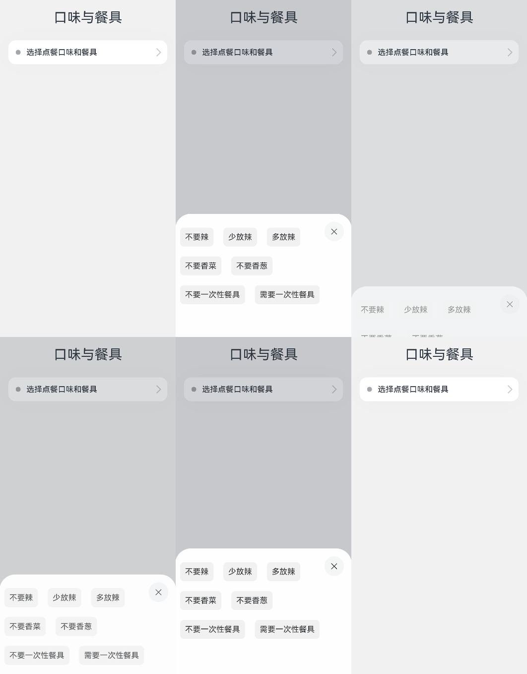
bindSheet属性可为组件绑定半模态页面,在组件出现时可通过设置自定义或默认的内置高度确定半模态大小。构建半模态转场动效的步骤基本与使用bindContentCover构建全屏模态转场动效相同。
完整示例和效果如下。
- @Entry
- @Component
- struct BindSheetDemo {
- // 半模态转场显示隐藏控制
- @State isShowSheet: boolean = false;
- private menuList: string[] = ['不要辣', '少放辣', '多放辣', '不要香菜', '不要香葱', '不要一次性餐具', '需要一次性餐具'];
-
- // 通过@Builder构建半模态展示界面
- @Builder
- mySheet() {
- Column() {
- Flex({ direction: FlexDirection.Row, wrap: FlexWrap.Wrap }) {
- ForEach(this.menuList, (item: string) => {
- Text(item)
- .fontSize(16)
- .fontColor(0x333333)
- .backgroundColor(0xf1f1f1)
- .borderRadius(8)
- .margin(10)
- .padding(10)
- })
- }
- .padding({ top: 18 })
- }
- .width('100%')
- .height('100%')
- .backgroundColor(Color.White)
- }
-
- build() {
- Column() {
- Text('口味与餐具')
- .fontSize(28)
- .padding({ top: 30, bottom: 30 })
- Column() {
- Row() {
- Row()
- .width(10)
- .height(10)
- .backgroundColor('#a8a8a8')
- .margin({ right: 12 })
- .borderRadius(20)
-
- Column() {
- Text('选择点餐口味和餐具')
- .fontSize(16)
- .fontWeight(FontWeight.Medium)
- }
- .alignItems(HorizontalAlign.Start)
-
- Blank()
-
- Row()
- .width(12)
- .height(12)
- .margin({ right: 15 })
- .border({
- width: { top: 2, right: 2 },
- color: 0xcccccc
- })
- .rotate({ angle: 45 })
- }
- .borderRadius(15)
- .shadow({ radius: 100, color: '#ededed' })
- .width('90%')
- .alignItems(VerticalAlign.Center)
- .padding({ left: 15, top: 15, bottom: 15 })
- .backgroundColor(Color.White)
- // 通过选定的半模态接口,绑定模态展示界面,style中包含两个参数,一个是设置半模态的高度,不设置时默认高度是Large,一个是是否显示控制条DragBar,默认是true显示控制条,通过onDisappear控制状态变量变换。
- .bindSheet(this.isShowSheet, this.mySheet(), {
- height: 300,
- dragBar: false,
- onDisappear: () => {
- this.isShowSheet = !this.isShowSheet;
- }
- })
- .onClick(() => {
- this.isShowSheet = !this.isShowSheet;
- })
- }
- .width('100%')
- }
- .width('100%')
- .height('100%')
- .backgroundColor(0xf1f1f1)
- }
- }
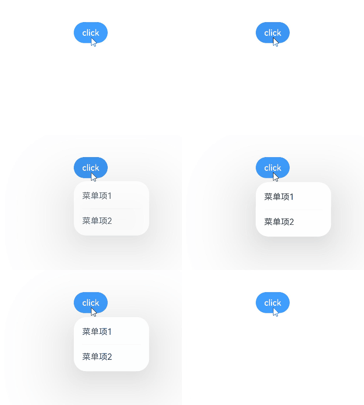
bindMenu为组件绑定弹出式菜单,通过点击触发。完整示例和效果如下。
- class BMD{
- value:ResourceStr = ''
- action:() => void = () => {}
- }
- @Entry
- @Component
- struct BindMenuDemo {
-
- // 第一步: 定义一组数据用来表示菜单按钮项
- @State items:BMD[] = [
- {
- value: '菜单项1',
- action: () => {
- console.info('handle Menu1 select')
- }
- },
- {
- value: '菜单项2',
- action: () => {
- console.info('handle Menu2 select')
- }
- },
- ]
-
- build() {
- Column() {
- Button('click')
- .backgroundColor(0x409eff)
- .borderRadius(5)
- // 第二步: 通过bindMenu接口将菜单数据绑定给元素
- .bindMenu(this.items)
- }
- .justifyContent(FlexAlign.Center)
- .width('100%')
- .height(437)
- }
- }
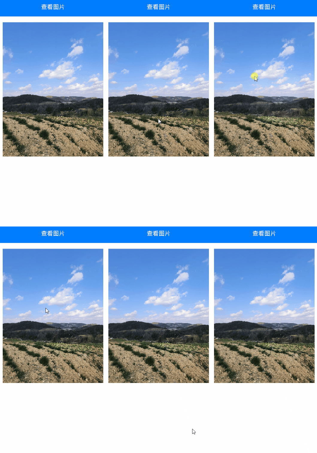
bindContextMenu为组件绑定弹出式菜单,通过长按或右键点击触发。
完整示例和效果如下。
- @Entry
- @Component
- struct BindContextMenuDemo {
- private menu: string[] = ['保存图片', '收藏', '搜一搜'];
- private pics: Resource[] = [$r('app.media.icon_1'), $r('app.media.icon_2')];
-
- // 通过@Builder构建自定义菜单项
- @Builder myMenu() {
- Column() {
- ForEach(this.menu, (item: string) => {
- Row() {
- Text(item)
- .fontSize(18)
- .width('100%')
- .textAlign(TextAlign.Center)
- }
- .padding(15)
- .border({ width: { bottom: 1 }, color: 0xcccccc })
- })
- }
- .width(140)
- .borderRadius(15)
- .shadow({ radius: 15, color: 0xf1f1f1 })
- .backgroundColor(0xf1f1f1)
- }
-
- build() {
- Column() {
- Row() {
- Text('查看图片')
- .fontSize(20)
- .fontColor(Color.White)
- .width('100%')
- .textAlign(TextAlign.Center)
- .padding({ top: 20, bottom: 20 })
- }
- .backgroundColor(0x007dfe)
-
- Column() {
- ForEach(this.pics, (item: Resource) => {
- Row(){
- Image(item)
- .width('100%')
- .draggable(false)
- }
- .padding({ top: 20, bottom: 20, left: 10, right: 10 })
- .bindContextMenu(this.myMenu, ResponseType.LongPress)
- })
- }
- }
- .width('100%')
- .alignItems(HorizontalAlign.Center)
- }
- }
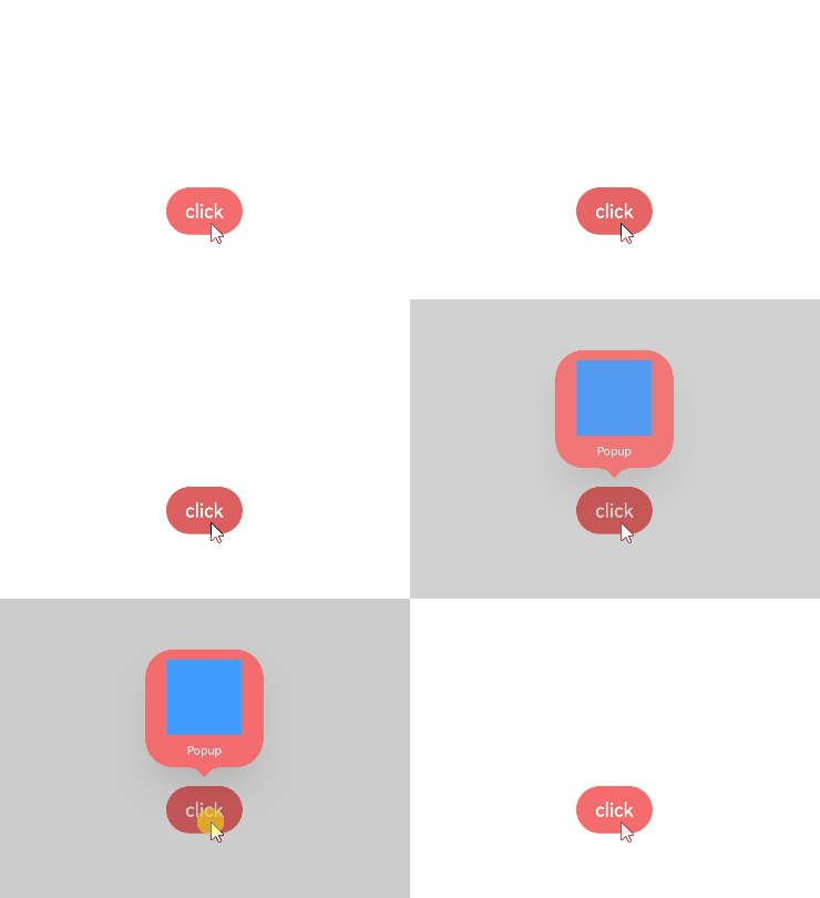
bindpopup属性可为组件绑定弹窗,并设置弹窗内容,交互逻辑和显示状态。
完整示例和代码如下。
- @Entry
- @Component
- struct BindPopupDemo {
-
- // 第一步:定义变量控制弹窗显示
- @State customPopup: boolean = false;
-
- // 第二步:popup构造器定义弹框内容
- @Builder popupBuilder() {
- Column({ space: 2 }) {
- Row().width(64)
- .height(64)
- .backgroundColor(0x409eff)
- Text('Popup')
- .fontSize(10)
- .fontColor(Color.White)
- }
- .justifyContent(FlexAlign.SpaceAround)
- .width(100)
- .height(100)
- .padding(5)
- }
-
- build() {
- Column() {
-
- Button('click')
- // 第四步:创建点击事件,控制弹窗显隐
- .onClick(() => {
- this.customPopup = !this.customPopup;
- })
- .backgroundColor(0xf56c6c)
- // 第三步:使用bindPopup接口将弹窗内容绑定给元素
- .bindPopup(this.customPopup, {
- builder: this.popupBuilder,
- placement: Placement.Top,
- maskColor: 0x33000000,
- popupColor: 0xf56c6c,
- enableArrow: true,
- onStateChange: (e) => {
- if (!e.isVisible) {
- this.customPopup = false;
- }
- }
- })
- }
- .justifyContent(FlexAlign.Center)
- .width('100%')
- .height(437)
- }
- }
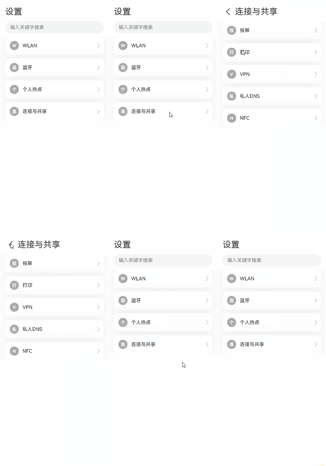
上述模态转场接口需要绑定到其他组件上,通过监听状态变量改变调起模态界面。同时,也可以通过if范式,通过新增/删除组件实现模态转场效果。
完整示例和代码如下。
- @Entry
- @Component
- struct ModalTransitionWithIf {
- private listArr: string[] = ['WLAN', '蓝牙', '个人热点', '连接与共享'];
- private shareArr: string[] = ['投屏', '打印', 'VPN', '私人DNS', 'NFC'];
- // 第一步:定义状态变量控制页面显示
- @State isShowShare: boolean = false;
- private shareFunc(): void {
- this.getUIContext()?.animateTo({ duration: 500 }, () => {
- this.isShowShare = !this.isShowShare;
- })
- }
-
- build(){
- // 第二步:定义Stack布局显示当前页面和模态页面
- Stack() {
- Column() {
- Column() {
- Text('设置')
- .fontSize(28)
- .fontColor(0x333333)
- }
- .width('90%')
- .padding({ top: 30, bottom: 15 })
- .alignItems(HorizontalAlign.Start)
-
- TextInput({ placeholder: '输入关键字搜索' })
- .width('90%')
- .height(40)
- .margin({ bottom: 10 })
- .focusable(false)
-
- List({ space: 12, initialIndex: 0 }) {
- ForEach(this.listArr, (item: string, index: number) => {
- ListItem() {
- Row() {
- Row() {
- Text(`${item.slice(0, 1)}`)
- .fontColor(Color.White)
- .fontSize(14)
- .fontWeight(FontWeight.Bold)
- }
- .width(30)
- .height(30)
- .backgroundColor('#a8a8a8')
- .margin({ right: 12 })
- .borderRadius(20)
- .justifyContent(FlexAlign.Center)
-
- Column() {
- Text(item)
- .fontSize(16)
- .fontWeight(FontWeight.Medium)
- }
- .alignItems(HorizontalAlign.Start)
-
- Blank()
-
- Row()
- .width(12)
- .height(12)
- .margin({ right: 15 })
- .border({
- width: { top: 2, right: 2 },
- color: 0xcccccc
- })
- .rotate({ angle: 45 })
- }
- .borderRadius(15)
- .shadow({ radius: 100, color: '#ededed' })
- .width('90%')
- .alignItems(VerticalAlign.Center)
- .padding({ left: 15, top: 15, bottom: 15 })
- .backgroundColor(Color.White)
- }
- .width('100%')
- .onClick(() => {
- // 第五步:改变状态变量,显示模态页面
- if(item.slice(-2) === '共享'){
- this.shareFunc();
- }
- })
- }, (item: string): string => item)
- }
- .width('100%')
- }
- .width('100%')
- .height('100%')
- .backgroundColor(0xfefefe)
-
- // 第三步:在if中定义模态页面,显示在最上层,通过if控制模态页面出现消失
- if(this.isShowShare){
- Column() {
- Column() {
- Row() {
- Row() {
- Row()
- .width(16)
- .height(16)
- .border({
- width: { left: 2, top: 2 },
- color: 0x333333
- })
- .rotate({ angle: -45 })
- }
- .padding({ left: 15, right: 10 })
- .onClick(() => {
- this.shareFunc();
- })
- Text('连接与共享')
- .fontSize(28)
- .fontColor(0x333333)
- }
- .padding({ top: 30 })
- }
- .width('90%')
- .padding({bottom: 15})
- .alignItems(HorizontalAlign.Start)
-
- List({ space: 12, initialIndex: 0 }) {
- ForEach(this.shareArr, (item: string) => {
- ListItem() {
- Row() {
- Row() {
- Text(`${item.slice(0, 1)}`)
- .fontColor(Color.White)
- .fontSize(14)
- .fontWeight(FontWeight.Bold)
- }
- .width(30)
- .height(30)
- .backgroundColor('#a8a8a8')
- .margin({ right: 12 })
- .borderRadius(20)
- .justifyContent(FlexAlign.Center)
-
- Column() {
- Text(item)
- .fontSize(16)
- .fontWeight(FontWeight.Medium)
- }
- .alignItems(HorizontalAlign.Start)
-
- Blank()
-
- Row()
- .width(12)
- .height(12)
- .margin({ right: 15 })
- .border({
- width: { top: 2, right: 2 },
- color: 0xcccccc
- })
- .rotate({ angle: 45 })
- }
- .borderRadius(15)
- .shadow({ radius: 100, color: '#ededed' })
- .width('90%')
- .alignItems(VerticalAlign.Center)
- .padding({ left: 15, top: 15, bottom: 15 })
- .backgroundColor(Color.White)
- }
- .width('100%')
- }, (item: string): string => item)
- }
- .width('100%')
- }
- .width('100%')
- .height('100%')
- .backgroundColor(0xffffff)
- // 第四步:定义模态页面出现消失转场方式
- .transition(TransitionEffect.OPACITY
- .combine(TransitionEffect.translate({ x: '100%' }))
- .combine(TransitionEffect.scale({ x: 0.95, y: 0.95 })))
- }
- }
- }
- }