


智能客服
你问我答,随时在线为你解决问题















从API version 4开始支持。后续版本如有新增内容,则采用上角标单独标记该内容的起始版本。
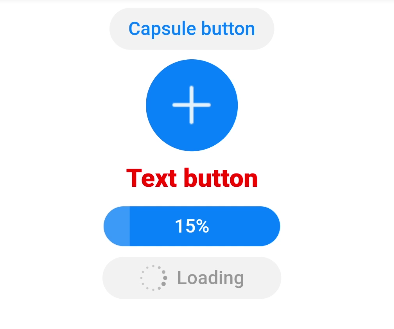
按钮组件,包括胶囊按钮、圆形按钮、文本按钮、弧形按钮、下载按钮。
不支持。
除支持通用属性外,还支持如下属性:
| 名称 | 类型 | 默认值 | 必填 | 描述 |
|---|---|---|---|---|
| type | string | - | 否 | 不支持动态修改。默认展示类胶囊型按钮,不同于胶囊类型,四边圆角可以通过border-radius分别指定。该属性可选值包括: - capsule:胶囊型按钮,带圆角按钮,有背景色和文本。 - circle:圆形按钮,支持放置图标。 - text:文本按钮,仅包含文本显示。 - arc:弧形按钮,仅支持智能穿戴。 - download:下载按钮,额外增加下载进度条功能。 |
| value | string | - | 否 | button的文本值。 |
| icon | string | - | 否 | button的图标路径,图标格式为jpg,png和svg。 |
| placement5+ | string | end | 否 | 仅在type属性为缺省时生效,设置图标位于文本的位置,可选值为: - start:图标位于文本起始处。 - end:图标位于文本结束处。 - top:图标位于文本上方。 - bottom:图标位于文本下方。 |
| waiting | boolean | false | 否 | waiting状态,waiting为true时展现等待中转圈效果,位于文本左侧。类型为download时不生效。 |
除支持通用样式外,还支持如下样式:
| 名称 | 类型 | 默认值 | 必填 | 描述 |
|---|---|---|---|---|
| text-color | <color> | #007dff | 否 | 按钮的文本颜色。 |
| font-size | <length> | 16px | 否 | 按钮的文本尺寸。 |
| allow-scale | boolean | true | 否 | 按钮的文本尺寸是否跟随系统设置字体缩放尺寸进行放大缩小。 如果在config描述文件中针对ability配置了fontSize的config-changes标签,则应用不会重启而直接生效。 |
| font-style | string | normal | 否 | 按钮的字体样式。 |
| font-weight | number | string | normal | 否 | 按钮的字体粗细。见text组件font-weight的样式属性。 |
| font-family | <string> | sans-serif | 否 | 按钮的字体列表,用逗号分隔,每个字体用字体名或者字体族名设置。列表中第一个系统中存在的或者通过自定义字体指定的字体,会被选中作为文本的字体。 |
| icon-width | <length> | - | 否 | 设置圆形按钮内部图标的宽,默认填满整个圆形按钮。 icon使用svg图源时必须设置该样式。 |
| icon-height | <length> | - | 否 | 设置圆形按钮内部图标的高,默认填满整个圆形按钮。 icon使用svg图源时必须设置该样式。 |
| radius | <length> | - | 否 | 按钮圆角半径。在圆形按钮类型下该样式优先于通用样式的width和height样式。 |
除支持通用样式中background-color、opacity、display、visibility、position、[left|top|right|bottom]外,还支持如下样式:
| 名称 | 类型 | 默认值 | 必填 | 描述 |
|---|---|---|---|---|
| text-color | <color> | #de0000 | 否 | 弧形按钮的文本颜色。 |
| font-size | <length> | 37.5px | 否 | 弧形按钮的文本尺寸。 |
| allow-scale | boolean | true | 否 | 弧形按钮的文本尺寸是否跟随系统设置字体缩放尺寸进行放大缩小。 |
| font-style | string | normal | 否 | 弧形按钮的字体样式。 |
| font-weight | number | string | normal | 否 | 弧形按钮的字体粗细。见text组件font-weight的样式属性。 |
| font-family | <string> | sans-serif | 否 | 按钮的字体列表,用逗号分隔,每个字体用字体名或者字体族名设置。列表中第一个系统中存在的或者通过自定义字体指定的字体,会被选中作为文本的字体。 |
支持通用事件。
支持通用方法。
类型为download时,支持如下方法:
| 名称 | 参数 | 描述 |
|---|---|---|
| setProgress | { progress:percent } | 设定下载按钮进度条进度,取值位于0-100区间内,当设置的值大于0时,下载按钮展现进度条。当设置的值大于等于100时,取消进度条显示。 浮在进度条上的文字通过value值进行变更。 |
- <!-- xxx.hml -->
- <div class="div-button">
- <button class="first" type="capsule" value="Capsule button"></button>
- <button class="button circle" type="circle" icon="common/ic_add_default.png"></button>
- <button class="button text" type="text">Text button</button>
- <button class="button download" type="download" id="download-btn"
- onclick="progress">{{downloadText}}</button>
- <button class="last" type="capsule" waiting="true">Loading</button>
- </div>
- /* xxx.css */
- .div-button {
- flex-direction: column;
- align-items: center;
- }
- .first{
- background-color: #F2F2F2;
- text-color: #0D81F2;
- }
- .button {
- margin-top: 15px;
- }
- .last{
- background-color: #F2F2F2;
- text-color: #969696;
- margin-top: 15px;
- width: 280px;
- height:72px;
- }
- .button:waiting {
- width: 280px;
- }
- .circle {
- background-color: #007dff;
- radius: 72px;
- icon-width: 72px;
- icon-height: 72px;
- }
- .text {
- text-color: red;
- font-size: 40px;
- font-weight: 900;
- font-family: sans-serif;
- font-style: normal;
- }
- .download {
- width: 280px;
- text-color: white;
- background-color: #007dff;
- }
- // xxx.js
- export default {
- data: {
- count: 5,
- downloadText: "Download"
- },
- progress(e) {
- this.count+= 10;
- this.downloadText = this.count+ "%";
- this.$element('download-btn').setProgress({ progress: this.count});
- if (this.count>= 100) {
- this.downloadText = "Done";
- }
- }
- }
智能客服
你问我答,随时在线为你解决问题
合作咨询
我们的专家服务团队将竭诚为您提供专业的合作咨询服务
解决方案
精准高效的一站式服务支持,助力开发者商业成功