智能客服
你问我答,随时在线为你解决问题















组件提供勾选框样式、状态按钮样式及开关样式。
该组件从API Version 8开始支持。后续版本如有新增内容,则采用上角标单独标记该内容的起始版本。
仅当ToggleType为Button时可包含子组件。
Toggle(options: { type: ToggleType, isOn?: boolean })
卡片能力: 从API version 9开始,该接口支持在ArkTS卡片中使用。
元服务API: 从API version 11开始,该接口支持在元服务中使用。
系统能力: SystemCapability.ArkUI.ArkUI.Full
参数:
| 参数名 | 类型 | 必填 | 说明 |
|---|---|---|---|
| type | ToggleType | 是 | 开关的样式。 默认值:ToggleType.Switch |
| isOn | boolean | 否 | 开关是否打开,true:打开,false:关闭。 默认值:false 从API version 10开始,该参数支持$$双向绑定变量。 |
卡片能力: 从API version 9开始,该接口支持在ArkTS卡片中使用。
元服务API: 从API version 11开始,该接口支持在元服务中使用。
系统能力: SystemCapability.ArkUI.ArkUI.Full
| 名称 | 说明 |
|---|---|
| Checkbox | 提供单选框样式。 说明: API version 11开始,Checkbox默认样式由圆角方形变为圆形。 通用属性margin的默认值为: { top: '14px', right: '14px', bottom: '14px', left: '14px' }。 默认尺寸为: {width:'20vp', height:'20vp'}。 |
| Button | 提供状态按钮样式,如果子组件有文本设置,则相应的文本内容会显示在按钮内部。 默认尺寸为:高为28vp,宽无默认值。 |
| Switch | 提供开关样式。 说明: 通用属性margin默认值为: { top: '6px', right: '14px', bottom: '6px', left: '14px' }。 默认尺寸为: {width:'36vp', height:'20vp'}。 |
除支持通用属性外,还支持以下属性:
selectedColor(value: ResourceColor)
设置组件打开状态的背景颜色。
卡片能力: 从API version 9开始,该接口支持在ArkTS卡片中使用。
元服务API: 从API version 11开始,该接口支持在元服务中使用。
系统能力: SystemCapability.ArkUI.ArkUI.Full
参数:
| 参数名 | 类型 | 必填 | 说明 |
|---|---|---|---|
| value | ResourceColor | 是 | 组件打开状态的背景颜色。 默认值: 当ToggleType为Switch时,默认值为$r('sys.color.ohos_id_color_component_activated') 当ToggleType为Checkbox时,默认值为$r('sys.color.ohos_id_color_component_activated') 当ToggleType为Button时,默认值为$r('sys.color.ohos_id_color_component_activated')混合$r('sys.color.ohos_id_color_text_highlight_bg')的透明度。 |
switchPointColor(color: ResourceColor)
设置Switch类型的圆形滑块颜色。仅对type为ToggleType.Switch生效。
卡片能力: 从API version 9开始,该接口支持在ArkTS卡片中使用。
元服务API: 从API version 11开始,该接口支持在元服务中使用。
系统能力: SystemCapability.ArkUI.ArkUI.Full
参数:
| 参数名 | 类型 | 必填 | 说明 |
|---|---|---|---|
| color | ResourceColor | 是 | Switch类型的圆形滑块颜色。 默认值:$r('sys.color.ohos_id_color_foreground_contrary') |
switchStyle(value: SwitchStyle)
设置Switch类型的样式。仅对type为ToggleType.Switch生效。
元服务API: 从API version 12开始,该接口支持在元服务中使用。
系统能力: SystemCapability.ArkUI.ArkUI.Full
参数:
| 参数名 | 类型 | 必填 | 说明 |
|---|---|---|---|
| value | SwitchStyle | 是 | Switch样式风格。 |
contentModifier(modifier: ContentModifier<ToggleConfiguration>)
定制Toggle内容区的方法。
元服务API: 从API version 12开始,该接口支持在元服务中使用。
系统能力: SystemCapability.ArkUI.ArkUI.Full
参数:
| 参数名 | 类型 | 必填 | 说明 |
|---|---|---|---|
| modifier | ContentModifier<ToggleConfiguration> | 是 | 在Toggle组件上,定制内容区的方法。 modifier: 内容修改器,开发者需要自定义class实现ContentModifier接口。 |
元服务API: 从API version 12开始,该接口支持在元服务中使用。
系统能力: SystemCapability.ArkUI.ArkUI.Full
| 名称 | 类型 | 必填 | 说明 |
|---|---|---|---|
| pointRadius | number | Resource | 否 | 设置Switch类型的圆形滑块半径。 说明: 不支持百分比,设定值小于0时按照默认算法设置,设定值大于等于0时按照设定值设置。 未设定此属性时,圆形滑块半径根据默认算法设置。 默认算法:(组件高度(单位:vp) / 2) - (2vp * 组件高度(单位:vp) / 20vp)。 |
| unselectedColor | ResourceColor | 否 | 设置Switch类型关闭状态的背景颜色。 默认值:0x337F7F7F。 |
| pointColor | ResourceColor | 否 | 设置Switch类型的圆形滑块颜色。 默认值:$r('sys.color.ohos_id_color_foreground_contrary') |
| trackBorderRadius | number | Resource | 否 | 设置Switch类型的滑轨的圆角。 说明: 不支持百分比,设定值小于0时按照默认算法设置,设定值大于组件高度一半时按照组件高度一半设置,其他场合按照设定值设置。 未设定此属性时,滑轨圆角根据默认算法设置。 默认算法:组件高度(单位:vp) / 2。 |
除支持通用事件外,还支持以下事件:
onChange(callback: (isOn: boolean) => void)
开关状态切换时触发该事件。
卡片能力: 从API version 9开始,该接口支持在ArkTS卡片中使用。
元服务API: 从API version 11开始,该接口支持在元服务中使用。
系统能力: SystemCapability.ArkUI.ArkUI.Full
参数:
| 参数名 | 类型 | 必填 | 说明 |
|---|---|---|---|
| isOn | boolean | 是 | 为true时,代表状态从关切换为开。false时,代表状态从开切换为关。 |
开发者需要自定义class实现ContentModifier接口。
元服务API: 从API version 12开始,该接口支持在元服务中使用。
系统能力: SystemCapability.ArkUI.ArkUI.Full
| 名称 | 类型 | 只读 | 可选 | 说明 |
|---|---|---|---|---|
| isOn | boolean | 否 | 否 | 开关是否打开。 默认值:false |
| enabled | boolean | 否 | 否 | 是否可以切换状态。 |
| triggerChange | Callback<boolean> | 否 | 否 | 触发switch选中状态变化。 |
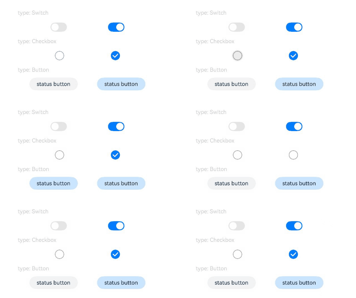
该示例通过配置ToggleType设置Toggle的勾选框样式、状态按钮样式及开关样式。
- // xxx.ets
- @Entry
- @Component
- struct ToggleExample {
- build() {
- Column({ space: 10 }) {
- Text('type: Switch').fontSize(12).fontColor(0xcccccc).width('90%')
- Flex({ justifyContent: FlexAlign.SpaceEvenly, alignItems: ItemAlign.Center }) {
- Toggle({ type: ToggleType.Switch, isOn: false })
- .selectedColor('#007DFF')
- .switchPointColor('#FFFFFF')
- .onChange((isOn: boolean) => {
- console.info('Component status:' + isOn)
- })
-
- Toggle({ type: ToggleType.Switch, isOn: true })
- .selectedColor('#007DFF')
- .switchPointColor('#FFFFFF')
- .onChange((isOn: boolean) => {
- console.info('Component status:' + isOn)
- })
- }
-
- Text('type: Checkbox').fontSize(12).fontColor(0xcccccc).width('90%')
- Flex({ justifyContent: FlexAlign.SpaceEvenly, alignItems: ItemAlign.Center }) {
- Toggle({ type: ToggleType.Checkbox, isOn: false })
- .size({ width: 20, height: 20 })
- .selectedColor('#007DFF')
- .onChange((isOn: boolean) => {
- console.info('Component status:' + isOn)
- })
-
- Toggle({ type: ToggleType.Checkbox, isOn: true })
- .size({ width: 20, height: 20 })
- .selectedColor('#007DFF')
- .onChange((isOn: boolean) => {
- console.info('Component status:' + isOn)
- })
- }
-
- Text('type: Button').fontSize(12).fontColor(0xcccccc).width('90%')
- Flex({ justifyContent: FlexAlign.SpaceEvenly, alignItems: ItemAlign.Center }) {
- Toggle({ type: ToggleType.Button, isOn: false }) {
- Text('status button').fontColor('#182431').fontSize(12)
- }.width(106)
- .selectedColor('rgba(0,125,255,0.20)')
- .onChange((isOn: boolean) => {
- console.info('Component status:' + isOn)
- })
-
- Toggle({ type: ToggleType.Button, isOn: true }) {
- Text('status button').fontColor('#182431').fontSize(12)
- }.width(106)
- .selectedColor('rgba(0,125,255,0.20)')
- .onChange((isOn: boolean) => {
- console.info('Component status:' + isOn)
- })
- }
- }.width('100%').padding(24)
- }
- }
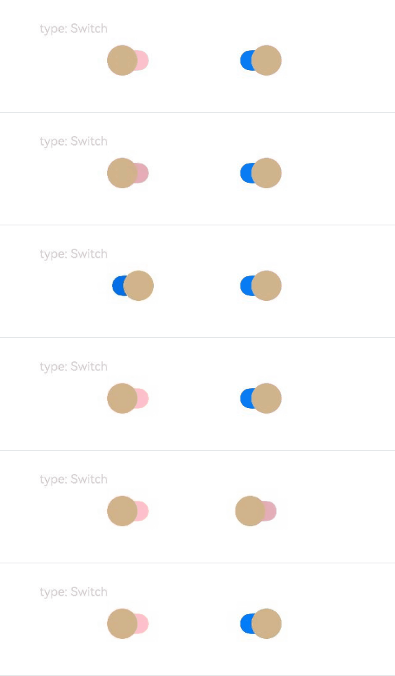
该示例实现了自定义设置Toggle组件Switch样式的圆形滑块半径、关闭状态的背景颜色、圆形滑块颜色、滑轨的圆角。
- // xxx.ets
- @Entry
- @Component
- struct ToggleExample {
- build() {
- Column({ space: 10 }) {
- Text('type: Switch').fontSize(12).fontColor(0xcccccc).width('90%')
- Flex({ justifyContent: FlexAlign.SpaceEvenly, alignItems: ItemAlign.Center }) {
- Toggle({ type: ToggleType.Switch, isOn: false })
- .selectedColor('#007DFF')
- .switchStyle({
- pointRadius: 15,
- trackBorderRadius: 10,
- pointColor: '#D2B48C',
- unselectedColor: Color.Pink })
- .onChange((isOn: boolean) => {
- console.info('Component status:' + isOn)
- })
-
- Toggle({ type: ToggleType.Switch, isOn: true })
- .selectedColor('#007DFF')
- .switchStyle({
- pointRadius: 15,
- trackBorderRadius: 10,
- pointColor: '#D2B48C',
- unselectedColor: Color.Pink })
- .onChange((isOn: boolean) => {
- console.info('Component status:' + isOn)
- })
- }
- }.width('100%').padding(24)
- }
- }
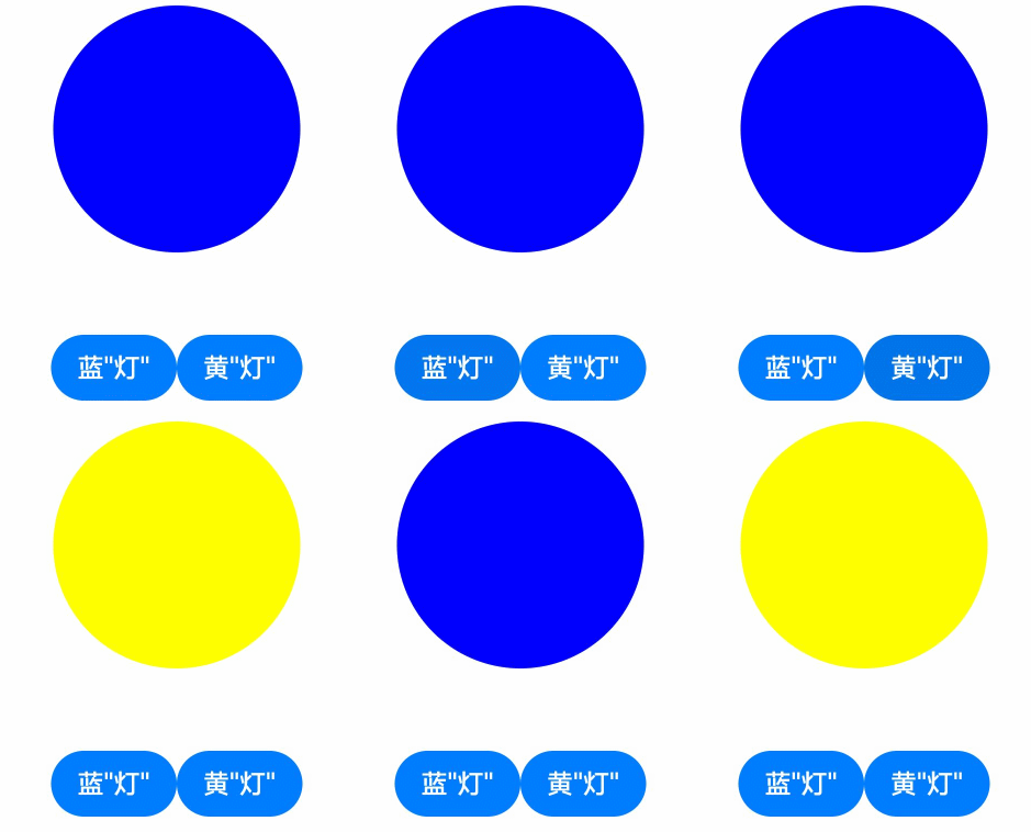
该示例实现了自定义Toggle样式的功能。自定义样式实现了通过按钮切换圆形颜色的功能:点击蓝圆按钮,圆形背景变蓝色,点击黄圆按钮,圆形背景变黄色。
- // xxx.ets
- class MySwitchStyle implements ContentModifier<ToggleConfiguration> {
- selectedColor: Color = Color.White
- lamp: string = 'string';
- constructor(selectedColor: Color, lamp: string) {
- this.selectedColor = selectedColor
- this.lamp = lamp;
- }
- applyContent() : WrappedBuilder<[ToggleConfiguration]>
- {
- return wrapBuilder(buildSwitch)
- }
- }
- @Builder function buildSwitch(config: ToggleConfiguration) {
- Column({ space: 50 }) {
- Circle({ width: 150, height: 150 })
- .fill(config.isOn ? (config.contentModifier as MySwitchStyle).selectedColor : Color.Blue)
- Row() {
- Button('蓝'+ JSON.stringify((config.contentModifier as MySwitchStyle).lamp))
- .onClick(() => {
- config.triggerChange(false);
- })
- Button('黄'+ JSON.stringify((config.contentModifier as MySwitchStyle).lamp))
- .onClick(() => {
- config.triggerChange(true);
- })
- }
- }
- }
-
- @Entry
- @Component
- struct Index {
- build() {
- Column({ space: 50 }) {
- Toggle({ type: ToggleType.Switch})
- .enabled(true)
- .contentModifier(new MySwitchStyle(Color.Yellow, '灯'))
- .onChange((isOn: boolean) => {
- console.info('Switch Log:' + isOn)
- })
- }.height('100%').width('100%')
- }
- }