Intelligent Assistant
Chat with our virtual assistant to get answers promptly.
The <rating> component provides a rating bar, commonly used for reviews and ratings. For details, see rating
Create a <rating> component in the .hml file under pages/index.
- <!-- xxx.hml -->
- <div class="container">
- <rating></rating>
- </div>
- /* xxx.css */
- .container {
- width: 100%;
- height: 100%;
- display: flex;
- justify-content: center;
- align-items: center;
- background-color: #F1F3F5;
- }
- .rating {
- width: 80%;
- height: 150px;
- }

Use the <rating> component to set the number of stars in a rating bar and the current rating using the numstars and rating attributes, respectively.
- <!-- xxx.hml -->
- <div class="container">
- <rating numstars="6" rating="5">
- </rating>
- </div>
- /* xxx.css */
- .container {
- width: 100%;
- height: 100%;
- display: flex;
- justify-content: center;
- align-items: center;
- background-color: #F1F3F5;
- }
- .rating {
- width: 80%;
- height: 150px;
- }

Use the <rating> component to set the background images when a rating star is unselected, selected, and partially selected using the star-background, star-foreground, and star-secondary attributes, respectively.
- <!-- xxx.hml -->
- <div class="container">
- <div style="width: 500px;height: 500px;align-items: center;justify-content: center;flex-direction: column;">
- <rating numstars="5" rating="1" class="myrating" style="width: {{ratewidth}}; height:{{rateheight}};
- star-background: {{backstar}}; star-secondary: {{secstar}};star-foreground: {{forestar}};rtl-flip: true;">
- </rating>
- </div>
- </div>
- /* xxx.css */
- .container {
- width: 100%;
- height: 100%;
- flex-direction: column;
- align-items: center;
- justify-content: center;
- background-color: #F1F3F5;
- }
- // index.js
- export default {
- data: {
- backstar: 'common/love.png',
- secstar: 'common/love.png',
- forestar: 'common/love1.png',
- ratewidth: '400px',
- rateheight: '150px'
- },
- onInit(){
- }
- }

You must set star-background, star-secondary, and star-foreground. If they are not set, gray rating stars will be displayed, indicating an incorrect image source configuration
These three attributes support only PNG and JPG images from local file paths.
Add the change event to the <rating> component to display the current rating.
- <!-- xxx.hml -->
- <div class="container">
- <rating numstars="5" rating="0" onchange="showrating"></rating>
- </div>
- /* xxx.css */
- .container {
- width: 100%;
- height: 100%;
- display: flex;
- justify-content: center;
- align-items: center;
- background-color: #F1F3F5;
- }
- .rating {
- width: 80%;
- height: 150px;
- }
- // xxx.js
- export default {
- showrating(e) {
- this.getUIContext().getPromptAction().showToast({
- message:'Rating' + e.rating
- })
- }
- }

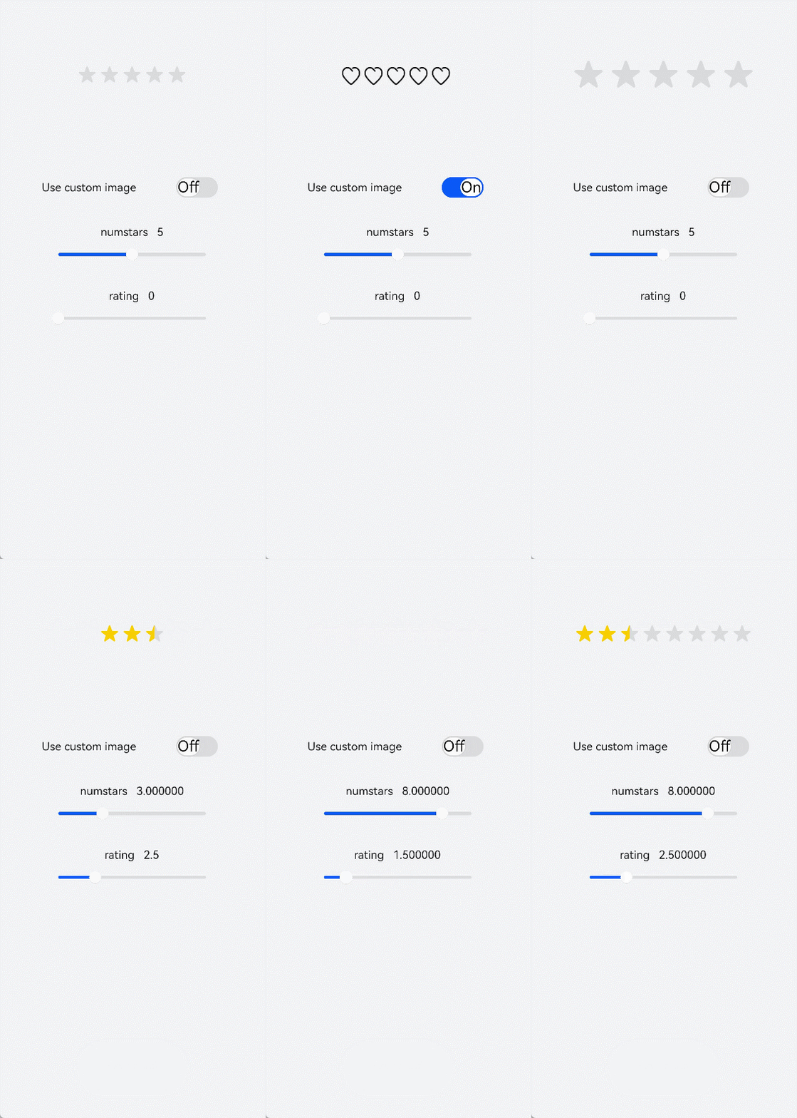
Change the switch status to toggle between the star background images and drag the slider to adjust the rating values.
- <!-- xxx.hml -->
- <div style="width: 100%;height:100%;flex-direction: column;align-items: center;background-color: #F1F3F5;">
- <div style="width: 500px;height: 500px;align-items: center;justify-content: center;flex-direction: column;">
- <rating numstars="{{stars}}" rating="{{rate}}" stepsize="{{step}}" onchange="showrating" class="myrating"
- style="width: {{ratewidth}};height:{{rateheight}};star-background: {{backstar}};star-secondary: {{secstar}};
- star-foreground: {{forestar}};rtl-flip: true;"></rating>
- </div>
- <div style="flex-direction: column;width: 80%;align-items: center;">
- <div style="width: 100%;height: 100px;align-items: center;justify-content: space-around;">
- <text&>Use custom image</text&>
- <switch checked="false" showtext="true" onchange="setstar"></switch>
- </div>
- <div style="width: 100%;height:120px;margin-top: 50px;margin-bottom: 50px;flex-direction: column;align-items: center;
- justify-content: space-around;">
- <text>numstars {{stars}}</text>
- <slider id="sli1" min="0" max="10" value="5" step="1" onchange="setnumstars"></slider>
- </div>
- <div style="width: 100%;height:120px;flex-direction: column;align-items: center;justify-content: space-around;">
- <text>rating {{rate}}</text>
- <slider id="sli2" min="0" max="10" value="{{rate}}" step="0.5" onchange="setrating"></slider>
- </div>
- </div>
- </div>
- /* xxx.css */
- .myrating:active {
- width: 500px;
- height: 100px;
- }
- .switch{
- font-size: 40px;
- }
- // xxx.js
- export default {
- data: {
- backstar: '',
- secstar: '',
- forestar: '',
- stars: 5,
- ratewidth: '300px',
- rateheight: '60px',
- step: 0.5,
- rate: 0
- },
- onInit(){
- },
- setstar(e) {
- if (e.checked == true) {
- this.backstar = 'common/love.png'
- this.secstar = 'common/love.png'
- this.forestar = 'common/love1.png'
- } else {
- this.backstar = ''
- this.secstar = ''
- this.forestar = ''
- }
- },
- setnumstars(e) {
- this.stars = e.progress
- this.ratewidth = 60 * parseInt(this.stars) + 'px'
- },
- setrating(e){
- this.rate = e.progress
- },
- showrating(e) {
- this.rate = e.rating
- this.getUIContext().getPromptAction().showToast({
- message:'Rating' + e.rating
- })
- }
- }