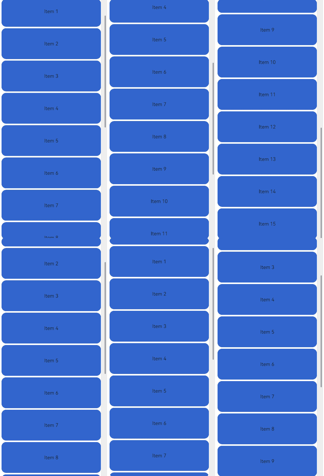
The ScrollBar is used together with scrollable components, such as List, Grid, and Scroll.

This component is supported since API version 8. Updates will be marked with a superscript to indicate their earliest API version.
APIs
ScrollBar(value: ScrollBarOptions)
Atomic service API: This API can be used in atomic services since API version 11.
System capability: SystemCapability.ArkUI.ArkUI.Full
Parameters
| Name | Type | Mandatory | Description |
|---|---|---|---|
| value | ScrollBarOptions | Yes | Scrollbar settings. |
ScrollBarOptions
Atomic service API: This API can be used in atomic services since API version 11.
System capability: SystemCapability.ArkUI.ArkUI.Full
| Name | Type | Mandatory | Description |
|---|---|---|---|
| scroller | Scroller | Yes | Scroller, which can be bound to scrollable components. |
| direction | ScrollBarDirection | No | Scrollbar direction in which scrollable components scroll. Default value: ScrollBarDirection.Vertical |
| state | BarState | No | Scrollbar state. Default value: BarState.Auto |

The ScrollBar component defines the behavior style of the scrollable area, and its subnodes define the behavior style of the scrollbar.
This component is bound to a scrollable component through scroller, and can be used to scroll the scrollable component only when their directions are the same. The ScrollBar component can be bound to only one scrollable component, and vice versa.
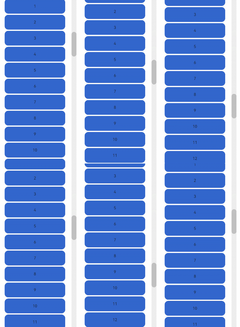
Since API version 12, the ScrollBar component displays a default scrollbar style when without child nodes.
ScrollBarDirection
Atomic service API: This API can be used in atomic services since API version 11.
System capability: SystemCapability.ArkUI.ArkUI.Full
| Name | Description |
|---|---|
| Vertical | Vertical scrollbar. |
| Horizontal | Horizontal scrollbar. |
Example 1
This example illustrates the style of a ScrollBar component with child components.
// xxx.ets
@Entry
@Component
struct ScrollBarExample {
  private scroller: Scroller = new Scroller()
  private arr: number[] = [0, 1, 2, 3, 4, 5, 6, 7, 8, 9, 10, 11, 12, 13, 14, 15]

  build() {
    Column() {
      Stack({ alignContent: Alignment.End }) {
        Scroll(this.scroller) {
          Flex({ direction: FlexDirection.Column }) {
            ForEach(this.arr, (item: number) => {
              Row() {
                Text(item.toString())
                  .width('80%')
                  .height(60)
                  .backgroundColor('#3366CC')
                  .borderRadius(15)
                  .fontSize(16)
                  .textAlign(TextAlign.Center)
                  .margin({ top: 5 })
              }
            }, (item:number) => item.toString())
          }.margin({ right: 15 })
        }
        .width('90%')
        .scrollBar(BarState.Off)
        .scrollable(ScrollDirection.Vertical)
        ScrollBar({ scroller: this.scroller, direction: ScrollBarDirection.Vertical,state: BarState.Auto }) {
          Text()
            .width(20)
            .height(100)
            .borderRadius(10)
            .backgroundColor('#C0C0C0')
        }.width(20).backgroundColor('#ededed')
      }
    }
  }
} 
Example 2
This example illustrates the style of a ScrollBar component without child components.
@Entry
@Component
struct ScrollBarExample {
  private scroller: Scroller = new Scroller()
  private arr: number[] = [0, 1, 2, 3, 4, 5, 6, 7, 8, 9, 10, 11, 12, 13, 14, 15]

  build() {
    Column() {
      Stack({ alignContent: Alignment.End }) {
        Scroll(this.scroller) {
          Flex({ direction: FlexDirection.Column }) {
            ForEach(this.arr, (item: number) => {
              Row() {
                Text(item.toString())
                  .width('80%')
                  .height(60)
                  .backgroundColor('#3366CC')
                  .borderRadius(15)
                  .fontSize(16)
                  .textAlign(TextAlign.Center)
                  .margin({ top: 5 })
              }
            }, (item:number) => item.toString())
          }.margin({ right: 15 })
        }
        .width('90%')
        .scrollBar(BarState.Off)
        .scrollable(ScrollDirection.Vertical)
        ScrollBar({ scroller: this.scroller, direction: ScrollBarDirection.Vertical,state: BarState.Auto })
      }
    }
  }
}