The Refresh component is a container that provides the pull-to-refresh feature.

-
This component is supported since API version 8. Updates will be marked with a superscript to indicate their earliest API version.
-
This component provides linkage with a vertical scrolling Swiper and Web component since API version 12. The linkage does not work if the loop attribute of Swiper is set to true.
Child Components
This component supports only one child component.
Since API version 11, this component's child component moves down with the pull-down gesture.
APIs
Refresh(value: RefreshOptions)
Atomic service API: This API can be used in atomic services since API version 11.
System capability: SystemCapability.ArkUI.ArkUI.Full
Parameters
| Name | Type | Mandatory | Description |
|---|---|---|---|
| value | RefreshOptions | Yes | Parameters of the Refresh component. |
RefreshOptions
System capability: SystemCapability.ArkUI.ArkUI.Full
| Name | Type | Mandatory | Description |
|---|---|---|---|
| refreshing | boolean | Yes | Whether the component is being refreshed. The value true means that the component is being refreshed, and false means the opposite. Default value: false This parameter supports $$ for two-way binding of variables. Atomic service API: This API can be used in atomic services since API version 11. |
| offset(deprecated) | string | number | No | Distance from the pull-down starting point to the top of the component. Default value: 16, in vp This API is deprecated since API version 11. No substitute API is provided. NOTE The value range of offset is [0vp, 64vp]. If the value is greater than 64 vp, the value 64 vp will be used. The value cannot be a percentage or a negative number. |
| friction(deprecated) | number | string | No | Coefficient of friction, which indicates the <Refresh> component's sensitivity to the pull-down gesture. The value ranges from 0 to 100. Default value: 62 - 0 indicates that the Refresh component is not responsive to the pull-down gesture. - 100 indicates that the Refresh component is highly responsive to the pull-down gesture. - A larger value indicates higher responsiveness of the Refresh component to the pull-down gesture. This API is deprecated since API version 11. You can use pullDownRatio instead since API version 12. |
| builder10+ | CustomBuilder | No | Custom content in the refreshing area. NOTE In API version 10 and earlier versions, there is a height limit of 64 vp on custom components. This restriction is removed since API version 11. When a custom component is set with a fixed height, it will be displayed below the refreshing area at that fixed height; when the custom component does not have a height set, its height will adapt to the height of the refreshing area, which may result in the height of the custom component changing to 0 along with the refreshing area. To prevent its height from being less than expected, you are advised to set a minimum height constraint for the custom component. For reference, see Example 2. Since API version 12, use refreshingContent instead of builder for customizing the content of the refreshing area, to avoid animation interruptions caused by the destruction and re-creation of the custom component during the refreshing process. Atomic service API: This API can be used in atomic services since API version 11. |
| promptText12+ | ResourceStr | No | Custom text displayed at the bottom of the refreshing area. NOTE When setting the text, follow the constraints on the Text components. If you are using builder or refreshingContent to customize the content displayed in the refreshing area, the text set with promptText will not be displayed. When promptText is set and effective, the refreshOffset attribute defaults to 96 vp. Atomic service API: This API can be used in atomic services since API version 12. |
| refreshingContent12+ | ComponentContent | No | Custom content in the refreshing area. NOTE If this parameter and the builder parameter are set at the same time, the builder parameter does not take effect. When a custom component is set with a fixed height, it will be displayed below the refreshing area at that fixed height; when the custom component does not have a height set, its height will adapt to the height of the refreshing area, which may result in the height of the custom component changing to 0 along with the refreshing area. To prevent its height from being less than expected, you are advised to set a minimum height constraint for the custom component. For reference, see Example 5. Atomic service API: This API can be used in atomic services since API version 12. |
[h2]refreshOffset12+
refreshOffset(value: number)
Sets the pull-down offset that initiates a refresh.
Atomic service API: This API can be used in atomic services since API version 12.
System capability: SystemCapability.ArkUI.ArkUI.Full
Parameters
| Name | Type | Mandatory | Description |
|---|---|---|---|
| value | number | Yes | Pull-down offset, in vp. Default value: 96 vp when promptText is set and 64 vp when promptText is not If the value specified is 0 or less than 0, the default value is used. |
[h2]pullToRefresh12+
pullToRefresh(value: boolean)
Sets whether to initiate a refresh when the pull-down distance exceeds the value of refreshOffset.
Atomic service API: This API can be used in atomic services since API version 12.
System capability: SystemCapability.ArkUI.ArkUI.Full
Parameters
| Name | Type | Mandatory | Description |
|---|---|---|---|
| value | boolean | Yes | Whether to initiate a refresh when the pull-down distance exceeds the value of refreshOffset. The value true means to initiate a refresh, and false means the opposite. Default value: true |
[h2]pullDownRatio12+
pullDownRatio(ratio: Optional<number>)
Sets the pull-down ratio.
Atomic service API: This API can be used in atomic services since API version 12.
System capability: SystemCapability.ArkUI.ArkUI.Full
Parameters
| Name | Type | Mandatory | Description |
|---|---|---|---|
| ratio | Optional<number> | Yes | Pull-down ratio. A larger value indicates higher responsiveness to the pull-down gesture. The value 0 indicates that the pull-down does not follow the gesture, and 1 indicates that the pull-down follows the gesture proportionally. If this parameter is not set or is set to undefined, a dynamic pull-down ratio is used. That is, the larger the pull-down distance, the smaller the ratio. The value ranges from 0 to 1. A value less than 0 is handled as 0, and a value greater than 1 is handled as 1. |
[h2]onStateChange
onStateChange(callback: (state: RefreshStatus) => void)
Called when the refresh status changes.
Atomic service API: This API can be used in atomic services since API version 11.
System capability: SystemCapability.ArkUI.ArkUI.Full
Parameters
| Name | Type | Mandatory | Description |
|---|---|---|---|
| state | RefreshStatus | Yes | Refresh status. |
[h2]onRefreshing
onRefreshing(callback: () => void)
Called when the component starts refreshing.
Atomic service API: This API can be used in atomic services since API version 11.
System capability: SystemCapability.ArkUI.ArkUI.Full
[h2]onOffsetChange12+
onOffsetChange(callback: Callback<number>)
Called when the pull-down distance changes.
Atomic service API: This API can be used in atomic services since API version 12.
System capability: SystemCapability.ArkUI.ArkUI.Full
Parameters
| Name | Type | Mandatory | Description |
|---|---|---|---|
| value | number | Yes | Pull-down distance. Unit: vp |
RefreshStatus
Atomic service API: This API can be used in atomic services since API version 11.
System capability: SystemCapability.ArkUI.ArkUI.Full
| Name | Value | Description |
|---|---|---|
| Inactive | 0 | The component is not pulled down. This is the default value. |
| Drag | 1 | The component is being pulled down, but the pull-down distance is shorter than the minimum length required to trigger the refresh. |
| OverDrag | 2 | The component is being pulled down, and the pull-down distance exceeds the minimum length required to trigger the refresh. |
| Refresh | 3 | The pull-down ends, and the component rebounds to the minimum length required to trigger the refresh and enters the refreshing state. |
| Done | 4 | The refresh is complete, and the component returns to the initial state (at the top). |
[h2]Example 1
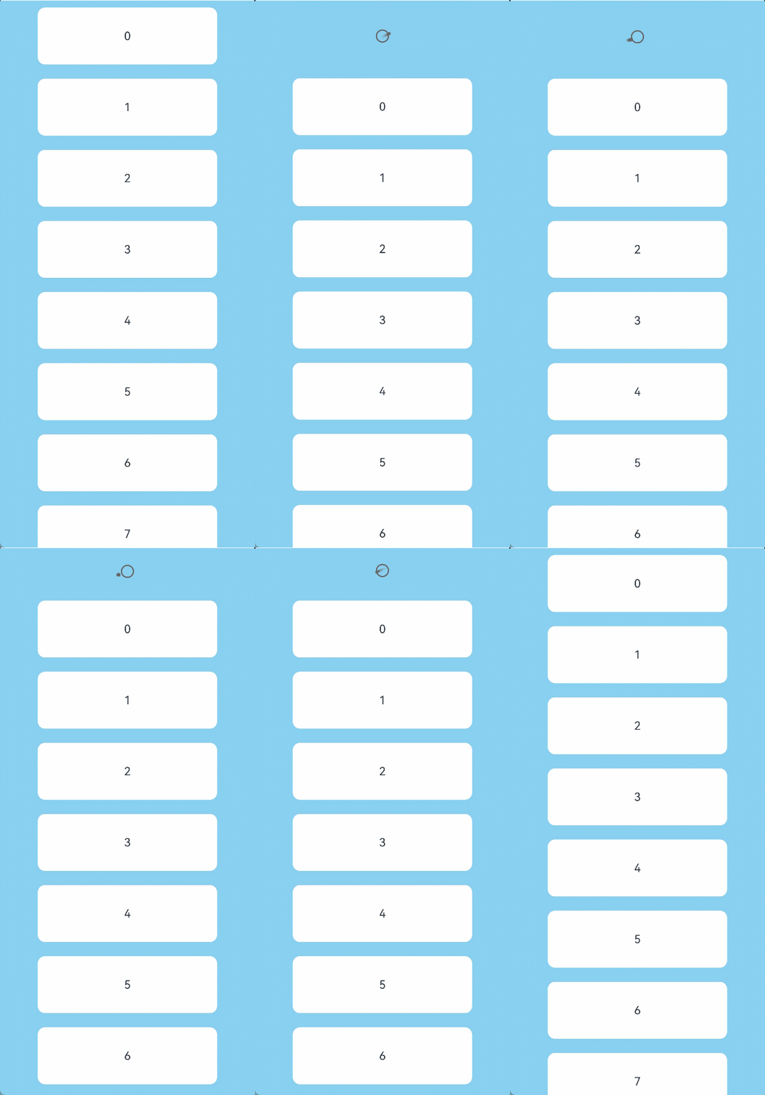
This example implements a Refresh with its refreshing area in the default style.
// xxx.ets
@Entry
@Component
struct RefreshExample {
  @State isRefreshing: boolean = false
  @State arr: String[] = ['0', '1', '2', '3', '4','5','6','7','8','9','10']

  build() {
    Column() {
      Refresh({ refreshing: $$this.isRefreshing}) {
        List() {
          ForEach(this.arr, (item: string) => {
            ListItem() {
              Text('' + item)
                .width('70%').height(80).fontSize(16).margin(10)
                .textAlign(TextAlign.Center).borderRadius(10).backgroundColor(0xFFFFFF)
            }
          }, (item: string) => item)
        }
        .onScrollIndex((first: number) => {
          console.info(first.toString())
        })
        .width('100%')
        .height('100%')
        .alignListItem(ListItemAlign.Center)
        .scrollBar(BarState.Off)
      }
      .onStateChange((refreshStatus: RefreshStatus) => {
        console.info('Refresh onStatueChange state is ' + refreshStatus)
      })
      .onOffsetChange((value: number) => {
        console.info('Refresh onOffsetChange offset:' + value)
      })
      .onRefreshing(() => {
        setTimeout(() => {
          this.isRefreshing = false
        }, 2000)
        console.log('onRefreshing test')
      })
      .backgroundColor(0x89CFF0)
      .refreshOffset(64)
      .pullToRefresh(true)
    }
  }
} 
[h2]Example 2
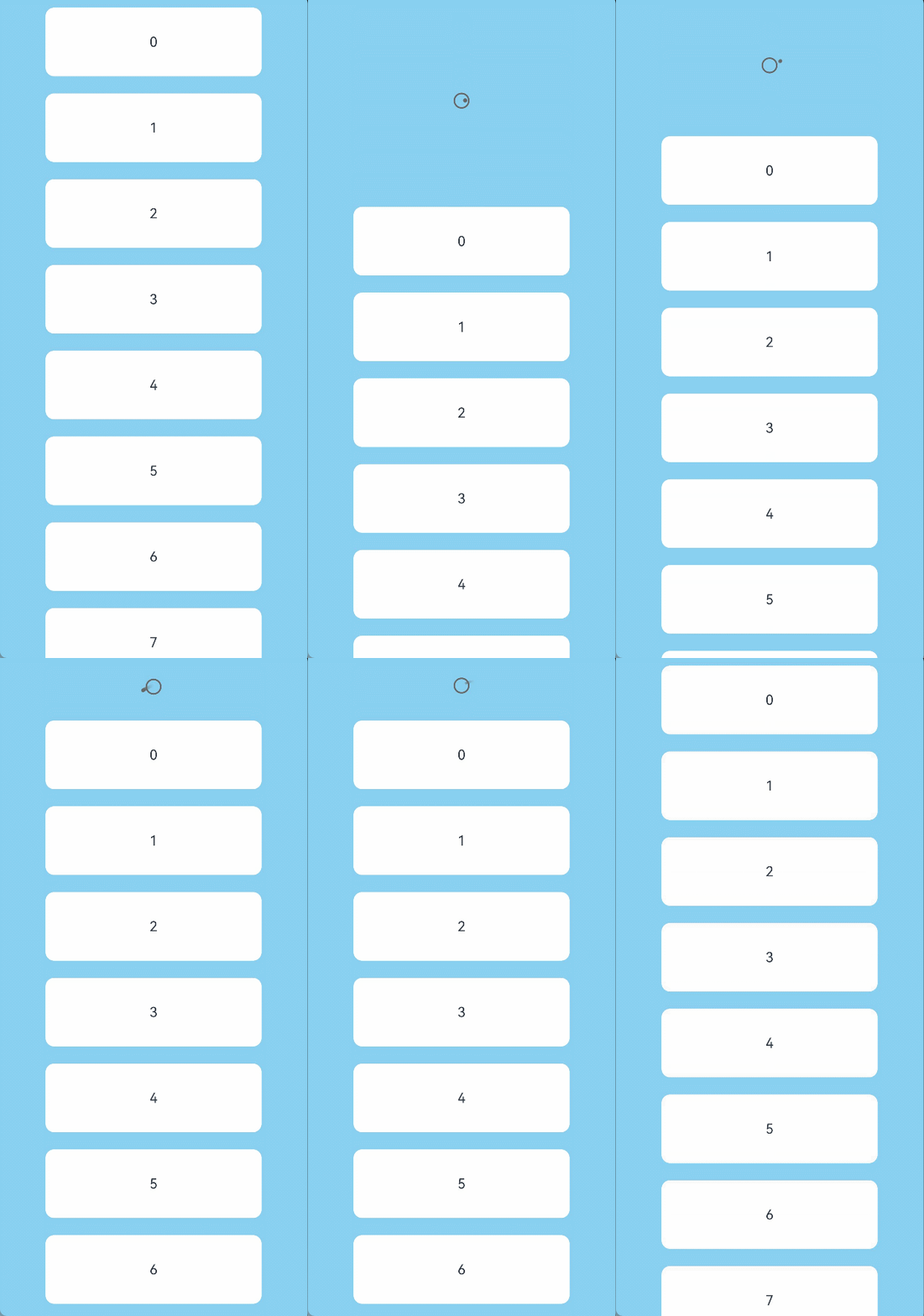
This example implements a Refresh with its refreshing area displaying the custom content defined with builder.
// xxx.ets
@Entry
@Component
struct RefreshExample {
  @State isRefreshing: boolean = false
  @State arr: String[] = ['0', '1', '2', '3', '4','5','6','7','8','9','10']
  @Builder
  customRefreshComponent()
  {
    Stack()
    {
      Row()
      {
        LoadingProgress().height(32)
        Text("Refreshing...").fontSize(16).margin({left:20})
      }
      .alignItems(VerticalAlign.Center)
    }
    .align(Alignment.Center)
    .clip(true)
    .constraintSize({minHeight:32}) // Setting a minimum height constraint ensures that the height of the custom component does not fall below the specified minHeight when the height of the refreshing area changes.
    .width("100%")
  }

  build() {
    Column() {
      Refresh({ refreshing: $$this.isRefreshing,builder:this.customRefreshComponent()}) {
        List() {
          ForEach(this.arr, (item: string) => {
            ListItem() {
              Text('' + item)
                .width('70%').height(80).fontSize(16).margin(10)
                .textAlign(TextAlign.Center).borderRadius(10).backgroundColor(0xFFFFFF)
            }
          }, (item: string) => item)
        }
        .onScrollIndex((first: number) => {
          console.info(first.toString())
        })
        .width('100%')
        .height('100%')
        .alignListItem(ListItemAlign.Center)
        .scrollBar(BarState.Off)
      }
      .backgroundColor(0x89CFF0)
      .pullToRefresh(true)
      .refreshOffset(64)
      .onStateChange((refreshStatus: RefreshStatus) => {
        console.info('Refresh onStatueChange state is ' + refreshStatus)
      })
      .onRefreshing(() => {
        setTimeout(() => {
          this.isRefreshing = false
        }, 2000)
        console.log('onRefreshing test')
      })
    }
  }
} 
[h2]Example 3
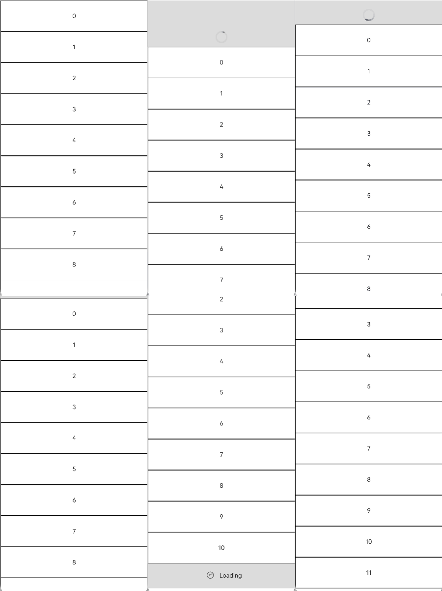
This example implements a Refresh component that produces a bounce effect when the boundary is reached.
// Index.ets
@Entry
@Component
struct ListRefreshLoad {
  @State arr: Array<number> = [0, 1, 2, 3, 4, 5, 6, 7, 8, 9, 10];
  @State refreshing: boolean = false;
  @State refreshOffset: number = 0;
  @State refreshState: RefreshStatus = RefreshStatus.Inactive;
  @State canLoad: boolean = false;
  @State isLoading: boolean = false;

  @Builder
  refreshBuilder() {
    Stack({ alignContent: Alignment.Bottom }) {
      // can use the refresh state to decide whether the progress component is exist or not.
      // in this case, the component is not exist otherwise in the pull down or refresh state
      if (this.refreshState != RefreshStatus.Inactive && this.refreshState != RefreshStatus.Done) {
        Progress({ value: this.refreshOffset, total: 64, type: ProgressType.Ring })
          .width(32).height(32)
          .style({ status: this.refreshing ? ProgressStatus.LOADING : ProgressStatus.PROGRESSING })
          .margin(10)
      }
    }
    .clip(true)
    .height("100%")
    .width("100%")
  }

  @Builder
  footer() {
    Row() {
      LoadingProgress().height(32).width(48)
      Text("Loading")
    }.width("100%")
    .height(64)
    .justifyContent(FlexAlign.Center)
    // hidden this component when don't need to load
    .visibility(this.isLoading ? Visibility.Visible : Visibility.Hidden)
  }

  build() {
    Refresh({ refreshing: $$this.refreshing, builder: this.refreshBuilder() }) {
      List() {
        ForEach(this.arr, (item: number) => {
          ListItem() {
            Text('' + item)
              .width('100%')
              .height(80)
              .fontSize(16)
              .textAlign(TextAlign.Center)
              .backgroundColor(0xFFFFFF)
          }.borderWidth(1)
        }, (item: string) => item)

        ListItem() {
          this.footer();
        }
      }
      .onScrollIndex((start: number, end: number) => {
        // when reach the end of list, trigger data load
        if (this.canLoad && end >= this.arr.length - 1) {
          this.canLoad = false;
          this.isLoading = true;
          // simulate trigger data load
          setTimeout(() => {
            for (let i = 0; i < 10; i++) {
              this.arr.push(this.arr.length);
              this.isLoading = false;
            }
          }, 700)
        }
      })
      .onScrollFrameBegin((offset: number, state: ScrollState) => {
        // loading can be triggered only when swipe up
        if (offset > 5 && !this.isLoading) {
          this.canLoad = true;
        }
        return { offsetRemain: offset };
      })
      .scrollBar(BarState.Off)
      // open the spring back of edge
      .edgeEffect(EdgeEffect.Spring, { alwaysEnabled: true })
    }
    .width('100%')
    .height('100%')
    .backgroundColor(0xDCDCDC)
    .onOffsetChange((offset: number) => {
      this.refreshOffset = offset;
    })
    .onStateChange((state: RefreshStatus) => {
      this.refreshState = state;
    })
    .onRefreshing(() => {
      // simulate refresh the data
      setTimeout(() => {
        this.refreshing = false;
      }, 2000)
    })
  }
} 
[h2]Example 4
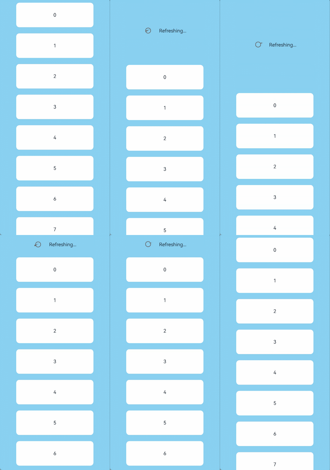
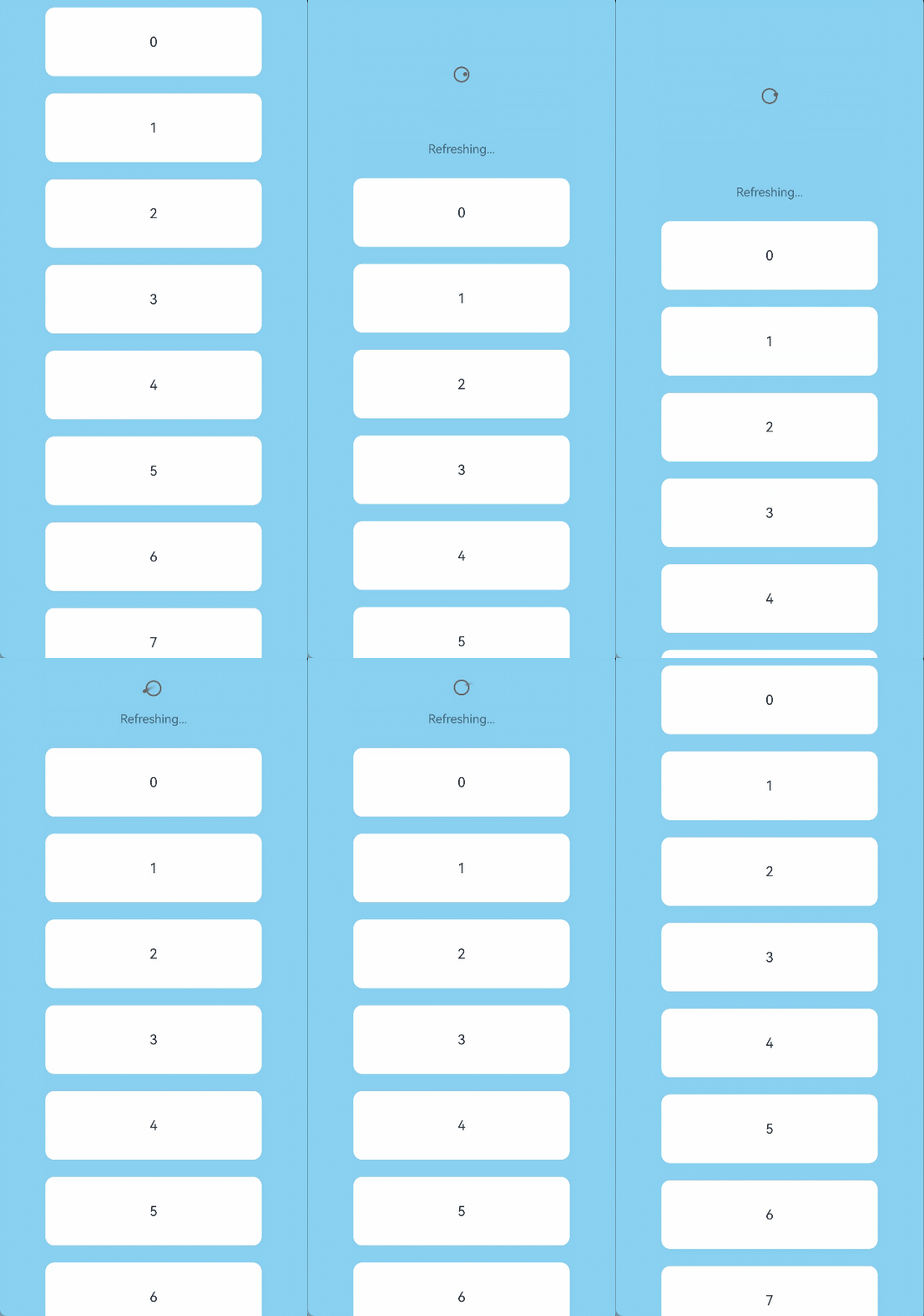
This example demonstrates how to use promptText to set the text displayed in the refreshing area.
// xxx.ets
@Entry
@Component
struct RefreshExample {
  @State isRefreshing: boolean = false
  @State promptText: string = "Refreshing..."
  @State arr: String[] = ['0', '1', '2', '3', '4','5','6','7','8','9','10']

  build() {
    Column() {
      Refresh({ refreshing: $$this.isRefreshing, promptText: this.promptText}) {
        List() {
          ForEach(this.arr, (item: string) => {
            ListItem() {
              Text('' + item)
                .width('70%').height(80).fontSize(16).margin(10)
                .textAlign(TextAlign.Center).borderRadius(10).backgroundColor(0xFFFFFF)
            }
          }, (item: string) => item)
        }
        .onScrollIndex((first: number) => {
          console.info(first.toString())
        })
        .width('100%')
        .height('100%')
        .alignListItem(ListItemAlign.Center)
        .scrollBar(BarState.Off)
      }
      .backgroundColor(0x89CFF0)
      .pullToRefresh(true)
      .refreshOffset(96)
      .onStateChange((refreshStatus: RefreshStatus) => {
        console.info('Refresh onStatueChange state is ' + refreshStatus)
      })
      .onOffsetChange((value: number) => {
        console.info('Refresh onOffsetChange offset:' + value)
      })
      .onRefreshing(() => {
        setTimeout(() => {
          this.isRefreshing = false
        }, 2000)
        console.log('onRefreshing test')
      })
    }
  }
} 
[h2]Example 5
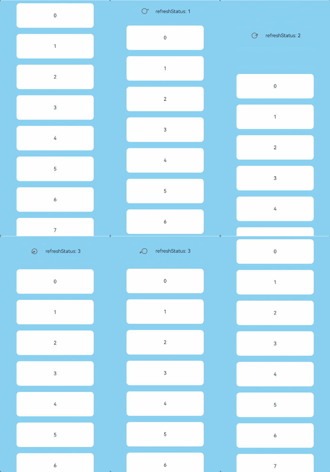
This example implements a Refresh with its refreshing area displaying the custom content defined with refreshingContent.
import { ComponentContent } from '@ohos.arkui.node';

class Params {
  refreshStatus: RefreshStatus = RefreshStatus.Inactive

  constructor(refreshStatus: RefreshStatus) {
    this.refreshStatus = refreshStatus;
  }
}

@Builder
function customRefreshingContent(params:Params) {
  Stack() {
    Row() {
      LoadingProgress().height(32)
      Text("refreshStatus: "+params.refreshStatus).fontSize(16).margin({left:20})
    }
    .alignItems(VerticalAlign.Center)
  }
  .align(Alignment.Center)
  .clip(true)
  .constraintSize({minHeight:32}) // Setting a minimum height constraint ensures that the height of the custom component does not fall below the specified minHeight when the height of the refreshing area changes.
  .width("100%")
}

@Entry
@Component
struct RefreshExample {
  @State isRefreshing: boolean = false
  @State arr: String[] = ['0', '1', '2', '3', '4','5','6','7','8','9','10']
  @State refreshStatus: RefreshStatus = RefreshStatus.Inactive
  private contentNode?: ComponentContent<Object> = undefined

  aboutToAppear():void {
    let uiContext = this.getUIContext();
    this.contentNode = new ComponentContent(uiContext, wrapBuilder(customRefreshingContent), new Params(this.refreshStatus))
  }

  build() {
    Column() {
      Refresh({ refreshing: $$this.isRefreshing, refreshingContent:this.contentNode}) {
        List() {
          ForEach(this.arr, (item: string) => {
            ListItem() {
              Text('' + item)
                .width('70%').height(80).fontSize(16).margin(10)
                .textAlign(TextAlign.Center).borderRadius(10).backgroundColor(0xFFFFFF)
            }
          }, (item: string) => item)
        }
        .onScrollIndex((first: number) => {
          console.info(first.toString())
        })
        .width('100%')
        .height('100%')
        .alignListItem(ListItemAlign.Center)
        .scrollBar(BarState.Off)
      }
      .backgroundColor(0x89CFF0)
      .pullToRefresh(true)
      .refreshOffset(96)
      .onStateChange((refreshStatus: RefreshStatus) => {
        this.refreshStatus = refreshStatus
        this.contentNode?.update(new Params(this.refreshStatus)) // Update the content of the custom component.
        console.info('Refresh onStatueChange state is ' + refreshStatus)
      })
      .onRefreshing(() => {
        setTimeout(() => {
          this.isRefreshing = false
        }, 2000)
        console.log('onRefreshing test')
      })
    }
  }
} 
[h2]Example 6
This example shows how to use the pullDownRatio attribute and the onOffsetChange event to implement the maximum pull-down distance.
import { ComponentContent } from '@ohos.arkui.node';

@Builder
function customRefreshingContent() {
  Stack() {
    Row() {
      LoadingProgress().height(32)
    }
    .alignItems(VerticalAlign.Center)
  }
  .align(Alignment.Center)
  .clip(true)
  .constraintSize({minHeight:32}) // Setting a minimum height constraint ensures that the height of the custom component does not fall below the specified minHeight when the height of the refreshing area changes.
  .width("100%")
}

@Entry
@Component
struct RefreshExample {
  @State isRefreshing: boolean = false
  @State arr: String[] = ['0', '1', '2', '3', '4','5','6','7','8','9','10']
  @State maxRefreshingHeight: number = 100.0
  @State ratio: number = 1
  private contentNode?: ComponentContent<Object> = undefined

  aboutToAppear():void {
    let uiContext = this.getUIContext();
    this.contentNode = new ComponentContent(uiContext, wrapBuilder(customRefreshingContent))
  }

  build() {
    Column() {
      Refresh({ refreshing: $$this.isRefreshing, refreshingContent:this.contentNode}) {
        List() {
          ForEach(this.arr, (item: string) => {
            ListItem() {
              Text('' + item)
                .width('70%').height(80).fontSize(16).margin(10)
                .textAlign(TextAlign.Center).borderRadius(10).backgroundColor(0xFFFFFF)
            }
          }, (item: string) => item)
        }
        .onScrollIndex((first: number) => {
          console.info(first.toString())
        })
        .width('100%')
        .height('100%')
        .alignListItem(ListItemAlign.Center)
        .scrollBar(BarState.Off)
      }
      .backgroundColor(0x89CFF0)
      .pullDownRatio(this.ratio)
      .pullToRefresh(true)
      .refreshOffset(64)
      .onOffsetChange((offset: number)=>{
          this.ratio = 1 - Math.pow((offset / this.maxRefreshingHeight), 3) // The closer to the maximum pull-down distance, the smaller the pull-down ratio.
      })
      .onStateChange((refreshStatus: RefreshStatus) => {
        console.info('Refresh onStatueChange state is ' + refreshStatus)
      })
      .onRefreshing(() => {
        setTimeout(() => {
          this.isRefreshing = false
        }, 2000)
        console.log('onRefreshing test')
      })
    }
  }
}