Intelligent Assistant
Chat with our virtual assistant to get answers promptly.
The ColumnSplit component lays out child components vertically and inserts a horizontal divider between every two child components.
This component is supported since API version 7. Updates will be marked with a superscript to indicate their earliest API version.
Supported
This component limits the height of its child components through dividers. During initialization, the divider positions are calculated based on the height of its child components. After initialization, dynamic height modifications to child components do not affect divider positions. To adjust child component heights, drag the adjacent dividers.
After initialization, dynamic changes to the margin, border, or padding attributes may cause the size of the child components to exceed the allowable distance between adjacent dividers. In such cases, dividers cannot be dragged to adjust the height of the child components.
ColumnSplit()
Creates a vertical split layout container with dividers between child components.
Atomic service API: This API can be used in atomic services since API version 11.
System capability: SystemCapability.ArkUI.ArkUI.Full
In addition to the universal attributes, the following attributes are supported.
The default value of shape clipping of the ColumnSplit component is true.
resizeable(value: boolean)
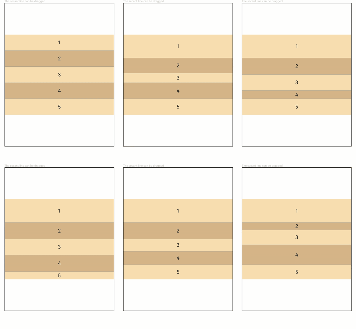
Sets whether the divider can be dragged.
Atomic service API: This API can be used in atomic services since API version 11.
System capability: SystemCapability.ArkUI.ArkUI.Full
Parameters
| Name | Type | Mandatory | Description |
|---|---|---|---|
| value | boolean | Yes | Whether the divider can be dragged. true: The divider can be dragged. false: The divider cannot be dragged. Default value: false Invalid values are treated as the default value. |
divider(value: ColumnSplitDividerStyle | null)
Margin of the divider.
Atomic service API: This API can be used in atomic services since API version 11.
System capability: SystemCapability.ArkUI.ArkUI.Full
Parameters
| Name | Type | Mandatory | Description |
|---|---|---|---|
| value | ColumnSplitDividerStyle | null | Yes | Margin of the divider, that is, the distance between the divider and the child component. Default value: null. When this parameter is set to null, the distance between the divider and the child component is 0 vp. Invalid values are treated as the default value. |
Sets the distance between the child component and the upper and lower dividers.
Atomic service API: This API can be used in atomic services since API version 11.
System capability: SystemCapability.ArkUI.ArkUI.Full
| Name | Type | Read-Only | Optional | Description |
|---|---|---|---|---|
| startMargin | Dimension | No | Yes | Distance between the child component and the upper divider. Default value: 0 Invalid values are treated as the default value. In this case, the attribute value obtained by the getInspectorByKey() API is undefined. |
| endMargin | Dimension | No | Yes | Distance between the child component and the lower divider. Default value: 0 Invalid values are treated as the default value. In this case, the attribute value obtained by the getInspectorByKey() API is undefined. |
Similar to RowSplit, the dividers of ColumnSplit adjust the height of adjacent child components. However, this adjustment is only applied to the extent that the resulting height stays within the height limits of the child components.
Universal attributes such as clip and margin are supported. If clip is not set, the default value true is used.
The universal events are supported.
This example shows how to set the resizable ColumnSplit component and its effect.
// xxx.ets
@Entry
@Component
struct ColumnSplitExample {
  build() {
    Column(){
      Text('The dividing line can be dragged').fontSize(9).fontColor(0xCCCCCC).width('90%')
      ColumnSplit() {
        Text('1').width('100%').height(50).backgroundColor(0xF5DEB3).textAlign(TextAlign.Center)
        Text('2').width('100%').height(50).backgroundColor(0xD2B48C).textAlign(TextAlign.Center)
        Text('3').width('100%').height(50).backgroundColor(0xF5DEB3).textAlign(TextAlign.Center)
        Text('4').width('100%').height(50).backgroundColor(0xD2B48C).textAlign(TextAlign.Center)
        Text('5').width('100%').height(50).backgroundColor(0xF5DEB3).textAlign(TextAlign.Center)
      }
      .borderWidth(1)
      .resizeable(true) // The divider can be dragged.
      .width('90%').height('60%')
    }.width('100%')
  }
} 
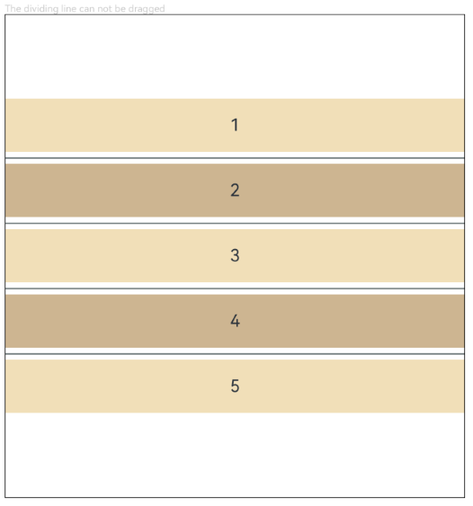
This example shows how to set the ColumnSplit component with spacing and its effect.
// xxx.ets
@Entry
@Component
struct ColumnSplitDividerExample {
  build() {
    Column() {
      Text('The dividing line can be dragged').fontSize(9).fontColor(0xCCCCCC).width('90%')
      ColumnSplit() {
        Text('1').width('100%').height(50).backgroundColor(0xF5DEB3).textAlign(TextAlign.Center)
        Text('2').width('100%').height(50).backgroundColor(0xD2B48C).textAlign(TextAlign.Center)
        Text('3').width('100%').height(50).backgroundColor(0xF5DEB3).textAlign(TextAlign.Center)
        Text('4').width('100%').height(50).backgroundColor(0xD2B48C).textAlign(TextAlign.Center)
        Text('5').width('100%').height(50).backgroundColor(0xF5DEB3).textAlign(TextAlign.Center)
      }
      .borderWidth(1)
      .divider({ startMargin: 5, endMargin: 5 }) // Set the spacing.
      .width('90%')
      .height('60%')
    }.width('100%')
  }
}