


Intelligent Assistant
Chat with our virtual assistant to get answers promptly.
SaveButton is a system API for the save security control. It applies to scenarios where apps need temporary media library access permissions to save images or videos, such as saving images to albums and exporting media content.
After the SaveButton component is integrated into an app, a confirmation dialog will appear when the user taps the component for the first time. If the user allows access, the app obtains temporary authorization to call media library APIs. For related APIs, see Interface (PhotoAccessHelper). If the user denies access or dismisses the dialog, authorization will not be granted for this operation. No dialog box will appear for subsequent uses.
For API version 19 and earlier, the authorization duration is 10 seconds. For API version 20 and later, the authorization duration is 1 minute.
You need to call media library APIs to obtain file handles and complete temporary-authorized operations such as creating media resources within the authorization period. After authorization expires, existing file handles acquired during the valid period remain available for read and write operations.
This component is supported since API version 10. Updates will be marked with a superscript to indicate their earliest API version.
Not supported
SaveButton()
Creates a SaveButton component with an icon, text, and background. When the user taps the save button for the first time, a dialog will pop up. Once the user grants permission, the app obtains temporary authorization to access media library APIs. No dialog box will appear for subsequent uses.
In API version 19 or earlier, authorization remains valid for 10 seconds. After authorization expires, existing file handles acquired during the valid period remain available for read and write operations.
In API version 20 or later, authorization remains valid for 1 minute. After authorization expires, existing file handles acquired during the valid period remain available for read and write operations.
You may want to learn the restrictions on security component styles to avoid authorization failures caused by incompliant styles.
Model restriction: This API can be used only in the stage model.
Atomic service API: This API can be used in atomic services since API version 11.
System capability: SystemCapability.ArkUI.ArkUI.Full
SaveButton(options: SaveButtonOptions)
Creates a save button with the specified icon, text and button type. When the user taps the save button for the first time, a dialog will pop up. Once the user grants permission, the app obtains temporary authorization to access media library APIs. No dialog box will appear for subsequent uses.
In API version 19 or earlier, authorization remains valid for 10 seconds. After authorization expires, existing file handles acquired during the valid period remain available for read and write operations.
In API version 20 or later, authorization remains valid for 1 minute. After authorization expires, existing file handles acquired during the valid period remain available for read and write operations.
You may want to learn the restrictions on security component styles to avoid authorization failures caused by incompliant styles.
Model restriction: This API can be used only in the stage model.
Atomic service API: This API can be used in atomic services since API version 11.
System capability: SystemCapability.ArkUI.ArkUI.Full
Parameters
| Name | Type | Mandatory | Description |
|---|---|---|---|
| options | SaveButtonOptions | Yes | Configuration options for the save button, used to set properties such as icon, text and button type. You are advised to explicitly set at least one of icon and text to help users identify the button. If both are not specified, the component uses the default style. |
Defines options for the save button, including icon, text, and button type.
Model restriction: This API can be used only in the stage model.
Atomic service API: This API can be used in atomic services since API version 11.
System capability: SystemCapability.ArkUI.ArkUI.Full
| Name | Type | Read-Only | Optional | Description |
|---|---|---|---|---|
| icon | SaveIconStyle | No | Yes | Icon style of the SaveButton component. If this parameter is not specified, no icon is displayed. If neither icon nor text is provided, the component uses the default style. |
| text | SaveDescription | No | Yes | Text on the SaveButton component. If this parameter is not specified, no text is displayed. If neither text nor icon is provided, the component uses the default style. |
| buttonType | ButtonType | No | Yes | Background type of the SaveButton component. Default value: ButtonType.Capsule |
Enumerates icon styles of the SaveButton component.
Model restriction: This API can be used only in the stage model.
Atomic service API: This API can be used in atomic services since API version 11.
System capability: SystemCapability.ArkUI.ArkUI.Full
| Name | Value | Description |
|---|---|---|
| FULL_FILLED | 0 | Filled style icon. |
| LINES | 1 | Line style icon. |
Enumerates text descriptions of the SaveButton component.
Model restriction: This API can be used only in the stage model.
System capability: SystemCapability.ArkUI.ArkUI.Full
| Name | Value | Description |
|---|---|---|
| DOWNLOAD | 0 | The text on the SaveButton component is Download. Atomic service API: This API can be used in atomic services since API version 11. |
| DOWNLOAD_FILE | 1 | The text on the SaveButton component is Download file. Atomic service API: This API can be used in atomic services since API version 11. |
| SAVE | 2 | The text on the SaveButton component is Save. Atomic service API: This API can be used in atomic services since API version 11. |
| SAVE_IMAGE | 3 | The text on the SaveButton component is Save image. Atomic service API: This API can be used in atomic services since API version 11. |
| SAVE_FILE | 4 | The text on the SaveButton component is Save file. Atomic service API: This API can be used in atomic services since API version 11. |
| DOWNLOAD_AND_SHARE | 5 | The text on the SaveButton component is Download & share. Atomic service API: This API can be used in atomic services since API version 11. |
| RECEIVE | 6 | The text on the SaveButton component is Receive. Atomic service API: This API can be used in atomic services since API version 11. |
| CONTINUE_TO_RECEIVE | 7 | The text on the SaveButton component is Continue. Atomic service API: This API can be used in atomic services since API version 11. |
| SAVE_TO_GALLERY12+ | 8 | The text on the SaveButton component is Save to Gallery. Atomic service API: This API can be used in atomic services since API version 12. |
| EXPORT_TO_GALLERY12+ | 9 | The text on the SaveButton component is Export. Atomic service API: This API can be used in atomic services since API version 12. |
| QUICK_SAVE_TO_GALLERY12+ | 10 | The text on the SaveButton component is Save to Gallery. Atomic service API: This API can be used in atomic services since API version 12. |
| RESAVE_TO_GALLERY12+ | 11 | The text on the SaveButton component is Resave. Atomic service API: This API can be used in atomic services since API version 12. |
| SAVE_ALL18+ | 12 | The text on the SaveButton component is Save all. Atomic service API: This API can be used in atomic services since API version 18. |
Enumerates the authorization results after the SaveButton component is tapped.
Model restriction: This API can be used only in the stage model.
System capability: SystemCapability.ArkUI.ArkUI.Full
| Name | Value | Description |
|---|---|---|
| SUCCESS | 0 | Authorization is successful. Atomic service API: This API can be used in atomic services since API version 11. |
| TEMPORARY_AUTHORIZATION_FAILED | 1 | Authorization fails. Atomic service API: This API can be used in atomic services since API version 11. |
| CANCELED_BY_USER21+ | 2 | Authorization is canceled by the user through a dialog box after the SaveButton component is clicked. This value is returned in the callback result only when userCancelEvent is triggered with its parameter set to true. Atomic service API: This API can be used in atomic services since API version 21. |
type SaveButtonCallback = (event: ClickEvent, result: SaveButtonOnClickResult, error?: BusinessError<void>) => void
Triggered when the SaveButton component is clicked.
Model restriction: This API can be used only in the stage model.
Atomic service API: This API can be used in atomic services since API version 18.
System capability: SystemCapability.ArkUI.ArkUI.Full
Parameters
| Name | Type | Mandatory | Description |
|---|---|---|---|
| event | ClickEvent | Yes | Click event object, which includes information such as click position, timestamp, and input device. |
| result | SaveButtonOnClickResult | Yes | Authorization result. Returns SUCCESS if temporary authorization is granted for the save operation, and media library APIs can be accessed. Returns TEMPORARY_AUTHORIZATION_FAILED if temporary authorization fails and users cannot proceed with subsequent save actions. Returns CANCELED_BY_USER if users manually cancel authorization in the dialog box. This result is returned only when userCancelEvent is called with its parameter set to true. If userCancelEvent is not set to true, TEMPORARY_AUTHORIZATION_FAILED is returned when users cancel authorization instead. |
| error | BusinessError<void> | No | Error code and message when the component is clicked. If this parameter is not specified, the value is undefined. Use the result parameter to determine the authorization status. Error code 1 indicates an internal system error. Possible causes and solutions are as follows: 1. Inter-Process Communication (IPC) failure. Check the system status and try again. 2. Failed to display the security component dialog box. Check whether the save button is blocked or complies with style constraints for security components. Correct the issues and retry. Error code 2 indicates invalid property settings. Possible causes are as follows: 1. The font or icon size is too small. 2. The font or icon color is too similar to the background color. 3. The font or icon color is too transparent. 4. The padding is negative. 5. The component is obscured by other components or windows. 6. Text extends beyond the component background area. 7. The component exceeds the window or screen bounds. 8. The component size is too large. 9. The component text is truncated and not fully displayed. 10. Other improper property settings affect the display of the security component. |
Universal attributes are not supported. This component supports the attributes listed below, as well as universal attributes of security components.
setIcon(icon: Resource)
Sets the icon of the SaveButton component.
Model restriction: This API can be used only in the stage model.
Required permissions: ohos.permission.CUSTOMIZE_SAVE_BUTTON
Atomic service API: This API can be used in atomic services since API version 20.
System capability: SystemCapability.ArkUI.ArkUI.Full
Parameters
| Name | Type | Mandatory | Description |
|---|---|---|---|
| icon | Resource | Yes | Custom icon resource information. Only data sources of the Resource type are supported. Images in the following formats are supported: PNG, JPG, JPEG, BMP, SVG, WebP, GIF, and HEIF. For details about the supported image formats, see Image. If the resource is not an image resource or the format is not supported, the icon is displayed as blank. Since API version 26.0.0, data sources of the Resource type in Symbol format are supported. If the app does not have the ohos.permission.CUSTOMIZE_SAVE_BUTTON permission, the custom icon does not take effect and the save button uses the default style. |
setText(text: string | Resource)
Sets the text of the SaveButton component.
Model restriction: This API can be used only in the stage model.
Required permissions: ohos.permission.CUSTOMIZE_SAVE_BUTTON
Atomic service API: This API can be used in atomic services since API version 20.
System capability: SystemCapability.ArkUI.ArkUI.Full
Parameters
| Name | Type | Mandatory | Description |
|---|---|---|---|
| text | string | Resource | Yes | Custom text, used to replace the default system text for business-specific scenarios. When a string is passed, the text content is directly used. When a Resource is passed, multi-language adaptation is implemented via resource management. If the app does not have the ohos.permission.CUSTOMIZE_SAVE_BUTTON permission, this setting does not take effect and the save button uses the default style. |
iconSize(size: Dimension | SizeOptions)
Sets the icon size of the SaveButton component.
Model restriction: This API can be used only in the stage model.
Atomic service API: This API can be used in atomic services since API version 20.
System capability: SystemCapability.ArkUI.ArkUI.Full
Parameters
| Name | Type | Mandatory | Description |
|---|---|---|---|
| size | Dimension | SizeOptions | Yes | Icon size. Pixel units such as vp and px are supported. The default width and height are 16 vp. Percentage strings are not supported. If a percentage string is passed as a Dimension parameter, the icon will be displayed with the default size. If either the width or height property of a SizeOptions type parameter is set to a percentage string, the icon will be displayed with a size of 0 vp. For the system icons provided by the SaveButton component: - Dimension type: Width and height are both set to the specified value. - SizeOptions type: If width and height are different, the smaller value is used for both. If only one value is specified, it applies to both dimensions. This rule ensures square display and consistent visual appearance of system icons. For custom icons: - Dimension type: Width and height are both set to the specified value. - SizeOptions type: It is recommended that you set both width and height explicitly; if only one value is set, it applies to both dimensions. Custom icons support flexible sizing to adapt to different image aspect ratios. - If the specified size's aspect ratio does not match the custom icon's original ratio, the icon displays in ImageFit.Cover mode. |
iconBorderRadius(radius: Dimension | BorderRadiuses)
Sets the corner radius of the SaveButton component.
Model restriction: This API can be used only in the stage model.
Required permissions: ohos.permission.CUSTOMIZE_SAVE_BUTTON
Atomic service API: This API can be used in atomic services since API version 20.
System capability: SystemCapability.ArkUI.ArkUI.Full
Parameters
| Name | Type | Mandatory | Description |
|---|---|---|---|
| radius | Dimension | BorderRadiuses | Yes | Corner radius of the SaveButton component. You can set the radius for each of the four corners individually. The default value is 0 vp for all four corners. Units such as vp and px are supported, and valid values are greater than or equal to 0. Negative values are automatically clamped to 0. If the app does not have the ohos.permission.CUSTOMIZE_SAVE_BUTTON permission, the corner radius setting of the icon does not take effect. |
stateEffect(enabled: boolean)
Sets the press effect of the SaveButton component.
Model restriction: This API can be used only in the stage model.
Required permissions: ohos.permission.CUSTOMIZE_SAVE_BUTTON
Atomic service API: This API can be used in atomic services since API version 20.
System capability: SystemCapability.ArkUI.ArkUI.Full
Parameters
| Name | Type | Mandatory | Description |
|---|---|---|---|
| enabled | boolean | Yes | Whether to enable the press effect. true to enable, false otherwise. Default value: true. If the app does not have the ohos.permission.CUSTOMIZE_SAVE_BUTTON permission, the press effect setting does not take effect. |
userCancelEvent(enabled: boolean)
Sets the user authorization cancellation event for the SaveButton component. This API can be used to distinguish between user cancellation and authorization failures for differentiated service logic, such as logging user behaviors or prompting users to retry.
Model restriction: This API can be used only in the stage model.
Atomic service API: This API can be used in atomic services since API version 21.
System capability: SystemCapability.ArkUI.ArkUI.Full
Parameters
| Name | Type | Mandatory | Description |
|---|---|---|---|
| enabled | boolean | Yes | Whether to receive the user authorization cancellation event of the save button. The value true indicates that when a user manually cancels authorization in the authorization dialog box, the callback returns the result CANCELED_BY_USER. The value false indicates that user cancellation is not distinguished from other scenarios. Default value: false. You are advised to enable this parameter if your service needs to distinguish between user cancellation and system errors/authorization failures. |
symbolIconColor(color: Array<ResourceColor>)
Sets the color of the symbol icon for the save button.
Since: 26.0.0
Model restriction: This API can be used only in the stage model.
Required permissions: ohos.permission.CUSTOMIZE_SAVE_BUTTON
Atomic service API: This API can be used in atomic services since API version 26.0.0.
System capability: SystemCapability.ArkUI.ArkUI.Full
Parameters
| Name | Type | Mandatory | Description |
|---|---|---|---|
| color | Array<ResourceColor> | Yes | Symbol icon color of the save button. This parameter applies to scenarios where the symbol icon needs to be consistent with the service visual style. Default value: varies depending on symbolrenderingstrategy. If the app does not have the ohos.permission.CUSTOMIZE_SAVE_BUTTON permission, the setting does not take effect. |
symbolFontWeight(fontWeight: number | FontWeight | string | Resource)
Sets the font weight of the symbol icon for the save button.
Since: 26.0.0
Model restriction: This API can be used only in the stage model.
Required permissions: ohos.permission.CUSTOMIZE_SAVE_BUTTON
Atomic service API: This API can be used in atomic services since API version 26.0.0.
System capability: SystemCapability.ArkUI.ArkUI.Full
Parameters
| Name | Type | Mandatory | Description |
|---|---|---|---|
| fontWeight | number | FontWeight | string | Resource | Yes | Symbol icon font weight of the save button. For the number type: The value range is [100, 900] with an increment of 100. Larger values result in bolder font weight. For the string type: The value can be a numeric string of the number type (for example, "400") or a lowercase string of the enumerated value of FontWeight (for example, "normal"). Default value: FontWeight.Normal (the corresponding value is 400) If the app does not have the ohos.permission.CUSTOMIZE_SAVE_BUTTON permission, the setting does not take effect. |
symbolRenderingStrategy(strategy: SymbolRenderingStrategy)
Sets the rendering strategy for the symbol icon of the save button.
Since: 26.0.0
Model restriction: This API can be used only in the stage model.
Required permissions: ohos.permission.CUSTOMIZE_SAVE_BUTTON
Atomic service API: This API can be used in atomic services since API version 26.0.0.
System capability: SystemCapability.ArkUI.ArkUI.Full
Parameters
| Name | Type | Mandatory | Description |
|---|---|---|---|
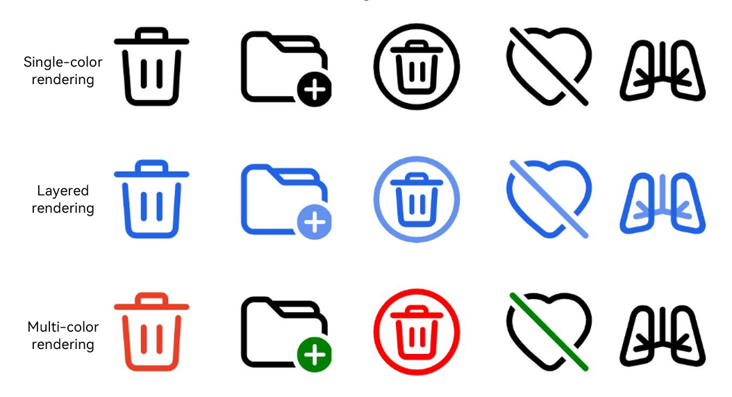
| strategy | SymbolRenderingStrategy | Yes | Rendering strategy for the symbol icon of the save button, which defines how the symbol icon is rendered. Default value: SymbolRenderingStrategy.SINGLE If the app does not have the ohos.permission.CUSTOMIZE_SAVE_BUTTON permission, the setting does not take effect. |
The figure below shows the effects of different rendering strategies.
Only the following events are supported.
onClick(event: SaveButtonCallback)
Triggered when the SaveButton component is clicked. When a user clicks the save button for the first time, an authorization dialog box is displayed. If the user allows authorization, the app obtains temporary access to media library APIs. For details about the authorization duration, see the description of the SaveButton constructor. Authorization fails if the user declines authorization or closes the dialog box.
Model restriction: This API can be used only in the stage model.
Atomic service API: This API can be used in atomic services since API version 11.
System capability: SystemCapability.ArkUI.ArkUI.Full
Parameters
| Name | Type | Mandatory | Description |
|---|---|---|---|
| event | SaveButtonCallback | Yes | Callback object for the click event, which carries click details, authorization result and error information. From API version 10 to 17, the parameter type is (event: ClickEvent, result: SaveButtonOnClickResult) => void. Starting from API version 18, SaveButtonCallback is adopted uniformly, which additionally provides error information. |
// xxx.ets
import { photoAccessHelper } from '@kit.MediaLibraryKit';
import { fileIo } from '@kit.CoreFileKit';
import { BusinessError } from '@kit.BasicServicesKit';

@Entry
@Component
struct Index {
  handleSaveButtonClick: SaveButtonCallback =
    async (event: ClickEvent, result: SaveButtonOnClickResult, error?: BusinessError) => {
      if (result === SaveButtonOnClickResult.SUCCESS) {
        try {
          // Obtain the app context.
          const context = this.getUIContext().getHostContext();
          // Create an instance of the image access helper.
          let helper = photoAccessHelper.getPhotoAccessHelper(context);
          // Create an image resource and obtain its URI.
          let uri = await helper.createAsset(photoAccessHelper.PhotoType.IMAGE, 'png');
          // Open the file based on its URI. The write process is not time bound.
          let file = await fileIo.open(uri, fileIo.OpenMode.READ_WRITE | fileIo.OpenMode.CREATE);
          // Write to the file.
          await fileIo.write(file.fd, "context");
          // Close the file.
          await fileIo.close(file.fd);
        } catch (err) {
          console.error(`errCode: ${err.code}, errMessage: ${err.message}`);
        }
      } else if (result === SaveButtonOnClickResult.CANCELED_BY_USER) {
        console.info("errCode: " + error?.code);
        console.info("errMessage: " + error?.message);
      } else {
        console.error(`errCode: ${error.code}, errMessage: ${error.message}`);
      }
    };

  build() {
    Row() {
      Column({ space: 10 }) {
        // Create a default button with an icon, text, and background.
        SaveButton().onClick((this.handleSaveButtonClick))
        // Whether the button has an icon, text, and background depends on whether the corresponding parameter is passed in. If buttonType is not passed in, the button uses the ButtonType.Capsule settings.
        SaveButton({ icon: SaveIconStyle.FULL_FILLED })
        // Create a button with only an icon and background. If the alpha value of the most significant eight bits of the background color is less than 0x1a, the system forcibly adjusts the alpha value to 0xff.
        SaveButton({ icon: SaveIconStyle.FULL_FILLED, buttonType: ButtonType.Capsule })
          .backgroundColor(0x10007dff)
        // Create a button with an icon, text, and background. If the alpha value of the most significant eight bits of the background color is less than 0x1a, the system forcibly adjusts the alpha value to 0xff.
        SaveButton({ icon: SaveIconStyle.FULL_FILLED, text: SaveDescription.DOWNLOAD, buttonType: ButtonType.Capsule })
        // Create a button with an icon, text, and background. If the set width is less than the minimum allowed, the button's text will wrap to guarantee full text display.
        SaveButton({ icon: SaveIconStyle.FULL_FILLED, text: SaveDescription.DOWNLOAD, buttonType: ButtonType.Capsule })
          .fontSize(16)
          .width(30)
        // Create a button with an icon, text, and background. If the set width is less than the minimum allowed, the button's text will wrap to guarantee full text display.
        SaveButton({ icon: SaveIconStyle.FULL_FILLED, text: SaveDescription.DOWNLOAD, buttonType: ButtonType.Capsule })
          .fontSize(16)
          .size({ width: 30, height: 30 })
        // Create a button with an icon, text, and background. If the set width is less than the minimum allowed, the button's text will wrap to guarantee full text display.
        SaveButton({ icon: SaveIconStyle.FULL_FILLED, text: SaveDescription.DOWNLOAD, buttonType: ButtonType.Capsule })
          .fontSize(16)
          .constraintSize({
            minWidth: 0,
            maxWidth: 30,
            minHeight: 0,
            maxHeight: 30
          })
        // Configure the SaveButton component to receive the user authorization cancellation event.
        SaveButton({ icon: SaveIconStyle.FULL_FILLED, text: SaveDescription.DOWNLOAD })
          .onClick((this.handleSaveButtonClick))
          .userCancelEvent(true)
      }.width('100%')
    }.height('100%')
  }
} The app requires the ohos.permission.CUSTOMIZE_SAVE_BUTTON permission.
// xxx.ets
@Entry
@Component
struct SetIcon {
  build() {
    Row() {
      Column({ space: 10 }) {
        // Set icon to the resource type. The icon is displayed when permission is granted.
        SaveButton({ icon: SaveIconStyle.FULL_FILLED, text: SaveDescription.DOWNLOAD })
          .setIcon($r('app.media.startIcon'))
        // Set text to the string type. The text is displayed when permission is granted.
        SaveButton({ icon: SaveIconStyle.FULL_FILLED, text: SaveDescription.DOWNLOAD })
          .setText("Set Text for SaveButton")
        // Set text to the resource type. The resource text is displayed when permission is granted.
        SaveButton({ icon: SaveIconStyle.FULL_FILLED, text: SaveDescription.DOWNLOAD })
          .setText($r('app.string.app_name'))
        // Set the save button icon size. The input parameter is of the Dimension type.
        SaveButton({ icon: SaveIconStyle.FULL_FILLED, text: SaveDescription.DOWNLOAD })
          .iconSize(28)
        // Set the default save button icon size. The input parameter is SizeOptions type. It uses smaller value between width and height as the default icon size.
        SaveButton({ icon: SaveIconStyle.FULL_FILLED, text: SaveDescription.DOWNLOAD })
          .iconSize({ width: 20, height: 40 })
        // Set the custom save button icon size. The input parameter is SizeOptions type. The image is displayed based on the configured width and height.
        SaveButton({ icon: SaveIconStyle.FULL_FILLED, text: SaveDescription.DOWNLOAD })
          .setIcon($r('app.media.startIcon'))
          .iconSize({ width: 30, height: 40 })
        // Set the custom save button icon size. The input parameter is of the SizeOptions type with a single value. The image is displayed based on the configured width and height.
        SaveButton({ icon: SaveIconStyle.FULL_FILLED, text: SaveDescription.DOWNLOAD })
          .setIcon($r('app.media.startIcon'))
          .iconSize({ width: 40 })
        // Set the corner radius of the save button icon. The input parameter is of the Dimension type. All four corners use the input parameter value.
        SaveButton({ icon: SaveIconStyle.FULL_FILLED, text: SaveDescription.DOWNLOAD })
          .backgroundColor(Color.Orange)
          .setIcon($r('app.media.background'))
          .iconSize(30)
          .iconBorderRadius(6)
        // Set the square icon corner radius greater than half side length to display as circle.
        SaveButton({ icon: SaveIconStyle.FULL_FILLED, buttonType: ButtonType.Circle })
          .backgroundColor(Color.Orange)
          .setIcon($r('app.media.foreground'))
          .iconSize(30)
          .iconBorderRadius(30)
          .padding(0)
        // Set the custom icon to a circle via iconBorderRadius, with a transparent background and visible border.
        SaveButton({ icon: SaveIconStyle.FULL_FILLED, buttonType: ButtonType.Circle })
          .setIcon($r('app.media.background'))
          .backgroundColor(Color.Transparent)
          .iconSize(40)
          .iconBorderRadius(30)
          .borderWidth(1)
          .borderColor(Color.Black)
          .borderStyle(BorderStyle.Solid)
          .padding(10)
        // Set the border radius for the SaveButton component corners. The input parameter is of the BorderRadiuses type. Each corner uses the corresponding input parameter value. Unset corners remain square.
        SaveButton({ icon: SaveIconStyle.FULL_FILLED, text: SaveDescription.DOWNLOAD })
          .backgroundColor(Color.Orange)
          .setIcon($r('app.media.background'))
          .iconSize(30)
          .iconBorderRadius({ topLeft: 10, topRight: 16, bottomRight: 20 })
        // Disable the pressed state effect for the SaveButton component.
        SaveButton({ icon: SaveIconStyle.FULL_FILLED, text: SaveDescription.DOWNLOAD })
          .stateEffect(false)
      }.width('100%')
    }.height('100%')
  }
} The app requires the ohos.permission.CUSTOMIZE_SAVE_BUTTON permission.
// xxx.ets
@Entry
@Component
struct Index {

  build() {
    Row() {
      Column({ space: 10 }) {
        // Set the symbol icon for the save button.
        SaveButton()
          .setIcon($r('sys.symbol.ohos_folder_badge_plus'))

        // Set the symbol icon color to green and white, and apply the single-color rendering strategy.
        SaveButton()
          .setIcon($r('sys.symbol.ohos_folder_badge_plus'))
          .symbolIconColor([Color.Green, Color.White])
          .symbolRenderingStrategy(SymbolRenderingStrategy.SINGLE)

        // Set the symbol icon color to green and white, and apply the multi-color rendering strategy.
        SaveButton()
          .setIcon($r('sys.symbol.ohos_folder_badge_plus'))
          .symbolIconColor([Color.Green, Color.White])
          .symbolRenderingStrategy(SymbolRenderingStrategy.MULTIPLE_COLOR)

        // Set the symbol icon color to green, and apply the multi-color rendering strategy.
        SaveButton()
          .setIcon($r('sys.symbol.ohos_folder_badge_plus'))
          .symbolIconColor([Color.Green])
          .symbolRenderingStrategy(SymbolRenderingStrategy.MULTIPLE_COLOR)

        // Set the symbol icon color to green and white, and apply the layered rendering strategy.
        SaveButton()
          .setIcon($r('sys.symbol.ohos_folder_badge_plus'))
          .symbolIconColor([Color.Green, Color.White])
          .symbolRenderingStrategy(SymbolRenderingStrategy.MULTIPLE_OPACITY)

        // Set the font weight of the symbol icon to Lighter.
        SaveButton()
          .setIcon($r('sys.symbol.ohos_folder_badge_plus'))
          .symbolIconColor([Color.Green])
          .symbolRenderingStrategy(SymbolRenderingStrategy.MULTIPLE_COLOR)
          .symbolFontWeight(FontWeight.Lighter)

        // Set the font weight of the symbol icon to Bolder.
        SaveButton()
          .setIcon($r('sys.symbol.ohos_folder_badge_plus'))
          .symbolIconColor([Color.Green])
          .symbolRenderingStrategy(SymbolRenderingStrategy.MULTIPLE_COLOR)
          .symbolFontWeight(FontWeight.Bolder)
      }
      .width('100%')
    }
    .height('100%')
  }
}