













从API version 7开始支持。后续版本如有新增内容,则采用上角标单独标记该内容的起始版本。
- 入门了解鸿蒙应用和多设备开发,学习如何构建应用/元服务
- 设计了解鸿蒙应用和多设备开发,学习如何构建应用/元服务
- 开发获取官方开发工具和文档等资源,将创意转化为鸿蒙应用
- 分发通过华为应用市场发布你的应用,多渠道触达用户
- 推广与变现一站式流量增长与营销变现平台
- 文档获取全旅程官方文档,助力鸿蒙应用开发、上架与运营。
- 支持获取客服帮助、技术支持、活动资讯等信息
输入关键字搜索
开发者能力认证
鸿蒙高校创新赛
HarmonyOS 7
animation
HarmonyOS行业解决方案
layoutWeight
HarmonyOS模板&组件
bindPopup
bindsheet
CTRL+K
API参考概述
应用框架
系统
媒体
图形
应用服务
AI
公共基础能力
标准库
您当前正在浏览HarmonyOS最新文档,覆盖已发布的所有API版本,可在API参考中筛选您使用的API版本。详细的版本配套关系请参考版本说明。
属性动画 (animation)
Phone12+PC/2in113+Tablet12+TV19+Wearable18+
更新时间: 2026-09-04 10:41
复制页面
组件的某些通用属性变化时,若不设置动画,属性变化会直接跳变到目标值。通过属性动画可实现渐变过渡效果,使界面变化更加自然流畅。支持的属性包括width、height、backgroundColor、opacity、scale、rotate、translate等。对于改变布局类属性(如宽高)的动画,内容通常会直接跳变到最终状态,例如文字或Canvas中的内容。如果希望内容跟随宽高变化,可以使用renderFit属性进行配置。
说明
animation
Phone12+PC/2in113+Tablet12+TV19+Wearable18+
animation(value:AnimateParam): T
设置组件的属性动画,当组件的通用属性发生变化时,按照AnimateParam参数配置对属性变化过程进行渐变过渡。
说明
在单一页面上同时存在数十个及以上应用动效的组件时,可以使用renderGroup方法来解决卡顿问题,从而提升动画性能。最佳实践请参考优化动画性能中的使用renderGroup。
该接口不支持在attributeModifier中调用,在attributeModifier中调用animation不会产生动画效果。如需在attributeModifier中实现属性变化动画,请使用显式动画(animateTo)替代。
仅对部分通用属性生效(包括width、height、backgroundColor、opacity、scale、rotate、translate等)。对于改变布局类属性(如宽高)的动画,组件内容(如文字或Canvas中的内容)通常会直接跳转到最终状态。如果希望内容跟随宽高变化平滑过渡,可以配合使用renderFit属性进行配置,建议将renderFit设置为RenderFit.CENTER或RenderFit.TOP_LEFT等值,使内容在动画过程中随组件尺寸同步变化。
卡片能力: 从API version 9开始,该接口支持在ArkTS卡片中使用。
元服务API: 从API version 11开始,该接口支持在元服务中使用。
系统能力: SystemCapability.ArkUI.ArkUI.Full
参数:
展开
| 参数名 | 类型 | 必填 | 说明 |
|---|---|---|---|
| value | AnimateParam | 是 | 设置动画效果相关参数,各属性的取值范围及含义详见AnimateParam对象说明。 |
返回值:
展开
| 类型 | 说明 |
|---|---|
| T | 返回当前组件,用于链式调用。 |
属性动画只对写在animation前面的属性生效,产生渐变过渡效果;写在animation之后的属性变化不会有渐变动画效果,而是直接跳变到目标值。组件构造器的属性(如Column构造器的space参数、List构造器的initialIndex参数等在组件构造时传入的参数)不支持动画效果,仅对通过属性方法(如.width()、.height()、.backgroundColor()等)设置的属性生效。
收起
自动换行
深色代码主题
复制
- @Entry
- @Component
- struct AnimationExample {
- @State widthSize: number = 250;
- @State heightSize: number = 100;
- @State rotateAngle: number = 0;
- @State flag: boolean = true;
- @State space: number = 10;
-
- build() {
- Column() {
- Column({ space: this.space }) // 改变Column构造器中的space动画不生效
- .onClick(() => {
- if (this.flag) {
- this.widthSize = 150;
- this.heightSize = 60;
- this.space = 20; // 改变this.space动画不生效
- } else {
- this.widthSize = 250;
- this.heightSize = 100;
- this.space = 10; // 改变this.space动画不生效
- }
- this.flag = !this.flag;
- })
- .backgroundColor(Color.Black)
- .margin(30)
- .width(this.widthSize) // 只有写在animation前面才生效
- .height(this.heightSize) // 只有写在animation前面才生效
- // 为按钮尺寸变化配置缓出曲线,重复播放3次
- .animation({
- duration: 2000,
- curve: Curve.EaseOut,
- iterations: 3,
- playMode: PlayMode.Normal
- })
- // .width(this.widthSize) // 动画不生效
- // .height(this.heightSize) // 动画不生效
- }
- }
- }
示例
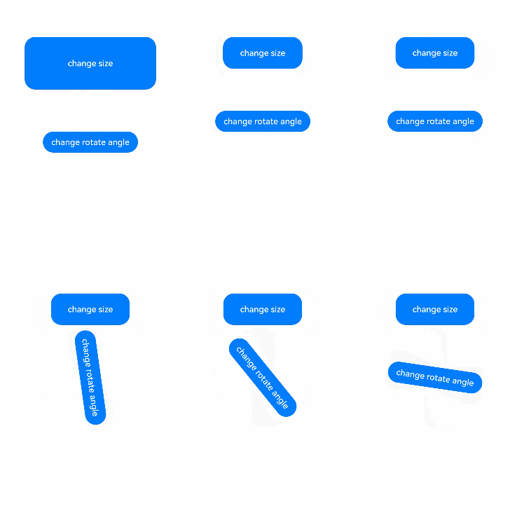
该示例通过animation实现了组件的属性动画。
收起
自动换行
深色代码主题
复制
- // xxx.ets
- @Entry
- @Component
- struct AttrAnimationExample {
- @State widthSize: number = 250
- @State heightSize: number = 100
- @State rotateAngle: number = 0
- @State flag: boolean = true
-
- build() {
- Column() {
- Button('change size')
- .onClick(() => {
- if (this.flag) {
- this.widthSize = 150
- this.heightSize = 60
- } else {
- this.widthSize = 250
- this.heightSize = 100
- }
- this.flag = !this.flag
- })
- .margin(30)
- .width(this.widthSize)
- .height(this.heightSize)
- .animation({
- duration: 2000,
- curve: Curve.EaseOut,
- iterations: 3,
- playMode: PlayMode.Normal
- })
- Button('change rotate angle')
- .onClick(() => {
- this.rotateAngle = 90
- })
- .margin(50)
- .rotate({ angle: this.rotateAngle })
- // 为旋转角度变化配置阻尼曲线,延迟500ms启动,无限循环交替播放
- .animation({
- duration: 1200,
- curve: Curve.Friction,
- delay: 500,
- iterations: -1, // 设置-1表示动画无限循环
- playMode: PlayMode.Alternate,
- expectedFrameRateRange: {
- min: 20,
- max: 120,
- expected: 90,
- }
- })
- }.width('100%').margin({ top: 20 })
- }
- }


华为开发者联盟 版权所有 ©2026