目录
- 版本概览
- 版本号格式调整说明
- OS新增和增强特性
- 总览
- 针对所有应用的变更
- 针对所有应用的变更
- 针对所有应用的变更
- UX样式或效果的变更
- Ability Kit
- Agent Framework Kit
- ArkUI
- ArkWeb
- Audio Kit
- Background Tasks Kit
- Basic Services Kit
- Connectivity Kit
- Device Security Kit
- Form Kit
- Graphics Accelerate Kit
- IPC Kit
- Live View Kit
- Location Kit
- MDM Kit
- Media Kit
- Media Library Kit
- NearLink Kit
- Network Kit
- Telephony Kit
- Universal Keystore Kit
- Ability Kit
- Accessibility Kit
- Account Kit
- Agent Framework Kit
- AOD Navigation Kit
- AppGallery Kit
- ArkData
- ArkGraphics 2D
- ArkTS
- ArkUI
- ArkWeb
- Asset Store Kit
- Audio Kit
- AVSession Kit
- Background Tasks Kit
- Basic Services Kit
- Calendar Kit
- Call Service Kit
- Camera Kit
- Confidential Space Kit
- Connectivity Kit
- Contacts Kit
- Core File Kit
- Crypto Architecture Kit
- Data Protection Kit
- Desktop Extension Kit
- Device Security Kit
- Distributed Service Kit
- Enterprise Data Guard Kit
- Enterprise Space Kit
- Enterprise Threat Protection Kit
- FAST Kit
- Form Kit
- Graphics Accelerate Kit
- Image Kit
- IME Kit
- Input Kit
- Intents Kit
- Live View Kit
- Localization Kit
- Location Kit
- Map Kit
- MDM Kit
- Media Kit
- Media Library Kit
- Multimodal Awareness Kit
- Natural Language Kit
- NearLink Kit
- Network Boost Kit
- Network Kit
- Notification Kit
- Online Authentication Kit
- Payment Kit
- PDF Kit
- Pen Kit
- Performance Analysis Kit
- Remote Communication Kit
- Ringtone Kit
- Service Collaboration Kit
- Service Support Kit
- Service Support System Kit
- Spatial Recon Kit
- Speech Kit
- Telephony Kit
- Test Kit
- UI Design Kit
- Universal Keystore Kit
- User Authentication Kit
- Vision Kit
- Ability Kit
- Accessibility Kit
- Accessory Kit
- Account Kit
- AR Engine
- ArkData
- ArkGraphics 2D
- ArkGraphics 3D
- ArkTS
- ArkUI
- ArkWeb
- Asset Store Kit
- Audio Kit
- AVSession Kit
- Background Tasks Kit
- Basic Services Kit
- Camera Kit
- Connectivity Kit
- Contacts Kit
- Core File Kit
- Core Vision Kit
- Crypto Architecture Kit
- Data Augmentation Kit
- Data Protection Kit
- Device Certificate Kit
- Device Security Kit
- Distributed Service Kit
- Enterprise Data Guard Kit
- Enterprise Space Kit
- FAST Kit
- Graphics Accelerate Kit
- Image Kit
- IME Kit
- Input Kit
- Live View Kit
- Localization Kit
- Location Kit
- MDM Kit
- Mechanic Kit
- Media Kit
- Media Library Kit
- NearLink Kit
- Network Boost Kit
- Network Kit
- Notification Kit
- Online Authentication Kit
- PDF Kit
- Performance Analysis Kit
- Preview Kit
- Push Kit
- Remote Communication Kit
- Scan Kit
- Scenario Fusion Kit
- Screen Time Guard Kit
- Sensor Service Kit
- Share Kit
- Telephony Kit
- Test Kit
- UI Design Kit
- Universal Keystore Kit
- User Authentication Kit
- 新增和增强特性
- 变更说明
- 新增和增强特性
- 新增和增强特性
- 所有HarmonyOS开发套件版本
- 版本概览
- OS新增和增强特性
- Ability Kit
- ArkGraphics 2D
- ArkTS
- ArkUI
- ArkWeb
- Audio Kit
- Background Tasks Kit
- Call Service Kit
- Camera Kit
- Contacts Kit
- Core File Kit
- Distributed Service Kit
- Enterprise Threat Protection Kit
- MDM Kit
- Media Library Kit
- Performance Analysis Kit
- Wear Engine
- Ability Kit
- App Gallery Kit
- ArkData
- ArkGraphics 2D
- ArkTS
- ArkUI
- ArkWeb
- Audio Kit
- AVSession Kit
- Background Tasks Kit
- Basic Services Kit
- Call Service Kit
- Camera Kit
- Connectivity Kit
- Core File Kit
- Core Speech Kit
- Data Protection Kit
- Desktop Extension Kit
- Device Security Kit
- Distributed Service Kit
- Enterprise DataGuard Kit
- Enterprise Threat Protection Kit
- Form Kit
- Health Service Kit
- Image Kit
- Live View Kit
- Map Kit
- MDM Kit
- Media Kit
- Media Library Kit
- Multimodal Awareness Kit
- NearLink Kit
- Network Boost Kit
- Network Kit
- Notification Kit
- Payment Kit
- Performance Analysis Kit
- Remote Communication Kit
- Screen Time Guard Kit
- Speech Kit
- Telephony Kit
- UI Design Kit
- Universal Keystore Kit
- Vision Kit
- Wear Engine Kit
- 新增和增强特性
- 版本概览
- OS新增和增强特性
- 总览
- 针对所有应用的变更
- Ability Kit
- ArkUI
- Basic Services Kit
- Connectivity Kit
- Core File Kit
- IPC Kit
- Location Kit
- MDM Kit
- Media Library Kit
- Network Kit
- Payment Kit
- Remote Communication Kit
- Share Kit
- Telephony Kit
- Ability Kit
- Accessibility Kit
- Account Kit
- AppGallery Kit
- AR Engine
- ArkData
- ArkGraphics 2D
- ArkGraphics 3D
- ArkTS
- ArkUI
- ArkWeb
- Audio Kit
- AVSession Kit
- Background Tasks Kit
- Basic Services Kit
- Calendar Kit
- Call Service Kit
- Camera Kit
- Cloud Foundation Kit
- Connectivity Kit
- Contacts Kit
- Core File Kit
- Crypto Architecture Kit
- Data Augmentation Kit
- Data Protection Kit
- Desktop Extension Kit
- Device Certificate Kit
- Device Security Kit
- Distributed Service Kit
- Enterprise Space Kit
- File Manager Service Kit
- Form Kit
- Game Service Kit
- Graphics Accelerate Kit
- IAP Kit
- Image Kit
- IME Kit
- Input Kit
- IPC Kit
- Live View Kit
- Localization Kit
- Location Kit
- Map Kit
- MDM Kit
- Media Kit
- Media Library Kit
- Multimodal Awareness Kit
- NearLink Kit
- Network Kit
- Notification Kit
- Payment Kit
- PDF Kit
- Pen kit
- Performance Analysis Kit
- Remote Communication Kit
- Sensor Service Kit
- Service Collaboration Kit
- Spatial Recon Kit
- Speech Kit
- Telephony Kit
- UI Design Kit
- Universal Keystore Kit
- Weather Service Kit
- 新增和增强特性
- 变更说明
- 新增和增强特性
- 版本概览
- OS新增和增强特性
- Ability Kit
- AppGallery Kit
- ArkData
- ArkGraphics 2D
- ArkGraphics 3D
- ArkTS
- ArkUI
- ArkWeb
- Audio Kit
- AVSession Kit
- Background Tasks Kit
- Basic Services Kit
- Call Service Kit
- Camera Kit
- Connectivity Kit
- Contacts Kit
- Crypto Architecture Kit
- Desktop Extension Kit
- Device Certificate Kit
- Device Security Kit
- Enterprise Space Kit
- Form Kit
- Game Service Kit
- Image Kit
- IME Kit
- Input Kit
- Live View Kit
- Map Kit
- MDM Kit
- Media Kit
- Media Library Kit
- Network Kit
- Notification Kit
- PDF Kit
- Performance Analysis Kit
- Scan Kit
- Scenario Fusion Kit
- Screen Time Guard Kit
- Sensor Service Kit
- Share Kit
- Telephony Kit
- Test Kit
- UI Design Kit
- Universal Keystore Kit
- User Authentication Kit
- 新增和增强特性
- 新增和增强特性
- 版本概览
- OS新增和增强特性
- Ability Kit
- ArkUI
- ArkWeb
- Background Tasks Kit
- Basic Services Kit
- Connectivity Kit
- Media Library Kit
- Notification Kit
- Performance Analysis Kit
- Ability Kit
- Accessibility Kit
- Agent Framework Kit
- ArkGraphics 2D
- ArkGraphics 3D
- ArkUI
- ArkWeb
- Audio Kit
- AVSession Kit
- Background Tasks Kit
- Basic Services Kit
- Calendar Kit
- Camera Kit
- Cloud Foundation Kit
- Connectivity Kit
- Core File Kit
- Crypto Architecture Kit
- Data Protection Kit
- Device Certificate Kit
- Device Security Kit
- Enterprise Space Kit
- Game Service Kit
- IME Kit
- Location Kit
- Map Kit
- MDM Kit
- Media Kit
- Media Library Kit
- NearLink Kit
- Network Kit
- Online Authentication Kit
- PDF Kit
- Performance Analysis Kit
- Remote Communication Kit
- Scenario Fusion Kit
- Share Kit
- Spatial Recon Kit
- Speech Kit
- Telephony Kit
- UI Design Kit
- 新增和增强特性
- 新增和增强特性
- 版本概览
- OS新增和增强特性
- 总览
- OS平台API行为的变更
- OS平台API行为的变更
- OS平台API行为的变更
- UX样式或效果的变更
- OS平台API行为的变更
- UX样式或效果的变更
- Ads Kit
- ArkData
- ArkUI
- ArkWeb
- Basic Services Kit
- Camera Kit
- Connectivity Kit
- Core File Kit
- MDM Kit
- Media Kit
- Multimodal Awareness Kit
- Network Kit
- Notification Kit
- Telephony Kit
- User Authentication Kit
- Ability Kit
- Accessibility Kit
- Account Kit
- Agent Framework Kit
- AppGallery Kit
- ArkData
- ArkGraphics 2D
- ArkGraphics 3D
- ArkTS
- ArkUI
- ArkWeb
- Audio Kit
- AVSession Kit
- Background Tasks Kit
- Basic Services Kit
- Calendar Kit
- Camera Kit
- Connectivity Kit
- Core File Kit
- Data Augmentation Kit
- Desktop Extension Kit
- Device Certificate Kit
- Device Security Kit
- Distributed Service Kit
- Enterprise Data Guard Kit
- Enterprise Space Kit
- Form Kit
- Game Service Kit
- IAP Kit
- Image Kit
- IME Kit
- Input Kit
- Live View Kit
- Localization Kit
- Location Kit
- Map Kit
- MDM Kit
- Media Kit
- Media Library Kit
- Network Boost Kit
- Network Kit
- Notification Kit
- Online Authentication Kit
- Payment Kit
- Performance Analysis Kit
- Push Kit
- Remote Communication Kit
- Scenario Fusion Kit
- Service Collaboration Kit
- Share Kit
- Test Kit
- UI Design Kit
- Universal Keystore Kit
- User Authentication Kit
- Ability Kit
- Accessibility Kit
- Account Kit
- AppGallery Kit
- AR Engine
- ArkData
- ArkGraphics 2D
- ArkTS
- ArkUI
- ArkWeb
- Audio Kit
- Background Tasks Kit
- Basic Services Kit
- Call Service Kit
- Car Kit
- Core File Kit
- Core Vision Kit
- Data Augmentation Kit
- Data Protection Kit
- Device Security Kit
- Distributed Service Kit
- Form Kit
- Game Service Kit
- Image Kit
- IME Kit
- Input Kit
- Intents Kit
- Live View Kit
- Localization Kit
- Map Kit
- MDM Kit
- Media Kit
- Media Library Kit
- Multimodal Awareness Kit
- Network Kit
- PDF Kit
- Pen Kit
- Performance Analysis Kit
- Remote Communication Kit
- Screen Time Guard Kit
- Sensor Service Kit
- Share Kit
- Telephony Kit
- UI Design Kit
- Ability Kit
- Accessibility Kit
- AR Engine
- ArkData
- ArkGraphics 2D
- ArkGraphics 3D
- ArkTS
- ArkUI
- ArkWeb
- Asset Store Kit
- Audio Kit
- AVSession Kit
- Background Tasks Kit
- Basic Services Kit
- Camera Kit
- Connectivity Kit
- Core File Kit
- Crypto Architecture Kit
- Data Augmentation Kit
- Data Protection Kit
- Device Certificate Kit
- Device Security Kit
- Distributed Service Kit
- Enterprise Space Kit
- Form Kit
- Graphics Accelerate Kit
- Image Kit
- IME Kit
- Input Kit
- Localization Kit
- Location Kit
- MDM Kit
- Media Kit
- Media Library Kit
- Multimodal Awareness Kit
- Notification Kit
- Online Authentication Kit
- Pen kit
- Performance Analysis Kit
- Remote Communication Kit
- Screen Time Guard Kit
- Share Kit
- Test Kit
- UI Design Kit
- Universal Keystore Kit
- User Authentication Kit
- 新增和增强特性
- 变更说明
- 新增和增强特性
- 版本概览
- 新增和增强特性
- Account Kit
- AREngine
- ArkUI
- Connectivity Kit
- Intents Kit
- Media Kit
- Multimodal Awareness Kit
- Pen Kit
- Sensor Service Kit
- Ability Kit
- Account Kit
- AppGallery Kit
- ArkGraphics 2D
- ArkGraphics 3D
- ArkTS
- ArkUI
- ArkWeb
- Audio Kit
- AVSession Kit
- Background Tasks Kit
- Basic Services Kit
- Camera Kit
- Connectivity Kit
- Core File Kit
- Core Speech Kit
- Device Security Kit
- Distributed Service Kit
- Driver Development Kit
- Enterprise Data Guard Kit
- Form Kit
- Graphics Accelerate Kit
- IME Kit
- Live View Kit
- Localization Kit
- Location Kit
- Map Kit
- MDM Kit
- Media Kit
- Media Library Kit
- Network Kit
- Payment Kit
- Pen Kit
- Performance Analysis Kit
- Telephony Kit
- UI Design Kit
- Vision Kit
- 新增和增强特性
- 新增和增强特性
- 版本概览
- OS新增和增强特性
- 总览
- OS平台API行为的变更
- UX样式或效果的变更
- Ability Kit
- Accessibility Kit
- Account Kit
- AR Engine
- ArkData
- ArkGraphics 2D
- ArkGraphics 3D
- ArkTS
- ArkUI
- ArkWeb
- Asset Store Kit
- Audio Kit
- AVSession Kit
- Background Tasks Kit
- Basic Services Kit
- Calendar Kit
- Camera Kit
- Car Kit
- Connectivity Kit
- Core File Kit
- Core Speech Kit
- Crypto Architecture Kit
- Device Certificate Kit
- Device Security Kit
- Distributed Service Kit
- Driver Development Kit
- Form Kit
- Game Service Kit
- Graphics Accelerate Kit
- Health Service Kit
- IAP Kit
- Image Kit
- IME Kit
- Input Kit
- IPC Kit
- Localization Kit
- Location Kit
- Map Kit
- MDM Kit
- Media Kit
- Media Library Kit
- Multimodal Awareness Kit
- NearLink Kit
- Network Kit
- Notification Kit
- Online Authentication Kit
- PDF Kit
- Pen kit
- Performance Analysis Kit
- Push Kit
- Remote Communication Kit
- Scan Kit
- Scenario Fusion Kit
- Sensor Service Kit
- Share Kit
- Status Bar Extension Kit
- Telephony Kit
- Test Kit
- UI Design Kit
- User Authentication Kit
- Vision Kit
- Wear Engine
- 新增和增强特性
- 变更说明
- 版本概览
- 新增和增强特性
- Ability Kit
- ArkData
- ArkUI
- AVSession Kit
- Background Tasks Kit
- Connectivity Kit
- File Manager Service Kit
- IAP Kit
- IME Kit
- Media Kit
- Payment Kit
- PDF Kit
- Preview Kit
- DevEco Studio
- 版本概览
- 新增和增强特性
- Ads Kit
- ArkUI
- ArkWeb
- AVSession Kit
- Background Tasks Kit
- Connectivity Kit
- Input Kit
- Location Kit
- Media Library Kit
- Network Kit
- Reader Kit
- Telephony Kit
- 新增和增强特性
- 变更说明
- 版本概览
- 新增和增强特性
- 总览
- OS平台API行为的变更
- OS平台API行为的变更
- UX样式或效果的变更
- OS平台API行为的变更
- UX样式或效果的变更
- ArkUI
- Asset Store Kit
- IME Kit
- Ability Kit
- App Gallery Kit
- ArkData
- ArkGraphics 3D
- ArkUI
- ArkWeb
- Basic Services Kit
- Camera Kit
- Connectivity Kit
- Contacts Kit
- Core File Kit
- Device Security Kit
- Enterprise DataGuard Kit
- Game Service Kit
- IAP Kit
- Image Kit
- IME Kit
- Input Kit
- Localization Kit
- Map Kit
- MDM Kit
- Media Library Kit
- Multimodal Awareness Kit
- Network Kit
- Remote Communication Kit
- Speech Kit
- Ability Kit
- Ads Kit
- AppGallery Kit
- App Linking Kit
- ArkData
- ArkGraphics 2D
- ArkUI
- ArkWeb
- Background Tasks Kit
- Basic Services Kit
- Cloud Foundation Kit
- Connectivity Kit
- Core File Kit
- Game Service Kit
- Image Kit
- IME Kit
- Live View Kit
- MDM Kit
- Media Kit
- Media Library Kit
- Network Kit
- Performance Analysis Kit
- Share Kit
- Vision Kit
- DevEco Studio
- 版本概览
- 新增和增强特性
- 总览
- OS平台API行为的变更
- UX样式或效果的变更
- Ability Kit
- ArkData
- ArkGraphics 2D
- ArkTS
- ArkUI
- ArkWeb
- Asset Store Kit
- Audio Kit
- AVSession Kit
- Basic Services Kit
- Call Service Kit
- Camera Kit
- Connectivity Kit
- Core File Kit
- Core Vision Kit
- Device Certificate Kit
- Game Service Kit
- IAP Kit
- Image Kit
- IME Kit
- Input Kit
- Live View Kit
- Location Kit
- MDM Kit
- Media Kit
- Media Library Kit
- Network Kit
- Online Authentication Kit
- Payment Kit
- PDF Kit
- Performance Analysis Kit
- Push Kit
- Scan Kit
- Scenario Fusion Kit
- Speech Kit
- Status Bar Extension Kit
- Store Kit
- Telephony Kit
- Test Kit
- User Authentication Kit
- Vision Kit
- Weather Service Kit
- 新增和增强特性
- 变更说明
- 版本概览
- 新增和增强特性
- 总览
- OS平台API行为的变更
- UX样式或效果的变更
- OS平台API行为的变更
- UX样式或效果的变更
- ArkUI
- Audio Kit
- Camera Kit
- Image Kit
- Media Kit
- Natural Language Kit
- Ability Kit
- ArkData
- ArkGraphics 2D
- ArkTS
- ArkUI
- ArkWeb
- AVSession Kit
- Background Tasks Kit
- Basic Services Kit
- Camera Kit
- Connectivity Kit
- Device Certificate Kit
- Game Service Kit
- Image Kit
- Input Kit
- Map Kit
- Media Kit
- Media Library Kit
- NearLink Kit
- Network Kit
- Notification Kit
- Online Authentication Kit
- Payment Kit
- Remote Communication Kit
- Vision Kit
- Wallet Kit
- 新增和增强特性
- 变更说明
- 版本概览
- 新增和增强特性
- 总览
- 针对所有应用的变更
- 针对API 12应用的变更
- UX样式或效果的变更
- 针对所有应用的变更
- 针对API 12应用的变更
- 针对所有应用的变更
- 针对API 12应用的变更
- UX样式或效果的变更
- 针对所有应用的变更
- 针对API 12应用的变更
- UX样式或效果的变更
- 针对所有应用的变更
- 针对API 12应用的变更
- UX样式或效果的变更
- Ability Kit
- Account Kit
- ArkData
- ArkGraphics 3D
- ArkTS
- ArkUI
- ArkWeb
- Audio Kit
- Basic Services Kit
- Calendar Kit
- Call Kit
- Camera Kit
- Car Kit
- Connectivity Kit
- Core File Kit
- Core Vision Kit
- Crypto Architecture Kit
- Device Security Kit
- Image Kit
- Map Kit
- Media Kit
- Media Library Kit
- Natural Language Kit
- Network Boost Kit
- Network Kit
- Online Authentication Kit
- Performance Analysis Kit
- Scenario Fusion Kit
- Share Kit
- Telephony Kit
- Universal Keystore Kit
- Vision Kit
- Account Kit
- Ark Data
- ArkGraphics 2D
- ArkTS
- ArkUI
- ArkWeb
- AVSession Kit
- Camera Kit
- IAP Kit
- IME Kit
- Pen Kit
- Service Collaboration Kit
- Ability Kit
- Accessibility Kit
- ArkData
- ArkTS
- ArkUI
- Basic Services Kit
- Camera Kit
- Car Kit
- Core Vision Kit
- Device Security Kit
- Localization Kit
- Media Library Kit
- Natural Language Kit
- Ability Kit
- Account Kit
- Ads Kit
- ArkData
- ArkGraphics 2D
- ArkTS
- ArkUI
- ArkWeb
- Asset Store Kit
- Basic Services Kit
- Connectivity Kit
- Core File Kit
- Core Vision Kit
- Driver Development Kit
- Game Service Kit
- Intents Kit
- Location Kit
- Map Kit
- Media Kit
- Media Library Kit
- MindSpore Lite Kit
- Network Kit
- Notification Kit
- PDF Kit
- Performance Analysis Kit
- Remote Communication Kit
- Ringtone Kit
- Store Kit
- UI Design Kit
- Universal Keystore Kit
- Vision Kit
- Wear Engine
- Ability Kit
- Account Kit
- ArkData
- ArkGraphics 2D
- ArkTS
- ArkUI
- ArkWeb
- Audio Kit
- Basic Services Kit
- Calendar Kit
- Camera Kit
- Car Kit
- Connectivity Kit
- Core File Kit
- Core Vision Kit
- Data Protection Kit
- Device Certificate Kit
- Device Security Kit
- DRM Kit
- Form Kit
- Game Service Kit
- Health Service Kit
- IAP Kit
- Image Kit
- IME Kit
- IPC Kit
- Live View Kit
- Map Kit
- MDM Kit
- Media Kit
- Media Library Kit
- Network Boost Kit
- Network Kit
- Notification Kit
- Performance Analysis Kit
- Scan Kit
- Scenario Fusion Kit
- Share Kit
- Speech Kit
- Store Kit
- Telephony Kit
- UI Design Kit
- User Authentication Kit
- Vision Kit
- Wallet Kit
- Wear Engine
- Weather Service Kit
- Ability Kit
- Accessibility Kit
- Account Kit
- Ads Kit
- ArkData
- ArkGraphics 2D
- ArkGraphics 3D
- ArkTS
- ArkUI
- ArkWeb
- Asset Store Kit
- Audio Kit
- AVSession Kit
- Background Tasks Kit
- Basic Services Kit
- Calendar Kit
- Call Kit
- Camera Kit
- Car Kit
- Cloud Foundation Kit
- Connectivity Kit
- Contacts Kit
- Core File Kit
- Core Speech Kit
- Core Vision Kit
- Crypto Architecture Kit
- Data Loss Prevention Kit
- Device Certificate Kit
- Device Security Kit
- Distributed Service Kit
- Driver Development Kit
- DRM Kit
- Enterprise Data Guard Kit
- Form Kit
- Game Service Kit
- Health Service Kit
- IAP Kit
- Image Kit
- IME Kit
- Input Kit
- Intents Kit
- IPC Kit
- Live View Kit
- Localization Kit
- Location Kit
- Map Kit
- MDM Kit
- Media Kit
- Media Library Kit
- MindSpore Lite Kit
- Natural Language Kit
- Network Kit
- Notification Kit
- Online Authentication Kit
- Payment Kit
- PDF Kit
- Pen Kit
- Performance Analysis Kit
- Preview Kit
- Push Kit
- Remote Communication Kit
- Scan Kit
- Scenario Fusion Kit
- Sensor Service Kit
- Service Collaboration Kit
- Share Kit
- Speech Kit
- Status Bar Extension Kit
- Store Kit
- Telephony Kit
- Test Kit
- Universal Keystore Kit
- User Authentication Kit
- Vision Kit
- Wallet Kit
- 新增和增强特性
- 变更说明
- 已解决和已知的问题
- 关于应用兼容性的介绍
- 影响应用兼容性的关键信息
- ArkTS API兼容性保护
- C API兼容性保护
- 兼容性告警屏蔽
- CAPI兼容性保护高阶用法
- 应用升级targetSDKVersion兼容低版本指导
- 应用集成三方库(har包)的兼容性指导
- 应用集成“集成态hsp”的兼容性指导
- UI自定义组件兼容性指导
- 应用升级适配指导——向26.0.0升级
- 存量设备API版本使用数量参考
- 各版本支持设备型号清单
- 文档变更说明
- 获取支持与帮助
- 26.0.0的行为变更汇总
- 6.1.1(24)无行为变更
- 6.1.0(23)的行为变更汇总
- 6.0.2(22)无行为变更
- 6.0.1(21)无行为变更
- 6.0.0(20)的行为变更汇总
- 5.1.1(19)无行为变更
- 5.1.0(18)的行为变更汇总
- 5.0.5(17)无行为变更
- 5.0.4(16)无行为变更
- 5.0.3(15)的行为变更汇总
- 5.0.2(14)的行为变更汇总
- 5.0.1(13)的行为变更汇总
- 工具概述
- 下载与安装DevEco Studio
- 使用新UI
- 工程介绍
- 工程目录结构介绍
- 工程模板介绍
- 创建一个新的工程
- 添加和删除模块
- 导入和引用模块
- 卸载和加载模块
- 开发静态共享包
- 开发动态共享包
- 发布共享包
- 引用及管理共享包
- 版本说明
- 概述
- 快速开始
- 配置文件
- 日志
- ohpm-repo help
- ohpm-repo install
- ohpm-repo start
- ohpm-repo restart
- ohpm-repo stop
- ohpm-repo --version
- ohpm-repo encrypt_password
- ohpm-repo pack
- ohpm-repo deploy
- ohpm-repo restore
- ohpm-repo mirror_storage
- ohpm-repo check_storage
- ohpm-repo remove_instance
- ohpm-repo export_pkginfo
- ohpm-repo batch_download
- ohpm-repo batch_publish
- ohpm-repo export_userinfo
- ohpm-repo import_userinfo
- ohpm-repo export_pkgPermission
- ohpm-repo import_pkgPermission
- 单点部署
- 多实例部署
- 前台页面
- 个人中心主页
- 用户管理
- 仓库管理
- 包权限管理
- 认证管理
- 组织管理
- 操作日志
- 系统设置
- 安全配置指南
- 常见问题FAQ
- 数据迁移
- 1.0.1升级至2.X.X/5.X.X版本
- 1.1.0升级至2.X.X/5.X.X版本
- 2.X.X/5.X.X升级至更高版本
- 自定义存储插件配置
- 模板文件
- 自定义认证插件配置
- 模板文件
- 自定义登录验证插件配置
- 模板文件
- 数据备份
- 导出OpenHarmony三方库中心仓元数据至ohpm-repo
- ohpm仓库接口协议
- 自定义元数据规则校验插件配置
- 模板文件
- 基于Dockerfile部署ohpm-repo私仓
- 添加Ability
- 添加Page
- 生成单层图标
- 创建服务卡片
- 创建意图框架
- 业务介绍
- 注册华为开发者账号并实名认证
- 搭建开发环境
- 创建HarmonyOS应用/元服务
- 创建HarmonyOS应用工程
- 创建元服务工程
- 历史工程转换为端云一体化开发工程
- 开发流程
- 创建并配置函数
- 开发函数
- 调试函数
- 部署函数
- 开发流程
- 创建云对象
- 开发云对象
- 调试云对象
- 部署云对象
- 开发流程
- 创建对象类型
- 添加数据条目
- 部署云数据库
- (可选)一键生成Model Class
- 部署云侧工程
- (可选)同步云端代码至DevEco Studio工程
- 在端侧调用云函数
- 在端侧调用云对象
- 在端侧访问云数据库
- 在端侧调用云存储
- (可选)通过CloudDev面板获取云开发资源支持
- 打包测试
- 发布上架
- FAQ
- 通用云开发模板
- 离线环境配置指导
- 代码阅读
- 代码生成/补全
- 代码实时检查及快速修复
- Code Linter代码检查
- 规则变更说明
- recommended推荐规则清单
- @typescript-eslint/adjacent-overload-signatures
- @typescript-eslint/array-type
- @typescript-eslint/await-thenable
- @typescript-eslint/ban-ts-comment
- @typescript-eslint/ban-tslint-comment
- @typescript-eslint/ban-types
- @typescript-eslint/brace-style
- @typescript-eslint/class-literal-property-style
- @typescript-eslint/comma-dangle
- @typescript-eslint/comma-spacing
- @typescript-eslint/consistent-indexed-object-style
- @typescript-eslint/consistent-type-assertions
- @typescript-eslint/consistent-type-definitions
- @typescript-eslint/consistent-type-imports
- @typescript-eslint/default-param-last
- @typescript-eslint/dot-notation
- @typescript-eslint/explicit-function-return-type
- @typescript-eslint/explicit-member-accessibility
- @typescript-eslint/explicit-module-boundary-types
- @typescript-eslint/func-call-spacing
- @typescript-eslint/init-declarations
- @typescript-eslint/keyword-spacing
- @typescript-eslint/lines-between-class-members
- @typescript-eslint/member-delimiter-style
- @typescript-eslint/member-ordering
- @typescript-eslint/method-signature-style
- @typescript-eslint/naming-convention
- @typescript-eslint/no-array-constructor
- @typescript-eslint/no-base-to-string
- @typescript-eslint/no-confusing-non-null-assertion
- @typescript-eslint/no-confusing-void-expression
- @typescript-eslint/no-dupe-class-members
- @typescript-eslint/no-duplicate-imports
- @typescript-eslint/no-dynamic-delete
- @typescript-eslint/no-empty-function
- @typescript-eslint/no-empty-interface
- @typescript-eslint/no-explicit-any
- @typescript-eslint/no-extraneous-class
- @typescript-eslint/no-extra-non-null-assertion
- @typescript-eslint/no-extra-parens
- @typescript-eslint/no-extra-semi
- @typescript-eslint/no-floating-promises
- @typescript-eslint/no-for-in-array
- @typescript-eslint/no-implicit-any-catch
- @typescript-eslint/no-implied-eval
- @typescript-eslint/no-inferrable-types
- @typescript-eslint/no-invalid-this
- @typescript-eslint/no-invalid-void-type
- @typescript-eslint/no-loop-func
- @typescript-eslint/no-loss-of-precision
- @typescript-eslint/no-magic-numbers
- @typescript-eslint/no-misused-new
- @typescript-eslint/no-misused-promises
- @typescript-eslint/no-namespace
- @typescript-eslint/no-non-null-asserted-optional-chain
- @typescript-eslint/no-non-null-assertion
- @typescript-eslint/no-parameter-properties
- @typescript-eslint/no-redeclare
- @typescript-eslint/no-require-imports
- @typescript-eslint/no-restricted-syntax
- @typescript-eslint/no-shadow
- @typescript-eslint/no-this-alias
- @typescript-eslint/no-throw-literal
- @typescript-eslint/no-type-alias
- @typescript-eslint/no-unnecessary-boolean-literal-compare
- @typescript-eslint/no-unnecessary-condition
- @typescript-eslint/no-unnecessary-qualifier
- @typescript-eslint/no-unnecessary-type-arguments
- @typescript-eslint/no-unnecessary-type-assertion
- @typescript-eslint/no-unnecessary-type-constraint
- @typescript-eslint/no-unsafe-argument
- @typescript-eslint/no-unsafe-assignment
- @typescript-eslint/no-unsafe-call
- @typescript-eslint/no-unsafe-member-access
- @typescript-eslint/no-unsafe-return
- @typescript-eslint/no-unused-expressions
- @typescript-eslint/no-unused-vars
- @typescript-eslint/no-use-before-define
- @typescript-eslint/no-useless-constructor
- @typescript-eslint/prefer-as-const
- @typescript-eslint/prefer-enum-initializers
- @typescript-eslint/prefer-for-of
- @typescript-eslint/prefer-function-type
- @typescript-eslint/prefer-includes
- @typescript-eslint/prefer-literal-enum-member
- @typescript-eslint/prefer-namespace-keyword
- @typescript-eslint/prefer-nullish-coalescing
- @typescript-eslint/prefer-optional-chain
- @typescript-eslint/prefer-readonly
- @typescript-eslint/prefer-readonly-parameter-types
- @typescript-eslint/prefer-reduce-type-parameter
- @typescript-eslint/prefer-regexp-exec
- @typescript-eslint/prefer-string-starts-ends-with
- @typescript-eslint/prefer-ts-expect-error
- @typescript-eslint/promise-function-async
- @typescript-eslint/quotes
- @typescript-eslint/require-array-sort-compare
- @typescript-eslint/require-await
- @typescript-eslint/restrict-plus-operands
- @typescript-eslint/restrict-template-expressions
- @typescript-eslint/return-await
- @typescript-eslint/semi
- @typescript-eslint/space-before-function-paren
- @typescript-eslint/space-infix-ops
- @typescript-eslint/strict-boolean-expressions
- @typescript-eslint/switch-exhaustiveness-check
- @typescript-eslint/triple-slash-reference
- @typescript-eslint/type-annotation-spacing
- @typescript-eslint/typedef
- @typescript-eslint/unbound-method
- @typescript-eslint/unified-signatures
- prefer-const
- eqeqeq
- @security/no-commented-code
- @security/no-cycle
- @security/no-unsafe-aes
- @security/no-unsafe-dh
- @security/no-unsafe-dsa
- @security/no-unsafe-dh-key
- @security/no-unsafe-dsa-key
- @security/no-unsafe-ecdsa
- @security/no-unsafe-hash
- @security/no-unsafe-mac
- @security/no-unsafe-rsa-encrypt
- @security/no-unsafe-rsa-key
- @security/no-unsafe-rsa-sign
- @security/no-unsafe-3des
- @security/specified-interface-call-chain-check
- @security/no-unsafe-kdf
- @security/no-unsafe-sm4
- @security/no-unsafe-sm2-key
- @security/no-unsafe-sm2-cipher
- @security/no-unsafe-ecdh
- @security/no-unsafe-huks
- @performance/avoid-overusing-custom-component-check
- @performance/bad-deep-clone-check
- @performance/constant-property-referencing-check-in-loops
- @performance/crypto-replacement-check
- @performance/custom-node-memory-leak-check
- @performance/dark-color-mode-check
- @performance/datashare-query-unrelease-check
- @performance/foreach-args-check
- @performance/foreach-index-check
- @performance/gif-hardware-decoding-check
- @performance/hp-arkui-avoid-update-auto-state-var-in-aboutToReuse
- @performance/hp-arkui-avoid-empty-callback
- @performance/hp-arkui-combine-same-arg-animateto
- @performance/hp-arkui-image-async-load
- @performance/hp-arkui-load-on-demand
- @performance/hp-arkui-limit-refresh-scope(已下线)
- @performance/hp-arkui-no-func-as-arg-for-reusable-component
- @performance/hp-arkui-no-high-freq-log(已下线)
- @performance/hp-arkui-no-stringify-in-lazyforeach-key-generator
- @performance/hp-arkui-no-state-var-access-in-loop
- @performance/hp-arkts-no-use-any-export-current
- @performance/hp-arkts-no-use-any-export-other
- @performance/hp-arkui-remove-container-without-property
- @performance/hp-arkui-replace-nested-reusable-component-by-builder
- @performance/hp-arkui-reduce-pangesture-distance
- @performance/hp-arkui-remove-redundant-nest-container
- @performance/hp-arkui-remove-redundant-state-var
- @performance/hp-arkui-remove-unchanged-state-var
- @performance/hp-arkui-set-cache-count-for-lazyforeach-grid
- @performance/hp-arkui-suggest-cache-avplayer
- @performance/hp-arkui-suggest-reuseid-for-if-else-reusable-component
- @performance/hp-arkui-suggest-use-effectkit-blur
- @performance/hp-arkui-suggest-use-get-anonymousid-async
- @performance/hp-arkui-use-attributeUpdater-control-refresh-scope
- @performance/hp-arkui-use-grid-layout-options
- @performance/hp-arkui-use-id-in-get-resource-sync-api
- @performance/hp-arkui-use-local-var-to-replace-state-var
- @performance/hp-arkui-use-onAnimationStart-for-swiper-preload
- @performance/hp-arkui-use-object-link-to-replace-prop
- @performance/hp-arkui-use-row-column-to-replace-flex
- @performance/hp-arkui-use-reusable-component
- @performance/hp-arkui-use-scale-to-replace-attr-animateto
- @performance/hp-arkui-use-taskpool-for-web-request
- @performance/hp-arkui-use-transition-to-replace-animateto
- @performance/hp-arkui-use-word-break-to-replace-zero-width-space
- @performance/hp-arkui-wrap-waterflow-if-else-footer(已下线)
- @performance/high-frequency-log-check
- @performance/hp-ffrt-no-use-std
- @performance/hp-performance-no-closures
- @performance/hp-performance-no-dynamic-cls-func
- @performance/init-list-component
- @performance/js-code-cache-by-interception-check
- @performance/js-code-cache-by-precompile-check
- @performance/lazyforeach-args-check(已下线)
- @performance/lottie-animation-destroy-check
- @performance/multiple-associations-state-var-check
- @performance/monitor-invisible-area-in-image-animation
- @performance/no-use-any-import
- @performance/no-high-loaded-frame-rate-range
- @performance/number-init-check
- @performance/nested-post-frame-callback-check
- @performance/object-creation-check(已下线)
- @performance/reasonable-audio-use-check
- @performance/reasonable-gps-use-check
- @performance/reuse-date-instances-check
- @performance/reasonable-sensor-use-check
- @performance/sparse-array-check
- @performance/start-window-icon-check
- @performance/state-variable-usage-in-ui-format-check
- @performance/typed-array-check
- @performance/timezone-interface-check
- @performance/tabs-on-change-check
- @performance/update-state-var-between-animatetos-check
- @performance/web-cache-mode-check
- @performance/web-on-active-check
- @performance/waterflow-data-preload-check
- @previewer/mandatory-default-value-for-local-initialization
- @previewer/no-page-method-on-preview-component
- @previewer/no-unallowed-decorator-on-root-component
- @cross-device-app-dev/color-contrast
- @cross-device-app-dev/color-value
- @cross-device-app-dev/font-size-unit
- @cross-device-app-dev/font-size
- @cross-device-app-dev/grid-columns-span
- @cross-device-app-dev/grid-span-value
- @cross-device-app-dev/one-multi-breakpoint-check
- @cross-device-app-dev/sidebar-navigation
- @cross-device-app-dev/size-unit
- @cross-device-app-dev/touch-target-size
- @cross-device-app-dev/window-size-change-listener-check
- @cross-device-app-dev/immersive-effect-check
- @hw-stylistic/array-bracket-spacing
- @hw-stylistic/brace-style
- @hw-stylistic/comma-spacing
- @hw-stylistic/curly
- @hw-stylistic/file-naming-convention
- @hw-stylistic/indent
- @hw-stylistic/keyword-spacing
- @hw-stylistic/max-len
- @hw-stylistic/no-multi-spaces
- @hw-stylistic/no-tabs
- @hw-stylistic/object-property-newline
- @hw-stylistic/one-var-declaration-per-line
- @hw-stylistic/operator-linebreak
- @hw-stylistic/quotes
- @hw-stylistic/semi-spacing
- @hw-stylistic/space-before-blocks
- @hw-stylistic/space-before-function-paren
- @hw-stylistic/space-infix-ops
- @correctness/avsession-buttons-check
- @correctness/audio-interrupt-check
- @correctness/audio-pause-or-mute-check
- @correctness/avsession-metadata-check
- @correctness/image-pixel-format-check
- @correctness/image-interpolation-check
- @correctness/listen-default-network-change
- @correctness/listen-multi-network-concurrent
- @correctness/multimedia-use-stride-in-image-receiver
- @correctness/redundant-dependency-check
- @correctness/v1-nested-object-property-change-format-check
- @correctness/v1-state-object-member-used-in-function-parameter-check
- @correctness/accessibility-label-check
- @correctness/accessibility-focus-redundancy-check
- @correctness/accessibility-type-redundancy-check
- @correctness/accessibility-status-missing-check
- @compatibility/api-compatibility-check
- @compatibility/deprecate-api-check
- Code Scanner代码检查
- Clang-Tidy代码检查
- 代码重构
- 文档生成
- @author
- @copyright
- @deprecated
- @param
- @returns
- @since
- @throws
- @todo
- @version
- {@link}
- 快速插入场景化代码片段
- 跨语言代码编辑
- 代码索引(clangd)
- 概述
- PreviewChecker检测规则
- 查看ArkTS/JS预览效果
- 查看ArkUI预览效果
- Profile Manager
- 查看多端设备预览效果
- Inspector双向预览
- 预览数据模拟
- 使用预览器调试应用
- 支持使用预览器的API清单
- 自动签名
- 手动签名
- 使用本地真机运行应用
- 使用仿真器运行轻量级智能穿戴应用
- 使用环境
- 设备支持类型
- 模拟器与真机的差异
- 创建模拟器
- 启动和关闭模拟器
- 操控屏幕
- 使用工具栏
- 移动和缩放模拟器
- 模拟器访问网络
- 安装应用程序包和上传文件
- 更多的扩展能力
- 自定义屏幕配置
- 通过命令行使用模拟器
- 离线部署模拟器
- 模拟器错误码
- 调试概述
- 自定义运行/调试配置
- 调试场景说明
- debug启动调试
- attach启动调试
- 等待调试
- 使用断点
- 检查变量
- 反向调试
- extension调试
- 多进程调试
- 打印表达式
- 智能步入
- 查看异步函数堆栈
- 启动调试
- 使用断点
- 检查变量
- 汇编调试
- 查看内存信息
- 使用LLDB调试命令
- 反向调试
- 堆栈可视化
- so信息可视化
- 设置执行点
- 智能步入
- Native调试启动加速
- 调试Native子进程
- 使用调试器
- 跨语言调试
- 三方库源码调试
- 增量调试
- Hot Reload
- 查看ArkUI状态变量
- 开发者选项
- 开发者关怀
- 布局分析
- 访问设备文件
- 位置模拟
- 数据库调试
- 截屏
- 录屏
- 设备投屏
- 运行配置错误码
- 热重载和增量调试错误码
- 调试失败错误码
- hdc命令失败错误码
- 日志分析
- FaultLog
- 查看Cpp Crash(进程崩溃)日志
- 查看AppFreeze(应用冻屏)日志
- 查看App Killed(应用终止)日志
- 解析应用minidump/coredump文件
- 堆栈轨迹分析
- 异常堆栈解析原理
- 使用ASan检测内存错误
- 使用HWASan检测内存错误
- 使用TSan检测线程错误
- 使用UBSan检测未定义行为
- 方舟运行时检测
- 仪器测试(Instrument Test)
- 本地测试(Local Test)
- Mock能力
- 黑盒覆盖率测试
- 仪器测试错误码
- 本地测试错误码
- 命令行测试错误码
- 体检概述
- 场景化体检
- 规则体检
- 上架前体检
- 上架合规体检
- 导入DevEco Testing的检测报告进行诊断
- 导入上架检测报告进行诊断
- 管理体检报告
- 规则总览
- 点击操作响应快
- 点击操作完成快
- 滑动操作响应快
- 滑动过程流畅
- 转场操作流畅
- 动态内存峰值占用
- 前台场景内存峰值占用
- 后台CPU占用峰值
- 节点数超过500过多
- 启动加载完成快
- 配置代理
- Terminal环境变量说明
- DevEco Studio配置参数列表
- 关闭数据采集
- 日志收集和诊断数据
- OHPM版本号规则
- pac.json5隐私清单文件
- 版本说明
- 构建系统生命周期
- 构建任务说明
- 构建产物说明
- 配置文件概述
- hvigor-config.json5文件
- 工程级build-profile.json5文件
- 模块级build-profile.json5文件
- 多模块管理
- 添加依赖项
- 能力说明
- 实践说明
- 构建HAR
- 配置CPP
- 预构建库快速链接
- 多工程构建
- HAP唯一性校验逻辑
- 自定义.hvigor目录路径
- 能力说明
- 实践说明
- 能力说明
- 实践说明
- 能力说明
- 实践说明
- 守护进程
- 并行构建
- 增量构建
- 模块化编译
- 分析构建过程
- 性能/内存优化:多目标编译优化实践
- 性能/内存优化:多HAP/HSP工程编译优化实践
- 性能优化:自定义插件和任务优化实践
- 性能优化:混合语言工程Sync优化实践
- 性能优化:缓存插件实践
- 内存优化:远程编译实践
- 实验特性
- 开发Hvigor任务
- 开发Hvigor插件
- 基础构建能力
- 插件上下文
- API使用示例
- 任务可视化与执行
- 混淆加固
- 使用日志记录
- 编译构建常见问题
- 依赖错误码
- 脚本错误码
- 配置错误码
- 资源缺失错误码
- 语法错误码
- 规格错误码
- 权限错误码
- 操作异常错误码
- ArkTS编译错误码
- 签名工具错误码
- 性能调优工具简介
- 界面布局
- 会话区
- 数据区
- 性能优化过程简介
- 性能问题定界:实时监控
- 性能问题定位:深度录制
- Frame分析
- ArkUI分析
- 案例:使用Frame模板分析应用卡顿问题
- Launch模板基本操作
- 案例:应用冷启动首帧完成时延问题分析
- Snapshot模板基本操作
- 案例:ArkTS内存泄漏分析
- 内存分析介绍
- 内存分析数据筛选
- 启动时内存分析
- 案例:Native内存泄漏分析
- UI组件内存:ComMemory分析
- 能耗诊断:Energy分析
- 加载丢帧:ArkWeb分析
- 网络诊断:Network分析
- 并行并发:Concurrency分析
- GPU活动分析
- 基础耗时:Time分析
- CPU活动分析
- IO耗时:FileSystem分析
- GPU帧捕获工具:Graphics Profiler抓帧入口
- DevEco Profiler术语
- 常见问题
- 错误码
- 快捷键
- 发布应用
- 运维分析
- 获取Command Line Tools
- 代码检查工具(codelinter)
- ArkTSDoc文档生成工具(arktsdoc)
- 模拟器工具(Emulator)
- 命令行构建工具(hvigorw)
- 堆栈解析工具(hstack)
- 系统平台要求
- ohpmrc
- oh-package.json5
- ohpm config
- ohpm help
- ohpm info
- ohpm init
- ohpm install
- ohpm list
- ohpm publish
- ohpm uninstall
- ohpm prepublish
- ohpm unpublish
- ohpm update
- ohpm root
- ohpm version
- ohpm cache clean
- ohpm run
- ohpm --version
- ohpm ping
- ohpm clean
- ohpm dist-tags
- ohpm convert
- ohpm dependency-check
- ohpm config错误码
- ohpm info错误码
- ohpm install错误码
- ohpm list错误码
- ohpm publish错误码
- ohpm uninstall错误码
- ohpm unpublish错误码
- ohpm update错误码
- ohpm root错误码
- ohpm version错误码
- ohpm cache clean错误码
- ohpm run错误码
- ohpm ping错误码
- ohpm clean错误码
- ohpm dist-tags错误码
- ohpm convert错误码
- ohpm dependency-check错误码
- ohpm命令公共错误码
- 搭建流水线
- 版本说明
- 工具概述
- 知识问答
- 工程问答
- 特性问答
- 代码分析
- 代码生成
- 代码修改
- 编辑区对话
- 代码续写
- 页面生成
- 万能卡片生成
- 单元测试用例生成
- 代码智能解读
- 编译报错智能分析
- 智慧调优
- 应用UI生成
- 意图装饰器生成和小艺智能体创建
- 自定义智能体(Agent)配置和调用
- 模型上下文协议(MCP)配置
- 模型(Model)配置
- 规则(Rules)配置
- 技能(Skills)配置
- 记忆(Memory)配置
- 自定义提示词库(Prompts)配置
- 自定义指令(Commands)配置
- 本地知识库配置
- 工具概述
- 下载与安装DevEco Studio
- 工程目录结构介绍
- 工程模板介绍
- 创建一个新的工程
- 添加和删除模块
- 开发静态共享包
- 开发动态共享包
- 发布共享包
- 引用及管理共享包
- 添加Ability
- 添加Page
- 创建服务卡片
- 常见问题
- 代码阅读
- 代码生成/补全
- 代码实时检查及快速修复
- Code Linter代码检查
- recommended推荐规则清单
- @typescript-eslint/adjacent-overload-signatures
- @typescript-eslint/await-thenable
- @typescript-eslint/array-type
- @typescript-eslint/ban-ts-comment
- @typescript-eslint/ban-tslint-comment
- @typescript-eslint/ban-types
- @typescript-eslint/brace-style
- @typescript-eslint/class-literal-property-style
- @typescript-eslint/comma-dangle
- @typescript-eslint/comma-spacing
- @typescript-eslint/consistent-indexed-object-style
- @typescript-eslint/consistent-type-assertions
- @typescript-eslint/consistent-type-definitions
- @typescript-eslint/consistent-type-imports
- @typescript-eslint/default-param-last
- @typescript-eslint/dot-notation
- @typescript-eslint/explicit-function-return-type
- @typescript-eslint/explicit-member-accessibility
- @typescript-eslint/explicit-module-boundary-types
- @typescript-eslint/func-call-spacing
- @typescript-eslint/init-declarations
- @typescript-eslint/keyword-spacing
- @typescript-eslint/lines-between-class-members
- @typescript-eslint/member-delimiter-style
- @typescript-eslint/member-ordering
- @typescript-eslint/method-signature-style
- @typescript-eslint/naming-convention
- @typescript-eslint/no-array-constructor
- @typescript-eslint/no-base-to-string
- @typescript-eslint/no-confusing-non-null-assertion
- @typescript-eslint/no-confusing-void-expression
- @typescript-eslint/no-dupe-class-members
- @typescript-eslint/no-duplicate-imports
- @typescript-eslint/no-dynamic-delete
- @typescript-eslint/no-empty-function
- @typescript-eslint/no-empty-interface
- @typescript-eslint/no-explicit-any
- @typescript-eslint/no-extraneous-class
- @typescript-eslint/no-extra-non-null-assertion
- @typescript-eslint/no-extra-parens
- @typescript-eslint/no-extra-semi
- @typescript-eslint/no-floating-promises
- @typescript-eslint/no-for-in-array
- @typescript-eslint/no-implicit-any-catch
- @typescript-eslint/no-implied-eval
- @typescript-eslint/no-inferrable-types
- @typescript-eslint/no-invalid-this
- @typescript-eslint/no-invalid-void-type
- @typescript-eslint/no-loop-func
- @typescript-eslint/no-loss-of-precision
- @typescript-eslint/no-magic-numbers
- @typescript-eslint/no-misused-new
- @typescript-eslint/no-misused-promises
- @typescript-eslint/no-namespace
- @typescript-eslint/no-non-null-asserted-optional-chain
- @typescript-eslint/no-non-null-assertion
- @typescript-eslint/no-parameter-properties
- @typescript-eslint/no-redeclare
- @typescript-eslint/no-require-imports
- @typescript-eslint/no-restricted-syntax
- @typescript-eslint/no-shadow
- @typescript-eslint/no-this-alias
- @typescript-eslint/no-throw-literal
- @typescript-eslint/no-type-alias
- @typescript-eslint/no-unnecessary-boolean-literal-compare
- @typescript-eslint/no-unnecessary-condition
- @typescript-eslint/no-unnecessary-qualifier
- @typescript-eslint/no-unnecessary-type-arguments
- @typescript-eslint/no-unnecessary-type-assertion
- @typescript-eslint/no-unnecessary-type-constraint
- @typescript-eslint/no-unsafe-argument
- @typescript-eslint/no-unsafe-assignment
- @typescript-eslint/no-unsafe-call
- @typescript-eslint/no-unsafe-member-access
- @typescript-eslint/no-unsafe-return
- @typescript-eslint/no-unused-expressions
- @typescript-eslint/no-unused-vars
- @typescript-eslint/no-use-before-define
- @typescript-eslint/no-useless-constructor
- @typescript-eslint/prefer-as-const
- @typescript-eslint/prefer-enum-initializers
- @typescript-eslint/prefer-for-of
- @typescript-eslint/prefer-function-type
- @typescript-eslint/prefer-includes
- @typescript-eslint/prefer-literal-enum-member
- @typescript-eslint/prefer-namespace-keyword
- @typescript-eslint/prefer-nullish-coalescing
- @typescript-eslint/prefer-optional-chain
- @typescript-eslint/prefer-readonly
- @typescript-eslint/prefer-readonly-parameter-types
- @typescript-eslint/prefer-reduce-type-parameter
- @typescript-eslint/prefer-regexp-exec
- @typescript-eslint/prefer-string-starts-ends-with
- @typescript-eslint/prefer-ts-expect-error
- @typescript-eslint/promise-function-async
- @typescript-eslint/quotes
- @typescript-eslint/require-array-sort-compare
- @typescript-eslint/require-await
- @typescript-eslint/restrict-plus-operands
- @typescript-eslint/restrict-template-expressions
- @typescript-eslint/return-await
- @typescript-eslint/semi
- @typescript-eslint/space-before-function-paren
- @typescript-eslint/space-infix-ops
- @typescript-eslint/strict-boolean-expressions
- @typescript-eslint/switch-exhaustiveness-check
- @typescript-eslint/triple-slash-reference
- @typescript-eslint/type-annotation-spacing
- @typescript-eslint/typedef
- @typescript-eslint/unbound-method
- @typescript-eslint/unified-signatures
- prefer-const
- eqeqeq
- @security/no-commented-code
- @security/no-cycle
- @security/no-unsafe-aes
- @security/no-unsafe-dh
- @security/no-unsafe-dh-key
- @security/no-unsafe-dsa
- @security/no-unsafe-dsa-key
- @security/no-unsafe-ecdsa
- @security/no-unsafe-hash
- @security/no-unsafe-mac
- @security/no-unsafe-rsa-encrypt
- @security/no-unsafe-rsa-key
- @security/no-unsafe-rsa-sign
- @security/no-unsafe-3des
- @security/specified-interface-call-chain-check
- @performance/constant-property-referencing-check-in-loops
- @performance/foreach-args-check
- @performance/foreach-index-check
- @performance/hp-arkui-avoid-update-auto-state-var-in-aboutToReuse
- @performance/hp-arkui-avoid-empty-callback
- @performance/hp-arkui-combine-same-arg-animateto
- @performance/hp-arkui-image-async-load
- @performance/hp-arkui-load-on-demand
- @performance/hp-arkui-no-func-as-arg-for-reusable-component
- @performance/hp-arkui-no-stringify-in-lazyforeach-key-generator
- @performance/hp-arkui-no-state-var-access-in-loop
- @performance/hp-arkts-no-use-any-export-current
- @performance/hp-arkts-no-use-any-export-other
- @performance/hp-arkui-remove-container-without-property
- @performance/hp-arkui-replace-nested-reusable-component-by-builder
- @performance/hp-arkui-reduce-pangesture-distance
- @performance/hp-arkui-remove-redundant-nest-container
- @performance/hp-arkui-remove-redundant-state-var
- @performance/hp-arkui-remove-unchanged-state-var
- @performance/hp-arkui-set-cache-count-for-lazyforeach-grid
- @performance/hp-arkui-suggest-cache-avplayer
- @performance/hp-arkui-suggest-reuseid-for-if-else-reusable-component
- @performance/hp-arkui-suggest-use-effectkit-blur
- @performance/hp-arkui-suggest-use-get-anonymousid-async
- @performance/hp-arkui-use-attributeUpdater-control-refresh-scope
- @performance/hp-arkui-use-grid-layout-options
- @performance/hp-arkui-use-id-in-get-resource-sync-api
- @performance/hp-arkui-use-local-var-to-replace-state-var
- @performance/hp-arkui-use-onAnimationStart-for-swiper-preload
- @performance/hp-arkui-use-object-link-to-replace-prop
- @performance/hp-arkui-use-row-column-to-replace-flex
- @performance/hp-arkui-use-reusable-component
- @performance/hp-arkui-use-scale-to-replace-attr-animateto
- @performance/hp-arkui-use-taskpool-for-web-request
- @performance/hp-arkui-use-transition-to-replace-animateto
- @performance/hp-arkui-use-word-break-to-replace-zero-width-space
- @performance/high-frequency-log-check
- @performance/hp-performance-no-closures
- @performance/hp-performance-no-dynamic-cls-func
- @performance/init-list-component
- @performance/js-code-cache-by-interception-check
- @performance/js-code-cache-by-precompile-check
- @performance/lottie-animation-destroy-check
- @performance/multiple-associations-state-var-check
- @performance/no-high-loaded-frame-rate-range
- @performance/number-init-check
- @performance/sparse-array-check
- @performance/start-window-icon-check
- @performance/typed-array-check
- @performance/timezone-interface-check
- @performance/waterflow-data-preload-check
- @previewer/mandatory-default-value-for-local-initialization
- @previewer/no-page-method-on-preview-component
- @previewer/no-unallowed-decorator-on-root-component
- @cross-device-app-dev/color-contrast
- @cross-device-app-dev/color-value
- @cross-device-app-dev/font-size-unit
- @cross-device-app-dev/font-size
- @cross-device-app-dev/grid-columns-span
- @cross-device-app-dev/grid-span-value
- @cross-device-app-dev/sidebar-navigation
- @cross-device-app-dev/size-unit
- @cross-device-app-dev/touch-target-size
- @hw-stylistic/array-bracket-spacing
- @hw-stylistic/brace-style
- @hw-stylistic/comma-spacing
- @hw-stylistic/curly
- @hw-stylistic/file-naming-convention
- @hw-stylistic/indent
- @hw-stylistic/keyword-spacing
- @hw-stylistic/max-len
- @hw-stylistic/no-multi-spaces
- @hw-stylistic/no-tabs
- @hw-stylistic/object-property-newline
- @hw-stylistic/one-var-declaration-per-line
- @hw-stylistic/operator-linebreak
- @hw-stylistic/quotes
- @hw-stylistic/semi-spacing
- @hw-stylistic/space-before-blocks
- @hw-stylistic/space-before-function-paren
- @hw-stylistic/space-infix-ops
- 代码重构
- 配置调试签名
- 使用本地真机运行应用
- 使用本机运行应用
- 概述
- 多设备预览器和真机的差异
- 使用多设备预览器
- 查看应用组件树
- 调试概述
- 自定义运行/调试配置
- debug启动调试
- attach启动调试
- 使用断点
- 检查变量
- 启动调试
- 使用断点
- 检查变量
- 汇编调试
- 查看内存信息
- 使用LLDB调试命令
- 反向调试
- 堆栈可视化
- so信息可视化
- 使用调试器
- Hot Reload
- 布局分析
- 访问设备文件
- 截屏
- 日志分析
- FaultLog
- 使用ASan检测内存错误
- 使用HWASan检测内存错误
- 使用TSan检测线程错误
- 使用UBSan检测未定义行为
- 方舟运行时检测
- 仪器测试(Instrument Test)
- Mock能力
- 配置OHPM代理
- 关闭数据采集
- 采集日志与诊断数据
- 构建系统生命周期
- 构建任务说明
- 构建产物说明
- 配置文件概述
- hvigor-config.json5文件
- 工程级build-profile.json5文件
- 模块级build-profile.json5文件
- 可视化配置
- 多模块管理
- 添加依赖项
- 能力说明
- 实践说明
- 构建HAR
- 配置CPP
- 多工程构建
- 自定义.hvigor目录路径
- 能力说明
- 实践说明
- 能力说明
- 实践说明
- 能力说明
- 实践说明
- 守护进程
- 并行构建
- 增量构建
- 模块化编译
- 分析构建过程
- 实验特性
- 开发hvigor任务
- 开发hvigor插件
- 基础构建能力
- 插件上下文
- API使用示例
- 混淆加固
- 使用日志记录
- 依赖错误码
- 脚本错误码
- 配置错误码
- 资源缺失错误码
- 语法错误码
- 规格错误码
- 权限错误码
- 操作异常错误码
- ArkTS编译错误码
- 性能调优工具简介
- 界面布局
- 会话区
- 数据区
- 性能优化过程简介
- 性能问题定界:实时监控
- 性能问题定位:深度录制
- Frame分析
- 内存分析介绍
- 内存分析数据筛选
- 基础耗时分析:Time分析
- 快捷键
- 发布应用
- 获取Command Line Tools
- 代码检查工具(codelinter)
- 命令行构建工具(hvigorw)
- ohpmrc
- oh-package.json5
- ohpm config
- ohpm help
- ohpm info
- ohpm init
- ohpm install
- ohpm list
- ohpm publish
- ohpm uninstall
- ohpm prepublish
- ohpm unpublish
- ohpm update
- ohpm root
- ohpm version
- ohpm cache clean
- ohpm run
- ohpm --version
- ohpm ping
- ohpm clean
- ohpm dist-tags
- ohpm convert
- ohpm config错误码
- ohpm info错误码
- ohpm install错误码
- ohpm list错误码
- ohpm publish错误码
- ohpm uninstall错误码
- ohpm unpublish错误码
- ohpm update错误码
- ohpm root错误码
- ohpm version错误码
- ohpm cache clean错误码
- ohpm run错误码
- ohpm ping错误码
- ohpm clean错误码
- ohpm dist-tags错误码
- ohpm convert错误码
- ohpm命令公共错误码
- 搭建流水线
- 工具概述
- 版本说明
- 下载与安装
- Agent模式
- 模型配置
- 常用配置
- 命令
- 常见问题
- 快速入门
- 自然语言生成代码
- UX设计稿生成代码
- 修复编译报错
- 配置Skill
- 配置Models
- 斜杠命令
- 迁移CodeGenie数据至DevEco Code常见问题
- 版本说明
- 工具概述
- 快速入门
- 常用开发任务
- 命令
- 常见问题
- 设计理念
- 色彩
- 鸿蒙黑体
- 文本排版
- 应用图标
- HarmonyOS Symbol
- 沉浸光感
- 圆角参数
- 间隔参数
- 布局基础
- 响应式应用架构
- 响应式布局方法
- 概述
- 设计原则
- 动效属性
- 转场动效
- 手势动效
- 界面用语
- 全球化
- 隐私
- 概览
- 底部页签
- 子页签
- 标题栏
- 导航点
- 文本
- 分隔器
- 子标题
- 进度条
- 索引条
- 滚动条
- 新事件标记
- 即时反馈
- 即时操作
- 气泡提示
- 数据可视化
- 二维码
- 文本时钟
- 图片
- 空白
- 按钮
- 下拉按钮
- 状态按钮
- 操作块
- 工具栏
- 核心操作栏
- 菜单
- 文本选择菜单
- 文本框
- 搜索框
- 数字加减
- 图案锁
- 勾选
- 开关
- 单选框
- 评分条
- 滑动条
- 选择器
- 色彩选择器
- 分段按钮
- 列表
- 弹出框
- 半模态面板
- 概述
- 手势
- 光标交互
- 焦点导航
- 鼠标
- 键盘
- 触控板
- 拖拽
- 框选
- 交互事件归一
- 导航条
- 通知
- 实况窗
- 多窗口交互
- 闪控球和闪控窗
- 服务卡片
- 画中画
- 深色模式
- 状态栏
- 播控中心
- 桌面快捷方式
- 鸿蒙卡片
- 分享
- 华为账号开放登录
- 华为支付
- 预览
- 启动页
- 碰一碰
- 靠近发现
- 智感握姿
- 平行视界
- 概述
- 基础信息
- 服务卡片
- 状态机卡片
- 元服务体验场景
- 通用友好
- 轻量高效
- 简洁高级
- 安全可靠
- 账号
- 手机
- 设计原则
- 双折叠
- 三折叠
- 阔折叠
- 平板
- 设计概述
- 窗口框架
- 应用设计
- 应用接入状态栏
- 折叠电脑
- 概述
- 基础体验要求
- 设计基础
- 系统架构
- 应用架构
- HUAWEI HiCar
- 概述
- 应用架构
- 人机交互
- 间隔参数
- 智慧屏
- 概述
- 影音娱乐类
- 社交通讯类
- 拍摄美化类
- 新闻阅读类
- 电商购物类
- 金融理财类
- 便捷生活类
- 旅游住宿类
- 出行导航类
- 移动支付类
- 游戏类
- 汽车类
- 办公类
- 概述
- 通用应用 UX 体验标准
- 大屏应用 UX 体验标准
- 折叠屏应用 UX 体验标准
- 电脑应用 UX 体验标准
- 智慧屏应用 UX 体验标准
- 元服务 UX 体验标准
- 智能穿戴应用 UX 体验标准
- Ability Kit简介
- 应用模型概述
- 应用/组件级配置
- UIAbility组件概述
- UIAbility组件生命周期
- UIAbility组件启动模式
- UIAbility组件基本用法
- UIAbility组件与UI的数据同步
- 启动应用内的UIAbility组件
- 通过Call调用实现多端协同
- UIAbility备份恢复
- EmbeddedUIExtensionAbility
- 使用AppServiceExtensionAbility组件实现后台服务
- AbilityStage组件管理器
- 应用上下文Context
- Want概述
- 显式Want与隐式Want匹配规则
- 使用显式Want启动应用组件
- 常见action与entities(不推荐使用)
- 组件启动规则
- 获取/设置环境变量
- 进程模型概述
- 子进程开发指导(ArkTS)
- 子进程开发指导(C/C++)
- 独立进程开发指导
- 线程模型
- 应用配置文件
- 应用生命周期概述
- 应用启动流程
- 应用启动设置
- 应用启动框架AppStartup
- 应用预加载
- 应用快启
- 应用退出
- 应用退出(PC/2in1)
- 应用重启
- 获取应用异常退出原因
- 应用间跳转概述
- 拉起指定应用概述
- (可选)使用canOpenLink判断应用是否可访问
- 获取目标应用的URL信息
- 使用Deep Linking实现应用间跳转
- 使用App Linking实现应用间跳转
- 显式Want跳转切换应用链接跳转适配指导
- 应用链接说明
- 拉起指定类型的应用概述
- 拉起导航类应用(startAbilityByType)
- 拉起邮件类应用(startAbilityByType)
- 拉起邮件类应用(mailto方式)
- 拉起金融类应用(startAbilityByType)
- 拉起航班类应用(startAbilityByType)
- 拉起快递类应用(startAbilityByType)
- 拉起图片编辑类应用(startAbilityByType)
- 拉起文件处理类应用(startAbility)
- 拉起系统应用
- 应用间跳转实践概览
- 社交分享跳转
- 广告跳转
- 特殊文本识别跳转
- Web和应用的跳转与拉起
- 方舟智能开发框架概述
- 意图框架概述
- 意图开发概述
- 使用配置文件开发意图
- 使用装饰器开发意图
- 附录:标准意图接入规范
- 调试意图
- 基于ArkTS脚本的应用Skill开发指导
- 端侧A2A框架概述
- 使用AgentExtensionAbility组件实现智能体服务
- AgentExtensionAbility配置文件说明
- 模块化对象模型概述 (C/C++)
- 使用ModularObjectExtensionAbility实现模块化对象 (C/C++)
- 使用Taihe实现ModularObjectExtensionAbility的IPC通信 (C/C++)
- 使用ModularObjectDispatcher实现动态接口调用 (C/C++)
- Ability Kit术语
- Accessibility Kit 简介
- 按钮标注
- 标注屏幕朗读内容
- 插画/视频/动画的播报
- 重新设置新焦点位置
- 多维信息整体朗读
- 多UI控件组合
- 朗读多语言内容
- 禁用屏幕朗读焦点
- 控件状态变化
- 控件位置调整
- 卡片自动居中
- 列表项组件整体聚焦
- 内容动态变化
- 弹窗类控件走焦
- 网络连接中断播报
- 自定义控件播报状态
- 自定义无障碍滚动步数
- 自定义控件走焦顺序
- 主动通知页面变化
- 测试屏幕朗读功能
- 应用声明接入系统关怀模式
- 应用内关怀模式与系统设置同步
- 获取关怀模式状态
- ArkData简介
- 标准化数据定义概述
- 标准化数据类型 (ArkTS)
- 标准化数据类型 (C/C++)
- 标准化数据结构 (ArkTS)
- 标准化数据结构 (C/C++)
- 基于标准化数据结构的控件 (ArkTS)
- UTD预置列表
- 应用数据持久化概述
- 通过用户首选项实现数据持久化 (ArkTS)
- 通过用户首选项实现数据持久化 (C/C++)
- 通过键值型数据库实现数据持久化 (ArkTS)
- 通过关系型数据库实现数据持久化 (ArkTS)
- 通过关系型数据库实现数据持久化 (C/C++)
- 通过向量数据库实现数据持久化 (ArkTS)
- 通过向量数据库实现数据持久化 (C/C++)
- 同应用跨设备数据同步概述
- 键值型数据库跨设备数据同步 (ArkTS)
- 关系型数据库跨设备数据同步 (ArkTS)
- 分布式数据对象跨设备数据同步 (ArkTS)
- 同应用端云数据同步概述
- 端云数据同步云侧环境部署指导
- 端云数据同步关系型数据库端侧开发指导 (ArkTS)
- 数据可靠性与安全性概述
- 数据库备份与恢复 (ArkTS)
- 数据库备份与恢复 (C/C++)
- 数据库加密 (ArkTS)
- 数据库加密 (C/C++)
- 基于设备分类和数据分级的访问控制 (ArkTS)
- 基于设备分类和数据分级的访问控制 (C/C++)
- E类加密数据库的使用 (ArkTS)
- 跨应用数据共享概述
- 应用间配置共享 (ArkTS)
- 通过标准化数据通路实现数据共享 (ArkTS)
- 通过标准化数据通路实现数据共享 (C/C++)
- 应用数据向量化 (ArkTS)
- preferences数据库调试工具指导
- vector-store数据库调试工具指导
- SQLite调试工具指导
- ArkData术语
- ArkData常见问题
- ArkTS简介
- ArkTS基础类库概述
- XML概述
- XML生成
- XML解析
- XML转换
- Buffer与FastBuffer
- JSON扩展库
- 容器类库概述
- 线性容器
- 非线性容器
- 基础库常见问题
- 并发概述
- 异步并发 (Promise和async/await)
- 多线程并发概述
- TaskPool简介
- TaskPool使用规范
- Worker简介
- TaskPool和Worker的对比
- ArkTS线程间通信概述
- 线程间通信对象概述
- 普通对象
- 容器类对象
- ArrayBuffer对象
- SharedArrayBuffer对象
- Transferable对象 (NativeBinding对象)
- Sendable对象简介
- Sendable使用规则与约束
- 异步锁
- 异步等待
- ASON解析与生成
- 共享容器
- 共享模块
- Sendable对象冻结
- Sendable使用场景
- 使用TaskPool执行独立的耗时任务
- 使用TaskPool执行多个耗时任务
- TaskPool任务与宿主线程通信
- Worker和宿主线程的即时消息通信
- Worker同步调用宿主线程的接口
- 多级Worker间高性能消息通信
- Worker向宿主线程进行消息插队通信
- 应用多线程开发概述
- 耗时任务并发场景简介
- CPU密集型任务开发指导 (TaskPool和Worker)
- I/O密集型任务开发指导 (TaskPool)
- 同步任务开发指导 (TaskPool和Worker)
- 长时任务并发场景简介
- 长时任务开发指导 (TaskPool)
- 常驻任务并发场景简介
- 常驻任务开发指导 (Worker)
- 批量数据写数据库场景
- 业务模块并发加载场景
- 全局配置项功能场景
- ArkUI数据更新场景
- C++线程间数据共享场景
- TaskPool指定任务并发度场景
- ArkUI瀑布流渲染场景
- 获取最近访问列表场景
- 多线程取消TaskPool任务场景
- 自定义Native Transferable对象的多线程操作场景
- 自定义Native Sendable对象的多线程操作场景
- Worker常驻线程通过TaskPool进行多任务并发处理
- Sendable对象改造实践
- 并发常见问题
- ArkTS跨语言交互
- ArkTS运行时概述
- GC垃圾回收
- 模块化运行简介
- 动态加载
- 延迟加载 (lazy import)
- 同步方式动态加载Native模块
- 静态方式加载Native模块
- 基于Node-API加载模块
- 模块加载副作用及优化
- 模块化调试工具
- 模块化常见问题
- ArkTS运行时常见问题
- ArkTS编译工具链概述
- 方舟字节码概述
- 方舟字节码文件格式
- 方舟字节码基本原理
- 方舟字节码函数命名规则
- 编译期自定义修改方舟字节码
- 方舟字节码生成常见问题
- Disassembler反汇编工具
- ArkGuard源码混淆工具概述
- ArkGuard混淆原理
- ArkGuard混淆配置选项
- ArkGuard混淆保留选项
- ArkGuard混淆开启指南
- ArkGuard混淆实践指导
- 不同包类型的源码混淆建议
- ArkGuard混淆常见问题
- ArkGuard字节码混淆工具概述
- ArkGuard字节码混淆原理及功能
- ArkGuard字节码混淆开启指南
- 不同包类型的字节码混淆建议
- ArkGuard字节码混淆常见问题
- 在build-profile.json5中配置arkOptions
- ArkTS术语
- ArkUI简介
- UI开发(ArkTS声明式开发范式)概述
- 基本语法概述
- UI装饰器总览
- 声明式UI描述
- 创建自定义组件
- 自定义组件生命周期
- 自定义组件生命周期(推荐)
- 自定义组件的自定义布局
- 自定义组件成员属性访问限定符使用限制
- @Reusable装饰器:V1组件复用
- @ReusableV2装饰器:V2组件复用
- 全局复用:集中化的组件回收与复用
- 自定义组件复用开发实践
- 组件复用问题诊断分析
- 自定义组件冻结(V1)
- 自定义组件冻结(V2)
- 组件封装
- 组件扩展概述
- @Builder装饰器:自定义构建函数
- @LocalBuilder装饰器:维持组件关系
- @BuilderParam装饰器:引用@Builder函数
- wrapBuilder:封装全局@Builder
- mutableBuilder:实现全局@Builder动态更新
- @Styles装饰器:定义组件重用样式
- @Extend装饰器:定义扩展组件样式
- stateStyles:多态样式
- @AnimatableExtend装饰器:定义可动画属性
- @Require装饰器:校验构造传参
- 状态管理概述
- 状态管理原理介绍
- 状态管理V1和V2更新机制差异
- MVVM模式(V1)
- MVVM模式(V2)
- @State装饰器:组件内状态
- @Prop装饰器:父子单向同步
- @Link装饰器:父子双向同步
- @Provide装饰器和@Consume装饰器:与后代组件双向同步
- @Observed装饰器和@ObjectLink装饰器:嵌套类对象属性变化
- @Watch装饰器:状态变量更改通知
- @Track装饰器:class对象属性级更新
- 管理应用拥有的状态概述
- LocalStorage:页面级UI状态存储
- AppStorage:应用全局的UI状态存储
- PersistentStorage:持久化存储UI状态
- Environment:设备环境查询
- @Local装饰器:组件内部状态
- @Param装饰器:组件外部输入
- @Once装饰器:初始化同步一次
- @Event装饰器:规范组件输出
- @Provider装饰器和@Consumer装饰器:跨组件层级双向同步
- @ObservedV2装饰器和@Trace装饰器:类属性变化观测
- @Monitor装饰器:状态变量修改异步监听
- @SyncMonitor装饰器:状态变量修改同步监听
- @Computed装饰器:计算属性
- @Type装饰器:标记类属性的类型
- AppStorageV2: 应用全局UI状态存储
- PersistenceV2: 持久化存储UI状态
- getTarget接口:获取状态管理框架代理前的原始对象
- makeObserved接口:将非观察数据变为可观察数据
- canBeObserved接口:判断对象是否可被观察
- addMonitor/clearMonitor接口:动态添加/取消监听
- applySync/flushUpdates/flushUIUpdates接口:同步刷新
- $$语法:系统组件双向同步
- !!语法:双向绑定
- V1-V2迁移概述
- 组件内状态变量迁移
- 数据对象状态变量迁移
- 应用内状态变量迁移
- 组件复用迁移
- 循环渲染迁移
- 内置对象的迁移
- 卡片状态变量迁移
- AnimateTo使用迁移
- 状态管理V1和V2混用指导(API version 19前)
- 状态管理V1和V2混用指导(API version 19及之后)
- 组件内状态管理常见问题
- 数据对象状态管理常见问题
- 应用内状态管理和其他常见问题
- 状态变量改变不触发组件刷新问题常用定位方法
- 状态管理术语
- 渲染控制概述
- if/else:条件渲染
- ForEach:循环渲染
- LazyForEach:数据懒加载
- Repeat:可复用的循环渲染
- ContentSlot:混合开发
- @Env:环境变量
- @CustomEnv:自定义环境变量
- 组件导航和页面路由概述
- Navigation基础架构介绍
- Navigation子页面
- Navigation页面路由
- Navigation转场动画
- Navigation跨包路由
- Navigation分栏开发
- 页面路由 (@ohos.router)(不推荐)
- Router切换Navigation
- 布局概述
- 线性布局 (Row/Column)
- 层叠布局 (Stack)
- 弹性布局 (Flex)
- 相对布局 (RelativeContainer)
- 栅格布局 (GridRow/GridCol)
- 动态布局 (DynamicLayout)
- 容器断点 (ContainerReader)
- 选项卡 (Tabs)
- 开发应用沉浸式效果
- 布局优化指导
- 列表与网格概述
- 创建列表 (List)
- 弧形列表 (ArcList)(圆形屏幕推荐使用)
- 创建网格 (Grid/GridItem)
- Grid网格元素拖拽
- 创建瀑布流 (WaterFlow)
- 常见瀑布流操作
- 创建懒加载布局 (LazyColumnLayout/LazyVGridLayout/LazyVWaterFlowLayout)
- 创建懒加载自定义布局 (LazyDynamicLayout)
- 常见列表流
- 文本概述
- 文本显示 (Text/Span)
- 文本输入 (TextInput/TextArea/Search)
- 富文本编辑(RichEditor)
- 图标小符号 (SymbolGlyph/SymbolSpan)
- 属性字符串 (StyledString/MutableStyledString)
- 图文混排
- 管理软键盘
- 富文本显示的选型与开发
- 文本展开折叠
- 自定义键盘
- 显示图片 (Image)
- 视频播放 (Video)
- 创建轮播 (Swiper)
- 创建弧形轮播 (ArcSwiper)(圆形屏幕推荐使用)
- 基于colorFilter实现图片滤镜效果
- 基于resizable实现图片拉伸效果
- 按钮与选择组件概述
- 按钮 (Button)
- 弧形按钮 (ArcButton)(圆形屏幕推荐使用)
- 单选框 (Radio)
- 切换按钮 (Toggle)
- 自定义渲染 (XComponent)
- 进度条 (Progress)
- 弹窗概述
- 弹出框概述
- 不依赖UI组件的全局自定义弹出框 (openCustomDialog)
- 基础自定义弹出框 (CustomDialog)
- 固定样式弹出框
- 页面级弹出框
- 弹出框层级管理
- 弹出框控制器
- 弹出框焦点策略
- 弹出框蒙层控制
- 菜单概述
- 菜单控制(Menu)
- 不依赖UI组件的全局菜单 (openMenu)
- 气泡提示概述
- 气泡提示(Popup)
- 不依赖UI组件的全局气泡提示 (openPopup)
- 绑定模态页面概述
- 绑定半模态页面(bindSheet)
- 绑定全模态页面(bindContentCover)
- 即时反馈(Toast)
- 设置浮层(OverlayManager)
- 自定义弹窗选型与开发
- 沉浸光感简介
- 开启沉浸光感
- 组件适配沉浸光感
- 沉浸式系统材质视效
- 沉浸光感功耗优化
- 沉浸光感常见问题
- 沉浸光感典型场景
- 几何图形绘制概述
- 绘制几何图形 (Shape)
- 形状裁剪(clipShape)
- 交互响应概述
- 交互基础机制说明
- 支持触屏输入事件
- 支持鼠标输入事件
- 支持触控板输入事件
- 支持键盘输入事件
- 支持游戏手柄输入事件
- 支持表冠输入事件
- 支持智慧手势输入事件
- 绑定手势方法
- 单一手势
- 组合手势
- 多层级手势事件
- 手势冲突处理
- 支持统一拖拽
- 支持焦点处理
- 动画概述
- 属性动画概述
- 实现属性动画
- 自定义属性动画
- 转场动画概述
- 出现/消失转场
- 模态转场
- 共享元素转场 (一镜到底)
- 旋转屏动画
- 页面转场动画 (不推荐)
- 粒子动画
- 组件动画
- 动画曲线概述
- 传统曲线
- 弹簧曲线
- 动画衔接
- 阴影
- 色彩
- 动态模糊
- 对比动态模糊与静态模糊
- 高效使用模糊
- 模糊卡顿问题定位与指导
- 帧动画(ohos.animator)
- 优化动画性能
- 自定义能力概述
- 自定义组合
- 自定义节点概述
- 自定义占位节点
- 自定义组件节点 (FrameNode)
- 自定义渲染节点 (RenderNode)
- 自定义声明式节点 (BuilderNode)
- 设置自定义节点跨语言属性
- 组件动态创建
- 使用画布绘制自定义图形 (Canvas)
- 自定义绘制修改器 (DrawModifier)
- 自定义扩展能力概述
- 内容修改器 (ContentModifier)
- 属性修改器 (AttributeModifier)
- 属性更新器 (AttributeUpdater)
- UI国际化
- 无障碍开发指导
- 支持适老化
- 应用深浅色适配
- 设置应用内主题换肤
- 使用UI上下文接口操作界面(UIContext)
- 使用组件截图(ComponentSnapshot)
- 长截图
- 感知组件可见性
- 检查页面布局
- 媒体查询 (@ohos.mediaquery)
- 全屏启动元服务 (FullScreenLaunchComponent)
- 同应用进程嵌入式组件 (EmbeddedComponent)
- 基于NDK构建UI概述
- 嵌入ArkTS组件
- 接入ArkTS页面
- 使用布局组件
- 设置通用布局属性
- 使用导航类组件
- 使用列表
- 使用瀑布流
- 使用网格
- 使用Text组件
- 使用属性字符串
- 添加输入框文本事件监听
- 显示图片(Image)
- 使用滑块视图容器 (Swiper)
- 构建表单组件
- 构建弹窗
- 动画概述
- 使用动画开发指导
- 使用滑动选择器 (Picker)
- 添加事件监听
- 绑定基础输入事件
- 绑定手势事件
- 绑定拖拽事件
- 构建自定义组件
- 自定义绘制
- 通过自绘制接入无障碍
- 通过EmbeddedComponent拉起EmbeddedUIExtensionAbility
- 查询和操作NDK节点
- NDK多实例场景开发
- NDK多线程创建组件
- 构建渲染节点
- UI开发 (兼容JS的类Web开发范式)概述
- 文件组织
- js标签配置
- app.js
- HML语法参考
- CSS语法参考
- JS语法参考
- 生命周期
- 资源限定与访问
- 多语言支持
- 组件介绍
- 布局说明
- 添加标题行和文本区域
- 添加图片区域
- 添加留言区域
- 添加容器
- 添加交互
- 动画
- 手势事件
- 页面路由
- list开发指导
- dialog开发指导
- form开发指导
- stepper开发指导
- tabs开发指导
- swiper开发指导
- text开发指导
- input开发指导
- button开发指导
- picker开发指导
- image开发指导
- image-animator开发指导
- rating开发指导
- slider开发指导
- chart开发指导
- switch开发指导
- toolbar开发指导
- menu开发指导
- marquee开发指导
- qrcode开发指导
- search开发指导
- Canvas对象
- CanvasRenderingContext2D对象
- Path2D对象
- OffscreenCanvasRenderingContext2D对象
- 栅格布局
- 基础知识
- 绘制图形
- 绘制路径
- 绘制文本
- 属性样式动画
- transform样式动画
- background-position样式动画
- svg动画
- 组件动画
- 动画动效
- 动画帧
- 自定义组件
- 使用WebGL绘制图形
- UI稳定性故障分析概述
- UI相关应用崩溃常见问题
- UI相关应用无响应常见问题
- UI显示异常调试
- UI上下文异常调试
- UI预览
- UI调优
- UI高性能开发
- Navigation常见问题
- 自定义节点常见问题
- 按钮与选择组件常见问题
- 弹窗组件常见问题
- 使用文本常见问题
- 动态属性设置常见问题
- 命令式节点常见问题
- UI并行化常见问题
- 手势事件冲突常见问题
- 窗口开发概述
- 窗口类型开发概述
- 子窗口开发指导
- 模态窗口开发指导
- 全局悬浮窗开发指导
- 闪控窗开发指导
- 闪控球开发指导
- 画中画开发概述
- 使用XComponent实现画中画功能开发 (ArkTS)
- 使用typeNode实现画中画功能开发 (ArkTS)
- 使用NDK接口实现画中画功能开发 (C/C++)
- 画中画常见问题
- 窗口模式简介
- 智慧多窗简介
- 应用声明支持智慧多窗
- 应用布局适配智慧多窗
- 顶部窗口控制条避让适配智慧多窗
- 自由窗口简介
- 应用适配自由窗口
- 窗口生命周期
- 窗口旋转
- 窗口旋转实践案例
- 窗口布局
- 窗口焦点
- 窗口层级
- 窗口沉浸式
- 截图与隐私模式 (ArkTS)
- 控制亮度与常亮 (ArkTS)
- 设置窗口动效 (ArkTS)
- 控制窗口外观 (ArkTS)
- 使用WindowManager管理多模输入事件 (C/C++)
- 应用启动页简介
- 配置应用启动页
- 启动页资源分类配置
- 窗口元数据配置
- 窗口开发术语
- 窗口开发常见问题
- 窗口开发常见日志问题与定位
- 屏幕管理简介
- 使用OH_DisplayManager实现屏幕基础信息查询和状态监听 (C/C++)
- 使用Display实现屏幕属性查询及状态监听 (ArkTS)
- 屏幕管理开发术语
- 屏幕开发常见问题
- ArkUI术语
- ArkWeb简介
- ArkWeb进程
- Web组件的生命周期
- User-Agent开发指导
- 管理Cookie及数据存储
- Web深色模式适配
- 在新窗口中打开页面
- 管理位置权限
- 使用隐私模式
- 使用运动和方向传感器监测设备状态
- Web组件渲染模式
- Web组件大小自适应页面内容布局
- 优化跳转至新Web组件过程中的页面闪烁现象
- 获取网页内容高度
- 应用侧调用前端页面函数
- 前端页面调用应用侧函数
- 建立应用侧与前端页面数据通道
- 应用侧与前端页面的相互调用(C/C++)
- 建立应用侧与前端页面数据通道(C/C++)
- Web组件嵌套滚动
- Web页面显示内容滚动
- Web组件对接软键盘
- Web组件焦点管理
- 使用Web组件的手势与应用交互
- 使用Web组件管理网页缩放
- 使用Web组件显示网页弹框
- 使用Web组件的拖拽功能与网页交互
- Web应用模拟点击检测
- 解决Web组件本地资源跨域问题
- 使用智能防跟踪功能
- 使用Web组件的广告过滤功能
- 坚盾守护模式
- 使用Web组件加载页面
- Web组件拦截能力的使用
- 管理页面跳转及浏览记录导航
- 拦截Web组件发起的网络请求
- 自定义页面请求响应
- 加速Web页面的访问
- 设置Web组件前进后退缓存
- Web组件在不同的窗口间迁移
- 使用Web组件上传文件
- 使用Web组件的下载能力
- 在Web中打开摄像头和麦克风
- 托管网页中的媒体播放
- Web组件支持画中画
- Web组件支持视频沉浸式全屏播放
- 使用Web组件打印前端页面
- 使用Web组件保存前端页面为PDF
- 使用Web组件的PDF文档预览能力
- 网页中安全区域计算和避让适配
- 使用Web组件菜单处理网页内容
- 使用Web组件与系统剪贴板交互处理网页内容
- 使用Web组件的智能分词能力
- Web组件长截图
- 同层渲染
- 同层渲染原生组件
- 使用离线Web组件
- 使用WebNativeMessagingExtensionAbility组件实现浏览器扩展和应用通信场景
- 使用DevTools工具调试前端页面
- 使用Crashpad收集Web组件崩溃信息
- 定位与解决Web白屏问题
- 使用Hypium实现ArkWeb自动化测试
- 定位网页加载问题
- ArkWeb术语
- Background Tasks Kit简介
- 短时任务(ArkTS)
- 短时任务(C/C++)
- 长时任务(ArkTS)
- 延迟任务(ArkTS)
- 代理提醒(ArkTS)
- Background Tasks Kit接入规范
- Background Tasks Kit术语
- Content Embed Kit简介
- 客户端和服务端交互流程
- 服务端应用开发
- 客户端应用开发
- Content Embed Kit常见问题
- Content Embed Kit术语
- Core File Kit简介
- 应用文件概述
- 应用沙箱目录
- 应用文件访问(ArkTS)
- 应用文件访问(C/C++)
- 应用及文件系统空间统计
- 应用文件分享
- 应用共享目录配置
- 应用数据备份恢复概述
- 应用接入数据备份恢复
- 应用数据备份恢复验证指导
- 应用克隆适配指导
- 应用数据迁移功能介绍
- 适配流程
- 应用数据迁移适配指导
- 开发者自验证
- 端到端验证
- 常见问题与异常处理
- 应用升级过程代码开发注意事项
- 用户文件概述
- 用户文件URI介绍
- FileUri开发指导(C/C++)
- 获取用户目录环境(C/C++)
- 选择用户文件
- 保存用户文件
- 授权持久化
- 授权持久化(C/C++)
- 获取并使用公共目录
- 分布式文件系统概述
- 设置分布式文件数据等级
- 跨设备文件共享和访问
- 跨设备文件拷贝
- 端云文件协同概述
- 端云文件协同适配指导
- 压缩解压缩概述
- 文件归档类压缩解压缩(C/C++)
- 流式压缩解压缩(C/C++)
- 缓冲区压缩解压缩(C/C++)
- Native侧实现文件访问
- Data Augmentation Kit简介
- 知识加工
- RAG概述
- 知识问答
- 配置提示词模板
- 配置超参
- 配置分析过程模板
- 完整示例代码
- 智慧化数据检索-ArkTS
- 智慧化数据检索-C++
- 端侧问答模型
- RAG术语
- 端侧问答模型术语
- Form Kit简介
- ArkTS卡片概述
- 创建ArkTS卡片
- 配置ArkTS卡片的配置文件
- 管理ArkTS卡片生命周期
- ArkTS卡片进程模型
- ArkTS卡片界面开发概述
- ArkTS卡片为组件添加动效
- ArkTS卡片使用画布组件绘制自定义图形
- ArkTS卡片使用自定义字体
- ArkTS卡片页面刷新概述
- ArkTS卡片主动刷新
- ArkTS卡片被动刷新
- ArkTS卡片Push刷新
- 刷新本地图片和网络图片
- 根据卡片状态刷新不同内容
- ArkTS卡片页面交互概述
- 卡片跳转到应用页面(router事件)
- 卡片拉起应用UIAbility到后台(call事件)
- 卡片传递消息给应用(message事件)
- 通过router或call事件刷新卡片内容
- ArkTS卡片编辑
- 在应用内将ArkTS卡片添加到桌面
- ArkTS锁屏卡片
- ArkTS背板透明卡片
- ArkTS待机屏保卡片
- 互动卡片概述
- 趣味交互类型互动卡片开发指导
- 场景动效类型互动卡片开发指导
- 音乐服务卡片
- 卡片更新与数据交互
- ArkTS卡片适配常见问题
- JS卡片概述
- JS卡片开发指导(Stage模型)
- JS卡片开发指导(FA模型)
- Form Kit术语
- IME Kit简介
- 实现一个输入法应用
- 在自绘编辑框中使用输入法
- 切换输入法应用
- 输入法子类型开发指南
- 输入法安全模式介绍
- 在自绘编辑框中使用输入法开发指导 (C/C++)
- 输入法应用沉浸模式
- Ime工具
- 不可获焦窗口中输入框与输入法交互指南
- 输入法开发服务术语
- IPC Kit简介
- IPC与RPC通信开发指导(ArkTS)
- IPC与RPC通信开发指导(C/C++)
- 远端状态订阅开发实例
- IPC与RPC通信术语
- Localization Kit简介
- 国际化界面设计
- 区域ID与文化习惯划分
- 系统语言与区域
- 应用偏好语言
- 用户偏好
- 时间日期国际化
- 数字与度量衡国际化
- 电话号码格式化
- 设置日历和历法
- 时区
- 夏令时跳变
- 概述
- 本地习惯排序
- 创建索引
- 字符处理
- 概述
- 本地化语言与地区名称
- 多语言适配
- 避免硬编码与拼接
- 提供翻译场景
- 支持单复数
- 伪本地化测试概述
- 翻译伪本地化测试
- 界面镜像伪本地化测试
- 语言测试
- Localization Kit术语
- UI Design Kit简介
- (推荐)分层图标处理
- 单层图标处理
- 设置动态模糊样式
- 设置信息提醒
- 设置自定义区域
- 标题栏动态显隐
- 半模态样式
- 图标类型设置
- 设置应用内多窗
- 开发实例
- 设置overlay模式的侧边栏
- 设置embed模式的侧边栏
- 侧边栏菜单样式
- 设置页签栏的分割线
- 设置页签栏的模糊样式
- 设置页签的图标出血样式
- 设置侧边栏半屏居中对齐样式
- 设置页签栏的悬浮样式
- 设置常驻通知弹窗
- 设置定时通知弹窗
- 设置有主按钮的组件
- 设置无主按钮的组件
- 设置附带横滑的列表样式
- 设置列表卡片样式
- 应用加载自定义Symbol
- 点光源效果
- 按压阴影
- 双边边缘流光
- 背景流光
- 自带背景的双边流光
- 应用内多窗
- 沉浸光感
- 颜色选择与收藏管理
- 怎么获取layeredDrawableDescriptor对象信息?
- 401 参数检查失败的可能原因和解决办法
- UI Design Kit术语
- 访问控制概述
- 应用权限管控概述
- 选择申请权限的方式
- 声明权限
- 向用户申请授权
- 再次向用户申请授权
- 向用户申请单次授权
- 手动设置授权
- 申请受限权限
- 开放权限(系统授权)
- 开放权限(用户授权)
- 受限开放权限
- 企业类应用可用权限
- 仅MDM应用可用权限
- 应用权限组列表
- 移除已申请的权限
- 抓包/调试权限常见问题
- 安全控件概述
- 使用粘贴控件
- 使用保存控件
- 使用系统Picker
- 密码自动填充服务概述
- 快速适配
- 账号密码保存
- 账号密码更新
- 账号密码填充
- 强密码填充
- 为应用添加自动生成高强度密码的建议
- 自定义布局下的适配建议
- 系统可适配的场景
- 网页接入密码保险箱
- 应用与网页共用账号密码
- 应用加密
- Asset Store Kit简介
- 保护密码类数据
- 保护需要用户认证的密码类数据
- 新增关键资产(ArkTS)
- 删除关键资产(ArkTS)
- 更新关键资产(ArkTS)
- 查询关键资产(ArkTS)
- 查询需要用户认证的关键资产(ArkTS)
- 批量新增关键资产(ArkTS)
- 批量删除关键资产(ArkTS)
- 批量更新关键资产(ArkTS)
- 管理群组关键资产(ArkTS)
- 同步(备份恢复)关键资产(ArkTS)
- 新增关键资产(C/C++)
- 删除关键资产(C/C++)
- 更新关键资产(C/C++)
- 查询关键资产(C/C++)
- 管理群组关键资产(C/C++)
- 同步(备份恢复)关键资产(C/C++)
- Asset Store Kit术语
- Confidential Space Kit简介
- 运行数据应用处理数据
- Confidential Space Kit术语
- Crypto Architecture Kit简介
- 随机生成对称密钥(ArkTS)
- 随机生成对称密钥(C/C++)
- 指定二进制数据转换对称密钥(ArkTS)
- 指定二进制数据转换对称密钥(C/C++)
- 随机生成非对称密钥对(ArkTS)
- 随机生成非对称密钥对(C/C++)
- 指定二进制数据转换非对称密钥对(ArkTS)
- 指定二进制数据转换非对称密钥对(C/C++)
- 指定密钥参数生成非对称密钥对(ArkTS)
- 指定密钥参数生成非对称密钥对(C/C++)
- 使用ECC压缩/非压缩公钥格式转换(ArkTS)
- 使用ECC压缩/非压缩公钥格式转换(C/C++)
- 使用ECC压缩/非压缩点格式转换(ArkTS)
- 使用ECC压缩/非压缩点格式转换(C/C++)
- 指定PEM格式字符串数据转换非对称密钥对(ArkTS)
- 指定PEM格式字符串数据转换非对称密钥对(C/C++)
- 使用RSA私钥进行编码解码(ArkTS)
- 使用RSA私钥进行编码解码(C/C++)
- 使用私钥对象获取公钥对象(ArkTS)
- 使用私钥对象获取公钥对象(C/C++)
- 使用AES对称密钥加解密(ArkTS)
- 使用AES对称密钥加解密(C/C++)
- 使用DES对称密钥加解密(ArkTS)
- 使用DES对称密钥加解密(C/C++)
- 使用3DES对称密钥加解密(ArkTS)
- 使用3DES对称密钥加解密(C/C++)
- 使用SM4对称密钥加解密(ArkTS)
- 使用SM4对称密钥加解密(C/C++)
- 使用ChaCha20对称密钥加解密(ArkTS)
- 使用ChaCha20对称密钥加解密(C/C++)
- 使用RSA非对称密钥加解密(ArkTS)
- 使用RSA非对称密钥加解密(C/C++)
- 使用SM2非对称密钥加解密(ArkTS)
- 使用SM2非对称密钥加解密(C/C++)
- 使用AES-WRAP算法对对称密钥加解密(ArkTS)
- 使用AES-WRAP算法对对称密钥加解密(C/C++)
- 使用SM2密文格式转换(ArkTS)
- 使用SM2密文格式转换(C/C++)
- 使用RC2对称密钥(CBC模式)加解密(ArkTS)
- 使用RC4对称密钥加解密(ArkTS)
- 使用ECIES混合加解密(ArkTS)
- 使用ECIES混合加解密(C/C++)
- 使用RSA密钥对签名验签(ArkTS)
- 使用RSA密钥对签名验签(C/C++)
- 使用ECDSA密钥对签名验签(ArkTS)
- 使用ECDSA密钥对签名验签(C/C++)
- 使用ECC密钥对签名验签(ArkTS)
- 使用SM2密钥对签名验签(ArkTS)
- 使用SM2密钥对签名验签(C/C++)
- SM2签名数据格式转换(ArkTS)
- SM2签名数据格式转换(C/C++)
- 使用ML-DSA密钥对签名验签(ArkTS)
- 使用ECDH进行密钥协商(ArkTS)
- 使用ECDH进行密钥协商(C/C++)
- 使用X25519进行密钥协商(ArkTS)
- 使用X25519进行密钥协商(C/C++)
- 使用DH进行密钥协商(ArkTS)
- 使用DH进行密钥协商(C/C++)
- 使用KEM进行密钥封装解封装(ArkTS)
- 消息摘要计算SHA256(ArkTS)
- 消息摘要计算SHA256(C/C++)
- 消息摘要计算MD5(ArkTS)
- 消息摘要计算MD5(C/C++)
- 消息摘要计算SHA3(ArkTS)
- 消息摘要计算SHA3(C/C++)
- 消息认证码计算HMAC(ArkTS)
- 消息认证码计算HMAC(C/C++)
- 消息认证码计算CMAC(ArkTS)
- 消息认证码计算CMAC(C/C++)
- 安全随机数生成(ArkTS)
- 安全随机数生成(C/C++)
- 使用硬件熵源生成安全随机数(ArkTS)
- 使用硬件熵源生成安全随机数(C/C++)
- 使用PBKDF2进行密钥派生(ArkTS)
- 使用PBKDF2进行密钥派生(C/C++)
- 使用HKDF进行密钥派生(ArkTS)
- 使用HKDF进行密钥派生(C/C++)
- 使用SCRYPT进行密钥派生(ArkTS)
- 使用SCRYPT进行密钥派生(C/C++)
- 使用X963KDF进行密钥派生(ArkTS)
- 使用X963KDF进行密钥派生(C/C++)
- 实现跨平台加解密数据兼容性
- Crypto Architecture Kit术语
- 数据防泄漏服务简介
- 数据防泄漏服务开发指导(ArkTS)
- 数据防泄漏服务开发指导(C/C++)
- 适配加密分享
- Data Protection Kit术语
- Device Certificate Kit简介
- 证书算法库框架概述
- 证书对象的创建、解析和校验
- 证书扩展信息对象的创建、解析和校验
- 证书吊销列表对象的创建、解析和校验
- 证书链校验时从PKCS #12文件构造TrustAnchor对象数组
- 证书链校验器对象的创建和校验
- 证书集合及证书吊销列表集合对象的创建和获取
- 证书链对象的创建和校验
- 使用系统预置CA证书校验证书链
- 证书CMS签名
- 证书CMS封装
- 证书CMS验签
- 证书CMS解封装
- 证书PKCS #12的创建和解析
- 证书链在线校验证书吊销状态
- 证书链校验时下载缺失的中间CA证书
- 构建并校验证书链
- 证书管理服务概述
- CA证书开发指导
- 应用证书凭据开发指导
- 用户证书凭据开发指导
- 系统证书凭据开发指导
- Device Certificate Kit术语
- Device Security Kit简介
- 服务配额
- 开通Device Security服务
- 基于服务账号生成鉴权令牌
- 应用设备状态检测
- 系统完整性增强检测
- 系统完整性检测
- URL检测
- 本地系统完整性检测
- 统一风控凭证
- 安全摄像头场景
- 安全地理位置场景
- 安全图像压缩、裁剪场景
- 验证匿名证书链
- 验证签名
- 可信应用服务术语
- 数字盾服务概述
- 设置数字盾密码
- 修改数字盾密码
- 关闭数字盾服务
- 交易信息密码认证
- 开通生物特征认证能力
- 生物特征认证交易
- 关闭指定生物类型认证能力
- 数字盾签名密钥备份与恢复
- 网页场景接入数字盾(FIDO2)
- 数字盾服务术语
- 单客户端订阅场景
- 订阅通知类事件
- 订阅阻断类事件
- 进程信息查询场景
- 代码签名信息查询场景
- 通知类客户端信息查询场景
- 阻断类客户端信息查询场景
- 订阅通知类事件
- 订阅阻断类事件
- 进程信息查询场景(C/C++)
- 代码签名信息查询场景(C/C++)
- 通知类客户端信息查询场景(C/C++)
- 阻断类客户端信息查询场景(C/C++)
- 涉诈剧本检测
- 模拟点击检测
- 模拟点击增强检测
- 业务风险检测术语
- 星盾机密风控引擎
- 查询设备安全模式(C/C++)
- 获取诈骗消息
- 获取诈骗通话记录
- 获取诈骗应用
- 防窥保护
- 病毒防护服务管理(C/C++)
- 查询超级隐私模式状态
- 查询超级隐私模式管控策略
- 订阅超级隐私模式状态改变事件
- 订阅超级隐私模式管控策略改变事件
- 个人数据处理说明
- 支持的国家/地区
- Enterprise Data Guard Kit简介
- 开发准备
- 启动文件扫描任务
- 打开文件
- 设置文件属性标签
- 获取文件属性标签
- 获取文件URI
- 删除指定路径下的文件
- 更新安全管控策略
- 设置KIA文件列表
- 订阅或取消订阅KIA文件拷贝、重命名和压缩事件
- 设置KIA文件水印图片
- 添加、删除、获取放通应用列表
- 设置HDC认证密钥
- 订阅或取消订阅打印服务启动事件
- 进程管控时长管理
- 获取解密硬盘数据的企业恢复密钥
- 获取重置锁屏密码的企业恢复密钥
- 获取挑战值
- 挑战值签名
- 更新企业公钥证书
- 删除企业恢复密钥
- Enterprise Data Guard Kit权限获取失败
- Enterprise Data Guard Kit术语
- Enterprise Threat Protection Kit简介
- 开发准备
- 启动应用目录文件扫描任务
- 打开文件
- 文件隔离
- 文件隔离恢复
- 文件隔离删除
- 隔离查询
- 威胁进程终止
- Enterprise Threat Protection Kit常见问题
- Enterprise Threat Protection Kit术语
- Online Authentication Kit简介
- 开发准备
- FIDO免密认证
- IFAA免密认证
- SOTER免密认证
- 概述
- 通行密钥身份认证(ArkTS)
- 通行密钥身份认证(C/C++)
- DID数字身份
- Online Authentication Kit术语
- IFAA常见问题
- 个人数据处理说明
- 网站链接免责声明
- Universal Keystore Kit简介
- 本地密钥管理基础概念
- 密钥生成介绍及算法规格
- 生成密钥(ArkTS)
- 生成密钥(C/C++)
- 密钥导入介绍及算法规格
- 明文导入密钥(ArkTS)
- 明文导入密钥(C/C++)
- 安全导入密钥(ArkTS)
- 安全导入密钥(C/C++)
- 数字信封导入密钥(ArkTS)
- 数字信封导入密钥(C/C++)
- 密钥使用介绍及通用流程
- 加密/解密介绍及算法规格
- 加解密(ArkTS)
- 加解密(C/C++)
- 签名/验签介绍及算法规格
- 签名/验签(ArkTS)
- 签名/验签(C/C++)
- 密钥协商介绍及算法规格
- 密钥协商(ArkTS)
- 密钥协商(C/C++)
- 密钥封装机制介绍及算法规格
- 密钥封装(ArkTS)
- 密钥派生介绍及算法规格
- 密钥派生(ArkTS)
- 密钥派生(C/C++)
- 用户身份认证访问控制简介
- 用户身份认证访问控制开发指导
- 细粒度用户身份认证访问控制开发指导
- HMAC介绍及算法规格
- HMAC(ArkTS)
- HMAC(C/C++)
- CMAC(ArkTS)
- CMAC(C/C++)
- 密钥删除(ArkTS)
- 密钥删除(C/C++)
- 密钥证明介绍及算法规格
- 匿名密钥证明(ArkTS)
- 匿名密钥证明(C/C++)
- 离线匿名密钥证明(ArkTS)
- 应用真实性证明简介
- 应用端开发
- 服务器端开发
- 应用端开发
- 服务器端开发
- 验证应用请求真实性集成设计实践
- 查询密钥是否存在(ArkTS)
- 查询密钥是否存在(C/C++)
- 获取密钥属性(ArkTS)
- 获取密钥属性(C/C++)
- 密钥导出(ArkTS)
- 密钥导出(C/C++)
- 查询密钥别名集(ArkTS)
- 查询密钥别名集(C/C++)
- 加密导出导入密钥介绍
- 加密导出导入密钥(ArkTS)
- 加密导出导入密钥(C/C++)
- 群组密钥介绍
- 群组密钥(ArkTS)
- 群组密钥(C/C++)
- 外部密钥管理扩展简介
- Provider管理介绍及规格
- 注册/注销Provider(ArkTS)
- 注册/注销Provider(C/C++)
- 资源管理介绍及规格
- 获取资源ID(ArkTS)
- 打开资源/关闭资源(ArkTS)
- 打开资源/关闭资源(C/C++)
- 密钥生成与导入导出介绍
- 密钥生成(ArkTS)
- 密钥导入(ArkTS)
- 公钥导出(ArkTS)
- UKey PIN码认证介绍及规格
- 查询认证状态(ArkTS)
- 查询认证状态(C/C++)
- 清除UKey PIN码认证状态(ArkTS)
- 签名/验签介绍及算法规格
- 签名/验签(ArkTS)
- 签名/验签(C/C++)
- 通用查询介绍及规格
- 通用查询(ArkTS)
- 通用查询(C/C++)
- 属性设置(ArkTS)
- 获取错误信息(ArkTS)
- UKey流程示例指导
- CryptoExtensionAbility扩展能力介绍
- CryptoExtensionAbility适配开发指导
- 个人数据处理说明
- Universal Keystore Kit术语
- User Authentication Kit简介
- 开发准备
- 查询支持的认证能力
- 发起认证
- 认证过程中取消认证
- 感知和调整认证过程
- 切换自定义认证
- 查询用户注册凭据的状态
- 使用嵌入式用户身份认证控件
- 查询指定认证类型的认证冻结状态
- 伴随设备认证
- 指纹登录怎么检测设备指纹是否发生变化
- 如何感知指纹登录中间认证失败结果
- User Authentication Kit术语
- Accessory Kit简介
- 配件接入
- API使用过程中流程执行异常,无法完成预期操作
- Accessory Kit术语
- Connectivity Kit简介
- 蓝牙服务开发概述
- 蓝牙设置
- 查找设备
- 配对与连接设备
- 连接和传输数据
- 查找设备
- 连接和传输数据
- 可选属性显式设置为undefined报401无效参数
- 如何抓取蓝牙HCI日志
- 蓝牙术语
- NFC服务开发概述
- NFC标签读写开发指南
- HCE卡模拟开发指南
- 安全单元访问开发指南
- WLAN服务开发概述
- P2P模式开发指南
- STA模式开发指南
- Wi-Fi扫描开发指南
- 融合短距服务开发概述
- 伙伴设备与HarmonyOS设备互通的开发指南
- 融合短距术语
- 星闪简介
- 开发准备
- 发现星闪设备
- 管理SSAP连接及服务
- 使用星闪传输数据
- 获取星闪合作设备集合信息
- 星闪常见问题
- 星闪术语
- Distributed Service Kit简介
- 分布式设备管理开发指南
- 跨设备连接UIAbility开发指南
- 增强连接开发指导
- NearLink Kit简介
- 开发准备
- 查询是否支持星闪
- 查询星闪开关状态
- 发送星闪广播
- 发起星闪扫描
- SSAP服务端
- SSAP客户端
- 使用星闪传输数据
- 获取星闪合作设备集合信息
- NearLink Kit常见问题
- NearLink Kit术语
- Network Kit简介
- 使用HTTP访问网络
- 使用WebSocket访问网络
- 使用WebSocket访问网络(C/C++)
- 使用Socket访问网络
- 使用MDNS访问局域网服务
- 使用DNS解析域名
- 使用HTTP全局拦截器 (C/C++)
- 管理网络连接
- 管理网络连接(C/C++)
- 连接VPN
- 应用网络重连
- 网络信息查询与连接管理
- 网络连接安全配置
- 统计网络流量消耗
- 使用网络防火墙
- 扩展认证
- Network Kit术语
- Network Boost Kit简介
- 开发准备
- 网络质量评估
- 网络场景识别
- 应用传输体验反馈
- 弱网感知判决
- 连接迁移通知
- 迁移模式设置
- 概述
- 业务场景设置
- 多网状态监听
- 多网建议监听
- 多网配额查询
- 多网发起和释放
- 多网并发网络加速
- 网络质量评估 (C/C++)
- 网络场景识别 (C/C++)
- 应用传输体验反馈 (C/C++)
- 弱网感知判决 (C/C++)
- 连接迁移通知 (C/C++)
- 迁移模式设置 (C/C++)
- 业务场景设置(C/C++)
- 多网状态监听(C/C++)
- 多网建议监听(C/C++)
- 多网配额查询(C/C++)
- 多网发起和释放(C/C++)
- 在进行多网并发传输时,如何判断当前使用的网络是Wi-Fi还是流量
- 如果使用多网并发能力超过剩余配额限制,会发生什么
- Network Boost Kit术语
- Remote Communication Kit简介
- 开发准备
- 发送网络请求(ArkTS)
- 取消网络请求(ArkTS)
- 关闭会话(ArkTS)
- 发送网络请求(C++)
- 取消网络请求(C++)
- 关闭会话(C++)
- DnsConfiguration:定制DNS
- TransferConfiguration:定制数据传输
- ProxyConfiguration:定制代理
- SecurityConfiguration:定制安全传输行为
- ProcessingConfiguration:定制处理行为
- 拦截器:更丰富、更高阶的定制能力
- 快速实现上传下载
- 实现请求暂停、恢复与断点续传
- 流式传输
- 基于TracingConfiguration实现性能维测
- 通过配置Configuration优化传输性能
- HTTP缓存基本功能
- Session间缓存共享
- 自定义缓存拦截器
- 通过预建连接提升HTTP传输性能
- QUIC长连接接收消息推送
- 使用URPC进行远程程序调用
- Remote Communication Kit术语
- Service Collaboration Kit简介
- 跨设备互通特性简介
- 跨设备互通开发指导
- 跨设备互通NDK特性概述
- 跨设备互通NDK开发指导
- 跨设备互通(RichEditor控件)
- 碰一碰实现设备间交互
- 接入跨设备互通控件后,设备选择列表没有周围设备
- Telephony Kit简介
- 拨打电话
- 短信服务
- Telephony Kit术语
- 使用网络领航员进行网络模拟
- 使用网络报文分析功能实现tcpdump抓包
- Basic Services Kit简介
- 公共事件简介
- 动态订阅公共事件
- 取消动态订阅公共事件
- 发布公共事件
- 订阅公共事件(C/C++)
- 取消订阅公共事件(C/C++)
- 发布公共事件(C/C++)
- Common Event Service术语
- 使用Emitter进行线程间通信
- 系统账号介绍
- 管理应用账号
- USB服务开发概述
- USB设备管理
- USB控制传输
- USB中断传输
- USB批量传输
- USB实时传输
- USB串口通信服务开发概述
- USB串口配置管理
- USB串口通信管理
- 常见问题
- USB服务开发术语
- 串口通信开发指导
- 示例服务器开发概述
- 示例服务器开发指导
- 升级服务术语
- 申请访问剪贴板权限
- 使用剪贴板进行复制粘贴
- 使用剪贴板进行复制粘贴(C/C++)
- 使用剪贴板进行延迟复制粘贴
- 剪贴板术语
- 应用文件上传下载
- 压缩与解压
- 划词服务概述
- 实现一个划词扩展能力
- 划词服务术语
- 阻止系统闲时进入睡眠开发指南
- 文件打印(C/C++)
- 打印扩展能力
- Desktop Extension Kit简介
- 应用接入状态栏
- 应用接入快捷栏
- Desktop Extension Kit 术语
- FAST Kit简介
- 使用SegmentMap查询维护区间信息
- 使用RectPartition求解矩形划分
- 使用PolyRoot求解多项式根
- 使用ConcurrentHashmap在多线程下完成键值信息的查找维护
- 使用DSP进行向量计算
- 使用DSP进行二阶IIR滤波
- 使用DSP进行FFT变换
- 使用Hashmap完成键值数据的维护
- 使用Sort进行通用和自然语言排序
- 使用mathPrediction进行数理预测
- 使用perfHint系统性能优化(ArkTS)
- 使用perfHint系统性能优化(C/C++)
- FAST Kit术语
- Function Flow Runtime Kit概述
- Function Flow Runtime并发范式
- Function Flow Runtime串行队列(C)
- Function Flow Runtime并发队列(C)
- Function Flow Runtime图依赖并发(C)
- Function Flow Runtime串行队列(C++)
- Function Flow Runtime并发队列(C++)
- Function Flow Runtime图依赖并发(C++)
- Function Flow Runtime任务伙伴(C++)
- Function Flow Runtime开发指导
- Function Flow Runtime C API
- Function Flow Runtime术语
- Input Kit简介
- 输入设备开发指导
- 优先响应系统功能键开发指导
- 鼠标光标开发指导
- 事件监听开发指导(C/C++)
- 事件拦截开发指导(C/C++)
- Input Kit术语
- MDM Kit简介
- MDM Kit开发指南
- 应用模型
- 多应用管控
- EnterpriseAdminExtensionAbility开发指南
- 个人数据处理说明
- MDM Kit术语
- 附录
- Kernel Enhance Kit 简介
- QoS 开发指导
- 格物服务开发指导
- 高负载场景线程优先级设置
- 术语
- Linx Kit简介
- 启用热点加速
- Linx Kit术语
- Service Support Kit简介
- 检测设备硬件一致性
- Car Kit简介
- 开发准备
- 导航流转至车机
- 地址流转至车机
- 下车步行导航流转
- 主动获取HiCar的连接状态
- 监听HiCar的连接状态
- 超级桌面应用接入分布式相机
- Car Kit术语
- Driver Development Kit简介
- 环境准备
- 开发无UI界面基础驱动
- 开发带UI界面基础驱动
- 开发适用USB协议的设备驱动
- 开发适用HID协议的设备驱动
- 开发适用串口协议的设备驱动
- 开发适用SCSI协议的设备驱动
- 常见问题
- 扩展外设驱动开发术语
- Multimodal Awareness Kit简介
- Stationary开发指导
- 获取用户动作开发指导
- 设备状态感知开发指导
- 元数据绑定开发指导
- Multimodal Awareness Kit术语
- Pen Kit简介
- 接入手写套件
- 接入报点预测
- 接入一笔成形
- 接入全局取色
- 接入手写交互
- 接入手写笔跟手性加速
- 接入全局取色
- 接入报点预测
- 接入手写笔跟手性加速
- Pen Kit手写套件是否支持自定义笔刷?
- Pen Kit手写套件是否支持自定义笔宽?
- Pen Kit手写套件是否支持自定义颜色?
- Pen Kit手写套件的工具栏是否可以单独提供?
- 集成了Pen Kit手写套件,还需要集成报点预测吗?
- 集成了Pen Kit手写套件,还需要集成一笔成形吗?
- Pen Kit报点预测功能能够调整预测的程度吗?
- 为什么一笔成形识别不出来?
- Sensor Service Kit开发简介
- 传感器开发概述
- 传感器开发指导(ArkTS)
- 传感器开发指导(C/C++)
- 振动开发概述
- 振动开发指导(ArkTS)
- 振动开发指导(C/C++)
- Sensor Service Kit术语
- Mechanic Kit简介
- 目标拍摄跟踪开发指南
- 术语
- 业务简介
- 场景介绍
- 申请接入Wear Engine服务
- 配置Client ID
- 已连接穿戴设备查询
- 请求用户授权
- 穿戴设备信息查询
- 目标设备选择
- 应用间消息通信
- 状态查询与订阅
- 穿戴设备模板化通知
- 穿戴设备传感器获取
- 管理应用与Wear Engine服务的连接状态
- 已连接对端设备查询
- 应用间消息通信
- 调测验证
- 如果工程已有APP ID,是否需要重新申请,填写新的APP ID
- 如何获取应用指纹
- 没有弹出用户授权界面
- 接口调用时返回App has not applied for the Wear Engine service错误信息
- 打开HR传感器后,没有立刻上报数据
- HR传感器数据中,存在数值为0或255的异常情况
- 手机和轻量级智能穿戴设备通信,提示错误码206
- 手机侧应用发送文件给穿戴设备侧应用时,提示错误码1008500011
- 更多:若以上FAQ仍不能解决,可通过在线提单反馈
- 个人数据处理说明
- Wear Engine Kit术语
- AOD Navigation Kit简介
- 开发准备
- 接入熄屏导航
- AOD Navigation Kit术语
- Performance Analysis Kit简介
- 简介
- JS Crash(进程崩溃)检测
- Cpp Crash(进程崩溃)检测
- AddrSanitizer(地址越界)检测
- AppFreeze(应用冻屏)检测
- Resource Leak(资源泄漏)检测
- 任务超时检测
- App Killed(应用终止)检测
- 页面切换日志
- 功耗检测
- 性能检测
- 使用HiLog打印日志(ArkTS)
- 使用HiLog打印日志(C/C++)
- HiAppEvent介绍
- 事件订阅简介
- 事件订阅(ArkTS)
- 事件订阅(C/C++)
- 崩溃事件介绍
- 订阅崩溃事件(ArkTS)
- 订阅崩溃事件(C/C++)
- 应用冻屏事件介绍
- 订阅应用冻屏事件(ArkTS)
- 订阅应用冻屏事件(C/C++)
- 应用冻屏告警事件介绍
- 订阅应用冻屏告警事件(ArkTS)
- 订阅应用冻屏告警事件(C/C++)
- 资源泄漏事件介绍
- 订阅资源泄漏事件(ArkTS)
- 订阅资源泄漏事件(C/C++)
- 地址越界事件介绍
- 订阅地址越界事件(ArkTS)
- 订阅地址越界事件(C/C++)
- 主线程超时事件介绍
- 订阅主线程超时事件(ArkTS)
- 订阅主线程超时事件(C/C++)
- 任务执行超时事件介绍
- 订阅任务执行超时事件(ArkTS)
- 订阅任务执行超时事件(C/C++)
- 应用终止事件介绍
- 订阅应用终止事件(ArkTS)
- 订阅应用终止事件(C/C++)
- ArkWeb抛滑丢帧事件介绍
- 订阅ArkWeb抛滑丢帧事件(ArkTS)
- 启动耗时事件介绍
- 订阅启动耗时事件(ArkTS)
- 订阅启动耗时事件(C/C++)
- 滑动丢帧事件介绍
- 订阅滑动丢帧事件(ArkTS)
- 订阅滑动丢帧事件(C/C++)
- CPU高负载事件介绍
- 订阅CPU高负载事件(ArkTS)
- 24h功耗器件分解统计事件介绍
- 订阅24h功耗器件分解统计事件(ArkTS)
- 音频卡顿事件介绍
- 订阅音频卡顿事件(ArkTS)
- 订阅音频卡顿事件(C/C++)
- HiAppEvent常见问题
- 使用FaultLogExtensionAbility订阅事件
- HiTraceMeter介绍
- 使用HiTraceMeter跟踪性能(ArkTS)
- 使用HiTraceMeter跟踪性能(C/C++)
- 查看HiTraceMeter日志
- HiTraceChain介绍
- 使用HiTraceChain打点(ArkTS)
- 使用HiTraceChain打点(C/C++)
- 使用HiChecker检测问题(ArkTS)
- HiDebug能力概述
- HiDebug接口使用示例(ArkTS)
- HiDebug接口使用示例(C/C++)
- 使用HiCollie检测业务线程卡死卡顿问题(C/C++)
- 使用HiCollie监控函数执行时间超长问题(C/C++)
- 错误管理开发指导
- 应用恢复开发指导
- 应用灰度采集介绍
- 使用HiRetrieval进行应用灰度采集(ArkTS)
- Performance Analysis Kit术语
- 个人数据处理说明
- Test Kit简介
- SDK命令行工具简介
- hdc
- aa工具
- bm工具
- 打包工具
- 拆包工具
- 扫描工具
- cem工具
- anm工具
- edm工具
- restool工具
- param工具
- power-shell工具
- atm工具
- network-cfg工具
- hilog
- hilogtool
- hidumper
- PrivacyManagerService
- hitrace
- hiperf
- hiprofiler
- uinput
- toybox工具
- 媒体库资源访问工具
- devicedebug工具
- rawheap-translator工具
- js-rawheap-translator工具
- SourceMap Splitter工具
- netcopilot工具
- 二进制签名工具
- 媒体开发概览
- 使用HDR Vivid特性开发媒体应用
- Audio Kit简介
- 音频焦点和音频会话开发概述
- 音频焦点介绍
- 音频会话管理(ArkTS)
- 使用OHAudio开发音频会话功能(C/C++)
- 音频播放开发概述
- 选择合适的播放流类型
- 推荐使用OHAudio开发音频播放功能(C/C++)
- 使用AudioRenderer开发音频播放功能(ArkTS)
- 低时延音频播放(C/C++)
- 低功耗音频播放
- 使用AudioHaptic开发音振协同播放功能(ArkTS)
- 使用SoundPlayer开发系统音效播放功能
- 播放音量管理
- 空间音频能力查询和状态订阅
- 音频播放流管理
- 音频录制开发概述
- 选择合适的录制流类型
- 推荐使用OHAudio开发音频录制功能(C/C++)
- 使用AudioCapturer开发音频录制功能(ArkTS)
- 低时延音频录制(C/C++)
- 实现后台录音
- 录制系统音频概述与接口选择
- 实现录制系统音频
- 管理麦克风静音状态
- 查询和监听其他应用录制状态
- 录音并发策略说明
- 实现自定义耳返
- 实现低时延耳返
- 查询和监听音频输入设备
- 查询和监听音频输出设备
- 实现音频输入设备路由切换
- 实现音频输出设备路由切换
- 响应输出设备变更时合理暂停
- 音频通话开发概述
- 开发音频通话功能
- 提升音频性能体验
- 音频工作组管理
- 音频编创开发概述(C/C++)
- 离线编辑(C/C++)
- 实时预览(C/C++)
- 音频格式转换(C/C++)
- 空间音频渲染(C/C++)
- 音频效果(C/C++)
- OH_MIDI概述(C/C++)
- 使用OH_MIDI进行MIDI开发(C/C++)
- 从OpenSL ES切换到OHAudio(C/C++)
- 使用OpenSL ES开发音频播放功能(C/C++)
- 使用OpenSL ES开发音频录制功能(C/C++)
- 使用音频快照获取问题定位信息
- 播放无声定位指导
- 播放卡顿、杂音定位指导
- 录音无声定位指导
- Audio Kit术语
- AVCodec Kit简介
- AVCodec支持的格式
- 获取支持的编解码能力
- 音频编码
- 音频编码同步模式
- 音频解码
- 音频解码同步模式
- 视频编码
- 视频编码同步模式
- 时域可分层视频编码
- B帧视频编码
- 典型场景的视频编码配置
- ROI视频编码
- 编码支持一入二出
- 编码支持前处理
- 视频解码
- 视频解码同步模式
- 智能流畅倍速解码
- 视频可变帧率
- Audio Vivid能力介绍
- Audio Vivid解封装
- Audio Vivid解码
- Audio Vivid编码
- Audio Vivid播放
- HDR Vivid视频播放
- HDR Vivid视频录制
- 视频解码支持HDRVivid2SDR
- 媒体数据封装
- 媒体数据解封装
- Surface模式解码视频的播放控制
- 音画同步
- 渲染视频画面
- HDR Vivid视频播放与录制开发实践
- HDR Vivid视频转码SDR视频开发实践
- 基于Buffer模式进行视频转码
- 基于Surface模式进行视频编码
- 创建视频解码器和NativeWindow初始化并行
- 视频编解码宽高、跨距与裁剪信息说明
- AVSession Kit简介
- 本地媒体会话概述
- 媒体会话提供方(ArkTS)
- 媒体会话提供方(C/C++)
- 应用接入AVSession场景介绍
- 后台播放
- 应用接入歌词组件
- 媒体会话控制方
- 使用组件切换通话设备
- 播控特性简介
- 投播开发指导
- 扩展屏投播开发指导
- 应用接入播控自检表
- 基础播控
- 快捷播放
- 音视频投播
- 播控推荐服务
- 自定义播控中心控制按钮显示布局
- 使用音频模板
- 本地媒体会话常见问题
- 分布式媒体会话常见问题
- 使用AVCastPicker组件常见问题
- 使用AVCastPickerHelper接口常见问题
- AVSession Kit术语
- Camera Kit简介
- 申请相机开发的权限
- 相机管理(ArkTS)
- 设备输入(ArkTS)
- 会话管理(ArkTS)
- 通过系统相机拍照和录像(CameraPicker)
- 预览(ArkTS)
- 双路预览(ArkTS)
- 拍照(ArkTS)
- 拍照实践(ArkTS)
- 录像(ArkTS)
- 录像实践(ArkTS)
- 元数据(ArkTS)
- 手电筒使用(ArkTS)
- 适配不同折叠状态的摄像头变更(ArkTS)
- 分段式拍照(ArkTS)
- 分段式拍照实践(ArkTS)
- 动态照片拍摄(ArkTS)
- 相机基础动效(ArkTS)
- 在Worker线程中使用相机(ArkTS)
- 相机启动恢复实践(ArkTS)
- 自动切换摄像头实践(ArkTS)
- 白平衡设置(ArkTS)
- 压力管控(ArkTS)
- 相机控制器(ArkTS)
- 微距能力设置(ArkTS)
- 多摄同开(ArkTS)
- YUV拍照(ArkTS)
- 对焦(ArkTS)
- 适配相机旋转角度(ArkTS)
- 相机旋转角度的术语
- 安全相机(ArkTS)
- 动态调整预览帧率(ArkTS)
- 使用相机预配置(ArkTS)
- HDR Vivid相机拍照(ArkTS)
- HDR Vivid相机录像(ArkTS)
- 相机预览花屏解决方案
- 相机管理 (C/C++)
- 设备输入(C/C++)
- 会话管理(C/C++)
- 预览(C/C++)
- 预览流二次处理(C/C++)
- 拍照(C/C++)
- 拍照实践(C/C++)
- 分段式拍照(C/C++)
- 录像(C/C++)
- 录像实践(C/C++)
- 元数据(C/C++)
- 手电筒使用(C++)
- 压力管控(C/C++)
- 微距能力设置(C/C++)
- 多摄同开(C/C++)
- YUV拍照(C/C++)
- 对焦(C/C++)
- 适配相机旋转角度(C/C++)
- 相机旋转角度的术语
- 动态调整预览帧率(C/C++)
- 使用相机预配置(C/C++)
- 相机API调用时序问题
- 相机预览流启动问题
- 会话配置问题
- 相机预览画面旋转异常问题
- 白平衡相关问题
- 色彩空间配置异常问题
- Camera Kit术语
- DRM Kit 简介
- 数字版权保护(ArkTS)
- 数字版权保护(C/C++)
- 基于AVPlayer播放DRM节目(ArkTS)
- 基于AVCodec播放DRM节目(C/C++)
- Image Kit简介
- 使用ImageSource完成图片解码
- 使用ImageSource完成多图对象解码
- 图片解码内存优化(ArkTS)
- 图片区域解码与下采样(ArkTS)
- 使用ImageSource获取RAW数据
- 使用ImagePacker完成图片编码
- 使用ImagePacker完成多图对象编码
- 使用PixelMap完成图像变换
- 使用PixelMap完成位图操作
- 使用VideoProcessingEngine实现图片超分辨率
- 读取和编辑图片Exif信息
- 读取和编辑图片XMP元数据
- 使用ImageSource获取专有元数据
- 使用ImageReceiver完成图片接收
- 使用Image_NativeModule完成图片解码
- 使用Image_NativeModule完成多图对象解码
- 图片解码内存优化(C/C++)
- 图片区域解码与下采样(C/C++)
- 使用Image_NativeModule完成动图解码
- 使用Image_NativeModule完成HDR图片解码
- 使用Image_NativeModule完成图片编码
- 使用Image_NativeModule完成多图对象编码
- 使用Image_NativeModule完成位图操作
- 使用ImageEffect编辑图片
- 图片缩放
- 图片动态元数据生成
- 图片色彩空间转换
- 单层HDR图片转换双层
- 双层HDR图片转换单层
- 使用Image_NativeModule读取和编辑图片Exif信息
- 使用Image_NativeModule完成图片接收
- 如何处理HEIF图片
- 如何获取图片的旋转角度信息
- Image Kit异常处理
- Image Kit常见崩溃报错问题
- 图片解码
- 图片编码
- 图像变换
- 位图操作
- 图片接收
- Image Kit术语
- Media Kit简介
- 使用AVPlayer播放音频(ArkTS)
- 使用AVPlayer播放视频(ArkTS)
- 使用AVPlayer设置播放URL(ArkTS)
- 使用AVPlayer播放流媒体(ArkTS)
- 使用AVPlayer添加视频外挂字幕(ArkTS)
- 使用SoundPool播放短音频(ArkTS)
- 使用AVRecorder录制音频(ArkTS)
- 使用AVRecorder录制视频(ArkTS)
- 使用AVScreenCaptureRecorder录屏写文件(ArkTS)
- 使用AVMetadataExtractor提取音视频元数据信息(ArkTS)
- 使用AVImageGenerator提取视频指定时间图像(ArkTS)
- 使用AVTranscoder实现视频转码(ArkTS)
- 创建异步线程执行AVTranscoder视频转码(ArkTS)
- 转码常见问题
- 基于AVPlayer播放长视频实践
- 基于AVPlayer播放短视频实践
- 基于AVPlayer播放嵌入式短视频实践
- 基于AVPlayer播放网络视频实践
- 在线视频播放卡顿优化
- 基于系统能力获取视频缩略图
- 基于AVScreenCapture实现屏幕录制(ArkTS)
- 使用AVPlayer播放音频(C/C++)
- 使用AVPlayer播放视频(C/C++)
- 使用AVPlayer播放流媒体(C/C++)
- 使用LPP播放器播放视频 (C/C++)
- 使用AVRecorder录制音频(C/C++)
- 使用AVRecorder录制视频(C/C++)
- AVScreenCapture录屏基础流程
- AVScreenCapture录屏自定义场景
- 录屏常见问题
- 使用AVScreenCapture录屏写文件(C/C++)
- 使用AVScreenCapture实现窗口级录屏(C/C++)
- 基于AVScreenCapture实现屏幕录制(C/C++)
- 屏幕录制支持矩形区域录制
- 使用AVMetadataExtractor获取元数据(C/C++)
- 使用AVImageGenerator获取视频帧(C/C++)
- 使用AVTranscoder实现视频转码(C/C++)
- 视频缩放
- 视频动态元数据生成
- 视频色彩空间转换
- Media Kit术语
- Media Library Kit 简介
- 使用Picker选择媒体库资源
- 保存媒体库资源
- 使用PhotoPicker组件访问图片/视频
- 使用AlbumPicker组件访问相册列表
- 使用RecentPhoto组件获取最近一张图片
- 使用PickerController将编辑后的图片替换原图
- 使用PhotoPicker推荐图片
- 访问和管理动态照片资源
- 使用MovingPhotoView播放动态照片
- 设备升级继承媒体文件访问权限
- 开发准备
- 媒体资源使用指导
- 用户相册资源使用指导
- 系统相册资源使用指导
- 媒体资源变更通知相关指导
- 使用MediaAssetManager请求媒体资源(C/C++)
- 图片获取与保存实践
- 如何正确管理媒体资源
- 如何正确判断媒体资源类型
- 查看的媒体图片未包含地理位置信息
- 如何正确处理高像素图片
- Media Library Kit术语
- Ringtone Kit简介
- 设置铃声
- Scan Kit简介
- 开发准备
- 接入“扫码直达”服务
- 默认界面扫码
- 自定义界面扫码
- 识别本地图片
- 识别图像数据
- 通过文本生成码图
- 通过字节数组生成码图
- 如何添加“扫码直达”服务的快速入口
- 扫码直达跳转失败
- Scan Kit无法识别多个码图
- 上传软件包时提示“上传的软件包与声明支持设备不一致”
- 默认界面扫码中相册扫码识别多码失败
- 条形码识别错误
- 条形码识别坐标信息为空
- 自定义界面扫码预览画面出现拉伸
- 自定义界面扫码黑屏现象
- 自定义界面扫码如何连续扫码
- 通过字节数组生成码图无法识别
- 默认界面扫码取消后,如何感知
- H5场景如何接入扫码
- 如何主动通过手势缩放变焦比
- 自定义界面扫码如何实现扫码框
- 默认界面扫码/自定义界面扫码体验设计
- 自定义界面扫码如何增加重试机制
- 自定义界面扫码同时调用本地图片识码时,应用概率性自动退出
- 如何将码图背景颜色设置成透明色
- Scan Kit术语
- 个人数据处理说明
- AR Engine简介
- 开发准备
- 管理AR会话介绍
- 管理AR会话(ArkTS)
- 管理AR会话(C/C++)
- 运动跟踪介绍
- 获取设备位姿(ArkTS)
- 获取设备位姿(C/C++)
- 平面识别介绍
- 检测环境中的平面(ArkTS)
- 检测环境中的平面(C/C++)
- 命中检测介绍
- 物体摆放(ArkTS)
- 物体摆放(C/C++)
- 平面语义介绍
- 识别平面语义(ArkTS)
- 识别平面语义(C/C++)
- 物体语义介绍
- 识别目标形状(C/C++)
- 环境Mesh识别介绍
- 获取网格扫描信息(ArkTS)
- 获取网格扫描信息(C/C++)
- 深度估计介绍
- 获取深度估计信息(ArkTS)
- 获取深度图(C/C++)
- 高精几何重建介绍
- 高精几何重建(ArkTS)
- 高精几何重建(C/C++)
- 人体骨骼点识别与跟踪介绍
- 人体跟踪与骨骼关键点识别(ArkTS)
- 人体跟踪与骨骼关键点识别(C/C++)
- 人脸识别与跟踪介绍
- 人脸跟踪(ArkTS)
- 人脸跟踪(C/C++)
- 图像跟踪介绍
- 图像跟踪(ArkTS)
- 图像跟踪(C/C++)
- 获取检测平面的二维顶点数组时报错:“plane is nullptr!”,返回错误码:401
- 摄像头被遮挡一段时间后再放开,输出的位姿有跳变
- 反光、光线暗或者弱纹理场景(输入图像颜色变化小)下无法识别平面
- 某些特殊场景下(如附近存在磁场干扰、手机发烫或扫描到重复纹理等),出现平面漂移或者位姿数据跳变现象
- 数据类型转换说明
- AR Engine术语
- 个人数据处理说明
- 附录
- ArkGraphics 2D简介
- 可变帧率简介
- 请求动画绘制帧率
- 请求UI绘制帧率
- 请求自绘制内容绘制帧率
- NativeDisplaySoloist开发指导 (C/C++)
- 过度绘制调试使用指导
- 图形绘制与显示开发概述
- 画布的获取与绘制结果的显示(ArkTS)
- 画布的获取与绘制结果的显示(C/C++)
- 画布操作及状态处理(ArkTS)
- 画布操作及状态处理(C/C++)
- 绘制效果概述
- 基础绘制效果(ArkTS)
- 复杂绘制效果(ArkTS)
- 基础绘制效果(C/C++)
- 复杂绘制效果(C/C++)
- 图元绘制概述
- 几何形状绘制(ArkTS)
- 图片绘制(ArkTS)
- 字块绘制(ArkTS)
- 几何形状绘制(C/C++)
- 图片绘制(C/C++)
- 字块绘制(C/C++)
- 文本开发概述
- 使用主题字体(ArkTS)
- 自定义字体的注册和使用(ArkTS)
- 系统字体的信息获取和使用(ArkTS)
- 使用主题字体(C/C++)
- 自定义字体的注册和使用(C/C++)
- 系统字体的信息获取和使用(C/C++)
- 文本测量(ArkTS)
- 文本测量(C/C++)
- 简单文本绘制与显示(ArkTS)
- 复杂文本绘制与显示(ArkTS)
- 自定义文本绘制与显示(ArkTS)
- 简单文本绘制与显示(C/C++)
- 复杂文本绘制与显示(C/C++)
- 自定义文本绘制与显示(C/C++)
- 文本开发常见问题
- 添加图像效果 (C/C++)
- NativeVSync开发指导 (C/C++)
- NativeBuffer开发指导 (C/C++)
- NativeImage开发指导 (C/C++)
- NativeWindow开发指导 (C/C++)
- GPU/CPU内存访问同步操作开发指南 (C/C++)
- 图形缓冲区常见稳定性问题 (C/C++)
- ArkGraphics 2D术语
- ArkGraphics 3D简介
- 场景搭建与管理
- 创建并使用材质资源
- 创建并使用图片资源
- 创建并使用环境资源
- .shader资源文件格式要求
- 场景动画控制与管理
- ArkGraphics Editor插件及编辑器的下载与安装
- Graphics Accelerate Kit简介
- 业务概述
- 概述
- OpenGL ES平台
- Vulkan平台
- 概述
- OpenGL ES平台
- Vulkan平台
- 概述
- OpenGL ES平台
- Vulkan平台
- 概述
- OpenGL ES平台
- Vulkan平台
- 概述
- Vulkan平台
- ABR功能开发
- OpenGTX功能开发
- 业务概述
- 开发准备
- extension系统托管下载
- extension协同下载
- 应用前台下载资源包
- 系统后台切应用前台接续下载资源包
- 发布资源包下载任务
- 查看资源包分发数据
- 开发准备
- 业务概述
- 实现秒级启动
- 业务概述
- 实现游戏预启动
- 开发准备
- 实现游戏伴随
- 超帧和ABR支持的图形API有哪些
- Kit支持的设备类型有哪些
- 开启超帧外插模式后运动物体边缘出现严重拖影现象,可能的原因是什么
- 哪些特征的Buffer适合使能ABR
- ABR进行Buffer分辨率调整引起其他Pass渲染效果异常,该如何解决
- 集成ABR后,从游戏引擎获取到的Native纹理内容为空,该如何解决
- 上传至华为CDN的资源包文件支持哪些格式类型
- 集成游戏资源加速ExtensionAbility方法,未配置游戏资源加速ExtensionAbility组件类型信息,导致功能未生效
- 集成了游戏资源加速ExtensionAbility方法,未配置网络权限,导致功能未生效
- 游戏资源加速ExtensionAbility方法中使用static静态变量为什么不生效
- 如何解析华为CDN场景下manifestUrl对应的xml文件
- 是否可以仅接入下载ExtensionAbility,而不改写原先在游戏引擎内部的下载逻辑或下载中间件
- 接入资源包后台下载功能后如何使用指定测试设备进行自测
- 是否可以终止已发布的下载任务,例如游戏出现问题时是否能够及时关闭
- 是否可以申请长时任务,在游戏前台下载资源包过程中切后台时免冻结并继续下载资源包
- 若开发者在游戏中使用Unity Addressables资源管理框架,如何集成游戏资源包后台下载功能
- 通过加载内存镜像启动的游戏会全屏显示来电提醒,应该如何避免
- 游戏上划退出后,场景切换阶段存在振动,应该如何避免
- 快速启动的游戏存在三方SDK功能异常,应该如何排查
- 游戏调用UnityEngine.Application.Quit侧滑退出时出现黑屏现象,应该如何避免
- 日志中频繁打印BusinessError: The Worker instance is not running, maybe worker is terminated when PostMessage错误信息,应该如何排查
- 游戏出现卡死后,应该如何避免下一次秒启后还是卡死场景
- 秒级启动后,游戏出现类似UIContent is nullptr报错导致登录等异常,应该如何排查
- 游戏因未实现防沉迷提醒提审被拒,应该如何解决
- 游戏秒级启动场景中闪屏播放与游戏音频恢复不同步,应该如何解决
- 游戏接入秒级启动后无法热更应该如何处理
- 团结引擎1.8.1~1.9.0版本在Tablet设备上调用秒启接口异常应该如何解决
- 游戏截图回调没有返回的文件描述符如何处理
- Graphics Accelerate Kit术语
- Spatial Recon Kit简介
- 加载3DGS模型
- 添加滤镜效果
- 重建三维场景(C/C++)
- 管理Spatial Recon会话
- Spatial Recon Kit术语
- XEngine Kit简介
- 开发准备
- 空域GPU超分
- 时域AI超分
- 空域AI超分
- 自适应VRS
- Subpass Shading
- 光线追踪反射
- 光线追踪阴影和环境光遮蔽
- 光线追踪全局光照
- 控显分离
- 高性能GPU排序
- 创建特性实例失败如何处理
- 超分和自适应VRS特性是否可以同时使用
- 自适应VRS深度附件使用说明
- XEngine Kit术语
- Account Kit简介
- 开发者使用Account Kit的登录能力的管理细则
- 申请账号权限
- 配置签名和指纹
- 配置Client ID
- 概述
- 华为账号一键登录(获取手机号和UnionID/OpenID)
- 使用“华为账号登录”按钮登录
- 使用自定义按钮登录
- 静默登录
- 扫码授权登录
- 概述
- 获取头像昵称
- 获取手机号
- 获取收货地址
- 获取发票抬头
- 概述
- 通过华为账号一键登录获取用户风险等级
- 华为账号其他方式登录获取用户风险等级
- 获取实名年龄段
- 概述
- 应用与系统联动切换未成年人模式
- 应用内开启未成年人模式
- 关闭应用的未成年人模式(推荐)
- 关闭系统的未成年人模式
- 应用内调整未成年人模式设置
- Account Kit Skill能力开放
- Account Kit通知事件
- 1001500001 应用指纹证书校验失败的可能原因和解决办法
- 1001502014 应用未申请scopes或permissions权限的可能原因和解决方法
- 一键登录场景下无法获取到匿名手机号如何解决
- 一键登录场景下无法获取到明文手机号如何解决
- 一键登录场景下,应用已展示一键登录页,此时用户退出、切换或注销华为账号应该如何处理
- 使用华为账号一键登录功能时,是以华为账号的UnionID/OpenID还是以手机号作为用户的主要标识
- HarmonyOS APK应用和HarmonyOS应用在一键登录场景下的用户数据如何互通
- 无法获取到头像昵称如何解决
- OpenID和UnionID的格式说明
- Access Token和Refresh Token的有效时长是多久
- Access Token和Refresh Token长度限制要求
- ID Token的使用场景与使用方法
- 未成年人模式开启后USB断连如何解决
- 订阅到系统未成年人模式开启了,这个时候应用要怎么处理
- 三方开发框架接入华为账号一键登录
- 不同开发者的应用之间如何实现用户数据互通
- 401 参数检查失败的可能原因和解决办法
- 60180007 服务端通过Authorization Code无法获取到华为账号一键登录手机号如何解决
- 1001502003 输入参数值无效的可能原因和解决办法
- Account Kit术语
- 个人数据处理说明
- 支持的国家/地区
- Ads Kit简介
- Ads Kit术语
- 开发准备
- 流量变现服务开发概述
- 横幅广告
- 原生广告
- 激励广告
- 插屏广告
- 开屏广告
- 贴片广告
- 实时竞价
- 展示广告时显示白屏
- 鲸鸿动能媒体服务平台打开受限
- PC设备请求或展示广告时返回了801错误码
- 开放匿名设备标识服务
- 鲸鸿动能Ads Kit个人数据处理说明
- AppGallery Kit简介
- 概述
- 接入流程
- 开通相关服务和配置参数
- 配置应用
- 数字商品介绍
- 通过AppGallery Connect配置数字商品
- 通过Server API配置数字商品
- 展示数字商品
- 购买数字商品
- 发放数字商品权益
- 测试数字商品服务
- 添加元服务卡片至桌面
- 展示应用详情页面
- 添加桌面快捷方式
- 查询应用内快捷方式
- 删除应用内快捷方式
- 产品特性按需分发(ArkTS)
- 产品特性按需分发(C/C++)
- 生态查询服务
- 应用市场更新功能
- 开发概述
- 注册企业账号
- 管理归因角色
- 标准转化事件
- 自定义转化事件
- 管理归因策略
- 登记归因来源及转化
- 归因结果回传
- 接入调试功能
- 隐私管理服务
- 通过AppGallery Connect动态管理应用图标
- 实现应用图标动态切换
- 应用评论服务
- AppGallery Connect中可以配置多个订阅关键事件回调地址吗?
- AppGallery Connect获取的IAP公钥最大长度是多少?便于用户存储设置的最大长度是多少?
- AppGallery Connect商品管理页面,商品价格编辑界面的默认价格表示什么意思?
- 在AppGallery Connect中单独修改商品在某个地区的价格,以后汇率变动,是否会影响应用内的商品价格?
- AppGallery Connect商品管理页面中,价格展示是否做了数字调整?比如小数点第二位6/9等调整?
- 是否必须使用SHA256的证书才能通过验签?
- 签名校验是否可以都在服务端执行?
- 支付界面是否仅有一种UI设计?是否存在其他支付界面方案?
- 是否能在删除商品后添加具有相同productId的商品?
- 数字商品服务器支持证书
- 数字商品服务器支持加密套件
- 数字商品服务中订单订购状态有哪些?
- 订阅商品的续费周期规则是什么?
- 订阅型商品中的续费周期1个月是指30天、31天还是自然月?同理,2个月、3个月具体包含多少天数?
- 订阅时长按照自然月计算时,2月份是28天还是29天?
- 应用市场推荐展示元服务卡片异常
- 按需加载场景中加载动态模块失败
- 按需加载模块是否支持单独上架应用市场或单独更新?
- 按需加载场景中,应用在加载指定模块后重启,还是已加载状态吗?是否需要重新发起按需加载请求?
- 按需加载场景中,用户在加载指定模块后是否可以卸载,然后重新发起请求?
- 按需加载场景中,是否支持依赖模块同步加载?
- 按需加载场景中,是否支持同时存在多个任务?
- 按需加载成功后,再通过应用市场更新应用,是否需要再次触发按需加载?
- 按需加载成功后,跳转动态模块页面失败?
- 未上架应用市场的应用,如何快速接入调试产品特性按需分发功能?
- 生态查询服务场景中获取自身场景值为空
- 应用市场更新功能抛出不在前台异常
- 向用户显示应用更新提示弹框文案能否自定义?
- 调用应用归因服务登记归因来源接口报错身份检查错误
- 如何过滤应用归因服务的日志?
- 如何过滤应用内快捷方式加桌的日志?
- 应用内快捷方式加桌返回401错误码
- 标准化事件及应用归因签名
- 支持的国家/地区
- 场景值
- AppGallery Kit术语
- App Linking Kit简介
- 基本准备工作
- 开通App Linking服务
- 通过App Linking应用链接拉起指定应用
- 通过直达应用市场能力跳转至应用市场下载详情页
- 通过延迟链接跳转至应用详情页
- 通过聚合链接按指定方式跳转至应用
- App Linking Kit术语
- Calendar Kit简介
- 日历账户管理
- 日程管理
- 注册并管理一键服务日程
- 日历服务实践案例
- Call Service Kit简介
- 开发准备
- 来电场景
- 去电场景
- 企业联系人信息来去电页面显示
- 企业服务信息来去电页面显示
- 应用跳转陌生号码和信息识别页面
- 来电横幅无法拉起
- 来电横幅通知头像无法显示
- Cloud Foundation Kit简介
- 基本准备工作
- 开通云函数服务
- 开通云数据库服务
- 开通云存储服务
- 开通预加载服务
- Node.js
- 创建函数
- 测试函数
- 调用函数
- 启动本地云函数
- 调用本地云函数
- 新增对象类型
- 新增存储区
- 引入对象类型文件
- 初始化数据库访问
- 查询数据
- 写入数据
- 删除数据
- 设置云存储配置项
- 初始化全局应用上下文
- 初始化存储实例
- 上传指定文件至云侧
- 下载云侧文件至本地
- 获取云侧文件下载地址
- 删除云侧文件
- 获取云侧文件列表
- 获取云侧文件的元数据
- 设置云侧文件的元数据
- 概述
- 开发流程
- 配置预加载
- 开发预加载资源接口
- 预加载工具类
- 预加载实现类
- 调用安装预加载
- 调用周期性预加载
- 调用跳链安装预加载
- 调用全部预加载
- 调试周期性预加载
- 错误码
- 使用模拟器调试
- 使用云存储上传文件失败,提示“404:Product does not exist”
- 使用云存储上传文件失败,app日志提示“"state":65”,upload进程日志提示“403 Forbidden”
- 调用云存储业务接口失败,app日志提示“"state":65”,upload进程日志提示“404 Not Found”
- 如何通过应用侧日志定位预加载问题
- 运行应用时提示“appid **** is not in white list, to skip”
- 运行应用时报“XXX Read timed out”异常
- Cloud Foundation Kit术语
- 个人数据处理说明
- 支持的国家/地区
- Contacts Kit简介
- 使用picker管理联系人
- Enterprise Space Kit简介
- 开发准备
- 文件外发管控
- 工作空间管理
- 工作空间配置
- 空间事件订阅
- 进程访问限制
- 深度冻结策略
- 企业账号认证
- 跨空间消息提醒
- Enterprise Space Kit常见问题
- Enterprise Space Kit术语
- File Manager Service Kit简介
- 删除文件到回收站
- 获取文件图标
- 解析文件快捷方式
- File Manager Service Kit术语
- Game Controller Kit简介
- 监听设备上下线(C/C++)
- 监听游戏手柄的轴和按键事件(C/C++)
- Game Controller Kit术语
- Game Service Kit简介
- 概述
- 网络游戏登录概述
- 接入华为账号登录(必选)
- 接入游戏官方账号登录
- 单机游戏登录
- 开发后自检
- 概述
- 开发准备
- 小游戏登录(必选)
- 小游戏支付
- 基础游戏服务术语
- 概述
- 开发准备
- 开发指导(ArkTS)
- 开发指导(C/C++)
- 游戏场景感知术语
- 概述
- 开发准备
- 传输资源包
- 传输安装包
- 游戏近场快传术语
- 个人数据处理说明
- 若游戏无HarmonyOS 4及以下系统包时,是否可以不配置APP ID映射关系
- 游戏官方账号图标大小是多少
- 如何设置游戏登录界面不显示官方账号登录
- 玩家选错登录账号后如何处理
- 使用C#语言开发的游戏是否可以接入游戏场景感知功能?
- 配置回调地址
- 获取游戏密钥
- Health Service Kit简介
- 接入流程
- 应用开发者申请资质说明
- 数据开放总览
- 申请运动健康服务
- 配置Client ID
- 拉起运动健康App隐私授权
- 管理用户授权
- 管理数据源
- 运动健康采样数据
- 锻炼记录
- 健康记录
- 实时三环数据
- 手动数据同步
- 管理用户授权
- 读取运动健康采样数据
- 读取锻炼记录
- 读取健康记录
- 实时三环数据
- 管理用户授权
- 运动联动管理
- 概要
- 权限说明
- 日常活动
- 心率
- 血氧
- 压力
- 体温
- 血压
- 体重
- 身高
- 情绪
- 心率变异性
- 简介
- 跑步
- 健走
- 骑行
- 跳绳
- 户外探险
- 篮球
- 滑雪
- 潜水闭气测试
- 潜水闭气训练
- 潜水
- 椭圆机
- 高尔夫
- 登山
- 游泳
- 划船机
- 其他运动
- 睡眠
- 生理周期
- 申请验证获取正式权限
- Health Service Kit常见问题
- Health Service Kit术语
- 个人数据处理说明
- 标志使用规范
- IAP Kit简介
- IAP Kit接入规范
- 接入Skill(可选)
- 使用入门
- 开通商户服务
- 创建项目和应用
- 开启和激活应用内购买服务
- (可选)申请嵌入式收银台开放能力权限
- (可选)配置应用内购买服务参数
- 配置商品信息
- 配置签名
- 配置应用身份信息
- 接入购买
- 权益发放
- 自动续期订阅说明
- 接入自动续期订阅
- 权益发放
- 接入购买
- 权益发放
- 沙盒测试
- 收益分析和报告
- 退款
- 开票
- AppGallery Connect中可以配置多个关键事件通知接收地址吗?
- AppGallery Connect获取的IAP公钥最大长度是多少?便于用户存储设置的最大长度是多少?
- AppGallery Connect商品管理页面,商品价格编辑界面的默认价格表示什么意思?
- 在AppGallery Connect中单独修改商品在某个地区的价格,以后汇率变动,是否会影响应用内的商品价格?
- AppGallery Connect商品管理页面中,价格展示是否做了数字调整?比如小数点第二位6/9等调整?
- 是否必须使用SHA256的证书才能通过验签?
- 签名校验是否可以都在服务端执行?
- 是否能在删除商品后添加具有相同productId的商品?
- IAP服务器支持的证书范围
- IAP服务器支持的加密套件范围
- 如何解决证书链不完整?
- 应用在子窗口中调用createPurchase拉起IAP Kit收银台时,子窗口会被隐藏,此现象正常吗?
- 在沙盒环境进行测试,但是实际需要真实支付是为什么?
- HarmonyOS元服务和HarmonyOS应用是否可以共用同一个API密钥?
- purchaseToken和purchaseOrderId这两个参数的最大长度是多少?
- subGroupId(订阅组ID)、subGroupGenerationId(订阅组的代ID)和subscriptionId(订阅ID)说明
- developerPayload处理机制及使用建议
- 应用迁移后,JWT密钥验签错误自查方法
- 自动续期订阅商品,A切换B且立即生效时,新订阅有效期的组成
- IAP Kit术语
- 华为IAP范围覆盖
- Live View Kit简介
- 实况窗设计规范
- 基本准备工作
- 开通推送服务权益
- 设置数据处理位置
- 开通实况窗服务权益
- 接入联调测试
- 申请实况窗正式权限
- 开发实况窗须知
- 构建本地实况窗
- 通过Push Kit更新实况窗
- 更新实况窗被频控的问题
- 三方开发框架接入的问题
- 关于实况窗生命周期的问题
- 关于实况窗模板使用的问题
- 关于实况窗数量约束的问题
- Live View Kit术语
- Location Kit简介
- 申请位置权限开发指导
- 申请开放能力权限指导
- 获取设备的位置信息开发指导(ArkTS)
- 获取设备的位置信息开发指导(C/C++)
- 正地理编码与逆地理编码开发指导
- 地理围栏简介
- 端侧GNSS围栏开发指导
- 云侧围栏开发指导
- 个人数据处理说明
- 相关实例
- 附录
- Map Kit简介
- 开发准备
- 显示地图
- 切换地图类型
- 显示我的位置
- 显示自定义地图
- 控件交互
- 手势交互
- 事件交互
- 更改地图位置
- 地图截图
- 标记
- 折线
- 信号路线
- 弧线
- 多边形
- 圆形
- 点注释
- 气泡
- 点聚合
- 覆盖物
- 3D建筑
- 动态轨迹
- 设置地图元素压盖顺序
- 瓦片图层
- 热力图
- 矢量图层
- 流场图层
- 海量点图层
- POI搜索
- 地理编码
- 出行路线规划
- 批量算路
- 轨迹绑路
- 静态图
- 地点详情展示
- 地点选取
- 区划选择
- 通过地图应用实现导航等能力
- 离线地图
- 坐标纠偏
- 距离计算
- 地图不显示
- siteId参数如何获取
- 手势卡顿或者不生效
- 设置地图Logo始终显示
- 场景化控件的language参数生效范围
- 个人数据处理说明
- 上架前准备-获取地图服务协议及资质证明
- 地图数据版权声明
- 支持的语言
- 支持的国家/地区
- Map Kit 术语
- Notification Kit简介
- 请求通知授权
- 管理通知角标
- 管理通知渠道
- 发布文本类型通知
- 发布进度条类型通知
- 为通知添加自定义铃声
- 为通知添加行为意图
- 更新通知
- 取消通知
- 跨设备协同通知概述
- 清除跨设备场景下的重复通知
- 通知订阅扩展能力概述
- 通知订阅扩展能力开发步骤
- Notification Kit术语
- 申请优先通知权益
- 应用内通知设置快捷入口开发指导
- Payment Kit简介
- 接入规范学习
- 接入Skill说明
- 收银台设计规范
- 商户入网和获取商户号
- (可选)特定场景配置操作
- 开通支付服务
- 商户号绑定AppID
- 准备证书
- 端侧应用配置
- 云侧服务准备
- (可选)数字人民币接入准备
- (可选)用户身份验证服务接入准备
- 商户基础支付场景
- 平台类商户合单支付场景
- 免密代扣说明
- 支付并签约场景
- 签约代扣场景
- 数字人民币支付场景
- 业务规则说明
- 混合支付场景
- 纯外部支付场景
- 基于URL跳转方式
- 基于接口拉起方式
- 三方支付问题处理
- 引导用户绑卡场景
- 实名信息验证/授权场景
- 人脸核身实人验证场景
- 身份验证服务调用记录查看
- 沙盒环境验证
- 商家券场景
- 领券场景
- 选券场景
- Payment Kit术语表
- 服务与支持
- 接入开发时,请求参数的签名、结果验签在什么场景使用?
- Payment Kit的签名公私钥怎么获取?
- GET请求的bodySign是对谁签名得到的?
- 拉起收银台无反应或报错?
- 支付成功后没有收到回调?
- 同一用户重复签约,会生成多笔签约吗?
- 华为支付签约的免密代扣在哪里可以解约?
- 关于支付回调的验签,为什么预下单请求验签的时候使用SHA256,回调验签却使用SM2?只能使用SM2进行验签吗?
- 接口请求响应“无效的签名”应该如何排查?
- 收银台报错“服务暂不可用,请稍后重试”?
- 预下单请求报错“交易订单状态异常”?
- 预下单一段时间后再支付,能否有接口查到prepayId?
- 部分提供通知回调的API接口中的callbackUrl参数是否可以自定义?回调通知的报文是否支持商户自定义?
- 同一次支付请求接收到多次回调通知,怎么解决?
- 商户提供的回调通知接口在Payment Kit生产环境需要加网络允许清单吗?如何验证提供的回调地址Payment Kit服务器访问是否正常?
- 商户侧没有传营销信息,支付回调里面为什么会有营销信息?
- App和元服务接口入参除了appId不同,其他如商户号、证书、密钥这些可以使用相同的吗?
- 商户入网后,有商户接入联调环境吗?
- 请求头PayMercAuth中的callerId和请求体中的mercNo或者combineMercNo是什么关系?
- 请求接口加签验证中,如果请求头“PayMercAuth”中bodySign字段为空值,会做验签吗?还是会先校验字段?
- 不更换商户订单号重复发起退款,返回000000,不返回退款金额的原因是什么?
- Payment Kit的退款操作,除了通过接入指导中的退款接口退款,还有财务功能相关平台吗?能从这个平台进行退款?
- 下载账单文件后,应该使用哪种格式来解析日期?
- 收银台支付报错“应用信息校验不通过,请联系商家处理”?
- 商户号绑定AppID提示“主体不一致”?
- 如何联系运营机构或受理服务机构获取开发指引?
- 找不到“支付服务(非虚拟类)”菜单或AppID关联授权的页面怎么处理?
- PDF Kit简介
- 打开和保存PDF文档
- 添加、删除PDF页
- PDF页面文本、图片和批注
- 转换指定页面或指定区域为图片
- 转换整个PDF文档为图片
- 判断PDF文档是否加密及删除加密
- 添加、删除书签
- 添加、删除页眉页脚
- 添加、删除水印
- 添加、删除背景
- 预览PDF文档
- 打开和保存PDF文档
- 设置PDF文档预览效果
- 搜索关键字
- 高亮显示PDF文档
- 批注
- PDF缩略图转换为图片
- 优化PDF文档切换体验
- PDF Kit可以移除具体页面的页眉页脚、水印、背景吗?
- PDF文档支持在线预览吗?
- Preview Kit简介
- 文件预览
- 文件打开加速(C/C++)
- 文件打开加速状态感知(已废弃)
- 通用文件缓存加速(C/C++)
- openPreview打开显示预览失败
- 使用DocumentViewPicker拿到的uri通过openPreview打开显示预览失败
- Preview Kit术语
- Push Kit简介
- 使用入门
- 学习Push Kit接入规范
- 开通推送服务
- 申请推送场景化消息权益
- 获取Push Token
- 发送通知消息
- 撤回通知消息
- 推送角标刷新消息
- 推送卡片刷新消息
- 发送语音播报消息
- 撤回语音播报消息
- 推送后台消息
- 推送实况窗消息
- 推送应用内通话消息
- 端云调试概述
- 基于服务账号生成鉴权令牌
- 推送场景化消息
- (可选)开发消息回执
- (可选)推送报告
- (可选)测试消息分析
- 场景化消息开发Skill
- 通知消息自分类权益推荐Skill
- 获取AAID
- 如何处理推送消息时遇到的问题
- 关于云侧接口推送成功但设备收不到推送消息的问题
- 如何处理误分类问题
- 如何处理推送通知消息数量不够用问题
- 关于通知消息被频控的问题
- 应用内通话消息在设备重启后的首次锁屏状态问题
- 如何处理应用内通话消息的来电横幅问题
- 场景化消息中的请求URL版本问题
- 应用处于后台时应用内如何接收消息
- 要实现即时聊天功能应该使用什么类型的场景化消息
- 如何收费
- 如何更换回执服务器证书的问题
- 个人数据处理说明
- Push Kit术语
- 通知内容管理细则
- 通知违规处罚标准
- 支持的国家/地区
- Reader Kit简介
- 获取书籍信息
- 获取目录列表
- 构建阅读器
- 自定义字体
- 自定义页面背景
- 修改翻页方式、字体大小及行间距
- 适配深、浅色模式
- 监听文本缩放因子变化
- 手动触发翻页
- 阅读进度通知
- Scenario Fusion Kit简介
- 开发准备
- 快速验证手机号Button
- 选择头像Button
- 打开APP Button
- 选择收货地址Button
- 选择发票抬头Button
- 地图选点Button
- 权限设置Button
- 获取手机号和风险等级Button
- 省市区选择器Input
- 通过API获取系统信息属性
- 通过API异步获取系统信息属性
- 通过API获取系统设置属性
- 通过API展示关注组件
- 文件路径转换API
- 智能填充概述
- 典型场景展示
- 动态修改ContentType值
- 自动补全地址表单所在地区
- 推荐车牌号场景
- 推荐数据源及推荐逻辑说明
- ContentType使用场景说明
- H5接入智能填充
- React Native框架+H5接入智能填充
- Flutter框架+H5接入智能填充
- Taro框架+H5接入智能填充
- Weex框架+H5接入智能填充
- mPaas框架+H5接入智能填充
- H5/三方框架和HarmonyOS配置项映射关系
- Scenario Fusion Kit术语
- 单击快速验证手机号按钮,无法拉起页面
- 打开应用功能跳转第三方应用失败
- 剪贴板粘贴框遮挡智能填充选择框
- 个人数据处理说明
- 支持的国家/地区
- Screen Time Guard Kit简介
- 配置签名
- 受限ACL权限申请
- 概述
- 请求用户授权
- 取消用户授权
- 健康使用设备授权列表页中应用授权开关打开/关闭时触发回调
- 概述
- 拉起应用选择页
- 拉起许可应用跳转页
- 概述
- 添加策略
- 修改策略
- 查询策略配置数据
- 启动策略
- 停止策略
- 查询策略运行数据
- 删除策略
- 概述
- 设置应用访问限制
- 解除应用访问限制
- 拦截页跳转至管控应用
- Screen Time Guard Kit术语
- Share Kit简介
- 宿主应用发起分享需使用精细化的utd类型
- 目标设备接收分享数据一步直达体验
- 概述
- 宿主应用接入模式
- 通过分享面板发起分享
- 配置目标应用名单(仅对企业应用开放)
- 自定义配置操作区
- 获取分享结果
- 应用内处理分享内容
- 分享详情页处理分享内容
- 分享详情页关闭分享面板
- 判断应用是否被系统分享拉起
- 共享联系人信息到分享推荐区
- 目标应用设计规范
- 分享链接
- 分享图片
- 分享视频
- 分享文本
- 概述
- 内容分享
- 邀请组队
- 概述
- 分享内容直达应用界面
- 手机与PC/2in1、手机与Tablet间相互分享
- 概述
- 打开设备侧隔空传送开关
- 可信任设备间传输
- 分享App Linking直达应用
- 拉起系统分享框失败
- 分享数据类型不支持
- 分享时提示“您选择的文件不支持分享”
- Share Kit术语
- Wallet Kit简介
- Wallet Kit接入Skill说明
- 概述
- 开发准备
- 开通车钥匙
- 查看车钥匙
- 更新车钥匙
- 使用车钥匙
- 迁移车钥匙
- 删除车钥匙
- 上传车端数据到DK服务器
- 概述
- 开发准备
- 开通交通卡
- 充值交通卡
- 更新交通卡
- 删除交通卡
- 概述
- 开发准备
- 开通园区卡
- 查看园区卡
- 更新园区卡
- 删除园区卡
- 生成展示二维码
- 概述
- 开发准备
- 开通会员卡
- 查看会员卡
- 更新会员卡
- 删除会员卡
- 概述
- 开发准备
- 开通酒店房卡
- 查看酒店房卡
- 更新酒店房卡
- 删除酒店房卡
- 概述
- 开发准备
- 开通出行凭证
- 查看出行凭证
- 更新出行凭证
- 删除出行凭证
- 概述
- 开发准备
- 开通活动/景点门票
- 查看活动/景点门票
- 更新活动/景点门票
- 删除活动/景点门票
- 概述
- 开发准备
- 开通通用凭证
- 查看通用凭证
- 更新通用凭证
- 删除通用凭证
- Wallet Kit支持在除手机外的设备中调用吗?
- 开发者应用使用Wallet Kit,是否需要集成华为Account Kit?
- Wallet Kit接口调用注意事项?
- 现有提供的几种接入方式中,比较常用的是哪种?
- 如何查看已添加卡券?
- 用户领取了同一商户的多张卡券,但是打开华为钱包后只显示一张卡券?
- 用户删卡时会删除哪些信息?
- Wallet Kit术语
- Weather Service Kit简介
- 开发准备
- 获取天气数据
- 如何获取指定城市的天气数据
- Weather Service Kit接口有定位功能吗
- 请求了分钟级降水预报/天气预警/潮汐,未返回任何数据。
- 个人数据处理说明
- Agent Framework Kit简介
- 通过Function组件拉起智能体
- 通过AgentExtensionAbility实现智能体间A2A协议通信
- Agent Framework Kit术语
- CANN Kit简介
- 开发准备
- Model Zoo
- 概述
- 无训练量化
- 插件式量化
- LLM模型一站式量化
- 插件式量化
- 量化基模外挂LoRA微调
- 网络结构搜索训练
- 模型轻量化示例
- 常见问题
- 模型收益
- 模型转换前准备
- 模型转换示例
- OMG参数
- 概述
- AIPP参数
- 模型转换AIPP配置文件说明
- 可变data_type
- 部署全流程
- 模型推理
- AIPP部署
- 异构
- 维测调优
- 内存零拷贝
- 深度融合
- 创建项目
- 配置项目NAPI
- 集成模型
- 单算子应用
- AscendC简介
- 环境准备
- 快速入门
- 基本架构
- 计算单元
- 存储单元
- 控制单元
- SPMD模型
- 核函数
- 硬件架构抽象
- 编程范式
- 接口概述
- 基础API
- 高阶API
- 算子实现概述
- 矢量编程
- 基础知识
- 矩阵编程算子实现
- 工程化算子开发概述
- 创建算子工程
- 算子原型定义实现
- Kernel侧算子实现
- Host侧Tiling实现
- 算子工程编译
- 算子包安装
- 算子调试概述
- 输入数据和标杆数据准备
- 算子json配置模板获取
- 固定输入/输出顺序的算子json配置
- params归一格式的算子json配置
- Tiling调测功能
- CPU孪生调试功能
- Simulator性能仿真功能
- printf/PRINTF功能
- DumpTensor功能
- DumpAccChkPoint功能
- assert功能
- gdb调试
- 算子入图概述
- 开发流程
- 图编译和图执行
- AI框架算子适配概述
- ONNX框架
- Tensor基本概念
- 数据排布格式
- 如何使用double buffer优化性能
- 如何申请workspace作为临时内存
- 如何升级工程到最新版本
- 算子工程创建工具参数说明
- 数据生成脚本适配样例
- 算子json配置文件样例
- 精度比对结果输出样例
- 同源算子调测样例
- ascendebug调测工具参数说明
- 算子开发常见问题
- AscendC API列表
- 通用约束
- LocalTensor
- GlobalTensor
- ShapeInfo
- UnaryRepeatParams
- BinaryRepeatParams
- ScalarGetCountOfValue
- ScalarCountLeadingZero
- ScalarCast
- CountBitsCntSameAsSignBit
- ScalarGetSFFValue
- Exp
- Ln
- Abs
- Reciprocal
- Sqrt
- Rsqrt
- Not
- Relu
- 更多样例
- Add
- Sub
- Mul
- Div
- Max
- Min
- And
- Or
- 更多样例
- Adds
- Muls
- Maxs
- Mins
- ShiftLeft
- ShiftRight
- LeakyRelu
- 更多样例
- Axpy
- 更多样例
- 精度转换指令
- Transpose
- TransDataTo5HD
- Duplicate
- CreateVecIndex
- 数据分散/数据收集
- 普通数据搬运
- 随路格式转换
- DataCopyPad
- 构造函数
- InitBuffer
- Init
- Destroy
- Reset
- AllocEventID
- ReleaseEventID
- FetchEventID
- GetBaseAddr
- InitBufPool
- GetTPipePtr
- 简介
- 构造函数
- InitBufPool
- InitBuffer
- Reset
- 简介
- AllocTensor
- FreeTensor
- EnQue
- DeQue
- VacantInQue
- HasTensorInQue
- GetTensorCountInQue
- HasIdleBuffer
- FreeAllEvent
- 简介
- 构造函数
- AllocTensor
- FreeTensor
- EnQue
- DeQue
- VacantInQue
- HasTensorInQue
- GetTensorCountInQue
- HasIdleBuffer
- FreeAllEvent
- 简介
- 构造函数
- Get
- GetWithOffset
- GetSysWorkSpacePtr
- SetSysWorkSpace
- GetUserWorkspace
- PipeBarrier(ISASI)
- TPosition
- GetBlockNum
- GetBlockIdx
- DumpTensor
- printf
- assert
- DumpAccChkPoint
- Trap
- GET_TILING_DATA
- GET_TILING_DATA_WITH_STRUCT
- TILING_KEY_IS
- 使用说明
- Matmul模板参数
- MatmulConfig
- Init
- SetTensorA
- SetTensorB
- Iterate
- GetTensorC
- IterateAll
- End
- 使用说明
- 构造函数
- TCubeTiling结构体
- Tanh
- SoftmaxFlashV2
- Sigmoid
- 数据填充
- 原型注册接口(OP_ADD)
- Input
- Output
- Attr
- SetInferShape
- SetInferDataType
- AICore
- ParamType
- DataType
- Format
- ValueDepend
- Follow
- OpAttrDef
- SetTiling
- AddConfig
- TilingData结构定义
- TilingData结构注册
- 简介
- GetCoreNum
- GetSocVersion
- GetCoreNumAic
- GetCoreNumAiv
- CalcTschBlockDim
- GetCoreMemSize
- GetCoreMemBw
- GetLibApiWorkSpaceSize
- 内部关联接口
- GmAlloc
- GmFree
- ICPU_RUN_KF
- ICPU_SET_TILING_KEY
- 基础数据结构和接口列表
- 简介
- 构造函数
- GetInstanceNum
- GetInstanceStart
- SetInstanceStart
- SetInstantiationNum
- 构造函数
- GetDataType
- GetFormat
- GetOriginFormat
- GetStorageFormat
- GetExpandDimsType
- SetDataType
- SetStorageFormat
- SetOriginFormat
- SetExpandDimsType
- 简介
- 构造函数
- GetNodeType
- GetNodeName
- GetIrInputsNum
- GetInputsNum
- GetOutputsNum
- GetIrOutputsNum
- GetInputInstanceInfo
- GetOutputInstanceInfo
- GetInputTdInfo
- GetOutputTdInfo
- GetAttrs
- MutableInputInstanceInfo
- MutableOutputInstanceInfo
- MutableInputTdInfo
- MutableOutputTdInfo
- MutableAttrs
- SetNodeType
- SetNodeName
- Init
- CalcSize
- 简介
- Init
- Add
- Get
- GetSize
- GetOverHeadLength
- 简介
- Create
- Init
- GetSize
- SetSize
- GetCapacity
- GetData
- MutableData
- 简介
- 构造函数
- operator==
- GetFullSize
- SetExpandIndex
- IsExpandIndex
- Expand(输出新shape)
- Expand(更改原shape)
- GetInputDesc
- GetOutputDesc
- GetOptionalInputDesc
- GetDynamicInputDesc
- GetRequiredInputDesc
- GetIrInputInstanceInfo
- GetIrOutputInstanceInfo
- GetComputeNodeInputNum
- GetComputeNodeOutputNum
- GetAttrs
- GetNodeType
- GetNodeName
- GetComputeNodeInfo
- GetKernelName
- GetKernelType
- GetExtendInfo
- GetInputDataType
- GetOptionalInputDataType
- GetRequiredInputDataType
- GetOutputDataType
- SetOutputDataType
- GetInputShape
- GetInputTensor
- GetOptionalInputShape
- GetRequiredInputTensor
- GetRequiredInputShape
- GetOutputShape
- GetInputShapeRange
- GetInputTensorRange
- GetOptionalInputTensorRange
- GetDynamicInputTensorRange
- GetOptionalInputShapeRange
- GetDynamicInputShapeRange
- GetRequiredInputShapeRange
- GetRequiredInputTensorRange
- GetOutputShapeRange
- 构造和析构函数
- InferShape
- InferShapeRange
- InferDataType
- Tiling
- PrivateAttr
- TilingParse
- InputsDataDependency
- InferOutDataTypeSameWithFirstInput
- GenSimplifiedKey
- OpExecuteFunc
- TilingInputsDataDependency
- HostInputs
- OutputShapeDependOnCompute
- 简介
- 构造函数
- operator==
- SetMin
- SetMax
- GetMin
- GetMax
- 构造函数
- GetAttrPointer
- GetInt
- GetListInt
- GetListListInt
- GetStr
- GetTensor
- GetFloat
- GetBool
- GetListFloat
- GetListListFloat
- GetAttrNum
- 简介
- 构造函数
- operator==
- operator!=
- operator[]
- IsScalar
- SetScalar
- GetDimNum
- SetDimNum
- GetDim
- SetDim
- AppendDim
- 构造函数
- GetOriginFormat
- SetOriginFormat
- GetStorageFormat
- SetStorageFormat
- GetExpandDimsType
- SetExpandDimsType
- MutableExpandDimsType
- operator==
- operator!=
- 简介
- 构造函数
- GetOriginShape
- GetStorageShape
- MutableOriginShape
- MutableStorageShape
- operator==
- operator!=
- 构造函数与析构函数
- operator
- GetAddr
- GetSize
- SetSize
- GetPlacement
- SetPlacement
- Free
- SetAddr
- IsSharedWith
- ShareFrom
- TensorPlacementUtils
- 构造函数
- GetShapeSize
- GetData
- SetData
- GetAddr
- GetSize
- SetSize
- GetDataType
- SetDataType
- CreateFollowing
- GetStorageShape
- MutableStorageShape
- GetOriginShape
- MutableOriginShape
- GetShape
- GetStorageFormat
- SetStorageFormat
- GetOriginFormat
- SetOriginFormat
- GetFormat
- MutableFormat
- GetExpandDimsType
- SetExpandDimsType
- GetPlacement
- SetPlacement
- GetTensorData
- MutableTensorData
- GetInputShape
- GetInputTensor
- GetOptionalInputTensor
- GetRequiredInputTensor
- GetOptionalInputShape
- GetRequiredInputShape
- GetOutputShape
- SetTilingKey
- GetTilingKey
- SetBlockDim
- GetBlockDim
- SetTilingCond
- GetTilingCond
- GetTilingData
- GetRawTilingData
- GetWorkspaceSizes
- GetWorkspaceNum
- GetPlatformInfo
- 构造函数
- GetCapacity
- GetDataSize
- SetDataSize
- GetData
- Append
- CreateCap
- CalcTotalSize
- Init
- operator
- 简介
- MutableData
- GetData
- TensorPlacement
- 内部关联接口
- 构造函数和析构函数
- Malloc
- Free
- MallocAdvise
- 构造函数和析构函数
- GetString
- 关系符重载
- Find
- Hash
- GetLength
- 构造函数和析构函数
- CreateFrom
- GetValue
- AutoMappingSubgraphIOIndexFuncRegister
- 构造函数和析构函数
- GetAutoMappingSubgraphIOIndexFunc
- AddAutoMappingSubgraphIOIndexFunc
- 构造函数和析构函数
- SetInputHandleShapesAndTypes
- SetOutputHandleShapesAndTypes
- GetInputHandleShapesAndTypes
- GetOutputHandleShapesAndTypes
- SetMarks
- GetMarks
- Create
- GetResourceContext
- SetResourceContext
- RegisterReliedOnResourceKey
- AddChangedResourceKey
- GetReliedOnResourceKeys
- GetChangedResourceKeys
- ClearChangedResourceKeys
- InferFormatFuncRegister
- InferShapeFuncRegister
- InferValueRangeFuncRegister
- ListTensorType
- 构造函数和析构函数
- GetAddr
- GetSize
- SetSize
- Free
- AddCount
- SubCount
- GetCount
- OperatorCreatorRegister
- CreateOperator
- GetOpsTypeList
- IsExistOp
- 构造函数和析构函数
- AddControlInput
- BreakConnect
- IsEmpty
- InferShapeAndType
- GetAttr
- GetAllAttrNamesAndTypes
- GetAllIrAttrNamesAndTypes
- GetDynamicInputNum
- GetDynamicInputDesc
- GetDynamicOutputNum
- GetDynamicOutputDesc
- GetDynamicSubgraph
- GetDynamicSubgraphBuilder
- GetInferenceContext
- GetInputConstData
- GetInputsSize
- GetInputDesc
- GetName
- GetSubgraph
- GetSubgraphBuilder
- GetSubgraphNamesCount
- GetSubgraphNames
- GetOpType
- GetOutputDesc
- GetOutputsSize
- SetAttr
- SetInput
- SetInferenceContext
- SetInputAttr
- SetOutputAttr
- GetInputAttr
- GetOutputAttr
- TryGetInputDesc
- UpdateInputDesc
- UpdateOutputDesc
- UpdateDynamicInputDesc
- UpdateDynamicOutputDesc
- VerifyAllAttr
- DynamicInputRegister
- DynamicInputRegisterByIndex
- DynamicOutputRegister
- SubgraphCountRegister
- SetSubgraphBuilder
- OpReceiver
- 总体说明
- 构造函数和析构函数
- REGISTER_CUSTOM_OP宏
- FrameworkType
- OriginOpType
- ParseParamsFn
- ParseParamsByOperatorFn
- FusionParseParamsFn
- FusionParseParamsFn(Overload)
- ParseSubgraphPostFn
- ParseOpToGraphFn
- ImplyType
- DelInputWithCond
- DelInputWithOriginalType
- GetImplyType
- GetOmOptype
- GetOriginOpTypeSet
- GetFrameworkType
- GetParseParamFn
- GetParseParamByOperatorFn
- GetFusionParseParamFn
- GetFusionParseParamByOpFn
- GetParseSubgraphPostFn
- GetParseOpToGraphFn
- AutoMappingFn
- AutoMappingByOpFn
- AutoMappingFnDynamic
- AutoMappingByOpFnDynamic
- AutoMappingSubgraphIndex
- InputReorderVector
- Promote
- 构造函数和析构函数
- SetShape
- GetShape
- SetType
- GetDataType
- 构造函数和析构函数
- GetDim
- GetDims
- GetDimNum
- GetShapeSize
- SetDim
- TensorDescInfo
- 构造函数和析构函数
- GetConstData
- GetDataType
- GetExpandDimsRule
- GetFormat
- GetName
- GetOriginFormat
- GetOriginShape
- GetPlacement
- GetRealDimCnt
- GetShape
- GetShapeRange
- GetSize
- SetConstData
- SetDataType
- SetExpandDimsRule
- SetFormat
- SetName
- SetOriginFormat
- SetOriginShape
- SetPlacement
- SetRealDimCnt
- SetSize
- SetShape
- SetShapeRange
- SetUnknownDimNumShape
- Update
- TensorType
- 构造函数和析构函数
- Clone
- IsValid
- GetData
- GetDataType
- GetExpandDimsRule
- GetFormat
- GetOriginFormat
- GetOriginShapeDim
- GetOriginShapeDimNum
- GetPlacement
- GetSize
- GetShapeDimNum
- GetShapeDim
- GetTensorDesc
- SetData
- SetDataType
- SetExpandDimsRule
- SetFormat
- SetOriginFormat
- SetOriginShapeDim
- SetOriginShapeDimNum
- SetPlacement
- SetShapeDimNum
- SetShapeDim
- SetTensorDesc
- ResetData
- DataTypeToAscendString
- AscendStringToDataType
- FormatToAscendString
- AscendStringToFormat
- DataTypeToSerialString
- SerialStringToDataType
- FormatToSerialString
- SerialStringToFormat
- DataFormatToFormat
- GetDataTypeLength
- VerifyFuncRegister
- ConvertToAscendString
- ConvertToListAscendString
- GetC0Format
- GetC0Value
- GetFormatFromC0
- GetFormatFromSub
- GetFormatFromSubAndC0
- GetFormatName
- GetPrimaryFormat
- GetSizeByDataType
- GetSizeInBytes
- GetSubFormat
- HasC0Format
- HasSubFormat
- ge::graphStatus
- DataType
- Format
- BROADCAST_INFER
- COMMON_INFER_FUNC_REG
- DECLARE_ERRORNO
- ELMTWISE_INFER_SHAPEANDTYPE
- IMPLEMT_COMMON_INFERFUNC
- IMPLEMT_INFERFORMAT_FUNC
- IMPLEMT_INFERFUNC
- IMPLEMT_VERIFIER
- INFER_FORMAT_FUNC_REG
- INFER_FUNC_REG
- 原型定义接口(REG_OP)
- 原型定义衍生接口说明
- VERIFY_FUNC_REG
- 兼容性说明
- 昇腾和麒麟同代AI处理器的映射关系
- 概述
- L2 Cache
- 数据类型
- 原子操作
- 同步控制
- 矩阵计算
- 数据搬运
- 资源管理
- 系统变量
- Kernel Tiling
- SuperKernel
- 高阶API迁移指导
- 算子编译迁移指导
- 简介
- 环境准备
- 三段式量化步骤
- 量化效果评估
- 原始模型导出为友好结构ONNX模型
- ONNX模型转换CANN模型
- 判断模型能否在手机上运行?
- 推理函数支持的数据格式有哪些?
- 如何处理OMG离线模型输出算子类型错误?
- 算法在设计模型时,如何确认哪些算子在CANN上性能较优?
- CANN Kit术语
- 版本获取方法
- 支持的算子
- 可视化工具
- Core Speech Kit简介
- 文本转语音
- 语音识别
- 个人数据处理说明
- Core Vision Kit简介
- 通用文字识别
- 人脸检测
- 人脸比对
- 主体分割
- 多目标识别
- 骨骼点检测
- 图像超分
- 通过文本搜索图片
- 个人数据处理说明
- Intents Kit简介
- Intents Kit接入流程
- 概述
- 场景体验
- 接入方案
- 开发者测试
- 概述
- 场景体验
- 接入方案
- 开发者测试
- 概述
- 场景体验
- 接入方案
- POI方案
- Beacon(蓝牙信标设备)方案
- 概述
- 场景体验
- 概述
- 任务执行类场景方案(配置文件接入方式)
- 方案概述
- 基于Link的装饰器方案
- 基于Page的装饰器方案
- 基于函数的装饰器方案
- 自定义意图相关信息定义规范
- 功能一步达场景方案
- 配置文件接入方式自测试方案
- 装饰器接入方式自测试方案
- 概述
- 场景体验
- 功能搜索方案
- 内容搜索方案
- 意图标准协议上架指导
- MCP协议上架指导
- intentName报错Intent 'xxxxxx' is not included in domain 'xxxxxx'. Select an intent from the list of suggestions.如何解决?
- inputParams报错Value should be one of: "intentName", "domain", "intentVersion", "srcEntry", "uiAbility", "serviceExtension", "uiExtension", "form"如何解决?
- 使用意图框架调试助手Agent进行联调时,小艺拉起应用后,出现闪退情况,应该如何处理?
- 功能一步达场景是否有云侧动态声明词条的方案?
- Intents Kit术语
- 附录A:获取华为账号对应UID的方式
- MindSpore Lite Kit简介
- 使用MindSpore Lite进行模型转换
- 使用MindSpore Lite进行模型推理 (C/C++)
- 使用MindSpore Lite进行端侧训练 (C/C++)
- 使用MindSpore Lite实现图像分类 (ArkTS)
- 使用MindSpore Lite实现图像分类 (C/C++)
- 使用MindSpore Lite实现语音识别 (C/C++)
- MindSpore Lite Kit算子支持列表
- MindSpore Lite Kit术语
- Natural Language Kit简介
- 分词
- 实体抽取
- Neural Network Runtime Kit简介
- Neural Network Runtime对接AI推理框架开发指导
- Neural Network Runtime Kit术语
- Speech Kit简介
- 朗读控件
- AI字幕控件
- Vision Kit简介
- 人脸活体检测
- 卡证识别
- 文档扫描
- AI识图
- 个人数据处理说明
- NDK开发导读
- 创建NDK工程
- NDK工程构建概述
- 使用DevEco Studio模板构建NDK工程
- 使用命令行CMake构建NDK工程
- 在NDK工程中使用预构建库
- 毕昇编译器
- 三方动态链接库集成
- 代码开发概述
- C/C++标准库机制概述
- fdsan使用指导
- Node-API简介
- Node-API接口返回状态码介绍
- Node-API支持的数据类型和接口
- Node-API开发规范
- 使用Node-API实现跨语言交互开发流程
- 使用Node-API进行扩展能力功能开发
- 使用Node-API接口进行array相关开发
- 使用Node-API接口进行ArrayBuffer相关开发
- 使用Node-API接口操作bigint类型值
- 使用Node-API接口进行buffer相关开发
- 使用Node-API接口创建基本数据类型
- 使用Node-API进行class相关开发
- 使用Node-API接口注册和使用环境清理钩子
- 使用Node-API接口进行Date相关开发
- 使用Node-API接口进行错误处理开发
- 使用Node-API接口关联数据,使其生命周期与当前环境的生命周期相关联
- 使用Node-API接口进行函数创建和调用
- 使用Node-API接口进行生命周期相关开发
- 使用Node-API接口进行object相关开发
- 使用Node-API其他实用接口
- 使用Node-API接口进行primitive类相关开发
- 使用Node-API接口处理异步操作
- 使用Node-API接口设置ArkTS对象的属性
- 使用Node-API接口创建和获取string值
- 使用Node-API进行自定义异步操作相关开发
- 使用Node-API接口进行异步任务开发
- 使用Node-API接口进行线程安全开发
- Native与ArkTS对象绑定
- Native与Sendable ArkTS对象绑定
- 使用Node-API接口创建ArkTS运行时环境
- 使用Node-API接口在主线程中进行模块加载
- 使用扩展的Node-API接口在异步线程中运行和停止事件循环
- 使用Node-API接口进行模块加载
- 使用Node-API接口从异步线程向ArkTS线程投递指定优先级和入队方式的任务
- 使用扩展的Node-API接口在当前线程中创建、切换和销毁上下文环境
- 使用扩展的Node-API接口创建对ArkTS对象的强引用
- 使用扩展的Node-API接口创建和销毁临界区作用域及访问字符串内容
- 使用Node-API接口产生的异常日志/崩溃分析
- 使用Node-API调用返回值为promise的ArkTS方法
- 使用扩展的Node-API接口创建对ArkTS对象的Sendable强引用
- 使用扩展的Node-API接口加速属性访问
- Node-API常见问题
- 稳定性相关问题汇总
- 内存泄漏相关问题汇总
- 常见基本功能问题汇总
- JSVM-API简介
- JSVM-API支持的数据类型和接口
- 使用JSVM-API实现JS与C/C++语言交互开发流程
- JSVM-API使用规范
- JSVM-API常见问题
- 使用JSVM-API接口进行任务队列相关开发
- 使用JSVM-API接口进行虚拟机快照相关开发
- 使用JSVM-API接口进行WebAssembly模块相关开发
- 使用JSVM-API接口进行函数创建和调用
- 使用JSVM-API接口进行JSON操作
- 使用JSVM-API接口进行array相关开发
- 使用JSVM-API接口进行ArrayBuffer相关开发
- 使用JSVM-API接口从外部内存创建ArrayBuffer
- 使用JSVM-API接口操作bigint类型值
- 使用JSVM-API接口进行class相关开发
- 使用JSVM-API接口进行Date相关开发
- 使用JSVM-API接口进行debug操作
- 使用JSVM-API接口进行object相关开发
- 使用JSVM-API接口进行primitive类型相关开发
- 使用JSVM-API接口处理异步操作
- 使用JSVM-API接口设置JavaScript对象的属性
- 使用JSVM-API接口创建和获取string值
- 使用JSVM-API接口获取JSVM API的版本号
- 使用JSVM-API接口进行错误处理开发
- 使用JSVM-API接口进行JavaScript代码调试调优
- 使用JSVM-API接口进行生命周期相关开发
- 使用JSVM-API进行内存管理
- 使用JSVM-API判断给定的两个JS value是否严格相等
- 使用JSVM-API进行异常的定制化处理
- 使用JSVM-API感知JSVM引擎生命周期管理
- 使用JSVM-API获取堆快照及监控堆内存阈值
- 使用JSVM-API接口进行 private 属性相关开发
- 使用JSVM-API接口提供Latin1/UTF16格式字符串相关开发
- 使用JSVM-API接口进行Proxy相关开发
- 使用JSVM-API接口进行Well-known symbols相关开发
- 使用JSVM-API接口进行Wrapper object相关开发
- 使用JSVM-API接口创建和获取数值
- JSVM-API调试&定位
- 使用JSVM-API接口进行Trace相关开发
- JSVM-API 申请JIT权限指导
- JSVM-API 坚盾守护模式
- JSVM 定位内存泄漏问题指导
- 使用JSVM-API接口创建多个引擎执行JS代码并销毁
- 使用code cache加速编译
- JSVM通用调优实践
- 使用HiSmartPerf采集JSVM trace
- 使用DevTools进行网页内存分析
- Longque-JS-API使用指导
- OpenMP简介
- OpenMP应用构建和运行指南
- Rawfile开发指导
- NativeBundle开发指导
- GN构建工程配置HarmonyOS编译工具链
- CMake构建工程配置HarmonyOS编译工具链
- Make构建工程配置HarmonyOS编译工具链
- Configure构建工程配置HarmonyOS编译工具链
- 使用lycium交叉编译框架快速编译三方库
- 跨语言调用复杂参数传递
- Native侧子线程与UI主线程通信
- 调试和性能分析概述
- C/C++内存错误检测
- LLDB高性能调试器
- 硬件兼容性简介
- HarmonyOS ABI
- CPU特性
- 使用Neon指令扩展
- 开发说明
- 系统能力SystemCapability使用指南
- 通用错误码
- SDK编译校验错误码
- @ohos.app.ability.Ability (Ability基类)
- @ohos.app.ability.AbilityConstant (Ability相关常量)
- @ohos.app.ability.abilityLifecycleCallback (UIAbility生命周期回调监听器)
- @ohos.app.ability.AbilityStage (AbilityStage组件管理器)
- @ohos.app.ability.ActionExtensionAbility (支持业务操作自定义的ExtensionAbility组件)
- @ohos.app.ability.application (应用工具类)
- @ohos.app.ability.ApplicationStateChangeCallback (应用进程状态变化监听器)
- @ohos.app.ability.appMemoryOptimizer (应用内存优化器)
- @ohos.app.ability.AppServiceExtensionAbility (应用后台服务扩展组件)
- @ohos.app.ability.AtomicServiceOptions (openAtomicService可选参数)
- @ohos.app.ability.autoFillManager (自动填充框架)
- @ohos.app.ability.ChildProcess (子进程基类)
- @ohos.app.ability.childProcessManager (子进程管理)
- @ohos.app.ability.ChildProcessArgs (子进程参数)
- @ohos.app.ability.ChildProcessOptions (子进程启动选项)
- @ohos.app.ability.common (Ability公共模块)
- @ohos.app.ability.CompletionHandler (拉起应用结果的操作类)
- @ohos.app.ability.CompletionHandlerForAtomicService (打开元服务结果的操作类)
- @ohos.app.ability.CompletionHandlerForAbilityStartCallback (拉起应用结果回调的操作类)
- @ohos.app.ability.contextConstant (Context相关常量)
- @ohos.app.ability.EmbeddableUIAbility (可嵌入式UIAbility组件)
- @ohos.app.ability.EmbeddedUIExtensionAbility (支持跨进程界面嵌入的ExtensionAbility组件)
- @ohos.app.ability.EnvironmentCallback (系统环境变化监听器)
- @ohos.app.ability.ExtensionAbility (扩展能力基类)
- @ohos.app.ability.insightIntent (意图框架基础定义)
- @ohos.app.ability.InsightIntentContext (意图执行上下文)
- @ohos.app.ability.InsightIntentDecorator (意图装饰器定义)
- @ohos.app.ability.InsightIntentEntryExecutor (@InsightIntentEntry的意图执行基类)
- @ohos.app.ability.InsightIntentExecutor (意图执行基类)
- @ohos.app.ability.insightIntentProvider (意图提供方管理能力)
- @ohos.app.ability.PhotoEditorExtensionAbility (支持图片编辑能力的ExtensionAbility组件)
- @ohos.app.ability.OpenLinkOptions (openLink的可选参数)
- @ohos.app.ability.ShareExtensionAbility (支持分享详情页接入的ExtensionAbility组件)
- @ohos.app.ability.StartOptions (startAbility的可选参数)
- @ohos.app.ability.systemConfiguration (系统环境模块)
- @ohos.app.ability.UIAbility (带界面的应用组件)
- @ohos.app.ability.UIExtensionAbility (带界面的ExtensionAbility组件)
- @ohos.app.ability.UIExtensionContentSession (带界面扩展能力的界面操作类)
- @ohos.app.ability.sendableContextManager (sendable上下文管理)
- @ohos.app.ability.scriptManager (脚本管理)
- @ohos.app.appstartup.StartupConfig (启动框架配置信息)
- @ohos.app.appstartup.StartupConfigEntry (启动框架配置)
- @ohos.app.appstartup.StartupListener (启动框架任务监听器)
- @ohos.app.appstartup.startupManager (启动框架管理能力)
- @ohos.app.appstartup.StartupTask (启动框架任务)
- @ohos.app.ability.autoStartupManager (开机自启管理能力)
- @ohos.app.agent.agentConstant (Agent常量)
- @ohos.app.agent.AgentExtensionAbility (智能体扩展组件)
- @ohos.app.agent.AgentUIExtensionAbility (带界面的智能体扩展组件)
- @ohos.continuation.continuationManager (流转/协同管理)
- ContinuationExtraParams
- ContinuationResult
- @ohos.ability.ability (Ability模块)
- @ohos.ability.featureAbility (FeatureAbility模块)
- @ohos.ability.particleAbility (ParticleAbility模块)
- DataAbilityOperation
- DataAbilityResult
- StartAbilityParameter
- AppVersionInfo
- Context (FA模型的上下文基类)
- ProcessInfo
- @ohos.abilityAccessCtrl (程序访问控制管理)
- @ohos.ability.screenLockFileManager (锁屏敏感数据管理)
- @ohos.app.ability.abilityManager (Ability信息管理)
- @ohos.app.ability.appManager (应用管理)
- @ohos.app.ability.appRecovery (应用故障恢复)
- @ohos.app.ability.Configuration (环境变量)
- @ohos.app.ability.ConfigurationConstant (环境变量相关的常量定义)
- @ohos.app.ability.continueManager (跨端迁移)
- @ohos.app.ability.dataUriUtils (DataUriUtils模块)
- @ohos.app.ability.dialogRequest (dialogRequest模块)
- @ohos.app.ability.errorManager (错误管理模块)
- @ohos.app.ability.hyperSnapManager (应用快启管理)
- @ohos.app.ability.kioskManager (Kiosk模式管理)
- @ohos.app.ability.Want (Want)
- @ohos.app.ability.wantAgent (WantAgent模块)
- @ohos.app.ability.wantConstant (Want常量)
- @ohos.bundle.bundleManager (应用程序包管理模块)
- @ohos.bundle.defaultAppManager (默认应用管理)
- @ohos.bundle.launcherBundleManager (launcherBundleManager模块)
- @ohos.bundle.overlay (overlay特征模块)
- @ohos.bundle.pluginBundleManager (pluginBundleManager模块)
- @ohos.bundle.shortcutManager (shortcutManager模块)
- @ohos.bundle.skillManager (skillManager模块)
- AbilityResult
- ConnectOptions
- DataAbilityHelper
- AbilityMonitor
- AbilityRunningInfo
- AbilityStageContext
- AbilityStageMonitor
- AbilityStartCallback
- AbilityStateData
- AgentCard
- AgentExtensionContext (智能体扩展组件上下文)
- AgentHostProxy
- ApplicationContext (应用上下文)
- ApplicationStateObserver
- AppServiceExtensionContext (应用后台服务扩展组件上下文)
- AppStateData
- AutoFillRect
- AutoFillRequest
- AutoFillType
- AutoFillTriggerType
- BaseContext
- Context (Stage模型的上下文基类)
- EmbeddableUIAbilityContext
- ErrorObserver
- EventHub
- ExtensionContext
- KioskStatus (Kiosk状态信息)
- LoopObserver
- PageNodeInfo
- ProcessInformation
- ProcessRunningInfo
- UIAbilityContext
- UIExtensionContext
- UIServiceExtensionConnectCallback
- UIServiceProxy
- ProcessData
- PhotoEditorExtensionContext
- SendableContext
- ViewData
- AbilityInfo
- ApplicationInfo
- BundleInfo
- ElementName
- ExtensionAbilityInfo
- HapModuleInfo
- LauncherAbilityInfo
- Metadata
- OverlayModuleInfo
- PluginBundleInfo
- Skill
- ShortcutInfo
- SkillInfo
- PermissionRequestResult
- TriggerInfo
- WantAgentInfo
- @ohos.ability.dataUriUtils (DataUriUtils模块)
- @ohos.ability.errorCode (ErrorCode)
- @ohos.ability.wantConstant (wantConstant)
- @ohos.application.appManager (appManager)
- @ohos.application.Configuration (Configuration)
- @ohos.application.ConfigurationConstant (ConfigurationConstant)
- @ohos.application.Want (Want)
- @ohos.wantAgent (WantAgent模块)
- @ohos.bundle (Bundle模块)
- @system.package (应用管理)
- Want
- AbilityInfo
- ApplicationInfo
- BundleInfo
- CustomizeData
- ElementName
- HapModuleInfo
- ModuleInfo
- ShortcutInfo
- AbilityAccessControl
- AbilityBase
- AbilityRuntime
- Native_Bundle
- ChildProcess
- ability_access_control.h
- ability_base_common.h
- ability_runtime_common.h
- application_context.h
- context_constant.h
- connect_options.h
- native_ability_wrapper.h
- native_child_process.h
- native_interface_bundle.h
- start_options.h
- want.h
- ability_resource_info.h
- bundle_manager_common.h
- context.h
- extension_ability.h
- modular_object_dispatcher.h
- modular_object_extension_ability.h
- modular_object_extension_context.h
- modular_object_extension_manager.h
- AbilityBase_Element
- AbilityBase_Want
- AbilityRuntime_StartOptions
- NativeChildProcess_Fd
- NativeChildProcess_FdList
- NativeChildProcess_Options
- NativeChildProcess_Args
- Ability_ChildProcessConfigs
- OH_NativeBundle_ApplicationInfo
- OH_NativeBundle_ElementName
- OH_NativeBundle_Metadata
- OH_NativeBundle_ModuleMetadata
- OH_NativeBundle_AbilityResourceInfo
- AbilityRuntime_Context
- AbilityRuntime_Context*
- AbilityRuntime_NativeAbilityWrapper
- AbilityRuntime_ExtensionInstance
- AbilityRuntime_ExtensionInstance*
- OH_AbilityRuntime_ModObjDispatcher_InputParams
- OH_AbilityRuntime_ModObjDispatcher_TypeInfo
- OH_AbilityRuntime_ModObjDispatcher_Variant
- OH_AbilityRuntime_ModularObjectDispatcher*
- OH_AbilityRuntime_ModularObjectDispatcher_Array*
- OH_AbilityRuntime_ModularObjectDispatcher_Map*
- OH_AbilityRuntime_ModularObjectDispatcher_Set*
- OH_AbilityRuntime_ModularObjectDispatcher_Struct*
- OH_AbilityRuntime_ModularObjectDispatcher_TypeDescriptor*
- OH_AbilityRuntime_ModularObjectDispatcher_Vector*
- OH_AbilityRuntime_ModularObjectExtensionInfo*
- OH_AbilityRuntime_AllModularObjectExtensionInfos*
- OH_AbilityRuntime_ConnectOptions
- OH_AbilityRuntime_ModularObjectExtensionContext*
- OH_AbilityRuntime_ModularObjectExtensionInstance
- OH_AbilityRuntime_ModObjExtensionInstance*
- 元能力子系统错误码
- DistributedSchedule错误码
- 包管理子系统通用错误码
- 访问控制错误码
- 锁屏敏感数据管理错误码
- @ohos.accessibility (辅助功能)
- @ohos.accessibility.GesturePath (手势路径)
- @ohos.accessibility.GesturePoint (手势触摸点)
- @ohos.application.AccessibilityExtensionAbility (辅助功能扩展能力)
- AccessibilityExtensionContext (辅助功能扩展上下文)
- 无障碍子系统错误码
- @ohos.data.commonType (数据通用类型)
- @ohos.data.dataAbility (DataAbility谓词)
- @ohos.data.dataShare (数据共享)
- @ohos.data.dataSharePredicates (数据共享谓词)
- @ohos.data.distributedDataObject (分布式数据对象)
- @ohos.data.distributedKVStore (分布式键值数据库)
- @ohos.data.preferences (用户首选项)
- @ohos.data.sendablePreferences (共享用户首选项)
- 模块描述
- Functions
- Interface (RdbStore)
- Interface (ResultSet)
- Class (LiteResultSet)
- Interface (Transaction)
- Interfaces (其他)
- Class (RdbPredicates)
- Enums
- Types
- @ohos.data.sendableRelationalStore (共享关系型数据库)
- @ohos.data.unifiedDataChannel (标准化数据通路)
- @ohos.data.uniformDataStruct (标准化数据结构)
- @ohos.data.uniformTypeDescriptor (标准化数据定义与描述)
- @ohos.data.ValuesBucket (数据集)
- @ohos.data.intelligence (智慧数据平台)
- @ohos.data.cloudData (端云服务)
- @ohos.data.distributedData (分布式数据管理)
- @ohos.data.rdb (关系型数据库)
- @ohos.data.storage (轻量级存储)
- @system.storage (数据存储)
- resultSet (结果集)
- @ohos.data.UdmfComponents (内容卡片)
- Preferences
- RDB
- UDMF
- oh_preferences.h
- oh_preferences_err_code.h
- oh_preferences_option.h
- oh_preferences_value.h
- data_asset.h
- oh_cursor.h
- oh_data_value.h
- oh_data_values.h
- oh_data_values_buckets.h
- oh_predicates.h
- oh_rdb_crypto_param.h
- oh_rdb_transaction.h
- oh_rdb_types.h
- oh_value_object.h
- oh_values_bucket.h
- relational_store.h
- relational_store_error_code.h
- udmf.h
- udmf_err_code.h
- udmf_meta.h
- uds.h
- utd.h
- OH_Cursor
- OH_Predicates
- OH_RDB_ReturningContext
- OH_VObject
- OH_VBucket
- OH_Rdb_Config
- OH_Rdb_Store
- Rdb_DistributedConfig
- Rdb_KeyInfo
- Rdb_KeyData
- Rdb_ChangeInfo
- Rdb_SubscribeCallback
- Rdb_DataObserver
- Rdb_Statistic
- Rdb_TableDetails
- Rdb_ProgressDetails
- Rdb_ProgressObserver
- OH_Preferences
- OH_PreferencesOption
- OH_PreferencesPair
- OH_PreferencesValue
- Data_Asset
- OH_Data_Value
- OH_Data_Values
- OH_Data_VBuckets
- OH_Rdb_CryptoParam
- OH_RDB_TransOptions
- OH_Rdb_Transaction
- OH_Rdb_ConfigV2
- OH_UdmfData
- OH_UdmfRecord
- OH_UdmfRecordProvider
- OH_UdmfProperty
- OH_Udmf_ProgressInfo
- OH_UdmfGetDataParams
- OH_UdmfOptions
- OH_UdmfDataLoadParams
- OH_UdmfDataLoadInfo
- OH_UdsPlainText
- OH_UdsHyperlink
- OH_UdsHtml
- OH_UdsAppItem
- OH_UdsFileUri
- OH_UdsPixelMap
- OH_UdsArrayBuffer
- OH_UdsContentForm
- OH_UdsDetails
- OH_Utd
- 关系型数据库错误码
- 数据共享错误码
- 分布式数据对象错误码
- 分布式键值数据库错误码
- 用户首选项错误码
- 统一数据管理框架错误码
- 智慧数据平台错误码
- 模块描述
- Class (Array)
- Class (Map)
- Class (Set)
- Class (ArrayBuffer)
- Class (Int8Array)
- Class (Uint8Array)
- Class (Int16Array)
- Class (Uint16Array)
- Class (Int32Array)
- Class (Uint32Array)
- Class (Uint8ClampedArray)
- Class (Float32Array)
- Class (BitVector)
- Interface (ConcatArray)
- Types
- @arkts.lang (ArkTS语言基础能力)
- @arkts.math.Decimal (高精度数学库Decimal)
- 模块描述
- Functions
- namespace (locks)
- namespace (ASON)
- Class (SendableLruCache)
- @ohos.buffer (Buffer)
- @ohos.convertxml (XML转换JavaScript)
- @ohos.fastbuffer (FastBuffer)
- @ohos.process (获取进程相关的信息)
- @ohos.taskpool (启动任务池)
- @ohos.uri (URI字符串解析)
- @ohos.url (URL字符串解析)
- @ohos.util (util工具函数)
- @ohos.util.ArrayList (线性容器ArrayList)
- @ohos.util.Deque (线性容器Deque)
- @ohos.util.HashMap (非线性容器HashMap)
- @ohos.util.HashSet (非线性容器HashSet)
- @ohos.util.json (JSON解析与生成)
- @ohos.util.LightWeightMap (非线性容器LightWeightMap)
- @ohos.util.LightWeightSet (非线性容器LightWeightSet)
- @ohos.util.LinkedList (线性容器LinkedList)
- @ohos.util.List (线性容器List)
- @ohos.util.PlainArray (非线性容器PlainArray)
- @ohos.util.Queue (线性容器Queue)
- @ohos.util.Stack (线性容器Stack)
- @ohos.util.stream (数据流基类stream)
- @ohos.util.TreeMap (非线性容器TreeMap)
- @ohos.util.TreeSet (非线性容器TreeSet)
- @ohos.worker (启动一个Worker)
- @ohos.xml (XML解析与生成)
- @ohos.util.Vector (线性容器Vector)
- 语言基础类库错误码
- TSC错误码介绍
- 编译工具链错误码
- es2abc编译器错误码
- 源码混淆错误码
- @ohos.animator (动画)
- @ohos.arkui.componentSnapshot (组件截图)
- @ohos.arkui.componentUtils (componentUtils)
- @ohos.arkui.dragController (DragController)
- @ohos.arkui.drawableDescriptor (DrawableDescriptor)
- @ohos.arkui.inspector (布局回调)
- @ohos.arkui.node (自定义节点)
- @ohos.arkui.observer (无感监听)
- @ohos.arkui.Prefetcher (内容预取)
- @ohos.arkui.shape (形状)
- @ohos.arkui.theme(主题换肤)
- 模块描述
- Class (ComponentSnapshot)
- Class (ComponentUtils)
- Class (ContextMenuController)
- Class (CursorController)
- Class (DragController)
- Class (DynamicSyncScene)
- Class (FocusController)
- Class (Font)
- Class (FrameCallback)
- Class (Magnifier)
- Class (MarqueeDynamicSyncScene)
- Class (MeasureUtils)
- Class (MediaQuery)
- Class (OverlayManager)
- Class (PromptAction)
- Class (Router)
- Class (SmartGestureController)
- Class (BaseGestureHandlingProposal)
- Class (TargetedGestureProposal)
- Class (ClickActionProposal)
- Class (SelectActionProposal)
- Class (NoneActionProposal)
- Class (BackPressActionProposal)
- Class (PageSwitchActionProposal)
- Class (ScrollActionProposal)
- Class (GestureHandlingResolution)
- Class (SwiperDynamicSyncScene)
- Class (TextMenuController)
- Class (UIContext)
- Class (ResolvedUIContext)
- Class (UIInspector)
- Class (UIObserver)
- Interface (AtomicServiceBar)
- Interfaces (其他)
- Enums
- Types
- @ohos.arkui.uiExtension (uiExtension)
- @ohos.arkui.uiMaterial (系统材质)
- @ohos.arkui.StateManagement (状态管理)
- @ohos.curves (插值计算)
- @ohos.font (注册自定义字体)
- @ohos.matrix4 (矩阵变换)
- @ohos.measure (文本计算)
- @ohos.mediaquery (媒体查询)
- @ohos.pluginComponent (PluginComponentManager)
- @ohos.promptAction (弹窗)
- @ohos.router (页面路由)(不推荐)
- @ohos.uiAppearance (用户界面外观)
- getContext
- postCardAction
- BuilderNode
- ComponentContent
- FrameNode
- Graphics
- LayoutAlgorithm
- LazyLayoutAlgorithm
- NodeController
- RenderNode
- AttributeUpdater
- Content
- NodeContent
- Resource
- @ohos.window.floatView (闪控窗)
- @ohos.PiPWindow (画中画窗口)
- @ohos.window.floatingBall (闪控球窗口)
- 模块描述
- Functions
- Interface (Window)
- Interface (WindowStage)
- Interfaces (其他)
- Enums
- Types
- @ohos.display (屏幕属性)
- @ohos.screenshot (屏幕截图)
- @ohos.prompt (弹窗)
- @system.app (应用上下文)
- @system.configuration (应用配置)
- @system.mediaquery (媒体查询)
- @system.prompt (弹窗)
- @system.router (页面路由)
- XComponentNode
- 触摸事件
- 鼠标事件
- 轴事件
- 按键事件
- 表冠事件
- 焦点轴事件
- 点击事件
- 拖拽事件
- 焦点事件
- 悬浮事件
- 组件快捷键事件
- 键盘判断事件
- 自定义事件拦截
- 自定义事件分发
- 全局基础输入事件监听
- 无障碍控制操作
- 无障碍悬浮事件
- 挂载卸载事件
- 组件区域变化事件
- 组件尺寸变化事件
- 组件可见区域变化事件
- 组件标识
- 分布式迁移标识
- 显隐控制
- 背景设置
- 浮层
- Z序控制
- 隐私遮罩
- 禁用反色能力
- 尺寸设置
- 位置设置
- 布局约束
- Flex布局
- 安全区域
- 组件级像素取整
- 页面级像素取整
- 边框设置
- 图片边框设置
- 不透明度设置
- 图形变换
- 图像效果
- 形状裁剪
- 颜色渐变
- 前景色设置
- 前景属性设置
- 外描边设置
- 视效设置
- 组件内容模糊
- 运动模糊
- 点击回弹效果
- 特效绘制合并
- 组件内容填充方式
- 禁用控制
- 焦点控制
- 拖拽控制
- 拖拽排序
- 悬浮态效果
- 点击音效
- 智慧手势响应
- 触摸热区设置
- 触摸测试控制
- 事件独占控制
- 鼠标光标控制
- 多态样式
- Popup控制
- Tips控制
- 菜单控制
- 无障碍属性
- 全屏模态转场
- 半模态转场
- 动态属性设置
- 动态手势设置
- 自定义绘制
- 自定义内容
- 自定义属性设置
- 动态SymbolGlyphModifier属性设置
- 属性操作工具
- 复用标识
- 复用选项
- 工具栏设置
- 节点调测标签
- 绑定手势事件
- 设置组件绑定的手势
- 手势处理器
- TapGesture
- LongPressGesture
- PanGesture
- PinchGesture
- RotationGesture
- SwipeGesture
- GestureGroup
- 自定义手势判定
- 手势拦截增强
- 手势公共接口
- Flex
- Column
- Row
- Stack
- RelativeContainer
- DynamicLayout
- ContainerReader
- GridRow
- GridCol
- ColumnSplit
- RowSplit
- SideBarContainer
- List
- ListItem
- ListItemGroup
- ArcList
- ArcListItem
- Grid
- GridItem
- Scroll
- Swiper
- ArcSwiper
- WaterFlow
- FlowItem
- LazyVGridLayout
- LazyVWaterFlowLayout
- LazyColumnLayout
- LazyDynamicLayout
- ScrollBar
- Refresh
- ArcScrollBar
- 滚动组件通用接口
- Indicator
- Navigation
- NavDestination
- MultiNavigation
- Tabs
- TabContent
- ToolBarItem
- Button
- Toggle
- Checkbox
- CheckboxGroup
- UIPickerComponent
- CalendarPicker
- DatePicker
- TextPicker
- TimePicker
- Radio
- Rating
- Select
- Slider
- ArcButton
- ArcSlider
- 选择器(Picker)公共接口
- Text
- TextArea
- TextInput
- RichEditor
- Search
- Span
- ImageSpan
- ContainerSpan
- SelectionContainer
- SymbolSpan
- SymbolGlyph
- Hyperlink
- RichText
- 属性字符串
- 输入框类组件通用接口
- 文本组件公共接口
- Image
- ImageAnimator
- Video
- 图像类型定义
- SVG标签说明
- SVG标签解析能力增强
- AlphabetIndexer
- ArcAlphabetIndexer
- Badge
- Counter
- DataPanel
- Gauge
- LoadingProgress
- Marquee
- PatternLock
- Progress
- QRCode
- TextClock
- TextTimer
- 信息展示公共接口
- Blank
- Divider
- Canvas
- CanvasGradient
- CanvasPattern
- CanvasRenderingContext2D
- DrawingRenderingContext
- ImageBitmap
- ImageData
- Matrix2D
- OffscreenCanvas
- OffscreenCanvasRenderingContext2D
- Path2D
- 画布绘制通用属性
- 画布绘制通用方法
- Circle
- Ellipse
- Line
- Polyline
- Polygon
- Path
- Rect
- Shape
- 图形绘制通用属性
- XComponent
- Component3D
- EmbeddedComponent
- Menu
- MenuItem
- MenuItemGroup
- ContextMenu
- 属性动画 (animation)
- 显式动画 (animateTo)
- 关键帧动画 (keyframeAnimateTo)
- 页面间转场 (pageTransition)
- 组件内转场 (transition)
- 共享元素转场 (sharedTransition)
- 组件内隐式共享元素转场 (geometryTransition)
- 路径动画 (motionPath)
- 粒子动画 (Particle)
- 显式动画立即下发 (animateToImmediately)
- 警告弹窗 (AlertDialog)
- 列表选择弹窗 (ActionSheet)
- 自定义弹窗 (CustomDialog)
- 日历选择器弹窗 (CalendarPickerDialog)
- 日期滑动选择器弹窗 (DatePickerDialog)
- 时间滑动选择器弹窗 (TimePickerDialog)
- 文本滑动选择器弹窗 (TextPickerDialog)
- 弹出框 (Dialog)
- FormLink
- 安全控件通用属性
- PasteButton
- SaveButton
- WithTheme
- AtomicServiceNavigation
- AtomicServiceSearch
- AtomicServiceTabs
- AtomicServiceWeb
- InterstitialDialogAction
- HalfScreenLaunchComponent
- NavPushPathHelper
- NodeContainer
- ContentSlot
- 自定义组件的生命周期
- 自定义组件的生命周期(推荐)
- 自定义组件的自定义布局
- 自定义组件内置方法
- 自定义组件参数
- @Component:自定义组件
- @ComponentV2:自定义组件V2
- @Entry:页面入口
- @AnimatableExtend:定义可动画属性
- @Builder装饰器:自定义构建函数
- @BuilderParam装饰器:引用@Builder函数
- @Extend:扩展组件样式
- @LocalBuilder装饰器:维持组件关系
- @Require装饰器:校验构造传参
- @Reusable:组件复用
- @ReusableV2:组件复用V2
- @Styles:组件重用样式
- wrapBuilder: 封装全局@Builder
- mutableBuilder: 实现全局@Builder动态更新
- 组件预览
- Chip
- ChipV2
- ChipGroup
- ChipGroupV2
- ComposeListItem
- ComposeListItemV2
- ComposeTitleBar
- ComposeTitleBarV2
- DownloadFileButton
- DialogV2
- EditableTitleBar
- EditableTitleBarV2
- ExceptionPrompt
- ExceptionPromptV2
- Filter
- FolderStack
- FoldSplitContainer
- FormMenu
- FullScreenLaunchComponent
- GridObjectSortComponent
- Popup
- PopupV2
- ProgressButton
- ProgressButtonV2
- SegmentButton
- SegmentButtonV2
- SelectTitleBar
- SelectionMenu
- SplitLayout
- SubHeader
- SubHeaderV2
- SwipeRefresher
- SwipeRefresherV2
- TabTitleBar
- ToolBar
- ToolBarV2
- TreeView
- TreeViewV2
- advanced.Counter
- CounterV2
- DatePickerComponent
- 应用级变量的状态管理
- 内置环境变量说明
- ForEach
- LazyForEach
- Repeat
- @Consume:与后代组件双向同步
- @Link:父子双向同步
- @LocalStorageLink:LocalStorage双向数据同步
- @LocalStorageProp:LocalStorage单向数据同步
- @ObjectLink:嵌套类对象属性变化
- @Observed:嵌套类对象属性变化
- @Prop:父子单向同步
- @Provide:与后代组件双向同步
- @State:组件内状态
- @StorageLink:AppStorage双向数据同步
- @StorageProp:AppStorage单向数据同步
- @Track:class对象属性级更新
- @Watch:状态变量更改通知
- @Computed:计算属性
- @Consumer:跨组件层级双向同步
- @Event:规范组件输出
- @Local:组件内部状态
- @Monitor:状态变量修改监听
- @ObservedV2:类属性变化观测
- @Once:初始化同步一次
- @Param:组件外部输入
- @Provider:跨组件层级双向同步
- @SyncMonitor:状态变量修改同步监听
- @Trace:类属性变化观测
- @Type:标记类属性的类型
- @Env:环境变量
- WithEnv:环境变量容器
- @CustomEnv:自定义环境变量
- 基础类型定义
- 像素单位
- 枚举说明
- 设置事件回调
- GridContainer
- Panel
- NavRouter
- Navigator
- 点击控制
- 栅格设置
- Stepper
- StepperItem
- 通用属性
- 通用样式
- 通用事件
- 通用方法
- 动画样式
- 渐变样式
- 转场样式
- 媒体查询
- 自定义字体样式
- 原子布局
- badge
- dialog
- div
- form
- list
- list-item
- list-item-group
- panel
- popup
- refresh
- stack
- stepper
- stepper-item
- swiper
- tabs
- tab-bar
- tab-content
- button
- chart
- divider
- image
- image-animator
- input
- label
- marquee
- menu
- option
- picker
- picker-view
- piece
- progress
- qrcode
- rating
- richtext
- search
- select
- slider
- span
- switch
- text
- textarea
- toolbar
- toolbar-item
- toggle
- web
- xcomponent
- video
- canvas组件
- CanvasRenderingContext2D对象
- Image对象
- CanvasGradient对象
- ImageData对象
- Path2D对象
- ImageBitmap对象
- OffscreenCanvas对象
- OffscreenCanvasRenderingContext2D对象
- 基本概念
- grid-container
- grid-row
- grid-col
- 通用属性
- svg
- rect
- circle
- ellipse
- path
- line
- polyline
- polygon
- text
- tspan
- textPath
- animate
- animateMotion
- animateTransform
- 自定义组件的基本用法
- 数据传递与处理
- 继承样式
- slot插槽
- 生命周期定义
- 旋转表冠事件监听
- 动态创建组件
- 数据类型说明
- 文件组织
- js标签配置
- app.js
- 生命周期
- 多语言支持
- HML语法参考
- CSS语法参考
- JS语法参考
- 通用事件
- 通用属性
- 通用样式
- 动画样式
- 媒体查询
- div
- list
- list-item
- stack
- swiper
- chart
- image
- image-animator
- input
- marquee
- picker-view
- progress
- qrcode
- slider
- switch
- text
- canvas组件
- CanvasRenderingContext2D对象
- 旋转表冠事件监听
- 文件组织
- HML语法参考
- CSS语法参考
- 多语言支持
- 版本兼容适配
- 设置主题样式
- 通用属性
- 通用样式
- 通用事件
- 渐变样式
- 媒体查询
- 自定义字体样式
- 无障碍
- 原子布局
- badge
- div
- list
- list-item
- stack
- swiper
- button
- calendar
- chart
- clock
- divider
- image
- input
- progress
- span
- text
- 自定义组件使用说明
- 数据类型说明
- ArkUI_NativeModule
- ArkUI_Accessibility
- OH_NativeXComponent Native XComponent
- ArkUI_EventModule
- WindowManager
- OH_DisplayManager
- ArkUI_RenderNodeUtils
- common_attributes.h
- common_type.h
- drag_and_drop.h
- drawable_descriptor.h
- image.h
- image_animator.h
- layout.h
- embedded_component.h
- native_animate.h
- native_dialog.h
- native_gesture.h
- native_interface.h
- native_interface_accessibility.h
- native_interface_focus.h
- native_interface_xcomponent.h
- native_key_event.h
- native_material.h
- ArkUI_NodeAttributeType(基础属性)
- ArkUI_NodeAttributeType(通用属性)
- ArkUI_NodeAttributeType(布局属性)
- ArkUI_NodeAttributeType(布局类组件相关属性)
- ArkUI_NodeAttributeType(动效、视效相关属性)
- ArkUI_NodeAttributeType(交互类相关属性)
- ArkUI_NodeAttributeType(表单类组件相关属性)
- ArkUI_NodeAttributeType(滚动容器类组件相关属性)
- ArkUI_NodeAttributeType(导航类组件相关属性)
- ArkUI_NodeAttributeType(信息展示类组件相关属性)
- ArkUI_NodeAttributeType(信息选择类组件相关属性)
- ArkUI_NodeAttributeType(无障碍相关属性)
- ArkUI_NodeAttributeType(文本显示类组件相关属性)
- ArkUI_NodeAttributeType(文本输入类组件相关属性)
- ArkUI_NodeAttributeType(富文本类组件相关属性)
- ArkUI_NodeAttributeType(图类组件相关属性)
- ArkUI_NodeAttributeType(XComponent组件相关属性)
- ArkUI_NodeAttributeType(EmbeddedComponent组件相关属性)
- ArkUI_NodeAttributeType(其他)
- custom_attributes.h
- native_node_napi.h
- native_render.h
- grid.h
- list.h
- native_type.h
- native_type_visual.h
- native_xcomponent_key_event.h
- navigation_router.h
- picker.h
- button.h
- checkbox.h
- slider.h
- scroll.h
- styled_string.h
- custom_span.h
- image_span.h
- progress.h
- rich_editor.h
- text.h
- text_common.h
- text_input.h
- text_area.h
- swiper.h
- water_flow.h
- ui_input_event.h
- oh_window.h
- oh_window_comm.h
- oh_window_event_filter.h
- oh_window_pip.h
- oh_display_capture.h
- oh_display_info.h
- oh_display_manager.h
- xcomponent.h
- error_code.h
- ArkUI_NodeEvent
- ArkUI_Context
- ArkUI_Context*
- ArkUI_DragEvent
- ArkUI_DragPreviewOption
- ArkUI_DragAction
- ArkUI_DragAndDropInfo
- ArkUI_DrawableDescriptor
- ArkUI_DrawableDescriptor_AnimationController
- OH_ArkUI_FontConfigs
- OH_ArkUI_FontWeightConfigs
- OH_PixelmapNative*
- ArkUI_ExpectedFrameRateRange
- ArkUI_AnimateCompleteCallback
- ArkUI_NativeAnimateAPI_1
- ArkUI_AnimateOption
- ArkUI_Curve
- ArkUI_Curve*
- ArkUI_KeyframeAnimateOption
- ArkUI_AnimatorOption
- ArkUI_Animator*
- ArkUI_AnimatorEvent
- ArkUI_AnimatorOnFrameEvent
- ArkUI_TransitionEffect
- ArkUI_NativeDialogAPI_1
- ArkUI_NativeDialogAPI_2
- ArkUI_NativeDialogAPI_3
- ArkUI_DialogDismissEvent
- ArkUI_CustomDialogOptions
- ArkUI_NativeGestureAPI_1
- ArkUI_NativeGestureAPI_2
- ArkUI_GestureRecognizer
- ArkUI_GestureInterruptInfo
- ArkUI_GestureEvent
- ArkUI_GestureEventTargetInfo
- ArkUI_GestureCollectInterceptInfo
- ArkUI_ParallelInnerGestureEvent
- ArkUI_TouchRecognizer
- ArkUI_TouchRecognizerHandle
- ArkUI_TouchRecognizerHandleArray
- ArkUI_GestureRecognizerHandle
- ArkUI_GestureRecognizerHandleArray
- ArkUI_AccessibleAction
- ArkUI_AccessibleRect
- ArkUI_AccessibleRangeInfo
- ArkUI_AccessibleGridInfo
- ArkUI_AccessibleGridItemInfo
- ArkUI_AccessibilityProviderCallbacks
- ArkUI_AccessibilityProviderCallbacksWithInstance
- ArkUI_AccessibilityElementInfo
- ArkUI_AccessibilityEventInfo
- ArkUI_AccessibilityProvider
- ArkUI_AccessibilityActionArguments
- ArkUI_AccessibilityElementInfoList
- OH_NativeXComponent_HistoricalPoint
- OH_NativeXComponent_TouchPoint
- OH_NativeXComponent_TouchEvent
- OH_NativeXComponent_MouseEvent
- OH_NativeXComponent_Callback
- OH_NativeXComponent_MouseEvent_Callback
- OH_NativeXComponent_ExpectedRateRange
- OH_NativeXComponent
- OH_NativeXComponent_KeyEvent
- OH_NativeXComponent_ExtraMouseEventInfo
- OH_ArkUI_SurfaceHolder
- OH_ArkUI_SurfaceCallback
- OHNativeWindow
- ArkUI_XComponentSurfaceConfig
- ArkUI_AttributeItem
- ArkUI_NodeComponentEvent
- ArkUI_StringAsyncEvent
- ArkUI_TextChangeEvent
- ArkUI_NativeNodeAPI_1
- OH_ArkUI_TextEditorChangeEvent
- ArkUI_NodeCustomEvent
- ArkUI_NodeAdapter*
- ArkUI_NodeAdapterEvent
- ArkUI_NodeContentEvent
- ArkUI_ContextCallback
- ArkUI_NumberValue
- ARKUI_TextPickerRangeContent
- ARKUI_TextPickerCascadeRangeContent
- ArkUI_ColorStop
- ArkUI_Rect
- ArkUI_IntSize
- ArkUI_IntOffset
- ArkUI_Margin
- ArkUI_Matrix4
- ArkUI_Matrix4RotationOptions
- ArkUI_Matrix4ScaleOptions
- ArkUI_Matrix4TranslationOptions
- ArkUI_PointF
- ArkUI_TranslationOptions
- ArkUI_ScaleOptions
- ArkUI_RotationOptions
- ArkUI_NativeDialog
- ArkUI_LayoutConstraint
- ArkUI_DrawContext
- ArkUI_Node*
- ArkUI_NativeDialog*
- ArkUI_WaterFlowSectionOption
- ArkUI_ListItemSwipeActionItem
- ArkUI_ListItemSwipeActionOption
- ArkUI_NodeContent*
- ArkUI_AlignmentRuleOption
- ArkUI_GuidelineOption
- ArkUI_BarrierOption
- ArkUI_ImageAnimatorFrameInfo
- ArkUI_ListChildrenMainSize
- ArkUI_ProgressLinearStyleOption
- ArkUI_CustomProperty
- ArkUI_HostWindowInfo
- ArkUI_ActiveChildrenInfo
- ArkUI_CrossLanguageOption
- AbilityBase_Want
- ArkUI_EmbeddedComponentOption
- ArkUI_AccessibilityState
- ArkUI_AccessibilityValue
- ArkUI_SystemFontStyleEvent
- ArkUI_CustomSpanMeasureInfo
- ArkUI_CustomSpanMetrics
- ArkUI_CustomSpanDrawInfo
- ArkUI_SwiperIndicator
- ArkUI_SwiperDigitIndicator
- ArkUI_SwiperArrowStyle
- ArkUI_StyledString_Descriptor
- ArkUI_SnapshotOptions
- ArkUI_TextPickerRangeContentArray
- ArkUI_TextCascadePickerRangeContentArray
- ArkUI_SelectionOptions
- ArkUI_VisibleAreaEventOptions
- ArkUI_PositionEdges
- ArkUI_PixelRoundPolicy
- ArkUI_MotionPathOptions
- ArkUI_StyledString
- OH_ArkUI_SpanStyle
- OH_ArkUI_ImageAttachment
- OH_ArkUI_CustomSpan
- OH_ArkUI_TextStyle
- OH_ArkUI_ParagraphStyle
- OH_ArkUI_GestureStyle
- OH_ArkUI_TextShadowStyle
- OH_ArkUI_DecorationStyle
- OH_ArkUI_BaselineOffsetStyle
- OH_ArkUI_LetterSpacingStyle
- OH_ArkUI_LineHeightStyle
- OH_ArkUI_LineSpacingStyle
- OH_ArkUI_UrlStyle
- OH_ArkUI_BackgroundColorStyle
- OH_ArkUI_UserDataSpan
- OH_ArkUI_LeadingMarginSpanDrawInfo
- ArkUI_TextLayoutManager
- ArkUI_TextMarqueeOptions
- ArkUI_UIInputEvent
- ArkUI_ShowCounterConfig
- ArkUI_TextContentBaseController
- PictureInPicture_PipConfig
- WindowManager_Rect
- OH_PixelmapNative
- WindowManager_WindowProperties
- WindowManager_AvoidArea
- WindowManager_MainWindowInfo
- WindowManager_WindowSnapshotConfig
- OH_WindowManager_FrameMetrics
- OH_WindowManager_DensityInfo
- NativeDisplayManager_Rect
- NativeDisplayManager_WaterfallDisplayAreaRects
- NativeDisplayManager_CutoutInfo
- NativeDisplayManager_DisplayHdrFormat
- NativeDisplayManager_DisplayColorSpace
- NativeDisplayManager_DisplayInfo
- NativeDisplayManager_DisplaysInfo
- ArkUI_CircleShape
- ArkUI_ColorAnimatableProperty*
- ArkUI_ColorProperty*
- ArkUI_CommandPath
- ArkUI_FloatAnimatableProperty*
- ArkUI_FloatProperty*
- ArkUI_ImmersiveMaterial
- ArkUI_ImmersiveMaterial*
- ArkUI_LightEffectOptions
- ArkUI_LightEffectOptions*
- ArkUI_NodeBorderColor
- ArkUI_NodeBorderRadius
- ArkUI_NodeBorderStyle
- ArkUI_NodeBorderWidth
- ArkUI_RectShape
- ArkUI_RenderContentModifier*
- ArkUI_RenderNodeClipOption
- ArkUI_RenderNode*
- ArkUI_RenderNodeMaskOption
- ArkUI_RenderBlurStyleOption
- ArkUI_RoundRectShape
- ArkUI_Vector2AnimatableProperty*
- ArkUI_Vector2Property*
- ArkUI_ContentTransitionEffect
- ArkUI_CoastingAxisEvent
- ArkUI_GridItemRect
- ArkUI_GridItemSize
- ArkUI_GridLayoutOptions
- ArkUI_TouchTestInfo
- ArkUI_TouchTestInfoItem
- ArkUI_TouchTestInfoItem*
- ArkUI_TouchTestInfoItemHandle*
- ArkUI_TextMenuItem
- ArkUI_TextMenuItemArray
- ArkUI_TextEditMenuOptions
- ArkUI_TextSelectionMenuOptions
- ArkUI_SelectedDragPreviewStyle
- ArkUI_PickerIndicatorBackground
- ArkUI_PickerIndicatorDivider
- ArkUI_PickerIndicatorStyle
- OH_ArkUI_DecorationStyleOptions
- OH_ArkUI_TextDataDetectorConfig
- OH_ArkUI_TextEditorSelectionMenuOptions
- OH_ArkUI_TextEditorPlaceholderOptions
- OH_ArkUI_TextEditorStyledStringController
- OH_ArkUI_TextEditorParagraphStyle
- OH_ArkUI_ShadowOptions
- OH_ArkUI_TextEditorTextStyle
- OH_ArkUI_TextController
- ArkUI_NativeGestureAPI_3
- ArkUI_ParallelGestureEvent
- OH_ArkUI_LinearGradientOptions
- OH_ArkUI_RadialGradientOptions
- 接口调用异常错误码
- 弹窗错误码
- 页面路由错误码
- 拖拽事件错误码
- 图像AI分析错误码
- 焦点错误码
- 系统资源错误码
- 附属节点错误码
- 半模态错误码
- 滚动类组件错误码
- 截图错误码
- 属性字符串错误码
- UI上下文错误码
- 注册节点渲染状态监听错误码
- 交互事件错误码
- Canvas组件错误码
- 自定义节点错误码
- 动态属性设置错误码
- 逻辑组件错误码
- UIExtension错误码
- 用户界面外观服务错误码
- NodeAdapter错误码
- XComponent组件错误码
- Video组件错误码
- 状态管理错误码
- 渲染节点错误码
- DrawableDescriptor错误码
- 环境变量错误码
- 反色能力错误码
- 屏幕错误码
- 窗口错误码
- 编译错误码
- 模块描述
- Functions
- Class (AdsBlockManager)
- Class (BackForwardCacheOptions)
- Class (BackForwardCacheSupportedFeatures)
- Class (GeolocationPermissions)
- Class (JsMessageExt)
- Class (MediaSourceInfo)
- Class (NativeMediaPlayerSurfaceInfo)
- Class (PdfData)
- Class (ProxyConfig)
- Class (PrefetchOptions)
- Class (ProxyController)
- Class (ProxyRule)
- Class (SecurityParams)
- Class (WebviewController)
- AIPageCommand
- AIPageInteraction
- AIPageResult
- Class (WebCookieManager)
- Class (WebDataBase)
- Class (WebDownloadDelegate)
- Class (WebDownloadItem)
- Class (WebDownloadManager)
- Class (WebHttpBodyStream)
- Class (WebMessageExt)
- Class (WebResourceHandler)
- Class (WebSchemeHandler)
- Class (WebSchemeHandlerRequest)
- Class (WebSchemeHandlerResponse)
- Class (WebStorage)
- Class (UserAgentBrandVersion)
- Class (UserAgentMetadata)
- Interface (BackForwardList)
- Interface (NativeMediaPlayerBridge)
- Interface (NativeMediaPlayerHandler)
- Interface (WebMessagePort)
- Interfaces (其他)
- Enums
- Types
- @ohos.web.netErrorList (ArkWeb网络协议栈错误列表)
- @ohos.web.WebNativeMessagingExtensionAbility (Web Native Messaging Extension Ability)
- @ohos.web.WebNativeMessagingExtensionContext (Web Native Messaging Extension Context)
- @ohos.web.webNativeMessagingExtensionManager (Web Native Messaging Extension Manager)
- 组件描述
- 属性
- 事件
- Class (ClientAuthenticationHandler)
- Class (ConsoleMessage)
- Class (ControllerHandler)
- Class (DataResubmissionHandler)
- Class (EventResult)
- Class (FileSelectorParam)
- Class (FileSelectorResult)
- Class (FullScreenExitHandler)
- Class (HttpAuthHandler)
- Class (JsGeolocation)
- Class (JsResult)
- Class (PermissionRequest)
- Class (ScreenCaptureHandler)
- Class (SslErrorHandler)
- Class (VerifyPinHandler)
- Class (WebContextMenuParam)
- Class (WebContextMenuResult)
- Class (WebCookie)
- Class (WebKeyboardController)
- Class (WebResourceError)
- Class (WebResourceRequest)
- Class (WebResourceResponse)
- Interfaces(其他)
- Enums
- Types
- Class (WebController)
- Web
- arkweb_error_code.h
- arkweb_interface.h
- arkweb_net_error_list.h
- arkweb_scheme_handler.h
- arkweb_type.h
- native_interface_arkweb.h
- ArkWeb_AnyNativeAPI
- ArkWeb_BlanklessInfo
- ArkWeb_SchemeHandler_
- ArkWeb_ResourceHandler_
- ArkWeb_Response_
- ArkWeb_ResourceRequest_
- ArkWeb_RequestHeaderList_
- ArkWeb_HttpBodyStream_
- ArkWeb_JavaScriptBridgeData
- ArkWeb_WebMessage*
- ArkWeb_JavaScriptValue*
- ArkWeb_WebMessagePort*
- ArkWeb_JavaScriptObject
- ArkWeb_ProxyMethod
- ArkWeb_ProxyMethodWithResult
- ArkWeb_ProxyObject
- ArkWeb_ProxyObjectWithResult
- ArkWeb_ControllerAPI
- ArkWeb_ComponentAPI
- ArkWeb_WebMessagePortAPI
- ArkWeb_WebMessageAPI
- ArkWeb_CookieManagerAPI
- ArkWeb_JavaScriptValueAPI
- Webview错误码
- @ohos.reminderAgentManager (后台代理提醒)
- @ohos.resourceschedule.backgroundTaskManager (后台任务管理)
- @ohos.resourceschedule.workScheduler (延迟任务调度)
- @ohos.WorkSchedulerExtensionAbility (延迟任务调度回调)
- @ohos.resourceschedule.backgroundProcessManager (后台子进程管控)
- WorkSchedulerExtensionContext (延迟任务调度回调上下文)
- @ohos.backgroundTaskManager (后台任务管理)
- @ohos.bundleState (设备使用信息统计)
- @ohos.reminderAgent (后台代理提醒)
- BackgroundProcessManager
- TransientTask
- background_process_manager.h
- transient_task_api.h
- transient_task_type.h
- TransientTask_DelaySuspendInfo
- TransientTask_TransientTaskInfo
- backgroundTaskManager错误码
- backgroundProcessManager错误码
- reminderAgentManager错误码
- workScheduler错误码
- ContentEmbed
- content_embed_common.h
- content_embed_document.h
- content_embed_extension.h
- content_embed_proxy.h
- ContentEmbed_Document
- ContentEmbed_Storage
- ContentEmbed_StorageElement
- ContentEmbed_StorageElements
- ContentEmbed_Stream
- ContentEmbed_ExtensionContext
- ContentEmbed_ExtensionContext*
- ContentEmbed_ExtensionInstance
- ContentEmbed_ExtensionInstance*
- ContentEmbed_Object
- ContentEmbed_Object*
- ContentEmbed_Info
- ContentEmbed_Format
- ContentEmbed_ExtensionProxy
- ContentEmbed_Capability
- @ohos.application.BackupExtensionAbility (备份恢复扩展能力)
- @ohos.file.cloudSync (端云同步能力)
- @ohos.file.cloudSyncManager (端云同步管理能力)
- @ohos.file.environment (目录环境能力)
- @ohos.file.fileuri (文件URI)
- @ohos.file.fs (文件管理)
- @ohos.file.hash (文件哈希处理)
- @ohos.file.picker (选择器)
- @ohos.file.securityLabel (数据标签)
- @ohos.file.statvfs (文件系统空间统计)
- @ohos.file.storageStatistics (应用空间统计)
- @ohos.fileshare (文件分享)
- @ohos.file.BackupExtensionContext (备份恢复扩展能力)
- @ohos.document (文件交互)
- @ohos.fileio (文件管理)
- @ohos.statfs (statfs)
- @system.file (文件存储)
- Environment
- FileIO
- fileShare
- fileUri
- CloudDisk
- Archive
- oh_environment.h
- error_code.h
- oh_fileio.h
- oh_file_share.h
- oh_file_uri.h
- oh_cloud_disk_manager.h
- cloud_disk_error_code.h
- oh_archive.h
- oh_archive_errcode.h
- FileShare_PolicyErrorResult
- FileShare_PolicyInfo
- CloudDisk_ChangeData
- CloudDisk_ChangesResult
- CloudDisk_DisplayNameInfo
- CloudDisk_FailedList
- CloudDisk_FileSyncState
- CloudDisk_PathInfo
- CloudDisk_ResultList
- CloudDisk_SyncFolder
- OH_Archive_StreamInfo
- OH_Archive_Stream_Config
- ArchiveWriteCtx*
- ArchiveReadCtx*
- ArchiveStreamWriteCtx*
- ArchiveStreamReadCtx*
- 文件管理错误码
- rag(检索增强生成)
- retrieval(智慧化数据平台)
- knowledgeProcessor(知识加工)
- localChatModel(端侧问答模型)
- ArkTS API错误码
- AIP
- Retrieval
- aip_error_code.h
- aip_retrieval.h
- aip_retrieval_condition.h
- aip_retrieval_condition_vector.h
- aip_retrieval_query.h
- aip_retrieval_record.h
- @ohos.app.form.formBindingData (卡片数据绑定类)
- @ohos.app.form.FormExtensionAbility (FormExtensionAbility)
- @ohos.app.form.formInfo (formInfo)
- @ohos.app.form.formProvider (formProvider)
- @ohos.app.form.FormEditExtensionAbility (FormEditExtensionAbility)
- @ohos.app.form.LiveFormExtensionAbility (LiveFormExtensionAbility)
- FormExtensionContext
- FormEditExtensionContext
- LiveFormExtensionContext
- @ohos.application.formBindingData (卡片数据绑定类)
- @ohos.application.formError (formError)
- @ohos.application.formInfo (formInfo)
- @ohos.application.formProvider (formProvider)
- 卡片错误码
- @ohos.InputMethodExtensionAbility (InputMethodExtensionAbility)
- @ohos.InputMethodExtensionContext (InputMethodExtensionContext)
- @ohos.inputMethod.Panel (输入法面板)
- @ohos.InputMethodSubtype (输入法子类型)
- @ohos.inputMethod (输入法框架)
- @ohos.inputMethodEngine (输入法服务)
- @ohos.inputMethodList (输入法切换列表控件)
- @ohos.inputMethod.ExtraConfig (输入法扩展信息)
- InputMethod
- inputmethod_attach_options_capi.h
- inputmethod_controller_capi.h
- inputmethod_cursor_info_capi.h
- inputmethod_inputmethod_proxy_capi.h
- inputmethod_private_command_capi.h
- inputmethod_text_avoid_info_capi.h
- inputmethod_text_config_capi.h
- inputmethod_text_editor_proxy_capi.h
- inputmethod_types_capi.h
- InputMethod_AttachOptions
- InputMethod_CursorInfo
- InputMethod_InputMethodProxy
- InputMethod_PrivateCommand
- InputMethod_TextAvoidInfo
- InputMethod_TextConfig
- InputMethod_TextEditorProxy
- 输入法框架错误码
- @ohos.rpc (RPC通信)
- OHIPCParcel
- OHIPCRemoteObject
- OHIPCSkeleton
- OHIPCErrorCode
- IPCKit
- ipc_cparcel.h
- ipc_cremote_object.h
- ipc_cskeleton.h
- ipc_error_code.h
- ipc_kit.h
- OHIPCParcel
- OH_IPC_MessageOption
- OHIPCRemoteProxy
- OHIPCRemoteStub
- OHIPCDeathRecipient
- RPC错误码
- @ohos.i18n (国际化-I18n)
- @ohos.intl (国际化-Intl)
- @ohos.resourceManager (资源管理)
- @ohos.sendableResourceManager (资源管理)
- RawFileDescriptor
- Resource
- SendableResource
- rawfile
- resourcemanager
- i18n
- ohresmgr.h
- raw_dir.h
- raw_file.h
- raw_file_manager.h
- resmgr_common.h
- timezone.h
- errorcode.h
- RawDir
- RawFileDescriptor
- RawFileDescriptor64
- RawFile
- RawFile64
- NativeResourceManager
- ResourceManager_Configuration
- DateTimeRule
- InitialTimeZoneRule
- TimeArrayTimeZoneRule
- AnnualTimeZoneRule
- TimeZoneRules
- TimeZoneRuleQuery
- I18n错误码
- 资源管理错误码
- hdsDrawable (图标处理)
- symbolRegister (symbol注册)
- hdsEffect (hds高级视效)
- hdsMaterial (hds沉浸光感材质)
- ArkTS API错误码
- HdsNavigation (导航根视图容器)
- HdsNavDestination (导航子页面容器)
- HdsSideBar (侧边栏)
- HdsSnackBar (即时操作)
- HdsSideMenu (侧边菜单)
- HdsActionBar (操作栏)
- HdsTabs (底部页签)
- HdsListItem (列表项)
- HdsListItemCard (列表卡片)
- HdsVisualComponent (视效组件)
- MultiWindowEntryInAPP (应用内多窗)
- HdsColorPicker (颜色选择器组件)
- @ohos.security.asset (关键资产存储服务)
- AssetApi
- AssetType
- asset_api.h
- asset_type.h
- Asset_Blob
- Asset_Value
- Asset_Attr
- Asset_Result
- Asset_ResultSet
- Asset_SyncResult
- 关键资产存储服务错误码
- @hms.security.confidentialSpace (机密空间服务)
- ArkTS API错误码
- @ohos.security.cryptoFramework (加解密算法库框架)
- @system.cipher (加密算法)
- CryptoArchitectureKit
- CryptoAsymCipherApi
- CryptoAsymKeyApi
- CryptoCommonApi
- CryptoDigestApi
- CryptoKdfApi
- CryptoKeyAgreementApi
- CryptoMacApi
- CryptoRandApi
- CryptoSignatureApi
- CryptoSymCipherApi
- CryptoSymKeyApi
- crypto_architecture_kit.h
- crypto_asym_cipher.h
- crypto_asym_key.h
- crypto_common.h
- crypto_digest.h
- crypto_kdf.h
- crypto_key_agreement.h
- crypto_mac.h
- crypto_rand.h
- crypto_signature.h
- crypto_sym_cipher.h
- crypto_sym_key.h
- Crypto_DataBlob
- OH_CryptoAsymCipher
- OH_CryptoSm2CiphertextSpec
- OH_CryptoKeyPair
- OH_CryptoPubKey
- OH_CryptoPrivKey
- OH_CryptoAsymKeyGenerator
- OH_CryptoPrivKeyEncodingParams
- OH_CryptoAsymKeySpec
- OH_CryptoAsymKeyGeneratorWithSpec
- OH_CryptoEcPoint
- OH_CryptoDigest
- OH_CryptoKdf
- OH_CryptoKdfParams
- OH_CryptoKeyAgreement
- OH_CryptoMac
- OH_CryptoRand
- OH_CryptoVerify
- OH_CryptoSign
- OH_CryptoEccSignatureSpec
- OH_CryptoSymCipher
- OH_CryptoSymCipherParams
- OH_CryptoSymKey
- OH_CryptoSymKeyGenerator
- cryptoFramework错误码
- @ohos.dlpPermission (数据防泄露)
- @ohos.security.identifySensitiveContent (识别敏感内容)
- DlpPermissionApi
- dlp_permission_api.h
- DLP服务错误码
- DeviceVerify(应用设备状态检测)
- SafetyDetect(安全检测)
- RiskControlEngine(星盾机密风控引擎)
- TrustedAppService(可信应用服务)
- BusinessRiskIntelligentDetection(业务风险检测)
- SecurityAudit(安全审计)
- AntifraudPicker(反诈选择器)
- TrustedAuthentication(数字盾服务)
- DlpAntiPeep(防窥保护)
- SuperPrivacyMode(超级隐私模式)
- DeviceVerify(应用设备状态检测)
- SafetyDetect(安全检测)
- RiskControlEngine(星盾机密风控引擎)
- TrustedAppService(可信应用服务)
- BusinessRiskIntelligentDetection(业务风险检测)
- SecurityAudit(安全审计)
- AntifraudPicker(反诈选择器)
- TrustedAuthentication (数字盾服务)
- DlpAntiPeep(防窥保护)
- SuperPrivacyMode(超级隐私模式)
- DeviceSecurityMode
- SecurityAudit
- SecurityAntivirus
- device_security_mode.h
- security_audit.h
- security_antivirus.h
- SecurityAudit_Event
- SecurityAudit_Filter
- SecurityAntivirus_Antivirus
- SecurityAudit_AuthClientConfiguration
- 验证deviceToken
- 查询设备标记状态
- 更新设备标记状态
- 删除设备标记状态
- REST API错误码
- fileGuard (文件分级管控)
- recoveryKey(企业恢复密钥)
- 企业数据保护服务错误码
- virusRemediation(病毒检测与处置)
- ArkTS API 错误码
- FIDO
- IFAA
- SOTER
- 通行密钥
- DID
- FIDO
- IFAA
- SOTER
- 通行密钥
- DID数字身份服务
- FIDO2(通行密钥服务)
- fido2_api.h
- AuthenticationExtensionsClientOutputs
- FIDO2_AttestationFormatsArray
- FIDO2_AuthenticatorAttestationResponse
- FIDO2_AuthenticatorMetadata
- FIDO2_AuthenticatorMetadataArray
- FIDO2_AuthenticatorResponse
- FIDO2_AuthenticatorSelectionCriteria
- FIDO2_AuthenticatorTransportArray
- FIDO2_Capability
- FIDO2_CapabilityArray
- FIDO2_CredentialCreationOptionArray
- FIDO2_CredentialCreationOptions
- FIDO2_CredentialRequestOptions
- FIDO2_PublicKeyAssertionCredential
- FIDO2_PublicKeyAttestationCredential
- FIDO2_PublicKeyCredentialCreationOptions
- FIDO2_PublicKeyCredentialDescriptor
- FIDO2_PublicKeyCredentialDescriptorArray
- FIDO2_PublicKeyCredentialHintArray
- FIDO2_PublicKeyCredentialParameters
- FIDO2_PublicKeyCredentialRequestOptions
- FIDO2_PublicKeyCredentialRpEntity
- FIDO2_PublicKeyCredentialUserEntity
- FIDO2_TokenBinding
- Uint8Buff
- @ohos.security.cert (证书模块)
- @ohos.security.certManager (证书管理模块)
- @ohos.security.certManagerDialog (证书管理对话框模块)
- CertManager
- CertManagerType
- cm_native_api.h
- cm_native_type.h
- OH_CM_Blob
- OH_CM_Credential
- OH_CM_CredentialDetailList
- OH_CM_UkeyInfo
- 证书错误码
- 证书管理错误码
- 证书管理对话框错误码
- @ohos.security.huks (通用密钥库系统)
- @ohos.security.huksExternalCrypto (外部密钥管理)
- @ohos.security.CryptoExtensionAbility (密钥扩展能力)
- HuksExternalCryptoApi
- HuksExternalCryptoTypeApi
- HuksKeyApi
- HuksParamSetApi
- HuksTypeApi
- native_huks_external_crypto_api.h
- native_huks_external_crypto_type.h
- native_huks_api.h
- native_huks_param.h
- native_huks_type.h
- OH_Huks_ExternalCryptoParam
- OH_Huks_ExternalCryptoParamSet
- OH_Huks_Result
- OH_Huks_Blob
- OH_Huks_Param
- OH_Huks_ParamSet
- OH_Huks_CertChain
- OH_Huks_KeyInfo
- OH_Huks_PubKeyInfo
- OH_Huks_KeyMaterialRsa
- OH_Huks_KeyMaterialEcc
- OH_Huks_KeyMaterialDsa
- OH_Huks_KeyMaterialDh
- OH_Huks_KeyMaterial25519
- OH_Huks_KeyAliasSet
- HUKS错误码
- @ohos.userIAM.userAuth (用户认证)
- @ohos.userIAM.userAuthIcon (嵌入式用户身份认证控件)
- 用户认证错误码
- accessoryAccessManager(配件接入管理)
- @ohos.bluetooth.a2dp (蓝牙a2dp模块)
- @ohos.bluetooth.access (蓝牙access模块)
- @ohos.bluetooth.baseProfile (蓝牙baseProfile模块)
- @ohos.bluetooth.ble (蓝牙ble模块)
- @ohos.bluetooth.connection (蓝牙connection模块)
- @ohos.bluetooth.constant (蓝牙constant模块)
- @ohos.bluetooth.common (蓝牙common模块)
- @ohos.bluetooth.hfp (蓝牙hfp模块)
- @ohos.bluetooth.hid (蓝牙hid模块)
- @ohos.bluetooth.pan (蓝牙pan模块)
- @ohos.bluetooth.socket (蓝牙socket模块)
- @ohos.bluetooth.pbap (蓝牙pbap模块)
- @ohos.bluetooth.map (蓝牙map模块)
- @ohos.connectedTag (有源标签)
- @ohos.nfc.cardEmulation (标准NFC-cardEmulation)
- @ohos.nfc.controller (标准NFC)
- @ohos.nfc.tag (标准NFC-Tag)
- @ohos.secureElement (安全单元的通道管理)
- @ohos.wifiManager (WLAN)
- @ohos.wifiManagerExt (WLAN扩展接口)
- @ohos.FusionConnectivity.partnerAgent(设备状态通知模块)
- @ohos.FusionConnectivity.PartnerAgentExtensionContext (设备状态通知能力上下文)
- @ohos.FusionConnectivity.PartnerAgentExtensionAbility (支持设备状态通知的ExtensionAbility组件)
- @ohos.FusionConnectivity.ranging (融合测距模块)
- @ohos.nearlink.manager (星闪基础管理能力)
- @ohos.nearlink.remoteDevice (星闪远端设备连接能力)
- @ohos.nearlink.advertising (星闪广播能力)
- @ohos.nearlink.scan (星闪扫描能力)
- @ohos.nearlink.ssap (星闪SSAP连接能力)
- @ohos.nearlink.dataTransfer (星闪数据传输能力)
- @ohos.nearlink.cdsm (星闪合作设备集合管理能力)
- @ohos.nearlink.constant (星闪公共常量定义)
- nfctech (标准NFC-Tag Nfc 技术)
- tagSession (标准NFC-Tag TagSession)
- Bluetooth
- Wifi
- oh_bluetooth.h
- oh_wifi.h
- 蓝牙服务子系统错误码
- Wi-Fi错误码
- NFC错误码
- SE(secureElement)错误码
- 融合短距服务子系统错误码
- 星闪错误码
- @ohos.bluetooth (蓝牙)
- @ohos.bluetoothManager (蓝牙)
- @ohos.wifi (WLAN)
- @ohos.wifiext (WLAN扩展接口)
- @system.bluetooth (蓝牙)
- @ohos.distributedDeviceManager (设备管理)
- @ohos.distributedsched.abilityConnectionManager (应用多端协同管理)
- @ohos.application.DistributedExtensionAbility (协同Extension)
- @ohos.application.DistributedExtensionContext (协同Extension上下文)
- @ohos.distributedsched.linkEnhance (增强连接)
- @ohos.distributedsched.proxyChannelManager (代理通道管理)
- DeviceManager
- oh_device_manager.h
- oh_device_manager_err_code.h
- 设备管理错误码
- 增强连接错误码
- 代理通道管理错误码
- manager(星闪开关能力)
- remoteDevice(对端设备的连接能力)
- advertising(星闪广播能力)
- scan(星闪扫描能力)
- ssap(星闪SSAP连接能力)
- dataTransfer(星闪数传能力)
- cdsm(星闪合作设备集合管理能力)
- constant(星闪公共常量定义)
- ArkTS API错误码
- @ohos.net.connection (网络连接管理)
- @ohos.net.ethernet (以太网连接管理)
- @ohos.net.http (数据请求)
- @ohos.net.mdns (MDNS管理)
- @ohos.net.policy (网络策略管理)
- @ohos.net.socket (Socket连接)
- @ohos.net.statistics (流量管理)
- @ohos.net.sharing (网络共享管理)
- @ohos.net.vpnExtension (VPN增强管理)
- @ohos.net.vpn (VPN管理)
- @ohos.net.webSocket (WebSocket连接)
- @ohos.net.netFirewall (网络防火墙)
- @ohos.net.networkSecurity (网络安全校验)
- @ohos.net.eap (扩展认证)
- @ohos.app.ability.VpnExtensionAbility (三方VPN能力)
- VpnExtensionContext
- NetConnection
- Netstack
- NetEthernet
- TrafficFilter
- net_connection.h
- net_connection_type.h
- net_ssl_c.h
- net_ssl_c_type.h
- net_trafficfilter.h
- net_trafficfilter_type.h
- net_websocket.h
- net_websocket_type.h
- net_http.h
- net_http_type.h
- http_interceptor.h
- http_interceptor_type.h
- net_ethernet.h
- net_ethernet_type.h
- NetConn_NetHandle
- NetConn_NetCapabilities
- NetConn_NetAddr
- NetConn_Route
- NetConn_HttpProxy
- NetConn_ConnectionProperties
- NetConn_NetHandleList
- NetConn_NetSpecifier
- NetConn_NetConnCallback
- NetConn_ProbeResultInfo
- NetConn_TraceRouteInfo
- NetConn_TraceRouteOption
- NetStack_CertBlob
- NetStack_CertificatePinning
- NetStack_Certificates
- WebSocket
- WebSocket_CloseResult
- WebSocket_CloseOption
- WebSocket_ErrorResult
- WebSocket_OpenResult
- WebSocket_Header
- WebSocket_RequestOptions
- Http_Buffer
- Http_HeaderValue
- Http_HeaderEntry
- Http_ClientCert
- Http_CustomProxy
- Http_Proxy
- Http_PerformanceTiming
- Http_RequestOptions
- Http_Response
- Http_Request
- Http_EventsHandler
- Http_Headers
- OH_TrafficFilter_IPAddress
- OH_TrafficFilter_IPCidr
- OH_TrafficFilter_IPRange
- OH_TrafficFilter_IPMulti
- OH_TrafficFilter_IPMatch
- OH_TrafficFilter_InterfaceMatch
- OH_TrafficFilter_PortRange
- OH_TrafficFilter_PortMulti
- OH_TrafficFilter_PortMatch
- OH_TrafficFilter_ConnectionInfo
- OH_TrafficFilter_ProcessInfo
- OH_TrafficFilter_RedirectRule
- OH_TrafficFilter_Redirector
- OH_Http_Interceptor_Headers
- OH_Http_Interceptor_Request
- OH_Http_Interceptor_Response
- OH_Http_Interceptor
- Ethernet_MacAddressInfo
- Ethernet_MacAddrInfoList
- Ethernet_NetAddr
- Ethernet_NetAddrInfo
- Ethernet_NetAddrList
- @system.network (网络状态)
- @system.fetch (数据请求)
- HTTP错误码
- Socket错误码
- WebSocket错误码
- 网络连接管理错误码
- 以太网连接错误码
- 扩展认证错误码
- 网络共享错误码
- 策略管理错误码
- MDNS错误码
- 流量管理错误码
- VPN错误码
- 网络安全校验错误码
- 内核错误码
- 防火墙错误码
- netQuality(网络质量)
- netHandover(连接迁移)
- netBoost(网络加速)
- ArkTS API错误码
- NetworkBoost
- network_boost_handover.h
- network_boost_quality.h
- network_boost.h
- HMS_NetworkBoost_HandoverCallback
- NetworkBoost_DataSpeedAction
- NetworkBoost_HandoverComplete
- NetworkBoost_HandoverStart
- NetworkBoost_NetHandle
- NetworkBoost_NetworkQos
- NetworkBoost_NetworkQosArray
- NetworkBoost_NetworkScene
- NetworkBoost_WeakSignalPrediction
- NetworkBoost_MultiPathQuota
- NetworkBoost_MultiPathQuotaInfo
- NetworkBoost_MultiPathRecommendation
- NetworkBoost_MultiPathRequestResult
- NetworkBoost_MultiPathStateChange
- NetworkBoost_SceneDesc
- rcp(数据请求)
- urpc(高性能rpc通信库)
- RemoteCommunication
- rcp.h
- rcp_quic.h
- Rcp_Buffer
- Rcp_CertificateAuthority
- Rcp_ClientCertificate
- Rcp_Configuration
- Rcp_ConnectionConfiguration
- Rcp_ContentOrPathOrCallback
- Rcp_CookieAttributeEntry
- Rcp_Credential
- Rcp_DebugInfo
- Rcp_DnsConfiguration
- Rcp_DnsOverHttps
- Rcp_DnsRule
- Rcp_DnsServers
- Rcp_EventsHandler
- Rcp_Exclusions
- Rcp_FormFieldFileValue
- Rcp_FormFieldValue
- Rcp_FormOrder
- Rcp_HeaderEntry
- Rcp_HeaderValue
- Rcp_InfoToCollect
- Rcp_Interceptor
- Rcp_InterceptorArray
- Rcp_IpAddress
- Rcp_IpAndPort
- Rcp_MultipartFormFieldValue
- Rcp_OnDataReceiveCallback
- Rcp_OnHeaderReceiveCallback
- Rcp_OnProgressCallback
- Rcp_OnVoidCallback
- Rcp_ProxyConfiguration
- Rcp_Request
- Rcp_RequestContent
- Rcp_RequestCookieEntry
- Rcp_Response
- Rcp_ResponseCallbackObject
- Rcp_ResponseCookies
- Rcp_SecurityConfiguration
- Rcp_ServerAuthentication
- Rcp_SessionConfiguration
- Rcp_SessionListener
- Rcp_StaticDnsRule
- Rcp_StaticDnsRuleItem
- Rcp_SyncInterceptor
- Rcp_SyncInterceptorArray
- Rcp_TimeInfo
- Rcp_Timeout
- Rcp_TracingConfiguration
- Rcp_TransferConfiguration
- Rcp_TransferRange
- Rcp_Urls
- Rcp_WebProxy
- Rcp_OnBinaryReceiveCallback
- Rcp_OnStatusCodeReceiveCallback
- Rcp_OnGetDataCallback
- Rcp_QuicSlist
- Rcp_QuicIpAddress
- Rcp_QuicIoVec
- Rcp_QuicStreamData
- API错误码
- 故障日志关键字段说明
- @hms.collaboration.serviceInteraction (碰一碰)
- CollaborationCamera (跨设备互通组件)
- CollaborationService (跨设备互通组件)
- CollaborationDevicePicker (流转控件)
- devicePicker (设备选择控制器)
- ServiceCollaboration
- service_collaboration_api.h
- ServiceCollaboration_CollaborationDeviceInfo
- ServiceCollaboration_CollaborationDeviceInfoSets
- ServiceCollaboration_SelectInfo
- ServiceCollaborationCallback
- ServiceCollaboration_SelectInfoV2
- 错误码
- @ohos.telephony.call (拨打电话)
- @ohos.telephony.data (蜂窝数据)
- @ohos.telephony.esim (eSIM卡管理)
- @ohos.telephony.observer (电话服务状态监听)
- @ohos.telephony.radio (网络搜索)
- @ohos.telephony.sim (SIM卡管理)
- @ohos.telephony.sms (短信服务)
- @ohos.telephony.vcard (VCard模块)
- Telephony
- telephony_data.h
- telephony_radio.h
- telephony_radio_type.h
- Telephony_NetworkState
- 电话子系统错误码
- @ohos.account.appAccount (应用账号管理)
- @ohos.account.distributedAccount (分布式账号管理)
- @ohos.account.osAccount (系统账号管理)
- @ohos.batteryInfo (电量信息)
- @ohos.busManager.serial (串口通信管理)
- @ohos.deviceInfo (设备信息)
- @ohos.power (系统电源管理)
- @ohos.runningLock (RunningLock锁)
- @ohos.thermal (热管理)
- @ohos.usbManager (USB管理)
- @ohos.usbManager.serial (串口管理)
- @ohos.app.ability.PrintExtensionAbility (打印扩展能力)
- PrintExtensionContext
- @ohos.pasteboard (剪贴板)
- @ohos.print (打印)
- @ohos.scan (扫描)
- @ohos.request (上传下载)
- @ohos.request.cacheDownload (缓存下载)
- @ohos.zlib (Zip模块)
- @ohos.selectionInput.SelectionExtensionAbility (划词扩展能力)
- @ohos.selectionInput.SelectionExtensionContext (划词扩展上下文)
- @ohos.selectionInput.selectionManager (划词管理)
- @ohos.selectionInput.SelectionPanel (划词面板)
- 系统定义的公共事件
- @ohos.commonEventManager (公共事件模块)
- @ohos.events.emitter (Emitter)
- CommonEventData
- CommonEventPublishData
- CommonEventSubscriber
- CommonEventSubscribeInfo
- @ohos.base (公共回调信息)
- @ohos.annotation (注解)
- @ohos.customization.customConfig (定制配置)
- @ohos.settings (设置数据项名称)
- @ohos.settingsLite (设置信息)
- @ohos.wallpaper (壁纸)
- @ohos.resourceschedule.systemload (性能功耗热融合档位)
- @ohos.systemDateTime (系统时间、时区)
- @ohos.intelligentScene (情景模式)
- 系统公共事件定义
- @ohos.commonEvent (公共事件模块)
- @ohos.usb (USB管理)
- @system.brightness (屏幕亮度)
- @system.battery (电量信息)
- @system.device (设备信息)
- @system.request (上传下载)
- @ohos.screenLock (锁屏管理)
- @ohos.systemTime (系统时间、时区)
- OH_CommonEvent
- DeviceInfo
- OsAccount
- OH_BatteryInfo
- OH_Scan
- OH_Print
- Pasteboard
- TimeService
- deviceinfo.h
- ohbattery_info.h
- oh_commonevent.h
- oh_commonevent_support.h
- oh_pasteboard.h
- oh_pasteboard_err_code.h
- os_account.h
- os_account_common.h
- ohprint.h
- ohscan.h
- time_service.h
- CommonEvent_SubscribeInfo
- CommonEvent_PublishInfo
- CommonEvent_RcvData
- Pasteboard_ProgressInfo
- Pasteboard_GetDataParams
- OH_PasteboardObserver
- OH_Pasteboard
- Print_Margin
- Print_PageSize
- Print_Range
- Print_DefaultValue
- Print_PrinterCapability
- Print_PrinterInfo
- Print_PrintJob
- Print_Property
- Print_PropertyList
- Print_Resolution
- Print_StringList
- Print_PrintAttributes
- Print_PrintDocCallback
- Scan_ScannerDevice
- Scan_PictureScanProgress
- Scan_ScannerOptions
- USB服务错误码
- 串口管理错误码
- RunningLock锁错误码
- zlib子系统错误码
- 剪贴板错误码
- 热管理错误码
- 上传下载错误码
- 时间时区服务错误码
- 公共事件错误码
- 系统电源管理错误码
- 账号管理错误码
- 打印服务错误码
- 设置数据项错误码
- 划词服务错误码
- 情景模式错误码
- deviceInfo错误码
- statusBarManager(状态栏管理服务)
- StatusBarViewExtensionAbility(状态栏扩展Ability)
- quickBarManager(快捷栏管理服务)
- ArkTS API错误码
- @hms.fast.mathPrediction (数理预测)
- @hms.fast.schedulingOptimization (系统性能优化)
- ArkTS API错误码
- FAST
- fast_ads_concurrent_hashmap.h
- fast_ads_segment_map.h
- fast_common_def.h
- fast_dsp_common.h
- fast_dsp_transform.h
- fast_solver_polynomial.h
- fast_solver_rect_partition.h
- fast_collections_hashmap.h
- fast_utils_algorithm.h
- scheduling_optimization.h
- FAST_BiquadCoefficients
- FAST_BiquadCoefficientsD
- FAST_Biquadm
- FAST_BiquadmD
- FAST_BiquadState
- FAST_BiquadStateD
- FAST_Poly
- FAST_Rect
- FAST_SplitComplex
- FAST_SplitComplexD
- HMS_FAST_SortData
- FFRT
- condition_variable.h
- loop.h
- mutex.h
- queue.h
- shared_mutex.h
- sleep.h
- task.h
- timer.h
- fiber.h
- type_def.h
- ffrt_function_header_t
- ffrt_dependence_t
- ffrt_deps_t
- ffrt_task_attr_t
- ffrt_queue_attr_t
- ffrt_condattr_t
- ffrt_mutexattr_t
- ffrt_rwlockattr_t
- ffrt_mutex_t
- ffrt_rwlock_t
- ffrt_cond_t
- ffrt_loop_t
- ffrt_queue_t
- ffrt_task_handle_t
- ffrt_fiber_t
- @ohos.multimodalInput.inputDevice (输入设备)
- @ohos.multimodalInput.inputEvent (输入事件)
- @ohos.multimodalInput.intentionCode (意图事件)
- @ohos.multimodalInput.keyCode (键值)
- @ohos.multimodalInput.keyEvent (按键输入事件)
- @ohos.multimodalInput.mouseEvent (鼠标输入事件)
- @ohos.multimodalInput.gestureEvent (手势事件)
- @ohos.multimodalInput.pointer (鼠标光标)
- @ohos.multimodalInput.touchEvent (触屏输入事件)
- @ohos.multimodalInput.infraredEmitter (红外管理)
- @ohos.multimodalInput.inputConsumer (全局快捷键)
- @ohos.multimodalInput.inputEventClient (输入事件注入)
- input
- oh_axis_type.h
- oh_input_manager.h
- oh_key_code.h
- oh_pointer_style.h
- Input_InterceptorEventCallback
- Input_DeviceListener
- OH_PixelmapNative
- Input_KeyState
- Input_KeyEvent
- Input_MouseEvent
- Input_TouchEvent
- Input_AxisEvent
- Input_Hotkey
- Input_DeviceInfo
- Input_InterceptorOptions
- Input_CursorConfig
- Input_CustomCursor
- Input_CursorInfo
- 全局快捷键管理错误码
- 输入设备错误码
- 鼠标光标错误码
- 红外管理错误码
- 输入事件注入错误码
- @ohos.enterprise.accountManager (账号管理)
- @ohos.enterprise.adminManager (admin权限管理)
- @ohos.enterprise.applicationManager (应用管理)
- @ohos.enterprise.bluetoothManager (蓝牙管理)
- @ohos.enterprise.browser (浏览器管理)
- @ohos.enterprise.bundleManager (包管理)
- @ohos.enterprise.common (Enterprise公共模块)
- @ohos.enterprise.deviceControl (设备控制管理)
- @ohos.enterprise.deviceInfo (设备信息管理)
- @ohos.enterprise.deviceSettings (设备设置管理)
- @ohos.enterprise.locationManager (位置服务管理)
- @ohos.enterprise.networkManager (网络管理)
- @ohos.enterprise.restrictions (限制类策略)
- @ohos.enterprise.securityManager (安全管理)
- @ohos.enterprise.systemManager (系统管理)
- @ohos.enterprise.usbManager (USB管理)
- @ohos.enterprise.wifiManager (Wi-Fi管理)
- @ohos.enterprise.EnterpriseAdminExtensionAbility (企业设备管理扩展能力)
- @ohos.enterprise.telephonyManager (通话管理)
- EnterpriseAdminExtensionContext (企业设备管理扩展能力上下文环境)
- 企业设备管理错误码
- QoS
- qos.h
- OH_QoS_GewuCreateSessionResult
- OH_QoS_GewuSubmitRequestResult
- hotspot-accelerate(热点加速)
- linx_hotspot.h
- 热点加速错误码
- deviceDetection (设备硬件一致性检测)
- ArkTS API错误码
- navigationInfoMgr(导航信息管理)
- smartMobilityCommon (智慧出行场景)
- ArkTS API错误码
- naviTurnMode
- trafficLane
- @ohos.app.ability.DriverExtensionAbility (驱动程序扩展能力)
- @ohos.driver.deviceManager (外设管理)
- DriverExtensionContext
- Ddk
- HidDdk
- ScsiPeripheralDDK
- UsbDdk
- USBSerialDDK
- ddk_api.h
- ddk_types.h
- hid_ddk_api.h
- hid_ddk_types.h
- scsi_peripheral_api.h
- scsi_peripheral_types.h
- usb_ddk_api.h
- usb_ddk_types.h
- usb_serial_api.h
- usb_serial_types.h
- DDK_Ashmem
- Hid_EmitItem
- Hid_Device
- Hid_EventTypeArray
- Hid_KeyCodeArray
- Hid_AbsAxesArray
- Hid_RelAxesArray
- Hid_MscEventArray
- Hid_EventProperties
- Hid_RawDevInfo
- Hid_DeviceHandle
- ScsiPeripheral_DeviceMemMap
- ScsiPeripheral_IORequest
- ScsiPeripheral_Request
- ScsiPeripheral_Response
- ScsiPeripheral_TestUnitReadyRequest
- ScsiPeripheral_InquiryRequest
- ScsiPeripheral_InquiryInfo
- ScsiPeripheral_ReadCapacityRequest
- ScsiPeripheral_CapacityInfo
- ScsiPeripheral_RequestSenseRequest
- ScsiPeripheral_BasicSenseInfo
- ScsiPeripheral_VerifyRequest
- ScsiPeripheral_Device
- UsbControlRequestSetup
- UsbDeviceDescriptor
- UsbConfigDescriptor
- UsbInterfaceDescriptor
- UsbEndpointDescriptor
- UsbDdkEndpointDescriptor
- UsbDdkInterfaceDescriptor
- UsbDdkInterface
- UsbDdkConfigDescriptor
- UsbRequestPipe
- UsbDeviceMemMap
- Usb_DeviceArray
- Usb_NonRootHubArray
- UsbSerial_Params
- UsbSerial_Device
- 驱动错误码
- @ohos.stationary (设备状态感知框架)
- @ohos.multimodalAwareness.motion (动作感知能力)
- @ohos.multimodalAwareness.metadataBinding (元数据绑定)
- @ohos.multimodalAwareness.deviceStatus (设备状态感知)
- @ohos.multimodalAwareness.userStatus (用户状态感知)
- 动作感知错误码
- 元数据绑定错误码
- 设备状态感知错误码
- 用户状态感知错误码
- HandwriteController (手写套件功能)
- PointPredictor(报点预测功能)
- InstantShapeGenerator(一笔成形功能)
- imageFeaturePicker (全局取色功能)
- stylusInteraction (手写笔交互功能)
- StylusFrameBoost(手写笔跟手性加速功能)
- HandwriteComponent(手写套件组件)
- GlobalColorPicker
- HandWrite
- native_gcp_api.h
- native_handwrite_api.h
- HMS_GCP_Color
- HMS_GCP_PickedColorInfo
- HandWrite_HistoricalPoint
- ArkTS API 错误码
- @ohos.sensor (传感器)
- @ohos.vibrator (振动)
- @system.sensor (传感器)
- @system.vibrator (振动)
- Sensor
- Vibrator
- oh_sensor.h
- oh_sensor_type.h
- vibrator.h
- vibrator_type.h
- Sensor_Info
- Sensor_Event
- Sensor_SubscriptionId
- Sensor_SubscriptionAttribute
- Sensor_Subscriber
- Vibrator_Attribute
- Vibrator_FileDescription
- 传感器错误码
- 振动错误码
- @ohos.distributedHardware.mechanicManager (机械体控制模块)
- 机械体控制模块错误码
- wearEngine(穿戴设备能力开放)
- wearEngineLite(穿戴设备能力开放)(Lite)
- ArkTS API错误码
- aodNaviManager (熄屏导航服务)
- ArkTS API错误码
- @ohos.hichecker (检测模式)
- @ohos.hidebug (Debug调试)
- @ohos.hilog (HiLog日志打印)
- @ohos.hiTraceChain (分布式跟踪)
- @ohos.hiTraceMeter (性能打点)
- @ohos.hiviewdfx.FaultLogExtensionAbility (故障延迟通知)
- @ohos.hiviewdfx.FaultLogExtensionContext (故障延迟通知上下文)
- @ohos.hiviewdfx.hiAppEvent (应用事件打点)
- @ohos.hiviewdfx.hiRetrieval (应用灰度)
- @ohos.hiviewdfx.jsLeakWatcher (ArkTS泄漏检测)
- @ohos.bytrace (性能打点)
- @ohos.hiAppEvent (应用打点)
- @ohos.faultLogger (故障日志获取)
- HiAppEvent
- HiCollie
- HiDebug
- HiLog
- HiTrace
- hiappevent.h
- hiappevent_cfg.h
- hiappevent_event.h
- hiappevent_param.h
- hicollie.h
- hidebug.h
- hidebug_type.h
- log.h
- trace.h
- HiAppEvent_AppEventInfo
- HiAppEvent_AppEventGroup
- ParamListNode*
- HiAppEvent_Watcher
- HiAppEvent_Processor
- HiAppEvent_Config
- HiCollie_DetectionParam
- HiCollie_SetTimerParam
- HiDebug_ThreadCpuUsage
- HiDebug_SystemMemInfo
- HiDebug_NativeMemInfo
- HiDebug_MemoryLimit
- OH_HiDebug_RequestTraceConfig
- HiDebug_JsStackFrame
- HiDebug_NativeStackFrame
- HiDebug_StackFrame
- HiDebug_MallocDispatch
- HiDebug_Backtrace_Object__*
- HiDebug_GraphicsMemorySummary
- HiDebug_ProcessSamplerConfig
- OH_HiDebug_ResProfilerConfig
- OH_HiDebug_ProfilingResult
- HiTraceId
- Faultlogger 错误码
- 应用事件打点错误码
- HiDebug错误码
- HiDebug CpuUsage错误码
- HiDebug Trace错误码
- HiCollie错误码
- JsLeakWatcher错误码
- 应用灰度错误码
- @ohos.app.ability.abilityDelegatorRegistry (AbilityDelegatorRegistry)
- @ohos.application.testRunner (TestRunner)
- @ohos.UiTest
- @ohos.test.PerfTest
- AbilityDelegator
- AbilityDelegatorArgs
- ShellCmdResult
- @ohos.application.abilityDelegatorRegistry (AbilityDelegatorRegistry)
- UiTest错误码
- PerfTest错误码
- 模块描述
- Functions
- Interface (AudioCapturer)
- Interface (AudioDebuggingManager)
- Interface (AudioDeviceEnhanceManager)
- Interface (AudioManager)
- Interface (AudioRecordingManager)
- Interface (AudioRenderer)
- Interface (AudioRoutingManager)
- Interface (AudioSessionManager)
- Interface (AudioSpatializationManager)
- Interface (AudioStreamManager)
- Interface (AudioVolumeGroupManager)
- Interface (AudioVolumeManager)
- Interface (AudioLoopback)
- Interfaces (其他)
- Enums
- Constants
- Types
- @ohos.multimedia.audioHaptic (音振协同)
- @ohos.multimedia.systemSoundManager (系统声音管理)
- SystemSoundPlayer (音效播放器)
- @ohos.multimedia.avVolumePanel (音量面板)
- OHAudio
- OHAudioSuite
- OHMIDI
- native_audiocapturer.h
- native_audio_manager.h
- native_audio_routing_manager.h
- native_audio_session_manager.h
- native_audio_stream_manager.h
- native_audio_volume_manager.h
- native_audiorenderer.h
- native_audio_common.h
- native_audio_accessory_common.h
- native_audio_accessory_manager.h
- native_audio_accessory_input_stream_manager.h
- native_audio_converter.h
- native_audio_device_base.h
- native_audio_debugging_manager.h
- native_audio_device_enhance_manager.h
- native_audio_resource_manager.h
- native_audiostream_base.h
- native_audiostreambuilder.h
- native_audio_suite_base.h
- native_audio_suite_engine.h
- native_audio_session_base.h
- native_midi_base.h
- native_midi.h
- OH_AudioManager
- OH_AudioRoutingManager
- OH_AudioSession_Strategy
- OH_AudioSession_DeactivatedEvent
- OH_AudioSession_StateChangedEvent
- OH_AudioSessionManager
- OH_AudioStreamManager
- OH_AudioVolumeManager
- OH_AudioDeviceDescriptorArray
- OH_AudioDeviceDescriptor
- OH_AudioDebuggingManager
- OH_AudioDeviceEnhanceManager
- OH_AudioResourceManager
- OH_AudioWorkgroup
- OH_AudioAccessoryManager
- OH_AudioAccessory
- OH_AudioAccessoryInputStream
- OH_AudioAccessoryInfo
- OH_AudioAccessoryNoiseReductionCapability
- OH_AudioAccessoryCapabilities
- OH_AudioStreamInfo
- OH_AudioRenderer_Callbacks_Struct
- OH_AudioCapturer_Callbacks_Struct
- OH_AudioStreamBuilderStruct
- OH_AudioRendererStruct
- OH_AudioCapturerStruct
- OH_AudioFormat
- OH_AudioDataArray
- OH_EqualizerFrequencyBandGains
- OH_AudioSuiteEngineStruct
- OH_AudioSuitePipelineStruct
- OH_AudioNodeStruct
- OH_AudioNodeBuilderStruct
- OH_AudioSuite_SpaceRenderPositionParams
- OH_AudioSuite_PureVoiceChangeOption
- OH_AudioSuite_SpaceRenderExtensionParams
- OH_AudioSuite_SpaceRenderRotationParams
- OH_AudioConverter_Format
- OH_AudioConverterStruct
- OH_MIDIEvent
- OH_MIDIDeviceInformation
- OH_MIDIPortInformation
- OH_MIDIPortDescriptor
- OH_MIDICallbacks
- OH_MIDIClientStruct
- OH_MIDIDeviceStruct
- Audio错误码
- AVCapability
- AudioCodec
- CodecBase
- Core
- VideoDecoder
- VideoEncoder
- AVDemuxer
- AVMuxer
- AVSource
- Multimedia_Drm
- native_avcapability.h
- native_avcodec_audiocodec.h
- native_avcodec_base.h
- media_types.h
- native_audio_channel_layout.h
- native_audio_vivid.h
- native_avbuffer.h
- native_avbuffer_info.h
- native_averrors.h
- native_avformat.h
- native_avmemory.h
- native_avcodec_videobase.h
- native_avcodec_videodecoder.h
- native_avcodec_videoencoder.h
- native_avdemuxer.h
- native_avmuxer.h
- native_avsource.h
- native_cencinfo.h
- OH_AVRange
- OH_AVCapability
- OH_AVCodecAsyncCallback
- OH_AVCodecCallback
- OH_AVDataSource
- OH_AVDataSourceExt
- NativeWindow
- OH_AVCodec
- OH_AVBuffer
- OH_AVCodecBufferAttr
- OH_AVFormat
- OH_AVMemory
- OH_AVDemuxer
- DRM_MediaKeySystemInfo
- OH_AVMuxer
- OH_AVSource
- DrmSubsample
- OH_AVCencInfo
- OH_CartesianPosition
- OH_PolarPosition
- OH_AudioObjectPosition
- OH_AudioVividMetaBuilderStruct
- AudioDecoder
- AudioEncoder
- avcodec_audio_channel_layout.h
- native_avcodec_audiodecoder.h
- native_avcodec_audioencoder.h
- 模块描述
- Functions
- Class (AVCastPickerHelper)
- Interface (AVCastController)
- Interface (AVSession)
- Interface (AVSessionController)
- Interfaces (其他)
- Enums
- Types
- @ohos.multimedia.avCastPickerParam (投播组件参数)
- 模块描述
- Functions
- Class (AVMusicTemplate)
- Class (AVMusicTemplateController)
- Interfaces (其他)
- Enums
- Types
- @ohos.multimedia.avCastPicker (投播组件)
- @ohos.multimedia.avInputCastPicker (录音设备选择组件)
- OHAVSession
- native_avmetadata.h
- native_avsession.h
- native_avsession_errors.h
- native_avcastcontroller.h
- native_avplaybackstate.h
- native_avqueueitem.h
- native_avsession_base.h
- native_deviceinfo.h
- OH_AVMetadataBuilderStruct
- OH_AVMetadataStruct
- AVSession_PlaybackPosition
- OH_AVSession
- OH_AVCastController
- OH_AVSession_AVPlaybackState
- OH_AVSession_AVQueueItem
- OH_AVSession_AVMediaDescription
- OH_AVSession_AVMediaDescriptionBuilder
- AVSession_OutputDeviceInfo
- AVSession_DeviceInfo
- 媒体会话管理错误码
- 音频模板错误码
- 模块描述
- Functions
- Interface (Aperture)
- Interface (ApertureQuery)
- Interface (AutoDeviceSwitch)
- Interface (AutoDeviceSwitchQuery)
- Interface (AutoExposure)
- Interface (AutoExposureQuery)
- Interface (CameraInput)
- Interface (CameraManager)
- Interface (CameraOutput)
- Interface (CapturePhoto)
- Interface (ColorManagement)
- Interface (ColorManagementQuery)
- Interface (ControlCenter)
- Interface (ControlCenterQuery)
- Interface (Flash)
- Interface (FlashQuery)
- Interface (Focus)
- Interface (FocusQuery)
- Interface (Macro)
- Interface (MacroQuery)
- Interface (ManualExposure)
- Interface (ManualExposureQuery)
- Interface (ManualFocus)
- Interface (ManualFocusQuery)
- Interface (ManualIso)
- Interface (ManualIsoQuery)
- Interface (MetadataOutput)
- Interface (OIS)
- Interface (OISQuery)
- Interface (Photo)
- Interface (PhotoOutput)
- Interface (PhotoSession)
- Interface (PreviewOutput)
- Interface (SecureSession)
- Interface (Session)
- Interface (Stabilization)
- Interface (StabilizationQuery)
- Interface (VideoOutput)
- Interface (VideoSession)
- Interface (WhiteBalance)
- Interface (WhiteBalanceQuery)
- Interface (Zoom)
- Interface (ZoomQuery)
- Interfaces (其他)
- Enums
- Types
- 废弃的Interface (CaptureSession, deprecated)
- @ohos.multimedia.cameraPicker (相机选择器)
- OH_Camera
- camera.h
- camera_device.h
- camera_input.h
- camera_manager.h
- capture_session.h
- metadata_output.h
- metadata_object_ext.h
- photo_native.h
- photo_output.h
- preview_output.h
- video_output.h
- Camera_Size
- Camera_Profile
- Camera_FrameRateRange
- Camera_VideoProfile
- Camera_OutputCapability
- Camera_Device
- Camera_DeviceQueryInfo
- Camera_StatusInfo
- Camera_Point
- Camera_Location
- Camera_PhotoCaptureSetting
- OH_Camera_PhotoCaptureSettingExt
- Camera_FrameShutterInfo
- Camera_CaptureEndInfo
- Camera_Rect
- OH_Camera_Rect_Ext
- Camera_MetadataObject
- OH_Camera_MetadataObjectExt
- Camera_TorchStatusInfo
- Camera_SmoothZoomInfo
- Camera_CaptureStartInfo
- Camera_FrameShutterEndInfo
- Camera_FoldStatusInfo
- Camera_AutoDeviceSwitchStatusInfo
- Camera_ConcurrentInfo
- Camera_ControlCenterStatusInfo
- Camera_Manager
- CameraInput_Callbacks
- Camera_Input
- CameraManager_Callbacks
- CaptureSession_Callbacks
- Camera_CaptureSession
- MetadataOutput_Callbacks
- Camera_MetadataOutput
- OH_PhotoNative
- PhotoOutput_Callbacks
- Camera_PhotoOutput
- PreviewOutput_Callbacks
- Camera_PreviewOutput
- VideoOutput_Callbacks
- Camera_VideoOutput
- Camera_OcclusionDetectionResult
- OH_Camera_ZoomRange
- OH_Camera_PhysicalAperture
- OH_Camera_ZoomPointInfo
- Camera错误码
- 模块描述
- Functions
- Interface (MediaKeySession)
- Interface (MediaKeySystem)
- Interfaces (其他)
- Enums
- Drm
- native_drm_common.h
- native_drm_err.h
- native_mediakeysession.h
- native_mediakeysystem.h
- DRM_MediaKeyRequestInfo
- DRM_MediaKeyRequest
- DRM_Statistics
- DRM_OfflineMediakeyIdArray
- DRM_KeysInfo
- DRM_MediaKeyStatus
- DRM_PsshInfo
- DRM_MediaKeySystemInfo
- DRM_MediaKeySystemDescription
- MediaKeySystem
- MediaKeySession
- MediaKeySession_Callback
- OH_MediaKeySession_Callback
- DRM错误码
- 模块描述
- Functions
- Interface (AuxiliaryPicture)
- Interface (Image)
- Interface (ImageCreator)
- Interface (ImagePacker)
- Interface (ImageReceiver)
- Interface (ImageSource)
- Interface (Metadata)
- Class (ExifMetadata)
- Class (MakerNoteHuaweiMetadata)
- Class (HeifsMetadata)
- Class (WebPMetadata)
- Class (GifMetadata)
- Class (JfifMetadata)
- Class (TiffMetadata)
- Class (PngMetadata)
- Class (XMPMetadata)
- Class (AvisMetadata)
- Interface (Picture)
- Interface (PixelMap)
- Interfaces (其他)
- Enums
- Types
- Constants
- @ohos.multimedia.sendableImage (基于Sendable对象的图片处理)
- @ohos.multimedia.videoProcessingEngine (视频处理引擎)
- Image_NativeModule
- Image
- ImageEffect
- ImageProcessing
- image_common.h
- image_native.h
- image_packer_native.h
- image_receiver_native.h
- image_source_native.h
- picture_native.h
- pixelmap_native.h
- image_mdk.h
- image_mdk_common.h
- image_packer_mdk.h
- image_pixel_map_mdk.h
- image_pixel_map_napi.h
- image_receiver_mdk.h
- image_source_mdk.h
- image_effect.h
- image_effect_errors.h
- image_effect_filter.h
- image_processing.h
- image_processing_types.h
- OH_ImageSourceNative
- OH_ImageSource_Info
- OH_DecodingOptionsForPicture
- OH_DecodingOptions
- OH_PixelmapNative
- OH_NativeBuffer
- OH_Pixelmap_HdrStaticMetadata
- OH_NativeColorSpaceManager
- OH_Pixelmap_HdrDynamicMetadata
- OH_Pixelmap_HdrGainmapMetadata
- OH_Pixelmap_HdrMetadataValue
- OH_Pixelmap_InitializationOptions
- OH_Pixelmap_ImageInfo
- Image_Size
- Image_Region
- OH_PictureMetadata
- Image_String
- OH_ImageNative
- OH_ImagePackerNative
- OH_ImageBufferData
- OH_PackingOptions
- OH_PackingOptionsForSequence
- OH_ImageReceiverNative
- OH_ImageReceiverOptions
- OH_PictureNative
- OH_AuxiliaryPictureNative
- OH_AuxiliaryPictureInfo
- OhosImageRect
- ImageNative_
- OhosImageComponent
- OhosImageSize
- ImagePacker_Opts_
- ImagePacker_Native_
- OhosPixelMapInfos
- NativePixelMap_
- OhosPixelMapCreateOps
- OhosPixelMapInfo
- OhosImageReceiverInfo
- ImageReceiverNative_
- OhosImageRegion
- ImageSourceNative_
- OhosImageSourceOps
- OhosImageDecodingOps
- OhosImageSourceInfo
- OhosImageSource
- OhosImageSourceDelayTimeList
- OhosImageSourceSupportedFormat
- OhosImageSourceSupportedFormatList
- OhosImageSourceProperty
- OhosImageSourceUpdateData
- OH_ImageEffect
- ImageEffect_DataValue
- OH_EffectFilter
- OH_EffectFilterInfo
- OH_EffectBufferInfo
- ImageEffect_Any
- ImageEffect_FilterNames
- ImageEffect_FilterDelegate
- ImageEffect_Region
- ImageEffect_Size
- ImageProcessing_ColorSpaceInfo
- OH_ImageProcessing
- Image_PositionArea
- Image_Scale
- OH_ComposeOptions
- OH_ImageRawData
- OH_PictureNative_AuxiliaryPictureCopyItem
- OH_PictureNative_MetadataCopyItem
- Image错误码
- 视频处理引擎错误码
- 模块描述
- Functions
- Interface (AVAdsController)
- Interface (AVDownloaderManager)
- Interface (AVImageGenerator)
- Interface (AVMetadataExtractor)
- Interface (AVPlayer)
- Interface (AVRecorder)
- Interface (AVScreenCaptureRecorder)
- Interface (AVTranscoder)
- Interface (MediaSource)
- Interface (MediaSourceLoadingRequest)
- Interfaces (其他)
- Enums
- Types
- 废弃的Interface (AudioPlayer, deprecated)
- 废弃的Interface (AudioRecorder, deprecated)
- 废弃的Interface (VideoPlayer, deprecated)
- @ohos.multimedia.videoProcessing (视频处理)
- SoundPool (音频池)
- AVImageGenerator
- AVMetadataExtractor
- AVPlayer
- AVRecorder
- AVTranscoder
- AVScreenCapture
- AVSinkBase
- LowPowerAudioSink
- LowPowerVideoSink
- VideoProcessing
- AVMediaSource
- AVMediaBase
- avimage_generator.h
- avimage_generator_base.h
- avmetadata_extractor.h
- avmetadata_extractor_base.h
- avplayer.h
- avplayer_base.h
- avrecorder.h
- avrecorder_base.h
- avtranscoder.h
- avtranscoder_base.h
- native_avscreen_capture.h
- native_avscreen_capture_base.h
- native_avscreen_capture_errors.h
- lowpower_audio_sink.h
- lowpower_audio_sink_base.h
- lowpower_avsink_base.h
- lowpower_video_sink.h
- lowpower_video_sink_base.h
- video_processing.h
- video_processing_types.h
- avmedia_base.h
- avmedia_source.h
- avmetakeys.h
- OH_AVImageGenerator
- OH_AVMetadataExtractor
- MediaKeySession
- DRM_MediaKeySystemInfo
- AVPlayerCallback
- OH_AVPlayer
- OH_AVRecorder_Profile
- OH_AVRecorder_Location
- OH_AVRecorder_MetadataTemplate
- OH_AVRecorder_Metadata
- OH_AVRecorder_Config
- OH_AVRecorder_Range
- OH_AVRecorder_EncoderInfo
- OH_AVRecorder
- OH_AVTranscoder
- OH_AVTranscoder_Config
- OH_AudioCaptureInfo
- OH_AudioEncInfo
- OH_AudioInfo
- OH_VideoCaptureInfo
- OH_VideoEncInfo
- OH_VideoInfo
- OH_RecorderInfo
- OH_AVScreenCaptureConfig
- OH_PrivacyProtectInfo
- OH_AVScreenCaptureCallback
- OH_Rect
- OH_AudioBuffer
- OH_NativeBuffer
- OH_AVScreenCapture
- OH_AVScreenCapture_ContentFilter
- OH_AVScreenCapture_CaptureStrategy
- OH_AVScreenCapture_UserSelectionInfo
- OH_AVScreenCaptureHighlightConfig
- OH_LowPowerAudioSink
- OH_LowPowerAudioSinkCallback
- OH_AVSamplesBuffer
- OH_LowPowerAVSink_Capability
- OH_LowPowerVideoSink
- OH_LowPowerVideoSinkCallback
- VideoProcessing_ColorSpaceInfo
- OH_VideoProcessing
- NativeWindow
- OH_AVFormat
- VideoProcessing_Callback
- OH_AVPlaybackStrategy
- OH_AVMediaSource
- OH_AVHttpHeader
- OH_AVMediaSourceLoadingRequest
- OH_AVMediaSourceLoader
- OH_AVSeiMessageArray
- OH_AVMetadataExtractor_OutputParam
- OH_AVMetadataExtractor_FrameInfo
- OH_MultiDisplayCapability
- OH_AVPlayerVideoOutput
- Media错误码
- 模块描述
- Functions
- Class (MediaAlbumChangeRequest)
- Class (MediaAssetChangeRequest)
- Class (MediaAssetsChangeRequest)
- Class (MediaAssetManager)
- Class (PhotoViewPicker)
- Classes (其他)
- Interface (AbsAlbum)
- Interface (Album)
- Interface (FetchResult)
- Interface (MediaAssetDataHandler)
- Interface (MediaAssetProgressHandler)
- Interface (MovingPhoto)
- Interface (PhotoAccessHelper)
- Interface (PhotoAsset)
- Interface (QuickImageDataHandler)
- Interfaces (其他)
- Enums
- Types
- @ohos.file.sendablePhotoAccessHelper (基于Sendable对象的相册管理模块)
- @ohos.file.AlbumPickerComponent (Album Picker组件)
- @ohos.file.PhotoPickerComponent (PhotoPicker组件)
- @ohos.file.RecentPhotoComponent (最近图片组件)
- @ohos.multimedia.movingphotoview (动态照片)
- MediaAssetManager
- media_access_helper_capi.h
- media_asset_base_capi.h
- media_asset_capi.h
- media_asset_change_request_capi.h
- media_asset_manager_capi.h
- moving_photo_capi.h
- MediaLibrary_RequestId
- OH_MediaAssetManager
- OH_MediaAssetChangeRequest
- OH_MovingPhoto
- OH_MediaAsset
- MediaLibrary_RequestOptions
- 媒体库错误码
- ringtone(铃声服务)
- ArkTS API 错误码
- customScan (自定义界面扫码)
- detectBarcode (图像识码)
- generateBarcode (码图生成)
- scanBarcode (默认界面扫码)
- scanCore (扫码公共信息)
- ArkTS API错误码
- arEngine(AR增强现实能力)
- arViewController(AR场景管理能力)
- ARView(AR场景可视化)
- AR Engine
- ar_engine_core.h
- AREngine_ARAugmentedImageSource
- AREngine_ClipPlaneDistance
- AREngine_ARSemanticDensePointData
- AREngine_ARSemanticDenseCubeData
- AR Engine错误码
- @ohos.effectKit (图像效果)
- @ohos.graphics.colorSpaceManager (色彩管理)
- @ohos.graphics.sendableColorSpaceManager (可共享的色彩管理)
- @ohos.graphics.common2D (2D图形通用数据类型)
- @ohos.graphics.displaySync (可变帧率)
- 模块描述
- Class (Brush)
- Class (Canvas)
- Class (ColorFilter)
- Class (Font)
- Class (ImageFilter)
- Class (Lattice)
- Class (MaskFilter)
- Class (Matrix)
- Class (Path)
- Class (PathEffect)
- Class (PathIterator)
- Class (Pen)
- Class (PointUtils)
- Class (RectUtils)
- Class (Region)
- Class (RoundRect)
- Class (SamplingOptions)
- Class (ShaderEffect)
- Class (ShadowLayer)
- Class (TextBlob)
- Class (Tool)
- Class (Typeface)
- Class (TypefaceArguments)
- Interfaces (其他)
- Enums
- @ohos.graphics.hdrCapability (HDR能力)
- @ohos.graphics.text (文本模块)
- @ohos.graphics.uiEffect (效果级联)
- OH_NativeBuffer
- NativeColorSpaceManager
- NativeDisplaySoloist
- Drawing
- effectKit
- OH_NativeImage
- NativeVsync
- NativeWindow
- NativeFence
- buffer_common.h
- native_buffer.h
- native_color_space_manager.h
- native_display_soloist.h
- drawing_bitmap.h
- drawing_brush.h
- drawing_canvas.h
- drawing_color.h
- drawing_color_filter.h
- drawing_color_space.h
- drawing_error_code.h
- drawing_filter.h
- drawing_font.h
- drawing_font_collection.h
- drawing_font_mgr.h
- drawing_gpu_context.h
- drawing_image.h
- drawing_image_filter.h
- drawing_lattice.h
- drawing_mask_filter.h
- drawing_matrix.h
- drawing_memory_stream.h
- drawing_path.h
- drawing_path_effect.h
- drawing_path_iterator.h
- drawing_pen.h
- drawing_pixel_map.h
- drawing_point.h
- drawing_record_cmd.h
- drawing_rect.h
- drawing_region.h
- drawing_register_font.h
- drawing_round_rect.h
- drawing_sampling_options.h
- drawing_shader_effect.h
- drawing_shadow_layer.h
- drawing_surface.h
- drawing_text_blob.h
- drawing_text_declaration.h
- drawing_text_font_descriptor.h
- drawing_text_global.h
- drawing_text_line.h
- drawing_text_lineTypography.h
- drawing_text_run.h
- drawing_text_typography.h
- drawing_typeface.h
- drawing_types.h
- effect_filter.h
- effect_types.h
- native_image.h
- native_vsync.h
- buffer_handle.h
- external_window.h
- graphic_error_code.h
- native_fence.h
- OH_NativeBuffer_ColorXY
- OH_NativeBuffer_Smpte2086
- OH_NativeBuffer_Cta861
- OH_NativeBuffer_StaticMetadata
- OH_NativeBuffer_Config
- OH_NativeBuffer_Plane
- OH_NativeBuffer_Planes
- OH_NativeBuffer
- ColorSpacePrimaries
- WhitePointArray
- DisplaySoloist_ExpectedRateRange
- OH_Drawing_BitmapFormat
- OH_Drawing_Font_Metrics
- OH_Drawing_GpuContextOptions
- OH_Drawing_RunBuffer
- OH_Drawing_PlaceholderSpan
- OH_Drawing_FontDescriptor
- OH_Drawing_LineMetrics
- OH_Drawing_FontFallbackInfo
- OH_Drawing_FontFallbackGroup
- OH_Drawing_FontAdjustInfo
- OH_Drawing_FontAliasInfo
- OH_Drawing_FontGenericInfo
- OH_Drawing_FontConfigInfo
- OH_Drawing_FontStyleStruct
- OH_Drawing_FontFeature
- OH_Drawing_StrutStyle
- OH_Drawing_RectSize
- OH_Drawing_Point2D
- OH_Drawing_Point3D
- OH_Drawing_Image_Info
- OH_Drawing_RectStyle_Info
- OH_Drawing_String
- OH_Filter_ColorMatrix
- OH_OnFrameAvailableListener
- OH_NativeVSync_ExpectedRateRange
- BufferHandle
- Region
- Rect
- OHHDRMetaData
- OHExtDataHandle
- OH_NativeColorSpaceManager
- OH_DisplaySoloist
- NativePixelMap_
- OH_PixelmapNative
- OH_Drawing_FontCollection
- OH_Drawing_Typography
- OH_Drawing_TextStyle
- OH_Drawing_TypographyStyle
- OH_Drawing_LineTypography
- OH_Drawing_TypographyCreate
- OH_Drawing_TextBox
- OH_Drawing_PositionAndAffinity
- OH_Drawing_Range
- OH_Drawing_TextShadow
- OH_Drawing_FontParser
- OH_Drawing_TextTab
- OH_Drawing_TextLine
- OH_Drawing_Run
- OH_Drawing_FontFullDescriptor
- OH_Drawing_FontVariationAxis
- OH_Drawing_FontVariationInstance
- OH_Drawing_FontVariationInstanceCoordinate
- OH_Drawing_Canvas
- OH_Drawing_Pen
- OH_Drawing_Region
- OH_Drawing_Brush
- OH_Drawing_Path
- OH_Drawing_PathIterator
- OH_Drawing_Lattice
- OH_Drawing_Bitmap
- OH_Drawing_Point
- OH_Drawing_PixelMap
- OH_Drawing_ColorSpace
- OH_Drawing_PathEffect
- OH_Drawing_Rect
- OH_Drawing_RoundRect
- OH_Drawing_Matrix
- OH_Drawing_ShaderEffect
- OH_Drawing_ShadowLayer
- OH_Drawing_Filter
- OH_Drawing_MaskFilter
- OH_Drawing_ColorFilter
- OH_Drawing_Font
- OH_Drawing_FontFeatures
- OH_Drawing_MemoryStream
- OH_Drawing_FontArguments
- OH_Drawing_Typeface
- OH_Drawing_TextBlob
- OH_Drawing_Image
- OH_Drawing_ImageFilter
- OH_Drawing_SamplingOptions
- OH_Drawing_TextBlobBuilder
- OH_Drawing_GpuContext
- OH_Drawing_Surface
- OH_Drawing_FontMgr
- OH_Drawing_FontStyleSet
- OH_Drawing_RecordCmdUtils
- OH_Drawing_RecordCmd
- OH_Drawing_Array
- OH_Filter
- OH_NativeImage
- NativeWindow
- NativeWindowBuffer
- OH_NativeVSync
- OHIPCParcel
- 色彩管理错误码
- 图形绘制与显示错误码
- @ohos.graphics.scene (ArkGraphics 3D模块)
- Scene
- SceneNode
- SceneType
- SceneResources
- ScenePostProcessSettings
- assetDownloadManager(资源包下载管理)
- AssetAccelerationExtensionAbility(资源加速ExtensionAbility)
- AssetAccelerationExtensionContext(资源加速ExtensionContext)
- launchAcceleration(游戏启动加速)
- gameBuddyService(游戏伴随服务)
- ArkTS API错误码
- GraphicsAccelerate
- abr_base.h
- abr_gles.h
- frame_generation_base.h
- frame_generation_gles.h
- frame_generation_vk.h
- opengtx_base.h
- ABR_CameraData
- ABR_Vector3
- FG_AlgorithmModeInfo
- FG_ContextDescription_VK
- FG_Dimension2D
- FG_DispatchDescription_GLES
- FG_DispatchDescription_VK
- FG_ImageFormat_VK
- FG_ImageInfo_VK
- FG_ImageSync_VK
- FG_Mat4x4
- FG_ResolutionInfo
- FG_Vec3D
- FG_PerFrameExtendedCameraInfo
- FG_IntegrationInfo
- OpenGTX_ConfigDescription
- OpenGTX_FrameRenderInfo
- OpenGTX_GameSceneInfo
- OpenGTX_NetworkInfo
- OpenGTX_NetworkLatency
- OpenGTX_ResolutionValue
- OpenGTX_Vector3
- spatialRender
- spatialEdit
- SpatialRecon
- spatial_recon_interface.h
- HMS_SpatialRecon_ModelWriteInfo
- HMS_SpatialRecon_DataFrame
- HMS_SpatialRecon_Session
- AREngine_ARSession
- AREngine_ARFrame
- XEngine
- xeg_extension_defs.h
- xeg_gles_adaptive_vrs.h
- xeg_gles_extension.h
- xeg_gles_neural_upscale.h
- xeg_gles_spatial_upscale.h
- xeg_gles_temporal_upscale.h
- xeg_vulkan_adaptive_vrs.h
- xeg_vulkan_common.h
- xeg_vulkan_extension.h
- xeg_vulkan_hps.h
- xeg_vulkan_rt_reflection.h
- xeg_vulkan_rt_visible_mask.h
- xeg_vulkan_rtgi.h
- xeg_vulkan_spatial_upscale.h
- xeg_vulkan_temporal_upscale.h
- xeg_vulkan_neural_upscale.h
- xeg_control_display_separation.h
- XEG_AdaptiveVRSCreateInfo
- XEG_AdaptiveVRSDescription
- XEG_DDGICreateInfo
- XEG_DDGIDescription
- XEG_DDGIVolumeEntryParameters
- XEG_ExtensionProperties
- XEG_HPSCreateInfo
- XEG_HPSRadixSort
- XEG_HPSRadixSortDescription
- XEG_NNGICreateInfo
- XEG_NNGIDescription
- XEG_RTAOParameters
- XEG_RTReflectionCreateInfo
- XEG_RTReflectionDescription
- XEG_RTShadowAOCreateInfo
- XEG_RTShadowAODenoiserParameters
- XEG_RTShadowAODescription
- XEG_RTShadowParameters
- XEG_SpatialUpscaleCreateInfo
- XEG_SpatialUpscaleDescription
- XEG_TemporalUpscaleCreateInfo
- XEG_TemporalUpscaleDescription
- XEG_NeuralUpscaleCreateInfo
- XEG_NeuralUpscaleDescription
- @hms.core.authentication (华为账号应用统一认证服务)
- @hms.core.account.extendService (华为账号增强服务)
- @hms.core.account.shippingAddress (华为账号收货地址管理服务)
- @hms.core.account.minorsProtection (华为账号未成年人模式)
- @hms.core.account.invoiceAssistant (华为账号发票助手服务)
- @hms.core.account.realName (华为账号实名认证服务)
- @hms.core.account.intimate (华为账号亲密圈)
- LoginPanel (华为账号Panel登录组件)
- LoginWithHuaweiIDButton (华为账号Button登录组件)
- loginComponentManager (华为账号登录组件管理)
- ArkTS错误码
- 公共说明
- 概述
- 获取用户级凭证
- 刷新用户级凭证
- 解析凭证
- 取消用户级凭证授权
- 获取应用级凭证
- 获取二维码信息
- 获取用户级凭证
- 概述
- 一键登录获取华为账号绑定号码和UnionID/OpenID
- 获取华为账号用户信息-获取头像昵称
- 获取华为账号用户信息-获取手机号
- 获取用户风险等级
- 概述
- 获取实名信息
- 获取用户实名年龄段
- 实名信息校验
- 通过OpenID获取UnionID
- 通过Authorization Code获取GroupUnionID
- 通过OpenID或UnionID获取GroupUnionID
- 获取验证ID Token的JWT公钥信息
- 验证ID Token有效性
- 获取OpenID Connect配置公开信息
- 一键登录获取华为账号绑定号码和UnionID/OpenID(不推荐)
- REST API错误码
- @ohos.advertising (广告服务框架)
- @ohos.identifier.oaid (开放匿名设备标识服务)
- @ohos.advertising.AdsServiceExtensionAbility (广告扩展服务)
- Advertisement (请求的广告内容)
- @ohos.advertising.AdComponent (广告展示组件)
- @ohos.advertising.AutoAdComponent (轮播广告展示组件)
- 广告服务框架错误码
- 开放匿名设备标识服务错误码
- moduleInstallManager (产品特性按需分发)
- productViewManager (应用市场推荐)
- sceneManager (生态查询服务)
- updateManager(更新功能)
- attributionManager(应用归因服务)
- attributionTestManager(应用归因接入调试功能)
- privacyManager(隐私管理服务)
- appInfoManager(应用元数据管理服务)
- commentManager(应用评论服务)
- ArkTS API错误码
- ModuleInstall
- module_install.h
- 归因结果回传
- deferredLink (延迟链接能力)
- @ohos.calendarManager (日程管理能力)
- 日历服务错误码
- voipCall (应用内通话管理)
- CallerInfoQueryExtensionAbility (来去电信息查询扩展Ability)
- CallerInfoQueryExtensionContext (来去电信息查询扩展Context)
- numberIdentify (号码识别查询基本能力)
- ArkTS API错误码
- cloudCommon (公共模块)
- cloudFunction (云函数模块)
- cloudStorage (云存储模块)
- cloudDatabase (云数据库模块)
- cloudResPrefetch(预加载模块)
- ArkTS API错误码
- @ohos.contact (联系人)
- Contacts错误码
- @hms.enterpriseSpaceService.fileTransfer(空间数据传输)
- @hms.enterpriseSpaceService.spaceManager(空间管理)
- ArkTS API错误码
- fileManagerService
- ArkTS API错误码
- 图标格式说明
- GameController
- game_controller_type.h
- game_device.h
- game_device_event.h
- game_pad.h
- game_pad_event.h
- GameDevice_AllDeviceInfos
- GameDevice_DeviceInfo
- GameDevice_DeviceEvent
- GamePad_ButtonEvent
- GamePad_AxisEvent
- GamePad_PressedButton
- gamePlayer(基础游戏服务)
- gamePerformance(游戏场景感知)
- gameNearbyTransfer(游戏近场快传)
- ArkTS API错误码
- GamePerformance
- game_performance.h
- C API错误码
- 获取玩家标识
- 通过gamePlayerId获取playerId/openId/unionId
- 批量转换teamPlayerId
- 解绑账号
- 解绑账号通知
- healthStore (运动健康数据服务)
- healthService (运动健康联动服务)
- healthStore (运动健康数据服务)(Lite)
- healthService (运动健康联动服务)(Lite)
- healthDataTypes (运动健康数据类型常量)
- healthFields (运动健康数据字段)
- healthModels (运动健康数据模型)
- samplePointHelper (采样数据类型常量)
- healthSequenceHelper (健康记录类型常量)
- exerciseSequenceHelper (锻炼记录类型常量)
- healthDataTypes (运动健康数据类型常量)(Lite)
- healthFields (运动健康数据字段)(Lite)
- exerciseSequenceHelper (锻炼记录类型常量)(Lite)
- exerciseRealtimeHelper (实时运动数据类型常量)(Lite)
- ArkTS API错误码
- IAP
- 数据类型说明
- ArkTS API错误码
- CashierComponent (iap嵌入式收银台组件)
- cashierComponentManager (iap嵌入式收银台组件管理)
- 公共说明
- 生成服务端请求的token
- 对返回结果验签
- 订单状态查询(消耗型/非消耗型/非续期订阅商品)
- 订单确认发货(消耗型/非消耗型/非续期订阅商品)
- 应用购买记录相关支付订单查询
- 订阅状态查询
- 订阅确认发货
- 延迟订阅续订日期
- 根据交易号查询订单状态信息
- 查询用户的历史购买记录
- 服务端通知记录查询
- 测试服务端通知
- 生成优惠签名购买参数
- 服务端关键事件通知
- 接收退款申请事件通知
- 返回退款审核结果
- 数据类型说明
- REST API错误码
- liveViewManager
- LiveViewLockScreenExtensionAbility
- LiveViewLockScreenExtensionContext
- LiveViewCardExtensionAbility
- LiveViewCardExtensionContext
- ArkTS API错误码
- 实况窗Live View Kit与Push Kit的API字段关联
- @ohos.geoLocationManager (位置服务)
- @ohos.app.ability.FenceExtensionAbility (FenceExtensionAbility)
- @ohos.app.ability.FenceExtensionContext (FenceExtensionContext)
- @ohos.geolocation (位置服务)
- @system.geolocation (地理位置)
- Location
- oh_location.h
- oh_location_type.h
- Location_BasicInfo
- Location_RequestConfig
- Location_Info
- 位置服务错误码
- 模块描述
- Class (MapComponentController)
- Interface (BaseOverlay)
- Interface (Marker)
- Interface (MapPolyline)
- Interface (MapPolygon)
- Interface (MapCircle)
- Interface (BasePriorityOverlay)
- Interface (PointAnnotation)
- Interface (Bubble)
- Interface (CameraUpdate)
- Interface (Projection)
- Class (LatLngBoundsUtils)
- Class (Animation)
- Class (AlphaAnimation)
- Class (RotateAnimation)
- Class (ScaleAnimation)
- Class (TranslateAnimation)
- Class (FontSizeAnimation)
- Class (PlayImageAnimation)
- Class (AnimationSet)
- Interface (ClusterOverlay)
- Interface (ImageOverlay)
- Interface (BuildingOverlay)
- Interface (TraceOverlay)
- Interface (MapArc)
- class (SpatialRelationUtil)
- Interface (AnimateResult)
- Interface (MarkerDelegate)
- Interface (MapEventManager)
- Interface (MarkerClusterInfo)
- Interface (TileOverlay)
- Interface (IndoorMapInfo)
- Interface (Heatmap)
- Interface (MvtOverlay)
- Interface (FlowFieldOverlay)
- Interface (MassPointOverlay)
- Interface (MapSignalLine)
- Types
- Enums
- Functions
- mapCommon(地图属性模型)
- navi(路径规划)
- petalMaps(拉起地图应用)
- sceneMap(场景化控件)
- site(地点搜索)
- staticMap(静态图)
- offlineMapData(离线地图)
- ArkTS API错误码
- POI类型值
- 城市码及区划代码表
- 路径规划支持的国家/地区
- MapComponent(地图组件)
- @ohos.notificationManager (NotificationManager模块)
- @ohos.notificationExtensionSubscription (notificationExtensionSubscription模块)
- @ohos.application.NotificationSubscriberExtensionAbility (通知订阅扩展能力)
- @ohos.application.NotificationSubscriberExtensionContext (通知订阅扩展上下文)
- NotificationActionButton
- NotificationCommonDef
- NotificationContent
- NotificationExtensionContent
- NotificationFlags
- NotificationInfo
- NotificationRequest
- NotificationSlot
- NotificationTemplate
- NotificationUserInput
- NotificationExtensionSubscriptionInfo
- @ohos.notification (Notification模块)
- @system.notification (通知消息)
- NOTIFICATION
- notification.h
- 通知错误码
- paymentService (鸿蒙支付服务)
- realNameService(身份验证服务)
- ecnyPaymentService (数字人民币服务)
- thirdPaymentService(三方支付服务)
- promotionService(营销服务)
- ArkTS API错误码
- 公共说明
- 预下单
- 关闭订单
- 支付结果回调通知
- 通过sysTransOrderNo查询订单信息
- 通过mercOrderNo查询订单信息
- 申请退款
- 退款结果回调通知
- 通过sysRefundOrderNo查询退款订单信息
- 通过mercRefundOrderNo查询退款订单信息
- 预下单
- 支付结果回调通知
- 通过sysTransOrderNo查询订单信息
- 通过mercOrderNo查询订单信息
- 申请退款
- 退款结果回调通知
- 通过sysRefundOrderNo查询退款订单信息
- 通过mercRefundOrderNo查询退款订单信息
- 签约结果回调通知
- 通过mercContractCode查询签约订单信息
- 通过contractId查询签约订单信息
- 申请解约
- 解约结果回调通知
- 预签约
- 签约结果回调通知
- 申请免密代扣
- 代扣结果回调通知
- 通过mercContractCode查询签约订单信息
- 通过contractId查询签约订单信息
- 通过sysTransOrderNo查询订单信息
- 通过mercOrderNo查询订单信息
- 申请解约
- 解约结果回调通知
- 申请退款
- 退款结果回调通知
- 通过sysRefundOrderNo查询退款订单信息
- 通过mercRefundOrderNo查询退款订单信息
- 查询对账单
- 查询结算账单
- 预下单
- 关闭订单
- 支付结果回调通知
- 通过sysTransOrderNo查询订单信息
- 通过mercOrderNo查询订单信息
- 申请退款
- 退款结果回调通知
- 通过sysRefundOrderNo查询退款订单信息
- 通过mercRefundOrderNo查询退款订单信息
- 预下单
- 支付结果回调通知
- 通过sysTransOrderNo查询订单信息
- 通过mercOrderNo查询订单信息
- 申请退款
- 退款结果回调通知
- 通过sysRefundOrderNo查询退款订单信息
- 通过mercRefundOrderNo查询退款订单信息
- 签约结果回调通知
- 通过mercContractCode查询签约信息
- 通过contractId查询签约信息
- 申请解约
- 解约结果回调通知
- 预签约
- 签约结果回调通知
- 申请免密代扣
- 代扣结果回调通知
- 通过mercContractCode查询签约信息
- 通过contractId查询签约信息
- 通过sysTransOrderNo查询订单信息
- 通过mercOrderNo查询订单信息
- 申请解约
- 解约结果回调通知
- 申请退款
- 退款结果回调通知
- 通过sysRefundOrderNo查询退款订单信息
- 通过mercRefundOrderNo查询退款订单信息
- 预下单
- 关闭合单支付订单
- 合单支付结果回调通知
- 通过combinedSysTransOrderNo查询订单信息
- 通过combinedMercOrderNo查询订单信息
- 申请退款
- 退款结果回调通知
- 通过sysRefundOrderNo查询退款订单信息
- 通过mercRefundOrderNo查询退款订单信息
- 查询对账单
- 查询结算账单
- 获取应用级凭证
- 实名信息预验证
- 实名信息验证结果查询
- 实名信息授权结果查询
- 人脸核身实人预验证
- 人脸核身实人验证结果查询
- 创建券批次
- 修改券批次信息
- 查询券批次详情
- 上传券预存Code
- 修改券批次预算
- 设置回调通知地址
- 查询回调通知地址
- 发放优惠券
- 发券事件回调通知
- 核销优惠券
- 申请退券
- 使券失效
- 查询用户优惠券列表
- 查询用户单张优惠券详情
- 查询用户可用平台券
- REST API错误码
- 数据模型说明
- 附录
- pdfService(PDF服务)
- pdfViewManager(PDF预览)
- PdfView(PDF预览组件)
- ArkTS API 错误码
- filePreview(文件预览)
- openFileBoost(文件打开加速)(已废弃)
- ArkTS API错误码
- Preview
- open_file_boost.h
- file_cache_boost.h
- preview_kit.h
- AAID(应用匿名标识符)
- pushCommon(推送服务公共信息)
- pushService(推送服务基础能力)
- RemoteNotificationExtensionAbility(通知扩展Ability)
- RemoteNotificationExtensionContext(通知扩展Context)
- serviceNotification(服务通知)
- VoIPExtensionAbility(应用内通话消息扩展Ability)(已废弃)
- VoIPExtensionContext(应用内通话消息扩展Context)(已废弃)
- PushExtensionAbility(推送扩展Ability)
- PushExtensionContext(推送扩展Context)
- RemoteLocationExtensionAbility(定位扩展Ability)
- RemoteLocationExtensionContext(定位扩展Context)
- ArkTS API错误码
- 安全访问要求
- 图片风控
- 功能介绍
- 请求体结构说明
- 请求体参数说明
- 响应参数
- 请求示例
- 消息频控
- 消息撤回
- 消息回执
- 服务通知
- 服务动态推送接口
- 服务动态参数说明
- bookParser(书籍解析能力)
- readerCore(阅读核心能力)
- ReadPageComponent(阅读页组件)
- ArkTS API错误码
- atomicService(融合场景化API)
- fileUriService(文件路径转换API)
- ArkTS API错误码
- FunctionalButton(Button组件)
- functionalButtonComponentManager(场景化融合Button组件管理)
- FunctionalInput(Input组件)
- functionalInputComponentManager(场景化融合Input组件管理)
- ArkTS组件错误码
- @hms.utilityApplication.screenTimeGuard.guardService(屏幕时间守护服务)
- @hms.utilityApplication.screenTimeGuard.appPicker(应用选择)
- @hms.utilityApplication.screenTimeGuard.TimeGuardExtensionAbility(屏幕时间守护扩展Ability)
- @hms.utilityApplication.screenTimeGuard.TimeGuardExtensionContext(屏幕时间守护扩展Context)
- ArkTS API错误码
- systemShare(分享)
- harmonyShare(华为分享)
- ArkTS API错误码
- walletPass(Pass卡片能力)
- walletTransitCard(交通卡能力)
- ArkTS API错误码
- 公共说明
- 公共接口
- 数字车钥匙接口
- 园区卡接口
- 会员卡接口
- 酒店房卡接口
- 出行凭证接口
- 活动/景点门票接口
- 通用凭证接口
- REST API错误码
- weatherService(天气数据服务)
- ArkTS API错误码
- A2A (A2A协议)
- FunctionComponent(功能组件)
- ArkTS API错误码
- CANN
- hiai_aipp_param.h
- hiai_helper.h
- hiai_options.h
- hiai_single_op.h
- hiai_tensor.h
- llm_engine.h
- HiAISingleOpDescriptor_ConvolutionParam
- HiAI_SingleOpExecutorConvolutionParam
- HiAI_SingleOpExecutorFusedConvolutionActivationParam
- textToSpeech(文本转语音)
- speechRecognizer(语音识别)
- ArkTS API错误码
- textRecognition(文字识别)
- faceDetector(人脸检测)
- faceComparator(人脸比对)
- subjectSegmentation(主体分割)
- visionBase(Core Vision Kit基类)
- objectDetection(多目标识别)
- skeletonDetection(骨骼点检测)
- imageSuperResolution(图像超分)
- textSearchImage(通过文本搜索图片)
- ArkTS API错误码
- insightIntent
- InsightIntentUIExtensionAbility (意图调用UI扩展能力)
- ArkTS API错误码
- 意图共享
- 事件撤销
- textProcessing(文本处理)
- EntityType(实体类型)
- wordTag(词性)
- jsonObject(Entity返回参数说明)
- ArkTS API错误码
- @ohos.ai.mindSporeLite (端侧AI框架)
- MindSpore
- context.h
- data_type.h
- format.h
- model.h
- status.h
- tensor.h
- types.h
- OH_AI_TensorHandleArray
- OH_AI_ShapeInfo
- OH_AI_CallBackParam
- NNRTDeviceDesc
- OH_AI_ContextHandle
- OH_AI_DeviceInfoHandle
- OH_AI_TensorHandle
- OH_AI_AllocatorHandle
- OH_AI_ModelHandle
- OH_AI_TrainCfgHandle
- NeuralNetworkRuntime
- neural_network_core.h
- neural_network_runtime.h
- neural_network_runtime_type.h
- OH_NN_UInt32Array
- OH_NN_QuantParam
- OH_NN_Tensor
- OH_NN_Memory
- OH_NNModel
- OH_NNCompilation
- OH_NNExecutor
- NN_QuantParam
- NN_TensorDesc
- NN_Tensor
- TextReader(朗读控件)
- ReadStateCode(播报状态)
- WindowManager(窗口管理)
- TextReaderIcon(朗读听筒图标)
- TextReaderIconV2(朗读听筒图标)
- AICaptionComponent(AI字幕组件)
- ArkTS API错误码
- interactiveLiveness(人脸活体检测)
- visionImageAnalyzer(AI识图控件)
- CardRecognition(卡证识别控件)
- DocumentScanner(文档扫描控件)
- ArkTS API错误码
- Class (Console)
- loadNativeModule (同步动态加载系统库接口)
- SysCap (系统能力)
- Timer (定时器)
- SyscapNdk
- memory
- JSVM
- syscap_ndk.h
- purgeable_memory.h
- jsvm.h
- jsvm_types.h
- JSVM_CallbackStruct
- JSVM_HeapStatistics
- JSVM_InitOptions
- JSVM_CreateVMOptions
- JSVM_VMInfo
- JSVM_PropertyDescriptor
- JSVM_ExtendedErrorInfo
- JSVM_TypeTag
- JSVM_PropertyHandlerConfigurationStruct
- JSVM_ScriptOrigin
- JSVM_CompileOptions
- JSVM_CodeCache
- JSVM_PropertyHandler
- JSVM_DefineClassOptions
- JSVM_VM__*
- JSVM_VMScope__*
- JSVM_EnvScope__*
- JSVM_Script__*
- JSVM_Env__*
- JSVM_CpuProfiler__*
- JSVM_Value__*
- JSVM_Data__*
- JSVM_Ref__*
- JSVM_HandleScope__*
- JSVM_EscapableHandleScope__*
- JSVM_CallbackInfo__*
- JSVM_Deferred__*
- JSVM_CallbackStruct*
- JSVM_PropertyHandlerConfigurationStruct*
- JSVM_CompileProfile
- PurgMem
- JSVM_DeserializeResult
- libc标准库
- c++标准库
- Node-API
- libuv
- OpenSL ES
- OpenGL ES
- OpenGL
- EGL
- ICU4C
- zlib
- Vulkan开发概述
- Vulkan Surface开发指导
- Vulkan External Memory开发指导
- Vulkan支持能力
- Vulkan
- vulkan_ohos.h
- VkSurfaceCreateInfoOHOS
- VkNativeBufferOHOS
- VkSwapchainImageCreateInfoOHOS
- VkPhysicalDevicePresentationPropertiesOHOS
- VkNativeBufferUsageOHOS
- VkNativeBufferPropertiesOHOS
- VkNativeBufferFormatPropertiesOHOS
- VkImportNativeBufferInfoOHOS
- VkMemoryGetNativeBufferInfoOHOS
- VkExternalFormatOHOS
- NativeWindow
- OHBufferHandle
- OH_NativeBuffer
- HiTSS
- Native api中没有导出的符号列表
- NDK涉及的musl libc接口使用限制的说明
- Native api中导出的EGL符号列表
- Native api中导出的ICU4C符号列表
- Native api中导出的OpenGL ES 3.2符号列表
- OpenGL符号列表
- Seccomp开放系统调用列表
- 应用开发导读
- 开发准备
- 构建第一个HarmonyOS应用(ArkTS)
- 应用程序包概述
- 应用程序包结构
- HAP
- HAR
- HSP
- 应用安装卸载与更新开发指导
- 应用安装与更新一致性校验
- 应用配置文件概述
- app.json5配置文件
- module.json5配置文件
- 创建应用静态快捷方式
- 创建应用分身
- 创建应用多实例
- 配置应用图标和名称
- 配置应用右键扩展菜单(PC/2in1)
- HAR转HSP指导
- HSP转HAR指导
- HAP转HAR指导
- 集成态HSP
- 应用程序包集成bin文件(PC/2in1)
- Native侧跨HAR/HSP模块接口调用
- 开发与使用应用插件(PC/2in1)
- 应用程序包常见问题
- 应用程序包术语
- 资源分类与访问
- 初识ArkTS语言
- ArkTS语言介绍
- ArkTS编程规范
- ArkTS语法适配背景
- 从TypeScript到ArkTS的适配规则
- 适配指导案例
- ArkTS高性能编程实践
- 从Java到ArkTS的迁移指导
- 从Swift到ArkTS的迁移指导
- HarmonyOS术语
- 注册账号
- 实名认证介绍
- 账号服务与权限
- 整体流程
- 人脸识别认证
- 个人银行卡认证
- 身份证人工审核认证
- 华为云授权认证
- 整体流程
- 对公银行打款认证
- 企业资料人工审核认证
- 华为云授权认证
- 注册认证FAQ
- HarmonyOS 开发者中心工作流程
- 开发者信息维护
- 账号信息维护
- 账号停用及申诉
- 开发者账号FAQ
- 团队账号概览
- 团队账号使用指导
- 团队账号角色与权限
- 团队账号角色与权限详解
- 系统管理角色与权限
- 流量变现服务角色与权限
- 主题中心角色与权限
- 团队账号FAQ
- 关联主体介绍
- 关联主体操作指导
- 关联主体冻结管理
- 协议签署指南
- 协议包
- 华为开发者联盟用户协议
- 华为开发者服务协议
- 华为开发者商户服务协议
- 华为合作伙伴付费服务协议
- 华为合作伙伴后付费业务结算协议
- 华为支付商户服务协议(开发者联盟)
- 关于华为支付与隐私的声明
- 华为开发者联盟生态市场用户协议
- 华为应用市场联运服务协议
- 华为APIs使用协议
- 华为HarmonyOS 开发者中心隐私及安全声明
- HarmonyOS 开发者中心数据处理附录
- 数据处理信息
- 华为软件技术有限公司的子数据处理者
- ASPIEGEL SE的子数据处理者
- 华为服务(香港)有限公司的子数据处理者
- HarmonyOS 开发者中心数据中心地址
- 华为HarmonyOS 开发者中心服务协议
- 华为推送服务使用协议
- 华为地图服务协议
- 华为Nearby服务使用协议
- HUAWEI Health Service Kit 服务使用协议
- 华为钱包Wallet服务使用协议
- 华为机器学习服务使用协议
- AppGallery Connect付费服务协议
- 华为定位服务协议
- 华为推送用户增长服务协议
- 关于华为HarmonyOS 开发者中心与隐私的声明
- 华为开发者基础服务协议
- Huawei HarmonyOS 开发者中心应用签名服务协议
- WisePlay服务使用协议
- 华为开发者HiAI服务协议
- Business Connect服务协议
- 华为开发者音频内容合作协议
- 华为天气服务协议
- 华为主题服务协议
- 华为视频编辑服务使用协议
- 华为融合搜索服务使用协议
- HarmonyOS 开发助手插件使用条款
- HUAWEI HarmonyOS 开发者中心 Serverless服务使用协议
- 个人信息出境授权声明
- 开通商户服务
- 开通付费服务
- 创建HarmonyOS应用
- 创建元服务
- 创建小游戏
- 查看应用信息
- 管理数据处理位置
- (可选)管理接入的华为开放能力
- (可选)管理ACL权限
- 概述
- 免费试用收费服务
- 查看免费配额的使用情况
- 升级到按量付费档套餐
- 降级到免费档套餐
- 查看服务套餐详情
- 概述
- 申请调试证书
- 申请发布证书
- 申请In-house发布证书
- 申请企业应用发布证书
- 申请企业MDM应用发布证书
- 申请企业应用重签名证书
- 申请二进制证书
- 查看或轮换云管理证书
- 配置公钥指纹
- FAQ
- 概述
- 注册设备
- 删除设备
- FAQ
- 概述
- 申请调试Profile
- 申请发布Profile
- 申请In-house发布Profile
- 申请指定设备发布Profile
- 申请企业应用发布Profile
- 申请企业MDM应用发布Profile
- FAQ
- 管理凭证
- 概述
- 注册模拟器调试凭据
- 版本更新说明
- 架构概览
- 分层架构设计
- 模块化设计
- 应用并发设计
- 应用切面编程设计
- 应用埋点
- 应用隐私保护
- 应用数据安全
- 应用资产保护设计
- 体验建议概述
- 存储空间使用与文件生命周期管理
- 概述
- 通用规格
- 应用规格
- 元服务规格
- 卡片规格
- 自由流转规格
- 音频规格
- 显示规格
- 协议规格
- OS兼容
- 升级兼容
- 设备兼容
- 应用稳定性体验建议
- 概述
- 时延
- 帧率
- 内容显示
- 内存占用
- CPU占用
- 概述
- 后台任务使用
- 后台硬件资源使用
- 后台软件资源使用
- 前台帧率
- 前台绘制渲染
- 前台资源使用
- 概述
- 组件安全
- WebView安全
- 存储安全
- 配置安全
- 签名安全
- 实现安全
- 通知
- 选择和同意
- 收集
- 数据主体访问
- 向第三方披露
- 隐私保护能力
- 恶意弹窗
- 隐藏误导
- 恶意霸屏
- 保活拉活
- 伪造篡改
- 其他
- 应用UX体验建议
- 简介
- 创作云A2A模式Agent
- 创作端A2A模式Agent
- 开发者资料变更说明
- 大模型下线通知
- A2A基础配置
- A2A输出配置
- 动态开场对话
- 输入文件设置
- 快捷指令
- 背景图片
- 角色声音
- 插件
- 关联应用
- 触发器
- 账号绑定
- 变量
- Agent数字商品支付服务介绍
- Agent数字商品支付服务配置
- Agent数字商品支付服务收费调测
- 订单通知接口
- 权益查询接口
- 配置隐私和内容合规
- 云A2A协议技术规范
- 初始化/初始化完成
- 发起会话
- 终止会话
- 清理上下文
- 授权登录/解除授权
- PUSH通知
- 请求data数据结构定义
- 响应data数据结构定义
- 端侧插件工具指令说明
- 底部快捷指令说明
- 设备上下文参数指令说明
- 调试与预览
- 上架
- 京东:云A2A Agent协同最佳实践
- 能力介绍
- 配置隐私和内容合规
- 应用内Agent开发接入
- AgentCard定义规范
- 对话交互
- 长时任务伴随
- 界面操控伴随
- 原生操控
- chips(话题)推荐
- 动态开场白和引导语
- 异常处理与任务取消
- Part结构定义
- 其他结构定义
- 错误码总览
- 真机测试
- 上架
- 能力扩展:AgentUIExtensionAbility
- 腾讯视频:端A2A Agent协同最佳实践
- 开发指南
- 调试与预览
- 单Agent模式
- OpenClaw模式
- 创建工作流
- 开始节点
- 结束节点
- 大模型节点
- 插件节点
- 工作流节点
- 代码节点
- 选择器节点
- 意图分类节点
- 输出节点
- 循环节点
- 批处理节点
- 知识库节点
- 变量节点
- 查询计数变量节点
- 配额管理节点
- 长期记忆节点
- 文本处理节点
- 提问器节点
- 导入导出工作流
- 工作流版本管理
- 插件分类
- 标准注册
- 外部平台导入
- 发布插件
- 认证
- 创建云插件
- 文件导入生成云插件
- 基于意图框架创建云插件
- 创建工具
- 测试并发布插件
- 创建工具模拟集
- 创建端插件
- 基于已有意图转换创建插件
- 端插件配置
- 插件工具对应在端侧文件配置
- 插件工具的对应代码实现
- 创建工具模拟集
- 端插件权限管控
- 智慧分发特性
- 各垂域意图Schema
- 新建卡片
- 编辑组件
- 编辑变量
- 自定义卡片使用举例
- 跳转
- 给小艺对话或Agent发消息
- 设置变量值
- 修改组件属性
- 切换页面
- 查询应用安装状态
- 调用插件
- 复制到剪切板
- 预览图片
- 删除列表数据
- 操作小艺
- 组件使用方法概述
- 音频样式1
- 音频样式2
- 选项组组件用法
- 多页签组件用法
- 地图组件用法
- H5卡片用法
- 卡片预览、保存与发布
- 回复模板配置
- 卡片升级场景
- 卡片使用实践教程
- 界面
- 创建知识库
- 测试并发布知识库
- 在Agent中添加知识库
- 开发界面介绍
- 创建Skill
- 导入Skill
- 插件
- 生态Skill
- Agent
- 系统CLI
- 附件
- Skill检索
- Skill真机测试
- 上架&下架流程介绍
- Skill接入华为账号
- HarmonyOS Skill开发规范
- Skill信息安全审核&上架审核规范
- 种草打卡:Vibe Coding端云协同
- 同程程心:Vibe Coding场景化编排
- 评测集
- 评估器
- 评测任务
- 运营看板
- 图标设计指南
- 服务卡片设计指南
- Agent信息
- Agent安全
- Agent功能
- Agent内容
- Agent付费
- Agent广告
- 用户隐私
- 未成年人保护
- 知识产权
- Agent资质
- 开发者行为
- 内容合规信息中人工智能生成合成内容标识和大模型备案FAQ
- 权限用途描述FAQ
- 不收录类型
- Agent开发者违规处置措施
- 服务保障条款
- 小艺开放平台合作协议
- 协议变更点
- 智慧分发SDK合规使用指南
- 智慧分发SDK隐私声明
- HarmonyOS系统Agent GUI辅助操作机制说明
- 账号绑定接口
- 华为OAuth接口
- 内容数据同步接口
- 实现接口定义
- markdown语法规范
- 常见问题
- 什么是元服务
- 元服务特征及使用场景
- 元服务程序包基础知识
- 元服务开发旅程
- ASCF框架概述
- ASCF Toolkit(CLI工具)
- 全新创建ASCF项目
- 导入小程序资源
- 代码编辑
- 编译元服务
- 构建元服务
- ASCF DevEco Studio Plugin (鸿蒙电脑版 )
- 使用ASCF助手开发
- 使用HarmonyOS开发助手开发
- 创建ASCF元服务项目
- 转换小程序项目到元服务
- 基于三方框架(uni-app,Taro等)编译为ASCF范式
- 元服务与卡片共享存储数据
- 签名配置
- 运行调试元服务
- 发布元服务
- 接入隐私托管
- 接入开放能力
- 三方平台开发
- 访问网络
- 分包
- 预加载
- 分包异步化
- IDE本地运行时配置
- 画布
- 存储数据
- 文件系统
- 访问媒体文件
- 获取页面节点信息
- 内容风控服务
- 授权
- 开发沉浸式页面
- 自定义tabBar
- 按需注入和用时注入
- 阻断式更新
- 数据预拉取
- 携带参数拉起ASCF元服务
- want参数解析
- 获取华为账号用户信息
- 获取位置信息
- 向用户推送信息
- 接入支付服务
- 开发web-view组件
- 跳转
- 获取元服务链接
- 隐私托管
- 打开半屏元服务
- ASCF接口兼容性指南
- HarmonyOS 4及以下版本的元服务适配指南
- 在DevEco Studio中找不到创建ASCF元服务项目模板
- 在DevEco Studio调试运行ASCF元服务的时候报错
- ASCF引擎没有自动升级到最新版本
- 不支持ASCF的语法检查和提示
- 在DevEco Studio无法开启热重载功能
- 转换小程序源码时报错Output path is error
- 路径不可用报错
- 报错ERROR: build-profile.json5 file not found
- 报错ERROR: XXX contains error, please check it.
- 报错TypeError: Cannot read properties of undefined (reading 'hxml')
- 报错:Failed to execute 'createElement' on 'Document'
- hsp依赖检查错误
- 异步引用主包或本包组件,无法显示
- 报错ERROR: unknown option '--serve'
- devtool工具手动安装
- app.json配置pages字段重复报错
- uniapp调试生成sourcemap的问题
- 下载安装快应用加载器
- 报错error: Failed to install the HAP or HSP because the dependent module does not exist.
- require的用法,出现功能失效的情况。
- has.login接口运行报错
- 自定义组件未定义properties属性,传参为空
- 使用热重载功能元服务无法启动
- 模拟器运行问题处理
- 调试时运行时版本过低
- 地图组件标记点id重复导致功能异常
- 文件写入类API接口调用失败
- 点击跳转分包页面无响应
- ASCF元服务冷启动慢
- canvas绘制相关问题
- 拉起ASCF元服务时传递含?的参数导致参数获取不全
- has.navigateTo接口拉起页面时使用EventChannel通信报错
- video组件全屏播放时出现被页面内容遮挡的情况
- uni-app/Taro框架怎么开发元服务SKILL
- 在HarmonyOS 开发者中心上传ASCF元服务app包不通过返回错误码9
- 转换为ASCF框架后运行白屏或异常
- 启用热重载功能修改js/json文件不生效
- 使用云调试安装包失败
- uni-App转换ASCF常见问题
- button组件width和实际不一致问题
- ASCF框架与小程序的差异
- 开发第一个元服务概述
- 创建元服务工程
- 生成元服务图标
- 构建元服务页面
- 新建元服务卡片
- 使用真机运行元服务
- 元服务开发准备
- 分包
- 预加载
- 模块内页面路由
- 跨模块页面路由
- 使用元服务链接跳转元服务
- 使用普通链接二维码跳转元服务
- 拉起其他元服务
- 元服务更新
- 元服务大屏设备适配指南
- 服务卡片开发
- 网络管理开发概述
- HTTP数据请求
- 网络连接管理
- MDNS管理
- WebSocket连接
- 配置服务器域名
- 网络管理加速服务
- 通过用户首选项实现数据持久化
- 访问应用文件
- 文件预览服务
- 音视频
- 媒体会话
- 相机
- 使用Picker选择媒体库资源
- 图片开发概述
- 图片解码
- 图片编码
- 管理应用窗口
- Sensor Service Kit简介
- 传感器开发概述
- 传感器开发指导
- 振动开发概述
- 振动开发指导
- 蓝牙设置开发指导
- 广播开发指导
- 通用属性协议开发指导
- NFC标签读写开发指南
- HCE卡模拟开发指南
- Web组件概述
- AtomicServiceEnhancedWeb组件开发指南
- AtomicServiceEnhancedWeb组件参考
- 从ArkWeb组件升级为AtomicServiceEnhancedWeb
- 常见问题
- 配置业务域名
- 联系人服务
- 场景化视觉
- 意图框架
- 智能体框架
- Health Service Kit简介
- 接入流程
- 应用开发者申请资质说明
- 数据开放总览
- 申请运动健康服务
- 配置Client ID
- 管理用户授权
- 聚合查询运动健康采样数据
- 读取实时三环数据
- 权限说明
- 日常活动
- 申请验证获取正式权限
- 个人数据处理说明
- 标志使用规范
- 云开发
- 密钥管理
- 在线认证
- 使用加解密算法库
- 使用证书算法库
- 用户认证服务
- Device Security Kit简介
- 服务配额
- 开通Device Security服务
- 基于服务账号生成鉴权令牌
- 应用设备状态检测
- 系统完整性增强检测
- 系统完整性检测
- URL检测
- 统一风控凭证
- 星盾机密风控引擎
- 安全地理位置场景
- 验证匿名证书链
- 验证签名
- 数字盾服务
- 支持的国家/地区
- 内容风控服务介绍
- 开通内容风控服务
- 使用内容风控服务连接器
- 个人数据处理说明
- 天气
- 本地化开发服务
- 长时任务
- 应用事件打点开发指导
- HiLog开发指导
- ArkTS语言基础类库
- 自动化测试
- Account Kit简介
- 华为账号登录管理细则
- 申请账号权限
- 配置签名和指纹
- 配置Client ID
- 登录
- 概述
- 获取头像昵称概述
- 通过接口方式获取头像昵称
- 通过场景化控件方式获取头像
- 获取手机号
- 获取收货地址
- 获取发票抬头
- 获取风险等级
- 概述
- 元服务与系统联动切换未成年人模式
- 元服务内开启未成年人模式
- 关闭元服务的未成年人模式(推荐)
- 关闭系统的未成年人模式
- 元服务内调整未成年人模式设置
- Account Kit通知事件
- Account Kit常见问题
- 个人数据处理说明
- Push Kit简介
- 开发准备
- 开通服务通知并选用订阅模板
- 自助测试和自助分析
- 发起基于账号的订阅请求
- 推送基于账号的订阅消息
- 推送基于账号的服务动态消息
- 分享
- Scan Kit简介
- 开发准备
- 默认界面扫码
- 识别本地图片
- 识别图像数据
- 通过文本生成码图
- 通过字节数组生成码图
- Scan Kit常见问题
- 位置
- 地图
- 支付
- 应用内支付
- Ads Kit简介
- 开发准备
- 流量变现服务开发概述
- 横幅广告
- 原生广告
- 激励广告
- 插屏广告
- 贴片广告
- 实时竞价
- 流量变现服务常见问题
- Scenario Fusion Kit概述
- 服务动态授权码Button
- 元服务分享Button
- 反馈与投诉Button
- AppGallery Kit简介
- 应用市场更新功能
- 方案设计
- 开发指导
- 方案设计
- 开发指导
- 运行调试元服务
- 元服务SKILL开发规范
- 元服务SKILL设计规范
- 核准(备案)准备
- 首次核准(备案)
- 新增互联网信息
- 转移核准(备案)
- 变更核准(备案)
- 注销核准(备案)
- 取消接入
- 工信部核验核准(备案)短信
- 发布元服务
- 元服务上架审核预检
- 使用元服务体检工具检测
- 元服务生态运营规范
- 元服务命名规范
- 文件结构
- app.json全局配置
- 页面json配置
- 项目json配置
- hxml
- CSS
- js
- App
- Page
- 路由和生命周期
- 常用事件使用方式
- 使用hjs函数响应事件
- 事件分类
- 事件绑定和冒泡
- 事件捕获
- 事件对象
- 双向绑定
- 组件模板与数据绑定
- 组件 hxml 的 slot
- 组件样式及隔离策略
- Component
- 组件生命周期
- 创建自定义组件
- 使用自定义组件
- 组件之间通信
- 数据监听器observers
- 占位组件
- 响应事件
- 防盗链能力
- 框架间通信
- movable-area
- movable-view
- scroll-view
- swiper
- swiper-item
- view
- cover-view
- cover-image
- icon
- progress
- rich-text
- text
- button
- checkbox
- checkbox-group
- form
- input
- label
- picker
- picker-view
- picker-view-column
- radio
- radio-group
- slider
- switch
- textarea
- editor
- navigator
- image
- video
- camera
- audio
- map
- canvas
- web-view
- open-embedded-atomicservice
- agent-button
- API可用判断
- 系统信息
- 生命周期
- 应用级事件
- 调试
- 定时器
- 元服务信息
- 格式转换
- 更新
- 路由
- 跳转
- 桥接
- 交互
- 导航栏
- Tab Bar
- 字体
- 下拉刷新
- 滚动
- 动画
- 菜单
- 自定义组件
- 窗口
- 请求
- 下载
- 上传
- WebSocket
- 数据缓存
- 地图
- 图片
- 视频
- 相机
- AudioVoice
- AudioContext
- InnerAudioContext
- PlayBackgroundAudio
- BackgroundAudioManager
- 录音
- 富文本
- FileIntroduction
- FileSystemManager
- Stats
- 位置
- CanvasGlobal
- Canvas
- CanvasContext
- CanvasGradient
- Image
- CanvasRenderingContext2D
- CanvasPattern
- RenderingContext
- Path2D
- ImageData
- 账号
- 授权
- 设置
- 支付
- 隐私
- 消息订阅
- 收货地址
- 发票
- IAP
- 实名
- 分享
- 用户信息
- 网络
- 电话
- 设备方向
- 扫码
- 振动
- 电量
- 日历
- 蓝牙-通用
- 蓝牙-低功耗中心设备
- 联系人
- Wi-Fi
- 屏幕
- 加速计
- 罗盘
- 陀螺仪
- 键盘
- 剪贴板
- 加密
- 内存
- web-view组件控制
- 三方平台
- SelectorQuery
- IntersectionObserver
- 推送服务
- 人脸活体检测
- AI半屏通信
- 插屏广告
- 激励视频广告
- ArkTS API说明
- ASCF运行时
- ASCF Toolkit(CLI工具)
- ASCF DevEco Studio Plugin
- ASCF DevEco Studio Plugin (鸿蒙电脑版 )
- ASCF 开发助手(VSCode)
- 所有HarmonyOS版本
- 获取支持与帮助
- 鸿蒙游戏服务介绍
- 激励与扶持政策概述
- 2026鸿蒙应用开发者激励计划(现金激励)
- 鲸鸿动能激励政策(广告激励)
- 全场景接入与创新能力(资源激励)
- 独立游戏(扶持政策)
- 激励与扶持政策咨询
- 文档导读
- 系统适配概述
- 使用Cocos Creator概述
- 适配准备
- 游戏代码适配
- 系统能力适配
- 构建发布工程
- 运行调试
- (可选)提升性能
- 使用Cocos2d-x概述
- 适配准备
- 引擎适配
- 游戏代码适配
- 系统能力适配
- 隔离三方SDK代码
- 三方库适配
- mk转换CMake(可选)
- 生成HarmonyOS 5.0及以上工程
- 运行调试
- (可选)提升性能
- 使用Laya引擎概述
- 适配准备
- 游戏代码适配
- 系统能力适配
- 三方库适配
- 构建发布工程
- 运行调试
- (可选)提升性能
- 团结引擎游戏的系统适配
- 使用自己的引擎概述
- 适配准备
- 生命周期适配
- 线程模型及线程间通信
- 音视频适配
- Node-API跨语言调用
- 渲染及窗口开发
- Native一多适配
- 触摸及手势事件绑定
- 文件系统适配
- 系统能力适配
- 日志系统适配
- 三方库适配
- 运行调试
- (可选)提升性能
- 系统适配技术支持
- 适配PC设备
- 适配智慧屏设备
- 多终端适配技术支持
- 应用服务
- 创新特性
- 业务概述
- 图说游戏多媒体
- 产品优势
- 典型应用场景
- 如何收费
- 版本更新说明
- 创建项目和应用
- 准备游戏信息
- 开通服务
- 开启功能开关
- HarmonyOS 5.0及以上
- JS(小游戏)
- C#(Native)
- C#(小游戏)
- HarmonyOS 5.0及以上
- JS(小游戏)
- C#(Native)
- C#(小游戏)
- 概述
- 加入房间
- 切换房间
- 转让房主身份
- 获取指定房间信息
- 离开房间
- 设置麦克风状态
- 设置扬声器播放音量
- 禁言其他玩家
- 屏蔽其他玩家
- 获取当前发言玩家列表
- 范围语音
- 3D音效
- 语音变声
- 加入房间
- 切换房间
- 获取指定房间信息
- 离开房间
- 设置麦克风状态
- 设置扬声器播放音量
- 禁言其他玩家
- 屏蔽其他玩家
- 获取当前发言玩家列表
- 范围语音
- 3D音效
- 语音变声
- 概述
- 监听RTM连接状态
- 点对点消息
- 订阅与取消订阅频道
- 发布与接受频道消息
- 自定义玩家属性
- 自定义频道属性
- 查询频道信息
- 查询已订阅频道列表
- 查询频道历史消息
- 监听RTM连接状态
- 点对点消息
- 订阅与取消订阅频道
- 发布与接收频道消息
- 自定义玩家属性
- 自定义频道属性
- 查询频道信息
- 查询已订阅频道列表
- 查询频道历史消息
- 监听RTM连接状态
- 点对点消息
- 订阅与取消订阅频道
- 发布与接收频道消息
- 自定义玩家属性
- 自定义频道属性
- 查询频道信息
- 查询已订阅频道列表
- 查询频道历史消息
- 监听RTM连接状态
- 点对点消息
- 订阅与取消订阅频道
- 发布与接收频道消息
- 自定义玩家属性
- 自定义频道属性
- 查询频道信息
- 查询已订阅频道列表
- 查询频道历史消息
- 使用入门
- 功能开发
- 概述
- HarmonyOS 5.0及以上
- JS(小游戏)
- C#(Native)
- C#(小游戏)
- 概述
- HarmonyOS 5.0及以上
- C#(Native)
- 概述
- HarmonyOS 5.0及以上
- JS(小游戏)
- C#(Native)
- C#(小游戏)
- 概述
- 在HarmonyOS 开发者中心人工送检
- 使用REST API人工送检
- 查看检测结果
- 数据分析
- 使用限制
- HarmonyOS 5.0及以上
- JS(小游戏)
- C#(Native)
- C#(小游戏)
- HarmonyOS 5.0及以上
- JS(小游戏)
- C#(Native)
- C#(小游戏)
- 游戏多媒体FAQ
- 创建API客户端凭证
- 获取Token(项目级)
- HarmonyOS 5.0及以上
- JS(小游戏)
- C#
- C#(Native)
- C#(小游戏)
- 业务概述
- 图说联机对战
- 产品优势
- 典型应用场景
- 如何收费
- 版本更新说明
- 创建项目和应用
- 准备游戏信息
- 开通服务
- 服务管理
- 配置策略
- 配置匹配规则
- 帧同步管理
- 接口调用流程
- 集成SDK
- 初始化SDK
- 接口调用流程
- 创建房间
- 加入房间
- 获取可加入房间列表
- 接口调用流程
- 房间匹配
- 在线匹配
- 创建队伍
- 加入队伍
- 管理队伍
- 移除队员
- 离开队伍
- 解散队伍
- 队伍匹配
- 取消匹配
- 接口调用流程
- 更新玩家自定义状态
- 更新玩家自定义属性
- 更新房间信息
- 获取房间最新信息
- 移除房间内玩家
- 离开房间
- 解散房间
- 帧同步
- 发送客户端消息
- 发送服务端消息
- 掉线重连
- 多端登录导致下线
- 查询与回放对战录像
- 伪随机数生成器
- 使用签名初始化SDK
- 开发实战课
- 接口调用流程
- 集成SDK
- 初始化SDK
- 接口调用流程
- 创建房间
- 加入房间
- 获取可加入房间列表
- 接口调用流程
- 房间匹配
- 在线匹配
- 创建队伍
- 加入队伍
- 管理队伍
- 移除队员
- 离开队伍
- 解散队伍
- 队伍匹配
- 取消匹配
- 接口调用流程
- 更新玩家自定义状态
- 更新玩家自定义属性
- 更新房间信息
- 获取房间最新信息
- 移除房间内玩家
- 离开房间
- 解散房间
- 帧同步
- 发送客户端消息
- 发送服务端消息
- 掉线重连
- 多端登录导致下线
- 查询与回放对战录像
- 伪随机数生成器
- 使用签名初始化SDK
- 开发实战课
- 业务概述
- 准备工作
- 接入流程
- 消息通信
- 房间管理
- 缓存读写
- 事件监听
- 日志打印
- 使用示例
- 编译打包
- 本地调试
- 托管代码到实时服务器
- 统计分析
- 成功案例
- 使用限制
- JS
- C#
- JS
- C#
- 联机对战FAQ
- 联机对战错误码
- 获取Token
- 脚本模式详解
- 脚本示例
- 打包配置(C#)
- 华为服务技术支持
- 游戏场景感知
- 业务介绍
- 版本更新说明
- 下载工具
- 准备工作
- 设置采集要求
- 采集性能数据
- 本地查看
- 云端查看
- 分享报告
- 数据对比
- 系统数据
- GPU counter
- CPU trace
- CPU 火焰图
- 性能分析
- 整机测试
- 其他工具
- 版本升级
- Device
- 成功案例
- 个人数据处理说明
- 问题反馈
- HiSmartPerf FAQ
- HiSmartPerf适配机型
- 业务概述
- 产品优势
- 典型应用场景
- 如何收费
- 版本更新说明
- 注册开发者账号
- 创建项目和应用
- 开发指导
- 游戏性能分析
- 单用户查询
- 崩溃管理服务
- 功耗分析
- GPM使用限制
- 业务介绍
- 版本更新说明
- 下载工具
- HarmonyOS 开发者中心准备
- 获取License
- 工具配置
- 使用PGO优化编译
- 使用LTO优化编译
- 游戏接入PGA
- 执行PGA优化
- 打包
- 测试及验证收益
- SDK合规使用指南
- 业务介绍
- 版本更新说明
- 动态渲染SDK介绍
- 下载动态渲染SDK
- 接入动态渲染SDK
- 测试验证收益
- SDK合规使用指南
- 概述
- 产品优势
- 典型应用场景
- 版本更新说明
- 导入Package
- World & Entity概述
- 创建World
- 管理实体
- 特殊实体
- 批量实体操作
- 系统管理
- 优化性能技巧
- World & Entity常见问题
- Component & Tag概述
- 组件系统
- 标签系统
- 优化性能技巧
- Component & Tag常见问题
- Query概述
- 基本查询
- 实体迭代
- 查询过滤器
- CommandQueue延迟执行系统
- 性能对比和最佳实践
- Query常见问题
- System概述
- 系统管理
- 查询系统
- 系统生命周期回调
- 系统集合
- 系统灵活调度
- 性能监控和调试
- 实际应用示例
- System常见问题
- Lookup概述
- 定义Lookup组件
- Lookup基础查询
- 专用RangeLookup
- 实体关系查询
- ComponentLookup
- Lookup常见问题
- SharedComponent概述
- 定义SharedComponent
- SharedComponent基础操作
- SharedComponent查询
- Batch概述
- BatchEntityBuilder实体创建批处理
- BatchProcessor实体修改批处理
- 批量操作
- 性能优化技巧
- Batch常见问题
- Relation概述
- 自定义关系
- 添加/删除关系
- 获取和查询关系
- Event概述
- 监听PGD关键操作事件
- 管理自定义事件
- PGD/OOP混合模式概述
- Prefab与模板Entity初始化
- 基于模板Entity进行运行时Entity派生
- 删除派生的Entity
- GameObject与Entity数据同步
- PGD辅助工具概述
- Relationship Window概述
- 使用须知
- 常用操作
- System窗口
- Component窗口
- Entity窗口
- PGD Profiler(性能监控工具)
- ECS Converter概述
- 使用须知
- 基本转换步骤
- PGD Editor概述
- 使用须知
- 快速入门
- PGD World组件
- PGD Entity组件
- PGD Systems组件
- PGD Spawner组件
- SDK合规使用指南
- 概述
- 产品优势
- 典型应用场景
- 版本更新说明
- HarmonyOS 开发者中心准备
- 导入Package
- 确保AILOD端云连通
- 登录认证
- 方式一:创建单个模型简化任务
- 方式二:批量创建模型简化任务
- 下载模型简化结果
- 定量评测模型简化结果
- AILOD使用限制
- AILOD FAQ
- SDK隐私声明
- SDK合规使用指南
- 业务概述
- 产品优势
- 典型应用场景
- 如何收费
- 下载工具包
- HarmonyOS 开发者中心准备
- 环境准备
- 文件准备
- hdc工具配置
- 执行二进制插桩
- 选择游戏场景
- 采集profile数据
- 执行二进制优化
- 测试及验证收益
- 隐私声明
- 二进制优化服务FAQ
- 应用质量管理(APMS)
- 游戏性能分析与提升技术支持
- 游戏分发与运营
- 快游戏简介
- 快游戏API更新说明
- 注册开发者账号
- 创建项目和快游戏
- 打开API开关
- 生成并配置证书指纹
- 创建游戏内商品
- 准备游戏信息
- 设置配置项
- 设置支付服务端回调
- 开发流程
- 开发环境准备
- 低版本引擎开发快游戏
- 简介
- 版本更新说明
- 工具下载
- 界面
- 打开项目
- 生成睫毛图
- 快游戏调试
- 性能分析
- 生成签名证书
- 打包正式版本
- 接入流程
- 游戏登录
- 防沉迷
- 文件系统
- 分包加载
- 音频播放
- 多线程Worker
- 独立分包
- 消耗型商品
- 消耗型商品补单流程
- 非消耗型商品
- 沙盒测试
- 广告
- 联机对战
- 近场联机
- 游戏多媒体
- Deeplink
- 分享
- 快游戏直玩
- 直达礼包
- 快游戏试玩
- 订阅消息
- 弹出APK游戏安装页
- 打开APK游戏预约页
- 业务概述
- 将快游戏改造成创新互动卡片
- 为HarmonyOS 5.0及以上游戏创建加桌卡片
- 为快游戏创新互动卡片添加桌面卡片入口
- 打包测试
- 发布上架
- 嵌入式运行
- 快游戏无网专区
- 业务介绍
- 全新开发
- 发布上架
- 折叠屏适配开发指南
- 生成并配置证书指纹
- manifest配置文件
- 打包快游戏
- 华为手机连接电脑
- 测试快游戏
- 快游戏核准(备案)指南概述
- 华为云核准(备案)准备
- 国产游戏小程序核准准备
- 首次核准(备案)
- 新增互联网信息
- 新增接入
- 认领核准(备案)
- 转移核准(备案)
- 变更核准(备案)
- 注销核准(备案)
- 取消接入
- 首次核准(备案)
- 新增互联网信息
- 新增接入
- 认领核准(备案)
- 变更核准(备案)
- 注销核准(备案)
- 取消接入
- 工信部核验核准(备案)短信
- 账号管理
- 关于华为快应用核准(备案)服务与隐私的声明
- 个人信息收集清单
- 第三方SDK列表
- 协助修改核准(备案)信息在线服务条款
- 信息安全管理承诺书
- 上架前自检
- 提交上架申请
- 新游首发
- 直达礼包
- 报表分析
- 外部买量指南
- 升级与维护
- 账号
- 支付
- 礼包
- 分包
- 广告
- 帧率
- 文件
- 快游戏服务卡片
- 创新互动卡片
- 快游戏开发者工具
- 游戏引擎
- 其他开发问题
- 核准(备案)
- 上架审核
- 信息配置和运营
- 键鼠转触控映射设置使用指导
- 鸿蒙游戏生态发展报告
- 游戏接入系统服务相关参考
- Overview
- Overview
- IComponents
- Name
- PgdPosition
- PgdRotation
- PgdScale
- PgdTransform
- Overview
- Inactive
- ITags
- Overview
- IEntity
- EntityExtensions
- EntityFastAccess
- ChildEntitySet
- ChildEntitiesNode
- EntitySet
- SorterItem
- ReadOnlyEntitySet
- Overview
- Archetype
- CopyContext
- CopyMethod
- Overview
- ComponentLookup
- LinkComponentLookup
- LookupExtensions
- ILookup
- Overview
- IQuery
- IQuery
- QueryEntities
- QueryFilter
- QueryPattern
- QueryPattern
- ArchetypeChunk
- QueryArchetypeChunk
- Overview
- PgdSystemCollection
- PgdSystem / PgdSystem
- UpdateTick
- CommandQueue
- Overview
- IECSWorld
- Overview
- BatchEntityBuilder
- BatchProcessor
- Overview
- ComponentChangedEvent
- EntityCreatedEvent
- EntityDestroyedEvent
- TagChangedEvent
- ChildEntityChangedEvent
- SystemChangedEvent
- Overview
- IGenericRelation
- IEntityRelation
- RelationCollection
- EntityRelationPair
- RelationManager
- Overview
- GoLink
- PgdHybrid
- HybridTransformSync
- 获取Token
- 获取文件上传地址
- 上传单个文件
- 提交插桩任务
- 获取插桩结果
- 删除插桩任务
- 提交优化任务
- 获取优化结果
- 删除优化任务
- postman调试
- Overview
- GameMediaEngine
- GameVoiceEngine
- GameSpatialSoundEngine
- GameVoiceConversionEngine
- GameRtmEngine
- GameAudioEngine
- EventHandler
- EngineCreateParams
- LogLevel
- Player
- PlayerRole
- PlayerForbiddenStatus
- Room
- RoomType
- RoomStatus
- VolumeInfo
- SelfPosition
- RemotePlayerPosition
- PlayerPosition
- PlayerAxis
- VoiceType
- ConnectionStatus
- RtmConnectionChangedNotify
- SubscribeRtmChannelReq
- SubscribeRtmChannelResult
- UnSubscribeRtmChannelReq
- UnSubscribeRtmChannelResult
- PublishRtmPeerMessageReq
- PublishRtmPeerMessageResult
- PublishRtmChannelMessageReq
- PublishRtmChannelMessageResult
- ReceiveRtmPeerMessageNotify
- ReceiveRtmChannelMessageNotify
- SetRtmChannelPlayerPropertiesReq
- SetRtmChannelPlayerPropertiesResult
- GetRtmChannelPlayerPropertiesReq
- GetRtmChannelPlayerPropertiesResult
- DeleteRtmChannelPlayerPropertiesReq
- DeleteRtmChannelPlayerPropertiesResult
- RtmChannelPlayerPropertiesNotify
- SetRtmChannelPropertiesReq
- SetRtmChannelPropertiesResult
- GetRtmChannelPropertiesReq
- GetRtmChannelPropertiesResult
- DeleteRtmChannelPropertiesReq
- DeleteRtmChannelPropertiesResult
- RtmChannelPropertiesNotify
- GetRtmChannelInfoReq
- GetRtmChannelInfoResult
- GetRtmSubscribedChannelInfoResult
- GetRtmChannelHistoryMessagesReq
- GetRtmChannelHistoryMessagesResult
- RtmChannelHistoryMessage
- RtmMessageNotify
- RtmMessageContent
- RtmChannelMemberInfo
- ErrorResult
- AudioMsgFileInfo
- LocalAudioInfo
- LocalAudioClipStateInfo
- HWAudioClipStateEnum
- VoiceParam
- HWPGMEError
- Overview
- GameMediaEngine
- EngineCreateParams
- EventName
- EventHandler
- RtmConnectionChangedNotify
- SubscribeRtmChannelReq
- SubscribeRtmChannelResult
- UnSubscribeRtmChannelReq
- UnSubscribeRtmChannelResult
- PublishRtmPeerMessageReq
- PublishRtmPeerMessageResult
- PublishRtmChannelMessageReq
- PublishRtmChannelMessageResult
- ReceiveRtmPeerMessageNotify
- ReceiveRtmChannelMessageNotify
- SetRtmChannelPlayerPropertiesReq
- SetRtmChannelPlayerPropertiesResult
- GetRtmChannelPlayerPropertiesReq
- GetRtmChannelPlayerPropertiesResult
- DeleteRtmChannelPlayerPropertiesReq
- DeleteRtmChannelPlayerPropertiesResult
- RtmChannelPlayerPropertiesNotify
- SetRtmChannelPropertiesReq
- SetRtmChannelPropertiesResult
- GetRtmChannelPropertiesReq
- GetRtmChannelPropertiesResult
- DeleteRtmChannelPropertiesReq
- DeleteRtmChannelPropertiesResult
- RtmChannelPropertiesNotify
- GetRtmChannelInfoReq
- GetRtmChannelInfoResult
- GetRtmSubscribedChannelInfoResult
- GetRtmChannelHistoryMessagesReq
- GetRtmChannelHistoryMessagesResult
- RtmChannelHistoryMessage
- RtmMessageNotify
- RtmMessageContent
- RtmChannelMemberInfo
- VoiceParam
- ErrorResult
- GameMediaEngine
- IGameMMEEventHandler
- Overview
- EngineCreateParams
- Player
- Room
- SelfPosition
- RemotePlayerPosition
- PlayerPosition
- Axis
- RtmConnectionStatusNotify
- SubscribeRtmChannelReq
- SubscribeRtmChannelResult
- UnSubscribeRtmChannelReq
- UnSubscribeRtmChannelResult
- PublishRtmPeerMessageReq
- PublishRtmPeerMessageResult
- PublishRtmChannelMessageReq
- PublishRtmChannelMessageResult
- ReceiveRtmPeerMessageNotify
- ReceiveRtmChannelMessageNotify
- SetRtmChannelPlayerPropertiesReq
- SetRtmChannelPlayerPropertiesResult
- GetRtmChannelPlayerPropertiesReq
- GetRtmChannelPlayerPropertiesResult
- DeleteRtmChannelPlayerPropertiesReq
- DeleteRtmChannelPlayerPropertiesResult
- RtmChannelPlayerPropertiesNotify
- SetRtmChannelPropertiesReq
- SetRtmChannelPropertiesResult
- GetRtmChannelPropertiesReq
- GetRtmChannelPropertiesResult
- DeleteRtmChannelPropertiesReq
- DeleteRtmChannelPropertiesResult
- RtmChannelPropertiesNotify
- GetRtmChannelInfoReq
- GetRtmChannelInfoResult
- GetRtmSubscribedChannelInfoResult
- GetRtmChannelHistoryMessagesReq
- GetRtmChannelHistoryMessagesResult
- RtmChannelHistoryMessageNotify
- RtmMessageNotify
- RtmMessageContent
- RtmChannelMemberInfo
- AudioMsgFileInfo
- VoiceParam
- LocalAudioInfo
- AudioPlayStateInfo
- HWAudioClipsStateEnum
- ErrorResult
- Overview
- GMMEError
- GameMediaEngineForMiniGames
- IGameMMEEventHandlerForMiniGames
- Overview
- EngineCreateParamsForMiniGames
- RtmConnectionStatusNotify
- SubscribeRtmChannelReq
- SubscribeRtmChannelResult
- UnSubscribeRtmChannelReq
- UnSubscribeRtmChannelResult
- PublishRtmPeerMessageReq
- PublishRtmPeerMessageResult
- PublishRtmChannelMessageReq
- PublishRtmChannelMessageResult
- ReceiveRtmPeerMessageNotify
- ReceiveRtmChannelMessageNotify
- SetRtmChannelPlayerPropertiesReq
- SetRtmChannelPlayerPropertiesResult
- GetRtmChannelPlayerPropertiesReq
- GetRtmChannelPlayerPropertiesResult
- DeleteRtmChannelPlayerPropertiesReq
- DeleteRtmChannelPlayerPropertiesResult
- RtmChannelPlayerPropertiesNotify
- SetRtmChannelPropertiesReq
- SetRtmChannelPropertiesResult
- GetRtmChannelPropertiesReq
- GetRtmChannelPropertiesResult
- DeleteRtmChannelPropertiesReq
- DeleteRtmChannelPropertiesResult
- RtmChannelPropertiesNotify
- GetRtmChannelInfoReq
- GetRtmChannelInfoResult
- GetRtmSubscribedChannelInfoResult
- GetRtmChannelHistoryMessagesReq
- GetRtmChannelHistoryMessagesResult
- RtmChannelHistoryMessageNotify
- RtmMessageNotify
- RtmMessageContent
- RtmChannelMemberInfo
- ErrorResult
- Overview
- GMMEError
- 语音审核结果回调
- 获取Token(团队级)
- 获取文件上传地址
- 上传单个文件
- 开始文件识别
- 获取识别结果下载地址
- 下载识别结果文件
- 发送点对点消息
- 发送频道消息
- 设置频道属性
- 删除频道属性
- 概览
- Client
- Room
- Group
- Player
- RandomUtils
- GOBEError
- ClientConfig
- Signature
- PlatformType
- CreateRoomConfig
- GetAvailableRoomsConfig
- AvailableRoomsInfo
- CreateGroupConfig
- PlayerConfig
- MatchRoomConfig
- MatchGroupConfig
- MatchPlayerConfig
- MatchPlayerInfoParam
- MatchTeamInfoParam
- RoomInfo
- RouterInfo
- UpdateRoomInfo
- SendToClientInfo
- RecvFromClientInfo
- GroupInfo
- UpdateGroupConfig
- PlayerInfo
- BaseResponse
- UpdateCustomStatusResponse
- UpdateCustomPropertiesResponse
- MatchResponse
- OnMatchResponse
- RecordListResponse
- RecordInfoResponse
- ServerEvent
- RecvFrameMessage
- FrameInfo
- FramePlayerInfo
- FrameExtInfo
- RecordInfo
- RecvFromServerInfo
- Logger
- 返回码
- 概览
- Client
- Room
- Group
- Player
- RandomUtils
- ClientConfig
- Signature
- CreateRoomConfig
- JoinRoomConfig
- GetAvailableRoomsConfig
- CreateGroupConfig
- JoinGroupConfig
- LeaveGroupConfig
- DismissGroupConfig
- PlayerConfig
- RemovePlayerConfig
- MatchRoomConfig
- MatchGroupConfig
- MatchPlayerConfig
- MatchPlayerInfoParam
- MatchTeamInfoParam
- RoomInfo
- RouterInfo
- UpdateRoomPropertiesConfig
- SendToClientInfo
- RecvFromClientInfo
- GroupInfo
- ModifyGroupConfig
- RemoveGroupConfig
- PlayerInfo
- BaseResponse
- LoginBaseResponse
- CreateRoomBaseResponse
- JoinRoomBaseResponse
- GetAvailableRoomsBaseResponse
- CreateGroupBaseResponse
- MatchResponse
- GetRoomBaseResponse
- RecordListResponse
- RecordInfoResponse
- ServerEvent
- ServerFrameMessage
- FrameInfo
- FramePlayerInfo
- FrameExtInfo
- FramePlayerState
- FramePlayerProp
- RecordInfo
- SendToServerInfo
- RecvFromServerInfo
- SDKDebugLogger
- 返回码
- 概览
- GameServer
- LocalServerMethodRoute
- gobeDeveloperCode
- ActionArgs
- RoomInfo
- RouterInfo
- UpdateRoomInfo
- CacheValue
- PlayerInfo
- RecvFromClientInfo
- RecvFrameMessage
- FrameInfo
- FrameExtInfo
- PlayerStatusInfo
- FramePlayerPropInfo
- FramePlayerInfo
- FrameRoomInfo
- BaseResponse
- AuthResponse
- AvailableRoomsResponse
- 返回码
- qg
- 图片
- 字体
- 帧率
- 全局对象
- 系统信息
- 系统事件
- 应用管理(1080+)
- 生命周期
- 加速计
- 电量
- 剪贴板
- 罗盘
- 网络
- 屏幕
- 震动
- 键盘
- 交互
- 窗口
- 菜单
- 文件
- 多线程Worker
- 账号
- 支付
- 系统分享
- 第三方分享
- 广告
- 弹出APK游戏安装页
- 打开APK游戏预约页
- 设置
- 设备标识符
- 桌面图标
- 获取厂商标识
- 日历事件
- 近场联机
- 自定义数据分享
- 订阅消息
- 游戏事件
- 分包加载
- 性能
- 定时器
- 位置
- 数据存储
- 图片
- 音频
- 下载
- 上传
- 网络请求
- WebSocket
- UDP通信
- Web API
- Deeplink
- 打开第三方应用(1078+)
- 创新互动卡片
- 校验登录签名
- 登录验签接口签名字符串的生成方法
- 对登录验签响应消息验签的方法
- 直达礼包兑换接口
- 基础游戏服务
- 资源包后台下载
- JS SDK
- C# SDK
- Server
- 游戏场景感知
- HarmonyOS 开发者测试服务概述
- 单元测试框架使用指导
- UI测试框架使用指导
- 白盒性能测试框架使用指导
- 辅助测试工具使用指导
- 应用UI测试(基于Python)
- 自定义性能脚本测试(基于Python)
- HiSmartPerf Device性能使用指导
- wukong稳定性工具使用指导
- 快速上手
- 上架预检
- 性能测试
- 稳定性测试
- UX测试
- 其他测试服务
- 命令行执行测试
- 实用工具
- 常见问题
- 业务介绍
- 典型应用场景
- 计费说明
- 使用限制
- 调试流程
- 申请调试设备
- 调试应用
- 预约调试
- 使用控制参数面板调试
- 调试截屏
- 查看和导出日志
- 查看测试报告
- 管理设备
- 管理应用
- 调试流程
- 申请调试设备
- 调试应用
- 查看测试报告
- 管理应用
- FAQ
- 业务介绍
- 典型应用场景
- 计费说明
- 上架测试
- 自定义测试
- 兼容性测试
- 稳定性测试
- 性能测试
- 功耗测试
- UX测试
- 隐私测试
- 预置条件
- FAQ
- 审核政策总览
- 应用审核指南
- 元服务审核指南
- 应用资质审核要求
- 元服务资质审核要求
- 开发者账号与应用处理原因及措施
- 应用侵权投诉处理指引
- 联系我们
- 概述
- 资质提交入口
- 《安全评估报告》
- 计算机软件著作权证书
- ICP备案与《增值电信业务经营许可证》
- 《网络文化经营许可证》
- 《医疗机构执业许可证》
- 《测绘资质证书》
- 《互联网信息服务算法备案》
- 《人力资源服务许可证》及机构登记备案
- 资质授权关系说明格式
- 人工智能生成合成内容标识相关材料
- 《特种行业许可证》
- 《旅行社业务经营许可证》
- 《互联网宗教信息服务许可证》
- 《期刊出版许可证》
- 《网络出版服务许可证》
- 《出版物经营许可证》
- 《信息网络传播视听节目许可证》
- 《广播电视节目制作经营许可证》
- 《广播电视播出机构许可证》
- 《广播电视频道许可证》
- 《互联网新闻信息服务许可证》
- 《全国汽车流通信息管理系统备案》
- 《道路机动车辆生产企业准入资质》
- 《二手车交易市场经营者和二手车经营主体备案证明》
- 《食品经营许可证》
- 《国境口岸卫生许可证》
- 《网络餐饮服务第三方平台备案》
- 《网络食品交易第三方平台备案》
- 《网络预约出租汽车经营许可证》
- 《娱乐经营许可证》
- 民政部关于指定个人求助网络服务平台公示截图
- 《公共场所卫生许可证》
- 《兽药生产许可证》
- 《兽药经营许可证》
- 《快递业务经营许可证》
- 《快递末端网点备案回执》
- 《动物诊疗许可证》
- 《检验检测机构资质认定证书》
- 《营业性演出许可证》
- 《电影放映经营许可证》
- 《危险化学品经营许可证》
- 《成品油零售经营批准证书》
- 《单用途预付卡》备案
- 《铁路运输许可证》
- 《水路运输业务经营许可证》
- 《公共航空运输企业经营许可证》
- 《省级航运部门的备案证明》
- 《基础电信业务经营许可证》
- 《基金会法人登记证书》
- 《社团法人登记证书》
- 《公开募捐资格证书》
- 《慈善组织互联网募捐信息平台公告》截图
- 《支付业务许可证》
- 国家邮政管理部门备案截图
- 《食品生产许可证》
- 《预包装食品销售备案凭证》
- 《国产保健食品批准证书》
- 《进口保健食品批准证书》
- 房地产经纪机构备案证书
- 《建筑业企业资质证书》
- 《房地产开发资质等级证书》
- 《商品房预售许可证》
- 《商品房现售备案证明》
- 《道路运输经营许可证》
- 《专利代理机构执业许可证》
- 《文物拍卖许可证》
- 《拍卖经营批准证书》
- 《税务师事务所行政登记证书》
- 《认证机构批准书》
- 《对外劳务合作经营资格证书》
- 《保险许可证》
- 《司法鉴定许可证》
- 《全国工业产品生产许可证》
- 《种畜禽生产经营许可证》
- 《种子生产经营许可证》
- 《水产苗种生产经营许可证》
- 《会计师事务所执业证书》
- 《律师事务所执业许可证》
- 《仲裁委员会登记证》
- 《电子认证服务许可证》
- 《办学许可证》
- 《机动车驾驶员培训备案》
- 《省级教育行政部门备案》
- 《托育机构备案回执》
- 《典当经营许可证》
- 《保险中介许可证》
- 《第一类医疗器械生产备案凭证》
- 《医疗器械生产许可证》
- 《互联网药品信息服务资格证书》
- 互联网药品信息服务备案
- 《医疗器械网络销售备案凭证》
- 《医疗器械经营许可证》
- 《第二类医疗器械经营备案证》
- 《医疗器械网络交易服务第三方平台备案凭证》
- 《药品生产许可证》
- 《药品经营许可证》
- 《药品网络交易服务第三方平台备案凭证》
- 《诊所备案凭证》
- 《中医诊所备案证》
- 《经营证券期货业务许可证》
- 交易所行情授权书或会员证明
- 企业征信机构备案证明或《个人征信业务经营许可证》
- 《金融许可证》
- 全国股转公司的书面许可
- 《经营外汇业务许可证》
- 《个人本外币兑换特许业务经营许可证》
- 主管单位同意设立商业保理公司的批文或全国商业保理行业管理信息系统查询截图
- 《融资担保业务经营许可证》
- 批准成立股权交易市场相关文件
- 《私募基金备案证明》
- 《中国证券投资基金业协会会员证明》或中国证券投资基金业协会会员公示的查询截图
- 《私募基金管理人的登记》
- 证监会关于同意公募基金产品注册的批复或文件
- 金融管理部门批准文件证明
- 《交易所会员资格证书》
- 中国人民银行备案
- 合作金融机构的上海黄金交易所银行间黄金询价市场做市商资格(含尝试做市商)
- 《小额贷款公司经营许可证》或省政府及以上级别发放的相关批文
- 上海票据交易所批准并接入电子商业汇票系统的证明文件
- 金融监督管理部门的许可文件
- 应用年龄分级标准
- APP核准(APP备案)指引
- 应用审核相关讲解课程
- 应用审核Checklist
- 应用审核FAQ
- 游戏审核FAQ
- 元服务审核FAQ
- 应用年龄分级问卷FAQ
- 概述
- 1. 违规收集个人信息
- 2. 超范围收集个人信息
- 3. 违规使用个人信息
- 4. 定向推送行为
- 5. 权限索取行为
- 6. 自启动&关联启动
- 7. 下载分发行为
- 8. 违规获取个人信息
- 9. 账号注销常见问题
- 10. 开发者需提供真实有效的信息
- 11. 个人信息保护合规性检测服务介绍
- 应用隐私政策链接提交及内容规范参考FAQ
- APP自动续费服务FAQ
- AppGallery隐私标签服务说明
- 业务介绍
- 测试流程
- 创建测试群组
- 创建并发布测试版本
- 邀请用户参与测试
- 停止测试
- 测试流程
- 创建内部测试用户群组
- 创建外部测试用户群组
- 创建并发布测试版本
- 邀请用户参与测试
- 停止测试
- 测试反馈
- FAQ
- 业务介绍
- 测试流程
- 准备打包所需配置文件
- 编译打包应用
- 构建Deeplink实现下载应用
- 错误码
- FAQ
- 业务介绍
- 测试流程
- 创建并发布测试版本
- 用户参与测试
- 停止测试
- 测试版本转正式版本
- 发布指引
- 发布准备工作
- 上传软件包
- 配置支持设备
- 配置本地化基础信息(应用名称、图标)
- 配置应用分类、标签
- 配置开发者服务信息
- 选择待发布软件包
- 配置发布国家或地区
- 配置本地化基础信息(介绍、特性、素材)
- 配置应用内资费类型和应用内商品
- 配置内容分级
- 配置隐私说明
- 配置隐私声明
- 配置隐私标签信息
- 配置AI功能声明
- 配置版权信息
- 配置核准(备案)信息
- 填写审核信息与联系方式
- 设置上架时间
- 提交审核
- 发布指引
- 准备工作
- 上传软件包
- 配置支持设备
- 配置本地化基础信息(名称、图标)
- 配置应用分类标签
- 配置开发者服务信息
- 选取软件包版本
- 配置发布国家或地区
- 配置本地化基础信息(介绍、特性、素材)
- 配置应用内资费
- 配置内容分级
- 配置应用隐私说明
- 配置隐私声明
- 配置隐私标签信息
- 配置AI功能声明
- 配置版权信息
- 配置版号信息
- 配置应用内商品
- 配置核准(备案)信息
- 配置应用审核信息
- 配置联系方式
- 配置上架时间
- 提交审核
- 发布指引
- 发布准备工作
- 上传软件包
- 配置支持设备
- 配置本地化基础信息(应用名称、图标)
- 配置应用分类、标签和资质信息
- 配置开发者服务信息
- 选择待发布软件包
- 配置本地化基础信息(介绍、特性)
- 配置应用内资费类型和应用内商品
- 配置内容分级
- 配置隐私说明
- 配置隐私声明
- 配置AI功能声明
- 配置核准(备案)信息
- 填写审核信息与联系方式
- 设置上架时间
- 提交审核
- 发布指引
- 准备工作
- 申请ACL权限和开放能力
- 上传软件包
- 选择设备类型
- 配置本地化基础信息(游戏名称、游戏图标)
- 选择游戏分类和游戏标签
- 填写开发者服务信息
- 选择正式上架的软件包
- 配置本地化基础信息(介绍、特性、素材)
- 选择游戏内资费
- 配置内容分级
- 配置应用隐私说明
- 配置隐私声明
- 配置AI功能声明
- 上传版权材料
- 添加数字商品
- 填写备案信息
- 上传版号材料
- 填写游戏审核信息
- 填写联系方式
- 设置上架时间
- 提交审核
- 非公开发布
- 定向应用发布
- 发布In-house应用
- 催促/加急/撤销审核
- FAQ
- 软件包解析错误码
- 素材规范
- 更新应用信息
- 升级版本
- 回退版本
- 分阶段发布
- 分阶段发布(7天内自动更新)
- 自定义比例分阶段发布(7天内自动更新)
- 概述
- 发布时关联
- 管理应用系列进行关联
- 下架应用/元服务
- 删除应用/元服务
- 转移应用/元服务
- 查看版本历史记录
- 版本升级错误码说明
- 概述
- 配置隐私政策(HarmonyOS应用)
- 配置隐私政策(元服务)
- 配置用户协议
- FAQ
- 鸿蒙应用
- 鸿蒙元服务
- 数字商品接入流程
- 开通商户服务
- 打开应用内购买服务API开关
- 激活服务和配置事件通知
- 创建密钥
- 下载密钥
- 撤销密钥
- 公钥查询
- 前提条件
- 消耗型/非消耗型/非续期订阅商品
- 自动续期订阅商品
- 批量添加商品
- 前提条件
- 首次提交数字商品或新增数字商品类型
- 提交已生效类型的数字商品
- 下架/重新上架数字商品
- 前提条件
- 消耗型/非消耗型/非续期订阅商品
- 自动续期订阅商品
- 批量修改商品
- 常见错误说明
- 消耗型/非消耗型/非续期订阅商品
- 自动续期订阅商品
- 前提条件
- 删除数字商品
- 还原数字商品
- 用户支付价格(含税)换算规则
- 币种美化/更正规则
- 商品管理国家/地区、语言、币种表
- 付费下载应用
- 数字商品推广
- 退款管理
- 分析数据
- 财务结算
- 获取对账结算数据
- 常见问题
- 服务与支持
- 文档导读
- 接入要求
- 基础游戏服务
- 应用内支付服务
- 应用测试
- 开发后自检
- 提交上架
- 错误码
- FAQ
- 技术支持
- 非公开发布(已隐藏)
- 服务概览
- 登录指南
- 预约发布
- 内容预约
- 内容推广
- 私域推广
- 内容推荐
- 推广管理
- 推广分析
- 搜索优化服务
- 应用推广(已隐藏)
- 营销工具
- 评论与评分
- 数据分析
- 关于应用推广引擎与隐私的声明
- 游戏中心介绍
- 准备工作
- 游戏接入
- 游戏预约
- 游戏内测
- 版署实名认证申请
- 上架前自检
- 准备工作
- 提交上架
- 催促/加急/撤销审核
- 更新应用信息
- 升级版本
- 回退版本
- 分阶段发布(仅支持应用市场)
- 下架应用
- 删除应用
- 转移应用
- 查看版本历史记录
- 创建活动
- 参数说明
- 圈子管理
- 内容创作管理
- 攻略站
- 互动评论
- 前提条件
- 消耗型/非消耗型/非续期订阅商品
- 自动续期订阅商品
- 批量添加商品
- 前提条件
- 首次提交数字商品或新增数字商品类型
- 提交已生效类型的数字商品
- 下架/重新上架数字商品
- 前提条件
- 消耗型/非消耗型/非续期订阅商品
- 自动续期订阅商品
- 批量修改商品
- 常见错误说明
- 消耗型/非消耗型/非续期订阅商品
- 自动续期订阅商品
- 前提条件
- 删除数字商品
- 还原数字商品
- 用户支付价格(含税)换算规则
- 币种美化/更正规则
- 商品管理国家/地区、语言、币种表
- 常见问题
- 游戏道具商城
- 在玩服务管理
- 在玩服务魔方创意
- 数据运营
- 概述
- 大版本更新
- 首发
- 首曝
- 定档
- 特别活动
- 测试(内测)
- 管理游戏大事件
- 应用分析总览
- 分发分析
- 运营分析
- 质量分析
- 畅游
- 问卷服务
- 独立游戏
- 游戏侵权投诉方案
- 开发者群组使用细则
- 关联账号组
- 业务介绍
- 功能简介
- 配置指南
- 功能简介
- 配置指南
- 概览
- 角色权限
- 批量创建门店
- 批量变更门店
- 门店头图管理
- 批量导出门店
- 批量任务管理
- 批量删除门店
- 创建子服务及个性化设置
- 预览子服务卡
- 更新子服务
- 更新个性化设置
- 下架个性化设置
- 新增个性化设置
- 批量新建子服务
- 批量变更子服务
- 创建服务卡片(FormKit)
- 预览服务卡片(FormKit)
- 更新服务卡片(FormKit)
- 下架服务卡片(FormKit)
- 批量新建商品
- 批量变更商品
- 批量导出商品
- 批量下架商品
- 批量删除商品
- 元服务货仓审核规范
- 元服务商品及服务收录规范
- 服务卡片规范
- 获取want参数
- 概览
- 角色权限
- 批量创建门店
- 批量导出门店
- 批量变更门店
- 批量任务管理
- 批量删除门店
- 创建子服务及个性化设置
- 预览子服务卡
- 更新子服务
- 更新个性化设置
- 下架个性化设置
- 新增个性化设置
- 批量新建商品
- 批量变更商品
- 批量导出商品
- 批量下架商品
- 批量删除商品
- 服务商接入服务直达
- 商家直接接入服务直达
- 服务商接入鉴权方式
- 商家直接接入鉴权方式
- 上传图片
- 门店管理流程说明
- 创建门店
- 查询门店
- 更新门店
- 删除门店
- 查询门店列表
- 商品管理流程说明
- 创建商品
- 查询商品
- 更新商品
- 免审更新商品
- 下架商品
- 撤回商品审核
- 删除商品
- 查询商品列表
- 商品属性说明
- API错误码说明
- 功能简介
- 配置指南
- 平台券对接
- 商家券对接
- 卡片分发
- 业务简介
- 受限说明
- 创建服务
- HarmonyOS 5.0及以上
- HarmonyOS 3.1/4.0及以下
- 能力简介
- 普通链接跳转
- AppLinking跳转
- HarmonyOS 3.1/4.0及以下
- AirTouch格式说明
- 制作标签
- 标签烧录工具
- FAQ
- 参数回调接口
- 华为服务号介绍
- 注册开发者账号
- 开通服务号
- 认证服务号与权益
- 查询服务号审核状态
- 装修服务号主页
- 配置服务菜单
- 发布文章
- AI助手回复
- 私信回复
- 配置收到消息回复
- 欢迎消息介绍
- 模板消息
- 配置关联元服务
- 元服务管理
- 修改服务号基本信息
- 配置开发者信息
- 跳转配置
- 管理团队账号与成员账号
- 数据分析
- 支付成功页增加关注服务号入口
- 短信信息贴尾增加关注服务号入口
- APP/元服务内接入一键关注组件
- 会员卡增加关注服务号入口
- 推广服务号主页
- 关注/取消关注通知
- 发送模板消息
- 发布文章
- 服务号入驻规范
- 服务号基本信息规范
- 服务号主页素材规范
- 服务号运营规范
- 华为服务号平台合作协议
- 咨询与合作
- FAQ
- 元服务交易评价
- 元服务客服
- 应用源声分析
- 互动评论
- 创建活动
- 参数说明
- 编辑推荐业务介绍
- 概述
- 大版本更新
- 首发
- 首曝
- 定档
- 特别活动
- 测试(内测)
- 管理游戏大事件
- 内容创作管理
- 业务介绍
- 典型应用场景
- 使用限制
- SDK版本更新说明
- 开发流程
- 开通服务
- 启用认证方式
- (可选)安全配置
- 获取SDK配置信息
- 集成SDK
- 手机号码
- 邮箱
- 华为账号
- 自有账号
- 匿名账号
- 关联账号
- 登出
- 销户
- 账号重认证
- 异常处理
- 通过云函数扩展
- 用量统计
- 管理用户
- FAQ
- SDK隐私声明
- SDK合规使用指南
- 认证服务验证码语言类型
- Overview
- Token
- TokenResult
- SignInResult
- PhoneVerifyCode
- EmailVerifyCode
- VerifyCodeParam
- PhoneCredentialInfo
- EmailCredentialInfo
- HwIdCredentialInfo
- SelfBuildCredentialInfo
- SignInParam
- PhoneInfo
- EmailInfo
- PasswordInfo
- Auth
- AuthUser
- AuthUserExtra
- VerifyCodeResult
- CredentialInfo
- ProviderType
- UserProfileInfo
- VerifyCodeAction
- Region
- AGCAuthError
- 业务介绍
- 典型应用场景
- 使用限制
- SDK版本更新说明
- 开发流程
- 开发准备
- 集成SDK
- 设置应用内默认值
- 设置云端配置项
- 获取云端配置项
- SDK隐私声明
- SDK合规使用指南
- 历史版本管理
- Overview
- RemoteConfig
- ConfigValues
- RemoteConfigOptions
- RemoteConfigErrorCode
- 业务介绍
- 申请开通权限
- 接入流程
- 元服务嵌入式运行测试
- 创建全网态POI
- 创建全网态服务
- 接入流程
- 确认意图名称
- 意图注册
- 意图调用
- 上传已注册意图的软件包
- 创建测试用户
- 创建测试态POI
- 创建测试态服务
- 检查测试手机设置
- 下发测试任务
- 查看POI测试范围
- 开始测试
- 修改测试态服务
- 创建全网态POI
- 创建全网态服务
- 申请全网态服务上线
- 接入流程
- 确认意图名称
- 意图注册
- 意图调用
- 注册信标设备
- 上传已注册意图的软件包
- 创建测试用户
- 创建测试态POI
- 创建测试态服务
- 检查测试手机设置
- 下发测试任务
- 查看POI测试范围
- 开始测试
- 修改测试态服务
- 创建全网态服务
- 管理设备
- 管理服务
- 概述
- 接入流程
- 物料准备
- 创建链接
- 创建标签
- 制作标签
- 更新服务卡片
- 接入流程
- 创建链接
- 创建标签
- 下载标签
- 接入流程
- 物料准备
- 创建链接
- 创建标签
- 制作标签
- 更新服务卡片
- 接入流程
- 注册NFC设备
- 创建全网态服务
- 管理设备
- 管理服务
- 个人数据处理说明
- FAQ
- API版本更新说明
- 位置推荐开发指导
- 同步设备信息
- ConnectRet
- DeviceBaseInfo
- DeviceCustomInfo
- 错误码
- HarmonyOS标签开发流程
- 获取服务端API授权
- 创建HarmonyOS标签
- 查询HarmonyOS标签
- ConnectRet
- HmCodeOpenInfo
- AirtouchConfig
- 错误码
- 术语
- 如何反馈位置信息
- 申请使用已发布的POI
- 预置卡片及快照开发说明
- 模板卡片设计说明和示例
- 图文素材审核细则
- POI分类
- 小艺建议出卡问题的反馈方法
- 小艺建议出卡的验收要求
- 概述
- 素材管理
- 竖卡(4*3)
- 小卡(2*2)
- 优秀素材示例
- 前提条件
- 消耗型/非消耗型/非续期订阅商品
- 自动续期订阅商品
- 批量添加商品
- 前提条件
- 首次提交数字商品或新增数字商品类型
- 提交已生效类型的数字商品
- 下架/重新上架数字商品
- 前提条件
- 消耗型/非消耗型/非续期订阅商品
- 自动续期订阅商品
- 批量修改商品
- 常见错误说明
- 消耗型/非消耗型/非续期订阅商品
- 自动续期订阅商品
- 前提条件
- 删除数字商品
- 还原数字商品
- 用户支付价格(含税)换算规则
- 币种美化/更正规则
- 商品管理国家/地区、语言、币种表
- FAQ
- 在玩服务管理
- 在玩服务魔方创意
- 查看应用关键指标
- 分析应用使用情况
- 分析应用销售和订阅情况
- 分析应用内付费情况
- 分析应用质量
- 分析应用的近场数据
- FAQ
- 查看元服务关键指标
- 分析用户和元服务使用情况
- 分析元服务履约情况
- 分析元服务的近场数据
- FAQ
- 管理收益及结算
- 管理第三方支付发票
- 管理充值类发票
- 充值
- 退款
- 设置账户余额不足提醒
- 管理优惠券
- 管理服务预算
- 管理任务预算
- 管理订单
- 人工服务
- SaaS服务
- API服务
- 查看周期汇总账单
- 查看消费账单概览
- 查看消费账单明细
- 设置消费提醒
- 业务介绍
- 获取服务端授权
- Testing API指南
- 新建测试版本
- 查询上架自检报告信息
- 添加软件包
- 更新测试版本
- 更新测试生效版本
- 更新有效期内的测试版本信息
- 提交测试版本
- 新增测试群组
- 查询测试群组列表
- 删除测试群组
- 修改测试群组
- 查询测试群组成员
- 新增测试群组成员
- 查询测试群组成员
- 删除测试群组成员
- 发送邀请测试通知
- 生成邀请码
- 删除邀请码
- 查询测试群组邀请码
- 停止邀请码
- 停止测试版本
- 删除测试版本
- 创建公开链接
- 修改公开链接
- 查询公开链接
- 查询测试问题反馈维度
- 查询测试问题反馈
- 删除测试问题反馈
- AppLanguage
- AppReviewContact
- ConnectRet
- DeviceMaterial
- DeviceTypeInfo
- FileInfo
- GroupInfo
- InvitationCodeInfo
- OpenTestInfo
- PackagePermissionIntroVideo
- PageInfo
- PhasedReleaseInfo
- SimpleGroupInfo
- TestTaskInfo
- TesterInfo
- VersionExtInfo
- VersionVocReq
- deleteFeedbackRequest
- delFeedBackInfos
- feedbackListRequest
- 错误码
- Upload Management API指南
- 获取文件上传地址
- 上传文件
- 分片上传初始化
- 获取分片上传地址
- 上传分片实体
- 合并分片
- CommonUrlInfo
- ConnectRet
- FilePartComposeInfo
- FilePartInfo
- FilePartUploadInfo
- 错误码
- Publishing API指南
- 创建APP ID
- 查询应用包名对应的appid
- 查询团队账号下的成员角色列表
- 查询应用信息
- 更新应用基本信息
- 更新应用语言信息
- 删除应用语言信息
- 更新应用文件信息
- 更新应用软件包信息
- 更新版本上架时间
- 更新分阶段发布
- 查询应用软件包信息
- 查询软件包编译状态
- 查询应用所有版本类型的版本列表
- 查询应用未处理的问题工单
- 查询需要上传的资质文件信息
- 提交资质审核任务
- 查询资质审核任务详情
- 修改资质审核任务
- 撤销资质审核任务
- 删除资质审核任务
- 新建用户协议
- 查询用户协议列表
- 更新用户协议
- 提交隐私政策协议
- 查询隐私政策协议列表
- 更新隐私政策协议
- 申请年龄分级
- 提交发布
- 撤销审核
- 下架应用
- ACLPermission
- AdsInfo
- Agreement(用户协议)
- Agreement(隐私政策协议)
- AgreementBaseInfo(用户协议)
- AgreementBaseInfo(隐私政策协议)
- AgreementInfo(用户协议)
- AgreementInfo(隐私政策协议)
- AllPermission
- AppInfo
- AppReviewContact
- AuditInfo
- BriefPackageInfo
- BriefVersionInfo
- ConnectRet
- ContactInfo
- ContractObligationMode
- CustInfo
- CustomChapter
- CustomInfo
- DataItem
- DependentQual
- DependentQualLang
- DeviceMaterial
- DeviceMultiPermissionReason
- DevicePermission
- DeviceTypeInfo
- DeveloperInfo
- ExtendInfo
- ExtFieldCustomInfo
- FileInfo
- FullServiceMode
- GroupInfo
- InfoAccess
- InfoCancel
- InfoDelete
- InfoModify
- Lang
- LangFileInfo
- LanguageInfo
- LawRegulationMode
- ManagePersonalInfo
- MemberRoleList
- OpenTestInfo
- OtherRatingResult
- PackageInfo
- PackagePermissionIntroVideo
- PackageStates
- Pair
- Permission
- PersonalInfo
- PhasedReleaseInfo
- QualificationFileInfo
- QualificationInfo
- QualReviewTaskInfo
- RecommendInfo
- RequiredInfo
- Role
- SceneItem
- SdkInfo
- ServiceStop
- ServiceTypeInfo
- StorageInfo
- SubAgreement
- TagQual
- TagQualInfo
- TestTaskInfo
- ThirdSdkInfo
- ThirdSharedInfo
- VersionChangeDesc
- VersionVoc
- 错误码
- Provisioning API指南
- 申请证书
- 查询证书
- 删除证书
- 批量添加设备
- 查询设备列表
- 删除设备
- 申请Profile
- 查询Profile列表
- 修改Profile绑定的设备
- 删除Profile
- 查询可申请的ACL权限列表
- 申请受限ACL权限
- 查询受限ACL权限的申请状态
- 查询已申请的受限ACL权限
- 新增证书指纹
- 查询证书指纹
- 删除证书指纹
- AddDeviceInfo
- AddDeviceResult
- CertInfo
- ConnectRet
- DeviceInfo
- OpenApplyPermissionInfo
- OpenApplyPermissionStatusInfo
- Permission
- PermissionLanguage
- ProvisionInfo
- UserPermission
- 错误码
- Domain Management API指南
- 查询元服务的域名配置信息
- 新增/更新元服务的域名配置信息
- 查询域名修改次数/配置上限
- 下载域名配置文件
- 预检查业务域名配置
- AppDomainConfig
- ConnectRet
- DomainInfo
- DomainInfo2
- 错误码
- Reports API指南
- 获取应用源声数据详情
- 获取HarmonyOS应用或元服务报表的指标数据
- 获取HarmonyOS应用或元服务用户分析的报表文件
- 获取HarmonyOS应用下载安装的报表文件
- 获取HarmonyOS应用安装失败的报表文件
- 获取元服务分发分析的报表文件
- 获取AppFreeze指标
- 获取Crash指标
- 获取崩溃指标
- 获取冻屏指标
- 获取泄漏指标
- 上传符号表
- ConnectRet
- vocReportData
- analyticsReportData
- analyticsReportDataDetail
- CrashFilters
- FreezeFilters
- LeakFilters
- SeriesItem
- 错误码
- Comments API指南
- 查询应用评论列表
- 查询单个评论详情
- 回复评论和回复
- 查询应用评分列表
- AppRating
- RatingStat
- ReplyInfo
- ReviewInfo
- 错误码
- PMS API指南
- 上传资源
- 创建商品
- 提交商品审核
- 批量创建商品
- 创建商品订阅分组信息
- 更新商品订阅分组信息
- 查询商品订阅分组信息
- 更新商品订阅分组等级信息
- 查询商品详情
- 按条件查询商品信息
- 更新商品信息
- 批量更新商品
- 批量激活商品
- 批量去激活商品
- 查询是否有在线商品
- 创建商品促销信息
- 更新商品促销信息
- 查询商品促销详情
- 按条件查询商品促销信息
- 批量上线商品促销活动
- 批量下线商品促销活动
- 查询关联APP已有商品类型
- CountryPriceInfo
- DefaultProductPriceInfo
- ErrorResult
- ProductCheckInfo
- ProductDetailInfo
- ProductGroupInfo
- ProductInfo
- ProductImportInfo
- ProductImportErrorInfo
- ProductLanguageInfo
- ProductPromotionDetailInfo
- ProductPromotionInfo
- ProductPromotions
- ProductsQueryInfo
- ProductPriceInfo
- PromotionErrorInfo
- PromotionInfo
- PromotionIntroductoryInfo
- PromotionLanguageInfo
- PromotionPriceInfo
- SimpleGroupInfo
- ProductGroupLevelInfo
- 错误码
- 版本更新说明
- 开发概览
- 批量查询玩家基本信息
- 批量查询玩家角色信息
- 上传/下架游戏资源
- 查询游戏概要信息
- 查询战绩筛选标签
- 分页查询玩家战绩
- 查询资产概要
- 查询资产明细
- 版本更新说明
- 开发概览
- Java中对接口参数的处理建议
- 兼容性建议和原则
- 查询玩家区服角色
- 下单
- 版本更新说明
- 开发概览
- 新增资源包版本
- 资源包文件上传申请
- 资源包文件上传确认
- 修改资源包版本
- 发布资源包版本
- 删除资源包文件
- 查询资源包版本
- 查询资源包文件
- 错误码
- 示例代码
- 公共错误码
- FAQ
- 语言类型
- 国家码
- 应用游戏分类
- 应用分级
- 获取验签公钥
- 价格换算规则
- 应用文件要求
- 应用状态说明
- 资质编码与资质文件对照表
- npm包安装失败问题排查
- DevEco Studio内存占用过高问题排查
- IDE编译报错SDK component missing问题排查
- 环境检查时显示ohpm registry access不通过问题排查
- 导入Sample连接Gitee超时问题排查
- DevEco Studio自动签名时间过期问题排查
- ohpm命令行使用与环境变量配置常见问题
- DevEco Studio启动问题排查
- DevEco Studio环境配置常见问题
- 导入Sample时,提示SSL证书校验错误
- 下载HarmonyOS SDK时提示网络连接错误
- 流水线场景使用命令行工具sdkmgr下载Linux SDK失败
- ohpm-repo是否支持对HSP包的管理
- c++层的crash怎么定位
- DevEco Studio中如何设置超长日志自动换行
- 运行时出现Import DevEco Studio Settings弹窗
- Mac安装DevEco-Studio后启动报错“NSInternalInconsistencyException”如何解决
- DevEco Studio启动项目报错Project sync failed
- DevEco Studio编译时报错FetchPackageInfo: "@ohos/hamock" failed
- 创建新工程Create Project为空白如何解决
- DevEco Studio代码编辑界面显示元素如何关闭
- LSP Client Warning
- DevEco Studio无法登录成功
- 在IDE的控制台中输入ohpm -v报错Failed to find the executable 'node' command怎么处理
- DevEco Studio无法识别复制的模块
- 新建项目运行报错ROR:node
- DevEco Studio无法启动
- IDE编写C++代码时没有提示
- DevEco Studio新建项目失败的原因有哪些
- DevEco Studio版本更新后问题汇总
- DevEco Studio无法识别到连接的真机可能是哪些原因
- 在内网环境中使用DevEco Studio开发会有哪些常见问题
- 安装依赖的hvigor插件报错问题汇总
- Mac安装运行DevEco Studio异常问题汇总
- DevEco Studio中快捷键使用常见问题
- DevEco Studio使用过程中闪退或报错问题汇总
- DevEco Studio如何调整页面窗口布局
- DevEco Studio版本相关问题
- DevEco Studio安装插件异常的原因有哪些
- DevEco Studio安装后使用过程中常见配置问题
- DevEco Studio编译慢,模拟器启动慢
- DevEco Studio的SDK常见环境问题
- HarmonyOS中DevEco Studio缺少Device Manager入口及模拟器镜像下载报错的解决方案
- npm包离线安装常见问题
- build-profile.json5工程检查报错问题排查
- 使用了新API打包的APP包如何兼容安装在老系统和其他不兼容该API的设备
- 环境诊断、创建工程/模块界面全部显示空白
- 打开历史工程,报错提示“Install failed FetchPackageInfo: hypium failed”
- 如何使用DevEco Studio中的ArkTS代码模板
- 如何将HSP(动态共享包)转为HAR(静态共享包)
- 如何将HAR(静态共享包)转为HSP(动态共享包)
- 打印超过1000行的日志内容时,DevEco Studio控制台如何设置
- DevEco Studio如何自动install依赖
- 如何关闭DevEco Studio自动格式化功能
- 如何解决mac启动DevEco Studio报错提示“devecostudio”意外退出问题
- 如何解决Windows系统使用DevEco Studio时SDK卸载失败,报“Unable to rename the file. Cause:Unable to delete D:\xxx\default”错误
- .h文件中uint8_t无法使用如何解决
- 如何使用DevEco Studio上的Git工具进行多远程仓管理
- 工程中存在多处-Wunused-command-line-argument告警,影响查看有效日志
- 如何设置可以在工程目录中自动定位当前打开的文件
- 打开工程时左侧目录树不显示
- ExternalCpp视图中显示SDK的系统API
- 项目构建时,报依赖库版本不一致
- 使用发布证书打release包未成功的解决方案
- 怎么解决打包时依赖的Har包没有打进去的问题
- 引用三方库图片资源报错
- 如何在Entry模块中访问Library模块中的数据
- 构建多个不同的APP产物-icon和名称为何没有区别
- 超大字符串文件拆分解决资源引用卡顿问题
- 如何解决编译时报错owns a higher api version问题
- 项目入口的Ability配置错误,导致项目启动白屏
- 如何方便地管理项目中各模块的依赖库版本
- 提交版本提示存在Beta版本API
- 字节码HAR的代码防泄漏安全程度如何
- app中如何统一同一三方库的不同版本
- DevEco Studio代码编辑功能失效问题排查
- 编辑器自动联想、跳转等功能失效
- DevEco中是否有一键检查未引用资源的功能
- 在DevEco Studio中提交代码时,如何自动格式化修改过的代码
- DevEco中是否有预览结构树的方法
- 如何解决DevEco Studio左侧加断点的区域消失,无法加断点的问题
- DevEco Studio设置新建ets文件时自动添加头部注释和版权声明的方法
- 关于BuildProfile自定义字段报错:Property 'BUILD_VERSION' does not exist on type 'typeof BuildProfile'
- 如何过滤编辑器对超大文件的扫描
- DevEco Studio上使用生成NAPI功能时, 提示“Unsupported parameter type.”或 “Unsupported return type.”错误
- DevEco Studio上使用生成NAPI功能时, 提示“Failed to generate NAPI, check the napi_init.cpp file and try again. ”错误
- DevEco Studio上使用生成NAPI功能时, 提示“Could not find usage of napi_module_register in napi_init.cpp.”错误
- DevEco Studio上使用api或组件时编辑器提示各种报错与告警
- 为什么ArkTS API接口注释中@since版本看起来比接口实际引入时间更晚
- DevEco Studio自动提示导入部分标准库异常
- 如何设置DevEco Studio 的预览功能的屏幕像素值
- 预览功能使用过程中,可能无法使用帮助菜单压缩日志按钮收集日志
- 预览告警“@Consume/@Link decorated property
not initialized” - 预览告警“There are properties not initialized”
- 预览报错“Node service error detected.Reinstall DevEco Studio to fix the error. ”
- 预览窗口顶部和底部出现白边
- DevEco无法执行Previewer,报错“This module is referencing one or more HSPs and cannot be previewed.”怎么处理
- SVG图片在真机和DevEco Studio中颜色显示不一致该如何解决
- previewer显示的UX效果和真机的显示实际不一致
- 更新IDE后Preview无法使用该如何解决
- App加固与代码混淆配置常见问题
- HAR包编译脚本编写常见问题
- 构建任务执行shell脚本配置常见问题
- 应用编译打包CPU架构配置常见问题
- Stage模型项目依赖FA模型编译报错问题排查
- FA模型config.json配置错误编译报错问题排查
- 编译构建useNormalizedOHMUrl配置不匹配报错排查
- Hvigor版本更新依赖报错问题排查
- Release包混淆开启后运行异常问题排查
- C/C++项目三方so库未打包入HAP问题排查
- Native工程CMake编译NOTFOUND报错问题排查
- JDK版本不匹配导致编译失败问题排查
- 编译构建路径与依赖解析报错排查
- 编译构建密钥库密码错误问题排查
- 编译报错“Cannot read properties of undefined (reading 'split')”问题排查
- C++编译报错unknown type name问题排查
- oh-package.json5模块配置编译报错问题排查
- arm64、armv7、x86_64三种架构的适用范围
- C/C++编译报错问题排查
- HSP包编译类型注解报错问题排查
- Target AOT编译AP文件生成失败问题排查
- DevEco Studio工程配置调试与安装报错问题排查
- 模块找不到类型声明编译报错排查
- 编译构建配置文件报错问题排查
- HAR包Release编译类型配置常见问题
- 编译构建CPU与内存占用过高问题排查
- build-profile.json5配置编译报错问题排查
- 编译内存不足报错排查
- 流水线搭建sdkmgr下载报错问题排查
- 项目工程Native版本配置常见问题
- Native工程长度限制编译报错和告警问题排查
- HAP/HAR/HSP包编译常见问题
- 构建任务与文件冲突报错
- 如何解决编译报错“ Error: 'icon' value `$media:icons` invalid value.”的问题
- 编译报错00308002问题汇总
- 编译告警“The re-export name 'xx' need to be marked as type”
- 编译报错“ERROR: Failed :entry:default@CompileResource”
- 编译报错“Module 'xxx' has no exported member 'yyy'”
- 编译报错“Could not load ${file1} (imported by ${file2}): Maximum call stack size exceeded”
- 编译报错“Failed to get a resolved OhmUrl by filepath xx”
- 编译报错“Property xxx does not exist on type 'typeof BuildProfile'.”
- LABEL_VALUE_ERROR处理指导
- 应用/服务的启动界面信息缺失,提示“Schema validate failed”报错
- 编译报错“No available entry module found”
- 编译报错“Failed to generate test project build system”
- Static Library模块中src/main/cpp目录下的文件未打包进HAR
- ArkUI-X工程编译报错“The ArkUI-X project's structure has been changed”
- 编译报错“ninja: error: mkdir(xxx): No such file or directory”
- 执行sync过程中修改Hvigor及plugin版本导致build init
- 编译报错 “Unknown resource name”
- 编译报错“The reason and usedScene attributes are mandatory for user_grant permissions”
- 编译报错“Only one default card can be configured in the form_config.json file”
- 编译报错“In the form_config.json file, if the value of the updateEnabled field is true, the updateDuration and scheduleUpdateTime fields cannot be both empty”
- 编译时DevEco Studio报错App Launch: To run and debug the Harmony device, configure the HarmonyOS runtime
- 编译报错“Property 'XX' does not exist on type 'typeof BuildProfile'”
- 编译时DevEco Studio提示Signing material error
- 如何在不修改build-profile.json5的情况下选择构建debug或release版本
- 如何解决SDK与镜像不匹配导致abc文件无法正常运行的问题
- 如何解决自定义组件struct内不支持定义成员变量get/set方法的问题
- 如何给新增的module在线签名
- 如何设置DevEco Studio配置用来调试动态库
- 静态共享包HAR如何引用另一个HAR包中的so文件
- 怎样在编译配置中设置excludes文件
- 如何在编译过程中添加自定义任务
- 如何控制编译过程的cpu使用
- DevEco怎么导出项目的依赖树
- 如何在hvigor自定义任务中使用npm包
- 如何定制构建多目标产物
- 开发的插件能直接在DevEco Studio使用么
- 如何进行DevEco Studio编译构建初步性能分析
- 如何解决DevEco Studio编译hsp和闭源har包的时候,生成声明文件时emit的耗时过长导致编译慢的问题
- 如何获取BuildProfile中的值
- BuildProfile文件是否支持在Native侧直接读取
- 如何解决hdc file send指令行为异常
- 如何解决构建流水线提示Couldn't find hvigor/hvigor-wrapper.js的问题
- DevEco Studio编译报“Operation not permitted”无权限错误
- 编译命令行中如何传递参数并且在Hvigor编译阶段扩展插件中获取到
- 生成签名时报错删除 .p12 文件目录下的 material 文件夹,重新应用自动签名
- 如何通过构建参数传入签名信息
- DevEco Studio日志中如何排除某一特征的日志
- 编译报错:platform/OHOS to use this system, please post your config file on discourse.cmake.org so it
- 构建流水线报错:Failed to request the remote SDK
- 如何提高代码混淆率
- HarmonyOS NDK上的llvm是否有更改,一些中间产物能否复用
- armeabi-v7a是否支持Neon指令扩展
- 如何解决混淆之后的静态引用异常问题
- 编译的时候遇到“too many open files”
- 打包体积大如何配置优化包体积问题
- 编译通过,但是安装时失败报错“Error while Deploy Hap”
- 编译报错“Duplicated files found in module entry. This may cause unexpected errors at runtime”
- 构建报错“input module releaseType is different”
- 构建报错“debug is different”
- 编译报错“Init keystore failed: parseAlgParameters failed: ObjectIdentifier()”
- 编译报错“generate SignerBlock failed”
- 编译报错“java.io.IOException: DerValue.getOID, not an OID 49”
- 如何解决编译报错“Could not resolve 'xxx' from”,但'xxx'目录存在的问题
- 用户目录下没有npmrc文件
- 如何解决编译报错“Error: cJSON_Parse failed, please check the JSON file.”的问题
- 如何解决编译报错“Error: the name 'XXX' can only contain [a-zA-Z0-9_]”的问题
- 如何解决第三方包require语句报错
- 如何解决编译报错“Indexed access is not supported for fields(arkts-no-props-by-index)”的问题
- 如何解决编译报错“Declaration merging is not supported(arkts-no-decl-merging)” 或 “Cannot redeclare block-scoped variable 'xxx'”的问题
- 如何解决编译报错“arkts-no-any-unknown”和“Cannot find module 'xx' or its corresponding type declarations”的问题
- 如何解决编译报错“ERROR: ArkTS Compiler Error ERROR: /bin/sh: "xxxx/es2abc": Operation not permitted”的问题
- 如何解决编译报错“Cannot add xxxx items to index”的问题
- 编译初始化报错“resource busy or locked, open 'xxx\outputs\build-logs\build.log'”
- Mac环境下加载动态库,签名拦截导致未生效
- 文件没有默认导出,但可以默认导入的场景说明
- 编译报错“The service widget file contains one or more references to HSPs”
- 编译报错“The required attribute: module-name is missing”
- 编译报错“The srcPath is not a relative path:xxx”
- 编译报错“Method setProperty validate failed in hvigorfile.ts”
- 编译报错“The type of target device does not match the device type configured by module:xxx”
- 编译报错“The local dependency below in module %s is invalid”
- 编译报错“There are some dependency names that are inconsistent with the actual package names”
- 编译报错“Invalid form name 'xxx'.”
- 编译报错“File 'string.json' is missing the required property 'string'.”
- 编译报错“Invalid tag 'xxx' at 'xxx/xxx.json5'.”
- 编译报错“The 'tag' keyword is not allowed for 'version' at 'xxx/oh-package.json5'”
- 编译报错“module.json5 file not found.”
- 编译报错“The version number of the module must be a string, but received a xxx.”
- 编译报错“This project is in the FA model and does not allow for external dependencies.”
- 编译报错“Cannot depend on HAP modules outside of this project”
- 编译报错“Unrecognized archive format in parameterFile”
- 编译报错“The reason and usedScene attributes are mandatory for user_grant permissions.”
- 编译报错“The reason attribute are mandatory for user_grant permissions.”
- 编译报错“CMake task execution failed”
- 编译报错“Duplicate 'routerMap' object names detected.”
- 编译报错“The permission under requestPermissions must be a value that is predefined within the SDK or a custom one that you have included under definePermissions.”
- 编译报错“The metadata field in FormExtensionAbility cannot be left blank or as an empty array”
- 编译报错“In FormExtensionAbility, metadata must contain an object with its name set to 'ohos.extension.form' and resource set to a second-level resource reference.”
- 编译报错“byteCodeHar not supported when useNormalizedOHMUrl is not true.”
- 编译报错“Duplicate 'Module-Abilities' object names detected.”
- 如何快速关闭工程中所有字节码HAR配置
- 在.ts文件中使用“import { export } from 'xxx.so';”方式导入.so文件编译告警:“Currently module for 'xxx.so' is not verified. ”
- 构建HSP模块时报错“Ohos BundleTool [Error]: hsp has home ability;Ohos BundleTool [Error]: CompressEntrance::main exit, verify failed.”
- 编译报错"Error: open 'xxx\libimage_transcoder_shared.dll' failed"
- 执行命令卡在起daemon的日志上或编译报错“ReferenceError, TransformStream is not defined in hvigorfile: XXX”
- 升级react-native-openharmony编译出错
- 报错"ENOENT: no such file or directory, uv_cwd"
- DevEco Studio 6.0.0 Beta1 及以上版本DevEco Studio ARKUI-X工程构建app报错
- 构建过程中控制台报错:“构建过程中控制台报错:EPERM: operation not permitted, symlink 'xxxxxxxx' -> 'xxxxxxx'......”
- 新建工程/模块无法加载ets目录下的资源
- 三方SDK定制修改部分源码
- 并行编译多个大型Hap/Hsp模块可能会导致DevEco Studio闪退
- 编译报错“failed with:Exit code 0xc0000043”
- 编译报错:pnpm安装失败等问题汇总
- DevEco Studio中Cmake编译选项的优先级说明
- 预览器触发构建,编译时发生daemon相关报错
- 通过命令行获取profile文件中的bundleName信息失败怎么办
- 如何解决编译本地依赖包失败的问题
- 编译构建项目无法排除某些目录打包怎么处理
- IDE编译报错Invalid dependency
- 配置useNormalizedOHMUrl为true模式下常见错误
- 动态生成编译构建产物Hap和App的名称
- 打包App报错:input module vendor is different
- 基于hvigorfile.ts自定义打包文件名,如何删除同文件夹存在的安装包
- 如何动态修改oh-package.json5的内容
- 能否在编译打包时自定义版本号
- Hvigor编译构建实现添加自定义文件至.har产物中
- 移除module.json5中label和icon字段导致photoAccessHelper接口报错
- Index.d.ts接口定义文件中语法检查报错如何处理
- 一键编译打包所有product
- 如何在构建打包时获取云端文件新增或更新到rawfile文件夹中
- 使用Hvigor自定义不同产物的配置数据
- 如何清理HAP及元服务缓存解决安装不一致或网页修改无效果问题
- 如何解决打包时提示删除自定义字体无权限问题
- 编译报错daemon connections达到上限
- 获取Hap包的打包构建时间
- 使用HMRouter报错moduleContext is null in hvigorfile
- 如何解决编译构建时间过长问题
- 集成第三方字节码HAR包报错汇总
- es2abc常见问题定位
- 编译构建常见报错hvigor ERROR问题
- build-profile.json5中配置useNormalizedOHMUrl为true常见报错问题
- 编译构建时报错:资源缺失错误问题汇总
- 编译构建时报错:语法错误问题汇总
- 自定义Hvigor插件是否能进行断点调试
- 编译构建时报错:系统错误问题汇总
- 编译构建时报错:配置错误问题汇总
- 项目代码构建报错Cannot read properties of undefined (reading 'xxxx')
- 编译构建时报错:权限错误问题汇总
- 新建OpenHarmony工程仅修改打包方式未改配置导致加载so库闪退
- 登录超时说明
- 配置调试签名异常
- 打包签名验签失败问题排查
- 应用签名配置与证书使用常见问题
- DevEco Studio华为账号登录异常问题排查
- 应用签名失败与证书过期问题排查
- 自动签名报错问题定位
- 手动签名失败问题排查与解决
- 浏览器点击“允许”按钮后,出现登录客户端失败提示
- 登录时浏览器提示不安全,“你的连接不是私密连接”
- DevEco Studio在登录授权时无法弹出浏览器窗口
- 多人协作时DevEco Studio如何引用一份签名文件
- 签名后生成的material目录是干什么用的
- 打包报错提示“hap-sign-tool:error:invalid CEN header (bad signature)”
- 签名时,提示"Failed to query agreement signing records"
- 签名密钥库文件与JDK版本不兼容
- 签名密钥库文件口令错误
- 签名证书文件解析错误
- 软件包格式异常
- 项目多人开发时会导致signingConfigs冲突,该如何协调
- 如何处理密钥共享团队内部发生的merge冲突
- IDE在线签名报错该怎么解决
- 安装应用时提示“安装失败,请重试”
- 元服务编译打包时报错
- 打包后hap包安装失败,错误码:9568320
- 编译构建时报错:签名工具错误问题汇总
- Windows x86模拟器三方C/C++库使用限制
- 模拟器运行内存配置常见问题
- 本地模拟器启动与运行问题排查常见问题
- 在应用中如何区分真机和模拟器
- DevEco Studio设备管理获取模板数据、下载模拟器镜像提示网络异常
- 登录华为开发者账号后,提示需要实名认证
- 运行工程到本地模拟器,提示“Failed to get the device apiVersion”
- 模拟器播放本地音频文件偶现卡顿
- 模拟器时间与系统时间不一致
- 模拟器启动后,设备无法识别
- 模拟器“设置”中或List组件分割线不清晰或不显示
- 如何在模拟器访问Mac本地HTTP服务
- 虚拟机打开时,一直报错“无法打开libQt5Network.5.dylib,因为Apple无法检查其是否包含恶意软件”
- 点击Device Manager,提示“找不到应用程序”
- DevEco Studio修改文件后点击run,一直没成功跑起来,run按钮一直处于禁用状态(Mac环境)
- 模拟器在后台放置一段时间后会卡在加载状态,CPU占用率高
- 模拟器应用运行时崩溃退出
- 模拟器使用OpenGLES指令绘制图像,与真机存在色差
- 设备管理点击“新建模拟器”按钮无响应
- Windows x86模拟器卡在开机界面,无法进入桌面
- Windows X86模拟器启动后无法亮屏
- 模拟器使用物理键盘无法输入中文
- 模拟器中如何管理应用的权限
- 在模拟器上运行应用,应用生成的文件在哪个目录下
- 播放音频的过程中拔插耳机后,无法继续播放音频
- 模拟器上部分视频无法正常播放
- Windows X86模拟器使用过程中调整系统屏幕缩放比,模拟器显示异常
- Windows电脑上启动模拟器,提示可申请内存不足
- 存在多个DNS服务器时模拟器无法连接网络问题
- Native应用运行ABI配置报错问题排查
- DevEco Studio安装HAP包FileTransfer Failed错误排查
- Release应用堆栈解析错误排查常见问题
- 设备强制重启操作常见问题
- 真机调试与测试包安装方法常见问题
- C++调试启动报错问题排查
- DevEco Studio C/C++断点调试配置问题排查
- DevEco Studio Hot Reload热重载常见问题
- HAP包安装到其他手机方法与常见问题
- DevEco Studio安装HAP报错unlock screen failed问题排查
- 应用运行报错hap path error问题排查
- 真机设备识别常见问题
- HDC调试端口占用问题排查
- DevEco Studio安装HAP报错FileTransfer Failed问题排查
- 真机安装HAP包失败故障排查
- 调试过程中无法添加断点
- 设备ROM升级至5.0.0.31及以上版本,DevEco Studio连接设备不成功,查询不到设备
- HarmonyOS应用自动化签名时提示“Provision number exceeds limit”
- HarmonyOS应用自动化签名时提示“Unsupported restricted ACL permission exist in the configuration”
- 如何解决调试启动时,一直卡在Waiting for application to come online notification的问题
- entry引用本地library时,没有ASan日志输出
- Hot Reload执行失败原因说明
- 如何将设备中的截屏图片导出到本地
- 如何解决Network单元测试用例crash问题
- Native调试无法与lldb-server连接
- DevEco Studio安装HAP时报错“FileTransfer Failed: [Fail]Error opening file: operation not permitted”
- DevEco Studio安装HAP时报错“FileTransfer Failed: [Fail]Transfer Stop at:XXX, Reason: no space left on device”
- Native调试堆栈可视化功能并行栈视图显示空白
- DevEco如何配置不响应raise捕获到的assert信号
- 如何保证代码修改后每次Run之后Preferences存储的用户信息不会被清除
- ArkUI Inspector连接应用,偶现连接超时
- 2in1设备attach调试失败和增量调试失败
- HAP包在真机上安装失败如何解决
- 如何解决关闭开发者选项后应用白屏问题
- 如何搭建远程真机平台
- 在个别C++动态库中无法下断点单步调试
- 如何通过Hypium脚本实现多端连续滑动
- 编译构建问题如何获取关键日志
- HarmonyOS应用指定设备发布hdc应用安装失败
- 已发布模块如何本地调试
- 如何处理PyCharm创建的Hypium工程报错:未解析的引用‘devicetest’
- Hypium中,如何判断当前屏幕为横屏或竖屏
- Hypium中多种进行系统返回键操作方法
- 如何获取应用打印的日志并写入文件
- OpenHarmony类型的应用打包和调试常见问题
- 云调试应用期间出现黑屏如何处理
- 云调试应用安装失败常见问题排查与解决方案
- debug打包运行没问题,release打包后项目运行异常
- Profiler分析任务录制失败
- 导入历史数据失败
- 开启多线程开关后应用性能劣化
- Profiler录制Allocation没有Native信息
- Profiler窗口无法加载
- Profiler工具对Wearable设备开启泳道录制时会存在概率异常
- Profiler录制Launch,详情中Load ETS Files和TOP Redundant页签无数据
- 应用体检在MacOS X86_64的系统上无法进行检测
- 如何解决体检工具诊断结果代码行跳转不准确的问题
- 如何避免使用AppAnalyzer后使用git提示需要版本化
- DevEco Studio AppAnalyzer反复提示未配置python环境,无法进入卡片页
- 在macOS上使用Profiler录制数据时,必现trace相关泳道显示“No Data”
- PC设备录制Allocation模板时,Graphic Memory泳道中OpenGL ES子泳道无数据
- 录制Snapshot模板时,看不到taskPool线程内存信息
- 录制Allocation模板时,Memory泳道和Native Allocation泳道内存不一致
- 指标检测值无法点击拉起profiler
- DevEco Profile的SnapShot无法抓取ArkTS snapshot数据
- 升级DevEco Studio后执行测试任务失败
- 运行测试用例时,结果树始终处于加载状态
- 出现“container is not running”错误
- 运行UITest用例,运行超时屏幕黑屏后报错
- 原有工程使用新的DevEco Studio版本打开,运行测试用例失败
- 命令行方式执行Instrument Test堆栈路径打印错误
- ohosTest测试文件引用了entry模块的方法,测试时报cppcrash
- ohosTest测试文件引用了启动页的导出方法,测试时报错“Load Page Failed: pages/Index”
- DevEco Studio AppAnalyzer-安装Python依赖错误
- Mac安装Python不修改环境变量
- 录制结束时提示录制失败,无录制文件生成
- 录制成功但回放效果不符合预期
- Hypium框架中的BY.XPath指令为何获取不到控件
- DevEco Testing Hypium录制回放功能如何操作
- Hypium自动化测试如何访问设备的图库
- Instrument Test单元测试如何获取本地文件路径
- 如何统计单元测试的覆盖率
- 自动化测试框架如何读取应用内的文件
- 如何解决mock中继承Base64Helper不生效的问题
- 自定义UI组件无类型、无id,UI测试该如何操作
- Hypium连接设备提示“选中设备中包含不兼容的设备”
- Hypium是否支持在模拟器上执行测试用例
- PyCharm运行Hypium项目报错“测试用例的设备条件不满足”或者“required device does not exist”如何解决
- 使用Hypium自动化验证xpath控件的唯一性
- 使用命令行执行单元测试脚本常见问题和解决方案
- 单元测试中如何获取上下文Context
- Hypium中,执行脚本报错NameError: name 'UiParam' is not defined如何解决
- 单元测试的it中执行Driver.create()报错
- 如何对C++项目的模块进行单元测试
- DevEco Testing Hypium中的UiViewer使用中的常见问题和解决方案
- UI测试中如何在feature模块启动当前模块的ability
- wukong测试中的常见问题
- Hypium怎么在多台设备上并行执行测试用例
- Unit Test如何Mock系统API i18n
- 单元测试如何调用Socket服务
- 如何整合多个module模块的单元测试
- UI测试框架如何获取控件并进行操作
- 单元测试如何创建ArkTS测试用例
- 使用DevEco Studio执行单元测试脚本常见问题和解决方案
- Mock使用中的常见问题和解决方案
- Hypium如何区别使用XPath和UiViewer的path路径
- AI自动化测试的实现方式
- 上传软件包时,提示”No app with the specified package name is found under the team.”
- 直接用DevEco Studio上传软件包报错
- 应用UI生成插件解压APK文件报错问题排查
- 点击CodeGenie顶部栏的新建会话、历史记录等快捷按钮后无反应
- CodeGenie偶现报错:The reasoning_content in the thinking mode must be passed back to the API.
- 通过命令行或终端可以正常发布,在Git Bash上发布时提示错误:私钥路径中的私钥内容错误
- ohpm-repo私有化后删除上传包及审核上传包步骤
- 编译时DevEco Studio报“ohpm ERROR: EINSTALL install failed, Error: Dependency node build failed Install failed”错
- ohpm-repo使用mysqlDB插件连mysql时,报错“decrypt data failed. error: Unsupported state or unable to authenticate data”
- ohpm ERROR: JSON5: invalid end of input at 1:1
- 组件被错误下线后,重新推送包时提示需等待24小时,如何解除该限制
- ohpm私仓修改upload_max_times不生效
- 发布ohpm提示错误:The version field: 12.5.0.0-20-dev in the oh-package.json5 file does not satisfy the semver specification
- 如何查看项目中har版本冲突
- ohpm publish在本地Git bash环境下一直报错“the content of private key in the key_path error”
- 如何解决ohpm上传har包异常,报错:The publishId is invalid!
- 如何获取可用的三方库
- 如何使用ohpm引入三方库
- ohpm install下载三方库时报错
- 如何重命名本地引用库
- 参数化配置是否支持代码读取
- Profile文件解析与bundleName校验方法
- 如何解决无法配置ohpm-repo私仓多域名的问题
- 如何解决使用ohpm发布包到私仓报404错误
- ohpm私仓安装私有SDK失败
- 如何通过USB线将手机相册里面图片传到电脑上
- 使用codelinter实现IDE外静态代码分析
- ohpm-repo私仓上传包失败,页面提示系统文件损坏
- ohpm publish发布SDK报错
- onClick中使用async方法导致codelinter扫描告警处理
- 工程在IDE的终端无法识别ohpm
- 使用Dockerfile搭建Command Line Tools流水线
- ohpm-repo获取最近下载量失败
- ohpm unpublish ${name} -f命令执行失败
- 如何解决Could not find Node.js.Please install Node.js first
- 使用hdc shell param命令查询软件版本报错
- DevEco Studio使用ohpm install安装依赖报错问题汇总
- 动态共享包是否可以发布
- ohpm命令常见报错问题汇总
- 如何通过命令行或流水线脚本方式构建并安装应用
- 如何解决私仓上传包失败的问题
- 如何获取当前最前台UI界面的应用包名
- DevEco Studio频繁出现卡顿或卡死
- 模拟器真机预览器调试差异常见问题
- 模拟器运行应用报错提示设备和应用的API版本不匹配
- 模拟器中应用安装和运行异常的原因有哪些
- 模拟器无法连接网络问题定位
- 使用模拟器扩展能力的常见问题
- 模拟器创建和启动失败的原因有哪些
- DevEco Testing设备识别问题排查
- DevEco Testing模拟器支持情况常见问题
- 针对 HarmonyOS 应用测试,DevEco Testing提供了哪些配套测试能力
- 测试任务执行时,避免PC进入睡眠状态,如何设置
- 创建任务时,为什么会提示创建任务失败
- 是否支持对使用Flutter等三方框架开发的应用进行测试
- 使用DevEco Testing/DevEco Testing Hypium有疑问,如何自助查阅资料及指南
- 测试指南和FAQ无法解决问题时,如何获取在线支持
- DevEco Testing在无网络情况下能否使用
- DevEco Testing每次关闭再打开都需要重新输入账号密码如何解决
- 如何使用DevEco Testing进行应用安装/卸载
- DevEco Testing支持的设备类型
- Hypium运行报错:imported module hypium中找不到引用UiDriver
- 报告中为什么会出现未执行检测
- 测试过程中,设备断连重连后任务能否继续进行
- trace采集功能如何使用
- 任务出现超时未结束是什么原因
- 内存泄漏的定位日志为什么是乱码
- 为什么我的应用在开始稳定性测试后一直反复拉起退出,且最后测试中断结束,报告中展示测试中断?
- 为什么本地的报告文件夹下,稳定性问题的数量比DevEco Testing前端展示的报告问题数量多
- 为什么稳定性测试过程中的AppFreeze问题,有时Testing报告上显示的比设备faultlogger实际产生的问题数量少
- 如何获取和查看DevEco Testing稳定性测试日志
- 稳定性测试常见咨询FAQ
- 执行报告用例的其中一个步骤,在视频中动效为什么只录了一半
- Can't find component with [BY.text('XXX')] 的报错是什么原因
- 执行python.exe -m pip install --upgrade pip命令更新pip库时报错ValueError: Unable to find resource t64.exe in package pip._vendor.distlib
- 环境安装完成后,下载工程模板至本地,如果本地调试失败,测试服务包更新后,本地调试仍然失败,应如何处理
- 任务执行失败,原因:指定目录下未找到用例。该如何排查
- 安装完全部包后,本地调试运行脚本报错
- 卡顿率报了异常,丢帧卡顿次数为0,该如何理解
- 卡顿率显示的视频时间与下面给的视频图片集编号对不上,是什么原因
- 如何获取trace文件
- 卡顿率指标是怎么定义的
- 卡顿率是否支持应用自定义检测
- 如何结合trace,分析卡顿率指标异常问题
- 测试报告中,用例执行详情为红色,且无数据是什么原因
- 时延类指标出现负数是什么原因
- 测试结果中,指标值“0”和“-”有什么区别
- 如何解决场景化性能测试脚本运行报错:'NoneType' object has no attribute 'replace'
- 场景化性能测试任务创建及执行失败的常见问题
- DevEco Testing安全基础质量测试常见问题
- 如何定位安全基础质量测试检测不通过问题
- 如何定位UX测试结果不通过问题
- 创建任务时提示“ai模型暂未启动,请稍后再试”
- 测试报告中,为什么会出现测试项检测异常
- 测试报告中,为什么会批量出现待检测项
- 应用上架预检测试问题定位,可以参考哪些资料
- 上架预检执行多个小时是否正常
- 测试报告中,为什么会出现不涉及检测项
- 测试报告中,所有检测项均异常,异常原因提示“the ux script reports an error”,该如何处理
- 实际情况与测试结果有偏差,该如何处理
- 测试报告中,所有规则检测均异常,异常原因提示“arklayout存储失败”,该如何处理?
- 测试过程中,为什么测试页面截图会出现页面切换状态
- 测试过程中,控件语义识别中的“XXX的项”、“XXX的列”应如何理解
- 查看应用探索测试报告时,报告加载卡顿的原因是什么
- 遍历路径地图中,为什么会出现截图相同的节点
- 语义分析的过程中,为什么会对空白区域(看不到有按钮或文字)进行红框标记
- 应用中嵌入了Web窗口,能进行应用探索测试吗
- 应用为什么无法进行应用探索测试
- 执行场景压测,为什么有很多次失败?
- 应用稳定性问题定位,可以参考哪些资料
- 如何对指定的页面进行压测
- 生成回归测试包时报错提示“打包失败,当前项目根目录下缺少testcases文件夹”
- 生成回归测试包时报错提示“当前项目根目录下不存在setup-regression.py文件”
- 生成回归测试包时,如果出现“setup-regression.py解析失败,请检查setup-regression.py的写法是否规范”的错误提示,应如何处理
- 生成回归测试包时报错提示“测试套生成失败,请检查setup-regression.py文件后重试”
- 生成回归测试包时报错提示“dist/testsuite文件夹为临时目录,请确保该文件夹为空”
- 生成回归测试包时报错提示“测试包中需包含单个用例(json及对应的py文件),请校验setup-regression.py文件后重试”
- 生成回归测试包时报错提示“xxx.json中py_file字段为空,请检查该文件是否填写正确!”
- 生成回归测试包时报错提示“xxx.py文件不存在,请检查 json文件是否填写正确!”
- 生成回归测试包时报错提示“xxx模块下载失败”
- 选择测试包后报错提示“应用解析异常,请稍后重试”
- 选择测试包后,若出现“请添加测试步骤,具体请参考测试指南”的报错提示,请参考测试指南。
- 选择测试包后报错提示“测试包解析失败,请查看测试指南排查失败原因”
- 创建任务后报错提示“测试套中用例数量不为1,请检查后使用回归测试插件生成新的测试套!”
- 创建任务后报错提示“测试套类型异常,请使用回归测试插件生成测试套!”
- 创建回归测试任务时,提示“应用解析异常”
- 测试结束后hilog日志一栏显示“-”
- 测试过程中没有显示用例包步骤且指标监控中无数据
- 如何解决Hypium测试用例转换为测试服务包时py_file字段获取为空的问题
- 设备投屏时,投屏画面持续加载中如何处理
- 设备投屏时,投屏卡顿如何处理
- DevEco Testing设备投屏时切换流畅模式提示暂不支持如何解决
- DevEco Testing实用工具设备投屏一直提示加载中的排查方法
- 如何通过DevEco Testing将故障截图/录屏导出到电脑上
- 如何处理UIViewer获取页面时,无论如何操作切换设备界面,UIViewer展示的都是同一个界面
- UIViewer获取页面时,无法展示页面截图和元素树如何处理
- 应用前台CPU高负载
- hdc file recv命令接收文件失败问题排查与解决
- ArkUI-SaveButton点击无响应问题定位
- NFC提示弹窗无法关闭
- 应用导入大量图片后卡死
- AVPlayer内存泄漏导致应用闪退问题定位
- 后台音频播放或录音应用闪退问题定位
- 应用闪退与崩溃问题定位
- CppCrash问题定位
- 应用卡死问题定位
- 应用切换深色模式时发生闪退
- 启动应用时发生闪退
- 页面发生卡死,无法响应点击或侧滑操作
- 应用使用时卡死无响应
- 应用点击某功能时卡死无响应
- 使用应用过程中卡死,无法响应用户任何操作
- 应用在启动加载时,卡死无响应后闪退
- Native内存泄漏导致应用闪退
- HarmonyOS应用ArkTS老年代空间超限引发OOM内存溢出的定位与解决方案
- 在使用发音跟读功能时,应用出现闪退
- 应用使用卡顿,运行一段时间后出现闪退
- 未申请JIT权限导致应用卡死在启动页
- 应用刷新页面时出现闪退
- 线程泄漏问题定位
- 应用在使用过程中持续出现闪退
- 点击音频播放按钮,应用无响应
- 截屏操作耗时较长,多次截屏操作后出现无响应的现象
- 应用在6.0版本系统上启动时发生闪退,5.0版本启动正常
- 应用启动时一直闪退,无法打开
- 使用手机验证码登录帐号后,应用闪退
- 应用在弹窗消失后页面暗屏,点击侧滑无响应
- 点击拍照按钮后,页面上所有按钮点击无效
- 应用使用过程中自动退出
- 应用启动时长时间白屏后启动失败
- 页面内容在加载过程中,卡死无响应
- 多指操作时应用出现闪退
- 应用使用蓝牙功能时闪退
- 点击桌面图标跳转到设置界面
- 打开扫一扫,扫描二维码时应用闪退
- 应用在后台时,一段时间后自动退出
- 快速连续点击拍照按钮,应用闪退
- 未开启NFC情况下跳转NFC功能页面,应用闪退重启
- 点击跳转三方支付时应用闪退
- 跳转到新页面时,应用闪退
- 当跳转到新页面时提示登录超时,随后应用闪退
- 应用在背单词过程中出现闪退
- 应用启动中进行加解密处理时,出现闪退
- 如何定位应用中Native层出现的空指针解引用CppCrash
- hdc命令无法获取蓝牙HCI日志该怎么处理
- 如何解决日志内容过大时控制台打印被截断的问题
- aa命令拉起hipreview应用并预览本地文件失败
- 如何通过hdc命令获取当前真机调试的页面信息
- Attach Debugger调试失效,无法正常拦截断点
- DevEco Studio使用热重载报错:JSONException
- 如何通过无感监听实现Navigation根页面的埋点监听
- 自定义弹框资源未释放导致稳定性测试出现内存泄漏
- C++代码如何配置trace打点数据
- 进入应用时一直停留在启动页
- HiAppEvent获取的日志过长无法传输
- 使用PersistenceV2.globalConnect获取持久化数据时应用闪退
- Attach Debugger调试无法识别包名
- 应用无响应-UI或界面卡死(AppFreeze)场景分析与调优
- 应用闪退-Native运行时崩溃(CppCrash)信号与定位指导
- AppFreeze-主线程卡死(THREAD_BLOCK_6S)故障定位
- 句柄泄漏(FD_LEAK)问题排查与解决
- 应用闪退-ArkTS运行时崩溃(JsCrash)异常全集与定位
- AppFreeze-输入事件阻塞(APP_INPUT_BLOCK)故障定位
- NDK工程bad_variant_access崩溃分析和解决
- 应用闪退-Native内存(PSS_MEMORY)泄漏问题排查
- 内存泄漏-ashmem(KERNEL_MEMORY)问题排查
- 内存泄漏-ion(KERNEL_MEMORY)问题排查
- 内存泄漏-gpu/gpu_rs(KERNEL_MEMORY)问题排查
- ArkTS主线程执行高复杂度循环逻辑导致APP_INPUT_BLOCK卡顿
- 应用闪退无faultlog日志,如何定位解决
- CppCrash-SIGABRT(进程终止)类崩溃问题排查
- 如何收集应用崩溃信息
- 使用hilog命令查看日志常见问题
- 堆栈解析异常问题
- 代码调试断点不生效问题
- HarmonyOS下hidumper与SP_daemon工具常见问题解析
- 代码调试报错常见问题
- Profiler录制没有数据
- 如何检测资源泄漏问题
- 如何获取应用打印的hilog日志到本地查看
- aa命令常见问题
- API23/24版本JS OOM上报在CPP Crash中的原因
- 系统更新后屏幕显示条纹如何解决
- 应用启动因Seccomp拦截mbind系统调用失败如何解决
- Web页面点击响应慢
- 点击页签,页面切换响应慢
- ArkUI-Canvas组件图片放大卡顿问题定位
- H5页面加载缓慢
- flutter页面滑动卡顿
- ArkUI页面侧滑返回响应慢
- 应用在页面跳转时发生卡顿的现象
- ArkUI页面滑动卡顿
- ArkUI页面点击图片查看时加载缓慢
- ArkUI页面动画卡顿掉帧
- ArkUI页面加载慢
- H5页面中的图片、视频加载缓慢
- 应用冷启动慢
- ArkUI页面的视频加载缓慢
- 滑动浏览长图时有卡顿的情况
- ArkUI页面点击响应慢
- 应用拍照时延长
- 视频播放页面退出时声音暂停有延迟
- 点击web页面分享按钮生成页面截图响应慢
- 页面文字、按钮等内容加载慢
- 点击评论框进入评论页面时,软键盘弹出慢
- 视频录制完成后的加载时间过长
- 滑动翻页时动效卡顿不流畅
- 双指缩放时抖动卡顿
- 应用首次启动,隐私政策内容加载延迟
- 侧滑退出应用响应慢
- 文字翻转有延迟
- 滑动地图卡顿
- 点击返回按钮响应慢
- 应用内点击邀请好友生成分享图慢
- 横竖屏切换卡顿
- 打开隐私政策页面,隐私政策内容加载慢
- 点击桌面应用卡片按钮,按钮状态变化响应慢
- 应用内浏览文档上滑时不流畅
- 应用启动后停留闪屏页时间过长
- 动态变化的页面卡住一段时间无变化
- 开启倒计时铃声播放,后台音乐播放不流畅
- 左右滑动图片切换时文字没有跟随图片同步更新
- 折线图等复杂图表页面操作浏览丢帧
- 下拉页面列表刷新卡顿,延迟一段时间后突然回跳
- 多次点击按键,声音播放有延迟
- 点击视频播放按钮后长时间初始化
- 快速多次点击按键,声音播放有卡顿的情况
- 页面向上滑动不流畅,到达底部时频繁等待加载
- 快速滑动列表时数据加载延迟
- 移动滑块拼图验证慢
- Profiler监控SDK运行的性能时,如何延长录制时间
- 如何获取CPU使用率
- WaterFlow组件切换列数时卡顿
- 左右滑动页面切换卡顿无动效
- ArkUI页面滑动卡顿丢帧问题分析
- 如何获取应用性能监控数据
- console.log与hilog区别及使用选择常见问题
- hilog应用日志过滤设置常见问题
- hilog日志落盘存储常见问题
- hdc命令发送本地文件至远端设备常见问题
- 设备CPU信息获取方法常见问题
- HDC命令安装.app文件常见问题
- HDC命令截屏与相册图片获取常见问题
- 系统设备信息获取常见问题
- hdc工具常用命令与文件导出导入常见问题
- hdc命令找不到报错问题排查
- 通过hdc命令获取设备udid常见问题
- 如何解决Mac电脑不能识别hdc命令的问题
- 如何通过hdc命令清除手机中应用的缓存
- hilog日志如何设置为只打印当前应用的日
- hilog日志出现乱码原因是什么,如何解决
- 如何解决hilog.debug日志无法打印
- 如何查询应用当前CPU占用
- 如何查询应用堆内存的已分配内存大小和堆内存的空闲内存大小
- 当应用发生故障时,如何获取系统日志
- 如何查看应用是否为系统应用
- 如何实现crash堆栈抓取、crash回调
- 如何线上分析应用在CPU占用情况
- 如何查看ArkCompiler出现Error日志时,具体的异常调用栈信息
- 如何解决单个设备连接设备管理器多出三个设备并无法识别的问题
- 如何解决hdc server和client版本不一致的问题
- 如何解决Kill server failed 的问题
- 是否有目录可以通过hdc file send写入可执行程序
- 如何解决连接手机时,提示:“hdc server port 8710 has been used”的问题
- 如何通过hdc命令拉起指定的UIAbility
- 如何通过hdc命令关闭整个应用
- 如何在多设备情况下使用hdc
- 如何在HarmonyOS PC/2in1设备上查看MAC地址
- 如何通过hdc命令唤醒设备和查看屏幕状态
- 如何选择收集崩溃的方式,ErrorManager、FaultLog、HiAppEvent在监听crash上的差异
- 使用HiLog打印日志是否有长度限制
- 如何使用ErrorManager捕获异常
- DevEco Device File Browser无法查看系统媒体文件目录
- Hilog模块提供的OH_LOG_SetCallback接口返回的日志与系统落盘的Hilog日志是否一致
- hilog日志导致应用性能异常怎么定位优化
- 解决hdc执行返回command not found
- 如何获取hdc可执行二进制文件
- 在docker或者wsl系统中,无USB设备节点,hdc执行后无返回信息
- 无线调试手表时,hdc list targets查询设备信息返回unauthorized
- 安装VPN软件astrill后hdc访问不了设备
- 解决执行hdc出现FreeChannelContinue handle->data is nullptr
- Macbook(ARM芯片)HDC无法连接设备
- hdc无法安装包
- 解决linux18.04 首次安装hdc无法执行问题
- 连接设备,hdc shell命令可以查看到设备连接状态,但是DevEco Studio连接显示会闪跳一下,显示无设备
- hdc调试设备报错:hdc server port XXXX has been used,切换端口无效
- hdc list targets回显慢
- 开启VPN后访问https资源报错,如何导出日志信息定界问题
- 文件隔离后被隔离文件能否通过系统文管或系统UI查看和操作
- 应用安装状态检查常见问题
- 调试时出现安装错误
- HSP多包加载崩溃cppcrash异常问题排查
- 应用包信息查询与免安装配置常见问题
- 应用打包与安装操作常见问题
- 多HAP包集成同一HSP规则与配置常见问题
- 应用安装到设备方式常见问题
- HAR包使用常见问题排查
- 应用Debug与Release包判断常见问题
- HAP/HAR/HSP包常见问题
- SharedLibrary能否在配置文件中声明abilities、extensionAbilities标签
- HAR包中使用window作为Toast时无法引入页面组件
- 业务模块HAR如何获取宿主HAP的数据
- 如何判断应用可被卸载
- HAR、HSP不能支持Ability、Page声明,限制的理由是什么?后续是否会支持
- 是否允许HAR的循环依赖
- HAP依赖HAR A,HAR A依赖HAR B。HAP能否调用HAR B提供的接口?如果不支持间接依赖HAR,设计的原因是什么
- 通过resourceManager.getStringResource接口获取HSP资源文件报“Resource id invalid”错误
- 从HAP的拆包中,如何区分是HAR和HSP
- 在HAP中调用createModuleContext方法获取的Context是什么层级
- 如何获取当前HAP的BundleName
- 如何实现在不使用UIAbility的情况下,能够模块化管理代码,并且各个模块之间可以相互路由跳转
- Entry模块的HAP和Feature模块的HAP在使用和功能上的区别是什么
- 在HSP export类时,ts文件是按.d.ts导出还是.d.ets导出
- 如何避免模块下文件打包进HAR包后,存在的不可预期的资料、配置或信息安全风险
- HAR包多账号如何上传
- HSP包编译之后的.har文件的作用是什么
- 如何使HSP包版本号统一
- 对于HAP包中引用的HSP包是否有数量限制
- HAR如何转换为HSP
- HAR包是否支持依赖传递
- 如何卸载debug包
- 应用安装、卸载时是否有数据上报
- 如何解决依赖的版本冲突问题
- 为什么同一App下的HSP文件vendor参数不同时会安装失败
- 如何让两个HSP不相互依赖,使用对方的组件
- HAR和HSP的使用场景介绍
- 一个HSP模块如何快速切换成HAR模块
- 是否推荐使用BM QuickFix制造修复包
- 安装HAP包报“failed to install bundle. install debug type not same”错误
- 如何跨HSP包调用rawfile目录下的文件
- sign包和unsign包产物之间是否有差异
- 如何在应用内共享HSP
- 如何通过代码获取Hap包的打包时间
- 应用静态快捷方式如何接入X键
- 如何解决HAR包资源被覆盖问题
- 跨HAP包页面跳转方案
- 跨工程引用模块报错
- 编译HAR包报错无权限创建软链接
- 如何让HAR包的label名称跟随宿主HAP
- 如何通过定制多目标构建产物实现渠道打包及运行时读取渠道号
- 应用预装及上架全量包与取包逻辑说明
- Context功能使用常见问题
- Context类型与关系常见问题
- 拉起浏览器应用常见问题
- PC端应用关闭拦截与回调处理常见问题
- Emitter与EventHub事件通信机制常见问题
- 字体设置与效果常见问题
- 应用流转对账号有什么要求
- UIAbility间数据传递方法常见问题
- UIAbility生命周期变化订阅常见问题
- UIAbility生命周期与耗时操作常见问题
- Stage模型与FA模型对象共享差异
- 应用前后台状态判断与监听常见问题
- 通过Want调用其他应用打开文件常见问题
- 获取设备已安装应用列表数据常见问题
- Extension类进程崩溃是否会导致主进程崩溃
- 多设备API版本兼容性适配常见问题
- UIAbility生命周期与启动问题定位
- 如何使用AbilityStage的生命周期函数
- 如何在UIAbility调用terminateSelf()后设置不保留最近任务列表中的快照
- 部署HAP时上报“Failure[INSTALL_FAILED_SIZE_TOO_LARGE] error while deploying hap”错误
- 如何获取当前应用程序缓存目录
- 服务卡片EntryFormAbility生命周期回调函数在哪个ArkTS文件中调用
- 多Module应用通过startAbility()启动时报错
- 应用的进程启用过程是怎样的
- 是否允许三方应用在手机设备上Fork进程
- 多个UIAbility是运行在一个进程还是多个进程中?三方应用是否支持应用运行在多个进程下?主进程结束了,会影响子进程的运行吗
- ExtensionAbility如何与主进程通信
- onUnhandledException与onException回调分别什么时候触发
- TaskPool里面是否可以使用EventHub
- hdc shell命令是否支持schema uri模拟跳转
- 是否可以通过ApplicationContext启动UIAbility
- 从一个UIAbility跳转到另外一个Ability时,是否支持自定义转场动画的设置?怎么实现
- UIAbility和UIExtensionAbility有什么区别?分别推荐在什么场景使用
- UIAbility/Page/Component之间的关系?如何搭配使用
- 如何禁用窗口的全屏显示功能
- 如何获取指定bundleFlags的Ability信息
- 如何在UIAbility、页面和组件中获取UIAbilityContext
- 如何在工具类中获取Context
- 在使用UIAbilityContext时报401“The context must be a valid Context”的Context类型错误
- 应用、元服务和卡片是什么关系
- 系统应用、三方应用、预置应用有什么差别
- 如何设置默认语言和应用名称为中文
- 如何查询应用进程的pid信息
- 有了代码签名特性后,开发者的so文件在调试,发布等阶段该如何部署
- app.json5文件与工程级build-profile.json5文件的区别
- 如何在App启动时让各种权限弹窗的申请自动弹出
- 如果有多个UIAbility,如何判断应用进入后台
- 开发非UI功能,使用ts开发而非ets开发对应用有哪些影响(内存、CPU、hap大小等方面)
- 如何判断App的启动来源
- 如何获取当前页面对应的UIAbility名称
- UIAbility在内存不足的情况下?是否会回收若回收是否支持页面栈恢复
- 如何通过resourceManager获取rawFile路径下的文件
- HarmonyOS是否限制App进程fork子进程,是否允许app里自带的可执行文件运行(fork+exec)执行,并通过ptrace方式读取自身进程?这种方式以后是否会限制并禁止
- HarmonyOS提供了两种页面加载方式,两者有何区别,怎么选择
- 如何跳转到系统文件管理App界面
- HarmonyOS Next系统属于大端还是小端
- 应用启动时页面周边有白边
- 退出应用时的动画效果异常
- 应用启动图标动效异常,图片闪烁
- 已安装的应用在文件的打开方式中找不到
- 应用在设备上显示的图标,和应用市场上显示的图标不一致
- 拉起第三方应用打开文件失败
- 点击短信中的链接无法跳转至目标应用的页面
- 启动页展示系统默认图标问题
- 应用启动闪屏
- 切换自由多窗后会重新进入应用
- 通过链接跳转到应用市场提示不支持在当前设备安装
- 启动页未铺满屏幕、边缘出现黑边
- 拍摄完照片后,点击预览,直接跳转至图库
- 文件默认的打开方式中应用重复
- 应用退到后台再打开时,页面会回到首页
- 华为浏览器拉起应用类型错误
- 输入法应用打开时,自动跳转至系统设置
- 应用和元服务列表中无图标显示
- 深色模式下页面白屏
- 应用安装后,文件预览可用的打开方式不正确
- 在设置中修改字体大小和显示缩放大小后,应用页面布局异常
- 如何监听应用主动终止进程或用户主动清理
- 如何判断应用程序是否安装
- 申请用户授权拒绝后二次申请授权方案
- 生产和调试签名的appIdentifier/fingerprint是否相同
- UIAbility组件各场景生命周期及监听
- 使用App Linking实现应用冷启动时应用闪退
- 如何解决在真机上点击桌面App启动但跳转到了通知页的问题
- 如何获取APP的系统名称与桌面名称
- 如何隐藏应用启动时展示的应用图标
- 如何监听并响应应用切换前后台事件
- 如何在HAR/HSP包中监听系统环境变量变化
- 如何解决使用getBundleInfoForSelf接口获取appinfo中permissions信息为空的问题
- 应用被拉起时如何获取外部传入参数
- HarmonyOS应用中如何关闭深色模式
- 如何处理自定义文件类型
- 使用AppLinking拉起应用,为什么webview会展示一段json代码
- 启动应用时,启动页图标缩放
- 应用内点击拉起第三方应用失败
- 如何集成多个SDK解决不同abilityStage之间的冲突
- 如何获取应用包及项目配置项信息
- HarmonyOS媒体库相关权限申请及配置
- 如何实现资源替换overlay机制
- 如何获取Stage模型应用配置信息?
- 应用内字体未跟随系统设置变化
- 控制应用退至后台或直接销毁
- 如何判断应用是否为系统应用
- 如何判断应用是release包还是debug包
- 如何获取应用签名信息
- 三方应用如何添加到控制中心中
- 三方应用无页面常驻后台进程的实现方式
- HarmonyOS下应用侧如何在团结引擎工程中获取应用上下文
- 如何使用EventHub替代EventBus实现事件通信
- 应用后台业务执行与任务申请常见问题
- 音视频播放长时任务使用常见问题
- 如何在Stage模型中创建后台任务
- 应用运行时进程资源使用规格
- 如何确认延迟任务WorkSchedulerExtensionAbility回调方法onWorkStart、onWorkStop实现是否正确、是否可以成功回调
- 如何查询后台任务中短时任务/长时任务/延迟任务/后台代理提醒相关的系统日志
- 代理提醒如何实现自定义铃音
- 后台录音类型长时任务的实现指导方案
- 后台位置上报类型长时任务开发指导
- IPC跨进程异步返回数据
- 元服务卡片多张图片刷新展示常见问题
- 点击服务卡片如何跳转至指定的页面
- 元服务与服务卡片的区别
- 卡片数据同步异常
- 卡片组件的圆角显示异常
- 服务卡片拉起编辑页,出现闪屏
- 点击服务卡片有概率无法打开详情页
- 应用桌面服务卡片上图片显示不全
- 主应用如何获取卡片列表中某个卡片添加/移除
- 如何对服务卡片进行调试
- 如何在服务卡片上实现分钟级刷新的效果
- 如何通过AddFormMenuItem组件将沙箱图片刷新至卡片
- 如何实现拖拽卡片调整大小
- 如何根据不同尺寸的卡片适配不同的UI
- 如何判断卡片是否添加到桌面
- 卡片跳转到应用页面
- 卡片中引用HAR包中组件的实现方式及白屏问题解决
- 如何将卡片添加至桌面
- 卡片的生命周期回调函数有哪些
- 如何定位并解决卡片白屏展示的问题
- 服务卡片实现长期破窗效果
- 卡片数据更新时应用内数据不会自动更新
- ArkTS-ArrayList元素获取与截取常见问题
- 如何生成随机的uuid
- ArkTS AOP代码插桩功能实现常见问题
- ArkTS-Record工具类型使用常见问题
- ArkTS正则表达式使用常见问题
- Uint8Array与String及hex类型转换常见问题
- Base64编码与转换常见问题
- ArkTS语法特性与使用常见问题
- ArkTS语言概念与关联关系常见问题
- ArkTS自定义装饰器实现常见问题
- ArkTS-Array数组操作常见问题
- ArkTS-JSON数据解析与对象转换常见问题
- ArkTS语法使用与错误排查常见问题
- 页面上展示的日期与实际时间不符
- 将rawfile中json格式的字符串转换成对应的object对象后,调用实例方法后程序崩溃
- ArkTS中有类似java中的System.arraycopy数组复制的方法吗
- ArkTS文件后缀是否需要全部改成.ets
- 编译后生成的.abc文件存放路径在哪
- 如何实现字符串编解码
- 如何生成UUID的字符串
- 使用NAPI扩展TS接口时,常用属性和实现接口的基本用法
- pthread创建的线程中如何读取rawfile
- ArkTS的SendableClass对象内存共享的原理和限制是什么
- synchronized在java中可以修饰方法,从而简单地实现函数的同步调用。在系统ets开发中,如何简单实现该功能
- ArkTS类的方法是否支持重载
- 如何将类Java语言的线程模型(内存共享)的实现方式转换成在ArkTS的线程模型下(内存隔离)的实现方式
- AOT编译模式的产物及ap、an、ai文件是什么
- ArkTS中globalThis无法使用该如何替换
- 如何访问类的静态变量和方法
- 如何实现类似Java中的反射方法调用能力
- 系统使用了ArkTS作为开发语言,那这些代码在底层的解释运行的环境是自研的还是用的开源的,比如v8、jscore?另外系统也适配了React Native引擎,是不是也是复用的这个运行环境
- 是否支持开发者自行管理线程数量
- 是否支持模块的动态加载?如何实现
- 如何使用AOP接口实现重复插桩或替换
- 如何判断能否对接口进行插桩或替换
- 如何在ArkTS中实现运行时注解的能力
- ArkTS是否支持解构
- 是否支持在TS文件中加载ArkTS文件,TS是否会被限制使用
- ArkTS是否支持反射调用类的静态成员函数和实例成员函数
- 如何将Map转换为JSON字符串
- 如何将JSON对象转换成HashMap
- 如何将ArrayBuffer转成string
- 赋值和深/浅拷贝的区别
- ArkTS是否支持多继承
- ArkTS是否支持交叉类型
- ArkTS是否支持匿名内部类
- 如何通过AOP统计方法执行时间
- 如何快速生成class的setter和getter方法
- 如何实现Sendable类型和JSON数据的转换
- 如何处理大整数
- 如何通过判断函数入参类型实现不同代码逻辑
- 如何使用工具库对JSON进行解析与生成
- A持有B,B引用A的场景会不会导致内存泄漏
- 如何通过key获取对象值
- ModuleManager模块加载流程是什么样的
- 如何查看编译的详细过程
- 如何判断对象的类型
- 如何在ArkTS使用Reflect正确绑定this指针
- 混淆后的映射文件具体在哪个路径下
- 如何获取对象的所有方法
- 如何使用内置的js引擎?JIT支持策略如何
- 是否支持通过动态import反射调用类的静态成员函数和实例成员函数
- 如何获取环境变量信息
- 如何获取应用进程执行时间
- 如何指定对象某些属性参与序列化
- 对象反序列化时number类型丢失精度如何解决
- 当前ArkTS是否采用类Node.js的异步I/O机制
- 对于网络请求这类I/O密集型任务是否需要使用多线程进行处理
- 对于@ohos.net.http网络框架是否需要使用TaskPool处理
- 模块间循环依赖导致运行时未初始化异常问题定位
- 编译异常,无具体错误日志,难以定位问题
- gbk字符串TextEncoder编码结果属性buffer长度为何比编码结果长度略大
- ArkTS如何定义callback函数
- 对象中函数的this如何指向外层
- 如何实现匿名内部类
- 如何定义一个未知类型的对象
- 如何在调用处实现接口中的方法
- ArkTS类型转换方法,除了使用as是否有其他方法
- 如何在Index.ets中导出默认导出的对象
- ArkTS是否支持调用js文件中的方法
- 是否支持获取编译阶段的ets文件的AST语法树
- 应用通过对象字面量初始化class实例导致编译失败的原因和修改方案
- 如何在URL编码时处理特殊字符
- ArkTS自定义注解使用场景
- 文本内容显示乱码
- 应用启动超时问题
- 验证码后台计时不准确
- 音视频文件转换Base64字符串
- ArkTS中随机数生成
- 编译时class-transformer中-Type报错该如何解决
- 如何解析URL信息
- 异步接口如何以同步的方式进行调用
- emitter中接收ArrayBuffer使用console.log打印异常
- 组件如何拦截多次快速点击事件
- 混淆编译keep配置使用通配符*不生效
- 如何解决网络传输中字节流解码为UTF-8时出现的乱码问题
- 离开页面时如何销毁所有的setTimeout
- Release模式下对象无法使用Object.attribute方式获取属性
- 如何将多个JSON字符串合并
- 编译构建library模块时报错:"Property 'xxxxx' of exported class expression may not be private or protected"
- 如何自定义日期时间格式
- 如何判断对象是Record类型
- 如何使用泛型定义接口数据
- HarmonyOS系统实现异步锁的trylock
- ArkTS如何解析GeoJSON
- ArkTS是否支持Partial类型
- 常见数据格式与ArrayBuffer的互相转换
- ArkTS重写自定义类方法未生效
- 如何解决ArkUI.Lite开发穿戴应用时异步任务不生效问题
- Buffer如何追加数据
- ASON.parse生成的Sendable对象和@Sendable注解类的实例对象的差异
- String的静态方法详解
- 在catch中调用未定义的方法编译运行无法捕获报错
- ArkTS中as类型断言及JSON反序列化常见场景与注意事项
- 如何给泛型实例化
- 基于动态时间补偿实现自定义定时器
- Web组件中URL参数+号与空格的正确处理
- API 17及后续版本ArkTS基于的TypeScript版本说明
- ArkTS线程创建方式常见问题
- AppStartup跨线程单例不一致问题排查
- HAR包中创建Worker失败问题定位
- 应该如何设计大量线程并发方案
- 如何设置Task优先级
- 线程间JS对象通过序列化方式进行数据通信,是否存在性能问题
- TaskPool和Worker的异同点
- Worker和TaskPool的线程数量是否有限制
- JS线程通过napi创建的C++线程的处理结果,如何返回JS线程
- 系统多线程模型是什么样的
- 是否支持Context跨线程传递
- 在多线程并发场景中,如何实现安全访问同一块共享内存
- 子线程和主线程的优先级及任务执行策略是什么
- ArkTS中Worker线程、Taskpool线程如何与宿主线程通信
- ArkTS是否支持类似Java的共享内存模型进行多线程开发
- ArkTS的线程机制是怎么样的?每个线程是一个单独的JS引擎吗?如果每个线程开销较小的话,为什么要限制线程数量
- TaskPool在任务执行过程中如何跟主线程进行通信?如何操作同一块内存变量
- 对于多线程操作首选项和数据库是不是线程安全的?还是每一个线程独立的
- 如果在ArkTS中大部分后台任务(计算、埋点、入库)都使用异步并发的方式,是否会使主线程越来越慢,引起卡顿丢帧问题
- 在ArkTS的主线程中使用await会堵塞主线程吗
- 是否可以在TaskPool中动态加载模块(HAR、HSP、SO)
- TaskPool线程内存如何共享
- TaskPool后台I/O任务池,应用能否自行做管控?有无方法开放管理机制
- 如何解决应用需要避免开辟过多线程,并发处理任务数量受限,无法充分发挥设备性能的问题
- Worker线程内存如何共享
- 如何判断是否为主线程
- 如何对异步方法进行插桩/替换
- ArkTS实现多Worker实例
- 如何使用TaskPool在子线程调用对象成员函数
- 如何在Worker中开启多级子线程
- 是否支持#include
和std::pmr::vector - 异步并发导致首次更新数据失败
- 弹窗关闭延迟
- 加载弹窗闪烁
- TaskPool多线程如何共享对象
- 如何在多线程中传递Context上下文对象
- 如何解决数据库异步查询失败问题
- useNormalizedOHMUrl配置为true导致HAR包中创建Worker失败
- 冷启动产生ArkCompiler错误日志
- 如何使用TaskGroup快速实现图片灰度化
- TaskPool创建多线程修改单例对象变量失败问题如何解决
- 如何实现Worker并发时序同步
- ThreadWorker调用postMessage时序列化数据失败
- 主动取消TaskPool任务的实现
- 多线程消费场景中while循环加锁及wait_for的作用
- Native侧文件操作常见问题
- Native侧ArkTS对象释放常见问题
- Native侧SO库集成与加载方法常见问题
- Native侧SO库配置与依赖管理常见问题
- 三方SO库版本后缀使用与CMake配置常见问题
- Native与ArkTS跨语言交互与数据传递常见问题
- 如何通过AKI三方库实现ArkTS调用C/C++
- NDK与Native开发问题定位
- 下载任务切换到后台下载中断
- 在Native侧如何精准获取ArkTS侧传入的字符串长度
- 在Native侧如何处理ArkTS侧传入的字符串被截断的异常场景
- 如何对多个C++源文件中接口进行导出声明
- ArkTS侧与Native侧如何进行map数据交互
- 如何导出C++自定义类,导出后如何在ArkTS侧进行类方法调用
- 如何修改代码工程所支持的C++语言版本
- 如何在Native侧获取屏幕亮度
- 如何在Native侧区分ArkTS侧创建的ArrayBuffer和Uint8Array对象
- 如何将Native侧的函数封装到类中导出到ArkTS侧使用
- 如何获取Native侧printf等方法打印的信息
- Native侧如何获取ArkTS侧的应用包名
- 如何在Native侧调用ArkTS侧的系统能力
- Native侧如何访问ArkTS侧系统定义的异步方法
- 如何在Native侧直接使用其他模块的ArkTS方法
- 如何在Native侧访问应用包内Rawfile资源
- 如何在Native侧跨模块访问资源
- ArkTS的对象数据与Native的对象数据如何绑定,相互持有对象数据时内存如何管理
- NAPI执行上层回调时,如何获取env
- Native如何调ArkTS的方法
- 如何在Native侧集成三方库Curl,并进行HTTP数据请求
- Native侧如何使用hilog打印出日志信息
- napi_module结构体字段描述解析
- Native侧如何获取可操作的文件目录
- 新建工程如何使用已有工程中的so库函数
- ArkTS侧如何接收Native侧的键值对进行修改并返回到Native侧
- 如何正确地在CMakeLists.txt文件中配置头文件搜索路径
- Native侧如何引入头文件deviceinfo.h
- 如何在Native侧构建一个ArkTS对象
- Native侧如何打印char指针
- c++创建的(napi_create_object),或者作为参数传下来的js value,如果想持久持有,需要怎么做?以及怎么主动销毁或减少引用计数
- 在ArkTS层往C++层注册一个object或function,C++层可以按需往这个回调上进行扔消息同步到上层应用么,请提供示例?在注册object或function时,napi_env是否可以被长时持有?扔消息同步到上层应用时,是否需要在特定线程
- Cmake编译时如何显示不同级别的日志信息
- ArkTS侧如何释放绑定的C++侧对象
- Native侧如何获取ArkTS侧的Uint8Array实例
- Native侧如何获取ArkTS侧类实例
- 如何跨Hap模块调用C++ API
- HarmonyOS编译构建时如何指定编译架构信息
- 在ArkTS侧如何引用Native侧使用napi_create_buffer接口构造的对象
- 在CMakeLists文件中如何获取模块版本信息
- 传入自定义类型对象到Native侧时,index.d.ts文件如何声明
- Native侧如何对ArkTS传递的Object类型的数据、属性进行修改
- 如何通过多个xxx.d.ts文件导出Native侧接口
- 使用napi_run_script_path接口执行包内abc文件的使用限制
- 如何通过C接口使用网络相关功能
- 如何实现ArkTS与C/C++的HashMap转换
- napi_call_function调用时除了会有pending exception外,是否还有其他异常场景
- 在HSP/HAR包中支持导出C/C++的Native方法吗?如果不支持,替代方案是什么
- 如何在一个模块中使用另一个模块中编译出来的so
- napi_env禁止缓存的原因是什么
- 如何在ArkTS侧管理Native侧的C++对象
- har包的libc++版本与工程不一致时,程序如何兼容
- C侧如何打开文件
- Native侧如何合理管控对象的生命周期
- C/C++是否提供有OpenSSL库
- NAPI调用失败常见问题处理
- 如何解决napi_create_bool无法创建C++的bool类型
- 修改编译配置文件参数后导致SO文件异常变大的问题如何处理
- NDK工程编译时找不到符号
- NDK工程使用AES加密算法对任意长度明文加密失败
- 如何实现ArkTS到Native的跨模块长调用
- NDK中实现AVScreenCapture在Surface模式下回调编码数据到ArkTS侧
- 如何解决构建HAR包时头文件未被打包的问题
- 从napi导出的C++类如何在ArkTS侧被派生
- 如何避免调用napi_release_threadsafe_function释放tsfn后js_cb被再次执行
- NDK工程编译时提示找不到SO文件
- C++侧使用ArrayBuffer接收Float数组时异常
- native如何通过父类创建子类并返回到ArkTS侧
- ArkTS侧传入的string转换成std::string类型时报错
- 元服务/智能表应用能否使用NDK开发
- ArkTS侧如何批量传递函数到native侧
- napi_load_module_with_info使用限制和注意事项
- 在HarmonyOS工程中如何引用外部构建的so库
- 如何将C++中的复杂类传递至ArkTS
- NDK线程开发中的Env使用问题
- 故障排查
- 如何在Native侧C++子线程直接调用ArkTS接口,不用通过ArkTS侧触发回调
- ArkTS层调用Native层接口时的线程相关问题
- Native侧获取env具有线程限制,如何在C++子线程触发ArkTS侧回调
- 如何在Native侧调用ArkTS侧异步方法,并获取异步计算结果到Native侧
- Native侧代码与ArkTS侧的代码线程关系以及线程使用限制
- napi_env、napi_value实例是否可以跨worker线程共享
- Native如何创建子线程,有什么约束,与主线程如何通信
- 如何利用worker子线程调用napi实现loop改写变量
- Native侧的napi_env是否支持延迟调用或者异步调用
- 是否有让进程睡眠的API
- NAPI使用线程安全函数相关问题
- 线程安全函数使用问题汇总
- 如何管理JSVM_CallbackStruct生命周期
- 如何自排查_Bool类型没有找到的编译问题
- 如何自排查OOM(v8::FatalProcessOutOfMemory)错误
- 如何正确使用OH_JSVM_GetValueStringUtf8获取字符串
- 如何解决Finalizer方法中执行JS代码崩溃问题
- 如何解决应用运行时OH_JSVM_CreateVM多线程创建发生竞争,导致VM内部的成员变量(array_buffer_allocator_)内存异常应用退出问题
- 加载so库后App出现闪退如何解决
- 未捕获JS-Crash异常导致应用崩溃该如何处理
- Native查询麦克风权限状态时崩溃
- napi关联的c层对象无法触发GC
- Image组件图片加载与缓存常见问题
- ForEach与LazyForEach区别
- 页面加载Loading效果实现
- Navigation传参与导航栏设置常见问题
- ArkUI-布局margin设置不生效常见问题
- ArkUI-Swiper组件滑动与切换常见问题
- px2vp单位转换方法及常见问题
- Slider组件常见问题
- ArkUI-List组件布局与渲染常见问题
- bindPopup弹窗常见问题
- ArkUI-List组件滚动与滑动常见问题
- ArkUI设置图形效果与颜色渐变的常见问题
- 自定义弹窗弹出或关闭异常如何排查
- 跑马灯效果实现常见问题
- 如何使子组件间自适应保持相同间距
- 滚动与滑动组件实现吸顶效果常见问题
- 如何控制TextArea最多显示多少行,超出尺寸的显示滚动条
- Swiper嵌套Scroll组件滑动问题
- ArkUI-Image组件图片显示与处理常见问题
- Menu菜单使用常见问题
- ArkUI事件传递阻断常见问题
- ArkUI-Stack组件布局与功能使用常见问题
- bindSheet常见使用场景
- List组件拖拽功能
- 如何封装Popup组件到SDK
- 滚动条滑块主题色适配
- ForEach与LazyForEach界面不刷新问题排查
- 解决不同主轴方向的Flex组件嵌套高度不
- ArkUI-RichEditor键盘弹出与焦点问题定位
- ArkUI-Image图片拖拽与缩放平移问题定位
- 智能表表冠旋转事件无响应问题定位
- ArkUI标题栏渐变导致控件不显示问题定位
- Grid组件拖拽边缘无法继续拖动问题
- 开启“高对比度文字”时应用文字显示模糊
- ArkUI-List组件滑动与展示问题定位
- router参数传递和接收示例
- Video组件播放与显示问题定位
- ArkUI-Image组件图片显示异常问题定位
- ArkWeb多组件拖拽手势冲突问题定位
- Swiper嵌套Image显示图片失败
- LazyForEach懒加载界面不刷新问题定位
- Image组件加载的图片,如何缓解图片在缩放时的锯齿问题
- 如何对手势事件进行限流?例如500ms内不允许点击事件重复触发
- 如何在长按手势回调方法里获取手指触摸点的坐标
- 如何在可滚动的容器组件中实现曝光埋点
- 如何给UI组件设置不同情况下的属性
- 如何实现软键盘弹出后,整体布局不变
- 如何实现Tabs页签导航栏切换时,下划线也随之滑动
- 如何解决Web与List的嵌套滑动冲突
- 如何解决两层Tabs出现滑动冲突的情况
- 如何主动清除控件的焦点
- 如何解决List组件在不设置高度的情况下滑动不到底的问题
- 如何解决子组件全屏后margin不会生效的问题
- 如何通过PanGesture手势或者SwipeGesture手势实现自定义组件的惯性滚动效果
- 如何处理父子组件间的事件传递,例如,如何解决滑动冲突
- Text组件如何加载Unicode字符
- 如何在自定义组件的构建流程里跟踪组件数据或者状态,如在build里增加日志跟踪状态变量等
- 如何设置自定义组件height缺省
- 弹窗组件无法进入onPageShow方法
- Image无法使用bindContextMenu
- SideBarContainer如何设置controlButton属性
- 父组件如何与孙子组件进行状态同步
- 如何一键清空TextInput、TextArea组件内容
- 如何设置自定义弹窗位置
- 如何理解自定义弹窗(CustomDialog)中的gridCount参数
- TextInput组件密码模式下,右边的眼睛图标能否支持自定义
- TextInput的onSubmit事件如何使用
- TextInput在聚焦时如何使光标回到起点
- 如何获取组件的属性信息
- 如何获取可滚动组件的当前滚动偏移量
- TimePicker组件中文本的颜色和大小是否可以自定义
- ConstraintSize尺寸设置不生效
- 如何自定义Video组件控制栏样式
- 如何主动拉起软键盘
- 如何在List组件中分组展示不同种类的数据
- 通过$r访问应用资源是否支持嵌套形式
- TextInput如何限制输入字符为某些字符
- 如何根据组件内容大小修改浮动窗口
- List组件如何设置多列
- 如何设置区分TabBar和TabContent的分割线样式
- 为何RichText组件中内容可以滚动
- 如何设置List组件滑动到边缘无回弹效果
- 如何实现多行输入
- 文本组件是否支持分段设置字体样式
- 弹窗弹出时,输入框如何用代码设置全选
- TextInput组件包含英文和汉字时,如何设置全选
- Color支持哪些格式,使用color: 'rgba(0, 0, 255, .5)'格式不生效
- TextInput按压态背景色如何修改
- 组件最大和最小宽度和高度如何设置
- TextInput是否能自定义hover效果
- 如何去除tabbar滑动到边缘时的蒙层效果
- Grid组件的scrollBar是否支持自定义
- List组件如何设置两端的渐变效果
- 半模态转场如何控制固定高度
- ArkUI组件的字符串中如何实现字符串变量拼接
- 控制中心的下拉背景实时模糊是如何实现的
- 如何获取图片的宽高
- Image或者ImageSpan传入一个string类型的路径时无法加载图片
- Image组件如何读入沙箱内的图片
- Text组件设置maxLines后如何确定文本是否被隐藏
- 如何实现类似keyframes的效果
- Stack布局设置Alignment.Bottom没有生效
- 如何获取router.back传递的参数
- 焦点事件onBlur/onFocus回调无法触发
- Scroll里面套一个grid,如何禁用grid的滑动事件
- 键盘拉起时列表无法上下滑动
- 键盘移动焦点对象按下enter,为什么不会触发点击事件
- 多层组件嵌套button,如何阻止事件传递
- 在容器组件嵌套的场景下,如何解决手势拖拽事件出现错乱的问题
- 当父组件绑定了onTouch,其子组件Button绑定了onClick,如何做到点击Button只响应Button的onClick,而不用响应父组件的onTouch
- 点击文本输入框,如何屏蔽系统默认键盘弹起行为
- 如何阻止组件的鼠标事件冒泡到父组件
- 子组件事件能否传递到父组件
- 文档中提到键鼠事件可以设置冒泡阻断,其他事件是否支持
- 组件被隐藏后 onVisibleAreaChange 事件触发了两次
- 使用@Watch监听并在回调函数中调用其他异步接口时UI响应慢
- 如何移除页面上Video组件
- 触摸事件的TouchEvent调用stopPropagation时无法阻止事件分发
- 如何获取窗口的宽高信息
- 通用属性width是否支持设置变量
- 如何判断JS对象中是否存在某个值
- ArkUI有没有在组件刷新后的回调事件
- Grid如何实现拖拽功能
- 如何动态控制键盘绑定在不同的TextInput上
- 如何使用iconfont
- ForEach键值生成规则是怎样的
- Flex布局与w3c中的Flex是否有差异
- ArkUI组件能否支持继承
- Canvas绘制内容如何动态更新
- 组件是否支持泛型
- 自定义组件是否能通过容器保存
- 使用BuilderParam在父组件调用this的方法报错:Error message: undefined is not callable
- Component如何监听应用前后台切换
- 自定义组件如何实现类似系统组件的链式调用
- 自定义组件在外部设置属性方法和在build方法内部设置有什么区别
- 如何实现下拉刷新和上滑加载的效果
- 如何正确获取刘海区域的高度,topRect中的取值是height、top还是height+top
- 如何解决点击子组件模块区域会触发父组件的点击事件问题
- 当子组件触发触摸事件时,如果父组件也设置了触摸事件,如何解决父组件同时被触发的问题
- 使用0x八位颜色设置渐变透明度为什么与#八位资源颜色值不同
- 如何实现背景跟随文字大小改变
- ListItemGroup和LazyForEach如何结合使用
- 如何设置Text的字体,可以不受系统设置里显示字体大小的影响
- 如何使用Swiper组件实现下拉刷新
- 为什么vp2px、px2vp返回的结果不正确
- Navigation容器中,如何设置子组件的高度为100%,撑满父容器
- 如何实现点击输入框时会拉起软键盘,点击Button时软键盘关闭
- List的下拉加载如何回滚到当前展示位置
- TextInput的visibility属性设置为Hidden或者None之后是否可获焦
- 如何实现跨文件样式复用
- 如何实现跨文件组件复用
- 如何实现List内拖拽交换子组件位置
- 如何将ListItem的swipeAction滑动效果恢复到初始状态
- 自定义键盘和系统键盘如何切换
- 如何实现二维数组的懒加载
- 如何实现带图片的二维码效果
- Scroll中嵌套List,可否设置事件响应顺序,让List不响应滚动事件,让外层的Scroll滚动整个布局
- 如何清除输入框焦点
- 如何获取组件渲染完成时间
- Toggle组件设置拖动的同时如何屏蔽其本身的点击手势
- 如何通过路由的方式打开半屏
- 如何识别双击手势时忽视单击手势
- 如何将内容直接复制到剪贴板
- 在长按拖拽排序的场景下,如何实现自定义长按拖拽onItemDragStart的开始触发时长
- 绑定类型的组件和ForEach的正确连用方式
- 如何设置镜像语言的左右间距
- 如何实现Scroll、List单边回弹效果
- 如何合并两个列表并支持懒加载
- RelativeContainer组件height设置为auto,子组件以容器作为锚点,为什么auto不生效
- 如何解决滚动类容器的滚动事件和手势之间的冲突
- 如何使用ListItemGroup和LazyForEach结合并实现组件复用
- 如何在Text组件关闭bindSelection自定义菜单时,取消文本的选中状态
- WaterFlow、Grid、List这些容器的使用区别是什么
- 如何控制CustomDialog显示层级
- 如何处理ForEach第三个参数键值生成耗时久导致的卡顿问题
- Tab组件页面切换时,如何不显示中间过渡的tab页
- LocalStorage频繁读写复杂对象时性能变差的原因是什么?
- 如何给不同输入框绑定不同的自定义键盘
- 一个自定义组件内某一时机批量刷新多个@State修饰的状态变量,是否会影响性能
- List控件加载的数据如何判断是否超过一屏
- 双层嵌套list,如何使用LazyForEach起作用
- Marquee组件的文字滚动,第一次滚动出现大量空白,如何避免空白出现
- 如何解决Web页上下滑动时会误触发tab页翻页手势及tab页切换时Web组件还可以上下滚动问题
- 如何实现直播评论场景中顶部渐变遮罩效果
- 如何在Tabs的tabBar中添加其他组件
- 如何解决Text组件文本为中文、数字、英文混合时显示省略号截断异常的问题
- 如何修改bindPopup绑定的弹窗圆角大小和箭头颜色
- Toggle组件响应点击后会立即渲染并回调。如何实现点击后延迟改变状态并时回调
- 如何更改TextInput密码输入模式下passwordIcon的大小、颜色、位置
- Button组件无法设置字体最大、最小值
- Image组件长按和拖拽的系统手势和自定义手势冲突
- 如何实现通过侧滑手势关闭打开的悬浮框
- 如何理解AspectRatio对布局的影响
- 如何设置customspan不同位置的点击事件
- 自定义构建函数Builder与自定义组件component的使用区别以及限制是什么
- 如何打开键鼠穿越功能开关
- 是否支持对页面等ArkUI组件相关元素进行插桩
- 如何模拟点击事件
- 应用冷启动时,trace中dlopen:libace_compatible.z.so耗时长的可能原因
- onAreaChange回调事件和windowStatusChange回调事件两者有什么关系,时序是怎样的
- 给组件设置responseRegion属性向上下扩展热区,为什么上半部分可以响应点击,下半部分不能响应点击
- Surface模式下的XComponent组件在设置renderFit后如果出现显示异常,该如何调整以获得正确的显示效果
- 如何禁用Refresh组件的下拉刷新
- 使用Text嵌套Span或者使用属性字符串渲染文本,部分文本颜色显示异常
- Router路由跳转页面失败,可能有哪些原因
- Navigation跳转页面白屏,可能原因是什么
- 如何实现加载svga动画
- Swiper如何自定义导航点高度位置
- 当一个组件同时绑定了点击事件(onClick)和并行手势(.parallelGesture),为什么当操作为长按时,两个手势都会响应
- 如何监听Navigation页面的生命周期
- Navigation页面级弹窗,下层页面如何监听是否被Dialog覆盖
- Navigation组件中,NavDestination页面是否可以缓存,下次入栈可以复用
- Navigation路由,下层页面通过什么周期方法感知上层NavDestinationMode.DIALOG的弹出以及销毁
- Navigation组件,调用queryNavDestinationInfo返回undefined,如何正确调用这个接口
- Navigation组件,内部页面是否可以预加载
- 在Tabs组件中,哪些方式可以实现内容页的切换
- 如何监听Navigation页面栈变化
- Watch开发,ArcSwiper实现右滑退出
- Navigation页面接收参数一般推荐在什么生命周期接收
- Navigation页面参数如何管理?如:传递参数、参数返回、参数获取
- Navigation跨模块跳转报错
- NavPathStack清空页面栈或者按返回键,为什么显示的是导航栏,如何实现退出Navigation所在的页面
- Tabs是否支持懒加载
- 手表设备,息屏2分钟才能收到onHidden回调
- ArcSwiper如何适配表冠
- 如何给Swiper组件添加节流,控制Swiper的切换频率
- Scroll内容区的高度小于组件高度,是否无法滑动
- Scroll嵌套外层滚动容器滚动,如何设置nestedScroll,实现Scroll组件先滚动,滚动边缘后触发外层滚动容器滚动
- 如何让弹窗显示层级不在下一个页面上
- pc上,bindPopup设置了showInSubWindow:true时,气泡无法再弹出菜单
- 组件A通过bindContextMenu配置了长按菜单,点击菜单外区域,组件A响应了点击事件
- 如何针对UI组件属性做API版本兼容性判断
- TextInput、TextArea等组件如何禁止提示拍摄输入
- Tabs组件,TabContent页面加载耗时,预加载未生效,怎么解决
- 如何监听Tabs里面TabContent页面显示
- 如何控制Tabs内容页单向滑动切换
- FrameNode的isAttached接口是否可以判断FrameNode节点出现在屏幕上
- AppStorage里面存储数据,如何保证不会有内存泄漏
- customDialog里面页面跳转后,页面显示在弹窗下面,怎么调整
- Swiper左滑为什么会显示空白
- 如何实现Tabs切换页签,强制重新刷新页面数据
- Tabs组件,使用tab键循环走焦,会在最后一个页面和最后一个页签之间循环,怎么解决
- 如何去掉Tabs组件自定义tabBar的自带无障碍朗读
- 在子容器的onTouch中调用stopPropagation,为什么无法阻止外层容器的onClick事件
- Tabs如何禁止点击切换,以及禁止滑动内容页切换TabContent
- Tabs如何实现预加载特定的TabContent页
- Tabs导航页签栏如何根据Tabbar数均匀设置宽度
- 如何实现Tabs高度自适应内容
- aboutToReuse使用入参params刷新UI崩溃
- Tabs组件子组件包含if节点,if条件变更后, tabBar页签联动异常,有没有解决方案
- Navigation页面底部空白是什么,如何取消
- Text组件设置opacity后,文字颜色在整体透明度基础上叠加了一个透明,应该如何处理
- 设置了动态的visibility属性,切换组件的显示隐藏,使用requestFocus让组件获取焦点报错150003:the component is not on tree or does not exist.
- 如何实现当长按触发成功后,移出组件取消当前长按手势
- 如何判断组件遮挡情况,并主动隐藏被遮挡的组件
- 自定义组件内定义方法报错,出现异常的原因
- 如何解决应用键盘出现遮挡,输入框被拦截一半
- 鸿蒙电脑拖拽悬浮窗至扩展显示器时,如何保证悬浮窗布局不出现异常
- 自定义键盘如何设置可与输入框贴边
- 如何设置仅文字输入的键盘,即屏蔽键盘中AI功能
- 图片全屏预览蒙层未遮住背景
- 如何控制Swiper组件只能向一个方向滑动
- 实现Navigation首页和子页面互相跳转时的显隐监听
- 动态属性的使用场景
- 怎么解决Progress组件配合animateTo实现循环动画无反应问题
- 如何自定义cancelButton点击事件的业务逻辑
- 自定义弹窗如何使用WrappedBuilder封装的样式实现倒计时效果
- Image组件设置aspectRatio后宽度无法充满
- 页面滚动到某个距离后禁止继续向下滚动
- Text组件如何给文本添加下划线
- 实现从外部获取RichEditor焦点
- 如何让属性字符串字体大小随给定区域自适应变化
- 如何实现滑块移动并跟随滑块进度显示不同的内容UI
- 如何监听ListItemGroup的Header吸顶状态
- 分栏模式下,页面切换无响应
- 视频下方的列表刷新,视频同步发生刷新,刷新异常
- 滑动页签的同时会打开图片
- 文章内嵌套的视频点击全屏后,视频上下出现大量黑边
- 部分用户头像无法点击进入主页
- 如何实现镜像语言功能
- 如何解决组件消失后滑动手势依然可以触发的问题
- Swiper组件在删除数据时如何实现切换到前一个元素而非第一个
- Image组件加载在线图片报错
- 如何解决改变@Provide修饰的值,对应UI未刷新的问题
- 如何解决Scroll组件嵌套Web组件滑动冲突问题
- 自定义字体无法全局使用如何处理
- onTouch全局监听滑动事件
- ImageSpan使用场景
- 如何实现ListItem点击后居中显示的效果
- 如何实现通过滑动操作让组件消失和重现
- 如何给tabBar页签设置不同宽度
- 如何获取目标组件相对位置信息
- 页面跳转后bindSheet不消失于原页面
- 获取ListItem组件的高度问题
- 如何为自定义组件添加一个控制器
- router在RouterMode.Single模式下如何接收新参数
- 使用Slider时如何判断点击的是滑块还是进度条
- 通过滑动Swiper进行router路由跳转时页面闪烁如何解决
- 如何解决Video组件全屏播放时,自定义控制器显示异常的问题
- List嵌套LazyForEach滚动条大小会变化
- 停止滑动后Swiper的子组件获取的坐标发生骤变怎么解决
- 如何实现LED弹幕效果的滚动显示
- Scroll组件如何自动滚动到指定位置
- 如何使用template设置多个模板并解决渲染异常问题
- 如何解决ForEach渲染对象数组时,删除数据异常的问题
- 使用Repeat加载Text组件,内容渲染顺序出错如何解决
- Image组件加载SVG图片异常的常见问题
- 如何解决多层级组件手势冲突
- 如何使bindPopup在组件上下区域不足时可以覆盖组件显示
- 应用统计的视频播放时长比实际播放时长少
- 短视频开启自动连播失败
- 如何解决Video组件播放前出现预览黑屏的问题
- 如何实现子组件对角线分布效果
- RichEditor组件设置禁止编辑
- 长列表使用scrollToIndex卡顿问题
- 如何解决Grid组件中设置onGetIrregularSizeByIndex属性失效问题
- RichEditor设置内容自适应宽度
- 如何实现文字表面移动光线效果
- 修改被@State修饰的gesture属性参数不生效
- 如何为RichEditor中插入的图片绑定缩放手势
- Text组件嵌套多个Span组件的布局效果示例
- 如何实现List组件在多列模式下特殊列表项的独立布局
- Video播放系统图库视频
- 进入/退出全屏时,弹幕字体大小变化后才旋转屏幕
- Video组件实现横竖屏切换和全屏播放
- Video组件如何获取视频的时长和播放进度
- Video组件自动播放控制的常见场景
- Scroll嵌套RichEditor时滚动冲突问题
- 如何实现基于StyledString的气泡动态适配
- 如何实现组件RTL方向排列与滑动效果
- 如何解决软键盘弹出后顶部控件无法固定的问题
- 如何实现根据不同的列表项,弹出不同的上下文菜单
- 如何根据单行Item数量动态调整布局
- 如何解决防截屏失效问题
- 如何实现自定义UI单选功能
- RichEditor组件实现自定义换行键
- Video播放网络视频异常的常见问题
- 如何准确统计List中Item的曝光
- 多级Tabs感知当前屏幕显示的TabContent
- RichEditor实现“@XXX”自动替换图片
- Swiper组件禁止手动滑动
- 如何实现类似9-patch功能使图片指定区域不被拉伸
- 使用香港手机号登录无法接收验证码
- 已经登录过,但是点击评论依然提示需要登录
- 相机预览画面拉伸
- Navigation如何携带参数返回首页
- RichEditor如何限制最大行数
- Grid如何展开与收起二级子GridItem
- 实现在单行或多行文本后添加自定义标签
- TextInput设置手机号格式输入-如何解决修改数据后光标位置错乱的问题
- Radio组件通过ContentModifier实现自定义样式后如何实现单选
- 如何解决Refresh每次下拉重复触发刷新回调的问题
- 如何监听手机音量键动作
- 如何解决Scroll组件设置高度限制后,无法顶部对齐的问题
- GridRow布局如何设置滚动
- ListItemGroup如何使用三元运算符
- 如何限制RichEditor组件placeholder属性的显示行数
- TextPicker组件如何禁止响应事件
- GestureEvent手势事件坐标之间的区别
- 如何解决拖动手势时获取屏幕位置为空的问题
- 实现占位文字跟随内容一起上滑
- 如何解决关闭bindSheet半模态窗口时退出动效执行两次的问题
- 使用RichEditor实现@用户名效果
- 如何使用一个进度条同时显示两个进度
- 如何切换背景图片并添加动画效果
- PersistentStorage持久化数据无法删除
- Image组件根据不同状态设置不同资源
- 如何实现宿主组件隐藏而绑定的半模态页面仍显示的效果
- TextInput组件禁止长按事件
- TextArea拉起键盘的问题
- 如何实现简单列表折叠和展开
- 解决LazyForEach懒加载数据UI渲染失败的问题
- Text绑定自定义菜单
- 如何实现输入框在获焦时提示文本自动切换到左上角
- 如何设置半模态窗口高度自适应,同时自定义最高高度
- 如何解决Flex组件设置minHeight属性后子组件高度被压缩的问题
- attach设置软键盘属性inputAttribute不生效
- 设置密码时,可输入的长度与提示长度不符
- 如何实现屏幕像素(px)和毫米(mm)的互相转换以及应用场景
- 如何实现在class函数中直接调用自定义弹窗API
- Swiper组件导航点颜色重叠问题
- 如何用Progress组件显示任务列表进度
- 使用嵌套弹窗时,无法打开上层弹窗
- 如何控制Image组件的点击响应区域
- 自定义Progress样式的常见场景
- RichEditor限制最大输入以及粘贴的字符数
- 返回顶部按钮功能异常
- 如何解决动态修改TextArea数量时光标跳转的问题
- 如何解决Stack组件下子组件高度与层级问题
- Swiper如何设置数字指示器的背景色
- 如何使用Circle组件实现物体自由落体效果
- 如何扩大Image组件的点击区域
- padding边距显示不准确
- TextInput的placeholder文本显示不完整如何解决
- 实现组件拖拽不超出限定区域
- @BuilderParam如何接收父组件的状态变量
- 如何处理PanGesture与其他手势冲突问题
- LazyForEach的键值与数据刷新异常问题
- 应用协议弹窗侧滑后关闭导致无法进入应用
- 缩略图变成完整图时,显示变形
- 无法查看头像
- Scroll滚动到顶/底部后,下/上拖执行自定义方法
- Image动态设置圆角大小
- 如何实现可旋转的弧形图片集
- 如何解决Image组件切换网络图片失败后占位图未显示的问题
- Swiper如何实现弧形旋转切换动画效果
- Image加载沙箱图片
- 列表左右滑动时表头与列表内容未整体双向同步滑动
- 点击左边的各项功能模块,软键盘都会自动拉起又退出
- 视频播放界面下拉状态栏时,会误触发音量或亮度调节
- 鼠标无法滑动Scroll组件
- 图片缩放后翻转180度
- 点击验证码输入框拉起软键盘后需要切换到数字输入模式
- 搜索建议需要点击两次才会消失
- 标题栏与底部的列表条目无法一起滑动
- 应用每输入一个字符软键盘就会收起
- 应用内展示时间和系统时间不一致
- 行内文本高亮样式设置方案
- Text组件下Span布局属性和触摸事件无效
- 组件在扩展到安全区域后渲染异常如何解决
- 怎么解决自定义Span组件在NavDestination下无法显示问题
- 如何解决切换输入框导致输入法重复拉起问题
- 图文混排时Image组件交互事件无响应如何解决
- wrapBuilder函数内部状态无法刷新问题怎么处理
- Image组件加载含有特殊字符的图片失败如何解决
- 多指touch中move事件下发时机问题
- 如何动态设置Swiper组件的nextMargin属性
- 如何实现自定义Tabs模拟浏览器页签增加删除能力
- 怎么获取被@ObservedV2观察的数据对应的原始数据
- 系统组件双向同步语法对深层对象是否兼容
- List组件滚动优先级如何高于Scroll组件
- 富文本RichEditor能否实现有序标签和无序标签
- 如何解决Button嵌套Text组件后requestFocus无法获取焦点的问题
- 如何解决点击非菜单控制区域事件穿透到下层组件的问题
- 如何解决自定义组件设置margin后,点击下层区域无响应的问题
- 如何解决Scroll嵌套的ColumnSplit无法滑动的问题
- TextInput修改数据后光标位置重置
- 水印遮罩导致TextInput无法获取粘贴权限
- RichEditor获取ImageSpan中图片信息
- RichEditor组件高度限制失败
- 如何在页面中保存自定义弹窗内容
- Flex布局Text自动换行时显示不全
- Grid内组件用stateStyles实现按压效果有延迟
- 如何保证组件与变化组件的高度一致
- 解决bindContextMenu长按菜单关闭时的事件穿透问题
- 如何实现PC悬浮弹出提示框功能
- Swiper组件如何实现子组件高度自适应
- RichEditor组件设置属性字符串后如何监听文本行数
- stateStyles:多态样式如何设置不向父组件冒泡
- NavDestination嵌套使用Tabs,TabContent页面如何跳转至目标页面
- 手势触发的前提
- 如何解决使用attributeModifier属性会导致防抖方法重复触发的问题
- 如何实现EmbeddedComponent和EmbeddedUIExtensionAbility之间的双向通信
- RichEditor组件实现图片插入后换行并横向居中效果
- 如何实现输入框实时改变二维码并支持截图展示
- 如何在环形DataPanel组件上显示百分比信息
- 不同类型组件复用相同动态属性
- 智能表结合ArcButton实现调节系统音量
- 如何解决Flex组件设置width('auto')不生效的问题
- CustomContentDialog如何实现点击按钮不自动关闭弹窗
- 智能表结合ArcSlider实现调节屏幕亮度
- Canvas如何实现惯性滑动
- Popup如何实现点击按钮不关闭气泡,点击按钮外部关闭气泡
- 如何让Slider不显示进度变化动画
- RichEditor实现同时设置删除线和下划线
- 全局与局部自定义构建函数,传递与接收的区别
- 如何解决TextInput组件密码模式下图标不能修改的问题
- LazyForEach嵌套递归使用
- 如何在EntryAbility中获取Toggle组件的值
- 如何解决Navigation跳转页面白屏问题
- Tabs预加载的实现方式及常见问题
- 如何让轮播图根据进度条指示器进行切换
- 分类筛选功能异常
- 实现HSL颜色模型与HEX颜色模型互相转换
- 如何实现文本颜色渐变
- PersistenceV2如何实现数据持久化存储和修改
- 如何实现只对子组件进行横向裁剪,不进行纵向裁剪
- 半模态弹窗高度问题
- 如何实现圆形转盘的效果
- TextInput组件实现验证码输入框
- 应用内的图片拖拽进小艺后提示没有收到图片数据
- TextInput如何动态设置下划线颜色
- HarmonyOS如何加载HTML文本
- HitTestMode的不同应用场景
- @Param和@Once相较于@Prop、@Link的使用场景及优势
- 如何设置TabBar布局
- 识别和解决NodeController节点迁移双挂与卡顿问题
- 解决安全类窗口和自定义弹窗的调用时序引起的自定义弹窗不显示的问题
- 如何解决Tabs页签切换时的常见问题
- Select如何自定义按钮样式和内容
- @Monitor使用限制及常见问题介绍
- 如何实现HAP和HAR/HSP页面跳转
- Text组件实现长按全选内容并弹出自定义菜单
- 使用输入法进行文本输入时,输入框无响应
- 圆角边框问题
- 如何裁剪自定义形状
- 使用PersistentStorage持久化数据常见问题场景和注意事项
- 半模态弹窗常见的开发问题
- Tabs及其子组件生命周期触发问题
- 如何实现全局loading控件
- 可见区域变化监听事件onVisibleAreaChange使用问题
- Navigation基础传参和接收示例
- 通过UIPickerComponent动态渲染实现多级联动选择器
- 如何实现支付密码输入弹框
- expandSafeArea常见问题
- 组件如何实现带三角形指示箭头的边框
- 如何深度观测反序列化和未被@Observed/@ObservedV2装饰的对象
- 播放进度条的进度动画不流畅
- 自定义装饰器实现示例
- 长按Image组件拖动,如何避免唤醒小艺
- Text组件如何实现文字垂直方向显示效果
- 如何解决Menu组件在数据为空时依旧显示的问题
- 拖拽List组件内的子组件时,如何解决被拖拽的子组件位置会向两边偏移的问题
- Tabs索引持久化储存的问题
- Canvas绘制矩形无法覆盖文字
- SegmentButton如何设置点击回调事件
- 在Swiper上添加滑动手势监听
- 图片进度条的实现方案
- Canvas绘制蒙层在横屏的时候如何才能撑满屏幕
- 如何实现基于dialogContent的自定义弹窗的双向数据绑定
- 通过监听List滑动位置实现唤起组件的功能
- Image组件按照宽度进行填充加载时高度裁剪问题
- PersistenceV2持久化保存数据如何实现整体赋值
- 自定义组件添加链式调用导致布局异常
- 如何使容器内两个子组件高度统一
- 如何使两个TextInput组件有序输入内容
- 如何实现Tab与List联动
- 如何根据API版本动态增加Image组件的属性
- 如何实现图标垃圾桶
- RichEditor组件如何添加视频
- 如何解决页面上大量动效组件导致页面卡顿的问题
- 如何监听自定义子组件中TextInput输入内容的变化
- 如何绘制一个倾斜的Column
- GridItem包含图片时,拖拽图片无法交换位置
- 如何在动态修改Grid布局的行列数时Grid高度自适应
- Checkbox更改样式
- Slider组件滑轨的宽度不能铺满父容器
- Slider组件自定义气泡开发
- 如何解决点击Select下拉菜单会导致TextInput失焦的问题
- Checkbox多选、反选、全选场景实现方案
- 如何跨Text组件选择文本
- 华为登录页面白屏,点击无响应
- 点击跳转按钮无反应
- 滚动组件是否支持滚动时隐藏键盘
- 利用Flex布局实现子项的展开与折叠
- 移除bindPopup弹窗的阴影效果
- 如何使用小九宫格展示PatternLock控件的解锁轨迹
- setCurrentTime方法指定Video组件开始播放位置偶现其它帧闪烁的问题
- 如何解决Swiper组件在滑动过程中onGestureSwipe回调被触发多次的问题
- 如何实现从底部弹出自定义弹窗并根据手势下拉关闭
- deleteSpans删除光标前一个内容
- 如何让组件(如Toggle)在自定义弹窗点击确认之后才改变状态
- 识别Text组件中文本内容里的链接功能
- 监听Scroll滑动距离实现相关效果
- 如何实现点击GridItem获取选中内容
- 如何解决Swiper嵌套多个RichEditor时,RichEditor输入异常的问题
- 每输入一个字输入法软键盘都会收回
- 文本内容未居中,两侧留白不一致
- 如何通过ArrayBuffer流数据的方式注册全局字体
- Scroll容器嵌套RelativeContainer组件时无法滚动
- 如何获取LocalStorage实例对象
- 如何解决Swiper的prevMargin/nextMargin属性不生效问题
- List组件中加载多个Web组件只显示最后一个页面怎么解决
- 动态生成多个CheckboxGroup并设置全选
- Column宽高自适应背景图片大小
- 如何在滑块上添加文字
- Popup弹窗如何实现按钮关闭和外部点击关闭
- 解决Slider精度问题
- List组件替换元素位置导致UI显示异常
- 实现手指按下切换图片,松手换回原图
- 组件设置maskShape不生效
- 如何监听Swiper滑动索引位置
- 自定义键盘实现密码保险箱效果
- 如何让每个Tab页签的数据只请求一次
- 输入框输入时键盘异常收回又弹出
- 滑动组件的偏移量如何获取
- Text组件设置装饰线透明色不生效
- 如何在List使用懒加载时动态修改最后一条数据样式
- 如何适配内部有图案并且需要根据图案布局的.9图背景
- Swiper组件被遮挡,导致点击事件不生效
- 模拟实现Swiper
- 如何自定义bindPopup的交互式关闭功能
- 如何获取Span的位置信息
- Grid组件自动滚屏
- 验证码粘贴填充异常
- 图标点击间歇性无反应
- 重新初始化XComponent导致闪退
- 长列表数据刷新闪烁
- 如何通过拖拽拉起半模态弹窗
- 如何对PNG图标进行着色
- 如何实现类似雷达扫描的效果
- Span组件响应组件外点击事件
- Search组件是否支持设置placeholder文本和搜索图标的间距
- RichEditor组件如何阻止语音输入时触发aboutToDelete回调
- 在TextArea中复制完文字后如何取消文字的选中状态
- 列表上拉加载,始终显示加载提示
- 登录页面手机号输入长度不对仍然可以点击登录
- 实现List头部插入数据时显示的项不变
- 如何改变Scroll组件在分屏后的滚动方式
- 通过colorFilter和颜色矩阵修改Image的颜色
- XComponent实现多个画面切换
- LazyForEach删除数据出错
- 使用栅格布局,span和offset的具体数值对应关系
- 拖拽模块到指定位置
- 如何获取RichEditor组件中特殊字符
- 如何实现多列卡片列表无限循环滚动功能
- 如何实现Video组件画面尺寸跟随半模态页面bindSheet的尺寸同步变化
- 如何实现自定义分段按钮跟手滑动
- 如何自定义一个既可输入也可下拉选择的文本行
- 如何解决Checkbox组件无法全部选中的问题
- 在RichEditor中格式化展示字符串文本
- Button组件设置borderRadius无效
- 子组件的压缩优先级
- 基于单选框的深浅色模式切换失败
- 输入字符时光标总会跳转到最后
- 侧滑无法关闭弹窗
- 文本和富文本宽高计算
- 自定义组件拦截父组件的滚动
- 解决RichEditor输入换行符后监听异常的问题
- 多个Grid组件间GridItem相互拖拽时出现异常如何解决
- 如何实现自定义indicator
- 如何解决Scroll组件无法设置某个元素一直固定在首位的问题
- 如何解决顶部图片延伸场景存在留白问题
- TextInput、RichEditor、TextArea避让软键盘
- List组件实现自定义时间选择器
- router使用pushUrl回调崩溃
- Scroll嵌套List滚动回顶部的动画实现
- TextInput如何监听键盘的删除操作
- TextArea注入长文本未自动滚动
- 实现子组件适应最高子组件的高度
- 如何封装自定义UI框架
- Image加载失败时显示不同图片
- 如何给Span组件设置渐变背景色
- Scroll滚动回弹获取偏移位置不准确
- 如何实现双层Swiper组件嵌套联动
- Tab嵌套List的页面滚动问题
- 组件复用时,如何解决animation动画不停止的问题
- Text嵌套Span组件maxFontSize失效
- RichText组件字体大小设置失败
- 关于Span减少字体大小无法自适应缩放的问题
- 如何解决Swiper过早渲染导致渲染失败的问题
- Navigation跨包跳转报错hap path error
- 如何使用clip接口截断超出组件区域的内容
- Video初始化阶段闪屏
- 如何实现主动终止长按手势
- 如何解决TextInput限制输入异常问题
- 如何实现根据屏幕宽度自适应列数
- Swiper轮播组件单页如何显示非整数条的数据
- 如何让有自定义弹窗的应用进入多任务页面时,弹窗模糊显示
- 如何解决在ListItemGroup中设置onMove属性失效的问题
- onSizeChange计算有偏差,如何保持和onAreaChange计算一致
- 如何实现视频自动播放下一集
- promptAction.showToast在后台不显示
- constraintSize属性实现尺寸约束
- TextInput组件点击组件外区域收起软键盘的实现方案
- 使用clipShape进行裁剪后,borderRadius无法生效怎么处理
- 如何实现Flex组件的宽高自适应子组件
- Text组件如何获取关键字相对组件的坐标进行绘制下划线
- Refresh下拉刷新偏移量控制问题
- 如何实现页面内容随着侧边栏弹出平移
- 侧边栏的显示隐藏与常见使用问题
- Checkbox多选和反选功能实现
- 如何解决Grid组件在编辑模式打开后拖拽子组件异常问题
- 通过isShown状态控制bindContextMenu实现菜单随点击位置弹出
- Swiper如何实现惯性滚动效果
- 如何实现Slider滑块的自定义设置
- TextTimer展示纯秒数时间格式设置
- 无法通过点击在画板上画出点
- TextArea设置计数器显示效果
- 如何排查代码混淆导致功能异常问题以及常见报错案例
- 如何解决attributeModifier常见报错问题
- TextTimer组件使用计时功能时的常见场景
- ListItem如何实现左滑删除功能
- WrappedBuilder报参数类型不匹配的错误如何解决
- 如何实现横向翻页效果的Grid
- Text组件如何在设定范围内实现宽高自适应
- web组件隐藏时,回调事件不触发
- 如何使用layoutWeight属性设置子元素尺寸权重
- 如何实现可调高度的下载按钮
- 如何实现滑动经过复选框时选中/取消的功能
- 如何解决Scroll嵌套地图组件时的滚动冲突问题
- Progress如何控制平滑过渡的速率
- 一键抠图后图片边缘锯齿化
- 按照提示再侧滑一次仍然退出失败
- 如何解决启动页背景和startWindowIcon属性设置为同一张图时出现的闪屏问题
- 如何实现饼状进度条展示效果
- 如何通过计算和偏移实现消息气泡的效果
- Badge组件如何实现点击灰点处和按钮事件都生效
- 如何解决单个状态变量绑定多个@Watch监听器时部分监听器失效的问题
- 如何实现Swiper部分区域响应左右滑动事件
- 将点击事件中的坐标转换为相对坐标
- Slider设置渐变色常见场景
- Button组件背景色设置
- @ObservedV2与@Trace装饰的对象key都带有__ob_导致反序列化异常
- 如何解决Tabs和滚动组件的嵌套滑动问题
- 云调试环境下无法监听折叠屏屏幕状态的改变
- Tabs切换时进行弹窗拦截
- 如何禁止文本组件长按弹出菜单选项
- 如何实现Swiper控制最边缘时的弹性距离
- 如何实现Text短文本居中,长文本居左
- 输入框获焦时不显示光标
- 任意位置删除字符时光标总会跳转到最后删除字符
- 如何实现通过手势涂抹选择文字的效果
- ForEach实现刻度尺相关效果
- 如何在系统键盘和自定义键盘切换时自动适配输入框的高度
- 如何实现点击下拉菜单跳转指定页签
- 数据库加载成功后,页面无法监听数据变化
- 接收网络数据时,如何解决无法刷新@LocalBuilder装饰的组件的问题
- 移动地图时连续弹出加载中的提示,造成闪屏
- 如何解决地图页面操作手势卡顿或者不生效
- 滑动Swiper组件时如何不触发子组件的点击事件
- Rating组件自定义图片资源
- 如何解决Refresh组件阻尼状态下动画显示异常的问题
- 如何解决父组件的Fling效果无法被子组件继承滚动的问题
- 如何针对不同场景弹出特定类型软键盘
- ForEach嵌套TextArea时如何确保软键盘输入后不收起
- TextInput输入框绑定自定义键盘不生效的解决方案
- Stack组件中子组件超出边界显示问题
- 平板设备上访问应用内页面时出现请用手机访问的弹窗
- 应用在启动和退出时,状态栏颜色突兀
- 实现Slider进度和滑块解耦
- FrameNode自定义的TextArea节点如何实现自适应文本宽度
- 进入直播间时弹幕列表自动显示最新内容
- @Builder和@Component的区别与嵌套使用场景
- 视频播放出现闪屏
- 侧滑无法从首页退出应用
- 视频加载完成前会出现短暂黑屏现象
- 列表左滑删除时,删除按钮异常滑动到页面最左侧
- 页面上的图片无法显示或显示默认的图片样式
- Navigation组件,如何监听页面切换后系统动画的结束时机
- Button如何实现点击事件透传
- 复制粘贴或收到特殊文本时聊天页面卡死及应用闪退
- 嵌套Tabs时渐变导航无法穿透标题栏的解决方法
- 组件如何实现始终居中放大
- 折叠屏状态监听与可折叠特性判断常见问题
- 如何设置截图透明背景色
- 如何监听屏幕旋转事件
- 如何获取与设置屏幕亮度
- 如何获取设备屏幕横竖屏状态
- 如何获取手机屏幕信息
- 如何实现应用的屏幕自动旋转
- 页面存在透明的部分,使用组件截图保存为jpg图片,为什么变成了黑色
- ForEach渲染的List使用组件截图只能截取第一个ListItem
- 常见截图场景实现方案
- 如何对指定区域进行截图
- 登录界面焦点在非密码输入框时可被截屏
- 调整显示大小缩放后,布局异常如何处理
- 如何监听屏幕截屏、录屏及投屏状态变化
- 如何解决Swiper组件未显示页面无法截图的问题
- DPI相关单位换算
- screenshot.capture截图获取的图片无法展示
- 如何判断APP内容是否被截屏
- 解决系统截图保存至本地相册是空白图片的问题
- 如何解决组件宽高过长导致组件截图失败的问题
- HarmonyOS多窗口截图合并方案
- 应用启动后为横屏展示,发生页面跳转后转为竖屏
- 应用开启禁止截屏之后,用户进行截屏以及录屏后的行为是什么
- 如何设置禁止分屏
- 软键盘事件监听与避让模式设置常见问题
- 应用无交互超时弹窗提示功能实现常见问题
- 屏幕常亮设置常见问题
- 自定义弹窗和子窗口间的层级关系
- 如何设置窗口或页面透明背景色
- 如何监听窗口大小的变化
- 应用所有页面不允许截图和录屏
- 切换智慧多窗模式后页面内容遮挡如何排查
- startAbility启动小窗口后requestFocus原页面组件报错问题定位
- 全屏播放视频时,页面布局发生短暂错位
- 视频全屏播放状态下熄屏解锁后页面显示异常
- 应用退到后台后重新打开,会弹出相同的弹窗
- 如何解决子窗口设置状态栏颜色失败问题
- PC端启动应用默认全屏模式显示,非悬浮窗模式
- 拉起软键盘时闪过黑色块
- 应用从后台返回前台时,视频窗口闪屏
- 使用restore时出现801和1300004错误码时如何处理
- 沉浸式效果避让策略失效该如何解决
- 切换横屏操作后侧滑退出,页面仍为横屏
- 如何解决获取窗口实例时出现延迟的问题
- H5页面实现的登录界面可以被截屏
- 如何实现在多个页面不同位置复用同一个子窗口
- 悬浮窗切换全屏,底部留白
- 悬浮窗模式,应用页面未避让顶部窗口控制条
- 如何解决平板中多次点击按钮弹出多个弹窗导致弹窗区域背景色加深的问题
- 使用子窗口实现自定义宽度和圆角的弹窗
- 子窗口控制主窗口的页面跳转
- 从侧边栏启动应用,切换全屏后底部未避让导航栏问题
- 如何判断当前是否处于自由多窗及监听自由多窗切换
- 地图放大后,亮度显示不足,影响用户体验
- 弹窗重复打开问题
- 如何在子窗口为主窗口打开半模态弹窗
- 弹窗无法通过侧滑关闭
- 应用无法完全最大化
- 跳转页面后未避让状态栏
- 页面和导航条区域的色调不一致
- 应用未适配分屏模式
- 应用未适配悬浮窗模式
- 如何防止视频播放时自动熄屏
- 监听导航条安全区域高度处理不当导致布局异常
- 应用退出到后台如何正确自动启动画中画
- 如何在HAR模块中实现创建子窗口的方法并加载HAR模块中的页面
- 如何动态控制页面显示大小缩放跟随系统变化
- 在子窗口中使用Navigation进行多页面跳转
- 如何解决获取导航栏高度失败的问题
- 应用从后台返回前台时,退出沉浸式全屏
- 如何监听应用进入多任务
- 如何在分屏下自动适应是否滑动
- PC或平板自由多窗模式下,如何做到主窗口获焦,子窗口隐藏
- PC上如何实现全局悬浮窗效果
- 如何实现窗口状态栏颜色根据页面背景色反转显示
- 如何判断子窗口是否存在
- 如何获取窗口的尺寸及位置
- 如何判断目标窗口上方是否被全部遮挡
- bindSheet如何实现与List联动
- 使用全局闪控球实现应用外截图
- 在有透明子窗覆盖的情况下如何透传事件到主窗口
- 禁用分屏功能
- HarmonyOS如何监听窗口生命周期变化
- 开发应用沉浸式效果
- window弹窗打开时onBackPress失效
- 子窗口无法拖动
- 应用未显示系统导航栏
- 设置应用子窗口
- 如何实现单页面的沉浸式效果
- 如何在Native侧获取窗口ID
- 如何在SDK包中获取宿主应用的沉浸式状态
- 如何获取组件在屏幕中显示的比例
- 如何设置应用的启动图为全屏图片
- 如何解决全屏播放视频时状态栏异常显示的问题
- 防截屏功能实现及判断窗口是否允许截屏
- 如何设置窗口旋转
- 如何解决Web页面输入框拉起键盘后,页面头部被截断的问题
- 调用window实例的setWindowSystemBarProperties接口设置窗口状态栏和导航栏的高亮属性时不生效
- 如何获取窗口的宽度
- 如何解决window创建的模态窗口默认焦点不在界面上,导致不响应返回事件的问题
- 如何进行页面横竖屏切换
- 在屏幕底部的组件的响应区域是否存在遮挡
- 创建subwindow默认是否铺满全屏,铺满全屏时如何隐藏状态栏
- 如何获取底部手势横条的高度
- 如何在代码中触发应用后台运行
- 如何在使用子窗口时保持键盘获焦
- 状态栏与页面内容发生重叠,如何解决
- 进入全屏模式后隐藏状态栏,退出全屏模式如何显示状态栏
- 如何实现折叠屏折叠态不适配旋转,展示态适配旋转
- 在display.on('change')监听回调中,无法使用Window实例获取更新后的窗口大小
- 如何同时获取屏幕方向orientation和系统规避区avoidAreaChange信息
- 窗口Orientation枚举值8~10或12和枚举值13~16的区别
- 如何区分onPageHide的两种场景:应用退到后台,以及有新的页面打开
- 画中画如何获取当前视频播放状态
- List列表子组件顺序动画展示常见问题
- 穿戴侧应用开发方案
- ArkUI动画效果实现与控制常见问题
- ArkUI-Row组件布局问题排查
- RichEditor组件常见问题
- ArkUI状态管理与组件通信常见问题
- TextInput组件常见问题
- Text组件常见问题
- 组件背景拉伸常见问题
- 如何实现防截屏功能
- 如何判断当前设备是手机还是折叠屏手机
- 如何获取安全区域(状态栏、导航条、三键导航等)的高度并实现沉浸式下的避让
- 如何控制窗口旋转方向
- ArkUI-Canvas组件绘制功能常见问题
- List组件下拉刷新与加载
- 居中显示TimePicker的文本
- ArkUI-Grid组件布局与交互常见问题
- ArkUI页面路由跳转常见问题
- ArkUI手势常见问题
- ArkUI自定义弹窗功能实现与控制常见问题
- Pura X外屏适配申请与审核常见问题
- Tabs组件常见问题
- 软键盘避让与布局弹起常见问题
- 深浅色模式切换页面渲染失败
- 状态栏颜色设置与适配常见问题
- 面包屑导航效果实现常见问题
- ArkUI一多适配布局问题定位
- ArkUI复杂嵌套对象属性更新失效问题定位
- 使用输入法时无法输入部分字符问题定位
- ArkUI平板自由多窗挖孔区避让问题定位
- 窗口横竖屏旋转问题排查与解决
- ArkUI-Scroll滑动透明度渐变重叠显示问题定位
- ArkUI-Image组件图片闪烁问题定位
- 页面跳转后弹窗不关闭问题定位
- NavDestination首页跳转动画异常问题
- ArkUI平板分栏显示异常问题定位
- 沉浸式状态栏显示与避让问题定位
- 自定义弹窗键盘避让问题定位
- Tabs组件切换与显示问题定位
- 自由多窗小页面,页面向上滑动,正文内容跳动
- 应用页面亮度与系统组件亮度差别大
- 页面退出时,旧页面的内容与新页面的内容重叠
- 评论栏显隐不正确
- 用户未登录时显示退出登录按钮
- SegmentButton页签与显示的Tabs页不匹配
- 进入页面后,页面自动滑动
- 播放视频时,画面展示不全,存在截断的情况
- 页面中的图片无法被放大
- 预览器中图片进行缩放操作后,移出屏幕显示范围
- 组件间布局遮挡
- 应用内列表滑动后出现重复数据
- 点击图片,图片异常上下跳动
- 文本展示换行,布局异常
- 应用加载页面时有短暂的白屏
- 拉起软键盘后,软键盘遮挡页面内容
- 组件颜色与界面背景颜色相近
- Navigation在分栏模式下页面有大量留白
- 图片存在拉伸或压缩的现象
- 验证码输入第一位后无法自动进入下一输入框
- 点击进入页面后,页面内的单个组件异常闪动
- 多任务切换应用时,页面闪屏
- 页面溢出显示区域,显示不全
- 平板上应用启动页显示不全
- 视频切换时闪屏
- 上下文内容显示不一致
- 切换视频时都会短暂显示暂停按钮
- 平板或PC上,视频布局异常且播放时黑屏
- 上拉页面时,页面下方部分出现空白,显示异常
- 页面部分内容切换时,画面闪烁
- 在折叠屏展开态下,页面内容重叠
- 侧滑退出应用后再次打开,会有提示是否退出登录的弹框
- 更换系统语言后组件出现显示遮挡
- 从系统卡片跳转app页面,重复多次进入导致需要多次才能返回
- 应用一直展示加载的动效,功能无法使用
- 页面没有实现护眼模式
- 上层组件滑动时,下层组件同步滑动
- 修改头像后其他页面头像未同步更新
- 文本超出显示的高度范围
- 页面的弹窗阴影遮挡页面内容
- 平板设备横屏状态下,点击输入框时页面上移导致看不到输入框
- 弹窗箭头位置错误,指示不明确
- 下拉刷新列表,部分数据无变化
- 页面滑动幅度过大
- 弹窗在跳转新页面后未消失,覆盖在新页面上方
- 右滑时,页面会反复自动跳转
- 应用启动页图片截断
- 列表展开动效异常,与正在下移的组件重叠
- 页面底部弹窗显示不全
- 页面跳转时,有渐入渐出的动效
- 应用首次打开弹窗内容重叠
- 下载完成后,进度条回滚
- 首页数据加载慢导致页面布局波动
- 输入框组件自动获焦问题
- 提示框无法弹出
- 应用挂起或退出时,页面顶部闪现白条
- 全屏显示图片时拖动异常
- 折叠屏展开态,页面下方按钮显示在视窗外
- 应用首页在手机上侧滑能弹出弹窗,在平板上无法弹出弹窗
- 页面返回动画过长,无法流畅滑动
- 使用Scroll嵌套List实现可滚动表格
- 视频全屏时,侧滑返回不是退出全屏,而是退出视频播放页
- Canvas绘制圆弧失败
- 实现页面级弹出框的功能
- 如何实现商品切换与图片3D立体轮播效果
- 启动页中的图片宽高比异常
- 页面上下滑动时组件闪动
- 快速滑动页面时,顶部区域颜色渐变异常
- 点击点赞按钮,动画播放完毕后点赞图标消失
- TextInput限制输入
- 状态管理V1和V2适用场景介绍
- Navigation传参返回参数形式差异的问题
- 如何实现舵式底部导航
- Text组件滚动虚化样式实现
- 应用内提示登录信息存在特殊字符报错
- CanvasRenderingContext2D绘制长文本自动换行
- 视频全屏时顶部有白条,随后消失
- 实现页面栈中指定页面置底方法
- 使用TextPicker实现DatePicker的效果
- 如何通过Refresh组件实现下拉刷新动画
- 旋转验证码效果实现
- 密码输入框在弹出密码保险箱并自动填充密码后,会自动清空密码
- 图案锁功能实现
- 如何通过RelativeContainer实现列表的统一格式布局
- TabBar实现居左或居右样式
- List组件的item如何实现渐入渐出显示效果
- 如何控制RichEditor组件的光标手柄、菜单项及文本选中的显示与隐藏
- 如何实现Matrix2D图形在画布中心点放大并旋转角度
- CustomDialog动态设置宽高
- @State修饰单例模式实例时无法刷新UI
- 视频扩散播放效果实现
- Canvas实现量角器功能
- LazyForEach实现骨架屏预加载效果
- 如何使侧滑关闭操作透传到其他页面
- 使用animator动画实现Progress宽高变化效果
- 实现多个长度不一的子组件中间组件居中显示的功能
- 如何实现右侧滑出弹窗并选择弹窗中的选项
- Navigation使用replacePath跳转后,如何携带数据返回到栈内上一个页面
- 如何设置APP内全局字体大小
- 自定义Tabs样式,TabBar底部指示器如何对齐
- 多个弹窗链式调用时失败
- 如何实现手势控制多个Canvas图形的关联滑动与缩放效果
- 组件旋转动效实现
- Navigation如何获取页面名称
- 卡包展开折叠动画实现
- 如何解决NavDestination切换页面后浏览位置无法保存问题
- 实现bindContextMenu弹出式菜单点击后保持开启
- 关于ListItem中swipeAction使用问题合集
- 如何使用Canvas绘制树形组织结构
- @Prop装饰器装饰的值没有及时更新如何解决
- 组件实现随手拖动松手后贴边效果
- 如何绘制包含emoji的图文混合内容
- Swiper去除滚动动画实现GIF效果
- 如何给LazyForEach中的listitem添加动画效果
- 如何解决Text组件含有多种字符时两端对齐间距大小不一致问题
- 使用openCustomDialog实现菜单弹窗并返回选中项回调
- 如何实现组件数据双向同步
- 设置RichEditor键盘输入的字体颜色、字间距
- 如何解决RichText设置backgroundColor无效的问题
- RichEditor自定义菜单文本复制
- Navigation自定义toolBar实现多次点击常亮效果时显示异常
- TextInput背景设置
- NavPathStack跳转不存在页面时重定向
- Text组件字符超过特定长度时,超出部分如何隐藏与显示
- 跳转其他页面返回时,如何设置Tabs的默认显示页面
- 如何修改AlertDialog背景色
- Tabs如何根据TabBar数量更改页签栏排布
- 如何控制Popup在指定时机消失
- 新请求数据和上次数据相同时LazyForEach内子组件不更新的问题如何解决
- 判断滚动与滑动容器组件的子组件是否可见
- 如何实现页面上滑tabBar和顶部标题的悬停以及属性动画效果
- Tabs组件实现的侧边栏,如何实现自顶到底的效果
- 并发接口拦截器中如何实现全局弹窗
- 如何进行自定义弹窗的封装调用
- PersistentStorage无法获取持久化的数据如何解决
- Tab组件内Navigation跳转,TabBar导航栏隐藏失败如何解决
- 如何解决Navigation路由调用pop后onPop回调代码不执行的问题
- Navigation自定义标题栏不生效问题如何修改
- 使用NodeController加载不同模板函数
- 如何解决XComponent无法触发触摸事件问题
- LazyForEach渲染的List列表上滑触发刷新动画
- TabContent预加载问题
- 如何实现多行文本行中省略的效果
- 如何解决LocalStorage存储function报错问题
- 深色模式适配及持久化实现方式
- 使用组件截图后得到的图片如何传递给其他组件
- 如何解决键盘弹出后原UI布局错乱问题
- 如何实现规定时间范围内,应用任何页面都可显示的计时弹窗
- Swiper组件实现试卷打分功能
- 如何实现沉浸式效果与List列表滑动联动
- 如何监听Navigation路由的页面切换事件
- 多级Tabs嵌套滑动
- tabBar实现自定义遮罩效果
- 如何实现TextArea、TextInput获取光标时不拉起键盘
- 解决Row容器空间不足时子组件消失的问题
- 通过自定义弹窗实现自定义样式的Toast
- 如何使Popup宽度占满屏幕
- LazyForEach实现删除item动画效果
- 自定义弹窗从屏幕底部向上弹出的实现
- FormLink如何使用if/else进行渲染控制
- 如何解决Canvas绘制文本进行缩放后,内容模糊问题
- 如何设置半模态转场弹窗与设备屏幕底部的边距
- 如何解决容器类组件内容为空时margin的空间占用问题
- 父组件及其子组件实现持续缩放效果
- 如何实现评论区楼层效果
- getRectangleById获取组件位置异常
- 组件外层加了Navigation后,该组件的高度不能达到整个屏幕高度
- priorityGesture监听点击事件导致Tabs页面卡顿的问题
- Navigation在分栏模式下,如何给右侧空白部分设置默认页面
- 如何实现Tabs自定义页签的下划线与文字内容宽度一致
- 如何实现不同分组间元素拖拽切换效果
- TextInput组件的下划线设置
- 如何实现文本的动态播报
- 如何给视频背景添加高斯模糊
- 如何截取旋转后的图片
- 输入框光标闪烁效果
- 屏蔽Swiper组件切换效果
- 如何设置组件单边阴影样式
- 如何通过Swiper实现可见式卡片轮播效果
- 如何解决AttributeModifier封装scale动画问题
- 如何解决Column子组件超出容器边界
- Tabs切换TabContent时出现布局变动问题
- HarmonyOS中Navigation组件单栏与分栏模式动态切换及横屏布局异常解决方案
- Navigation导航模式根页面onPageShow生命周期触发问题
- 对象引用错误导致UI无法刷新
- 如何实现文字轮播卡片
- 如何封装bindPopup的options
- 如何实现为图片添加马赛克的效果
- 如何解决元素显隐时动画只执行一次的问题
- 禁止编辑TextInput内容
- 如何实现自定义Video组件的控制栏功能
- RichEditor实现上下角标数字的效果
- Text组件如何分布在Stack组件的四个角
- @Consume和@ObjectLink的核心差异是什么
- Swiper如何实现3D立方体旋转切换动画效果
- 如何使子元素高度超出父元素限制且不影响其他布局
- 如何解决给Image组件设置resizable在不同设备上显示不一致问题
- 按钮设置渐变属性后如何设置按压效果
- 如何实现覆盖状态栏的渐变背景效果
- 如何实现文字高亮滚动
- Tabs页面Navigation路由跳转的实现方式
- 如何实现Tabs组件隐藏部分Tab页面
- 如何利用属性字符串实现文字长按变色
- bindSheet底部按钮如何固定
- 如何扩展安全区域实现全屏遮罩
- 如何实现嵌套的抽屉效果
- 使用bindPopup实现气泡占用全屏时TextInput可以输入文本的效果
- 如何隐藏PatternLock控件的解锁轨迹
- List自适应高度
- 如何避免组件设置border属性后外侧有阴影线
- AppStorageV2怎么更新已保存的数据
- 如何保持Swiper中图片居中效果
- 如何实现长按进度动画
- TextInput组件如何实现文本默认选中效果
- 工厂模式创建的自定义弹窗背景颜色不随系统深色模式变化如何解决
- Select组件默认加粗字体
- TabContent切换后onWillShow,onWillHide回调次数异常
- Toast是否支持设置字体大小和弹窗宽高等属性
- 判断Text组件中的内容是否换行
- 状态管理中对象属性变化时UI不刷新
- 解决不同路由页面存在相同组件id导致组件无法获焦的问题
- 如何让一个组件显示在另一个组件上面
- 应用开启智慧多窗时底部导航栏缺失
- 如何对SelectDialog的单选项进行增减
- 如何实现类似其他平台popwindow弹窗效果
- 设置Text字体颜色后,手机运行项目,字体仍显示为黑色
- Tabs组件如何实现预加载
- 计算文本分页数据
- WaterFlow实现横向布局展示和滑动,并实现内容循环展示
- 输入组件获焦时实现提示文本的动态效果
- 如何使用renderFit实现自适应伸缩动画
- 如何绘制有图片超出弹窗边框的弹窗
- animation播放动画异常突变
- 如何实现不关闭弹窗的情况下跳转页面,并且页面返回时弹窗仍不关闭
- 实现游戏摇杆控制角色移动的动画效果
- 如何实现九宫格抽奖
- TextInput绑定的Popup气泡无法弹出
- 如何实现应用级别的全局置顶弹窗
- List嵌套Canvas滑动抖动问题
- PC应用内组件如何实现悬浮样式Hover效果
- 如何解决动画瞬间出现效果不连续的问题
- ForEach实现曲线滑动失败
- NavPathStack如何在自己封装的公共类中使用
- 如何实现组件弹簧拉伸回缩动效
- 如何添加并且动态修改全局水印
- 如何使用Swiper实现四宫格会议页面
- 如何实现Web组件在Navigation页面中返回上一页
- @ComponentV2自定义弹窗传参失败
- Progress组件实现时钟样式进度条
- Navigation中如何关闭removeByName删除页面时的默认动画
- 解决修改文本宽度缺乏过渡动画的问题
- 实现相机录像按钮动效
- 如何实现组件向上移动时被幕布遮挡的效果
- 被动获焦场景下,如何控制RichEditor不拉起软键盘
- onTouch事件在点击时一直触发Move状态的特性及处理逻辑
- 自定义DatePicker实现不同日历效果
- 列表选择弹窗ActionSheet的sheets属性无法实时更新
- 如何修改半模态弹窗关闭按钮背景色
- Text组件计算文本行数
- 实现跨页面的同步旋转图片动画
- 如何实现自动填充文本框
- 关闭ComponentContent创建的弹窗未触发aboutToDisappear生命周期回调
- List如何实现滑动翻页效果
- 如何实现获取验证码倒计时等待效果
- TimePickerDialog组件如何隐藏顶部的标题日期
- 实现自定义时间滑动选择器弹窗
- Text组件显示转义字符异常
- 如何实现文字压在底部下划线上的布局
- 如何同时打开多个自定义弹窗并设置层级关系
- 如何实现一个自定义高度的底部弹窗
- 如何同时绑定全模态和半模态转场
- Canvas绘制水印并动态修改覆盖区域的功能
- 使用属性动画和颜色渐变实现动态渐变色背景
- 如何实现List下滑指定距离才展开的效果
- ArrayList类型的状态变量改变后无法触发UI的渲染刷新
- 如何设置页面背景的透明度
- CustomDialog设置透明背景
- 如何在目标页面判断路由来源于Navigation还是Router
- 点击文字在文字中心显示标记图案
- 使用openCustomDialog时如何关闭指定的弹窗
- TextInput组件中如何实现点击输入框弹出Popup气泡,选中内容时关闭Popup
- List下拉刷新时如何保证更新后的页面停留在原始位置上
- 关于在Navigation的子页面使用bindSheet导致侧滑无响应的问题定位
- 自定义Slider滑块
- Progress组件起点与终点样式重叠及白边问题
- 如何判断用户的点击事件是否落在目标区域
- 关于绘制表格内容的问题
- 如何实现唱片机指针摆动动画效果
- Swiper组件动态加载数据及currentIndex保持
- 如何实现手风琴动画
- Circle显示不同进度水波纹
- 自定义实现图标拖动效果
- 如何实现球形粒子动画效果
- 三维旋转loading动效
- 如何使用Canvas绘制饼状图
- 如何解决LazyForEach刷新数据时List无法滑动问题
- 如何将Canvas图像传递到Dialog子页面
- removeByNavDestinationId如何被上一页面感知并传递参数给上一页面
- 自定义router到Navigation中NavDestination子页面的转场动画
- Progress滑动评分动效实现
- CustomDialog如何添加平移动画,实现从底部右侧平移进入/滑出
- 使用HMRouter跳转后Radio无法保持选中状态
- 如何解决List组件部分分割线不显示的问题
- 如何使用List组件实现流畅的无限下拉滑动效果
- 如何通过List组件实现可自动循环滚动的列表
- Grid组件如何通过拖拽拉伸放大item子组件
- Tabs页签动态收缩异常
- 如何实现连续点击小圆点的动画
- Tabs如何实现TabBar中TabItem不均匀分布
- 如何实现在NavDestination子页面中动态调整公共组件的样式
- 如何实现光标跟随
- Image动态适配Text的宽高
- 如何实现支持滑动调节护眼强弱的护眼模式
- Tabs和同方向滑动的子组件的滑动动作隔离
- List组件分组滚动效果实现
- tabBar导航页签栏中页签销毁重构,如何继续执行属性动画
- 如何实现视频流列表功能
- Navigation路由导航更新全局变量时机
- 如何实现弹窗不避让软键盘
- OverlayManager实现页面顶部固定公告
- 如何实现List滑动时数据更新不渲染到组件上
- 股票期权场景实现
- 多级筛选功能实现
- 如何让Canvas绘制内容能超出父组件的限制
- Tabs子组件切换时触发数据刷新
- 状态变量随滚动重复赋值引起UI不刷新
- 如何对bindMenu菜单进行自定义样式
- 如何解决父子组件传递私有@Builder函数,内容不显示的问题
- 如何解决打断无限循环动画后,动画失效问题
- 如何实现随机生成数字图形验证码
- 参数传递错误导致执行getXComponentSurfaceId出现应用闪退
- 实现横屏分栏模式下视频全屏播放
- 如何实现含有emoji表情的渐变色文字
- 如何实现圆角矩形进度条
- 实现Text长按和点击弹出不同的菜单
- 如何实现List联动滑动,子项点击弹出自定义气泡
- 上传的自定义字体无法正确加载
- 文本内容超出组件时,文本内容无法向右对齐
- 如何在同一个坐标系统里绘制多个Polygon
- 如何实现Text字号自适应缩放与省略
- 如何实现List组件所有分组上滑吸顶效果及触底提示
- Canvas绘制时如何使fillStyle可以使用Resource颜色资源
- 如何实现评论输入框支持自定义表情展示
- 如何实现图片透明度渐变动画
- 如何在子组件中关闭父组件弹出的弹窗
- 停止XComponent渲染数据
- 如何设置bindPopup的箭头颜色
- 如何使自定义弹窗的侧滑事件作用到页面组件上
- openCustomDialog蒙层如何添加模糊效果
- 如何实现旋转共享元素转场
- 如何实现自定义动画的弹窗
- 如何实现速度均匀的多边形伸缩动画
- 如何解决OffscreenCanvas绘制鼠标路径时路径不平滑的问题
- 通过弹窗生命周期实现广告弹窗的倒计时控制
- Tabs组件如何根据数据源动态更改TabContent数量
- 如何在AlertDialog中根据数组动态生成多个按钮
- ActionSheet如何设置item样式
- 如何让半透明颜色绘制时不进行叠加
- TabBar如何自定义下划线
- 如何实现画布绘制的图案随手指移动
- 如何实现页面跳转弹窗不关闭
- 如何在图片旋转变换时加上动画效果
- 如何在全局自定义Builder中实现动画效果
- 使用@ObservedV2和@Trace深度观测对象时,数据改变而UI未刷新
- Canvas绘制文字时如何设置样式
- 弹窗一直显示在最上层,无法关闭
- 如何实现图片平滑切换动画效果
- 如何结合关键帧动画和路径动画绘制
- 实现Text组件和TextInput组件可以切换的堆叠布局
- 如何通过手势实现组件惯性滚动动画
- 如何勾勒出类似人脸的轮廓
- 使用animateTo循环播放动画时刷新状态变量无法刷新UI
- 如何实现顶部自定义下拉菜单及其遮罩效果
- 如何解决Repeat渲染数据重复显示问题
- 实现可展开的首页缩略图
- 用户关闭键盘后,输入框未下滑吸底,导致底部出现空白遮挡页面
- 如何实现弹框跟随自定义UI组件的消失而消失
- 页面上下滑动后视频重新播放
- 如何实现画布的扩展以及内容的移动
- HarmonyOS中多个组件同时使用animateTo动画不同步的问题
- 实现子组件创建和销毁后的排序显示
- TextInput实现自定义密码显隐效果
- @Monitor如何监听深层属性的变化
- 自定义嵌套弹窗统一关闭
- 组件曲线移动动画
- 如何在Toggle的圆形滑块上添加文字
- TabBar常见角标场景实现
- 智能表如何适配智慧手势
- 如何实现想法标记功能
- Navigation如何实现从0至1渐变出现的跳转动画
- 实现Text设置lineHeight属性后文本垂直居中显示
- 如何解决多弹窗跳转页面覆盖问题
- 如何实现V1、V2版本之间父子组件的数据传递与共享
- TabBar如何实现常见背景样式
- @Watch监听生效触发规则与常见问题场景
- 如何实现Canvas画布移动
- RichEditor实现撤销和重做功能
- 如何实现Canvas绘制刷新以及防止绘制丢失
- 基于属性字符串实现Span的边框效果
- router跳转时如何实现3D翻转动画效果
- 如何实现全局可调用弹窗
- 多个滚动组件同步滚动实现方案及应用场景
- 如何监听Tabs切换
- 如何在Canvas上实现涂抹效果
- 如何在不同场景下实现页面置灰效果
- TextInput组件如何使用showError展示错误文本
- 使用Swiper实现图片的一镜到底转场效果
- 自定义字体的注册和使用
- 如何解决linearGradient渐变到透明时出现黑色的问题
- 实现一个左右抖动的动画效果
- 如何实现环形仪表盘
- 如何解决CustomDialog内嵌套Navigation导致弹窗无法底部对齐的问题
- 粒子动画的常见应用场景
- 如何实现弹出弹窗时不自动收起软键盘
- 如何自定义Tabs页签导航栏及其对齐方式
- 如何加载和使用自定义字体
- 如何选择图文混排的实现方案
- 如何实现分组列表的吸顶/吸底效果
- List组件如何实现多列效果
- 如何设置分组列表的圆角和间距
- 如何获取UI组件的显示或隐藏状态
- 如何实现类似插槽的功能
- 在使用Canvas的场景中,如何主动控制组件刷新UI
- 如何在键盘弹出时仅调整指定UI组件的位置,而不影响整体布局
- 自定义字体的注册方式是什么,如何从资源存放路径中取出字体资源
- AppStorage是否支持线程间共享对象,如果不支持,推荐替代方案是什么
- 图片如何添加渐变模糊
- 如何去除Tabs组件两侧的蒙层
- 如何获取Text组件中文字的宽度
- Navigation的toolbar中设置大图标时被切断
- 如何监听屏幕旋转
- 如何实现文本竖向排列
- 如何将背景颜色设置为透明
- 如何设置组件不同状态下的样式
- Button组件如何设置渐变背景色
- ArkUI中icon资源锯齿感严重
- XComponent组件如何设置背景颜色
- UI布局默认是多少vp为基准,以达到不同机器自适应
- 如何实现两层Tab嵌套滑动的效果
- 如何实现文本在标签右侧显示并自动换行
- 如何实现全局层级的自定义UI控件
- 如何实现背景以圆弧形式向外扩展的翻页动画效果
- ForEach循环渲染中组件UI刷新异常问题
- 如何实现带有滚动动画效果的数字显示组件
- 实现Image组件的渐变模糊效果
- 如何解决Canvas节点重新渲染后CanvasRenderingContext2D参数的属性会重置的问题
- 使用状态管理V1、V2进行深度观测的区别和优缺点
- 如何根据不同的路由来源执行不同的转场动画
- 如何解决使用@State修饰对象数组,数据变化时页面不刷新问题
- 如何在TabBar页签栏添加其他组件
- @Builder装饰器参数传递限制与使用方式介绍
- PersistenceV2持久化后数据无法读取的问题
- 实现UI组件跟随bindSheet高度变化
- 如何实现Flex分页展示的功能
- Navigation加载启动页方案
- HarmonyOS下HdsNavigation与HdsTabs实现滚动模糊及沉浸光感材质效果的解决方案
- 如何设置TabBar切换动画
- HarmonyOS应用侧基于Tabs组件实现胶囊样式、悬浮留空及重叠毛玻璃等常见TabBar自定义样式
- 如何解决页面跳转无响应问题
- openBindSheet引用颜色资源不随系统深浅色模式切换变化
- List如何实现单击、长按气泡及拖动排序的功能
- Slider交互与动画控制
- 实现卡片投影效果
- NavDestination生命周期使用常见问题
- Toast弹窗使用常见问题
- 如何设置TabContent切换动画
- 如何获取状态栏等避让区进行避让
- 如何拦截页面跳转
- 基于Flex布局的常见换行场景
- 使用放大和缩小动画效果的场景
- 适老化适配问题
- CanvasRenderingContext2D是否可以绘制GIF动画
- 开发自定义键盘,HarmonyOS中有没有长按按键子项生成气泡效果的API
- 如何将自定义弹窗Builder作为变量传递实现弹窗控制器
- 使用状态管理V2实现Navigation页面路由
- 过长文字如何滚动显示
- XComponent 怎么设置成透明
- 如何实现拖拽时列表项占位动画的效果
- 如何设置子组件宽度使其不超过父组件的大小
- 外部容器Stack能否满足适应内部容器组件的圆角等样式
- 布局是否支持css里的calc(100vh - 100px)类似能力
- 如何实现一个组件不停地旋转
- 如何实现上下切换的页面间跳转动画
- 自定义组件间如何实现从底部滑入滑出的效果
- @Watch是否有粘性的概念
- 应用如何设置隐藏顶部的状态栏
- 如何保持屏幕常亮
- 如何设置沉浸式窗口
- 如何实现Tabs组件的TabBar居左对齐
- 如何在自定义弹窗中再次弹窗
- @Style 和 @Extend 是否支持export导出
- 是否navigation有最大页面数量限制?router栈的栈最大是32个,超过32个是无响应还是报错
- Navigation中pushPathByName与pushDestinationByName的区别
- 如何实现文本展开收起功能
- 使用Navigation导航时,NavDestination页如何获取路由参数
- 如何在Navigation页面中实现侧滑事件拦截
- 如何完成挖孔屏的适配
- 如何实现窗口、页面和组件的一键置灰功能(灰色模式)
- 如何实现List/Swiper/Grid嵌套滚动的下拉刷新和上拉加载更多
- 禁用Tab组件边缘滑动回弹效果的方法
- struct和class的区别是什么
- 跳转页面如何实现页面级别的透明效果
- 如何查看触摸热区范围
- 常用可以设置'auto'的属性的组件及其含义的介绍
- 使用Canvas如何实现部分区域镂空的效果
- 如何实现List的折叠动画效果
- bindPopup适配Web组件长按菜单功能,设置offset控制弹窗的偏移
- 如何避免Badge在数量显示切换时的Image闪烁问题
- 如何在系统深色模式下使用getColorSync(resource)返回深色颜色值
- 汉字转拼音如何去掉音标
- 如何实现组件动态上下树
- 如何获取ArkTS状态管理框架代理前的原始对象
- 如何实现ArkUI组件字符串变量拼接
- 如何解决组件消失动画偏移闪烁
- 使用Router跳转导致闪退,可能是什么原因,如何排查
- 如何实现弹窗动画和遮罩动画分开设置
- 如何实现在图片进行绘制马赛克的效果
- 如何实现swiper根据内容高度随滑动距离变动的效果
- Navigation自定义标题栏不生效,可能是什么原因
- Navigation管理的页面生命周期是什么,需要什么回调监听页面生命周期
- Navigation路由,如何快速实现RouterMap注册转为wrapBuilder注册
- Navigation组件,打开页面耗时,是否有优化建议
- Navigation如何设置默认页
- Navigation如何取消单双栏切换动效
- Navigation通过pushPathByName跳转页面为什么显示空白
- NavDestinationMode.DIALOG模式下,如何针对弹窗内容或者背景遮罩做转场动效
- 使用Navigation,页面从A->B->C->D,D直接调用popToName到A,不会触发B、C的onPop是什么原因
- Navigation如何在自定义组件之间传递NavPathStack实例
- Tabs如何实现TabBar左对齐
- Navigation组件,使用customNavContentTransition自定义转场动效,如何实现动效逻辑跟组件解耦
- Swiper怎么实现Item部分可见的效果?有没有示例展示
- 有没有Navigation实现跨模块跳转的demo工程,包括系统路由表以及自定义路由表的实践
- Navigation组件NavPathStack removeByName默认会有底部滑入滑出的动画,如何关闭动画
- Tabs如何设置页面margin,使得边距空白跟随页面滑动
- Tabs组件,自定义tabBar切换动画有延迟,Tabs页面切换完才触发tabBar切换,如何修改
- 全屏模态转场和半模态转场中是否可以实现避让软键盘
- FrameNode的性能为什么不如声明式
- AppStorage存了对象之后里面的值取不出来,什么原因
- 半模态打开的页面被半模态覆盖了,怎么解决
- Navigation组件,页面切换时,两个页面的生命周期时序关系是什么
- 组件内转场(transition)新增内容动画生效,但删除内容动画不生效的可能原因是什么
- 如何实现护眼模式
- 组件截图(ComponentSnapshot)返回错误码100001,可能原因为截图尺寸过大,文档说明其与具体硬件限制有关,如何查看具体限制是多少
- 如何监听页面切换
- 如何实现键盘上方自定义工具栏
- 不同机型默认返回的fontWeightScale不同是否正常
- 悬浮键盘位置尺寸修改防抖
- 光标跟随相关接口
- 通过外接键盘无法输入数字
- 自定义键盘如何实现搜索等功能键
- 实现小艺输入法的输入效果
- 如何关闭安全键盘
- 如何实现悬浮键盘的拖动效果
- 输入法预上屏如何实现
- 数据存储沙箱路径获取常见问题
- RdbStore多线程常见问题
- 数据库句柄资源过载异常问题排查与解决
- Preferences数据持久化报错15501002问题排查与解决
- 如何将PixelMap的数据存储到数据库中
- 多个相同BundleName的HAP包,使用preference数据如何共享
- 关于数据库存储的位置,以及存储的区别
- 卡片开发中如何实现数据持久化
- 如何从数据库中获得特定类型的文件列表
- 如何使用Sqlite全文检索能力
- 如何获知Sqlite支持版本
- 通过RdbStore.query()获取resultSet对象,出现resultSet的rowCount返回结果为-1
- 如何读取本地/预制数据库
- 用sqlite开发时,怎么保证数据库同一时间只能支持一个写操作?怎么创建索引
- 数据库查询失败 14800007
- 如何通过谓词查询方式获取数据
- 数据库batchInsert和单个事务insert效率问题
- 如果需要保存多张表,是创建一个数据库保存多张表还是创建多个数据库,每个数据库只保存一张表?使用的原则是什么
- relationalStore.getRdbStore 执行多次,参数相同,获得的是同一个数据库对象吗
- 是否可以创建一个单例,一直持有数据库对象?这样有没有性能影响
- 应用的数据库db文件的目录的绝对路径
- 关系型数据库RDB支持哪些搜索能力
- 创建KVManager时bundleName必须是本应用的包名吗
- 分布式对象必须要把默认obj的属性的每一个项值都设置undefined否则都会倒灌
- setSessionId加入组网和on启动监听前后设置的区别
- @ohos.data.preferences在App退出重启后,持久化数据丢失
- 非UI页面使用用户首选项时context如何获取
- 如何实现同步方式调用数据库接口
- 首选项错误码:code:"401" err: Error: Parameter error. The type of 'value' must be ValueType. 如何排查问题
- 如何查看或导出持久化数据
- 插入数据之后,RDB数据库的wal文件体积异常
- 用户首选项是线程安全的吗
- 为什么在关系型数据库中调用deleteRdbStore函数后并未真实删除数据库,对数据库的操作依旧可用
- HarmonyOS应用数据存储仍采用沙箱机制,各个APP有自己数据可见范围,为什么不将各APP产生的数据统一存储(同一个目录或者DB下)
- 数据存储方案如何选择
- 跨模块、跨进程时如何保证正常读取首选项中数据
- 数据管理如何保证数据安全
- relationalStore是线程安全的吗
- App更新版本后,之前的首选项数据是否保留
- ArkData StoreConfig.customDir配置不生效
- 如何将数据库数据内置到App
- @ohos.data.distributedKVStore接口中的deleteKVStore,第一个参数appId需要传递什么值
- 关于对relationalStore.RdbStore的使用问题:如何查询数据库,需要开一个子线程吗
- ValuesBucket是否有可动态添加字段的方式
- 应用每次登录都需要确认隐私协议
- preferences实现数据跨进程读取
- 非持久化存储导致数据丢失问题
- PersistentStorage、Preferences、键值型数据库、关系型数据库的区别及适用场景
- 如何解决传入错误的上下文对象而导致获取首选项实例失败的问题
- 如何解决Preferences存储时报错的问题
- 如何导出并查看数据库文件
- 首选项保存数据时报错:Cannot read property putSync of undefined
- 关系型数据库如何存取bigint型数据
- 如何解决PersistentStorage在EntryAbility中获取持久化数据失败的问题
- 如何在指定文件夹内备份关系型数据库
- 如何将数据库的中number类型升级为BigInt
- 如何使用公共目录下的数据库文件
- 如何通过关系型数据库实现全文检索
- 如何在服务卡片与主应用之间共享持久化数据
- 如何在卡片和应用间共享UI状态
- 如何实现后台定时器
- 如何读取项目工程下预置的SQLite数据库
- 应用被用户主动退出/清理时如何保存数据
- 文件下载存储常见问题
- @ohos.request上传下载报错问题排查
- rawfile目录文件读取与访问常见问题
- 沙箱目录文件操作与路径获取常见问题
- 如何导出手机的文件, 例如外部存储的文件
- DOWNLOAD模式保存文件访问常见问题
- 文件基础服务操作与读写常见问题
- 应用缓存无法彻底清除问题排查与解决
- 如何使用Zip模块解压项目目录rawfile中的文件至应用的沙箱目录中
- 如何实现文件不存在则创建文件
- 如何修改沙箱路径下json文件的指定内容
- 如何将像素点保存到图片文件
- 应用从远程服务器下载文件的下载路径
- 文件分享能否使用Want配置打开具体应用,而不是显示选择窗口
- 系统文件管理器支持的最长文件名是多少
- fileIo.write是否支持utf-8之外的编码格式
- 怎么获取应用已使用的缓存大小,如何使用API清理缓存
- Hash.hash是否支持同步接口
- el1与el2文件之间的区别
- 如何保存faultLogger
- 如何存储文件才不会跟随app卸载而删除
- 通过fs.openSync获得的fd,传递到C侧调close后,ArkTS侧fs.closeSync是不是不用调了
- 文件路径fd和internal的区别是什么
- 使用request.uploadFile上传文件后,没有回调可以获取到服务器返回的message信息,不能明确知道文件是否上传成功
- 如何解决调用两次fs接口写文件,但第二次写入的内容未完全覆盖第一次写入的内容的问题
- 从FilePicker返回的图片地址uri是不是只是在一定的时间内有访问权限
- 如何从一个二进制文件中读取其字节数组?通过fs.createStreamSync只能获取到ArrayBuffer,如何转成number[]
- fileIo.open读取应用沙盒路径失败
- 字体管理器中注册自定义字体时字体文件的路径如何填写
- 如何将数据持续写入文件内
- 手机应用开发是否允许自行设置是否备份自身数据
- fs.write返回的长度和本身content长度不一致
- 如何获取文件的扩展名
- 获取公共下载目录api不可用
- 不同类型的Context获取fileDir目录的结果不一致
- 如何读取指定文件内容,并转为具体对象
- 如何判断文件是不是目录
- 解决冷启动picker选择器无权限问题
- 如何创建临时文件
- 应用沙箱路径及访问URI的大小写分段规则是什么?
- 升级至API 26后使用“DocumentViewPicker”拉起文件选择Picker的聚合视图模式时支持文件格式过滤
- 清理用户缓存后仍然显示有缓存数据存在
- 相册选择图片缩略图不显示
- 应用内下载的非图片、视频类文件,在设备上找不到
- 无法在文件管理和图库中查看下载的图片
- 通过API获取文件系统总存储空间、空闲可用存储空间与手机存储内存显示不一致
- 文件夹下所有文件拷贝至另一个文件夹
- 如何在应用沙箱内创建文件或者文件夹
- rawfile下文件拷贝到沙箱后大小和内容错误如何解决
- fs.writeSync写文件时如何在文件末尾追加内容
- 文件下载到本地后内容丢失
- 如何读写外置存储设备(如U盘)中的文件
- 如何实现准确判断压缩文件类型
- 如何使用DownloadFileButton组件保存文件
- 获取多个文件的持久化读写权限
- 关系型数据库文件如何清理
- 关于系统设置中应用的存储大小
- 如何读写常见办公类文件
- 如何读取占用空间不同的文件
- fs.write和fs.createStream区别及使用场景
- 在线视频下载后默认打开的是文件预览器
- 媒体资源保存常见问题
- 删除媒体库资源方法区别
- PhotoPicker组件大图预览模式常见问题
- 图库图片选择与上传常见问题
- 如何监听文件或文件目录的变化
- 截屏图片保存在系统哪个目录下
- 关于导入图片的使用权限和问题
- 如何选择文件保存路径
- 编辑富文本文件时,无法显示插入的视频文件
- 保存视频失败
- 保存图片时,预览图显示空白
- 打开PhotoViewPicker时默认选中上次选中的图片
- SaveButton保存图片,媒体库没有实时刷新的问题如何定位
- 如何解决拍照后对应图片保存到本地无法打开的问题
- 如何解决photoAccessHelper.getAssets获取竖向视频宽高不正确问题
- PhotoPicker如何根据用户首次选择的文件类型控制仅选择图片或视频
- 如何根据图片名称过滤系统相册内图片
- 如何解析网络图片URI的后缀名并将其保存至相册
- 使用安全控件、弹窗授权保存图片与视频的相关问题
- 如何获取相册中文件的MD消息摘要值
- 生成的二维码图保存到本地图片失败
- 编辑图片后上传图片,上传的图片仍为编辑前的图片
- 如何实现动态照片压缩
- AVPlayer播放相册中的视频
- 短时间内保存多个资源如何避免重复弹窗
- photoPicker如何筛选某个相册的图片和视频
- PhotoPicker的常见使用问题
- 聚焦输入框,拉起小艺键盘输入时会重复朗读,比如输入“1”,会读“1 1”
- 如何读取rawfile中的xml文件并转化为String类型
- 数字支持货币分隔符显示吗
- 如何将app.media.app_icon,转换为PixelMap
- 如何使用实现汉字转拼音
- 如何读取工程中/resources下json文件
- 如何将文件转换成字符串
- 在多模块工程中,如何获取har/hsp中的rawfile资源
- 显示的农历月份比实际少一个月
- 如何定位单独设置APP偏好语言失败的问题
- 资源文件string.json中修改后无法同步修改代码
- 如何实现在程序运行时动态添加并使用多语言资源
- 应用界面如何显示系统语言之外的语言
- 如何根据系统语言动态切换字体
- 如何跟随系统深/浅色模式获取对应的资源文件
- ArkWeb执行JS脚本常见问题
- ArkWeb网页加载问题排查与解决
- ArkWeb第三方WebView内核支持说明
- ArkWeb网页加载常见问题
- ArkWeb多媒体文件加载常见问题
- ArkWeb H5与原生交互常见问题
- ArkWeb页面跳转常见问题
- 如何通过网页拉起摄像头/麦克风实现拍照、录音录像、视频通话和拉起图库等功能
- ArkWeb视频加载布局异常问题定位
- ArkWeb页面顶部显示链接信息问题定位
- ArkWeb网页视频全屏问题排查与解决
- ArkWeb视频横屏全屏播放问题定位
- ArkWeb页面跳转问题定位
- 如何解决Web加载H5页面时出现的白屏问题
- Web组件调用WebviewController相关接口报17100001错误
- ArkWeb同层渲染滚动问题定位
- loadUrl添加headers参数失败问题定位
- Web组件的onLoadIntercept返回结果是否影响onInterceptRequest
- 为什么Web组件的onKeyEvent键盘事件不生效
- onInterceptRequest拦截URL并自定义HTML文件,页面加载失败
- 如何解决Web组件加载的HTML页面内检测网络状态失败
- Web组件中如何通过手势滑动返回上一个Web页面
- WebView中,双向交互可以使用JSBridge技术,也可以使用端口通信技术,这两者有什么区别
- 注册的自定义字体在 webview 中无效
- javaScriptProxy和registerJavaScriptProxy有什么区别,能注册多少个对象
- 通过网络请求而来的 Cookie 如何同步配置到web中
- 多个Cookie如何进行批量设置
- 登录信息的cookie应该在什么时机注入?如何确保刚刚打开的web能注入登录信息cookie
- 如何实现Web和Webview对前端常用框架(如Vue,React)的适配
- 如何在Web请求时添加header头
- Web组件对H5页面、常用框架VUE、React的页面支持情况,包括本地和网络端的页面
- Web组件如何访问本地的资源文件,并添加查询参数
- 如何判断Web滑动到了顶部/底部,并且把滑动事件传递给页面
- 在Web组件的H5页面中,如何使用a标签实现打开各种页面
- Web加载的H5页面跳转后,如何避免原有页面注册的资源被清空
- Web组件使用rawFile加载离线html时,如何在url后拼接参数
- 如何在webview中使用H5中的alert
- webview是否支持CodeCache
- 动态创建web组件应该在什么场景下使用,性能如何
- PDF预览如何隐藏PDF操作按钮栏
- 如何解决webview离线加载白屏问题
- 如何解决webview loaddata白屏问题
- 能否同步webview的cookie与app中的cookie
- Web组件中,如何在DOM树加载前后运行JS脚本
- 如何全局存储WebController
- 如何解决webview每次调试都需要寻找进程号问题
- 使用Web组件,在哪个回调事件中可以设置自定义用户代理
- 系统目前是否支持webrtc的功能,规格是什么
- web拦截如何处理文件
- WebView如何设置mixcontent策略,用以解决http与https混合加载的问题
- 如何适配网页内播放器全屏
- 如何设置request.agent.Config中saveas参数
- 如何使用Web组件下载pdf文件并展示给用户
- HarmonyOS Webview如何实现透明效果
- Web组件的滚动条能否设置隐藏
- Webview 目前支持预览什么文件
- web组件访问过程中的illegal、fraud、risk和warning这4个风险等级区别是什么?是否可以自定义
- 有无api判断web组件是否与controller绑定
- 在onInterceptRequest接口中,如何异步处理响应数据
- 在onInterceptRequest接口中,通过request.getRequestHeader()可以获取所有的请求头吗
- WebviewController的getPageHeight方法在哪个生命周期函数中调用
- ArkWeb组件是否支持深拷贝
- ArkWeb如何适配多种设备
- Web组件的内存占用与内存回收机制
- Web页面切换软键盘意外弹出
- 如何将Web组件加载的HTML页面转化并保存为PDF文件
- Web加载失败时的白屏页面如何改为自定义错误页
- 返回的html里包含数学公式,怎么合理渲染到页面
- 网络问题导致image组件加载在线图片失败
- Web使用vh适配网页被缩小
- 同层渲染场景下控件使能沉浸光感效果变透明
- 应用内弹窗无法通过侧滑关闭
- Web页面点击无响应
- H5页面弹出错误提示信息
- 进入页面后,页面内容抖动
- 应用内网页输入时,键盘弹出或收起行为异常
- 跳转到的目标页面为空白页
- 视频详情页加载时,视频出现由小变大的缩放问题
- Web页面如何适配深色模式
- 加载网页,图片被截断且页面能够横向滑动
- 图片展示页面,图片序号显示有误
- H5页面点击邮件链接后跳转空白页面
- 应用返回前台后,退出了全屏播放
- H5页面上的音频播放时没有声音
- 页面标题内容快速变化
- 应用查询设备信息提示信息有误
- 点击H5页面中的按钮,未正常跳转其他页面
- 视频播放页面出现标签栏
- Web组件如何正确设置User-Agent
- Web组件上PDF的预览下载以及常见问题定位解决
- Web场景下主动拉起软键盘
- Web组件如何实现页面截图
- 如何解决Scroll组件嵌套Web组件后无法跟随页面整体滚动的问题
- Web组件内容过长时,底部的内容无法滑动联动如何解决
- 如何解决Web组件首次加载完网页立即滑动发生明显卡顿问题
- Web组件点击全屏播放导致页面布局错乱的问题如何处理
- 如何解决Web组件高度无法动态改变的问题
- 使用ArkWeb下载文件提示完成但文件为何为空
- Web组件加载视频时无法隐藏下载按钮怎么处理
- 如何解决网页发生重定向后JS对象丢失的问题
- Web组件频繁改变高度卡顿
- 如何使用Web播放16进制数据流格式的音频
- 如何实现长按识别H5页面的二维码图片
- Web组件如何实现拦截网络超链接后在浏览器中打开
- 如何解决Web组件加载H5页面时拉起系统拨号等功能出现白屏
- 如何获取runJavaScript执行异步方法后的返回值
- Web组件加载链接,如何修改链接网页中的文本
- Webview中如何使用自定义字体
- Web组件如何实现屏幕共享功能
- Web组件如何监听页面加载进度
- Tabs组件嵌套Web,无法左右滑动
- Web组件loadUrl加载修改hash参数的链接页面未刷新
- 如何获取Web组件的宽度
- 如何实现系统状态栏颜色随H5改变
- 如何使Web组件不自动获取焦点
- Web组件加载网页如何获取网页的标题及标题来源
- 如何解决H5页面的输入框在聚焦和失焦时,键盘的自动拉起和隐藏问题
- Web组件使用JavaScriptProxy注入JsBridge对象时,Jsb Permission Denied报错如何解决
- Web组件如何解决切换可见状态出现残留帧
- Web组件拦截请求跳转指定页面后再返回时白屏
- 如何在H5中调用麦克风
- ArkWeb如何根据异步请求返回数据加载真实Url页面
- 应用侧如何获取H5中input元素的accept属性值
- Navigation组件管理两个界面都加载本地H5进行交互跳转,如何进行页面刷新
- Web如何拦截网页加载错误并重新加载指定页面
- 根据Web页面是否成功加载动态展示不同页面
- H5页面如何调用应用自定义弹窗并传递参数
- Scroll内Web嵌套其他组件时滑动优先级设置
- 如何根据Web中的权限请求去动态申请权限
- 如何处理H5页面的定时器退到后台不执行问题
- Web组件加载网络链接失败后如何加载错误页面
- 网页在HarmonyOS PC上的华为浏览器中无法打开如何处理
- HarmonyOS系统浏览器下载内容页面如何获取到文件类型对应的图标
- Web组件同层渲染时如何传自定义参数
- Web组件页面加载失败后如何获取加载异常的信息
- H5适配HarmonyOS开发指导
- Web组件如何清除缓存信息
- 如何通过User-Agent识别系统类型和设备类型
- HarmonyOS NEXT系统浏览器UA问题
- 应用ArkTS侧如何通过代码手动控制H5中视频
- Web加载网页性能提升方式与使用场景总结
- H5网页中Cookie跨域场景及解决方案
- 如何避免多个页面同时触发onRenderExited回调
- Web中登录界面登录后如何不触发密码保险箱保存密码
- 如何解决应用侧从H5侧接收参数报错问题
- 如何解决Web组件设置Cookie属性无法生效的问题
- Web组件的metaViewport属性使用注意事项
- Web组件使用loadData加载富文本失败如何处理
- ArkWeb本地资源跨域问题和解决方案
- 如何实现Web组件在折叠屏上分栏展示
- Web组件的请求拦截接口使用场景总结
- 如何解决ArkWeb视频播放异常问题
- Web组件加载网页过程中遇到的证书相关问题及解决方案
- 如何解决应用侧浮层被Web遮挡及触摸事件穿透问题
- 如何调试定位应用内嵌H5白屏问题
- ASCF框架web-view组件如何向H5的window对象注入方法或属性
- 平板弹窗被遮挡
- 三折叠设备未适配,页面出现错乱、重叠、拉伸、截断等异常情况
- 应用权限授权类型与状态查询常见问题
- 权限申请被拒绝后,再次申请权限,是否出现申请权限弹窗
- 用户更新app后是否还会弹出权限申请弹窗
- 请求精准定位权限申请注意事项
- 用户在权限弹框中禁止应用获取权限,如何再次显示用户授权弹窗
- 动态申请权限能否添加描述
- user_grant权限预授权,可以使用吗
- 系统安全能力哪些是天然具备的,哪些需要开发者适配
- 在系统设置修改了应用权限,应用能否监听到权限变化
- 应用申请位置信息权限为什么没有弹窗
- 向用户申请授予权限但被用户拒绝后,如何处理才能避免应用二次进入时崩溃
- 是否支持动态授权
- module.json5配置文件中extensionAbilities和requestPermissions的权限声明有何区别
- 如何判断应用权限是否允许,以及拒绝后再次授权
- 应用权限管理界面的权限跳转到系统设置界面,无对应权限
- 使用了某些权限但是系统设置页不存在,应用内如何引导用户修改权限
- 系统中关闭已开启的权限,应用被重启
- 如何撤销已经申请的权限
- 超级隐私模式下,应用权限申请异常
- 应用申请权限是否可以在子模块中申请
- IDE应用调用插件包二进制及so文件的权限与签名要求
- 多端适配场景下不同设备ACL权限分别配置的打包方案
- Asset Store是否会被其他应用获取?是否会出现跨设备同步的情况
- HarmonyOS应用的安全性如何?是否存在被逆向分析的风险
- HarmonyOS软件需要加壳吗
- 应用更换证书后,能否访问之前用Asset Store Kit(ASSET)存储的关键资产
- 如何解决ASSET查询不到存入数据的问题
- 关于关键资产信息问题
- 公钥数据格式转换常见问题
- 加解密与签名验签问题定位
- 如何获取应用签名证书的hash值
- 如何使用服务端下发的RSA公钥(字符串)对明文数据进行加密
- ECC算法是否支持secp256r1
- 如何对大文件进行SM4加密
- 如何实现RSA的公钥PK加密一段文字
- 如何解决base64解码为乱码问题
- 如何对公钥和私钥进行加解密
- Huks生成2048位RSA密钥,加密数据,报错401错误
- HMAC加密报错:Error message:convertSymKey key failed!
- 如何用已有证书做RSA的公钥加密
- 如何使用SM3算法进行消息认证码计算
- 如何存储公钥
- 在进行aes加密的时候,如何把字符串转换成Key对象
- 如何使用SM3算法生成散列值
- rsa加密公钥convertKey异常:401 invalid param
- SM2算法的C1C3C2格式密文与ASN.1编码格式如何互换
- 如何校验文件一致性
- 如何解决ArkTS SM2签名数据服务端无法验证问题
- 如何使用ZeroPadding解决AES算法加密程序崩溃
- RSA如何使用现有的公私钥进行分段加解密
- 如何解决使用ArkTS的HMACSHA1算法加密后云侧无法解密的问题
- SM2国密基于十六进制公钥参数加密
- AES加解密CBC模式解密失败
- decodeURI解码部分字符失败
- AES|GCM没有aad和authTag如何加解密
- 如何解决AES解密Base64格式密文失败的问题
- 如何使用DSA算法实现签名验签的功能
- 如何实现SM4加解密工具
- AES加密如何使用ISO7816-4PADDING进行填充
- 实现高效且安全的RSA与AES混合加密过程
- 如何解决RSA加密报-1错误码问题
- 3DES加密实现兼容java的解密
- HMAC使用用户身份认证控制访问
- 如何生成DH密钥
- 如何解决对文件进行SM3摘要计算结果错误的问题
- 客户端公钥与服务端公钥不匹配问题
- SM4加解密CTR的分组模式使用IVParamsSpec参数后加解密失败
- 实现传入密码哈希值与目标密码哈希值的一致性比较函数
- 使用24位的16进制字符串生成SM4算法密钥报错是什么原因
- 如何指定密钥与偏移量实现DES加解密算法
- ECC密钥如何转化为非压缩十六进制字符串
- 使用TaskPool在子线程使用AES加密
- 如何解决AES加解密报错问题
- AES加密密文与其他端结果不一致如何解决
- 如何解决RSA加解密报错问题
- 如何适配服务端AES加解密
- 如何实现文件加解密
- 如何将16进制字符串转换回cryptoFramework.SymKey类型
- 加解密、证书解析与电子签名相关能力的实现方式
- AES128|GCM解密报错convertSymKey key failed
- 如何实现SM2签名与验签数据预处理
- Crypto Architecture Kit加解密多线程使用规格说明
- HUKS生成的密钥在什么情况下会消失或被清理
- HUKS初始向量是否必须为随机数?对生成的密钥有什么影响
- 并发场景下AES加密失败
- 通用密钥库系统中,使用AES GCM算法进行操作,AAD可以为空吗
- HUKS解密时,若明文包含中文字符,则解密后明文与原明文不一致
- 如何获取HarmonyOS签名证书的公钥信息
- 如何使用用户自定义的pin码(6到16位)进行密钥解锁
- huks Native接口编译报错问题
- 如何保存私钥等重要数据
- huks.isKeyItemExist和huks.hasKeyItem的区别
- 如何解决DH公钥在服务端协商报参数不兼容的问题
- 关于huks.exportKeyItem函数401报错的原因
- HUKS如何分段加解密
- HUKS密钥变更导致历史密文无法解密如何解决
- 如何通过指纹登录
- 如何检查当前应用程序是否已经被授予相关权限
- 指纹登录怎么检测设备指纹是否发生变化
- 解决用户认证回调中onResult内部不能调用外部方法的问题
- 应用指纹登录开关已经打开,但仍显示未打开
- 指纹登录功能实现以及指纹锁定
- 实现生物认证功能
- HarmonyOS是否支持CFCA证书预置
- 证书链校验器的参数如何获取
- 如何解决x509Cert证书获取SN号与预期结果不一致的问题
- 如何解决createX509Cert读取证书文件获取的PublicKey使用报错问题
- APP备案如何获取公钥和证书指纹
- 安全审计API使用常见问题及解决方案
- 如何解决使用SafetyDetect安全检测checkSysIntegrity接口报错问题
- 如何解决校验设备token时报错“InvalidDeviceToken”的问题
- 使用ArkTS语言完成JWT鉴权令牌
- 系统安全性检测
- createAttestKey接口返回错误码1011500006
- 涉诈剧本检测接口多次调用成功后再次调用出现报错
- 代码层面如何判断当前设备支持防窥保护功能
- 如何判断系统是否root
- WebSocket协议支持问题
- 网络信息获取与状态监听常见问题
- HTTP请求配置常见问题
- HTTP请求底层原理与机制常见问题
- HTTP抓包调试常见问题
- HTTP请求错误排查
- HTTP分片上传报错问题定位
- TcpSocket数据截断与粘包问题排查与解决
- Socket访问IPv6报错问题定位
- http请求中response错误码返回6是什么意思
- 调用camera拍摄的照片如何上传到服务器
- 如何理解connection.getDefaultNet返回对象netHandle中的netId
- http网络连接中的通用知识
- 如何通过网络请求获取数据并通过List组件展示
- 如何使用网络接口获取数据库MySQL中的数据
- Socket连接报错,错误码88
- Stage模型如何配置支持http明文传输
- http请求中能否不设置Content-Type参数
- http请求响应为空,报错:"The request has been canceled or the number of requests exceeds 100"
- Socket接口库是否支持绑定域名
- http请求并发的最大数量限制是多少
- http请求结束后是否需要进行销毁
- http是否支持连接复用
- 应用能否指定使用某一网络来发请求
- 网络相关的三方库有哪些
- 三方件@ohos/axios中发起post请求,如何以queryParams形式传递参数
- ArkTS中HTTP请求如何以JSON形式进行传输
- 手机网络正常,但是调用connection.hasDefaultNet()接口失败
- 按照Axios三方库的下载安装步骤安装Axios,报错404如何解决
- 在ArkTS中,HTTP请求头中header参数中的key是否区分大小写
- 使用SocketServer时,如何解决较高概率接收不到 client.on("message", (value: SocketInfo) 中的回调问题
- 如何判断使用的是移动蜂窝网络
- http请求如何以表单形式进行传输
- 如何实现http长连接
- 如何实现http并行下载
- request和requestInStream的使用边界问题
- 在使用Socket连接相关接口时,NetAddress的address参数只能是IP地址,如果只有host的情况如何处理
- 在建立好TCPSocket之后,如何将复合类型结构转换为ArrayBuffer
- 如何将Axios获取GBK格式的网络数据转换UTF-8格式
- 如何判断当前网络能否上网
- Network connection模块netLost与netUnavailable监听场景如何区别
- connection能力netBearType类型与实际情况不符
- 无网络环境下使用同步方法获取网络状态报错
- 如何监听判断VPN类型网络
- connection如何获取网卡链路地址、DNS地址等信息
- 多种网络同时连接时如何优先使用wifi网络
- 如何解决应用退至后台TCP连接会被中断
- http模块证书验证的逻辑是什么
- http模块是否支持忽略证书认证
- 为什么在设置自定义DNS后,HTTP请求还是会走本地DNS缓存
- HTTP已有连接复用,如何使自定义DNS立即生效
- HTTP请求返回数据类型为JSON文件时如何读取data
- HarmonyOS中如何使用SSE方式请求大模型流式数据
- http请求requestInStream接口如何使用
- 如何优化WebSocket长连接在弱网环境下的重连效率与心跳机制
- Socket通信时,如何根据使用场景正确转换数据类型
- 实现手机端搭建HTTP服务端供电脑浏览器访问
- HTTP请求过程中如何解决encodeURI无效问题
- 断网时发起RCP请求多次返回不同的错误码
- 客户端如何根据服务器返回的内容自定义设置http请求头字段
- Webview如何设置HTTP代理
- 实现应用中的网络请求不被中间者拦截的方案
- 应用前后台切换后出现通信不可达、网络异常
- 如何限制UDPSocket通过特定网络发送广播
- Wi-Fi始终连接,如何感知Wi-Fi本身从无网络到有网络的状态
- 如何解决给HTTP请求添加本地的.cer证书问题
- 网络恢复后,页面内容无法刷新
- HarmonyOS系统对标其他平台的网络方案
- 如何判断某个IP是否在某IP段范围内
- ArkTS通过TCP检测多域名连通性并自动选择备用地址
- WebSocket发送消息失败,错误码是-1的原因
- App进入后台,是否会回收网络权限
- 应用拉起系统浏览器时,如何指定浏览器通过Wi-Fi网络加载网页
- WIFI环境下无法检测出IPv6地址
- TLSSocket中on('close')和on('error')事件的触发条件
- socket.TCPSocketServer订阅'connect'事件,off掉之后,重新订阅不生效
- 使用connection.setAppHttpProxy设置代理后如何取消代理
- 应用网络类型与显示状态不匹配
- 使用权限申请,没有拉起弹窗,可能原因是什么
- RCP网络请求报错:Syntax Error.Invalid url string
- 移动数据关闭再打开后,如何监听IPv6已激活
- 自定义拦截器写入中文公参在网络请求时变乱码
- 如何解决Socket bind失败问题
- 如何获取手机当前网络连接的子网掩码
- Native侧如何实现socket连接
- 如何解决TCPSocket发送数据报错"send failed, socket is 72, errno is 32"
- 下载过程中如何获取真实文件名
- HTTP中usingCache设置为true没有生效
- 解决上传文件时报错提示assertion (isArray) failed: not array的问题
- 目标IP是公司内网,请求失败,异常信息:Couldn't connect to server
- 解决调用mdns.removeLocalService移除mdns服务报错401问题
- 如何实现TcpSocket断开重连
- 如何通过Rcp跳过HTTPS证书验证以及传递请求体实现文件下载
- 如何在使用移动流量时进行相应提示
- 如何实现一键检测网络情况功能
- 如何根据网络情况进行不同的提示
- DNS域名解析错误
- 如何定位WebSocket连接异常断开
- 下载文件时,下载代理提示已下载完成,并且有实际下载内容,但是保存文件时为空
- VPN接入状态下,应用访问内网资源的流量未路由至VPN链路
- 如何解决LocalSocket创建报错
- HTTP网络请求extraData参数问题
- 是否可以用手机作为Socket服务器
- 如何获取实时网络速度
- 如何使用WireShark分析网络请求各阶段的TcpDump日志
- 如何解决http报错2300023
- 如何设置网络代理
- 如何指定使用蜂窝网络或wifi网络发送http请求
- 如何实现仅wifi网络时加载图片
- 全局订阅网络状态变化,如何在具体页面控制业务
- VPN流程问题排查指南
- IKEv2 IPSec MSCHAPv2类型VPN无法连接如何解决
- Socket并发连接阻塞图片加载如何解决
- WiFi环境下HttpRequest.request报错2300999如何解决
- rcp如何实现文件上传
- rcp模块发起请求时如何设置超时时间
- rcp请求是否有数据大小限制
- @ohos.request和rcp的上传下载功能有何区别
- rcp请求未正常执行且catch未捕获异常
- 如何解决创建rcp请求基类对象失败的问题
- 如何实现rcp网络请求时忽略csr证书校验
- ArkTs中如何使用切面编程
- 链接系统网络库librcp_c.so报错unable to find library -lrcp_c
- rcp怎么在请求和拦截器中增加query参数
- 如何排查rcp请求返回数据为空包的问题
- RCP网络请求在TaskPool子线程中使用异常
- 如何定位分析设置VPN服务器失败问题
- RCP下载文件,会重复回调同一个进度,如何解决
- RCP下载进度监听
- RCP响应结果解析及常见问题定位思路
- rcp如何实现流式传输
- rcp表单格式数据传输
- RCP会话实例如何在子线程使用
- HID蓝牙配对后如何实现自动连接
- 蓝牙BLE扫描与状态监听常见问题
- WiFi信息获取常见问题
- 蓝牙BLE扫描与状态监听常见问题
- BLE蓝牙数据传输与广播报错问题排查
- BLE蓝牙扫描与广播问题排查
- NFC服务执行Tag业务逻辑报错
- BLE蓝牙连接问题定位
- 三方应用如何获取蓝牙mac地址
- 如何扫描Wi-Fi列表
- USE_BLUETOOTH 和 ACCESS_BLUETOOTH的区别是什么
- 如何获取网络类型:Wi-Fi,3G,4G等
- 不支持NFC的设备使用NFC功能时应用闪退
- 如何实现BLE蓝牙快速回连
- 蓝牙相关业务开发中长时任务的使用流程以及注意事项
- 如何通过已连接的BLE蓝牙设备的虚拟MAC地址建立经典蓝牙连接
- HarmonyOS是否支持通过蓝牙连接第三方设备的音频模块
- 调用wifiManager.connectToCandidateConfig弹出Wi-Fi连接确认弹框后,如何判断用户点了连接还是取消
- 如何实现WLAN随机MAC地址获取
- 蓝牙监听接口重复触发
- App点击蓝牙设备列表不显示设备
- HarmonyOS蓝牙通信是否支持GAIA协议
- 蓝牙BLE无法连接设备问题定位——广播/扫描阶段
- 如何解决蓝牙/星闪协商MTU参数失败的问题
- 连接无网Wi-Fi时弹窗及无法访问外网问题如何解决
- 如何解决BLE蓝牙广播报文长度超出31字节
- 如何使用代码设置和连接Wi-Fi热点
- 如何在多个无名称ble设备中确定目标设备
- 蓝牙on('bondStateChange')监听取消输入PIN码回调有延迟
- 蓝牙发送大数据导致主线程卡死
- 当连接指定wifi时,第一次会有概率性连接失败,这是什么原因呢
- 连接过的蓝牙设备,重新连接失败
- socket.sppReadAsync循环读取异常
- 如何解决蓝牙订阅事件异常问题
- 蓝牙配对后系统蓝牙界面连接状态管理
- 蓝牙写入数据回调成功,无回复确认信息
- BLE蓝牙重连异常
- 其他厂商设备与HarmonyOS设备媒体控制的实现方式
- 蓝牙BLE广播是否支持自定义广播Type数据
- 蜂窝通信服务API编译告警问题排查
- 如何判断蜂窝信号强度
- 如何检测设备SIM卡是否已变更
- 星闪API外设设备名称获取方式
- 解决星闪扫描的设备广播名称只有9个字符长度的问题
- API兼容性保护判断常见问题
- 如何获取系统时间戳
- zip压缩数据长度获取
- 设备标识符获取与说明
- 文件下载分享功能常见问题
- 设备版本号获取常见问题
- 蓝牙SPP传输网络图片常见问题
- 剪贴板权限请求弹窗频繁问题定位
- 是否支持获取用户手机上所有的App列表
- eventId一样时,Emitter多次调用on是否能注册多个回调
- 如何获取系统时间,并且在切换时区时,时间戳一直保持北京时间
- 上传文件的uploadConfig中,internal开头的路径是否可以换成其他路径
- request.downloadFile使用报错,err number=8属于什么问题
- 通过公共事件服务CES发布、订阅事件,发布事件达到一定数量后,订阅者接收不到发布的事件
- 如何持有wakelock锁,防止系统休眠
- 点分版本号变更后API兼容性判断方式说明
- Request上传下载任务报错13400001
- 更换头像时头像资源加载异常
- 弹窗点击允许后没有进行后续对应操作
- request.downloadFile下载文件失败
- 发送消息后,消息列表内容未刷新
- 如何实现屏幕亮度自动调整或自定义调整
- 使用zlib解压buffer,如何动态设置目标缓冲区的数据长度
- 使用request.uploadFile进行多文件上传,后台未收到文件
- Emitter刷新UI失败问题
- 如何使用打印服务
- 如何监听到用户是否卸载了App
- request.downloadFile如何暂停、恢复下载
- 如何解决使用request.downloadFile下载完成后保存的图片是空白图片
- 元服务如何获取设备ID
- HarmonyOS如何监听U盘插拔
- 如何显示图片验证码
- 应用在后台如何接收公共事件
- 如何限制剪贴板数据的复制与粘贴范围
- request.agent是否可以不发送结果通知
- 如何判断应用运行在隐私空间
- 如何解决页面中使用emitter.emit执行卡顿问题
- 如何判断当前设备类型为平板或手机,并配置锁定横屏或竖屏
- 应用内电量与系统电量显示不一致
- 如何不受系统设置的时区影响按照固定时区解析时间
- USB设备调用libusb库读写fd时报错
- 剪贴板权限管控疑问
- 大数据量下载过程中会中断下载
- 访问剪贴板控件,没有剪贴板访问记录
- USB批量传输报错“-1”
- 如何判断Sendable对象是类的实例
- commonEventManager延迟释放机制问题
- 如何解决使用剪贴板接口阻塞主线程问题
- Pocket2和PuraX机型进行UI适配,怎么区分
- 应用复制粘贴功能异常分析
- 使用串口开发API时提示系统能力不支持
- 上传视频超时失败
- 如何实现子组件数据传递给父组件且父组件修改数据不影响子组件
- USB-串口应用打开/dev/bus下文件无权限
- 如何获取HarmonyOS手机系统版本信息
- Emitter线程间通信对象传递问题
- request上传文件后headerReceive内容无法解析
- 使用request.downloadFile下载图片到沙箱,图片无法打开
- ohos.request下载文件使用https链接下载失败,改成http可以下载成功
- 如何使用request.agent实现文件断点续传
- 能否检测到开发者选项中USB调试开关是否开启
- request.uploadFile多文件上传的特点
- 使用@ohos.request的request.agent上传文件,如何获得响应体
- 剪切板如何获取多样式数据类型的内容
- 发布公共事件如何限制指定的订阅者接收
- request.downloadFile, on('fail')回调报错8(ERROR_UNKNOWN) 的处理方法
- PC系统是否支持USB外接无线网卡
- 基于系统选择服务实现划词功能
- 打印场景如何通过软件设置自动选择打印机纸盒
- 物理键盘输入异常分析
- 大写字母键无效
- 如何设置鼠标指针样式和光标大小
- 鼠标指针在文字部分一直是手指点击状态
- 云桌面应用是否支持对键盘按键事件的拦截
- 模拟鼠标滚轮事件相关疑问
- 如何开展MDM应用测试
- 使用企业MDM应用权限调用API不生效
- 应用内设备信息仅显示品牌,型号信息缺失
- MDM设置网络白名单功能异常
- 如何设置升级策略
- 设置应用水印策略时报401错误及尺寸限制的解决方法
- 设置域名过滤规则后未生效如何解决
- 如何安装指定路径下的应用包
- 如何添加保活应用名单
- MDM设备控制管理:如何设置息屏时间
- 企业MDM应用如何为当前用户添加开机自启动应用名单
- setEthernetConfig接口报错9201010如何解决
- 恢复出厂设置安装MDM应用时进度跳变如何解决
- 企业屏保检查及锁屏壁纸设置实现方式
- 安装企业重签名证书接口certificateAlias参数的使用说明
- 通过应用管理接口隐藏桌面应用图标的实现方式
- PC应用状态栏接入与气泡提示实现常见问题
- 设备竖立状态判断
- 如何解决振动模块接口调用报错,错误码201的问题
- 如何读取运动传感器比如加速度传感器
- 关闭系统设置,使用vibrator模块设置的振动规则会失效
- 旋转锁定失效
- 如何获取设备传感器列表
- 权限申请和使用的顺序不合理
- 如何实现接近身体自动灭屏的功能
- 应用无法获取气压信息
- 如何实现小球随设备角度变化而运动
- 水平仪气泡移动方向错误
- 平板上指南针方位指向异常
- 调用sensor.once接口获取走路时的步频数据不准确
- 使用Vibrator模块intensity参数调节振幅
- 罗盘指南针方向与实际不符
- 如何确认硬件是否具备某个传感器
- 穿戴应用如何获取对应手表侧指纹
- 申请接入Wear Engine服务咨询
- 如何实现手机向智能手表发送模板通知
- 如何实现手机向智能手表发送消息
- Wear Engine请求用户授权requestAuthorization失败
- 获取穿戴设备SN号作为设备唯一标识的实现方式
- 相机设备查询与获取常见问题
- 使用XComponent组件显示相机的预览输出流时,如何获取相机的帧数据
- 如何获取前置摄像头的预览图像
- 如何设置相机焦距
- 如何检测当前相机服务的状态
- 如何读取相机的预览图
- 如何保证相机在全屏预览时不变形
- 相机预览切后台再回来画面不正确
- 如何实现相机关闭
- 预览流黑屏但无报错信息该怎么解决
- 如何避免预览流产生畸变
- 如何开关闪光灯
- 如何调用系统拍照并获取图片
- 视频流支持哪些格式
- 视频预览分辨率设置
- 如何实现拍照预览onPreviewFrame回调
- YUV数据相关格式
- 如何实现前置镜头的录像镜像功能
- 视频通话时,画面比例显示异常
- 应用拍摄出现偏色如何解决
- 调用preconfig接口发生报错7400201
- 视频通话时切换摄像头,画面呈现异常颜色
- 如何提升自定义相机拍摄照片的质感
- 应用已同意相机授权,点击扫一扫按钮调不起相机
- 应用内相机拍照后图片花屏
- 应用打开前置摄像头拍摄,点击闪光灯应用闪退
- 自定义相机如何切换前后摄像头
- 如何正确关闭释放相机流
- 如何处理相机旋转的相关问题
- 如何解决自定义扫码界面创建的截图与预览流中不一致问题
- HarmonyOS是否可以限制拍摄的视频时长
- 自定义相机预览界面有黑边
- 打开摄像头后使用DevEco Testing测试功耗,手机温度上升过快
- 自定义相机拍照如何自定义快门声音
- 使用折叠屏手机进行相机预览,在展开态时黑屏
- 应用频繁开关摄像头偶现AppFreeze
- 相机连续两次调用拍照方法报错
- 拉起相机时,预览界面花屏
- 打开相机进行拍照时,拍照预览区域尺寸异常
- 自定义相机如何隔一段时间获取并保存预览帧的图像
- 如何在相机预览界面绘制人脸跟踪框
- 相机服务异常排查指南
- 设备熄屏或者应用退后台能否继续维持相机录制状态
- 使用部分视频配置信息项录制视频文件损坏
- 配置参数异常排查须知
- 初次授权后相机不显示图像
- 如何实现自定义相机画面镜像效果
- 组件宽高与Profile分辨率的关系
- 相机对焦模式设置
- 如何使自定义相机完成对焦后拍照
- CameraPicker拍摄的优势及常见问题
- 视频录制时如何选择合适的Profile
- 不拉起相机实现无感拍照
- 帧率的选择和动态调整
- 如何排查相机界面黑屏问题
- 预览帧处理时如何选择format
- 应用切换前置摄像头卡住
- 如何使用CameraPicker拍摄HEIF图
- 图片压缩常见问题
- ArkUI-Image图片数据转换与显示常见问题
- PixelMap图片处理与转换常见问题
- 如何读取相册中的图片
- 图片数据处理与转换常见问题
- PixelMap创建崩溃问题定位
- 系统相册大图加载与解码报错问题定位
- 通过PixelMap_CreatePixelMap创建的对象,内存在ArkTS侧和Native侧是否共享
- 如何设置图片的高斯模糊效果
- 图片压缩API的quality参数与图片原始大小、压缩后大小的关系
- 图片编解码支持的格式有哪些
- 如何将相册选择的图片生成PixelMap
- 如何设置图片显示的分辨率
- 如何把ImageReceiver收到的视频帧数据保存到本地
- 为什么获取到的yuv数据量比宽*高*1.5多
- 将pixelFormat设置为nv21或者nv12时抛出错误码62980096怎么处理
- 如何将C++侧接收的PixelMap转换成cv::mat格式
- 如何生成带logo的二维码
- 如何对GIF图片进行压缩
- 图片加载失败
- 应用导入图片后提示图片文件过大
- 上传原图却显示模糊图片
- 对图片进行“图片转格式”操作后,图片预览图有比较长时间的空白
- 如何将图片转换为Base64格式
- 图片像素错误导致显示异常
- 使用PixelMap完成图像变换及常见问题
- 网络图片用Image组件加载变成横屏显示如何解决
- 如何解决创建PixelMap出现Create PixelMap error错误
- 如何将一张图片写入到另一张图片中
- 如何实现PixelMap图片颜色翻转
- 如何将图片的ArrayBuffer处理成黑白、灰度、彩色三种颜色
- 使用PixelMap高效完成一张图片裁剪为多个部分
- 实现图片部分区域透明化
- 如何加载显示不同深度的图片数据
- ImageBitmap如何加载不同来源的图片
- 超大分辨率图片压缩时应用Crash
- 应用内如何直接展示本应用保存到图库的图片和视频
- 如何获取PixelMap图像的文件大小
- 图片数据通过线程传输后打包的图片显示纯黑
- 自定义相机双路预览通过Image组件显示ImageReceiver接收的预览流图像异常
- 如何实现保存图片边缘增加贴边效果
- 如何实现解码Base64字符串格式图片为PixelMap并保存入系统图库
- YUV格式图片如何转换为RGB格式并展示
- 如何实现将图片分割成九宫格并保存至图库
- 点击图片时如何判断点击的位置是否为透明区域
- 使用rotate接口对PixelMap多次旋转后图像逐渐变小
- 获取媒体文件元数据信息及相关问题
- 自定义界面扫码黑屏问题排查与解决
- 扫码时无法识别多个码图
- 如何解决生成的二维码无法使用的问题
- 在自定义扫码界面退到后台再回到前台时扫码停止该如何解决
- 扫码界面如何监听无操作返回事件
- 如何解决自定义扫码只能扫描一次-无法持续扫码的问题
- 如何自定义扫码组件的扫码区域
- 如何获取扫码成功的那一帧图像
- 音频设备路由与扬声器听筒切换常见问题
- 音频播放功能实现常见问题
- 音频录制功能实现与状态检测常见问题
- AudioRenderer播放控制与跳转帧接口常见问题
- 手机设置静音,重启时开机动画有声音
- ArkWeb网页音频播放中断与续播适配
- AudioRenderer播放音频杂音问题定位
- 应用进入后台音频停止播放问题定位
- 音视频播放音量不同步与被打断后状态异常问题定位
- 创建多个视频组件无法播放
- OpenSL ES音频录制示例调用崩溃
- SoundPool播放的音频是否支持WMV格式
- 如何实现录音监听
- 音频处理哪些场景内置3A算法及AEC、ANC、AGC是否支持独立开关
- 播放短促提示音(如点赞、收藏、新消息等场景的提示音或音效),应该如何处理
- 静音播放音频时,如何做到不抢音频焦点
- 三方应用如何选择音频流类型
- 应用音频如何使用OpenSL切换为OHAudio
- 播放音频时,如何修改默认输出设备
- 音频焦点如何适配
- 设备切换后没有暂停
- 如何监听音频输出设备变更信息以作为应用处理自动暂停的依据
- 如何在录制采集音频时获取麦克风的音量大小
- 如何拦截系统音量调节的上下键
- 如何在AVRecorder录制WAV格式的音频文件时正确配置AVRecorderProfile参数
- 如何播放PCM格式的音频
- 使用AudioRenderer播放音频时,如何跳转到指定播放位置
- 播放新的音频时不会打断正在播放的音频
- 静音模式下有提示音
- 应用拉起麦克风导致播放中的音频中断
- 退出视频播放页面后,还有短暂声音残留
- 应用从后台切换至前台,播放音频无声音
- 音频声音大小不符合调节预期
- 应用打开时中断了听书功能
- 安全键盘输入法中断音乐播放如何解决
- 播放视频,摘下耳机后暂停播放,佩戴上以后未恢复播放
- 使用AudioCapturer录制音频时报错6800301该如何处理
- 如何播放PCM格式的音频数据
- AudioRenderer播放音频异常
- 如何控制音量条的位置或显隐
- 如何优化OHAudio音频播放卡顿的问题
- 录制音频时,如何指定蓝牙为音频输入设备
- 使用AudioCapturer录制音频时,如何获取音量分贝大小
- 使用OHAudio播放音频码流如何让音量最大
- 音量变化监听过程中失效
- 如何生成播放一段脉冲音频
- AudioRenderer设置音频流后输出设备不符合预期
- AudioRenderer如何根据进度条位置跳转播放
- AudioRenderer怎么播放PCM音频流
- H5页面中实现扬声器听筒切换
- 如何判断设备正在播放音频
- 如何调节系统音量
- AudioRenderer创建多个实例并轮询其状态来并发播放音乐
- Slider组件调节系统音量
- 使用AudioCapturer录制wav格式的音频
- 录音的时候播放音乐,如何自动中断录音
- AudioRenderer怎么判断音频播放结束
- OHAudio设置数据帧长不生效
- AudioCapturer录音失败
- 如何查询和监听最高优先级输出设备信息
- 通过监听距离来实现音频播放设备在扬声器和听筒之间切换
- 低功耗模式后台播放或息屏时,音频播放不完整
- AudioSession音频会话未停用影响其他应用音频
- 怎么在播放音频时不打断其他APP音频
- 音频录制默认打断策略表
- OHAudio播放音频出现卡顿问题
- 使用OHAudio录制Base64格式的音频
- 使用AVPlayer播放器概率性报错5400104、5400103要怎么处理
- 系统播放器AVPlayer支持的流媒体协议与功能
- 如何实现使用AVPlayer播放音频的过程中打断当前播放去播放另一个音频
- 使用AVPlayer播放视频时,如何实现应用从后台切回前台时继续播放原视频
- 使用video组件播放视频时,如何刷新重新加载视频?比如网络异常导致播放失败等情况
- 在使用Video组件时,为Video添加本地视频播放源后,立刻播放,为什么会播放失败
- 如何获取视频首帧画面
- 录屏帧率是否有限制,如何设置最大帧率
- 点击音频播放按钮,音频未播放
- 视频无法进行倍速播放
- AVPlayer视频列表反复滑动播放失败问题
- PC设备视频暂停后恢复播放报错
- 切换音频后快速点击播放按钮,播放的是切换前的音频
- 子页面播放音频返回首页后,仍会短暂听到音频声音
- 播放音频,进度条无法拖动
- 应用中播放多个视频后有多个音频同时播放
- 音频切出页面重新进入无法播放
- 应用下发音频数据不及时导致音频卡顿或有杂音
- 音频被收藏操作打断
- 媒体文件存在多个格式后缀
- 节拍器节拍不均
- 视频播放时无法通过手势调节音量和亮度
- SoundPool音频播放不完整不流畅
- 使用AVTranscoder进行视频转码失败
- AVScreenCapture录屏获取到的视频数据无法正常显示
- 如何解决屏幕停止录制后,无法开始第二次录制的问题
- 如何解决AVPlayer在List组件中无法实现全屏播放问题
- 关于从视频中提取特定帧图片的常见方法及问题
- SoundPool快速播放音频有破音
- 录制过程中音视频帧数据的转换
- AVPlayer播放网络视频流的相关问题
- AVRecorder如何获取录制音频的Uint8Array数据
- AVPlayer播放4KHDR视频时与周围UI样式不协调
- Video组件是否可以设置User-Agent
- AVPlayer播放直播流报错,错误码801,不支持loop
- 系统录屏授权时允许和禁止的回调怎么调用
- 如何获得音频比特率
- AVPlayer如何播放smb、ftp协议的视频
- 屏幕录制如何实时获取原始视频数据与编码视频码流数据
- 如何同时录制设备内部音频和麦克风音频,并合成两路音频
- AVPlayer播放音视频报错5400106
- 如何将录屏码流数据从Native侧传递到ArkTS侧
- 媒体服务报错5400102问题定位
- AVPlayer运行实例数量限制
- setDefaultOutputDevice切换听筒扬声器耗时较长
- AVSession播控中心不显示问题排查
- 音视频播控(AVSession)问题定位
- 如何响应播控中心的播放模式切换
- 应用如何更新进度条
- 为什么接入播控后,播控中心部分按钮是灰色的,不可点击
- 能否定制播控中心界面上显示的控制元素
- 如何在播控中心显示歌词
- 如何做到连续投播
- 系统是否支持DLNA设备投屏
- 如何自定义投播组件
- 应用内如何进行输出设备的选择
- 投播成功后,本端应用内该如何显示
- 投播后支持哪些控制功能
- 在投播过程中,出现设备连接失败、启动缓慢以及回调进度卡顿等问题,可能原因是什么
- 后台播放状态异常
- 播控中心的进度条展示错误,与应用内的进度条不一致
- 视频播放时,播控中心状态不正确,且无法暂停视频
- 创建AVSession出错,错误码6600101
- 应用内直播切换后台后声音正常但无播控组件
- 通话类应用自动和手动切换音频输出设备问题
- 音视频后台播放和长时任务的使用流程以及注意事项
- 播控中心通知栏显示问题
- AVMetadata的avQueueImage属性是否对图片大小有限制
- 使用投播组件开发投播功能及注意事项
- 播控中心的播放状态错误
- 视频播放画面异常常见问题定位
- 音视频编解码与转码常见问题
- VideoDecoder支持的包装方式是AVCC还是AnnexB
- 音视频文件的封装协议与编码格式有哪些
- 如何获取系统支持的编解码能力
- 如何进行视频压缩
- 如何将图片合成视频
- 视频画面模糊,清晰度低
- 应用内选择某个音频文件后无法播放
- 解封装和解码后的视频大小不一致
- MP4视频在系统相册的画面预览中会出现部分绿屏
- 视频硬解码CPU使用率高
- OH_AudioCodec_PushInputBuffer标记flag为EOS后再次填入数据返回AV_ERR_INVALID_STATE
- 解码器解码过程中卡住无输出
- 部分视频边缓存边播放失败
- 视频编码器初始化完成后能否动态修改画面宽高
- 视频解码过程中能否进行视频宽高的裁剪
- 视频解码如何传入SPS,PPS数据
- 如何实现视频压缩
- 配置视频文件的旋转角度失败
- 如何为AI合成的媒体文件添加隐式标识
- 如何实现图片模糊效果
- 如何使用EGL绘制自定义动画?请提供一个简单示例
- 多线程调用OH_Drawing_CreateFontCollection崩溃
- EGL绘制是否支持多线程?如何在多线程的场景下同时操作一块buffer进行图形绘制
- 解码后数据帧送显的两种方式
- OpenGL无法正常渲染某些分辨率YUV数据
- 使用eglSwapBuffers API,eglSwapBuffers执行报错错误码:EGL_BAD_SURFACE (300d)。日志显示:QEGLPlatformContext: eglSwapBuffers failed: 300d。
- 使用eglSwapBuffers API,eglSwapBuffers执行报错错误码:EGL_BAD_ALLOC。
- OpenGL同一个上下文在多线程中使用问题
- 关于GL_TEXTURE_2D和GL_TEXTURE_EXTERNAL_OES纹理类型的选择问题
- 一个EglSurface支持同时显屏和输出到编码器吗
- 如何主动关闭CPU访问窗口缓冲区数据降低功耗
- 使用drawTextBlob进行文本绘制的常见问题
- 如何实现多张图片的拼接
- 实现图片旋转、缩放裁剪预览效果
- Canvas绘制翻角效果
- RGB和HSB颜色如何互相转换
- DrawingRenderingContext绘制图像图形如何填充
- Canvas实现镂空效果
- 如何绘制虚线
- Canvas中clearRect无法清除上一绘画内容
- 运动轨迹如何分享为图片
- 基于Canvas的弹幕遮罩人物过滤
- 如何实现绘制内容在指定区域透明化
- 如何给图片添加底色
- 段落如何居中画布
- 离屏获取文本像素图并使用OpenGL绘制
- 如何解决Canvas画板设置CanvasRenderingContext2D线条样式失败的问题
- 大图添加水印性能优化
- Canvas绘制图形拖动卡顿
- 横竖屏切换时,如何防止画布被清空
- 如何绘制圆角矩形
- 如何实现智能手表圆形环绕文字效果
- Canvas图片绘制的常见使用场景
- 如何使OffscreenCanvas绘制的内容同步到多个Canvas中
- 如何为图片、视频添加水印
- Harmony无法正常显示对应的字体
- 实现一个可拖动的环形进度条且头尾使用自定义图片
- HarmonyOS应用内使用PdfView或Web组件预览PDF文件失败的排查方案
- 如何实现PDF的预览缩略图
- 在预览模式下,如何一键删除所有PDF标注
- 如何为PDF添加指定的字符串生成新的PDF文件
- PdfView能否获取目录
- 如何将不同尺寸的图片添加到PDF里
- PDF文档转换成的图片如何重命名
- PDF Kit提供的PDF转图片的多个API有什么区别
- PdfView组件如何实时显示编辑后的PDF文件
- PDFService.searchKey如何获取关键字数量和所属页码
- PdfView如何禁用缩放
- 如何合并多个PDF以及给PDF添加页码
- PDFView拖拽能力
- 从相册中选择图片添加到PDF页面中
- PDF添加SquareAnnotationInfo标注,设置fillColor无效如何解决
- PDF Kit水印相关问题汇总
- 如何通过Canvas绘制图形并添加到PDF上
- PDF添加水印是替换还是叠加
- 应用内发起通话,已经接通后通话状态显示错误
- 为什么企业来电显示中的"陌生号码与信息识别"页面设计两个按钮
- 当应用主进程被终止,企业联系人信息来去电页面显示的内容如何获取
- 企业联系人来去电信息手机号国家码匹配
- 通话服务中callId是否可以自定义,需要保持一致吗
- voip通话低延时模式场景下系统是否支持回声消除
- 地图组件Marker标记与样式自定义常见问题
- 地图定位功能实现常见问题
- 地图显示样式配置常见问题
- Map Kit地图加载Marker不展示问题
- 定位结果在地图上显示时存在偏差
- 搜索的地理位置信息不符合用户期望
- 地图标记点在缩放地图时发生位置偏移
- 路径规划场景中绘制颜色渐变的路径,颜色不生效问题如何解决
- 怎么在地图中确定某一段路线的方向
- 地图绘制在使用点聚合时并支持设置点信息窗和点注释功能
- 如何监听地图的移动
- 使用POI关键字搜索结果跟花瓣地图搜索不一致
- Map Kit点聚合场景中,如何更新标记的图标
- Map Kit如何知道地图进行了缩放
- 使用POI关键字搜索返回数据为空排查指导
- 地图事件监听中的覆盖物与聚合点事件的差异
- 地图服务使用报错
- 如何实现MapComponent地图占满屏幕
- 初始化地图全屏蓝色如何解决
- 地图服务覆盖物image如何添加网络图片url
- Map Kit地图服务如何设置我的位置图标实时指向当前设备移动方向
- 地图如何批量添加Marker
- 为什么fromScreenLocation接口和getVisibleRegion接口获取的矩形顶点坐标不一致
- MapKit服务中使用TileOverlayOptions访问瓦片地址tileUrl时报错:1007900060
- Map Kit如何实现离线地图能力
- Map Kit地图无法加载显示
- 地图如何实现添加折线显示在地点名称和图标(底图POI)上层
- 如何实现通过自定义滑块控制地图缩放
- 使用地图服务展示自定义信息窗时,返回上一页面产生崩溃如何解决
- 基于指定的经纬度坐标点,如何进行地图缩放
- 地图POI搜索中adminCode是否可以仅返回区划代码
- 如何解决自定义样式地图国境线不可见的问题
- 如何实现地图自动缩放并移动到中心点
- 如何解决模拟器加载地图显示空白
- 如何在地图上绘制虚线
- 如何修改地图的折线纹理间距
- 如何处理自定义地图通过JSON指定元素无法显示问题
- 如何在打开地图时,自动移动相机到当前设备位置
- 点击添加的marker位置与点击的位置不一致
- 通过地图应用实现导航常见问题
- 如何设置地图深色模式、浅色模式和自定义颜色
- Map Kit如何添加自定义信息窗并实现点击响应
- 地图视野范围如何设置
- 如何在Petal Maps Studio编辑器中修改水的颜色
- 如何将触摸点转换为地图经纬度坐标
- Map Kit如何设置“我的位置”模式(方向、跟随、移动)
- 如何自定义Marker样式
- HarmonyOS Map Kit获取多条公交与驾车规划路线的方法及花瓣地图一致性说明
- Map Kit使用报错1002600003如何解决
- Reader Kit获取书籍具体页数
- Reader Kit中PageDataInfo的startDomPos或endDomPos值的含义是什么
- Reader Kit(阅读服务)支持的能力及使用注意事项
- 如何解决华为开屏广告闪屏问题
- 激励广告回调中无法弹出Toast弹窗
- 如何解决获取OAID异常的问题
- 如何解决开屏广告未生效
- 华为账号登录与授权常见问题
- 华为账号一键登录问题定位
- 使用华为账号一键登录成功后,用户名显示为长段随机字符
- 华为账号一键登录获取不到手机号怎么解决
- oauth-login.cloud.huawei.com域名ip不固定的原因
- HarmonyOS如何开发青少年模式和老年模式
- 华为账号登录退出登录后路由栈清空问题
- 华为账号一键登录后是否可以与应用自身账号体系解绑
- LoginWithHuaweiIDButton能否根据loginType的属性动态切换登录类型
- 如何取消华为账号对其他应用/服务的授权
- 华为账号一键登录无后端场景的接入方式
- 应用内关闭未成年人模式,却引导关闭系统未成年人模式
- 获取未成年模式开启状态失败
- 仅支持三方用户账号登录的应用如何对接华为一键登录
- 华为账号一键登录是否有第三方隐私政策链接
- 如何通过华为账号进行用户数据同步
- 个人开发者是否可以使用一键登录
- 华为账号怎么切换到未成年人模式
- 两个华为账号登录获取的OpenID相同
- 客户端获取的OpenID、UnionID和服务端获取的OpenID、UnionID有什么区别
- 华为账号一键登录风控
- 使用华为账号登录,出口IP会有变化
- 跨平台静默登录导致账号割裂如何解决
- 收银台支付报错排查
- 华为支付拉起收银台,取消支付后点击重新支付不会跳转到开通页面
- 华为支付服务元服务支付鉴权报错
- 华为钱包和华为支付的区别是什么
- 华为支付预下单接口报错提示无效的商户号
- 商户号如何绑定AppID
- 华为支付服务接入前常见问题
- 如何实现联系人管理功能
- 调用queryContactsByPhoneNumber接口异常怎么解决
- 使用ContactsKit中的selectContacts方法报错
- 调用联系人服务(ContactKit)的queryContacts接口导致应用闪退
- 如何通过拉起通讯录添加联系人
- 分享图片到应用显示“您选择的文件不支持分享”
- 如何获取到其他应用分享的内容
- 如何解决分享pdf文件到微信问题
- 碰一碰分享提示暂无可用打开方式
- 分享不显示缩略图的原因有哪些
- 应用中如何拦截弹出分享窗口
- 如何隔空传送打开App Linking链接直达应用
- 跨端分享文件接收策略
- 如何分享用户目录文件
- 系统分享与数据接收常见问题
- 华为分享将应用的页面分享到另一个手机后不能引导下载应用
- 碰一碰分享未跳转应用内页面问题
- 屏幕时间守护服务的策略设置与使用时长查询
- 日程删除方式及耗时的对比
- 系统日历无法同步应用的日程信息
- 如何修改已有日程的重复属性
- HarmonyOS下如何通过Calendar Kit实现日程提醒功能
- 应用创建了日程事件但无相关提醒功能
- ohos.calendarManager创建日历账户Calendar报未知类型错误
- 日历中的日程类型有什么区别
- 如何使用editEvent接口新建日程
- 三方应用如何获取系统日历中的日程
- 系统服务自动接入实况窗常见问题
- 实况窗推送内容如何实现自定义
- 实况窗有哪些支持对接的场景以及消息推送机制
- 如何监听实况窗计时器倒计时结束事件并关闭实况窗
- 为什么配置胶囊实况窗icon后,胶囊实况窗中显示应用icon
- 查询天气数据失败怎么解决
- Preview Kit预览文件失败
- Preview Kit(文件预览服务)使用指南和注意事项
- Reader Kit如何进行小说章节跳转
- 如何实现Excel文件预览功能
- 如何使用预览打开OFD文件
- 如何实现Word文件预览功能
- 如何实现应用外预览pdf文件功能
- 如何实现通过文件选择器(FilePicker)选择文件进行预览
- 如何使用ohos.file.fs打开gbk编码文档
- Preview Kit暂不支持屏蔽分享与添加水印等安全定制能力
- 模拟器虚拟定位设置常见问题
- 应用获取定位权限问题排查与解决
- 应用获取设备定位信息问题定位
- 如何申请精确定位
- 定位服务使用什么坐标系,如何根据实际应用场景转换
- 在室内时,在持续定位场景中设置interval为1,为何不生效
- 开启定位后没有定位授权的弹窗
- 无法获取设备当前定位信息
- 自动获取定位信息失败
- 获取当前设备位置信息不准确
- 获取当前位置信息有一定的延迟
- 已开启应用的位置权限,但仍然提示未开启位置权限
- 位置权限关闭后,如何实现在应用内一步操作重新开启
- 持续定位首次定位之后间隔很久才开始二次定位
- 动态申请后台位置权限失败该如何处理
- 地理围栏功能的使用方式及常见问题解答
- 如何判断卫星是否参与定位
- 如何自定义公式计算两点位置坐标的距离
- 定位权限无法重复拉起如何解决
- maxAccuracy设置太小导致定位API失败
- 地图添加标记返回undefined如何解决
- HarmonyOS在未连接网络时能否获取位置信息
- 如何判断“访问我的位置”配置是否开启,若关闭如何跳转对应设置页面
- 获取当前海拔高度信息失败
- 如何监听/获取“位置”配置的开关状态
- 获取位置信息的一般指导和常见问题解决方案
- 如何解决经纬度坐标在地图上显示与实际地点有偏差问题
- 位置服务支持范围和能力说明
- 如何配置后台持续定位长时任务
- Push Kit推送服务接入常见错误码和解决方案
- 消息推送后手机未收到消息提示怎么处理
- 进入应用阅读消息后,下滑通知栏中的消息通知没有自动消失
- 消息推送限制和消息回执问题
- 收到推送但是没有铃声和震动提醒
- 设备收不到服务端手动推送的离线消息
- 如何判断APP是用户通过点击通知栏推送而唤起的?
- Push Kit消息缓存时间
- 应用内通话消息是继承UIAbility还是VoIPExtensionAbility
- 通知扩展消息语音播放提前退出
- HarmonyOS 3.x/4.x已接入过华为推送,HarmonyOS Next/5.x及以上版本应用如何升级适配
- 应用在前台时能否获取通知消息的内容
- 发送无效消息是否会消耗频控额度
- 自助分析结果显示“未查询到消息处理”
- App Linking跳转失败问题排查
- 如何解决AppLinking跳转与推送通知消息跳转配置冲突问题
- 如何在上架之前测试AppLinking导向自己App的链接
- JWS数据解码与验签常见问题
- 单机应用与元服务接入IAP Kit支付常见问题
- 应用内支付常见错误码和解决方案
- 数字商品配置后如何生效与测试
- 应用如何接入退款及常见问题
- 服务器关键事件消息通知常见问题及解决方案
- 应用内支付沙盒测试常见问题及解决方案
- 应用内支付自动续期订阅常见问题分析
- 订阅退订之后获取到的商家订单号不是最新的
- 如何查询应用内支付交易后的订单信息
- JWT Payload参数填写要求和常见问题
- AppGallery邀请测试创建与使用常见问题
- 拉起应用市场跳转详情页常见问题
- HarmonyOS应用上架备案流程与常见问题
- 私有云部署应用备案配置常见问题
- HarmonyOS 开发者中心软件包上传与打包签名常见问题
- 应用内检查更新实现及常见问题
- 企业主体能否多个开发者账号实名认证
- 应用内支付商品类型与ID配置常见问题
- 应用上架审核稳定性驳回日志获取问题排查
- HarmonyOS 开发者中心应用信息与图标配置常见问题
- 企业内部应用发布常见问题
- 隐私托管使用的场景和测试条件
- AGC应用发布审核与备案配置常见问题
- HarmonyOS 开发者中心创建应用包名已存在问题排查与解决
- HarmonyOS 开发者中心软件包上传报错996问题排查与解决
- 应用前台使用时发生闪退,或在后台时退出
- 用户尚未同意隐私政策,应用即申请收集用户信息
- 上架审核提示软著不通过应该如何处理
- 如何修复上架审核的定向推送问题
- HarmonyOS 开发者中心页面菜单缺失或点击菜单报错问题排查指导
- HarmonyOS指定设备发布描述文件签名sign字段如何生成
- 上架发布应用失败,提示“请使用发布版本的API开发应用申请上架”
- 如何解决应用市场更新失败,报错code"17700073"的问题
- 重新生成profile发布的应用,是否会影响安装之前发布的应用
- 如何解决应用向用户索取权限使用目的说明不明确等问题
- 集成三方sdk是否必须在隐私政策中标注
- 如何确保核心用户每次都能参与版本测试
- 解决同一个App包同时提交邀请测试和公开测试问题
- 申请证书数量限制问题
- 邀请测试中的版本如何继续添加测试人员
- 加入HarmonyOS开发服务商,需要使用未经认证的新账号吗
- 开发者中心添加的公钥指纹信息和证书文件指纹信息不一致
- 低版本手机应用市场是否能搜索到高版本应用
- HarmonyOS应用在开发者中心申请ACL受限权限与Profile配置流程及常见问题解决说明
- 上架时年龄分级结果与预期不符怎么处理
- 上传应用图标到HarmonyOS 开发者中心报错文件类型不对
- 开发者中心审核驳回:在同意隐私政策前,应用获取了用户的个人信息
- 应用上架检测出未使用的权限
- 应用内点击检查更新跳转到应用市场后提示“此应用暂不支持在当前设备安装”
- 应用更新无法拉起升级对话框
- 邀请测试链接点击无法安装如何解决
- 应用市场评论互动服务账号使用问题
- 应用上架检测反馈存在RS前台空跑现象
- HarmonyOS 开发者中心上架时如何指定应用版本号
- 应用发布选取新包时提示较低版本包,无法选择
- 如何解决关闭开发者模式时应用无法打开的问题
- 如何实现应用升级自定义弹窗并监控点击事件
- 如何实现动态修改应用图标
- 调用Comments API返回错误码20770002
- 多系统共用隐私政策协议时,需要注意哪些点
- 已发布应用是否会被要求强制升级
- 如何接入HarmonyOS 开发者中心应用性能监测服务(含崩溃服务)
- 使用AppGallery邀请测试打包使用什么类型的证书
- 隐私声明和用户协议,若用户没同意该如何处理
- 应用内需要提供举报功能,是需要使用华为提供的Kit吗
- 应用市场新版本app推送机制
- 使用productViewManager.loadProduct拉起的应用商店页如何在其他地方监听
- 证书生效,但开发工具提示证书过期
- 应用图标是否可以包含HarmonyOS的标识
- 应用提交上架审核后,撤销上架还需要审核吗
- 使用Testing API的更新测试版本接口,报错204144691
- 应用在不同系统版本下应用市场的下载规则
- 如何解决内部测试安装失败,报错误码17700018的问题
- HarmonyOS 开发者中心测试设备管理无法批量添加已删除的设备
- 应用误删后的恢复与重新创建方式
- HarmonyOS 开发者中心的控制台无法选择要提交的新版本
- 已经修改SDK版本但上架仍提示应用含有beta版的API该如何处理
- 邀请测试时无法选取上传的软件包怎么办
- HarmonyOS NEXT生态市场单独发布HAR包为什么需要工程签名
- 应用上架必须通过AppFreeze异常检测吗
- 申请发布证书时提示上传的CSR文件无效怎么办
- HarmonyOS 开发者中心自检结果是否阻塞上架提审
- 测试版本已审核通过,为何在AppGallery应用尝鲜中没有搜到
- 应用包无法上传到HarmonyOS 开发者中心怎么办,是否网络限制
- 应用市场提交版本时报错,软件包中含有不允许使用的权限,怎么定位
- Publishing API更新应用软件包信息返回204144693如何解决
- 如何动态设置应用图标
- Publishing API提交应用返回204144660的几种场景和解决方法
- HarmonyOS权限分类、受限权限审批前调试方法及开发者中心 Profile中权限置灰原因说明
- HarmonyOS按需加载实现方法和常见问题
- In-house应用发布指导和常见问题分析
- 证书和Profile类型及使用场景
- 应用证书到期后的影响及处理方式
- 调用Publishing API(HarmonyOS)的提交发布接口报错
- 如何解决首次运行弹出两个隐私政策弹窗的问题
- HarmonyOS 开发者中心应用自检结果的不一致问题
- 证书有效期和创建密钥时不一致
- 用户如何退出AppGallery邀请测试
- p12和csr文件丢失后如何找回并更新应用
- 应用市场搜索不到应用排查指导
- 预置应用(未上架应用市场),是否需在HarmonyOS 开发者中心创建APPID
- HarmonyOS指定设备发布常见错误码深度解析
- 试用调试Profile如何申请及注意事项
- 如何查看和管理HarmonyOS Next应用市场的用户评论数据
- HarmonyOS应用上架包签名信息获取
- HarmonyOS 开发者中心应用状态分类和相关操作
- 无权限签署华为开发者服务协议
- 邀请测试任务失效后如何重新开启
- 系统公共事件监听
- 用户通知服务常见问题
- 如何让事件只在一个UIAbility实例中传递
- requestEnableNotification接口申请通知权限的机制是怎样的
- 系统弹框和应用消息推送的区别是什么
- 调用notificationManager.publish发布通知失败
- emitter.off取消订阅某个事件后,是不是所有订阅该事件的地方都不会再收到该事件的消息
- 应用通知点击跳转异常
- 通知消息的角标信息显示不正确
- 打开应用弹出的通知授权弹窗来不及点就消失了
- 录屏已结束,通知栏仍显示录屏
- 如何发布本地消息到通知中心
- 如何实现应用内提示音:通知与自定义消息场景
- 如何设置应用通知角标
- 如何判断应用启动是来自于Notification Kit拉起的
- 通知订阅扩展能力常见问题
- 如何开通手机号码认证服务
- 使用开发者中心云数据库端云一体化开发,能否不使用服务器进行ICP备案
- 端云项目启动时crash报错问题
- 认证服务登录状态是否有时效
- 使用云存储进行身份验证如何获取用户ID
- 元服务使用云数据库是否需要获取用户凭据
- 云函数各触发器的场景使用
- 云数据库服务器侧错误,报错代码1008231001
- 如何处理部署云数据库对象失败:clouddb deploy failed. Reason is the index cannot be modified.
- 使用云数据库查询数据的时候,报“401:205525007:verify signature failed”
- 关于云数据库访问限制的问题
- 云数据库端云同步方案
- 云托管创建站点域名中点(.)自动消失问题说明
- 无法连接穿戴类设备
- Health Service Kit授权状态变更后未及时生效如何解决
- 运动健康服务授权及取消授权失败问题
- 华为运动健康服务中的基础运动健康数据是否包含血糖数据
- 运动健康无法获取数据常见问题和解决方案
- 如何获取运动健康全量数据副本
- 申请运动健康权限被拒问题排查定位
- 运动健康测试权限相关问题
- 企业开发者同步运动健康数据指导
- Game Controller Kit暂不支持动态查询手柄按键类型及震动等高级特性
- 拉起智能体对话框,通过queryText预设的问题没生效如何解决
- 卡证识别PixelMap转换问题排查
- AI识图识别沙箱图片问题排查
- 人脸活体检测结果获取方法
- 通过页面跳转将CardRecognition控件拍照界面关闭
- 如何区分CardRecognition的取消和失败
- 使用活体检测API报错闪退
- 活体检测动作个数常见问题
- 文档扫描后保存图片预览页面空白
- 活体检测返回后没有沉浸式如何解决
- 活体检测完成返回指定Navigation路由页面功能实现
- 如何解决活体检测报错1008302000
- 如何屏蔽卡证识别CardRecognition图库选择入口
- 扫描表格,未生成EXCEL格式文档
- 人脸活体检测结果mPixelMap的获取
- 如何解决朗读控件播放列表中加载失败的问题
- AI字幕与AI识图多语言配置常见问题
- 如何解决朗读控件TextReader的跳跃播放问题
- 如何修改TextReader控件在屏幕纵向的起始位置
- 人脸检测FaceRectangle坐标值偏差问题
- 如何解决主体分割保存的图片背景非透明的问题
- 图片文字识别方法及识别准确度优化
- AI服务Cannot read property xxx of undefined报错
- 如何对文本识别的文本行增加边框描边
- 如何判断skeletonDetection(骨骼点检测)能否使用设备的NPU运行
- 文本转语音男声音色无效
- 初始化语音识别引擎报错
- 文本转语音引擎使用问题
- 文本转语音如何区分是否为手动停止播报
- 语音识别数据源问题
- 实时语音识别与音频文件识别的功能实现
- 语音识别是否能够根据音色区分人物
- 文本转语音textToSpeech中onData未触发如何解决
- 语音识别结果没有纠正如何解决
- textToSpeech文本转语音播报音量无法调节
- 语音识别1002200010报错
- 语音识别自动停止或初始化失败问题解决方案
- POI场景近场服务接入
- 小艺开放平台意图注册审核“APP名称”与应用名称不一致如何解决
- 意图框架意图共享功能中insightIntent.shareIntent与意图共享接口的区别
- 自定义意图如何上架
- 意图框架接入流程问题
- InsightIntent debugging什么时候会被调用
- AI中英文语义分词功能
- Natural Language Kit获取Entity中缺少rrule字段
- 机器翻译服务是否有替代方案
- CANN Kit离线模型转换工具使用报错
- 使用OMG工具将ONNX模型转换为OM离线模型报错
- 使用CANN Kit加载ONNX模型转换后的OM模型报错
- MindSpore Lite Kit使用三方框架模型的方法
- 智能体如何获取华为账号手机号
- 智能体卡片变量问题
- 应用内呼出智能体提示“智能体未授权给该应用”
- 如何使用“真机测试”中的agent_login_session_id字段
- 如何查看智能体AgentID
- 小艺开放平台云插件调用云函数报错“域名只支持HTTPS和WSS协议,且须为公网地址”如何解决
- 智能体如何在真机上显示markdown格式文档
- 智能体如何在真机上显示markdown格式文档
- 元服务逆地理编码获取地址信息
- 如何将GIF图设置为组件背景
- 元服务基础概念常见问题
- Payment Kit与IAP Kit区别
- 小程序转换元服务常见问题
- 元服务卡片添加至桌面或负一屏常见问题
- 元服务版本升级适配问题
- 元服务隐私模式防截屏未生效排查
- HarmonyOS元服务Charles抓包调试配置
- 元服务启动入口
- 开发App和开发元服务如何选择?
- 开发了App,再开发元服务有什么价值?
- 对接华为支付的关键信息
- 元服务备案初审FAQ
- 为什么要做切换?
- 如未在限期内完成切换,将有何影响?
- 如何做切换,是否有切换指导?
- 工作量大概多少?
- 如果有疑问或问题,如何联系华为相关团队?
- 怎么接入平台统一的用户协议和隐私声明?
- 静默登录对开发者有什么价值?通过登录API,可以获取用户的手机号吗?
- 服务账号一生相随对比业界类似形态业务有什么差异?
- 想使用华为账号服务的API,需要先注册元服务吗?注册元服务到哪个阶段可以使用账号服务?
- 开发者可以使用自行设计的登录界面吗?
- 开发者怎么在元服务中使用开发者账号体系?
- 元服务界面有多个功能入口均依赖用户先关联开发者账号才能浏览、使用,开发者可以在用户一进入元服务就向用户申请手机号授权完成账号关联吗?应该怎么优化体验?
- 用户首次进入元服务时,已同意统一用户隐私声明,在用户授权手机号关联开发者账号时,还需要用户再次同意用户隐私声明吗?
- 用户变更华为账号下绑定的手机号后,开发者怎么管理元服务下的关联的开发者账号?
- 如开发者确有注册诉求,应该怎么设计开发者账号注册流程?
- 用户需要关联的开发者账号对应的手机号,不是华为账号绑定的手机号,如何进行关联?
- 手机号授权是永久授权吗,什么时候需要重新向用户申请授权?
- 华为账号支持获取用户实名认证信息吗?
- H5页面怎么使用华为账号手机号授权能力?
- 开发者可以采用用户手动输入手机号的方式获取用户手机号吗?
- 开发者是否需要在元服务内提供注销账号功能?
- 华为账号登录页面中,匿名手机号下方未展示"华为账号绑定号码"文本
- 元服务如何使用业务的账号体系
- 一次性订阅消息的订阅面板上,为什么不展示“总是保持以上选择”?
- 长期订阅消息从什么版本开始支持?
- 开发者如何获取用户的模板订阅状态?
- 我的元服务不属于“公共服务”,可以使用长期订阅消息吗?
- 一次性订阅消息、长期订阅消息是否可以在营销类场景使用?
- 发起订阅消息时,如何处理标题相同的模板?
- 元服务场景下如何通过Push Kit推送消息
- 如何获取code?
- 服务动态卡片支持展示动态更新的图片吗?
- 怎么指定服务动态场景中在实况窗展示的节点?
- 没有正式上架的元服务,怎么进行服务动态能力测试?
- 接口报错提示“用户没有授权的设备”是什么原因?
- 当前的业务场景模板没有被满足,后续是否还会开放更多的模板?
- 在服务动态的开发调测阶段,为什么消息卡片右下角或实况窗卡片左滑不展示元服务名称(appName)?
- 针对已开发App的开发者,元服务与App的一体两面是什么关系,有什么区别?
- 开发者如何触发小艺建议推荐他的元服务?能触达的点?
- 开发者开发完成后是否需要在应用市场发布?
- 元服务的服务商城已经有了吗?
- 当前有华为支付的API吗?
- 元服务能使用的API,应用也都可以使用吗?
- API 9不支持支付功能,从哪个版本开始会支持该功能?
- 怎么理解履约能力呢?
- 先接入应用App,元服务的先不接入,但是能否在负一屏的附近和搜索能够搜索到卡片?
- 元服务的包大小是2MB么?
- 元服务API 9和API 11有什么区别,如何升级到API 11?
- 元服务是否支持跨应用分享到其他应用程序?
- 元服务更新以后,是立刻生效的吗?会存在更新后有一部分设备运行的元服务还是旧版本?
- 元服务支持WebView打开Web页面吗?
- 元服务支持使用其他Web组件吗?
- 元服务首次被用户运行之后,我们可以定向push消息吗?同时运行元服务和App的时候,如果我们后台统一发送push,会收到两条一样的吗?
- 元服务是否支持与其他元服务/应用之间的跳转?
- 什么是关联主体?
- 元服务/App是否支持嵌入其他元服务?
- 元服务WebView组件是否需要校验业务域名?
- 元服务基于系统时制显示时间
- 元服务隐私协议弹框同意后展示业务页面
- 元服务打包大小限制
- 元服务能否拉起系统分享
- 元服务是否支持通过扫码直接进行功能验证
- 元服务中Navigation替换AtomicServiceNavigation
- 元服务是否支持使用三方库
- 元服务发布新版本后用户如何更新
- 元服务能否付费下载安装
- 是否有开发Demo,包括App内嵌元服务实现的功能实战案例?
- 开发元服务对开发成本/周期有什么影响?代码复用要怎么设计?
- 元服务只能使用API 11+,那么低版本的API是否兼容(是否可以使用低版本的API),比如华为支付API6?
- 元服务工程中,创建一个卡片是放在entry模块目录下吗,还是放在独立的模块中?
- 一个工程可以同时开发应用和元服务吗?
- JS库都能在HarmonyOS开发中用吗?
- HSP共享包可以降低元服务的包大小吗?
- 服务分发解决方案中,ibeacon拉起元服务,有相关的指导文档吗?
- HarmonyOS元服务开发工具和App开发工具有何差异?如何解决遇到的问题?
- 元服务如何做开放式(白名单)测试?
- 元服务如何获取逆地理编码
- 元服务加载H5页面白屏可能的原因及解决方案
- 业务域名配置失败可能的原因及解决方案
- 加载的H5页面中引用了三方的服务器域名要如何配置?
- 业务域名配置数量超过10个如何处理?
- CDN无法配置如何处理?
- 元服务H5如何调用页面方法
- FunctionalButton如何切换颜色?
- 元服务如何实现页面统一置灰功能?
- 元服务如何给图片添加水印?
- 元服务和服务卡片共享内存吗?
- 元服务和服务卡片如何共享数据?
- 服务卡片加载图片不显示
- 应用拉起元服务
- 已开启元服务豁免管控,AtomicServiceWeb加载网页失败
- 元服务AtomicServiceEnhancedWeb如何调试前端页面
- ASCF转换的元服务在模拟器上运行失败
- 卸载ASCF运行时报错:9568312
- ASCF打包的主包体积偏大,如何解决
- 如何安装ASCF运行时本地包
- 元服务申请权限前是否需要前置弹窗说明权限用途
- 元服务卡片上的图片锯齿感严重
- 元服务获取右上角胶囊位置和尺寸
- 服务卡片的生命周期函数中断点没有触发
- 如何查看元服务的沙箱文件
- 元服务获取系统时间
- 元服务卡片刷新
- 元服务截图报错问题定位
- 元服务中如何监听屏幕尺寸变化
- 元服务中网络双向校验
- Taro工程转ASCF框架后,真机拉起元服务显示白屏
- 元服务打开PDF文件的方式
- 覆盖安装偶现卡片显示异常问题
- HarmonyOS应用打包或上传时报错签名验证失败与Invalid Profile的排查与解决方案
- ASCF开发的元服务跳转与退出功能的实现方式
- ASCF元服务配置分包后,DevEco Studio无分包列表
- 如何在卡片中刷新展示网络图片
- ASCF转换的元服务运行报错:"Mixed Content"
- 位置服务获取定位时耗时较长
- 元服务加载H5页面白屏如何解决
- ascf视频组件区域无法做滑动页面操作
- 元服务H5调用ArkTS页面方法并返回结果
- 元服务右上角胶囊位置遮挡页面元素
- 如何基于已审核元服务模板修改为可上架的元服务应用
- 元服务如何调试App Linking链接
- 元服务子包网络请求失败,错误码:201
- 元服务本地调试时如何调测隐私弹框
- 在ASCF开发的元服务中如何实现避让胶囊Menubar
- 元服务基于AVPlayer实现的短音频播放方案
- 元服务基于AtomicServiceEnhancedWeb组件的H5相机拍摄与沙箱文件预览实现方案
- 元服务ArkTS页面与H5页面交互方法
- uniapp框架适配ASCF元服务后,服务直达卡片无法跳转至指定页面
- 开启元服务豁免管控,元服务网络请求失败
- ASCF元服务如何获取内存快照
- 如何批量生成元服务的睫毛图
- 元服务构建APP失败,报错"分包数量校验错误"
- 在元服务中如何通过像素Buffer创建PixelMap
- 元服务H5页面中如何调用系统API或三方SDK
- 服务商第三方平台授权信息列表中出现名称为空的数据项
- 元服务通过router事件刷新卡片内容
- 基于ASCF框架元服务的web-view如何实现与H5页面的双向通信
- 提交上架显示已有同名应用,但是应用市场却没搜到同名应用
- macOS运行元服务ASCF Debugger报错Node缺失的解决方案
- 元服务如何选择接入Payment Kit与IAP Kit
- ASCF元服务如何接入IAP Kit
- 元服务沉浸式布局与系统安全区避让的适配方案
- 元服务如何将PixelMap数据保存到系统相册中
- 元服务服务卡片偶现更新渲染失败
- 元服务初始化会报错:resourceManager of undefined
- ASCF元服务createSelectorQuery获取组件node为null
- 元服务卡片如何跳转ASCF页面
- ASCF元服务分包组件加载白屏
- 元服务首包大小计算规则
- 通过createWindow创建子窗口,顶部胶囊的位置异常
- 业务介绍
- 快速入门
- 数据总览
- 告警总览
- 告警通知
- 告警规则配置
- 指标详情
- 故障分析
- AI辅助分析
- 指标详情
- 故障分析
- AI辅助分析
- 指标详情
- 指标详情
- 故障分析
- 指标详情
- 故障分析
- 指标详情
- 指标详情
- 指标详情
- 指标详情
- 稳定性报告
- 性能报告
- 功耗报告
- 灰度采集
- 符号表
- FAQ
- 业务介绍
- 典型应用场景
- 接入准备
- 云函数
- 云数据库
- 云函数
- 新建告警
- 管理告警
- 告警通知
- 查看告警记录
- 星盾机密风控引擎
- 防窥保护
- 沉浸光感
- 自由流转概述
- 应用接续概述
- 应用接续数据迁移
- 常见接续最佳实践
- 视频投播
- 音频投播
- 跨设备拖拽
- 统一拖拽
- 跨设备剪贴板
- 跨设备剪贴板常见场景
- 碰一碰链接分享
- 碰一碰文件分享
- 隔空传送快速分享
- 办公编辑全场景协同最佳实践
- 智能穿戴导航协同
- 社交通讯全场景协同最佳实践
- 互动卡片开发实践
- 智感握姿
- 冷启网络预建链最佳实践
- 弱网直播优化
- 实现修图软件的波轮菜单功能
- 基于长时任务与实况窗的视频后台导出方案
- 全链路盯盘开发实践
- 游戏预启动开发实践
- 意图框架习惯推荐场景
- 智能体场景开发案例
- 一次开发,多端部署概览
- 从一个例子开始
- 多设备体验设计
- 窗口模式
- 窗口方向
- 窗口沉浸式
- 布局概述
- 响应式布局
- 页面布局场景
- 组件布局场景
- 屏幕类型布局场景
- 自适应布局
- 折叠屏悬停态
- Web响应式布局
- 平行视界
- 多设备交互
- 多设备资源文件
- 多设备长视频界面
- 多设备股票类界面
- 多设备商务办公界面
- 多设备音乐界面
- 多设备购物比价界面
- 多设备旅行订票界面
- 多设备地图导航界面
- 多设备便捷生活界面
- 多设备银行理财界面
- 多设备社区评论界面
- 多设备新闻阅读界面
- 多设备移动支付界面
- 多设备即时通讯界面
- 多设备图片美化界面
- 多设备游戏界面
- 多设备设置界面
- 多设备短视频界面
- 多设备功能开发
- 相机硬件差异
- 多设备适配屏幕差异
- 多设备工程部署与发布
- 双折叠应用开发
- 阔折叠/阔直板应用开发
- 三折叠应用开发
- 平板应用开发
- 电脑应用开发
- 折叠电脑应用开发
- 智能穿戴应用开发
- 轻量级智能穿戴应用开发
- 智慧屏应用开发
- 首页信息流体验优化
- 阅读器翻页
- 基于List和Scroller实现双向滚动列表
- 弹窗组件封装
- 自定义字体设置
- 在线短视频流畅切换
- 全屏短视频自适应缩放和沉浸
- 基于媒体能力实现直播单播功能
- 基于媒体能力实现直播连麦功能
- 视频类应用横竖屏切换
- K歌解决方案
- 视频轻编辑开发实践
- 听书解决方案
- 音频播放无声问题定位指导
- 使用Swiper组件实现轮播图
- 图片预览器
- 音质切换开发实践
- 图片合成视频开发实践
- 基于AudioRenderer和AudioCapturer实现音频波形动画
- 水印添加
- 基于Canvas实现录像回放时间轴
- 快捷骑行体验
- 锁屏沉浸实况窗
- AI辅助图文内容编创
- 评论回复弹窗
- 实现富文本编辑器
- 基于PixelMap实现图片编辑
- 基于PixelMap与Canvas实现图片编辑
- XComponent图形渲染常见问题定位指导
- 应用安全编码实践
- 应用权限申请
- 设备标识使用推荐
- ArkWeb组件安全开发
- 应用质量概览
- 性能概览
- 性能体验设计
- 开发态性能检测
- 启动耗时类问题检测方法
- 主线程超时类问题检测方法
- 滑动丢帧类问题检测方法
- 性能分析简介
- 点击响应时延分析
- 点击完成时延分析
- 帧率问题分析
- Web点击响应时延分析
- Web加载完成时延分析
- Web帧率问题分析
- 跨线程序列化耗时问题分析
- 内存基础知识
- 获取进程内存信息
- 分析ArkTS/JS内存
- 分析native内存
- 分析内核态内存
- 分析任务执行超时问题
- 感知流畅优化
- 渲染范围控制
- 布局节点减少
- 组件绘制优化
- 状态刷新控制
- 动画帧率优化
- 并发能力使用
- 资源提前加载
- 运行效率提高
- 耗时操作减少
- 操作延时触发
- 组件嵌套优化
- 懒加载优化性能
- UI组件性能优化
- 主线程耗时操作优化
- 高负载场景分帧渲染
- 长列表加载丢帧优化
- 瀑布流加载丢帧优化
- Grid组件加载丢帧优化
- Swiper组件加载丢帧优化
- 组件冗余刷新解决方案
- 马良GPU渲染优化
- 应用冷启动时延优化
- 应用时延优化
- 应用包体积优化
- 应用内存占用优化
- 图片资源加载优化
- 文件上传下载优化
- Web加载性能优化
- 应用闪屏解决方案
- Image白块解决方案
- 高性能JSON解析
- 高性能Protobuf解析
- 并行化性能优化
- 功耗概览
- 应用功耗体验
- 场景功耗测试
- 功耗基础质量测试
- 运行态功耗检测
- CPU高负载分析
- 前台不可见动效问题分析
- 应用UI进程空跑问题分析
- 自渲染图层未使用硬件合成问题分析
- 应用退后台禁止使用传感器问题分析
- 省电和深色模式下低功耗设计
- 基于LTPO的低功耗设计
- 高效利用HWC的低功耗设计
- 音乐播放场景低功耗规则
- 导航定位场景低功耗规则
- 静态场景低功耗规则
- 视频场景编解码低功耗规则
- 视频场景弹幕绘制低功耗规则
- 视频场景ROM低功耗建议
- 视频场景图层低功耗建议
- 视频场景Wi-Fi加载低功耗建议
- 网络资源低功耗建议
- 不可见组件低功耗建议
- 后台任务合理使用
- 应用后台运行
- 控制后台进程CPU使用率
- 蓝牙资源合理使用
- 网络资源合理使用
- 音频资源合理使用
- GPS资源合理使用
- 传感器资源合理使用
- 后台上传下载合理使用
- 后台音频播放合理使用
- 后台定位导航服务合理使用
- 后台系统资源合理使用
- Vsync低功耗优化
- Buffer低功耗优化
- 稳定性概览
- 地址越界检测能力概述
- 地址越界经典问题类型
- 地址越界检测工具原理
- 使用ASan检测内存错误
- 使用HWASan检测内存错误
- 使用GWP-ASan检测内存错误
- 适配常见问题
- 使用TSan检测线程问题
- 内存泄漏类问题检测方法概述
- JS内存泄漏问题检测方法
- Native内存泄漏问题检测方法
- JsLeakWatcher开发实践
- 内存泄漏定制能力开放使用指导
- 文件句柄泄漏类问题检测方法
- 线程泄漏类问题检测方法
- 方舟多线程检测
- 使用方舟异常信息增强检测
- 使用UBSan检测未定义行为
- 应用体检
- 使用DevEco Testing进行稳定性测试
- 地址越界类问题检测方法
- 资源泄漏类问题检测方法概述
- HiDebug资源采集API使用指导
- 应用冻屏类问题检测方法
- 应用崩溃问题检测方法
- 应用被终止问题检测方法
- CppCrash故障检测机制及规格说明
- SIGSEGV无效内存访问故障模式说明
- SIGABRT进程主动终止故障模式说明
- SIGBUS非法内存访问故障模式说明
- SIGILL非法指令故障模式说明
- SIGTRAP断点或陷阱异常故障模式说明
- 地址越界故障模式概述
- 内存越界访问故障模式说明
- 内存释放后访问故障模式说明
- 内存重复释放故障模式说明
- 内存释放地址异常故障模式说明
- 文件句柄非法关闭故障模式说明
- 未定义异常访问故障模式说明
- 数据竞争异常访问故障模式说明
- 应用冻屏故障检测机制及规格说明
- 应用主线程阻塞故障模式说明
- 应用主线程繁忙故障模式说明
- ArkWeb GPU进程卡死故障模式说明
- ArkWeb Render进程卡死故障模式说明
- ArkTS内存泄漏故障模式概述
- GlobalHandle类型内存泄漏故障模式说明
- LocalHandle类型内存泄漏故障模式说明
- VMRoot类型内存泄漏故障模式说明
- 申请超大对象导致OOM故障模式说明
- RSS内存泄漏故障模式概述
- NativeHeap堆过大导致内存泄漏故障模式说明
- 匿名映射过大导致内存泄漏故障模式说明
- 文件映射过大导致内存泄漏故障模式说明
- 栈内存过大导致内存泄漏故障模式说明
- 组合使用过大导致内存泄漏故障模式说明
- 泛PSS内存泄漏故障模式概述
- 应用泛PSS内存泄漏故障模式说明
- DMA内存泄漏故障模式概述
- 应用DMA内存泄漏故障模式说明
- ASHMEM内存泄漏故障模式概述
- 应用ASHMEM内存泄漏故障模式说明
- GPU内存泄漏故障模式概述
- 单应用自渲染GPU内存泄漏故障模式说明
- ArkWeb V8 OOM故障模式概述
- JS对象长期被JS持有导致内存泄漏故障模式说明
- JSVM OOM故障模式概述
- JS对象被Native持有导致内存泄漏故障模式说明
- JS对象长期被JS持有导致内存泄漏故障模式说明
- 线程泄漏故障模式概述
- 应用线程泄漏故障模式说明
- 句柄泄漏故障模式概述
- 应用句柄泄漏故障模式说明
- JS Crash故障模式说明
- CppCrash类问题分析方法
- JS Crash类问题分析方法
- 应用被查杀类问题分析方法
- 地址越界类问题分析方法
- 开发态快速定位应用崩溃
- 开发态快速定位ArkTS泄漏
- 开发态快速定位DMA泄漏
- 开发态快速定位Native泄漏
- 其他资源泄漏问题分析方法
- 应用冻屏问题排查方法
- 栈顶在方舟运行时的应用冻屏问题定位实践
- 开发态快速定位AppFreeze冻屏
- 运维态稳定性分析概述
- 运维态高效处理应用崩溃
- 运维态高效处理ArkTS泄漏
- 运维态高效处理Native泄漏
- 运维态高效处理GPU内核泄漏
- 运维态高效处理FD资源泄漏
- 运维态高效处理DMA资源泄漏
- 运维态高效处理线程泄漏
- 运维态高效处理应用冻屏
- NDK开发ArkTS侧编码规范
- Node-API开发规范
- C++编码规范
- libuv使用规范及案例
- 易错API的使用规范
- 使用DevEco Studio静态检测编码规范
- HiLog打印规范
- 地址越界类问题优化建议
- 资源泄漏类问题优化建议
- 应用冻屏类问题优化建议
- CppCrash类问题优化建议
- JS Crash类问题优化建议
- 地址越界类问题案例
- 资源泄漏类问题案例
- 应用冻屏类问题案例
- CppCrash类问题案例
- JS Crash类问题案例
- APM能力建设
- 应用事件
- 崩溃监测实践
- 基于DialogHub的通用弹窗
- 基于ScrollComponents实现瀑布流
- 基于ScrollComponents实现网格
- 基于ScrollComponents实现长列表
- 常见列表操作
- 基于StateStore的全局状态管理
- 常见导航样式案例
- 基于HMRouter的页面跳转
- 深色模式适配
- 页面亮度设置
- ArkTS高性能编程
- 基于Aspect插件库实现切面编程
- 基于AbcKitTS实现字节码插桩
- 桌面快捷方式
- 应用图标配置与开发
- 应用间跳转实践概览
- 电脑异形窗口
- 软键盘布局适配
- 多线程操作密集型关系型数据库和文件读写
- Web页面视频适配
- Web页面跨域解决方案
- 低功耗蓝牙基础使用
- 基于SFFT的大文件高速并发传输
- 相机分段式拍照性能优化
- 基于AVPlayer基础播控实践
- 概述
- 基于AudioRenderer播放PCM音频
- 基于OHAudio播放PCM音频
- 基于AVPlayer播放格式化音频(ArkTS)
- 基于AVPlayer播放格式化音频(C++)
- 基于SoundPool播放短音频
- 概述
- 基于AudioCapturer录制PCM音频(ArkTS)
- 基于OHAudio录制PCM音频(C++)
- 基于AVRecorder录制格式化音频(ArkTS)
- 基于AVRecorder录制格式化音频(C++)
- 基于AVScreenCapture录制音频
- 基于Video组件播放长视频
- 基于Video组件播放短视频
- 音频焦点管理解决方案
- 基于Audio能力实现音频耳返
- 管理音频输入设备开发实践
- 管理音频输出设备开发实践
- 空包
- 位置定位
- 定制hvigor插件
- 多目标产物构建
- 自动化测试框架开发实践
- 汽车资讯应用案例
- 附近地点查询与导航定位
- 一键拨号解决方案
- 行业常见问题
- 密码保险箱自定义
- 双列表联动切换
- 快递地址图片识别解决方案
- 卡证信息识别解决方案
- 室内高精度定位骑手取餐追踪
- 送餐相机拍照
- 快捷拨打电话后自动返回到三方应用
- 页面刷新小图和大图解决方案
- 长按复制地址解决方案
- 应用内自动调节屏幕亮度解决方案
- 深色页面状态栏文字颜色适配解决方案
- 多个后台长时任务管理解决方案
- 多场景拍照解决方案
- 行业常见问题
- 运动计划日历提醒配置
- 运动周期数据可视化图表绘制
- 运动场景实时定位与轨迹绘制
- 行业常见问题
- 教育培训应用案例
- 试卷PDF导入与长图导出解决方案
- 行业常见问题
- 云文档场景化解决方案
- 录音全链路场景化解决方案
- 考勤管理解决方案
- 音视频会议解决方案
- 日程管理解决方案
- 企业通讯录解决方案
- 邮件场景化解决方案
- 即时通信场景化方案
- 行业常见问题
- 出行导航应用案例
- 导航语音播报音频焦点管理
- 悬浮窗接单抢单解决方案
- 行业常见问题
- 保险应用案例
- 基金详情页解决方案
- 股票K线图解决方案
- 多任务窗口添加隐私遮罩
- 公共目录文件分片上传和保存
- 自选股解决方案
- 图文复制粘贴解决方案
- 应用适老化解决方案
- 行情看盘解决方案
- 生物认证解决方案
- 分享发送与接收实践
- 股票行情折叠屏适配解决方案
- 行业常见问题
- 围棋棋子绘制
- 七巧板拼图
- 儿童词语学习卡片
- 舒尔特方格专注力训练
- 儿童绘画板
- 行业常见问题
- 旅游住宿应用案例
- 行业常见问题
- 孕育健康应用案例
- 行业常见问题
- 新闻资讯应用案例
- 阅读记录卡片
- 图文动态编辑发布解决方案
- 行业常见问题
- 行业常见问题
- 蓝牙耳机佩戴检测及有线耳机断连的音视频播放控制
- 视频弹幕
- 视频投播
- 短视频播放场景
- 行业常见问题
- 通讯录管理解决方案
- 消息对话解决方案
- 行业常见问题
- 文件解压缩解决方案
- 读写NFC标签解决方案
- 文件上传下载解决方案
- 新订单揽收语音播报解决方案
- BLE蓝牙扫描连接与自动重连方案
- HID无感解锁解决方案
- 行业常见问题
- 购物商城应用案例
- 签到、完成浏览任务获取积分
- 刮擦抽奖互动
- 优惠券页面骨架屏效果
- 红包雨抽奖互动
- 多维度选品决策
- 首页二楼会场
- 行业常见问题
- 在线点餐与订单管理应用案例
- 菜谱应用模板
- 行业常见问题
- 拍摄美化应用案例
- 图片抠图
- 图片人脸位置识别
- 视频剪辑-添加画中画
- 拍照留证批量压缩上传
- 行业常见问题
- 缓存清除解决方案
- 登录认证解决方案
- 事件埋点解决方案
- 行业常见问题
自定义组件的生命周期
自定义组件的生命周期回调函数用于通知用户该自定义组件的生命周期,这些回调函数是私有的,在运行时由开发框架在特定的时间进行调用,不能从应用中主动调用。通过这些回调,开发者可以在组件创建时初始化数据和状态变量,在组件销毁时释放资源,在页面显示和隐藏时更新页面状态、刷新数据或暂停恢复任务,在组件复用时传递参数与更新状态等,从而实现组件的精细化管理。不要在多个窗口复用同一个自定义组件节点,其生命周期可能会紊乱。

- 本模块首批接口从API version 7开始支持,后续版本的新增接口,采用上角标单独标记接口的起始版本。
- 允许在生命周期函数中使用Promise和异步回调函数,比如网络资源获取、定时器设置等。
build
build(): void
build()函数用于定义自定义组件的声明式UI描述,自定义组件必须定义build()函数。
卡片能力: 从API version 9开始,该接口支持在ArkTS卡片中使用。
元服务API: 从API version 11开始,该接口支持在元服务中使用。
系统能力: SystemCapability.ArkUI.ArkUI.Full
aboutToAppear
aboutToAppear?(): void
aboutToAppear函数在创建自定义组件的新实例后,在其build()函数执行前调用。允许在aboutToAppear函数中改变状态变量,更改将在后续执行build()函数中生效。实现自定义布局的自定义组件的aboutToAppear生命周期在布局过程中触发。具体使用说明,详见自定义组件生命周期指南。

- 在该回调函数内,建议仅执行当前节点组件的初始化逻辑,避免高耗时操作阻塞主线程。对于高耗时操作,推荐采用缓存或异步方案替代。最佳实践请参考UI组件性能优化-避免在自定义组件的生命周期内执行高耗时操作。
- 在需要频繁创建和销毁组件的场景中,将会频繁调用该回调函数。最佳实践请参考主线程耗时操作优化指导-组件生命周期回调。
卡片能力: 从API version 9开始,该接口支持在ArkTS卡片中使用。
元服务API: 从API version 11开始,该接口支持在元服务中使用。
系统能力: SystemCapability.ArkUI.ArkUI.Full
onDidBuild12+
onDidBuild?(): void
onDidBuild函数在自定义组件的build()函数执行后调用,开发者可以在这个阶段实现埋点数据上报等不影响实际UI的功能。具体使用说明,详见自定义组件生命周期指南。
元服务API: 从API version 12开始,该接口支持在元服务中使用。
模型约束: 此接口仅可在Stage模型下使用。
系统能力: SystemCapability.ArkUI.ArkUI.Full
aboutToDisappear
aboutToDisappear?(): void
aboutToDisappear函数在自定义组件析构销毁时执行。不允许在aboutToDisappear函数中改变状态变量,特别是@Link变量的修改可能会导致应用行为不稳定。具体使用说明,详见自定义组件生命周期指南。不建议在aboutToDisappear函数调用后再触发例如自定义弹窗的创建等逻辑,这可能会因为组件树信息丢失导致应用行为异常,例如@Consume找不到对应的@Provide、弹窗内白屏不显示组件等。
卡片能力: 从API version 9开始,该接口支持在ArkTS卡片中使用。
元服务API: 从API version 11开始,该接口支持在元服务中使用。
系统能力: SystemCapability.ArkUI.ArkUI.Full
onPageShow
onPageShow?(): void
router路由页面(即@Entry装饰的自定义组件)每次显示时触发一次,包括路由跳转、应用进入前台等场景。
元服务API: 从API version 11开始,该接口支持在元服务中使用。
系统能力: SystemCapability.ArkUI.ArkUI.Full
onPageHide
onPageHide?(): void
router路由页面(即@Entry装饰的自定义组件)每次隐藏时触发一次,包括路由跳转、应用进入后台等场景。
元服务API: 从API version 11开始,该接口支持在元服务中使用。
系统能力: SystemCapability.ArkUI.ArkUI.Full
onBackPress
onBackPress?(): void | boolean
在router路由页面(即@Entry装饰的自定义组件)生效,当用户点击返回按钮时触发。返回true表示页面自己处理返回逻辑,不进行页面路由;返回false表示使用默认的路由返回逻辑,不设置返回值按照false处理。
元服务API: 从API version 11开始,该接口支持在元服务中使用。
系统能力: SystemCapability.ArkUI.ArkUI.Full
返回值:
类型 说明 void | boolean 返回按钮动作。返回true表示由页面自行处理返回逻辑,不进行页面路由;返回false表示使用默认的路由返回逻辑,不设置返回值时按false处理。 // xxx.ets @Entry @Component struct IndexComponent { @State textColor: Color = Color.Black; onPageShow() { // onPageShow触发时将textColor置为Blue this.textColor = Color.Blue; console.info('IndexComponent onPageShow'); } onPageHide() { // onPageHide触发时将textColor置为Transparent this.textColor = Color.Transparent; console.info('IndexComponent onPageHide'); } onBackPress() { // 点击返回键触发onBackPress,将textColor置为Red this.textColor = Color.Red; console.info('IndexComponent onBackPress'); } build() { Column() { Text('Hello World') .fontColor(this.textColor) .fontSize(30) .margin(30) }.width('100%') } }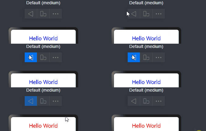
onNewParam19+
onNewParam?(param: ESObject): void
该回调仅生效于由@Entry装饰的、作为router路由页面存在的自定义组件。当之前存在于路由栈中的页面,通过单实例模式RouterMode移动到栈顶时触发该回调。
元服务API: 从API version 19开始,该接口支持在元服务中使用。
模型约束: 此接口仅可在Stage模型下使用。
系统能力: SystemCapability.ArkUI.ArkUI.Full
参数:
参数名 类型 必填 说明 param ESObject 是 路由跳转时传递到目标页面的数据。 // pages/Index.ets import { router } from '@kit.ArkUI'; export class RouterParam { msg: string = '__NA__'; constructor(msg: string) { this.msg = msg; } } @Entry @Component struct Index { aboutToAppear(): void { console.info('onNewParam', 'Index aboutToAppear'); } onNewParam(param: ESObject) { console.info('onNewParam', 'Index onNewParam, param: ' + JSON.stringify(param)); } build() { Column() { Button('push pageOne Standard') .margin(10) .onClick(() => { this.getUIContext().getRouter().pushUrl({ url: 'pages/PageOne', params: new RouterParam('push pageOne Standard') }, router.RouterMode.Standard); }) // Single模式下若PageOne已在栈中,会复用并触发PageOne.onNewParam Button('push pageOne Single') .margin(10) .onClick(() => { this.getUIContext().getRouter().pushUrl({ url: 'pages/PageOne', params: new RouterParam('push pageOne Single') }, router.RouterMode.Single); }) } .width('100%') .height('100%') } }// pages/PageOne.ets import { router } from '@kit.ArkUI'; import { RouterParam } from './Index'; @Entry @Component struct PageOne { aboutToAppear(): void { console.info('onNewParam', 'PageOne aboutToAppear'); } onNewParam(param: ESObject) { console.info('onNewParam', 'PageOne onNewParam, param: ' + JSON.stringify(param)); } build() { Column() { Button('push Index Standard') .margin(10) .onClick(() => { this.getUIContext().getRouter().pushUrl({ url: 'pages/Index', params: new RouterParam('push Index Standard') }, router.RouterMode.Standard); }) // Single模式下若Index已在栈中,会复用并触发Index.onNewParam Button('push Index Single') .margin(10) .onClick(() => { this.getUIContext().getRouter().pushUrl({ url: 'pages/Index', params: new RouterParam('push Index Single') }, router.RouterMode.Single); }) } .width('100%') .height('100%') } }aboutToReuse10+
aboutToReuse?(params: Record<string, Object | undefined | null>): void
当一个可复用的自定义组件从复用缓存中重新加入到节点树时,触发aboutToReuse生命周期回调,并将组件的构造参数传递给该回调。

- 避免对@Link/@ObjectLink/@Prop等自动更新的状态变量,在aboutToReuse()中重复赋值。
- 在滑动场景中,使用组件复用通常需要用该回调函数去更新组件的状态变量,因此在该回调函数中应避免耗时操作,否则会导致丢帧卡顿。最佳实践请参考主线程耗时操作优化指导-组件复用回调。
元服务API: 从API version 11开始,该接口支持在元服务中使用。
模型约束: 此接口仅可在Stage模型下使用。
系统能力: SystemCapability.ArkUI.ArkUI.Full
参数:
参数名 类型 必填 说明 params Record<string, Object | undefined | null> 是 自定义组件的构造参数。其中key为复用时外部传入的组件成员变量名,value为复用时外部传入的对应参数值。 // xxx.ets export class Message { value: string | undefined; constructor(value: string) { this.value = value; } } @Entry @Component struct Index { @State isShown: boolean = true; build() { Column() { // 点击Button切换isShown,控制Child从组件树移除或重新加入 Button('Hello World') .fontSize(50) .fontWeight(FontWeight.Bold) .onClick(() => { this.isShown = !this.isShown; }) if (this.isShown) { Child({ message: new Message('Child') }) } } .height('100%') .width('100%') } } @Reusable @Component struct Child { @State message: Message = new Message('AboutToReuse'); aboutToReuse(params: Record<string, ESObject>) { console.info('Reuse Child'); this.message = params.message as Message; } build() { Column() { Text(this.message.value) .fontSize(20) } .borderWidth(2) .height(100) } }aboutToReuse18+
aboutToReuse?(): void
当一个状态管理V2的可复用自定义组件从复用缓存中重新加入到节点树时,触发aboutToReuse生命周期回调。在频繁调用场景下,应避免在其中执行耗时操作,否则可能导致丢帧卡顿。
详细内容请参考@ReusableV2。
元服务API: 从API version 18开始,该接口支持在元服务中使用。
模型约束: 此接口仅可在Stage模型下使用。
系统能力: SystemCapability.ArkUI.ArkUI.Full
@Entry @ComponentV2 struct Index { @Local condition: boolean = true; build() { Column() { Button('回收/复用').onClick(() => { this.condition = !this.condition; }) // 点击切换回收/复用状态 if (this.condition) { ReusableV2Component() } } } } @ReusableV2 @ComponentV2 struct ReusableV2Component { @Local message: string = 'Hello World'; aboutToReuse() { console.info('ReusableV2Component aboutToReuse'); // 复用时被调用 } build() { Column() { Text(this.message) } } }aboutToRecycle10+
aboutToRecycle?(): void
组件的生命周期回调,在可复用组件从节点树上被加入到复用缓存之前调用。当该组件后续从复用缓存中被重新复用时,将触发aboutToReuse生命周期回调。在频繁调用场景下,应避免在其中执行耗时操作,否则可能导致丢帧卡顿。
元服务API: 从API version 11开始,该接口支持在元服务中使用。
模型约束: 此接口仅可在Stage模型下使用。
系统能力: SystemCapability.ArkUI.ArkUI.Full
// xxx.ets export class Message { value: string | undefined; constructor(value: string) { this.value = value; } } @Entry @Component struct Index { @State isShown: boolean = true; build() { Column() { Button('Hello World') .fontSize(50) .fontWeight(FontWeight.Bold) .onClick(() => { this.isShown = !this.isShown; }) if (this.isShown) { Child({ message: new Message('Child') }) } } .height('100%') .width('100%') } } @Reusable @Component struct Child { @State message: Message = new Message('AboutToReuse'); aboutToReuse(params: Record<string, ESObject>) { console.info('Reuse Child'); this.message = params.message as Message; } aboutToRecycle() { // 这里可以释放比较占内存的内容或其他非必要资源引用,避免一直占用内存,引发内存泄漏 console.info('Recycle Child,child进入复用池中'); } build() { Column() { Text(this.message.value) .fontSize(20) } .borderWidth(2) .height(100) } }onWillApplyTheme12+
onWillApplyTheme?(theme: Theme): void
onWillApplyTheme函数用于获取当前组件上下文的Theme对象,在创建自定义组件的新实例后、其build()函数执行之前调用。允许在onWillApplyTheme函数中改变状态变量,更改将在后续执行build()函数中生效。

从API version 18开始,该接口支持在状态管理V2组件中使用。
元服务API: 从API version 12开始,该接口支持在元服务中使用。
模型约束: 此接口仅可在Stage模型下使用。
系统能力: SystemCapability.ArkUI.ArkUI.Full
参数:
参数名 类型 必填 说明 theme Theme 是 自定义组件当前生效的Theme对象。 Theme12+
type Theme = import('../api/@ohos.arkui.theme').Theme
主题对象。
元服务API: 从API version 12开始,该接口支持在元服务中使用。
模型约束: 此接口仅可在Stage模型下使用。
系统能力: SystemCapability.ArkUI.ArkUI.Full
类型 说明 import('../api/@ohos.arkui.theme').Theme 自定义组件当前生效的Theme对象。 V1:
// xxx.ets
import { CustomTheme, CustomColors, Theme, ThemeControl } from '@kit.ArkUI';

class BlueColors implements CustomColors {
  fontPrimary = Color.White;
  backgroundPrimary = Color.Blue;
  brand = Color.Blue; // 品牌色
}

class PageCustomTheme implements CustomTheme {
  colors?: CustomColors;

  constructor(colors: CustomColors) {
    this.colors = colors;
  }
}
const blueColorsTheme = new PageCustomTheme(new BlueColors());
// setDefaultTheme应该在应用入口页面调用或者在Ability中调用。
ThemeControl.setDefaultTheme(blueColorsTheme);

@Entry
@Component
struct IndexComponent {
  @State textColor: ResourceColor = $r('sys.color.font_primary');
  @State columnBgColor: ResourceColor = $r('sys.color.background_primary');

  // onWillApplyTheme中可获取当前组件上下文的Theme对象。此处在onWillApplyTheme中将状态变量textColor、columnBgColor,赋值为当前使用的Theme对象(blueColorsTheme)中的配色。
  onWillApplyTheme(theme: Theme) {
    this.textColor = theme.colors.fontPrimary;
    this.columnBgColor = theme.colors.backgroundPrimary;
    console.info('IndexComponent onWillApplyTheme');
  }

  build() {
    Column() {
      // 组件初始值配色样式
      Column() {
        Text('Hello World')
          .fontColor($r('sys.color.font_primary'))
          .fontSize(30)
      }
      .width('100%')
      .height('25%')
      .borderRadius('10vp')
      .backgroundColor($r('sys.color.background_primary'))

      // 组件颜色生效为onWillApplyTheme中配置颜色。
      Column() {
        Text('onWillApplyTheme')
          .fontColor(this.textColor)
          .fontSize(30)
        Text('Hello World')
          .fontColor(this.textColor)
          .fontSize(30)
      }
      .width('100%')
      .height('25%')
      .borderRadius('10vp')
      .backgroundColor(this.columnBgColor)
    }
    .padding('16vp')
    .backgroundColor('#dcdcdc')
    .width('100%')
    .height('100%')
  }
}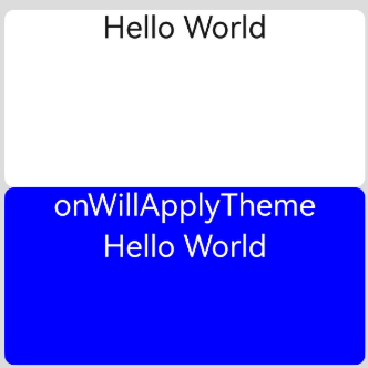
V2:
import { CustomTheme, CustomColors, Theme, ThemeControl } from '@kit.ArkUI';

class BlueColors implements CustomColors {
  fontPrimary = Color.White;
  backgroundPrimary = Color.Blue;
  brand = Color.Blue; // 品牌色
}

class PageCustomTheme implements CustomTheme {
  colors?: CustomColors;

  constructor(colors: CustomColors) {
    this.colors = colors;
  }
}

const blueColorsTheme = new PageCustomTheme(new BlueColors());
// setDefaultTheme应该在应用入口页面调用或者在Ability中调用。
ThemeControl.setDefaultTheme(blueColorsTheme);

@Entry
@ComponentV2
struct IndexComponent {
  @Local textColor: ResourceColor = $r('sys.color.font_primary');
  @Local columnBgColor: ResourceColor = $r('sys.color.background_primary');

  // onWillApplyTheme中可获取当前组件上下文的Theme对象。此处在onWillApplyTheme中将状态变量textColor、columnBgColor,赋值为当前使用的Theme对象(blueColorsTheme)中的配色。
  onWillApplyTheme(theme: Theme) {
    this.textColor = theme.colors.fontPrimary;
    this.columnBgColor = theme.colors.backgroundPrimary;
    console.info('IndexComponent onWillApplyTheme');
  }

  build() {
    Column() {
      // 组件初始值配色样式
      Column() {
        Text('Hello World')
          .fontColor($r('sys.color.font_primary'))
          .fontSize(30)
      }
      .width('100%')
      .height('25%')
      .borderRadius('10vp')
      .backgroundColor($r('sys.color.background_primary'))

      // 组件颜色生效为onWillApplyTheme中配置颜色。
      Column() {
        Text('onWillApplyTheme')
          .fontColor(this.textColor)
          .fontSize(30)
        Text('Hello World')
          .fontColor(this.textColor)
          .fontSize(30)
      }
      .width('100%')
      .height('25%')
      .borderRadius('10vp')
      .backgroundColor(this.columnBgColor)
    }
    .padding('16vp')
    .backgroundColor('#dcdcdc')
    .width('100%')
    .height('100%')
  }
}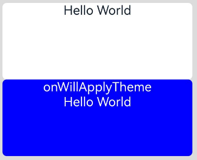
pageTransition9+
pageTransition?(): void
pageTransition函数用于定义页面入场和页面退场的转场动效。
元服务API: 从API version 11开始,该接口支持在元服务中使用。
系统能力: SystemCapability.ArkUI.ArkUI.Full
onFormRecycle11+
onFormRecycle?(): string
onFormRecycle回调函数在卡片回收时执行,卡片提供方可以返回需要卡片管理服务代保存的数据,在卡片恢复时通过onFormRecover接口传给卡片提供方。
元服务API: 从API version 12开始,该接口支持在元服务中使用。
卡片能力: 从API version 11开始,该接口支持在ArkTS卡片中使用。
模型约束: 此接口仅可在Stage模型下使用。
系统能力: SystemCapability.ArkUI.ArkUI.Full
返回值:
类型 说明 string 返回卡片提供方需要卡片管理服务代保存的数据。 示例:
@Entry @Component struct WidgetCard { readonly title: string = 'Hello World'; readonly actionType: string = 'router'; readonly abilityName: string = 'EntryAbility'; readonly message: string = 'add detail'; readonly fullWidthPercent: string = '100%'; readonly fullHeightPercent: string = '100%'; onFormRecycle(): string { let formId: string = '1859635745'; // 卡片回收时触发回调 console.info('card is recycled, formID: ' + formId); return formId; } onFormRecover(statusData: string): void { console.info('card has been restored, formID: ' + statusData); } build() { Row() { Column() { Text(this.title) .fontSize($r('app.float.font_size')) .fontWeight(FontWeight.Medium) .fontColor($r('sys.color.font')) } .width(this.fullWidthPercent) } .height(this.fullHeightPercent) .backgroundColor($r('sys.color.comp_background_primary')) .onClick(() => { postCardAction(this, { action: this.actionType, abilityName: this.abilityName, params: { message: this.message } }); }) } }onFormRecover11+
onFormRecover?(statusData: string): void
onFormRecover回调函数在卡片恢复时执行,卡片提供方可以拿到卡片回收时卡片管理服务代保存的数据,该数据可以通过onFormRecycle卡片回收回调函数保存到卡片管理服务。
元服务API: 从API version 12开始,该接口支持在元服务中使用。
卡片能力: 从API version 11开始,该接口支持在ArkTS卡片中使用。
模型约束: 此接口仅可在Stage模型下使用。
系统能力: SystemCapability.ArkUI.ArkUI.Full
参数:
参数名 类型 必填 说明 statusData string 是 卡片回收时卡片管理服务代保存的数据。 示例:
@Entry
@Component
struct WidgetCard {
  readonly title: string = 'Hello World';
  readonly actionType: string = 'router';
  readonly abilityName: string = 'EntryAbility';
  readonly message: string = 'add detail';
  readonly fullWidthPercent: string = '100%';
  readonly fullHeightPercent: string = '100%';

  onFormRecycle(): string {
    let formId: string = '1859635745';
    console.info('card is recycled, formID: ' + formId);
    return formId;
  }

  onFormRecover(statusData: string): void {
    // 在卡片恢复时触发回调
    console.info('card has been restored, formID: ' + statusData);
  }

  build() {
    Row() {
      Column() {
        Text(this.title)
          .fontSize($r('app.float.font_size'))
          .fontWeight(FontWeight.Medium)
          .fontColor($r('sys.color.font'))
      }
      .width(this.fullWidthPercent)
    }
    .height(this.fullHeightPercent)
    .backgroundColor($r('sys.color.comp_background_primary'))
    .onClick(() => {
      postCardAction(this, {
        action: this.actionType,
        abilityName: this.abilityName,
        params: {
          message: this.message
        }
      });
    })
  }
}

