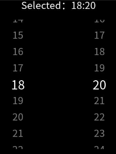
The <picker-view> component provides the view that shows an embedded scrollable selector on the screen.

This component is supported since API version 4. Updates will be marked with a superscript to indicate their earliest API version.
Attributes
| Name | Type | Default Value | Mandatory | Description |
|---|---|---|---|---|
| type | string | text | No | Type of the scrollable selector, which cannot be changed dynamically. Available values are as follows: - text: text selector. - time: time selector. |
| id | string | - | No | Unique ID of the component. |
| style | string | - | No | Style declaration of the component. |
| class | string | - | No | Style class of the component, which is used to refer to a style table. |
| ref | string | - | No | Reference information of child elements, which is registered with the parent component on $refs. |
Text selector (type is text)
| Name | Type | Default Value | Mandatory | Description |
|---|---|---|---|---|
| range | Array | - | No | Value range of the text selector. Use the data binding mode, for example, range = {{data}}. Declare the corresponding variable data: ["15", "20", "25"] in JavaScript. |
| selected | number | 0 | No | Default value of the text selector. The value is the index of range. |
Time selector (type is time)
| Name | Type | Default Value | Mandatory | Description |
|---|---|---|---|---|
| selected | string | 00:00 | No | Default value of the time selector, in the format of HH:mm. |
Events
Text selector (type is text)
| Name | Parameter | Description |
|---|---|---|
| change | { newValue: newValue, newSelected: newSelected } | Triggered when a value is specified for the text selector. |
Time selector (type is time)
| Name | Parameter | Description |
|---|---|---|
| change | { hour: hour, minute: minute} | Triggered when a value is specified for the time selector. |
Styles
| Name | Type | Default Value | Mandatory | Description |
|---|---|---|---|---|
| color | <color> | #808080 | No | Font color of a candidate item. |
| font-size | <length> | 30px | No | Font size of a candidate item. The value is of the length type, in pixels. |
| selected-color | <color> | #ffffff | No | Font color of the selected item. |
| selected-font-size | <length> | 38px | No | Font size of the selected item. The value is of the length type, in pixels. |
| selected-font-family | string | HYQiHei-65S | No | Font type of the selected item. |
| font-family | string | HYQiHe-65S | No | Font type of a candidate item. |
| width | <length> | <percentage>5+ | - | No | Component width. If this attribute is not set, the default value 0 is used. |
| height | <length> | <percentage>5+ | - | No | Component height. If this attribute is not set, the default value 0 is used. |
| padding | <length> | 0 | No | Shorthand attribute to set the padding for all sides. The attribute can have one to four values: - If you set only one value, it specifies the padding for all the four sides. - If you set two values, the first value specifies the top and bottom padding, and the second value specifies the left and right padding. - If you set three values, the first value specifies the top padding, the second value specifies the left and right padding, and the third value specifies the bottom padding. - If you set four values, they respectively specify the padding for top, right, bottom, and left sides (in clockwise order). |
| padding-[left|top|right|bottom] | <length> | 0 | No | Left, top, right, and bottom padding. |
| margin | <length> | <percentage>5+ | 0 | No | Shorthand attribute to set the margin for all sides. The attribute can have one to four values: - If you set only one value, it specifies the margin for all the four sides. - If you set two values, the first value specifies the top and bottom margins, and the second value specifies the left and right margins. - If you set three values, the first value specifies the top margin, the second value specifies the left and right margins, and the third value specifies the bottom margin. - If you set four values, they respectively specify the margin for top, right, bottom, and left sides (in clockwise order). |
| margin-[left|top|right|bottom] | <length> | <percentage>5+ | 0 | No | Left, top, right, and bottom margins. |
| border-width | <length> | 0 | No | Shorthand attribute to set the border width for all sides. |
| border-color | <color> | black | No | Shorthand attribute to set the color for all borders. |
| border-radius | <length> | - | No | Radius of round-corner borders. |
| background-color | <color> | - | No | Background color. |
| display | string | flex | No | Whether to display a box containing the element and the layout for its child elements. Available values are as follows: - flex: flexible layout - none: not rendered |
| [left|top] | <length> | <percentage>6+ | - | No | Edge of the element. - The left attribute specifies the left edge position of the element. This attribute defines the offset between the left edge of the margin area of a positioned element and left edge of its containing block. - The top attribute specifies the top edge position of the element. This attribute defines the offset between the top edge of a positioned element and that of a block included in the element. |
Methods
| Name | Parameter | Description |
|---|---|---|
| rotation | { focus: boolean } | Specifies whether to request focus for crown rotation. focus: true: acquires focus, allowing users to scroll options by rotating the crown (only works for single-column pickers). focus: false: releases focus. Note: This method has effect only for single-column pickers. For multi-column pickers, users must click to acquire focus before rotating the crown. |
Example
<!-- xxx.hml -->
  <div class="container">
  <text class="title">
    Selected: {{time}}
  </text>
  <picker-view class="time-picker" type="time" columns="2" ref="pickerViewObj" selected="{{defaultTime}}" @change="handleChange"></picker-view>
</div>
/* xxx.css */
.container {
flex-direction: column;
justify-content: center;
align-items: center;
left: 0px;
top: 0px;
width: 454px;
height: 454px;
}
.title {
font-size: 30px;
text-align: center;
}
.time-picker {
width: 500px;
height: 400px;
margin-top: 20px;
} /* xxx.js */
export default {
data: {
defaultTime: "",
time: "",
},
onInit() {
this.defaultTime = this.now();
this.time = this.defaultTime;
},
handleChange(data) {
this.time = this.concat(data.hour, data.minute);
},
now() {
const date = new Date();
const hours = date.getHours();
const minutes = date.getMinutes();
return this.concat(hours, minutes);
},
fill(value) {
return (value > 9 ? "" : "0") + value;
},
concat(hours, minutes) {
return `${this.fill(hours)}:${this.fill(minutes)}`;
},
onShow() {
this.$refs.pickerViewObj.rotation({focus: true})
},
onHide() {
this.$refs.pickerViewObj.rotation({focus: false})
}
}