


Intelligent Assistant
Chat with our virtual assistant to get answers promptly.
We use essential cookies for the website to function, as well as analytics cookies for analyzing and creating statistics of the website performance. To agree to the use of analytics cookies, click "Accept All". You can manage your preferences at any time by clicking "Cookie Settings" on the footer. More Information.
HarmonyOS
A hover event is triggered when the cursor slides over a component or when a stylus hovers and moves over the screen.
onHover(event: (isHover: boolean, event: HoverEvent) => void): T
Triggered when the mouse pointer or stylus enters or leaves the component.
Atomic service API: This API can be used in atomic services since API version 11.
System capability: SystemCapability.ArkUI.ArkUI.Full
Parameters
| Name | Type | Mandatory | Description |
|---|---|---|---|
| event | (isHover: boolean, event: HoverEvent) => void | Yes | Callback for mouse or stylus hover status. event: event bubbling control and coordinates of the hover position; available since API version 11. isHover: whether the mouse pointer or stylus is hovering over the component. true: The mouse pointer or stylus has entered the component. false: The mouse pointer or stylus has left the component. |
Return value
| Type | Description |
|---|---|
| T | Current component. |
onHoverMove(event: Callback<HoverEvent>): T
Triggered when a stylus hovers over the component.
Atomic service API: This API can be used in atomic services since API version 15.
System capability: SystemCapability.ArkUI.ArkUI.Full
Parameters
| Name | Type | Mandatory | Description |
|---|---|---|---|
| event | Callback<HoverEvent> | Yes | Callback that controls event bubbling blocking and obtains the stylus hover position coordinates. |
Return value
| Type | Description |
|---|---|
| T | Current component. |
Inherits from BaseEvent.
System capability: SystemCapability.ArkUI.ArkUI.Full
| Name | Type | Read Only | Optional | Description |
|---|---|---|---|---|
| x15+ | number | No | Yes | X coordinate of the cursor or stylus position in the component coordinate system based on the current component. Unit: vp. Atomic service API: This API can be used in atomic services since API version 15. |
| y15+ | number | No | Yes | Y coordinate of the cursor or stylus position in the component coordinate system based on the current component. Unit: vp. Atomic service API: This API can be used in atomic services since API version 15. |
| windowX15+ | number | No | Yes | X coordinate of the cursor or stylus position in the coordinate system of the current application window. Unit: vp. Atomic service API: This API can be used in atomic services since API version 15. |
| windowY15+ | number | No | Yes | Y coordinate of the cursor or stylus position in the coordinate system of the current application window. Unit: vp. Atomic service API: This API can be used in atomic services since API version 15. |
| displayX15+ | number | No | Yes | X coordinate of the cursor or stylus position in the coordinate system of the current screen window. Unit: vp. Atomic service API: This API can be used in atomic services since API version 15. |
| displayY15+ | number | No | Yes | Y coordinate of the cursor or stylus position in the coordinate system of the current screen window. Unit: vp. Atomic service API: This API can be used in atomic services since API version 15. |
| stopPropagation | () => void | No | No | Disables event bubbling propagation. Atomic service API: This API can be used in atomic services since API version 11. |
| globalDisplayX20+ | number | No | Yes | X coordinate of the cursor or stylus position in the global coordinate system. Unit: vp. Value range: [0, +∞). Atomic service API: This API can be used in atomic services since API version 20. |
| globalDisplayY20+ | number | No | Yes | Y coordinate of the cursor or stylus position in the global coordinate system. Unit: vp. Value range: [0, +∞). Atomic service API: This API can be used in atomic services since API version 20. |
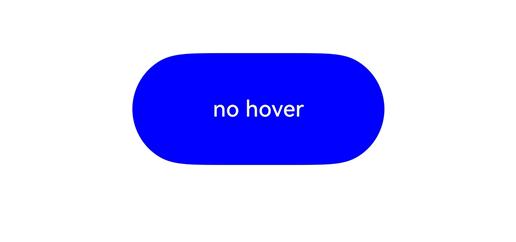
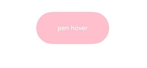
This example demonstrates how to set the onHover event on a button. When the mouse or stylus hovers over the button, the event is triggered to dynamically change the text content and background color of the button.
- // xxx.ets
- @Entry
- @Component
- struct HoverEventExample {
- @State hoverText: string = 'no hover';
- @State color: Color = Color.Blue;
-
- build() {
- Column({ space: 20 }) {
- Button(this.hoverText, { type: ButtonType.Capsule })
- .width(180).height(80)
- .backgroundColor(this.color)
- .onHover((isHover: boolean, event: HoverEvent) => {
- // Use the onHover event to dynamically change the text content and background color of a button when the mouse pointer or stylus is hovered on it.
- // Use event.sourceTool to determine whether the device is a mouse device or stylus.
- if (isHover) {
- if (event.sourceTool == SourceTool.Pen) {
- this.hoverText = 'pen hover';
- this.color = Color.Pink;
- } else if (event.sourceTool == SourceTool.MOUSE) {
- this.hoverText = 'mouse hover';
- this.color = Color.Red;
- }
- } else {
- this.hoverText = 'no hover';
- this.color = Color.Blue;
- }
- })
- }.padding({ top: 30 }).width('100%')
- }
- }
Diagrams:
The figure below shows how the button looks in the non-hovered state.
The figure below shows how the button looks when a stylus hovers on it.
This example demonstrates how to configure the onHoverMove event on a button, available since API version 15. When a stylus hovers over the button, the UI displays the current stylus position.
- // xxx.ets
- @Entry
- @Component
- struct OnHoverMoveEventExample {
- @State hoverMoveText: string = '';
-
- build() {
- Column({ space: 20 }) {
- Button('onHoverMove', { type: ButtonType.Capsule })
- .width(180).height(80)
- .onHoverMove((event: HoverEvent) => {
- this.hoverMoveText = 'onHoverMove:\nXY = (' + event.x + ', ' + event.y + ')' +
- '\nwindowXY = (' + event.windowX + ', ' + event.windowY + ')' +
- '\ndisplayXY = (' + event.displayX + ', ' + event.displayY + ')';
- })
-
- Text(this.hoverMoveText)
- }.padding({ top: 30 }).width('100%')
- }
- }
Diagrams:
When a stylus hovers over a button, the UI continuously updates to show the position of the stylus tip.

Intelligent Assistant
Chat with our virtual assistant to get answers promptly.
Quick start
Helps you find desired resources with ease.