


智能客服
你问我答,随时在线为你解决问题
设置组件的颜色渐变效果。
从API Version 7开始支持。后续版本如有新增内容,则采用上角标单独标记该内容的起始版本。
颜色渐变属于组件内容,绘制在背景上方。
颜色渐变不支持宽高显式动画,执行宽高动画时颜色渐变会直接过渡到终点。
linearGradient(value: {angle?: number | string; direction?: GradientDirection; colors: Array<[ResourceColor, number]>; repeating?: boolean;})
线性渐变。
卡片能力: 从API version 9开始,该接口支持在ArkTS卡片中使用。
元服务API: 从API version 11开始,该接口支持在元服务中使用。
系统能力: SystemCapability.ArkUI.ArkUI.Full
参数:
| 参数名 | 类型 | 必填 | 说明 |
|---|---|---|---|
| value | { angle?: number | string, direction?: GradientDirection, colors: Array<[ResourceColor, number]>, repeating?: boolean } | 是 | 线性渐变。 - angle: 线性渐变的起始角度。0点方向顺时针旋转为正向角度。 默认值:180 角度为字符串时仅支持类型deg,grad,rad,trun。 - direction: 线性渐变的方向,设置angle后不生效。 默认值:GradientDirection.Bottom - colors: 指定渐变色颜色和其对应的百分比位置的数组,设置非法颜色直接跳过。 - repeating: 为渐变的颜色重复着色。 默认值:false |
sweepGradient(value: {center: [Length, Length]; start?: number | string; end?: number | string; rotation?: number | string; colors: Array<[ResourceColor, number]>; repeating?: boolean;})
角度渐变。
元服务API: 从API version 11开始,该接口支持在元服务中使用。
系统能力: SystemCapability.ArkUI.ArkUI.Full
卡片能力: 从API version 9开始,该接口支持在ArkTS卡片中使用。
参数:
| 参数名 | 类型 | 必填 | 说明 |
|---|---|---|---|
| value | { center: [Length, Length], start?: number | string, end?: number | string, rotation?: number | string, colors: Array<[ResourceColor, number]>, repeating?: boolean } | 是 | 角度渐变,仅绘制0-360度范围内的角度,超出时不绘制渐变色,只绘制纯色。 - center:为角度渐变的中心点,即相对于当前组件左上角的坐标。 - start:角度渐变的起点。 默认值:0 角度为字符串时仅支持类型deg,grad,rad,trun。 - end:角度渐变的终点。 默认值:0 角度为字符串时仅支持类型deg,grad,rad,trun。 - rotation: 角度渐变的旋转角度。 默认值:0 角度为字符串时仅支持类型deg,grad,rad,trun。 - colors: 指定渐变色颜色和其对应的百分比位置的数组,设置非法颜色直接跳过。 - repeating: 为渐变的颜色重复着色。 默认值:false 说明: 设置为小于0的值时,按值为0处理,设置为大于360的值时,按值为360处理。 当start、end、rotation的数据类型为string,合法的取值为纯数字或纯数字后带"deg"(度)、"rad"(弧度)、"grad"(梯度)、"turn"(圈)单位,例如:"90"、 "90deg"、"1.57rad"。 |
radialGradient(value: { center: [Length, Length]; radius: number | string; colors: Array<[ResourceColor, number]>; repeating?: boolean })
径向渐变。
元服务API: 从API version 11开始,该接口支持在元服务中使用。
系统能力: SystemCapability.ArkUI.ArkUI.Full
卡片能力: 从API version 9开始,该接口支持在ArkTS卡片中使用。
参数:
| 参数名 | 类型 | 必填 | 说明 |
|---|---|---|---|
| value | { center: [Length, Length], radius: number | string, colors: Array<[ResourceColor, number]>, repeating?: boolean } | 是 | 径向渐变。 - center:径向渐变的中心点,即相对于当前组件左上角的坐标。 - radius:径向渐变的半径。 取值范围:[0,+∞) 说明: 设置为小于的0值时,按值为0处理。 - colors: 指定渐变色颜色和其对应的百分比位置的数组,设置非法颜色直接跳过。 - repeating: 为渐变的颜色重复着色。 默认值:false |
colors参数的约束:
ResourceColor表示填充的颜色,number表示指定颜色所处的位置,取值范围为[0,1.0],0表示需要设置渐变色的容器的开始处,1.0表示容器的结尾处。想要实现多个颜色渐变效果时,多个数组中number参数建议递增设置,如后一个数组number参数比前一个数组number小的话,按照等于前一个数组number的值处理。
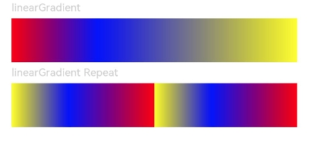
该示例通过linearGradient来实现组件颜色线性渐变。
- // xxx.ets
- @Entry
- @Component
- struct ColorGradientExample {
- build() {
- Column({ space: 5 }) {
- Text('linearGradient').fontSize(12).width('90%').fontColor(0xCCCCCC)
- Row()
- .width('90%')
- .height(50)
- .linearGradient({
- angle: 90,
- colors: [[0xff0000, 0.0], [0x0000ff, 0.3], [0xffff00, 1.0]]
- })
- Text('linearGradient Repeat').fontSize(12).width('90%').fontColor(0xCCCCCC)
- Row()
- .width('90%')
- .height(50)
- .linearGradient({
- direction: GradientDirection.Left, // 渐变方向
- repeating: true, // 渐变颜色是否重复
- colors: [[0xff0000, 0.0], [0x0000ff, 0.3], [0xffff00, 0.5]] // 数组末尾元素占比小于1时满足重复着色效果
- })
- }
- .width('100%')
- .padding({ top: 5 })
- }
- }
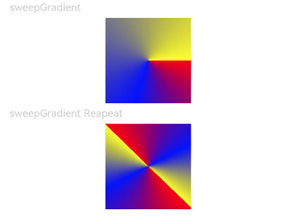
该示例通过sweepGradient来实现组件颜色旋转角度渐变。
- @Entry
- @Component
- struct ColorGradientExample {
- build() {
- Column({ space: 5 }) {
- Text('sweepGradient').fontSize(12).width('90%').fontColor(0xCCCCCC)
- Row()
- .width(100)
- .height(100)
- .sweepGradient({
- center: [50, 50],
- start: 0,
- end: 359,
- colors: [[0xff0000, 0.0], [0x0000ff, 0.3], [0xffff00, 1.0]]
- })
-
- Text('sweepGradient Reapeat').fontSize(12).width('90%').fontColor(0xCCCCCC)
- Row()
- .width(100)
- .height(100)
- .sweepGradient({
- center: [50, 50],
- start: 0,
- end: 359,
- rotation: 45, // 旋转角度
- repeating: true, // 渐变颜色是否重复
- colors: [[0xff0000, 0.0], [0x0000ff, 0.3], [0xffff00, 0.5]] // 数组末尾元素占比小于1时满足重复着色效果
- })
- }
- .width('100%')
- .padding({ top: 5 })
- }
- }
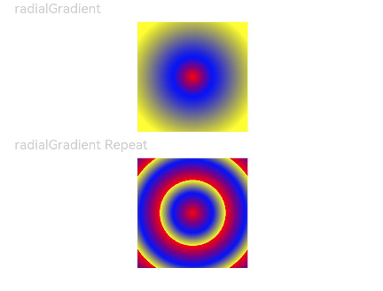
该示例通过radialGradient来实现组件颜色径向渐变。
- // xxx.ets
- @Entry
- @Component
- struct ColorGradientExample {
- build() {
- Column({ space: 5 }) {
- Text('radialGradient').fontSize(12).width('90%').fontColor(0xCCCCCC)
- Row()
- .width(100)
- .height(100)
- .radialGradient({
- center: [50, 50],
- radius: 60,
- colors: [[0xff0000, 0.0], [0x0000ff, 0.3], [0xffff00, 1.0]]
- })
- Text('radialGradient Repeat').fontSize(12).width('90%').fontColor(0xCCCCCC)
- Row()
- .width(100)
- .height(100)
- .radialGradient({
- center: [50, 50],
- radius: 60,
- repeating: true,
- colors: [[0xff0000, 0.0], [0x0000ff, 0.3], [0xffff00, 0.5]] // 数组末尾元素占比小于1时满足重复着色效果
- })
- }
- .width('100%')
- .padding({ top: 5 })
- }
- }
智能客服
你问我答,随时在线为你解决问题
合作咨询
我们的专家服务团队将竭诚为您提供专业的合作咨询服务
解决方案
精准高效的一站式服务支持,助力开发者商业成功