合作咨询
我们的专家服务团队将竭诚为您提供专业的合作咨询服务
多行文本输入框组件,当输入的文本内容超过组件宽度时会自动换行显示。
高度未设置时,组件无默认高度,自适应内容高度。宽度未设置时,默认撑满最大宽度。
该组件从API Version 7开始支持。后续版本如有新增内容,则采用上角标单独标记该内容的起始版本。
无
TextArea(value?: TextAreaOptions)
元服务API: 从API version 11开始,该接口支持在元服务中使用。
系统能力: SystemCapability.ArkUI.ArkUI.Full
参数:
| 参数名 | 类型 | 必填 | 说明 |
|---|---|---|---|
| value | TextAreaOptions | 否 | TextArea组件参数。 |
元服务API: 从API version 11开始,该接口支持在元服务中使用。
系统能力: SystemCapability.ArkUI.ArkUI.Full
| 名称 | 类型 | 必填 | 说明 |
|---|---|---|---|
| placeholder | ResourceStr | 否 | 设置无输入时的提示文本。输入内容后,提示文本不显示。 仅设置placeholder属性时,手柄依然跟随拖动,手柄松开后光标停留在文字开头位置。 |
| text | ResourceStr | 否 | 设置输入框当前的文本内容。 建议通过onChange事件将状态变量与文本实时绑定, 避免组件刷新时TextArea中的文本内容异常。 从API version 10开始,该参数支持$$双向绑定变量。 |
| controller8+ | TextAreaController | 否 | 设置TextArea控制器。 |
除支持通用属性,还支持以下属性:
通用属性padding的默认值为:
{
top: '8vp',
right: '16vp',
bottom: '8vp',
left: '16vp'
}
从API version 11开始,多行输入框可设置.width('auto')使组件宽度自适应文本宽度,自适应时组件宽度受constraintSize属性以及父容器传递的最大最小宽度限制,其余使用方式参考尺寸设置。
placeholderColor(value: ResourceColor)
设置placeholder文本颜色。
元服务API: 从API version 11开始,该接口支持在元服务中使用。
系统能力: SystemCapability.ArkUI.ArkUI.Full
参数:
| 参数名 | 类型 | 必填 | 说明 |
|---|---|---|---|
| value | ResourceColor | 是 | placeholder文本颜色。 默认值:跟随主题。 |
placeholderFont(value: Font)
设置placeholder文本样式,包括字体大小,字体粗细,字体族,字体风格。当前支持'HarmonyOS Sans'字体和注册自定义字体。
元服务API: 从API version 11开始,该接口支持在元服务中使用。
系统能力: SystemCapability.ArkUI.ArkUI.Full
参数:
| 参数名 | 类型 | 必填 | 说明 |
|---|---|---|---|
| value | Font | 是 | placeholder文本样式。 |
textAlign(value: TextAlign)
设置文本在输入框中的水平对齐方式。
支持TextAlign.Start、TextAlign.Center和TextAlign.End。
可通过align属性控制文本段落在垂直方向上的位置,此组件中不可通过align属性控制文本段落在水平方向上的位置,即align属性中Alignment.TopStart、Alignment.Top、Alignment.TopEnd效果相同,控制内容在顶部,Alignment.Start、Alignment.Center、Alignment.End效果相同,控制内容垂直居中,Alignment.BottomStart、Alignment.Bottom、Alignment.BottomEnd效果相同,控制内容在底部。
当textAlign属性设置为TextAlign.JUSTIFY时,最后一行文本不参与两端对齐,为水平对齐首部效果。
从API version 11开始,textAlign可设置TextAlign.JUSTIFY
元服务API: 从API version 11开始,该接口支持在元服务中使用。
系统能力: SystemCapability.ArkUI.ArkUI.Full
参数:
| 参数名 | 类型 | 必填 | 说明 |
|---|---|---|---|
| value | TextAlign | 是 | 文本在输入框中的水平对齐方式。 默认值:TextAlign.Start |
caretColor(value: ResourceColor)
设置输入框光标颜色。
元服务API: 从API version 11开始,该接口支持在元服务中使用。
系统能力: SystemCapability.ArkUI.ArkUI.Full
参数:
| 参数名 | 类型 | 必填 | 说明 |
|---|---|---|---|
| value | ResourceColor | 是 | 输入框光标颜色。 默认值:'#007DFF' |
从API version 12开始,此接口支持设置文本手柄颜色,光标和文本手柄颜色保持一致。
fontColor(value: ResourceColor)
设置字体颜色。
卡片能力: 从API version 9开始,该接口支持在ArkTS卡片中使用。
元服务API: 从API version 11开始,该接口支持在元服务中使用。
系统能力: SystemCapability.ArkUI.ArkUI.Full
参数:
| 参数名 | 类型 | 必填 | 说明 |
|---|---|---|---|
| value | ResourceColor | 是 | 字体颜色。 |
fontSize(value: number | string | Resource)
设置字体大小。
卡片能力: 从API version 9开始,该接口支持在ArkTS卡片中使用。
元服务API: 从API version 11开始,该接口支持在元服务中使用。
系统能力: SystemCapability.ArkUI.ArkUI.Full
参数:
| 参数名 | 类型 | 必填 | 说明 |
|---|---|---|---|
| value | Resource | number | string | 是 | 字体大小。fontSize为number类型时,使用fp单位。字体默认大小16fp。不支持设置百分比字符串。 |
fontStyle(value: FontStyle)
设置字体样式。
卡片能力: 从API version 9开始,该接口支持在ArkTS卡片中使用。
元服务API: 从API version 11开始,该接口支持在元服务中使用。
系统能力: SystemCapability.ArkUI.ArkUI.Full
参数:
| 参数名 | 类型 | 必填 | 说明 |
|---|---|---|---|
| value | FontStyle | 是 | 字体样式。 默认值:FontStyle.Normal |
fontWeight(value: number | FontWeight | string)
设置文本的字体粗细,设置过大可能会在不同字体下有截断。
卡片能力: 从API version 9开始,该接口支持在ArkTS卡片中使用。
元服务API: 从API version 11开始,该接口支持在元服务中使用。
系统能力: SystemCapability.ArkUI.ArkUI.Full
参数:
| 参数名 | 类型 | 必填 | 说明 |
|---|---|---|---|
| value | FontWeight | number | string | 是 | 文本的字体粗细,number类型取值[100, 900],取值间隔为100,默认为400,取值越大,字体越粗。string类型仅支持number类型取值的字符串形式,例如"400",以及"bold"、"bolder"、"lighter"、"regular"、"medium",分别对应FontWeight中相应的枚举值。 默认值:FontWeight.Normal |
fontFamily(value: string | Resource)
设置字体列表。
卡片能力: 从API version 9开始,该接口支持在ArkTS卡片中使用。
元服务API: 从API version 11开始,该接口支持在元服务中使用。
系统能力: SystemCapability.ArkUI.ArkUI.Full
参数:
inputFilter(value: ResourceStr, error?: (value: string) => void)
通过正则表达式设置输入过滤器。匹配表达式的输入允许显示,不匹配的输入将被过滤。仅支持单个字符匹配,不支持字符串匹配。
元服务API: 从API version 11开始,该接口支持在元服务中使用。
系统能力: SystemCapability.ArkUI.ArkUI.Full
参数:
| 参数名 | 类型 | 必填 | 说明 |
|---|---|---|---|
| value | ResourceStr | 是 | 正则表达式。 |
| error | (value: string) => void | 否 | 正则匹配失败时,返回被过滤的内容。 |
copyOption(value: CopyOptions)
设置输入的文本是否可复制。设置CopyOptions.None时,当前TextArea中的文字无法被复制或剪切,仅支持粘贴。
设置CopyOptions.None时,不允许拖拽。
元服务API: 从API version 11开始,该接口支持在元服务中使用。
系统能力: SystemCapability.ArkUI.ArkUI.Full
参数:
| 参数名 | 类型 | 必填 | 说明 |
|---|---|---|---|
| value | CopyOptions | 是 | 输入的文本是否可复制。 默认值:CopyOptions.LocalDevice,支持设备内复制。 |
maxLength(value: number)
设置文本的最大输入字符数。默认不设置最大输入字符数限制。到达文本最大字符限制,将无法继续输入字符,同时边框变为红色。
元服务API: 从API version 11开始,该接口支持在元服务中使用。
系统能力: SystemCapability.ArkUI.ArkUI.Full
参数:
| 参数名 | 类型 | 必填 | 说明 |
|---|---|---|---|
| value | number | 是 | 文本的最大输入字符数。 |
showCounter(value: boolean, options?: InputCounterOptions)
设置当通过InputCounterOptions输入的字符数超过阈值时显示计数器。
参数value为true时,才能设置options,文本框开启计数下标功能,需要配合maxlength(设置最大字符限制)一起使用。字符计数器显示的效果是当前输入字符数/最大可输入字符数。
当输入字符数大于最大字符数乘百分比值时,显示字符计数器。如果用户设置计数器时不设置InputCounterOptions,那么当前输入字符数达到最大字符数时,边框和计数器下标将变为红色。用户同时设置参数value为true和InputCounterOptions,当thresholdPercentage数值在有效区间内,且输入字符数超过最大字符数时,边框和计数器下标将变为红色,框体抖动。highlightBorder设置为false,则不显示红色边框,计数器默认显示红色边框。内联模式下字符计数器不显示。
元服务API: 从API version 11开始,该接口支持在元服务中使用。
系统能力: SystemCapability.ArkUI.ArkUI.Full
参数:
| 参数名 | 类型 | 必填 | 说明 |
|---|---|---|---|
| value | boolean | 是 | 是否显示计数器。 |
| options11+ | InputCounterOptions | 否 | 计数器的百分比。 |
style(value: TextContentStyle)
设置文本框多态样式,内联输入风格只支持TextAreaType.Normal类型。
元服务API: 从API version 11开始,该接口支持在元服务中使用。
系统能力: SystemCapability.ArkUI.ArkUI.Full
参数:
| 参数名 | 类型 | 必填 | 说明 |
|---|---|---|---|
| value | TextContentStyle | 是 | 文本框多态样式。 默认值:TextContentStyle.DEFAULT |
enableKeyboardOnFocus(value: boolean)
设置TextArea通过点击以外的方式获焦时,是否主动拉起软键盘。
从API version 10开始,获焦默认绑定输入法。
元服务API: 从API version 11开始,该接口支持在元服务中使用。
系统能力: SystemCapability.ArkUI.ArkUI.Full
参数:
| 参数名 | 类型 | 必填 | 说明 |
|---|---|---|---|
| value | boolean | 是 | 通过点击以外的方式获焦时,是否主动拉起软键盘。 默认值:true |
selectionMenuHidden(value: boolean)
设置是否不弹出系统文本选择菜单。
元服务API: 从API version 11开始,该接口支持在元服务中使用。
系统能力: SystemCapability.ArkUI.ArkUI.Full
参数:
| 参数名 | 类型 | 必填 | 说明 |
|---|---|---|---|
| value | boolean | 是 | 是否不弹出系统文本选择菜单。 设置为true时,单击输入框光标、长按输入框、双击输入框、三击输入框或者右键输入框,不弹出系统文本选择菜单。 设置为false时,弹出系统文本选择菜单。 默认值:false |
barState(value: BarState)
设置输入框编辑态时滚动条的显示模式。
元服务API: 从API version 11开始,该接口支持在元服务中使用。
系统能力: SystemCapability.ArkUI.ArkUI.Full
参数:
| 参数名 | 类型 | 必填 | 说明 |
|---|---|---|---|
| value | BarState | 是 | 输入框编辑态时滚动条的显示模式。 默认值:BarState.Auto |
maxLines(value: number)
配置textOverflow一起使用时,maxlines为可显示行数,超出截断;未配置textOverflow时,内联模式获焦状态下内容超出maxlines时,文本可滚动显示,内联模式非获焦状态下不生效maxlines,非内联模式按行截断。
元服务API: 从API version 11开始,该接口支持在元服务中使用。
系统能力: SystemCapability.ArkUI.ArkUI.Full
参数:
| 参数名 | 类型 | 必填 | 说明 |
|---|---|---|---|
| value | number | 是 | 内联输入风格编辑态时文本可显示的最大行数。 默认值:3,非内联模式下,默认值为+∞,不限制最大行数。 取值范围:(0, +∞) |
customKeyboard(value: CustomBuilder, options?: KeyboardOptions)
设置自定义键盘。
当设置自定义键盘时,输入框激活后不会打开系统输入法,而是加载指定的自定义组件。
自定义键盘的高度可以通过自定义组件根节点的height属性设置,宽度不可设置,使用系统默认值。
自定义键盘采用覆盖原始界面的方式呈现,当没有开启避让模式或者输入框不需要避让的场景不会对应用原始界面产生压缩或者上提。
自定义键盘无法获取焦点,但是会拦截手势事件。
默认在输入控件失去焦点时,关闭自定义键盘,开发者也可以通过TextAreaController.stopEditing方法控制键盘关闭。
如果设备支持拍摄输入,设置自定义键盘后,该输入框会不支持拍摄输入。
当设置自定义键盘时,可以通过绑定onKeyPrelme事件规避物理键盘的输入。
元服务API: 从API version 11开始,该接口支持在元服务中使用。
系统能力: SystemCapability.ArkUI.ArkUI.Full
参数:
| 参数名 | 类型 | 必填 | 说明 |
|---|---|---|---|
| value | CustomBuilder | 是 | 自定义键盘。 元服务API: 从API version 11开始,该接口支持在元服务中使用。 |
| options12+ | KeyboardOptions | 否 | 设置自定义键盘是否支持避让功能。 |
type(value: TextAreaType)
设置输入框类型。
元服务API: 从API version 12开始,该接口支持在元服务中使用。
系统能力: SystemCapability.ArkUI.ArkUI.Full
参数:
| 参数名 | 类型 | 必填 | 说明 |
|---|---|---|---|
| value | TextAreaType | 是 | 输入框类型。 默认值:TextAreaType.Normal |
enterKeyType(value: EnterKeyType)
设置输入法回车键类型。
元服务API: 从API version 12开始,该接口支持在元服务中使用。
系统能力: SystemCapability.ArkUI.ArkUI.Full
参数:
| 参数名 | 类型 | 必填 | 说明 |
|---|---|---|---|
| value | EnterKeyType | 是 | 输入法回车键类型。 默认值:EnterKeyType.NEW_LINE |
enableAutoFill(value: boolean)
设置是否启用自动填充。
元服务API: 从API version 12开始,该接口支持在元服务中使用。
系统能力: SystemCapability.ArkUI.ArkUI.Full
参数:
| 参数名 | 类型 | 必填 | 说明 |
|---|---|---|---|
| value | boolean | 是 | 是否启用自动填充。 true表示启用,false表示不启用。 默认值:true |
contentType(contentType: ContentType)
设置自动填充类型。
元服务API: 从API version 12开始,该接口支持在元服务中使用。
系统能力: SystemCapability.ArkUI.ArkUI.Full
参数:
| 参数名 | 类型 | 必填 | 说明 |
|---|---|---|---|
| contentType | ContentType | 是 | 自动填充类型。 |
lineHeight(value: number | string | Resource)
设置文本的文本行高,设置值不大于0时,不限制文本行高,自适应字体大小,number类型时单位为fp。
元服务API: 从API version 12开始,该接口支持在元服务中使用。
系统能力: SystemCapability.ArkUI.ArkUI.Full
参数:
| 参数名 | 类型 | 必填 | 说明 |
|---|---|---|---|
| value | number | string | Resource | 是 | 文本的文本行高。 |
decoration(value: TextDecorationOptions)
设置文本装饰线类型样式及其颜色。
元服务API: 从API version 12开始,该接口支持在元服务中使用。
系统能力: SystemCapability.ArkUI.ArkUI.Full
参数:
| 参数名 | 类型 | 必填 | 说明 |
|---|---|---|---|
| value | TextDecorationOptions | 是 | 文本装饰线对象。 默认值:{ type: TextDecorationType.None, color: Color.Black, style: TextDecorationStyle.SOLID } |
letterSpacing(value: number | string | Resource)
设置文本字符间距。设置该值为百分比时,按默认值显示。设置该值为0时,按默认值显示。
当取值为负值时,文字会发生压缩,负值过小时会将组件内容区大小压缩为0,导致无内容显示。
元服务API: 从API version 12开始,该接口支持在元服务中使用。
系统能力: SystemCapability.ArkUI.ArkUI.Full
参数:
| 参数名 | 类型 | 必填 | 说明 |
|---|---|---|---|
| value | number | string | Resource | 是 | 文本字符间距。 |
fontFeature(value: string)
设置文字特性效果,比如数字等宽的特性。
格式为:normal | <feature-tag-value>
<feature-tag-value>的格式为:<string> [ <integer> | on | off ]
<feature-tag-value>的个数可以有多个,中间用','隔开。
例如,使用等宽数字的输入格式为:"ss01" on。
元服务API: 从API version 12开始,该接口支持在元服务中使用。
系统能力: SystemCapability.ArkUI.ArkUI.Full
参数:
| 参数名 | 类型 | 必填 | 说明 |
|---|---|---|---|
| value | string | 是 | 文字特性效果。 |
Font Feature当前支持的属性见 fontFeature属性列表。
设置 Font Feature 属性,Font Feature 是 OpenType 字体的高级排版能力,如支持连字、数字等宽等特性,一般用在自定义字体中,其能力需要字体本身支持。
更多 Font Feature 能力介绍可参考 https://www.w3.org/TR/css-fonts-3/#font-feature-settings-prop 和 https://sparanoid.com/lab/opentype-features/
wordBreak(value: WordBreak)
设置文本断行规则。该属性对placeholder文本无效。
元服务API: 从API version 12开始,该接口支持在元服务中使用。
系统能力: SystemCapability.ArkUI.ArkUI.Full
参数:
| 参数名 | 类型 | 必填 | 说明 |
|---|---|---|---|
| value | WordBreak | 是 | 文本断行规则。 默认值:WordBreak.BREAK_WORD |
组件不支持clip属性设置,设置该属性任意枚举值对组件文本截断无影响。
selectedBackgroundColor(value: ResourceColor)
设置文本选中底板颜色。如果未设置不透明度,默认为20%不透明度。
元服务API: 从API version 12开始,该接口支持在元服务中使用。
系统能力: SystemCapability.ArkUI.ArkUI.Full
参数:
| 参数名 | 类型 | 必填 | 说明 |
|---|---|---|---|
| value | ResourceColor | 是 | 文本选中底板颜色。 默认为20%不透明度。 |
caretStyle(value: CaretStyle)
设置光标风格。
元服务API: 从API version 12开始,该接口支持在元服务中使用。
系统能力: SystemCapability.ArkUI.ArkUI.Full
参数:
| 参数名 | 类型 | 必填 | 说明 |
|---|---|---|---|
| value | CaretStyle | 是 | 光标的风格。 |
textIndent(value: Dimension)
设置首行文本缩进。
元服务API: 从API version 12开始,该接口支持在元服务中使用。
系统能力: SystemCapability.ArkUI.ArkUI.Full
参数:
| 参数名 | 类型 | 必填 | 说明 |
|---|---|---|---|
| value | Dimension | 是 | 首行文本缩进。 默认值:0 |
textOverflow(value: TextOverflow)
设置文本超长时的显示方式。
内联模式,主动配置textoverflow才会生效按maxline截断效果,不配置时,默认不截断。
文本截断是按字截断。例如,英文以单词为最小单位进行截断,若需要以字母为单位进行截断,wordBreak属性可设置为WordBreak.BREAK_ALL。
当overflow设置为TextOverflow.None、TextOverflow.Clip、TextOverflow.Ellipsis时,需配合maxLines使用,单独设置不生效。设置TextOverflow.None与TextOverflow.Clip效果一样。
卡片能力: 该接口支持在ArkTS卡片中使用。
元服务API: 从API version 12开始,该接口支持在元服务中使用。
系统能力: SystemCapability.ArkUI.ArkUI.Full
参数:
| 参数名 | 类型 | 必填 | 说明 |
|---|---|---|---|
| value | TextOverflow | 是 | 文本超长时的显示方式。 默认值:TextOverflow.Clip |
TextArea组件不支持设置TextOverflow.MARQUEE模式,当设置为TextOverflow.MARQUEE模式时 显示为TextOverflow.Clip
minFontSize(value: number | string | Resource)
设置文本最小显示字号。
需配合maxFontSize以及maxLines或布局大小限制使用,单独设置不生效。
自适应字号生效时,fontSize设置不生效。
元服务API: 从API version 12开始,该接口支持在元服务中使用。
系统能力: SystemCapability.ArkUI.ArkUI.Full
参数:
| 参数名 | 类型 | 必填 | 说明 |
|---|---|---|---|
| value | number | string | Resource | 是 | 文本最小显示字号。 |
maxFontSize(value: number | string | Resource)
设置文本最大显示字号。
需配合minFontSize以及maxLines或布局大小限制使用,单独设置不生效。
自适应字号生效时,fontSize设置不生效。
元服务API: 从API version 12开始,该接口支持在元服务中使用。
系统能力: SystemCapability.ArkUI.ArkUI.Full
参数:
| 参数名 | 类型 | 必填 | 说明 |
|---|---|---|---|
| value | number | string | Resource | 是 | 文本最大显示字号。 |
heightAdaptivePolicy(value: TextHeightAdaptivePolicy)
设置文本自适应高度的方式。
当设置为TextHeightAdaptivePolicy.MAX_LINES_FIRST时,优先使用maxLines属性来调整文本高度。如果使用maxLines属性的布局大小超过了布局约束,则尝试在minFontSize和maxFontSize的范围内缩小字体以显示更多文本。
组件设置为内联输入风格,编辑态与非编辑态存在字体大小不一致情况。
当设置为TextHeightAdaptivePolicy.MIN_FONT_SIZE_FIRST时,优先使用minFontSize属性来调整文本高度。如果使用minFontSize属性可以将文本布局在一行中,则尝试在minFontSize和maxFontSize的范围内增大字体并使用最大可能的字体大小。
当设置为TextHeightAdaptivePolicy.LAYOUT_CONSTRAINT_FIRST时,优先使用布局约束来调整文本高度。如果布局大小超过布局约束,则尝试在minFontSize和maxFontSize的范围内缩小字体以满足布局约束。
元服务API: 从API version 12开始,该接口支持在元服务中使用。
系统能力: SystemCapability.ArkUI.ArkUI.Full
参数:
| 参数名 | 类型 | 必填 | 说明 |
|---|---|---|---|
| value | TextHeightAdaptivePolicy | 是 | 文本自适应高度的方式。 默认值:TextHeightAdaptivePolicy.MAX_LINES_FIRST |
lineSpacing(value: LengthMetrics)
设置文本的行间距,设置值不大于0时,取默认值0。
元服务API: 从API version 12开始,该接口支持在元服务中使用。
系统能力: SystemCapability.ArkUI.ArkUI.Full
参数:
| 参数名 | 类型 | 必填 | 说明 |
|---|---|---|---|
| value | LengthMetrics | 是 | 文本的行间距。默认值:0 |
lineBreakStrategy(strategy: LineBreakStrategy)
设置折行规则。该属性在wordBreak不等于breakAll的时候生效,不支持连词符。
元服务API: 从API version 12开始,该接口支持在元服务中使用。
系统能力: SystemCapability.ArkUI.ArkUI.Full
参数:
| 参数名 | 类型 | 必填 | 说明 |
|---|---|---|---|
| strategy | LineBreakStrategy | 是 | 文本的折行规则。 默认值:LineBreakStrategy.GREEDY |
editMenuOptions(editMenu: EditMenuOptions)
设置自定义菜单扩展项,允许用户设置扩展项的文本内容、图标、回调方法。
元服务API: 从API version 12开始,该接口支持在元服务中使用。
系统能力: SystemCapability.ArkUI.ArkUI.Full
参数:
| 参数名 | 类型 | 必填 | 说明 |
|---|---|---|---|
| editMenu | EditMenuOptions | 是 | 扩展菜单选项。 |
enablePreviewText(enable: boolean)
设置是否开启输入预上屏。
预上屏内容定义为文字暂存态,目前不支持文字拦截功能,因此不触发onWillInsert、onDidInsert、onWillDelete、onDidDelete回调。
元服务API: 从API version 12开始,该接口支持在元服务中使用。
系统能力: SystemCapability.ArkUI.ArkUI.Full
参数:
| 参数名 | 类型 | 必填 | 说明 |
|---|---|---|---|
| enable | boolean | 是 | 是否开启输入预上屏。 默认值:true |
该接口在CAPI场景使用时下,默认关闭。可以在工程的module.json5中配置metadata字段控制是否启用预上屏,配置如下:
- "metadata": [
- {
- "name": "can_preview_text",
- "value": "true",
- }
- ]
除支持通用事件外,还支持以下事件:
onChange(callback: EditableTextOnChangeCallback)
输入内容发生变化时,触发该回调。
在本回调中,若执行了光标操作,需要开发者在预上屏场景下依据previewText参数调整光标逻辑,以适应预上屏场景。
元服务API: 从API version 11开始,该接口支持在元服务中使用。
系统能力: SystemCapability.ArkUI.ArkUI.Full
参数:
| 参数名 | 类型 | 必填 | 说明 |
|---|---|---|---|
| callback | EditableTextOnChangeCallback | 是 | 当前输入文本内容变化时的回调。 |
onEditChange(callback: (isEditing: boolean) => void)
输入状态变化时,触发该回调。有光标时为编辑态,无光标时为非编辑态。isEditing为true表示正在输入。
元服务API: 从API version 11开始,该接口支持在元服务中使用。
系统能力: SystemCapability.ArkUI.ArkUI.Full
参数:
| 参数名 | 类型 | 必填 | 说明 |
|---|---|---|---|
| isEditing | boolean | 是 | 为true表示正在输入。 |
onCopy(callback: (value: string) => void)
进行复制操作时,触发该回调。
元服务API: 从API version 11开始,该接口支持在元服务中使用。
系统能力: SystemCapability.ArkUI.ArkUI.Full
参数:
| 参数名 | 类型 | 必填 | 说明 |
|---|---|---|---|
| value | string | 是 | 复制的文本内容。 |
onCut(callback: (value: string) => void)
进行剪切操作时,触发该回调。
元服务API: 从API version 11开始,该接口支持在元服务中使用。
系统能力: SystemCapability.ArkUI.ArkUI.Full
参数:
| 参数名 | 类型 | 必填 | 说明 |
|---|---|---|---|
| value | string | 是 | 剪切的文本内容。 |
onPaste(callback: (value: string, event: PasteEvent) => void)
进行粘贴操作时,触发该回调。
元服务API: 从API version 11开始,该接口支持在元服务中使用。
系统能力: SystemCapability.ArkUI.ArkUI.Full
参数:
| 参数名 | 类型 | 必填 | 说明 |
|---|---|---|---|
| value | string | 是 | 粘贴的文本内容。 |
| event11+ | PasteEvent | 是 | 用户自定义的粘贴事件。 |
onTextSelectionChange(callback: (selectionStart: number, selectionEnd: number) => void)
文本选择的位置发生变化或编辑状态下光标位置发生变化时,触发该回调。
元服务API: 从API version 11开始,该接口支持在元服务中使用。
系统能力: SystemCapability.ArkUI.ArkUI.Full
参数:
| 参数名 | 类型 | 必填 | 说明 |
|---|---|---|---|
| selectionStart | number | 是 | 所选文本的起始位置,文字的起始位置为0。 |
| selectionEnd | number | 是 | 所选文本的结束位置。 |
onContentScroll(callback: (totalOffsetX: number, totalOffsetY: number) => void)
文本内容滚动时,触发该回调。
元服务API: 从API version 11开始,该接口支持在元服务中使用。
系统能力: SystemCapability.ArkUI.ArkUI.Full
参数:
| 参数名 | 类型 | 必填 | 说明 |
|---|---|---|---|
| totalOffsetX | number | 是 | 文本在内容区的横坐标偏移,单位px。 |
| totalOffsetY | number | 是 | 文本在内容区的纵坐标偏移,单位px。 |
onSubmit(callback: (enterKey: EnterKeyType) => void)
按下输入法回车键触发该回调。
元服务API: 从API version 12开始,该接口支持在元服务中使用。
系统能力: SystemCapability.ArkUI.ArkUI.Full
参数:
| 参数名 | 类型 | 必填 | 说明 |
|---|---|---|---|
| enterKey | EnterKeyType | 是 | 输入法回车键类型,类型为EnterKeyType.NEW_LINE时不触发onSubmit。 |
onWillInsert(callback: Callback<InsertValue, boolean>)
在将要输入时,触发该回调。
元服务API: 从API version 12开始,该接口支持在元服务中使用。
系统能力: SystemCapability.ArkUI.ArkUI.Full
参数:
| 参数名 | 类型 | 必填 | 说明 |
|---|---|---|---|
| callback | Callback<InsertValue, boolean> | 是 | 在将要输入时调用的回调。 在返回true时,表示正常插入,返回false时,表示不插入。 在预上屏和候选词操作时,该回调不触发。 仅支持系统输入法输入的场景。 |
onDidInsert(callback: Callback<InsertValue>)
在输入完成时,触发该回调。
元服务API: 从API version 12开始,该接口支持在元服务中使用。
系统能力: SystemCapability.ArkUI.ArkUI.Full
参数:
| 参数名 | 类型 | 必填 | 说明 |
|---|---|---|---|
| callback | Callback<InsertValue> | 是 | 在输入完成时调用的回调。 仅支持系统输入法输入的场景。 |
onWillDelete(callback: Callback<DeleteValue, boolean>)
在将要删除时,触发该回调。
元服务API: 从API version 12开始,该接口支持在元服务中使用。
系统能力: SystemCapability.ArkUI.ArkUI.Full
参数:
| 参数名 | 类型 | 必填 | 说明 |
|---|---|---|---|
| callback | Callback<DeleteValue, boolean> | 是 | 在将要删除时调用的回调。 在返回true时,表示正常删除,返回false时,表示不删除。 在预上屏删除操作时,该回调不触发。 仅支持系统输入法输入的场景。 |
onDidDelete(callback: Callback<DeleteValue>)
在删除完成时,触发该回调。
元服务API: 从API version 12开始,该接口支持在元服务中使用。
系统能力: SystemCapability.ArkUI.ArkUI.Full
参数:
| 参数名 | 类型 | 必填 | 说明 |
|---|---|---|---|
| callback | Callback<DeleteValue> | 是 | 在删除完成时调用的回调。 仅支持系统输入法输入的场景。 |
TextArea组件的控制器继承自TextContentControllerBase。
元服务API: 从API version 11开始,该接口支持在元服务中使用。
系统能力: SystemCapability.ArkUI.ArkUI.Full
- controller: TextAreaController = new TextAreaController()
constructor()
TextAreaController的构造函数。
元服务API: 从API version 11开始,该接口支持在元服务中使用。
系统能力: SystemCapability.ArkUI.ArkUI.Full
caretPosition(value: number): void
设置输入光标的位置。
元服务API: 从API version 11开始,该接口支持在元服务中使用。
系统能力: SystemCapability.ArkUI.ArkUI.Full
参数:
| 参数名 | 类型 | 必填 | 说明 |
|---|---|---|---|
| value | number | 是 | 从字符串开始到光标所在位置的字符长度。 |
setTextSelection(selectionStart: number, selectionEnd: number, options?: SelectionOptions): void
组件在获焦状态下,调用该接口设置文本选择区域并高亮显示,且只有在selectionStart小于selectionEnd时,文字才会被选取、高亮显示。
元服务API: 从API version 11开始,该接口支持在元服务中使用。
系统能力: SystemCapability.ArkUI.ArkUI.Full
参数:
| 参数名 | 类型 | 必填 | 说明 |
|---|---|---|---|
| selectionStart | number | 是 | 文本选择区域起始位置,文本框中文字的起始位置为0。 当selectionStart小于0时、按照0处理;当selectionStart大于文字最大长度时、按照文字最大长度处理。 元服务API: 从API version 11开始,该接口支持在元服务中使用。 |
| selectionEnd | number | 是 | 文本选择区域结束位置。 当selectionEnd小于0时、按照0处理;当selectionEnd大于文字最大长度时、按照文字最大长度处理。 元服务API: 从API version 11开始,该接口支持在元服务中使用。 |
| options12+ | SelectionOptions | 否 | 选中文字时的配置。 默认值:MenuPolicy.DEFAULT 元服务API: 从API version 12开始,该接口支持在元服务中使用。 |
如果selectionMenuHidden被赋值为true或设备为2in1时,即使options被赋值为MenuPolicy.SHOW,调用setTextSelection也不弹出菜单。
如果选中的文本含有emoji表情时,表情的起始位置包含在设置的文本选中区域内就会被选中。
stopEditing(): void
退出编辑态。
元服务API: 从API version 11开始,该接口支持在元服务中使用。
系统能力: SystemCapability.ArkUI.ArkUI.Full
元服务API: 从API version 12开始,该接口支持在元服务中使用。
系统能力: SystemCapability.ArkUI.ArkUI.Full
| 名称 | 值 | 描述 |
|---|---|---|
| NORMAL | 0 | 基本输入模式。 支持输入数字、字母、下划线、空格、特殊字符。 |
| NUMBER | 2 | 纯数字输入模式。 |
| PHONE_NUMBER | 3 | 电话号码输入模式。 支持输入数字、空格、+ 、-、*、#、(、),长度不限。 |
| 5 | 邮箱地址输入模式。 支持数字,字母,下划线、小数点、!、#、$、%、&、'、*、+、-、/、=、?、^、`、{、|、}、~,以及@字符(只能存在一个@字符)。 | |
| NUMBER_DECIMAL12+ | 12 | 带小数点的数字输入模式。 支持数字,小数点(只能存在一个小数点)。 |
| URL12+ | 13 | 带URL的输入模式。 |
自动填充类型。
元服务API: 从API version 12开始,该接口支持在元服务中使用。
系统能力: SystemCapability.ArkUI.ArkUI.Full
| 名称 | 值 | 描述 |
|---|---|---|
| USER_NAME | 0 | 【用户名】在已启用密码保险箱的情况下,支持用户名的自动保存和自动填充。 |
| PASSWORD | 1 | 【密码】在已启用密码保险箱的情况下,支持密码的自动保存和自动填充。 |
| NEW_PASSWORD | 2 | 【新密码】在已启用密码保险箱的情况下,支持自动生成新密码。 |
| FULL_STREET_ADDRESS | 3 | 【详细地址】在已启用情景化自动填充的情况下,支持详细地址的自动保存和自动填充。 |
| HOUSE_NUMBER | 4 | 【门牌号】在已启用情景化自动填充的情况下,支持门牌号的自动保存和自动填充。 |
| DISTRICT_ADDRESS | 5 | 【区/县】在已启用情景化自动填充的情况下,支持区/县的自动保存和自动填充。 |
| CITY_ADDRESS | 6 | 【市】在已启用情景化自动填充的情况下,支持市的自动保存和自动填充。 |
| PROVINCE_ADDRESS | 7 | 【省】在已启用情景化自动填充的情况下,支持省的自动保存和自动填充。 |
| COUNTRY_ADDRESS | 8 | 【国家】在已启用情景化自动填充的情况下,支持国家的自动保存和自动填充。 |
| PERSON_FULL_NAME | 9 | 【姓名】在已启用情景化自动填充的情况下,支持姓名的自动保存和自动填充。 |
| PERSON_LAST_NAME | 10 | 【姓氏】在已启用情景化自动填充的情况下,支持姓氏的自动保存和自动填充。 |
| PERSON_FIRST_NAME | 11 | 【名字】在已启用情景化自动填充的情况下,支持名字的自动保存和自动填充。 |
| PHONE_NUMBER | 12 | 【手机号码】在已启用情景化自动填充的情况下,支持手机号码的自动保存和自动填充。 |
| PHONE_COUNTRY_CODE | 13 | 【国家代码】在已启用情景化自动填充的情况下,支持国家代码的自动保存和自动填充。 |
| FULL_PHONE_NUMBER | 14 | 【包含国家代码的手机号码】在已启用情景化自动填充的情况下,支持包含国家代码的手机号码的自动保存和自动填充。 |
| EMAIL_ADDRESS | 15 | 【邮箱地址】在已启用情景化自动填充的情况下,支持邮箱地址的自动保存和自动填充。 |
| BANK_CARD_NUMBER | 16 | 【银行卡号】在已启用情景化自动填充的情况下,支持银行卡号的自动保存和自动填充。 |
| ID_CARD_NUMBER | 17 | 【身份证号】在已启用情景化自动填充的情况下,支持身份证号的自动保存和自动填充。 |
| NICKNAME | 23 | 【昵称】在已启用情景化自动填充的情况下,支持昵称的自动保存和自动填充。 |
| DETAIL_INFO_WITHOUT_STREET | 24 | 【无街道地址】在已启用情景化自动填充的情况下,支持无街道地址的自动保存和自动填充。 |
| FORMAT_ADDRESS | 25 | 【标准地址】在已启用情景化自动填充的情况下,支持标准地址的自动保存和自动填充。 |
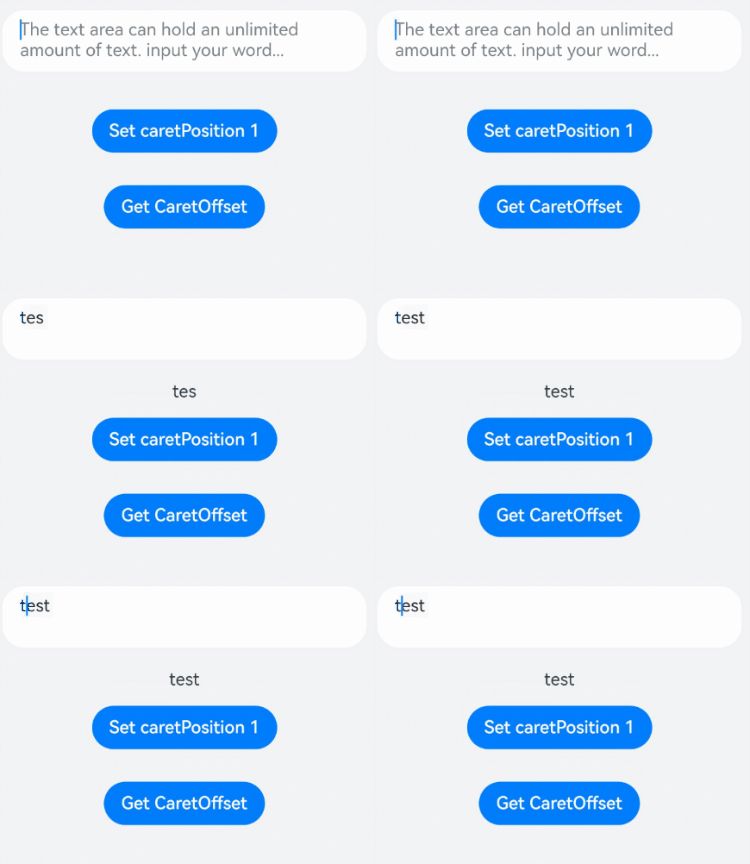
该示例通过controller实现了光标位置的设置与获取。
- // xxx.ets
- @Entry
- @Component
- struct TextAreaExample {
- @State text: string = ''
- @State positionInfo: CaretOffset = { index: 0, x: 0, y: 0 }
- controller: TextAreaController = new TextAreaController()
-
- build() {
- Column() {
- TextArea({
- text: this.text,
- placeholder: 'The text area can hold an unlimited amount of text. input your word...',
- controller: this.controller
- })
- .placeholderFont({ size: 16, weight: 400 })
- .width(336)
- .height(56)
- .margin(20)
- .fontSize(16)
- .fontColor('#182431')
- .backgroundColor('#FFFFFF')
- .onChange((value: string) => {
- this.text = value
- })
- Text(this.text)
- Button('Set caretPosition 1')
- .backgroundColor('#007DFF')
- .margin(15)
- .onClick(() => {
- // 设置光标位置到第一个字符后
- this.controller.caretPosition(1)
- })
- Button('Get CaretOffset')
- .backgroundColor('#007DFF')
- .margin(15)
- .onClick(() => {
- this.positionInfo = this.controller.getCaretOffset()
- })
- }.width('100%').height('100%').backgroundColor('#F1F3F5')
- }
- }
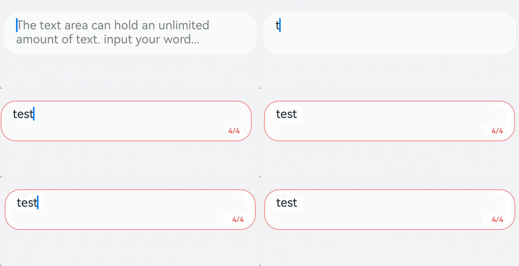
该示例通过maxLength、showCounter属性实现了计数器的功能。
- // xxx.ets
- @Entry
- @Component
- struct TextAreaExample {
- @State text: string = ''
- controller: TextAreaController = new TextAreaController()
-
- build() {
- Column() {
- TextArea({
- text: this.text,
- placeholder: 'The text area can hold an unlimited amount of text. input your word...',
- controller: this.controller
- })
- .placeholderFont({ size: 16, weight: 400 })
- .width(336)
- .height(56)
- .margin(20)
- .fontSize(16)
- .fontColor('#182431')
- .backgroundColor('#FFFFFF')
- .maxLength(4)
- .showCounter(true, { thresholdPercentage: 50, highlightBorder: true })
- //计数器显示效果为用户当前输入字符数/最大字符限制数。最大字符限制数通过maxLength()接口设置。
- //如果用户当前输入字符数达到最大字符限制乘50%(thresholdPercentage)。字符计数器显示。
- //用户设置highlightBorder为false时,配置取消红色边框。不设置此参数时,默认为true。
- .onChange((value: string) => {
- this.text = value
- })
- }.width('100%').height('100%').backgroundColor('#F1F3F5')
- }
- }
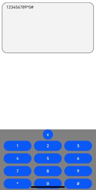
该示例通过customKeyboard属性实现了自定义键盘的功能。
- // xxx.ets
- @Entry
- @Component
- struct TextAreaExample {
- controller: TextAreaController = new TextAreaController()
- @State inputValue: string = ""
-
- // 自定义键盘组件
- @Builder CustomKeyboardBuilder() {
- Column() {
- Button('x').onClick(() => {
- // 关闭自定义键盘
- this.controller.stopEditing()
- })
- Grid() {
- ForEach([1, 2, 3, 4, 5, 6, 7, 8, 9, '*', 0, '#'], (item: number | string) => {
- GridItem() {
- Button(item + "")
- .width(110).onClick(() => {
- this.inputValue += item
- })
- }
- })
- }.maxCount(3).columnsGap(10).rowsGap(10).padding(5)
- }.backgroundColor(Color.Gray)
- }
-
- build() {
- Column() {
- TextArea({ controller: this.controller, text: this.inputValue})
- // 绑定自定义键盘
- .customKeyboard(this.CustomKeyboardBuilder()).margin(10).border({ width: 1 })
- .height(200)
- }
- }
- }
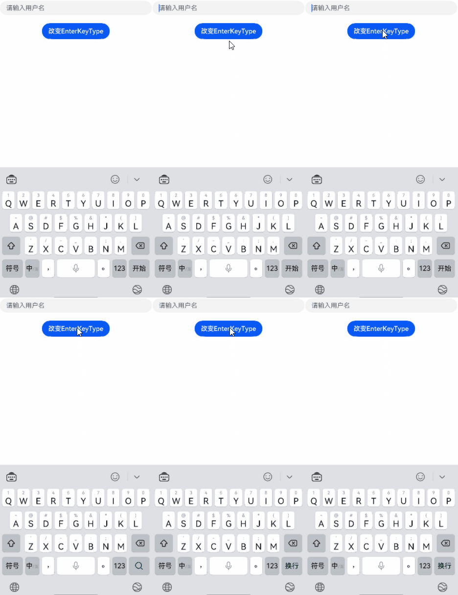
该示例通过enterKeyType属性实现了动态切换输入法回车键的效果。
- // xxx.ets
- @Entry
- @Component
- struct TextAreaExample {
- @State text: string = ''
- @State enterTypes: Array<EnterKeyType> =
- [EnterKeyType.Go, EnterKeyType.Search, EnterKeyType.Send, EnterKeyType.Done, EnterKeyType.Next,
- EnterKeyType.PREVIOUS, EnterKeyType.NEW_LINE]
- @State index: number = 0
-
- build() {
- Column({ space: 20 }) {
- TextArea({ placeholder: '请输入用户名', text: this.text })
- .width(380)
- .enterKeyType(this.enterTypes[this.index])
- .onChange((value: string) => {
- this.text = value
- })
- .onSubmit((enterKey: EnterKeyType) => {
- console.log("trigger area onsubmit" + enterKey);
- })
- Button('改变EnterKeyType').onClick(() => {
- this.index = (this.index + 1) % this.enterTypes.length;
- })
-
- }.width('100%')
- }
- }
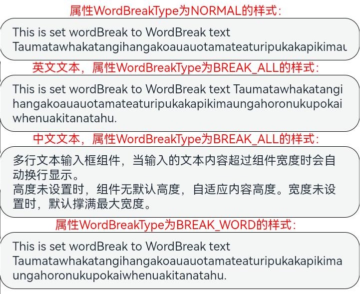
该示例通过wordBreak属性实现了TextArea不同断行规则下的效果。
- // xxx.ets
- @Entry
- @Component
- struct TextAreaExample {
- build() {
- Column() {
- Text("属性WordBreakType为NORMAL的样式:").fontSize(16).fontColor(0xFF0000)
- TextArea({
- text: 'This is set wordBreak to WordBreak text Taumatawhakatangihangakoauauotamateaturipukakapikimaungahoronukupokaiwhenuakitanatahu.'
- })
- .fontSize(16)
- .border({ width: 1 })
- .wordBreak(WordBreak.NORMAL)
- Text("英文文本,属性WordBreakType为BREAK_ALL的样式:").fontSize(16).fontColor(0xFF0000)
- TextArea({
- text: 'This is set wordBreak to WordBreak text Taumatawhakatangihangakoauauotamateaturipukakapikimaungahoronukupokaiwhenuakitanatahu.'
- })
- .fontSize(16)
- .border({ width: 1 })
- .wordBreak(WordBreak.BREAK_ALL)
- Text("中文文本,属性WordBreakType为BREAK_ALL的样式:").fontSize(16).fontColor(0xFF0000)
- TextArea({
- text: '多行文本输入框组件,当输入的文本内容超过组件宽度时会自动换行显示。\n高度未设置时,组件无默认高度,自适应内容高度。宽度未设置时,默认撑满最大宽度。'
- })
- .fontSize(16)
- .border({ width: 1 })
- .wordBreak(WordBreak.BREAK_ALL)
- Text("属性WordBreakType为BREAK_WORD的样式:").fontSize(16).fontColor(0xFF0000)
- TextArea({
- text: 'This is set wordBreak to WordBreak text Taumatawhakatangihangakoauauotamateaturipukakapikimaungahoronukupokaiwhenuakitanatahu.'
- })
- .fontSize(16)
- .border({ width: 1 })
- .wordBreak(WordBreak.BREAK_WORD)
- }
- }
- }
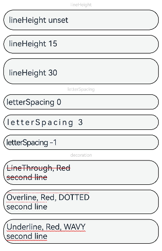
该示例通过lineHeight、letterSpacing、decoration属性展示了不同样式的文本效果。
- // xxx.ets
- @Entry
- @Component
- struct TextAreaExample {
- build() {
- Row() {
- Column() {
- Text('lineHeight').fontSize(9).fontColor(0xCCCCCC)
- TextArea({text: 'lineHeight unset'})
- .border({ width: 1 }).padding(10).margin(5)
- TextArea({text: 'lineHeight 15'})
- .border({ width: 1 }).padding(10).margin(5).lineHeight(15)
- TextArea({text: 'lineHeight 30'})
- .border({ width: 1 }).padding(10).margin(5).lineHeight(30)
-
- Text('letterSpacing').fontSize(9).fontColor(0xCCCCCC)
- TextArea({text: 'letterSpacing 0'})
- .border({ width: 1 }).padding(5).margin(5).letterSpacing(0)
- TextArea({text: 'letterSpacing 3'})
- .border({ width: 1 }).padding(5).margin(5).letterSpacing(3)
- TextArea({text: 'letterSpacing -1'})
- .border({ width: 1 }).padding(5).margin(5).letterSpacing(-1)
-
- Text('decoration').fontSize(9).fontColor(0xCCCCCC)
- TextArea({text: 'LineThrough, Red\nsecond line'})
- .border({ width: 1 }).padding(5).margin(5)
- .decoration({type: TextDecorationType.LineThrough, color: Color.Red})
- TextArea({text: 'Overline, Red, DOTTED\nsecond line'})
- .border({ width: 1 }).padding(5).margin(5)
- .decoration({type: TextDecorationType.Overline, color: Color.Red, style: TextDecorationStyle.DOTTED})
- TextArea({text: 'Underline, Red, WAVY\nsecond line'})
- .border({ width: 1 }).padding(5).margin(5)
- .decoration({type: TextDecorationType.Underline, color: Color.Red, style: TextDecorationStyle.WAVY})
- }.height('90%')
- }
- .width('90%')
- .margin(10)
- }
- }
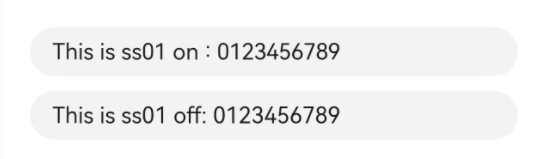
该示例通过fontFeature属性实现了文本在不同文字特性下的展示效果。
- // xxx.ets
- @Entry
- @Component
- struct TextAreaExample {
- @State text1: string = 'This is ss01 on : 0123456789'
- @State text2: string = 'This is ss01 off: 0123456789'
-
- build() {
- Column(){
- TextArea({text: this.text1})
- .fontSize(20)
- .margin({top:200})
- .fontFeature("\"ss01\" on")
- TextArea({text : this.text2})
- .margin({top:10})
- .fontSize(20)
- .fontFeature("\"ss01\" off")
- }
- .width("90%")
- .margin("5%")
- }
- }
该示例通过自定义键盘实现了键盘避让的功能。
- // xxx.ets
- @Entry
- @Component
- struct TextAreaExample {
- controller: TextAreaController = new TextAreaController()
- @State inputValue: string = ""
- @State height1:string|number = '80%'
- @State height2:number = 100
- @State supportAvoidance:boolean = true;
-
- // 自定义键盘组件
- @Builder CustomKeyboardBuilder() {
- Column() {
- Row(){
- Button('x').onClick(() => {
- // 关闭自定义键盘
- this.controller.stopEditing()
- }).margin(10)
- }
- Grid() {
- ForEach([1, 2, 3, 4, 5, 6, 7, 8, 9, '*', 0, '#'], (item: number | string) => {
- GridItem() {
- Button(item + "")
- .width(110).onClick(() => {
- this.inputValue += item
- })
- }
- })
- }.maxCount(3).columnsGap(10).rowsGap(10).padding(5)
- }.backgroundColor(Color.Gray)
- }
-
- build() {
- Column() {
- Row(){
- Button("20%")
- .fontSize(24)
- .onClick(()=>{
- this.height1 = "20%"
- })
- Button("80%")
- .fontSize(24)
- .margin({left:20})
- .onClick(()=>{
- this.height1 = "80%"
- })
- }
- .justifyContent(FlexAlign.Center)
- .alignItems(VerticalAlign.Bottom)
- .height(this.height1)
- .width("100%")
- .padding({bottom:50})
- TextArea({ controller: this.controller, text: this.inputValue})
- .height(100)
- // 绑定自定义键盘
- .customKeyboard(this.CustomKeyboardBuilder(),{ supportAvoidance: this.supportAvoidance }).margin(10).border({ width: 1 })
- // .height(200)
- }
- }
- }
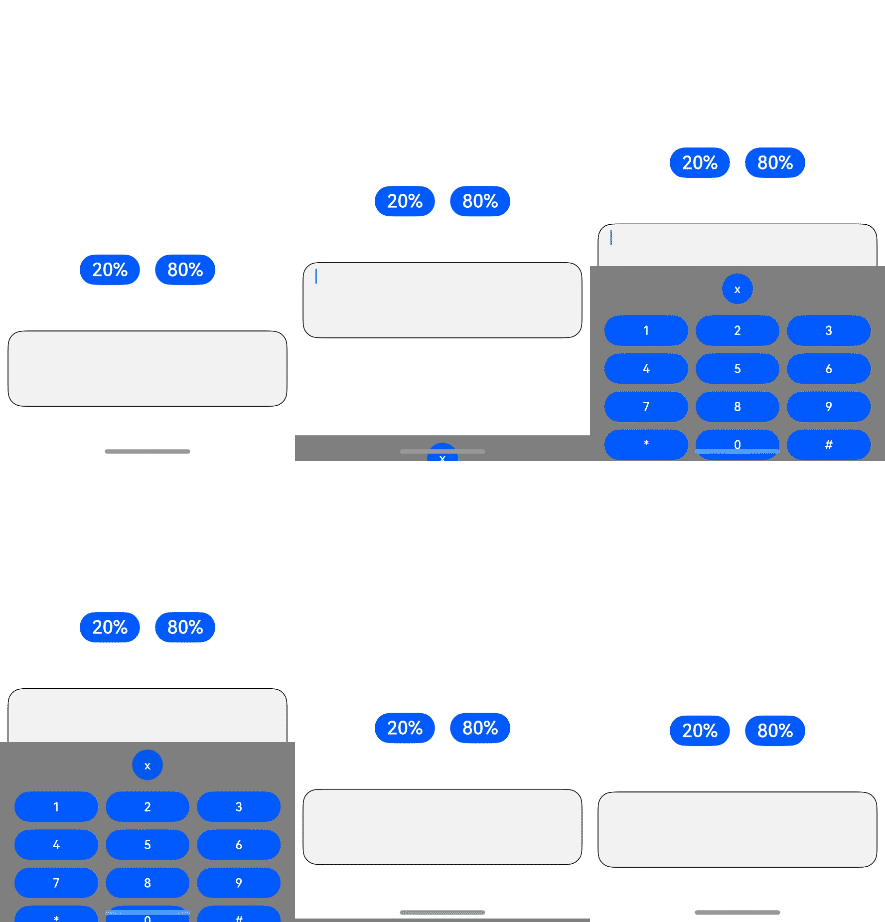
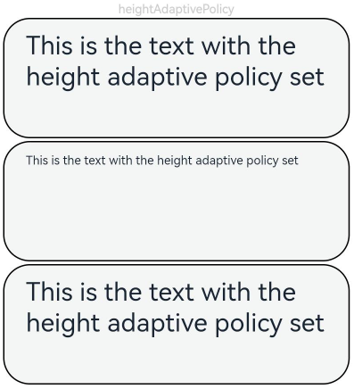
该示例通过minFontSize、maxFontSize、heightAdaptivePolicy属性展示了文本自适应字号的效果。
- // xxx.ets
- @Entry
- @Component
- struct TextAreaExample {
- build() {
- Row() {
- Column() {
- Text('heightAdaptivePolicy').fontSize(9).fontColor(0xCCCCCC)
- TextArea({text: 'This is the text with the height adaptive policy set'})
- .width('80%').height(90).borderWidth(1).margin(1)
- .minFontSize(4)
- .maxFontSize(40)
- .maxLines(3)
- .heightAdaptivePolicy(TextHeightAdaptivePolicy.MAX_LINES_FIRST)
- TextArea({text: 'This is the text with the height adaptive policy set'})
- .width('80%').height(90).borderWidth(1).margin(1)
- .minFontSize(4)
- .maxFontSize(40)
- .maxLines(3)
- .heightAdaptivePolicy(TextHeightAdaptivePolicy.MIN_FONT_SIZE_FIRST)
- TextArea({text: 'This is the text with the height adaptive policy set'})
- .width('80%').height(90).borderWidth(1).margin(1)
- .minFontSize(4)
- .maxFontSize(40)
- .maxLines(3)
- .heightAdaptivePolicy(TextHeightAdaptivePolicy.LAYOUT_CONSTRAINT_FIRST)
- }.height('90%')
- }
- .width('90%')
- .margin(10)
- }
- }
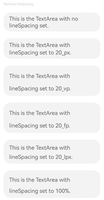
该示例通过lineSpacing属性展示了文本在不同行间距下的展示效果。
- // xxx.ets
- import { LengthMetrics } from '@kit.ArkUI'
-
- @Entry
- @Component
- struct TextAreaExample {
- build() {
- Flex({ direction: FlexDirection.Column, alignItems: ItemAlign.Start, justifyContent: FlexAlign.SpaceBetween }) {
- Text('TextArea lineSpacing.').fontSize(9).fontColor(0xCCCCCC)
- TextArea({ placeholder: 'This is the TextArea with no lineSpacing set.' })
- .fontSize(12)
- TextArea({ placeholder: 'This is the TextArea with lineSpacing set to 20_px.' })
- .fontSize(12)
- .lineSpacing(LengthMetrics.px(20))
- TextArea({ placeholder: 'This is the TextArea with lineSpacing set to 20_vp.' })
- .fontSize(12)
- .lineSpacing(LengthMetrics.vp(20))
- TextArea({ placeholder: 'This is the TextArea with lineSpacing set to 20_fp.' })
- .fontSize(12)
- .lineSpacing(LengthMetrics.fp(20))
- TextArea({ placeholder: 'This is the TextArea with lineSpacing set to 20_lpx.' })
- .fontSize(12)
- .lineSpacing(LengthMetrics.lpx(20))
- TextArea({ placeholder: 'This is the TextArea with lineSpacing set to 100%.' })
- .fontSize(12)
- .lineSpacing(LengthMetrics.percent(1))
- }.height(600).width(350).padding({ left: 35, right: 35, top: 35 })
- }
- }
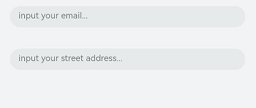
该示例通过contentType、enableAutoFill属性实现了文本自动填充的功能。
- // xxx.ets
- @Entry
- @Component
- struct TextAreaExample {
- @State text: string = ''
-
- build() {
- Column() {
- // 邮箱地址自动填充类型
- TextArea({ placeholder: 'input your email...' })
- .width('95%')
- .height(40)
- .margin(20)
- .contentType(ContentType.EMAIL_ADDRESS)
- .enableAutoFill(true)
- .maxLength(20)
- // 街道地址自动填充类型
- TextArea({ placeholder: 'input your street address...' })
- .width('95%')
- .height(40)
- .margin(20)
- .contentType(ContentType.FULL_STREET_ADDRESS)
- .enableAutoFill(true)
- .maxLength(20)
- }.width('100%').height('100%').backgroundColor('#F1F3F5')
- }
- }
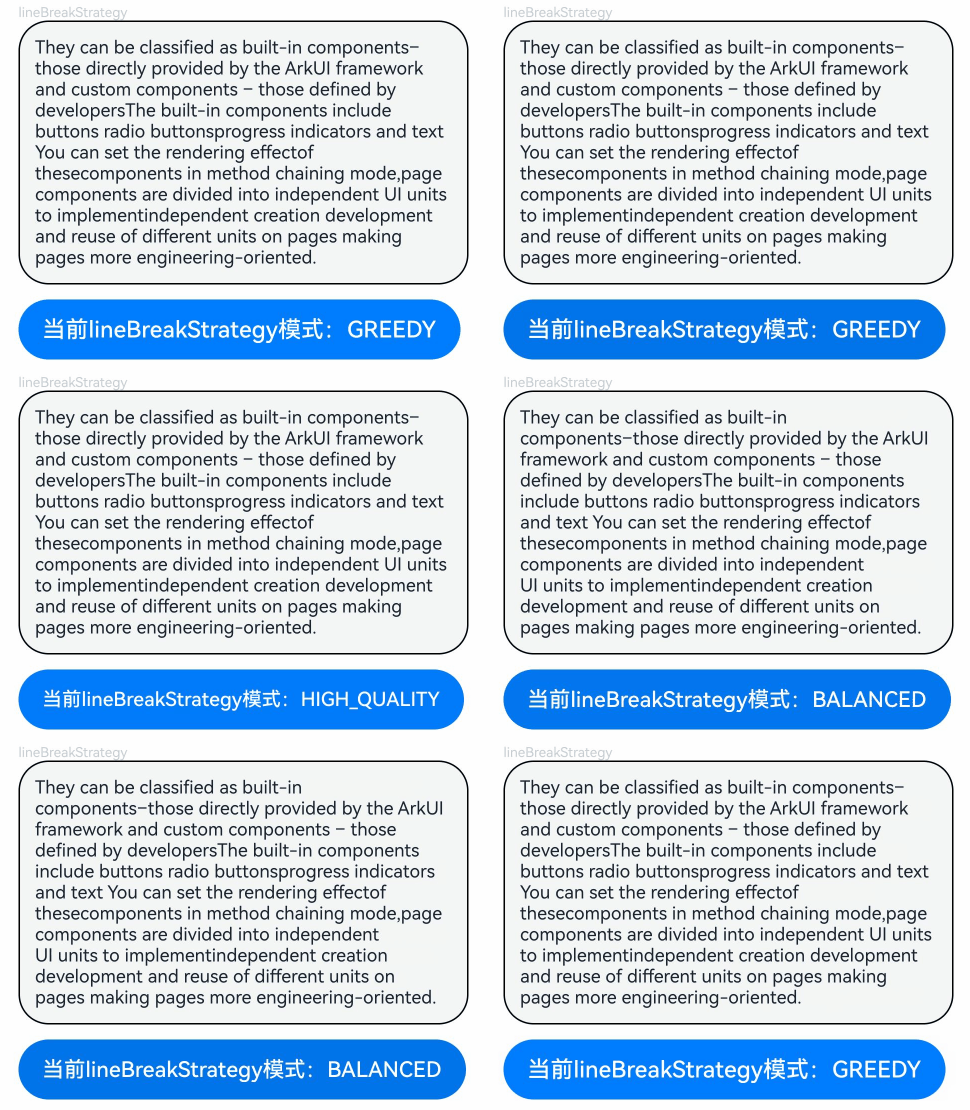
该示例通过lineBreakStrategy属性实现了TextArea不同折行规则下的效果。
- // xxx.ets
- @Entry
- @Component
- struct TextAreaExample {
- @State message1: string =
- "They can be classified as built-in components–those directly provided by the ArkUI framework and custom components – those defined by developers" +
- "The built-in components include buttons radio buttonsprogress indicators and text You can set the rendering effectof thesecomponents in method chaining mode," +
- "page components are divided into independent UI units to implementindependent creation development and reuse of different units on pages making pages more engineering-oriented."
- @State lineBreakStrategyIndex: number = 0
- @State lineBreakStrategy: LineBreakStrategy[] =
- [LineBreakStrategy.GREEDY, LineBreakStrategy.HIGH_QUALITY, LineBreakStrategy.BALANCED]
- @State lineBreakStrategyStr: string[] = ['GREEDY', 'HIGH_QUALITY', 'BALANCED']
-
- build() {
- Flex({ direction: FlexDirection.Column, alignItems: ItemAlign.Start }) {
- Text('lineBreakStrategy').fontSize(9).fontColor(0xCCCCCC)
- TextArea({ text: this.message1 })
- .fontSize(12)
- .border({ width: 1 })
- .padding(10)
- .width('100%')
- .lineBreakStrategy(this.lineBreakStrategy[this.lineBreakStrategyIndex])
- Row() {
- Button('当前lineBreakStrategy模式:' + this.lineBreakStrategyStr[this.lineBreakStrategyIndex]).onClick(() => {
- this.lineBreakStrategyIndex++
- if (this.lineBreakStrategyIndex > (this.lineBreakStrategyStr.length - 1)) {
- this.lineBreakStrategyIndex = 0
- }
- })
- }.padding({ top: 10 })
- }.height(700).width(370).padding({ left: 35, right: 35, top: 35 })
- }
- }
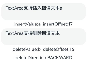
该示例通过onWillInsert、onDidInsert、onWillDelete、onDidDelete接口实现了插入和删除的功能。
- // xxx.ets
- @Entry
- @Component
- struct TextAreaExample {
- @State insertValue: string = ""
- @State deleteValue: string = ""
- @State insertOffset: number = 0
- @State deleteOffset: number = 0
- @State deleteDirection: number = 0
-
- build() {
- Row() {
- Column() {
- TextArea({ text: "TextArea支持插入回调文本" })
- .width(300)
- .height(60)
- .onWillInsert((info: InsertValue) => {
- this.insertValue = info.insertValue
- return true;
- })
- .onDidInsert((info: InsertValue) => {
- this.insertOffset = info.insertOffset
- })
-
- Text("insertValue:" + this.insertValue + " insertOffset:" + this.insertOffset).height(30)
-
- TextArea({ text: "TextArea支持删除回调文本b" })
- .width(300)
- .height(60)
- .onWillDelete((info: DeleteValue) => {
- this.deleteValue = info.deleteValue
- info.direction
- return true;
- })
- .onDidDelete((info: DeleteValue) => {
- this.deleteOffset = info.deleteOffset
- this.deleteDirection = info.direction
- })
-
- Text("deleteValue:" + this.deleteValue + " deleteOffset:" + this.deleteOffset).height(30)
- Text("deleteDirection:" + (this.deleteDirection == 0 ? "BACKWARD" : "FORWARD")).height(30)
-
- }.width('100%')
- }
- .height('100%')
- }
- }
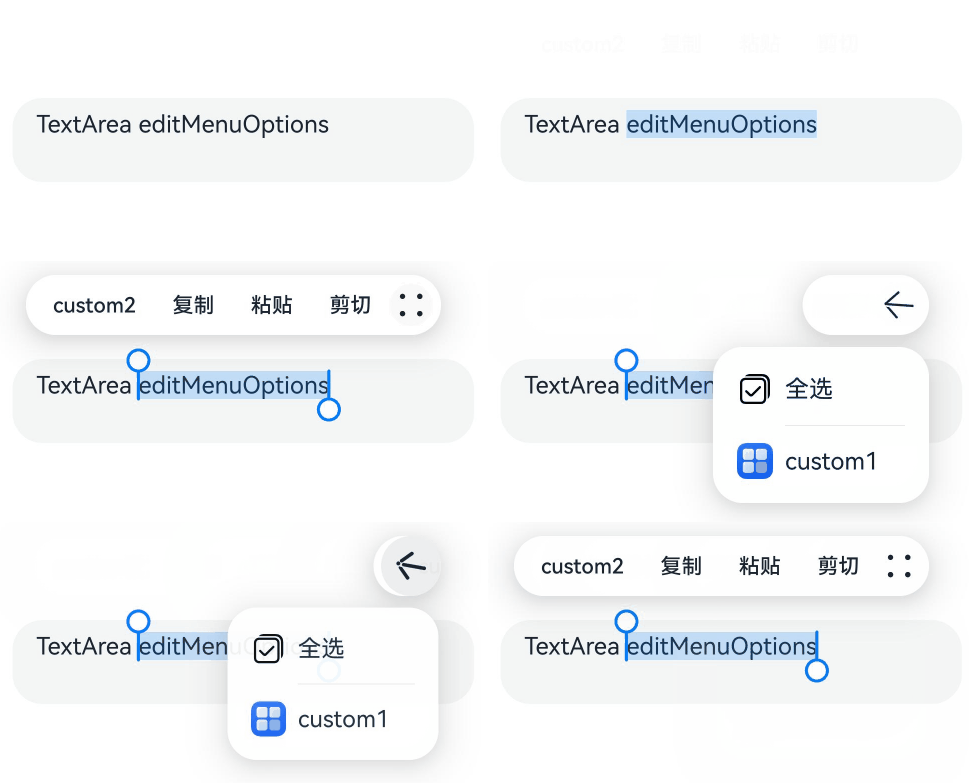
该示例通过editMenuOptions接口实现了文本设置自定义菜单扩展项的文本内容、图标以及回调的功能。
- // xxx.ets
- @Entry
- @Component
- struct TextAreaExample {
- @State text: string = 'TextArea editMenuOptions'
- onCreateMenu = (menuItems: Array<TextMenuItem>) => {
- let item1: TextMenuItem = {
- content: 'custom1',
- icon: $r('app.media.startIcon'),
- id: TextMenuItemId.of('custom1'),
- }
- let item2: TextMenuItem = {
- content: 'custom2',
- id: TextMenuItemId.of('custom2'),
- icon: $r('app.media.startIcon'),
- }
- menuItems.push(item1)
- menuItems.unshift(item2)
- return menuItems
- }
- onMenuItemClick = (menuItem: TextMenuItem, textRange: TextRange) => {
- if (menuItem.id.equals(TextMenuItemId.of("custom2"))) {
- console.log("拦截 id: custom2 start:" + textRange.start + "; end:" + textRange.end)
- return true
- }
- if (menuItem.id.equals(TextMenuItemId.COPY)) {
- console.log("拦截 COPY start:" + textRange.start + "; end:" + textRange.end)
- return true
- }
- if (menuItem.id.equals(TextMenuItemId.SELECT_ALL)) {
- console.log("不拦截 SELECT_ALL start:" + textRange.start + "; end:" + textRange.end)
- return false
- }
- return false
- }
- @State editMenuOptions: EditMenuOptions = {
- onCreateMenu: this.onCreateMenu, onMenuItemClick: this.onMenuItemClick
- }
-
- build() {
- Column() {
- TextArea({ text: this.text })
- .width('95%')
- .height(56)
- .editMenuOptions(this.editMenuOptions)
- .margin({ top: 100 })
- }
- .width("90%")
- .margin("5%")
- }
- }