


Intelligent Assistant
Chat with our virtual assistant to get answers promptly.
The noticebar element is used to display bulletins, system notifications, ads and so on. This element has the following features:
The following figure shows the effect.
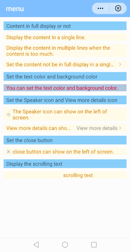
The basic layout code is as follows:
- <template>
- <div class="container">
- <text class="section">Basic layout</text>
- <noticebar class="notice" show-icon="true" show-close="true" scrollable="true"
- background-color="#B0C4DE" color="#DC143C"
- text="Quick apps are a new form of installation-free apps developed based on industry standards formulated by Quick App Alliance, which consists of mainstream mobile phone vendors in China." >
- </noticebar>
- </div>
- </template>
The layout of the notice bar element consists the bulletins, close button, speaker icon, scrolling text and text element for viewing more details.
- <template>
- <!-- Only one root node is allowed in template. -->
- <div class="container" style="background-color: {{backgroundColor}};display:{{displaynotice}}">
- <image class="img" if="{{showClose}}" src="./Images/close.png" onclick="close"></image>
- <image class="img" if="{{showIcon}}" src="./Images/sound.png"></image>
- <block if="{{scrollable}}">
- <div id="box" class="box">
- <text id="txt1" class="scrolltxt" style="width: {{textWidth}};color: {{color}}">{{ text }}</text>
- </div>
- </block>
- <block elif="{{showGetMore}}">
- <text class="elliptxt" style="color: {{color}}">{{ text }}</text>
- <div class="moreBox" onclick="getMore">
- <text class="moretxt" style="color: {{moreColor}}">{{ moreText }}</text>
- <image class="img" src="./Images/more.png"></image>
- </div>
- </block>
- <block else>
- <text class="plaintxt" style="color: {{color}}">{{ text }}</text>
- </block>
- </div>
- </template>
Supported attributes
Attribute | Type | Default Value | Description |
|---|---|---|---|
text | String | - | Text displayed on the notice bar. |
moreText | String | - | Text of the text element. This attribute is used when the content of the notice bar is not completely displayed. |
backgroundColor | Boolean | true | Background color of the notice bar. |
color | Color | #de8c17 | Color of the text displayed on the notice bar. |
speed | Number | 160 | Scrolling speed of the text. The default speed is 160 px per second. |
moreColor | Color | #999999 | Text color of the text element. |
scrollable | Boolean | false | Indicates whether text is scrolled. NOTE If the value is true, the text can be displayed only in a single line on the notice bar. |
showIcon | Boolean | false | Indicates whether to display the icon on the left side. |
showClose | Boolean | false | Indicates whether to display the close icon. Tap this icon to close the notice bar. |
showGetMore | Boolean | false | Indicates whether to display the text element for viewing more details. |
Supported event
Event | Parameter | Description |
|---|---|---|
getmore | {} | Event of viewing more details. |
The text displays on the notification bar and then starts to scroll left. When the text disappears, it scrolls from the right edge.
You need to calculate the actual width of the scrolling text in a single line in advance. If the width is longer than the device width, some text will not be displayed.
If the text width is smaller than that of the device screen, set the text width to the width of the device screen. Currently, the quick app does not provide the API for calculating the width of the text. However, this width is required for scrolling the text, without which the text is truncated by default. The width in this section is calculated based on the following formula: Width of the text = Width of a single text * Number of characters.
The animation duration depends on the text width. The wider the text is, the longer the animation duration is.
- onInit() {
- console.log("oninit showGetMore=" + this.showGetMore);
- console.log("oninit scrollable=" + this.scrollable);
- if (this.scrollable) {
- this.initScrollNoticeSize();
- }
- },
-
- initScrollNoticeSize() {
- this.deviceWidth = device.getInfoSync().screenWidth;
- console.info("initScrollNotice deviceWidth=" + this.deviceWidth);
- let len = this.text.length;
- console.log("onInit txt len=" + len);
- let w = this.singleTxtWidth * len;
- if (w < this.deviceWidth) {
- this.textWidth = this.deviceWidth;
- } else {
- this.textWidth = w;
- }
- console.log("textWidth= " + this.textWidth);
- setTimeout(() => {
- //this.calTextWidth();
- this.calBoxWidth();
- }, 1000);
- },
- close: function () {
- console.log("close=");
- this.stopAnimation = true;
- this.displaynotice = "none";
- this.$emit('close');
- },
Do not process the redirection logic in the subelement because each notice bar corresponds to a different notice page.
- getMoreDetail:function (evt){
- console.info("getMoreDetail evt:"+JSON.stringify(evt));
- prompt.showToast({
- message: JSON.stringify(evt.detail),
- duration: 2000,
- gravity: 'center'
- })
- }
- <noticebar class="notice" show-get-more="true" more-text="View more details" @getmore="getMoreDetail" text="[The text cannot be displayed in a single line] Quick apps are a new form of installation-free apps developed based on industry standards." ></noticebar>
- getMore: function () {
- console.info("getMore"+this.text);
- this.$emit('getmore', this.text);
- },
The following figure shows the effect.
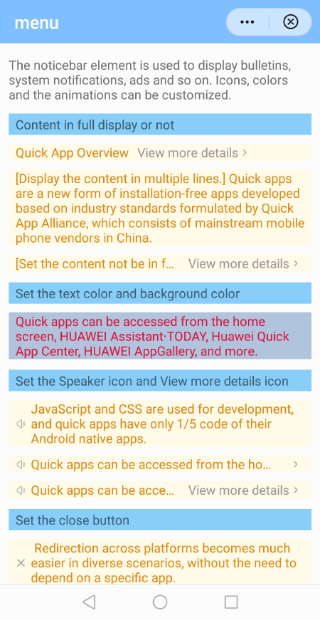
Cause analysis: The default value of flex-shrink is 1 in CSS. When the space calculated by the engine is insufficient, the icon is compressed.
Solution: Set flex-shrink to 0 to not resize the element.
The following figure shows the effect.
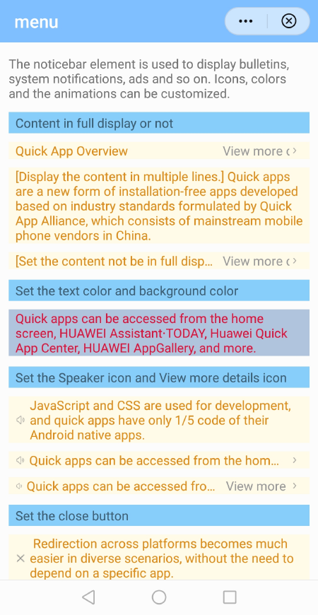
Solution: Set the width of elliptxt to 100% so that the text element is always displayed on the right side of the screen.
noticebar.ux file:
- <template>
- <!-- Only one root node is allowed in template. -->
- <div class="container" style="background-color: {{backgroundColor}};display:{{displaynotice}}">
- <image class="img" if="{{showClose}}" src="./Images/close.png" onclick="close"></image>
- <image class="img" if="{{showIcon}}" src="./Images/sound.png"></image>
- <block if="{{scrollable}}">
- <div id="box" class="box">
- <text id="txt1" class="scrolltxt" style="width: {{textWidth}};color: {{color}}">{{ text }}</text>
- </div>
- </block>
- <block elif="{{showGetMore}}">
- <text class="elliptxt" style="color: {{color}}">{{ text }}</text>
- <div class="moreBox" onclick="getMore">
- <text class="moretxt" style="color: {{moreColor}}">{{ moreText }}</text>
- <image class="img" src="./Images/more.png"></image>
- </div>
- </block>
- <block else>
- <text class="plaintxt" style="color: {{color}}">{{ text }}</text>
- </block>
- </div>
- </template>
- <style>
- .container {
- width: 100%;
- flex-direction: row;
- align-items: center;
- padding-left: 16px;
- padding-right: 16px;
- }
- .img {
- width: 28px;
- height: 28px;
- align-self: center;
- margin-right: 8px;
- resize-mode: contain;
- flex-shrink: 0;
- }
- .box {
- flex-direction: column;
- align-items: flex-start;
- }
- .moreBox {
- flex-direction: row;
- align-items: center;
- margin-left: 20px;
- flex-shrink: 0;
- }
- .moretxt {
- lines: 1;
- flex-shrink: 0;
- }
- .title {
- lines: 1;
- }
- .scrolltxt {
- lines: 1;
- margin-left: 20px;
- }
- .elliptxt {
- text-overflow: ellipsis;
- lines: 1;
- width: 100%;
- }
- .plaintxt {
- align-self: flex-start;
- }
- </style>
- <script>
- import device from '@system.device';
- module.exports = {
- props: {
- text: {
- type: String,
- default: ''
- },
- moreText: {
- type: String,
- default: ''
- },
- backgroundColor: {
- type: String,
- default: '#fffbe8'
- },
- speed: {
- // The default scrolling speed is 100 px per second.
- type: Number,
- default: 160
- },
- color: {
- type: String,
- default: '#de8c17'
- },
- moreColor: {
- type: String,
- default: '#999999'
- },
- scrollable: {
- // Scroll the text or not. The text does not scroll by default.
- type: Boolean,
- default: false
- },
- showIcon: {
- // Display the icon on the left side or not.
- type: [Boolean, String],
- default: false
- },
- showGetMore: {
- // Display the view more details icon on the right side or not.
- type: [Boolean, String],
- default: false
- },
- showClose: {
- // Display the close button on the left side or not.
- type: Boolean,
- default: false
- }
- },
- data() {
- return {
- singleTxtWidth: 80,
- textWidth: 750,
- deviceWidth: 0,
- boxWidth: 0,
- speed: 100,
- stopAnimation: false,
- displaynotice: "flex",
- animationDuration: 'none',
- animationPlayState: 'paused',
- animationDelay: '0s'
- }
- },
- onInit() {
- console.log("oninit showGetMore=" + this.showGetMore);
- console.log("oninit scrollable=" + this.scrollable);
- if (this.scrollable) {
- this.initScrollNoticeSize();
- }
- },
- initScrollNoticeSize() {
- this.deviceWidth = device.getInfoSync().screenWidth;
- console.info("initScrollNotice deviceWidth=" + this.deviceWidth);
- let len = this.text.length;
- console.log("onInit txt len=" + len);
- let w = this.singleTxtWidth * len;
- if (w < this.deviceWidth) {
- this.textWidth = this.deviceWidth;
- } else {
- this.textWidth = w;
- }
- console.log("textWidth= " + this.textWidth);
- setTimeout(() => {
- //this.calTextWidth();
- this.calBoxWidth();
- }, 1000);
- },
- calTextWidth() {
- var that = this;
- this.$element('txt1').getBoundingClientRect({
- success(res) {
- let msg = JSON.stringify(res);
- console.log ('calTextWidth current coordinate:' + msg);
- that.textleft = res.left;
- console.log("calTextWidth this.textleft=" + that.textleft);
- },
- fail() {
- console.log ('calTextWidth failed.');
- },
- complete() {
- console.log('calTextWidth complete')
- }
- })
- },
- calBoxWidth() {
- var that = this;
- this.$element('box').getBoundingClientRect({
- success(res) {
- let msg = JSON.stringify(res);
- console.log ('calBoxWidth current coordinate:' + msg);
- that.boxWidth = res.width;
- that.startAnimateScroll();
- },
- fail() {
- console.log ('calBoxWidth failed.');
- },
- complete() {
- console.log('calBoxWidth complete')
- }
- })
- },
- startAnimateScroll() {
- var that = this;
- this.duration = this.textWidth / this.speed * 1000;
- console.log("startAnimateScroll this.duration=" + this.duration)
- this.animationDelay = this.boxWidth / this.speed;
- let dis = -1 * this.textWidth;
- var options = {
- duration: this.duration,
- easing: 'linear',
- delay: this.animationDelay,
- fill: 'forwards'
- }
- var frames = [
- {
- transform: {
- translateX: 0,
- }
- },
- {
- transform: {
- translateX: dis,
- }
- }];
- var animation = this.$element('txt1').animate(frames, options);
- animation.play();
- animation.onfinish = function () {
- console.log("animation onfinish");
- that.animationLoop();
- }
- animation.oncancel = function () {
- console.log("animation oncancel");
- }
- },
- animationLoop() {
- if (this.stopAnimation) {
- return;
- }
- var that = this;
- this.duration = this.textWidth / this.speed * 1000;
- var options = {
- duration: this.duration, easing: 'linear',
- delay: 0,
- fill: 'forwards'
- }
- let value1 = this.boxWidth + 200;
- console.log("animationLoop value1=" + value1);
- let value2 = -1 * this.textWidth;
- var frames = [
- {
- transform: {
- translateX: value1,
- }
- },
- {
- transform: {
- translateX: value2,
- }
- }];
- var animation = this.$element('txt1').animate(frames, options);
- animation.play();
- animation.onfinish = function () {
- console.log("animation onfinish");
- that.animationLoop();
- }
- animation.oncancel = function () {
- console.log("animation oncancel");
- }
- },
- onDestroy: function () {
- console.log("ondestroy");
- this.stopAnimation = true;
- },
- click: function () {
- },
- close: function () {
- console.log("close=");
- this.stopAnimation = true;
- this.displaynotice = "none";
- this.$emit('close');
- },
- getMore: function () {
- console.info("getMore"+this.text);
- this.$emit('getmore', this.text);
- },
- }
- </script>
hello.ux file:
- <import name="noticebar" src="../Component/noticebar.ux"></import>
- <template>
- <!-- Only one root node is allowed in template. -->
- <div class="container">
- <text class="example-info">The noticebar element is used to display bulletins, system notifications, ads and so on. Icons, colors and the animations can be customized.</text>
- <text class="section">Content in full display or not</text>
- <noticebar class="notice" text="Quick App Overview" show-get-more="true" more-text="View more details" @getmore="getMoreDetail"></noticebar>
- <noticebar class="notice" text="[Display the content in multiple lines.] Quick apps are a new form of installation-free apps developed based on industry standards formulated by Quick App Alliance, which consists of mainstream mobile phone vendors in China." ></noticebar>
- <noticebar class="notice" show-get-more="true" more-text="View more details" @getmore="getMoreDetail" text="[The text cannot be displayed in a single line] Quick apps are a new form of installation-free apps developed based on industry standards." ></noticebar>
- <text class="section">Set the text color and background color</text>
- <noticebar class="notice" background-color="#B0C4DE" color="#DC143C" text="Quick apps can be accessed from the home screen, HUAWEI Assistant∙TODAY, Huawei Quick App Center, HUAWEI AppGallery, and more." ></noticebar>
- <text class="section">Set the speaker icon and the text element for viewing more details.</text>
- <noticebar class="notice" show-icon="true" text="JavaScript and CSS are used for development, and quick apps have only 1/5 code of their Android native apps." ></noticebar>
- <noticebar class="notice" show-icon="true" show-get-more="true" @getmore="getMoreDetail" text="Quick apps can be accessed from the home screen, HUAWEI Assistant∙TODAY, Huawei Quick App Center, HUAWEI AppGallery, and more." ></noticebar>
- <noticebar class="notice" show-icon="true" show-get-more="true" more-text="View more details" @getmore="getMoreDetail" text="Quick apps can be accessed from the home screen, HUAWEI Assistant∙TODAY, Huawei Quick App Center, HUAWEI AppGallery, and more." ></noticebar>
- <text class="section">Set the close icon</text>
- <noticebar class="notice" show-close="true" text=" Redirection across platforms becomes much easier in diverse scenarios, without the need to depend on a specific app." ></noticebar>
- <text class="section">Scroll the text</text>
- <noticebar class="notice" scrollable="true" text="Quick apps are a new form of installation-free apps developed based on industry standards formulated by Quick App Alliance, which consists of mainstream mobile phone vendors in China." ></noticebar>
- </div>
- </template>
-
- <style>
- .container {
- flex-direction: column;
- padding-left: 20px;
- padding-right: 20px;
- }
- .example-info{
- margin-top: 30px;
- }
- .notice{
- margin-top: 20px;
- }
- .section{
- background-color: #87cefa;
- width: 100%;
- height: 50px;
- margin-top: 25px;
- padding-left: 16px;
- }
- </style>
-
- <script>
- import prompt from '@system.prompt';
- module.exports = {
- data: {
- },
- onInit() {
- this.$page.setTitleBar({
- text: 'menu',
- textColor: '#ffffff',
- backgroundColor: '#007DFF',
- backgroundOpacity: 0.5,
- menu: true
- });
- },
- getMoreDetail:function (evt){
- console.info("getMoreDetail evt:"+JSON.stringify(evt));
- prompt.showToast({
- message: JSON.stringify(evt.detail),
- duration: 2000,
- gravity: 'center'
- })
- }
- }
- </script>