


智能客服
你问我答,随时在线为你解决问题















toolbar为页面工具栏组件,用于展示针对当前界面的操作选项,可作为页面的一级导航。具体用法请参考toolbar。
在pages/index目录下的hml文件中创建一个toolbar组件。
- <!-- xxx.hml -->
- <div class="container">
- <toolbar style="background-color: #F1F3F5;">
- <toolbar-item value="item1"></toolbar-item>
- <toolbar-item value="item2"></toolbar-item>
- </toolbar>
- </div>
- /* xxx.css */
- .container {
- width: 100%;
- height: 100%;
- flex-direction: column;
- justify-content: center;
- align-items: center;
- background-color: #F1F3F5;
- }
- toolbar-item{
- font-size: 35px;
- }
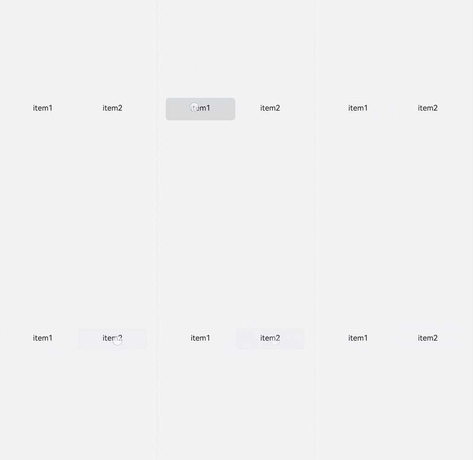
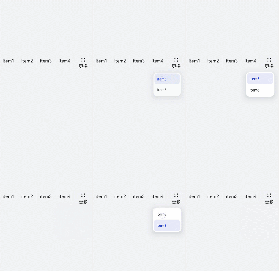
toolbar组件仅支持toolbar-item为子组件,页面最多可以展示5个toolbar-item子组件,如果存在6个及以上toolbar-item,则保留前面4个,后续的将收纳到工具栏上的更多项中,通过点击更多项弹窗进行展示。并且更多项展示的组件样式采用系统默认样式,toolbar-item上设置的自定义样式不生效。
- <!-- xxx.hml -->
- <div class="container">
- <toolbar>
- <toolbar-item value="item1"></toolbar-item>
- <toolbar-item value="item2"></toolbar-item>
- <toolbar-item value="item3"></toolbar-item>
- <toolbar-item value="item4"></toolbar-item>
- <toolbar-item value="item5"></toolbar-item>
- <toolbar-item value="item6"></toolbar-item>
- </toolbar>
- </div>
- /* xxx.css */
- .container {
- width: 100%;
- height: 100%;
- flex-direction: column;
- justify-content: center;
- align-items: center;
- background-color: #F1F3F5;
- }
- toolbar-item{
- font-size: 35px;
- }
设置position样式控制toolbar组件的位置,并设置子组件toolbar-item的字体颜色、大小及背景色。
- <!-- xxx.hml -->
- <div class="container">
- <toolbar style="position: fixed;bottom: 5%;width: 100%;background-color: #F1F3F5;">
- <toolbar-item value="item1" icon="common/images/1.png" class="toolbarActive"></toolbar-item>
- <toolbar-item value="item2" icon="common/images/2.png"></toolbar-item>
- <toolbar-item value="item3" icon="common/images/1.png"></toolbar-item>
- <toolbar-item value="item4" icon="common/images/2.png"></toolbar-item>
- </toolbar>
- </div>
- /* xxx.css */
- .container {
- background-color: #F1F3F5;
- flex-direction: column;
- width: 100%;
- height: 100%;
- justify-content: center;
- align-items: center;
- }
- toolbar-item{
- font-size: 35px;
- }

分别给toolbar-item绑定单击事件和长按事件,单击后文本变红,长按时文本变蓝。
- <!-- xxx.hml -->
- <div class="container">
- <toolbar style="position: fixed;top: 50%;width: 100%;background-color: #F1F3F5;">
- <toolbar-item value="item1" icon="common/images/1.png" style="color: {{itemColor}};" onclick="itemClick"></toolbar-item>
- <toolbar-item value="item2" icon="common/images/2.png" style="color: {{itemColor}}"></toolbar-item>
- <toolbar-item value="item3" icon="common/images/3.png" style="color: {{itemColor}}" onlongpress="itemLongPress"></toolbar-item>
- </toolbar>
- </div>
- /* xxx.css */
- .container {
- background-color: #F1F3F5;
- flex-direction: column;
- width: 100%;
- height: 100%;
- justify-content: center;
- align-items: center;
- }
- toolbar-item{
- font-size: 35px;
- }
- // xxx.js
- import promptAction from '@ohos.promptAction';
- export default {
- data:{
- itemColor:'black'
- },
- itemClick(){
- this.itemColor= "red";
- promptAction.showToast({duration:2000,message:'item click'});
- },
- itemLongPress(){
- promptAction.showToast({duration:2000,message:'item long press'});
- this.itemColor= "blue";
- },
- }
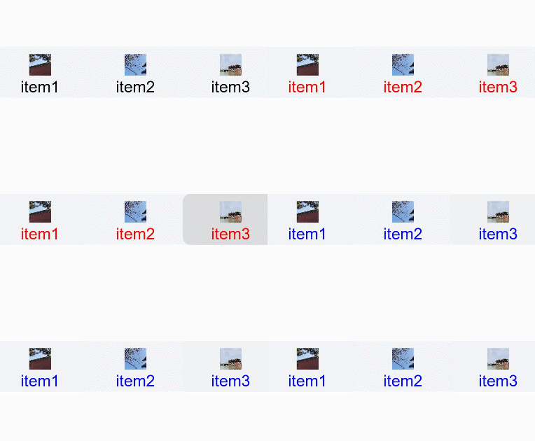
toolbar组件不支持添加事件和方法,但其子组件toolbar-item支持。
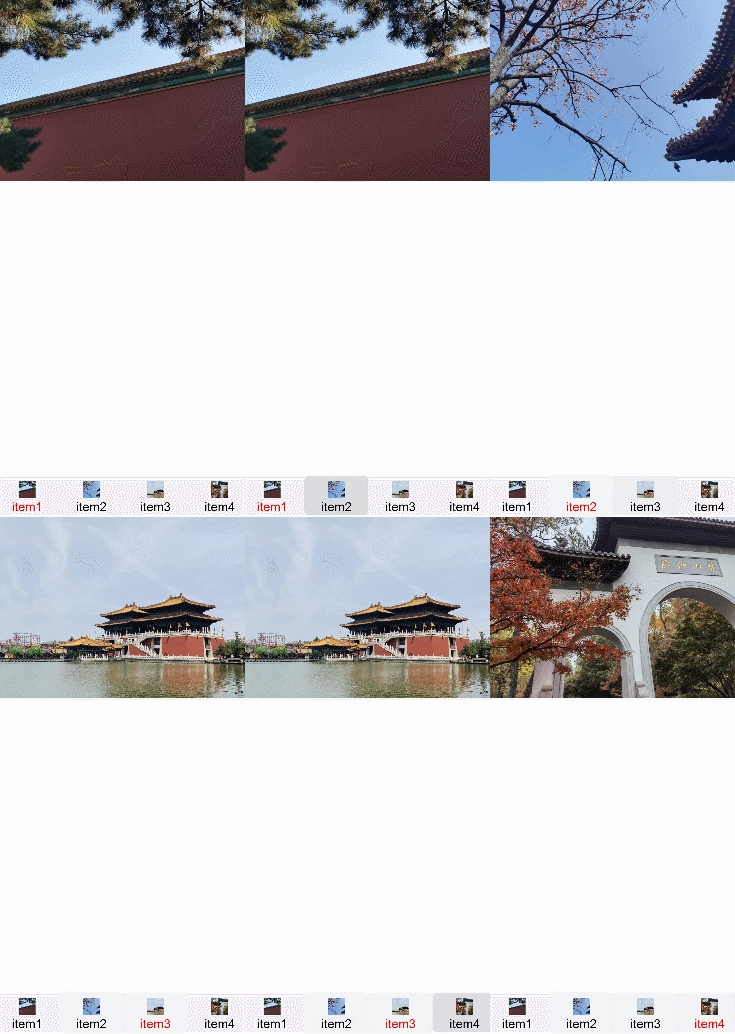
本场景中开发者可点击toolbar-item组件,改变当前组件文本颜色并更换相对应的图片内容。
使用for循环创建toolbar-item组件并添加点击事件,点击后获得索引值进行存储。设置文本颜色时,判断当前索引值是否为储存的值,若相同则设置为红色,不同则使用默认颜色。
- <!-- xxx.hml -->
- <div class="container">
- <image src="{{imgList[active]}}"></image>
- <toolbar style="position: fixed;bottom: 5%;width: 100%;background-color: #F1F3F5;">
- <toolbar-item value="{{ item.option}}" icon="{{item.icon}}" style="color: {{active == $idx?'red':'black'}};background-color: {{active== $idx?'#dbe7f1':'#F1F3F5'}};" for="{{item in itemList}}" onclick="itemClick({{$idx}})"></toolbar-item>
- </toolbar>
- </div>
- /* xxx.css */
- .container {
- background-color: #F1F3F5;
- flex-direction: column;
- width: 100%;
- justify-content: center;
- align-items: center;
- }
- toolbar-item{
- font-size: 35px;
- }
- // xxx.js
- export default {
- data:{
- active: 0,
- imgList:["common/images/1.png","common/images/2.png","common/images/3.png","common/images/4.png"],
- itemList:[
- {option:'item1',icon:'common/images/1.png'},
- {option:'item2',icon:'common/images/2.png'},
- {option:'item3',icon:'common/images/3.png'},
- {option:'item4',icon:'common/images/4.png'},
- ]
- },
- itemClick(id){
- this.active= id;
- },
- }
智能客服
你问我答,随时在线为你解决问题
合作咨询
我们的专家服务团队将竭诚为您提供专业的合作咨询服务
解决方案
精准高效的一站式服务支持,助力开发者商业成功