
Small theme: The small theme is the theme of changing the skin of the lock screen, home screen and icons range.
Large theme: The large theme is the theme of changing the skin of the lock screen, home screen, icons, contacts, messaging, quick settings, phone range.
Lock screen theme: The lock screen theme is a theme that only changes the skin of the lock screen.
Icon theme: Icon themes are themes that only changes the skin the icons.
All the above types of themes can be made directly using the hwt-Tool.
| Classification | Name in theme package | Small theme | Large theme | Lock screen theme | Icon theme |
|---|---|---|---|---|---|
| Lock screen | unlock | 1 | 1 | 1 | / |
| Wallpaper | wallpaper | 2 | 2 | 1 | / |
| Icons | icons | 62 | 62 | / | 62 |
| Home screen | com.huawei.android.launcher | 1 | 1 | / | 1 |
| Contacts | com.android.contacts | / | 1 | / | / |
| Messaging | com.android.mms | / | 1 | / | / |
| Quick settings | com.android.systemui | / | 1 | / | / |
| Phone setting | com.android.phone | / | 1 | / | / |
| Phone setting-recorder | com.android.phone.recorder | / | 1 | / | / |
| Phone setting-telecom | com.android.server.telecom | / | 1 | / | / |
| Preview | preview | 6-15 | 11-15 | 3-15 | 4-15 |
| Description | description.xml | 1 | 1 | 1 | 1 |
After export the theme, you can conduct self-tests according to the test specifications. After the self-check is correct, you can refer to the upload guide to upload the theme package to the Developer Alliance.
Small theme contains:
Lock screen
Wallpaper
Icons
Home screen
Preview
Description
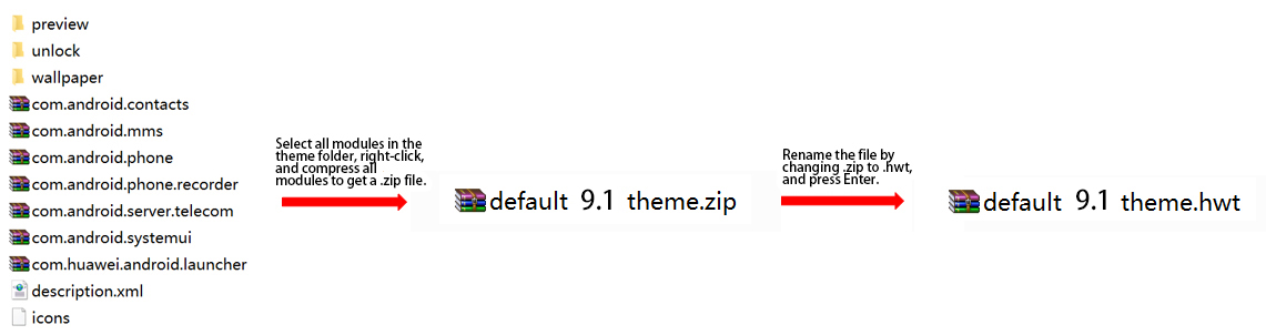
As shown in the figure below, by packaging the all files of the small theme, a small theme is completed:
In addition to the small theme content, large theme also contain:
Contacts
Messaging
Quick settings
Phone setting
Phone setting-recorder
Phone setting-telecom
As shown in the figure below, by packaging the all files of the large theme, a large theme is completed:
Lock screen theme contains:
Lock screen
The lock screen wallpaper in the wallpaper: unlock_wallpaper_X
Preview
Description
As shown in the figure below, by packaging the all files of the lock screen theme, alock screen themeis completed:

Icon theme contains:
Icons
Home screen
Preview
Description
As shown in the figure below, by packaging the all files of the Icon theme, a Icon theme is completed:

The lock screen methods of EMUI9.1 are as follows: slide unlock, magazine unlock, combined unlock and video unlock. Choose one of four.
For all types of lock screens, there must be a theme.xml file in the unlock folder. And they can also all be made using hwt-Tool.
The slide unlock is a full screen sliding unlock of a static wallpaper. The lock screen wallpaper needs to be placed in the wallpaper folder.
The size of the lock screen wallpaper is: 1080 × 2160px, the format is .jpg, and the file name is: unlock_wallpaper_X.jpg (X is the Arabic numerals in order, the first wallpaper X is 0).
The lock screen wallpaper sample is as follows:

Only one xml file in the slide unlock theme package. The displayed content shows the default effect. The code is fixed and designers can only modify the wallpaper, as shown below:
- <?xmlversion="1.0" encoding="UTF-8"?>
- -<HWTheme>
- <itemstyle="slide"/>
- </HWTheme>
The effect of the slide unlock is shown below:
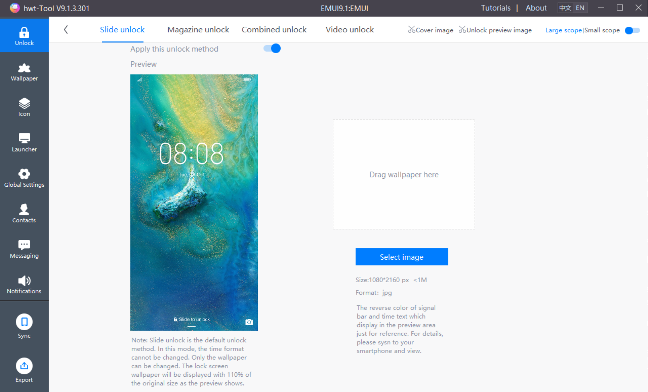
The slide unlock can be visually made by hwt-Tool:
When the magazine unlock is turned on in the settings, a different lock screen wallpaper is displayed each time the screen is lit, and the lock screen wallpaper designed by the designer is displayed for the first time.The lock screen wallpaper needs to be placed in the wallpaper folder.
The size of the lock screen wallpaper is: 1080 × 2160px, the format is .jpg, and the file name is: unlock_wallpaper_X.jpg (X is the Arabic numerals in order, the first wallpaper X is 0).
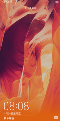
The lock screen wallpaper sample is as follows:
Magazine unlock is similar to slide to unlock. Only one .xml file is in the theme package. The displayed content shows the default effect. The code is fixed and designers can only modify the wallpaper, as shownbelow:
- <?xmlversion="1.0" encoding="UTF-8"?>
- -<HWTheme>
- <itemstyle="magazine"/>
- </HWTheme>
The effect of the magazine unlock is shown below:
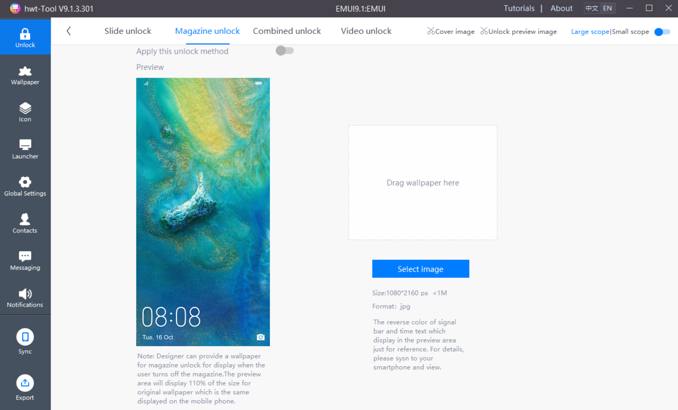
The magazine unlock can be visually made by hwt-Tool:
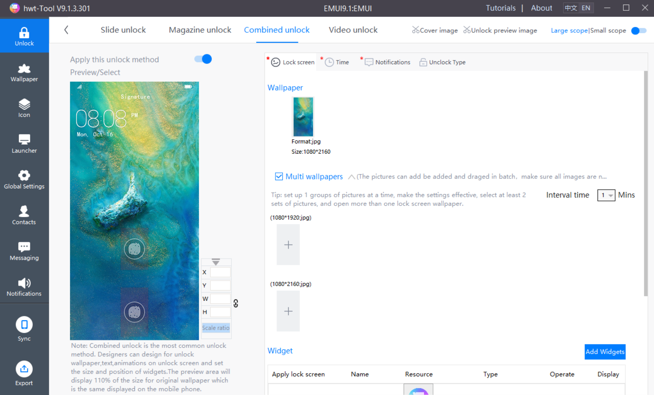
Combined unlock can be used to develop user interface with changing styles under certain requirements. It is easy to change the interface style, animation and even interactive mode. The combined unlock can be visually made by hwt-Tool:
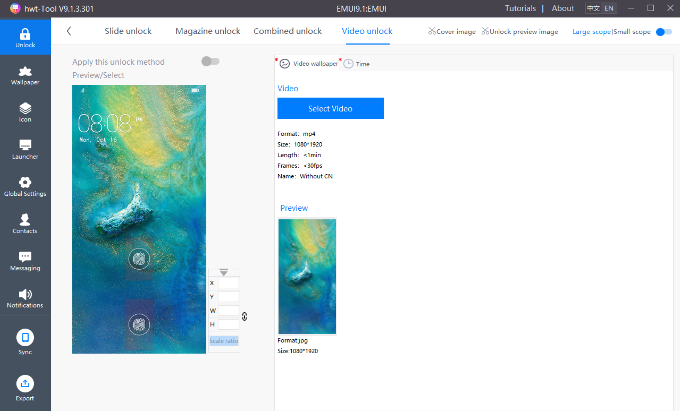
Video unlock is a lock screen that cyclically plays video on the lock screen. By default, full screen slides to unlock. The designer can make a video unlock wallpaper, and can modify the lock screen time cut, date and the color of the morning and afternoon.The video unlockcan be visually made by hwt-Tool:
The wallpaper is divided into home screen wallpaper and lock screen wallpaper, The size of the wallpaper should not exceed 1 MB. Multiple wallpapers can be set.
Designers should note that due to the features in EMUI9.1, the actual display of the lock screen wallpaper is magnified by 10%.
The lock screen wallpapers must be placed in wallpaper, in order to be compatible with phones that feature a display of 18:9 or above.
The size of the home screen wallpaper is: 2160 × 2160px, the format is .jpg, and the file name is: home_wallpaper_X.jpg (X is the Arabic numerals in order, the first wallpaper X is 0).
The home screen wallpaper template is as follows:
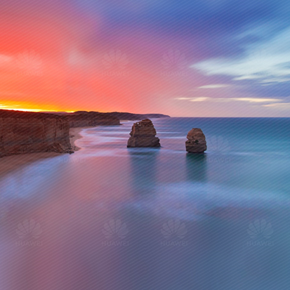
The size of the lock screen wallpaper is: 1080 × 2160px, the format is .jpg, and the file name is: unlock_wallpaper_X.jpg (X is the Arabic numerals in order, the first wallpaper X is 0).
The lock screen wallpapertemplateis as follows:
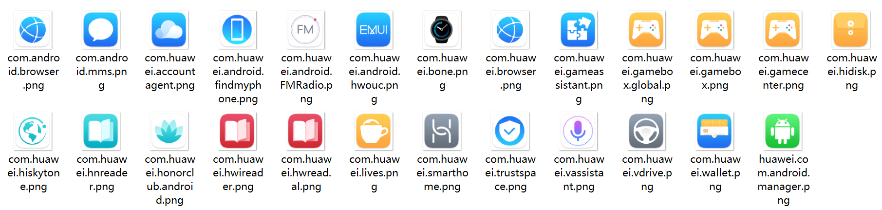
The icons include system icons and third-party icons. The system icons are further classified into dynamic icons and static icons. Size of icons: 192×192 px. Format of icons: png.
Modified item:
There are a total of 62+25 static icons, 62 are mandatory, and the remaining 25 are optional.
The static icons for Calendar and Clock cannot contain any misleading digits.
Two apps cannot use the same icon.
62 mandatory icons
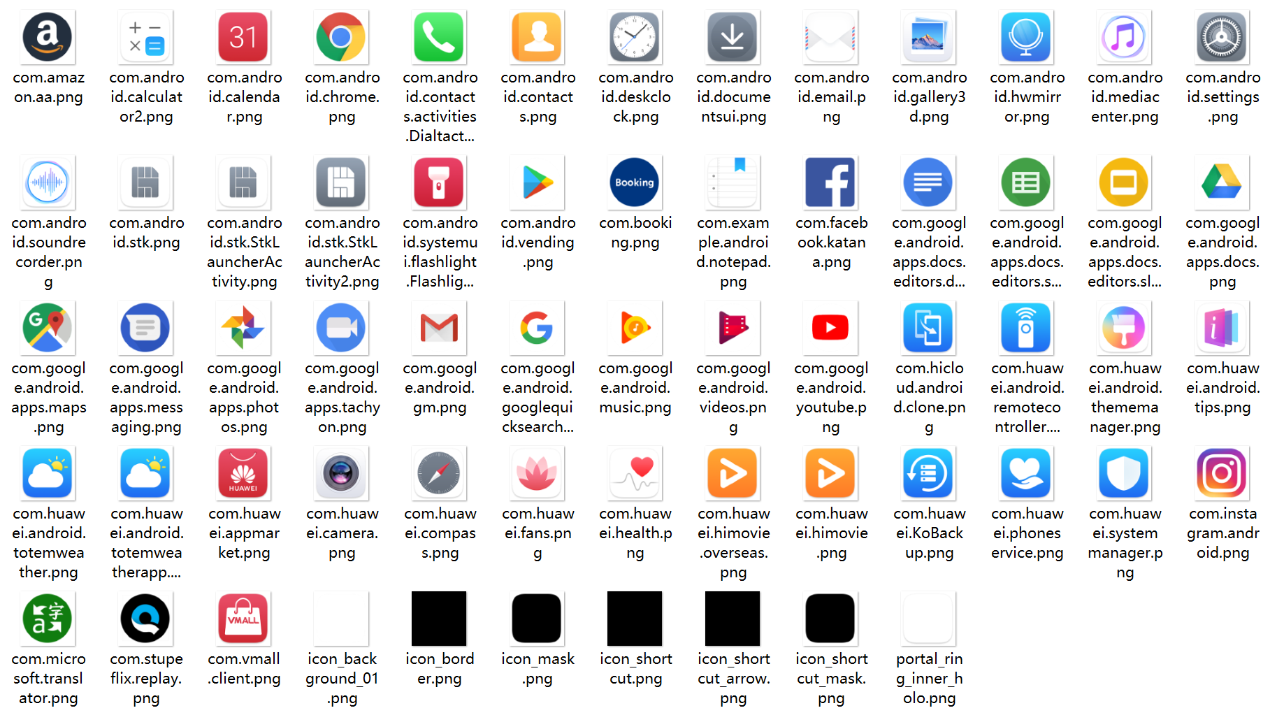
25 optional icons
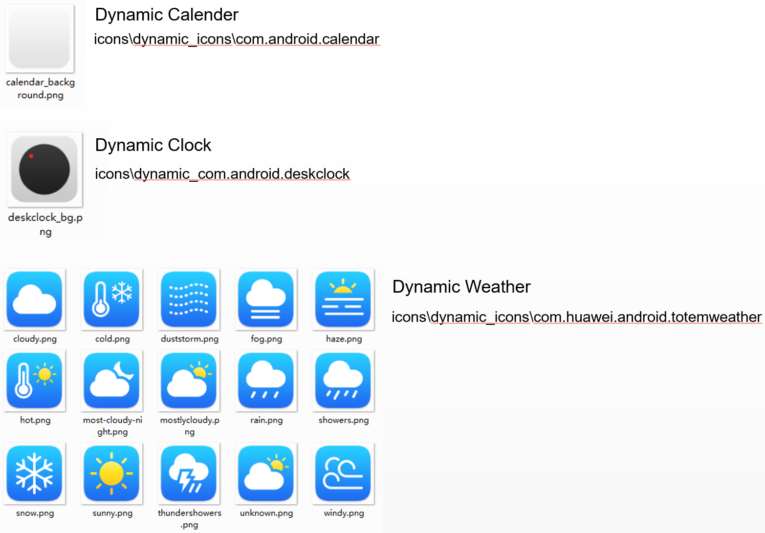
Dynamic icons are in the dynamic_icons folder under icons, and support the following 3 dynamic icons:
Note:
All of the preceding dynamic icons are optional.
Only ground needs to be provided for the dynamic Calendar. The detailed time is automatically written by the system. Designers can change the color of the displayed time in the theme.xml file in the launcher.
If no compatible dynamic icon is available, delete the folder to which the dynamic icon belongs. If all four dynamic icons are unavailable, delete the folder dynamic_icons.
The static icons of Calendar and Clock cannot contain any misleading digits, and two apps cannot use the same icon.
We hope that as many themes as possible can be adapted to third-party icons. For icons that are still incompatible, HUAWEI Themes enables designers to combine the background, border, and mask to produce a set of grounds, which integrate the un-adapted third-party icon style with the theme style.
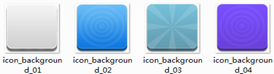
A set of third-party icon grounds consist of the icon_background_01.png, icon_border.png, and icon_mask.png. These three resources are all mandatory.
Icon_background_01.png - icon ground. Designer can make multiple grounds (in different patterns and colors). The system randomly selects a ground and places it under the third-party app icons. When designing the background, designers should take the size of other icons into consideration, to ensure that all of the icons are visually consistent.
Icon_border.png - icon border. The border should be placed on the top layer of a third-party icon and can be flexibly applied to produce multiple effects. For example, the icons on the right show the effects of antique finish or shadow transition. If such overlay effect is not required, set the border as transparent in the theme package.
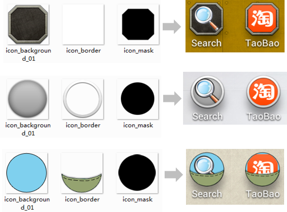
3. Icon_mask.png - icon mark. The mask must be in black. The section of a third-party icon within the black mask is displayed.
Icons, as the second important module after the lock screen, are important to the quality of a theme. We encourage you to adapt the as many as possible themes to third-party icons, and we will take the number and quality of system icons and adapted third-party icons as important metrics while evaluating themes and deciding whether to recommend a theme or not.
By querying the icon package name, the corresponding adapted icon is named as the correct package name and placed in the icons icon, which can better adapt to third-party icons. The upper limit of third-party icon adaptation is 20,000.
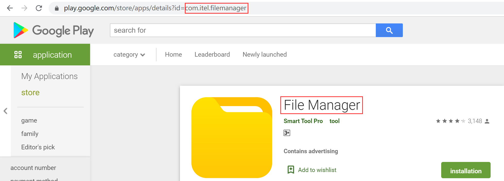
The third-party icon package name can be viewed by installing the third-party "package name viewer" application on the mobile phone, or at the following link:
For example, the package name of the File Manager is: com.itel.filemanager.
There are 24 pre-made cut-out files for framework-res-hwext:
| PNG | Remarks | EMUI9.1 resource name | size(px) |
|---|---|---|---|
 | Index pop background shape (must be black) | alphaindexerlistview_bg_label.9.png | 170x170 |
| Background of all major screens | background_emui.9.png | ≤1080×2160 |
 | Text input bar background | bg_edittext_item.9.png | No fixed dimensions |
 | Vertical scroll bar | bg_scrollbar.9.png | No fixed dimensions |
 | Horizontal scroll bar | bg_scrollbar_horizontal.9.png | No fixed dimensions |
 | Common button | button_big_bg_stroked.9.pn button_small_bg_stroked.9.png | No fixed dimensions |
 | Touched statusbutton | button_small_bg_stroked_pressed.9.pn button_big_bg_stroked_pressed.9.png | No fixed dimensions |
 | Disabled statusbutton | button_small_bg_stroked_disable.9.pn button_big_bg_stroked_disable.9.png | No fixed dimensions |
 | Spinner dialog box background | spinner_menu.9.png | No fixed dimensions |
 | Spinner dialog box selected block (top) The rounded angle must be the same as the spinner_menu.9.png round angle | list_selector_background_focused_top_emui.9.png | No fixed dimensions |
 | Spinner dialog box selected block (middle) | list_selector_background_focused_middle_emui.9.png | No fixed dimensions |
 | Search box background (default) | search_bg_normal.9.png | No fixed dimensions |
 | Search box background (activated) | search_bg_actived.9.png | No fixed dimensions |
 | Text-field | textfield_default_bubble_emui.9.pngBox-frame status textfield_default_linear_emui.9.pngDefault line shape status textfield_default_linear_actived_emui.9.pngTouched line shape status textfield_bg_error.9.pngError status | No fixed dimensions |
 | Slider_disabled | scrubber_control_disabled_emui.png | 220x120 |
 | Slider_normal | scrubber_control_normal_emui.png | 220x120 |
 | Slider_pressed | scrubber_control_pressed_emui.png | 220x120 |
 | Messaging/New message/Add attachment/Location/Full-screen divider | list_section_divider_emui.9.png | No fixed dimensions |
After the above cut-outs are made according to the specifications, they can be directly replaced with hwt-Tool, and the framework-res-hwext resources are replaced in the picture on the right side of [Global Settings]:
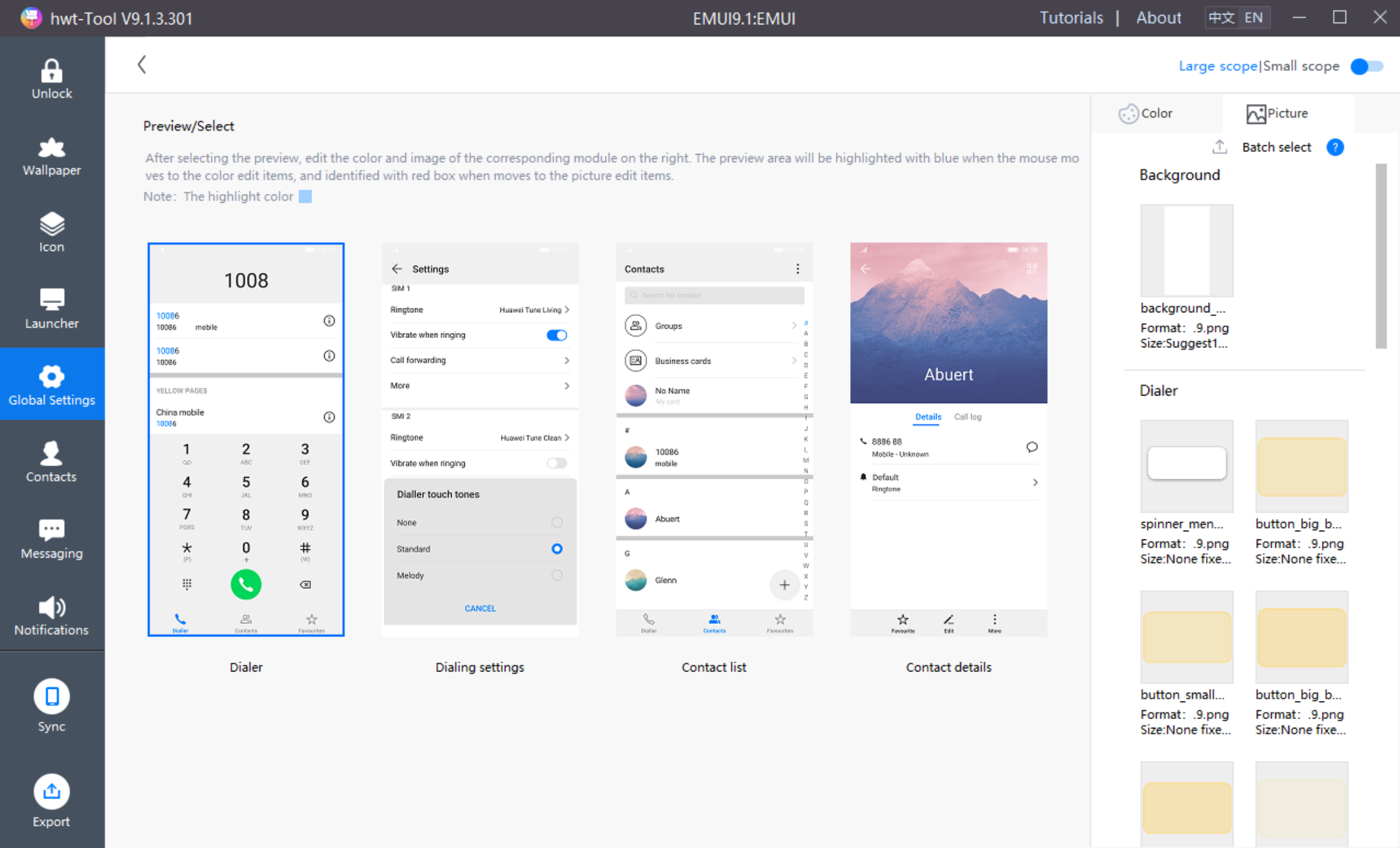
framework-res-hwext is a common system control, used in all modules. There are 2 files in it, as shown below:
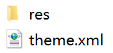
There is a drawable-xxhdpi folder in res, which contains 24 cut-out files of the above in framework-res-hwext;
theme.xml is the color code of framework-res-hwext.
The color of the framework-res-hwext is edited in the color on the right side of [Global Settings] in the hwt-Tool:
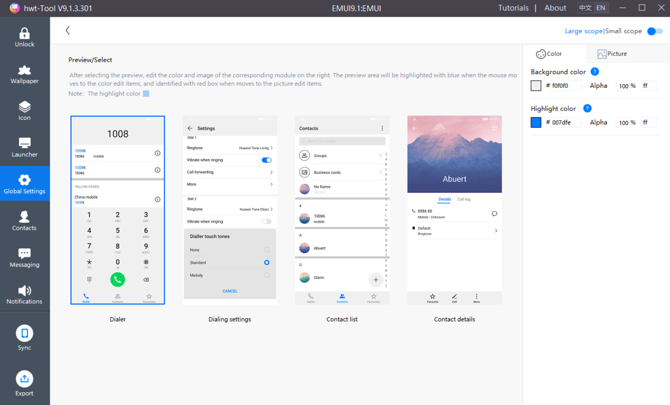
The home screen module needs 26 pre-made cut-out files:
| PNG | Remarks | EMUI9.1 resource name | Size(px) |
|---|---|---|---|
 | Add icon | folder_add_icon.png | 168×168 |
 | Folder background | folder_open_shadow.9.png | No fixed dimensions |
 | Drawer | ic_allapps.png | 192×192 |
| Drawer pressed | ic_allapps_pressed.png | 192×192 |
 | Optimize | ic_widget_bg.png | 192×192 |
 | Optimize | ic_widget_circle.png | 192×192 |
 | Optimize | ic_widget_glowline_danger.png | 192×192 |
 | Optimize | ic_widget_glowline_risk.png | 192×192 |
 | Optimize | ic_widget_glowline_safe.png | 192×192 |
 | Optimize | ic_widget_preview.png | 192×192 |
 | Home screen icon corner tag background color | ic_mark.9.png | No fixed dimensions |
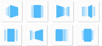 | Transition effects | launcher_edit_transition_box_current.png (Box) launcher_edit_transition_defult_current.png (Default) launcher_edit_transition_filpover_current.png (Flip over) launcher_edit_transition_page_current.png (Page) launcher_edit_transition_prespective_current.png (Perspective) launcher_edit_transition_rotate_current.png (Rotate) launcher_edit_transition_squeeze_current.png (Squeeze) launcher_edit_transition_windmill_current.png (Windmill) | 96×96 |
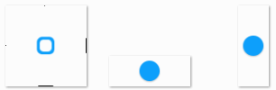 | Widgets editing resizer | widget_resize_frame_holo.9.png (Widgets editing box boarder) widget_resize_handle_horizontal.9.png (Widgets editing horizontal edit point) widget_resize_handle_vertical.9.png (Widgets editing vertical edit point) | No fixed dimensions |
 | Home screen/Multi-task screen/Split-screen icon | ic_sysbar_docked_huawei.png | 96×96 |
 | Home screen/Multi-task screen/Lock icon | hw_recents_lock.png | 96×96 |
 | Delete | ic_edit_delete.9.png | No fixed dimensions |
 | Share | ic_edit_share.9.png | No fixed dimensions |
After the above cut-outs are made according to the specifications, they can be directly replaced with hwt-Tool, and the home screen resources are replaced in the picture on the right side of [Launcher]:
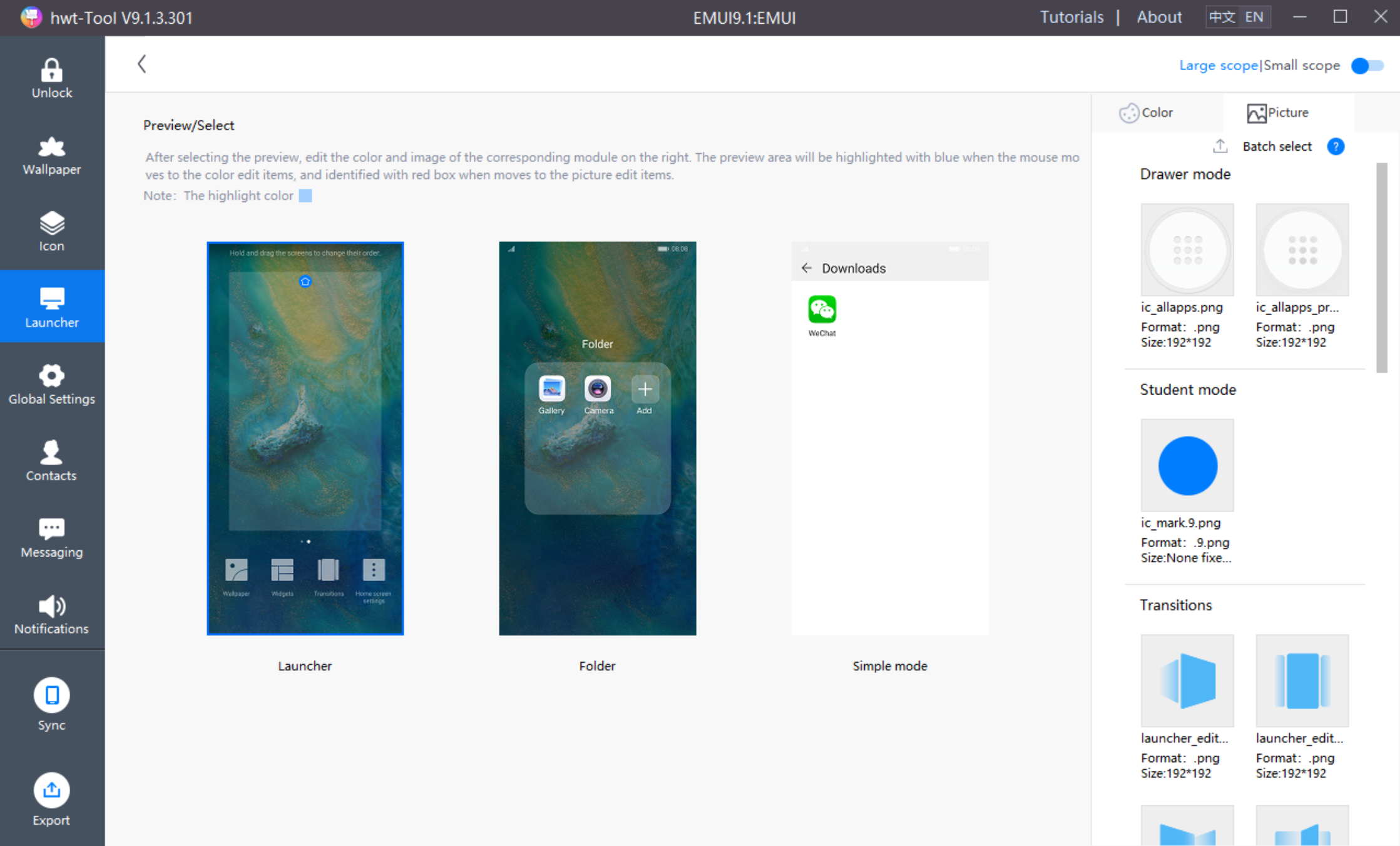
com.huawei.android.launcher is home screen module. There are 3 files in it, as shown below:
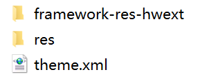
framework-res-hwext is a common module in the interface, the designer can modify the part referenced by the home screen module;
There is a drawable-xxhdpi folder in res, which contains 26 cut-out files of the above in home screen module;
theme.xml is the color code of home screen module.
The color of the home screen module is edited under the [Launcher] menu in the hwt-Tool:
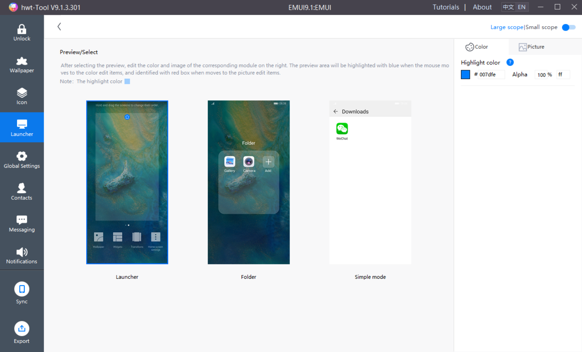
The contacts module needs 34 pre-made cut-out files:
| PNG | Remarks | EMUI9.1 resource name | Size(px) |
|---|---|---|---|
 | Keyboard keys in one-handed UI(cannot be transparent) | contact_dial_fun_menu.9.png | No fixed dimensions |
 | Keyboard keys pressed in one-handed UI(cannot be transparent) | contact_dial_fun_menu_pressed.9.png | No fixed dimensions |
 | Sync (login to LinkedIn) | ic_sync_anim_holo.png | 96×96 |
 | Dialer number 0 | dial_num_0_blk.png | Suggested:152*167 |
| Dialer number 1 | dial_num_1_blk.png | Suggested:152*167 | |
| Dialer number 2 | dial_num_2_blk.png | Suggested:152*167 | |
| Dialer number 3 | dial_num_3_blk.png | Suggested:152*167 | |
| Dialer number 4 | dial_num_4_blk.png | Suggested:152*167 | |
| Dialer number 5 | dial_num_5_blk.png | Suggested:152*167 | |
| Dialer number 6 | dial_num_6_blk.png | Suggested:152*167 | |
| Dialer number 7 | dial_num_7_blk.png | Suggested:152*167 | |
| Dialer number 8 | dial_num_8_blk.png | Suggested:152*167 | |
| Dialer number 9 | dial_num_9_blk.png | Suggested:152*167 | |
| Dialer number 0 press | dial_num_0_blk_press.png | Suggested:152*167 | |
| Dialer number 1 press | dial_num_1_blk_press.png | Suggested:152*167 | |
| Dialer number 2 press | dial_num_2_blk_press.png | Suggested:152*167 | |
| Dialer number 3 press | dial_num_3_blkpress.png | Suggested:152*167 | |
| Dialer number 4 press | dial_num_4_blk_press.png | Suggested:152*167 | |
| Dialer number 5 press | dial_num_5_blk_press.png | Suggested:152*167 | |
| Dialer number 6 press | dial_num_6_blk_press.png | Suggested:152*167 | |
| Dialer number 7 press | dial_num_7_blk_press.png | Suggested:152*167 | |
| Dialer number 8 press | dial_num_8_blk_press.png | Suggested:152*167 | |
| Dialer number 9 press | dial_num_9_blk_press.png | Suggested:152*167 | |
| Dialer key * | xing.png | Suggested:152*167 | |
| Dialer key * press | xingpress.png | Suggested:152*167 | |
| Dialer key # | jing.png | Suggested:152*167 | |
| Dialer key # press | jingpress.png | Suggested:152*167 | |
 | Index bar dialog box background(down) | fastscroll_familyname_normal.9.png | No fixed dimensions |
 | Index bar dialog box background(upper) | fastscroll_label_phonebook_emui_icon.png | 180*210 |
 | Index bar dialog box background(English) | fastscroll_label_phonebook_emui_null_icon.png | 180*180 |
 | Business cards background | profile_simple_card_background.9.png | No fixed dimensions |
 | Add/Edit contact Organization dialog box | company_pop_background.9.png | No fixed dimensions |
 | Contact details background | contact_detail_list_background.9.png | No fixed dimensions |
 | The color value is transparent, solving the problem that blue color blocks exist when clicking the dialpad for the first time | dialpad_button_press_state.9.png | No fixed dimensions |
After the above cut-outs are made according to the specifications, they can be directly replaced with hwt-Tool, and the contacts resources are replaced in the picture on the right side of [Contacts]:
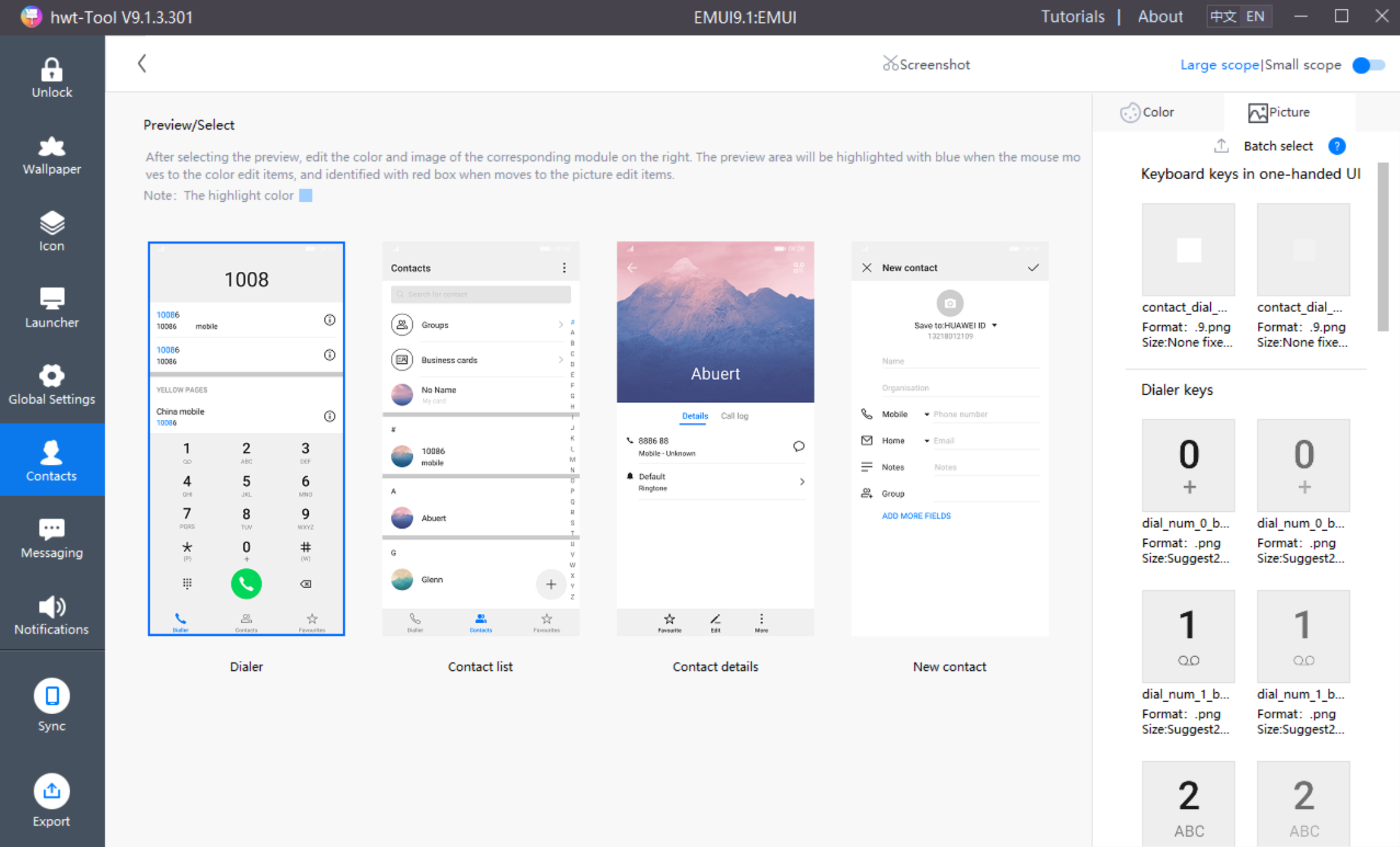
com.android.contacts is contacts module. There are 3 files in it, as shown below:
framework-res-hwext is a common module in the interface, the designer can modify the part referenced by the contacts module;
There is a drawable-xxhdpi folder in res, which contains 34 cut-out files of the above in contacts module;
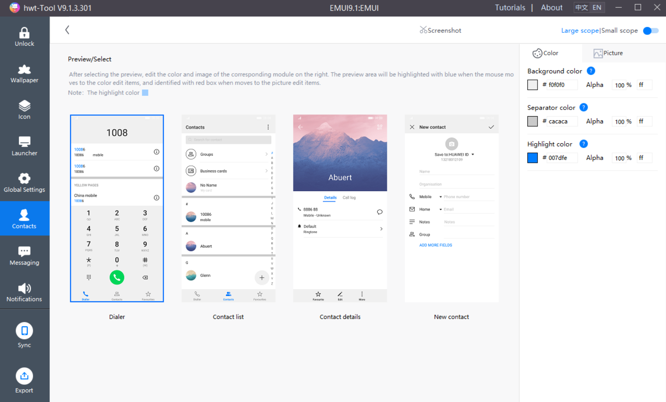
theme.xml is the color code of contacts module.
The color of the contacts module is edited under the [Contacts] menu in the hwt-Tool:
The messaging module needs 6 pre-made cut-out files:
| PNG | Remarks | EMUI9.1 resource name | Size(px) |
|---|---|---|---|
 | Messaging/Main screen/Huawei notifications icon | ic_message_noti_huawei.png | 120x120 |
 | Messaging/Smart SMS dialog box menu | duoqu_menu_bg.9.png | No fixed dimensions |
 | Messaging/Conversation/Card style bubble background | v_bg_3.9.png | No fixed dimensions |
 | Messaging/Conversation/Flight ticket bubble background | v_bg_4.9.png | No fixed dimensions |
 | Messaging/New message/Add attachment/Recording/Sound wave | rcs_mic_st_widget_recording_bar_glow.png | 688x688 |
 | Messaging/New message/Add attachment/Recording/Sound wave (Small) | mic_st_widget_speeching_glow.png | 688x688 |
After the above cut-outs are made according to the specifications, they can be directly replaced with hwt-Tool, and the messaging resources are replaced in the picture on the right side of [Messaging]:
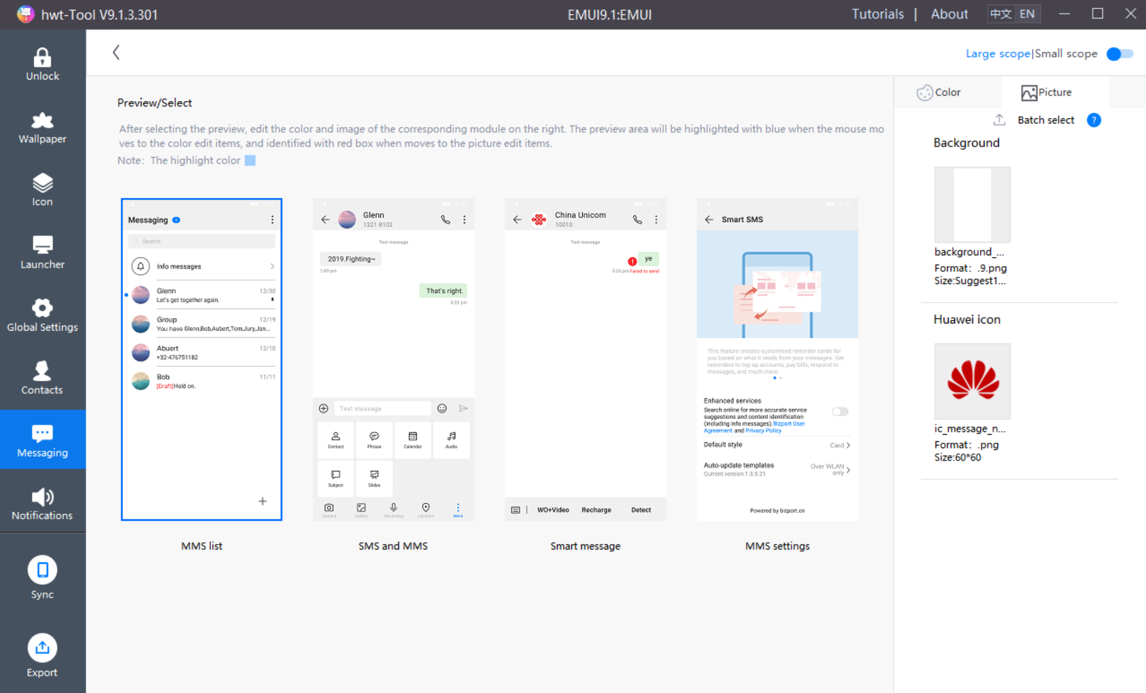
com.android.mms is messaging module. There are 3 files in it, as shown below:
framework-res-hwext is a common module in the interface, the designer can modify the part referenced by the messaging module;
There is a drawable-xxhdpi folder in res, which contains 6 cut-out files of the above in messaging module;
theme.xml is the color code of messaging module.
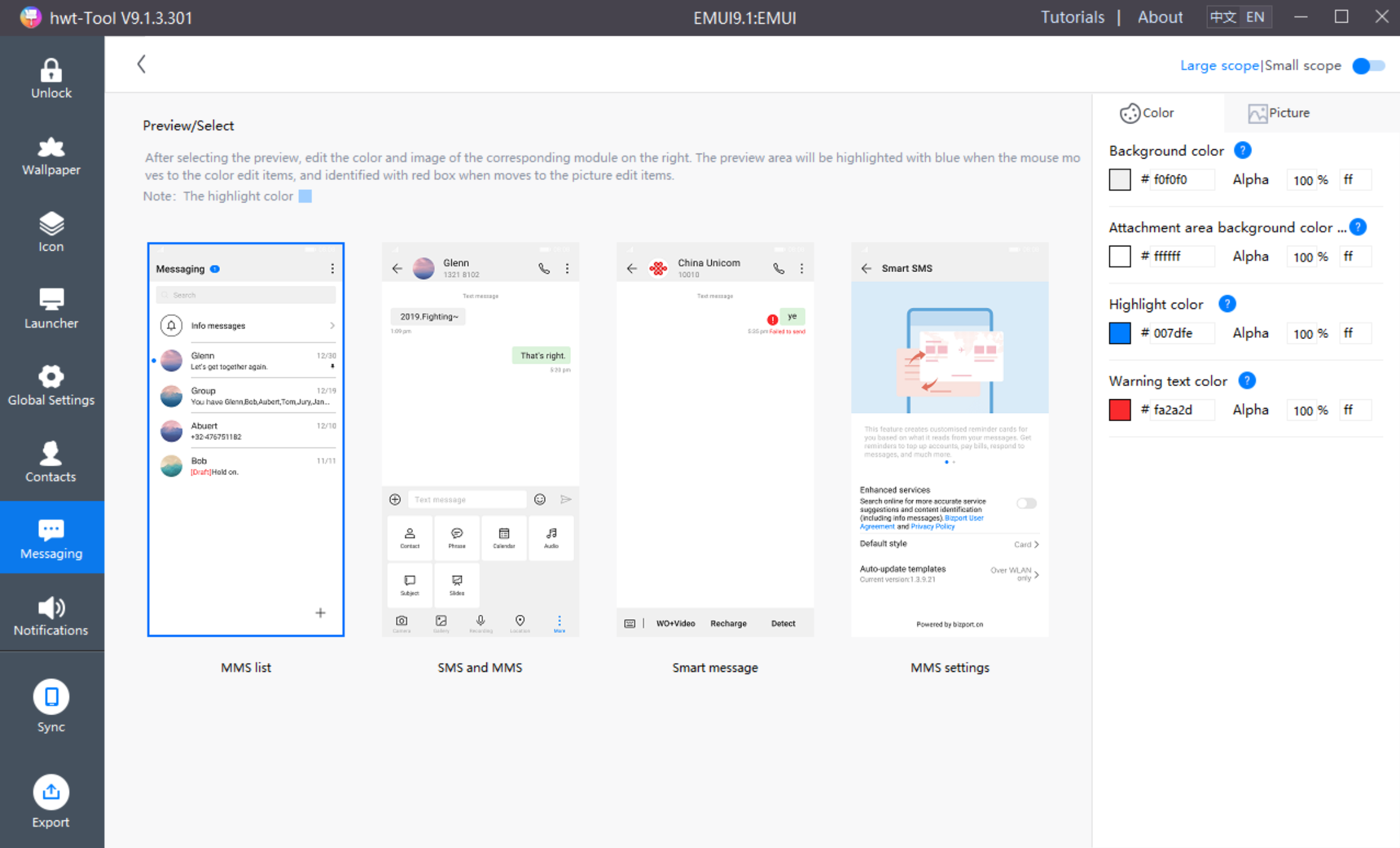
The color of the messaging module is edited under the [Messaging] menu in the hwt-Tool:
The quick settings module needs 5 pre-made cut-out files:
| PNG | Remarks | EMUI9.1 resource name | Size(px) |
|---|---|---|---|
 | Recent tasks/Cleanup button | hw_recents_close_all.png | 160×160 |
 | Recent tasks/Cleanup button background | hw_recents_close_all_press.png | 160×160 |
 | Volume panel | volume_popup.9.png | No fixed dimensions |
 | Screen lock preview icon | ic_onekey_widget_preview.png | 192×192 |
 | Screen lock on home screen | ic_onekey_widget_shortcut.png | 192×192 |
After the above cut-outs are made according to the specifications, they can be directly replaced with hwt-Tool, and the quick settings resources are replaced in the picture on the right side of [Notifications]:
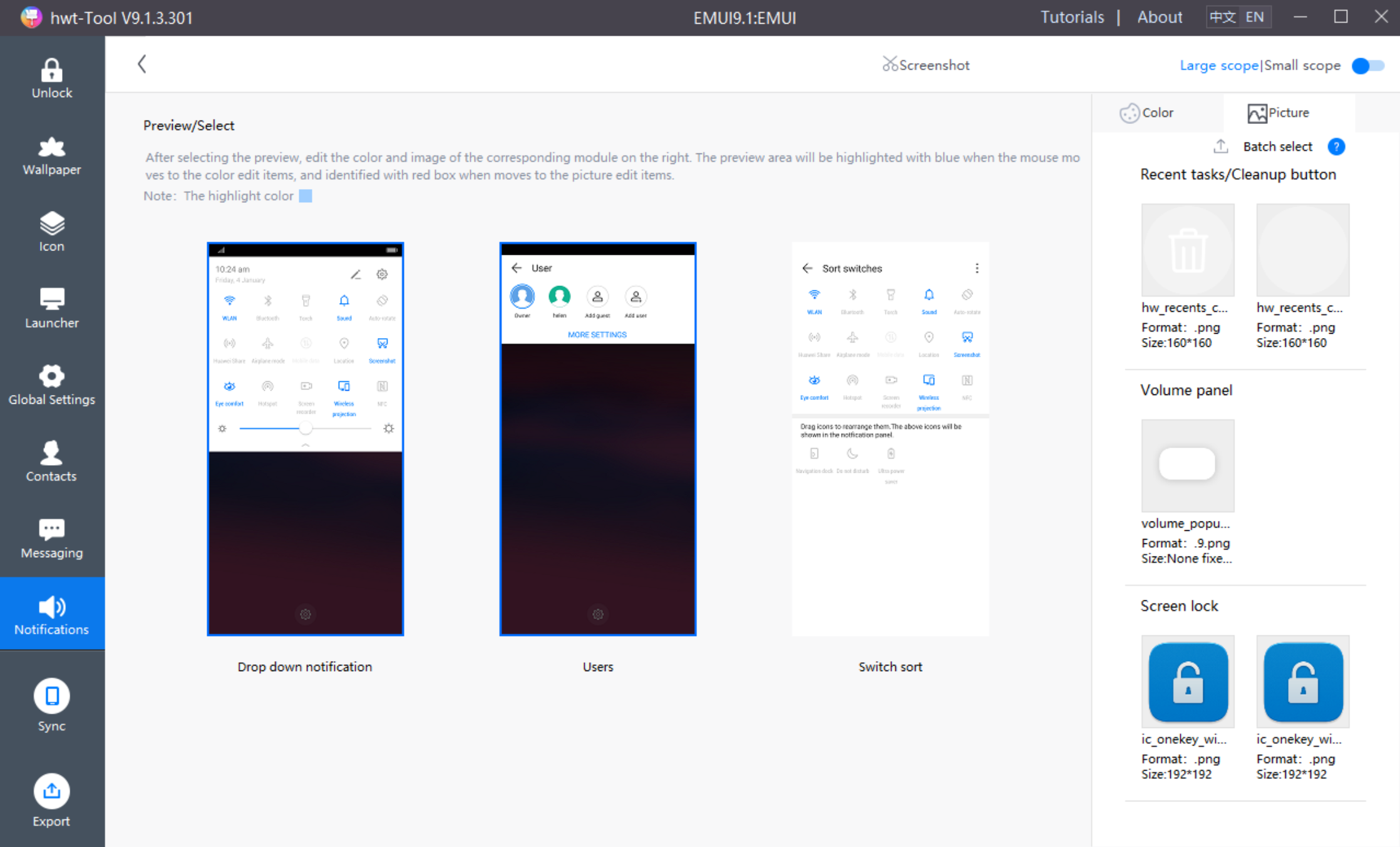
com.android.systemui is quick settings module. There are 3 files in it, as shown below:
framework-res-hwext is a common module in the interface, the designer can modify the part referenced by the quick settings module;
There is a drawable-xxhdpi folder in res, which contains 5 cut-out files of the above in quick settings module;
theme.xml is the color code of quick settings module.
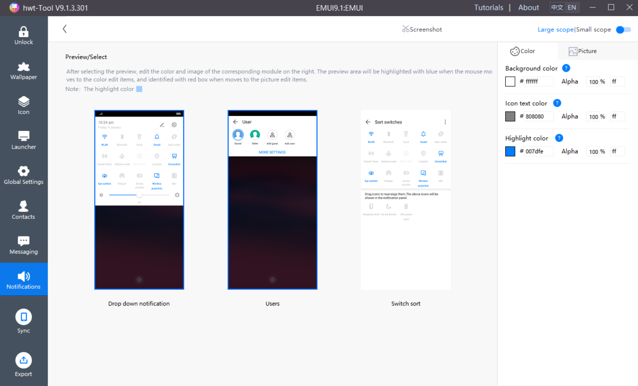
The color of the quick settings module is edited under the [Notifications] menu in the hwt-Tool:
The phone setting module needs 1 pre-made cut-out files:
| PNG | Remarks | EMUI9.1 resource name | Size(px) |
|---|---|---|---|
 | Large section divider bar | preference_category_backgound.9.png | No fixed dimensions |
com.android.phone is phone setting module. There are 3 files in it, as shown below:
framework-res-hwext is a common module in the interface, the designer can modify the part referenced by the phone setting module;
There is a drawable-xxhdpi folder in res, which contains 1 cut-out files of the above in phone setting module, which is merged into the contacts module in the hwt-Tool;
theme.xml is the color code of phone setting module, which is merged in the hwt-Tool.com.android.phone.recorderis phone setting-recorder module. There are 1 files in it, as shown below:

framework-res-hwext is a common module in the interface, the designer can modify the part referenced by the phone setting-recorder module;com.android.server.telecom is phone setting-telecom module. There are 1 files in it, as shown below:
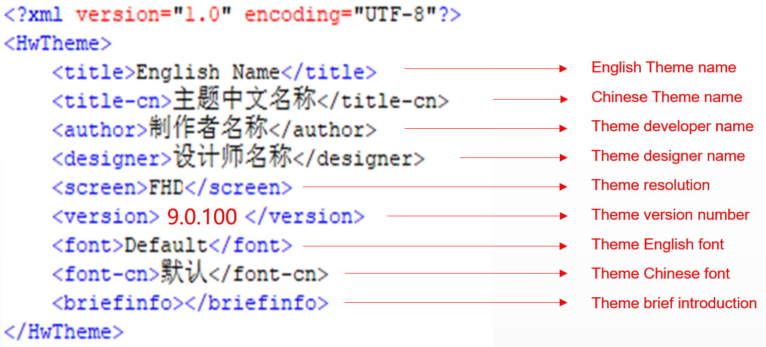
framework-res-hwext is a common module in the interface, the designer can modify the part referenced by the phone setting-telecom module;The description file is a file that stores basic information about the theme.
The English theme name, Chinese theme name, theme developer name, and theme designer name cannot be modified after the theme has been released.
The designer name is bound to the designer's HUAWEI Developer account.
The theme resolution, English font, and Chinese font retain the default value, and cannot be modified.
The first version of the theme is 9.0.100. If the version is updated, the version number becomes 9.0.10X (X is an Arabic numeral).
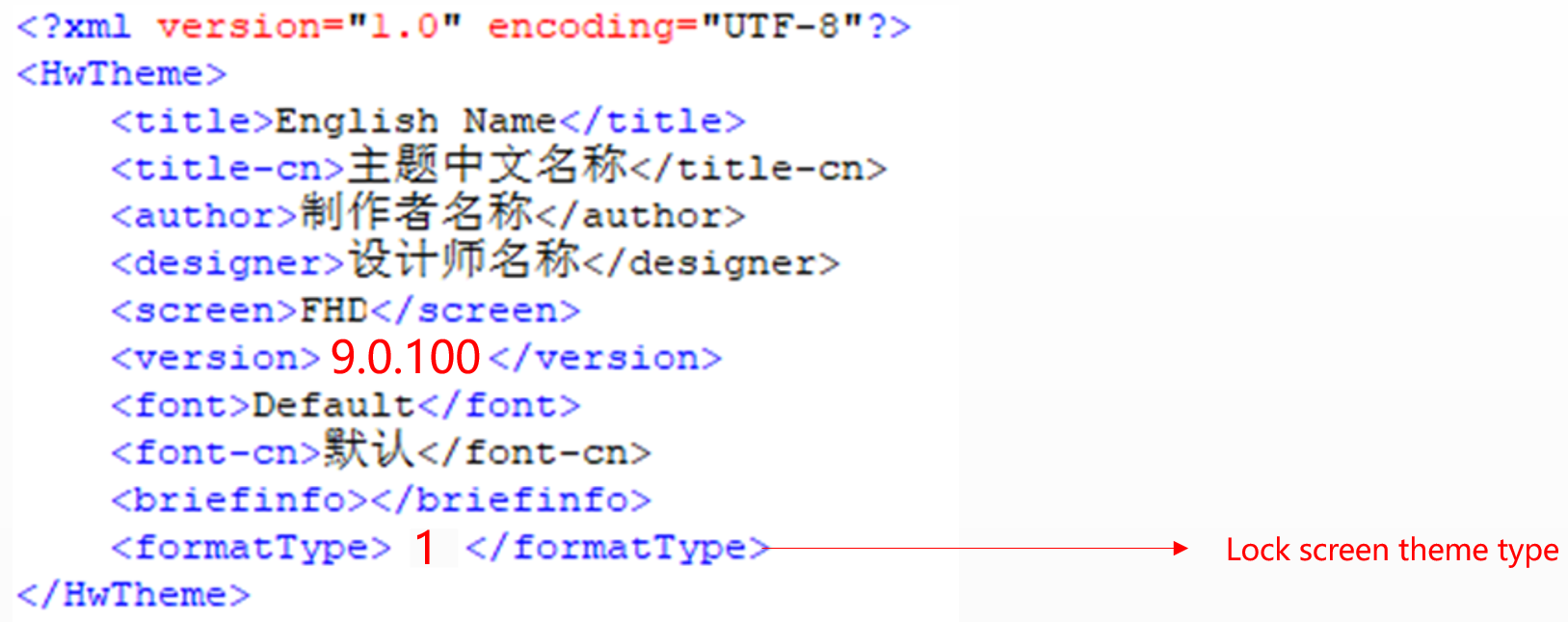
When uploading a lock screen package separately, designers must add the field of the theme type to the description.xml file in the lock screen package: <formatType>1</formatType>.
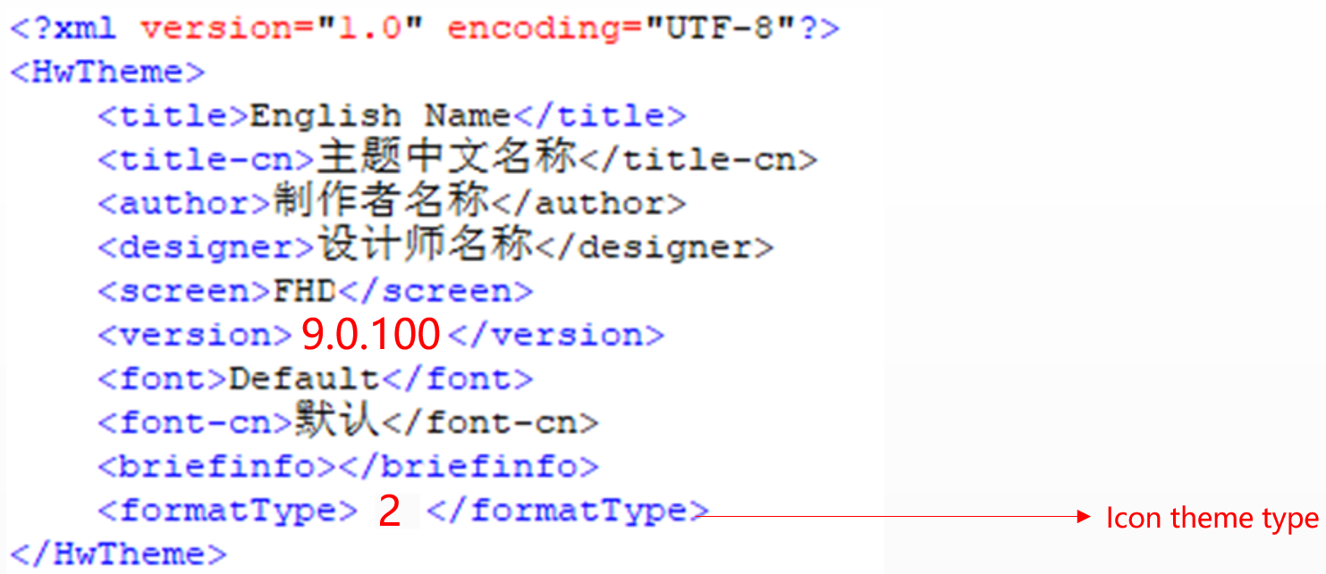
When uploading an icon package separately, designers must add the field of the theme type to the description.xml file in the icon package: <formatType>2</formatType>.
The preview is an overview of a theme. Users can determine the style of a theme through the preview.
All preview images can be made by taking screenshots directly from the hwt-Tool.
The size of all preview images, except the cover and icon preview images, is 1080×2160 px.The size of the cover image is 1080 × 1920px, the format is .jpg.The cover preview image must be identical to the lock screen preview image.The icon preview image can be replaced with the PSD source file.
Due to the limitation of the length of the database picture file name, the total number of preview images under the preview folder in the theme package must be ≤15.
Preview images can be made via screenshot, but the screenshot needs to be modified. Designers without Huawei mobile phones can use the available PSD template to generate preview images. For details, please refer to the PSD file description.
Theme packages that are uploaded to areas outside China cannot contain SMS message preview images, that is, images named preview_mms_X.jpg. However, the SMS module design and skin change must be ensured.
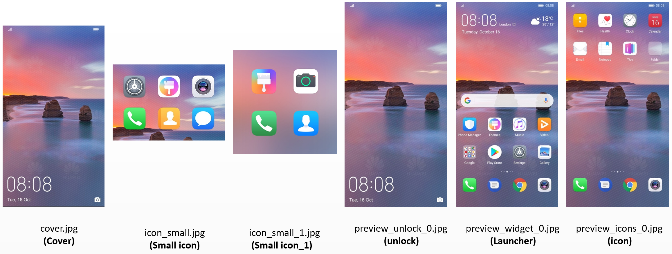
Note:
For cover preview images, no content, including status bar information and buttons, is allowed within 80 px of the top or bottom.
The status bar on preview images can only display the signal, battery level, and time (except cover, icon-small, and icon_small_1).
The preview image should be identical to the actual display effect on a mobile phone.The designer's message or design description is optional.
The preview image is named preview_widget_X.jpg (X can be 0, 1, 2, ... ...).
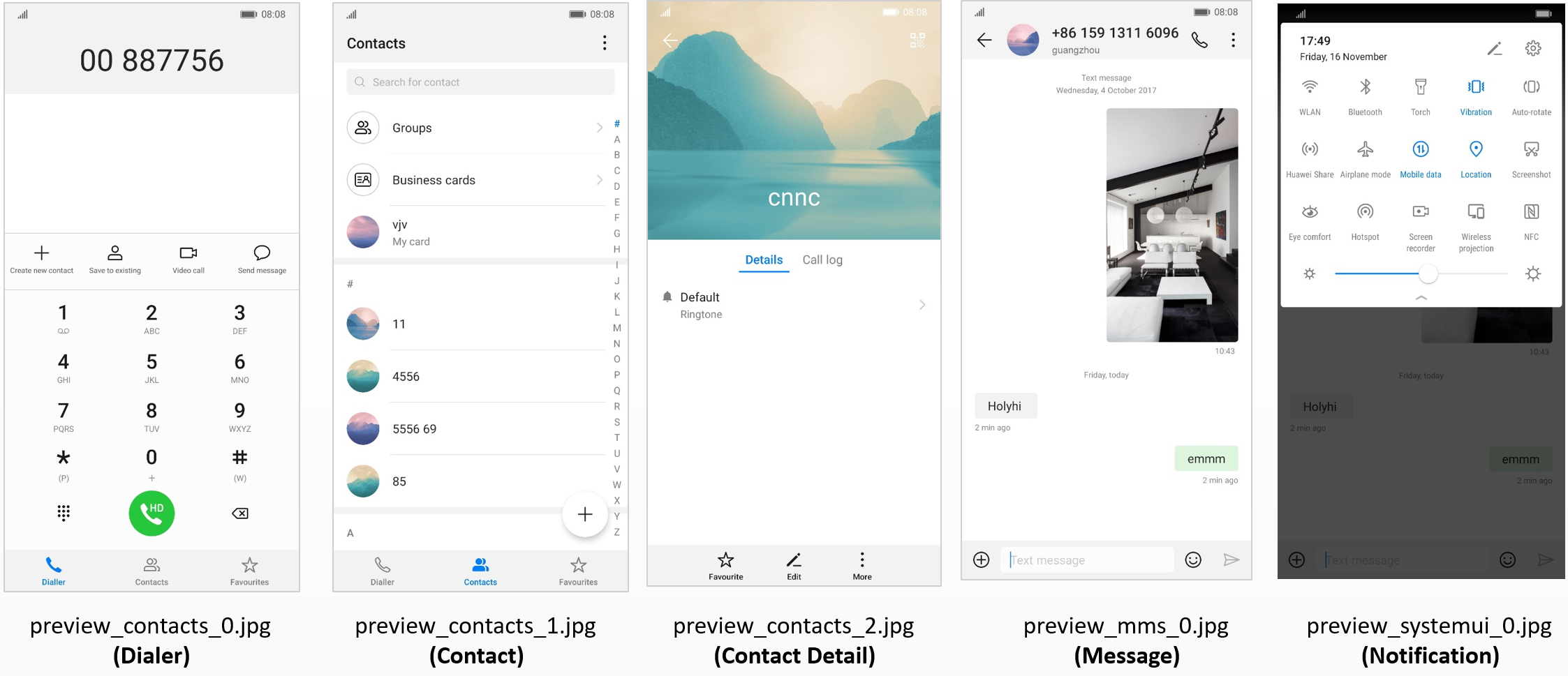
Note:
The status bar of preview images can only show the battery level and time (except cover, unlock, and icon_small).
The preview image should be identical to the actual display effect on a mobile phone.
A theme must contain the above preview images.
The theme supports video preview, the file does not need to be packaged in the theme, when uploading the theme, directly upload it on the alliance.
Note:
The video size is: 1080 × 2340px (for high-end models), 1080 × 1920px (for low-end models);
The Video format MP4, the MP4 codec system requires H.264, video file size is recommended within 10M, video duration is recommended within 15 seconds;
In order to ensure the preview effect, please provide a looping video to ensure that the first and the end of the connection part is smooth, there will be no screen beating or flashing.
coverpreview: cover.psd
small icon preview: icon_small.psd
small icon preview: icon_small_1.psd
icon preview: preview_icons_0.psd
lock screen preview: preview_unlock_0.psd
First screen preview: preview_widget_0.psd

When you need to modify a specific code or image resource separately, you need to manually compressing and decompressing.
Regarding themes in 9.1, with the exception of the preview, unlock, wallpaper, and description.xml files, other modules need to be compressed separately.
After modifying the file name extension, the system will display a message indicating that the file is unavailable. You can ignore this message.
Taking com.huawei.android.launcher as an example.:

Using small theme as an example


NinePatchDrawable files can be read only after NinePatchDrawable compilation.
To help new designers quickly adapt their themes to the system, the NinePatchDrawable graphics for the theme template have been compiled.
When designing a theme, you may refer to: Theme Template, Preview Template PSD, and Themes Resource Description Excel.
You can import a finished theme package via PC to a Huawei phone or Honor phone, to view and test the theme (import a 9.1 theme to a phone running EMUI 9.1). The import path is Internal sdcard/huawei/themes. The theme can be found in Themes - Me - My themes.
For details of themes test specifications, please click to view
For details of the content upload guide, please click to view
Attachment-Large Theme Template
Attachment-Preview Template PSD
Attachment-Themes Resource Description Excel
