Description
- This section uses resolution 466 x 466 px as an example. The creation methods for other resolutions are similar, with only some differences in the supported capability set. For details, please refer to:
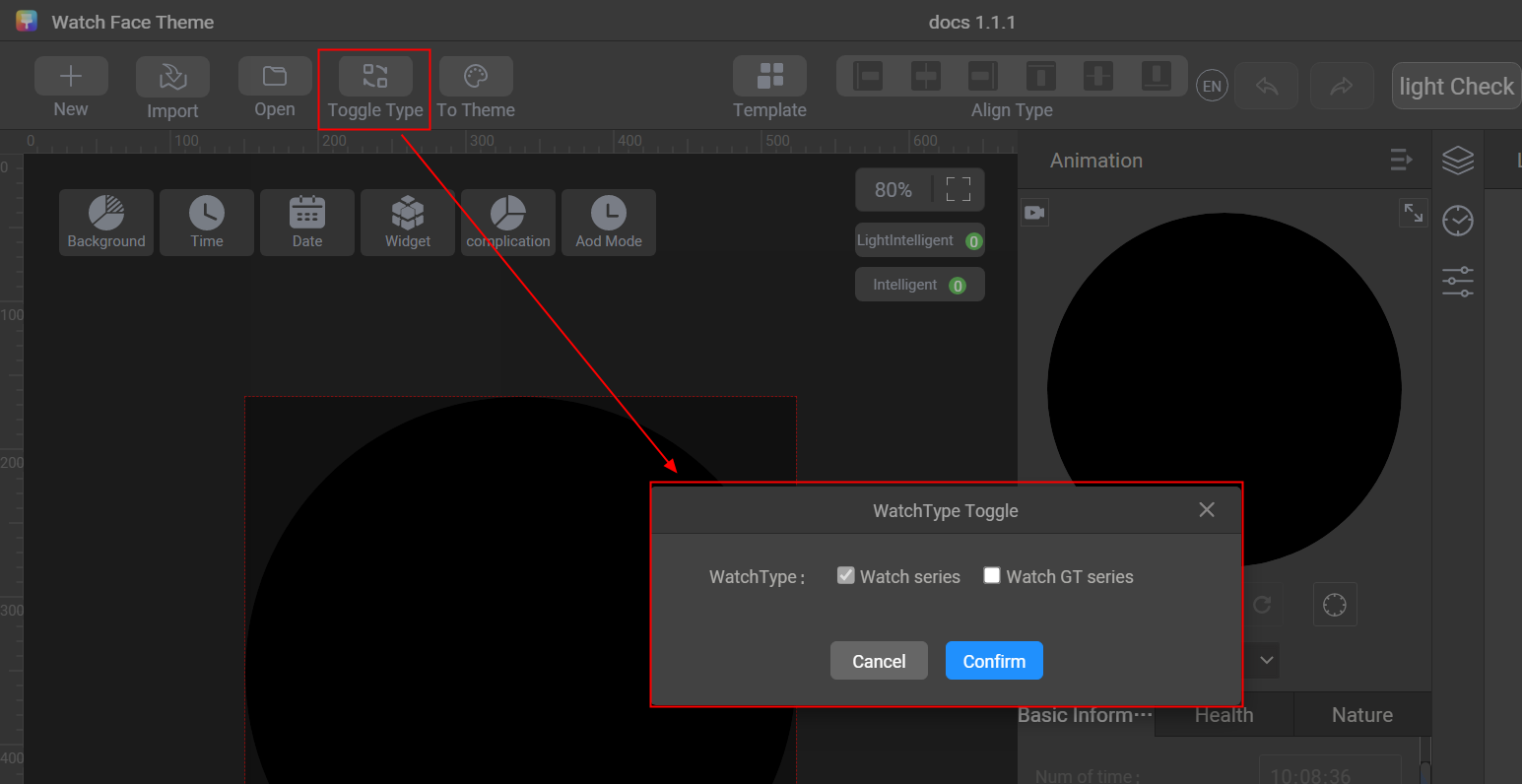
- Resolution 466 x 466 px supports two creation modes: WATCH series + GT series (2.y.z) and WATCH series (1.y.z). The two creation modes support different capability sets. You can click Toggle Type to switch between the two creation modes.
[h2]Single Image
Use the single image control to create a static watch face background.
Sliced image preparation:
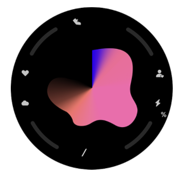

Sliced image description:
- Avoid background images with excessive white pixels or overly high saturation/brightness, as this will lead to increased power consumption and faster battery drain for the watch. Theme Studio supports brightness verification. Images with overly high brightness cannot be exported.
- When designing the background, try to integrate static elements into the background to reduce the number of layers and the image size.
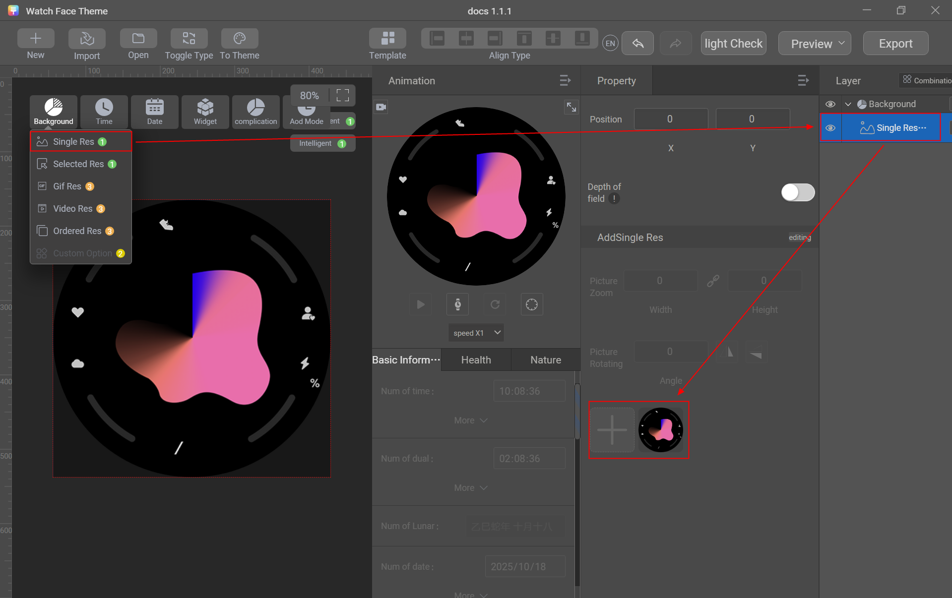
- Go to Background > Single Res.
- Import a watch face background image.
[h2]Selected Image
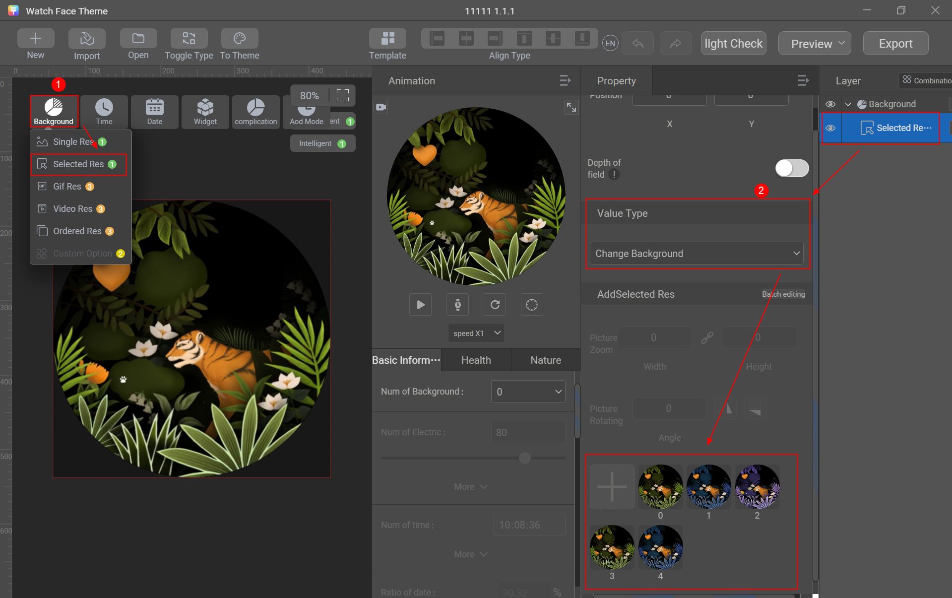
Use the selected image control to switch static watch face background images. Up to five static background images are supported.
Sliced image preparation:
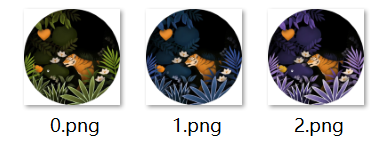
- Go to Background > Selected Res.
- Set Value Type to Change Background.
- Import five watch face background images.
[h2]Animated Image
Use the animated image control to upload animated image resources and create a dynamic watch face background.
Animated image preparation:
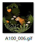

Animated image specifications:
- Animated image dimensions: 466 x 466 px
- Animated image size: ≤ 10 MB
- Animation duration: 5–10s
- Animated image format: GIF
- Animated image frame rate: 15–30 fps
- Only one animated image can be added.
- Ensure that the animated image can be played smoothly and cyclically without obvious frame skipping.
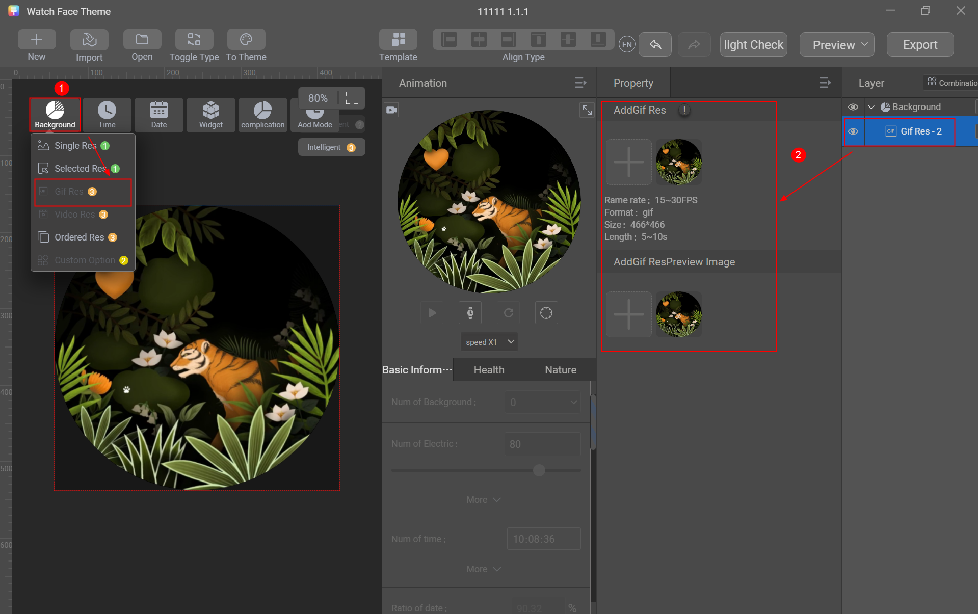
- Go to Background > Gif Res.
- Import the animated image resource and preview image.
[h2]Video
Use the video control to upload video resources and create a dynamic watch face background.
Video preparation:
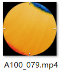

Video specifications:
- Video dimensions: 466 x 466 px
- Video size: ≤ 10 MB
- Video duration: 5–10s
- Video format: MP4
- Video encoding: H.264
- Video frame rate: 25–30 fps
- Up to three videos can be added.
- Ensure that the video can be played smoothly and cyclically without obvious frame skipping.
- Go to Background > Video Res.
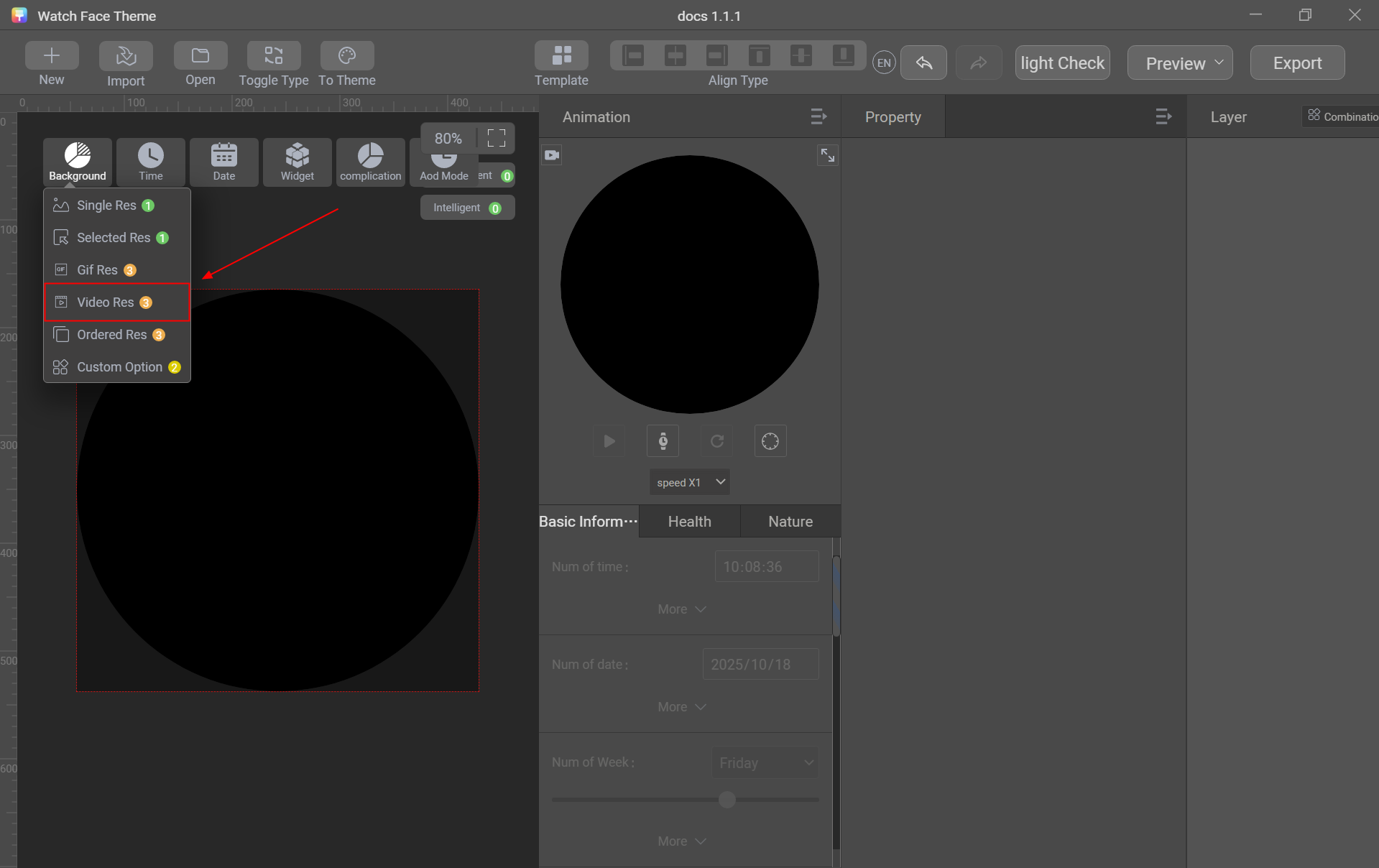
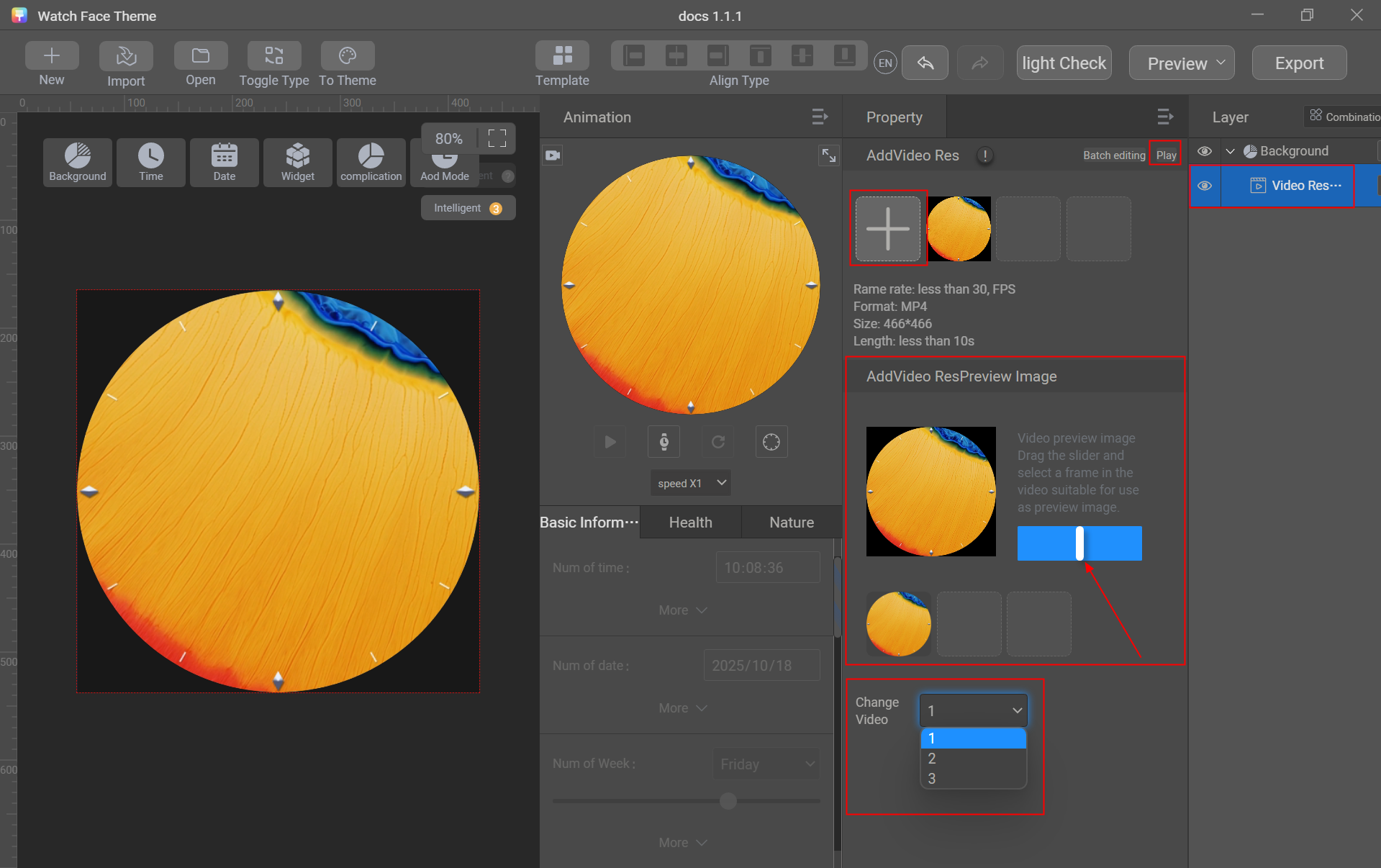
- Import video resources.
+: Click + to import video resources. Up to three videos can be added.
Play: Click Play to preview the video.
Drag the slider to select the proper image to generate a preview image (mandatory).
If multiple videos are added, you must switch among the videos and generate a preview image for each video.
[h2]Single-Group Sequence Frame
Use the single-group sequence frame control to upload single-group sequence frame resources and create a dynamic watch face background.
Single-group sequence frame preparation:
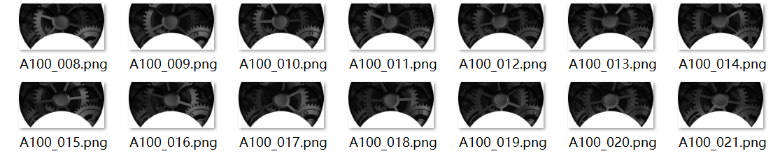

Single-group sequence frame specifications:
- Number of frames in a single group: For WATCH series + GT series (2.y.z), the number of frames must be less than or equal to 30. For WATCH series (1.y.z), the number of frames can be greater than 30.
- Size of a single frame in a single group: less than 40 KB (recommended)
- Single-group sequence frame format: PNG
- All the sequence frames in a single group must have the same dimensions and size.
- Dimensions of each single-group sequence frame: For WATCH series + GT series (2.y.z), the dimensions must be less than or equal to 200 x 200 px. For WATCH series (1.y.z), the dimensions can be greater than 200 x 200 px.
- Ensure that the single-group sequence frames can be played smoothly and cyclically without obvious frame skipping.
Creation procedure:
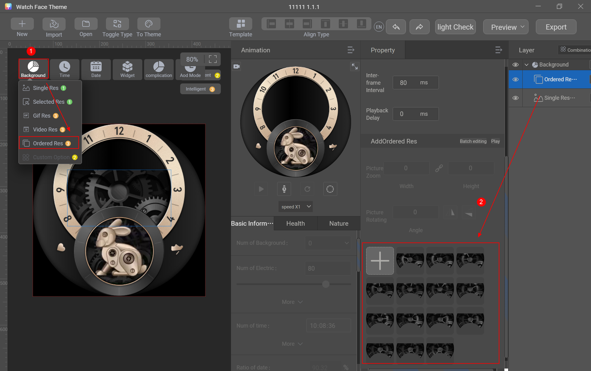
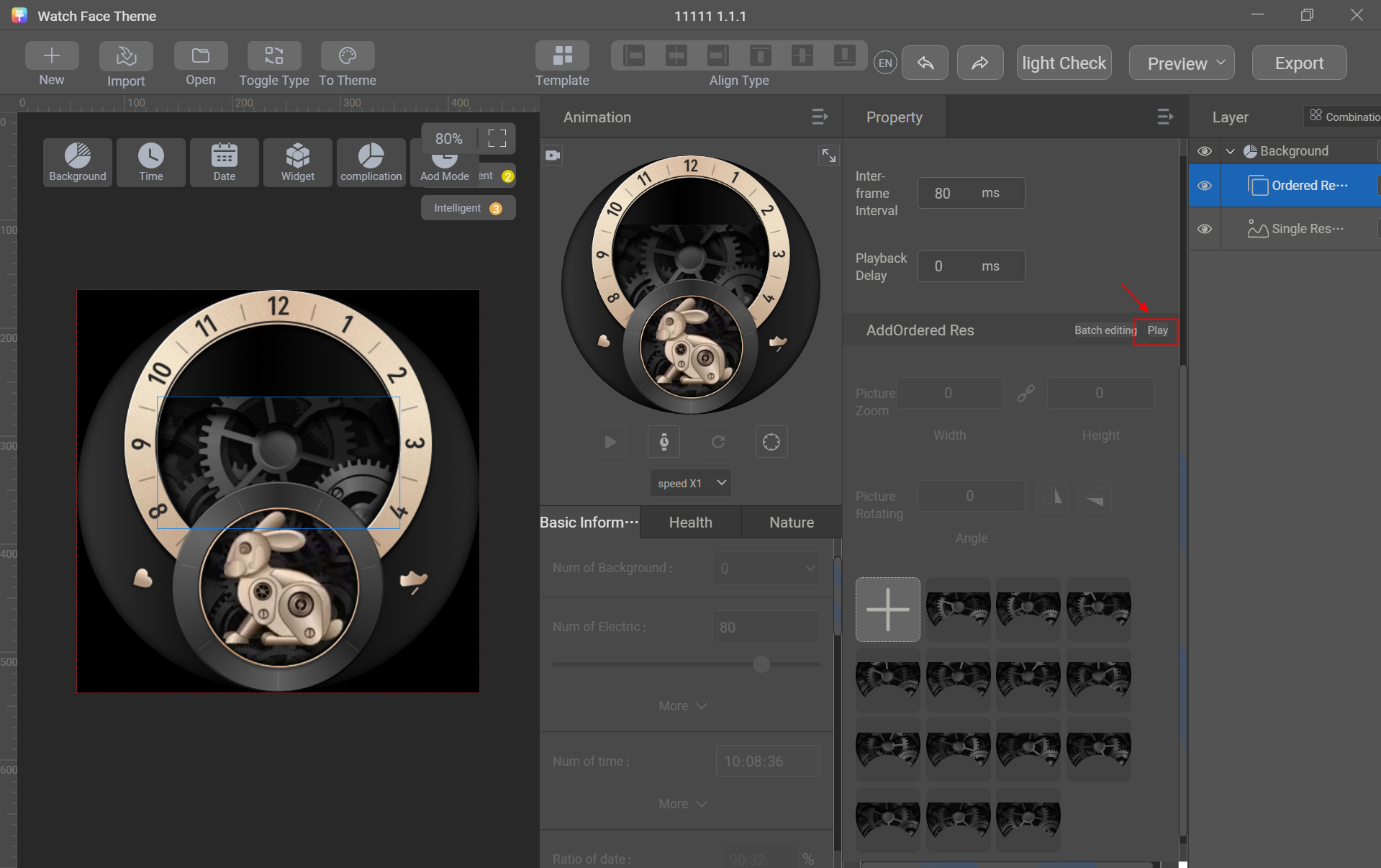
- Go to Background > Ordered Res and import the single-group sequence frame resources.
Play Mode: If you select Once, the sequence frames will be played only once on the watch face. If you select Loop, the sequence frames will be cyclically played on the watch face.
Position: coordinates of the single-group sequence frames on the watch face.
Inter-frame Interval: interval between frames.
Playback Delay: duration after which sequence frame playback starts.
- Check whether the sequence frames are played smoothly.
Play: Click Play to preview whether the sequence frames are played smoothly.
[h2]Analog Clock
Create the hour hand, minute hand, and second hand (optional) to display time through the watch face and hands.
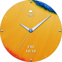
Control used: watch hand
Sliced image preparation: sliced images of the hour hand, minute hand, and second hand
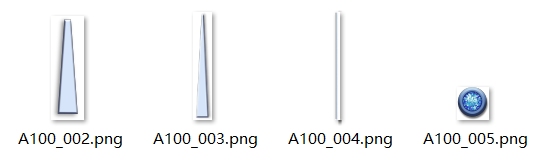

Sliced image description:
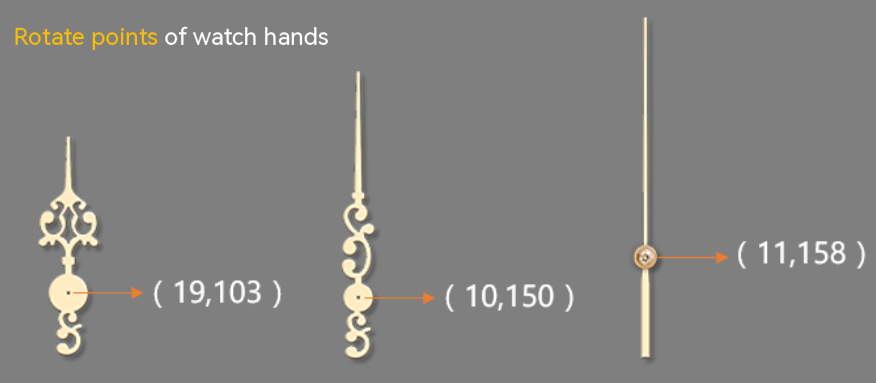
- The sliced images of the watch hands must point to the direction of 0 o'clock (initial direction).
- If the watch face background has a scale, the scale must be correct. You can use Theme Studio to check the scale.
Creation procedure:
- Go to Time > Hand Res.
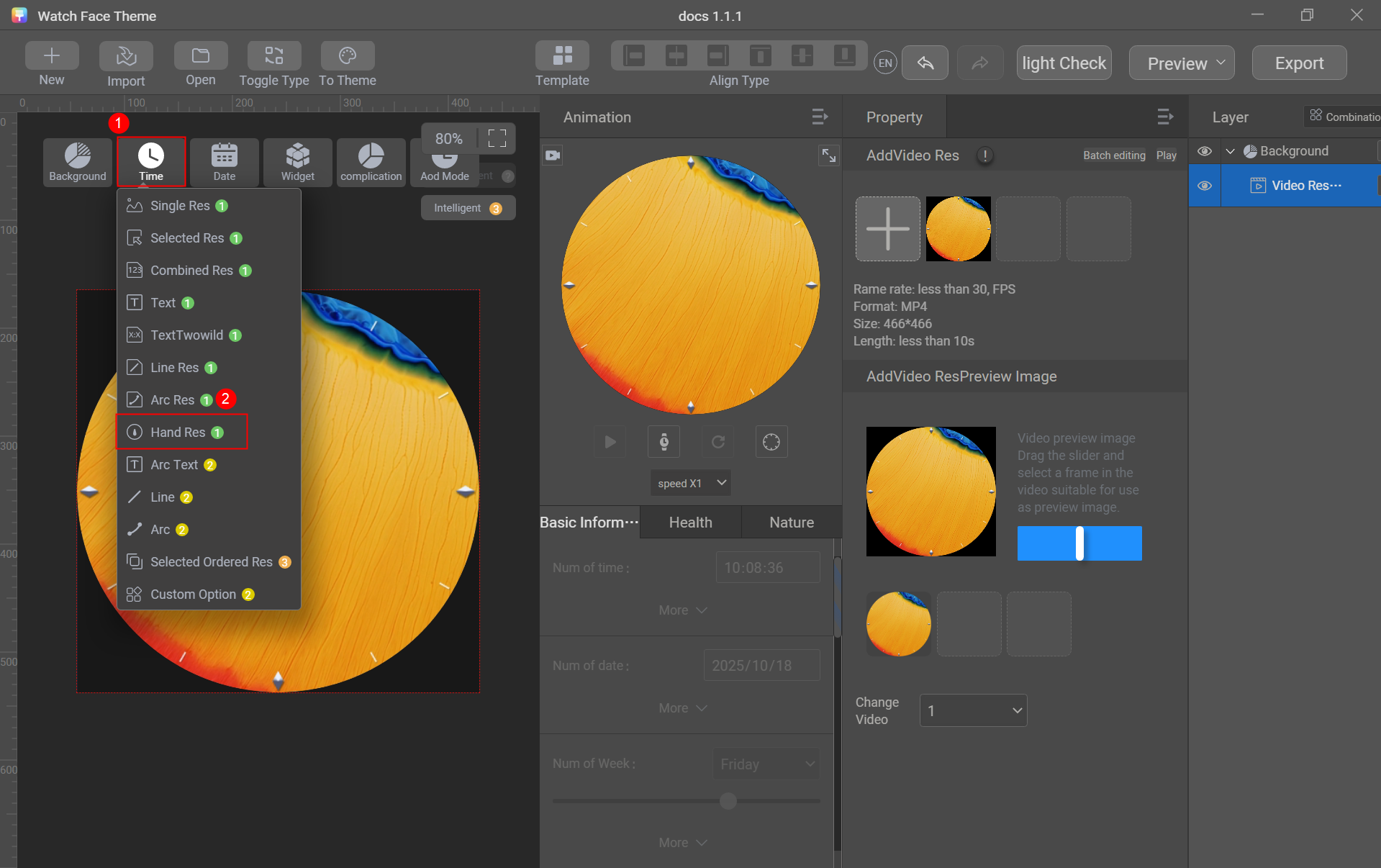
- Set Value Type to Hour 12 Ratio.
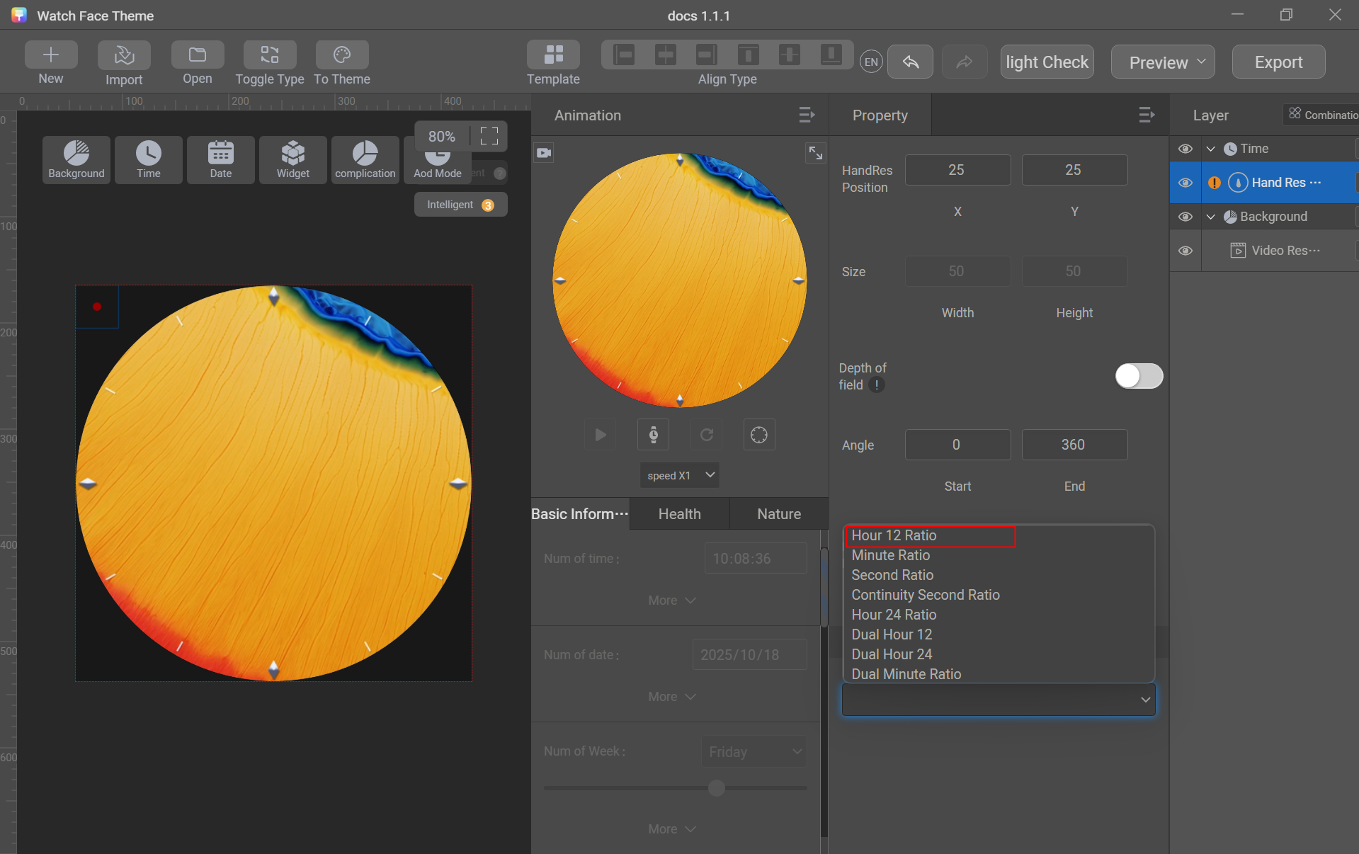
- Click + to import the sliced image of the hour hand, and set HandRes Position to (233, 233), Angle to (0, 360), and Rotate Point to (17, 104).
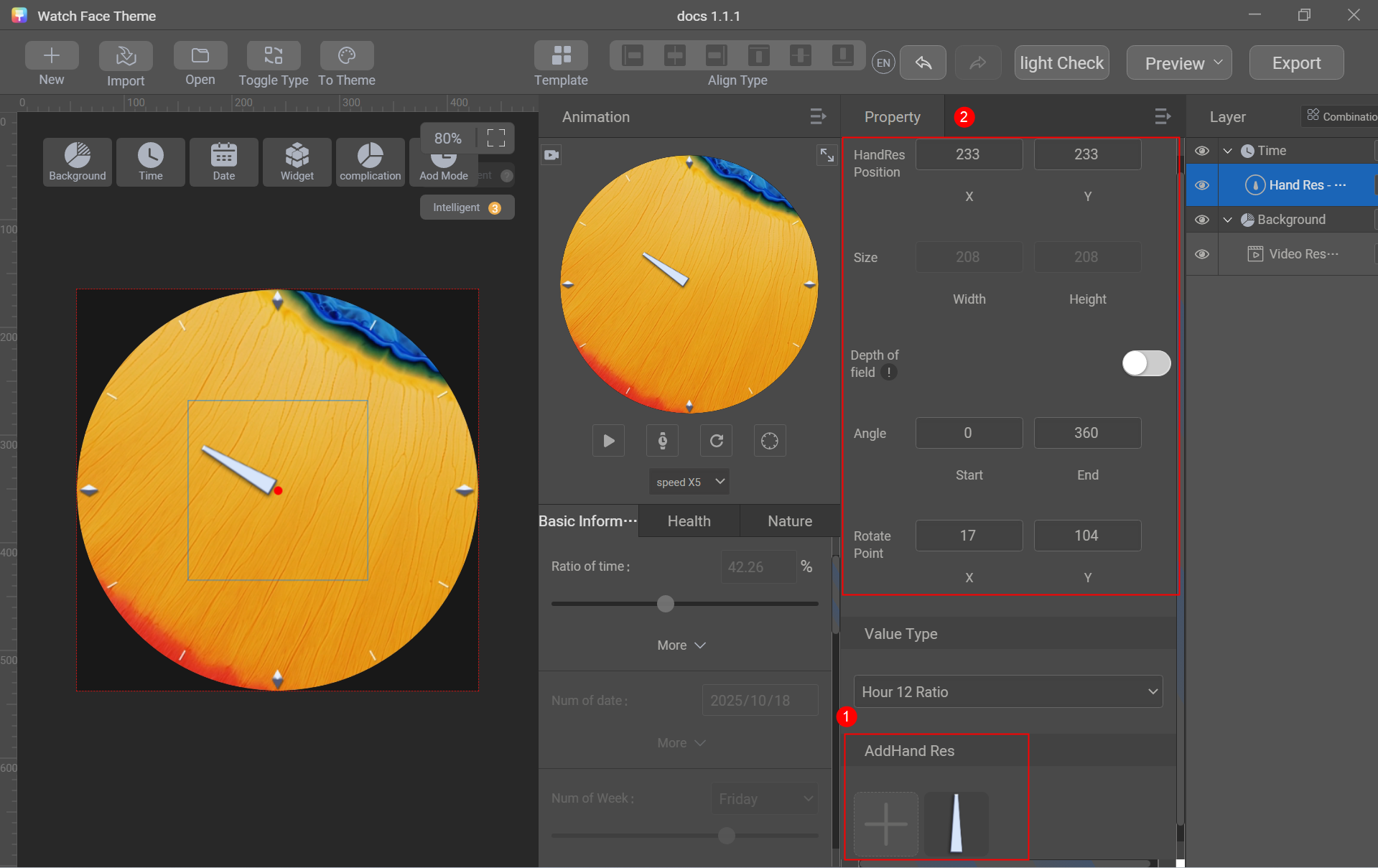
- Go to Time > Hand Res and set Value Type to Minute Ratio. Click + to import the sliced image of the minute hand, and set HandRes Position to (233, 233), Angle to (0, 360), and Rotate Point to (17, 196).
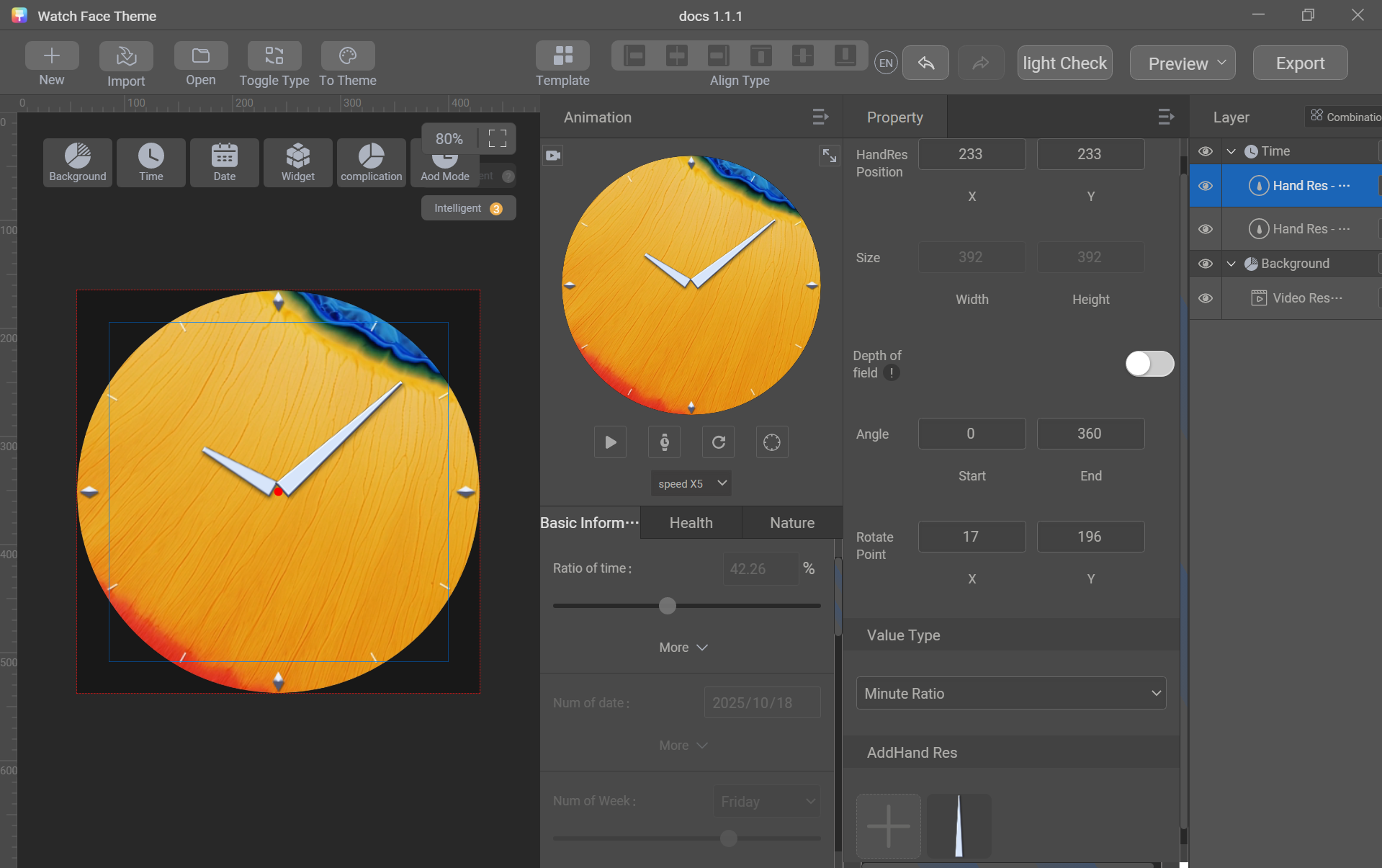
- Go to Time > Hand Res and set Value Type to Second Ratio. Click + to import the sliced image of the second hand, and set HandRes Position to (233, 233), Angle to (0, 360), and Rotate Point to (4, 165).
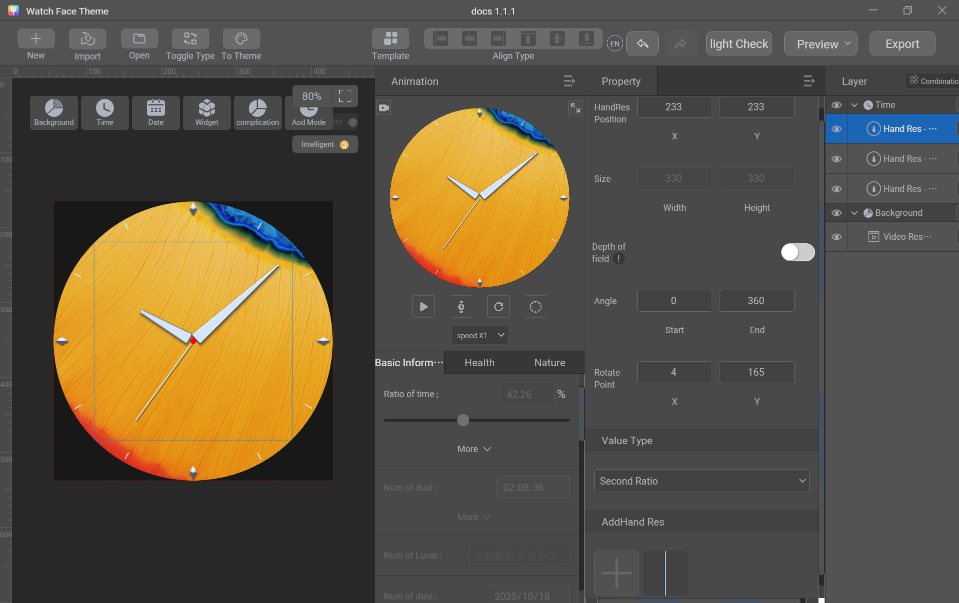
- Go to Time > Single Res, click + to import the sliced image of the decorative dot, and adjust the position.
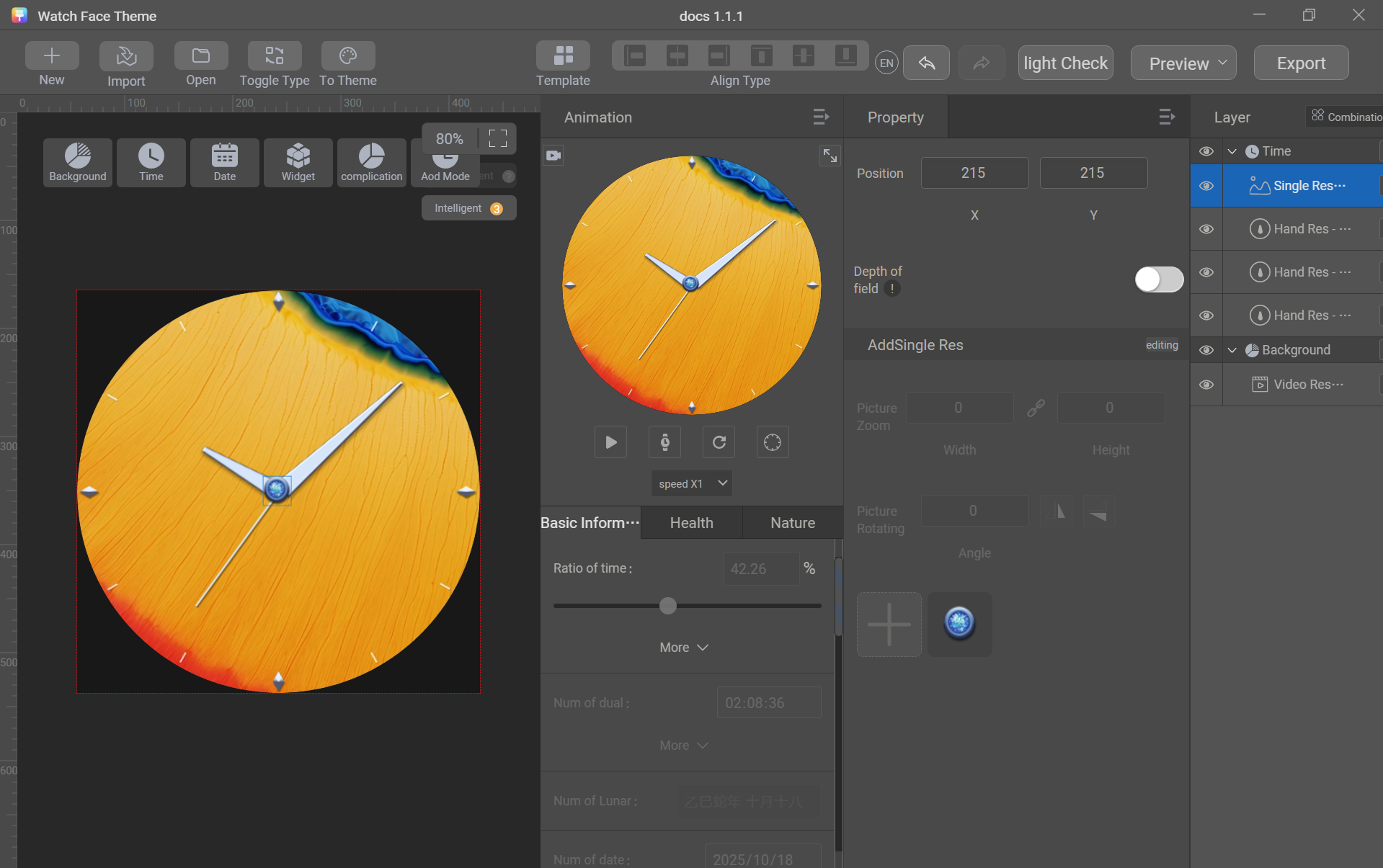

Parameter description:
- HandRes Position: anchor point of watch hands on the watch face canvas, which is generally the center of the canvas. For resolution 466 x 466 px, it's usually (233, 233). For resolution 280 x 456 px, it's usually (140, 228).
- Angle: rotation angle of a watch hand, which is usually 360° in analog clocks.
- Rotate Point: rotation center of a watch hand itself, which can be determined in the design software based on the watch hand design.
[h2]Digital Clock
Create sliced images of digits for hour, minute, and second (optional) to display time using digits 0–9.
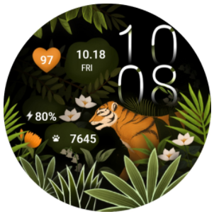
Control used: selected image
Sliced image preparation: sliced images of digits 0–9
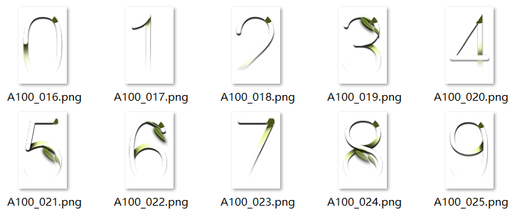
Creation procedure:
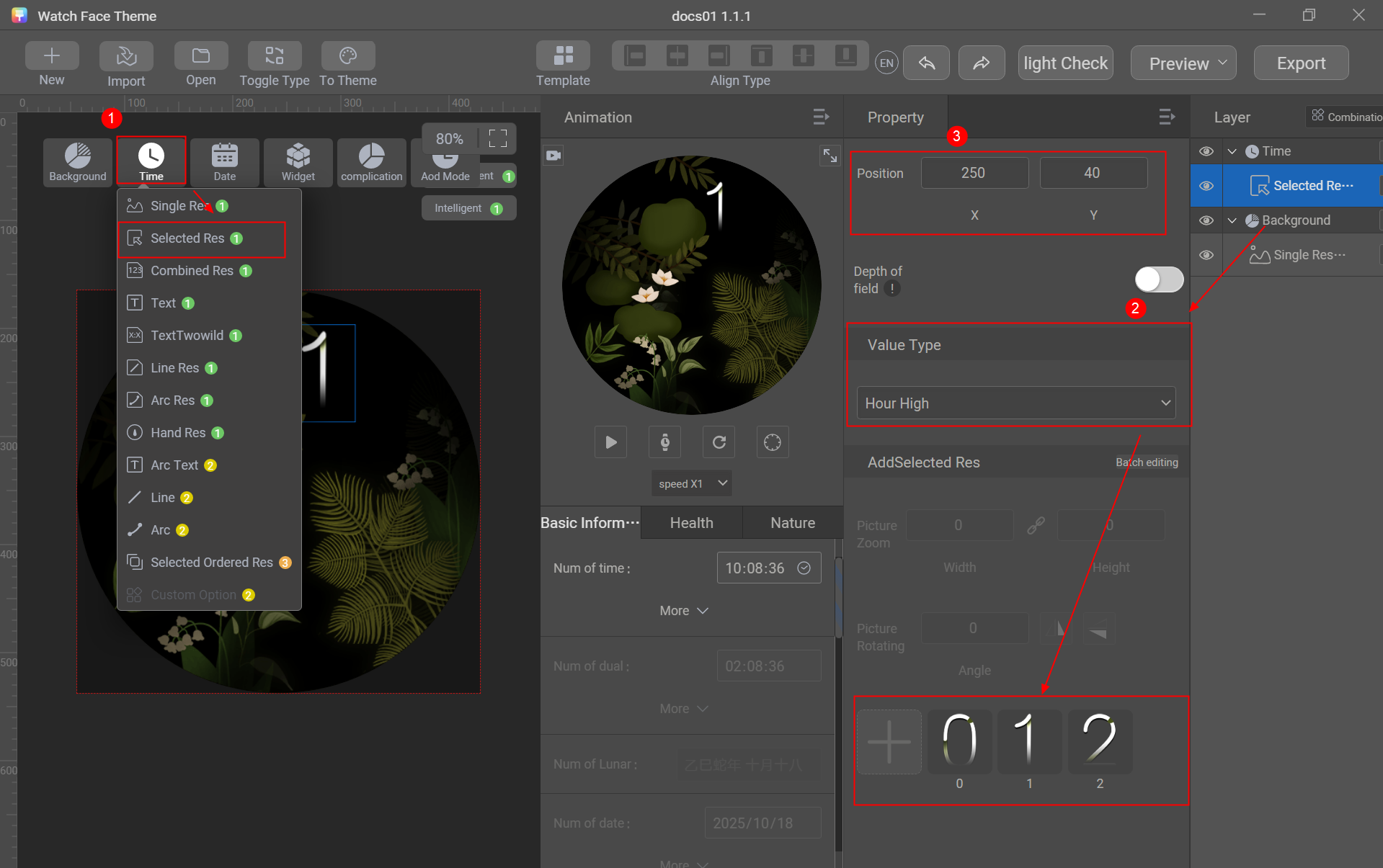
- Go to Time > Selected Res and set Value Type to Hour High. Click + to import the sliced images of digits 0–2 in batches and adjust the position.
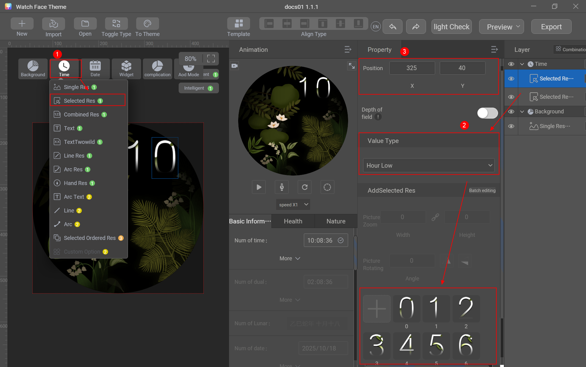
- Go to Time > Selected Res and set Value Type to Hour Low. Click + to import the sliced images of digits 0–9 in batches and adjust the position.
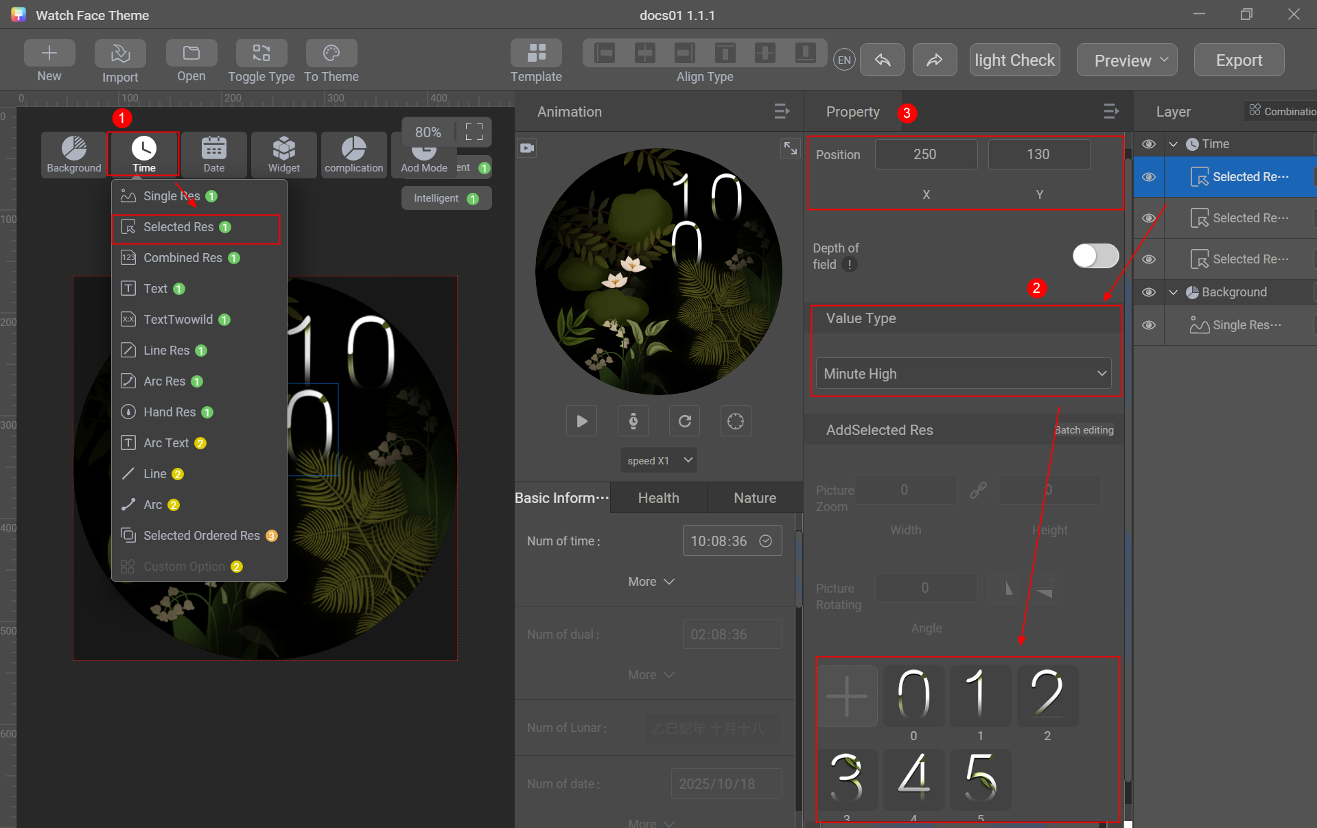
- Go to Time > Selected Res and set Value Type to Minute High. Click + to import the sliced images of digits 0–5 in batches and adjust the position.
- Go to Time > Selected Res and set Value Type to Minute Low. Click + to import the sliced images of digits 0–9 in batches and adjust the position.
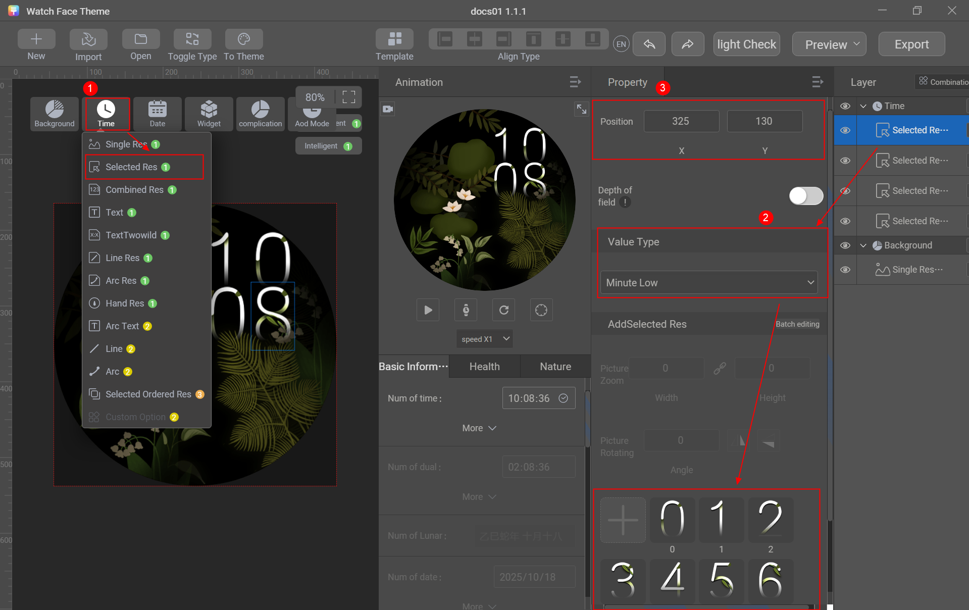

The positions of the hour high, hour low, minute high, and minute low must conform to the conventional reading habits to improve user experience.
[h2]Digital Clock - Multi-Group Sequence Frame
Design a group of sequence frames for each digit from 0 to 9 to display the dynamic effect of each digit. This is applicable only to digital clocks.
Control used: multi-group sequence frame
Sliced image preparation: sequence frame sliced images of digits 0–9
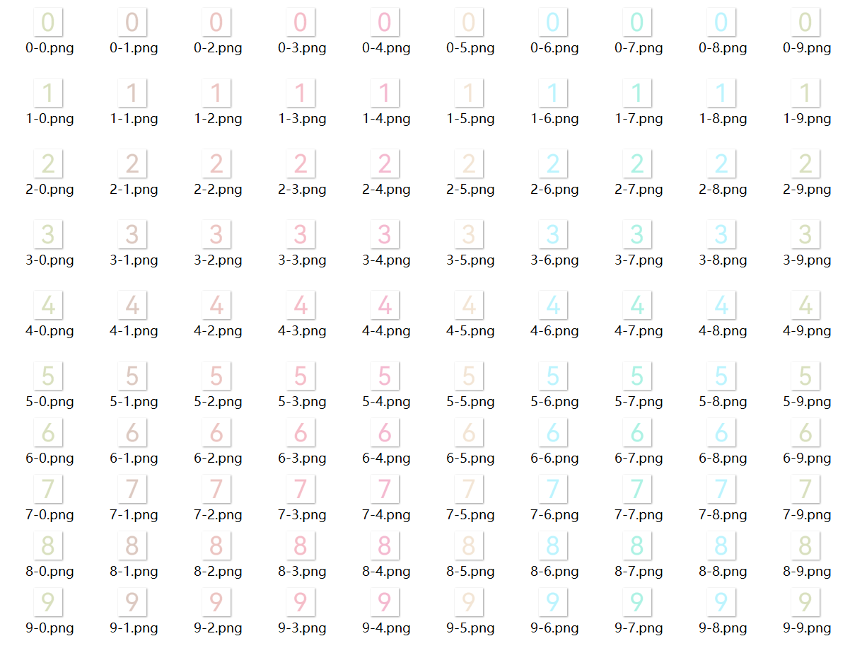
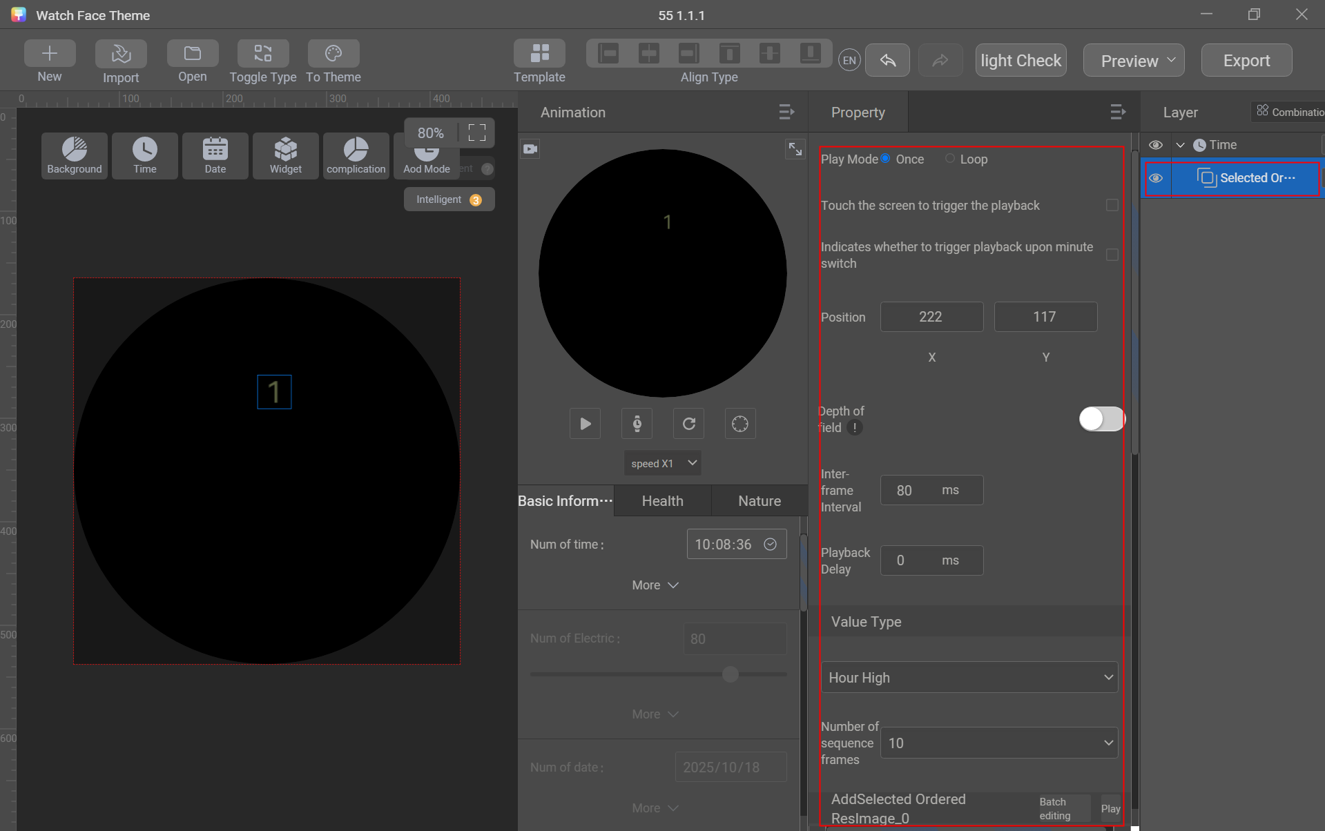
Creation procedure:
- Go to Time > Selected Ordered Res and set Value Type to Hour High. Click + to import the sequence frame sliced images of digits 0–2 in batches and adjust the position.
The value of Number of sequence frames ranges from 2 to 10. In this example, the value is 10. Therefore, you need to upload 10 sequence frames for each digit.
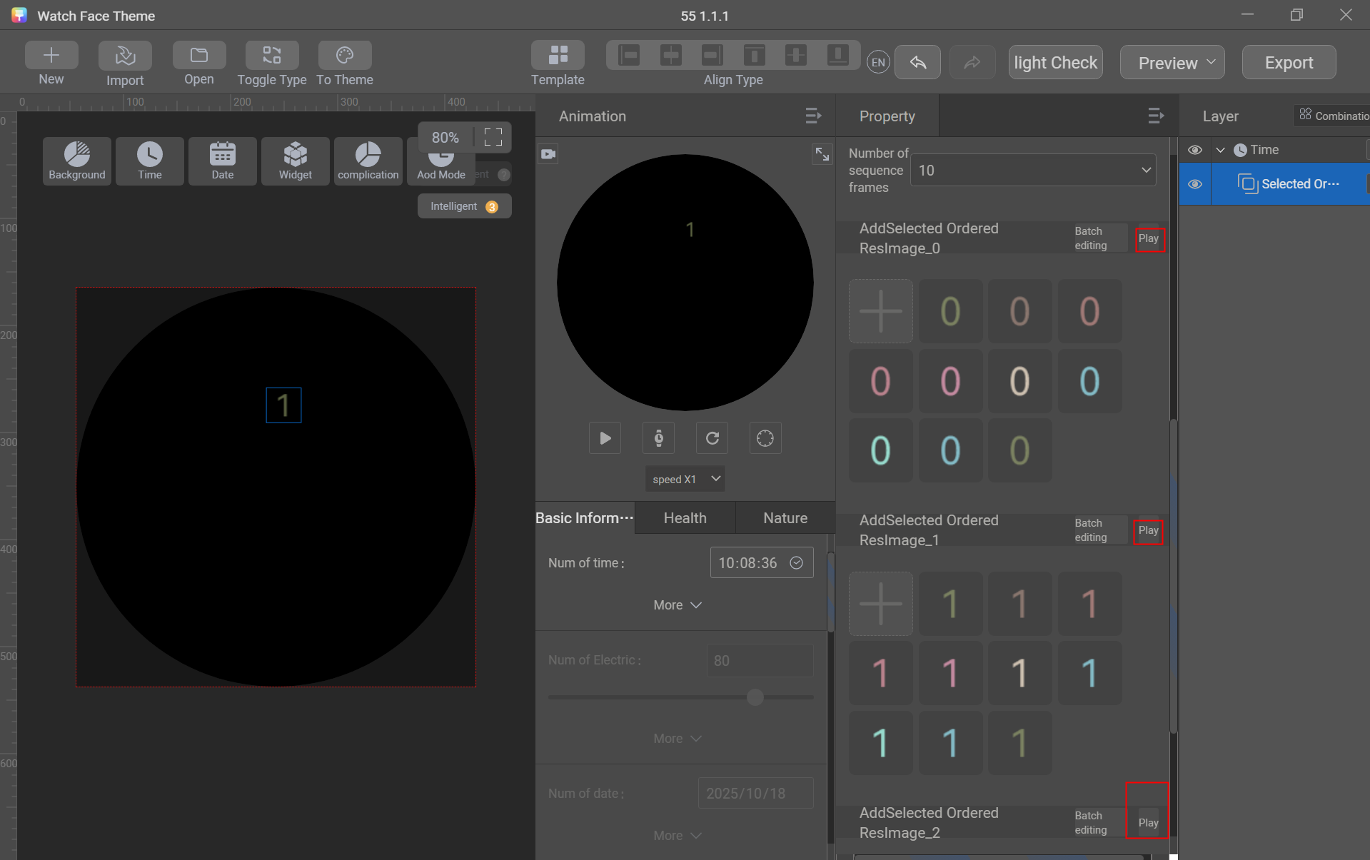
- Click Play to check whether the animation of the sequence frames of digits 0–2 is smooth.
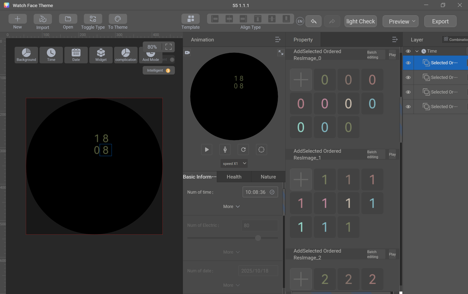
- Use the same method to create multi-group sequence frames for hour low, minute high, and minute low.
Date
A date generally contains the month, day, and day of the week. You can use text or image controls to create a date.
[h2]Date - Creation Using Text Controls
Use text controls to create the month, day, and day of the week.
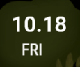
Controls used: connection text and text
Sliced image preparation: No need to prepare sliced images. Directly use text controls.
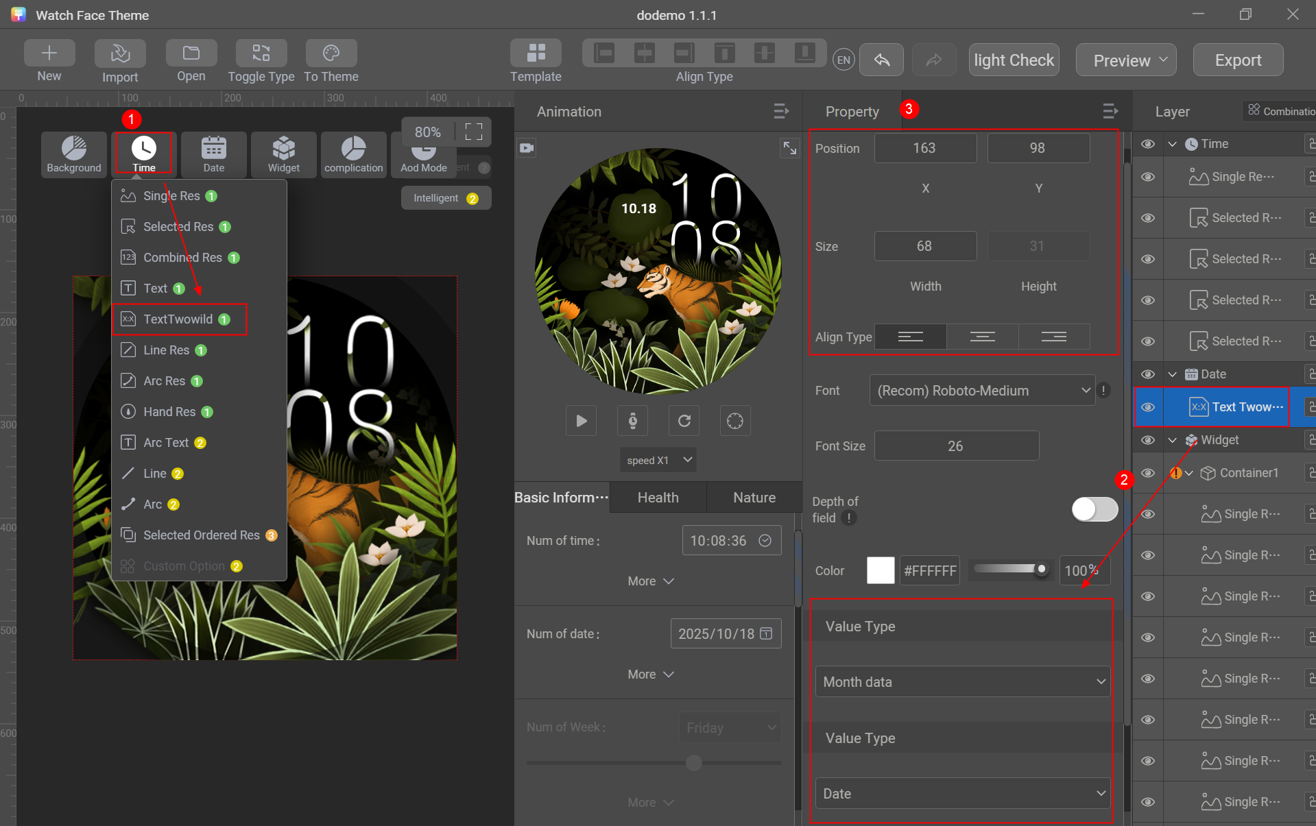
Creation procedure:
- Go to Date > TextTwowild, set the first Value Type to Month data, the second Value Type to Date, and Connect Type to Point, and adjust the position and size.
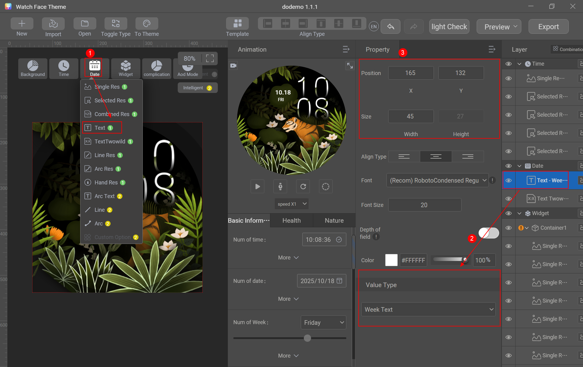
- Go to Date > Text, set Value Type to Week Text, and adjust the position and size.
[h2]Date - Creation Using Image Controls
Use image controls to create the month, day, and day of the week.
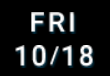
Control used: selected image
Sliced image preparation: sliced images of the month, day, and day of the week
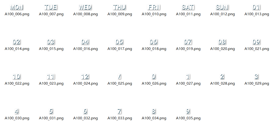

Sliced image description:
- The day of the week can be designed as the full name or abbreviation.
- The month can be designed as the full name or abbreviation, or numbers 1–12.
Creation procedure:
- Go to Date > Selected Res.
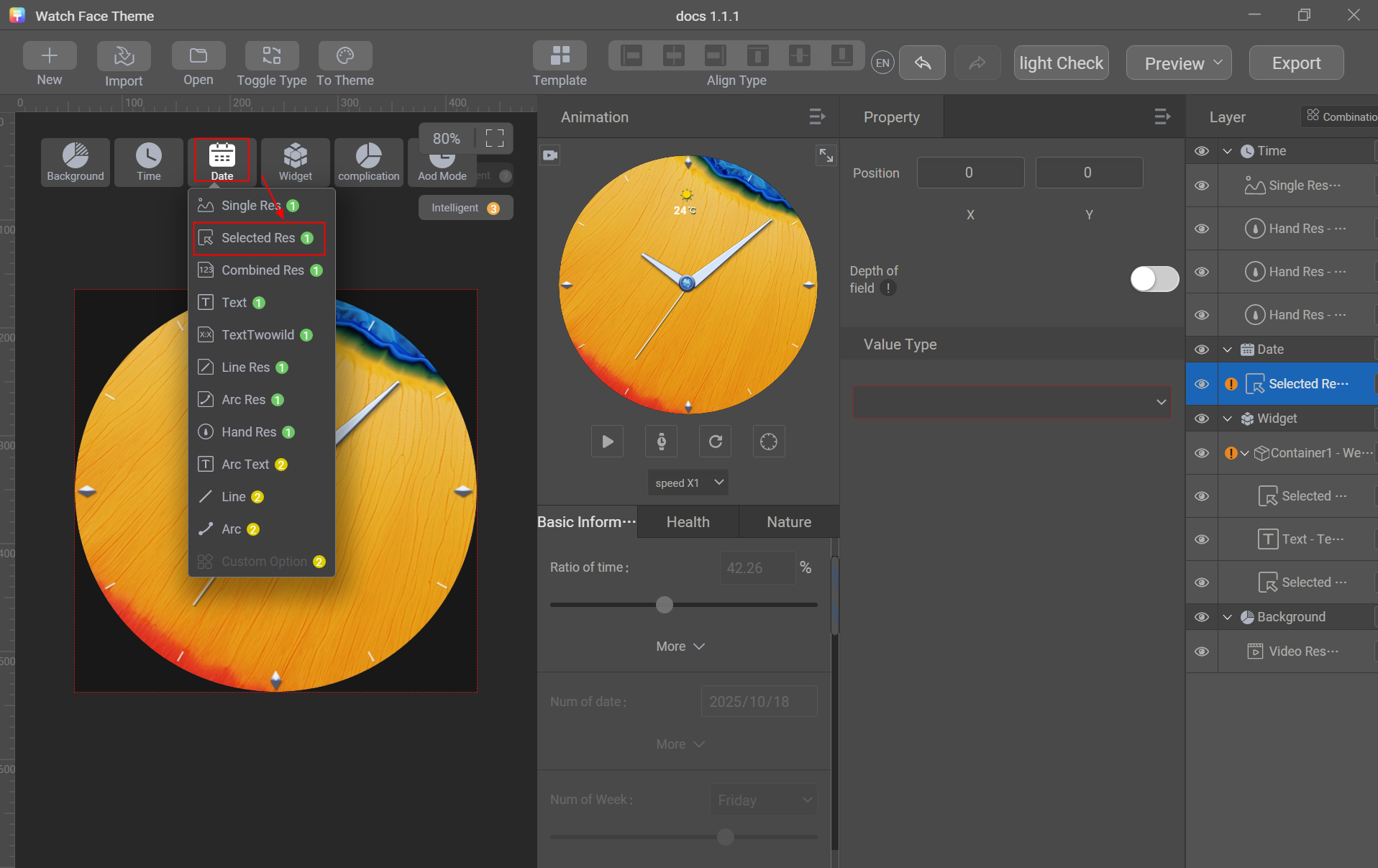
- Set Value Type to Week.
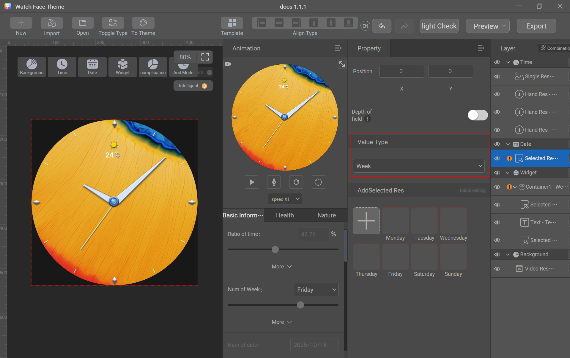
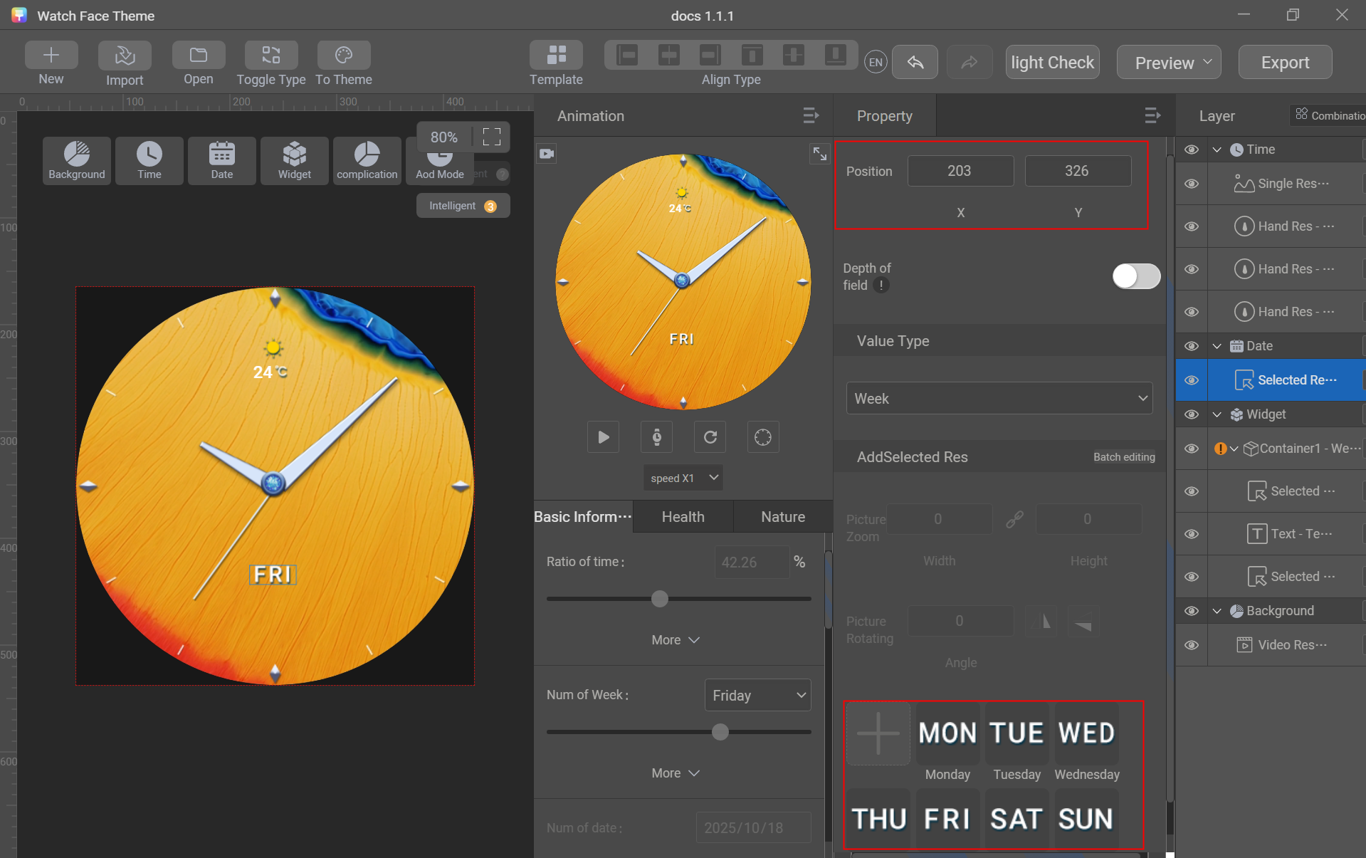
- Click + to import sliced images of days of the week, and adjust the position.
- Go to Date > Selected Res, set Value Type to Month, click + to import sliced images of months in batches, and adjust the position.
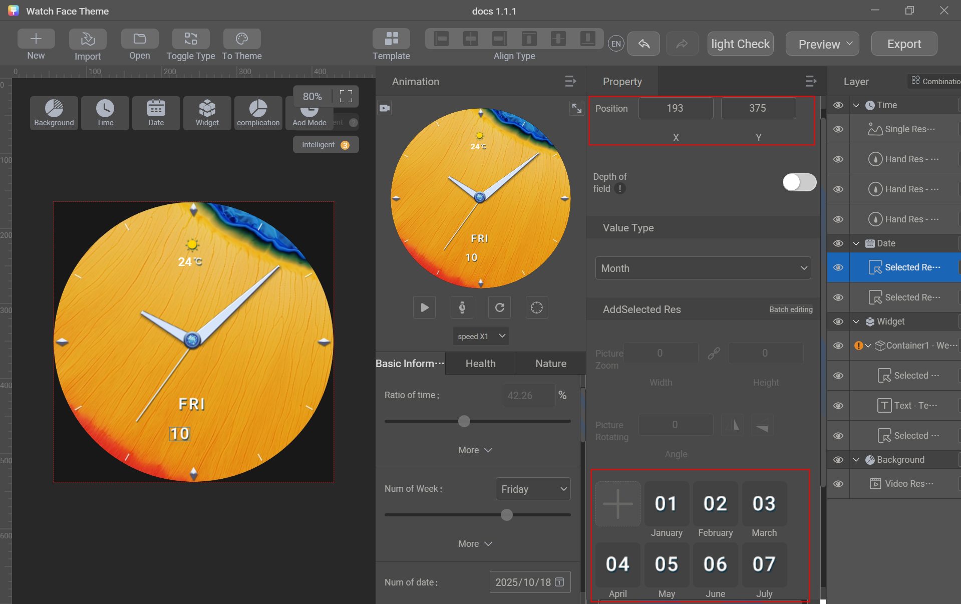
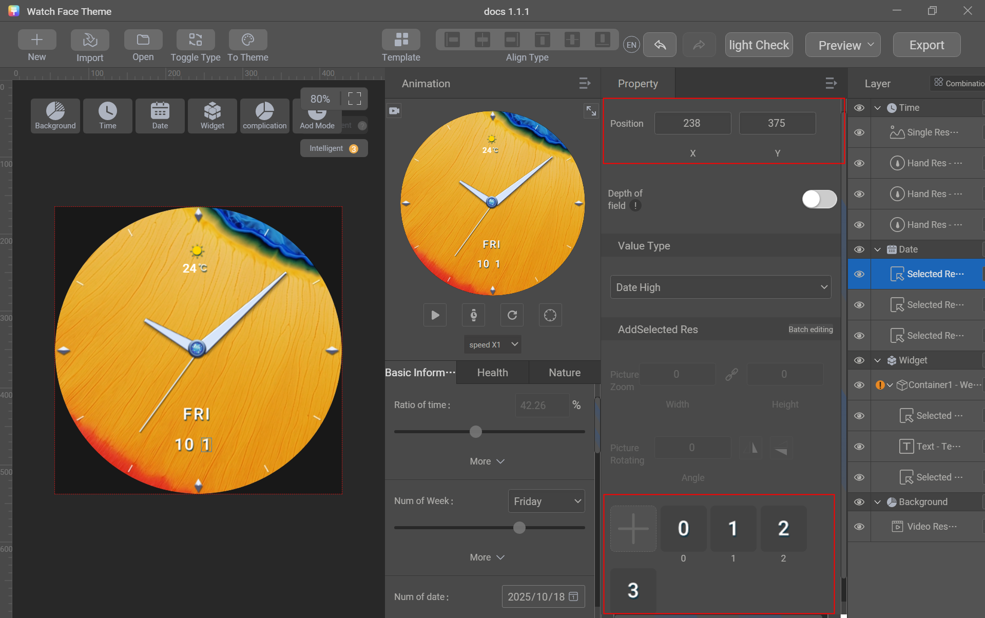
- Go to Date > Selected Res, set Value Type to Date High, click + to import sliced images of digits 0–3 in batches, and adjust the position.
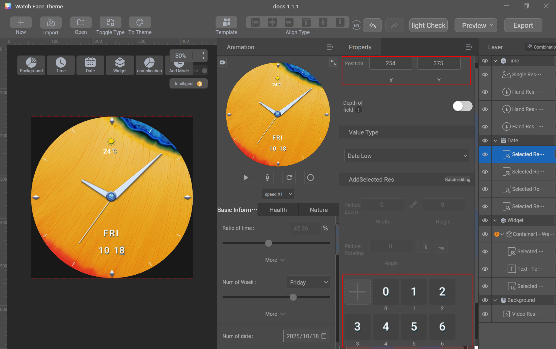
- Go to Date > Selected Res, set Value Type to Date Low, click + to import sliced images of digits 0–9 in batches, and adjust the position.
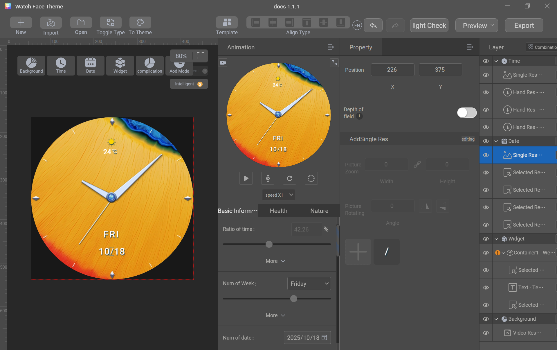
- Go to Date > Single Res, click + to import the sliced image of the connection symbol (/), and adjust the position.
[h2]Lunar Calendar
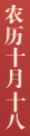
Use the selected image control to create the lunar month and day.
Control used: selected image
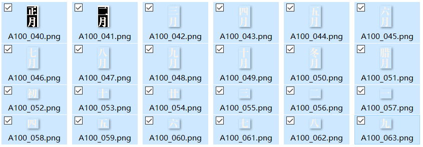
Sliced image preparation: lunar month, lunar date high, and lunar date low
Creation procedure:
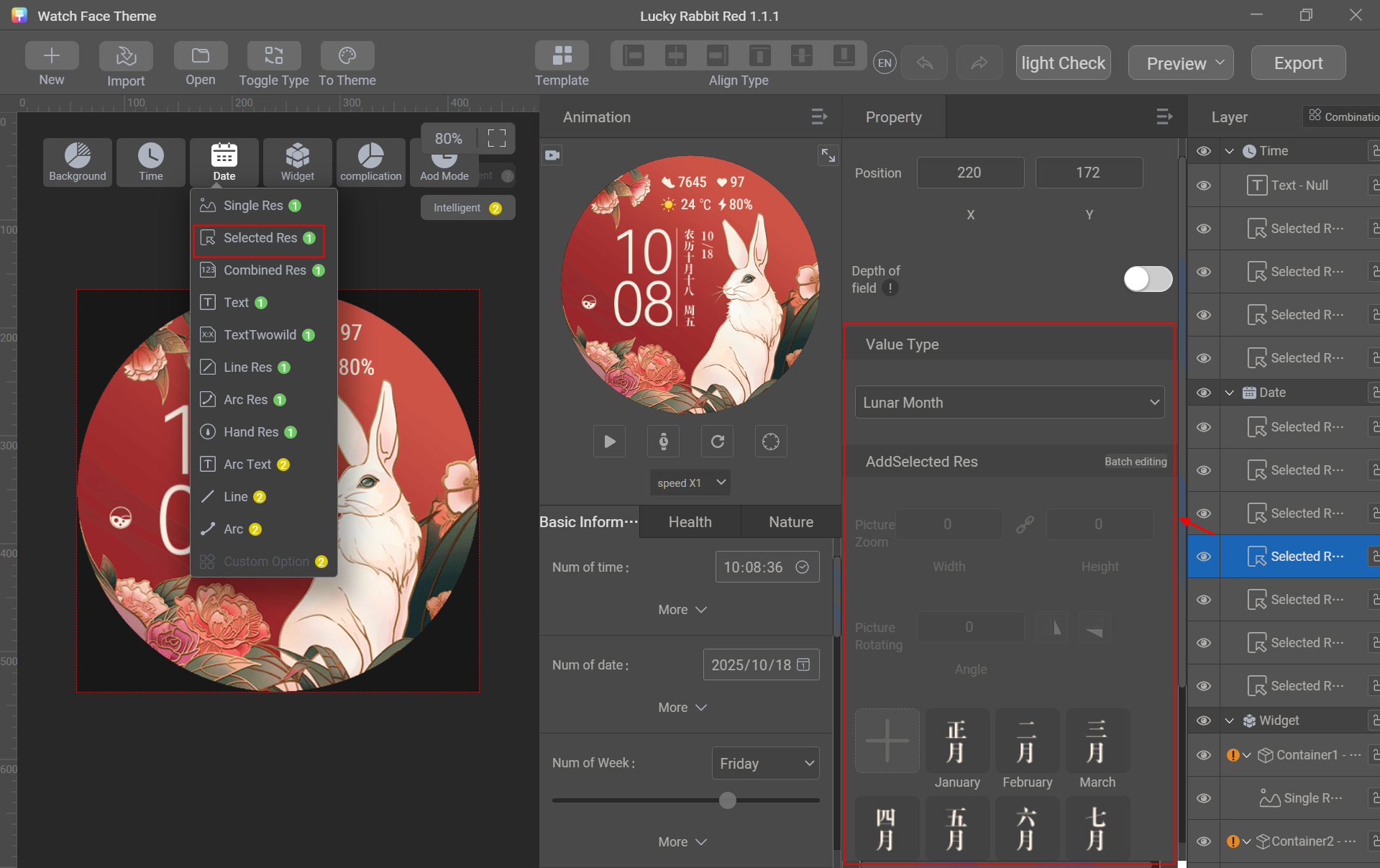
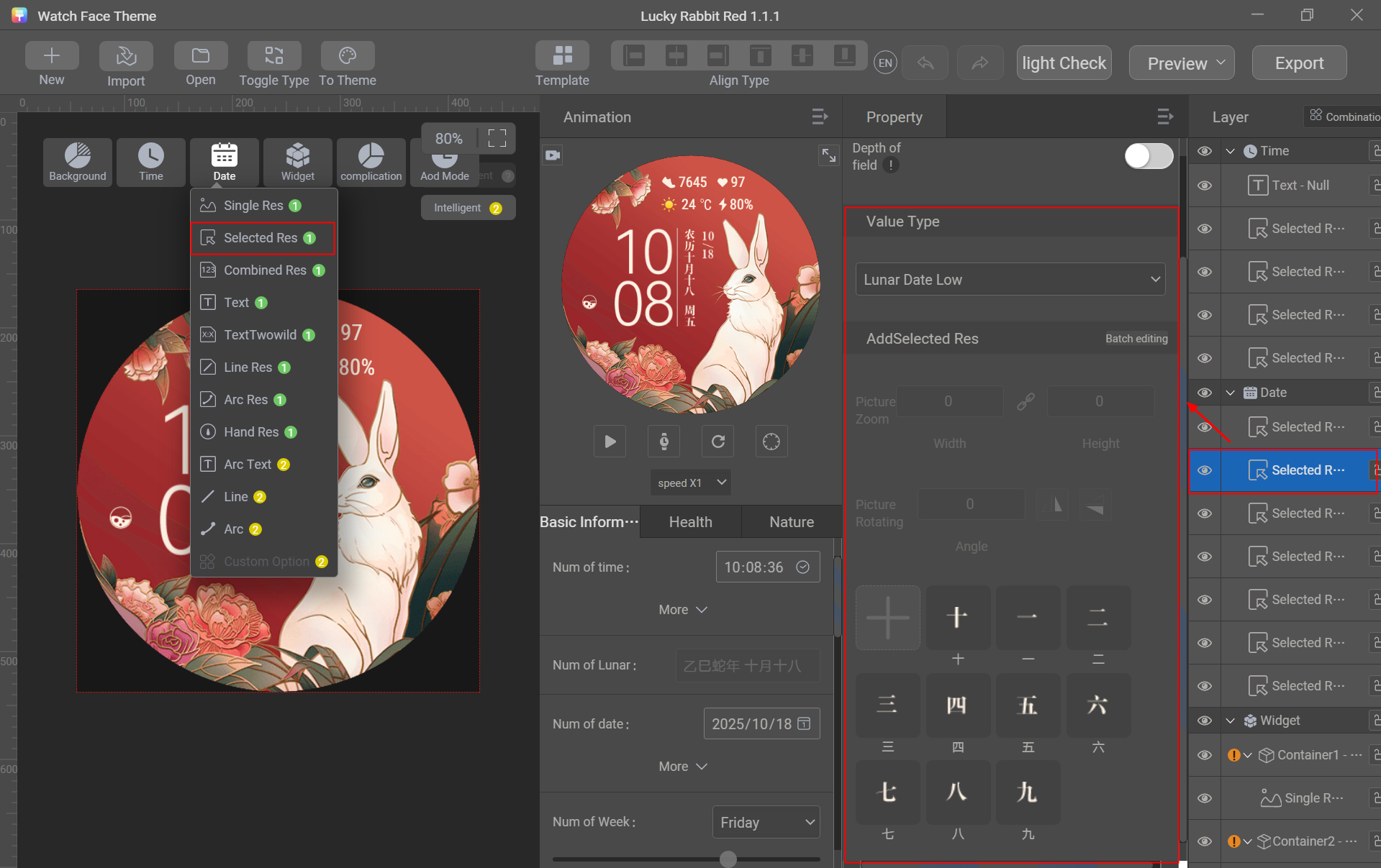
- Go to Date > Selected Res, set Value Type to Lunar Month, click + to import sliced images of lunar months in batches, and adjust the position.
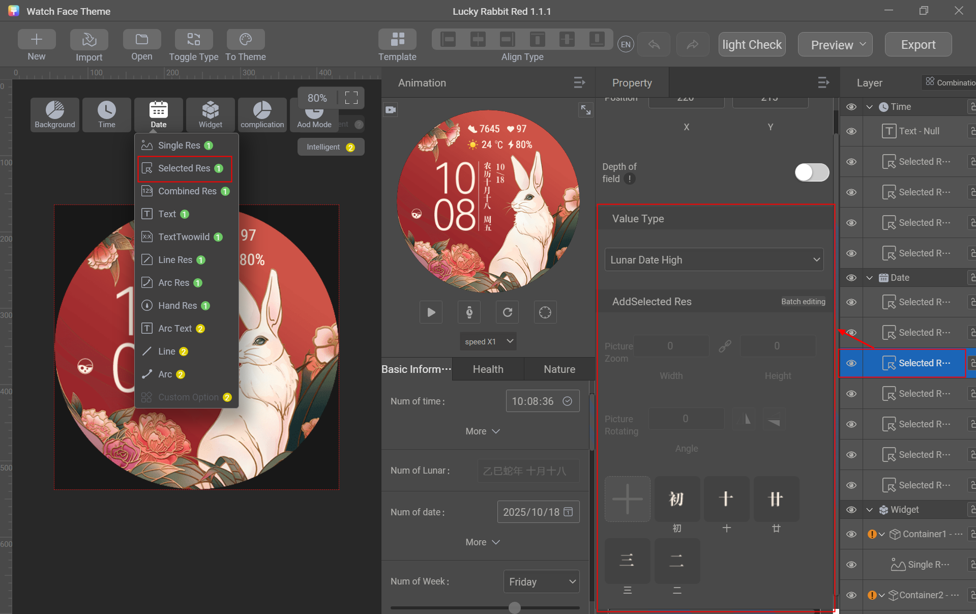
- Go to Date > Selected Res, set Value Type to Lunar Date High, click + to import sliced images of lunar date high in batches, and adjust the position.
- Go to Date > Selected Res, set Value Type to Lunar Date Low, click + to import sliced images of lunar date low in batches, and adjust the position.
[h2]Power
Generally, the power information includes the battery level numeric value (with the unit % required), battery level enumeration, and battery ratio.
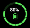
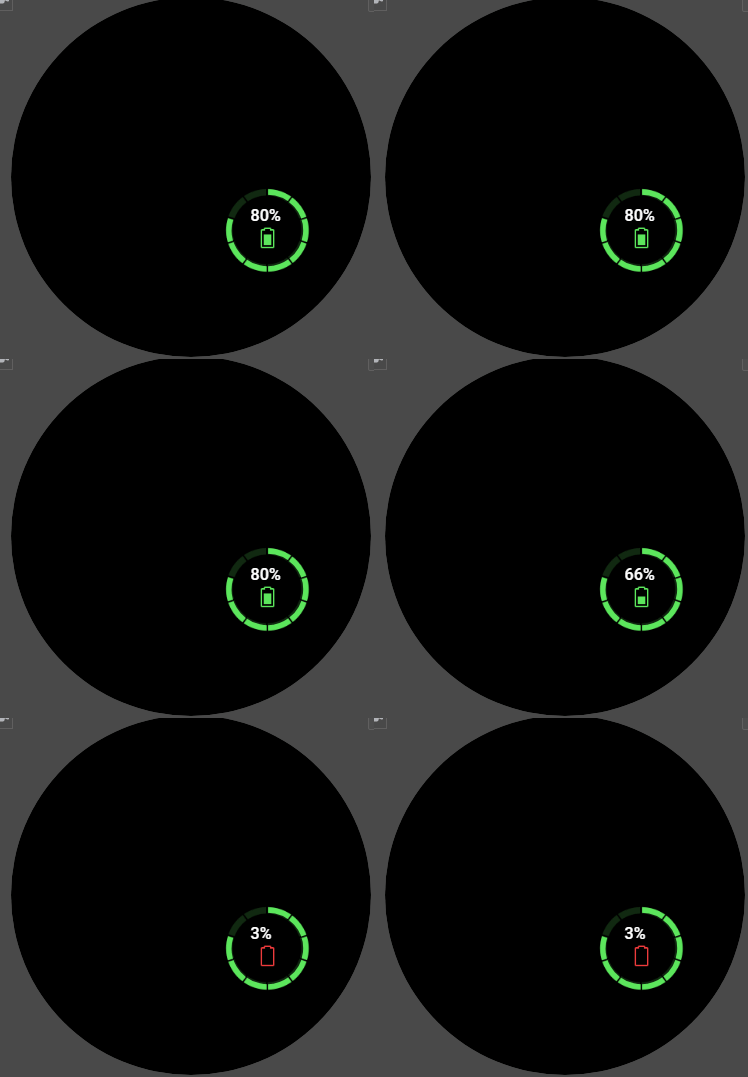
Controls used: connection text, selected image, and arc image
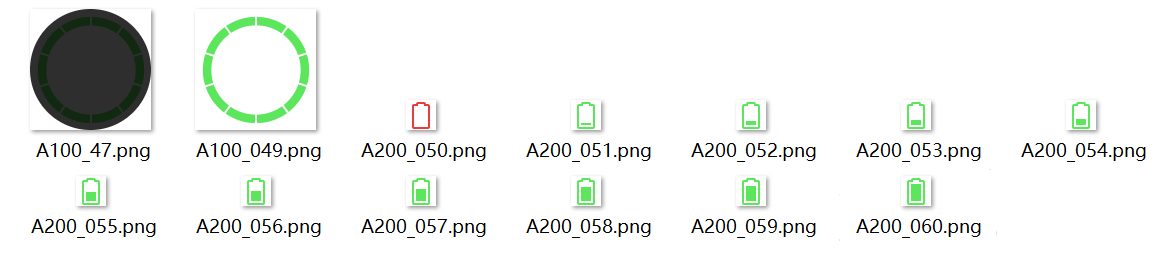
Sliced image preparation: selected images of battery level enumeration, battery ratio base image, and battery ratio arc image
Creation procedure:
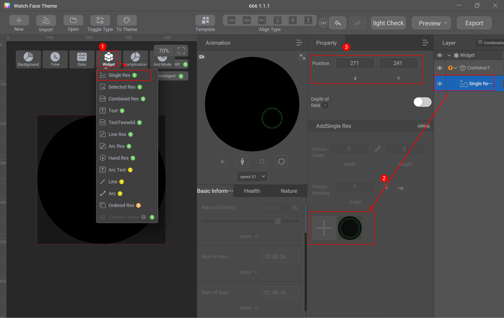
- Import the battery ratio base image.
Go to Widget > Single Res and import the battery ratio base image.
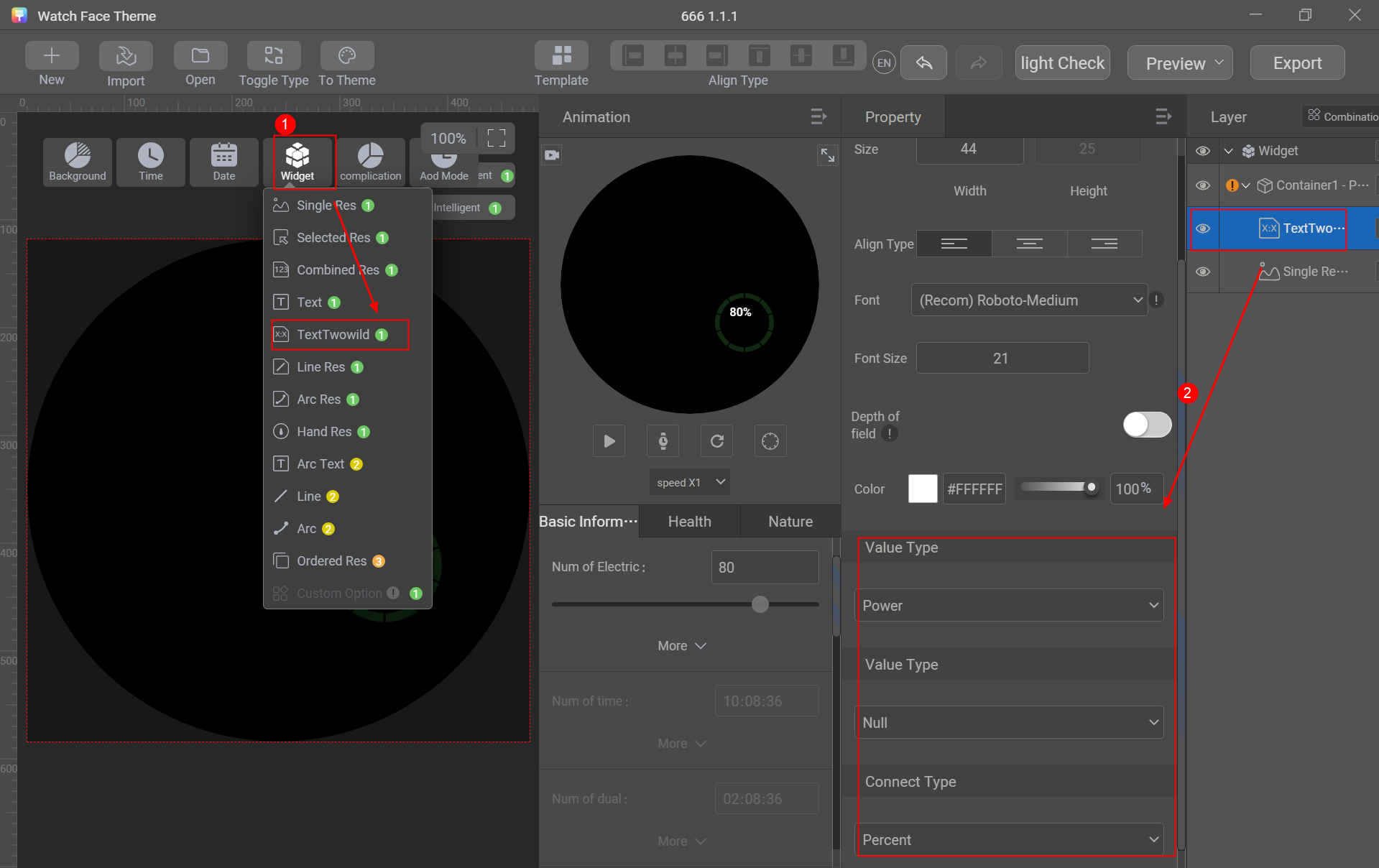
- Create the battery level text.
Go to Widget > TextTwowild, set the first Value Type to Power, the second Value Type to Null, and Connect Type to Percent, and adjust the position and size.
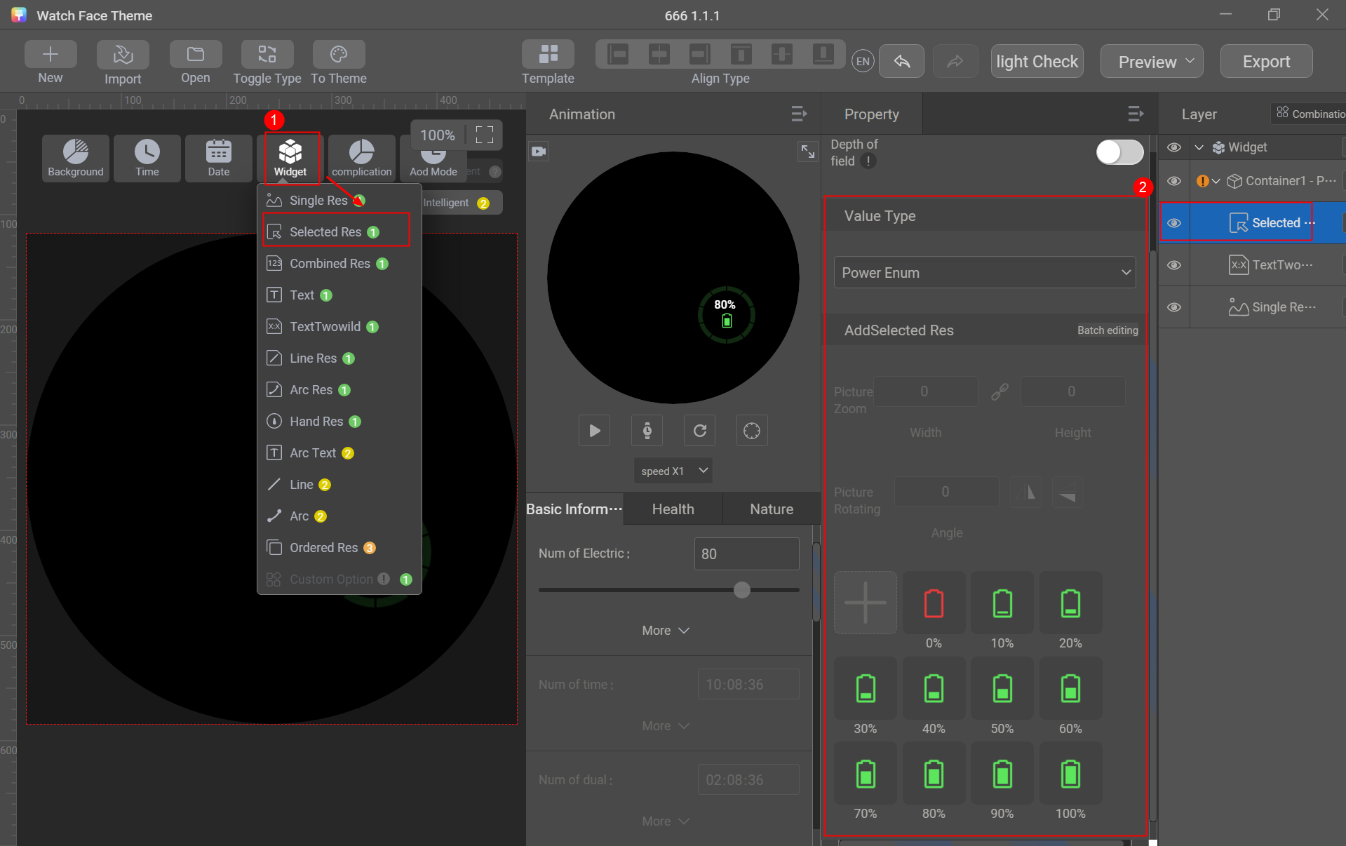
- Create the battery level enumeration.
Go to Widget > Selected Res, set Value Type to Power Enum, import the battery level enumeration images, and adjust the position.
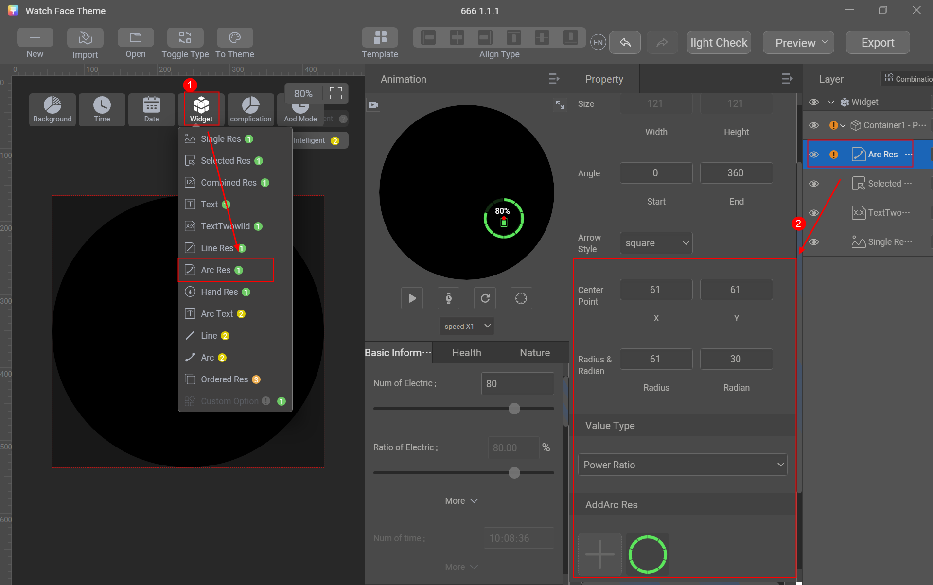
- Create the battery ratio.
Go to Widget > Arc Res, set Value Type to Power Ratio, import the battery ratio arc image, and adjust the position, angle, center point, radius, and arc width.
[h2]Steps
Generally, the steps information includes the icon, numeric value, and step goal completion.
Controls used: single image, arc text, and arc image
Sliced image preparation: step goal completion arc image and step goal completion base image
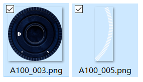

Sliced image description:
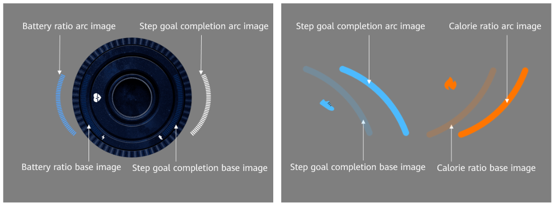
To use the arc image control to display the progress or proportion, you need to prepare an arc image and a base image.
- Arc image: displays the current progress or proportion. It typically uses bright colors and requires a separate layer to be created.
- Base image: displays the total progress or proportion. It typically uses dark colors and can either be a separate layer or integrated directly into the background image.
Creation procedure:
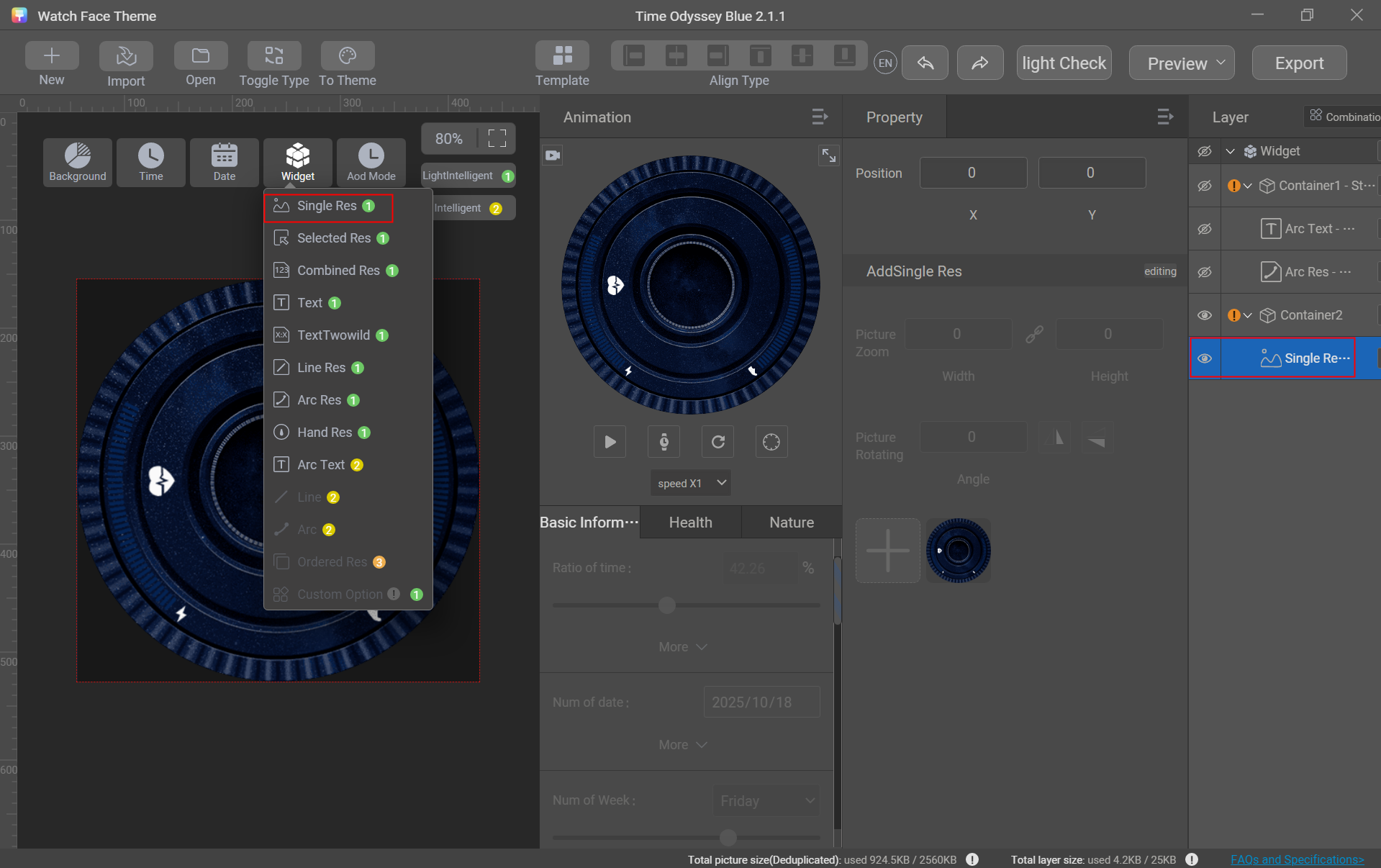
- Import a steps background image.
Go to Widget > Single Res and import a steps background image.
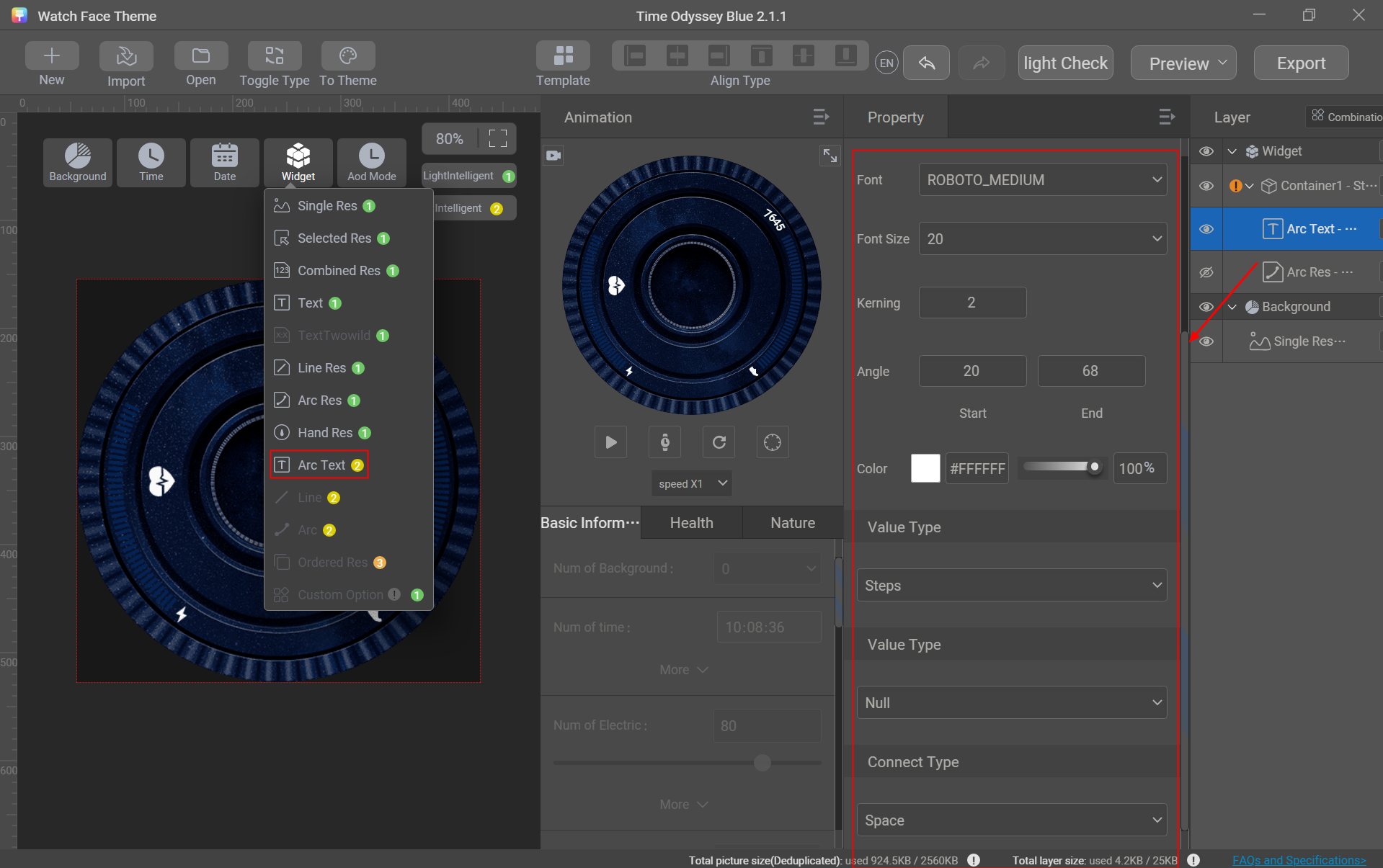
- Create the step count text.
Go to Widget > Arc Text, set the first Value Type to Steps, the second Value Type to Null, and Connect Type to Space, and adjust the position, size, alignment, font, font size, kerning, angle, and color.
- Create the step goal completion arc image.
Go to Widget > Arc Res, set Value Type to Steps Ratio, import the corresponding arc image, and adjust the position, angle, center point, radius, and arc width.
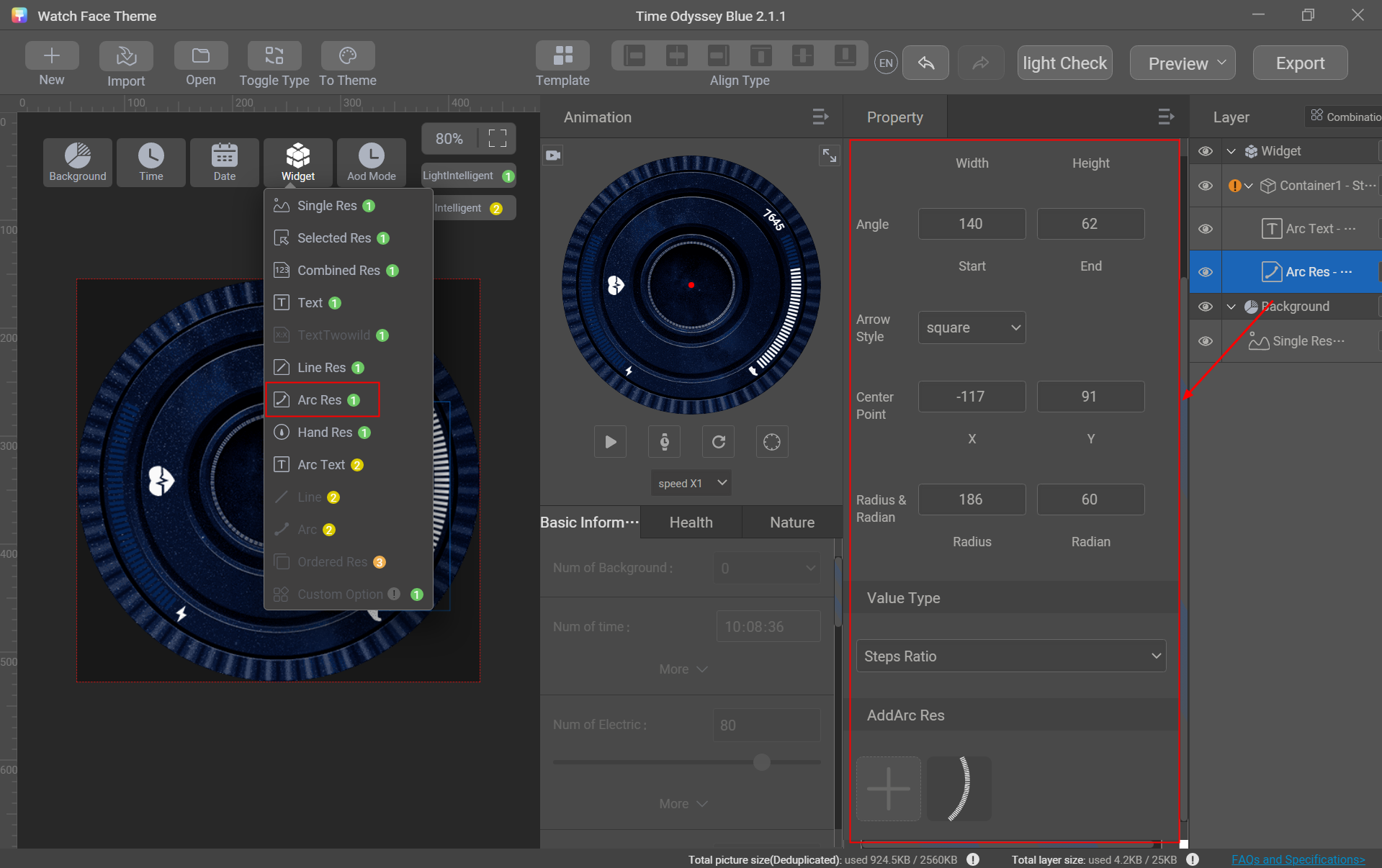

Parameter description:
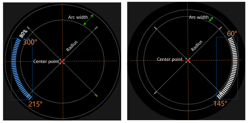
- Angle: defines the start and end points of the arc. Set the parameter based on the actual angle of the arc-shaped graphic. A circle is 360 degrees. Both clockwise (for example, from 60° to 145°) and counterclockwise (for example, from 300° to 215°) calculations are supported.
- Center Point: center of a circle. Radian: width of an arc. Radius: radius of an arc (inner circle radius + half of the arc width).
- The center point, arc width, and radius are combined to generate a circular ring. The ring must fully cover the range of the arc-shaped graphic. By applying the configured angle parameter, the arc-shaped graphic can display the current progress or proportion. For example: if the current step goal completion is 20%, the arc occupies 20% of the circle; if the completion is 90%, the arc occupies 90% of the circle.
[h2]Heart Rate
Generally, the heart rate information includes the heart rate icon, numeric value, and heart rate ratio.

Controls used: single image, combination image, and straight line
Sliced image preparation: sliced images of the heart rate icon, digits 0–9, fallback image, and default image
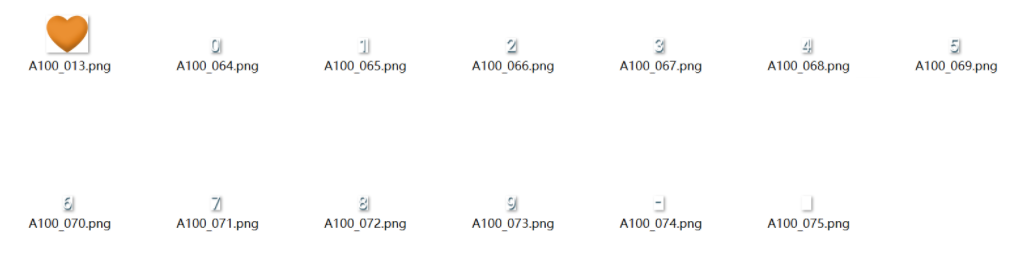

Sliced image description:
- Fallback image: Design an image displaying a hyphen (-). If no data is synchronized, the fallback image (-) will be displayed.
- Default image: Design a transparent image to fill the blank area.
- The fallback image and default image must have the same dimensions as the sliced images of digits 0–9.
Creation procedure:
- Go to Widget > Single Res, import the heart rate icon, and adjust the position.
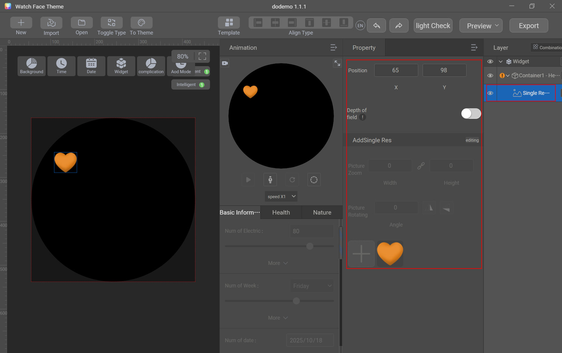
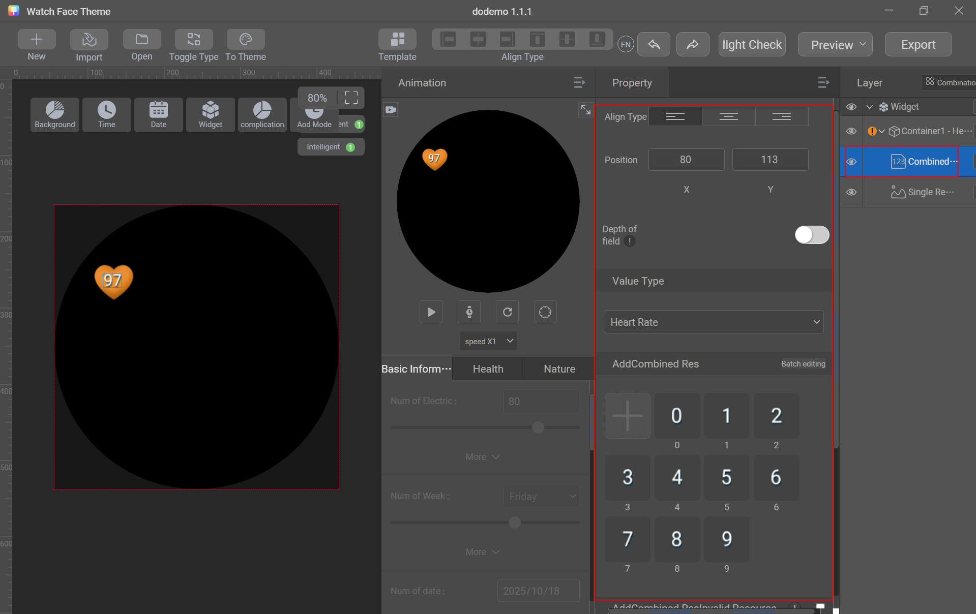
- Go to Widget > Combined Res, set Value Type to Heart Rate, import sliced images of digits 0–9, fallback image, and default image, and adjust the position and alignment.
- Go to Widget > Line, set Value Type to Heart Rate Ratio, and adjust the start point, end point, line width, main color, and background color.
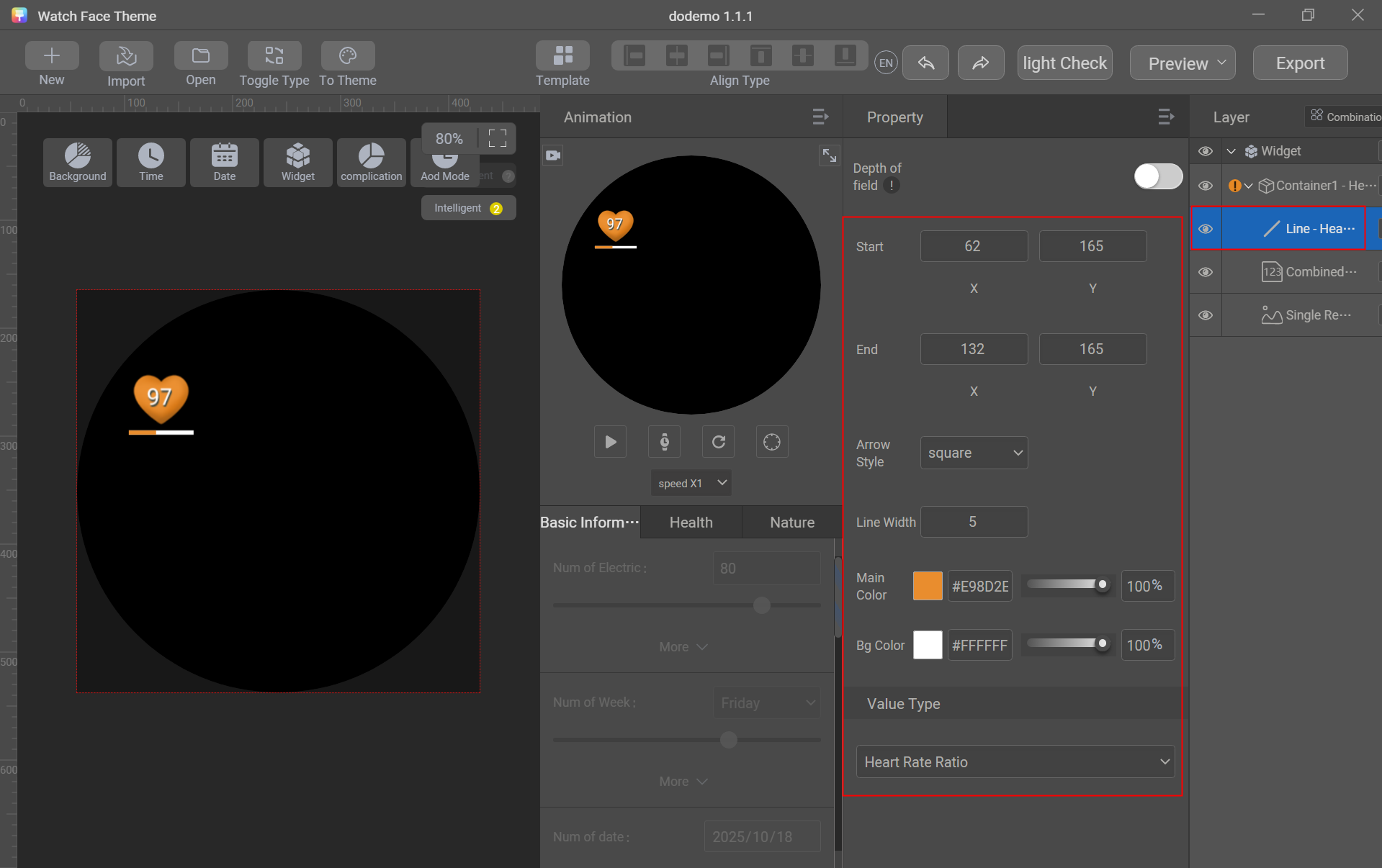

Straight line parameter description:
- Set the start point and end point to generate a line for displaying the progress or proportion.
- Main color: displays the current progress or proportion.
- Background color: displays the total progress or proportion.
[h2]Weather
Generally, the weather information includes the weather type (28 or 11 weather types), temperature value (with the unit °C or °F required), and temperature type.

Control used: selected image and text
Sliced image preparation: selected images of 28 weather types and selected images of temperature types
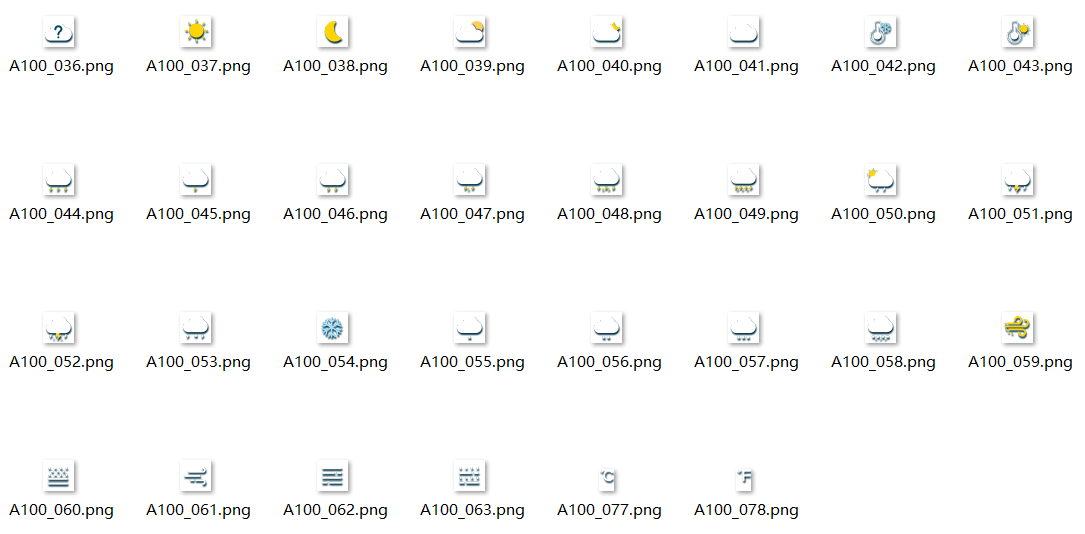

Sliced image description:
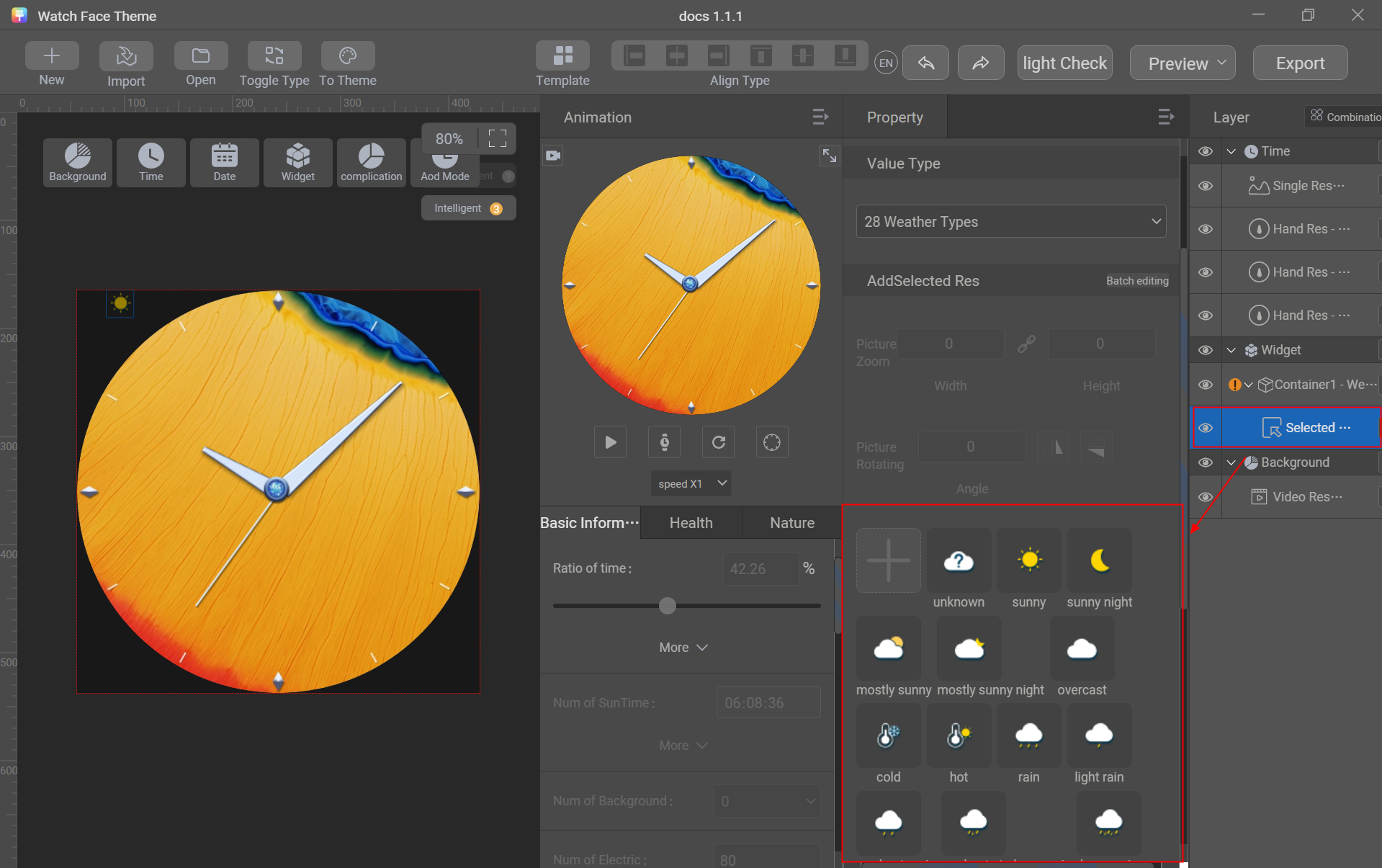
- The weather types have 28 or 11 sliced images, as shown in the preceding figure. The unknown weather type must be a cloud with a question mark (for example,
 ).
- The temperature types must include the Celsius icon (°C) and Fahrenheit icon (°F).
Creation procedure:
- Go to Widget > Selected Res and set Value Type to 28 Weather Types.
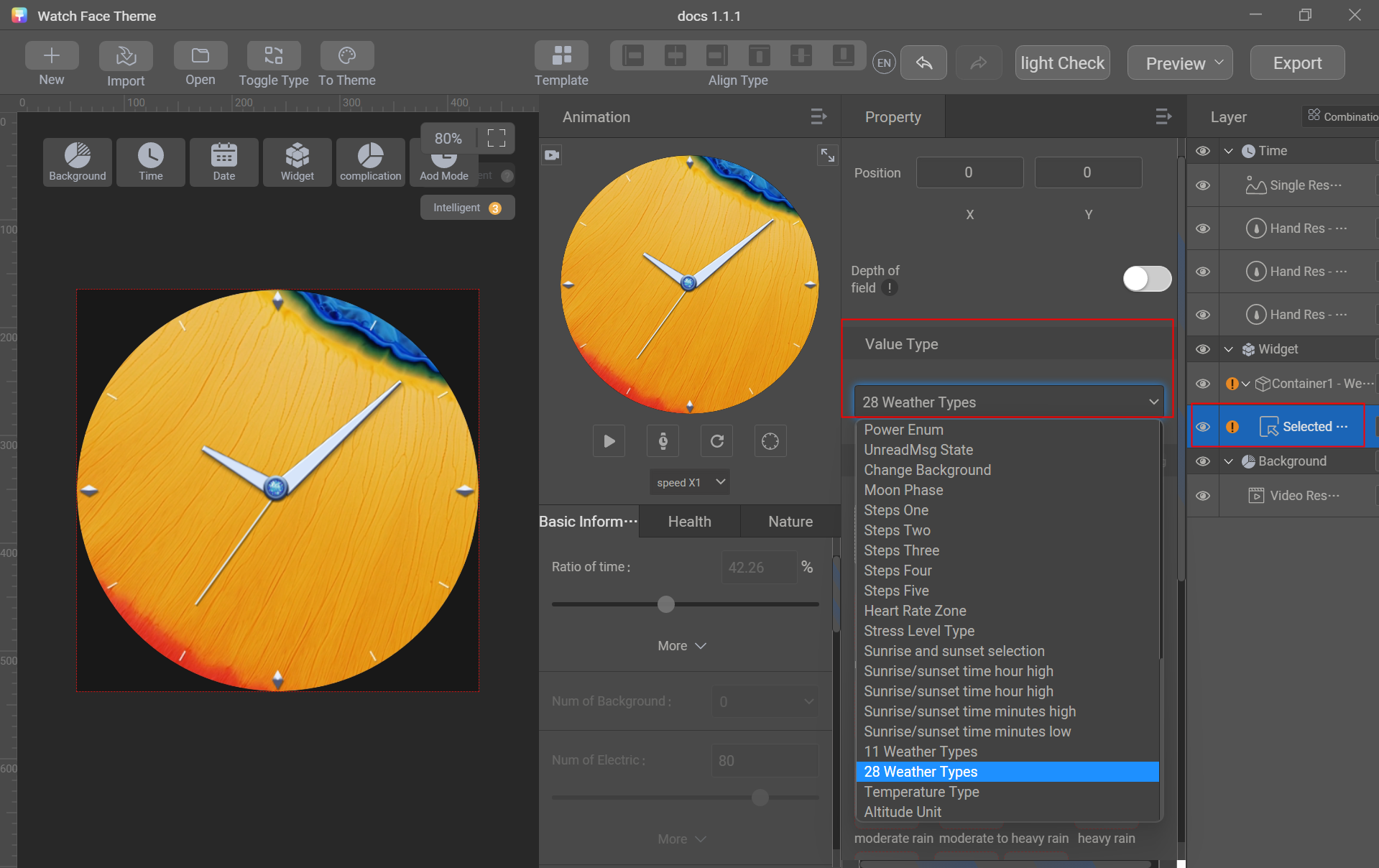
- Add the 28 sliced images of weather types in batches and adjust the position.
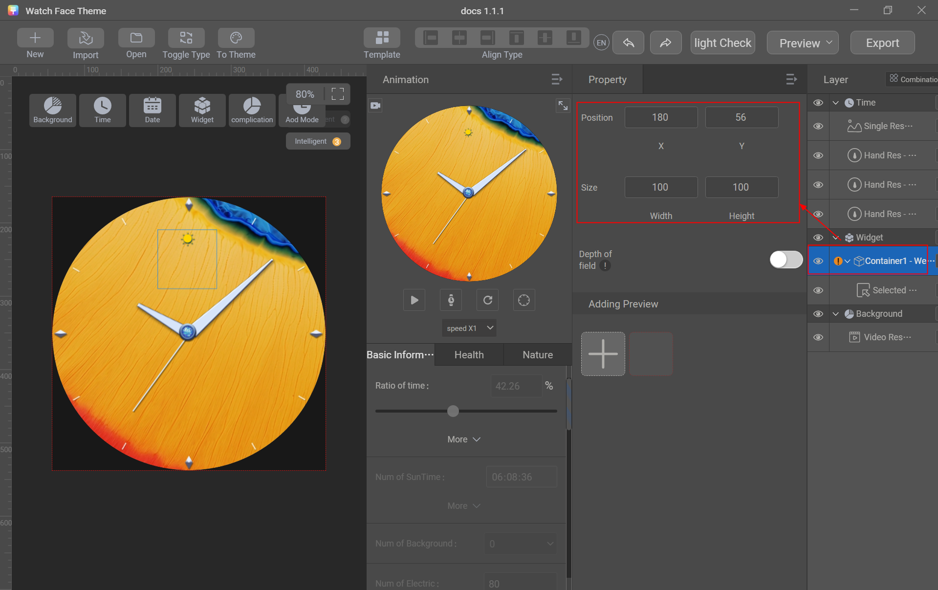
- In the layer area, click Container1 - Weather and adjust the position. The container size remains unchanged.
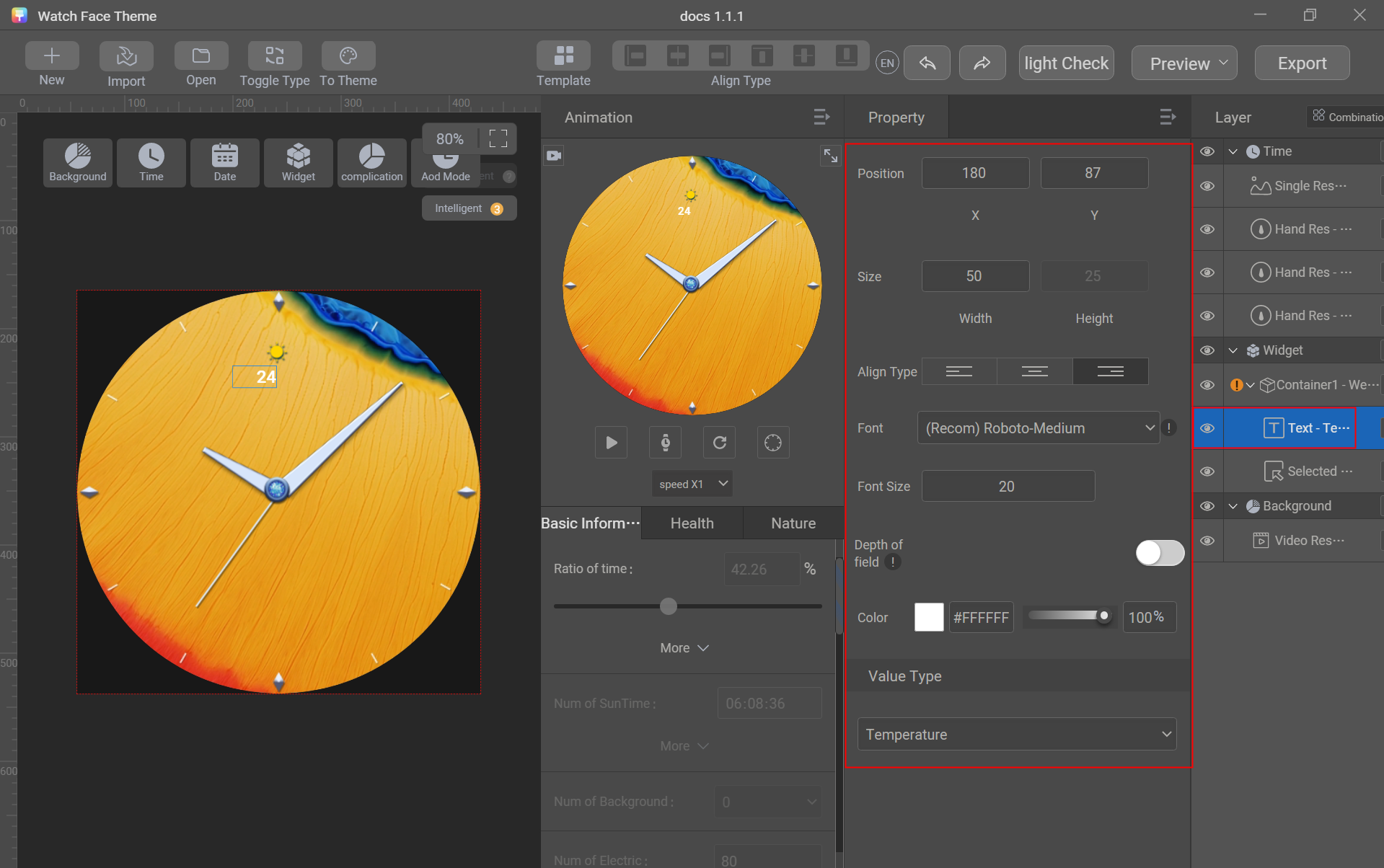
- Go to Widget > Text, set Value Type to Temperature, and adjust the position, size, alignment, font, font size, and color.
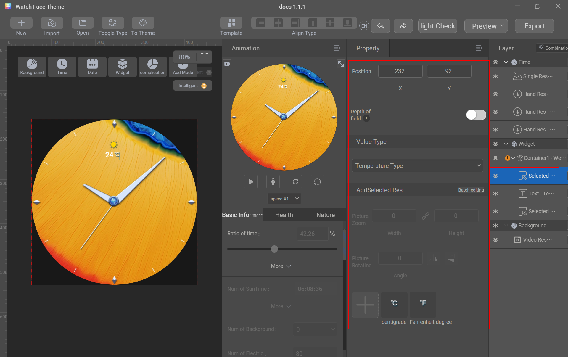
- Go to Widget > Selected Res, set Value Type to Temperature Type, import the sliced images of temperature types, and adjust the position.
Creating an AOD Watch Face

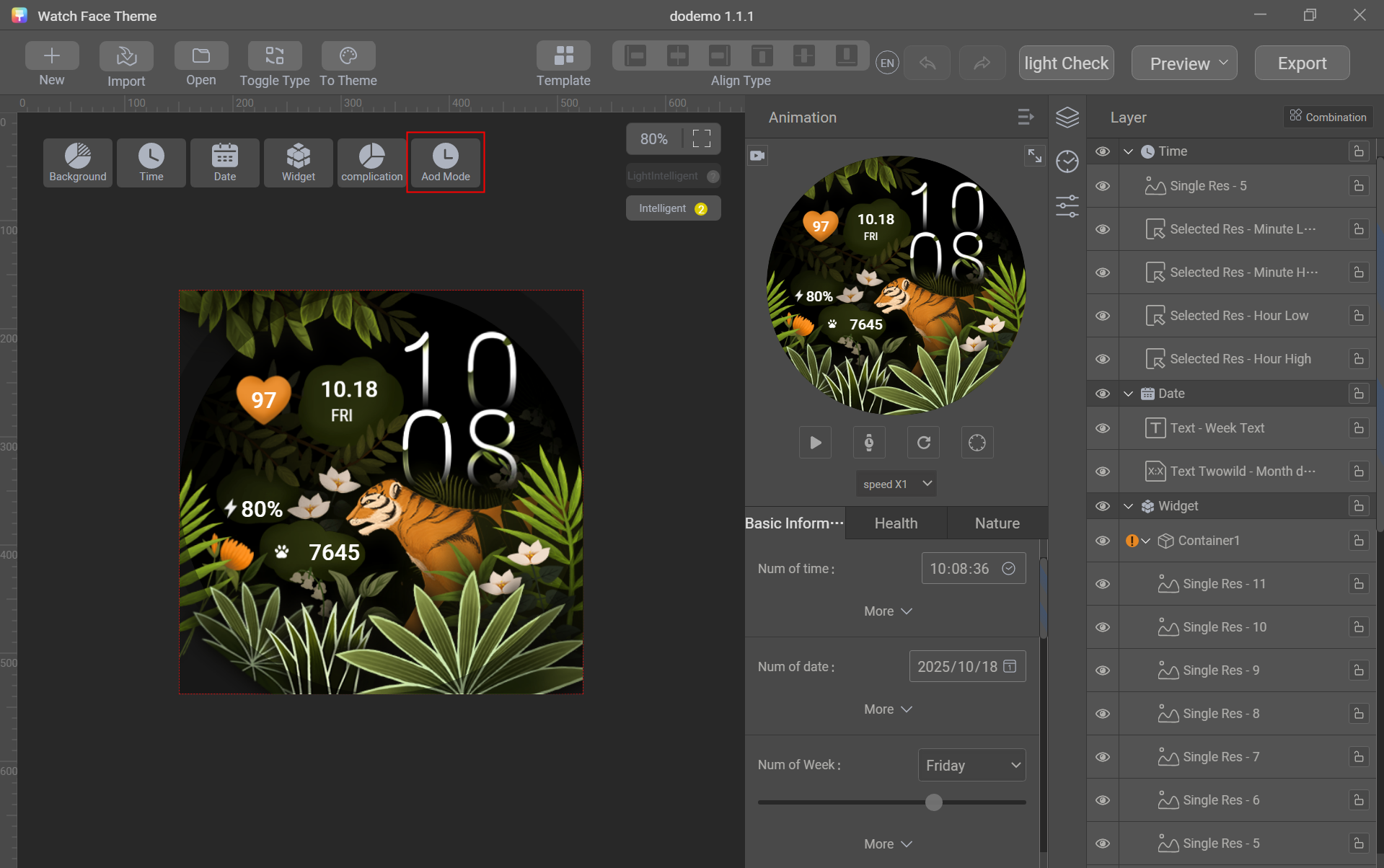
The default creation mode is for the active watch face. You can click Aod Mode to switch to the AOD watch face creation mode.
Requirements for an AOD watch face:
- The number of layers cannot exceed 30.
- The sequence frame, video, and GIF controls are unavailable.
- The AOD watch face resource package cannot be exported independently. Instead, it must be exported together with the active watch face resource package.
- Non-black pixels can take up no more than 10% or 20% of the entire screen. For details, please refer to resolutions and version numbers.
- Try to disperse non-black pixel areas on the screen, avoiding large, concentrated clusters. In any area of 200 x 200 px, the proportion of non-black pixels cannot exceed 60%.
Methods to create an AOD watch face:
Method 1: Create each layer separately just like creating an active watch face, as explained in detail above.
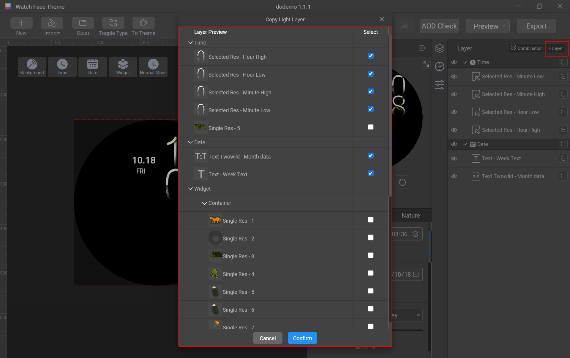
Method 2: Copy the layers of the active watch face with one click.
- Switch to Aod Mode.
- Click + Layer and select the required layers.
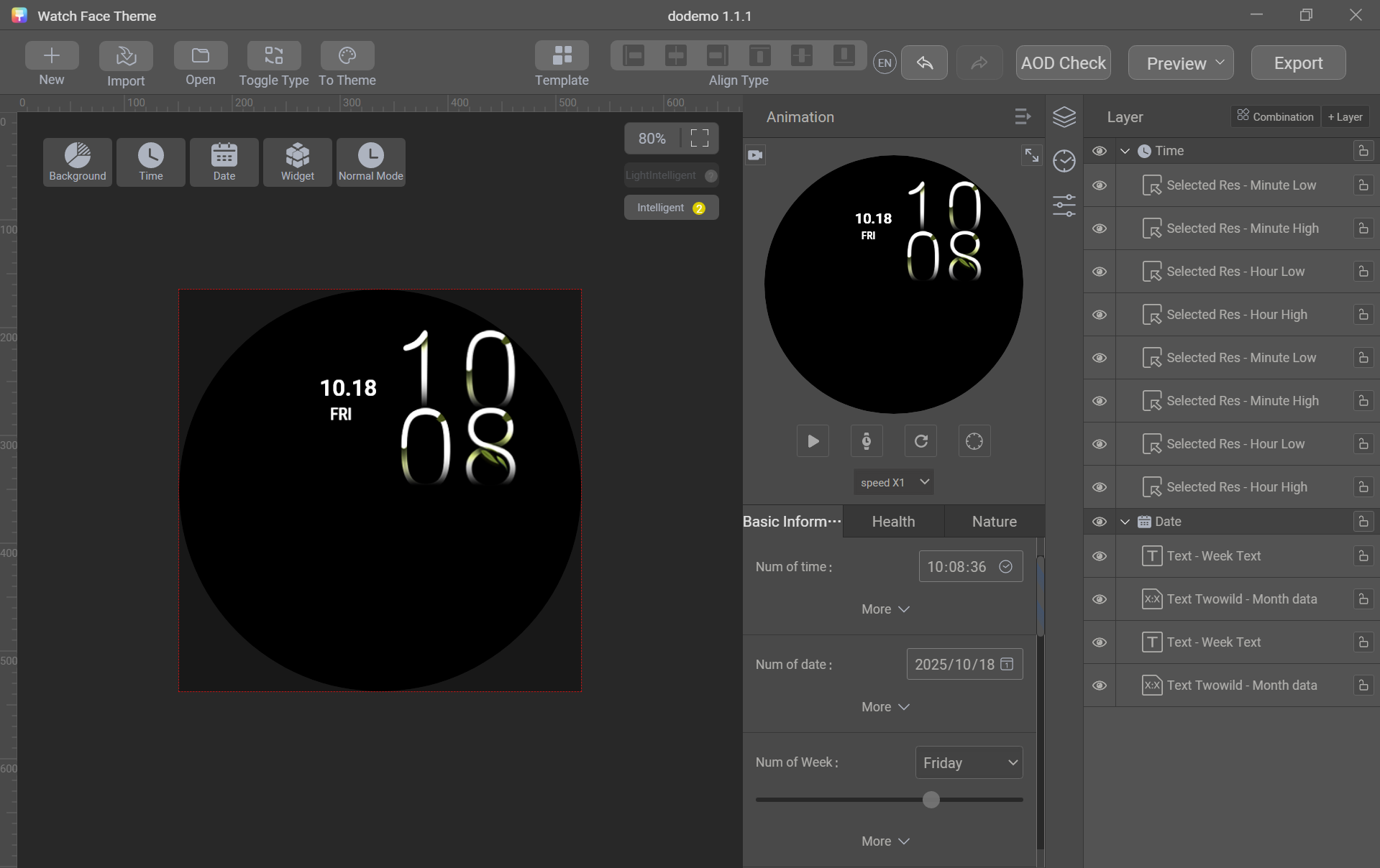
- Click Confirm. The selected layers will be copied to the AOD mode.
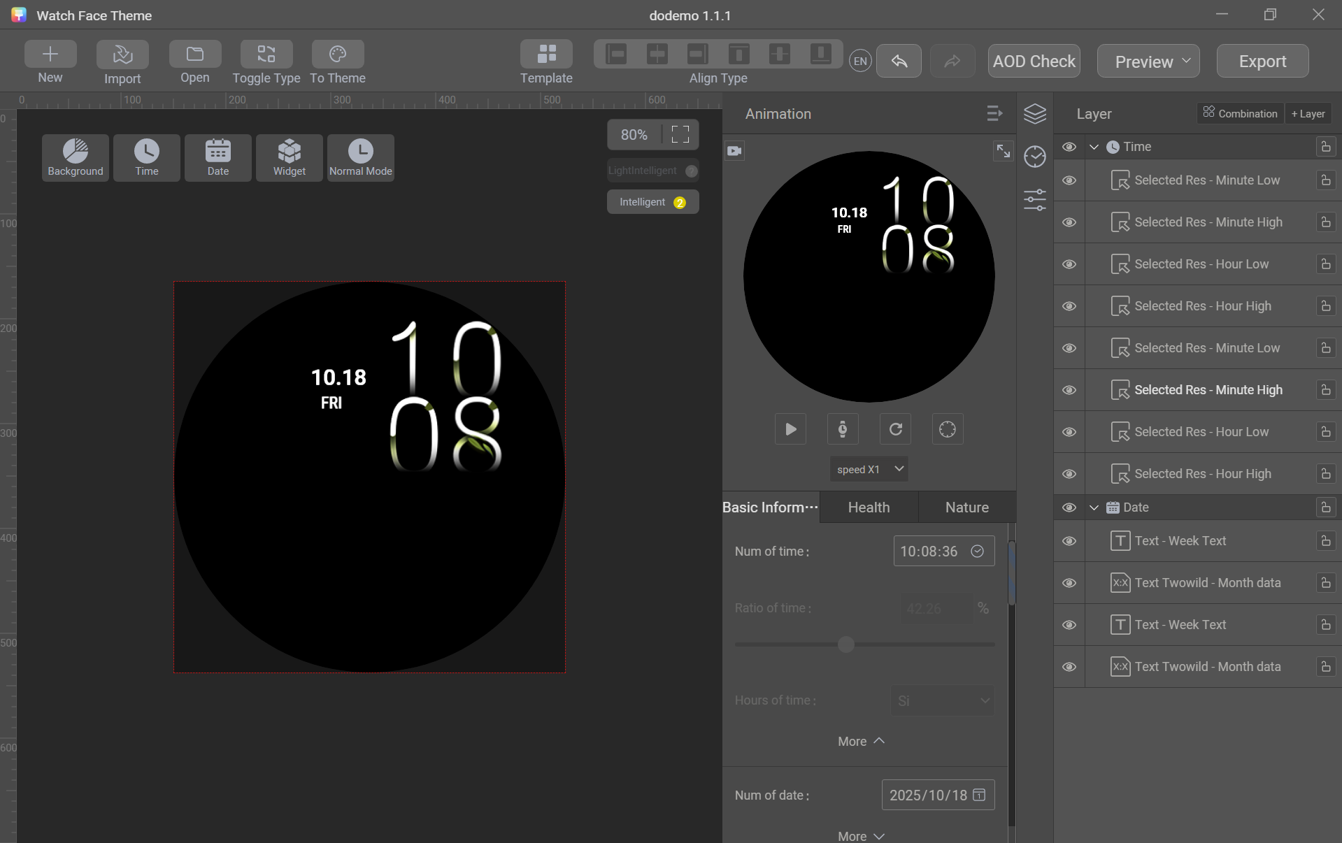
- Click the play button or move the progress bar to view the watch face effect. (After the test, click the restore button to restore the watch face to default values.)
- Click AOD Check to verify the proportion of non-black pixels.
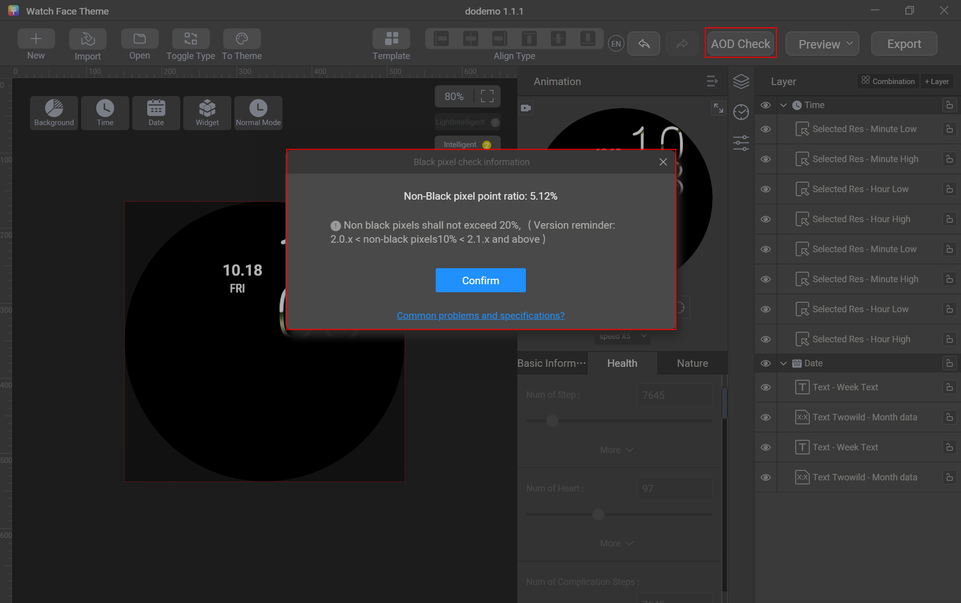

What can I do if the proportion of non-black pixels exceeds the threshold? For details, please refer to What should I do if I am prompted with a message warning of an excessive proportion of non-black pixels in the AOD mode?.