














工具问题
DevEco Studio
DevEco Testing
开发与测试问题
多设备场景
应用质量
应用框架开发
系统开发
媒体开发
图形开发
应用服务开发
AI功能开发
元服务开发
您当前正在浏览新版开发者文档中心,目录分类和层级有所调整。点击左侧当前文档分类名称前的“☰”图标,可切换文档分类。 了解新版目录
问题现象
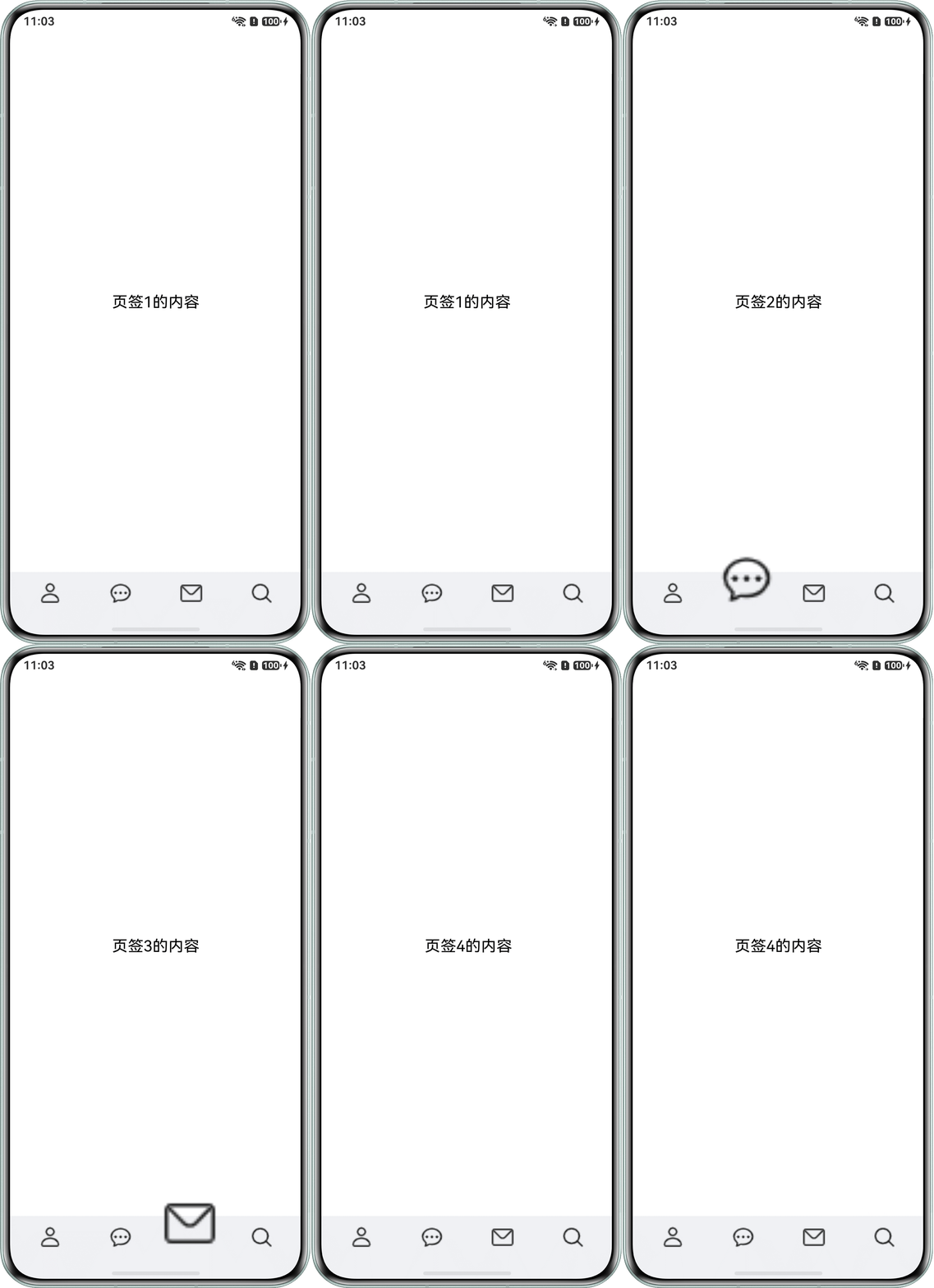
场景一:切换TabBar如何实现先放大后缩小复原动效?
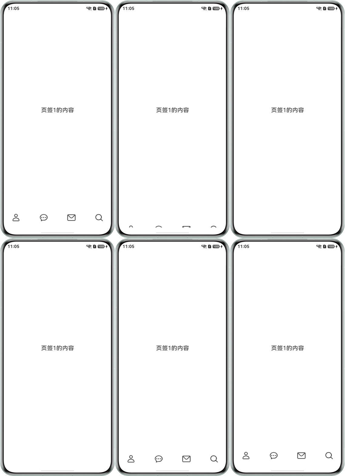
场景二:如何实现点击空白区域实现Tab栏下滑隐藏动效?
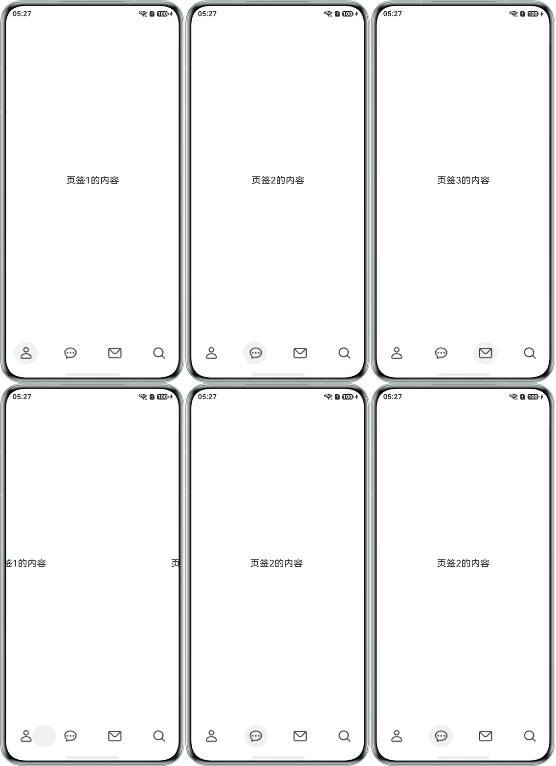
场景三:切换TabBar如何实现背景跟随手指拖动效果?
背景知识
- Tabs:进行内容视图切换的容器组件,每个页签对应一个内容视图。
- tabBar:设置TabBar上显示内容。
- barHeight:设置TabBar的高度值。
- onAnimationEnd:切换动画结束时触发该回调,包括动画过程中手势中断。当animationDuration为0时动画关闭,不触发该回调。
- onGestureSwipe:在页面跟手滑动过程中,逐帧触发该回调。
- animateTo:用于为闭包代码中的状态变化添加过渡动画效果。
- translate:设置组件平移。
- visibility:控制组件的显示或隐藏。
- onAreaChange:组件区域变化时触发该回调。仅会响应由布局变化所导致的组件大小、位置发生变化时的回调。
解决方案
展开
实现场景 | 实现方案 |
|---|---|
场景一:实现先放大后缩小复原动效。 | 使用Stack将自定义Tab栏与Tabs的TabBar区域重合,并通过 if/else 控制自定义Tab栏的渲染。通过animateTo的onFinish回调实现Tab内容的先放大后缩小,最后复原的动画效果。 |
场景二:点击空白区域实现Tab栏下滑隐藏动效。 | 使用animateTo和translate方法控制Tab栏内容在y轴上的下滑动画效果。通过onClick事件触发动画,实现Tab栏的隐藏和显示。 |
场景三:实现背景跟随手指拖动效果。 | 使用Stack将Tabs与背景组件堆叠,通过onAreaChange获取Tab宽度,计算中心位置。滑动时触发onGestureSwipe,背景跟随手指移动。滑动结束触发onAnimationEnd,根据移动距离判断是否吸附到目标Tab中心或回弹。 |
场景一:实现先放大后缩小复原动效
使用Stack将自定义Tab栏与Tabs的TabBar区域重合,并通过if/else对自定义Tab栏进行渲染控制。通过animateTo中onFinish回调实现Tab内容的先放大后缩小,最后复原的动画效果。参考代码如下所示:
收起
自动换行
深色代码主题
复制
- @Entry
- @Component
- struct OutFrame {
- fontColor: string = '#182431';
- selectedFontColor: string = '#007DFF';
- iconMinHeight: number = 640;
- // 图片资源仅供参考,开发者可替换成所需资源
- iconList: Resource[] = [
- $r('app.media.person'),
- $r('app.media.ellipsis_message'),
- $r('app.media.envelope'),
- $r('app.media.magnifyingglass')
- ];
- iconX: number = 20; // 图片位置x
- iconY: number = 65; // 图片位置Y
- private controller: TabsController = new TabsController();
- @State currentIndex: number = 0;
- @State iconWidth: number = 80; // 图片宽度
- @State iconHeight: number = 80; // 图片高度
- @State showAnimation: boolean = false; // 控制动画显示
- @State showTabIcon: boolean = true; // 控制Tab栏图标显隐
-
- @Builder
- tabBuilder(img: Resource, index: number) {
- Column() {
- Image(img)
- .width(30)
- .height(30)
- .visibility((this.showTabIcon && index === this.currentIndex) || index !== this.currentIndex ?
- Visibility.Visible : Visibility.Hidden);
- }
- .width('100%')
- .padding({ top: 5, bottom: 5 });
- }
-
- build() {
- Stack({ alignContent: Alignment.Bottom }) {
- if (this.showAnimation) {
- Row() {
- ForEach(this.iconList, (item: Resource, index: number) => {
- ListItem() {
- Image(item)
- .width(this.iconWidth)
- .height(this.iconHeight)
- .visibility(this.currentIndex === index ? Visibility.Visible : Visibility.Hidden);
- }
- .margin({ top: -20 });
- });
- }
- .width('90%')
- .justifyContent(FlexAlign.SpaceAround)
- .zIndex(1)
- .position({ x: this.iconX, y: this.iconY + this.iconMinHeight });
- }
- Tabs({ barPosition: BarPosition.End, controller: this.controller }) {
- ForEach(this.iconList, (item: Resource, index: number) => {
- TabContent() {
- Text(`页签${index + 1}的内容`)
- .fontSize(20)
- .fontColor('#000000');
- }
- .backgroundColor('#ffffff')
- .tabBar(this.tabBuilder(item, index));
- });
- }
- .zIndex(0)
- .vertical(false)
- .barMode(BarMode.Fixed)
- .barWidth(360)
- .barHeight('auto')
- .animationDuration(400)
- .onChange((index: number) => {
- // currentIndex控制TabContent显示页签
- this.currentIndex = index;
- this.showAnimation = true;
- this.showTabIcon = false;
- this.iconWidth = 70;
- this.iconHeight = 70;
- this.iconY = 65;
- // 设置动画实现效果
- this.getUIContext().animateTo({
- delay: 0,
- duration: 500,
- onFinish: () => {
- this.getUIContext().animateTo({
- delay: 0,
- duration: 500,
- onFinish: () => {
- this.showAnimation = false;
- this.showTabIcon = true;
- }
- }, () => {
- this.iconWidth = 5;
- this.iconHeight = 5;
- this.iconY = 80;
- });
- }
- }, () => {
- this.iconY = 45;
- });
- })
- .onAnimationStart((index: number, targetIndex: number) => {
- if (index === targetIndex) {
- return;
- }
- })
- .width('100%')
- .height('100%')
- .backgroundColor('#F1F3F5');
- }
- .width('100%');
- }
- }
效果图如下:
场景二:点击空白区域实现Tab栏下滑隐藏动效
使用animateTo和translate方法控制Tab栏内容在y轴上的下滑动画效果。参考代码如下所示:
收起
自动换行
深色代码主题
复制
- @Entry
- @Component
- struct HideTabBar {
- // 图片资源仅供参考,开发者可替换成所需资源
- iconList: Resource[] = [
- $r('app.media.person'),
- $r('app.media.ellipsis_message'),
- $r('app.media.envelope'),
- $r('app.media.magnifyingglass')
- ];
- barHeight: number = 70;
- @State transY: number = 0;
- @State showTabBar: boolean = true;
-
- @Builder
- tabBuilder(img: Resource) {
- Column() {
- Image(img)
- .width(30)
- .height(30);
- }
- .width('100%')
- .padding({ top: 5, bottom: 5 })
- .translate({ y: this.transY });
- }
-
- build() {
- Tabs({ barPosition: BarPosition.End }) {
- ForEach(this.iconList, (item: Resource, index: number) => {
- TabContent() {
- Text(`页签${index + 1}的内容`)
- .fontSize(20);
- }
- .tabBar(this.tabBuilder(item))
- .backgroundColor('#ffffff');
- });
- }
- .barHeight(this.barHeight)
- .vertical(false)
- .height('100%')
- .width('100%')
- .onClick(() => {
- // 添加消失动画
- this.getUIContext().animateTo({
- delay: 0,
- duration: 500,
- curve: Curve.EaseOut,
- iterations: 1
- }, () => {
- if (this.showTabBar) {
- this.transY = this.barHeight;
- } else {
- this.transY = 0;
- }
- this.showTabBar = !this.showTabBar;
- });
- });
- }
- }
效果图如下:
场景三:实现背景跟随手指拖动效果
- 使用Stack将Tabs与背景组件堆叠,并通过onAreaChange获取页面和单个Tab的宽度,计算每个Tab的中心位置。
- 滑动过程中触发onGestureSwipe,根据页面滑动的比例让背景跟随手指移动。
- 页面滑动结束触发onAnimationEnd,根据背景移动距离占总切换距离的比例判断是否超过设定阈值,超过则吸附到目标Tab的中心,未超过则回弹至原Tab的中心。
参考代码如下所示:
收起
自动换行
深色代码主题
复制
- @Entry
- @Component
- struct DragAction {
- // 图片资源仅供参考,开发者可替换成所需资源
- iconList: Resource[] = [
- $r('app.media.person'),
- $r('app.media.ellipsis_message'),
- $r('app.media.envelope'),
- $r('app.media.magnifyingglass')
- ];
- private controller: TabsController = new TabsController();
- threshold: number = 0.7; // 吸附阈值
- barHeight: number = 56;
- circleHeight: number = 50;
- circleWidth: number = 50;
- @State barWidth: number = 0; // 单个TabBar的宽度值
- @State currentIndex: number = 0;
- @State bgTransX: number = 0; // 背景的X偏移量
- @State pageWidth: number = 0; // tabContent内页面的宽度
-
- @Builder
- tabBuilder(img: Resource) {
- Column() {
- Image(img)
- .width(30)
- .height(30);
- }
- .width('100%');
- }
-
- // 计算背景的X偏移量
- getBgOffset(index: number) {
- return index * this.barWidth + (this.barWidth - this.circleWidth) / 2;
- }
-
- build() {
- Stack({ alignContent: Alignment.BottomStart }) {
- Circle()
- .width(this.circleWidth)
- .height(this.circleHeight)
- .zIndex(3)
- .fillOpacity(0.05)
- .animation({ duration: 200, curve: Curve.EaseOut })
- .translate({
- x: this.bgTransX,
- y: -(this.barHeight - this.circleHeight) / 2
- });
- Tabs({ barPosition: BarPosition.End, controller: this.controller }) {
- ForEach(this.iconList, (item: Resource, index: number) => {
- TabContent() {
- Text(`页签${index + 1}的内容`)
- .fontSize(20);
- }
- .tabBar(this.tabBuilder(item))
- .backgroundColor('#ffffff');
- });
- }
- // 获取单个TabBar的宽度值、背景的X偏移量、tabContent内页面的宽度
- .onAreaChange((old, current) => {
- console.info(`Succeeded in getting info.Old:${old.width},current:${current.width}.`);
- this.barWidth = Number(current.width) / this.iconList.length;
- this.bgTransX = this.getBgOffset(0);
- this.pageWidth = Number(current.width);
- })
- .id('tabs')
- .zIndex(1)
- .barMode(BarMode.Fixed)
- .scrollable(true)
- .animationDuration(200)
- .onChange((index: number) => {
- this.getUIContext().animateTo({
- delay: 0,
- duration: 200,
- curve: Curve.EaseOut,
- iterations: 1
- }, () => {
- this.currentIndex = index;
- // 重新偏移
- this.bgTransX = this.getBgOffset(index);
- this.currentIndex = index;
- });
- })
- .vertical(false)
- .height('100%')
- .width('100%')
- .backgroundColor('#ffffff')
- // 滑动过程中:跟随手指滑动
- .onGestureSwipe((index: number, event: TabsAnimationEvent) => {
- if (this.pageWidth <= 0 || this.barWidth <= 0) {
- return;
- }
- const ratio = event.currentOffset / this.pageWidth;
- const from = this.getBgOffset(index);
- this.bgTransX = from - ratio * this.barWidth;
- })
- // 松手后
- .onAnimationEnd((index: number) => {
- const targetIndex = index + 1;
- const from = this.getBgOffset(index); // 当前Tab的中心位置
- const to = this.getBgOffset(targetIndex); // 目标Tab的中心位置
- const totalMove = to - from;
- const currentMove = this.bgTransX - from;
- const progress = Math.abs(currentMove / totalMove); // 滑动进度
- this.getUIContext().animateTo({
- delay: 0,
- duration: 200,
- curve: Curve.EaseOut,
- iterations: 1
- }, () => {
- // 超过阈值,吸附到目标图标中心
- if (progress >= this.threshold) {
- this.bgTransX = to;
- } else {
- // 回弹原位置
- this.bgTransX = from;
- }
- });
- });
- }
- .height('100%')
- .width('100%');
- }
- }
效果图如下:
常见FAQ
Q:为什么对SVG和PNG使用animateTo,最终动画效果不同?
A:SVG的矢量特性支持属性级动画,PNG作为栅格图像,仅能通过组件的通用动画属性。设置SVG图片的动画,开发者可参考svg动画。
Q:如何优化动画效果?
A:优化动画效果可通过减少动画的复杂性、优化代码实现、使用硬件加速、调整动画帧率、缓存和重用动画资源等方式实现。


华为开发者联盟 版权所有 ©2026