Overview
The easyinput element is a type of enhanced input element that is used to enter information, search products and so on. This element has the following features:
- Its icons can be customized.
- Default value is provided.
- The query, clear, and disable functions can be implemented.
The easyinput element can be divided into two parts in the layout. One part has icons, and the other part has a text box.
The following figure shows the layout.
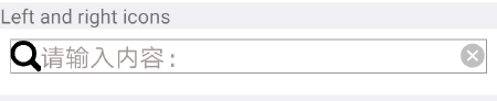
The basic layout code is as follows:
<text >Left and right icons</text>
<div class="example-body">
    <easyinput preimgsrc = "{{searchimgsrc}}" deletesrc = "{{deleteimgsrc}}"  @handleclick="handleClick"  @clearclick="clearClick"></easyinput>
</div> [h2]Customizing the Subelements
- Design the layout.
The UI of easyinput is universal, but the content layout is not. The content layout cannot be fixed. Otherwise, once the UI of the content part changes, the subelements have to be modified, which violates the open-closed principle in programming.
Therefore, multiple style attributes are supported in easyinput.ux for developers to customize the style.
<template> <div class="container"> <image src="{{this.preimgsrc}}" class="photo" onclick="handle()" ></image> <input disabled="{{this.disabled}}" class="selectionInput" placeholder="{{this.placeholderinput}}" maxlength="100" value="{{this.inputValue}}" onchange="updateValue" onselectionchange="*" > </input> <image src="{{this.sufimgsrc}}" class="photo" onclick="handle()" ></image> <image src="{{this.deletesrc}}" class="photo" onclick="resetValue()"></image> </div> </template> - Customize the attributes and supported events.Supported attributes
Attribute
Type
Default Value
Description
preimgsrc
String
-
Path of the search icon on the left.
sufimgsrc
String
-
Path of the search icon on the right. Either preimgsrc or sufimgsrc is required.
deletesrc
String
-
Path of the delete icon.
placeholderinput
String
Search keyword
Prompt text.
disabled
Boolean
false
Indicates whether the element is disabled.
Supported events
Event
Parameter
Triggering Condition
handleclick
left|right
The left or right search icon is tapped.
clearclick
{}
The content in the text box is cleared.
[h2]Implementing Data Communication Between the Parent Element and Subelements
- Pass the data from the parent element to the subelements.
- Define parameters such as preimgsrc, sufimgsrc, and disabled in props of the subelements to receive data returned from the parent element.
props: { preimgsrc: { type: String, default: '' }, sufimgsrc: { type: String, default: '' }, deletesrc: { type: String, default: '' }, placeholderinput: { type: String, default:'Enter what you want to search.' }, disabled: { type: Boolean, default: false }, }, - Pass the values from the parent element to the subelements. If the data type is Boolean, you cannot define it in the element directly. Define it in data instead.
<easyinput disabled="{{this.disabled}}" placeholderinput="{{this.placeholderinput}}"></easyinput>data() { return { placeholderinput: 'Disable', inputValue: '', sufimgsrc:'', preimgsrc:'', deleteimgsrc:'', disabled:'true' } },
- Define parameters such as preimgsrc, sufimgsrc, and disabled in props of the subelements to receive data returned from the parent element.
- Pass data and method from the subelements to the parent element.
- In the parent element, register a listener on the events to be triggered in the subelements.
<easyinput preimgsrc = "{{searchimgsrc}}" deletesrc = "{{deleteimgsrc}}" @handleclick="handleClick" @clearclick="clearClick"></easyinput>handleClick(e) { console.log(JSON.stringify(e)); prompt.showToast({ message: e.detail+ "icon is tapped", duration: 2000, gravity: 'center' }) }, clearClick(e){ console.log(JSON.stringify(e)); this.inputValue = '' } - Call this.$emit in the subelements to notify the parent element of the events and the parameters.
handle() { console.log("handleclick", this.sufimgsrc,this.preimgsrc); let direction; if (this.preimgsrc !== '') { direction ="left" }else if(this.sufimgsrc !== ''){ direction ="right" } this.$emit('handleclick',direction) }, resetValue() { this.inputValue = '' if(this.disabled){ this.placeholderinput = 'Search keyword' } this.$emit('clearclick', {}); },
- In the parent element, register a listener on the events to be triggered in the subelements.
Sample Code
easyinput.ux file:
<template>
<div class="container">
<image src="{{this.preimgsrc}}" class="photo" onclick="handle()" ></image>
<input disabled="{{this.disabled}}" class="selectionInput" placeholder="{{this.placeholderinput}}" maxlength="100"
value="{{this.inputValue}}" onchange="updateValue" onselectionchange="*" >
</input>
<image src="{{this.sufimgsrc}}" class="photo" onclick="handle()" ></image>
<image src="{{this.deletesrc}}" class="photo" onclick="resetValue()"></image>
</div>
</template>
<script>
module.exports = {
props: {
preimgsrc: {
type: String,
default: ''
},
sufimgsrc: {
type: String,
default: ''
},
deletesrc: {
type: String,
default: ''
},
placeholderinput: {
type: String,
default:'Search keyword'
},
disabled: {
type: Boolean,
default: false
},
},
data: {
inputValue: '',
direction:'',
},
onInit() {
this.$page.setTitleBar({ text: 'Input box' })
},
updateValue(e) {
this.inputValue = e.value;
console.log(e.value)
},
handle() {
console.log("handleclick", this.sufimgsrc,this.preimgsrc);
let direction;
if (this.preimgsrc !== '') {
direction ="left"
}else if(this.sufimgsrc !== ''){
direction ="right"
}
this.$emit('handleclick',direction)
},
resetValue() {
this.inputValue = ''
if(this.disabled){
this.placeholderinput = 'Search keyword'
}
this.$emit('clearclick', {});
},
}
</script>
<style>
.container{
width: 100%;
border-top-width: 1px;
border-bottom-width: 1px;
border-left-width: 1px;
border-right-width: 1px;
border-color: #999999;
}
.selectionInput{
width: 100%;
placeholder-color:rgb(161, 152, 152);
caret-color:#7b68ee;
}
</style> hello.ux file:
<import name="easyinput" src="../Easyinput/easyinput.ux"></import>
<template>
<div class="container">
<text class="example-info ">easyinput is a type of enhanced input element that has built-in borders, icons and so on, and contains all functions of input.</text>
<text >Left icon</text>
<div class="example-body">
<easyinput preimgsrc = "{{searchimgsrc}}" @handleclick="handleClick" ></easyinput>
</div>
<text >Right icon</text>
<div class="example-body">
<easyinput sufimgsrc = "{{searchimgsrc}}" @handleclick="handleClick" ></easyinput>
</div>
<text>Disable</text>
<div class="example-body">
<easyinput disabled="{{this.disabled}}" placeholderinput="{{this.placeholderinput}}" deletesrc = "{{deleteimgsrc}}" @clearclick="clearClick"></easyinput>
</div>
<text >Left and right icons</text>
<div class="example-body">
<easyinput preimgsrc = "{{searchimgsrc}}" deletesrc = "{{deleteimgsrc}}" @handleclick="handleClick" @clearclick="clearClick"></easyinput>
</div>
</div>
</template>
<script>
import prompt from '@system.prompt'
export default {
data() {
    return {
        placeholderinput: 'Disable',
        inputValue: '',
        sufimgsrc:'',
        preimgsrc:'',
        deleteimgsrc:'',
        disabled:'true'
    }
},
onInit() {
this.$page.setTitleBar({
text: 'menu',
});
this.searchimgsrc ='/Common/search.png'
this.deleteimgsrc = '/Common/delete.png'
},
handleClick(e) {
    console.log(JSON.stringify(e));
    prompt.showToast({
        message: e.detail+ "icon is tapped",
        duration: 2000,
        gravity: 'center'
    })
},
clearClick(e){
    console.log(JSON.stringify(e));
    this.inputValue = ''
}
}
</script>
<style>
.container {
flex: 1;
flex-direction: column;
background-color: #efeff4;
}
.text {
flex: 1;
font-size: 130px;
line-height: 150px;
}
.example-info {
padding: 15px;
color: #3b4144;
background-color: #ffffff;
}
.example-body {
flex-direction: column;
padding: 15px;
background-color: #ffffff;
height: 100px;
}
</style>