


Intelligent Assistant
Chat with our virtual assistant to get answers promptly.
This topic aims to elaborate on common responsive layout methods for developing multi-device UIs from the perspective of different screen types, helping you better understand and address the challenges in cross-device UI design. With the growing diversity of smart devices, screens of various sizes and shapes have emerged in the market. Common devices are as follows:
After understanding the characteristics of these devices and the differences in their screen sizes, you can design responsive layouts with strong adaptability and excellent user experience based on different screen forms. You must consider how to optimize content layout, image scaling, and the placement of interactive elements to ensure users get the best experience regardless of the device.
By analyzing the differences between various devices, we can see that each screen form has its unique application scenarios and design considerations. This topic explores in depth from the perspective of screen forms and elaborates on the following categories:
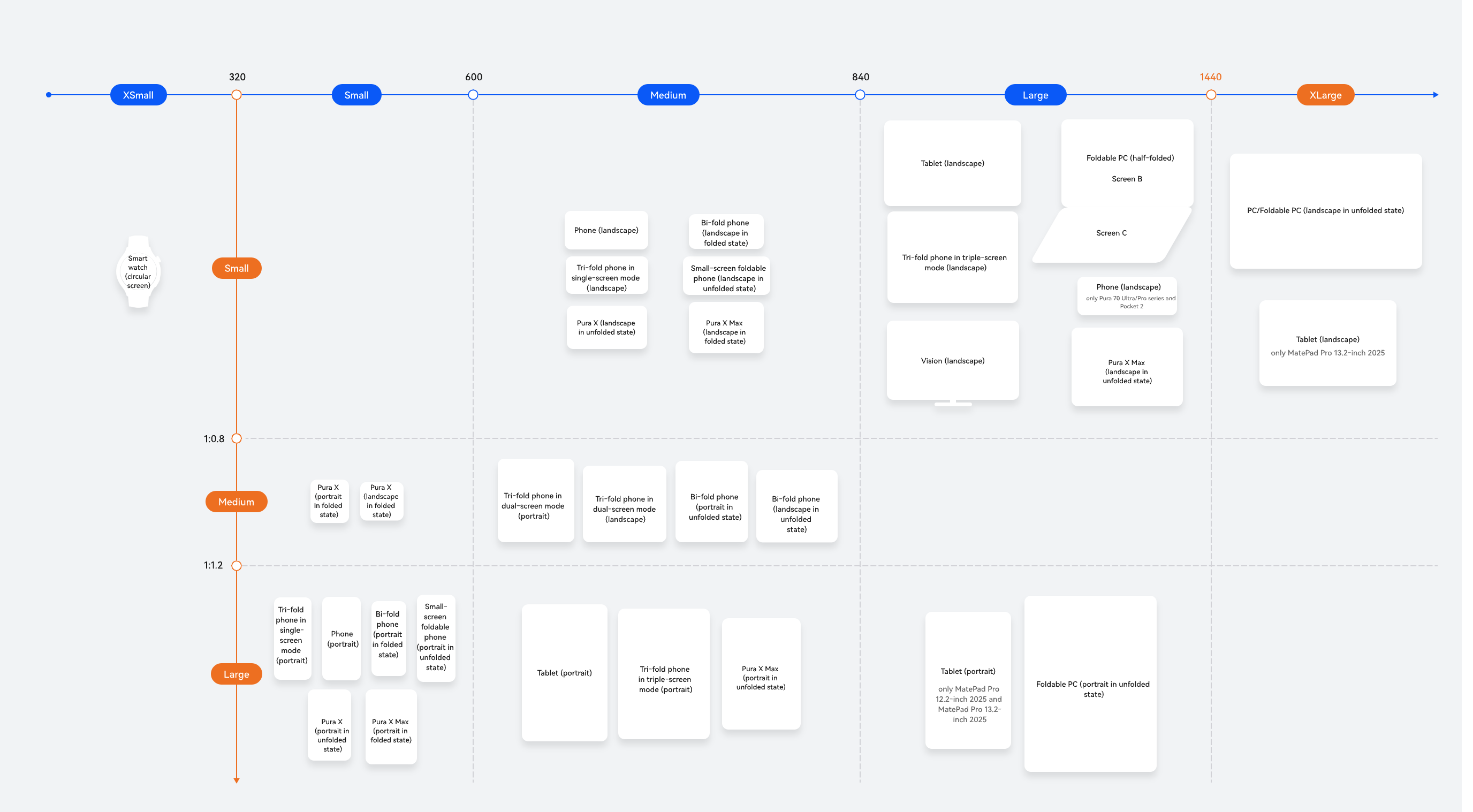
The preceding figure clearly illustrates the breakpoints of various devices under different screen forms, such as extra-large screen in landscape mode, large screen in landscape mode, large screen in portrait mode, large square screen, bar phone in portrait mode, bar phone in landscape mode, small square screen, and circular screen, laying a solid foundation for the in-depth discussion in the subsequent sections.
Extra-large screens in landscape mode typically have a horizontal resolution exceeding 1440 vp, with stronger multitasking capabilities. They can display multiple apps or complex layouts simultaneously, helping users enhance work efficiency. For details about typical device app development, see PC Application Development. It is suitable for productivity scenarios such as document processing, data analysis, programming, and content creation.
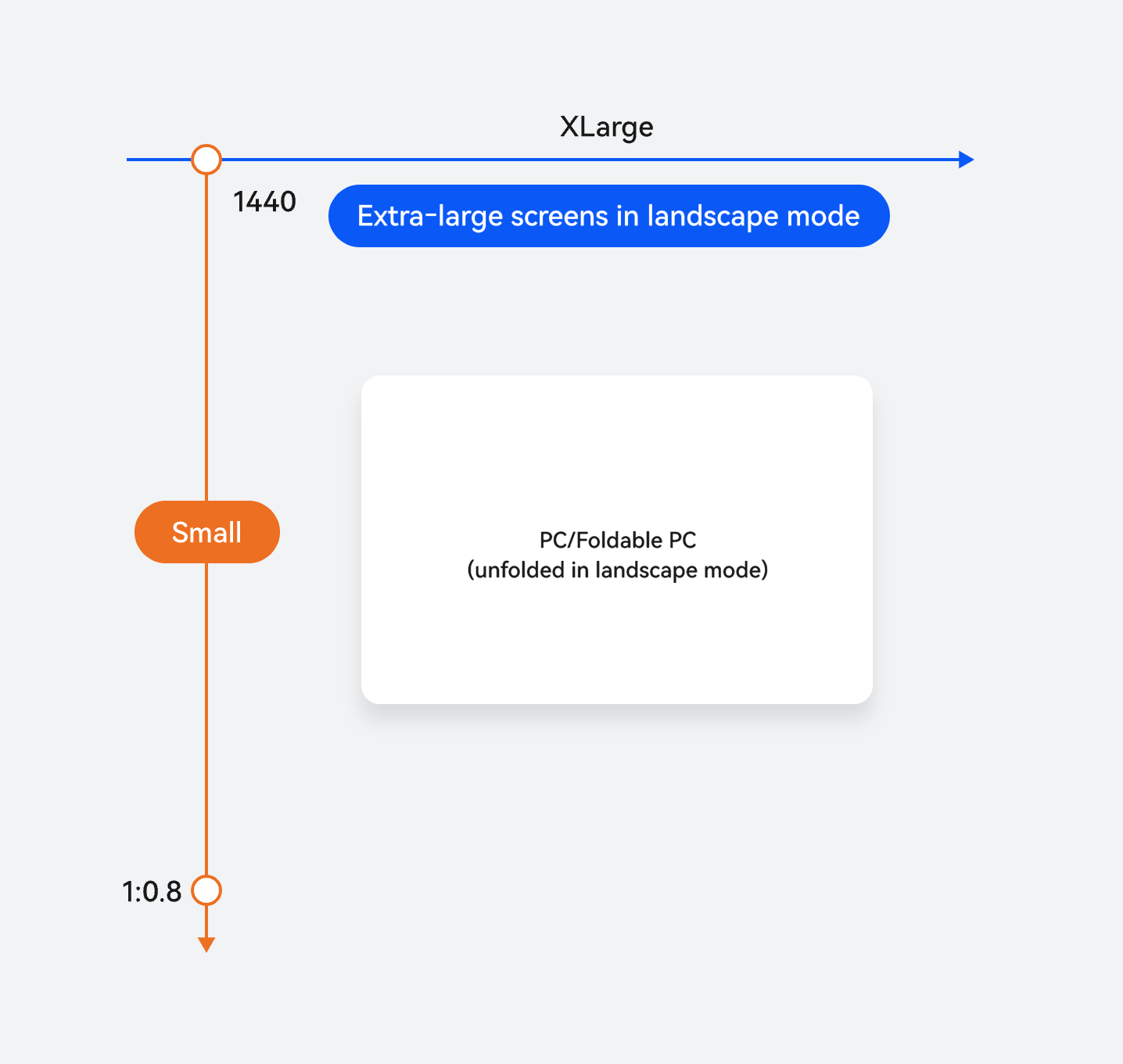
Horizontal/Vertical Breakpoint | Device |
|---|---|
xl for horizontal breakpoints and sm for vertical breakpoints | PCs/2-in-1 devices |
Extra-large screens in landscape mode have the unique advantage of large-sized screens. When developing apps, you are advised to adopt a responsive layout to adapt to real-time window size changes, ensuring the optimal layout for content display. In layout design, you are advised to set a navigation bar to improve usability, and combine repetition layouts and column layouts to make full use of screen space, thereby enhancing information density and user operational efficiency.
This section provides development guidelines for typical layout scenarios of extra-large screen (landscape) devices. For more UX design standards and specifications, see Application UX Standards for PCs/2-in-1 Devices and PC/2-in-1 Device.
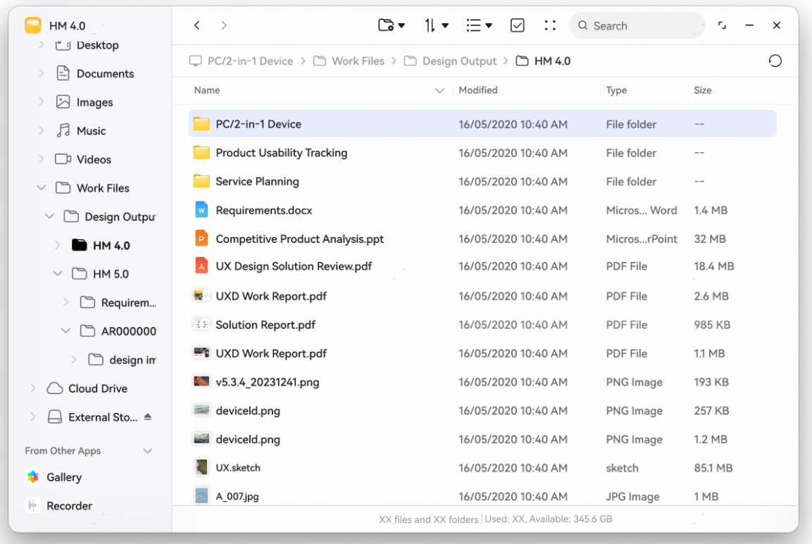
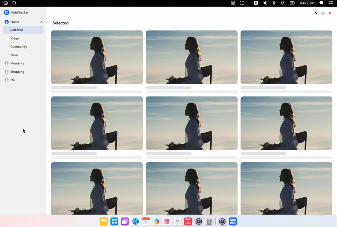
Layout suggestions: When the width of the app window reaches or exceeds 1440 vp, that is, the horizontal breakpoint is xl, you are advised to use the orientation layout to change the bottom navigation bar to a side hierarchical navigation bar.
How to implement: Use the SideBarContainer component to implement the sidebar. This component requires two child components to be passed in, representing the sidebar area and the content area, respectively.
The design diagram is as follows:
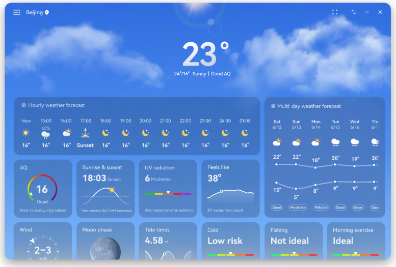
Layout suggestions: When a page needs to display a large number of elements, you are advised to use the repetition layout combined with grids to achieve structured and diversified arrangements.
How to implement: Use the Grid component. You can set columnsTemplate and rowsTemplate for different breakpoints to implement the multi-device effects of the grids.
The design diagram is as follows:
Layout suggestions: To improve screen utilization and display more content on a large screen, display more columns based on breakpoints to implement repetition layout.
How to implement: The List component provides the lanes property, which is used to set the number of columns or rows. This property is used to set more columns at the xl breakpoint.
The design diagram is as follows:
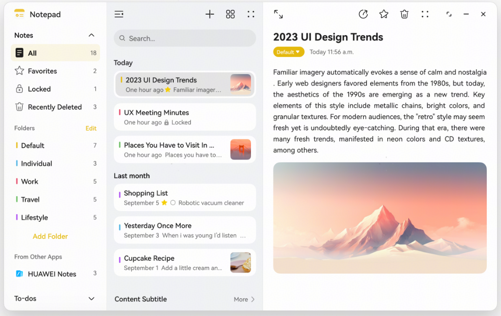
Layout suggestions: On extra-large screens in landscape mode, it is recommended that column layout be used for content with multi-level attributes to clearly display the hierarchical structure, increase information display density, and improve user operational efficiency.
How to implement: Use the Navigation and SideBarContainer components. At the xl breakpoint, set showSideBar of the SideBarContainer component to true to display the sidebar and set mode of the Navigation component to Auto.
The design diagram is as follows:
Large screens in landscape mode feature a horizontal resolution exceeding 840 vp, delivering expanded display area and enhanced information density. They support multi-app display or complex content layouts, significantly improving multitasking efficiency across devices like tablets and triple-screen tri-folds.
Such screens not only have a high resolution but also feature excellent display sharpness and a wide viewing area, making them suitable for displaying richer and multi-layered content. In various application scenarios such as learning, entertainment, or office work, these screens can provide users with clearer text, more complete UI layouts, and smoother visual experiences. This effectively improves information acquisition efficiency and usage comfort, while enhancing focus in work and study as well as task completion efficiency.
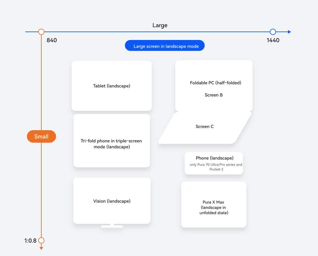
Horizontal/Vertical Breakpoint | Device |
|---|---|
lg for horizontal breakpoints and sm for vertical breakpoints | Tablets (landscape) |
Triple-screen tri-folds (landscape) | |
Foldable PCs (half-folded) | |
Pura 70 Ultra/Pro series and Pocket 2 phones (landscape) | |
Vision (landscape) | |
Pura X Max (landscape in unfolded state) |
Large screens in landscape mode have the unique advantage of large-sized screens. When developing apps, you are advised to adopt a responsive layout to adapt to real-time window size changes, ensuring the optimal layout for content display.
In large-screen landscape layout design, navigation bars are usually implemented to simplify operation flows and support multi-level information architectures, thereby improving app usability. To maximize the screen's capacity for displaying more content, use element repetition layouts. For scenarios combining images and text, content that is arranged vertically on small screens is typically displayed in horizontal layouts on large screens for better visual appeal. Additionally, sidebars can be used to display more information. Given the ample horizontal space, column layouts should be considered for implementing split views on a page—this enriches content presentation while boosting visual impact.
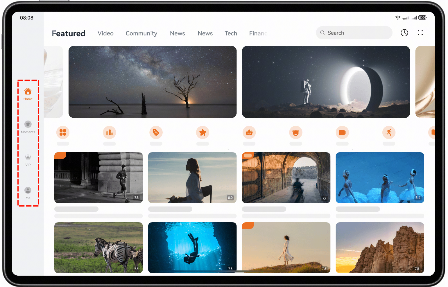
Layout suggestions: When the width of the app window reaches or exceeds 840 vp, that is, the horizontal breakpoint is lg, you are advised to use the orientation layout to change the bottom navigation bar to a side navigation bar.
How to implement: Use the Tabs component to implement navigation tabs. When the window is at the lg breakpoint, the tabs are located on the left side of the page, with vertical set to true and barPosition set to Start.
The design diagram is as follows:
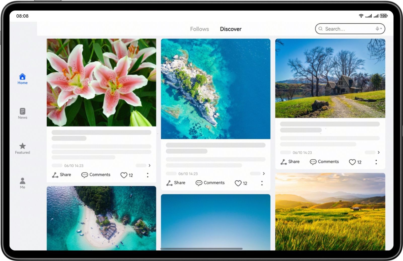
Layout suggestions: On wide-screen devices, use the responsive layout strategy to improve information display efficiency. Full-screen content on small-sized screens will automatically switch to a waterflow layout on wide screens. Through repetition layouts, more content can be displayed in a visualized manner, improving user browsing efficiency and information acquisition experience.
How to implement: Use the columnsTemplate property provided by the WaterFlow component to set the number of columns in the current WaterFlow component layout.
The design diagram is as follows:
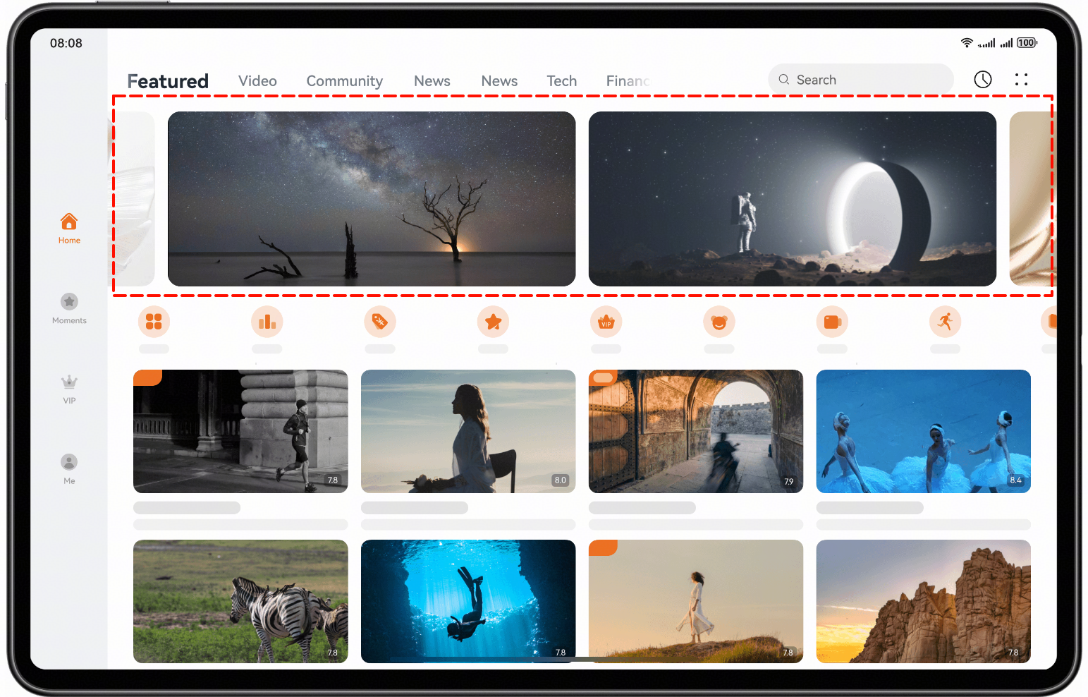
Layout suggestions: In the scenario where multiple images are displayed, use a carousel for image display and adopt a repetition layout to present repeated elements.
How to implement: The Swiper component is used to implement multi-image carousel. Configure the displayCount property of the Swiper component to set the number of images displayed in the viewport.
The design diagram is as follows:
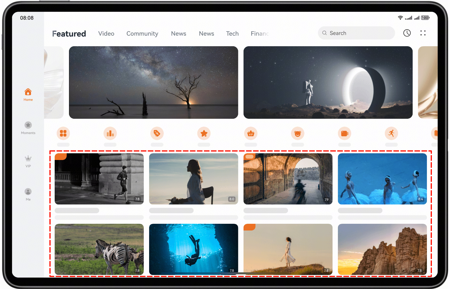
Layout suggestions: To allow the display of repeated content in the page (such as cards, product items, and article lists) to adjust dynamically based on available space, adopt the repetition layout, which automatically adjusts the number of columns, spacing, and arrangement direction according to the display characteristics of different devices.
How to implement: Use the Grid component. You can set columnsTemplate and rowsTemplate for different breakpoints to implement the multi-device effects of the grids.
The design diagram is as follows:
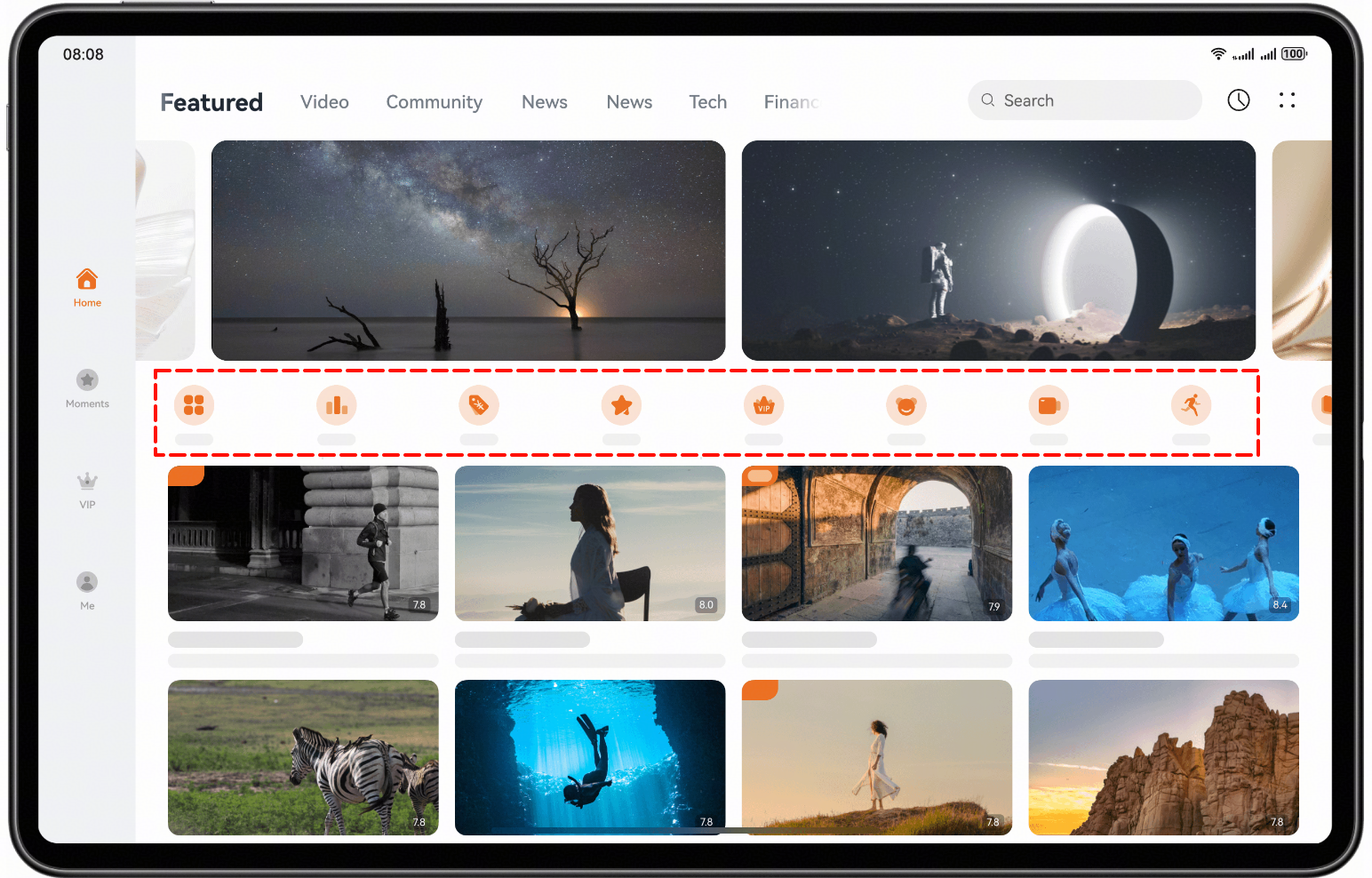
Layout suggestions: When a large amount of repeated content (such as product lists, article cards, and user comments) needs to be displayed in an orderly manner, use the repetition layout to structure the content using a unified style template.
How to implement: The List component provides the lanes property, which is used to set the number of columns or rows.
The design diagram is as follows:
Layout suggestions: To fully leverage the advantage of large-screen devices in space display, and to improve information density and user operational efficiency, use the column layout to properly divide the main content area and sidebar area.
How to implement: Use the SideBarContainer component to implement the sidebar. Set showSideBar to true at the lg breakpoint to display the sidebar.
The design diagram is as follows:
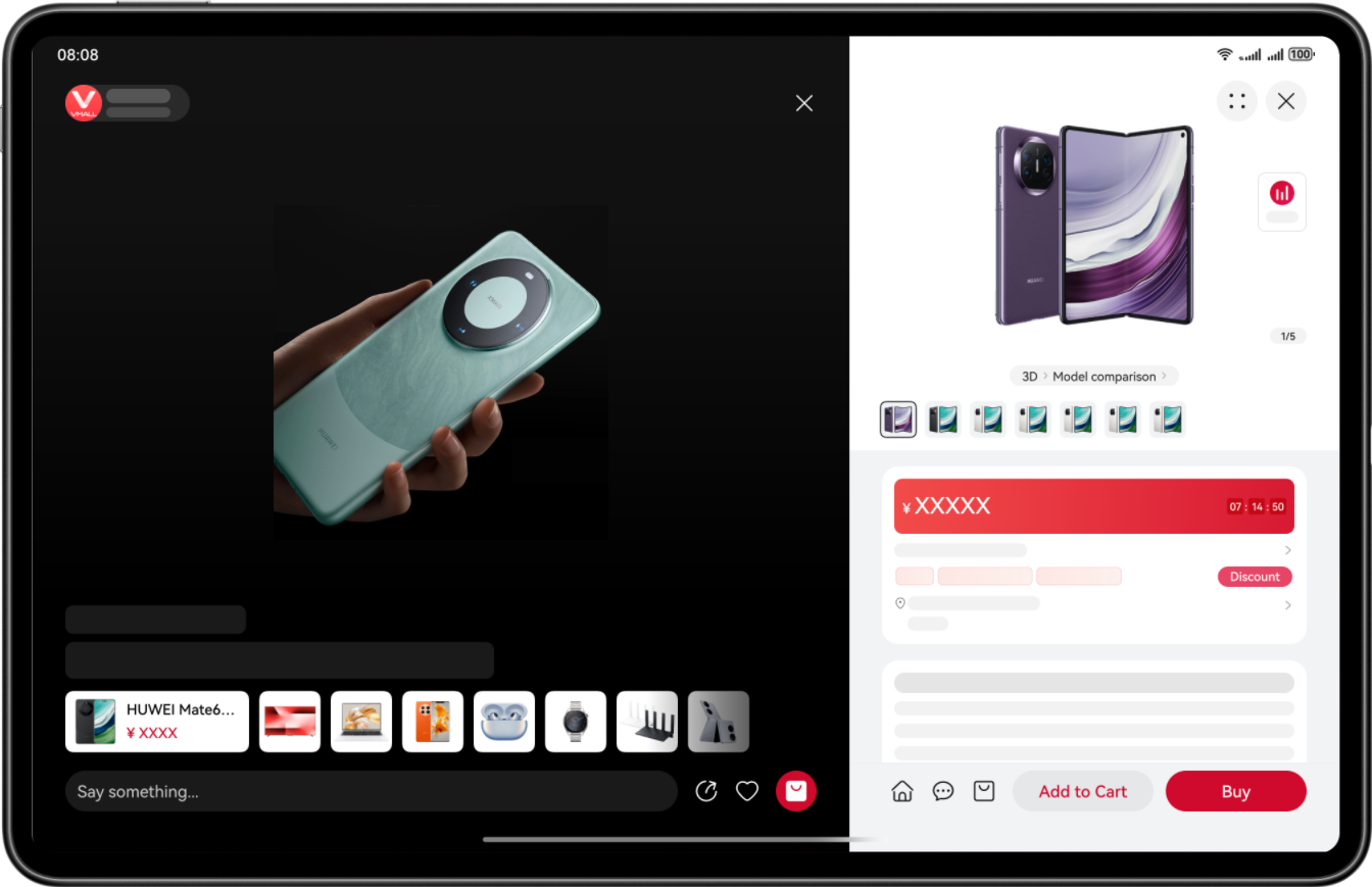
Layout suggestions: For app pages that contain hierarchical relationships, such as the level-1 directory, level-2 directory, and content area, you are advised to use the triple-column layout to display the content clearly and intuitively.
How to implement: Use the SideBarContainer and Navigation components together. At the lg breakpoint, set showSideBar of the SideBarContainer component to true to display the sidebar, and set mode of the Navigation component to Auto.
The design diagram is as follows:
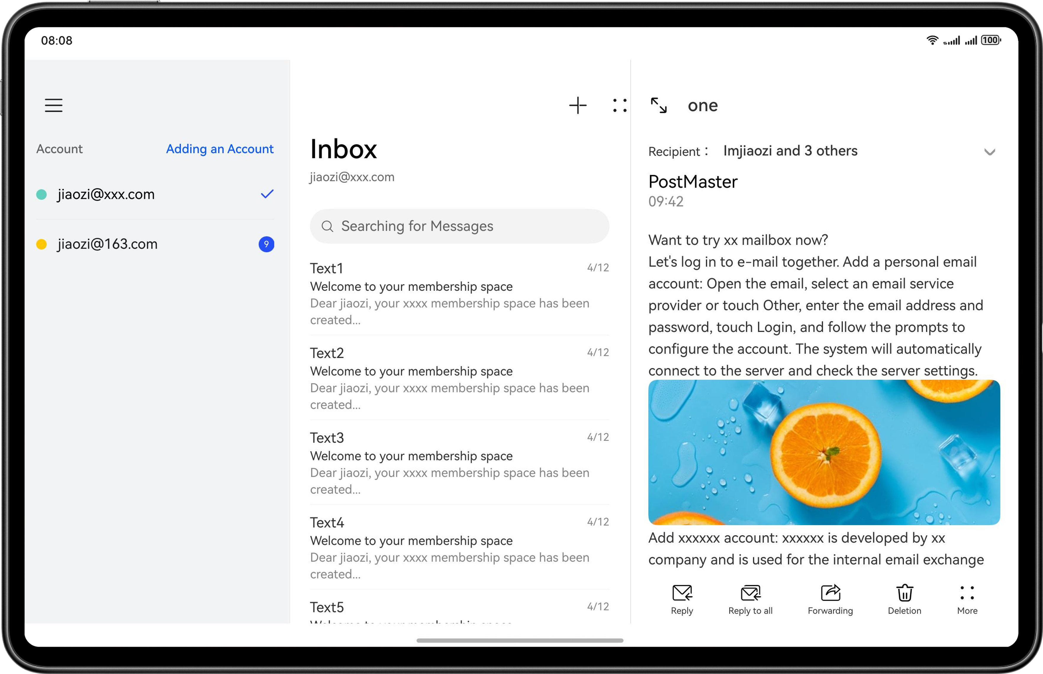
Layout suggestions: For scenarios requiring both images and text to be displayed, use the orientation layout, setting images and text in a left-right distribution to make information transmission more efficient and intuitive.
How to implement: use the GridRow and GridCol components to configure the number of columns occupied by grid sub-elements at different breakpoints. If the number of columns in a row exceeds the total number of columns of a grid component at the breakpoint, the grid sub-elements automatically wrap, thus achieving a flexible layout effect.
The design diagram is as follows:
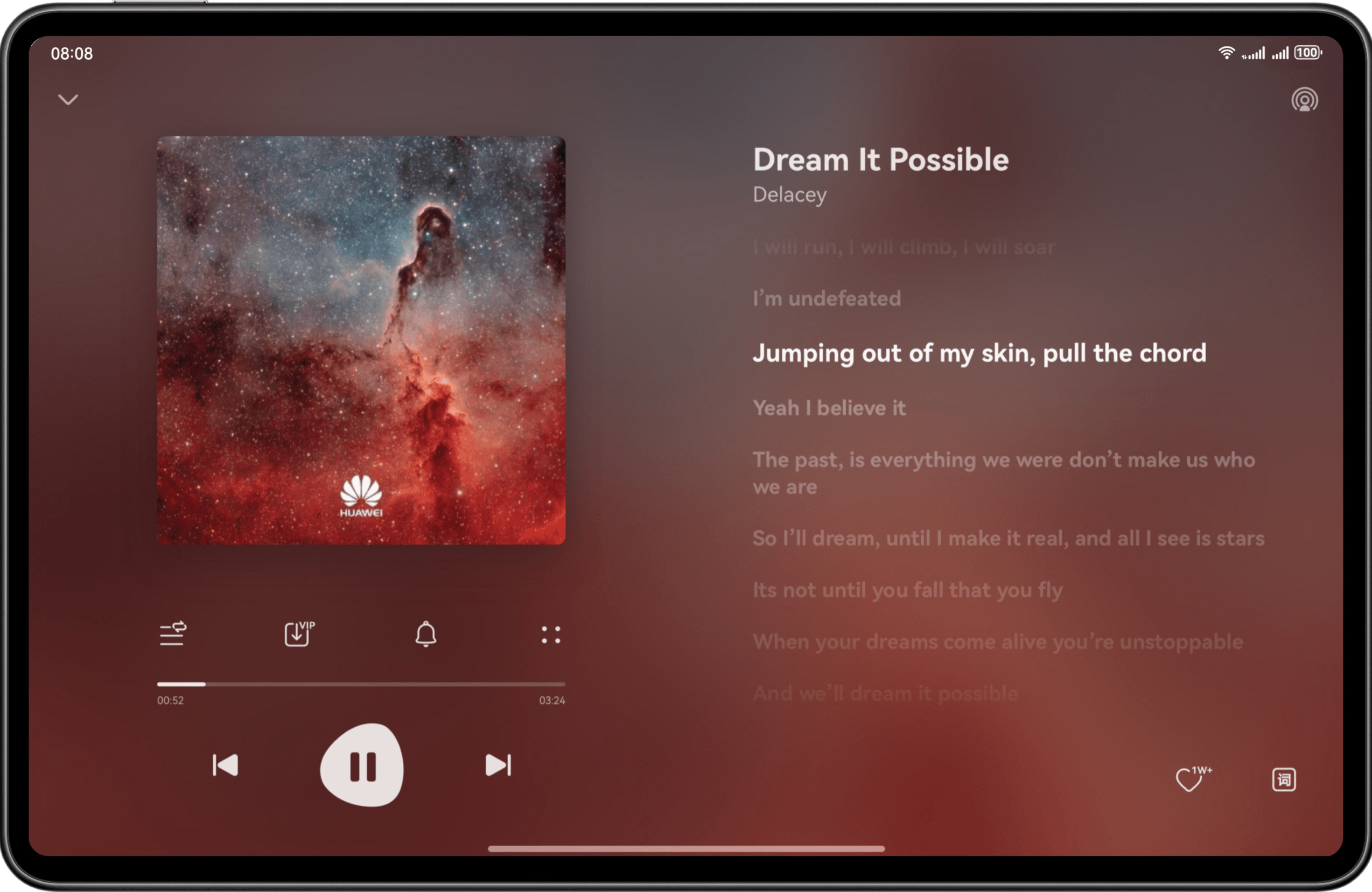
The large screen in portrait mode refers to the vertical display form of large-screen devices originally designed for landscape use, that is, the state of these devices after being rotated 90 degrees from their default landscape mode. Typical devices include tablets (portrait) and triple-screen tri-folds (portrait).
The portrait mode makes it easy for users to focus on content streams and perform basic operations such as scrolling and tapping.
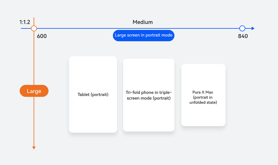
Horizontal/Vertical Breakpoint | Device |
|---|---|
md for horizontal breakpoints and lg for vertical breakpoints | Tablets (portrait) |
Triple-screen tri-folds (portrait) | |
Pura X Max (portrait in unfolded state) |
For large screens in portrait mode, the significant increase in screen height means users now have higher demands for operational efficiency and visual rhythm during content browsing. Therefore, targeted optimizations are needed for navigation bars and repetitive layouts, tailored to the display characteristics of portrait screens. On large screens in portrait mode, navigation bars are typically positioned at the top or bottom, making them easy for users to quickly recognize and operate. This device form provides ample vertical space, allowing the use of repetition layouts to display information modules that are structurally similar but differ in content. For details about the layout design for large screens in portrait mode, see Application UX Standards for Large-Screen Devices.
Layout suggestions: Place the tab bar at the bottom on large screens in portrait mode to improve the accessibility and operational efficiency of core functions.
How to implement: Use the responsive layout capability to set barPosition to End and vertical to false for the Tabs component.
The design diagram is as follows:
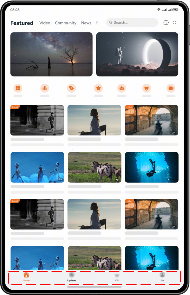
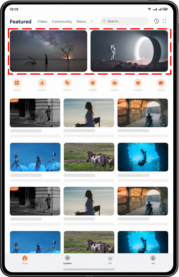
Layout suggestions: In large-screen portrait mode scenarios, due to the relatively large screen width, you are advised to use the repetition layout with multiple images in a carousel to improve content density and users' browsing efficiency.
How to implement: Use the Swiper component, which supports the swipe-based carousel display of images. You can set the displayCount property to display multiple carousel items at the same time.
The design diagram is as follows:
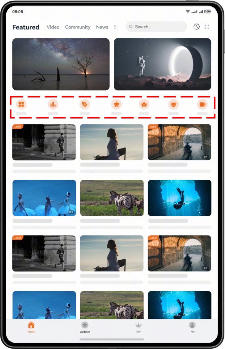
Layout suggestions: Compared with bar phones in portrait mode, large-screen portrait mode has a larger content display area. In this case, use the repetition layout, configured to display as either a single row with multiple columns or a single column with multiple rows.
How to implement: The List component provides the lanes property, which is used to set the number of columns or rows.
The design diagram is as follows:
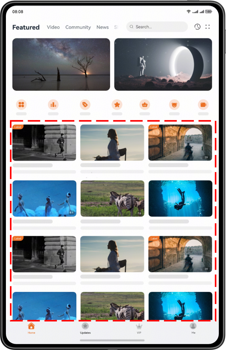
Layout suggestions: Compared with bar phones in portrait mode, large-screen portrait mode has a larger content display area. In this case, configure the layout to display as multiple rows and columns.
How to implement: Use the Grid component. You can set columnsTemplate and rowsTemplate for different breakpoints to implement the multi-device effects of the grids.
The design diagram is as follows:
Large square screens feature a 1:1 aspect ratio that creates a symmetrical and balanced visual effect. They have a horizontal resolution exceeding 600 vp, along with high information-carrying capacity, delivering excellent reading comfort. Typical devices include the Huawei Mate X series in their unfolded state, which offer users a wider operating space and more diverse UI layout possibilities.
Such screens are highly suitable for multitasking, split-screen content display, and creative apps, significantly enhancing user operational efficiency and interactive experience.
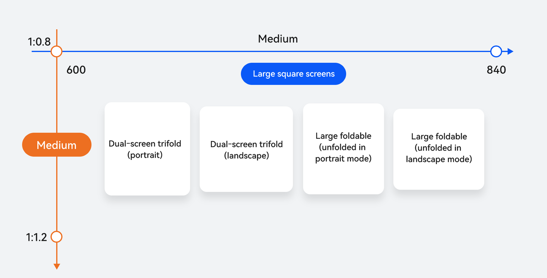
Horizontal/Vertical Breakpoint | Device |
|---|---|
md for horizontal breakpoints and md for vertical breakpoints | Bi-fold phones: Mate X series (unfolded) |
Tri-fold phones: Mate XT series (dual-screen M-state) |
Large square screens provide a vast display area, allowing navigation bars to include more function entry points without appearing cluttered. They are also suitable for adopting the repetition layout to present information units with similar structures but different content. Content that appears in the top-bottom arrangement on small screens shifts to a left-right layout on large square screens, making the page more visually appealing. Given the ample horizontal and vertical space of large square screens, column layout is recommended as a highly effective method for organizing information.
Layout suggestions: For large square screens at the md breakpoint, place the tab bar at the bottom, with icons and text horizontally arranged, tab widths evenly distributed, and tab height fixed at 56 vp.
How to implement: Use the responsive layout capability to set barPosition to End and vertical to false for the Tabs component.
The design diagram is as follows:
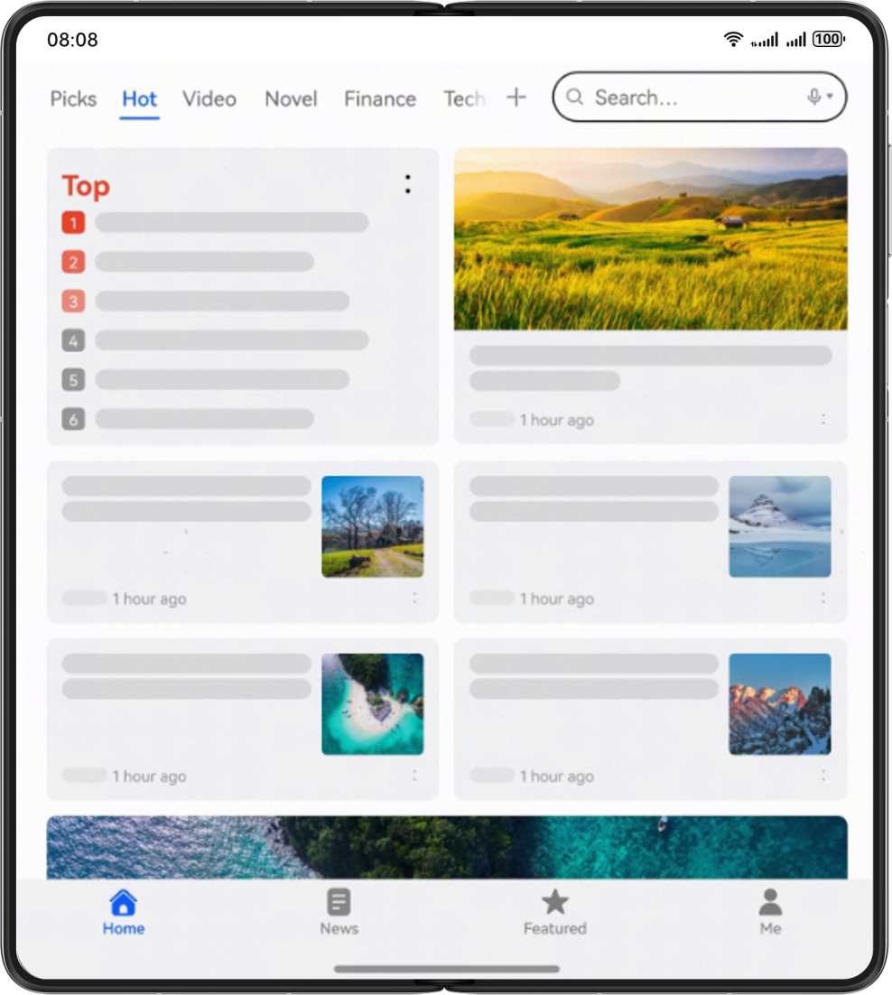
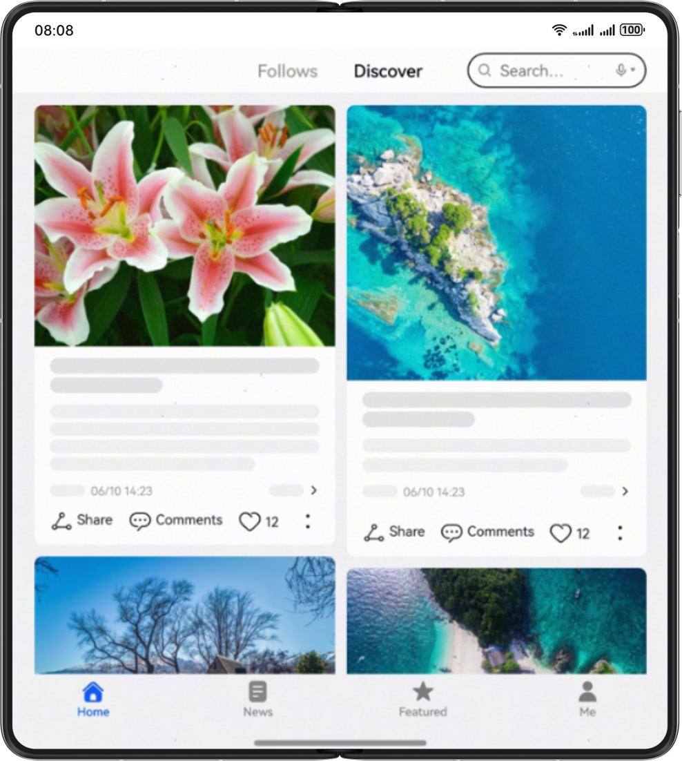
Layout suggestions: The content displayed in a single-column waterfall layout on small screens adopts the repetition layout on large square screens, transforming into a multi-column waterfall layout, which enhances the reading experience on wide-screen devices.
How to implement: Use the columnsTemplate property provided by the WaterFlow component to set the number of columns in the current WaterFlow component layout.
The design diagram is as follows:
Layout suggestions: Use the repetition layout for large square screens, displaying repetitive information elements in multiple rows and columns. This fully leverages the space advantages of large screens, enhancing information density and display efficiency.
How to implement: Use the Grid component to implement the multi-row and multi-column layout effects by defining row-column structures and cell distribution, enabling flexible display of information content.
The design diagram is as follows:
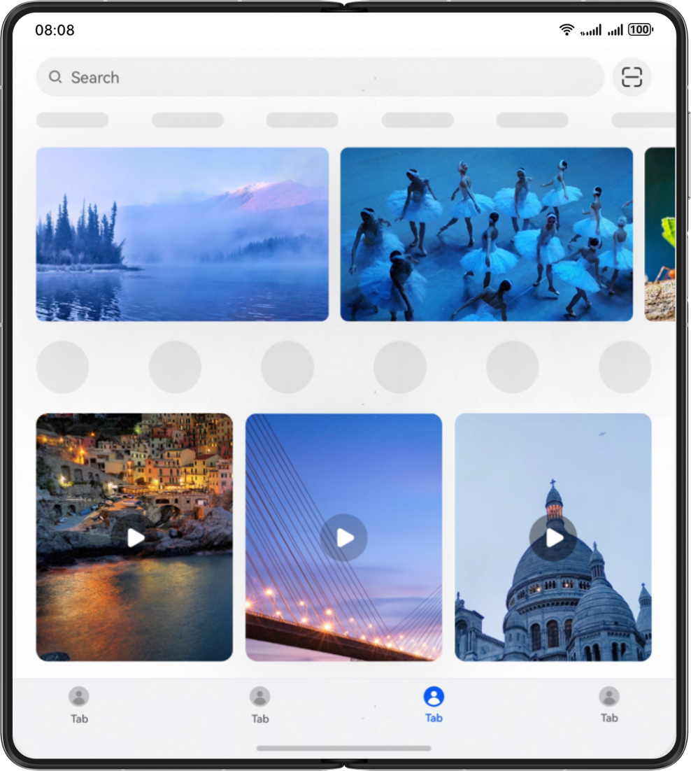
Layout suggestions: Use the repetition layout for large square screens. By arranging content in single row with multiple columns or single column with multiple rows, more content can be displayed, increasing the information density and enhancing UI utilization.
How to implement: The List component provides the lanes property, which is used to set the number of columns or rows.
The design diagram is as follows:
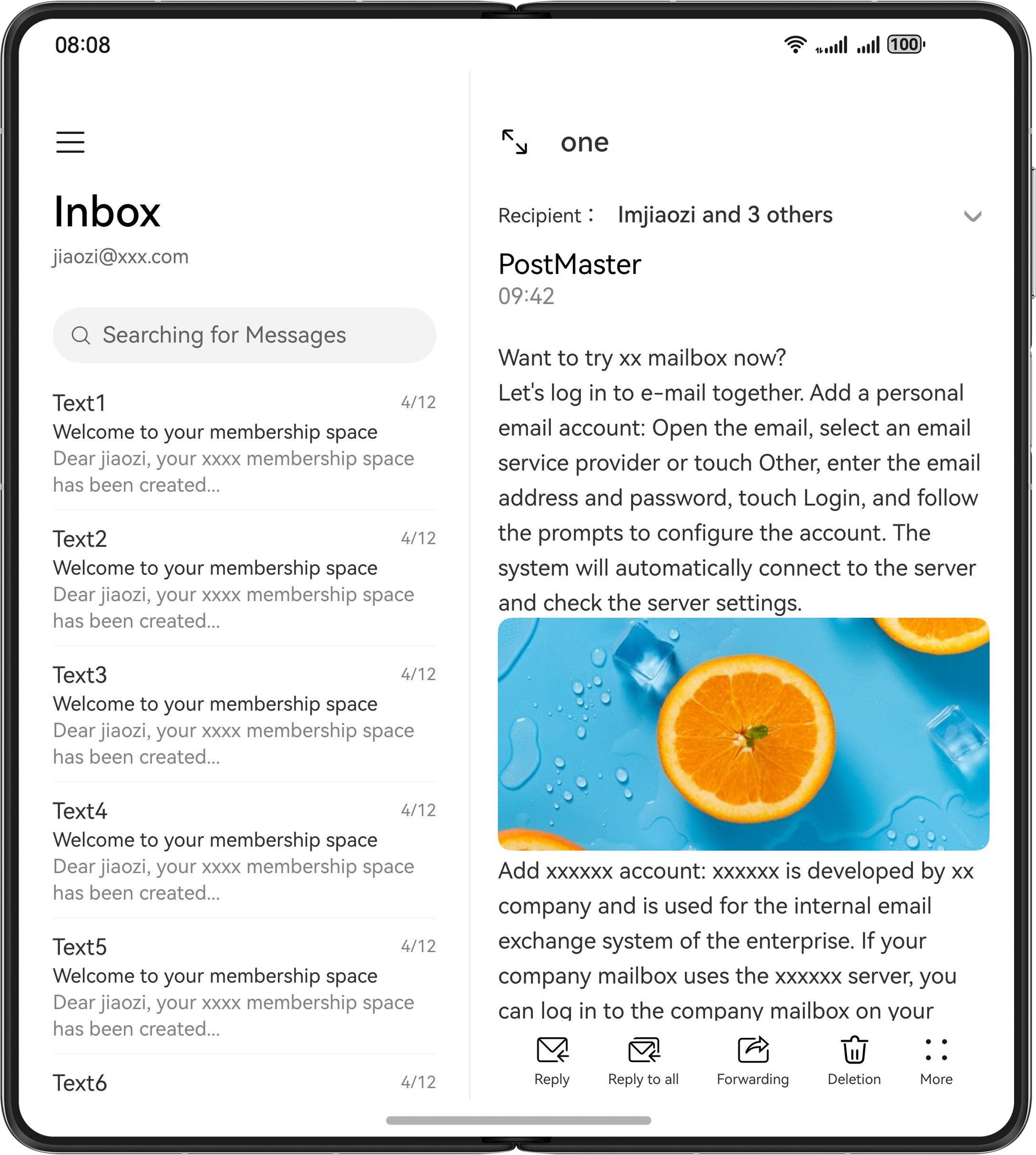
Layout suggestions: Use the column layout for large square screens with ample horizontal space to clearly display the content with hierarchical relationships, enhancing UI organization and user operational efficiency.
How to implement: Set mode of the Navigation component to Auto to automatically switch between the single-column and dual-column layouts.
The design diagram is as follows:
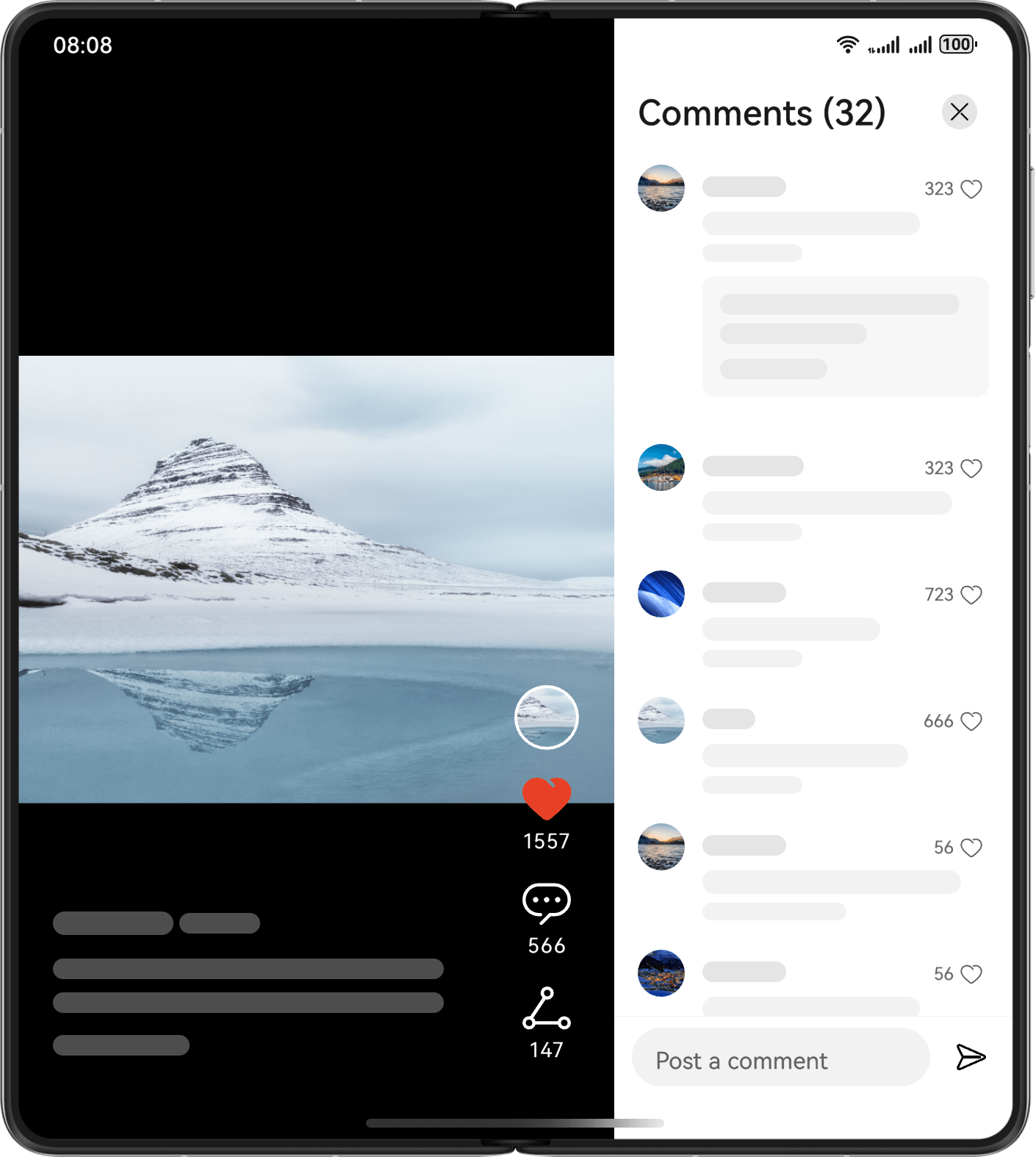
Layout suggestions: Use the column layout for large square screens with ample horizontal space and add sidebars when more information needs to be displayed, enhancing UI organization and information display efficiency.
How to implement: When the event for displaying the sidebar is triggered, use the SideBarContainer component and dynamically set showSideBar to true to display the sidebar.
The design diagram is as follows:
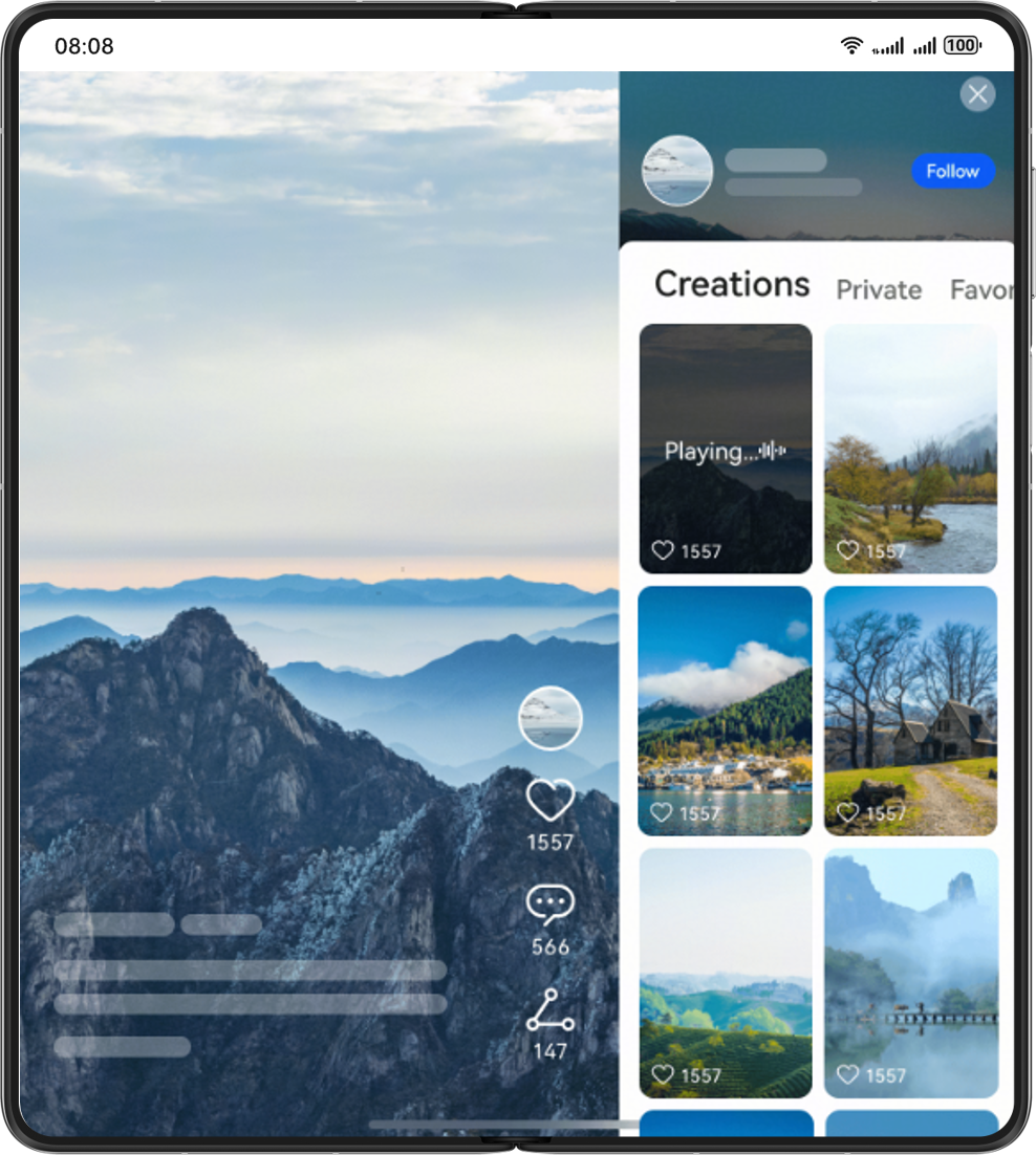
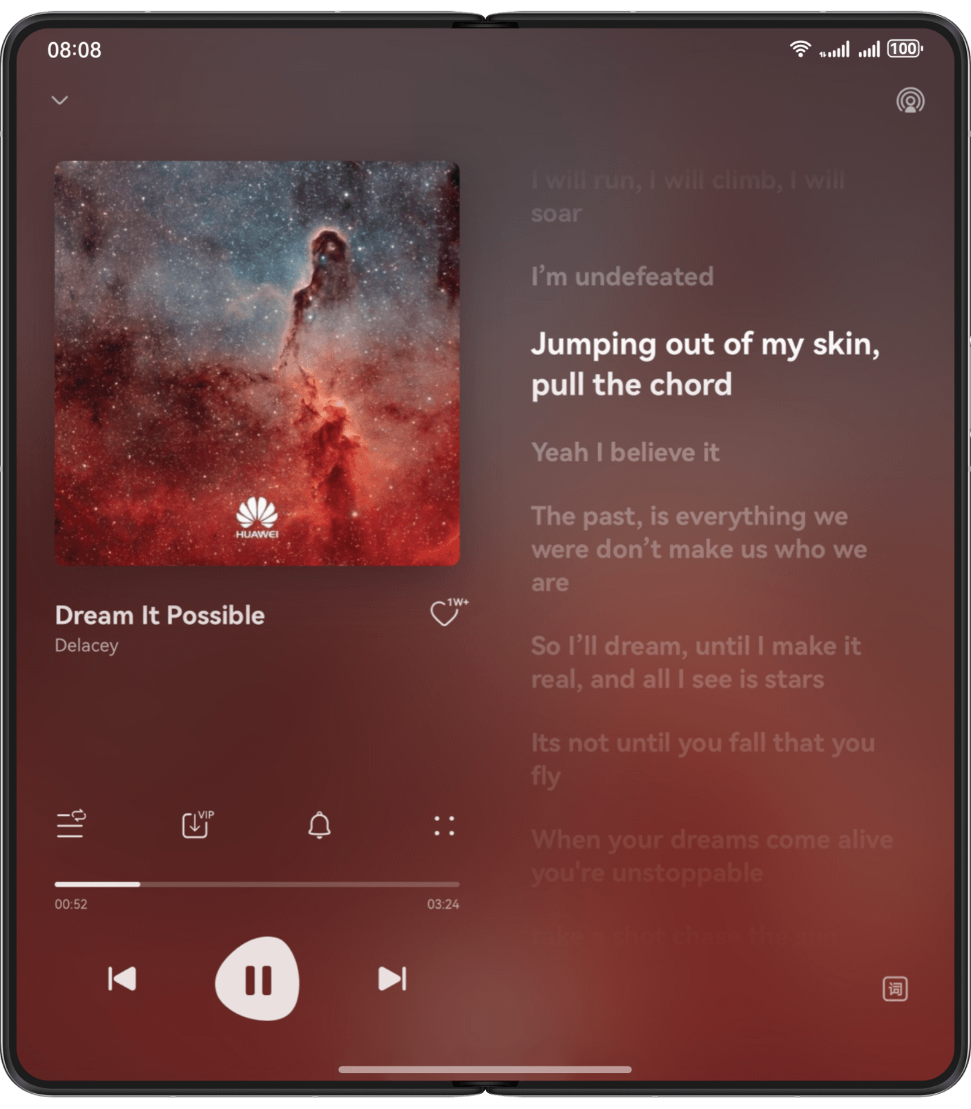
Layout suggestions: Content that appears in the top-bottom arrangement on small screens shifts to a left-right layout on large square screens using the orientation layout.
How to implement: Use the responsive layout capability and the Grid component. The number of columns occupied by grid sub-elements changes according to the developer's configuration. When the number of columns in a row exceeds the total number of columns of the grid component at a specific breakpoint, the row can be automatically wrapped.
The design diagram is as follows:
The bar phone in portrait mode is the dominant screen type for smartphones, featuring a balanced display area optimized for one-handed operations and daily information browsing. Typical devices include Huawei's full range of bar phones (such as Mate 60), small-screen foldable phones (unfolded), widescreen foldable phones (such as Pura X series in unfolded state and Pura X Max series in folded state), and bi-fold phones (folded).
This screen form is especially suitable for high-frequency interaction scenarios such as social apps, news feeds, instant messaging, and short video playback. Due to its high compatibility with mobile usage habits, UI designers can more easily achieve vertical content arrangement and hierarchical presentation. Additionally, the portrait-oriented bar phone demonstrates excellent compatibility in responsive layouts, flexibly accommodating varying resolutions and device sizes, and serving as a pivotal connecting role in multi-device collaborative development.
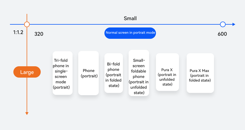
Horizontal/Vertical Breakpoint | Device |
|---|---|
sm for horizontal breakpoints and lg for vertical breakpoints | Bar phones |
Small-screen foldable phones (unfolded) | |
Pura X (unfolded) | |
Bi-fold phones (folded) | |
Tri-fold phones (folded) | |
Pura X Max (folded) |
For bar phones in portrait mode, with limited screen width but relatively ample height, should prioritize simplicity, intuitiveness, and operational efficiency as core goals in layout design. On a portrait screen, the navigation bar is usually placed at the top or bottom of the screen as the main entry for users to switch between functions and navigate between pages. In portrait-screen design, properly utilize the orientation layout to reduce visual congestion caused by limited space. Given the limited horizontal space of bar phones in portrait mode, the single-column layout is recommended.
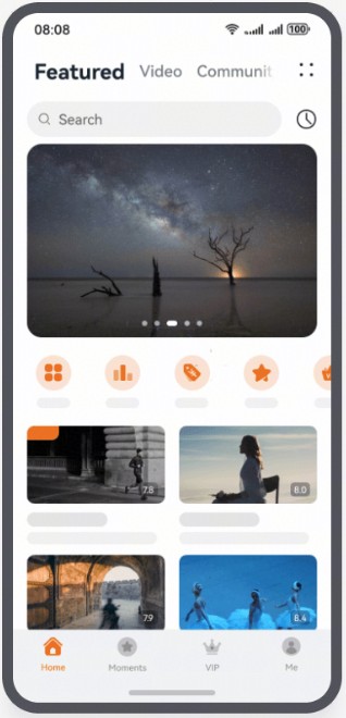
Layout suggestions: For bar phones in portrait mode, place the tab bar at the bottom, which allows users to quickly switch between functional modules, improving operation convenience and UI friendliness.
How to implement: Use the responsive layout capability to set barPosition to End and vertical to false for the Tabs component.
The design diagram is as follows:
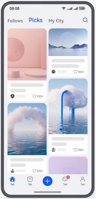
Layout suggestions: For bar phones in portrait mode, use the repetition layout to enhance content display density and scrolling experience, making it ideal for content-intensive scenarios such as image galleries, product lists, and dynamic cards.
How to implement: Use the columnsTemplate property provided by the WaterFlow component to set the number of columns in the current WaterFlow component layout.
The design diagram is as follows:
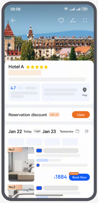
Layout suggestions: For bar phones in portrait mode, use a top-bottom layout, with content arranged from top to bottom in order of priority. This adapts to small-screen display needs, enhancing readability and operational convenience.
How to implement: use the GridRow and GridCol components to configure the number of columns occupied by grid sub-elements at different breakpoints.
The design diagram is as follows:
Layout suggestions: For bar phones in portrait mode, use the single-column layout, with the content arranged vertically in sequence, to improve the UI simplicity and user operational efficiency.
How to implement: set the mode property of the Navigation component to Stack.
The design diagram is as follows:
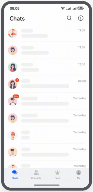
The primary use case for bar phones in landscape mode typically involves rotating from portrait mode. This display approach is ideal for scenarios requiring broader horizontal space to enhance visual experiences or improve operational efficiency, such as video playback, web browsing, document editing, and gaming. Typical devices include Huawei's full range of bar phones (such as Mate 60), small-screen foldable phones (unfolded), widescreen foldable phones (such as Pura X series in unfolded state and Pura X Max series in folded state), and bi-fold phones (folded).
On these devices, when users switch from the portrait mode to landscape mode, UIs automatically adapt to the new orientation. This delivers more immersive viewing experiences or optimized workflows for reading/editing tasks. For example, during video playback, landscape mode maximizes the screen horizontal space to minimize black bars and expand the effective viewable area; for document/spreadsheet editing, horizontal layouts display more columns/text content to boost productivity. Thus, bar phones in landscape mode enhance both practicality and versatile user experiences.
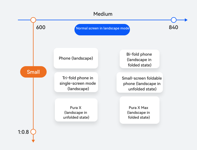
Horizontal/Vertical Breakpoint | Device |
|---|---|
md for horizontal breakpoints and sm for vertical breakpoints | Bar phones (landscape) |
Small-screen foldable phones (landscape mode in unfolded state) | |
Pura X (landscape mode in unfolded state) | |
Bi-fold phones (landscape mode in folded state) | |
Tri-fold phones (landscape mode in folded state) | |
Pura X Max (landscape in folded state) |
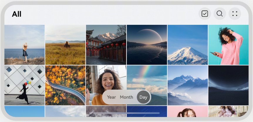
Landscape mode on bar phones, with increased screen width, provides users with a broader field of view and more extensive operating space. Thus, you can fully utilize horizontal space and adopt the repetition layout to enhance information density and interaction efficiency. A left-right structure can be used for displaying horizontal content. Given the longer horizontal length of bar phones in landscape mode, column layout is recommended to improve user operational efficiency.
Layout suggestions: For bar phones in landscape mode, use the repetition layout. The wider display area can be used to display more content horizontally, improving information density and browsing efficiency.
How to implement: Use the Grid component to implement the multi-row and multi-column layout effects by defining row-column structures and cell distribution, enabling flexible display of information content such as cards and product lists.
The design diagram is as follows:
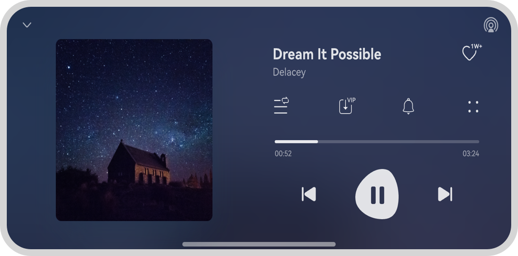
Layout suggestions: For bar phones in landscape mode, use the orientation layout, arranging images and text in a left-right manner to make rational use of horizontal space, thereby enhancing information display efficiency and UI aesthetics.
How to implement: Use the GridRow/GridCol component. The number of columns occupied by grid sub-elements changes according to the developer's configuration. When the number of columns in a row exceeds the total number of columns of the grid component at a specific breakpoint, the row can be automatically wrapped.
The design diagram is as follows:
Layout suggestions: For bar phones in landscape mode, use the column layout to divide the UI into left and right sections to fully utilize horizontal space, display more information, and improve user operational efficiency.
How to implement: Use the Navigation component and set mode to Auto. Alternatively, use the SideBarContainer component and set showSideBar to true to display the sidebar. Both methods can achieve the target effect.
The design diagram is as follows:
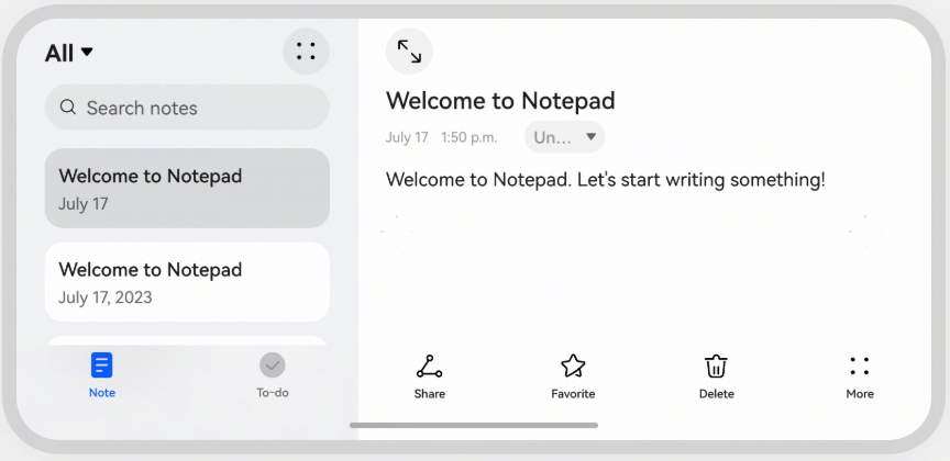
For details about the UI design of bar phones in landscape mode, see Long Video.
Small square screens feature an aspect ratio of 1:1 and a horizontal resolution below 600 vp, for example, the external screen of Huawei Pura X.
Such screens are mainly used in scenarios like instant messaging, convenient travel navigation, quick mobile payments, immersive audio-visual playback, and light gaming. They can fully leverage the advantages of small square screens—being efficient and convenient—without the need to operate via the internal screen.
Due to the 1:1 aspect ratio and small screen size, basic function adaptation is required. In actual adaptation, the key consideration is how to make full use of screen space to provide the best user experience.
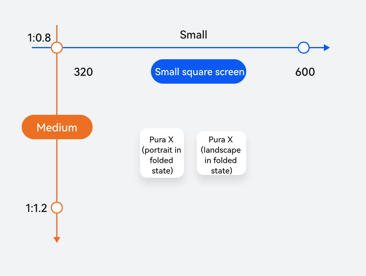
Horizontal/Vertical Breakpoint | Device |
|---|---|
sm for horizontal breakpoints and md for vertical breakpoints | Pura X in folded state |
This section describes the design scheme for the external small square screen of Pura X series products. The primary objectives are to ensure the complete display of page layouts without any truncation, compression, or overlapping, and to achieve full utilization of the screen space, thereby enhancing user experience.
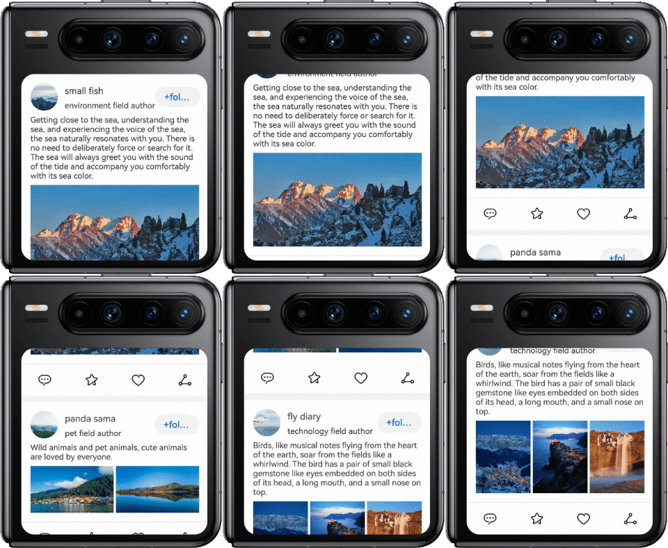
Layout suggestions: To allow for the complete content display on small square screen, you are advised to use the Scroll component to implement page scrolling.
The display effects are as follows.
Layout suggestions: To display the short video playback page on the small square screen, the background image or video must be zoomed in or out proportionally for immersive experience, namely, the upper part of the page is extended to the top title bar, and the lower part is extended to the bottom tab bar. Side components allow scrolling to reveal the full page content.
The display effects are as follows.
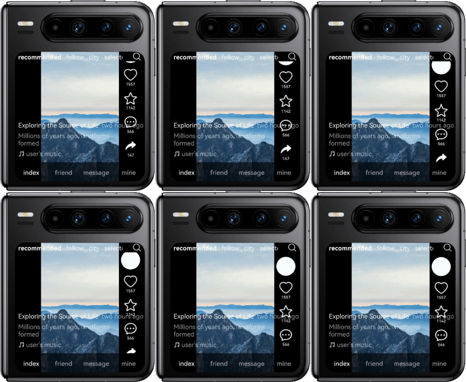
The Stack component is used to control the display layer of page content and the extension of background images without affecting interaction events. Through Z-order control, the layers are arranged from bottom to top as follows: the background image (video) area, bottom tab area, short video description area, side component area, and top tab area. For the top and bottom tab pages, set padding to topAvoidHeight and bottomAvoidHeight respectively to avoid the areas where the window cannot be displayed. In the side component area, the Scroll component is used to automatically control the swiping. The Blank component and displayPriority property are used to control the blank space on the upper and lower parts of the side component area. If the container height is sufficient, the blank space is displayed on the upper and lower parts; otherwise, the blank space is automatically hidden.
- Stack({ alignContent: Alignment.BottomEnd }) {
- // Background image.
- Row() {
- Image($r('app.media.background_image'))
- .height('100%')
- .objectFit(ImageFit.Cover)
- .aspectRatio(0.6)
- }
- .height('100%')
- .width('100%')
- .justifyContent(FlexAlign.Center)
-
- // Bottom tabs.
- List() {
- // ...
- }
- .backgroundColor($r('sys.color.mask_secondary'))
- .listDirection(Axis.Horizontal)
- .height(this.bottomBarHeight)
- .padding({ bottom: this.bottomAvoidHeight })
- // ...
-
- // Video description.
- Column() {
- // ...
- }
- .alignItems(HorizontalAlign.Start)
- .padding({
- left: $r('app.float.margin_md'),
- right: $r('app.float.margin_md')
- })
- // ...
-
- // Sidebar buttons.
- Scroll() {
- Column() {
- Blank()
- .layoutWeight(3)
- .displayPriority(1)
- // ...
- Blank()
- .layoutWeight(1)
- .displayPriority(1)
- }
- // ...
- }
- .scrollBar(BarState.Off)
- .layoutWeight(1)
- .width('56vp')
- .edgeEffect(EdgeEffect.None)
- .align(Alignment.Bottom)
- .margin({
- top: this.topAvoidHeight + 24,
- bottom: this.bottomBarHeight,
- right: '8vp'
- })
-
- // Top tabs.
- Row() {
- // ...
- }
- .height('100%')
- .width('100%')
- .backgroundColor(Color.Black)
Layout suggestions: If the window on the small square screen fails to hold a custom dialog box completely due to its height limitation, the content in the dialog box may be truncated. In this case, you need to adapt custom dialog boxes to the small square screen.
The display effects are as follows.
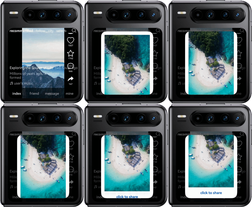
Implementation: Use a scrollable component to wrap the dialog box content area, and use constraintSize to restrict its maximum height to 90% of the parent component, preventing the dialog box content from being truncated.
- Scroll() {
- Column() {
- // ...
- }
- }
- .scrollBar(BarState.Off)
- .constraintSize({
- minHeight: 0,
- maxHeight: '90%'
- })
Layout suggestions: In common scenarios of the small square screen, implement the functions of hiding on upward swipe and restoring display on downward swipe to deliver a better content experience. By swiping up, users can temporarily hide UI elements such as the title bar and tab bar for immersive browsing. By swiping down, users can gradually restore the title bar and tab bar with animations.
The display effects are as follows.
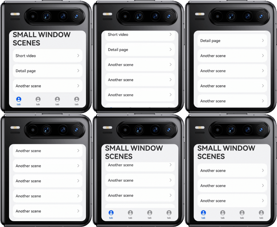
How to implement: Listen for the swipe event and dynamically adjust the height and opacity of page components during swiping to gradually display or hide the components. The implementation is as follows:
- @StorageLink('topBarHeight') topBarHeight: number = CommonConstants.UTIL_HEIGHTS[1] + this.topAvoidHeight;
- @State bottomBarHeight: number = CommonConstants.UTIL_HEIGHTS[0] + this.bottomAvoidHeight;
- @State barOpacity: number = 1;
- @StorageLink('topAvoidHeight') @Watch('topBarHeightChange') topAvoidHeight: number = 0;
- @StorageLink('bottomAvoidHeight') @Watch('bottomBarHeightChange') bottomAvoidHeight: number = 0;
- // ...
- topBarHeightChange(): void {
- if (this.currentWidthBreakpoint === WidthBreakpoint.WIDTH_SM &&
- (this.currentHeightBreakpoint === HeightBreakpoint.HEIGHT_MD ||
- this.currentHeightBreakpoint === HeightBreakpoint.HEIGHT_SM)) {
- this.topBarHeight = 78 + this.topAvoidHeight;
- }
- // ...
- };
-
- bottomBarHeightChange(): void {
- this.bottomBarHeight = 56 + this.bottomAvoidHeight;
- };
- export default class EntryAbility extends UIAbility {
- private uiContext ?: UIContext;
- private windowUtil?: WindowUtil = WindowUtil.getInstance();
- private windowObj?: window.Window;
- private onAvoidAreaChange: (avoidArea: window.AvoidAreaOptions) => void = (avoidArea: window.AvoidAreaOptions) => {
- if (avoidArea.type === window.AvoidAreaType.TYPE_SYSTEM) {
- AppStorage.setOrCreate('topAvoidHeight', this.windowObj!.getUIContext().px2vp(avoidArea.area.topRect.height));
- } else if (avoidArea.type === window.AvoidAreaType.TYPE_NAVIGATION_INDICATOR) {
- AppStorage.setOrCreate('bottomAvoidHeight', this.windowObj!.getUIContext().px2vp(avoidArea.area.bottomRect.height));
- }
- };
- // ...
- onWindowStageCreate(windowStage: window.WindowStage): void {
- // Main window is created, set main page for this ability
- hilog.info(0x0000, 'testTag', '%{public}s', 'Ability onWindowStageCreate');
- this.windowUtil?.setWindowStage(windowStage);
-
- windowStage.loadContent('pages/Index', (err) => {
- if (err.code) {
- hilog.error(0x0000, 'testTag', 'Failed to load the content. Cause: %{public}s', JSON.stringify(err) ?? '');
- return;
- }
- windowStage.getMainWindow((err: BusinessError, data: window.Window) => {
- if (err.code) {
- hilog.error(0x0000, 'testTag', 'Failed to get the main window. Cause: %{public}s', JSON.stringify(err) ?? '');
- return;
- }
- this.windowObj = data;
- this.uiContext = data.getUIContext();
- this.windowUtil!.setFullScreen();
- // ...
- let topAvoidHeight: window.AvoidArea = data.getWindowAvoidArea(window.AvoidAreaType.TYPE_SYSTEM);
- AppStorage.setOrCreate('topAvoidHeight', this.uiContext.px2vp(topAvoidHeight.topRect.height));
- let bottomAvoidHeight: window.AvoidArea =
- data.getWindowAvoidArea(window.AvoidAreaType.TYPE_NAVIGATION_INDICATOR);
- AppStorage.setOrCreate('bottomAvoidHeight', this.uiContext.px2vp(bottomAvoidHeight.bottomRect.height));
- data.on('avoidAreaChange', this.onAvoidAreaChange);
- if (AppStorage.get('currentWidthBreakpoint') === WidthBreakpoint.WIDTH_SM &&
- (AppStorage.get('currentHeightBreakpoint') === HeightBreakpoint.HEIGHT_MD ||
- AppStorage.get('currentHeightBreakpoint') === HeightBreakpoint.HEIGHT_SM)) {
- // Set top bar height when the application is in small screen.
- AppStorage.setOrCreate('topBarHeight',
- CommonConstants.UTIL_HEIGHTS[1] + this.uiContext!.px2vp(topAvoidHeight.topRect.height));
- } else {
- // Set top bar height when the application is in full screen.
- AppStorage.setOrCreate('topBarHeight',
- CommonConstants.UTIL_HEIGHTS[2] + this.uiContext!.px2vp(topAvoidHeight.topRect.height));
- }
- })
- // ...
- }
- // ...
- }
- Tabs() {
- TabContent() {
- Stack({ alignContent: Alignment.Top }) {
- Row() {
- Text($r('app.string.app_title'))
- .fontSize($r('app.float.font_size_xl'))
- .fontWeight(CommonConstants.FONT_WEIGHTS[1])
- .height(this.topBarHeight)
- .align(Alignment.Bottom)
- .padding({ bottom: 12 })
- }
- .height(this.topBarHeight)
- .opacity(this.barOpacity)
- // ...
- List({
- space: CommonConstants.LIST_SPACE[0],
- scroller: this.listScroller,
- }) {
- // ...
- }
- .onScrollIndex((start: number) => {
- this.currentIndex = start;
- })
- .margin({ top: this.topBarHeight })
- // ...
- }
- .height('100%')
- .width('100%')
- }
- .tabBar(this.bottomTabBuilder(0))
-
- // ...
- }
- // ...
- .barHeight(this.bottomBarHeight)
- // ...
- .onScrollFrameBegin((offset: number) => {
- if (this.currentWidthBreakpoint !== WidthBreakpoint.WIDTH_SM ||
- (this.currentHeightBreakpoint !== HeightBreakpoint.HEIGHT_MD &&
- this.currentHeightBreakpoint !== HeightBreakpoint.HEIGHT_SM)) {
- return { offsetRemain: offset };
- }
- if (offset > 0) {
- this.currentYOffset += offset;
- }
- if (offset < 0) {
- this.currentYOffset -= offset;
- }
- this.getUIContext().animateTo({
- duration: 300
- }, () => {
- this.topBarHeight = 0;
- this.bottomBarHeight = 0;
- this.barOpacity = 0;
- });
- return { offsetRemain: offset };
- })
- .onScrollStop(() => {
- setTimeout(() => {
- this.getUIContext().animateTo({
- duration: 300
- }, () => {
- this.bottomBarHeight = 56 + this.bottomAvoidHeight;
- this.topBarHeight = 78 + this.topAvoidHeight;
- this.barOpacity = 1;
- this.currentYOffset = 0;
- this.isHiding = false;
- });
- }, 500);
- });
Typical devices with circular screens include wearables such as smart watches, featuring instant notifications and lightweight interaction.
Instant notifications: They are almost unrestricted by time and space, facilitating timely alerts for users about relevant messages. Meanwhile, attention should be paid to reducing interference from repeated or irrelevant notifications in specific scenarios, with notification strategies adjusted based on users' actual usage.
Lightweight interaction: Within the same app, smart wearables should leverage their portability to serve as a supplement and an extension of large-screen devices rather than a replacement. In specific design, based on the screen size and usage environment of smart watches, customize streamlined UIs and ensure smooth user experience and convenient operation.
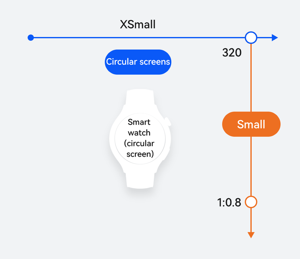
Horizontal/Vertical Breakpoint | Device |
|---|---|
xs for horizontal breakpoints and sm for vertical breakpoints | Smart watches (circular screen) |
Due to the unique screen shape and usage scenarios of circular-screen devices such as smart watches, their interaction modes and UI designs are significantly different from those of regular devices. To ensure consistent user experience and comprehensive adaptation of functions, you are advised to design the UI and logic dedicated to circular-screen devices during development, and create a separate HAP for release and installation.
When developing an app for wearables, you need to change the value of deviceTypes in module.json5 to wearable to ensure that the app can be correctly deployed and run on wearables. For details about the capabilities, see Wear Engine Kit.
This section takes the layout design of smart watches as an example to provide a design scheme for circular screens, ensuring complete content layout, enabling simple interactions, and expanding and supplementing the functions of other large-screen devices. The following provides the recommended design scheme and development guide tailored to common development scenarios for smart watches.
When the content to be displayed exceeds a single screen's capacity, adopt horizontal and vertical screen paging as layout strategies, ensuring that users can conveniently and completely view all information. With horizontal screen paging, content is distributed across horizontal pages. Users can browse additional content by swiping left or right, which is particularly suitable for content with larger width. Vertical screen paging allows content to extend across vertical pages. Users can access more information by scrolling up or down, making it ideal for displaying long lists or detailed descriptions. Comprehensively applying these two screen paging methods not only effectively avoids visual clutter caused by content congestion but also enhances the UI aesthetics and user interaction experience, ensuring that each part of the content is displayed clearly and in an orderly manner.
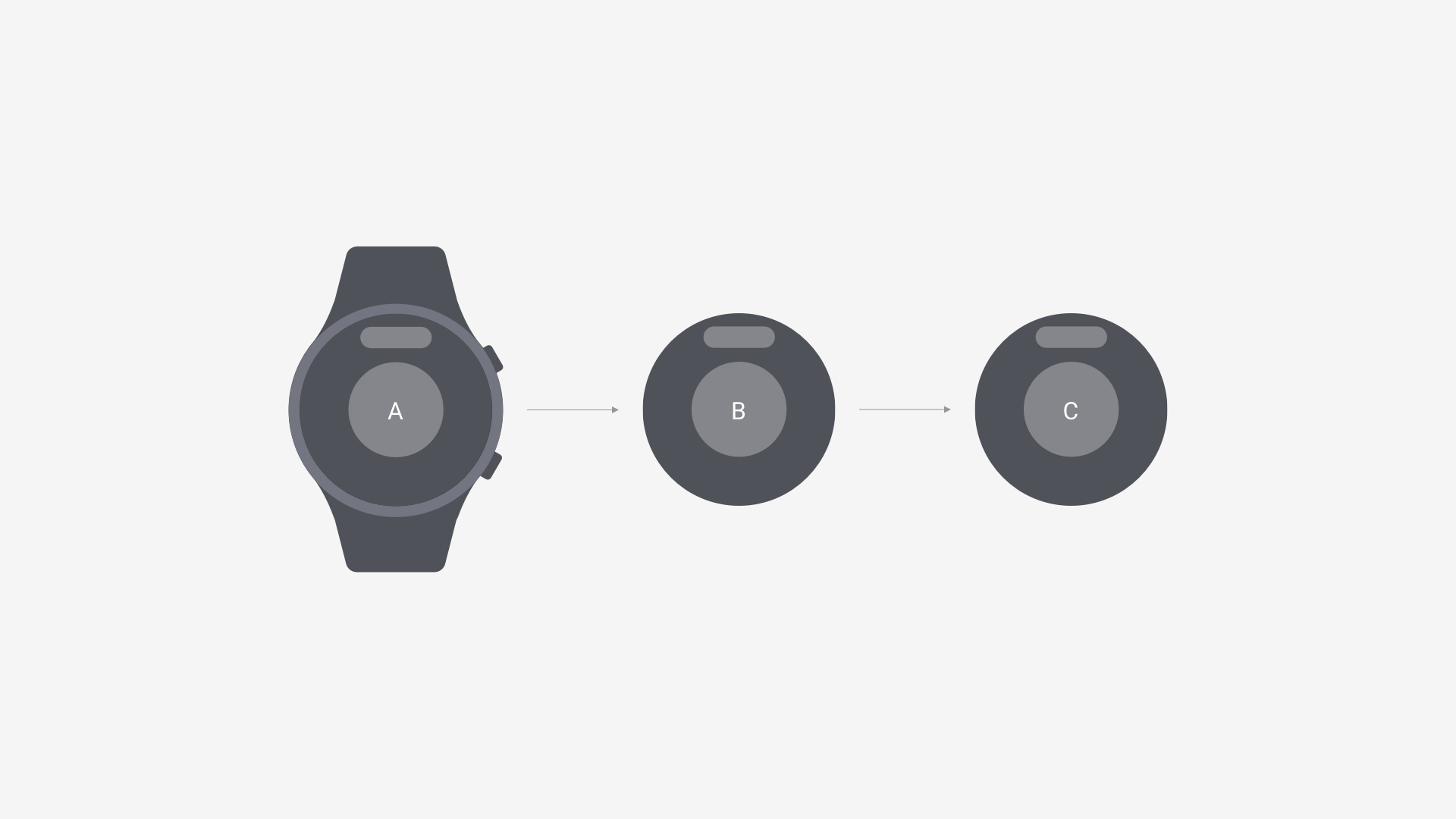
Horizontal screen paging allows content to extend to the next screen for independent arrangement, preventing information loss at the edges of the circular screen caused by flat content layout.
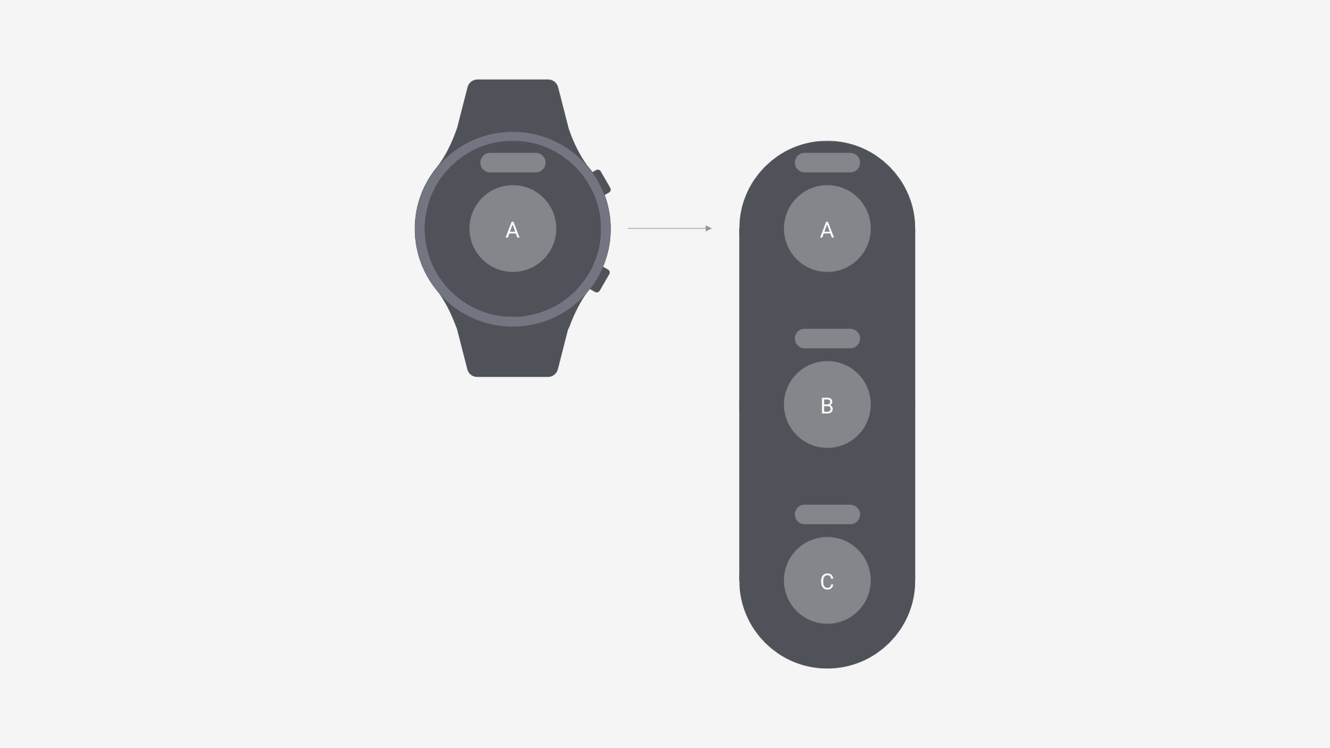
Vertical screen paging expands the vertical space for carrying information on smart watches, enhancing the continuity of information display.
ArkUI provides some arc-shaped components for circular screens. You are advised to prioritize using these adapted components for smart watch UI development. For details about how to develop smart watches, see Wearable Application Development.
Component | Description |
|---|---|
The ArcList component is an arc-shaped layout container that displays a series of list items. It presents the same type of data in multiple and coherent rows, for example, images or text. | |
The ArcButton component represents an arc button specifically designed for circular screens. It offers various button styles, such as emphasized, normal, and warning, tailored for watch UIs. | |
The ArcSlider component is designed for circular screens to quickly adjust settings, such as volume and brightness adjustment. | |
The ArcScrollBar component is used with scrollable components, such as ArcList, List, Grid, Scroll, and WaterFlow. | |
The ArcAlphabetIndexer component is an arc-shaped component designed for quick navigation through alphabetically sorted items. It can be integrated with container components to quickly locate items within the visible area. | |
The ArcSwiper component is used to display child components in carousel mode. | |
The ArcListItem component is used to display individual child components and must be used in conjunction with ArcList. |
Arc-shaped components are supported since API version 18. Updates will be marked with a superscript to indicate their earliest API version.
Smart watches' circular screens require specialized UI considerations, with their unique shape necessitating that the borderRadius attribute be set to 50% for the outermost container.
- build() {
- Navigation(this.pathStack) {
- // ...
- }
- .backgroundColor(Color.Black)
- .hideTitleBar(true)
- .hideToolBar(true)
- .height('100%')
- .width('100%')
- .borderRadius('50%')
- }
Content must be centered to ensure proper display on the circular screen, as shown below.
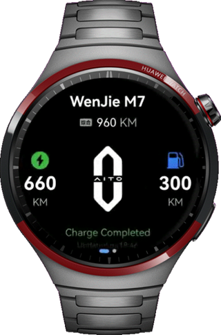
For smooth page transitions on smart watches, use the dedicated ArcSwiper component to implement vertical or horizontal swiping, as shown in the following figure.
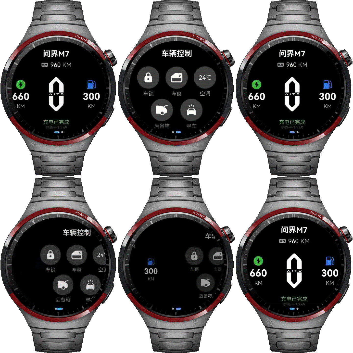
- ArcSwiper() {
- CarInformationView()
- CarControlView({ pathStack: this.pathStack })
- }