Overview
The cross-device adaptation technology aims to provide consistent cross-device UI, for example, ensuring the layout integrity in scenarios such as foldable screen opening and closing and free window adjustment. Its core strategy is to eliminate the truncation and whitespace issues caused by screen size differences through dynamic layout adjustment and responsive design, and ensure visual continuity during interaction state switching.
This topic is intended for intermediate and senior developers. Before you get started, you are advised to learn about One-Time Development for Multi-Device Deployment and Breakpoints.
This topic covers the following content:
- Adapting to cross-device screens: Adapt pages to different screen sizes of multiple devices. For details, see Adapting Pages to Different Screen Sizes. In scenarios such as short videos, you are advised to consider immersive experience and size adaptation of videos on multiple devices. For details, see Adapting Videos to Different Screen Sizes.
- Adapting to foldable device screens: In addition to adapting pages to different screen sizes, you are advised to adapt to the continuous open-close state and semi-folded state.
[h2]Adapting Pages to Different Screen Sizes
Adapting pages to different screen sizes is essentially adapting to different window sizes. The screen differences of smartphones, foldables, tablets, and PCs are ultimately reflected in the width, height, and aspect ratio of the app display window. Therefore, the core of adaptation is to abstract responsive capabilities based on window properties and dynamically adjust the UI with window size changes through breakpoint adaptation, ensuring stable display in any window specifications. For details, see Breakpoint-based UI Refresh. With one-time breakpoint-based layout adaptation, multiple window modes such as split-screen, floating window, and freeform window can be supported, ensuring smooth and continuous response to changes in different forms. The display effects are as follows.
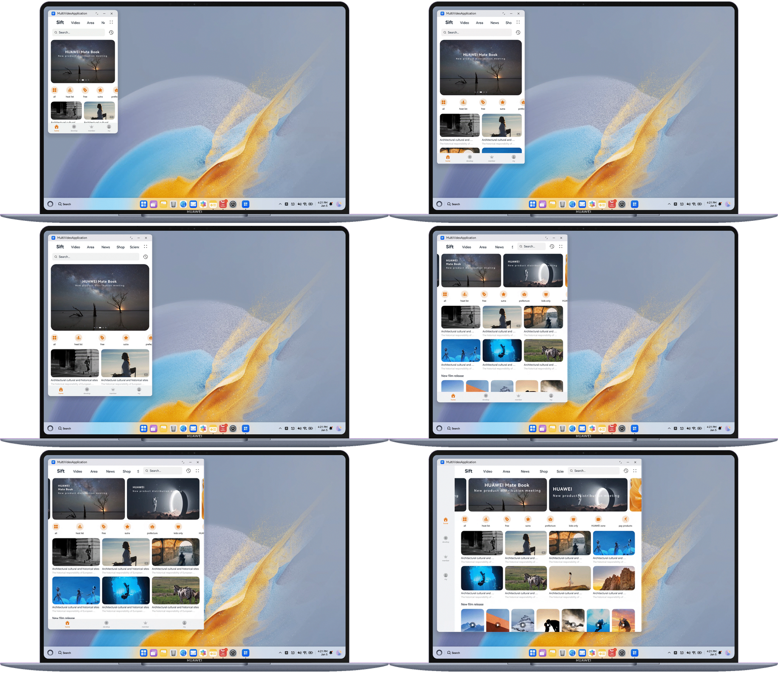
For details about the common responsive layouts of different screen types during cross-device UI development, see Screen Type-based Layout, including the adaptation of common window forms such as bar phone in portrait mode and large screen in landscape mode and special window forms such as small square screen.
[h2]Adapting Videos to Different Screen Sizes
Adapting videos to different screen sizes ensures that videos of different aspect ratios can be properly displayed on different device screens, without stretching distortion or excessive cropping of key content. To improve the video watching experience, you can display the video in full screen and reduce UI interference, so that users can focus more on the video content. The display effects are as follows.
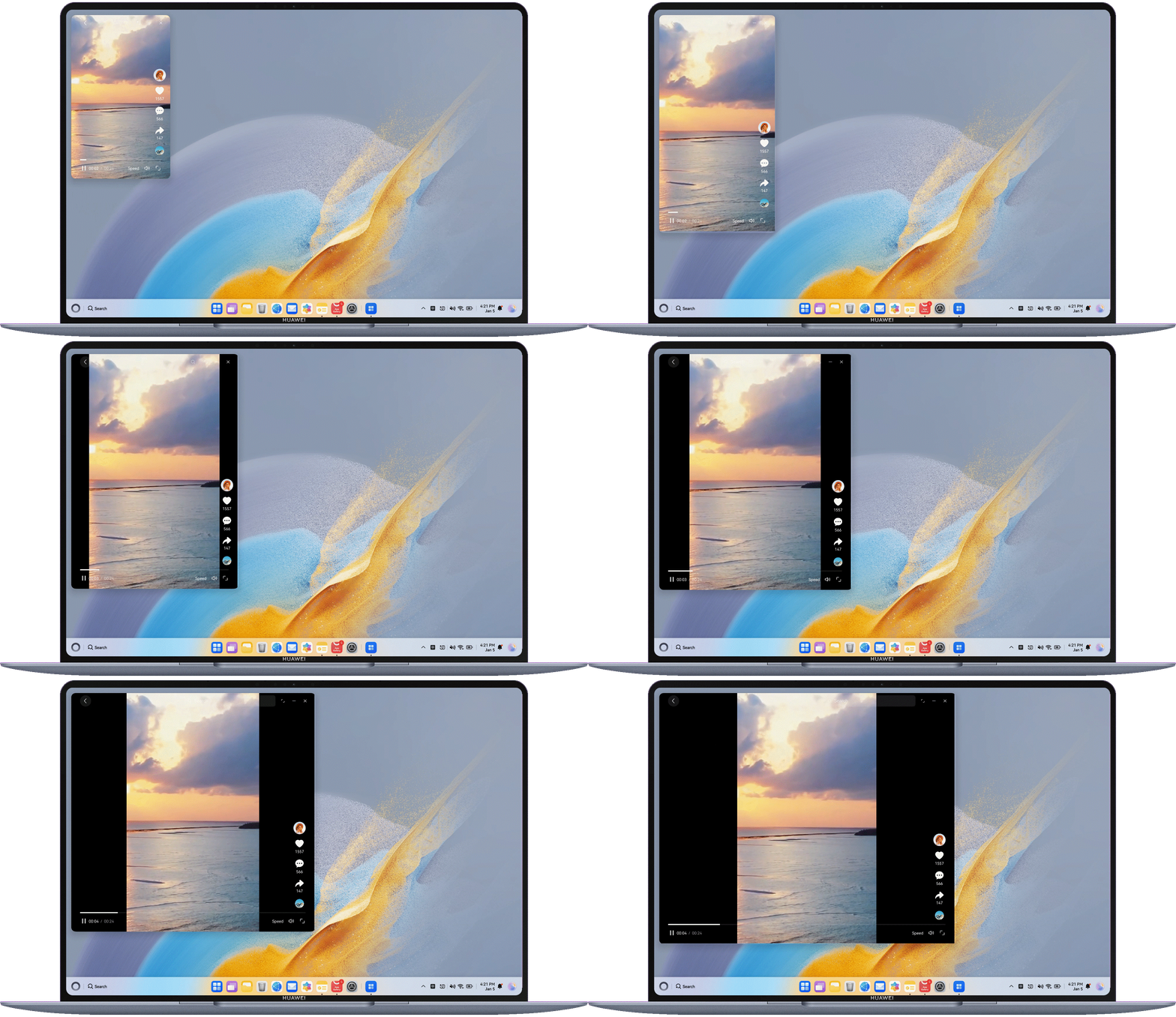
To achieve this effect, you need to consider the adaptation rules of videos of different sizes on different window sizes. Videos can be classified into 9:16 and non-9:16 videos based on the aspect ratio.

The adaptation rules in this topic are applicable to windows whose width is greater than 320 vp.
Adapting Videos with Non-9:16 Aspect Ratios
Videos with non-9:16 aspect ratios include vertical videos (height > width) and horizontal videos (width > height). The red area is the recommended video display area. The following figure shows the adaptation suggestions, where the horizontal coordinates indicate the window aspect ratios.
Adapting Videos with 9:16 Aspect Ratios
The following figure shows the effect of adapting to videos with 9:16 aspect ratios in the breakpoint range. The red area is the recommended video display area.
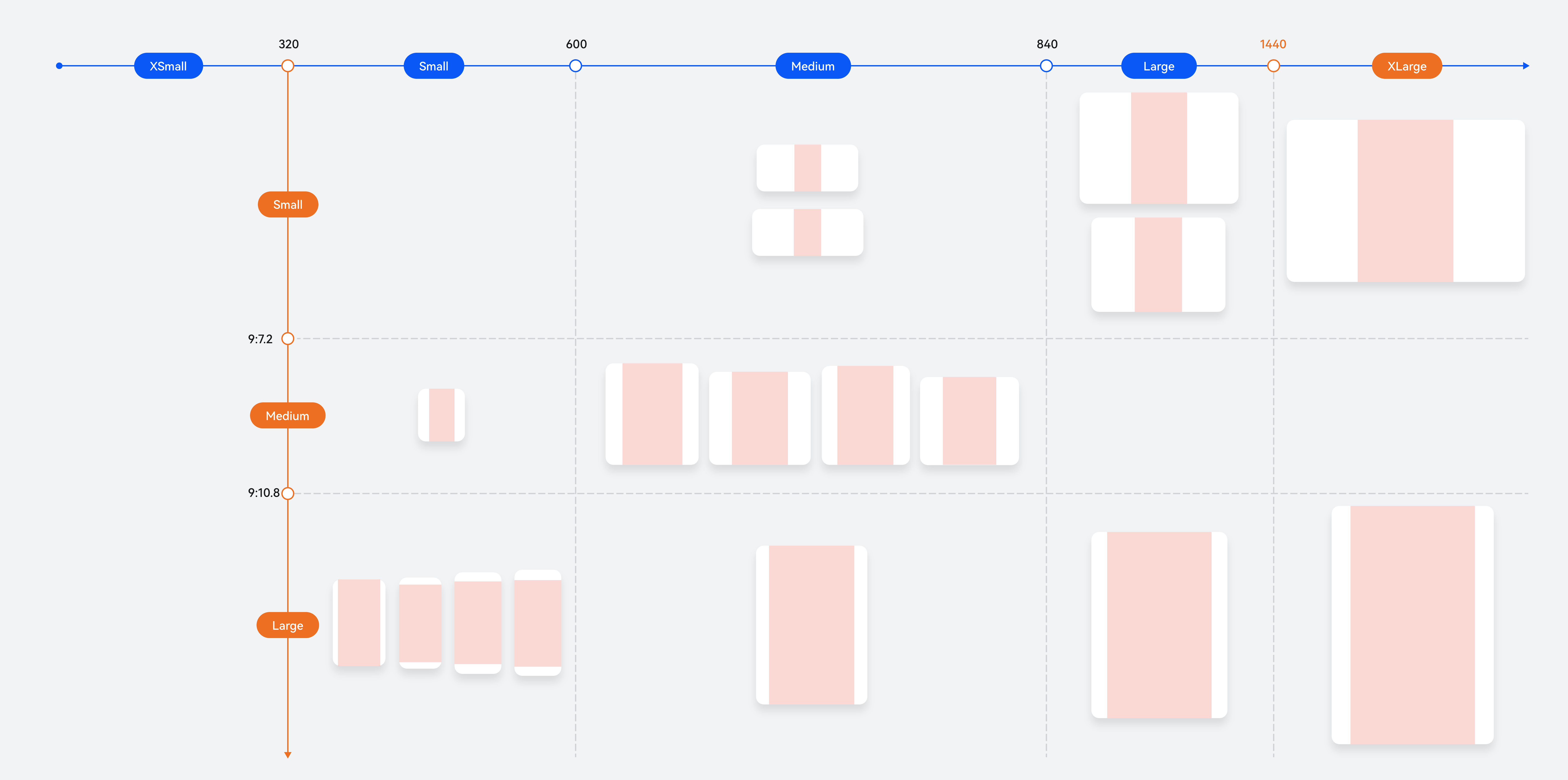
When the horizontal breakpoint is sm and the vertical breakpoint is lg, different adaptation suggestions are provided due to device size differences. For details, see the following figure. The horizontal coordinates indicate the window aspect ratios.
 For other window sizes that do not meet the requirements of the horizontal breakpoint sm and vertical breakpoint lg, it is recommended that the top status bar and bottom tab bar be designed in immersive mode, the content area height be equal to the window height, and the content area width be equal to the content area height multiplied by the video aspect ratio.
Obtaining Window Information
As described in the preceding content, when videos are adapted to different window sizes, parameters such as the window size and avoid area need to be obtained for calculation. The following methods will be used during adaptation:
- getWindowProperties(): Returns windowRect.width and windowRect.height, which indicate the width and height of the window respectively.
- getWindowAvoidArea(): Returns the AvoidArea object that contains the avoid area information of the current device.
- The screen window size may change. For example, the window size can be adjusted at will in freeform mode. You need to use on('windowSizeChange') to listen for the window size change. When the window size changes, the content area size needs to be recalculated according to the adaptation rules to ensure the video display effect.
- The system avoid area may change. For example, when switching from the full-screen mode to the floating window mode, you can use on('avoidAreaChange') to monitor the size change of the system avoid area. When the size of the avoid area changes, the content area size should be recalculated based on the adaptation rules.
For details about the sample code, see Short Video Adaptation Based on the adaptive_video Library.
Adapting to Foldable Device Screens
Foldable devices usually have two or more screens that can be displayed independently, such as Mate X5, Mate XT, and MateBook Fold. When adapting to foldable device screens, you need to pay attention to the opening-closing continuity and semi-folded state in addition to the page adaptation to different screen sizes.
[h2]Opening-Closing Continuity
Opening-closing continuity means that the page content is continuous and the tasks and related state before the switch can be saved and continued, or can be quickly restored, providing continuous user experience. The main standards are that the page does not redirect and the focus remains unchanged. For details, see Opening-Closing Continuity. It is recommended that the breakpoint be used to implement the continuity capability for the app page and functionality, and the window.on('windowSizeChange') API be used for listening.
The display module provides APIs for listening for the folding status. You are advised to use the APIs for the adaptation to some app functionality, such as adaptation to semi-folded state and configuring camera preview aspect ratios across multiple devices. However, these APIs cannot be used for the adaptation to continuity during folding status changes in the page layout.

- Folding status listening APIs are not recommended to implement responsive layout and continuity. Otherwise, the layout cannot be adjusted in a timely manner when the window changes but the folding status remains unchanged, causing page exceptions.
- During the unfolding and folding of a bi-fold phone, the time sequence for triggering various listening callbacks is as follows:
- Unfolded state to folded state: foldStatusChange (semi-folded state) -> foldStatusChange (folded state) -> foldDisplayModeChange -> windowSizeChange
- Folded state to unfolded state: foldStatusChange (semi-folded state) -> foldDisplayModeChange -> windowSizeChange -> foldStatusChange (unfolded state)
The following table lists the common APIs.
API | Description |
|---|---|
Obtains the width breakpoint value of the window where this instance is located. | |
Obtains the height breakpoint value of the window where this instance is located. | |
Subscribes to the window size change event. | |
Unsubscribes from the window size change event. | |
Checks whether the device is foldable. | |
Obtains the crease area of the foldable device in the current mode. | |
Obtains the current folding status of the foldable device. | |
Obtains the display mode of the foldable device. | |
Subscribes to fold status change events of the foldable device. | |
Unsubscribes from fold status change events of the foldable device. | |
Subscribes to display mode change events of the foldable device. | |
Unsubscribes from display mode change events of the foldable device. |
Refreshing the UI Layout After the Phone is Folded or Unfolded
Folding state changes of a bi-fold phone will cause the window size to change. You can register the on('windowSizeChange') event listener for window size changes, recalculate the current breakpoint in the callback function, and update the UI layout to ensure that the UI is synchronous with the current window size. This can effectively handle UI adaptation requirements in multiple scenarios such as device unfolding/folding, split-screen mode switching, and screen rotation, providing users with a smooth bi-fold phone experience.
private onWindowSizeChange: (windowSize: window.Size) => void = (windowSize: window.Size) => {
  AppStorage.setOrCreate('currentWidthBreakpoint', this.uiContext!.getWindowWidthBreakpoint());
  AppStorage.setOrCreate('currentHeightBreakpoint', this.uiContext!.getWindowHeightBreakpoint());
};
After the breakpoint change callback is triggered, you need to update the UI layout based on breakpoints to ensure layout continuity before and after the bi-fold phone is folded and unfolded. For details, see Breakpoint-based UI Refresh.
Ensuring Reading Focus Remains Unchanged for Scrollable Components
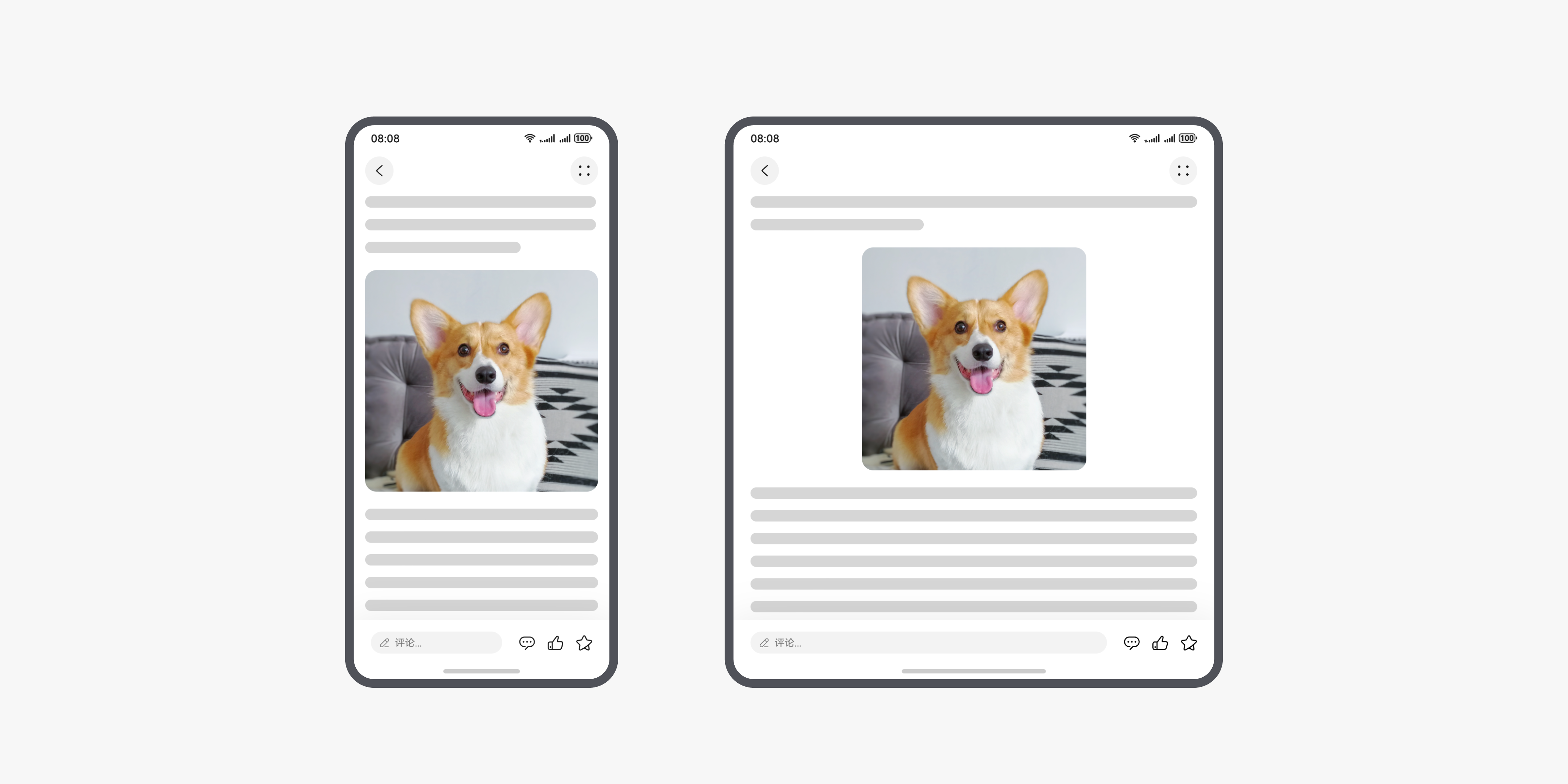
For continuity during switchover between folding states of the bi-fold phone, you need to ensure the reading focus remains unchanged for scrollable components such as the List, WaterFlow, and Scroll components. Currently, these components maintain the reading focus position based on a swiping offset before the folding state changes. However, because an internal height of the component may change before and after the folding state is switched, it is difficult to ensure the reading focus remains unchanged even with the same swiping offset. Therefore, special processing measures need to be taken for the foregoing scrollable components.
- List
The List component can use onScrollIndex() to listen for the child component's entering or leaving the list display area, and obtain the index at the top of the list display area. After obtaining the index at the top, the callback for listening for the state changes of the bi-fold phone can call the scrollToIndex() method provided by the Scroller to scroll the list to the position of the specified index, ensuring the reading focus remains unchanged. The following is an example:
Register the callback function for listening to index value changes in aboutToAppear to trigger the update.
aboutToAppear(): void {
  let callback: Callback<display.FoldStatus> = (data: display.FoldStatus) => {
    if (data === display.FoldStatus.FOLD_STATUS_EXPANDED) {
      this.barOpacity = 1;
      this.listScroller.scrollToIndex(this.currentIndex);
    } else if (data === display.FoldStatus.FOLD_STATUS_FOLDED) {
      this.listScroller.scrollToIndex(this.currentIndex);
    }
    hilog.info(0x0000, TAG, 'Listening enabled. Data: ' + JSON.stringify(data));
  };
  try {
    display.on('foldStatusChange', callback);
  } catch (error) {
    let err = error as BusinessError;
    hilog.error(0x0000, 'TestLog', `Failed to update fold status. Code: ${err.code}, message: ${err.message}`);
  }
}
Update the index value in the scrollToIndex() method of the List component.
List({ space: CommonConstants.LIST_SPACE[0], scroller: this.listScroller, }) { // ... } .onScrollIndex((start: number) => { this.currentIndex = start; }) - WaterFlow
The WaterFlow component needs to perform special judgment based on the scenario. If the number of columns displayed in the WaterFlow component does not change before and after the state changes of the bi-fold phone, the system can use the default swiping offset before the folding state changes to ensure the reading focus remains unchanged. If the number of columns displayed in the WaterFlow component changes after the state changes of the bi-fold phone, you need to change WaterFlowLayoutMode to SLIDING_WINDOW. Then, the reading focus of the WaterFlow component is automatically maintained based on the minimum index of the WaterFlow display area.
WaterFlow({ layoutMode: WaterFlowLayoutMode.SLIDING_WINDOW }) { LazyForEach(this.dataSource, (item: number) => { FlowItem() { Column() { Text('Num' + item).fontSize(12).height('16') } } .onAppear(() => { if (item + 20 == this.dataSource.totalCount()) { for (let i = 0; i < 100; i++) { this.dataSource.addLastItem(); } } }) .width('100%') .height(this.itemHeightArray[item % 100]) .backgroundColor(this.colors[item % 5]) }, (item: string) => item) } .columnsTemplate(this.waterFlowColumnsTemplate) - Scroll
The Scroll component ensures the reading focus remains unchanged based on the swiping offset before the folding. However, unlike the List component, the Scroll component cannot ensure the reading focus remains unchanged based on the list item index. The Scroll component provides the scrollBy() method to swipe a specified distance. You need to calculate the swipe distance based on the actual service scenario, and perform adaptation for the Scroll component to maintain the reading focus by using the scrollBy() method.
[h2]Semi-Folded State
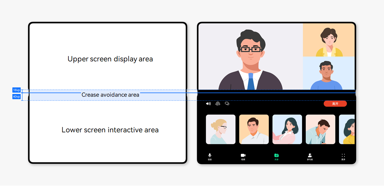
Foldable devices in the semi-folded state can be placed stably on a desk, achieving a hands-free experience. It is suitable for tasks that do not require frequent interaction, such as video calls, video playback, taking photos, and listening to music. For details about the design specifications, see Semi-Folded State. The upper and lower screens of a foldable device in the semi-folded state need to be properly arranged so that the displayed content avoids the crease. For details, see Semi-Folded State of Foldable Screens.